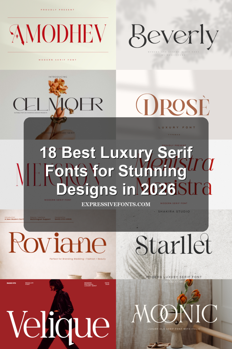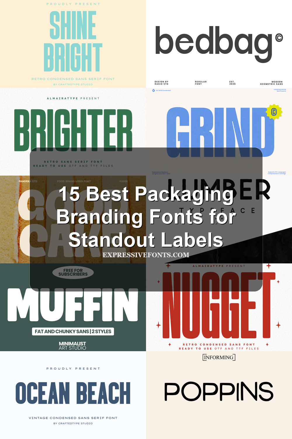
15 Best Packaging Branding Fonts for Standout Labels
Looking for more branding fonts? Browse our complete Branding Fonts collection to compare luxury, elegant, modern, feminine, minimal, boutique, beauty, fashion, packaging, and serif styles.
Packaging Branding Fonts can shape how a product feels before anyone reads the details. This collection is for designers building labels, boxes, stickers, pouches, logos, and shelf-ready brand systems, with styles ranging from clean geometric sans fonts to retro, chunky, and textured display type.
Clean & Geometric Packaging Branding Fonts
These packaging branding fonts use balanced geometry, open counters, and restrained shapes for modern labels, beauty packaging, editorial boxes, and clean product identities.
Balimo Font
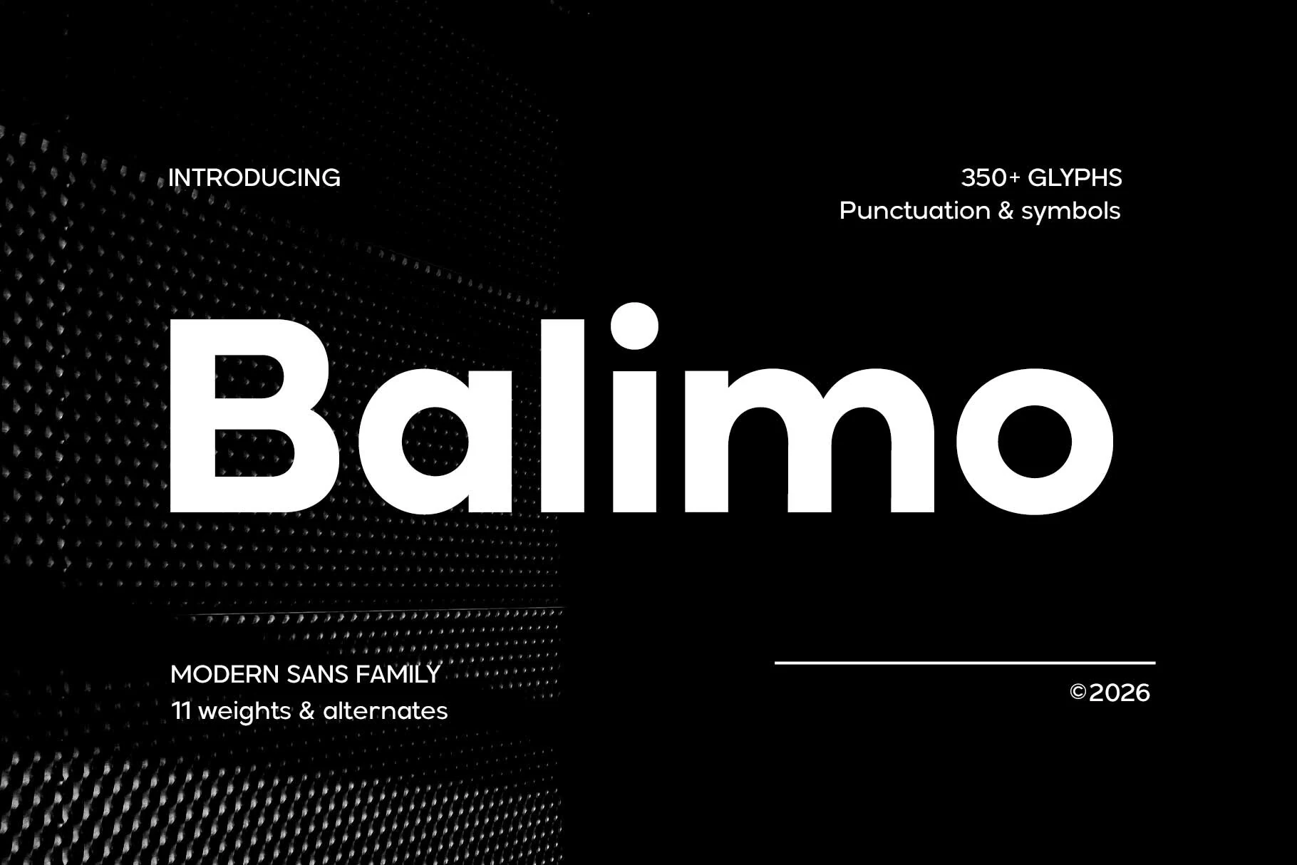
Best For: packaging, branding, product labels, editorial designs
Balimo Font has a crisp geometric structure, even stroke weight, and wide round counters that give the letterforms a confident, polished presence. Its refined proportions keep the style modern without feeling sterile, which makes it a strong fit for Packaging Branding Fonts when you want a clean identity with a clear visual voice.
The spacing feels steady and the shapes stay open, so Balimo can handle a bold product name as well as shorter supporting copy without losing clarity. It works best in restrained layouts with strong contrast and clear hierarchy, where the heavier text can anchor the design and smaller details remain easy to scan.
Bedbag Font
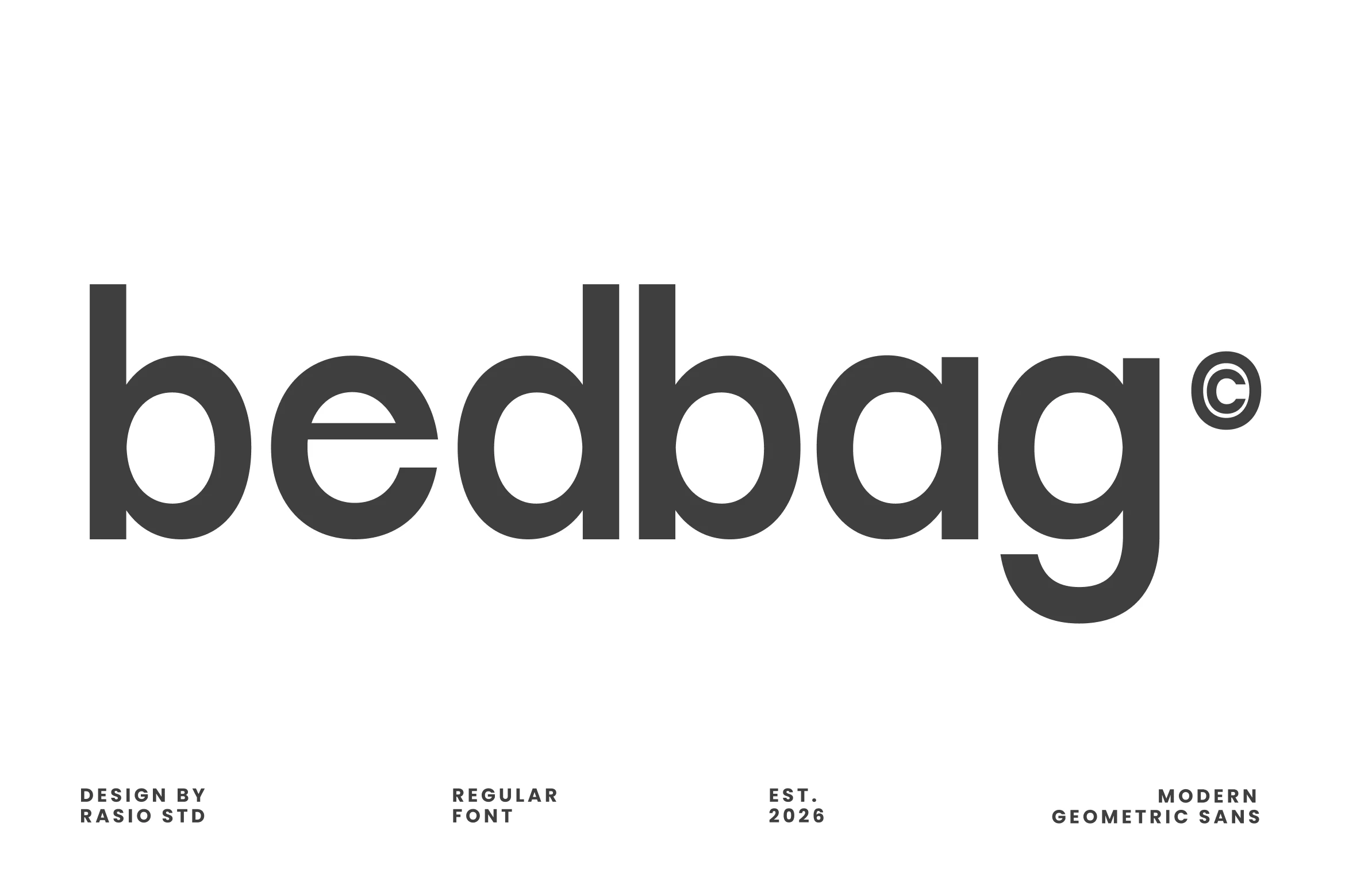
Best For: packaging, product labels, branding, modern designs
Bedbag Font has a clean geometric sans build with heavy lowercase forms, round counters, straight stems, and smooth curves that keep the wordmark stable and readable. Its neutral structure gives Packaging Branding Fonts a modern corporate tone without losing visual weight on labels or product names.
The even rhythm makes it useful for compact logo systems, poster titles, and web-facing brand text. Use tight-to-moderate spacing for the main name, then increase tracking in small supporting lines so the rounded shapes stay crisp and the hierarchy remains controlled.
Poppins Font
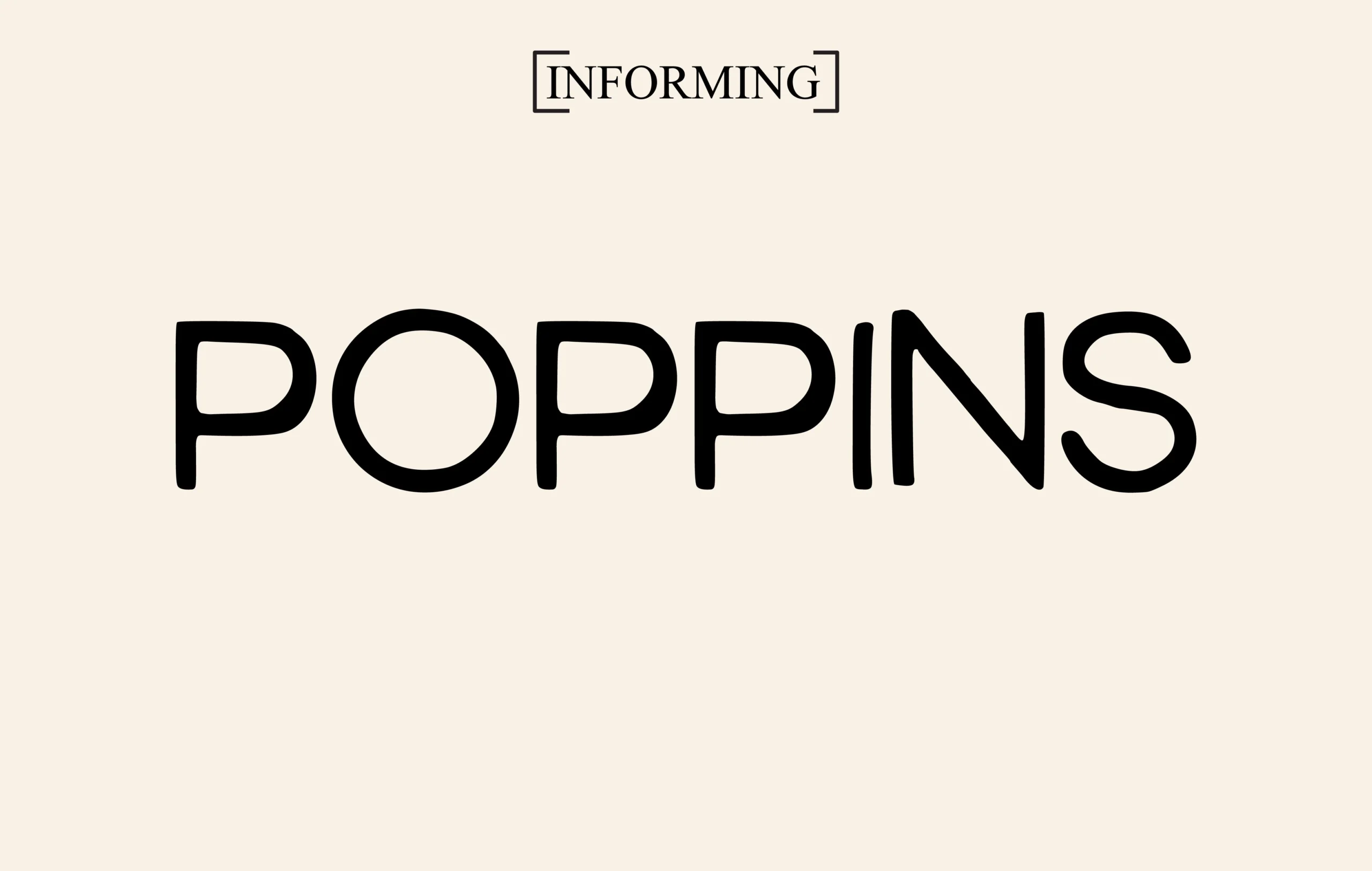
Best For: branding, packaging, product labels, clean designs
Poppins Font has a clean geometric sans structure with rounded bowls, even stroke weight, and soft terminals that keep it friendly instead of rigid. Its wide curves and simple shapes give Packaging Branding Fonts a polished, modern tone that feels easy to read at a glance.
The preview shows how well it holds together in large uppercase settings, where the open counters and steady rhythm create a calm, confident wordmark. It works especially well when you want a neat hierarchy on labels or boxes—pair it with generous spacing and minimal supporting text so the letterforms stay crisp and uncluttered.
Vonca Font
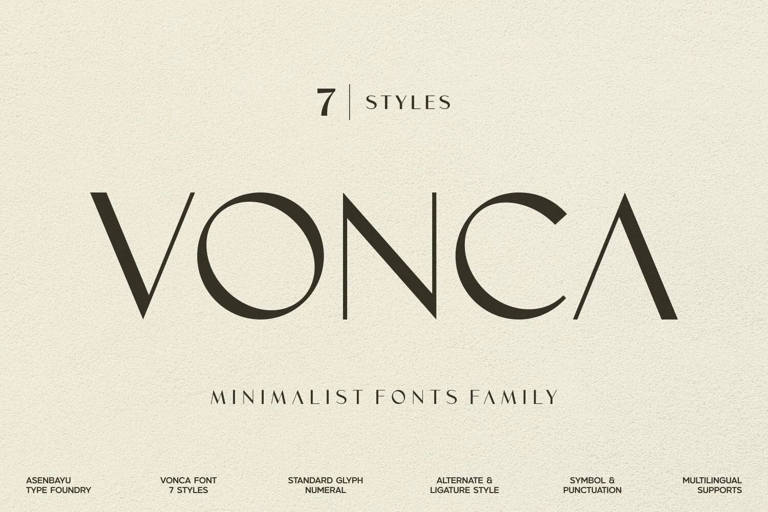
Best For: packaging, logos, branding, fashion branding
Vonca Font has a refined minimalist look built from thin strokes, geometric curves, and airy proportions that give each letter a sleek editorial presence. The sharp diagonals and wide spacing feel polished rather than cold, which makes it especially effective for Packaging Branding Fonts that need a quiet, high-end tone.
This is a display-forward family, so it works best when you let the shapes breathe in logos, labels, and fashion-led layouts. Use generous spacing and strong contrast to keep the delicate structure crisp; the clean geometry reads modern, while the restrained elegance can also support subtle vintage styling.
Retro & Condensed Packaging Branding Fonts
This group focuses on narrow, vintage, and high-impact letterforms that help labels, badges, snack packs, merch, and poster-style packaging feel bold from a distance.
Hamburger Heaven Font
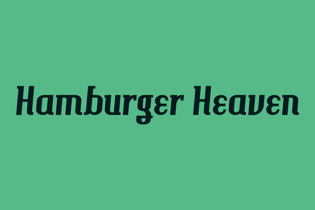
Best For: packaging, product labels, logos, retro designs
Hamburger Heaven Font has a dense vintage serif build with a forward-leaning stance, thick stems, bracketed serifs, and rounded internal shapes that keep the wordmark bold without feeling rigid. Its retro character fits Packaging Branding Fonts when the design needs a clear nostalgic cue rather than a neutral product label voice.
The heavier weight benefits from firm contrast against the background and moderate tracking, especially in headlines, labels, and logo lockups. Keep it to short names or display phrases; the slant and compact rhythm give strong shelf presence, but long copy would start to feel crowded.
Brighter Font
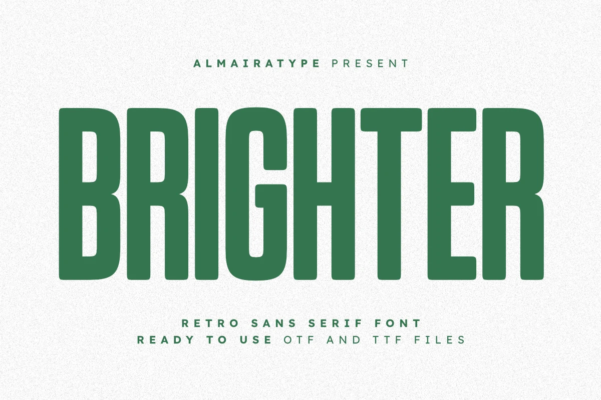
Best For: packaging, product labels, T-shirts, retro designs
Brighter Font uses a tall, solid retro sans structure with heavy vertical stems, squared shoulders, and softly rounded corners that stop the letters from feeling harsh. Its 70s and 80s influence gives Packaging Branding Fonts a strong throwback signal while keeping the shapes clean enough for modern labels and merchandise.
Theobald Font
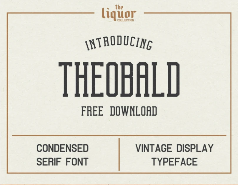
Best For: packaging, product labels, posters, vintage designs
Theobald Font has a tall condensed serif shape with firm vertical strokes, squared slab-like terminals, and a narrow rhythm that immediately points to beer labels, posters, and old advertising. It gives Packaging Branding Fonts a direct vintage cue without relying on distressed texture or decorative extras.
The compact width is useful when a product name needs to stack cleanly inside a label frame or badge. Keep tracking controlled in the main wordmark, then use wider spacing for small supporting lines so the dense uppercase forms stay readable and the hierarchy feels intentional.
Ocean Beach Font
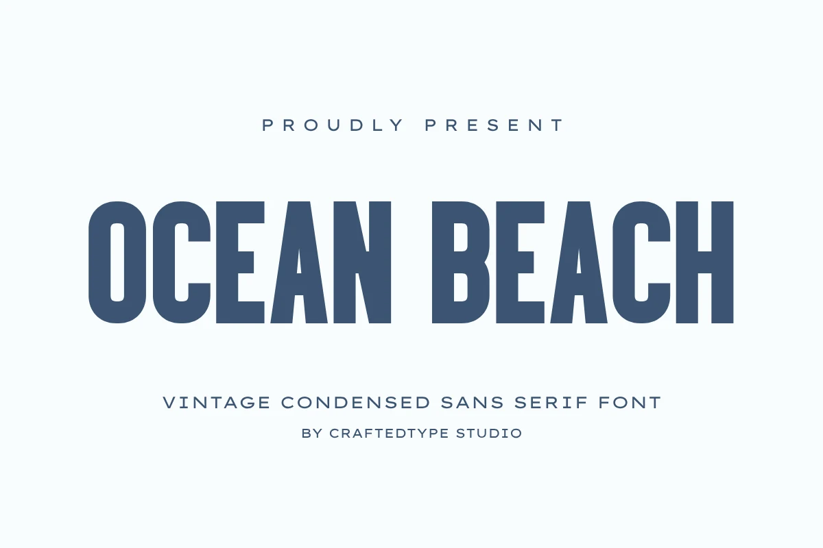
Best For: packaging, branding, posters, vintage designs
Ocean Beach Font has a tall condensed build with firm vertical strokes, blunt terminals, and a clean retro tone that feels crisp rather than decorative. That narrow structure gives Packaging Branding Fonts strong presence in a compact footprint, especially when a label or logo needs to look bold without taking up too much width.
The letterforms suit headlines, wordmarks, and short product names where height can do the work of emphasis. Keep the main line tight for impact, then add more tracking to smaller supporting text so the condensed shapes stay readable and the overall hierarchy feels balanced.
Gc Grind Font
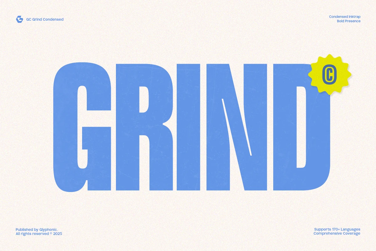
Best For: packaging, branding, posters, headlines
Gc Grind Font has a bold condensed structure with tall proportions, heavy strokes, and squared curves that give every word a solid, urban edge. The compact width makes it especially effective for Packaging Branding Fonts when you need a name or headline to hit hard without spreading too wide across the layout.
Its dense rhythm works best in short lines, posters, and assertive brand marks where scale does most of the styling. Keep supporting text simpler and lighter, and use spacing carefully around the main wordmark so the blocky forms stay crisp instead of crowding the composition.
Shine Bright Font
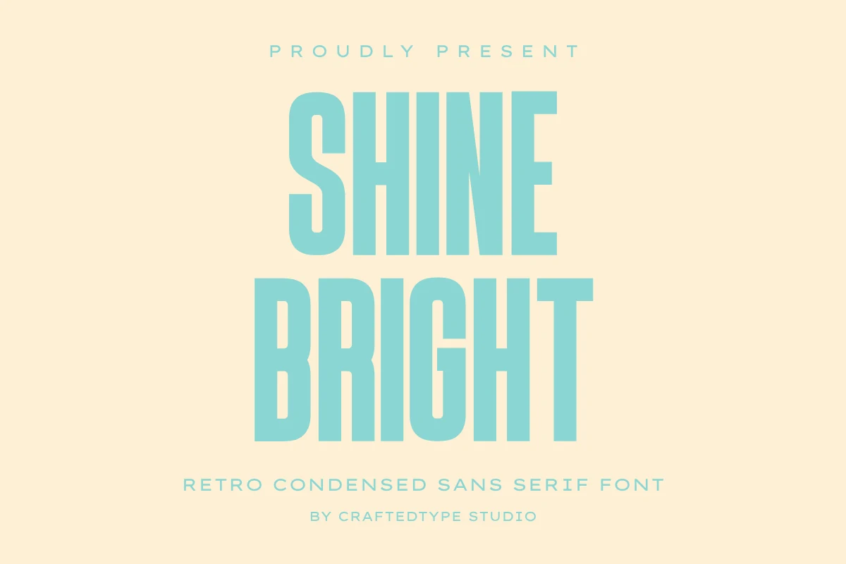
Best For: packaging, product labels, retro designs, merch design
Shine Bright Font has a heavy retro condensed sans build, with tall vertical stems, narrow counters, and smooth geometric edges that keep the letters firm rather than quirky. For Packaging Branding Fonts, that compact width is useful when a product name needs to feel loud without spreading too far across a label or pouch.
The preview shows its strength in stacked, all-caps title settings, where the dense rhythm creates a clean block of impact. Keep spacing controlled but not cramped, use strong contrast around it, and lean on the clean outlines for stickers, merch graphics, and cutting-machine layouts where simple edges matter.
Nugget Font
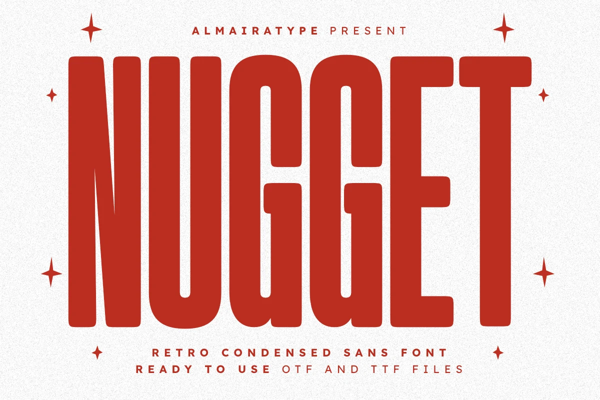
Best For: packaging, product labels, retro designs, T-shirts
Nugget Font uses a tall retro condensed sans shape with heavy vertical mass, narrow interior spaces, and subtly rounded corners. Its compressed width gives Packaging Branding Fonts a strong shelf-facing presence, especially when a short name needs to look bold without taking over the whole label.
The preview shows a dense all-caps rhythm with enough softness to avoid a harsh industrial feel. Keep tracking modest, use it for short headline blocks, and lean on the clean outer edges for stickers, T-shirts, mugs, and vinyl-cut graphics where simple silhouettes reproduce better than fussy detail.
Playful & Textured Packaging Branding Fonts
These fonts bring chunky curves, soft handmade shapes, and rough display texture for food packaging, stickers, casual labels, and brands that need a friendlier shelf voice.
Good Cake Font
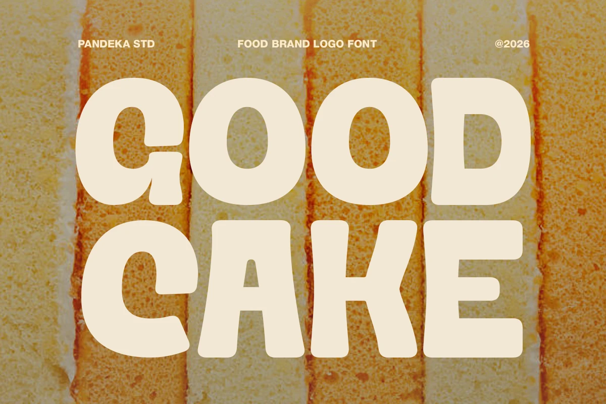
Best For: packaging, logos, product labels, stickers
Good Cake Font uses oversized chunky letters, broad counters, and soft corners that give it an instantly friendly bakery feel. The slightly uneven proportions keep it warm and handmade, and that retro sweetness suits Packaging Branding Fonts that need a cheerful, appetite-friendly voice.
The heavy shapes work best on short names, labels, and sticker-style marks where the font can stay large and readable. Give it some breathing room and pair it with simpler supporting text, so the playful curves remain clear instead of turning the layout dense.
Muffin Font
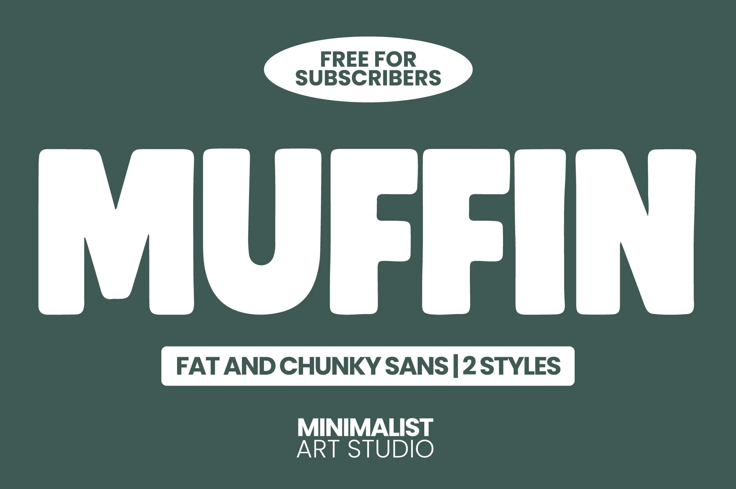
Best For: packaging, product labels, logos, stickers
Muffin Font is built from oversized fat sans letters with soft corners, tight counters, and a broad blocky rhythm that feels playful without becoming messy. Its chunky weight gives Packaging Branding Fonts a strong shelf-read, especially for food, snack, and casual product identities that need instant recognition.
The font works best as a short wordmark or large headline where the rounded mass can dominate the layout. Keep the supporting type narrow or lighter, and avoid crowding the edges; Muffin needs clear spacing so its heavy curves stay friendly instead of compressed.
Sugra Font
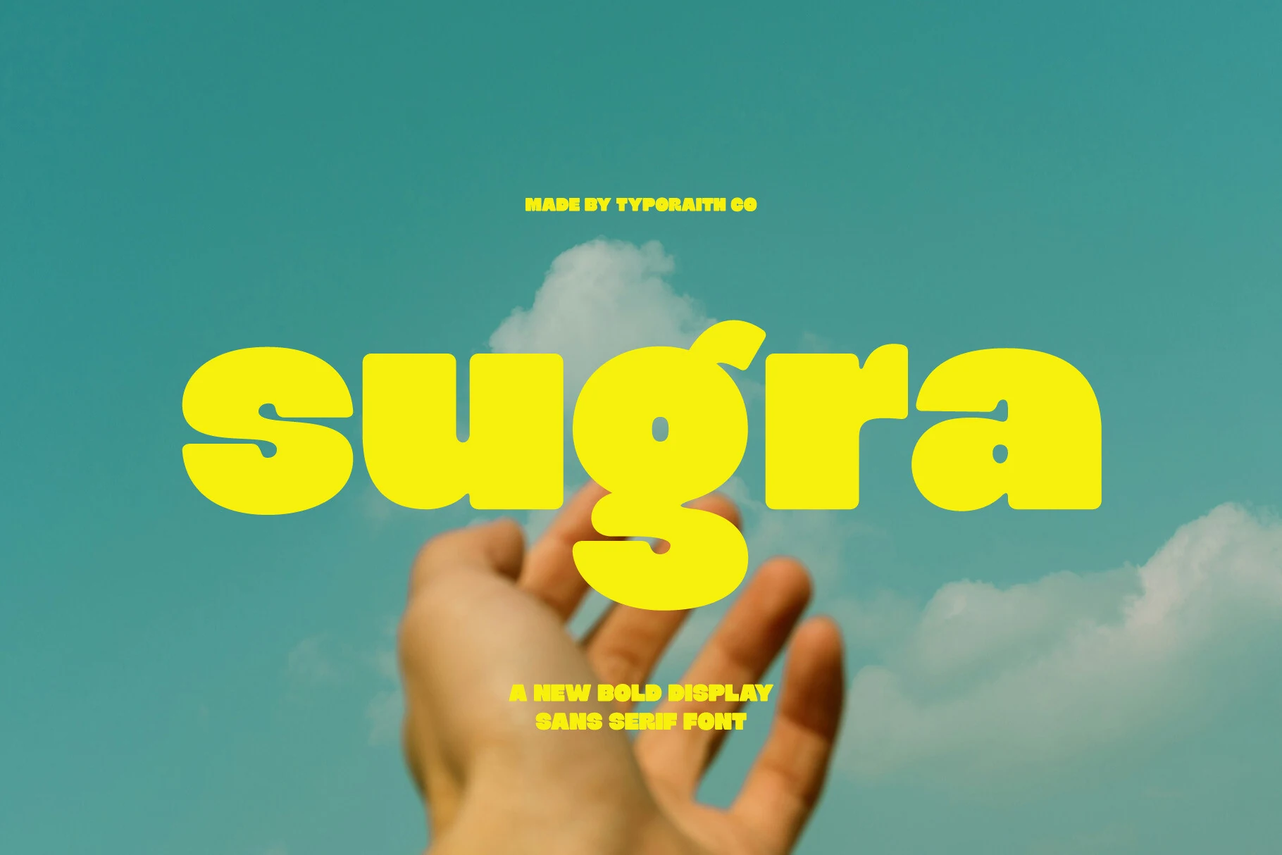
Best For: packaging, logos, posters, bold designs
Sugra Font has a heavy rounded sans shape with inflated counters, soft corners, and a low, wide rhythm that feels bold without becoming rigid. The letters sit tightly together, so its character comes from compact mass and smooth curves rather than sharp display tricks.
Use it where Packaging Branding Fonts need immediate shelf impact: snack labels, poster headlines, or upbeat logo marks. Its thick strokes hold up well against bright color, but the dense spacing works best with short words and clear contrast around the title.
Lumber Font
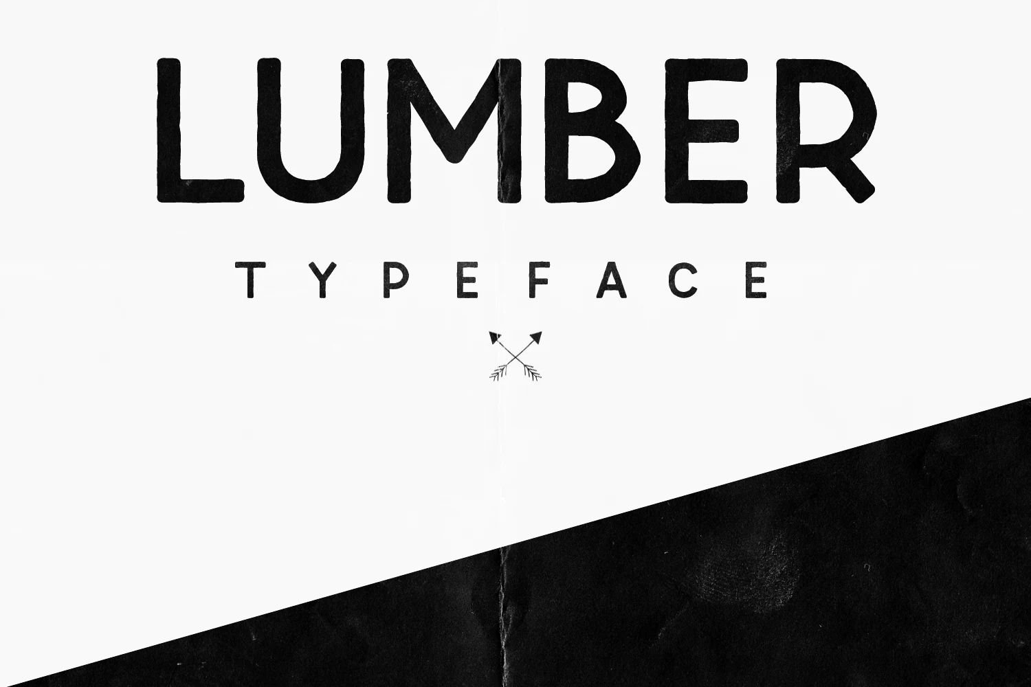
Best For: packaging, branding, signage, posters
Lumber Font has a roughened display sans look with chunky strokes, rounded corners, and slightly irregular construction that gives the letters a handmade, outdoorsy edge. That mix of simplicity and texture works well for Packaging Branding Fonts when a label needs to feel approachable, crafted, and easy to spot.
The preview shows strong uppercase forms with generous spacing, so it performs best in short names, headers, and badge-style layouts rather than dense copy. Let the texture do the work: pair it with cleaner secondary text and enough breathing room to keep the quirky shapes readable on signs, posters, or product wraps.
Conclusion
For a polished product system, start with clean geometric fonts. Choose retro condensed styles for bolder shelf impact, or use playful and textured fonts when the packaging needs warmth, flavor, or a handmade edge.