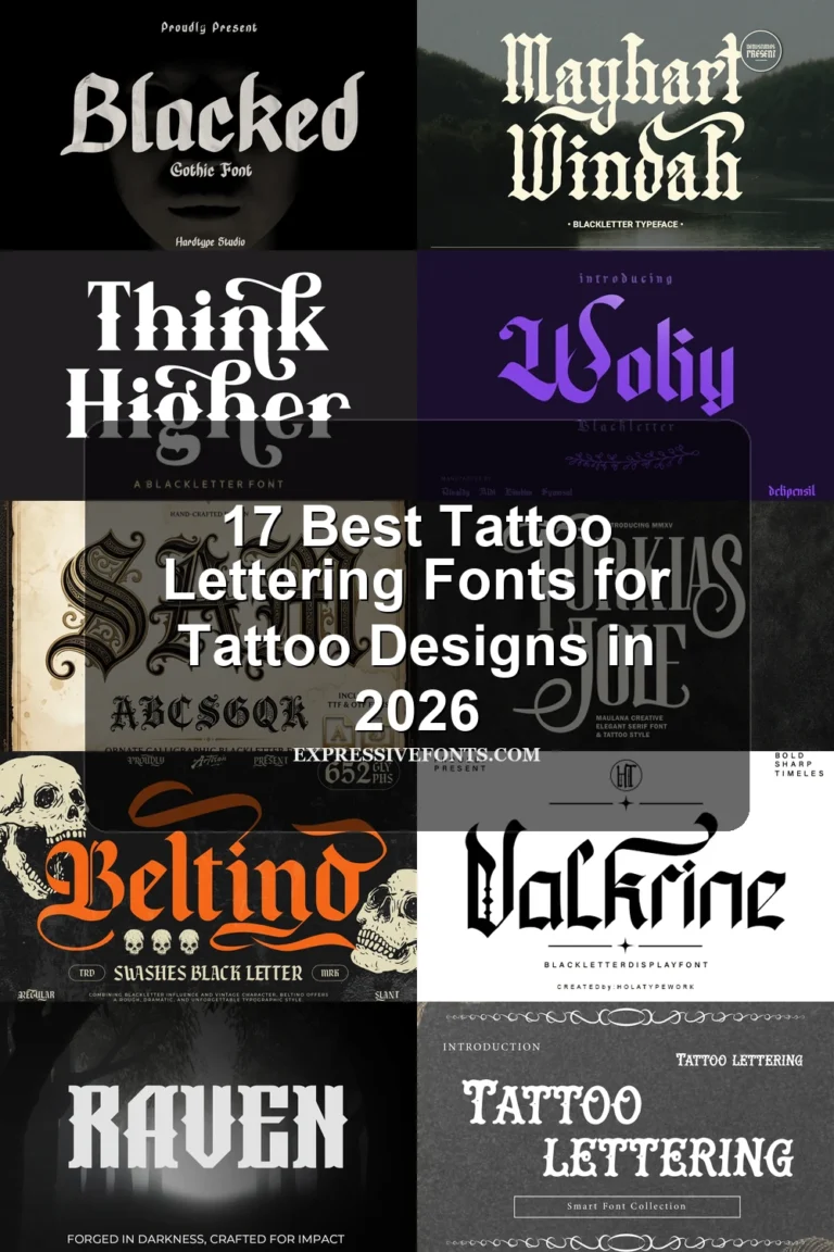
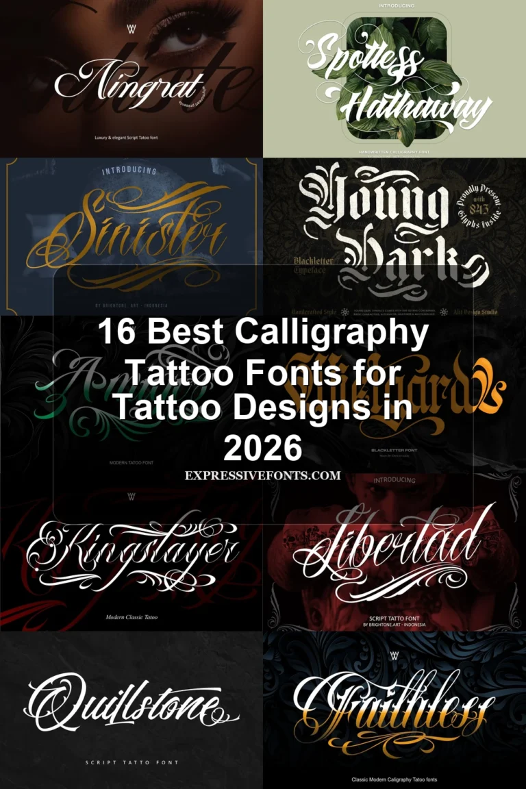
11 Best Blackletter Tattoo Font for Tattoo Designs in 2026
This Blackletter Tattoo Font collection spans dense Old English structures, connected calligraphic lettering, and distressed contemporary forms with sharp terminals, flourishes, or irregular edges. These differences make the fonts useful for tattoo-inspired logos, apparel, posters, signage, and other short display work where visual identity matters more than paragraph-length readability.
Looking for more tattoo fonts? Browse our complete Tattoo Fonts collection to compare calligraphy, lettering, cursive, gothic, and script tattoo styles.
Blackletter Tattoo Font: Traditional Dense Forms
This Blackletter Tattoo Font group centers on dense Old English construction: heavy verticals, fractured terminals, and stable upright forms. It is more formal and compact than the connected or distressed categories.
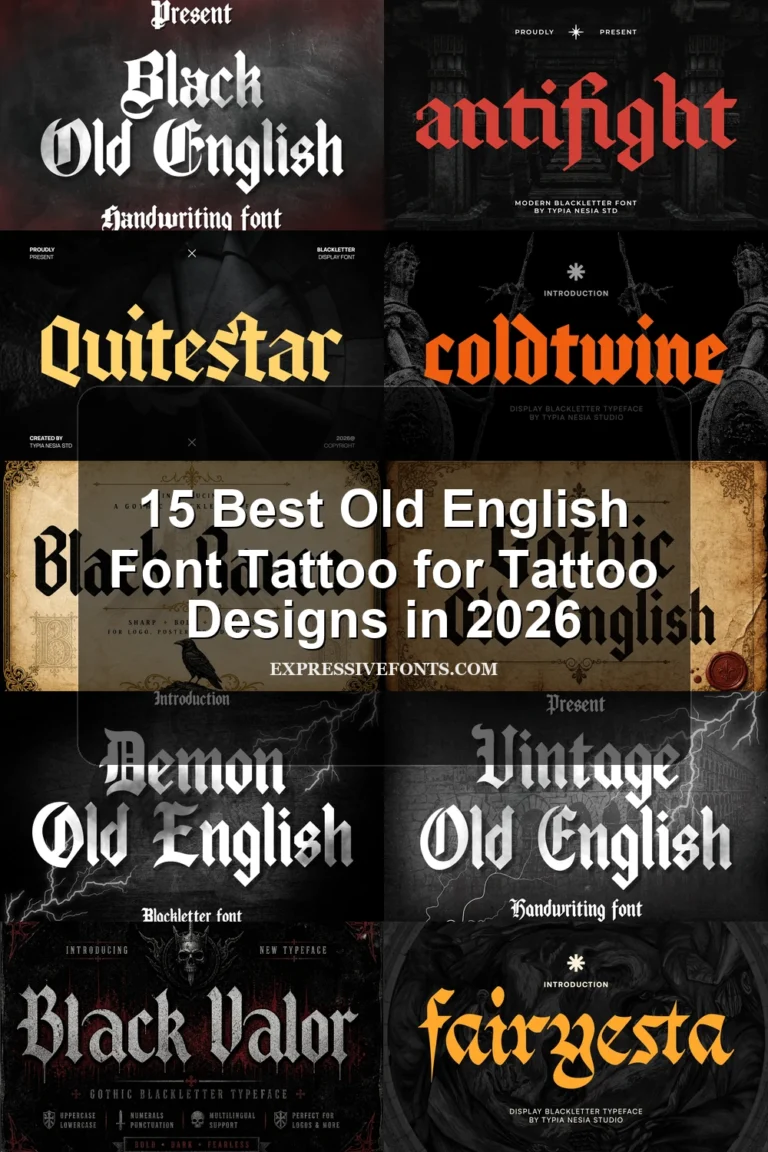
Gothic Old English Font
Best For: logos, posters, display text, signage
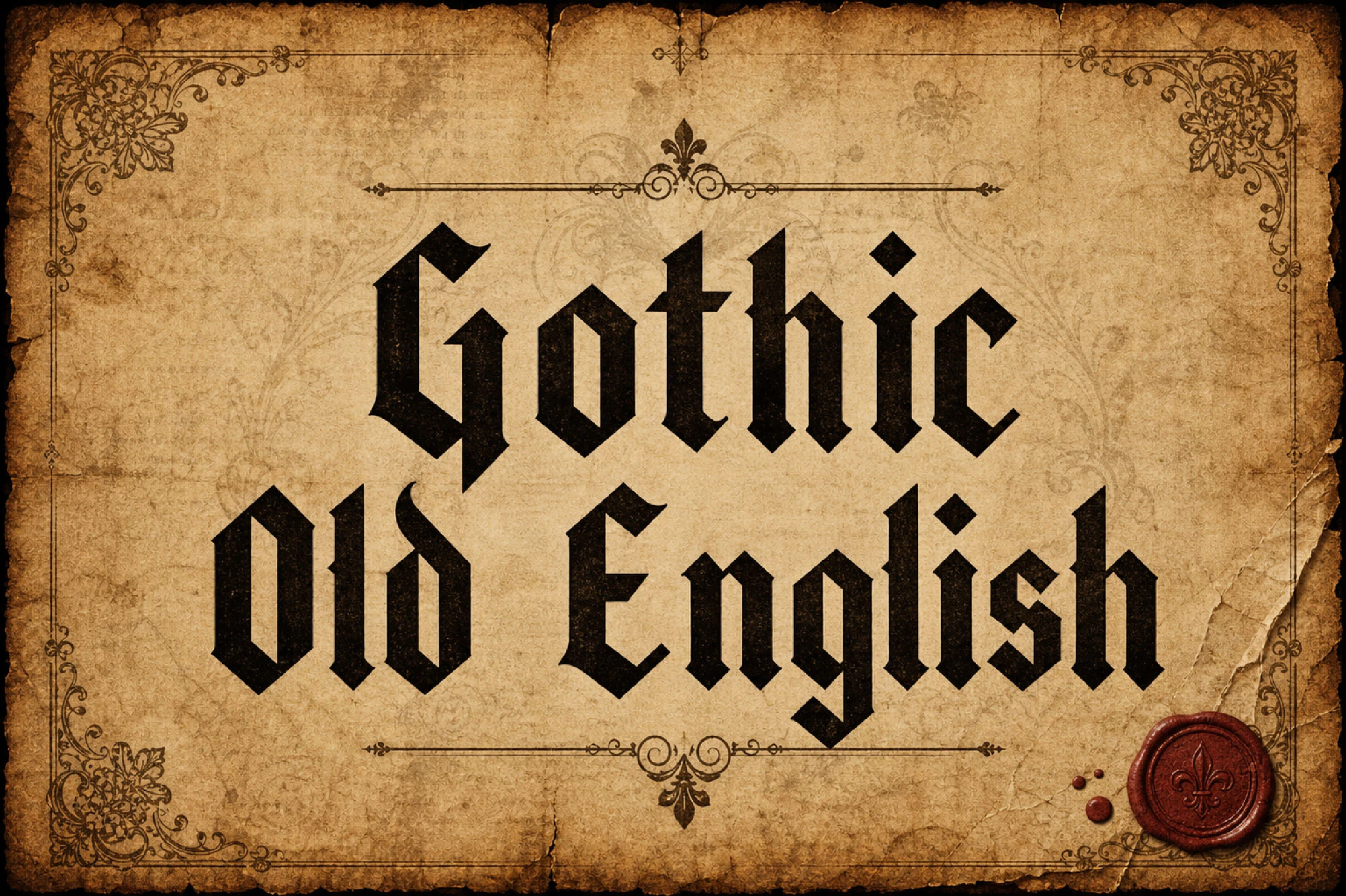
Gothic Old English Font delivers the collection's clearest traditional Old English structure through heavy vertical strokes, fractured shapes, diamond terminals, and a stable upright baseline. It works well for logos, signage, and display text, though its dense details need room to remain clear.
Ragnar Gothic Font
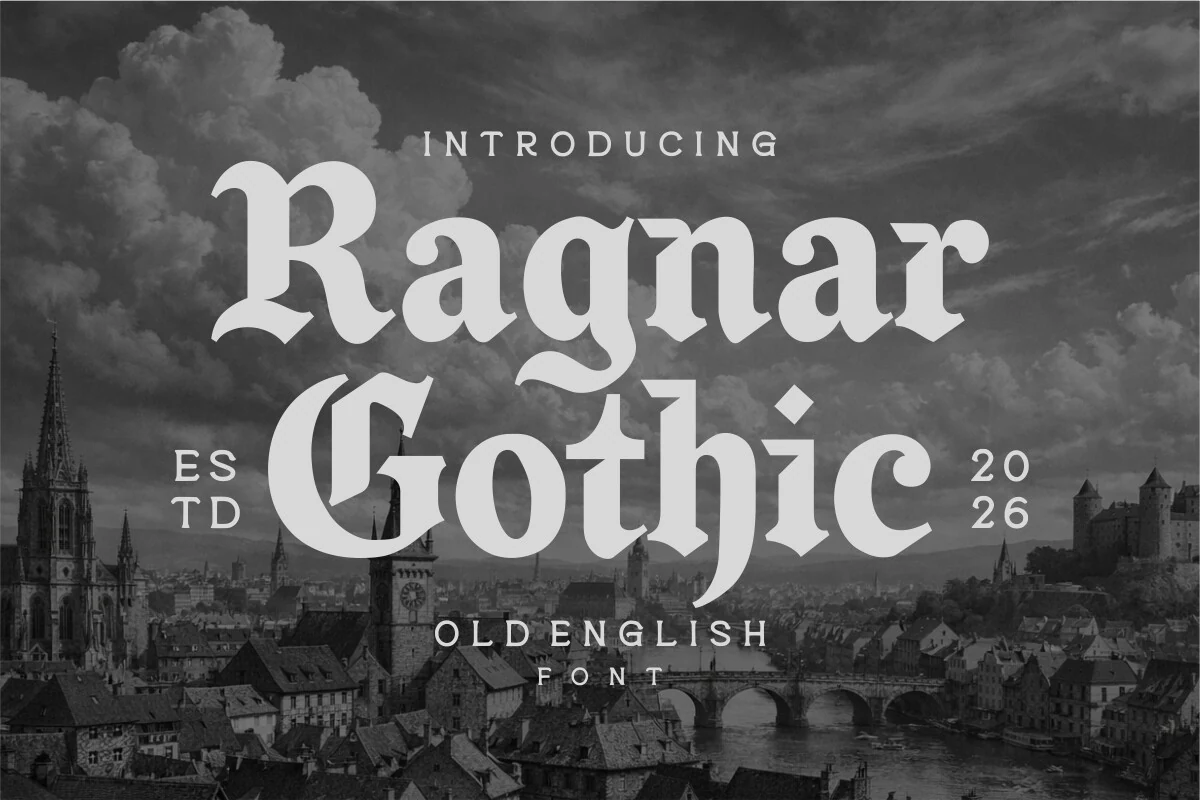
Best For: branding, logos, display text, headlines
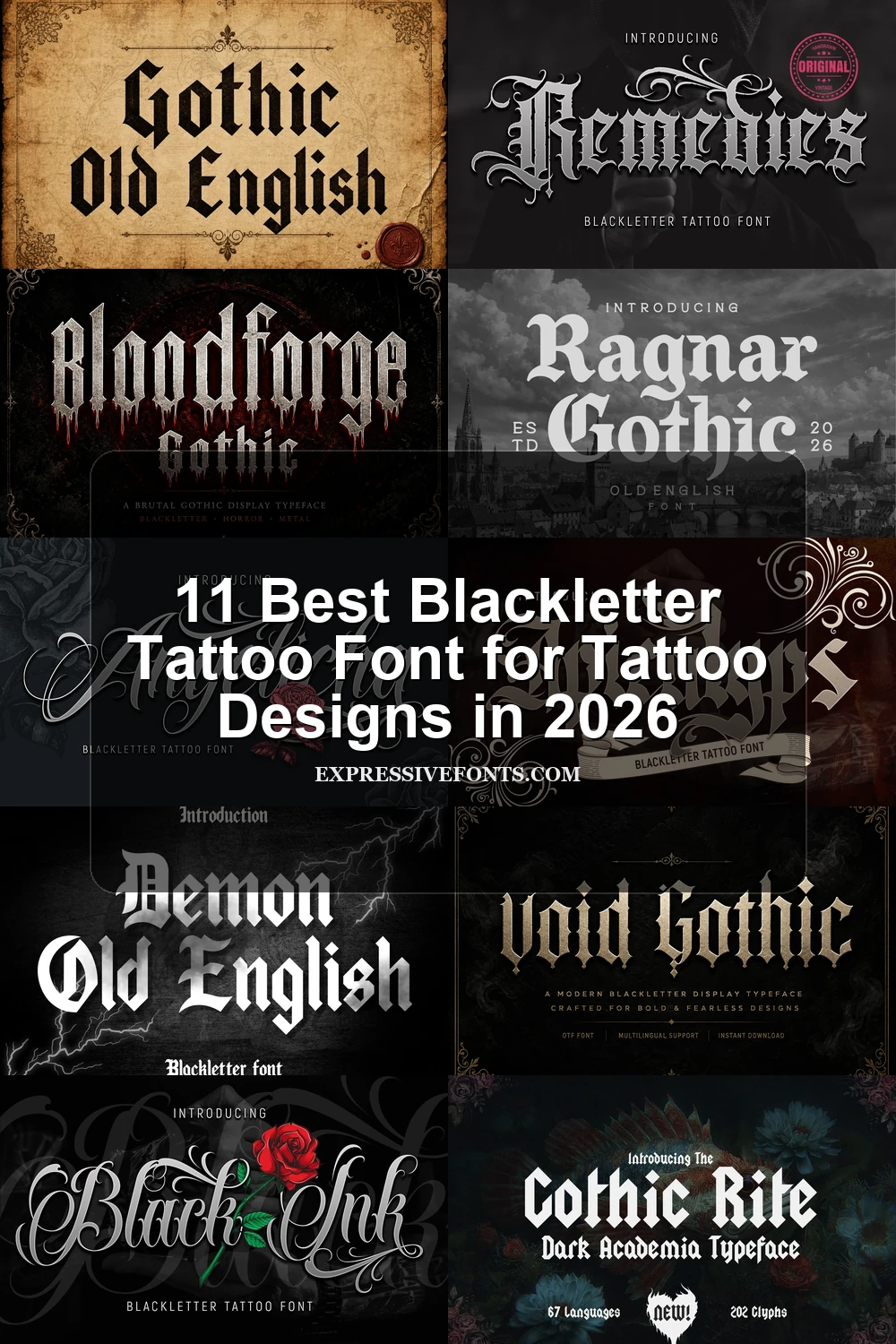
Ragnar Gothic Font builds its formal Old English identity from thick stems, pointed terminals, and decorative curves on capital letters. The flourished capitals give branding and headlines a distinct finish, while high contrast makes paragraphs difficult to scan.
Old English Texas Font
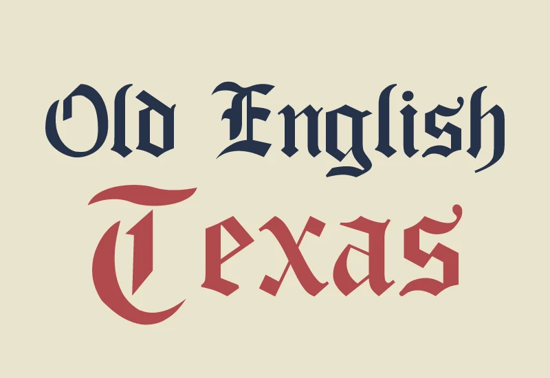
Best For: logos, posters, display text, signage
Old English Texas Font uses closely spaced, block-like forms and heavy vertical strokes to create a compressed silhouette. Its angular structure suits signage, logos, and posters, but the letterforms can merge into dark clusters when reduced.
Demon Old English Font
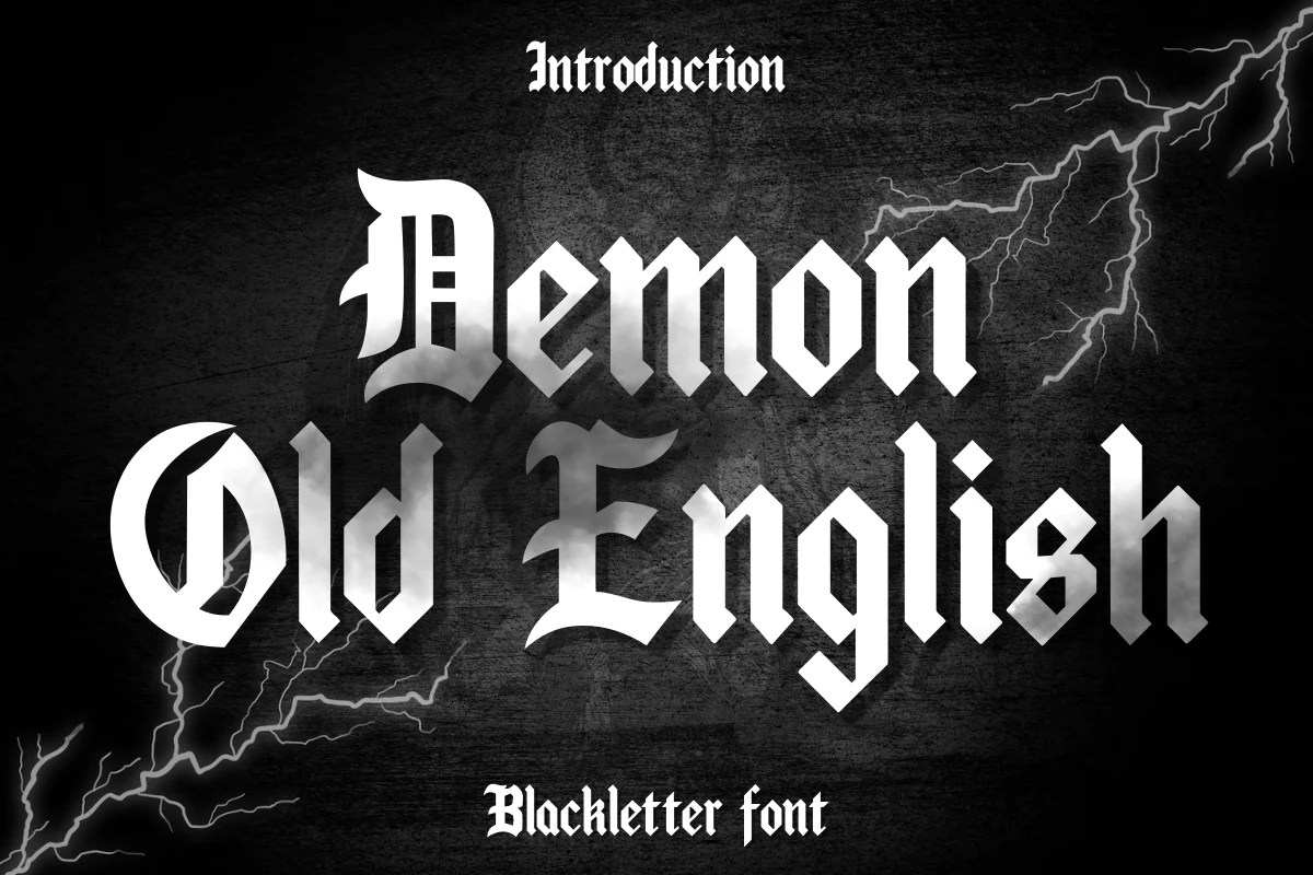
Best For: social media graphics, T-shirts, display text
Demon Old English Font packs heavy condensed strokes and internal character detailing into an intense Gothic block. It is most effective for short, prominent wording on shirts, banners, cards, and social graphics rather than small or lengthy text.
Ornamental and Connected Forms
Connected joins, calligraphic movement, and extended swashes define this group. Compared with the dense traditional faces, these designs feel more fluid; unlike aggressive forms, their identity comes from flourish and rhythm.
Apicalyps Font
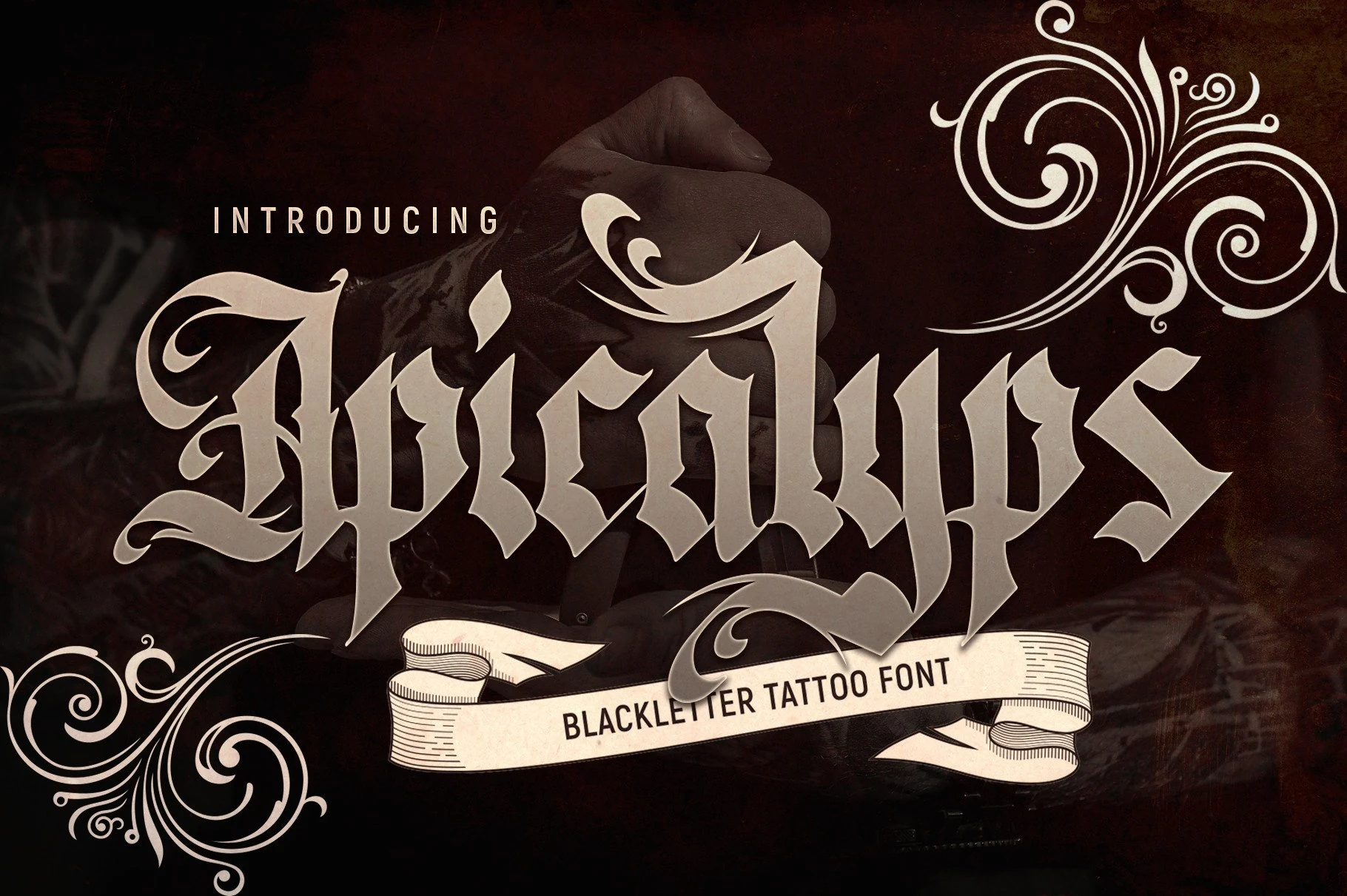
Best For: logos, T-shirts, posters, branding
Apicalyps Font uses narrow, heavy proportions, fractured angular strokes, and high contrast, with disconnected letters and extended swashes. Its intricate construction is best reserved for large logos, posters, or apparel graphics rather than small wording.
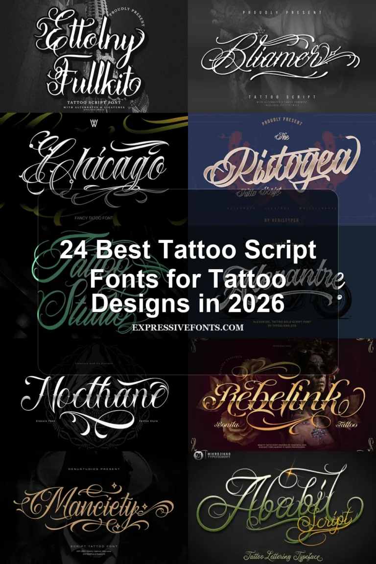
Angelicha Font
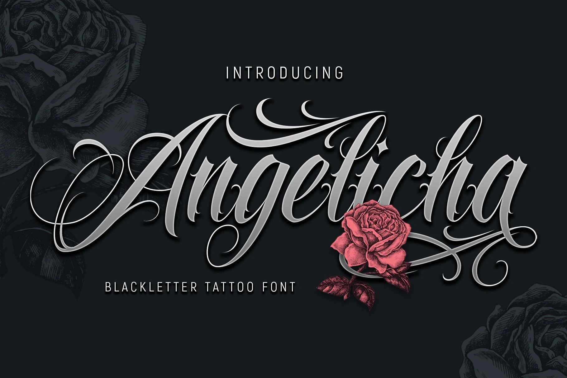
Best For: logos, T-shirts, posters, branding
Angelicha Font stands apart through fluid calligraphic connections rather than sharply separated forms. Pointed terminals retain its Gothic edge, while long swashes demand generous scale, making it more suitable for logos, poster titles, and short apparel lettering than extended copy.
Black Ink Font
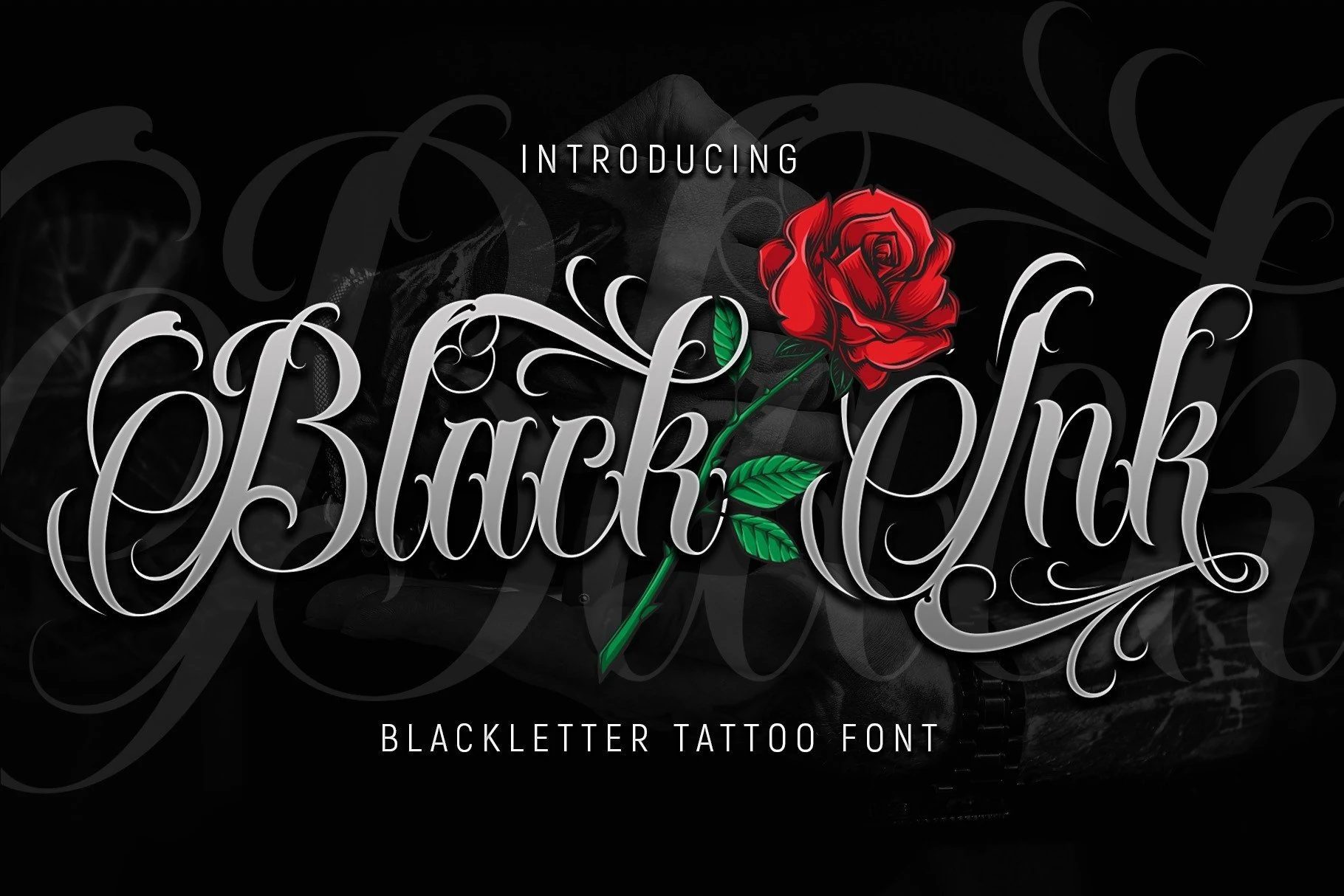
Best For: logos, posters, T-shirts, branding
For flowing tattoo-script lettering, Black Ink Font uses connected cursive forms, pointed pen terminals, high contrast, and extended swashes. The continuous joins work for signature-like logos and posters, but the flourishes need large sizing to stay legible.
Aggressive Contemporary Display Forms
These display faces push blackletter toward sharper, harsher territory through thorn terminals, high contrast, drips, and irregular textures. They create stronger visual impact than the steadier traditional forms.
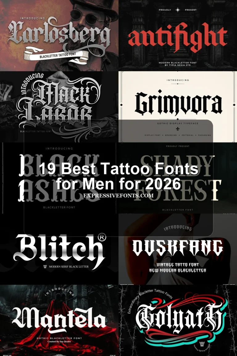
The Gothic Rite Font
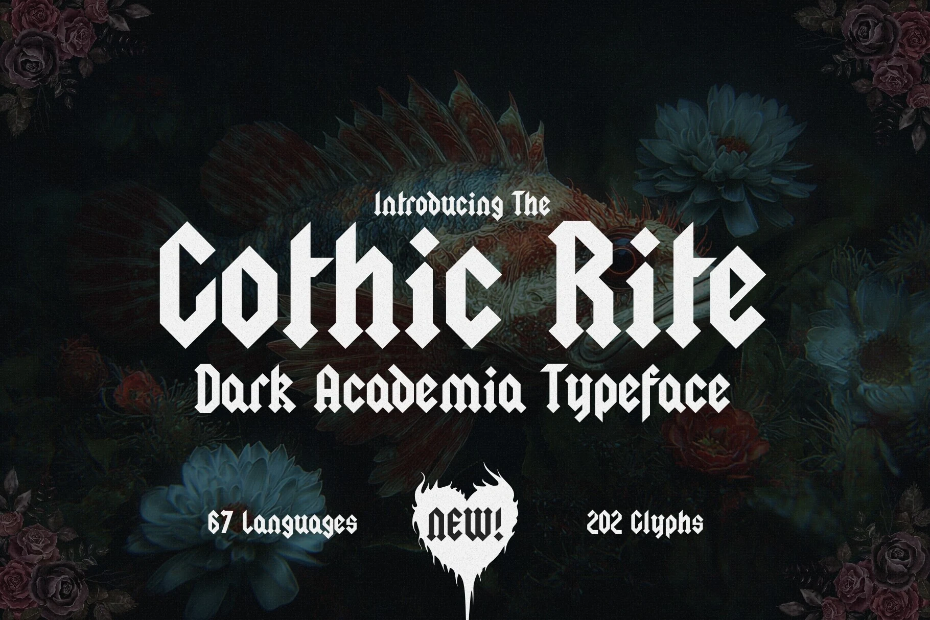
Best For: logos, book covers, posters, editorial designs
For title work, The Gothic Rite Font combines condensed vertical proportions, sharp diamond-shaped terminals, and strong thick-thin contrast. Its 202 glyphs and documented language coverage broaden title-setting options, but the intricate geometry is intended for logos, book covers, and posters rather than sustained reading.
Void Gothic Font
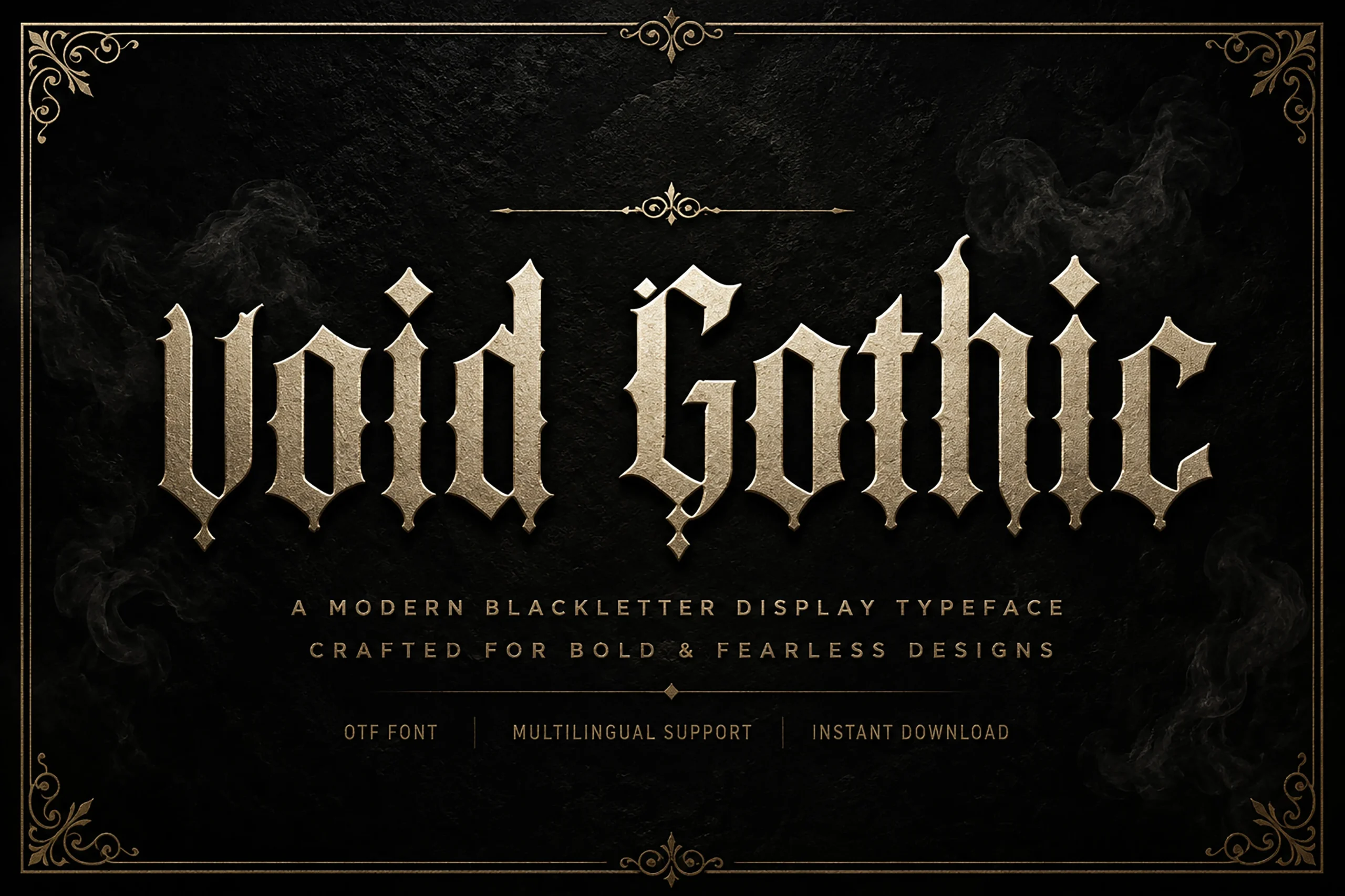
Best For: logos, posters, display text, headlines
For an updated headline treatment, Void Gothic Font pairs pointed diamond terminals and serif-like hooks with high-contrast angular lettering. Its intricate details reward large sizing in logos and posters, where the structure can be seen without competing with small-scale readability.
Remedies Font
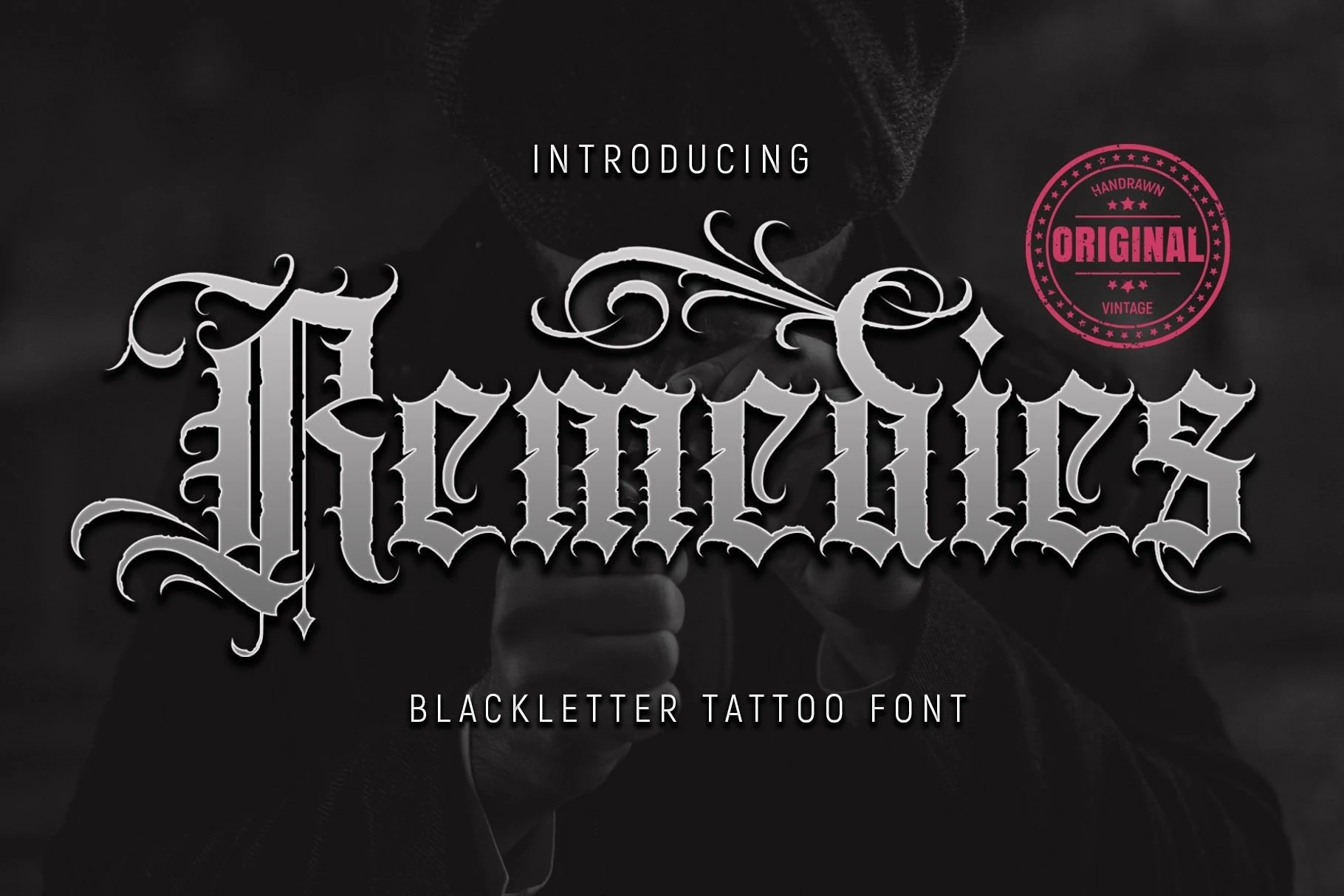
Best For: logos, posters, T-shirts, branding
Remedies Font creates a harsher silhouette with thorn-like terminals, condensed proportions, heavy contrast, and flourished capitals. The dense construction gives posters, shirts, and identity marks immediate presence, but compact placements will sacrifice clarity.
Bloodforge Gothic Font
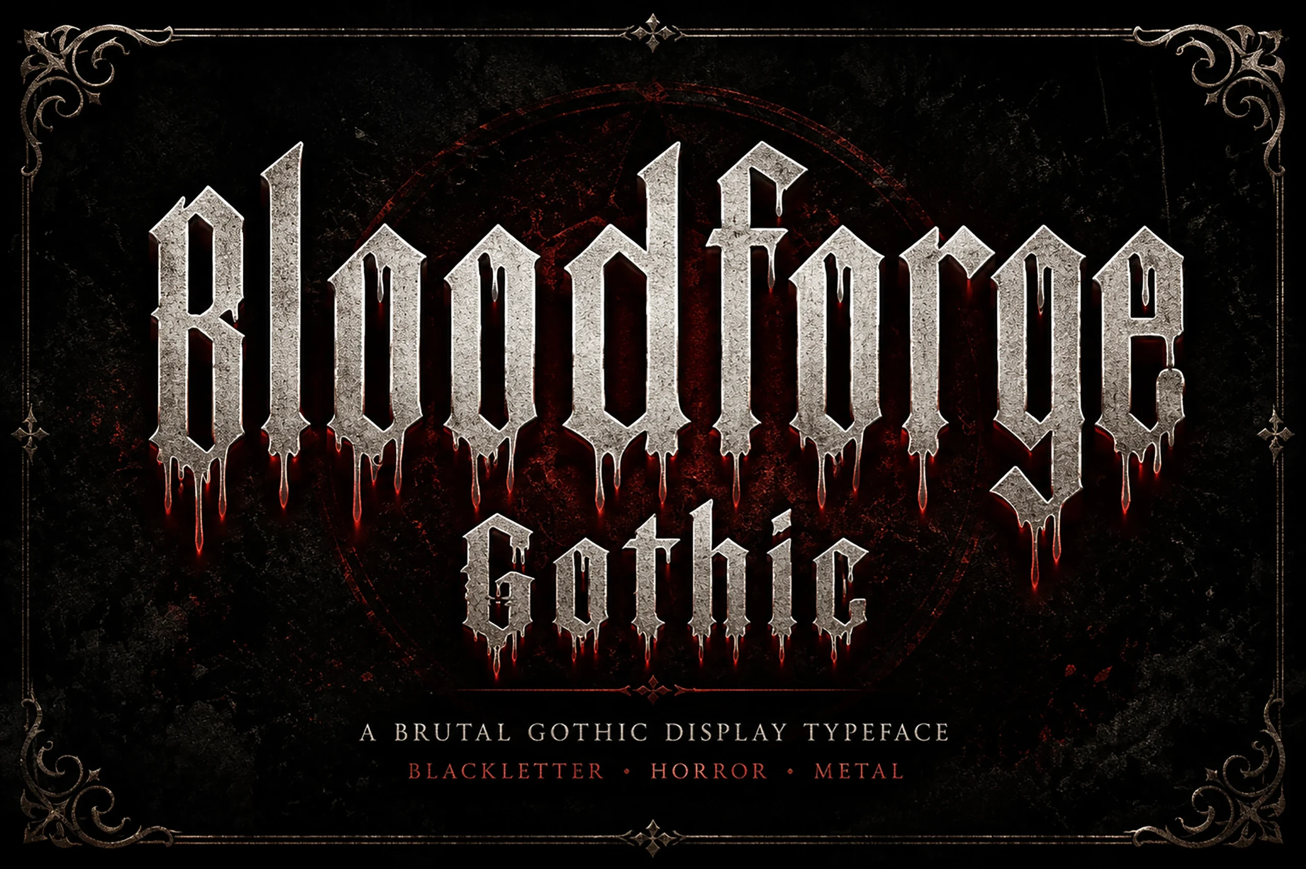
Best For: posters, T-shirts, display text, headlines
Bloodforge Gothic Font adds dripping base edges and weathered stone textures to a narrow, fractured blackletter structure. The irregular baseline suits horror-oriented posters and apparel graphics, while those effects make ordinary wording harder to parse.
How to Choose the Right Font
Choose a Blackletter Tattoo Font by deciding whether you need fractured density, connected movement, or distressed aggression first. Check weight and contrast at the intended scale, then test joins, flourishes, and terminals in the actual wording. For tattoos, logos, and apparel, keep text short and enlarge intricate faces; for signage, favor steadier traditional structures.