19 Best Cool Handwritten Fonts in 2026
Cool Handwritten Fonts range from restrained monoline signatures to textured brushes and high-contrast calligraphy. Together, they cover logo marks, invitations, packaging, signage, headlines, and short phrases, with construction and scale determining whether a style feels readable or purely decorative.
Looking for more cool fonts? Browse our complete Cool Fonts collection to compare bold, vintage, retro, script, and gothic cool styles.
Cool Handwritten Fonts: Flowing Signature Scripts
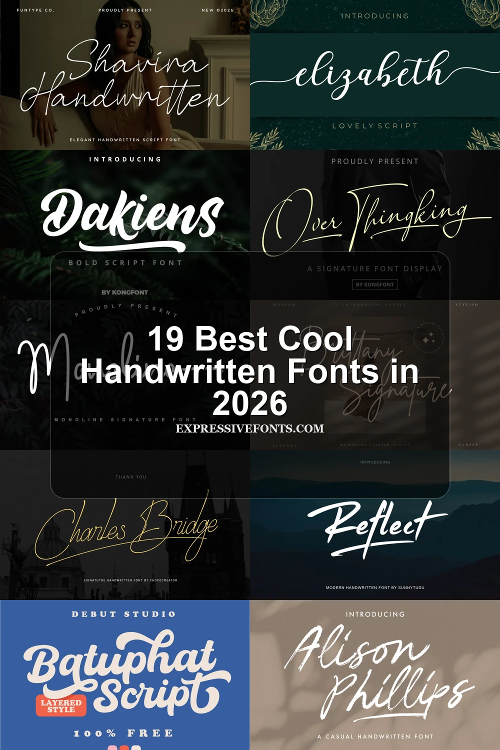
These Cool Handwritten Fonts rely on connected, usually monoline letters, rightward slants, and signature-like swashes. They feel lighter and more controlled than the heavier brush scripts or contrast-rich calligraphy.
Mueband Font
Best For: logos, branding, invitations
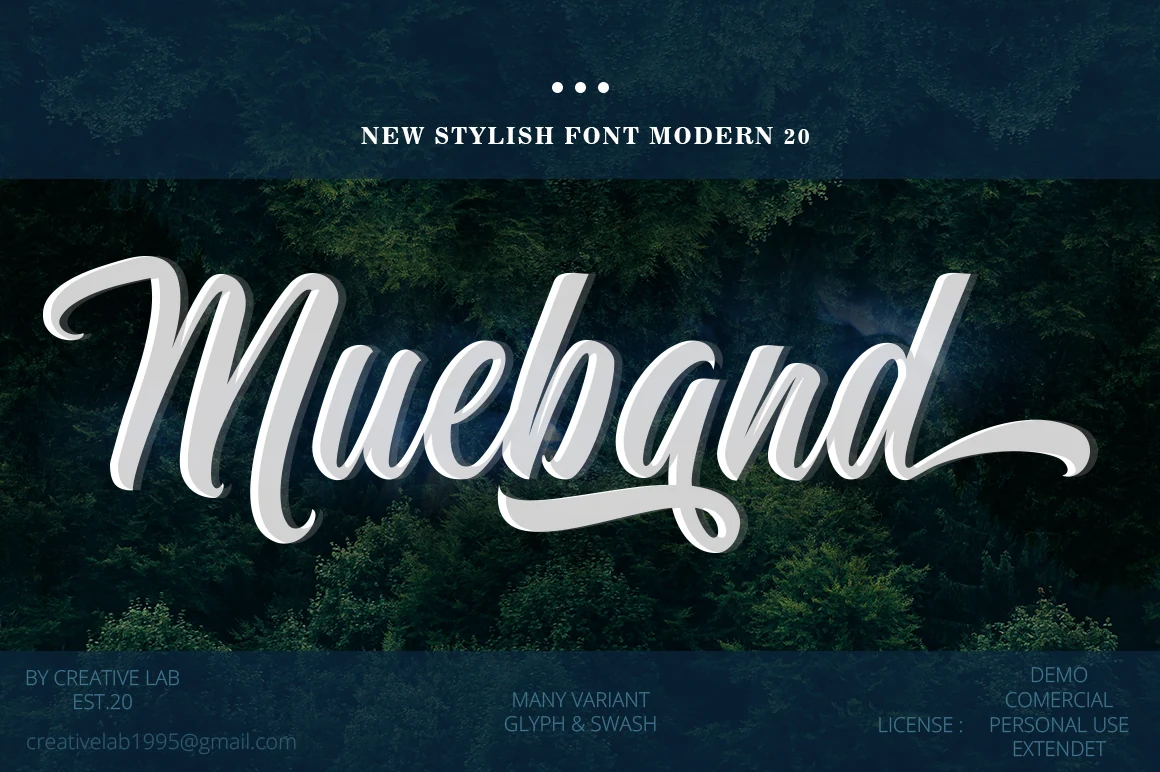
Mueband Font uses fluid connected cursive, a consistent rightward slant, and sweeping terminal swashes to form a signature-like silhouette. It reads clearly in logos and invitations at display sizes, but complex joins and flourishes lose clarity when reduced.
Monoline Font
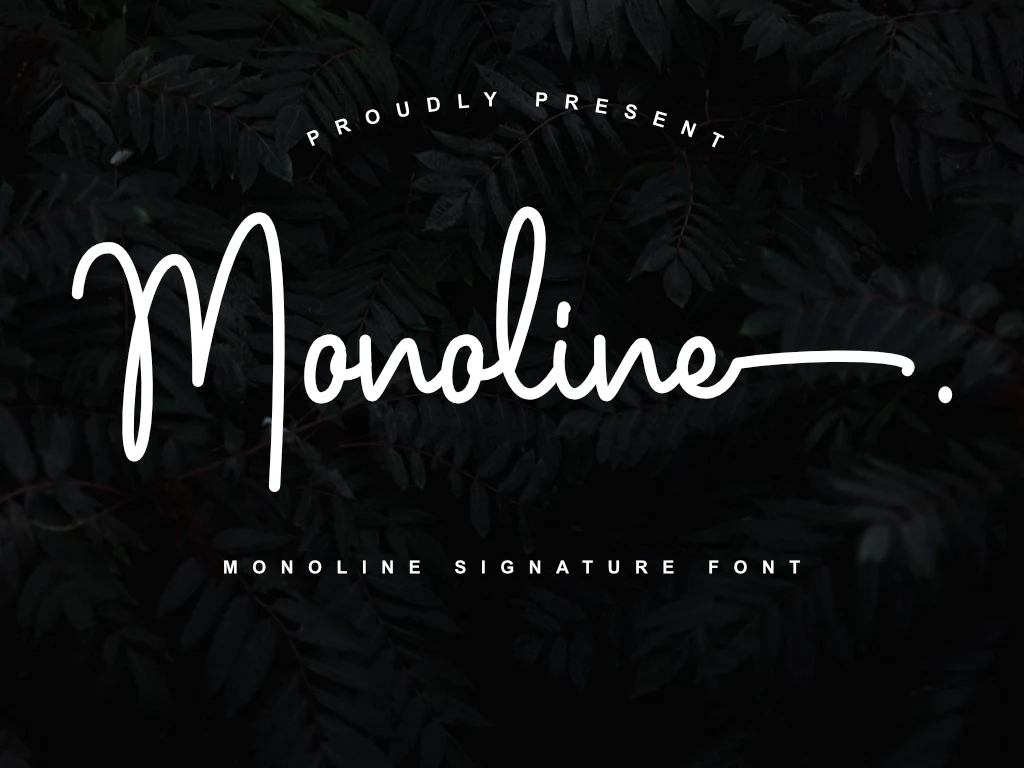
Best For: logos, branding, invitations
Monoline Font keeps its connected cursive construction visually even from letter to letter, with a slight forward slant and a long exit stroke. That consistent line supports large signature headings and branding, though the extended finish is awkward in dense text.
Callifornia Font
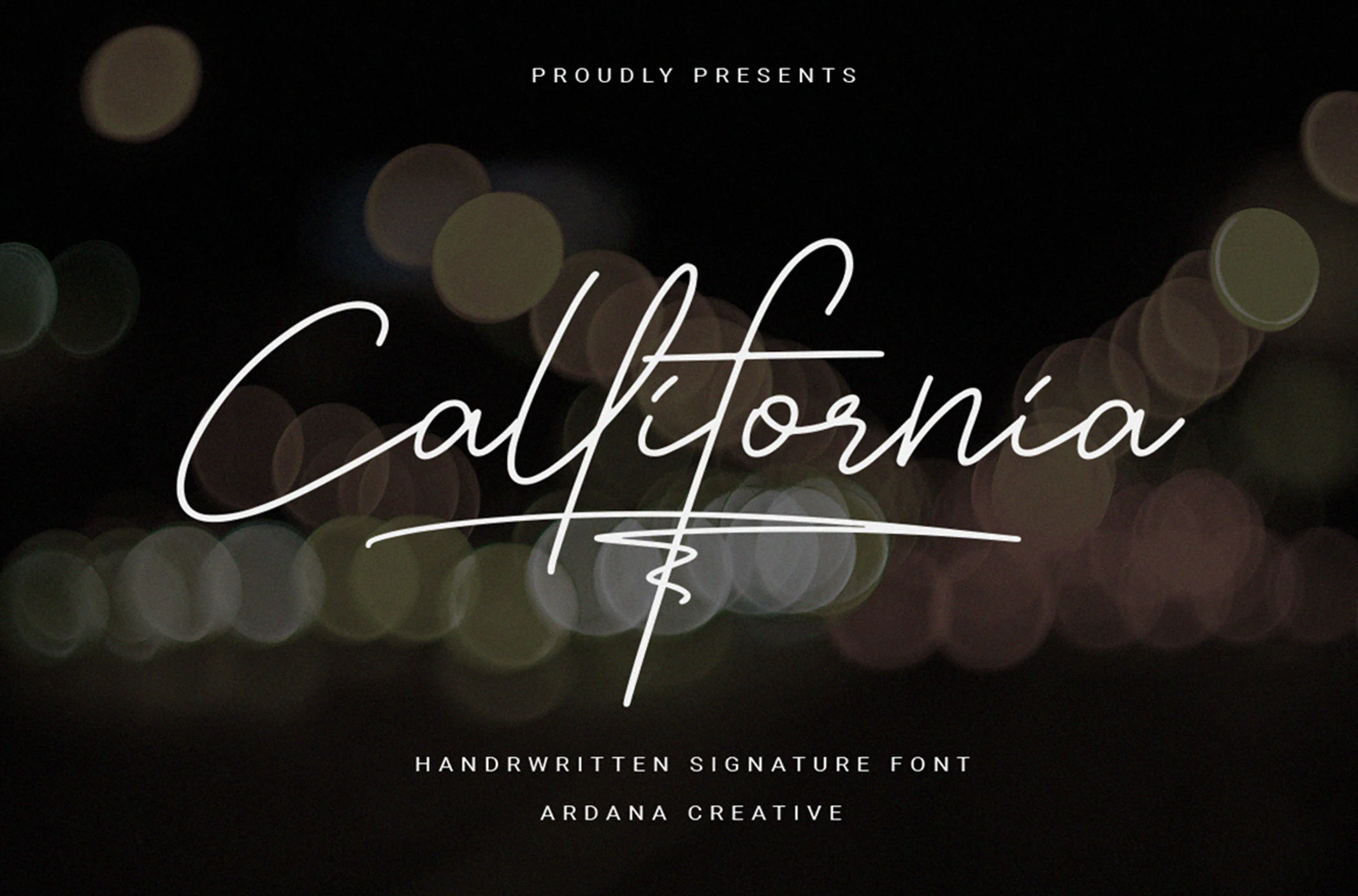
Best For: logos, branding, display text, short phrases
Callifornia Font suits short phrases and branding that need a distinctly personalized finish. Its monoline connected letters lean strongly right, while extended lowercase swashes add options through PUA encoding and extra glyphs. Give those details generous display size so intricate connections do not compromise readability.
Brittany Signature Script Font

Best For: logos, branding, display text, short phrases
Brittany Signature Script Font creates Cool Handwritten Fonts’ flowing signature effect through monoline connected letters, a rightward slant, and extended inky flourishes. Its low contrast keeps the silhouette cohesive for branding, though the joins still need generous display size.
Charles Bridge Signature Handwritten Font
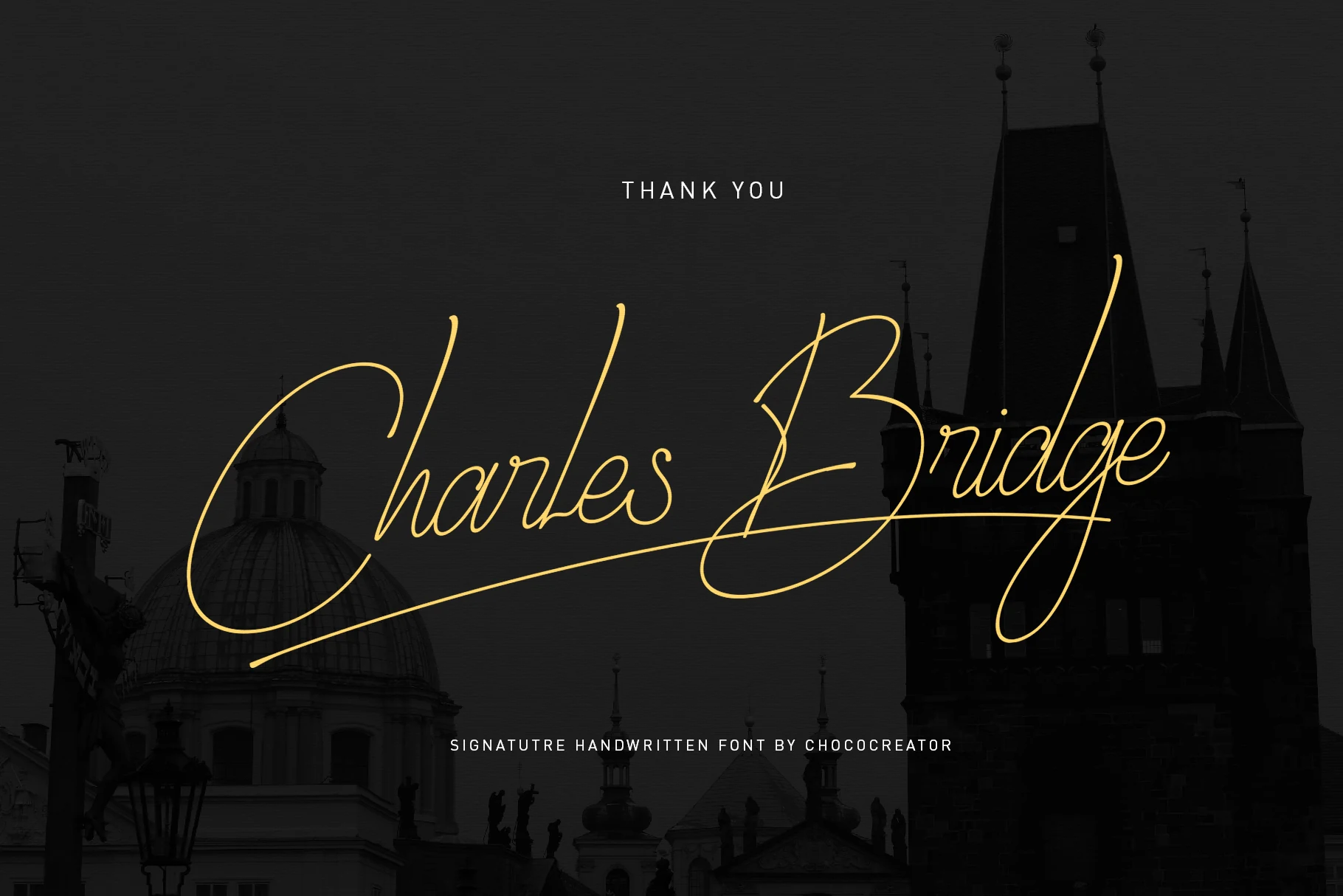
Best For: branding, wedding designs, invitations, display text
Charles Bridge Signature Handwritten Font balances long terminal swashes with a stable baseline and even monoline stroke. That control helps in wedding and branding work, although its connected calligraphy remains moderately readable and is best reserved for large display text.
Shavira Handwritten Font
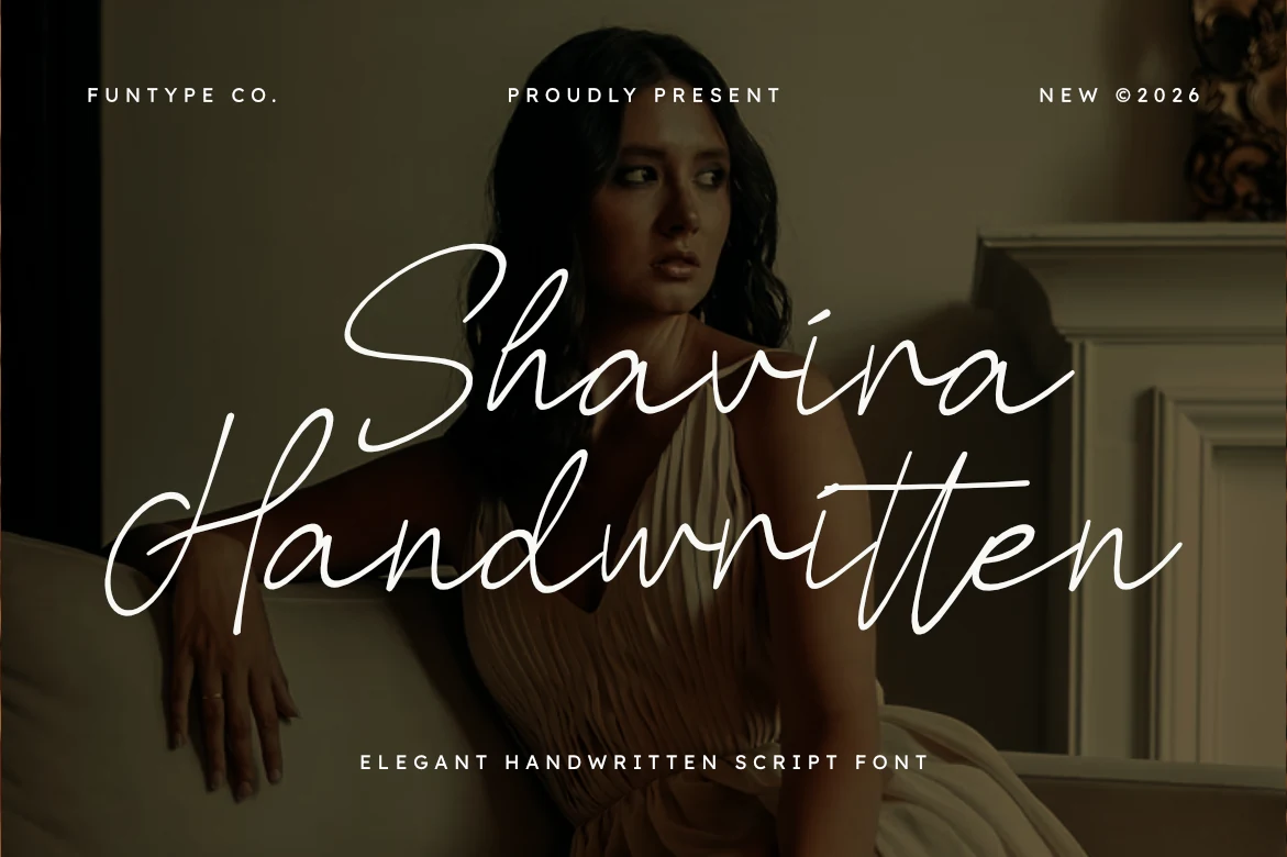
Best For: logos, branding, wedding designs, personal branding
For personal-brand logos and photography watermarks, Shavira Handwritten Font offers bold monoline connections, rounded terminals, and a strongly slanted axis. The fuller stroke gives signatures more presence, but interconnected letters need headline scale to avoid losing clarity.
Rocstaine Handwritten Font
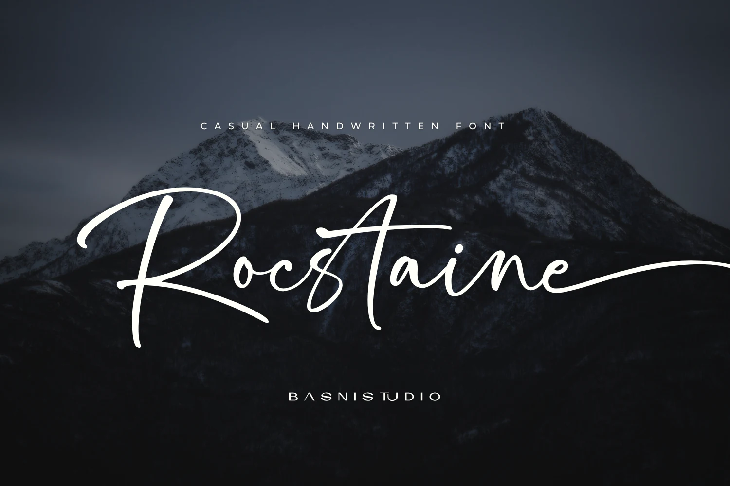
Best For: logos, branding, display text, short phrases
Rocstaine Handwritten Font stands apart through wide proportions, broad spacing, low-profile lowercase paths, and towering ascenders. Its extended entrance and exit swashes create an unusual horizontal rhythm for logos and short phrases, but the broad footprint can overwhelm compact layouts.
Handwritten Font
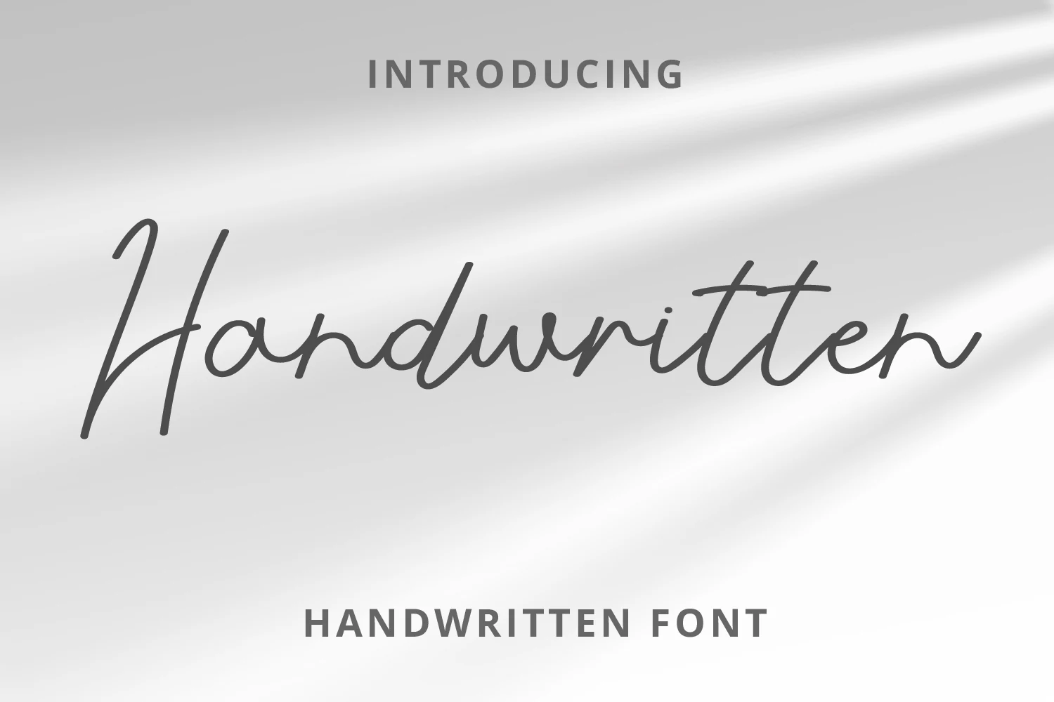
Best For: branding, invitations, quotes, personal branding
Handwritten Font uses thin monoline strokes, rounded terminals, and connected cursive that shifts along a bouncy baseline. That hand-shifted construction suits quotes and personal branding, while the baseline variation can undermine alignment in formal layouts.
Brush and Bold Display Scripts
This group emphasizes visual impact through thick strokes, dry-brush texture, shadows, and prominent terminals. Compared with flowing signature scripts, these faces occupy more visual weight and suit shorter, louder display settings.
Alison Phillips Casual Handwritten Font
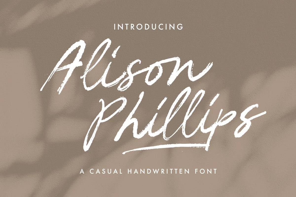
Best For: logos, branding, social media graphics, display text
Alison Phillips Casual Handwritten Font uses a dry-brush texture, variable stroke thickness, and disconnected, right-slanting characters. The separated forms keep words open and visibly handmade, but uneven brush weight makes it a display treatment rather than a choice for long copy.
Gient Font
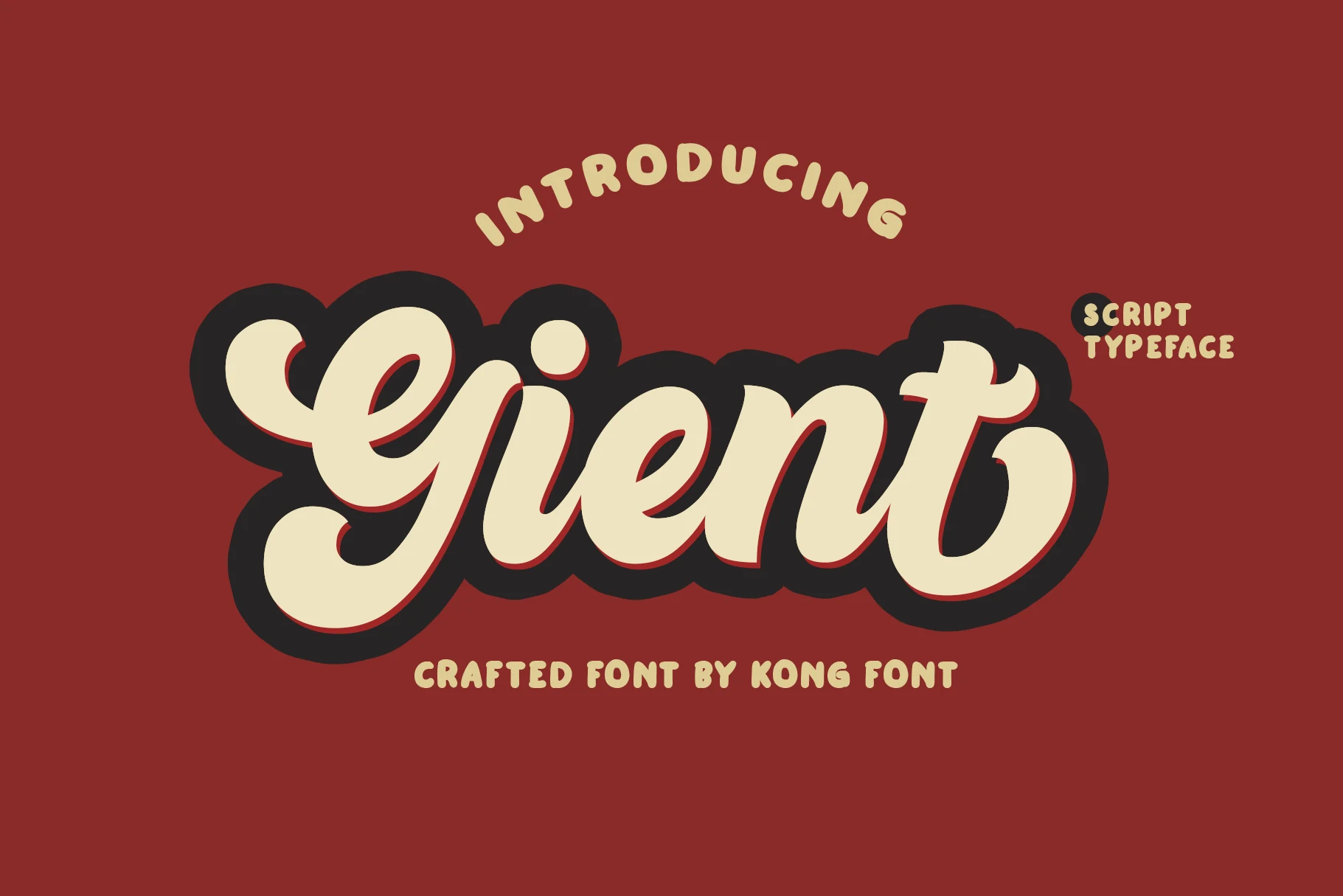
Best For: logos, signage, headlines, playful designs
Gient Font pairs thick rounded connected strokes with bulbous terminals and a stacked drop shadow, creating a built-in retro sign effect. The heavy silhouette holds up on signage and headlines, but the layered treatment and script structure are too busy for long reading.
Dakiens Font
Best For: logos, branding, headlines, display text
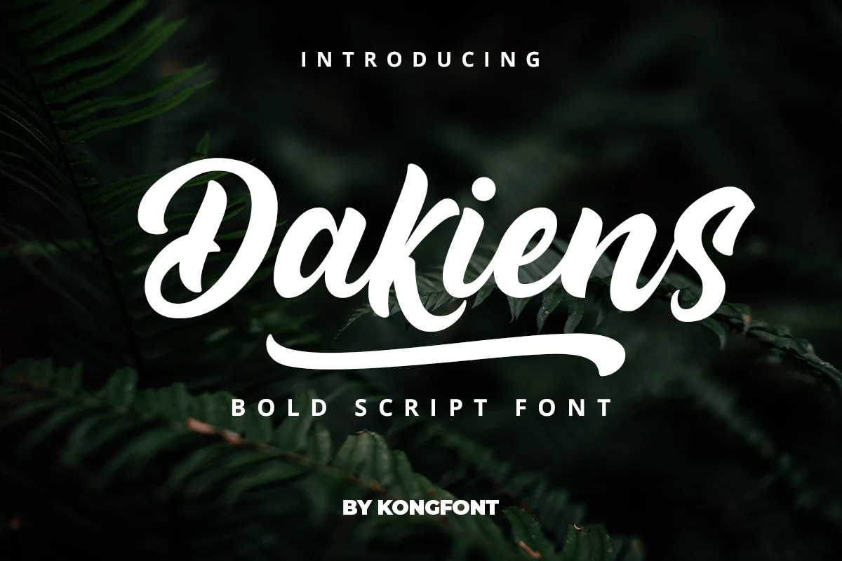
Dakiens Font builds a bold, high-contrast script around the initial letter’s swash underline. That stroke can turn a short wordmark into a complete logo gesture, though it may compete with adjacent lettering. Its thick forms are clearest at display size.
Reflect Handwritten Font
Best For: logos, branding, display text, short phrases
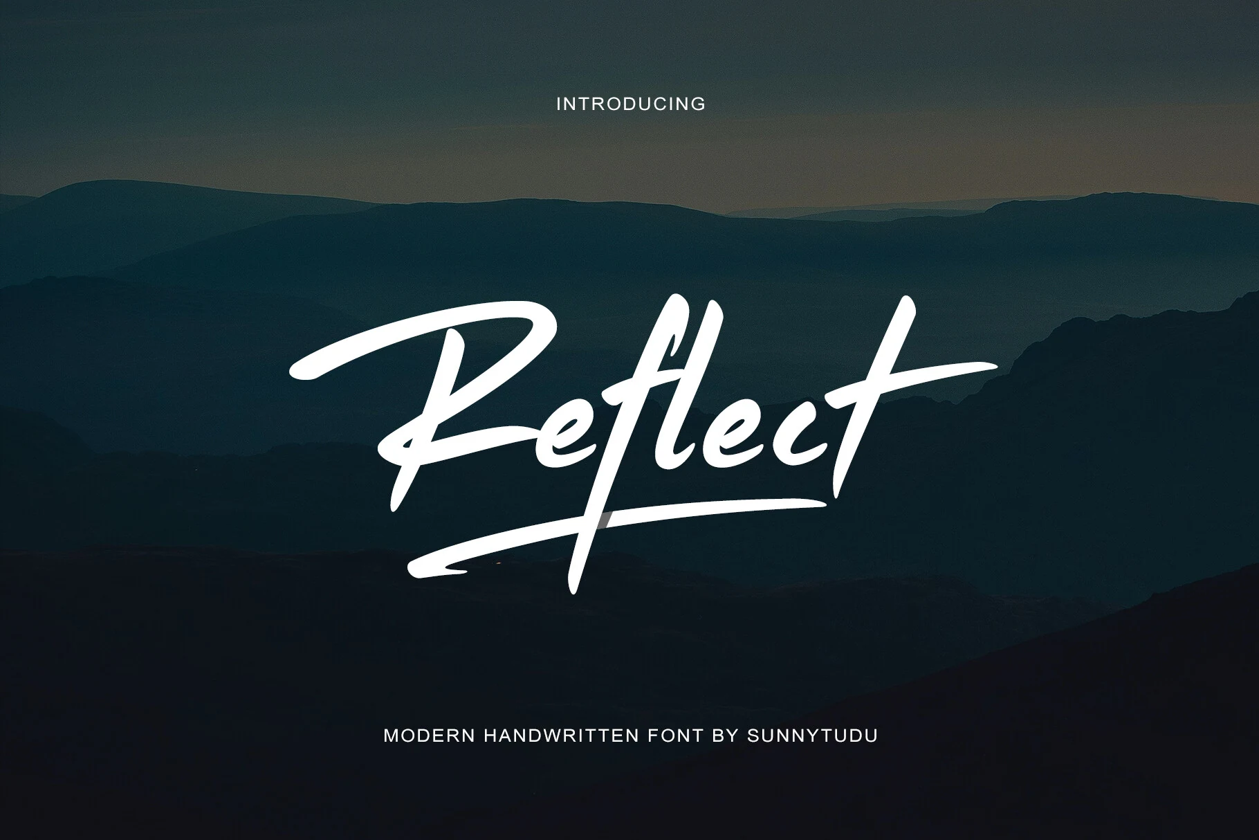
Reflect Handwritten Font combines dry-brush texture, sharp tapering terminals, and an underline that extends from the tail of the t. Fast connected strokes create strong movement for logos and short phrases, while the dense interconnections limit small-scale readability.
Batuphat Font
Best For: logos, branding, headlines, invitations
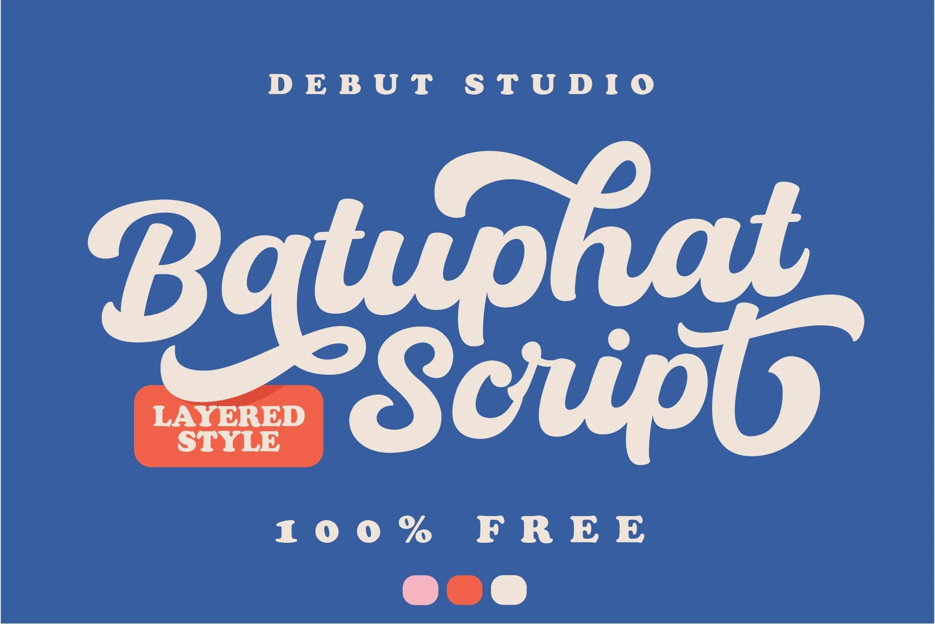
For branding, headlines, or invitations, Batuphat Font brings rounded terminals and pronounced flourishes to a bold connected construction. High contrast and flowing cursive give it a retro calligraphic voice, but the dense decorative details make body-sized setting impractical.
Together Font
Best For: logos, branding, invitations, headlines
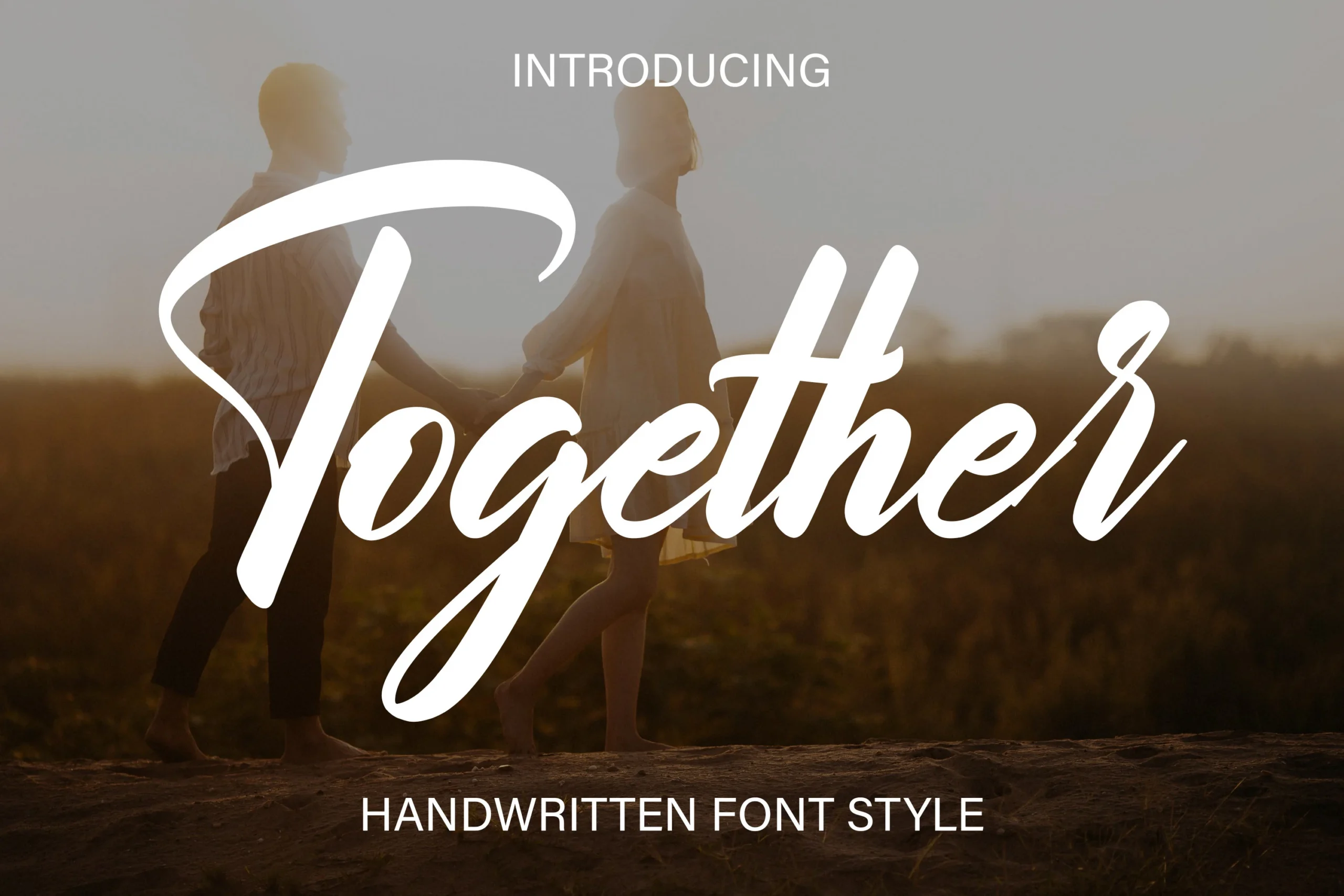
Together Font uses high-contrast brush strokes and prominent swash terminals on the uppercase T and lowercase r. It supports logos, ads, invitations, and headlines, but its stylized connected forms are better kept to short decorative text than extended reading.
Flourished Calligraphic Scripts
Flourished calligraphic scripts use pronounced thick-to-thin contrast, loops, and decorative swashes to frame words. Their formal construction separates them from the more even strokes and casual texture elsewhere in the collection.
Masterline Calligraphy Font
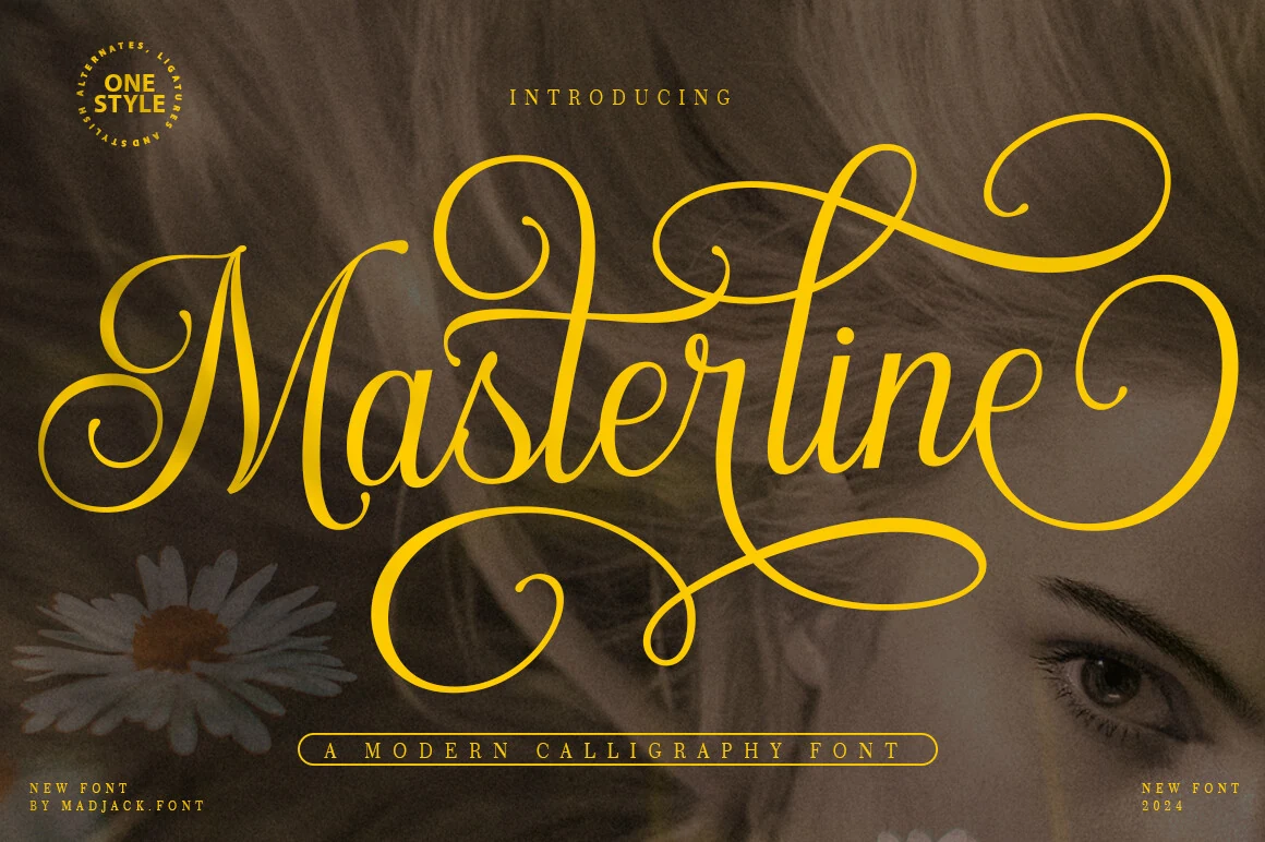
Best For: logos, packaging, wedding designs, headlines
Masterline Calligraphy Font frames words with high thick-to-thin contrast plus sweeping initial and terminal flourishes. It can anchor packaging, invitations, logos, and signage, but thin transitions and elaborate swashes need large sizing to remain legible.
Elizabeth Font
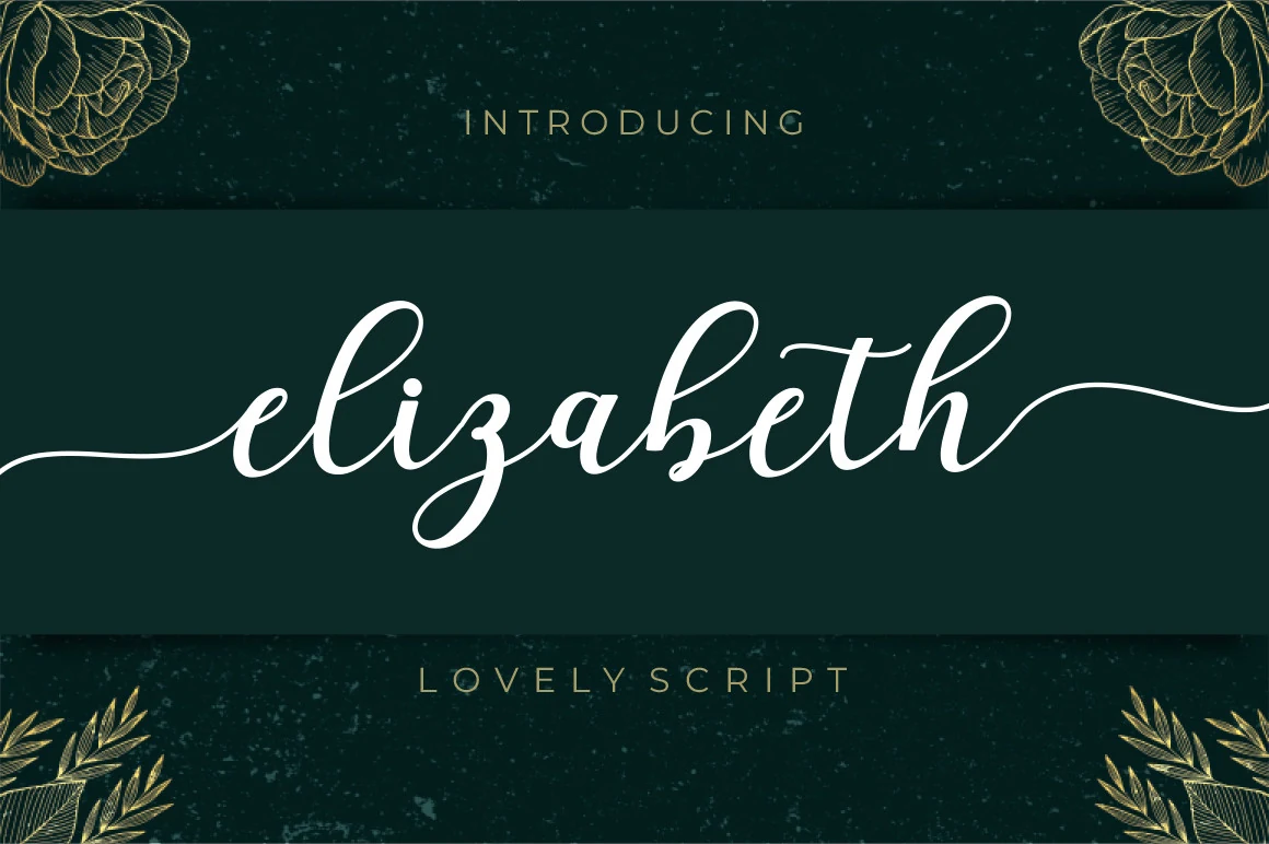
Best For: invitations, wedding designs, logos, display text
Elizabeth Font is defined by its extended decorative tail on the lowercase h, set within connected, high-contrast cursive. A stable baseline keeps decorative headings orderly, while intricate joins and fluid terminals make small or extended text difficult to read.
Calestine Calligraphy Font
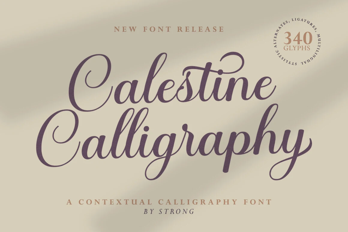
Best For: invitations, wedding designs, logos, headlines
Calestine Calligraphy Font combines balanced connected letters, a consistent rightward slant, looped terminals, and controlled thick-to-thin contrast. Its stable structure supports invitations and headlines at large sizes, although thin connections and decorative loops disappear sooner in reduced settings.
Over Thingking Font
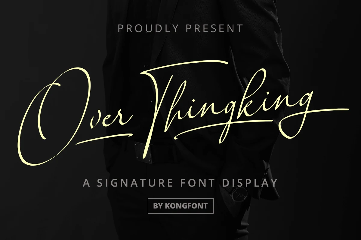
Best For: logos, branding, invitations, display text
Over Thingking Font suits logos and invitation phrases that need a deliberately customized finish. Its significant rightward slant, high contrast, connected forms, and sweeping swashes add distinction, while complex connections reduce clarity when the lettering is scaled down.
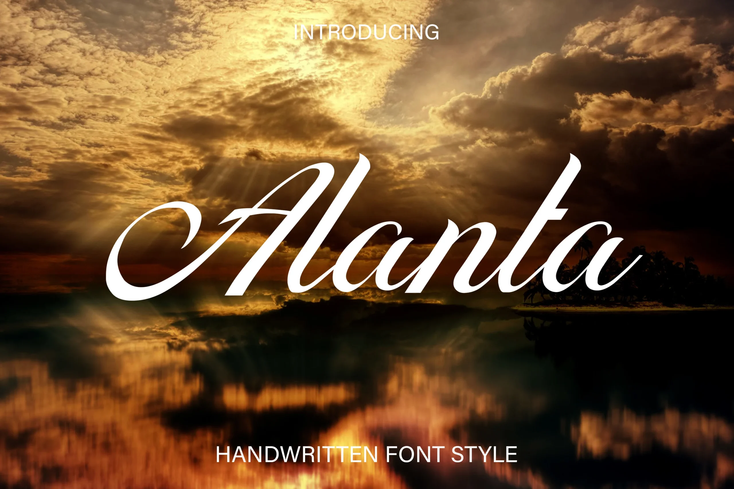
Alanta Font
Best For: headlines, short phrases, wedding designs, elegant designs
For elegant headlines and short wedding phrases, Alanta Font offers a recognizable looped uppercase A with flourishes inside a high-contrast connected alphabet. Its rightward slant adds flow, but thin-to-thick transitions and stylized joins lose clarity when reduced.
How to Choose the Right Font
Choose among Cool Handwritten Fonts by matching construction to scale: monoline scripts offer the most even silhouettes, brush styles add texture or weight, and high-contrast calligraphy supplies the strongest flourishes. Check joins, swashes, baseline behavior, and available width at the actual size; reserve intricate faces for short display text rather than paragraphs.