15 Best Bold Aesthetic Fonts in 2026
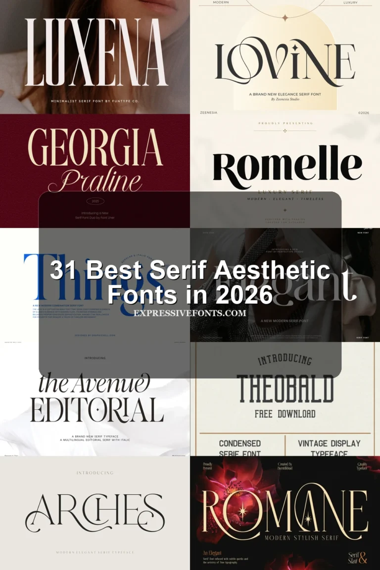
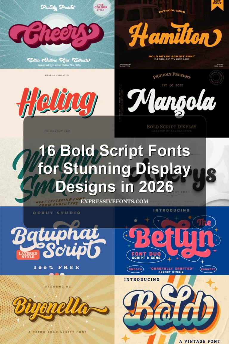
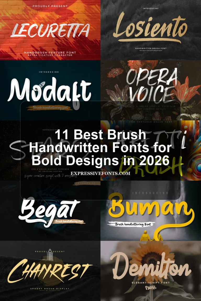
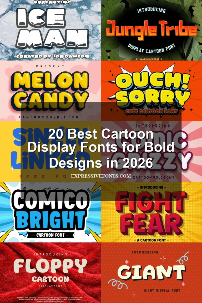
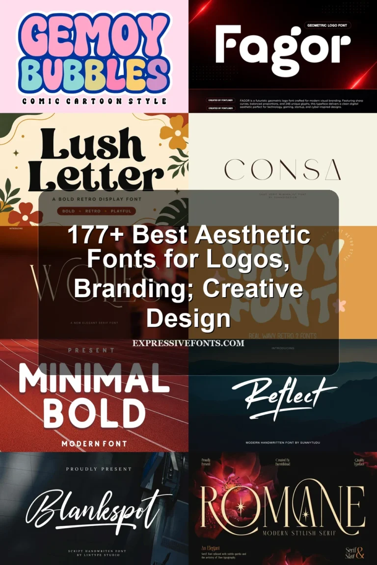
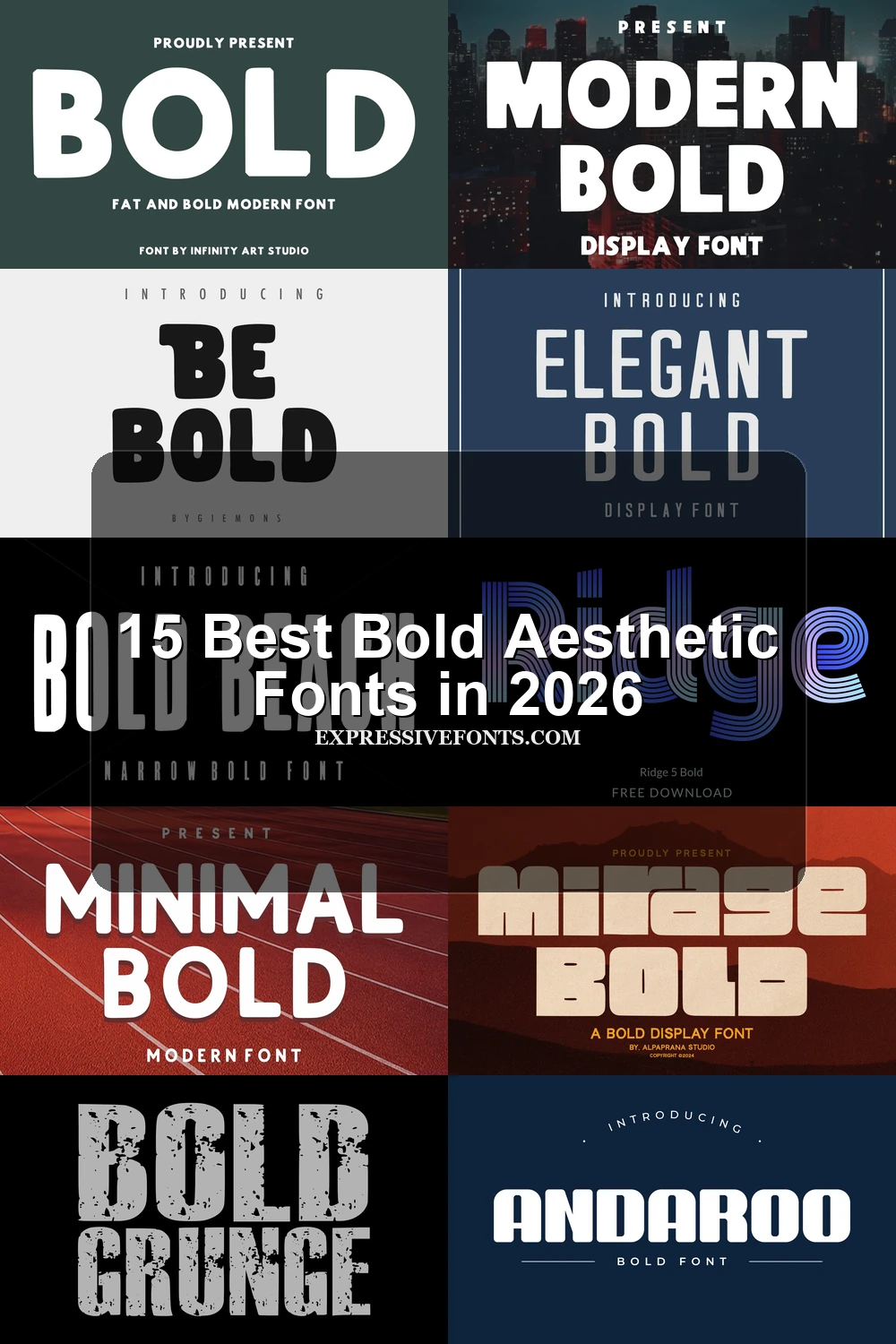
Bold Aesthetic Fonts span layered linework, rounded block forms, condensed lettering, distressed surfaces, and high-contrast serifs. Together, they cover practical display roles from logos and packaging to posters, apparel graphics, signage, and short website headlines, with scale and construction determining how clearly each one performs.
Looking for more aesthetic fonts? Browse our complete Aesthetic Fonts collection to compare modern, elegant, bold, vintage, and retro aesthetic styles.
Bold Aesthetic Fonts
Bold Aesthetic Fonts in this group use wide, rounded geometric forms and heavy monolinear strokes. They feel more open and substantial than the condensed, textured, or serif-led groups.
Hey Bold Font
Best For: logos, posters, display text, headlines
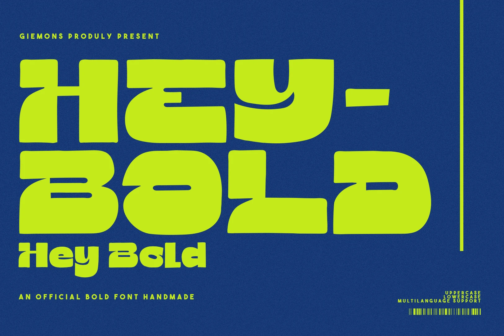
For logos, posters, or short display lines, Hey Bold Font introduces horizontal cut-outs through chunky geometric strokes, producing a stencil-like rhythm. Its wide rounded forms and minimal counters create a forceful silhouette, but those internal gaps and extreme weight limit small-size clarity. This is one of the more specialized Bold Aesthetic Fonts, best used where the lettering itself acts as the graphic.
Modern Bold Font
Best For: logos, branding, headlines, posters
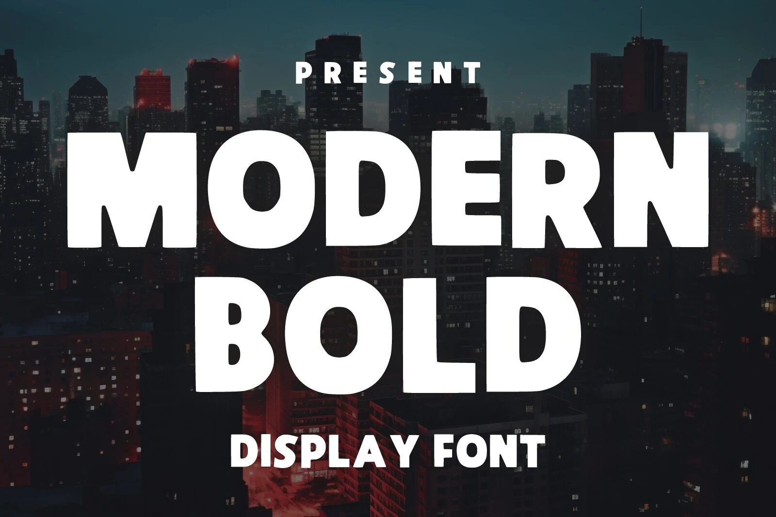
Wide geometric letters and rounded corners give Modern Bold Font a softer block structure, while low contrast keeps the forms straightforward. This Bold Aesthetic Fonts option stays clear in large headlines, logos, branding, posters, and social graphics without decorative texture. Use it when simple shapes need to carry the design across several prominent formats.
Be Bold Font
Best For: logos, posters, display text
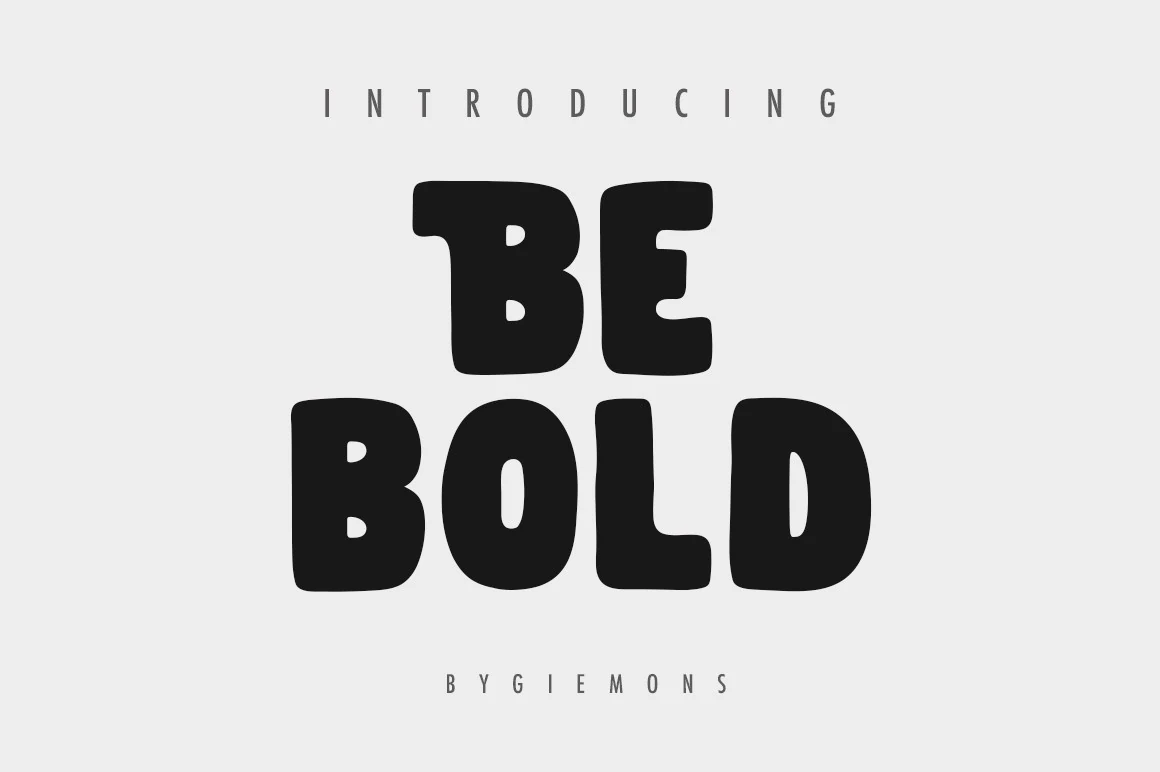
Broad rounded corners temper the ultra-heavy monolinear forms of Be Bold Font, making its wide block letters less severe than their weight suggests. The simple construction remains readable in logos, posters, and display text, including titles and apparel graphics, but provides little surface variation. It is a useful Bold Aesthetic Fonts choice for casual, direct lettering rather than intricate branding systems.
Bold Font
Best For: headlines, branding, logos, posters
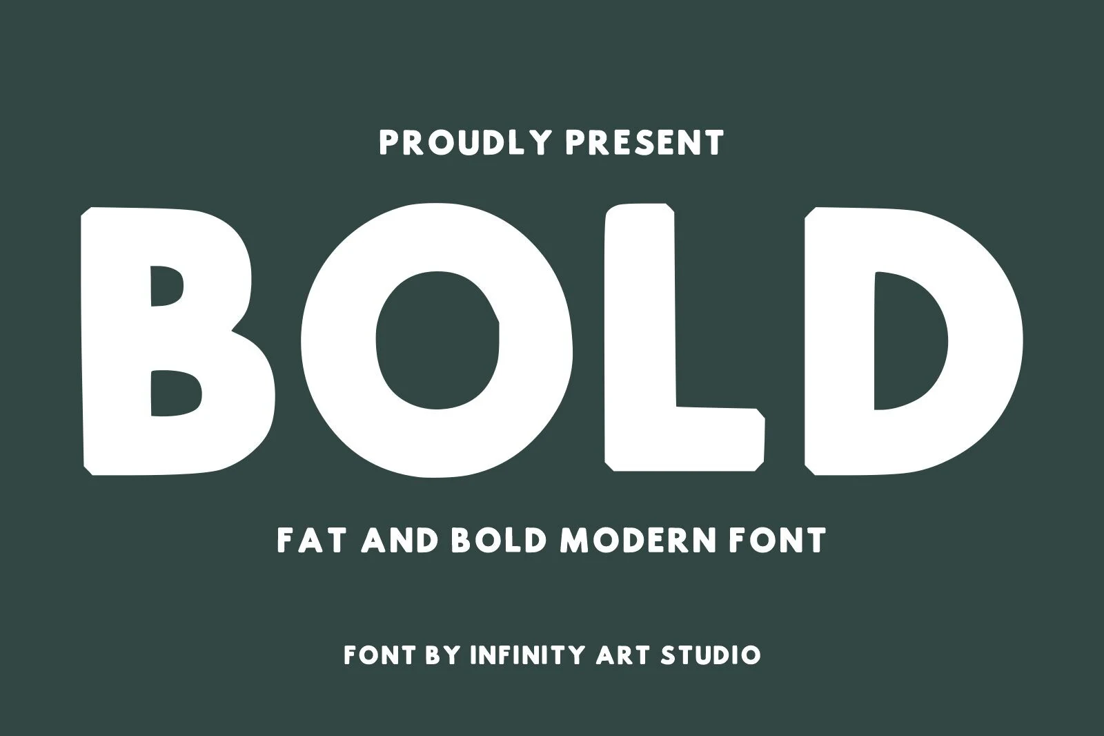
For short headlines, Bold Font creates an exceptionally solid block through extremely heavy, squarish letters and restricted internal counters. Rounded corners soften the outline, but the limited interior space quickly reduces small-scale clarity. This Bold Aesthetic Fonts option is best reserved for branding, logos, posters, packaging, and other large applications where mass matters more than extended reading.
Andaroo Bold Font
Best For: logos, headlines, display text, posters
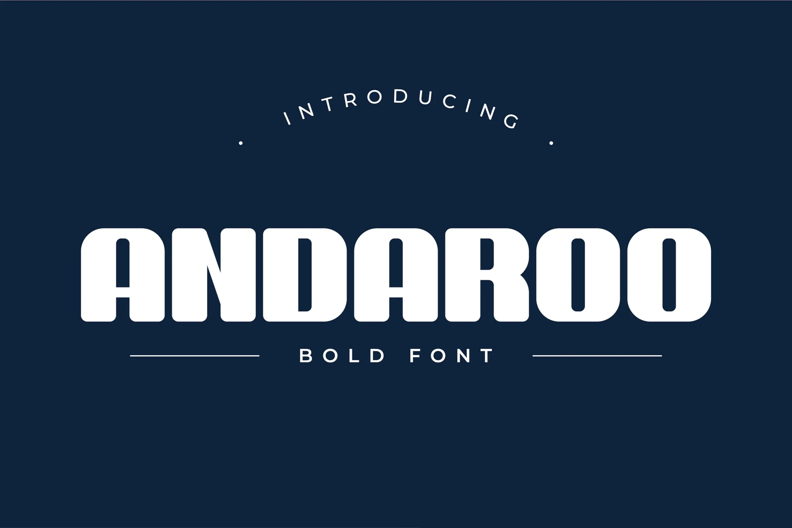
Andaroo Bold Font uses a large x-height, rounded exterior corners, and slab-like heavy weight without becoming strongly condensed. Generous spacing and simple, low-contrast shapes support clear large display text for logos, headlines, posters, and short display formats. Choose it when you want substantial lettering with more breathing room than the narrow block faces provide.
Minimal Bold Font
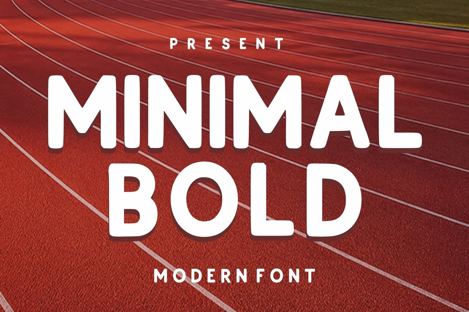
Best For: branding, headlines, signage
Minimal Bold Font keeps heavy rounded geometry within regular-width proportions, avoiding the stretched feel of wide faces and the tightness of condensed ones. Its even monolinear strokes and soft corners suit branding, headlines, signage, and modern designs where display clarity takes priority over texture. The controlled silhouette makes it a dependable option for straightforward wordmarks.
Condensed Block Displays
These faces compress heavy lettering into tall, narrow proportions, using squared terminals, tight spacing, and high x-heights. Their efficient width separates them from broader rounded displays.
Bold Beach Font
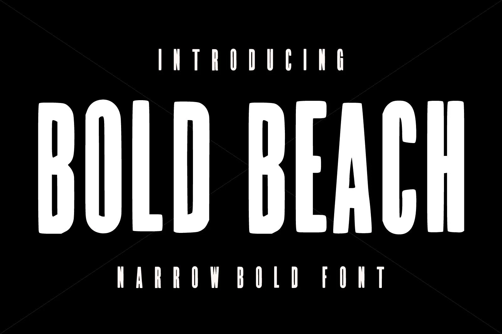
Best For: headlines, posters, logos, packaging
Tall, narrow proportions define Bold Beach Font, packing heavy rounded block letters into limited horizontal space. Its uniform strokes and softly rounded terminals make large headlines, posters, logos, and packaging easy to organize, while the condensed width becomes less comfortable for small text. It is a practical choice when a substantial wordmark must occupy a tight area.
Bold Fresh School Font
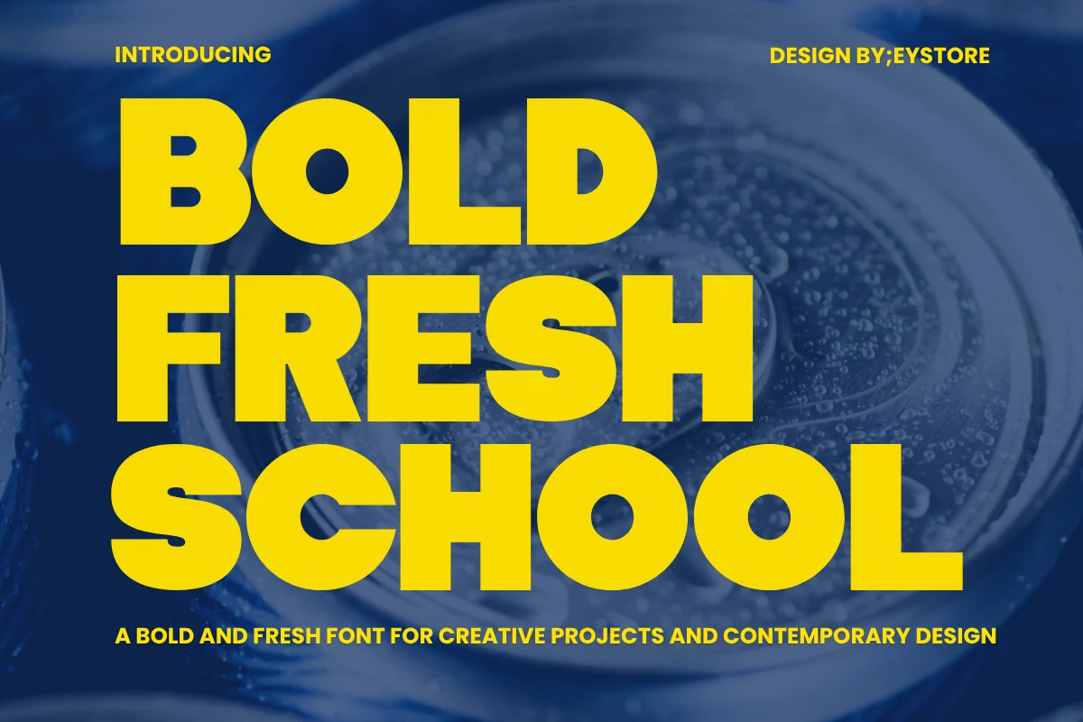
Best For: logos, branding, posters, headlines
Bold Fresh School Font uses condensed geometric letters, uniform heavy strokes, and square-like terminals to form a tightly packed block. The narrow width saves space in logos, branding, posters, and headlines, but close spacing and thick strokes make it unsuitable for body copy. It works best when a short message needs dense, orderly display lettering.
Elegant Bold Font
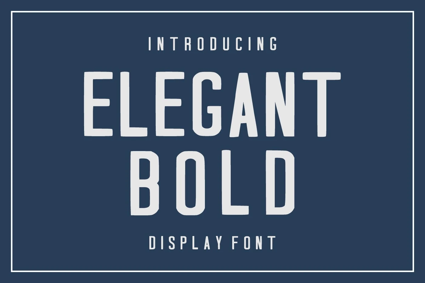
Best For: headlines, branding, posters, display text
Elegant Bold Font pairs tall condensed proportions with squared block corners and a high x-height. Its thick, uniform strokes hold up in headlines, branding, posters, and display text, while narrow counters may close down at small sizes. Select it when vertical economy and a tightly organized letter shape matter more than open spacing.
Strong Bold Font
Best For: posters, headlines, signage, display text
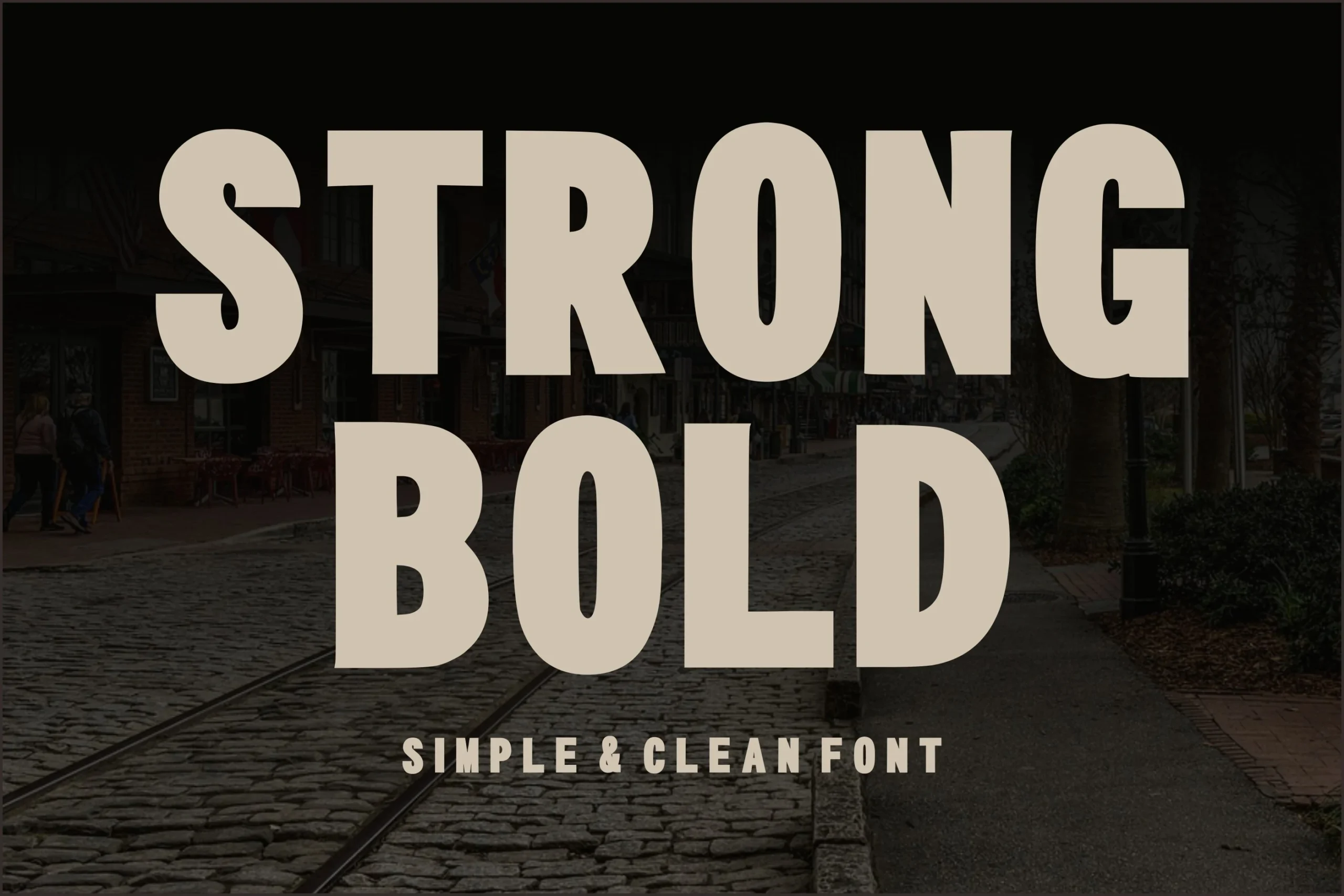
For posters, signage, and display text, Strong Bold Font prioritizes direct reading through simple heavy geometry, condensed proportions, and squared-off terminals. Its uniform strokes avoid decorative distractions and retain clarity at large sizes, although the narrow structure is not intended for body copy. It is the practical pick when a short message needs a firm, compact block.
Textured Display Statements
Layered strokes, distressed grain, and brush irregularities make texture the main visual feature here. Unlike the more controlled block groups, these fonts depend on surface character and large scale.
Ridge 5 Bold Font
Best For: branding, website headers, posters
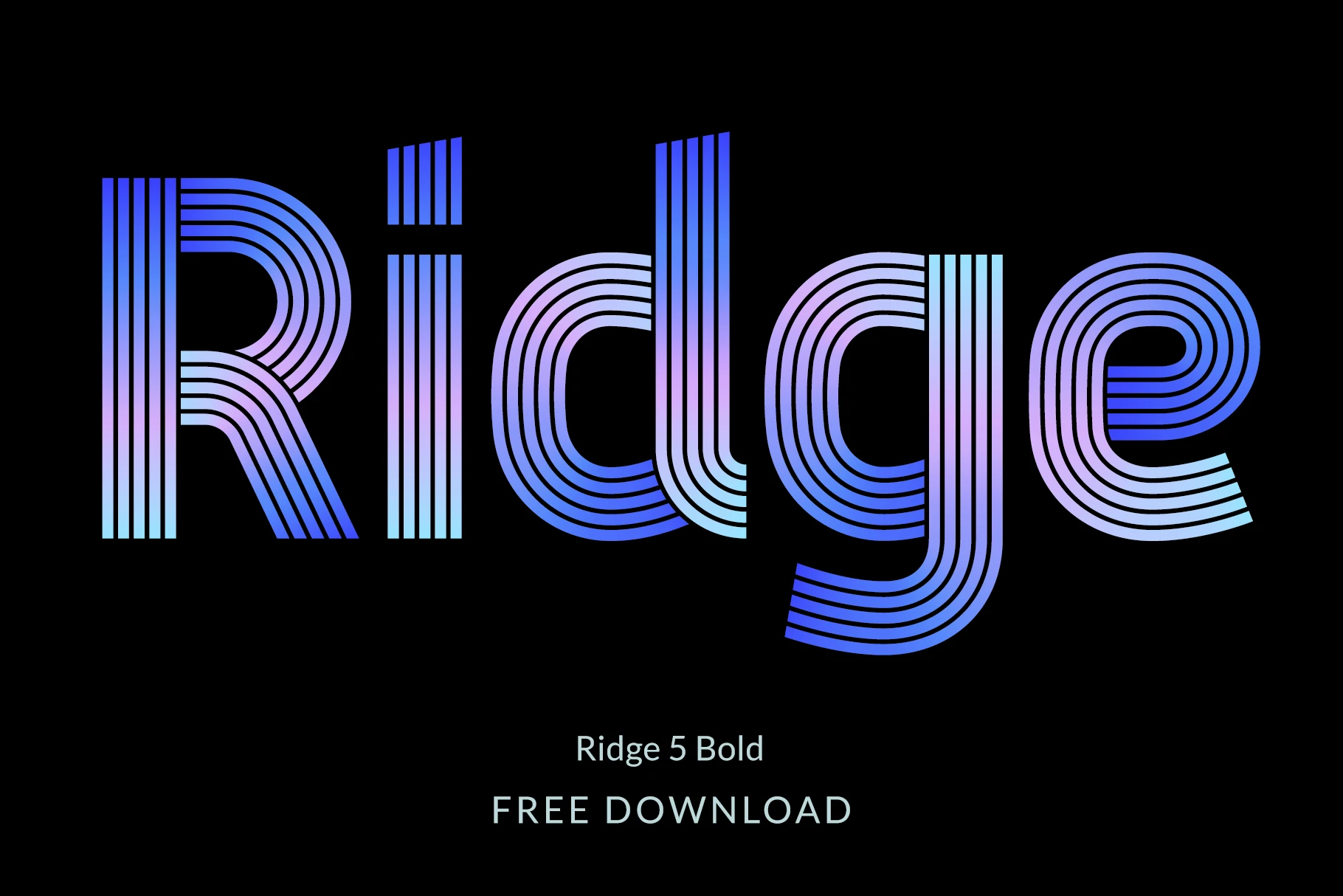
Ridge 5 Bold Font builds every character from multiple parallel lines, creating a layered retro-futurist structure instead of a solid stroke. That disconnected, monolinear construction includes lowercase characters, European diacritics, and alternates, but the internal lines can vibrate when reduced. Use it for large website headers, posters, branding, and other display text.
Bold Grunge Font
Best For: T-shirts, display text, headlines, posters
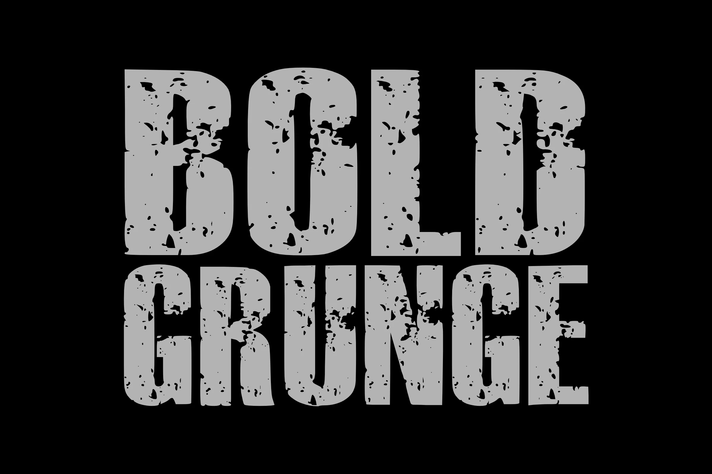
Bold Grunge Font makes distressed grain part of its heavy slab-serif letterforms rather than adding texture separately. Compressed proportions and blotchy surfaces suit T-shirts, merchandise graphics, posters, and display text, but the wear reduces reliability for small copy. Its strongest role is a large printed statement where imperfect edges are intentional.
Temur Amorak Urban Bold Brush Font
Best For: branding, posters, display text, headlines
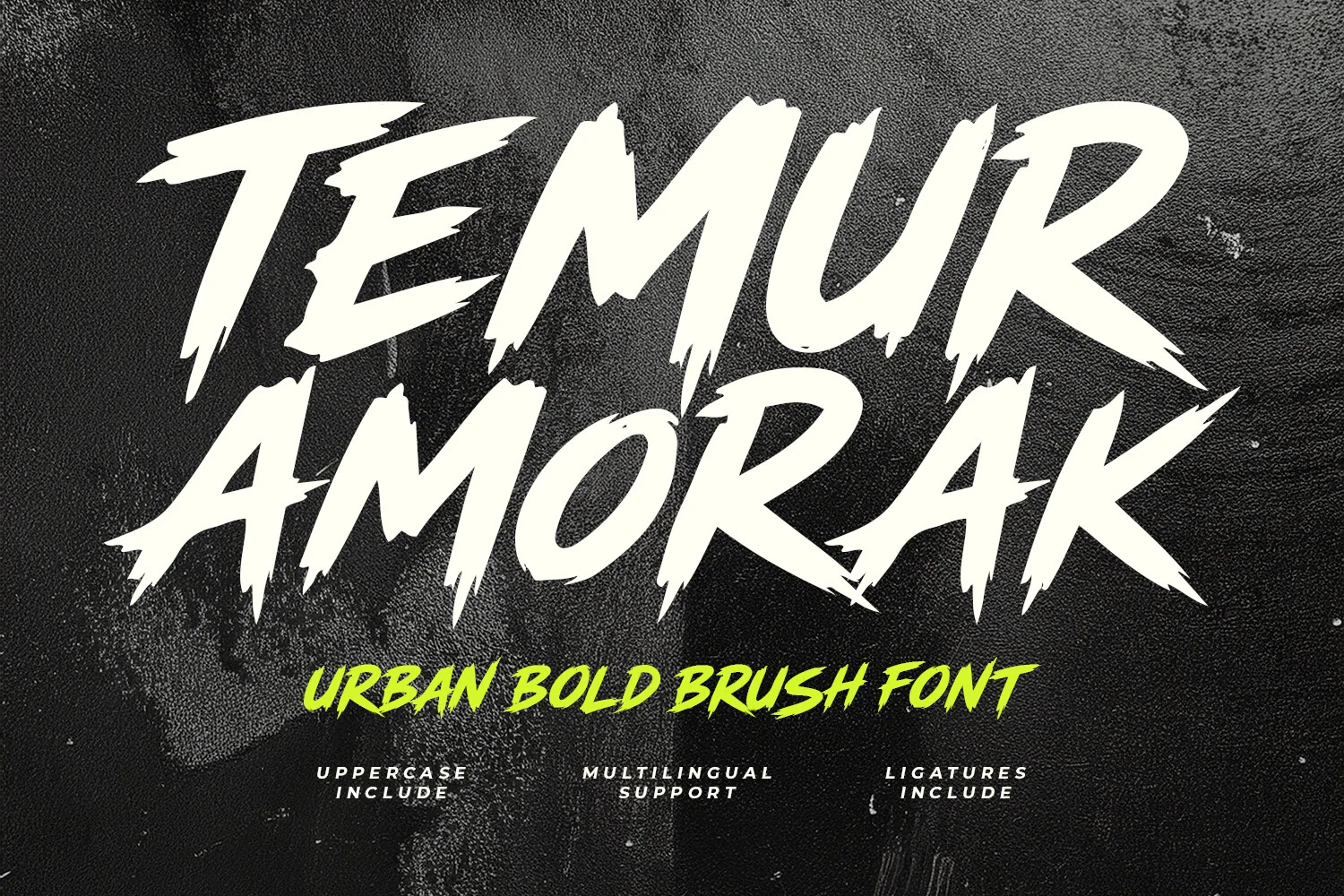
Temur Amorak Urban Bold Brush Font is built around dry-brush edges, jagged endings, right-leaning forms, and uneven proportions. Its high contrast and irregular texture create a visibly rough mark for branding, posters, display text, or headlines, with full uppercase characters, multilingual support, and ligatures. Keep the type large so the broken edges do not compromise recognition.
Vintage Serif Impact
High-contrast serifs, extended forms, and period-specific details give this pair a decorative label and packaging presence. They introduce more stroke variation than the low-contrast sans displays.
Rich Bold Font
Best For: logos, branding, packaging, headlines
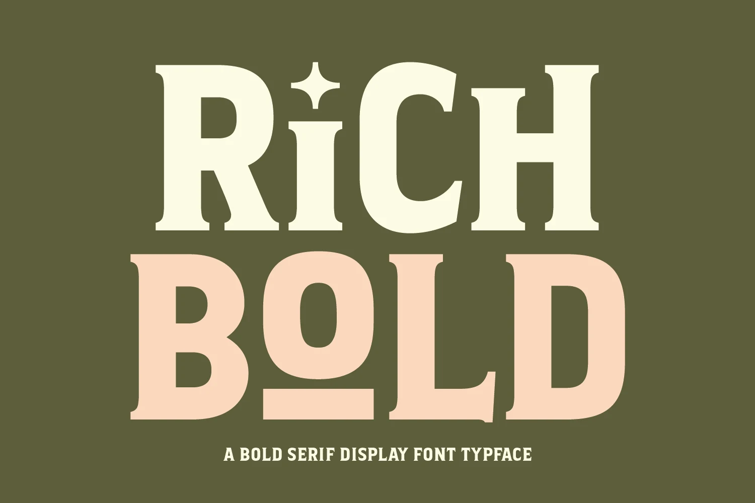
Rich Bold Font combines high-contrast serifs with wide, squared proportions and a star-like dot over the lowercase i. That decorative period detail gives logos, branding, packaging, and headlines a strong label-oriented identity, while the heavy strokes remain better at large sizes than in reduced text. It suits designs needing more historical character than a geometric sans can provide.
Mirage Bold Font
Best For: logos, branding, posters, packaging
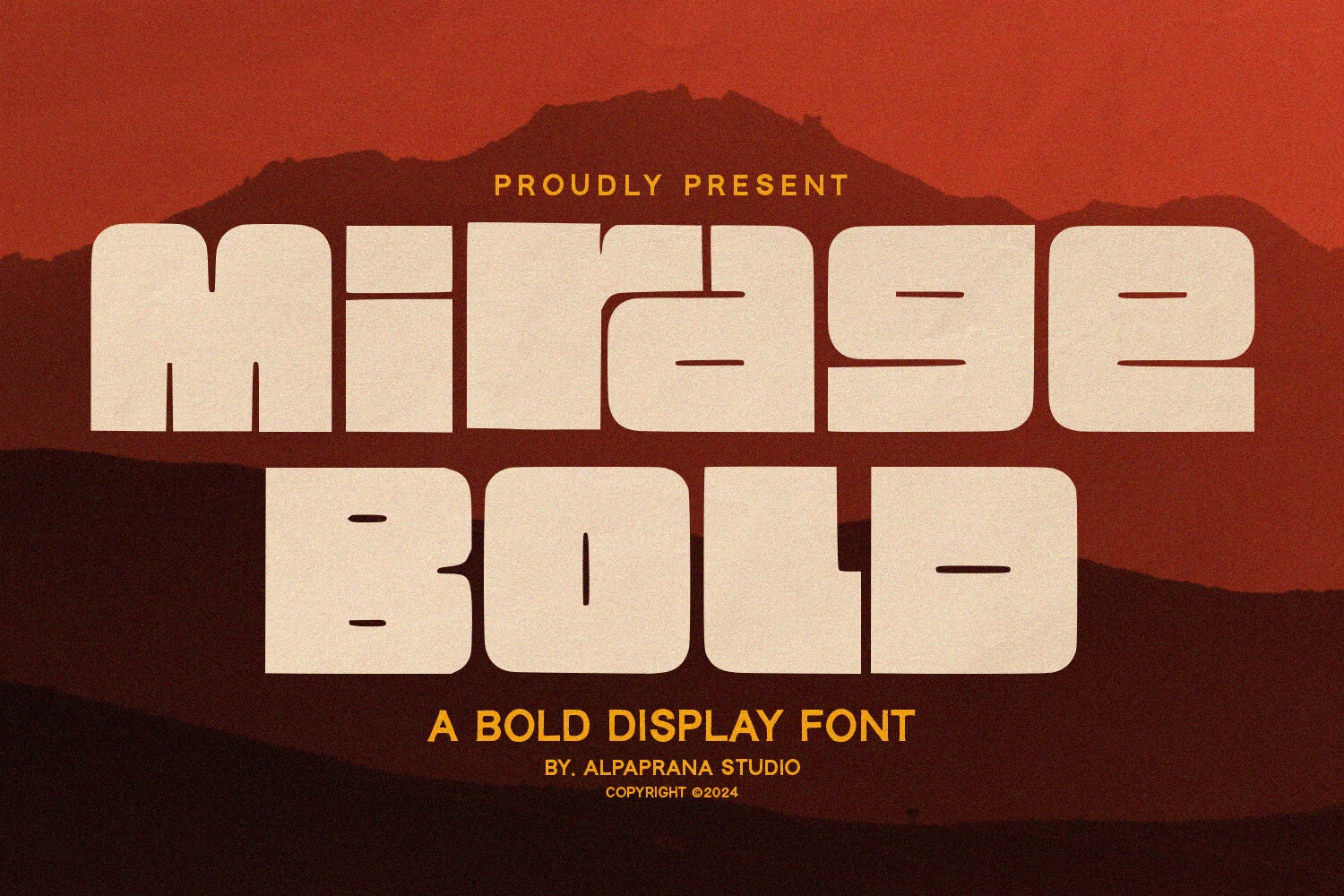
Mirage Bold Font stretches rounded forms into a wide, pillowy silhouette with very little interior space in closed letters. The ultra-heavy, low-contrast construction gives logos, branding, posters, and packaging a dense presence, though compressed counters lose clarity when reduced. Choose it when a broad wordmark needs mass more than easy reading.
How to Choose the Right Font
Choose by construction first: use multi-line or textured faces when surface detail is the message, rounded wide styles when you need a broad logo, and condensed blocks when space is limited. Check counters and spacing at the intended size, then reserve serif options for packaging or labels that benefit from contrast and period-specific detail. Bold Aesthetic Fonts work best when display scale supports their structure.