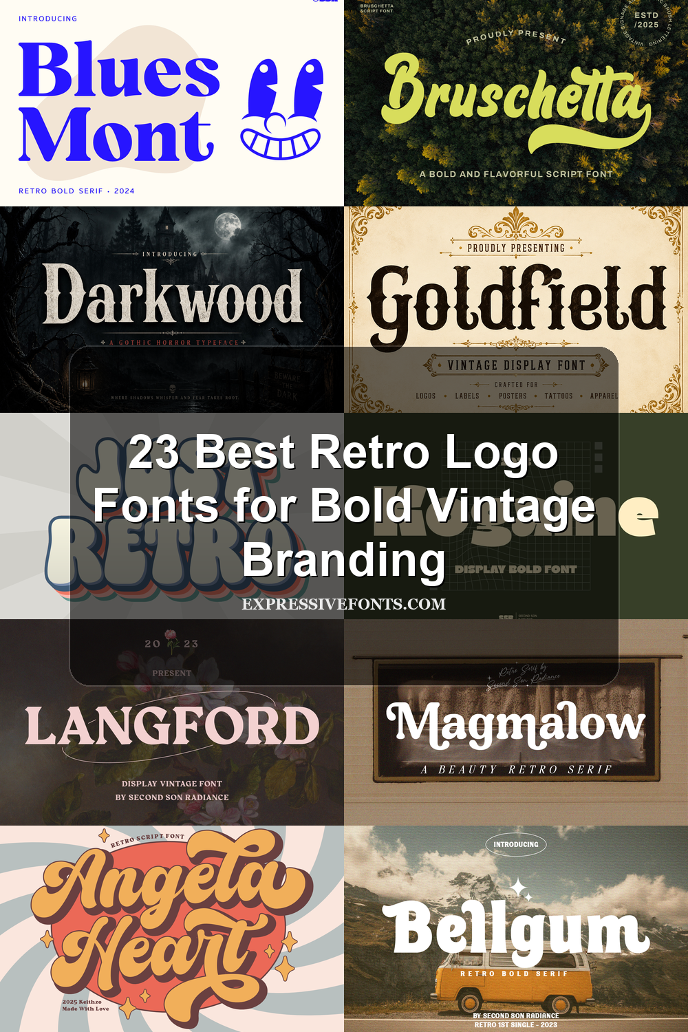
23 Best Retro Logo Fonts for Bold Vintage Branding
Retro Logo Fonts help designers build nostalgic brand marks with real visual character. This collection is made for logos, badges, posters, packaging, merch, labels, and social graphics where the type needs to feel vintage, bold, playful, or handcrafted.
Serif & Slab Retro Logo Fonts
These serif and slab retro fonts bring stronger structure, vintage authority, and editorial weight, making them suited to badges, labels, covers, packaging, and heritage logos.
Langford Font
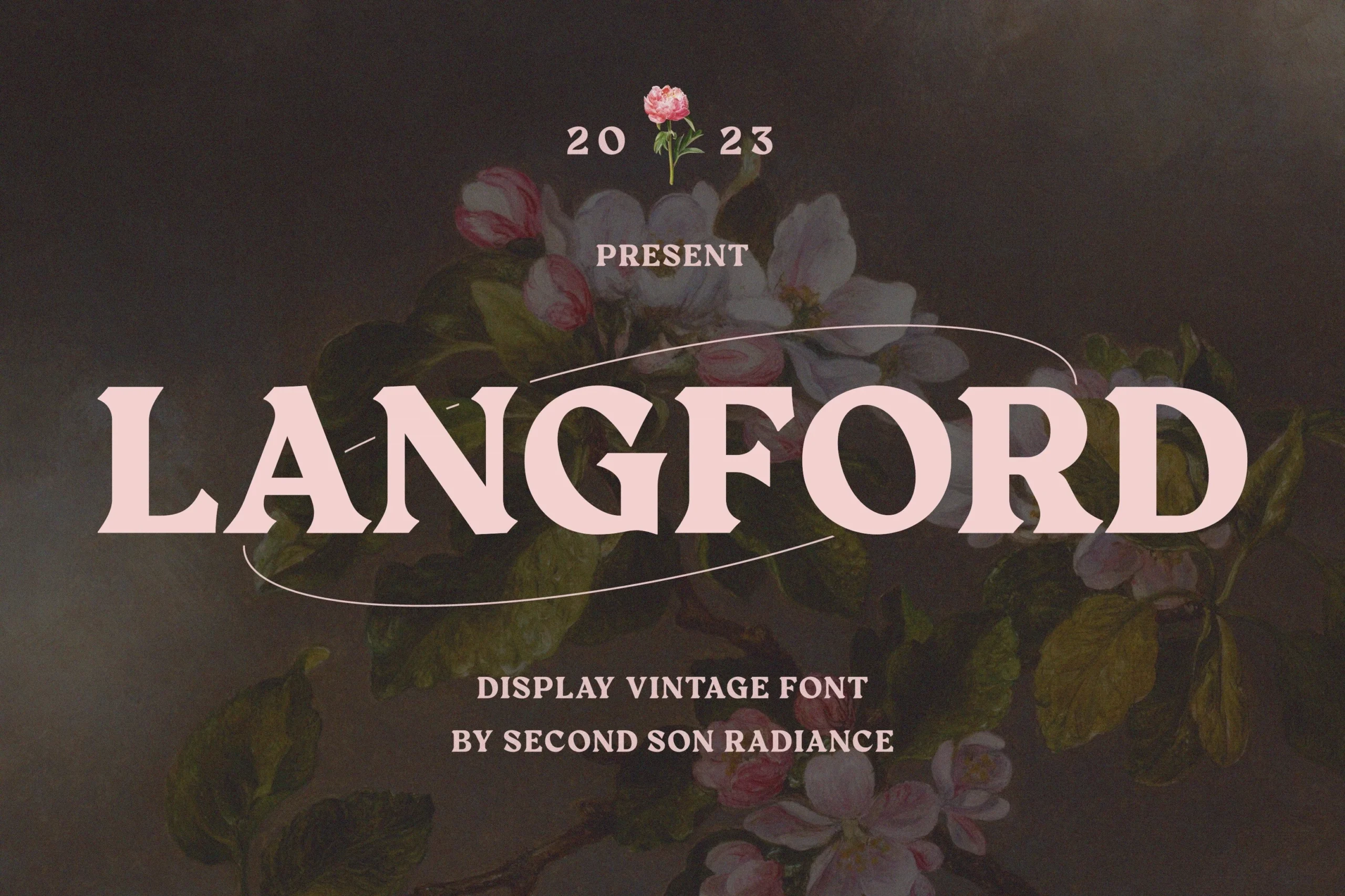
Best For: logos, branding, posters, vintage designs
Langford Font uses wide, heavy serif capitals with carved wedge serifs, firm vertical stems, and a squared vintage rhythm. Its chunky curves and sharp internal cuts give the wordmark a polished display presence without making the shapes feel fragile.
For Retro Logo Fonts, Langford works best when the title is allowed to dominate the layout. Keep spacing controlled rather than loose, and pair it with smaller supporting text so the bold serif proportions can carry posters, boutique branding, magazine-style covers, and vintage identity systems.
Goldfield Font
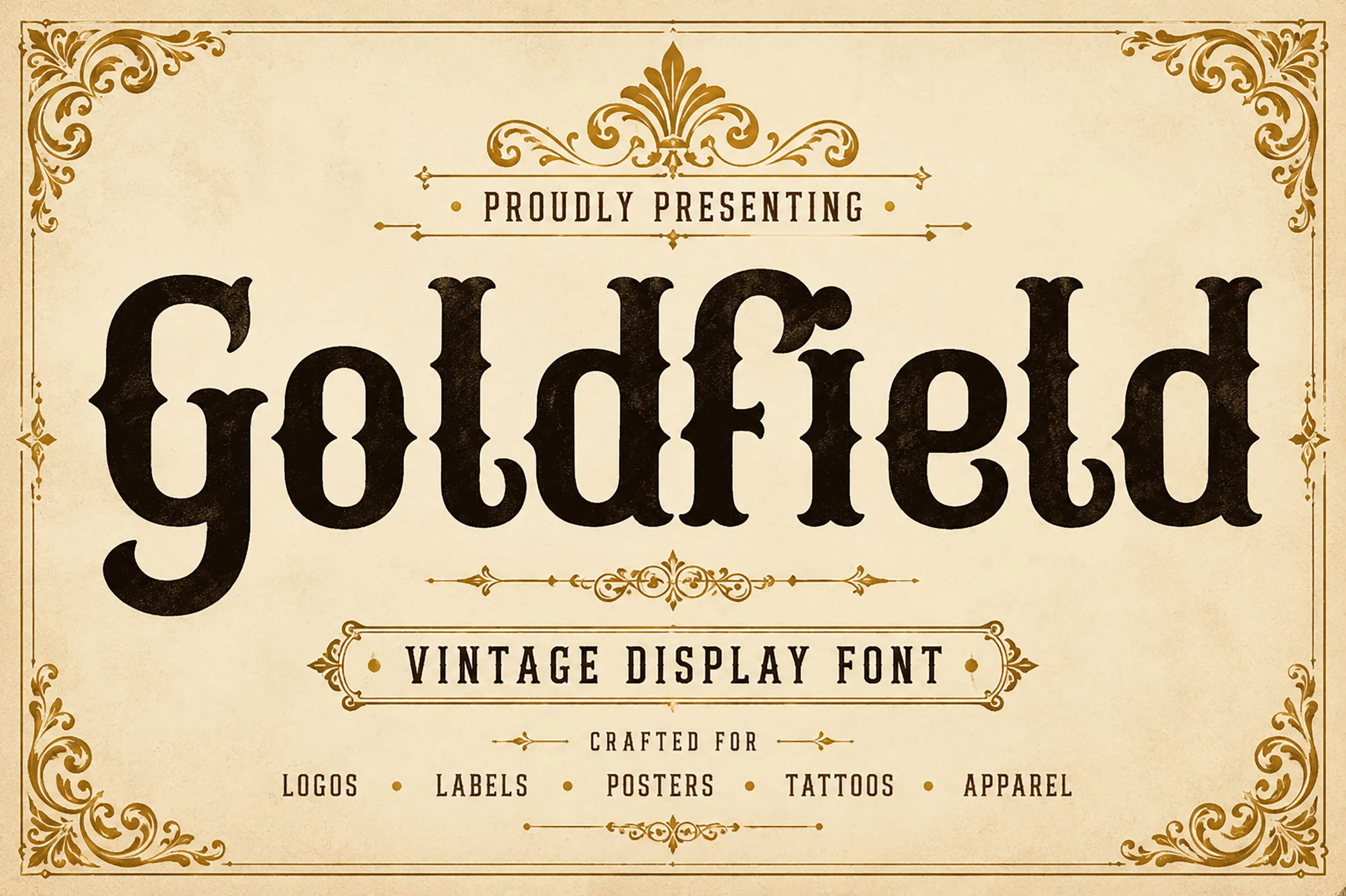
Best For: logos, product labels, posters, vintage designs
Goldfield Font has a sturdy western serif structure with chunky spurs, rounded counters, and thick strokes that give the lettering a carved, old-print presence. The shapes feel weighty and nostalgic, but the cleaner curves keep the texture polished instead of overly rustic.
Within Retro Logo Fonts, Goldfield stands out in short names, badge marks, and label-style layouts where its broad proportions can lead the hierarchy. It pairs especially well with a narrow secondary line, which helps the bold serif texture stay dominant on posters, packaging, and heritage-inspired branding.
Magmalow Font
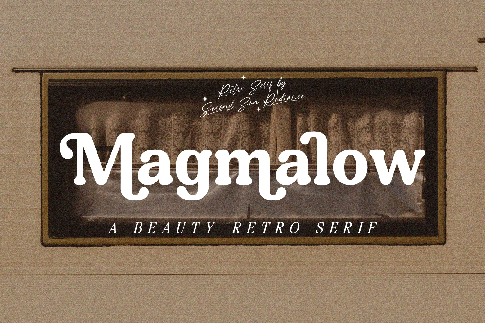
Best For: logos, branding, posters, magazine covers
Magmalow Font has a soft retro serif structure with rounded terminals, broad curves, and slightly swollen strokes that give the lettering a warm, friendly presence. It carries an unmistakable 80s feel, yet the weight stays solid enough for titles that need to read clearly at a glance.
In Retro Logo Fonts, Magmalow stands out when you want nostalgia without a harsh or western texture. It works especially well for short brand names, cover titles, and poster headlines; pair it with a narrow sans or spaced small caps so its wide bowls and smooth rhythm remain the visual lead.
Bellgum Font
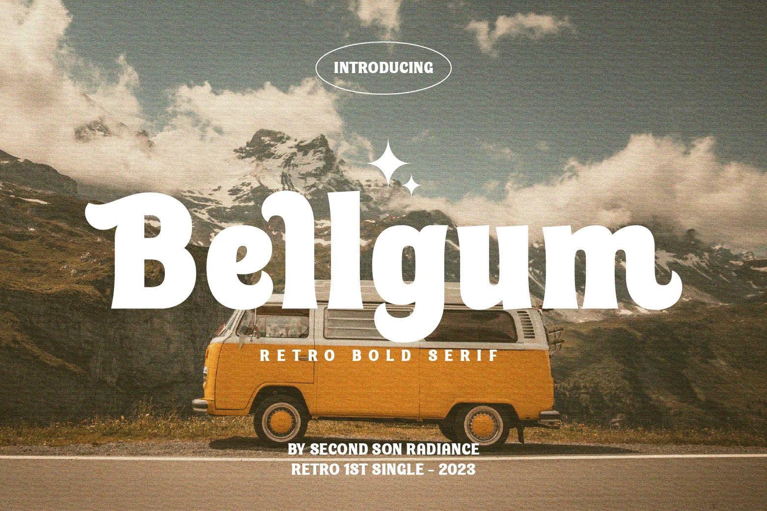
Best For: logos, branding, posters, magazine covers
Bellgum Font has a bold retro serif structure with rounded terminals, thick verticals, and soft inward curves that keep the heavy shapes feeling friendly. The letterforms have a broad, slightly inflated look, so the font lands somewhere between vintage poster type and an easygoing 80s headline.
When sorting through Retro Logo Fonts, Bellgum is strongest in short names, cover lines, and poster titles where its wide proportions can stay prominent. Pair it with condensed supporting text or small caps, and keep line breaks simple so the chunky serif rhythm stays clean in branding, editorial layouts, and display work.
Bluesmont Font
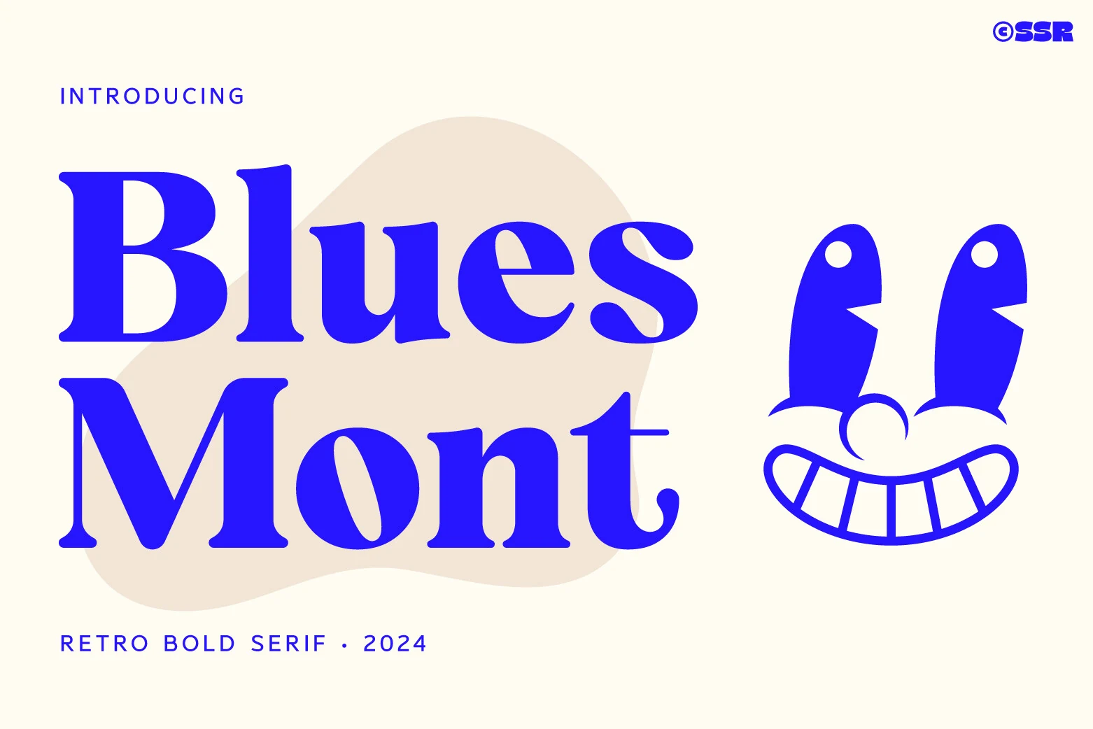
Best For: logos, branding, magazine covers, book covers
Bluesmont Font blends a retro serif structure with a cleaner, more minimal finish. The letters show rounded terminals, noticeable thick-to-thin contrast, and broad curves that make the wordmark feel polished rather than heavy, while the open counters help large display text stay clear.
If you are exploring Retro Logo Fonts, Bluesmont is strongest when the name itself needs to feel refined and bold at once. It pairs especially well with restrained supporting text, since the high contrast and smooth proportions already create enough hierarchy for branding, magazine-style covers, and elegant title layouts.
Retro Volt Font
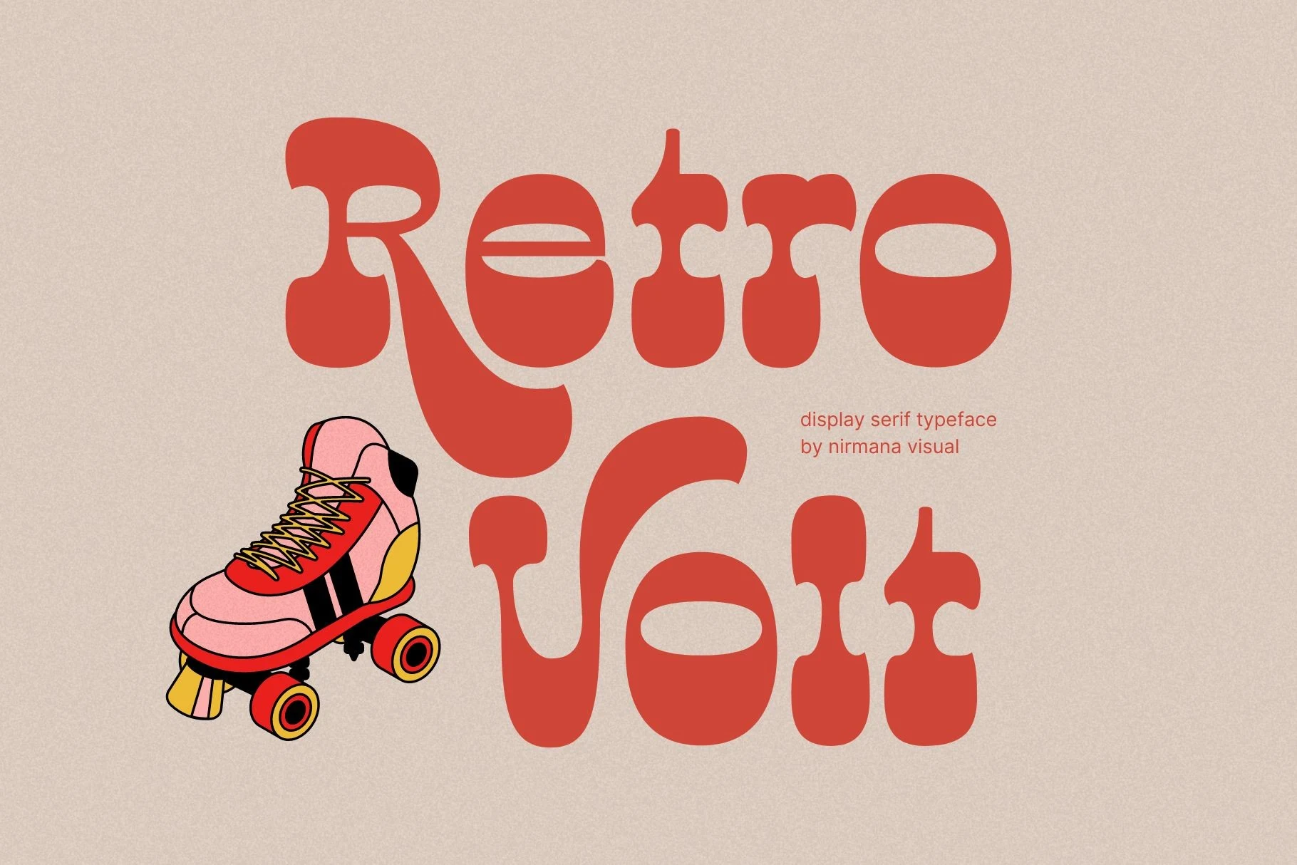
Best For: logos, posters, social media graphics, retro designs
Retro Volt Font has a distinctly 70s silhouette, with swollen serif shapes, soft slab-like terminals, and dramatic curves that drop deep below the baseline. The letterforms feel wide and sculpted rather than neat, which gives the face a laid-back groove with plenty of personality.
Used for Retro Logo Fonts, it works best when the wordmark stays short and the oversized curves have room to breathe. The broad counters help it read cleanly at display size, while a plain sans or light secondary line balances its weight in branding, ads, and social graphics.
Darkwood Font
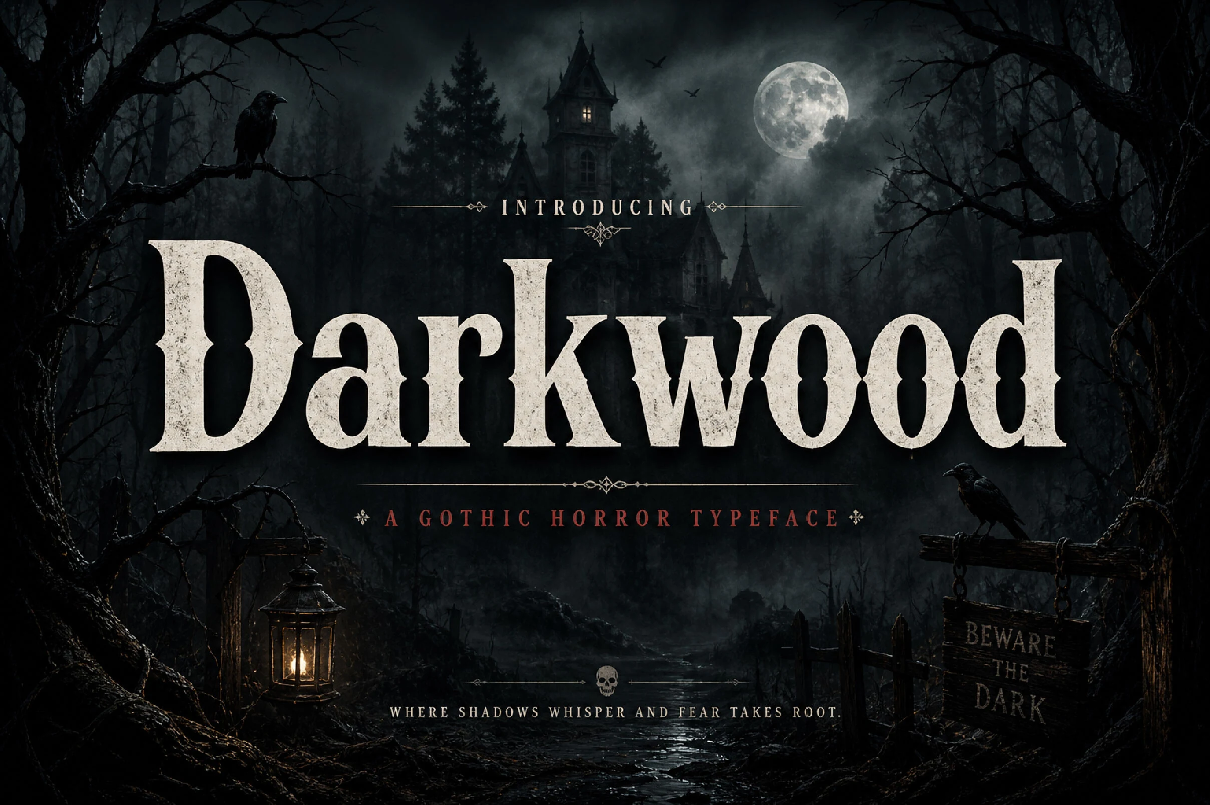
Best For: logos, posters, labels, vintage designs
Darkwood Font leans into heavy vintage serif construction: broad stems, blunt bracketed serifs, rounded counters, and sharp internal cuts that give the wordmark a gothic-poster weight without becoming ornamental blackletter.
For Retro Logo Fonts, its strength is in short, high-contrast titles where the dense letterforms can dominate the layout. Keep spacing controlled rather than loose; the chunky serifs create enough rhythm, while distressed or aged treatments work best when the headline remains large and simple.
Retro Chalet Font
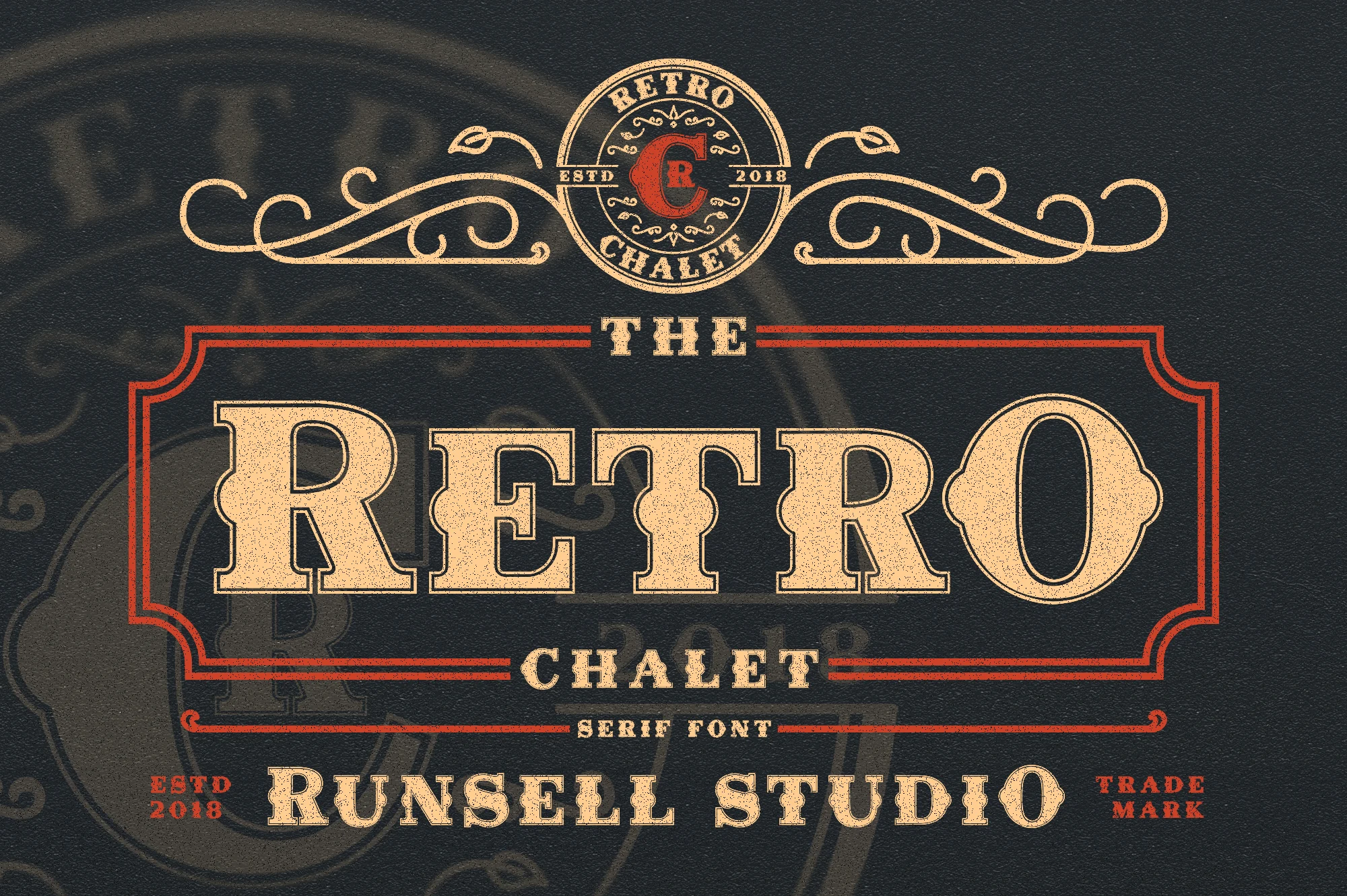
Best For: logos, posters, signage, vintage designs
Retro Chalet Font has the kind of bold slab-serif presence that feels lifted from an old trade sign. The letters are wide, squared, and sharply bracketed, while the inline treatment adds texture and depth without making the wordmark feel busy.
If you are comparing Retro Logo Fonts, this one shines when the design needs a dominant central title with supporting ornament around it. Use it at a generous size and let simpler secondary type handle the smaller details, so the sturdy forms keep their authority on badges, posters, and heritage-style branding.
Vintage Sheriff Font
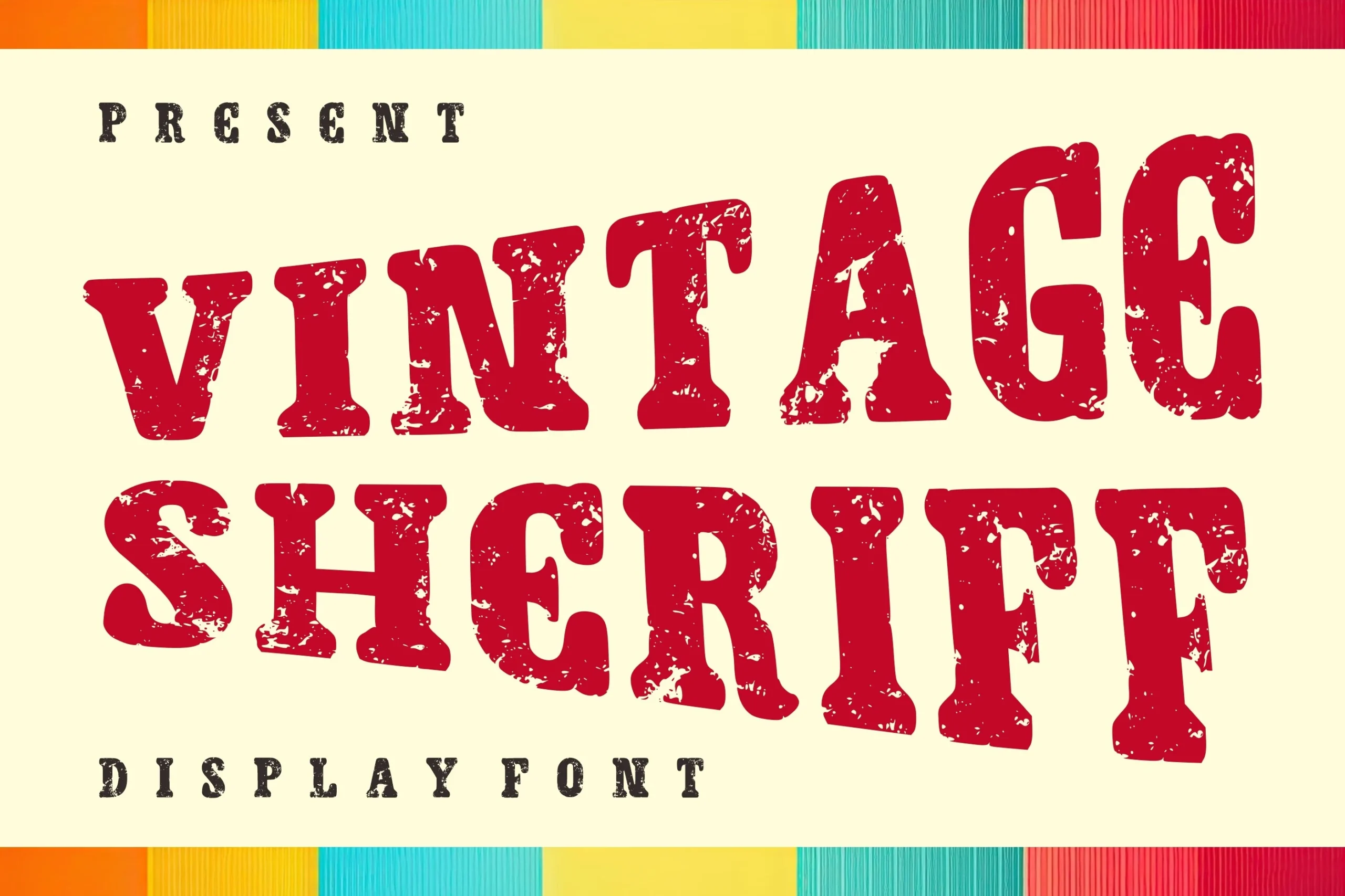
Best For: logos, signage, badges, vintage designs
Vintage Sheriff Font has a rugged western display shape, with broad slab serifs, heavy vertical stress, and uneven distressed texture across the letters. The rough edges and punched-out wear give it an old poster feel rather than a polished decorative serif look.
For Retro Logo Fonts, it is strongest in short badges, saloon-style signs, labels, and bold headline layouts. Keep contrast high and avoid tight background patterns; the distressed surface needs clean space around it so the chunky serif shapes stay readable at display size.
Script & Swash Retro Logo Fonts
These connected and flowing retro fonts use thick curves, loops, and underline swashes, making them useful for expressive logos, merch, posters, and friendly vintage branding.
Angela Heart Font
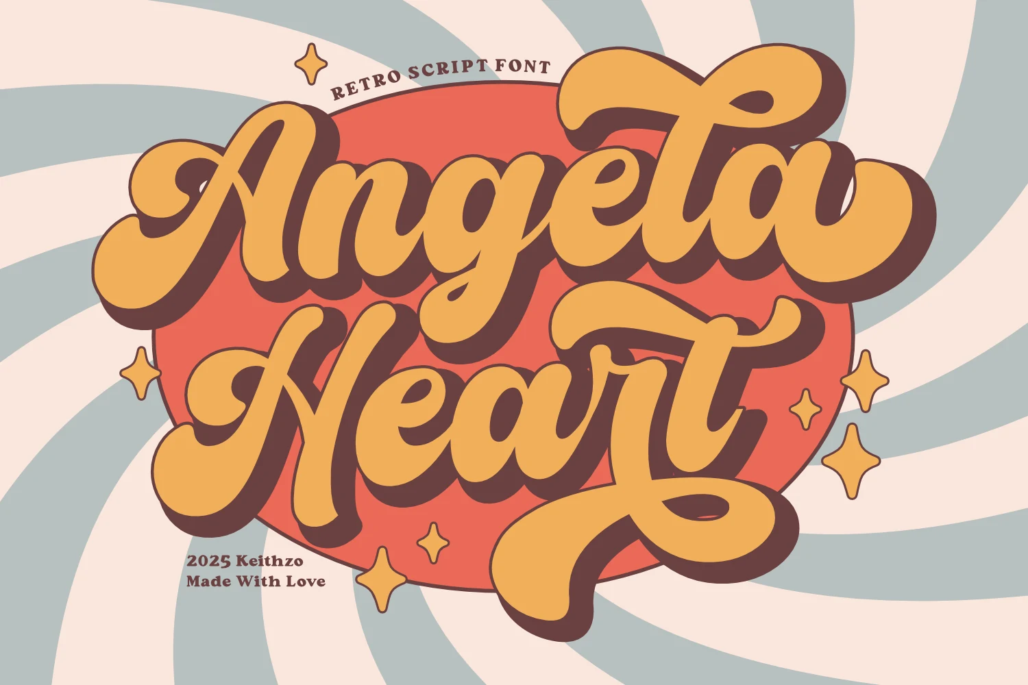
Best For: logos, posters, T-shirts, retro designs
Angela Heart Font leans into a thick retro script with buoyant curves, rounded joins, and oversized swashes that give the lettering a cheerful, full-bodied rhythm. The connected strokes feel smooth rather than delicate, so the font keeps its personality even when the wordmark gets dense.
For Retro Logo Fonts, this one works especially well in short names where the entry stroke, looping terminals, and stacked letter shapes have room to breathe. Keep the supporting text simple and smaller, and watch the lower swashes when building layouts for posters, merch, or bold brand marks.
Singtton Vintage Font
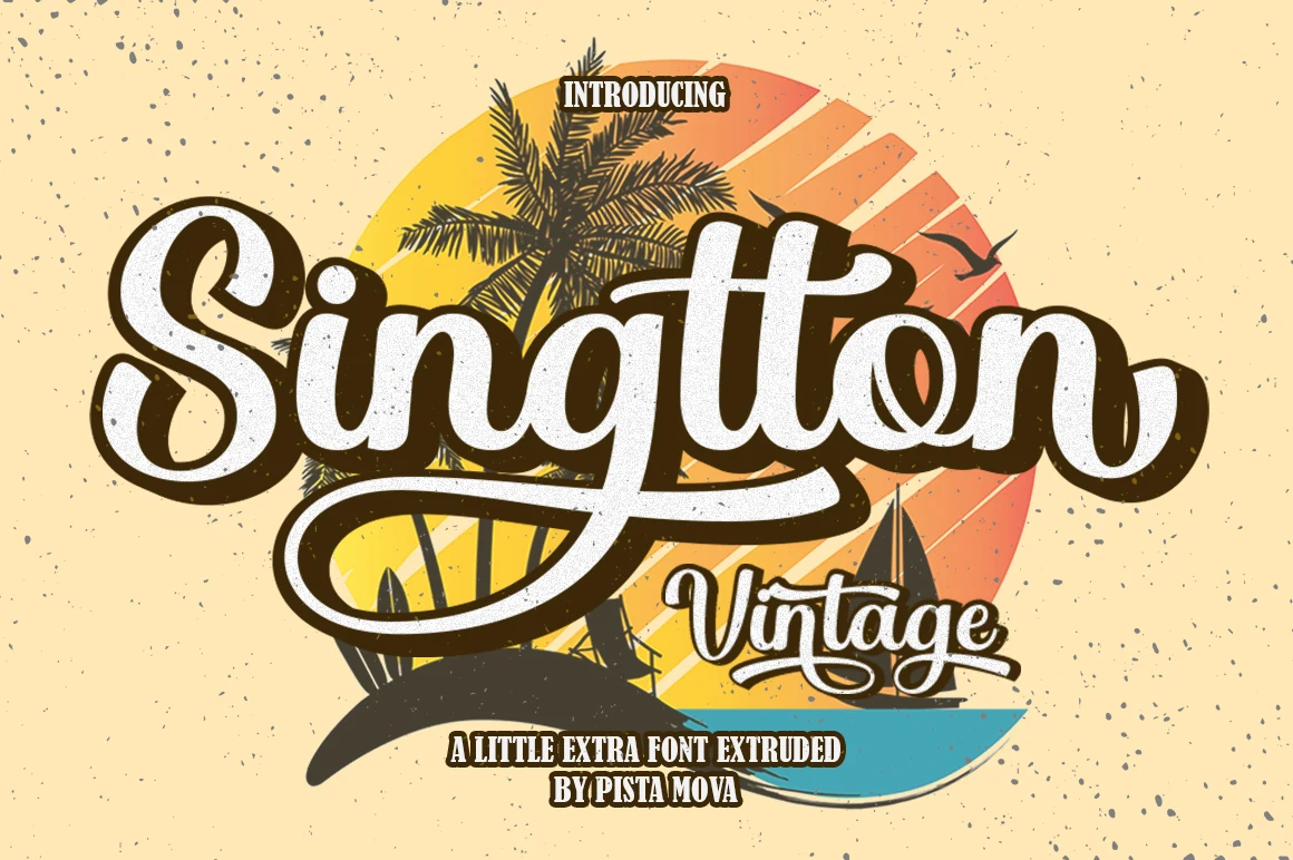
Best For: logos, posters, T-shirts, retro designs
Singtton Vintage Font uses a thick connected script with rounded terminals, soft inner curves, and a dramatic underline swash that instantly gives it a poster-ready silhouette. The dark outline and offset shadow add extra weight, so the lettering feels punchy and nostalgic rather than delicate.
If you’re browsing Retro Logo Fonts, this one is strongest in short names and bold headline placements where the looping tail can stay visible. Pair it with a plain supporting serif or sans, and leave a bit of space under the baseline flourish so the composition stays clean on logos, merch, and vintage-style promo pieces.
Bruschetta Font
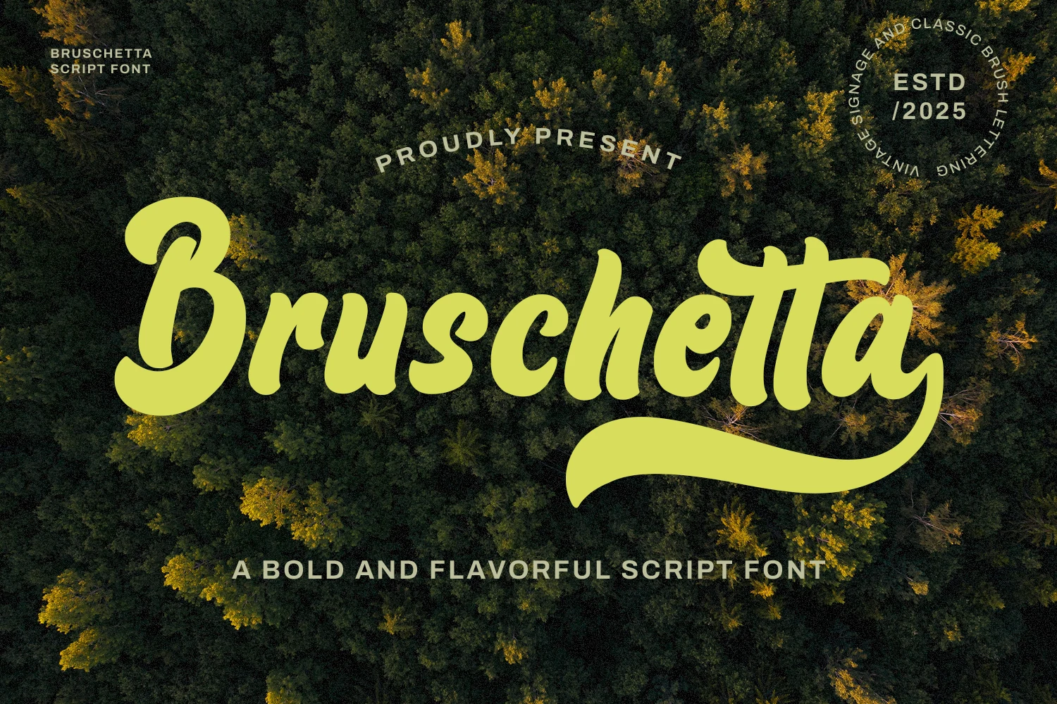
Best For: logos, signage, T-shirts, retro designs
Bruschetta Font is a bold handwritten script with thick rounded strokes, a relaxed forward lean, and a large looping capital that gives the wordmark immediate movement. The long terminal sweep under the baseline adds a vintage sign-painting feel without making the main letters hard to read.
For Retro Logo Fonts, Bruschetta is best treated as the main title rather than a small accent. Keep names short, give the underline enough lower margin, and use tight supporting text above or below it so the heavy script can carry food branding, outdoor signage, merch, and classic badge-style layouts.
Daliot Font
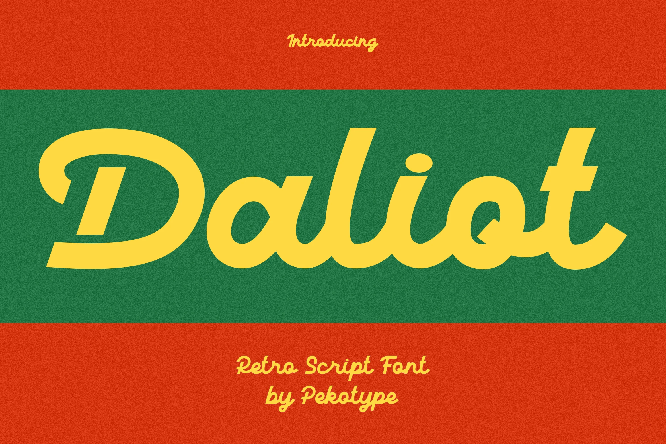
Best For: logos, branding, posters, retro designs
Daliot Font is a bold retro script with smooth connected curves, flat-ended strokes, and a wide italic flow. The oversized capital, rounded counters, and solid stroke weight give the lettering a confident 70s-style rhythm while keeping the word shape clean and readable.
For Retro Logo Fonts, Daliot works best in short names where the sweeping entry stroke and heavy lowercase forms can stretch across the layout. Use strong color contrast and avoid cramped spacing around the terminals, especially in logo marks, poster titles, and warm vintage brand systems.
Retro Music Font
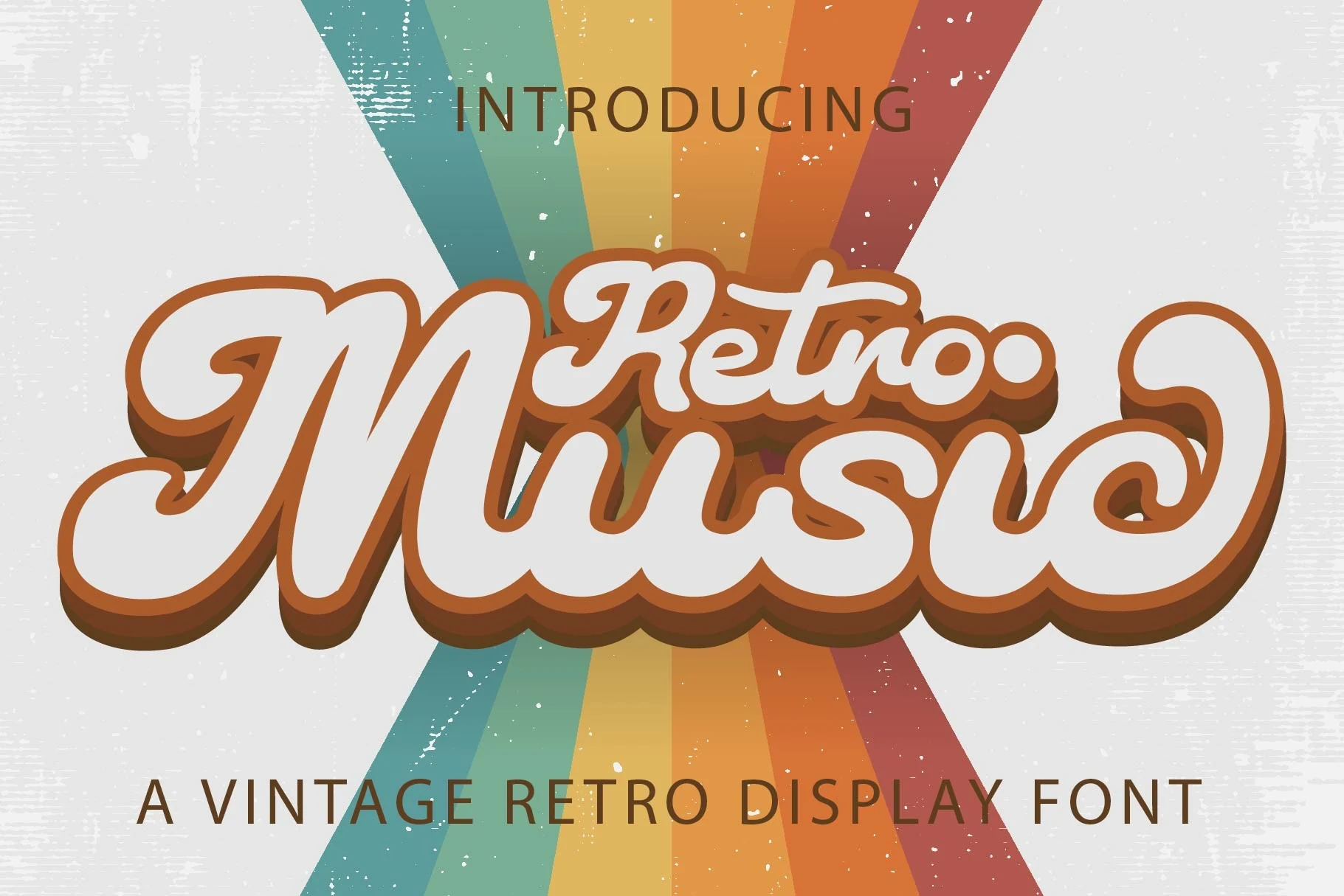
Best For: logos, branding, invitations, retro designs
Retro Music Font has a thick, flowing script structure with rounded terminals, compact joins, and a long curling swash that gives the wordmark a full, poster-style silhouette. The letters feel soft and bouncy rather than delicate, which keeps the vintage look playful and easy to spot.
It suits Retro Logo Fonts best when you want a friendly, high-impact headline with a strong nostalgic mood. Use it for short names or feature text, and keep secondary copy simple and lighter so the heavy curves, outline weight, and connected rhythm can carry the hierarchy without turning muddy.
Rounded & Groovy Retro Logo Fonts
These groovy retro fonts rely on puffy shapes, rounded corners, and soft 70s rhythm, working well for playful logos, stickers, social graphics, and bold casual branding.
Just Retro Font
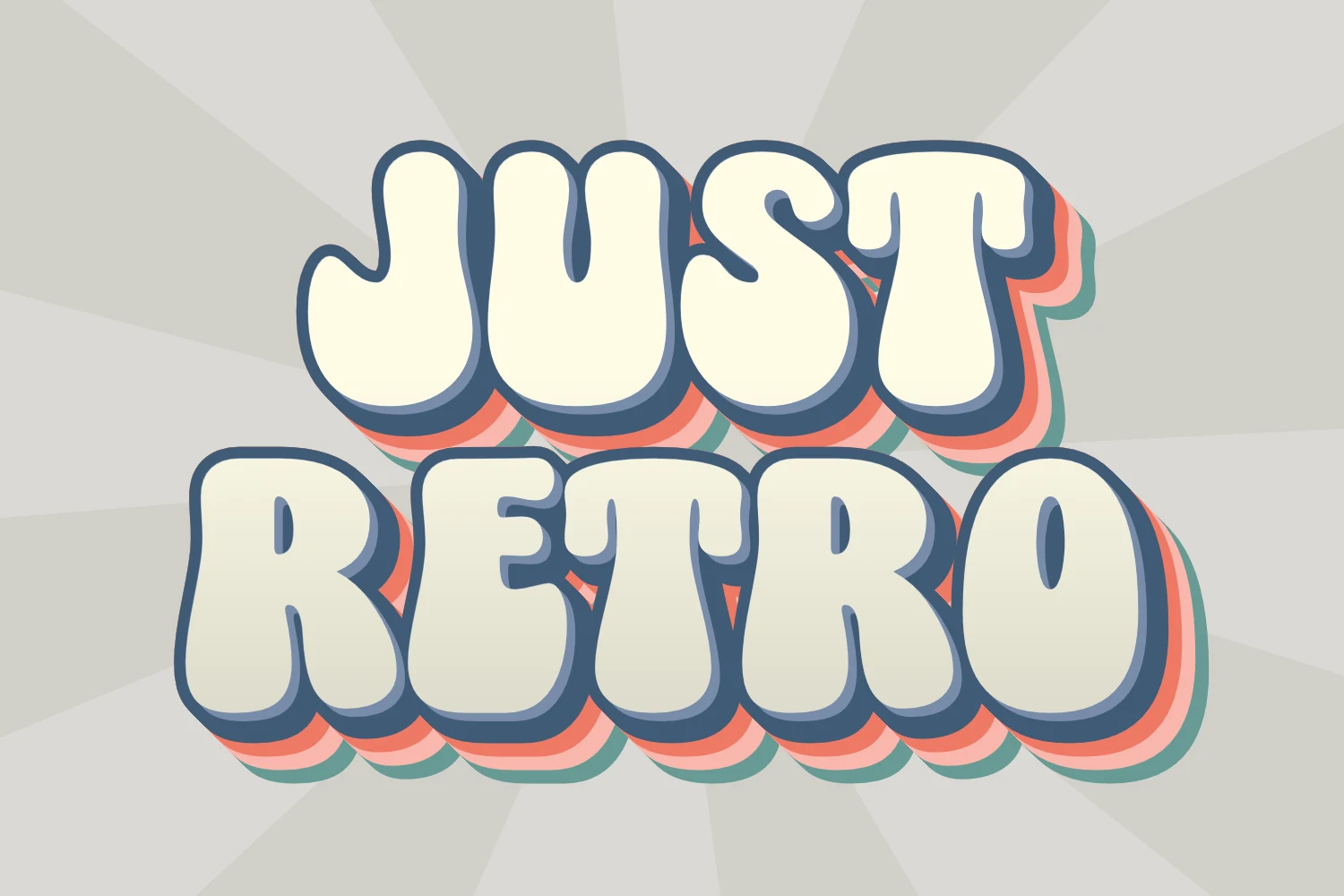
Best For: logos, posters, stickers, children’s designs
Just Retro Font uses thick bubble-style letters with rounded corners, soft counters, and a compact stacked rhythm. The broad shapes feel cheerful rather than heavy, while the bold outline and layered shadow give it that soft 70s depth without losing readability.
For Retro Logo Fonts, this one works best in short words where the chunky silhouette has room to breathe. Keep the tracking slightly open and let it lead the hierarchy, especially for posters, stickers, playful logos, or kid-focused designs that need instant warmth and a friendly retro hit.
Retro Extra Font
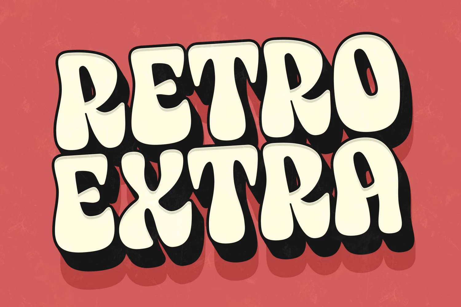
Best For: posters, headlines, stickers, playful designs
Retro Extra Font is built from oversized, puffy letterforms with rounded corners, narrow inner spaces, and a compact stacked rhythm. The thick black shadow gives the soft shapes extra punch, so the font reads cheerful and loud at the same time rather than merely cute.
If you are browsing Retro Logo Fonts, this one is strongest in short words and bold title treatments where the chunky silhouette can stay intact. Use it with simple supporting type and enough spacing around the edges, especially for posters, stickers, and headline layouts that need immediate visual weight.
Retro Change Font
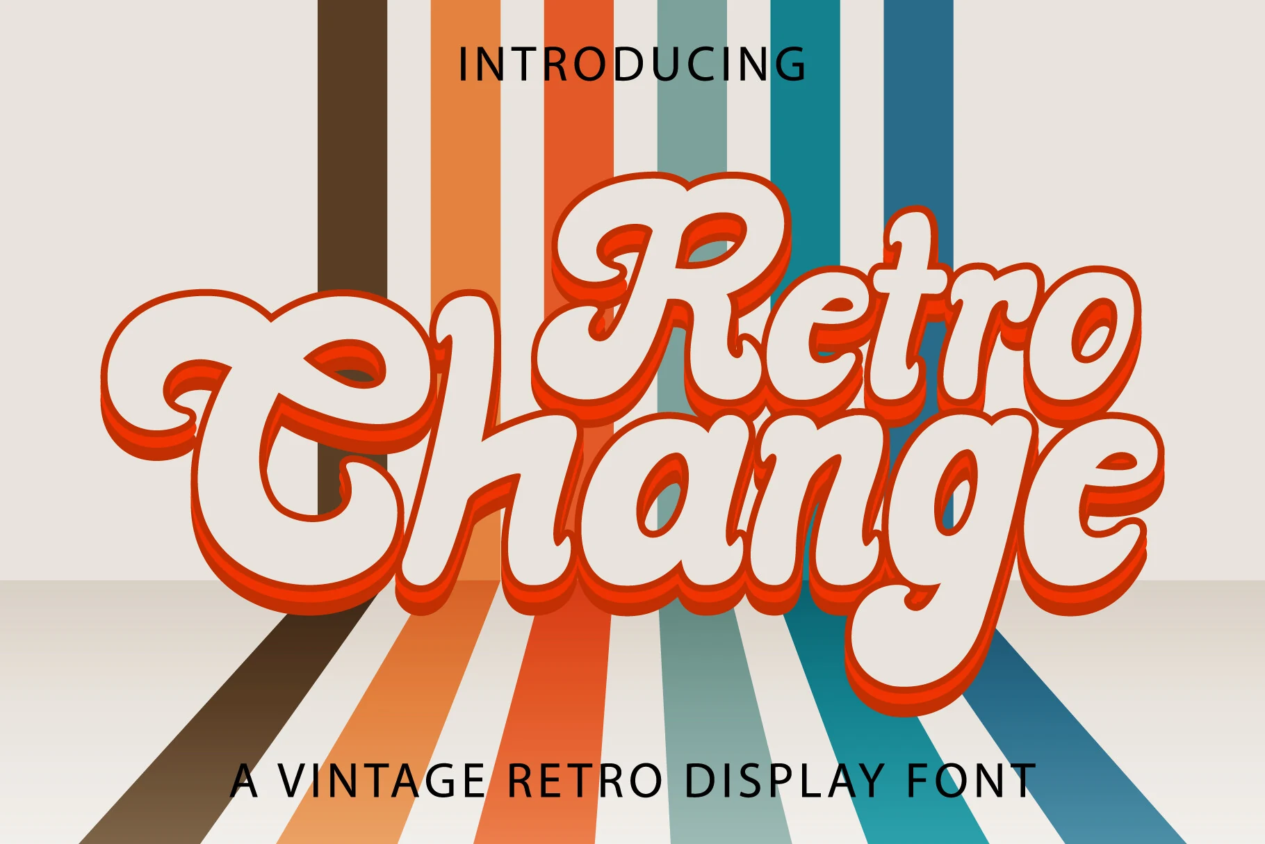
Best For: logos, branding, invitations, social media graphics
Retro Change Font has a chunky handwritten look with rounded bowls, oversized capitals, and soft curves that keep the lettering playful instead of rigid. The thick outline and layered shadow give it a lively 70s-style lift, while the broad strokes make the word shape easy to read at display size.
For Retro Logo Fonts, Retro Change works best in short names and bold headers where the heavy silhouette can stay intact. Give the shadow room around the edges and pair it with a simpler secondary typeface, especially when building logos, invitations, or social graphics that need a bright vintage punch.
Retro Give Font
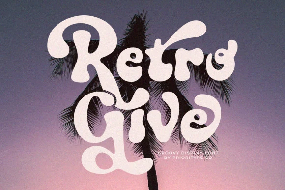
Best For: logos, branding, posters, retro designs
Retro Give Font has a swollen, groovy display shape with heavy rounded strokes, curled terminals, and a loose stacked rhythm. The letters feel soft rather than sharp, so it works best when the logo needs a friendly 70s pull without losing strong title weight.
For Retro Logo Fonts, its alternative characters are useful for building a more custom wordmark: swap repeat letters, vary the curls, and keep the spacing fairly tight so the chubby forms lock together as one graphic piece.
Wild Retro Font
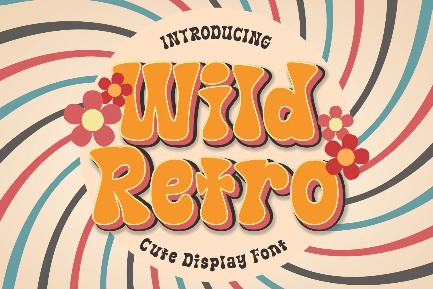
Best For: logos, posters, signage, retro designs
Wild Retro Font has an easy 70s feel built from chunky rounded strokes, soft corners, and loose, wavy proportions. The letters feel inflated and friendly, which gives headlines a cheerful bounce instead of a rigid geometric look.
It fits Retro Logo Fonts especially well when you want a nostalgic mark that still reads fast. Keep it for short names or display text, and pair it with a plain secondary typeface so the bubbly shapes, outlines, and shadow treatments can carry the hierarchy without looking crowded.
Kogaine Font
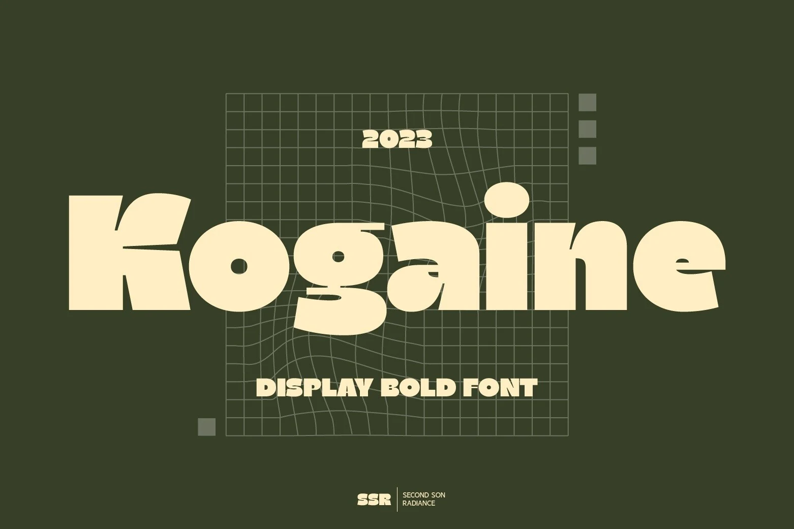
Best For: logos, branding, posters, retro designs
Kogaine Font uses oversized, soft-edged letterforms with thick rounded strokes and a slightly warped rhythm. The low counters, heavy bowls, and stretched horizontal shapes give it a bold retro display voice without relying on decorative outlines.
For Retro Logo Fonts, it works best when the main wordmark is allowed to fill the composition. Keep supporting text smaller and cleaner, because the wide proportions and compact spacing already create strong title hierarchy for posters, branding, and cover-style layouts.
Block & Shadow Retro Logo Fonts
These blocky retro fonts use heavy silhouettes, shadows, stripes, or distressed texture, giving posters, signage, apparel, and compact logos a louder graphic presence.
Retro Thunder Font
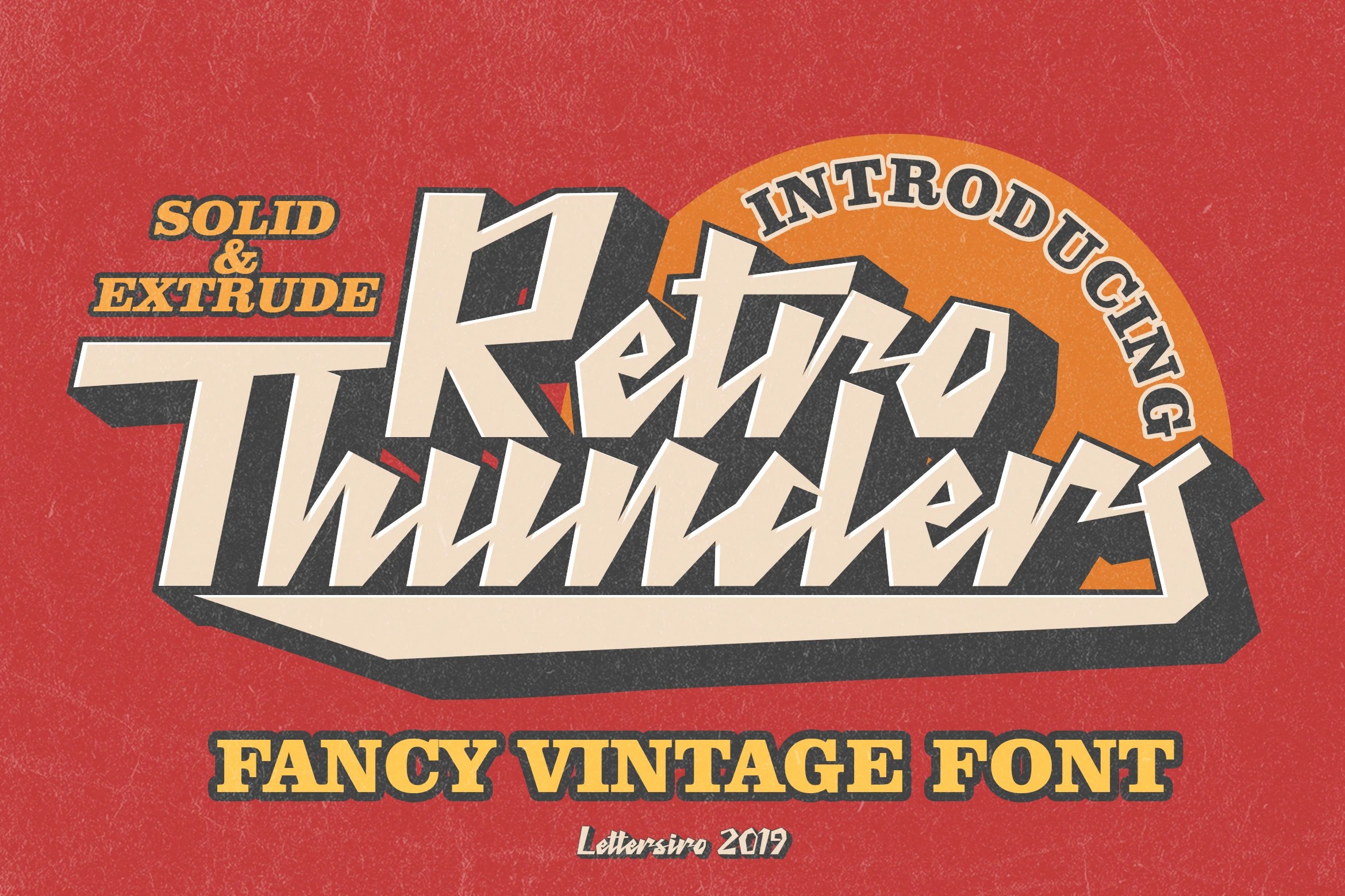
Best For: logos, posters, product labels, T-shirts
Retro Thunder Font has a hard-edged display look built from slanted strokes, pointed joins, and broad geometric letterforms. The solid face already feels assertive, while the thick extruded shadow turns each word into a compact block with real poster energy and a strong vintage sign vibe.
For Retro Logo Fonts, this style works best in short names, stacked titles, and label layouts where the angled rhythm can stay clear. Give the extrude room on the right and bottom edges, and pair it with simpler secondary text so the heavy silhouette stays crisp on apparel, covers, and bold branding pieces.
Retro 1960 Font
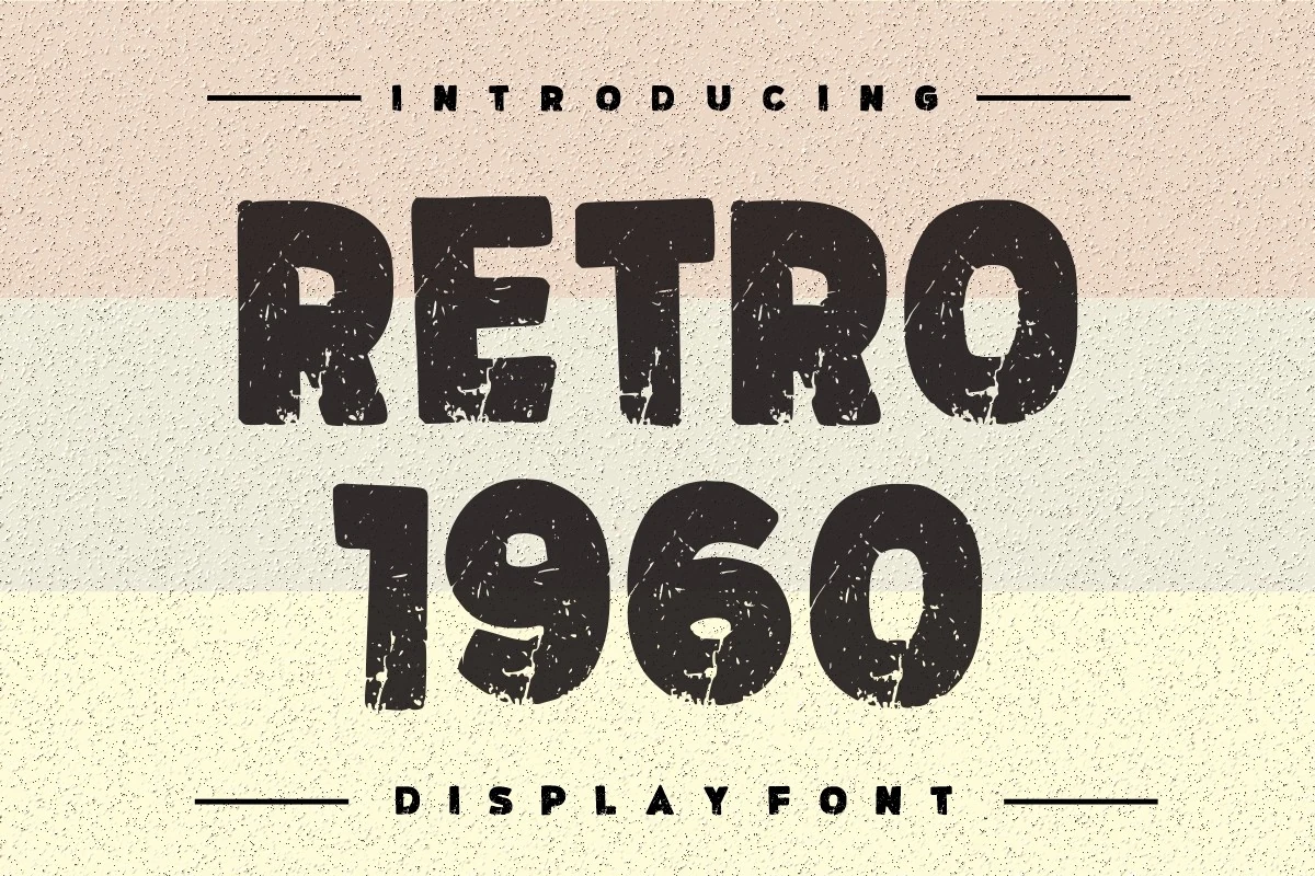
Best For: logos, posters, headlines, vintage designs
Retro 1960 Font has a chunky all-caps display look with broad strokes, softly rounded corners, and a worn texture that gives the letters a printed, timeworn feel. The shapes are simple and sturdy, so the distressed surface becomes the character instead of overpowering the word.
For Retro Logo Fonts, it works best in short titles and bold badges where the rough texture can stay visible. Keep the layout clean and avoid crowding it with ornate secondary type; a plain sans or spaced small caps helps the heavy forms hold attention on posters, branding, and ad-style graphics.
Usa Retro Font
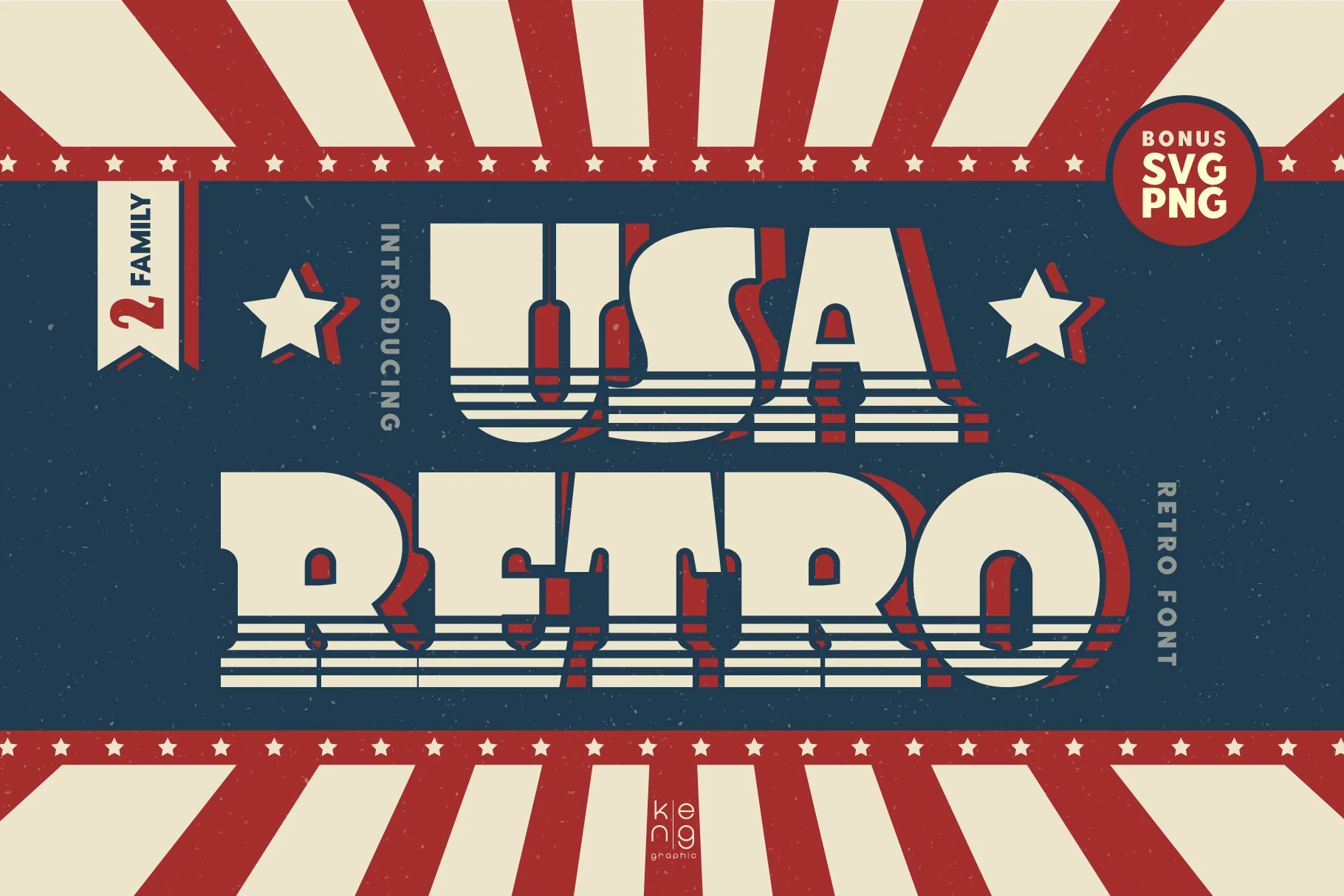
Best For: logos, posters, signage, retro designs
Usa Retro Font is built with wide, blocky letterforms, squared curves, and hefty slab-like terminals that echo old sign and poster lettering. The striped cutlines across the lower half add movement and texture, while the compact counters keep the words dense, bold, and easy to spot.
For Retro Logo Fonts, it works best in short names, badges, and punchy headers where the layered shadow and stripe detail can stay visible. Give it generous scale and pair it with a simple secondary typeface; that contrast helps the chunky silhouette lead the hierarchy without feeling crowded.
Conclusion
Choose a script style when the logo needs motion and personality, a rounded groovy style for playful 70s warmth, a serif or slab face for stronger heritage branding, and a block or shadow font when the mark needs maximum poster impact.