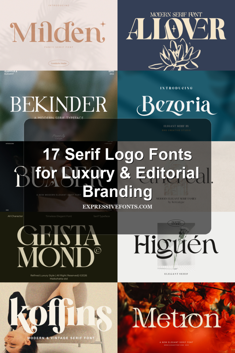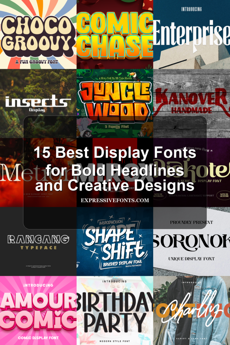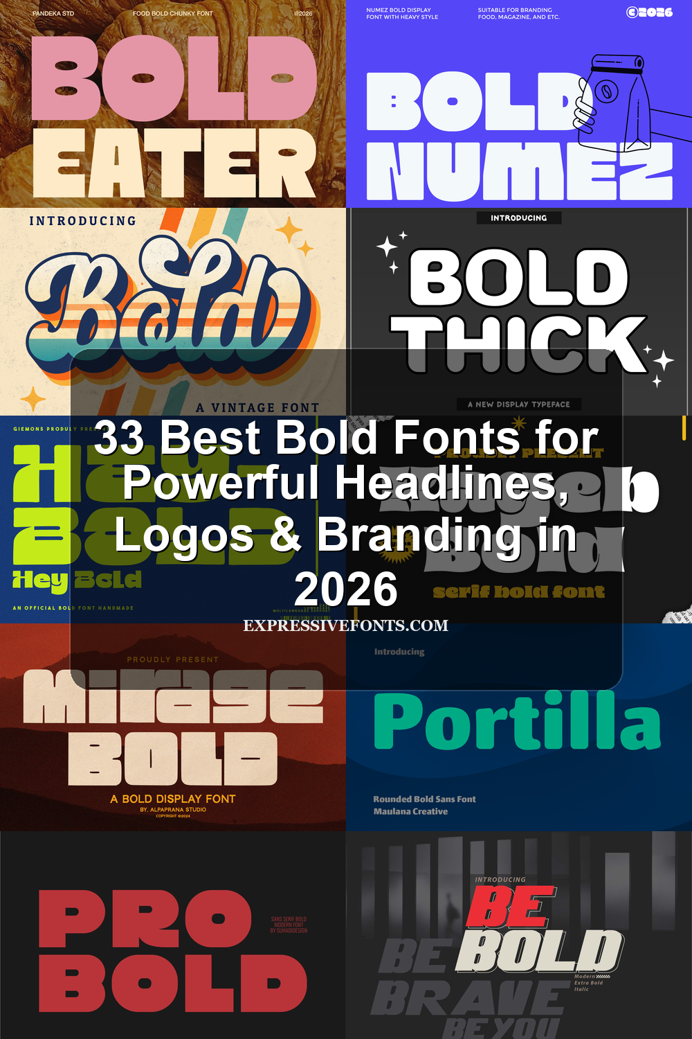
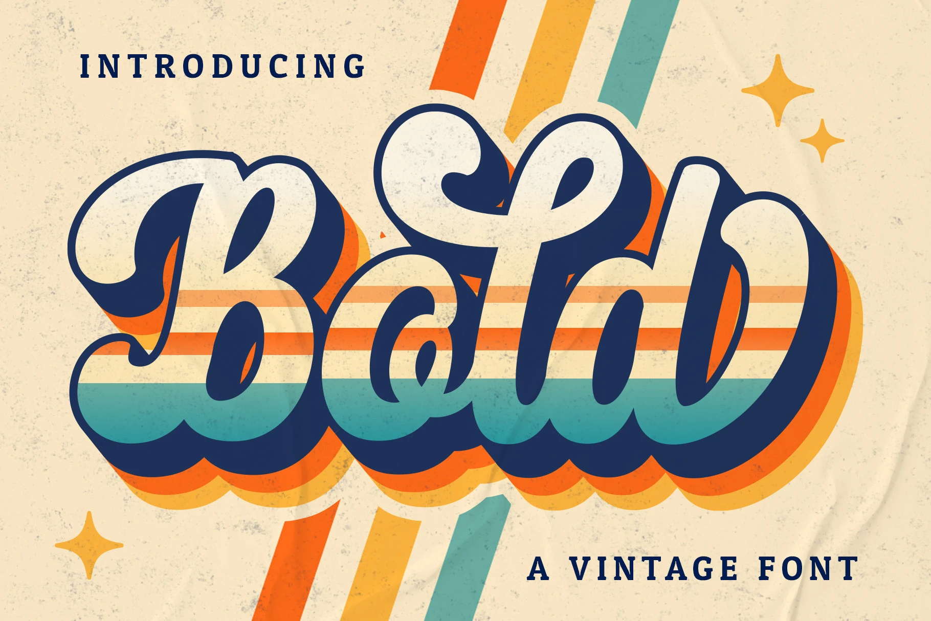
33 Best Bold Fonts for Powerful Headlines, Logos & Branding in 2026
Bold fonts add weight and personality fast. They work best when the text needs to lead the design: logos, posters, packaging, headlines, merch, and social media graphics.
This 2026 roundup includes clean geometric styles, condensed fonts, retro lettering, grunge textures, handwritten looks, and playful display options. Compare the style, readability, spacing, and letter shapes before choosing one for your project.
Portilla Rounded Bold Font
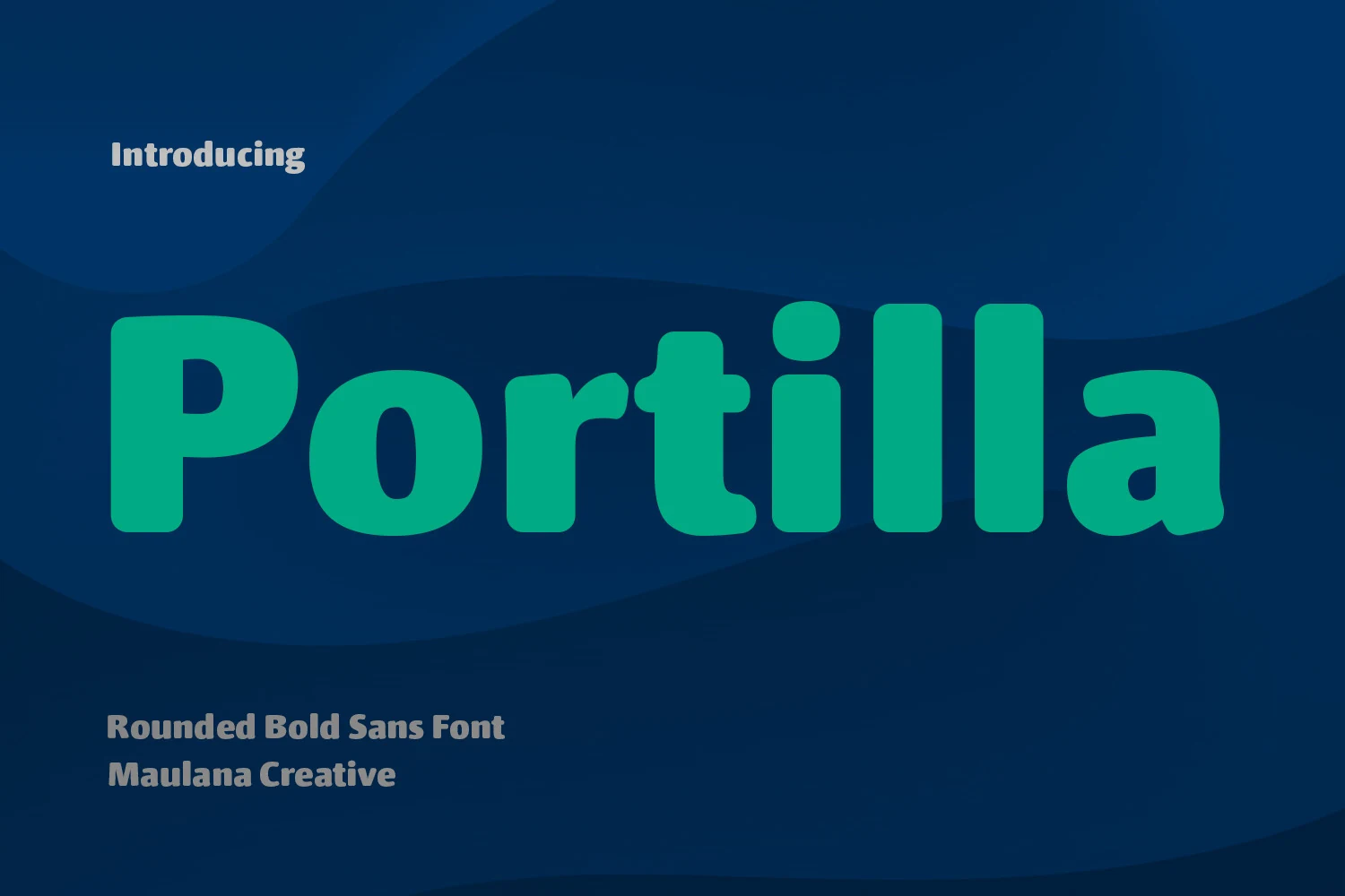
Best For: logos, social media graphics, website headers, book covers
Portilla Rounded Bold Font has thick, smooth letterforms with oversized curves, soft terminals, and open counters that keep the big shapes easy to read. It brings a friendlier mood to Bold fonts, making the weight feel approachable rather than harsh, especially in short names, headers, and playful identity work.
The rounded structure also makes spacing important: give the letters a little room so the bowls and counters stay clear, especially in logos or large titles. It pairs well with a sharper serif or a light sans, and the available alternates can help wordmarks feel less repetitive when you want a more custom finish.
Be Bold Font
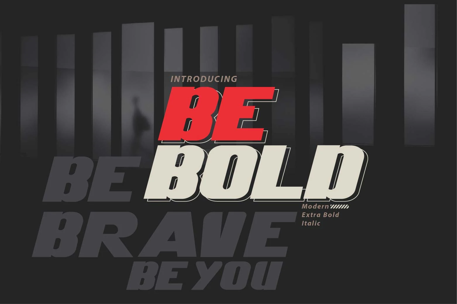
Best For: posters, headlines, branding, social media graphics
Be Bold Font is a wide extra bold italic display face with a strong forward slant, thick strokes, and compact counters that make every word feel fast and assertive. Its heavy silhouette gives Bold fonts this kind of punch, while the angled build adds a sporty editorial edge instead of a static blocky look.
This style works best in short, high-impact lines where the slant can create momentum across the layout. For posters, cover text, or branding, keep the wording concise and give the letters a bit of breathing room so the weight stays powerful without turning into a dense blur.
Loved Bold Font
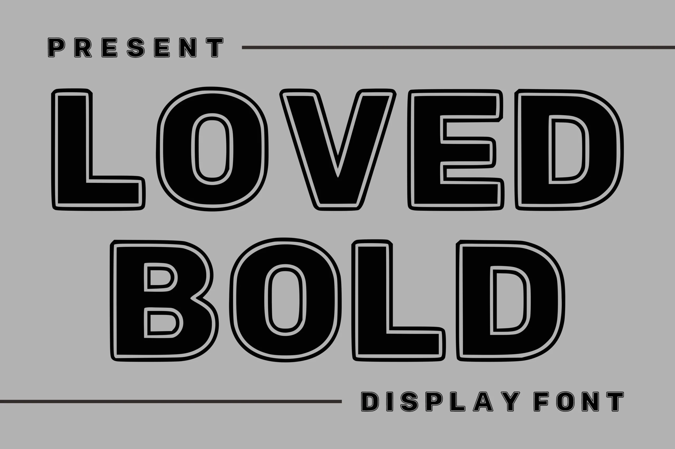
Best For: headlines, posters, merch design, retro designs
Loved Bold Font uses heavy block capitals with rounded corners, black fills, and clean outline accents that make each word feel loud without becoming messy. The wide letter shapes and stable baseline give it the punch expected from Bold fonts, while the inner contouring adds a slightly retro poster edge.
It works best when the hierarchy is simple: one dominant word, strong contrast, and enough spacing around the outline so the double-edge detail stays readable. For merchandise, signage, or headline graphics, keep phrases short and let the thick verticals carry the composition.
Thin in Bold Font
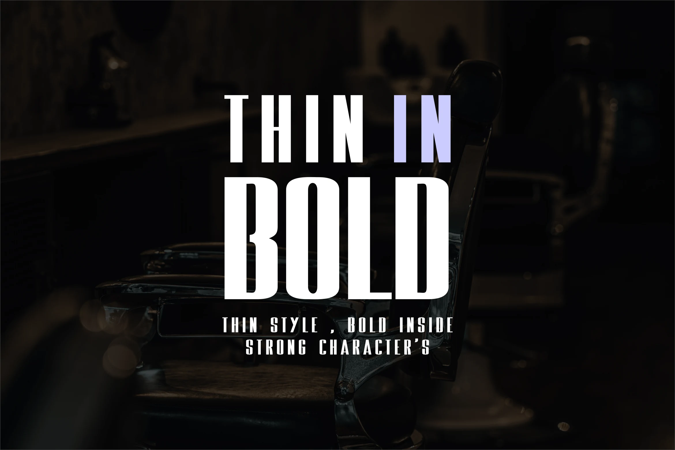
Best For: headlines, magazine covers, fashion branding, social media graphics
Thin in Bold Font takes a tall condensed sans serif structure and gives it a sleek editorial attitude. The uppercase letters are narrow, upright, and sharply cut, with a clean rhythm that feels modern rather than heavy. It brings a more fashion-led direction to Bold fonts, especially when you want impact without bulky proportions.
Its best feature is the vertical pull of the letterforms, which makes short headlines and cover-style wording look especially strong. Try it in stacked lines or roomy layouts, and pair it with a quieter secondary face so the condensed shapes stay crisp instead of feeling cramped.
Bold Beach Font
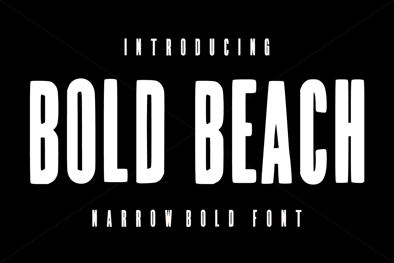
Best For: headlines, posters, logos, retro designs
Bold Beach Font is a condensed display face built from tall, heavy capitals with slightly softened corners and a steady vertical rhythm. The narrow proportions give it a poster-ready presence without feeling stiff, which makes it a strong pick within Bold fonts when you want impact and a faint retro edge.
Because the letters are so compressed, it handles longer words better than many wide display styles and keeps headlines strong in tight spaces. Use it for short stacked titles, logos, or packaging where the vertical shape can do the work, then pair it with simpler supporting text so the dense silhouette stays clear.
Caffe Bold Font
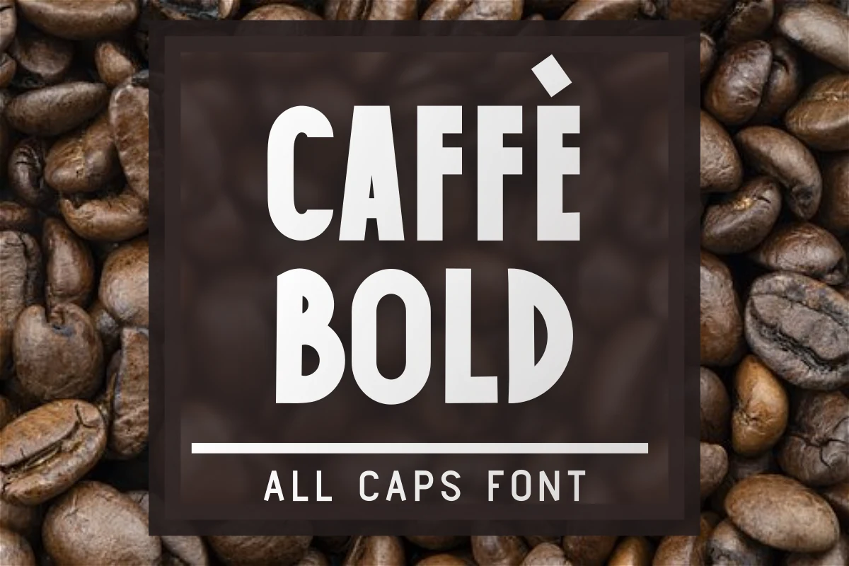
Best For: headlines, packaging, product labels, signage
Caffe Bold Font leans into the clean side of Bold fonts with tall all-caps sans serif letters, even stroke weight, and slightly condensed proportions that keep the texture solid without feeling bulky. The shapes are direct and sturdy, with smooth bowls and firm verticals that give words a practical, label-ready presence.
That straightforward structure makes it especially useful when you need fast readability at a glance. In packaging or signage, it works well for short names and stacked layouts, and the narrower width lets you fit more characters without losing impact. Pair it with lighter supporting text or a little extra spacing to keep the bold block crisp.
Bold Font
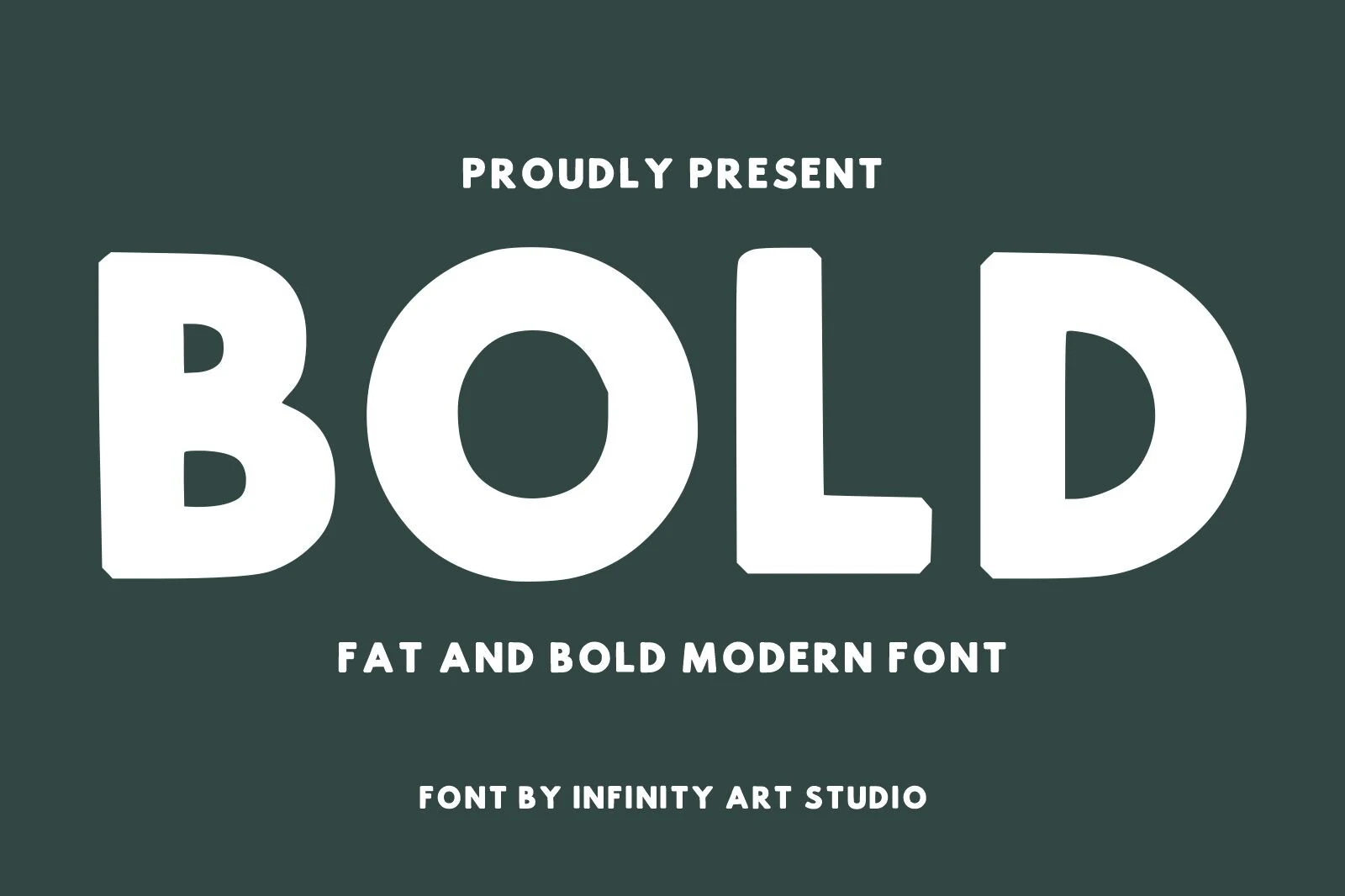
Best For: headlines, branding, posters, packaging
Bold Font has a hefty geometric build with broad strokes, rounded counters, and slightly clipped corners that keep the oversized forms feeling clean rather than cartoonish. Within Bold fonts, it reads as modern and minimal, with a big circular O and sturdy block shapes that give headlines instant weight.
Its practical strength is how quickly it fills a layout without needing extra effects. Short brand names, poster lines, and front-of-pack text look confident right away, especially if you give the letters a touch of spacing or wider margins so the heavy silhouette stays clear and controlled.
Gravel Bold Font
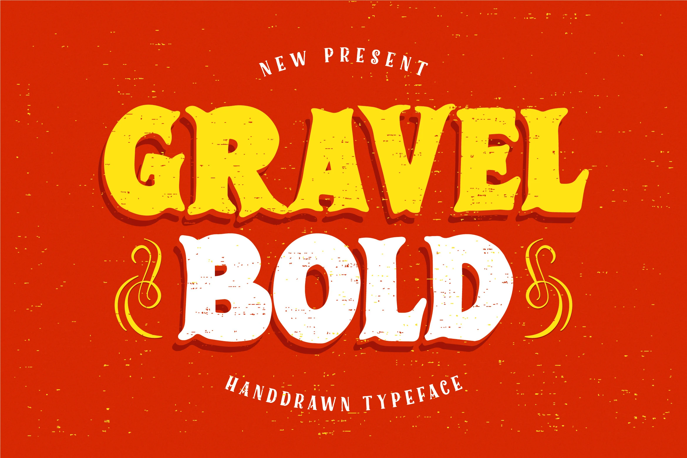
Best For: posters, book covers, children’s designs, retro designs
Gravel Bold Font has chunky serif letterforms with rounded bulges, lively terminals, and a worn texture that makes the strokes feel hand printed. The shadowed shapes and slightly theatrical curves give it a vintage poster energy, so within Bold fonts it feels expressive and playful instead of plain or rigid.
The distressed finish does a lot of the styling work for you, which makes this one especially effective for short titles and statement words. Use it at display size where the rough texture stays visible, and pair it with a cleaner support font so covers, posters, or kids-focused layouts keep their hierarchy clear.
Glory Bold Font
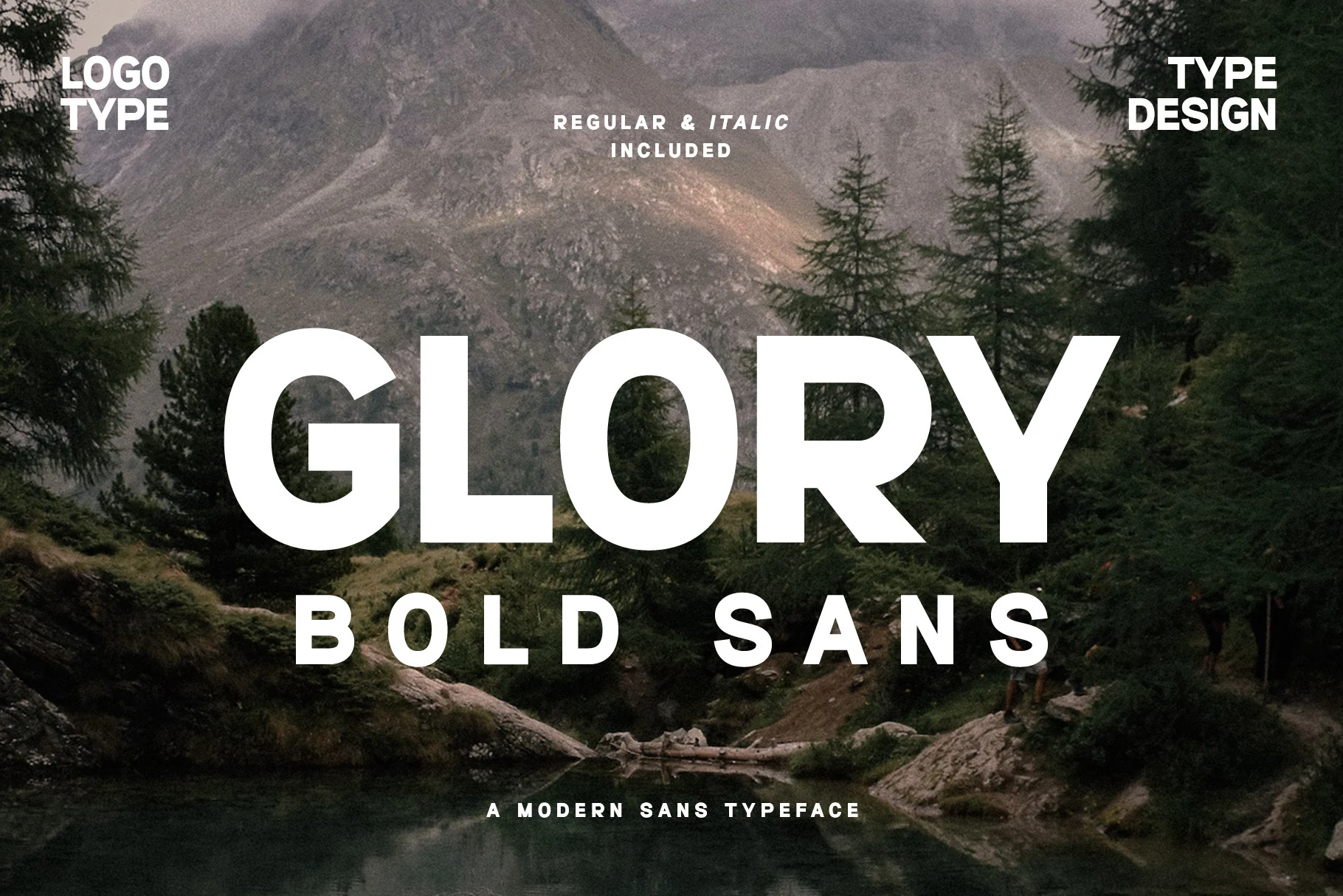
Best For: logos, branding, website headers, headlines
Glory Bold Font has a clean geometric sans structure with broad curves, rounded edges, and an even weight that keeps the big letterforms smooth rather than blunt. It fits naturally into Bold fonts thanks to its solid presence, but the softened shapes give it a more approachable, logo-friendly character.
What makes it especially useful is the balance between impact and clarity. The counters stay open, spacing feels steady, and short words read well at a glance, so it handles headers, wordmarks, and bold web titles without looking cramped. Pair it with a lighter sans for a tidy hierarchy and let the wide capitals carry the emphasis.
Yuletide Bold Block Font
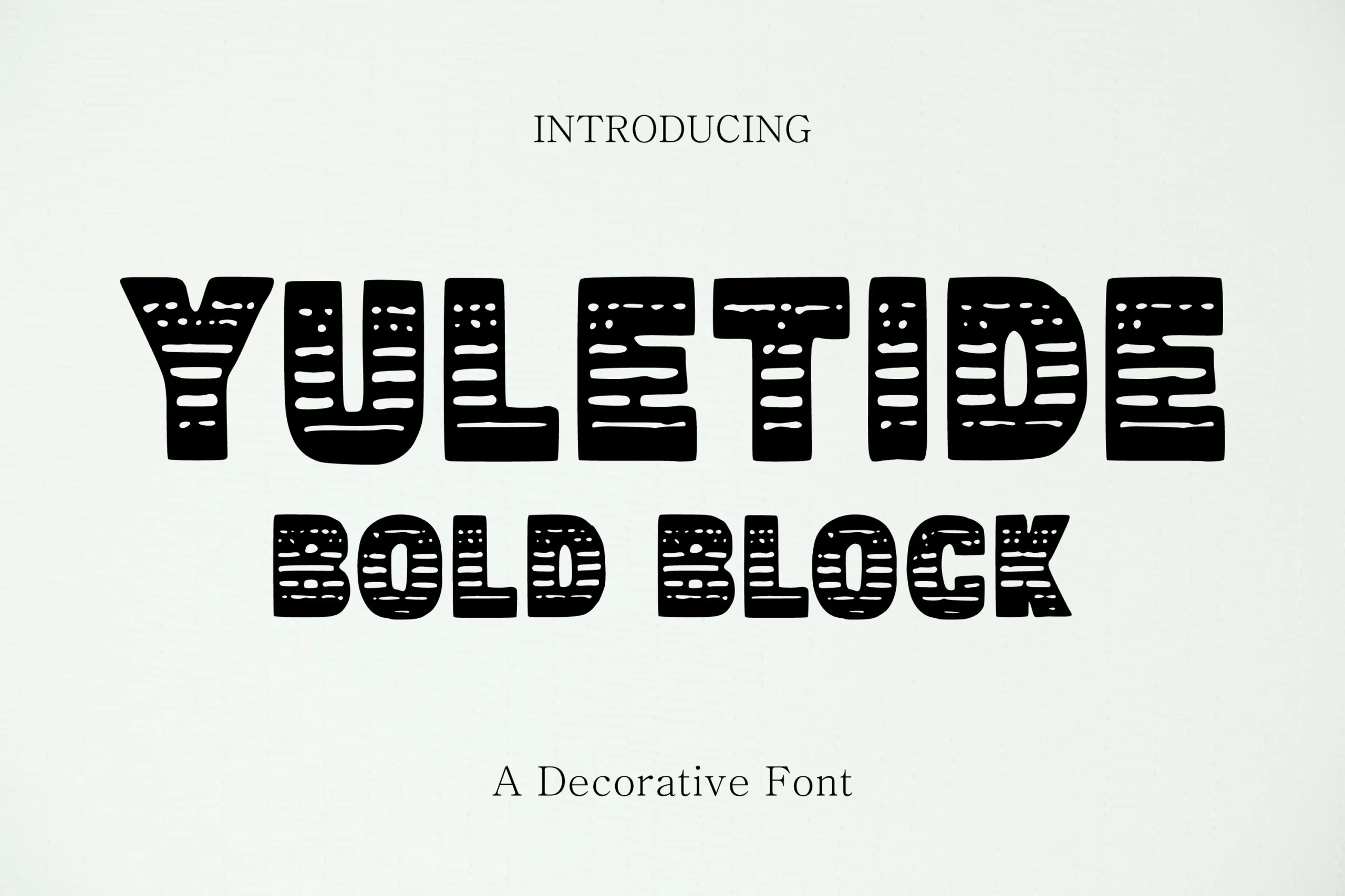
Best For: invitations, posters, wall art, decorative designs
Yuletide Bold Block Font has chunky decorative capitals with rounded corners and carved horizontal cut-ins that give the letters a hand-printed, woodcut flavor. The distressed detailing keeps the heavy shapes lively, so within Bold fonts it feels festive and characterful rather than plain, with a clear display-first personality.
This style works best in short seasonal wording where the texture can stay visible. Use it large on cards, posters, or gift packaging, and keep the supporting text smoother and simpler so the patterned strokes and stout proportions remain the main attraction.
Heavy Western Bold Font
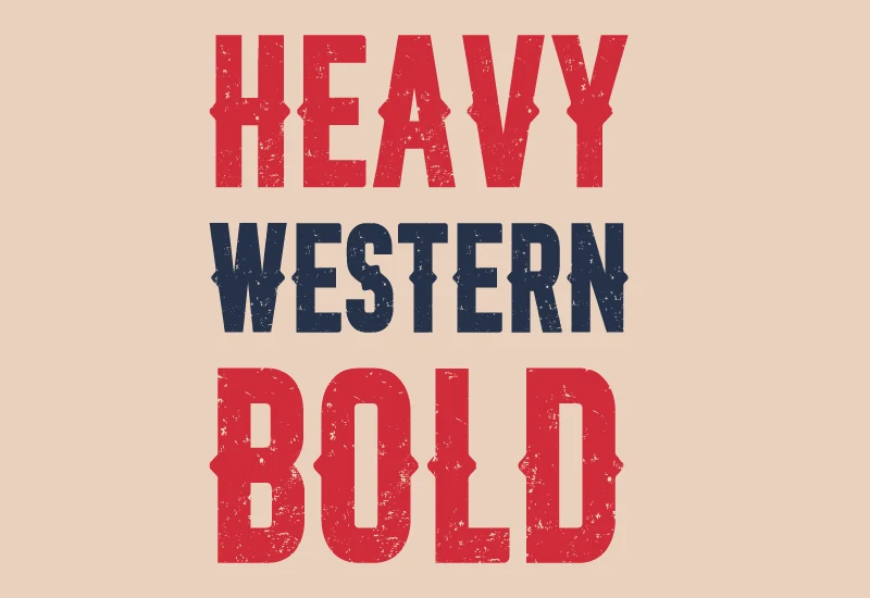
Best For: posters, signage, T-shirts, vintage designs
Heavy Western Bold Font uses thick block capitals with squared serifs, small cut-in details, and a rough distressed surface that gives the letters a gritty printed texture. Its tall, compressed rhythm keeps the words firm and forceful, making it one of the Bold fonts with a clear old-west display character.
The texture works best when the type is large enough for the worn marks to stay visible. Use it for short headlines, shirt graphics, or signage-style layouts, and avoid tight letter spacing; the heavy strokes need contrast and open margins to keep the western silhouette readable.
Mini Bold Font
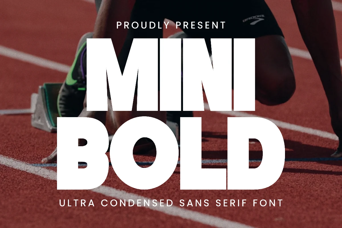
Best For: posters, logos, branding, T-shirts
Mini Bold Font is built from tall ultra-condensed sans serif capitals with heavy strokes, tight curves, and a strong upright stance that feels athletic right away. It gives Bold fonts a sharper, high-pressure look, with a narrow silhouette that keeps every word compact while still reading loud and clear.
That slim structure is especially useful when you need maximum impact in limited space. Longer words stay controlled in stacked headlines, poster layouts, and apparel graphics, while the dense vertical rhythm keeps the composition firm. Open the tracking slightly and pair it with a calmer secondary face so the weight stays crisp.
Pro Bold Font
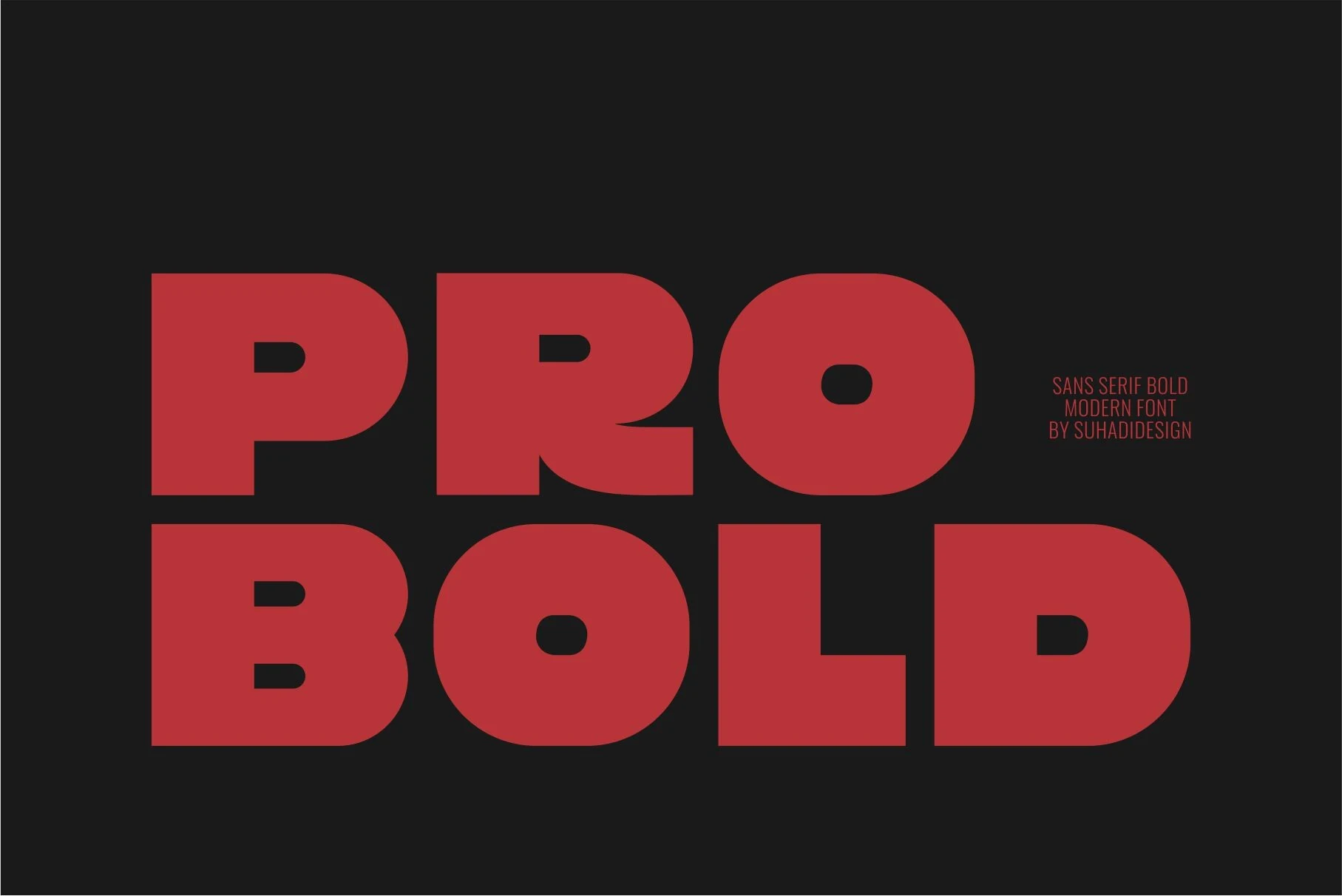
Best For: logos, branding, packaging, posters
Pro Bold Font leans on oversized geometric sans serif forms, compact counters, and broad rounded corners that make each word feel immediate and solid. Its thick monoline build gives Bold fonts a clean industrial confidence, while the smooth curves keep the weight looking polished rather than harsh.
It performs best in short headlines, labels, and front-facing branding where the heavy shapes can anchor the layout fast. Give it generous margins and avoid crowding the lines; the wide letters already carry plenty of mass, so a little breathing room keeps logos, packaging, and poster text crisp.
Rough Bold Font
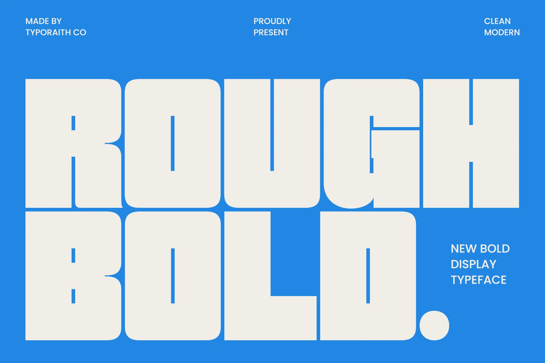
Best For: posters, headlines, branding, packaging
Rough Bold Font is built from oversized geometric letters with rounded outer corners, compact counters, and a broad blocky stance that feels immediate on the page. It brings a graphic edge to Bold fonts, giving short words a strong, modern silhouette without relying on decorative extras.
Its practical strength is how quickly it fills space in stacked lines and display layouts. Use it for posters, packaging, or big headers where generous margins help the heavy shapes stay crisp, then pair it with a simpler secondary face so the chunky rhythm remains the focus.
Bold Marker Font
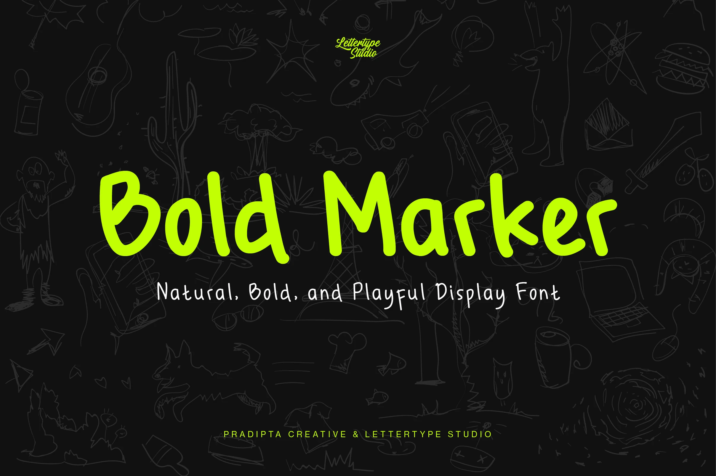
Best For: headlines, branding, packaging, playful designs
Bold Marker Font has a loose handwritten structure with thick rounded strokes, uneven curves, and a lively marker rhythm that keeps the lettering casual rather than polished. It brings a playful edge to Bold fonts, especially in the big looping capitals and slightly bouncy baseline that make words feel immediate and friendly.
It works best when you lean into short phrases and let the natural movement do the styling. For packaging, invitations, or display headlines, keep the copy brief and pair it with a clean supporting face so the informal shapes stay readable and the handwritten energy does not overpower the layout.
Moule Bold Font
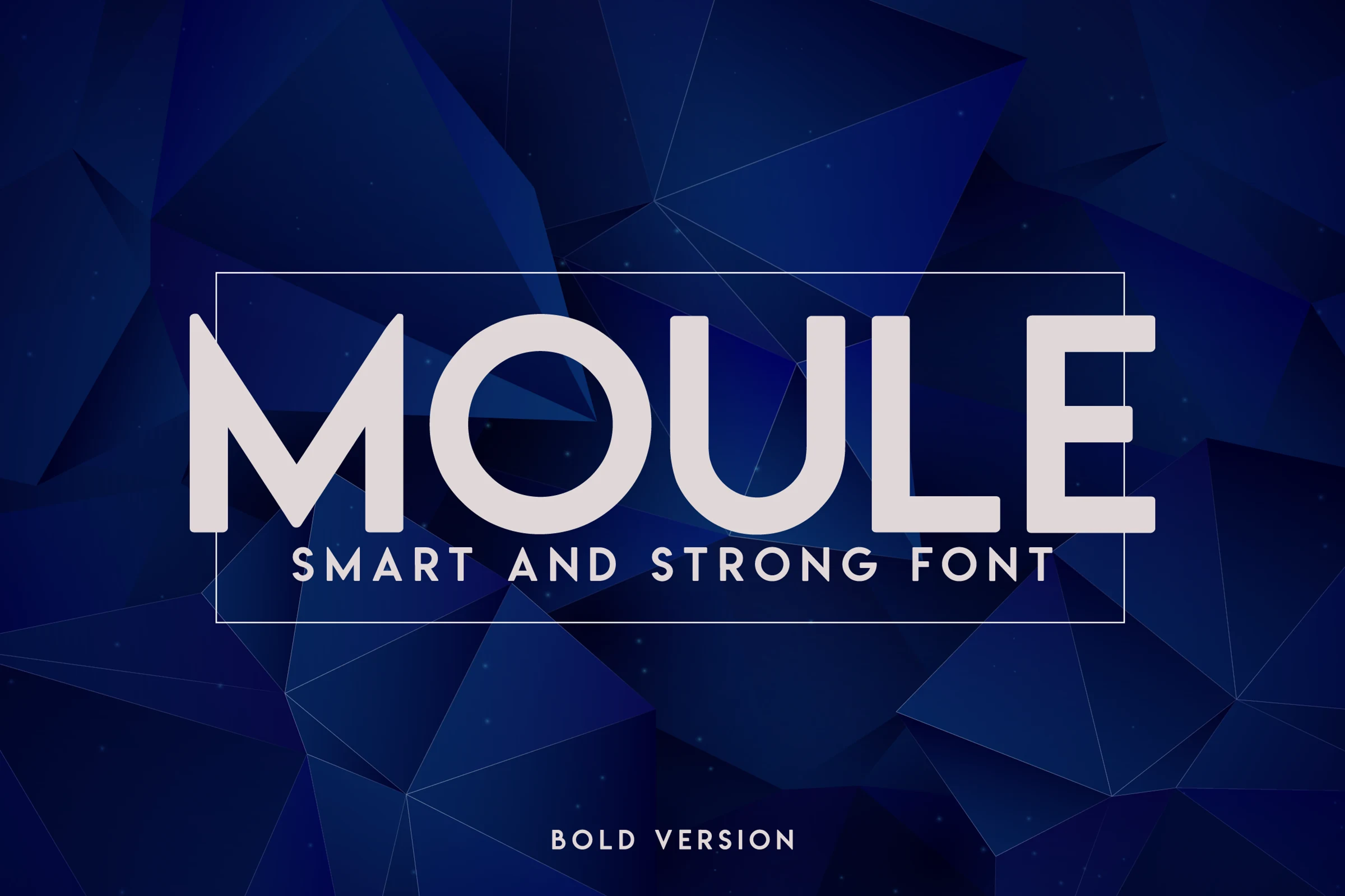
Best For: logos, branding, website headers, headlines
Moule Bold Font builds its strength through oversized geometric caps, a wide stance, and rounded inner cuts that keep the heavy forms from feeling blunt. The circular O and squared E give it a technical, confident rhythm rather than a hand-drawn or decorative mood.
Within Bold fonts, this one fits the clean architectural side of display typography. Use it where the title needs to look stable and engineered; tight tracking works on short words, while longer headlines need extra spacing so the broad stems and deep counters stay clear.
Bold Display Font
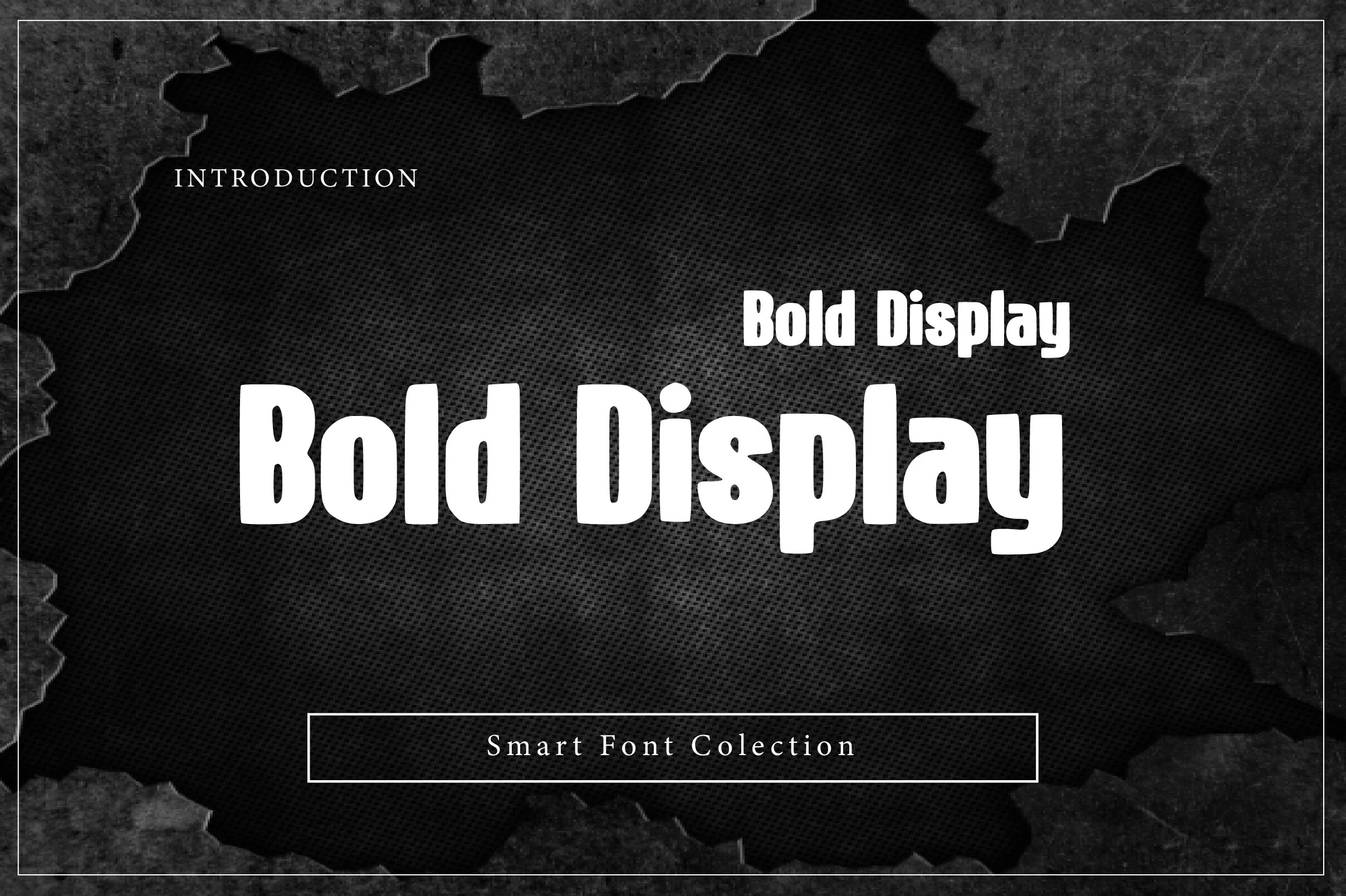
Best For: headlines, posters, display text, short phrases
Bold Display Font is built for instant impact, with chunky vertical strokes, soft rounded corners, and compact counters that make every word feel dense and commanding. Even with its heavy weight, the shapes stay friendly rather than harsh, giving the lettering a modern poster feel instead of a rigid industrial one.
In Bold fonts, this one stands out when you keep the wording tight and let the scale do the work. It handles short headlines especially well; add a little tracking or extra line spacing in stacked titles so the thick forms keep their punch without turning into one solid block.
Bold Retro Font
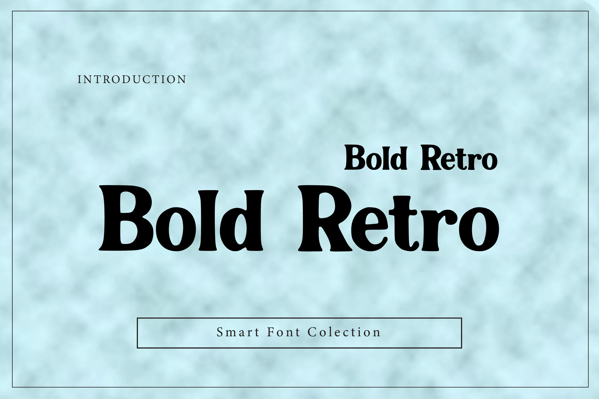
Best For: logos, posters, headlines, retro designs
Bold Retro Font has a full, weighty serif structure with rounded bowls, thick stems, and soft flared terminals that give it a distinctly vintage voice. The compact counters and slightly playful proportions make short words feel solid and expressive rather than stiff.
If you want bold fonts with a nostalgic pull, this one works best when you keep the message short and let the shapes carry the personality. It holds up especially well in titles and logo concepts, and a bit of extra spacing can help the dense letterforms stay clear at larger sizes.
Bold Thick Font
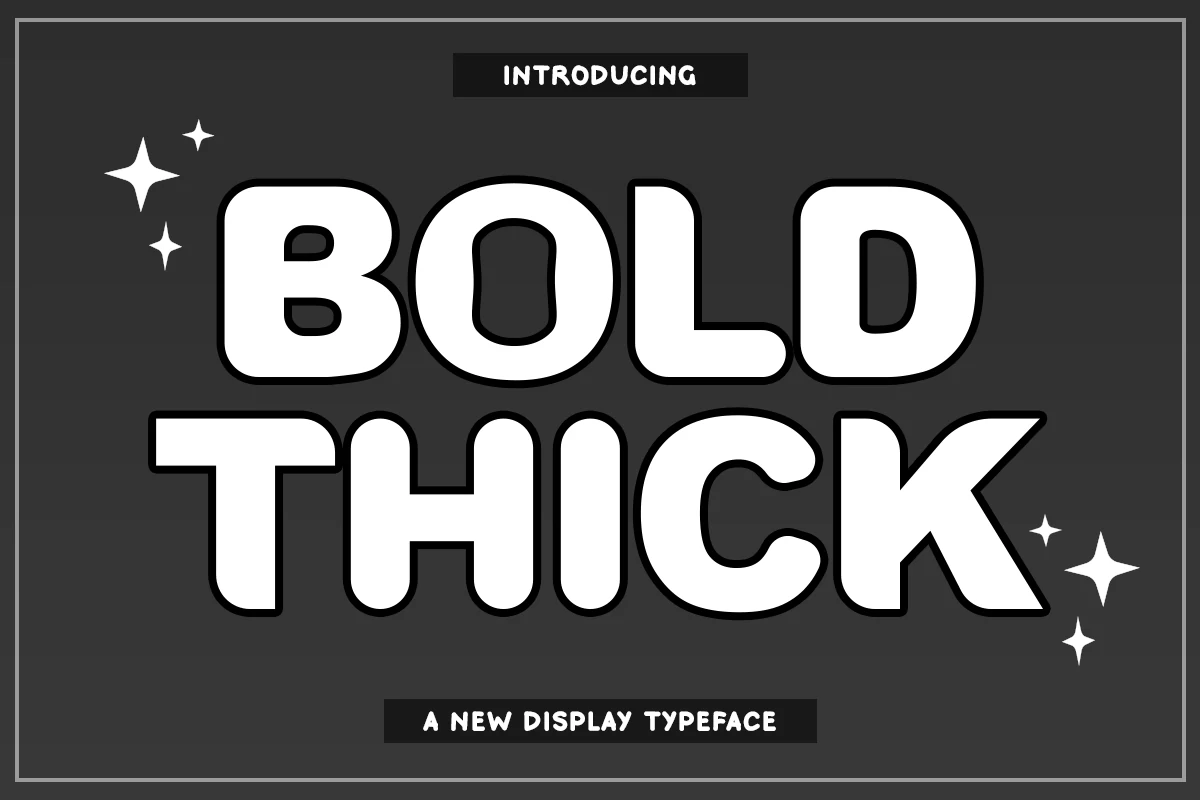
Best For: headlines, posters, logos, display text
Bold Thick Font uses inflated block shapes, rounded corners, and heavy outlines to create a loud display style with a cartoon-like punch. The wide bowls, compact counters, and soft terminals make the letters feel massive without becoming sharp or aggressive.
For Bold fonts that need a high-impact title voice, this one is strongest in short stacked words, poster headers, and logo marks. Keep contrast high and avoid tight line spacing; the thick strokes and black outline need enough separation to stay clean instead of merging into a dense shape.
Delvon Bold Font
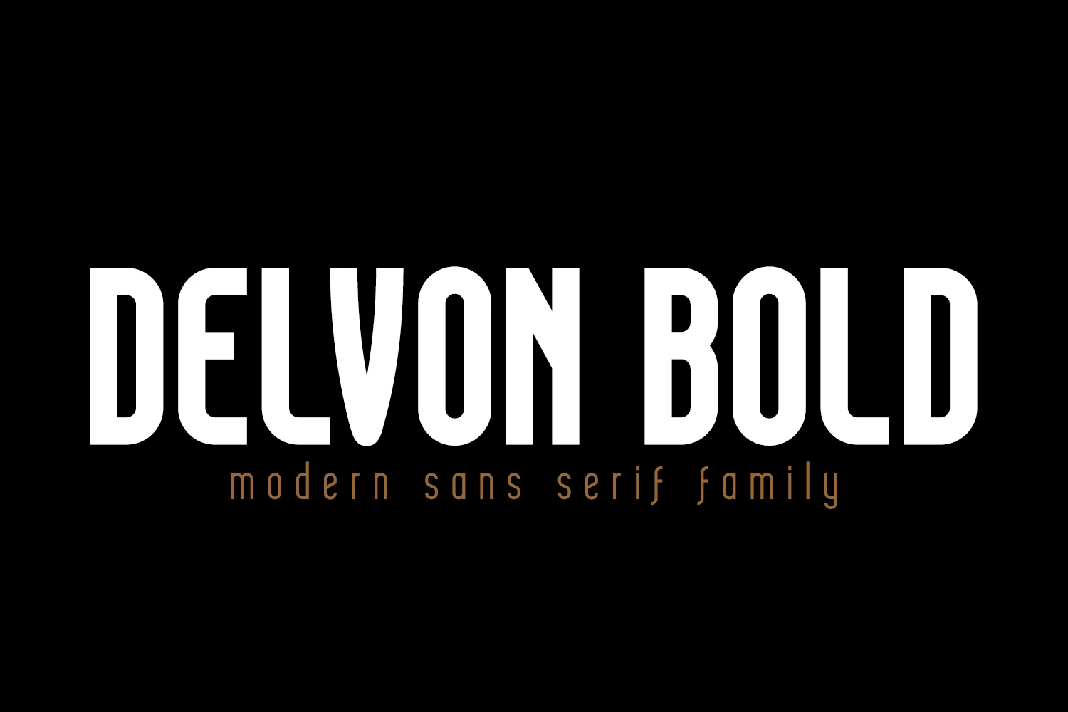
Best For: logos, branding, website headers, headlines
Delvon Bold Font has a tall condensed build with smooth monoline strokes, rounded corners, and generous vertical reach that gives it a sleek architectural feel. The narrow proportions keep big words compact, while the clean counters stop the heavy weight from looking crowded.
If you want Bold fonts that feel modern rather than loud, this one works especially well for logos, mastheads, and sharp headline systems. Its width helps fit more characters into tighter spaces, but a bit of tracking keeps long titles from feeling too compressed.
Bold Addict Font
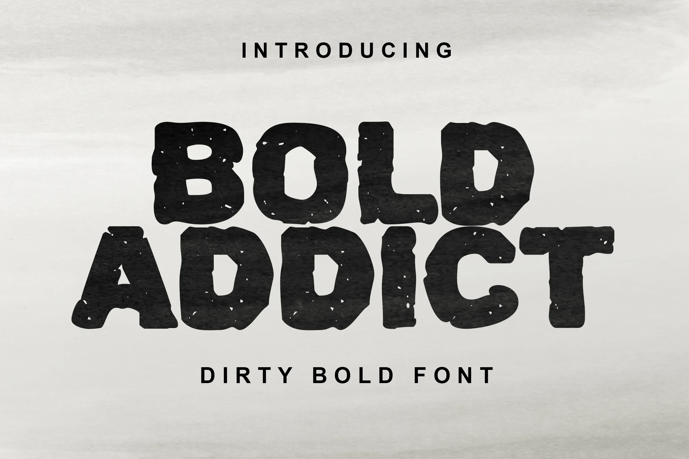
Best For: posters, headlines, merch design, T-shirts
Bold Addict Font has a heavy all-caps build with blunt corners, uneven edges, and a worn speckled texture that gives it a gritty screen-printed feel. The broad shapes stay readable, but the distressed surface keeps it from looking clean or corporate.
Across Bold fonts, this one leans clearly toward raw display work rather than polished branding. It performs best in short, forceful lines where the rough texture can stay visible, and it helps to pair it with simpler supporting text so the distressed letterforms keep their punch.
Bold Kids Font
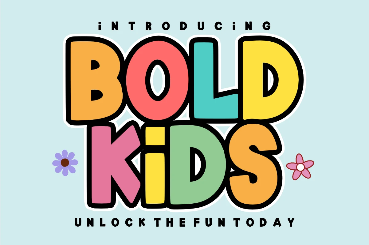
Best For: children’s designs, fun designs, stickers, posters
Bold Kids Font uses chunky hand-drawn letters, rounded corners, and a slight wobble in the shapes to create a cheerful, high-energy look. The bubble-like forms and thick outline keep every word loud and easy to read, giving Bold fonts a playful personality instead of a heavy feel.
It works best when you keep the wording short and let the scale carry the fun. The compact build makes it great for kid-focused titles, sticker text, and lively poster headings, while a plain supporting sans helps the colorful letterforms stay front and center.
Extra Bold Font
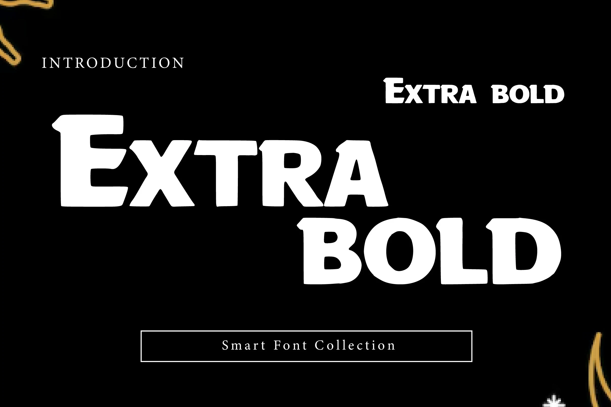
Best For: headlines, posters, logos, packaging
Extra Bold Font leans on broad slab-like forms, thick strokes, and slightly chiseled corners that give the letters a sturdy, poster-ready voice. The counters stay open enough to hold readability at scale, while the compact proportions make short titles feel dense and emphatic.
For Bold fonts that need instant impact, this one works best in short headlines, logos, or packaging where the weight can do the talking. Give it a bit of line spacing and pair it with a quieter sans for secondary copy, so the blocky silhouette stays crisp instead of turning visually heavy.
Ink Bold Font
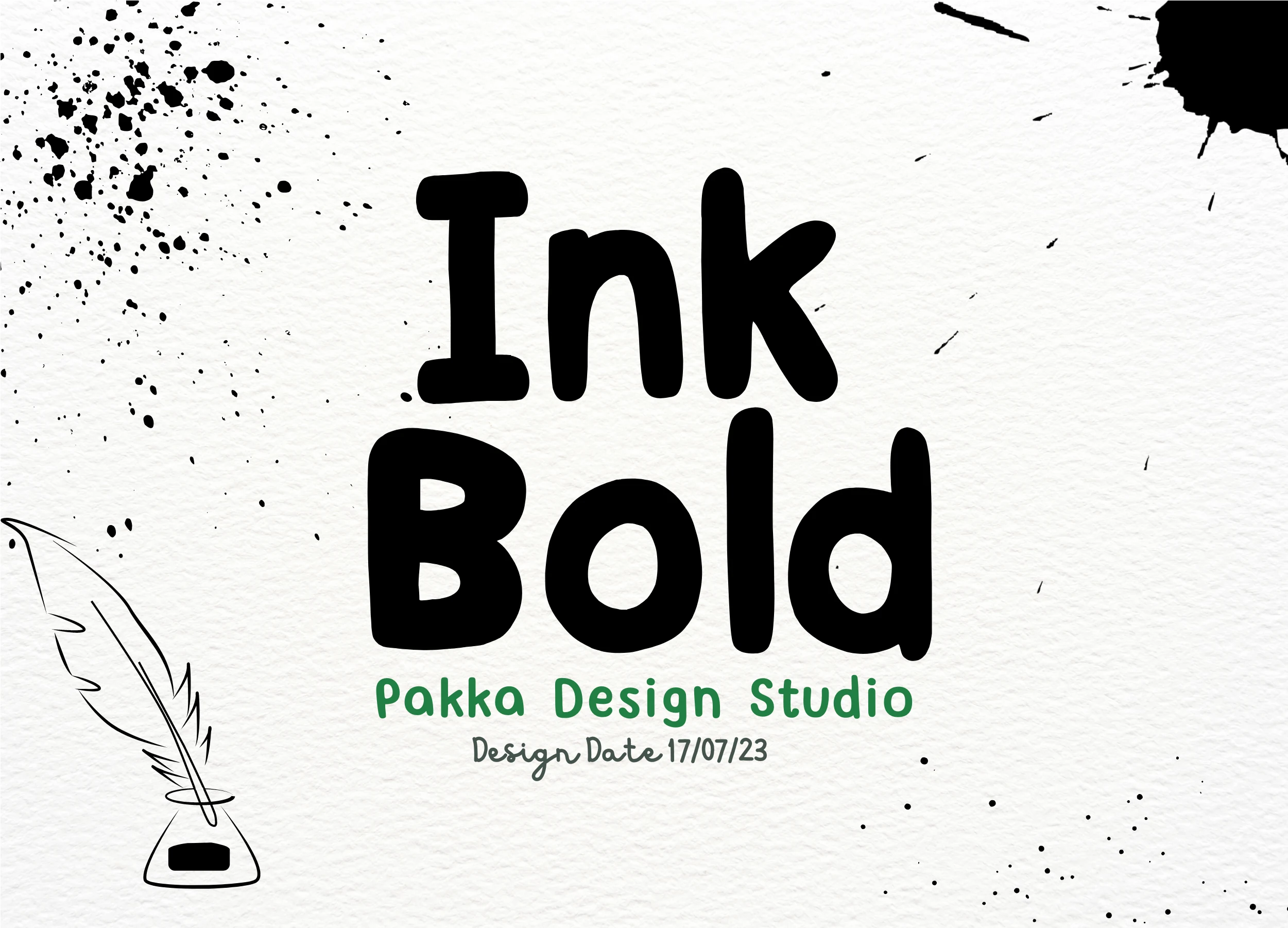
Best For: quotes, stickers, handmade designs, casual designs
Ink Bold Font has a soft handwritten feel built from thick rounded strokes, simple bowls, and slightly uneven proportions that keep it friendly rather than formal. The shapes are clean and easy to read, but the loose rhythm gives short words a personal, note-like character.
Among Bold fonts, this one works best when you want warmth and approachability instead of a rigid headline style. It suits quote graphics, labels, and casual branding especially well, and a little extra spacing helps the chunky letterforms keep their relaxed rhythm in longer words.
Bold Script Font
Best For: logos, branding, social media graphics, retro designs
Bold Script Font has thick looping strokes, oversized curves, and a soft connected rhythm that gives it a clear 70s display feel. The rounded swashes and cushioned shapes make each letter feel full and friendly, while the broad silhouette keeps short words highly visible.
It brings a more playful side to Bold fonts, especially for logos, branding, and headline graphics that need a vintage pulse. Let it lead with short words and generous scale, then pair it with a plain sans or compact caps so the heavy curves stay crisp instead of overpowering the layout.
Hey Bold Font
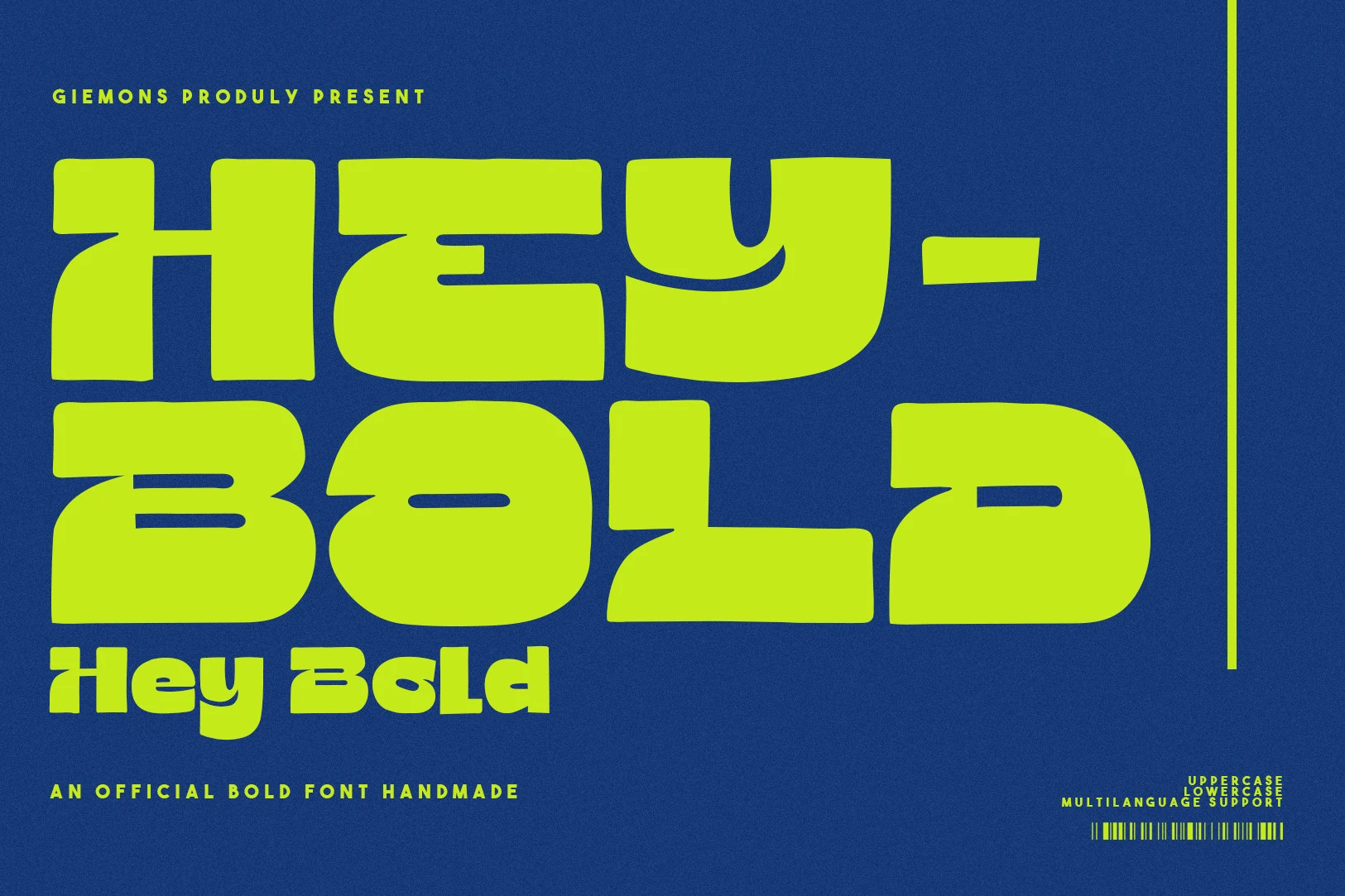
Best For: headlines, posters, social media graphics, bold designs
Hey Bold Font uses oversized geometric forms, squared curves, and thick rounded terminals to create a loud, poster-ready silhouette. Its compressed width and unusual cut-ins give the letters a futuristic rhythm, while the smooth heavy strokes keep the overall look clean instead of cluttered.
If you want Bold fonts with real presence, this one works best for short headlines, posters, and punchy social graphics. The broad shapes hold attention fast, but they look strongest when you leave generous negative space around them and use a plain supporting sans to keep the hierarchy sharp.
Bad Bold Grunge Font
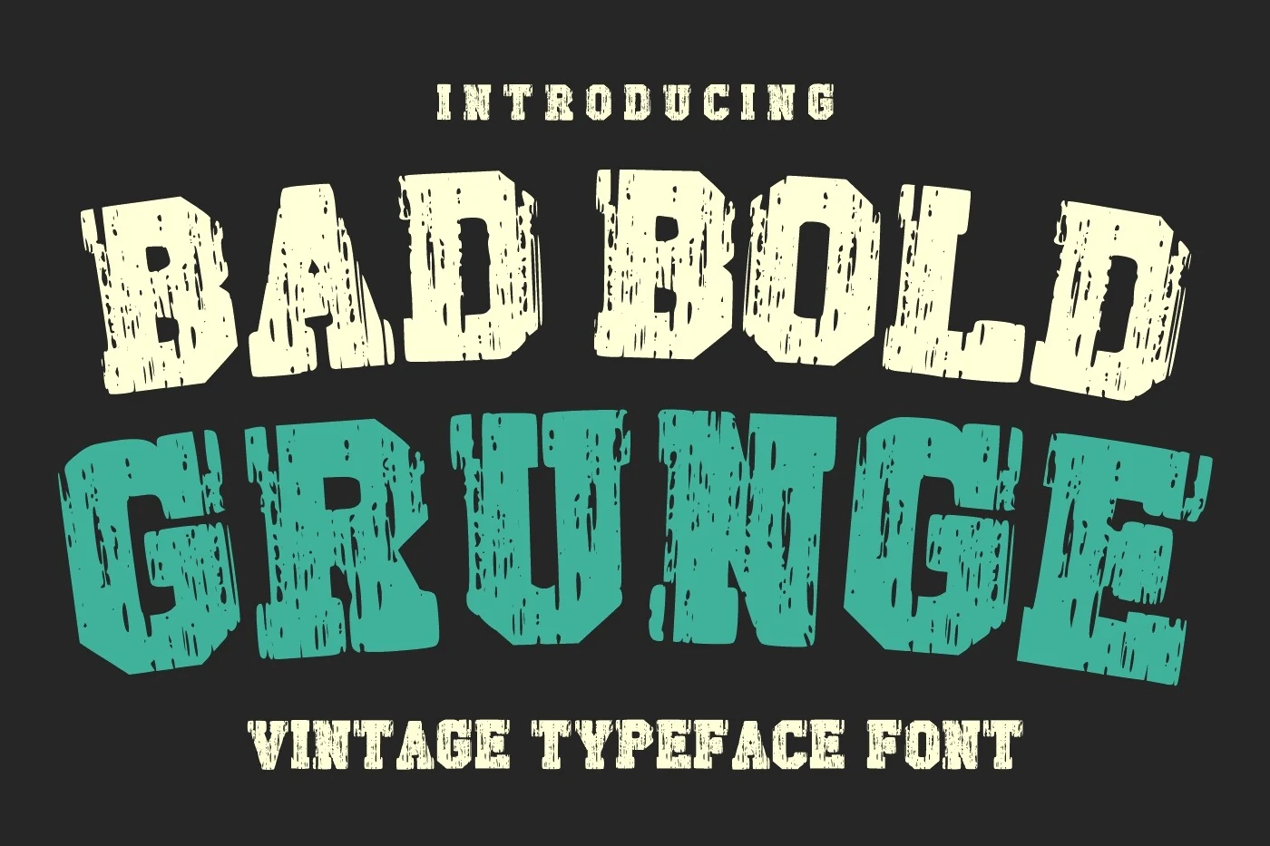
Best For: posters, merch design, T-shirts, vintage designs
Bad Bold Grunge Font has the rough authority of old poster type, with chunky all-caps letters, squared slab-like serifs, and worn vertical texture cut through each stroke. The slightly uneven angles and battered edges give the words a lived-in western feel rather than a clean studio finish.
For Bold fonts with a vintage edge, this one works best when you let the texture stay visible. It shines in short headlines, apparel graphics, and poster layouts where the distressed surface adds character, so keep supporting text simpler and avoid shrinking it too far.
Mirage Bold Font
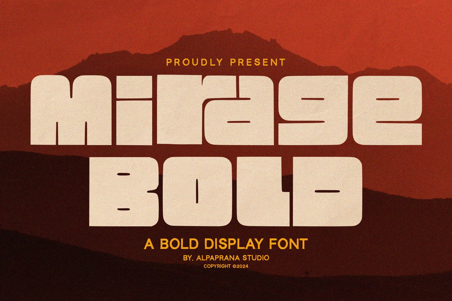
Best For: logos, posters, packaging, T-shirts
Mirage Bold Font has a compact super-heavy build with rounded corners, wide bowls, and low horizontal cuts that give the letterforms a futuristic retro feel. The blocky proportions make each word look dense and commanding, while the smooth edges keep the weight from turning harsh.
For Bold fonts that need instant presence, it works especially well in logos, posters, and apparel graphics where short words can fill the space cleanly. Keep the wording tight and let the oversized shapes lead, then pair it with lighter supporting text so the chunky silhouette stays crisp.
Kageb Bold Font
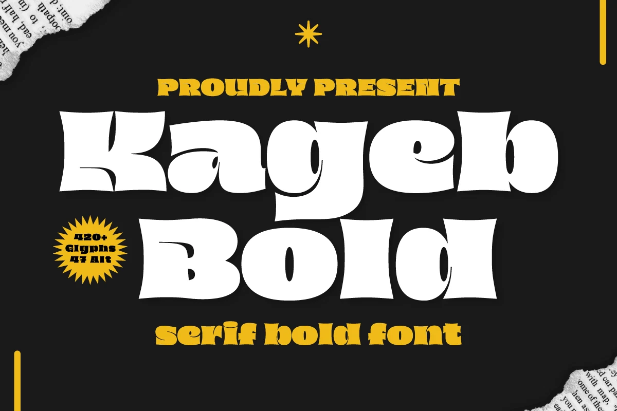
Best For: logos, headlines, posters, retro designs
Kageb Bold Font has a dramatic retro serif look, with thick stems, flared pointed serifs, and curved inner cuts that make each letter feel animated and full of swagger. The wide proportions and chunky weight give short words a big poster presence, while the quirky shapes keep the texture lively instead of rigid.
For Bold fonts that need instant personality, this one is strongest in headings, logos, and statement lines where the silhouette can stay visible. Let it take the top spot in the hierarchy, and give it enough spacing around the wordmark so those exaggerated serifs and deep counters do not crowd each other.
Andaroo Bold Font
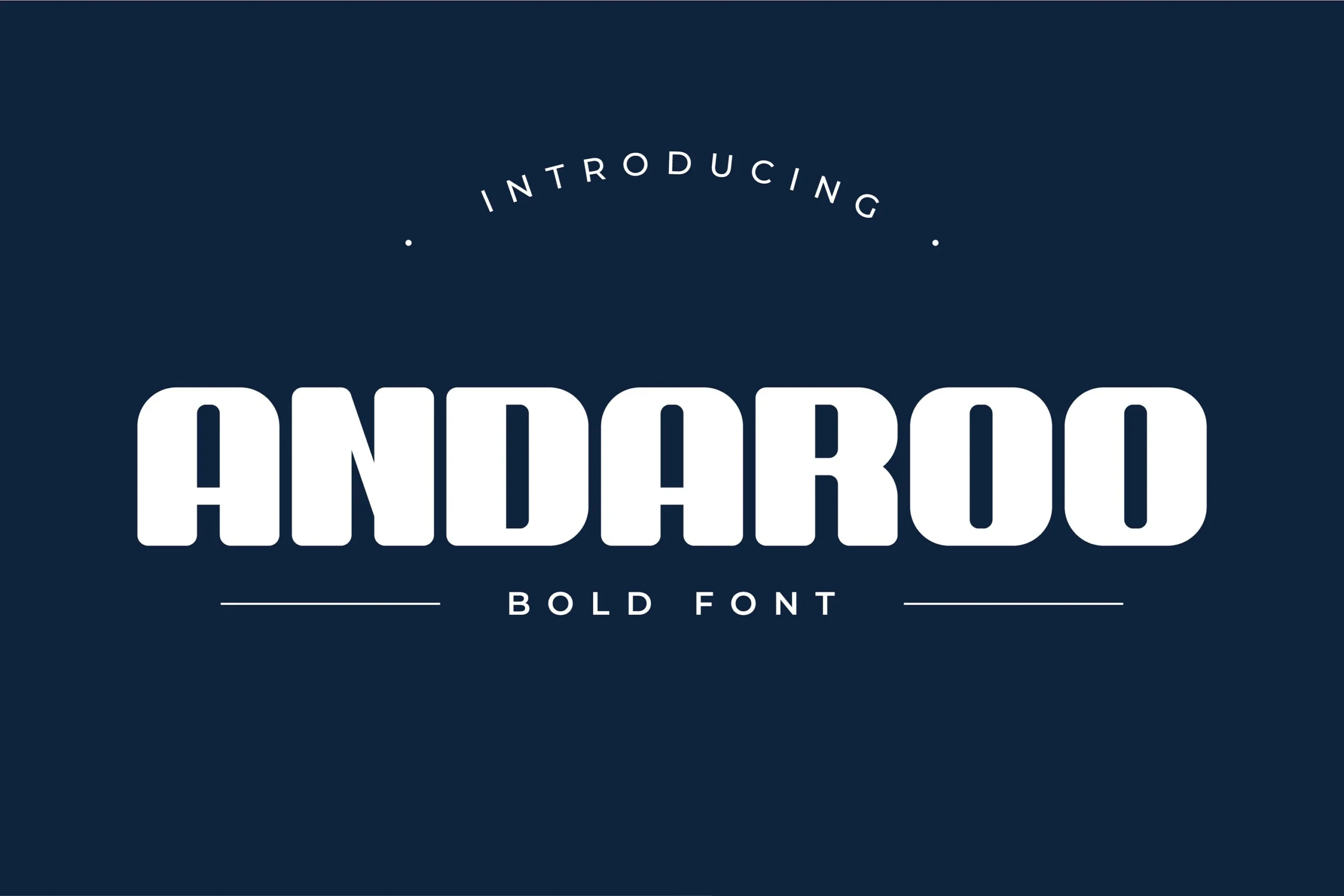
Best For: logos, branding, website headers, headlines
Andaroo Bold Font uses thick monoline strokes, rounded corners, and tall compact proportions to create a clean display look with a calm, confident weight. The softened terminals keep the heavy letterforms approachable, while the even rhythm helps large words read as one solid modern unit.
For Bold fonts that need structure without looking harsh, this one suits logos, mastheads, and website headers especially well. It handles short titles best; add a touch of tracking in longer lines so the chunky shapes keep their spacing and the rounded forms do not start to crowd.
Bold Numez Font
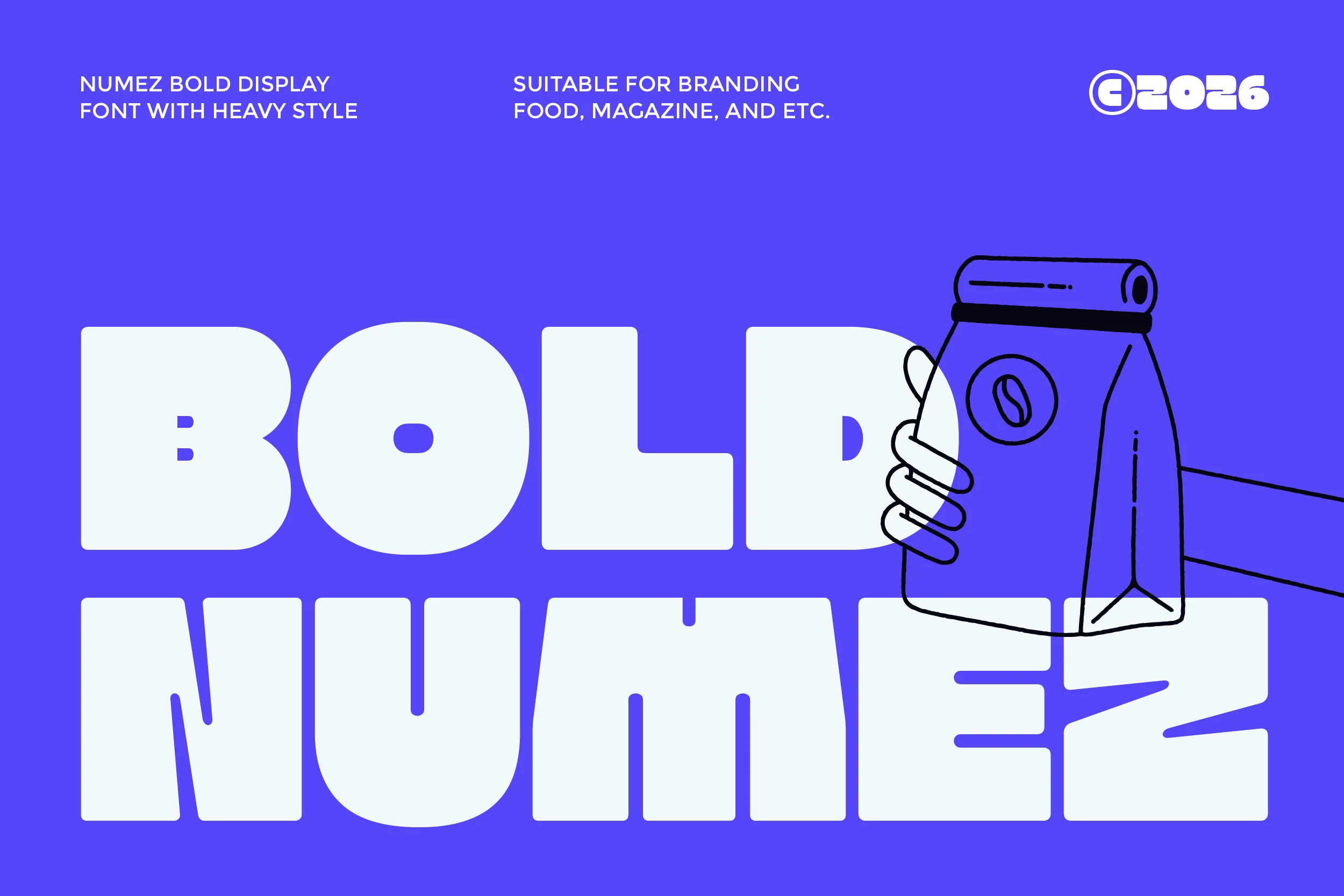
Best For: logos, packaging, headlines, bold designs
Bold Numez Font is built from dense, rounded block letters with very low contrast and a compressed display rhythm. The large counters and squared interior cuts keep the forms readable while the heavy weight gives the word shape a strong, poster-like mass.
Use it where Bold fonts need to act as the main visual object rather than quiet supporting text. Its tight proportions suit short names, packaging titles, and food or magazine branding; add contrast with lighter secondary type and avoid long lines that would turn the solid shapes into a slab of texture.
Ink Punk Outlined Bold Font
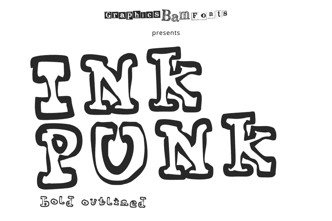
Best For: posters, stickers, headlines, fun designs
Ink Punk Outlined Bold Font has a scruffy, hand-drawn display look built from thick black outlines, uneven curves, and chunky serif-like shapes. The hollow interiors keep the letters from feeling too dense, while the irregular edges give the wordmark a loose, offbeat rhythm that feels more playful than polished.
For Bold fonts with a more rebellious personality, this one works best in short, high-impact lines where the outline can stay crisp. Use it on simple backgrounds, let the letter spacing breathe a little, and pair it with a plain supporting sans so the funky texture does not compete with the rest of the layout.
Bold Eater Font
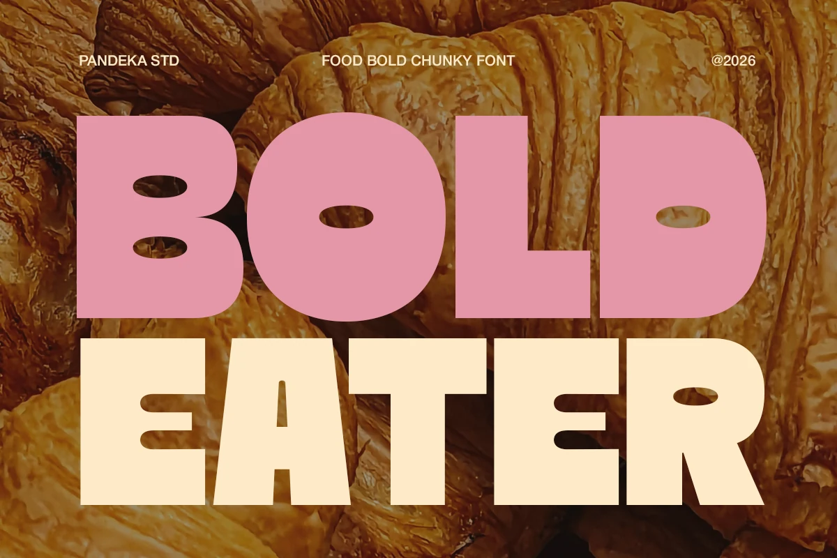
Best For: packaging, product labels, restaurant menus, posters
Bold Eater Font uses thick, blocky letterforms with soft rounded corners and wide oval counters that make each word feel hearty and approachable. The low contrast and compact structure give it a solid, edible presence, which suits food branding especially well without losing readability at a glance.
If you are browsing Bold fonts for packaging or menu headlines, this one has the right mix of friendliness and weight. Keep it on short lines where the chunky shapes stay punchy, and pair it with a simpler secondary face so prices, flavors, or supporting copy do not compete with its warm texture.
A good bold font is not just thick. It needs clear shapes, solid spacing, and enough character to fit the job.
Use cleaner bold fonts for logos and websites, textured or retro styles for posters and merch, and softer playful fonts for casual or kid-focused designs. Keep the text short, avoid cramped spacing, and let the font carry the main visual impact.