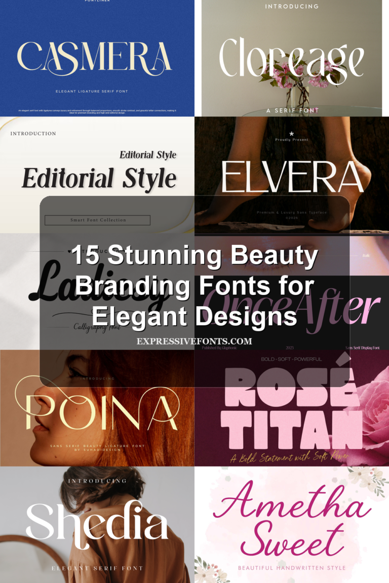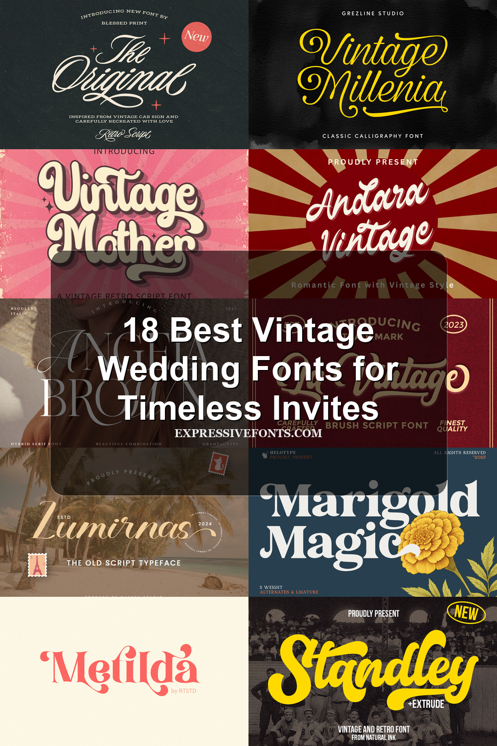
18 Best Vintage Wedding Fonts for Timeless Invites
Vintage Wedding Fonts are ideal for designers building romantic invitations, save-the-dates, monograms, logos, and stationery with old-world charm. This collection focuses on scripts, serif styles, and decorative display fonts that bring nostalgic character without losing readability.
Looking for more wedding fonts? Browse our complete Wedding Fonts collection to compare elegant, romantic, modern, vintage, boho, script, and calligraphy styles.
Elegant Script Vintage Wedding Fonts
These refined script fonts use long swashes, smooth slants, and formal curves for invitation names, ceremony titles, monograms, and romantic wedding branding.
Southwestern Font
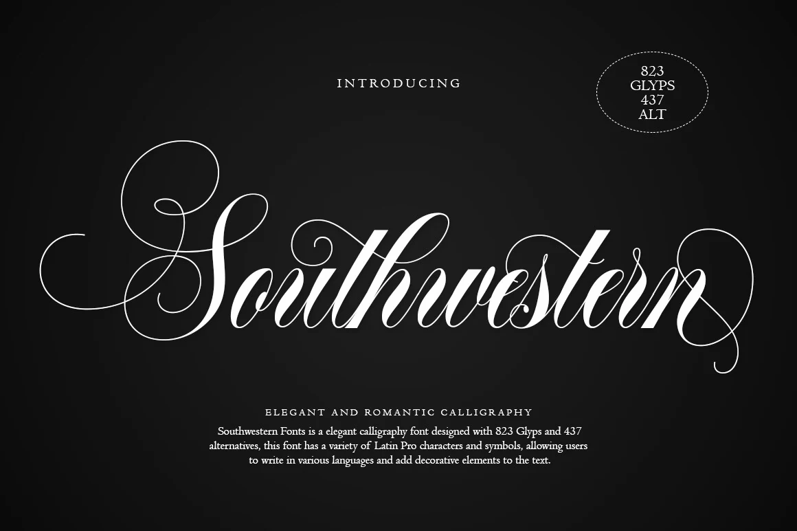
Best For: wedding designs, invitations, logos, vintage designs
Southwestern Font has the drama expected from Vintage Wedding Fonts: steep slant, sharp thick-to-thin contrast, and oversized entry and exit swashes that turn a single word into a formal centerpiece. The uppercase forms are especially ornamental, so the font works best when the title is short and the surrounding type stays restrained.
Its 823 glyphs and 437 alternatives give designers room to adjust capitals, terminals, and decorative endings instead of repeating the same flourish across every name or heading. Use the alternates selectively; the loops are elegant, but too many in one layout can crowd the spacing and weaken the hierarchy.
Swashiqa Font
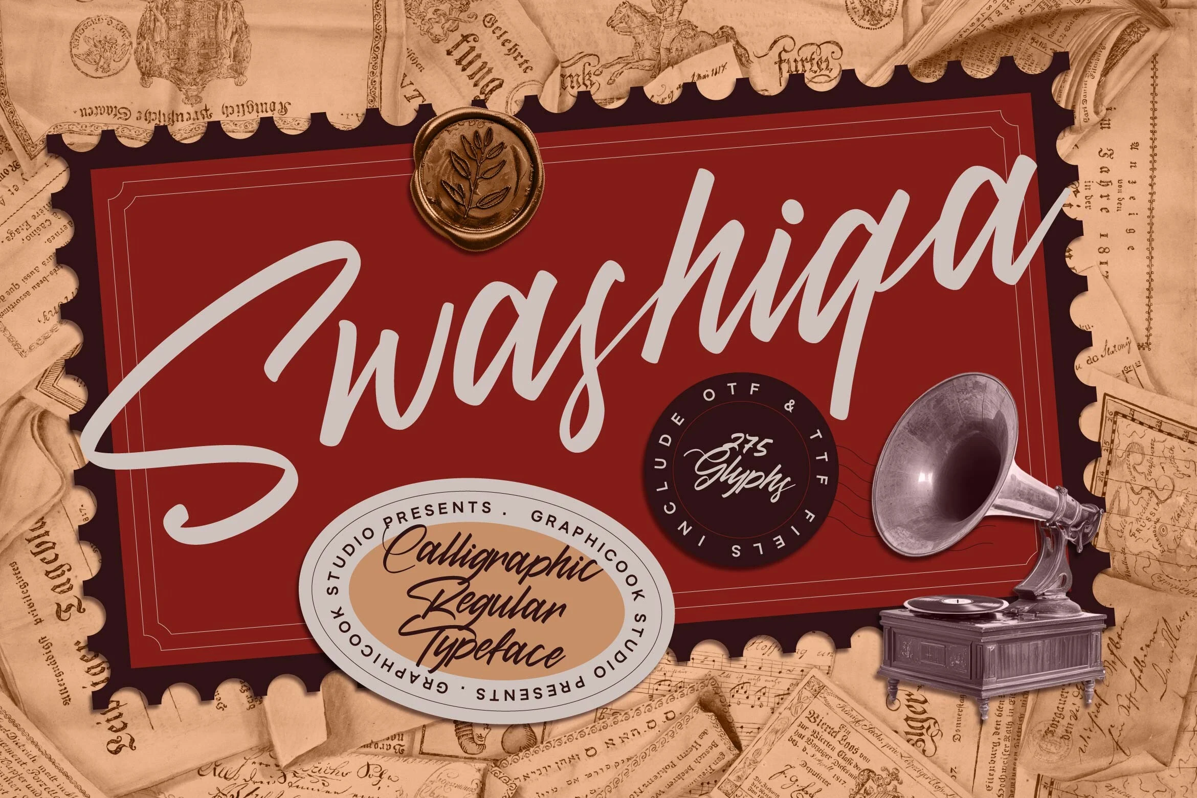
Best For: wedding designs, invitations, logos, vintage designs
Swashiqa Font leans into Vintage Wedding Fonts with a long sweeping capital S, a forward slant, and smooth connected strokes that give it a graceful but confident rhythm. It reads cleanly for a display script, while the tall ascenders and broad opening stroke make the strongest impact in names, headers, and other short lines.
The overall feel is classic and artistic rather than overly delicate, so it can carry both romance and vintage character in the same layout. Pair it with a restrained serif or small caps subtitle, and leave generous side margins so the opening swash and final tail do not press against frames, badges, or decorative borders.
Lumirnas Font
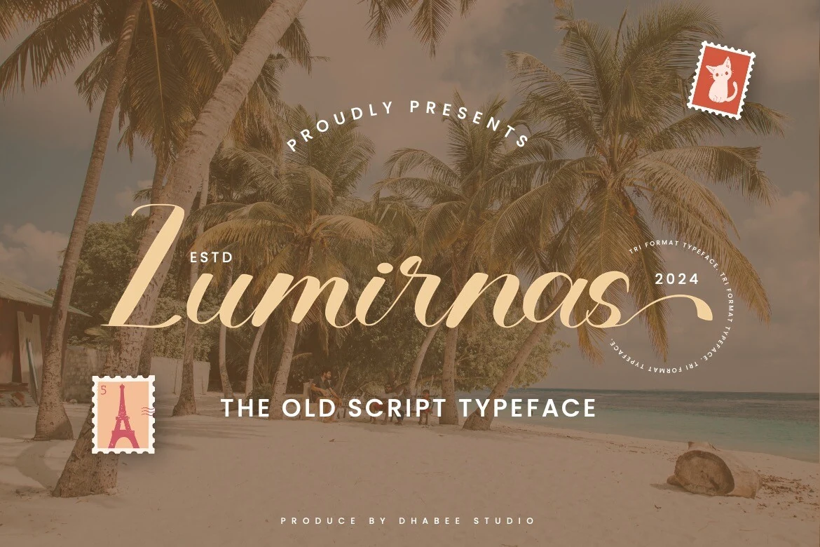
Best For: wedding designs, invitations, vintage designs, luxury designs
Lumirnas Font has the airy slant and smooth, tapering curves that make Vintage Wedding Fonts feel graceful without becoming fussy. The capitals open with generous movement, and the long finishing stroke gives short names or titles a polished focal point that suits invitations and branding especially well.
Its vintage flair leans refined rather than rustic, so it works best when the surrounding layout stays calm and well spaced. Use it at display size, let the swashes clear nearby borders, and pair it with a quiet serif or sans for details so the script keeps its elegant rhythm and readable flow.
Vintage Millenia Font
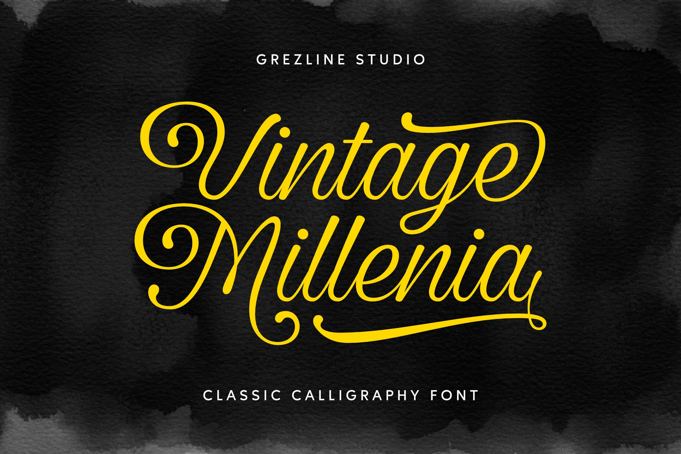
Best For: wedding designs, invitations, luxury designs, vintage designs
Vintage Millenia Font gives Vintage Wedding Fonts a confident calligraphic feel, with smooth rounded strokes, curled capitals, and long sweeping swashes that naturally frame a headline. The script looks elegant without becoming too delicate, so names and short titles keep their presence even with ornamental details.
Its strongest use is in display settings, where the extended terminals and baseline flourishes have room to breathe. Keep wording short, leave extra space above and below the line, and pair it with a restrained serif or spaced small caps for supporting text so the script remains the focal point.
Bold Retro Script Vintage Wedding Fonts
These heavier retro scripts bring rounded strokes, signage energy, and nostalgic charm to wedding logos, playful invitations, save-the-dates, and statement headers.
Standley Font
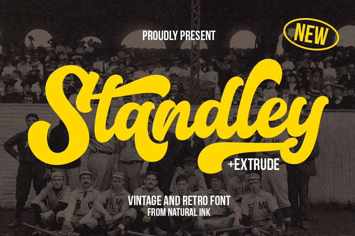
Best For: logos, invitations, wedding designs, retro designs
Standley Font brings a cheerful retro bounce to Vintage Wedding Fonts, with thick rounded strokes, smooth connections, and broad swashes that feel lifted from old signage. The heavy script stays readable, but its oversized capitals and tails look strongest in short names, headers, and statement words rather than longer lines.
Extra glyphs give you more freedom to refine letter joins and avoid repetitive shapes, while the extrude style makes it easier to build a layered shadow effect for logos or invitation titles. Pair it with a simple sans serif and leave a little breathing room around the swashes so the playful rhythm stays clear.
Vintage Mother Font
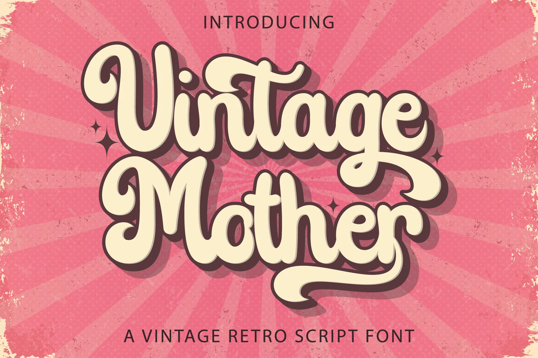
Best For: retro designs, vintage designs, logos, wedding designs
Vintage Mother Font is a chunky retro script with rounded strokes, curled terminals, and tightly stacked letterforms that create a bold poster-like rhythm. Within Vintage Wedding Fonts, it suits couples who want a playful throwback mood rather than delicate calligraphy.
The heavy weight and shadow-friendly shapes make it strong for logos, invitation headers, and stationery accents, but it needs short wording to avoid crowding. Keep contrast high, give the descenders and tails enough room, and use a plain companion font for dates, addresses, and smaller details.
Andara Vintage Font
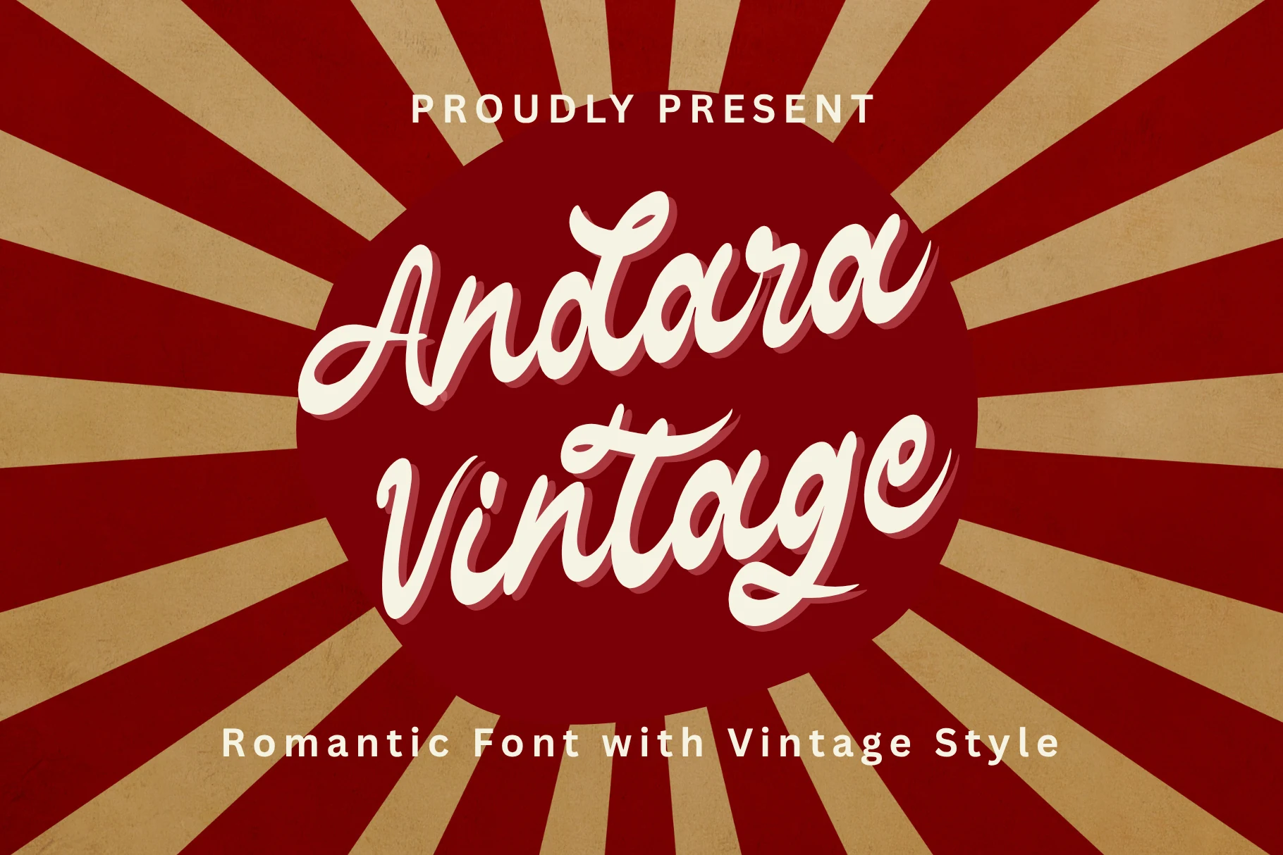
Best For: wedding designs, invitations, vintage designs, romantic designs
Andara Vintage Font has a soft retro bounce, with rounded handwritten strokes, compact curves, and a slightly slanted rhythm that feels warm rather than formal. For Vintage Wedding Fonts, it brings a relaxed romantic tone that works especially well in names, signage, and invitation headers where the connected script can stay large and readable.
The stroke weight is even and friendly, while the ligatures help awkward joins disappear so longer words look more natural. Keep the setting fairly open and avoid crowding it with ornate borders; paired with a simple serif or sans, the script keeps its vintage charm without losing hierarchy.
La Vintage Font
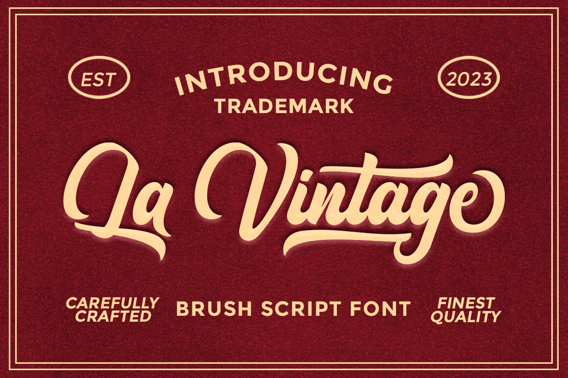
Best For: logos, wedding designs, vintage designs, artistic designs
La Vintage Font has a confident brush-script look, with thick painted strokes, rounded joins, and long swashes that give it a sign-painted retro presence. For Vintage Wedding Fonts, it feels more expressive than delicate, so it works best when you want names or titles to land as the main visual statement.
The handwritten texture is smoothed into clean display shapes, and the ligatures help the letters connect with a more natural flow. Keep the wording short and leave space around the entry and exit strokes; paired with a simple all-caps serif or sans, the script holds the spotlight without making the layout feel crowded.
The Original Script Font
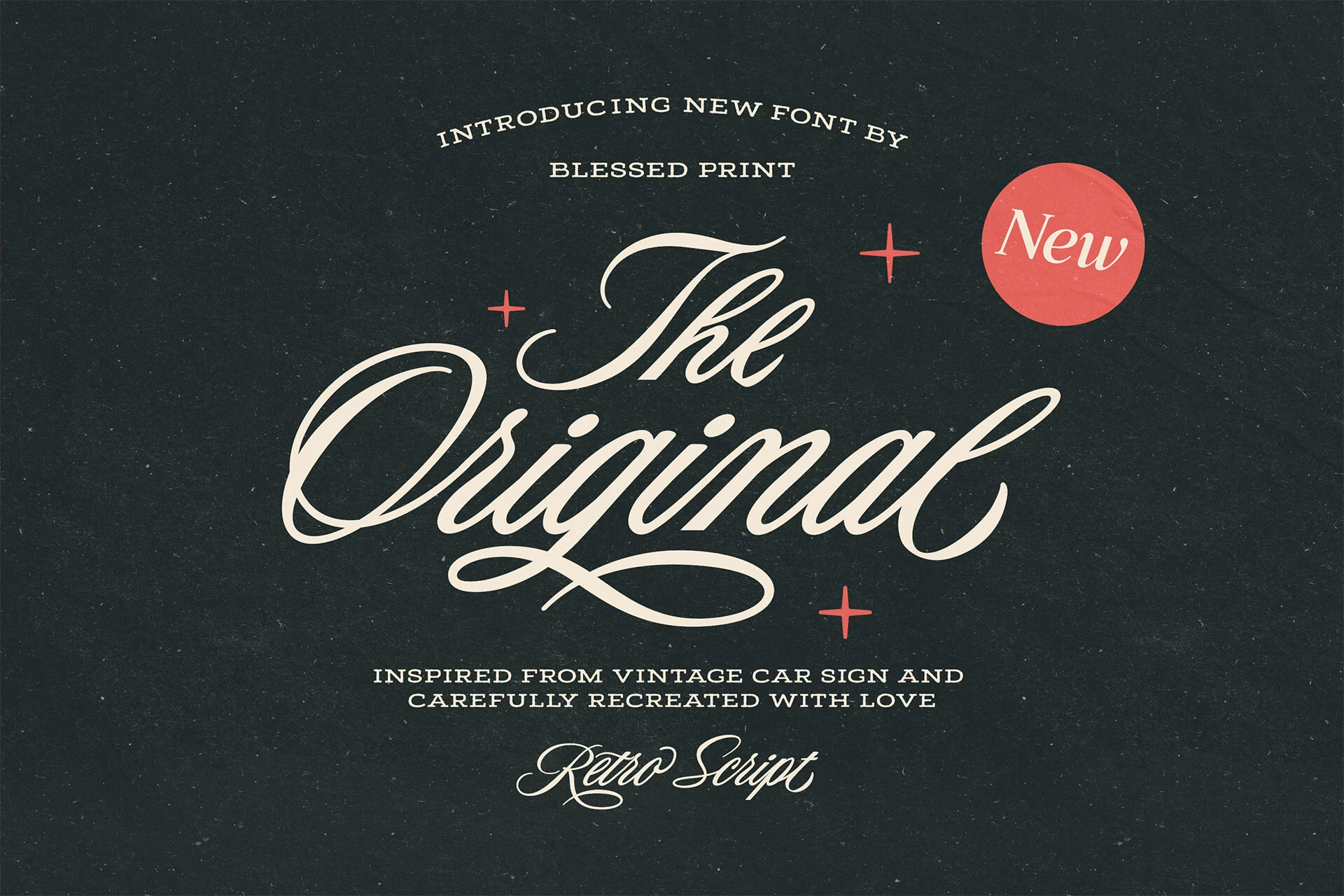
Best For: logos, packaging, invitations, wedding designs
The Original Script Font leans into classic sign-painting style, with broad entry strokes, looping capitals, and long swashes that give each word a drawn-by-hand rhythm. Its vintage car inspiration shows in the confident slant and generous flourishes, while the extra swashes make it easy to build a more custom-looking headline.
Used in Vintage Wedding Fonts, it brings a nostalgic tone that feels especially strong on names, crests, and statement headers. Let the script sit large and give the underline flourishes space to breathe, then pair it with a restrained serif or small caps line so the decorative movement stays elegant rather than crowded.
Birmingham Paradise Font
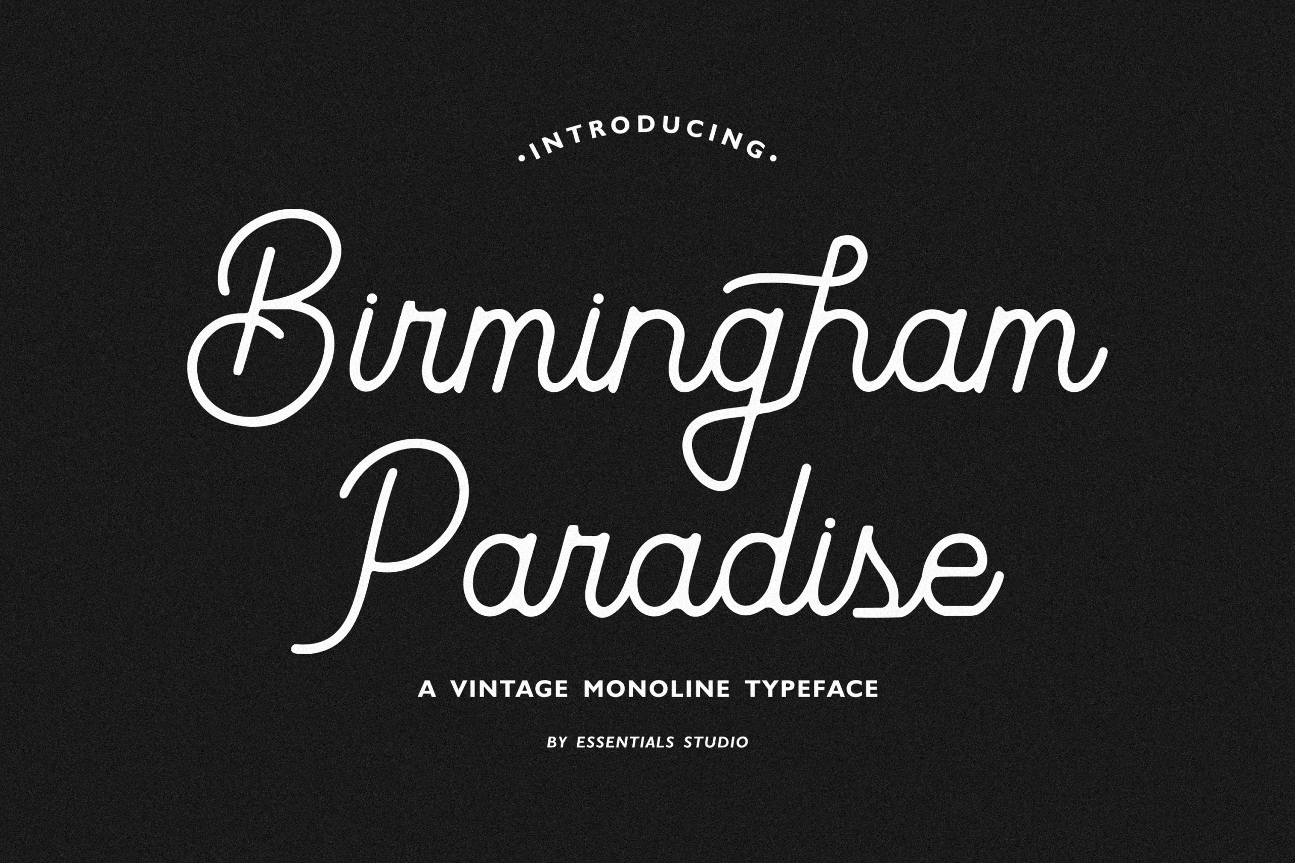
Best For: logos, invitations, wedding designs, vintage designs
Birmingham Paradise Font is a monoline script with smooth rounded joins, generous loops, and a steady stroke that keeps the lettering soft instead of fussy. It borrows from retro signage, but the cleaner construction gives it a more polished rhythm that reads well in names and short display lines.
That balance makes it a strong pick for Vintage Wedding Fonts, especially when you want a nostalgic feel without heavy ornament. Use it for invitations or headings at a comfortable size, and keep supporting text simple so the long capitals and lower loops can define the hierarchy without tangling the layout.
High-Contrast Serif Vintage Wedding Fonts
These sharp serif and serif-script fonts use thin hairlines, tall proportions, and couture contrast for luxury invitations, editorial wedding suites, and formal branding.
Besty Serif Font
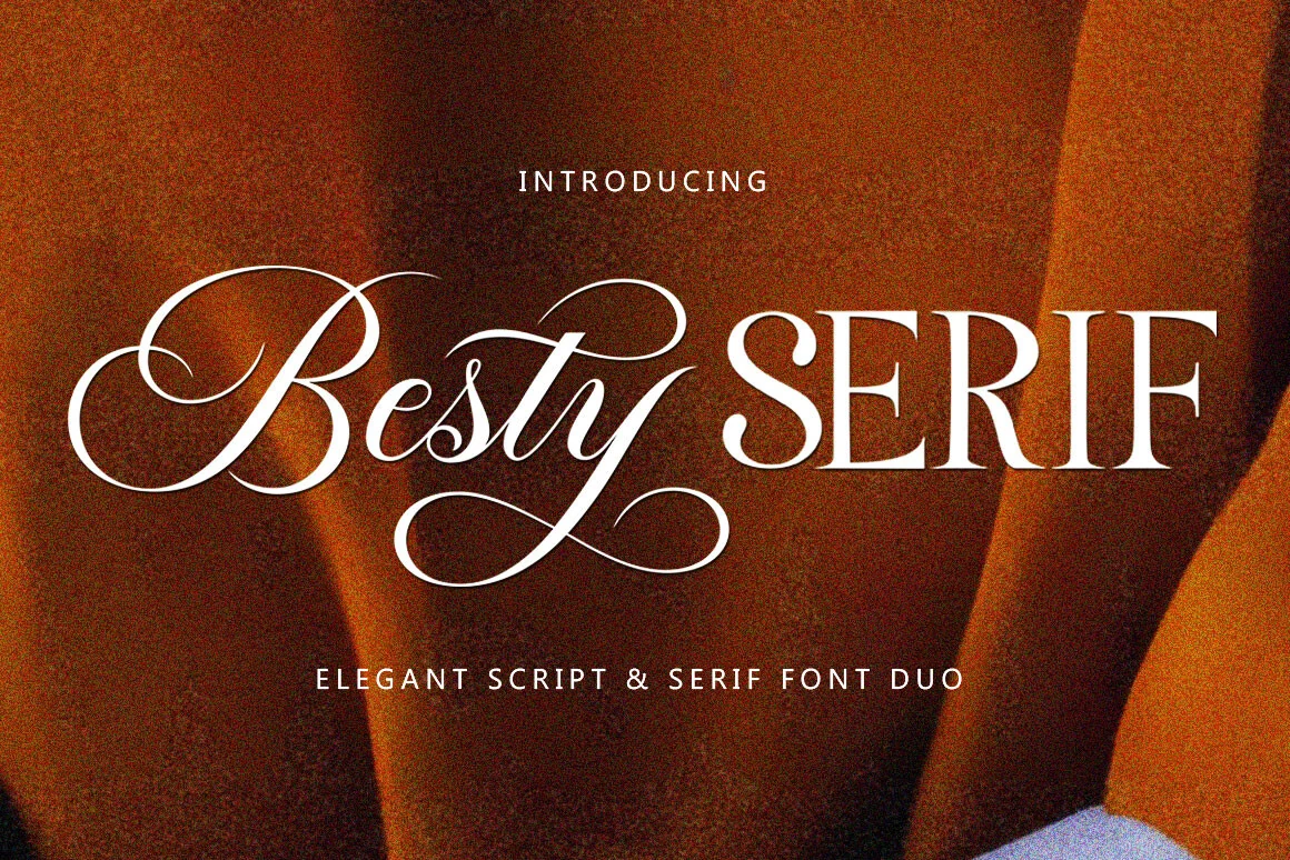
Best For: wedding designs, invitations, luxury designs, vintage designs
Besty Serif Font combines a flourishing script with a tall high-contrast serif, giving layouts a built-in title hierarchy instead of forcing one style to do everything. For Vintage Wedding Fonts, that pairing is useful: the script carries names and emotional emphasis, while the serif adds structure to dates, venues, and formal headings.
Both styles are strong enough to stand alone, but the preview shows how well they work side by side when contrast is controlled. Mixing them inside a word can create a distinctive logo treatment; keep the script swashes away from tight borders and let the serif handle longer readable text.
Angela Brown Font
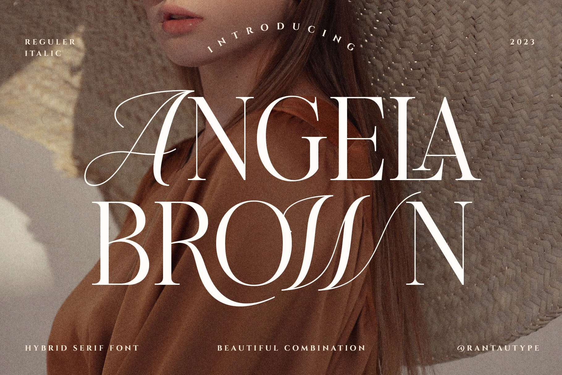
Best For: wedding designs, editorial designs, fashion branding, luxury designs
Angela Brown Font reads like a refined blend of classic calligraphy and high-contrast serif design, with razor-thin hairlines, tall proportions, and graceful swashed capitals. In Vintage Wedding Fonts, it feels especially polished: formal enough for names and titles, but still soft and romantic rather than stiff.
The serif structure keeps the larger words readable, while the calligraphic details add character where you want emphasis. It works best when you let the headline breathe with generous spacing and use a quieter companion font for supporting details, so the dramatic curves can hold the hierarchy without overcrowding the layout.
Hello Kalista Font
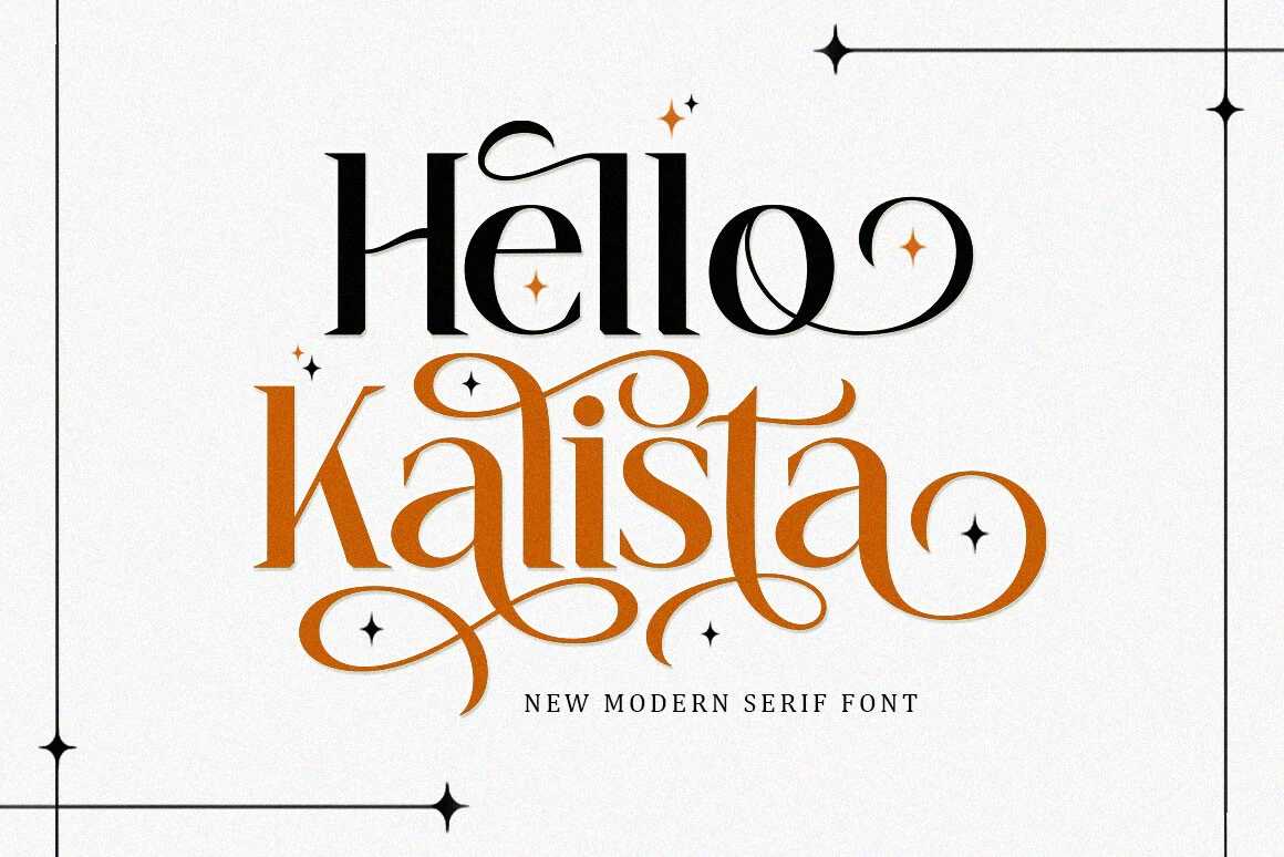
Best For: wedding designs, invitations, logos, editorial designs
Hello Kalista Font has the crisp contrast of a modern serif, but the long curling swashes and tapered terminals give it a more decorative, romantic edge. That mix feels especially right for Vintage Wedding Fonts, where formal wording benefits from a little movement instead of a rigid editorial look.
The letterforms stay clear at display size, while the flourished capitals and extended endings create a built-in focal point for names and titles. Use it for invitation headings or logo-style wordmarks, then keep the supporting text simpler so the thin hairlines and sweeping curves have enough space to read cleanly.
Tenopate Font
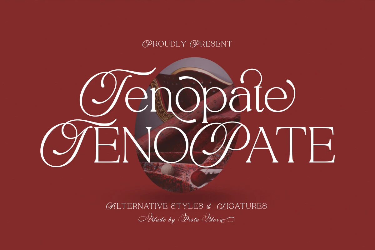
Best For: wedding designs, editorial designs, logos, vintage designs
Tenopate Font blends classic calligraphic flair with a crisp modern serif, using high contrast, airy proportions, and sweeping capitals to create a polished display look. For Vintage Wedding Fonts, that mix feels especially effective: romantic enough for names and monograms, yet structured enough to keep short headlines refined rather than overly decorative.
The regular and italic versions make it easy to add contrast inside one layout, whether you are styling invitation titles, logo lines, or editorial-style covers. Keep it at display sizes and give the swashed letters generous margins, because the long entry strokes and looping terminals need space to stay elegant and readable.
Voguer Font
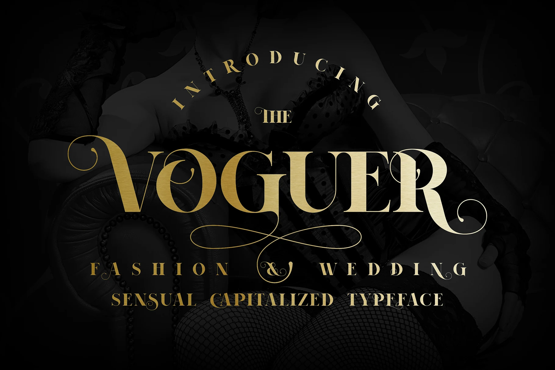
Best For: editorial designs, fashion branding, wedding designs, luxury designs
Voguer Font brings razor-sharp contrast, tall proportions, and dramatic curled terminals that echo old fashion-editorial mastheads. In Vintage Wedding Fonts, it offers a polished, couture direction, especially for monograms, names, and formal headings where the fine hairlines can stay crisp.
Because the strokes swing from very thick to very thin, it performs best at display sizes and in shorter lines. Use it for the primary title, then pair it with a quieter text face for details; that contrast keeps the hierarchy clear without relying on extra ornament.
Decorative Display Vintage Wedding Fonts
These display fonts add quirky serifs, handcrafted shapes, and old-print character for couples who want vintage wedding typography with a less traditional mood.
Anya Slab Font
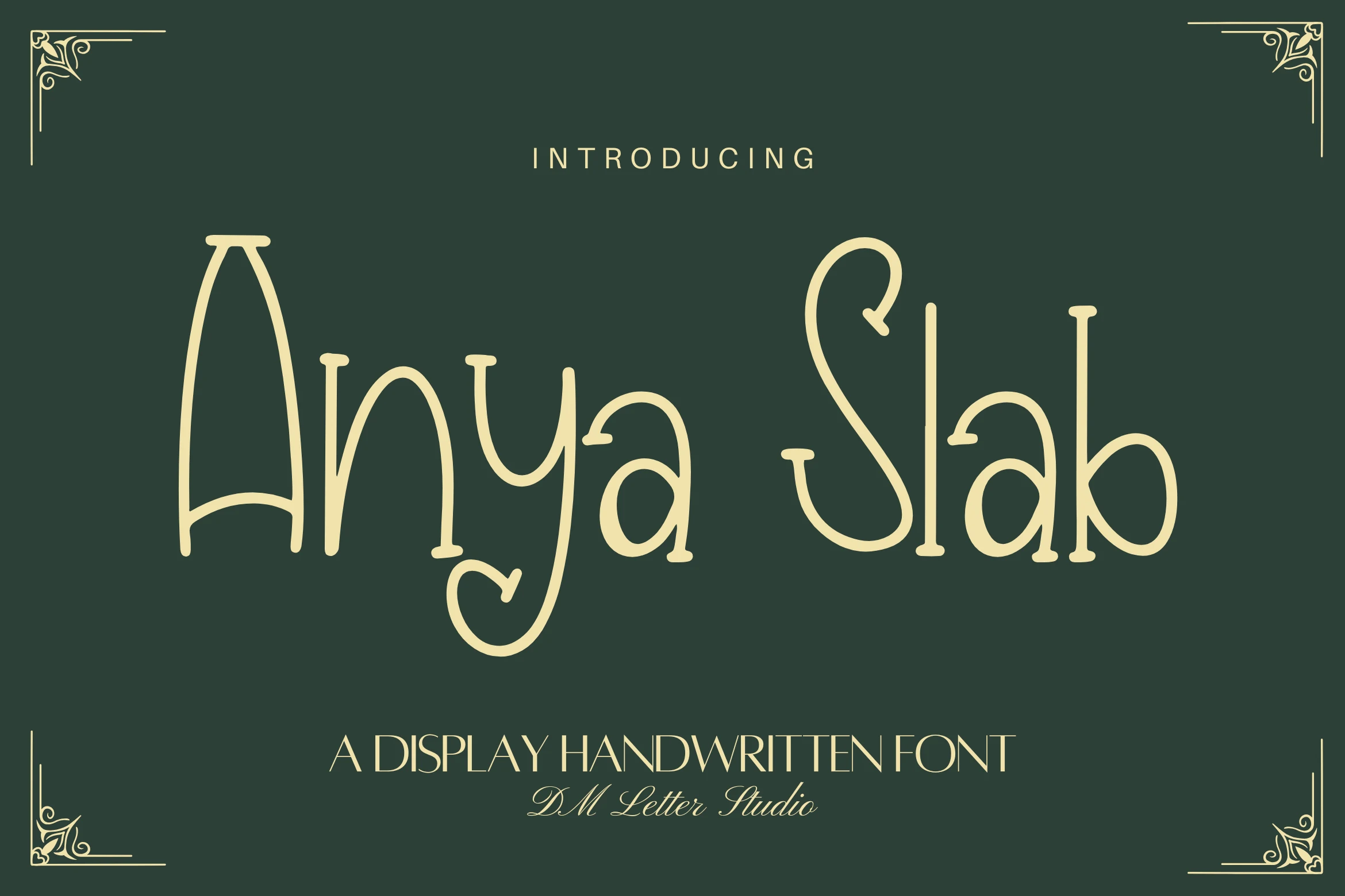
Best For: invitations, wedding designs, handmade designs, vintage designs
Anya Slab Font has a tall, airy silhouette with rounded handwritten strokes and subtle slab-like terminals, giving Vintage Wedding Fonts a more whimsical, handcrafted direction. The curled details in letters like the y and S add personality, but the narrow proportions keep it most effective in short lines where the shapes can stay open and readable.
It is clearly a display face, so use it for names, headings, or small invitation moments rather than dense text. A little extra tracking and line spacing helps the vertical rhythm settle, and a simple serif or clean companion font will keep the composition balanced without competing with its playful character.
Marigold Magic Font
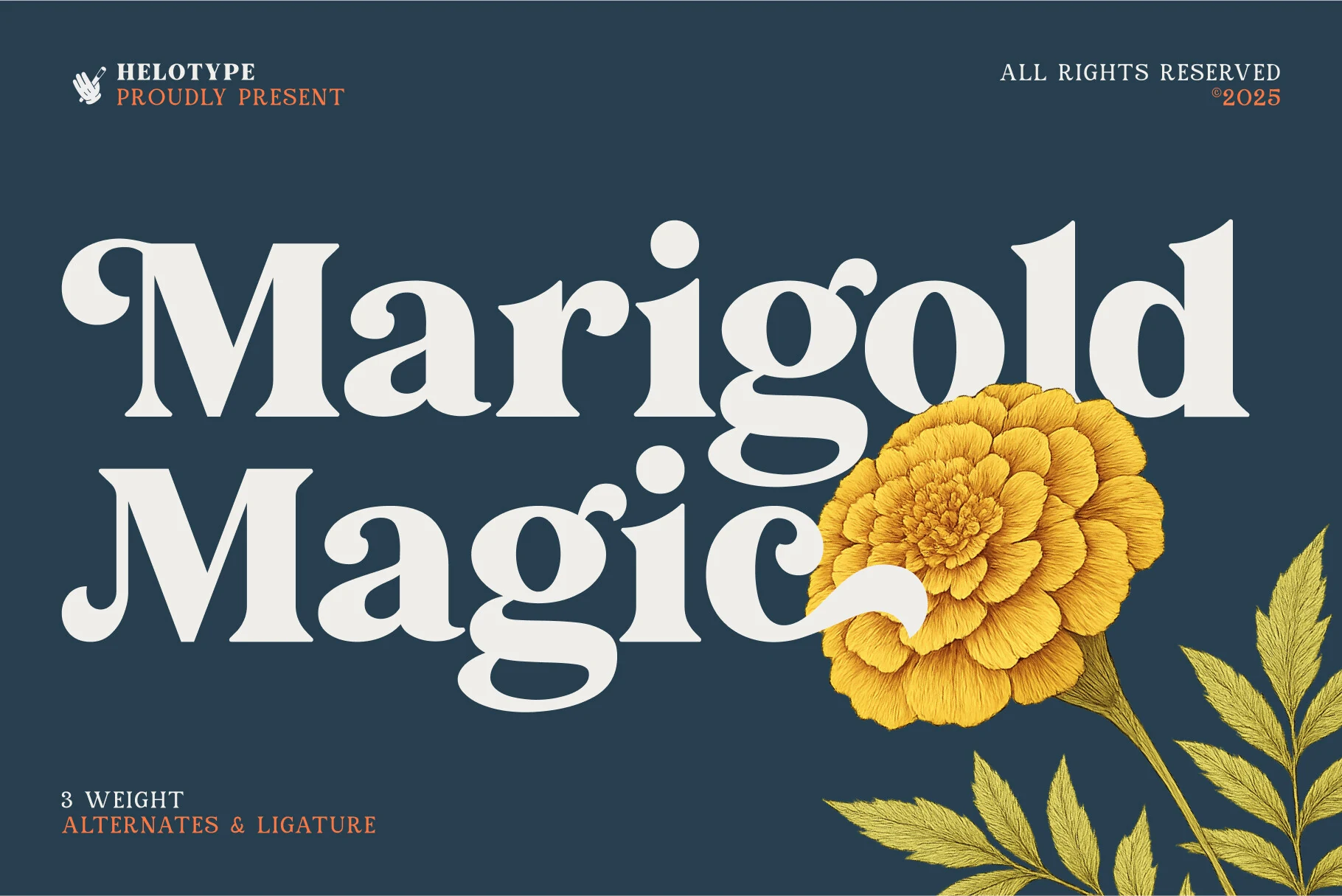
Best For: wedding designs, invitations, logos, vintage designs
Marigold Magic Font leans into Vintage Wedding Fonts with broad serif shapes, rounded ball terminals, and a sturdy old-print feel that reads charming rather than delicate. The letters have enough personality for names, invitation titles, and logo-style headings, while the overall rhythm stays clean and easy to scan.
Its 3 weights, alternates, and ligatures make it easier to build hierarchy without switching to an unrelated companion typeface. Try the heavier weight for the main title and a lighter one for subheads or venue details; that contrast keeps the layout polished and gives decorative letters room to stand out.
Metilda Font
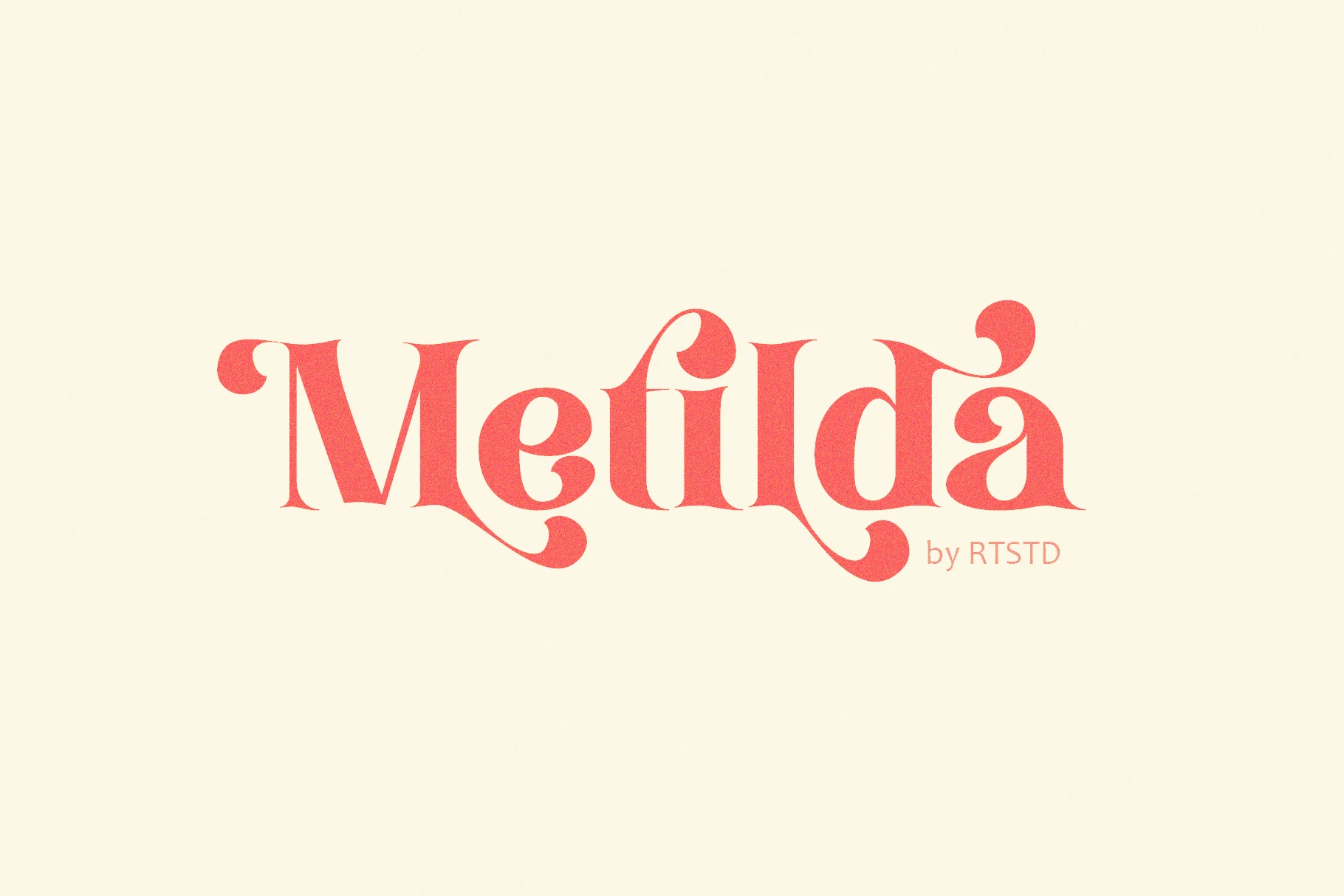
Best For: logos, invitations, wedding designs, vintage designs
Metilda Font is a decorative serif with thick vertical stems, narrow counters, and curling ball terminals that push it toward retro poster lettering rather than formal calligraphy. The ligatures and alternates matter here because they let repeated letters break into different curves, keeping a name or headline from looking rigid.
For Vintage Wedding Fonts, it works best as the main typographic voice on short titles, monograms, or invitation headers. Keep tracking tight enough for the swashes to connect visually, then pair it with quiet body text so the ornate serifs carry the hierarchy without crowding the layout.
Conclusion
For a formal wedding suite, start with elegant scripts or high-contrast serifs. For a warmer nostalgic look, use bold retro scripts. For more character, choose decorative display fonts and keep supporting text simple.