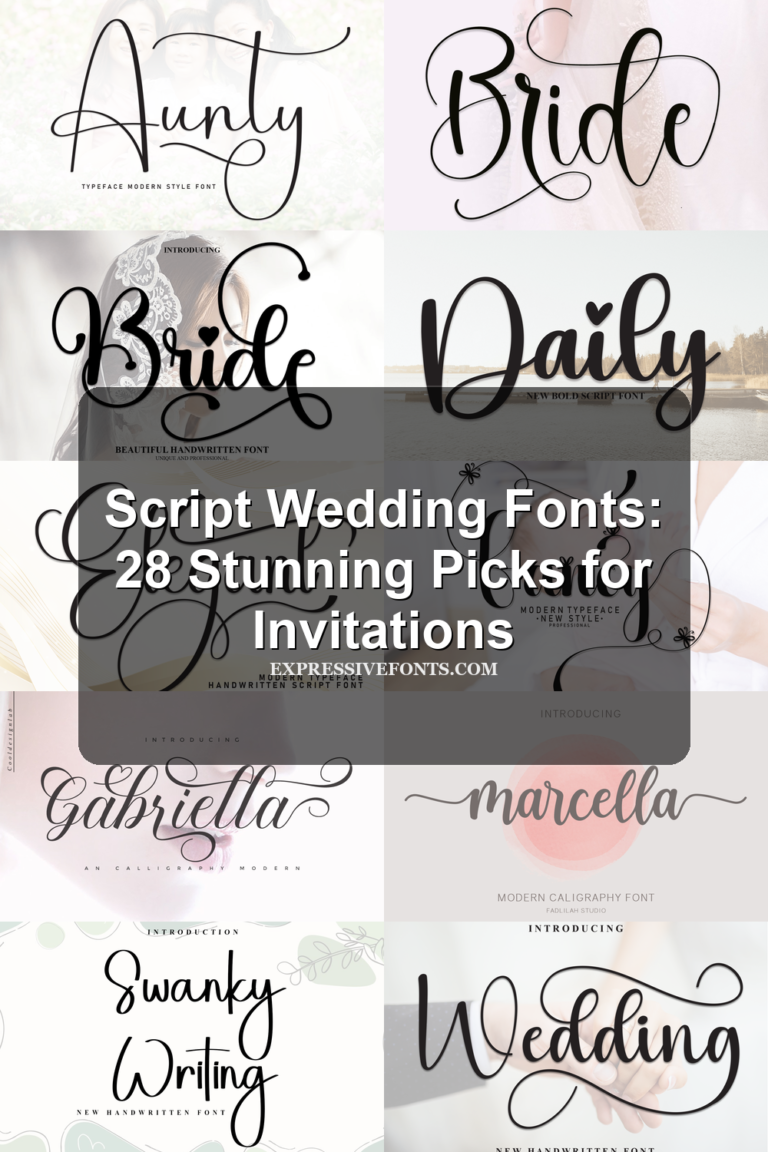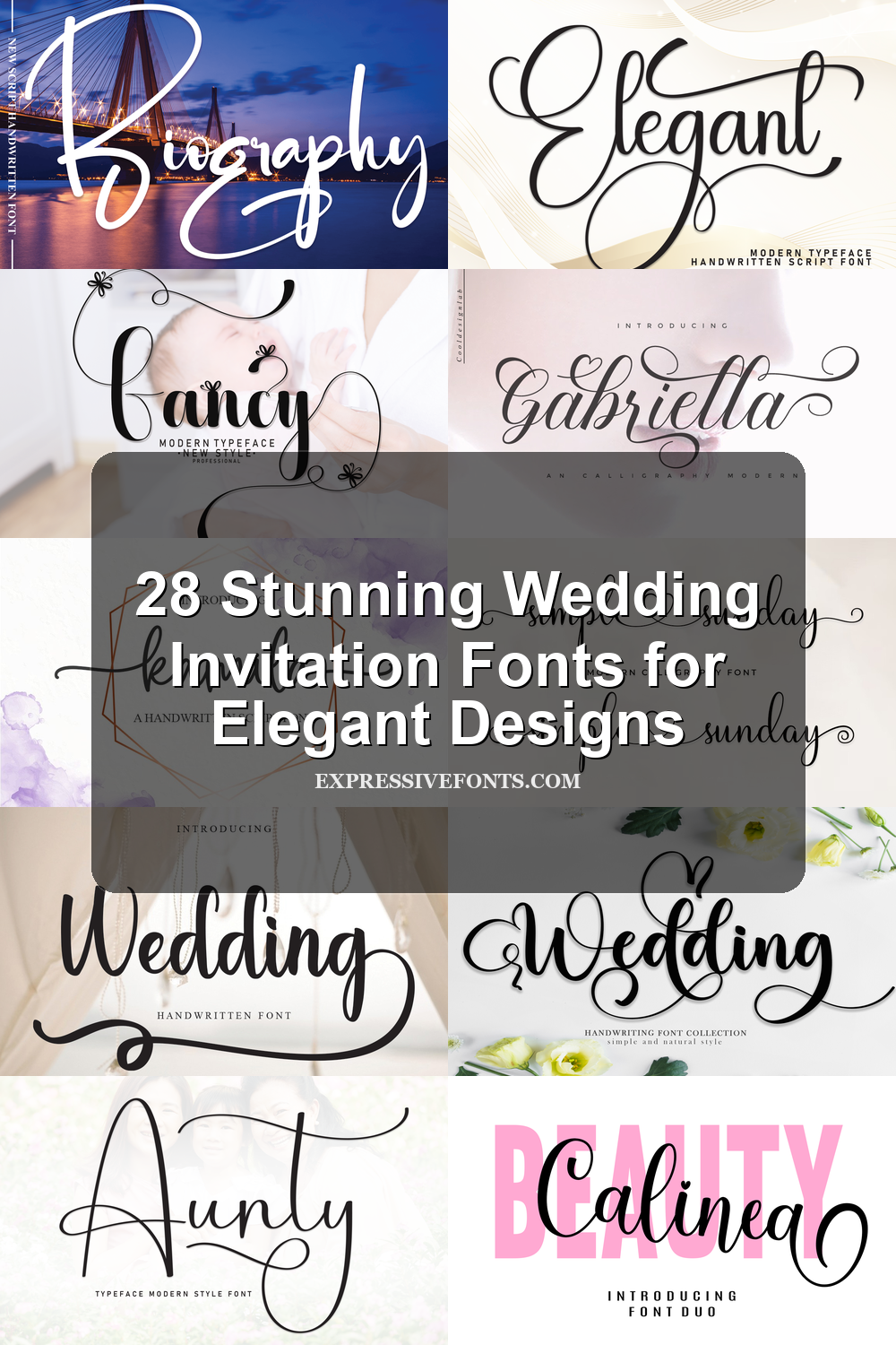
28 Stunning Wedding Invitation Fonts for Elegant Designs
Wedding Invitation Fonts set the tone before guests read a single detail. This collection is built for designers, stationers, and couples choosing type for invitations, save-the-dates, RSVP cards, wedding logos, labels, and romantic keepsakes. Use the categories below to compare formal calligraphy, modern signatures, playful scripts, and stronger display styles.
Looking for more wedding fonts? Browse our complete Wedding Fonts collection to compare elegant, romantic, modern, vintage, boho, script, and calligraphy styles.
Elegant & Ornamental Wedding Invitation Fonts
These fonts use formal swashes, high-contrast strokes, and polished calligraphy details for invitations that need a refined, ceremonial, or decorative focal line.
Marcella Font
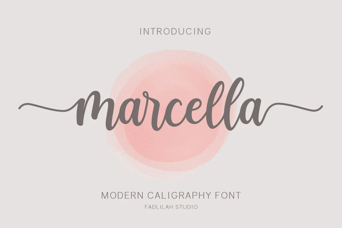
Best For: invitations, wedding designs, romantic designs, logos
Marcella Font uses a modern calligraphy rhythm with rounded bowls, heavy downstrokes, and thin entrance lines that stretch into long side swashes. The connected script feels polished rather than loose, giving short names and phrases a soft formal presence for Wedding Invitation Fonts.
Its contrast works best when the word has enough horizontal space, since the extended strokes are part of the composition. Keep supporting text lighter and simpler so Marcella can carry the title hierarchy without fighting dense details or tight margins.
Elegant Font
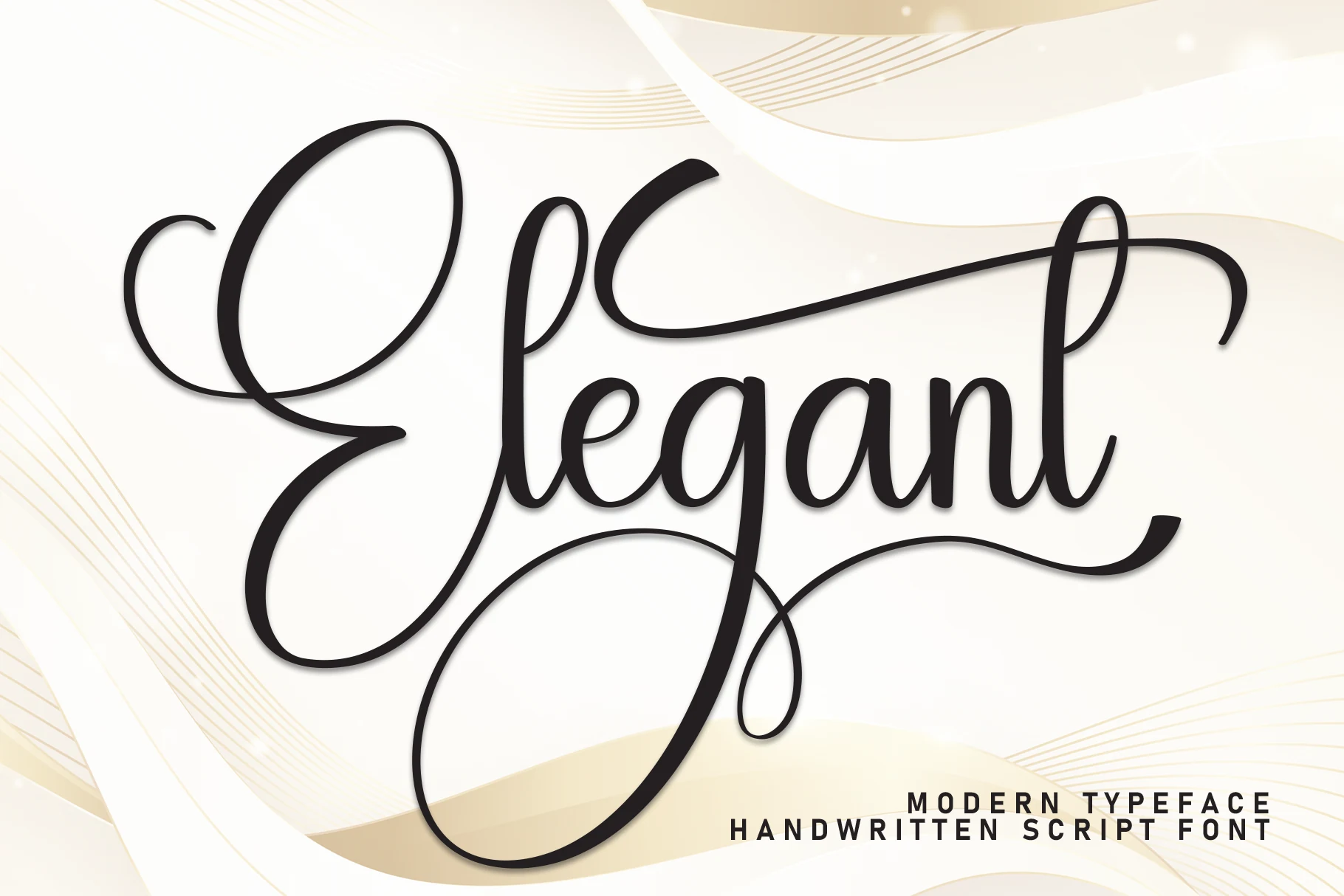
Best For: invitations, wedding designs, romantic designs, short phrases
Elegant Font has a polished handwritten script style with oversized loops, smooth rounded joins, and long sweeping swashes that turn the word into a full composition. That dramatic movement gives it a refined presence for Wedding Invitation Fonts, especially when you want the lettering itself to carry the mood.
Because the capitals and exit strokes take up generous space, this font reads best in short names, headings, and focal lines rather than dense copy. Pair it with restrained supporting text and leave extra margin around the swashes so the rhythm stays airy instead of cramped.
Intelligent Font
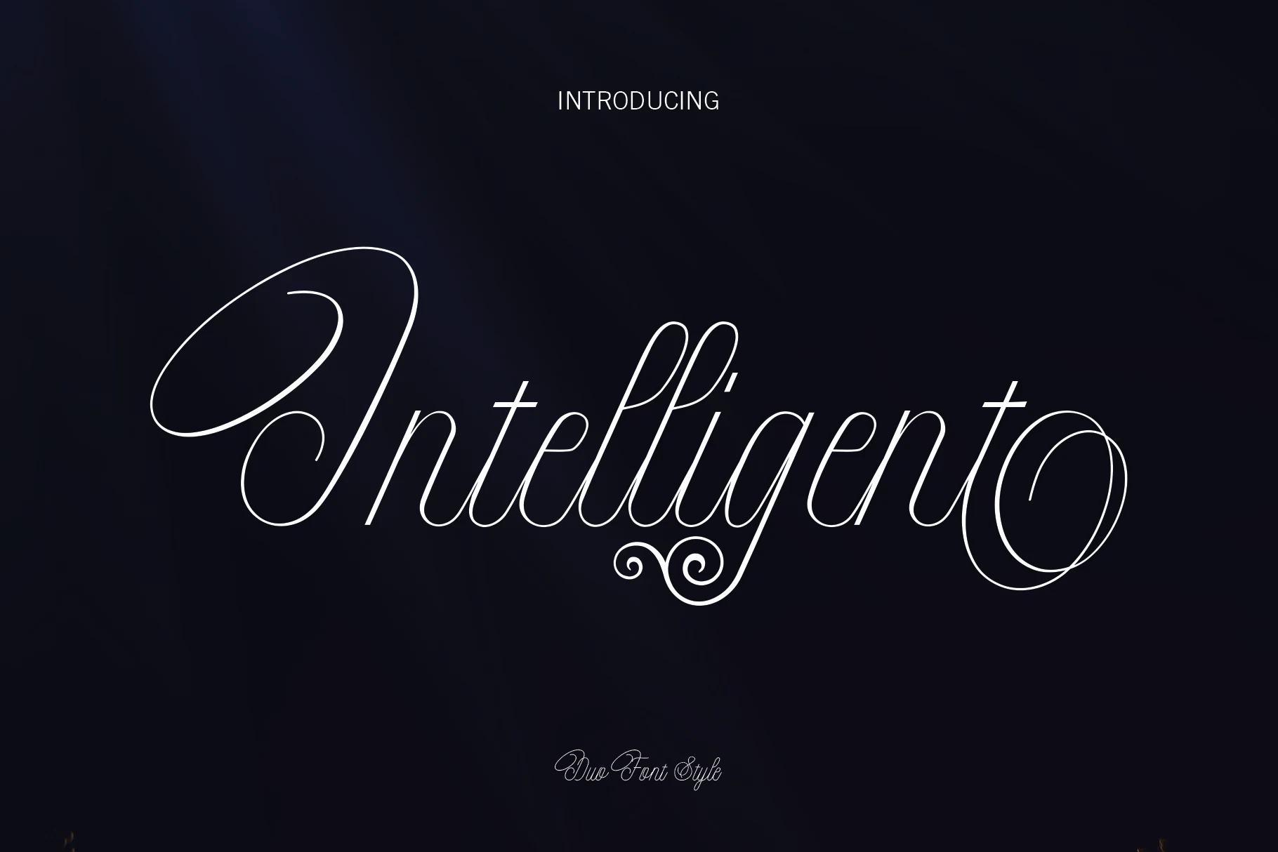
Best For: invitations, wedding designs, romantic designs, social media graphics
Intelligent Font has a refined script look built around very thin strokes, tall looping capitals, and long finishing swashes that stretch the word into an elegant silhouette. The letterforms feel airy and formal, which makes it a natural fit for Wedding Invitation Fonts where the name or headline needs to set the tone instantly.
The alternates and swash details help vary the composition, especially in short lines where the decorative endings have room to show. Pair it with simple supporting text and give the descenders extra space below, so the flourishes stay graceful instead of tangling into nearby elements.
Gabriella Script Font
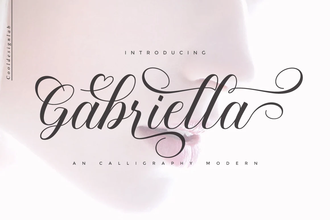
Best For: invitations, wedding designs, romantic designs, decorative designs
Gabriella Script Font is built for ornamental calligraphy, not quiet handwriting. In a Wedding Invitation Fonts roundup, it reads formal and expressive: a broad looped G, shaded downstrokes, thin hairline exits, and sweeping swashes that pull the word into one continuous gesture.
Those long flourishes need controlled composition. Use it for names, monograms, and short headline lines, then keep nearby text compact and restrained so the extended strokes do not collide with borders, floral art, or secondary details.
Fancy Font
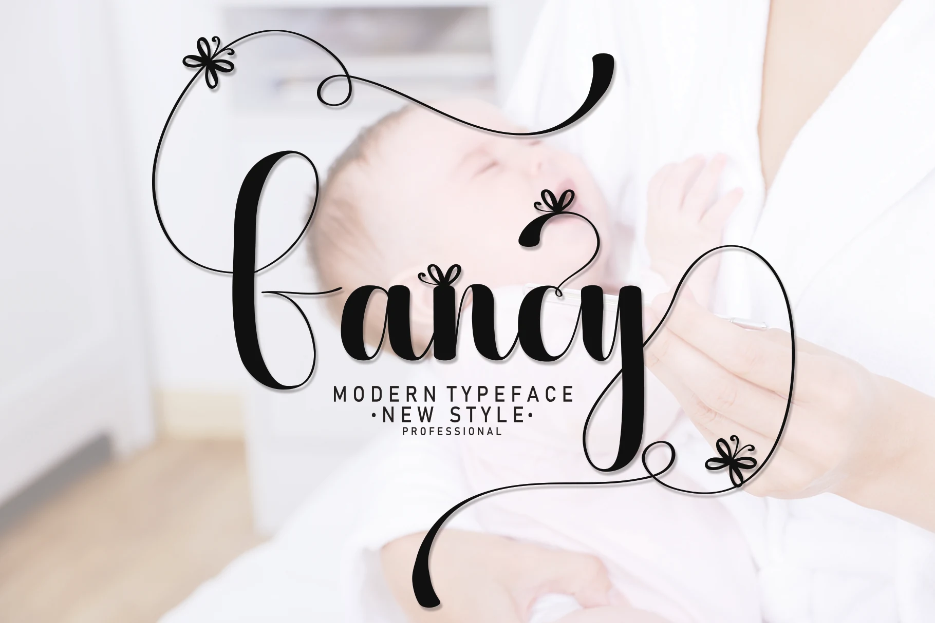
Best For: invitations, wedding designs, romantic designs, decorative designs
Fancy Font gives Wedding Invitation Fonts a more decorative script direction, pairing bold rounded strokes with airy looping swashes and tiny floral accents. The main letterforms feel full and confident, while the fine extensions add movement that makes the script look expressive rather than plain.
It works best for names, titles, and short romantic phrases where the long terminals can frame the layout. Give the capitals extra breathing room and pair it with a restrained serif or neat all-caps line underneath, so the flourishes stay elegant instead of crowding the composition.
Our Wedding Font
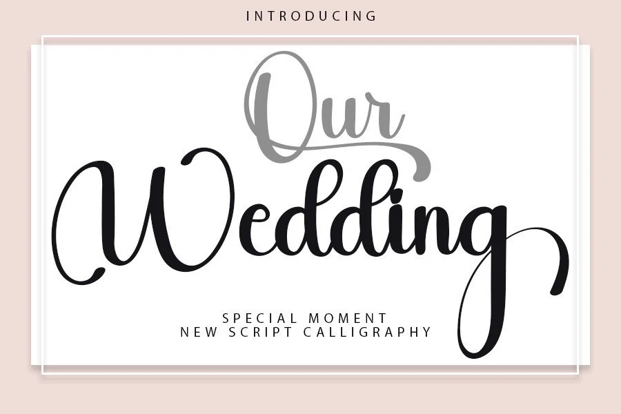
Best For: invitations, wedding designs, romantic designs, elegant designs
Our Wedding Font has a classic calligraphy base with a contemporary, controlled rhythm: medium-weight strokes, tall looping capitals, and long entry and exit lines that give names a ceremonial feel. The letters are balanced rather than wispy, so the script keeps enough presence for titles while still reading soft and formal.
Use it where Wedding Invitation Fonts need a clear focal word—couple names, venue titles, or short romantic phrases. The extended swashes need horizontal space, so keep line breaks generous and avoid tight tracking; a restrained serif or clean small-caps companion will make the script feel intentional instead of crowded.
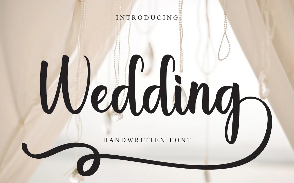
Wedding Font
Best For: invitations, wedding designs, elegant designs, feminine designs
Wedding Font leans into Wedding Invitation Fonts with a polished script style, mixing bold downstrokes, rounded counters, and long looping swashes that give the lettering a graceful, hand-drawn rhythm. The capitals feel especially expressive, while the main word shapes stay smooth and readable.
It works best for names, invitation covers, and refined branding where the flourishes can frame the composition instead of competing with other details. Pair it with a quiet serif or spaced small caps for dates and supporting copy, and leave enough room for the descenders to breathe.
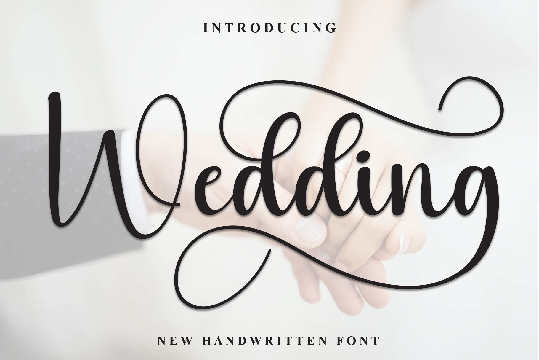
Wedding Font
Best For: invitations, wedding designs, romantic designs, elegant designs
Wedding Font has a bold handwritten presence with rounded strokes, oversized loops, and long sweeping terminals that give the wordmark a graceful, celebratory rhythm. The contrast stays moderate, so it feels expressive without turning fragile, and the larger swashes bring just enough drama for a refined display look.
It works best where Wedding Invitation Fonts need one strong focal line, especially for couple names or the main heading. Because the capitals and descenders stretch wide, leave generous side margins and pair it with a quiet serif for dates and details so the script stays elegant instead of crowding the layout.
Romantic & Feminine Wedding Invitation Fonts
This group focuses on soft loops, heart accents, rounded scripts, and warm romantic movement for names, stationery details, and feminine wedding layouts.
Beauty Calinea Font
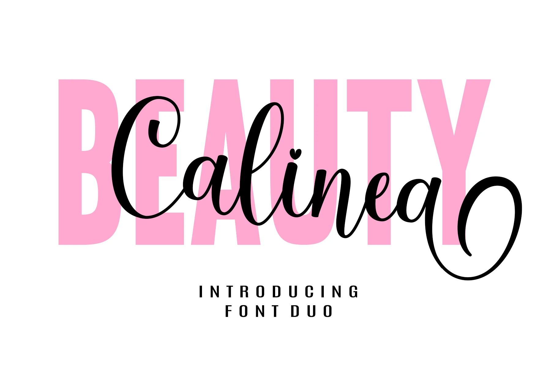
Best For: invitations, wedding designs, romantic designs, logos
Beauty Calinea Font pairs an oversized sans serif with a flowing modern script, creating built-in contrast between structure and softness. In the preview, the tall block capitals add weight while the script brings graceful loops, subtle stroke contrast, and a heart accent that fits Wedding Invitation Fonts naturally.
The duo works best when you let each style handle a different role in the layout. Use the sans layer for emphasis and the script for names or short focal phrases, keeping spacing open so the sweeping terminals stay clean instead of crowding the composition.
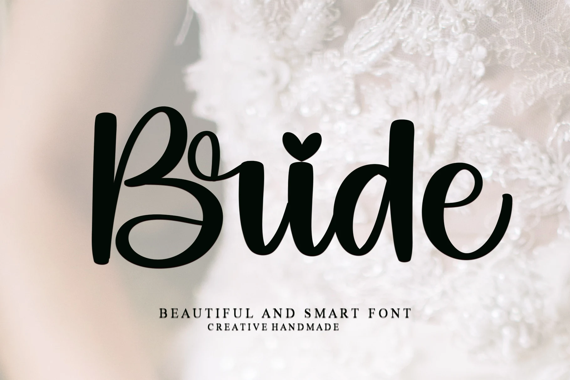
Bride Font
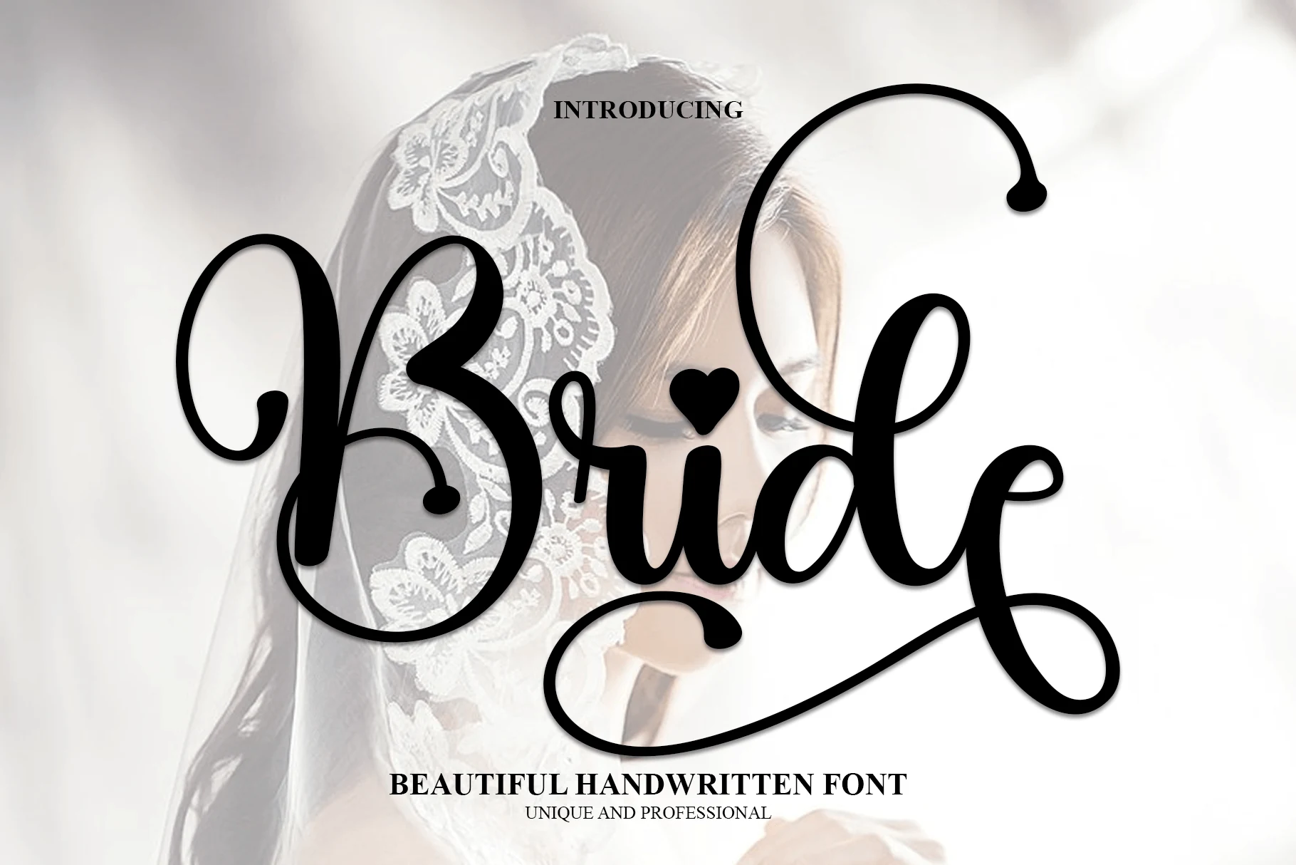
Best For: invitations, wedding designs, feminine designs, packaging
Bride Font has a soft handwritten style with rounded strokes, a looping capital B, and a small heart accent that gives the lettering a personal finish. The weight stays smooth and friendly rather than delicate, which makes it a natural fit for Wedding Invitation Fonts with a warm, feminine tone.
Its open shapes keep headlines readable, so it works well for names, short cover lines, and stationery details. Pair it with a light serif or clean sans for contrast, and avoid crowding the letters too tightly so the curves and inner spaces keep their relaxed rhythm.
Melissa Font
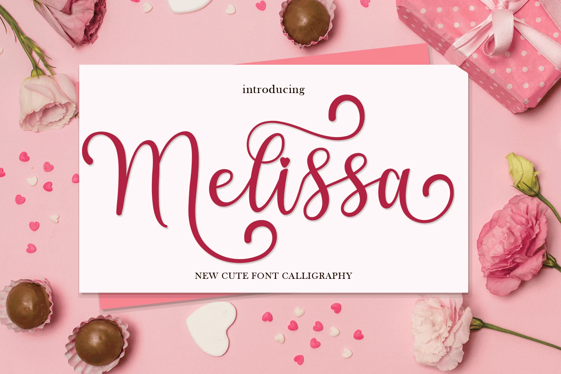
Best For: invitations, wedding designs, romantic designs, business cards
Melissa Font has a soft handwritten calligraphy look with smooth rounded strokes, generous loops, and a heart accent that adds a sweet romantic note. The tall swashes and open rhythm give it a light, decorative feel that suits Wedding Invitation Fonts, especially for names and short headline lines.
It handles best when you let the script breathe, since the capital M and long finishing curves need room to read cleanly. Pair it with a simple serif or understated sans for the secondary text, and keep the hierarchy clear so Melissa stays the focal element rather than competing with extra ornament.
Fantasy Font
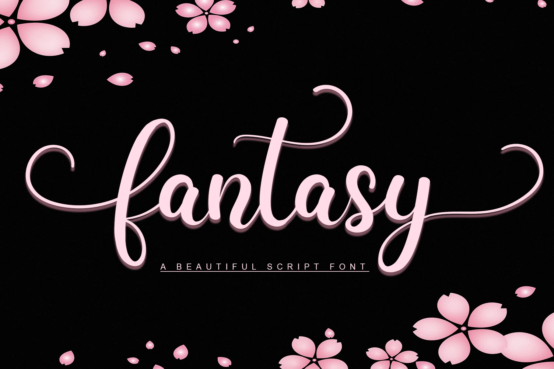
Best For: invitations, wedding designs, romantic designs, feminine designs
Fantasy Font gives Wedding Invitation Fonts a smooth romantic name style, with rounded script strokes, connected lowercase forms, and long entry and exit swashes that stretch across the line. The thick-to-thin shifts are restrained, so the lettering feels polished without becoming fragile.
Use it for short names, initials, or headline phrases where the flourishes can sit outside the main text block. Tight body copy will fight the wide capitals and looping descenders; a narrow serif or spaced small caps underneath will keep the hierarchy clean.
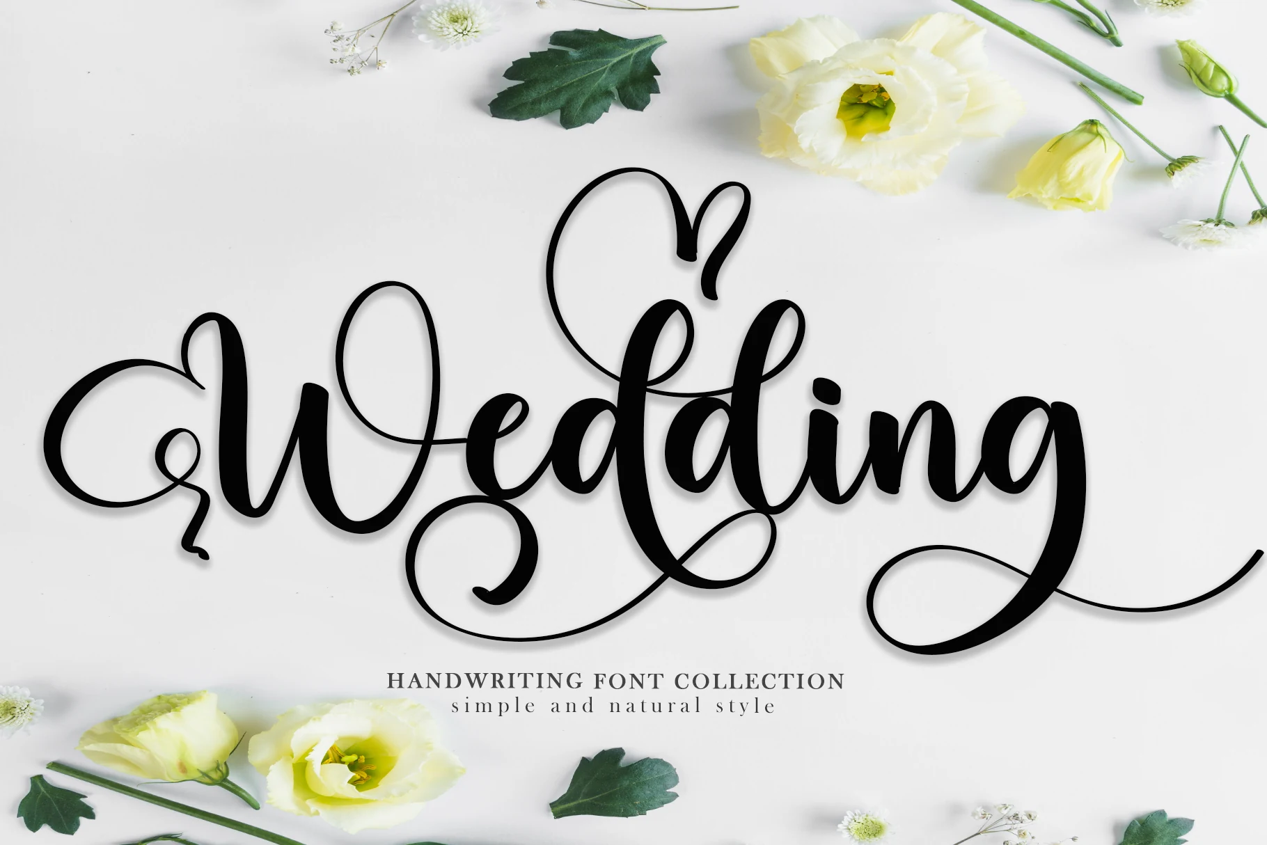
Wedding Font
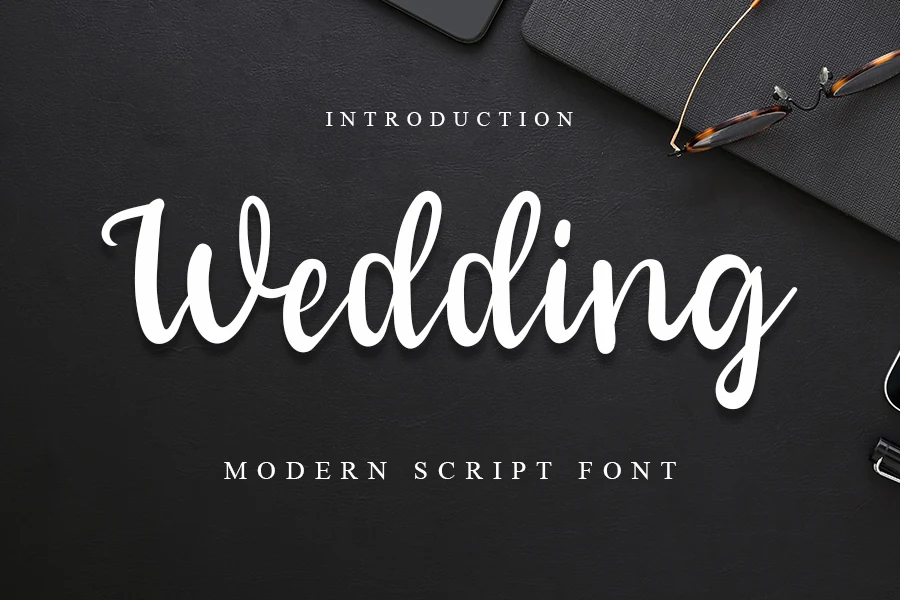
Best For: invitations, wedding designs, romantic designs, feminine designs
Wedding Font brings a lively handwritten feel to Wedding Invitation Fonts, with bold downstrokes, airy loops, and long curling swashes that stretch elegantly across the line. The script has a bouncy rhythm, but the letterforms stay full and clear enough to keep names and short phrases easy to read.
It is strongest in headings, couple names, and invitation covers where the oversized flourishes can frame the layout instead of crowding it. Pair it with a quiet serif for dates or venue details, and keep line spacing open so the descenders and terminal strokes do not tangle.
Bride Font
Best For: invitations, wedding designs, romantic designs, feminine designs
Bride Font has a friendly handwritten look with thick rounded strokes, a soft looping capital B, and a playful heart accent over the i. That mix gives Wedding Invitation Fonts a warm personality while keeping the word shapes clear and easy to read at a glance.
It suits names, invitation titles, and stationery details that need a casual romantic tone without delicate hairlines. Because the script is broad and full, it works best with generous margins and a lighter secondary font underneath to keep the hierarchy clean.
Fantastic Font
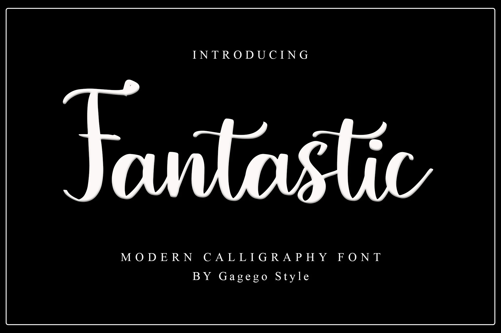
Best For: invitations, wedding designs, romantic designs, elegant designs
Fantastic Font gives Wedding Invitation Fonts a warm calligraphy look, with a tall looping F, rounded lowercase forms, and a gentle bounce that keeps the script lively without losing clarity. The strokes are smooth and full, so the word shapes stay readable even when the letters tuck closely together.
It works especially well for names, invitation headers, and short logo-style phrases where the baseline movement can do the styling for you. Keep secondary text quieter and more structured underneath; small caps or a restrained serif will balance the playful rhythm and sharpen the hierarchy.
Wedding Font
Best For: invitations, wedding designs, romantic designs, feminine designs
Wedding Font has a graceful handwritten look with thick rounded strokes, airy loops, and long finishing swashes that give the lettering a soft flowing rhythm. That makes it a natural fit for Wedding Invitation Fonts, especially when you want a script that feels decorative but still reads clearly in a single glance.
The capitals and descenders take up generous space, so it works best for names, headers, and short display lines rather than tightly packed text. Let the swashes extend into open margins, then add dates or venue details in a simple serif underneath to keep the hierarchy clean and calm.
Modern Signature Wedding Invitation Fonts
These signature-style fonts feel cleaner and more contemporary, making them useful for minimalist invitations, fashion-led stationery, and elegant branding.
Vanilla Flavor Font
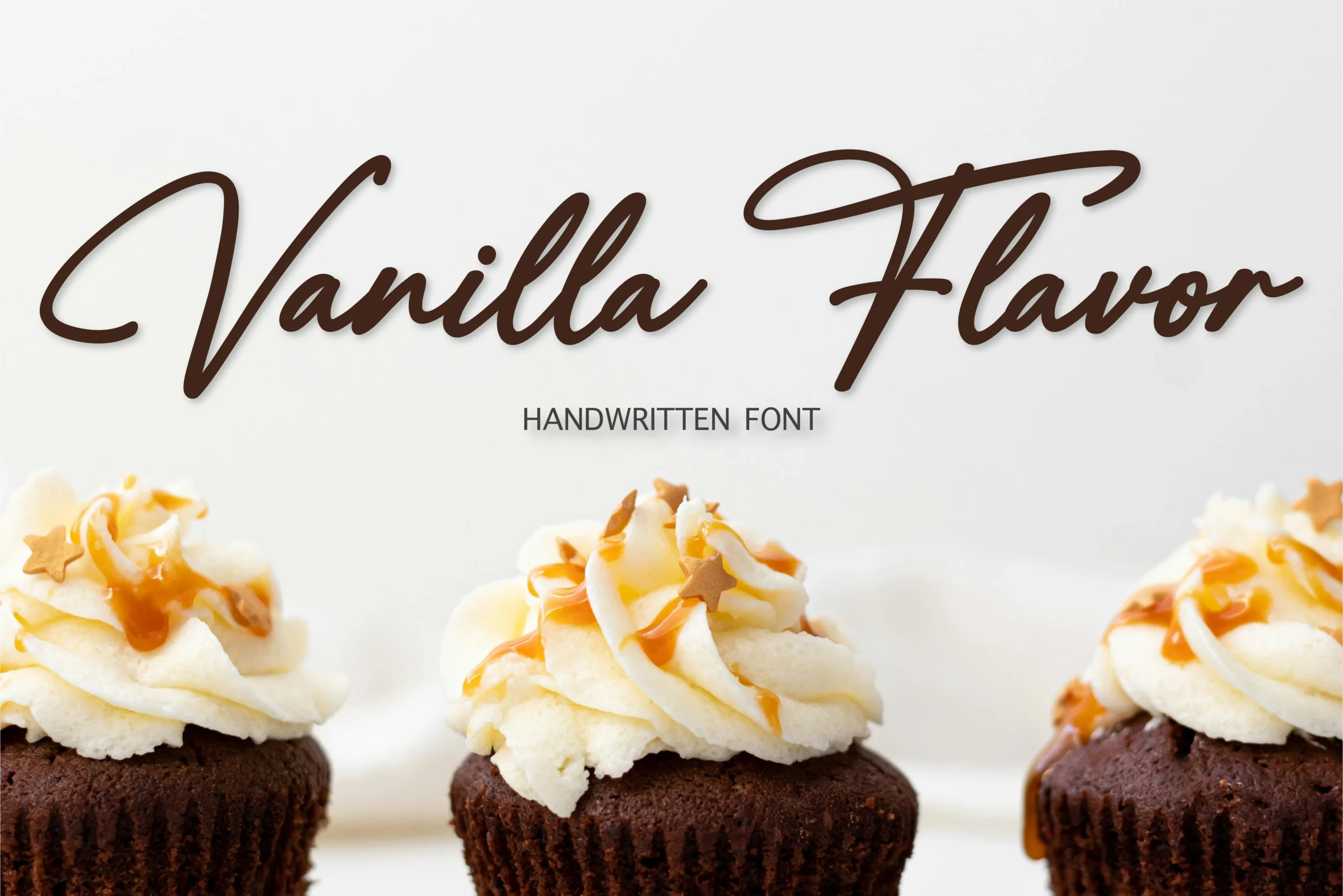
Best For: invitations, wedding designs, packaging, logos
Vanilla Flavor has the kind of smooth handwritten movement that feels polished without losing its handmade warmth. The long entry stroke on the V, narrow oval forms, and extended crossbar on the F create an elegant silhouette, giving Wedding Invitation Fonts a more refined, fashion-leaning tone than a casual brush script.
It suits packaging, logos, and stationery where a single word or short phrase needs personality but still reads cleanly. Use it with restrained supporting type and generous line spacing; the wide swashes and tall capitals do their best work when the layout gives them room to frame a name or headline.
Swanky Writing Font
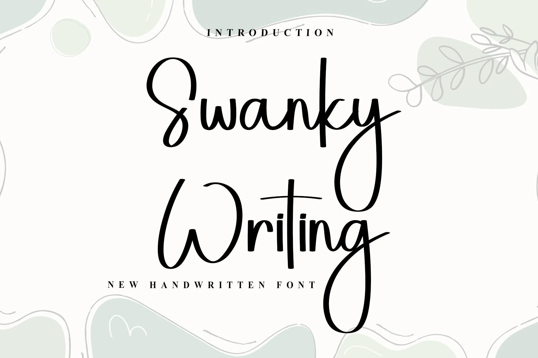
Best For: invitations, wedding designs, elegant designs, feminine designs
Swanky Writing Font feels clean and modern rather than overly formal, with slim strokes, open spacing, and oversized loops that give Wedding Invitation Fonts a polished handwritten character. The tall ascenders and deep descenders add movement, while the letterforms stay simple enough to keep names and short lines clear.
It works especially well for invitation titles, RSVP cards, and signature-style headings where the long W and y can extend into the surrounding space. Leave extra room around those swashes, and pair it with a restrained serif or spaced small caps to keep the layout crisp and balanced.
Biography Font
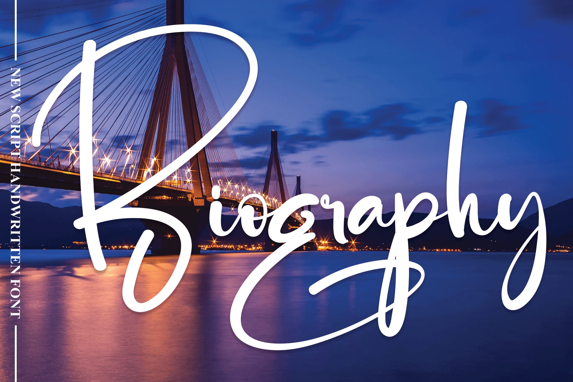
Best For: invitations, wedding designs, social media graphics, product packaging
Biography Font gives Wedding Invitation Fonts a bold signature look, built around extra-tall capitals, smooth monoline strokes, and dramatic loops that sweep well past the word itself. The script feels confident and modern, with enough openness in the lowercase to keep short names and titles readable.
It performs best when the lettering is allowed to dominate the layout, whether on invitation covers, packaging, or social graphics. Keep the wording short and place any supporting details in a restrained serif or spaced small caps, so the long swashes read as a feature instead of visual clutter.
Kamila Font
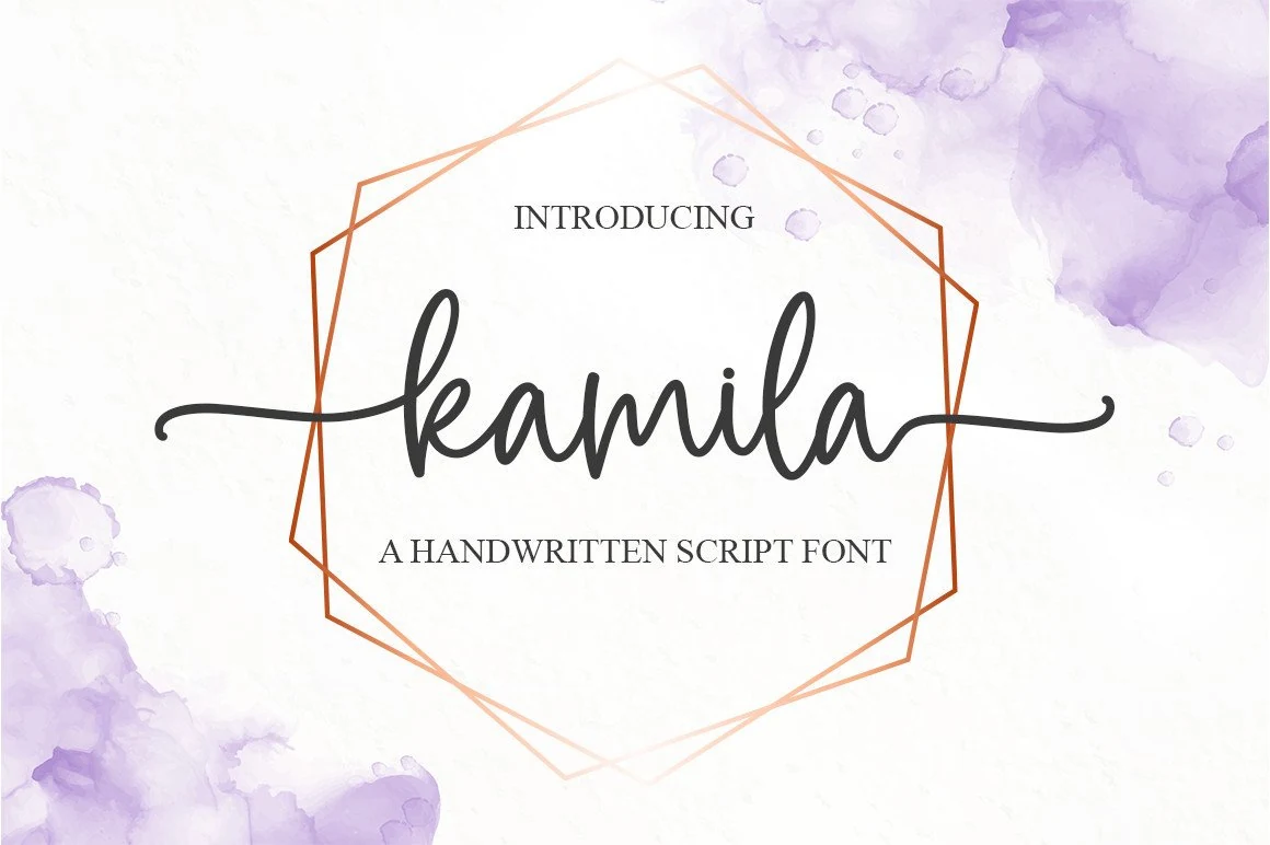
Best For: invitations, wedding designs, fashion branding, editorial designs
Kamila Font has a clean handwritten rhythm with smooth monoline strokes, narrow proportions, and long cross-line swashes that stretch neatly across the layout. That balance makes it a refined fit for Wedding Invitation Fonts, especially when you want something soft and modern rather than overly ornate.
The even letter spacing helps short names and headings stay readable, while the extended terminals create a built-in frame around the wording. Use it for invitation covers, fashion marks, or editorial titles, and keep the supporting text structured so the swashes remain the main point of contrast.
Aunty Font
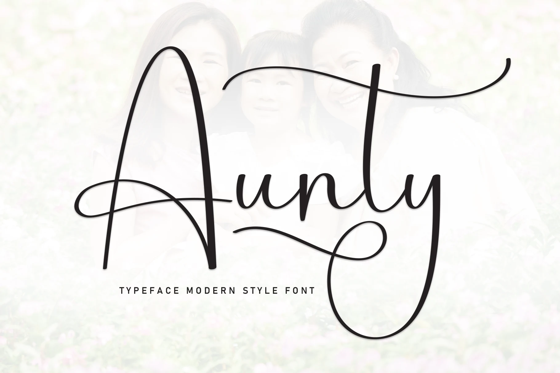
Best For: invitations, wedding designs, social media graphics, wall art
Aunty Font has a sleek handwritten look built from fine monoline strokes, an oversized capital A, and a looping descender that gives the word a graceful frame. That airy structure makes it a strong fit for Wedding Invitation Fonts when you want something light, modern, and visibly personal.
The long entrance and exit strokes need room to stretch, so it works best for names, short titles, and logo-style wording rather than dense copy. Pair it with compact serif or sans details underneath, and keep the line length short so the large swashes stay elegant instead of taking over the layout.
Simple Sunday Font
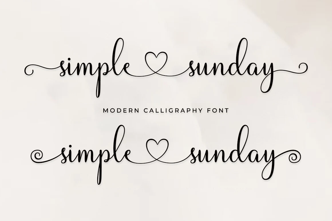
Best For: invitations, wedding designs, logos, social media graphics
Simple Sunday Font gives Wedding Invitation Fonts a light modern calligraphy feel, built from thin monoline strokes, tall upright loops, and a continuous baseline that links the words with a heart-shaped flourish. The script stays airy and readable, so it feels personal without turning overly ornate.
It works best for names, logo-style headings, and short romantic lines where the long entry and exit strokes can stretch into open space. Keep the wording brief and pair it with compact sans or small caps details underneath, so the delicate rhythm stays clear and elegant.
Bold & Playful Wedding Invitation Fonts
Use these fonts when the invitation needs more weight, charm, or graphic personality, from chunky scripts to serif display styles and retro lettering.
Daily Font
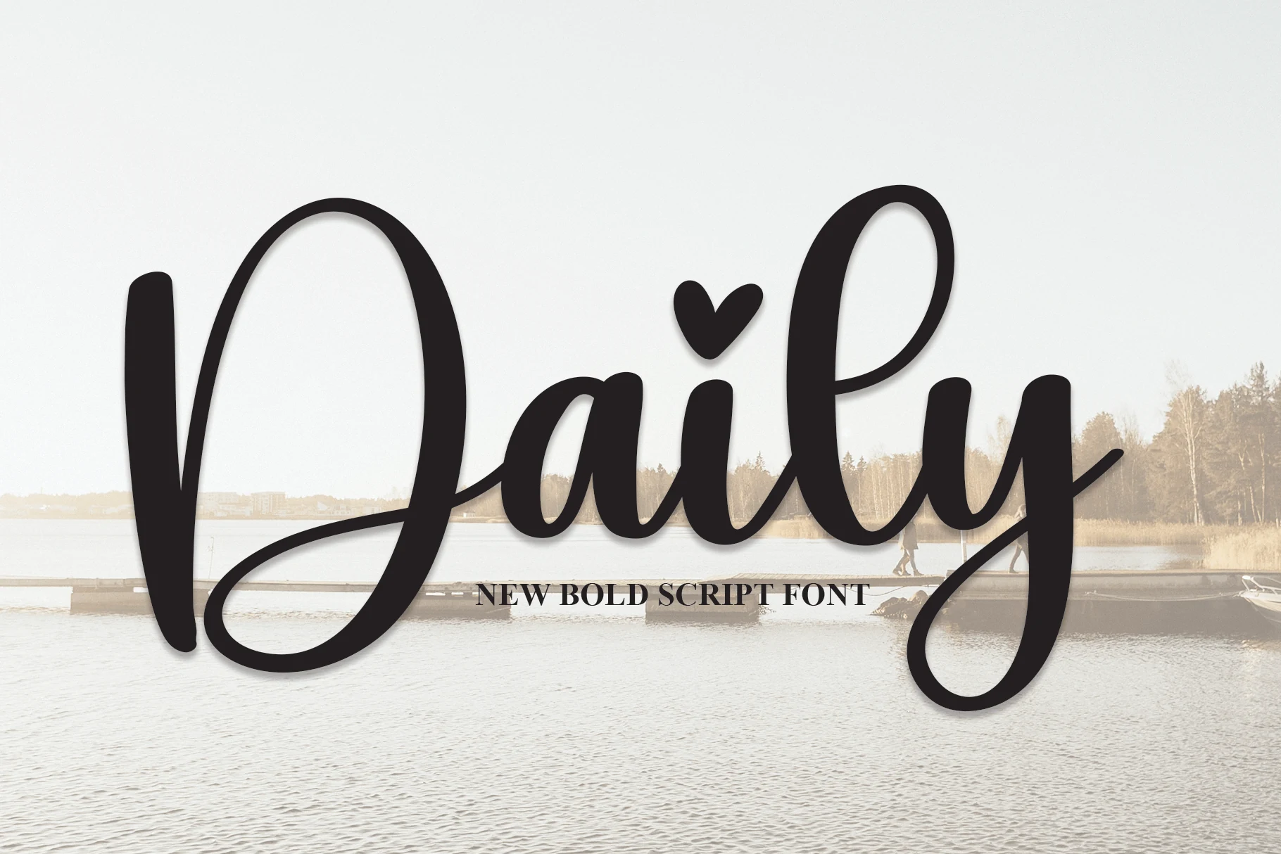
Best For: invitations, wedding designs, romantic designs, wall art
Daily brings a bolder voice to Wedding Invitation Fonts, with a heavy connected script, tall looped ascenders, and round pressure-like strokes that read more like hand-lettered signage than delicate calligraphy. The oversized D and sweeping y give the word shape strong movement, while the compact middle letters keep the rhythm dense and decorative.
Use it where the name or headline carries the layout: invitation names, watermarks, packaging marks, labels, and romantic wall art. Its thick strokes need clean contrast and controlled tracking; longer phrases will feel crowded, so let the script lead and keep supporting text quieter.
Gingerbread Cupcakes Font
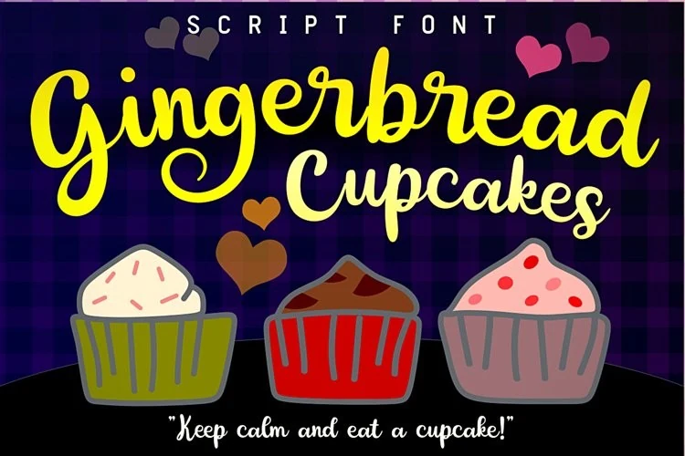
Best For: invitations, wedding designs, quotes, cute designs
Gingerbread Cupcakes has a candy-bright script look, with chunky rounded strokes, soft joins, and big looping curves that make the lettering feel upbeat and hand-drawn. Its bouncy rhythm gives Wedding Invitation Fonts a sweeter, more casual mood, especially when you want something charming rather than formal.
It works best in short lines where the playful shapes can stay clear—think names, thank-you cards, quotes, and logo-style headings. Pair it with a simple serif or clean sans for contrast, and leave a little extra space around the script so the tall curves and swashy details do not crowd the layout.
Be Mine Font
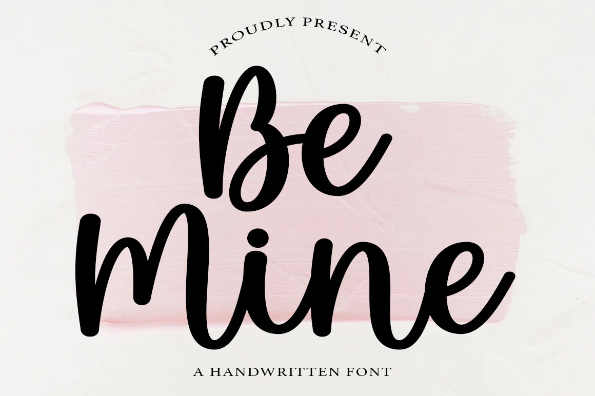
Best For: invitations, wedding designs, romantic designs, social media graphics
Be Mine Font brings a bold handwritten voice to Wedding Invitation Fonts, using thick rounded strokes, tall loops, and connected lowercase forms that feel casual but intentionally shaped. The letters have a soft bounce, with the oversized B and sweeping M giving short phrases immediate display weight.
It works best when the wording is brief and centered, especially for names, save-the-date lines, labels, or romantic social graphics. Keep supporting text lighter and more spaced out; the script is heavy enough to lead the hierarchy without needing extra ornament.
Gil Rose Font
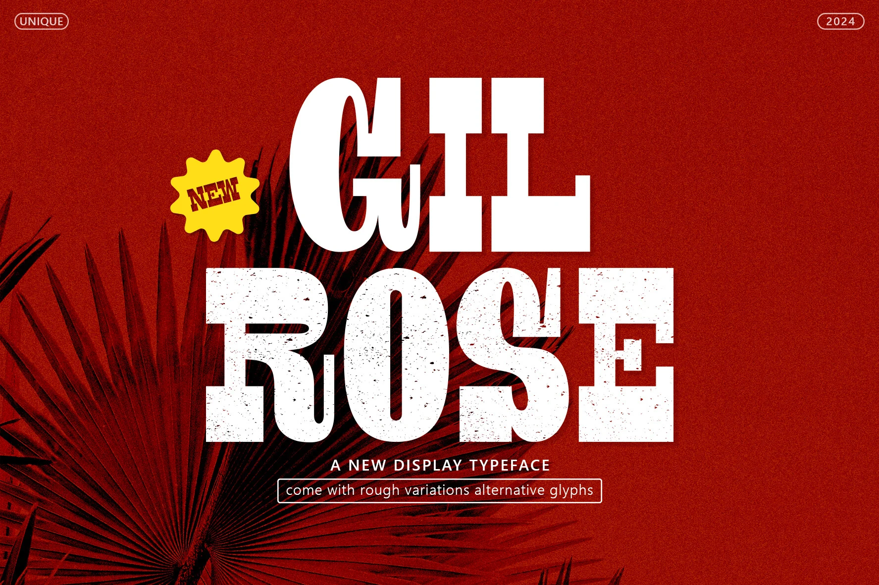
Best For: branding, posters, logos, invitations
Gil Rose Font has a bold display presence with oversized slab-serif forms, tight structure, and a lightly worn texture that adds grit to the heavy shapes. It leans more statement-making than delicate, which gives Wedding Invitation Fonts a stronger, more graphic direction when a script look would feel too predictable.
This style works best when it leads the hierarchy, especially in names, titles, or short feature lines. Keep surrounding text simpler and give the block enough contrast, since the dense proportions and textured counters are most effective when they do not compete with busy details.
The General Font
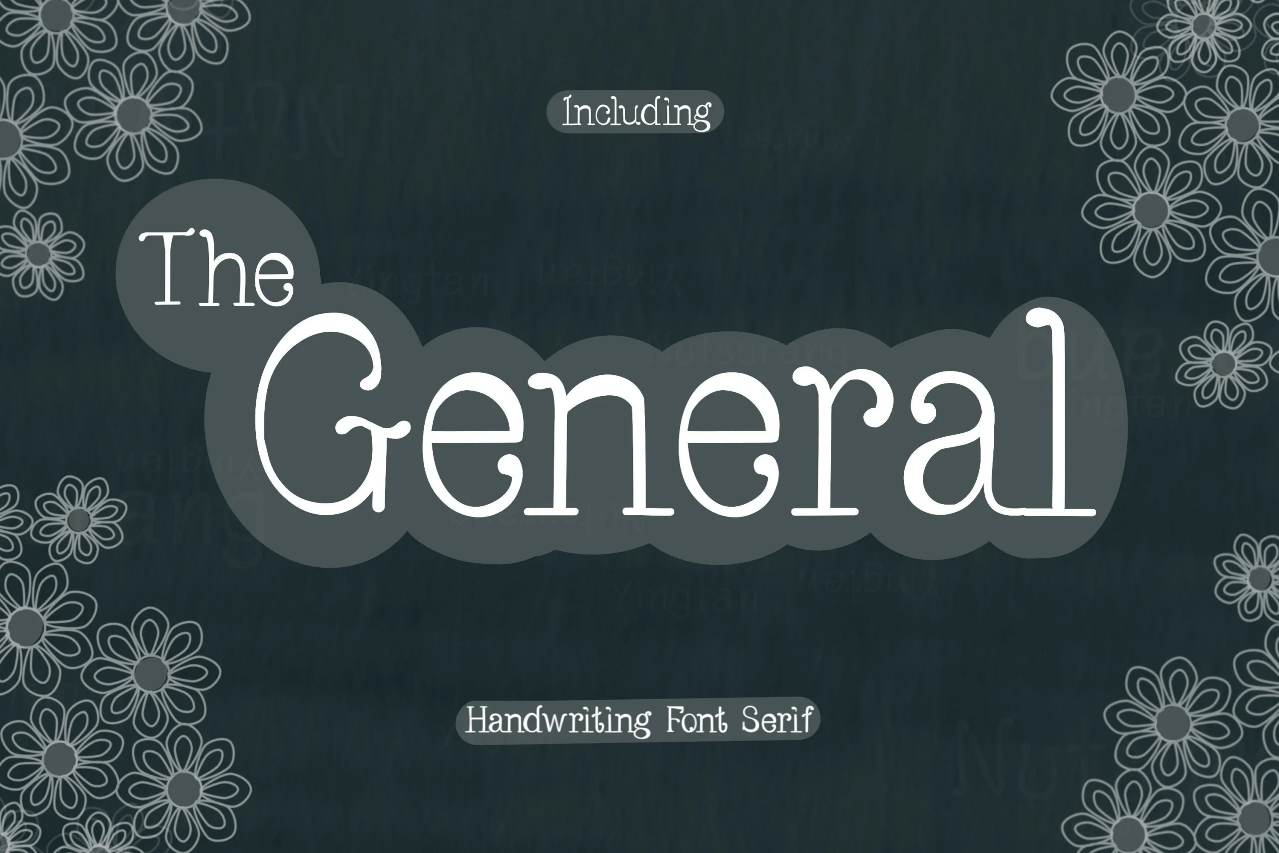
Best For: invitations, wedding designs, product labels, stickers
The General Font brings a softer serif direction to Wedding Invitation Fonts, with rounded terminals, generous counters, and slightly quirky curves that keep the lettering friendly rather than formal. The capital G and curled lowercase details give it a decorative touch, while the overall structure stays steady and easy to read.
It works especially well for short headers, labels, and names where the serif shapes can add character without relying on flourishes. A little extra tracking helps the open forms breathe, and pairing it with a simple script or clean sans underneath creates a clear title hierarchy without losing its cozy charm.
Reconcile Font
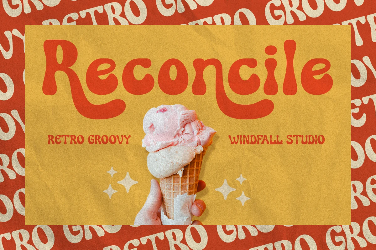
Best For: posters, headlines, retro designs, playful designs
Reconcile Font leans into a groovy retro look with chunky rounded shapes, soft corners, and exaggerated curves that give every word a cheerful 70s pulse. It is not the usual direction for Wedding Invitation Fonts, but it suits couples who want a playful, party-led feel instead of formal calligraphy.
The wide proportions make short titles hit hard, especially on welcome signs, save-the-dates, and bold cover lines. Let it handle the main headline, then use a quieter serif or simple sans for details so the thick letterforms keep their impact without crowding the layout.
Conclusion
Choose elegant calligraphy when the invitation needs formality, romantic scripts when the design should feel soft and personal, modern signature fonts for cleaner stationery, and bold display styles when the typography needs to become the main visual feature.