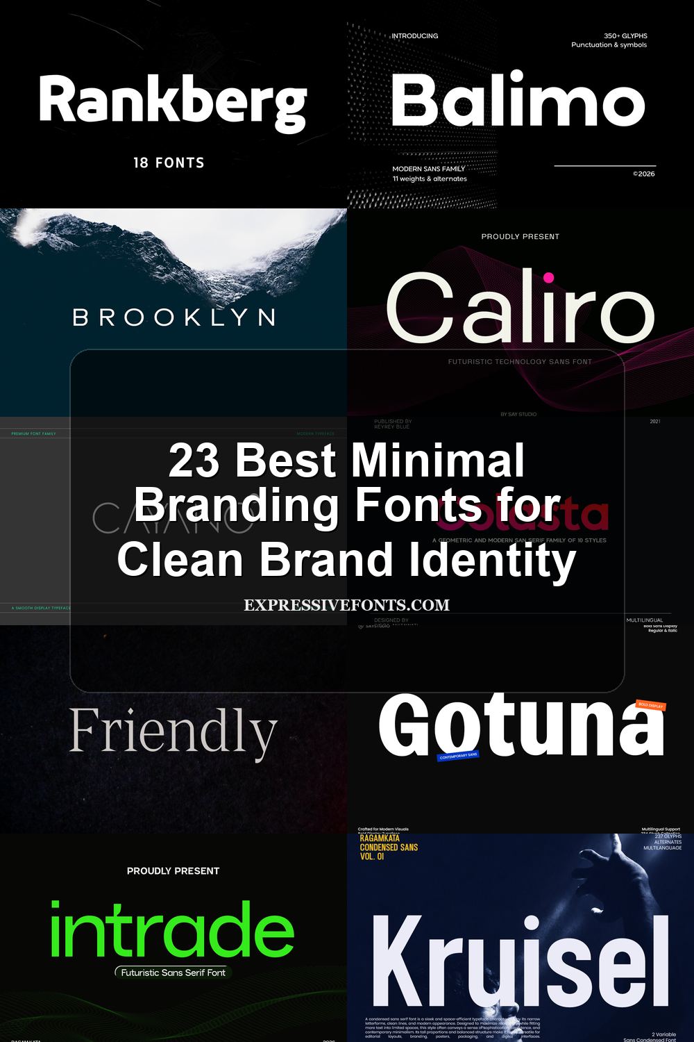
23 Best Minimal Branding Fonts for Clean Brand Identity
Looking for more branding fonts? Browse our complete Branding Fonts collection to compare luxury, elegant, modern, feminine, minimal, boutique, beauty, fashion, packaging, and serif styles.
Minimal Branding Fonts help clean visual identities feel sharper, calmer, and more deliberate. This collection is for designers building logos, packaging, websites, editorial layouts, and modern brand systems where the font needs to look polished without adding visual clutter.
Condensed & Impact Minimal Branding Fonts
These compressed and heavy styles suit compact logos, poster titles, and brand systems where clean typography needs strong vertical force.
Nothing Font
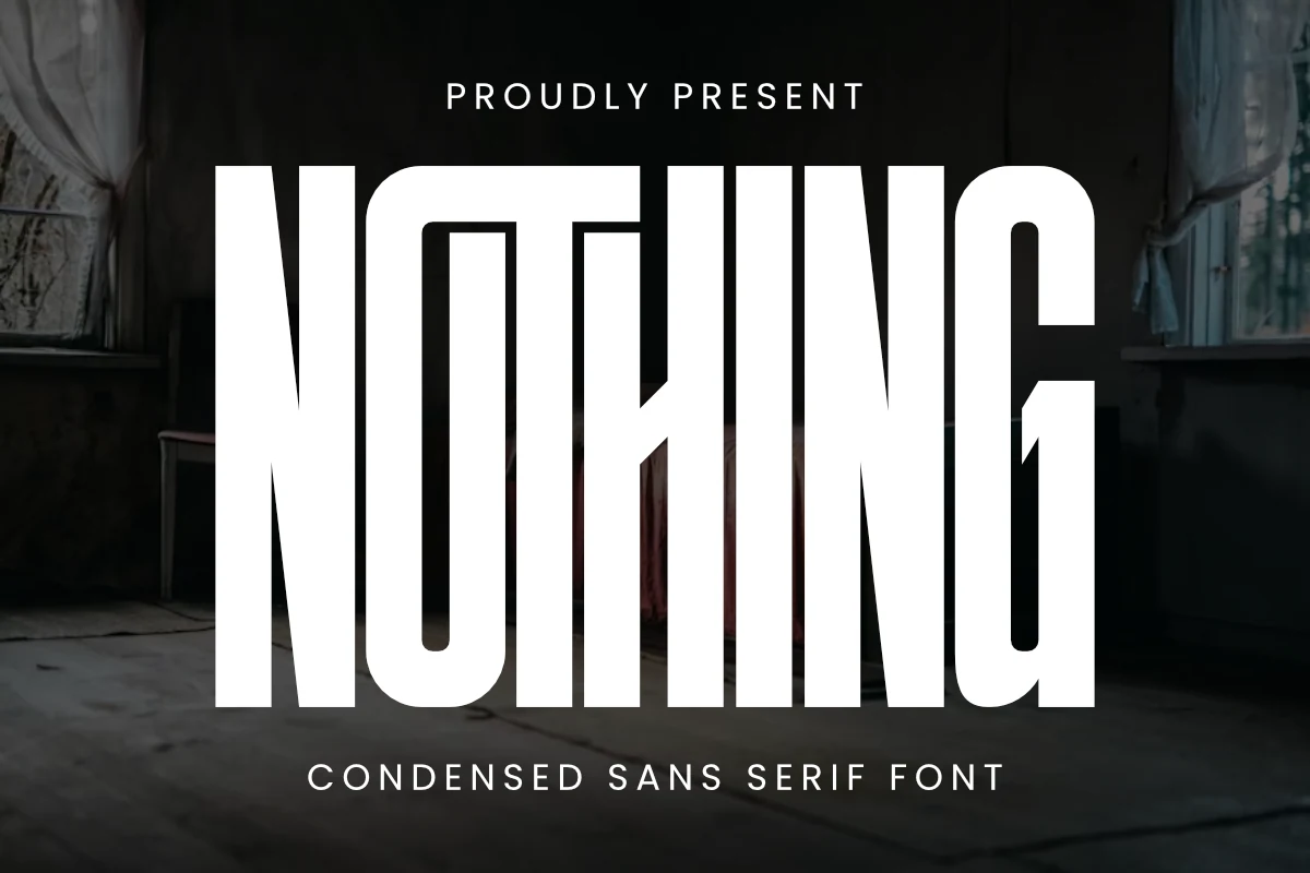
Best For: logos, posters, headlines, modern designs
Nothing Font uses extremely tall, compressed capitals with heavy vertical strokes and clean geometric cuts. The narrow proportions create a hard poster rhythm, while the squared structure keeps each word sharp instead of decorative.
For Minimal Branding Fonts, it works best where the typography is the main graphic element: strong logos, title cards, packaging fronts, and campaign headers. Keep spacing deliberate and contrast high, because the dense width gives impact but needs clear separation in longer names.
Kruisel Font
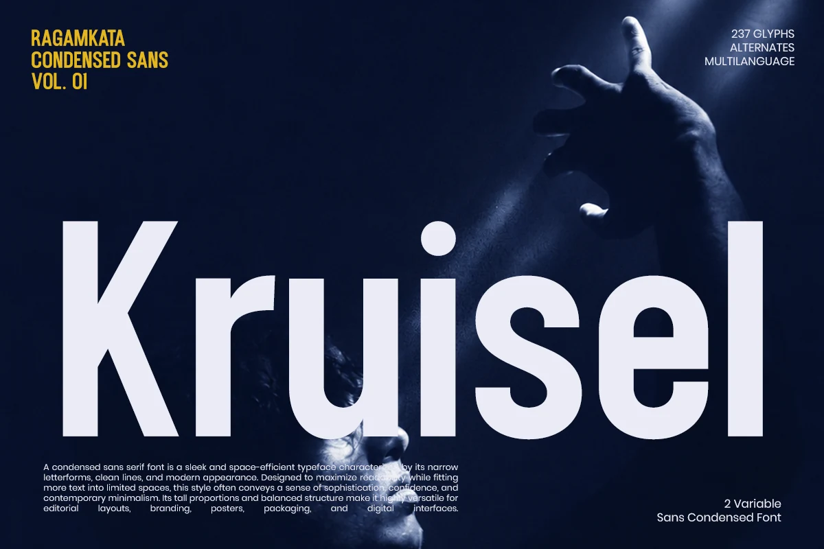
Best For: logos, posters, headlines, editorial designs
Kruisel Font has a tall condensed sans serif structure with heavy vertical strokes, tight curves, and compact letter widths that create a forceful headline rhythm. The clean geometric shapes keep the weight controlled, so it feels sharp and modern rather than rough.
For Minimal Branding Fonts, it works best when space is limited but the typography still needs impact. Use it for short logos, poster titles, and editorial headers with strong contrast; avoid crowding the margins, because the condensed forms need clear side spacing to stay readable.
Movault Font
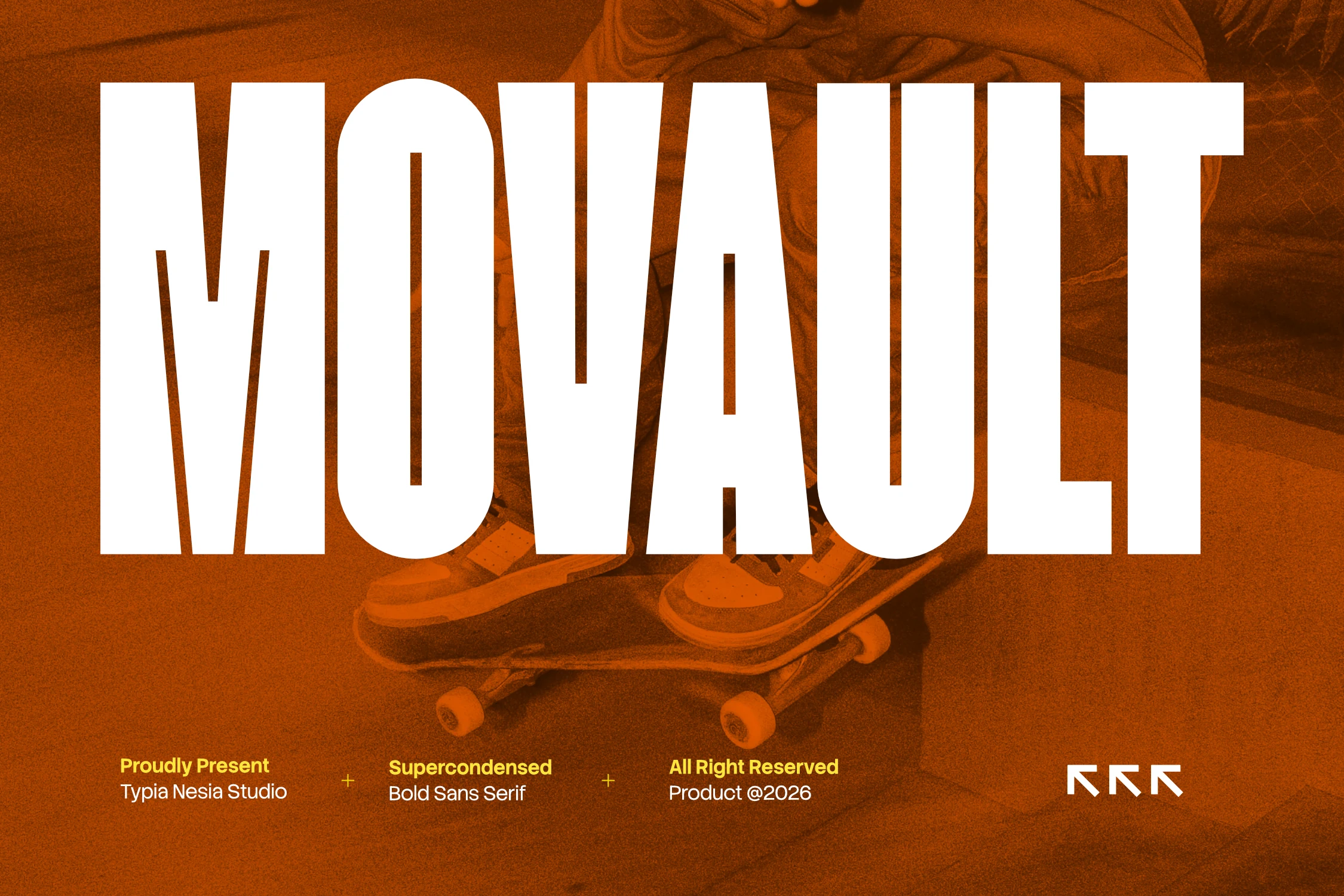
Best For: logos, branding, posters, headlines
Movault Font is built around a super-condensed bold sans structure, with towering uppercase forms, flat terminals, and a dense vertical rhythm. Its narrow proportions let a heavy wordmark fit into limited space, which suits Minimal Branding Fonts that need impact without decorative detail.
Use it for short titles, logos, poster lines, and campaign graphics where the typography is meant to dominate the composition. Because the counters are tight and the strokes are massive, add careful spacing and pair it with lighter secondary type to keep the hierarchy readable.
Thin & Elegant Minimal Branding Fonts
These airy, refined fonts work best for quiet logos, beauty packaging, editorial layouts, and brand identities built around space and restraint.
Phenom Font
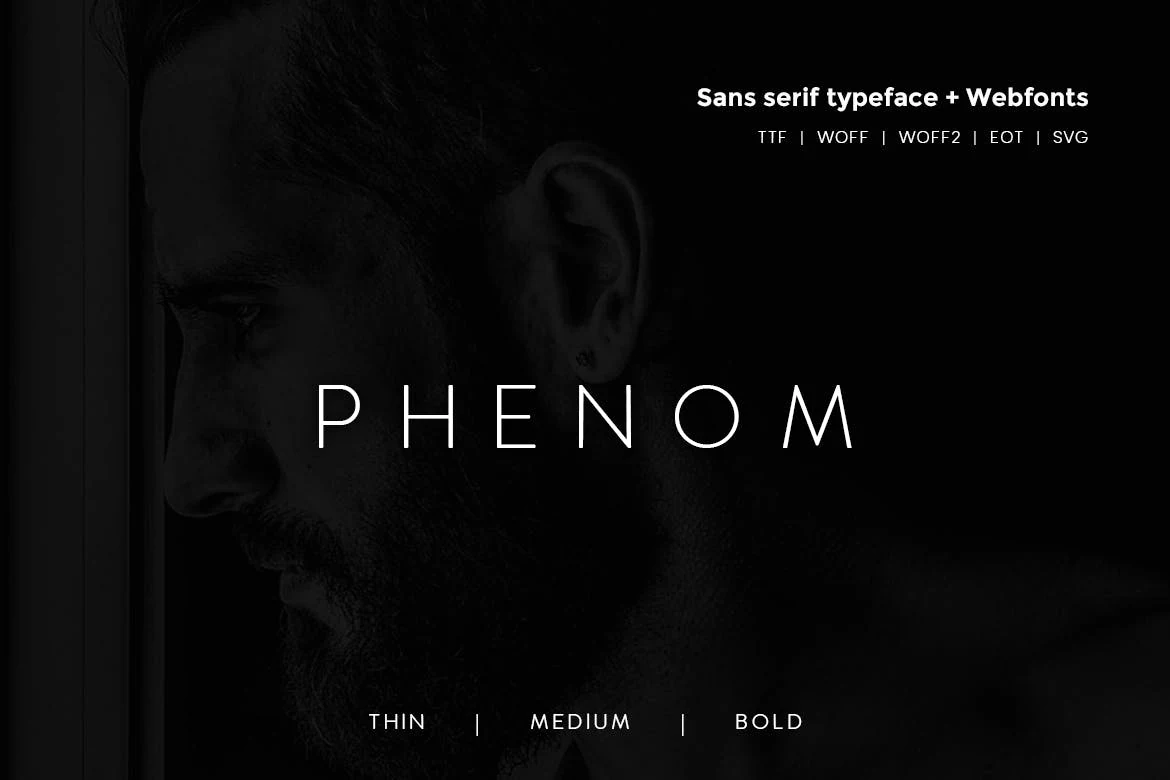
Best For: logos, business cards, website headers, minimal designs
Phenom Font is a quiet sans serif with thin strokes, open spacing, and clean uppercase shapes. Its letterforms avoid ornament, so the personality comes from proportion and rhythm rather than decoration.
For Minimal Branding Fonts, it works best when the layout gives the type enough negative space to stay crisp. Use strong contrast and measured tracking for logos, headers, or business cards, because the fine weight can lose authority if placed over busy texture.
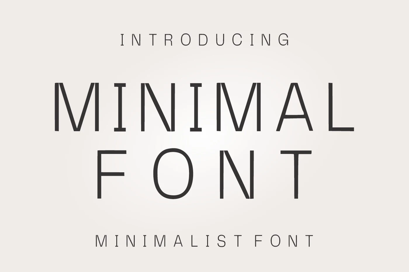
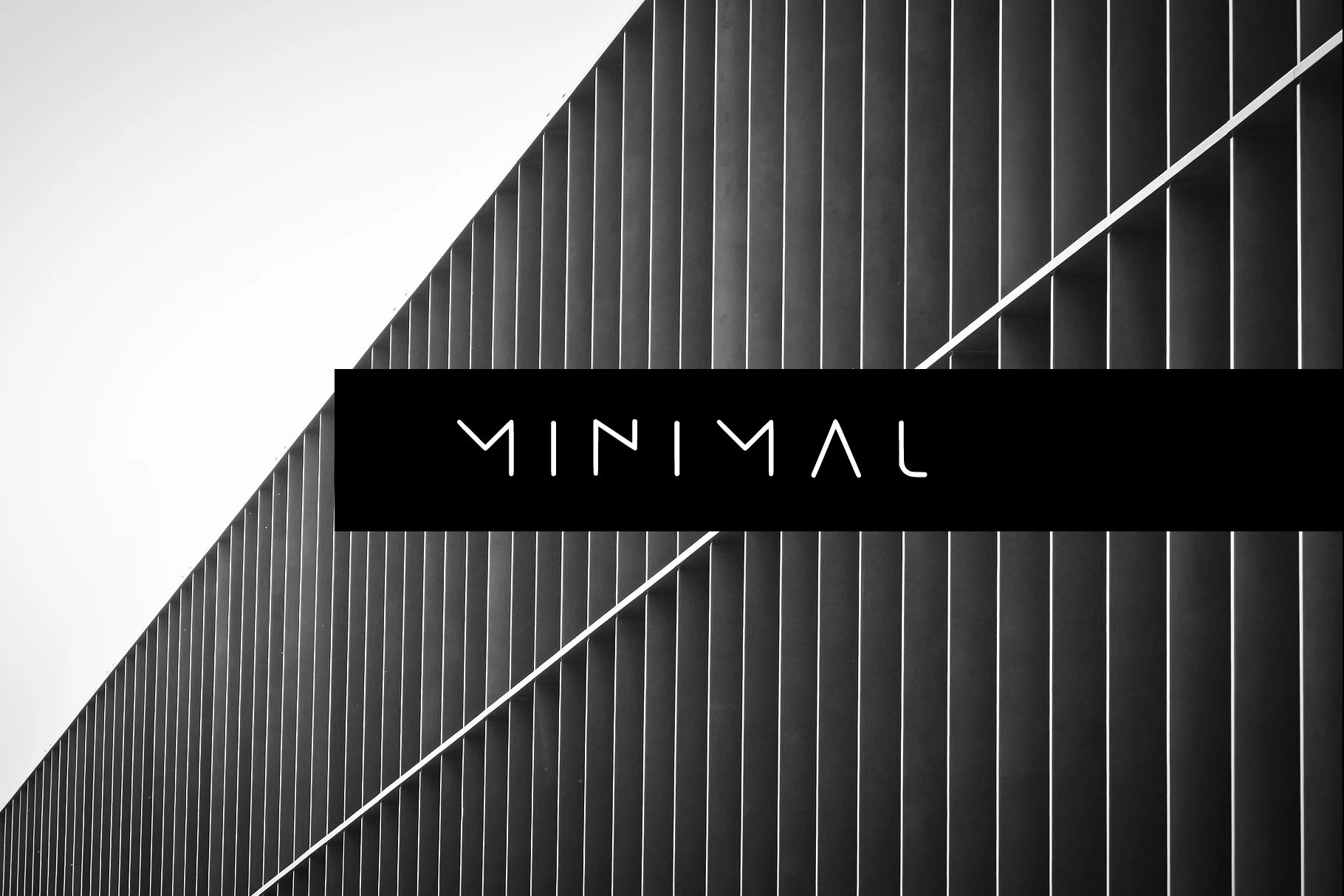
Minimal Font
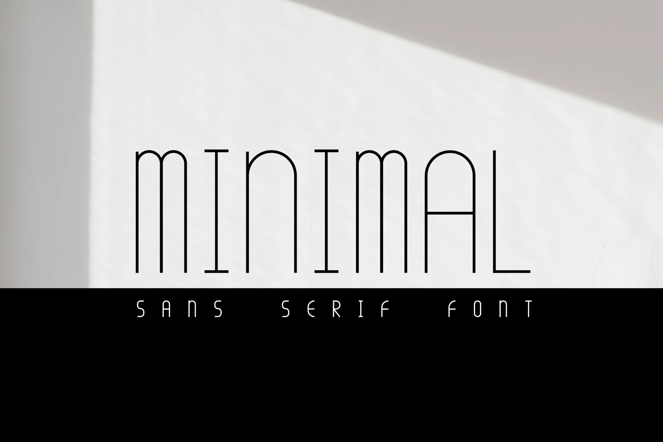
Best For: logos, website headers, display text, minimal designs
Minimal Font uses a fine monoline structure with wide spacing, open letter shapes, and angular breaks that give the capitals a precise architectural rhythm. The strokes are deliberately restrained, so the design feels clean without turning anonymous.
For Minimal Branding Fonts, it works best in short wordmarks, section headers, and refined display text where the spacing can remain part of the identity. Keep contrast high and avoid tight layouts, because the thin strokes need clear negative space to stay readable.
Minimal Font
Best For: logos, branding, website headers, minimal designs
Minimal Font is built from slim geometric strokes, open spacing, and angular letter breaks that make the wordmark feel precise and architectural. The light monoline weight gives it a clean display presence without adding decorative noise.
It suits Minimal Branding Fonts when the layout depends on restraint, contrast, and controlled negative space. Use it for short names, headers, or refined brand marks, keeping the tracking visible so the thin forms stay readable and intentional.
Luxury Font
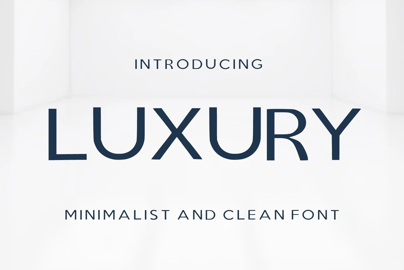
Best For: logos, website headers, beauty branding, high-end designs
Luxury Font combines slim geometric strokes, broad curves, and airy spacing for a polished look that feels quiet but deliberate. The simplified shapes keep it contemporary, while details like the rounded U and clean R give the lettering a refined editorial edge.
It suits Minimal Branding Fonts especially well when the goal is elegance without ornament. Use it for logos, packaging, or beauty-led headers at medium to large sizes, and keep the layout uncluttered so the negative space becomes part of the overall styling.
Brooklyn Font
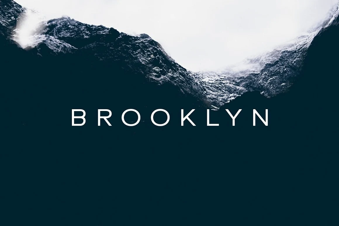
Best For: logos, website headers, display text, minimal designs
Brooklyn Font uses thin uppercase strokes, wide tracking, and clean circular forms to create a calm, spacious sans serif look. The even monoline weight and simple terminals keep the lettering neat, while the generous spacing gives each character a deliberate, premium rhythm.
It works well for Minimal Branding Fonts when the design needs restraint instead of force. Use it for short wordmarks, website headers, or display titles with high contrast; tighter compositions can make the fine strokes disappear, so let the spacing remain visible.
Cayano Pro Font
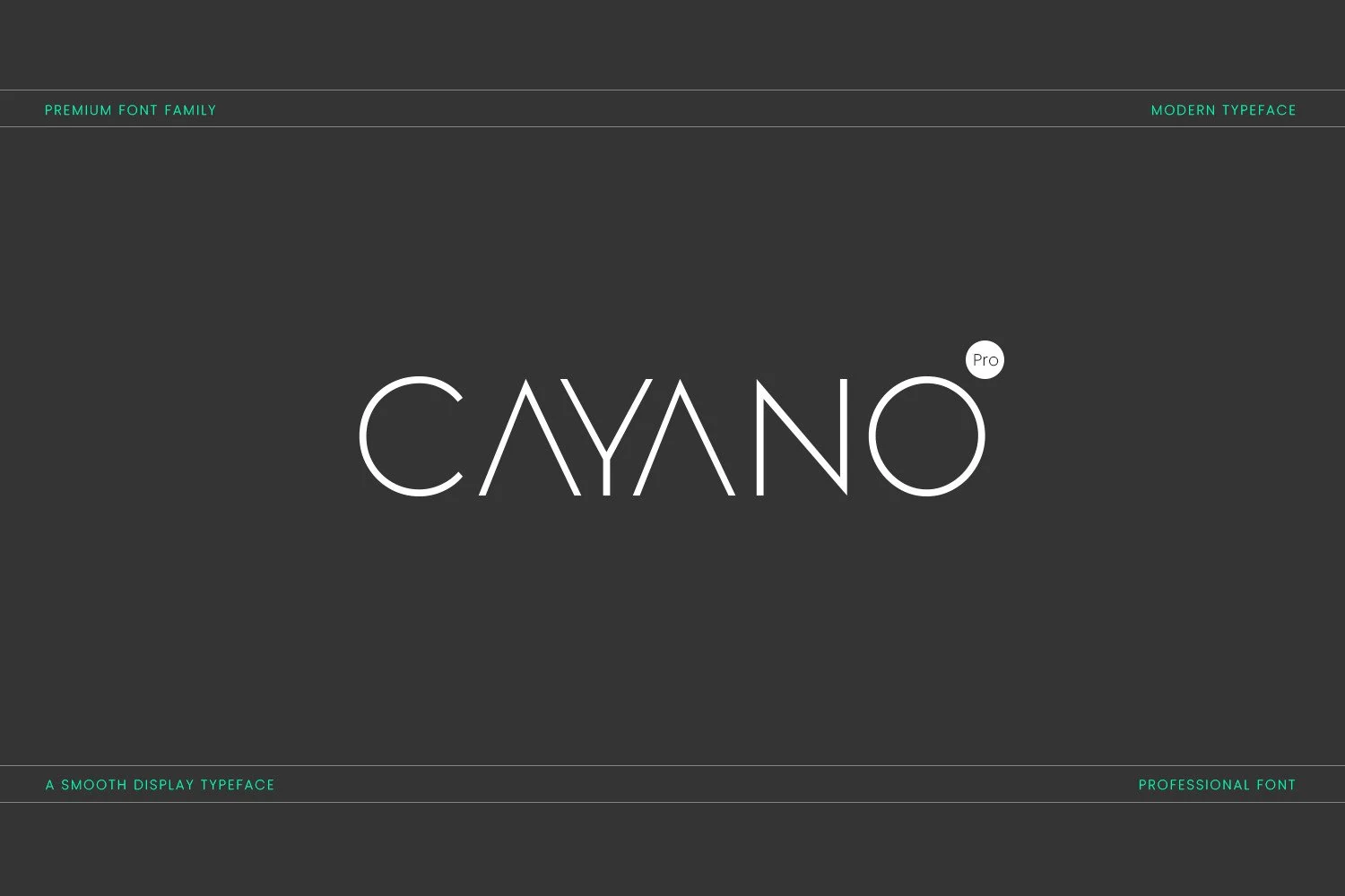
Best For: logos, magazine covers, invitations, minimal designs
Cayano Pro Font has a slim monoline structure with wide spacing, sharp terminals, and geometric curves that keep the letterforms airy and precise. The pointed A and smooth circular forms give it a polished display character that feels modern rather than ornate.
For Minimal Branding Fonts, it works best in logos, invitations, and editorial covers where the typography can sit with plenty of white space. Keep the tracking slightly open and the layout restrained, because the thin strokes and clean proportions carry the style on their own.
Friendly Font
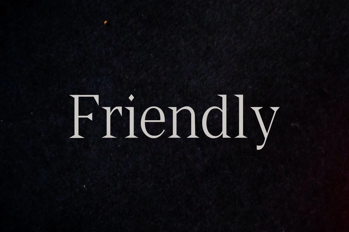
Best For: logos, magazine covers, quotes, elegant designs
Friendly Font has graceful serif letterforms with tapered strokes, crisp wedge-like serifs, and a soft contrast that keeps the word shape refined rather than severe. The proportions feel balanced and slightly literary, which gives it a calm, polished tone.
That character suits Minimal Branding Fonts when you want elegance without heavy ornament. It works best in short logos, editorial titles, or quote graphics where the texture of the serifs can stay visible, and a little extra spacing helps the details read cleanly.
Minimalist Font
Best For: logos, branding, minimal designs, clean designs
Minimalist Font uses a rounded monoline sans structure with tall uppercase forms, clean verticals, and softened terminals that keep the wordmark calm rather than severe. Its wide letter spacing gives the thin strokes enough air, which suits Minimal Branding Fonts where restraint is part of the identity.
Use it where the layout can support generous tracking and strong negative space. The simple geometry works well for logos, labels, and website headers, but very small text may lose presence because the strokes are light and the character shapes rely on open spacing.
Rounded & Futuristic Minimal Branding Fonts
These smooth and tech-leaning fonts fit startups, digital products, web headers, and modern brands that need clean forms with a subtle future-facing edge.
Intrade Font
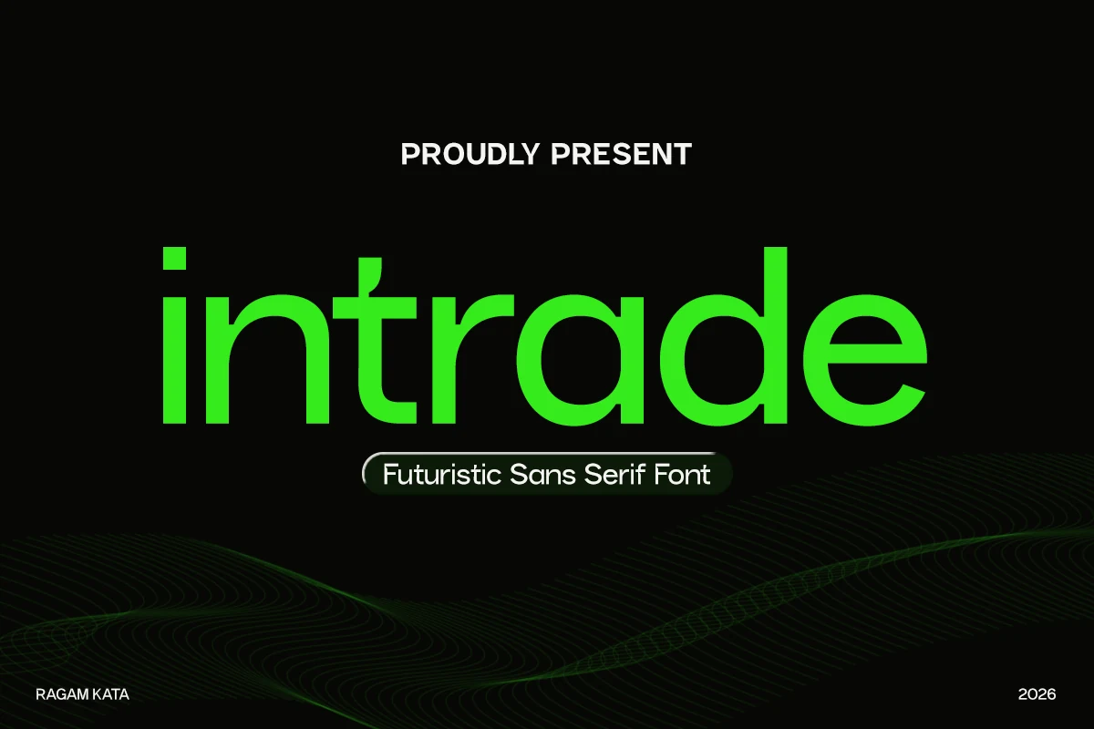
Best For: logos, website headers, modern designs, minimal designs
Intrade Font has a sleek geometric build with smooth curves, rounded terminals, and an even monoline weight that keeps the word shapes clean and calm. The lowercase styling gives it a more approachable rhythm, while the crisp structure still feels distinctly futuristic.
It suits Minimal Branding Fonts especially well when you want a modern identity that looks polished without feeling cold. The balanced proportions help logo lockups stay clear, and slightly open spacing works well for headers or packaging where you want a light, tech-forward presence.
Minimal Font
Best For: logos, website headers, display text, minimal designs
Minimal Font has a sleek monoline structure with airy spacing, rounded corners, and angular breaks that push it toward a distinctly futuristic look. The letterforms stay slim and controlled, so the design feels elegant rather than technical.
That makes it a strong option for Minimal Branding Fonts when you want a clean identity with a subtle sci-fi edge. It performs best in short logos, headers, and display settings where the spacing can stay open, helping the unusual shapes read clearly and keep their refined rhythm.
Mograph Font
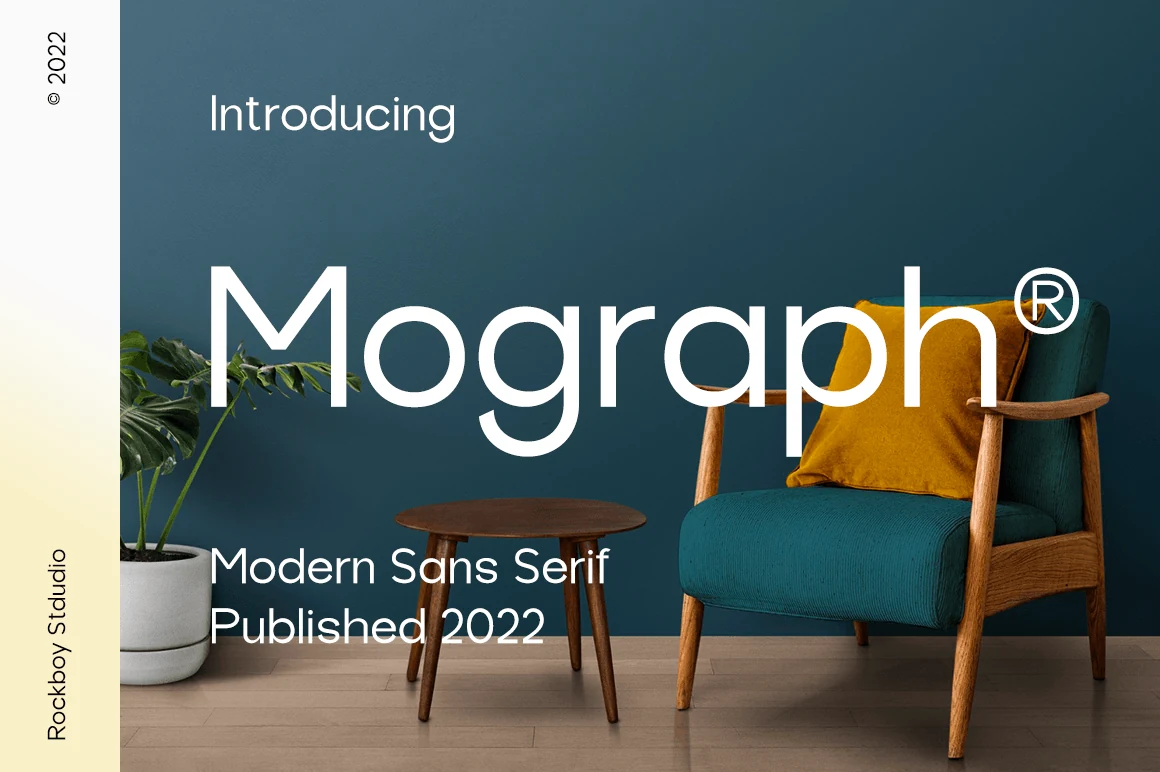
Best For: logos, branding, website headers, minimal designs
Mograph Font leans on smooth geometric construction, generous circular bowls, and a light monoline weight that keeps the large lettering airy rather than cold. That balance makes it a smart choice for Minimal Branding Fonts, especially when you want a clean identity with a softer, more approachable tone.
Its open shapes and steady rhythm read well in logos, headers, and product presentation, where simple composition does the work. Give it room and moderate tracking—the rounded forms look best when they are not crowded, and they pair naturally with understated supporting text.
Calior Font
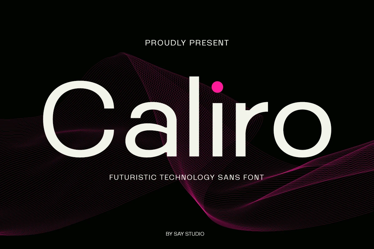
Best For: logos, branding, website headers, editorial designs
Calior Font has a sleek geometric sans structure with broad round bowls, smooth monoline strokes, and a measured futuristic tone that stays clean rather than flashy. The inktrap-inspired detailing sharpens the forms just enough to make it feel precise, which works especially well for Minimal Branding Fonts with a tech-leaning identity.
Its clear proportions suit headlines, startup wordmarks, dashboards, and editorial covers where you want a polished digital feel. Keep spacing controlled and pair it with simple secondary text—the crisp shapes already create enough personality, so the font performs best when the layout stays uncluttered.
Bold Geometric Minimal Branding Fonts
These sturdy geometric fonts are built for confident logos, packaging fronts, headlines, and identity systems that need weight without extra decoration.
Olline Font
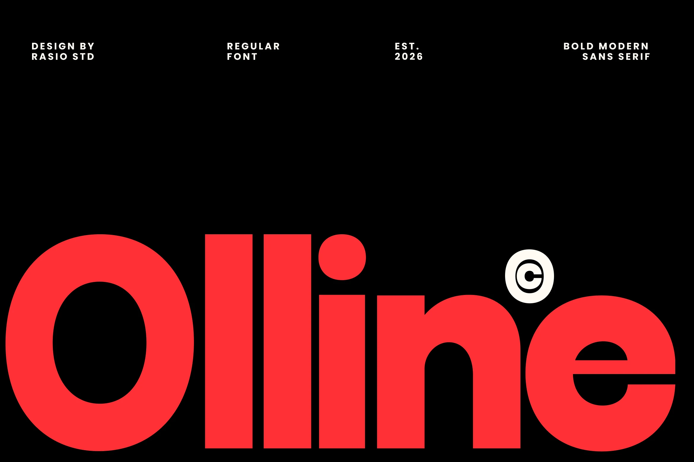
Best For: logos, posters, headlines, modern designs
Olline Font has a heavy geometric build with thick strokes, broad curves, and compact forms that give it immediate visual force. The rounded counters and stripped-back structure keep the bold weight crisp, so it feels modern and assertive rather than bulky.
It works especially well for Minimal Branding Fonts when you want a clean identity with more punch than a neutral sans can offer. Short names, packaging fronts, and display headlines suit it best; give it generous surrounding space, because the dense proportions read strongest when the type can dominate the hierarchy.
Methane Font
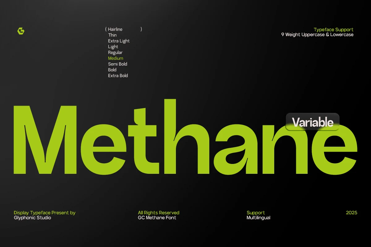
Best For: logos, website headers, modern designs, professional designs
Methane Font has a solid geometric build with broad curves, thick strokes, and a steady, controlled rhythm. The large rounded bowls and clean joins make it feel strong without looking heavy, giving headlines a polished, system-driven look.
That balance makes it a smart fit for Minimal Branding Fonts, especially when you need a clear identity that still carries weight. It works well in logos, interface headers, and print layouts where bold scale does the work, and slightly tighter spacing helps the wordmark feel even more unified.
Mansfield Font
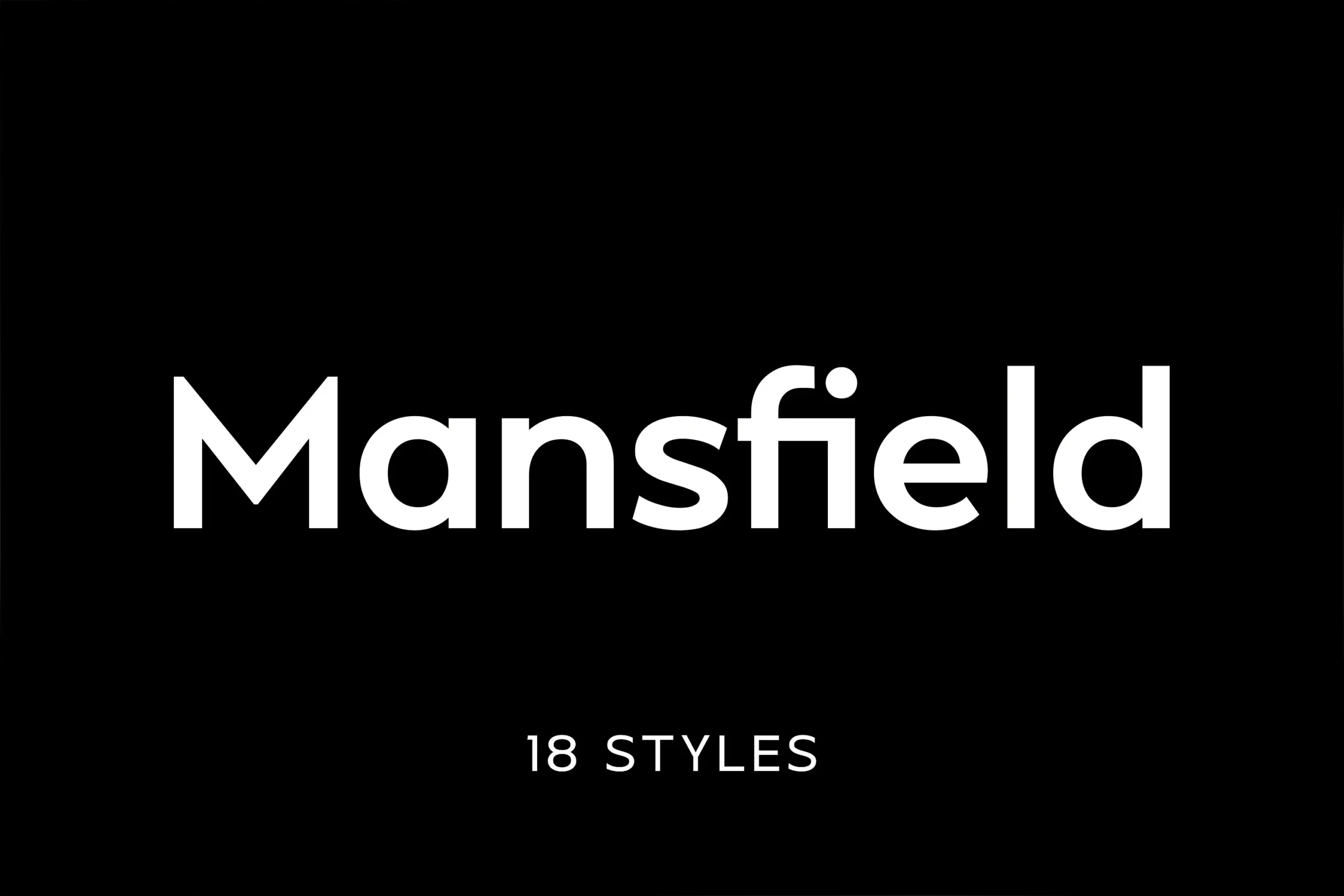
Best For: logos, branding, editorial designs, magazine covers
Mansfield Font has a geometric sans serif structure with rounded bowls, straight terminals, and a tall, steady x-height that keeps the word shape clean and controlled. The strokes stay even throughout, giving it that crisp neo-grotesque feel without looking cold.
It fits Minimal Branding Fonts especially well when you want a modern identity with more character than a neutral sans. The precise spacing helps logos and editorial titles feel orderly, and its tall proportions hold up nicely in stacked layouts or narrow cover compositions.
Colasta Font
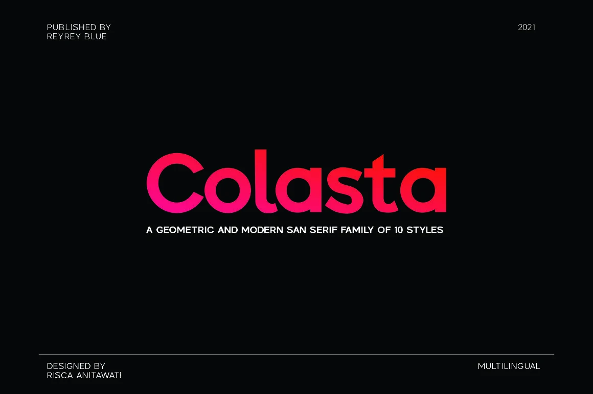
Best For: logos, branding, website headers, minimal designs
Colasta Font has a minimal geometric sans serif structure with clean curves, neat spacing, and a modern family-style rhythm. The multiple weights make it flexible for calm branding systems without adding decorative detail.
For Minimal Branding Fonts, it works well in logos, web headers, packaging, and identity systems where a simple sans serif needs to stay versatile. Use its lighter weights for refined layouts and heavier styles when the wordmark needs more presence.
Noirden Font
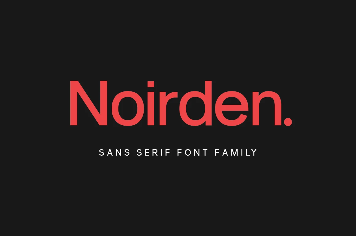
Best For: logos, branding, website headers, clean designs
Noirden Font has a bold geometric sans serif look with rounded bowls, even strokes, and a broad x-height that makes the lettering feel immediate and confident. The clean construction fits Minimal Branding Fonts especially well, while the softened curves keep the overall tone modern rather than harsh.
It works best in short wordmarks, headers, and packaging where the weight can carry the layout on its own. Pair it with restrained secondary text and strong contrast—the sturdy shapes and compact rhythm give brand names presence without relying on extra decoration.
Gotuna Font
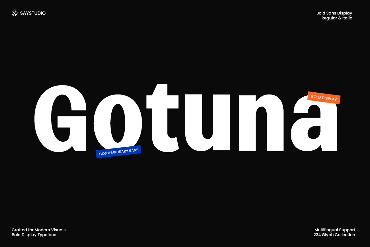
Best For: logos, branding, editorial designs, headlines
Gotuna Font has a heavy geometric build with broad counters, clean curves, and sturdy proportions that give it a direct contemporary voice. The bold display style feels compact and assured, making it a strong fit for Minimal Branding Fonts that need presence without extra ornament.
Use it when you want hierarchy to come from weight and proportion rather than effects. Its dense silhouette works especially well for logos, editorial covers, and campaign headlines, while lighter supporting text helps the strong letterforms stay crisp and intentional.
Balimo Font
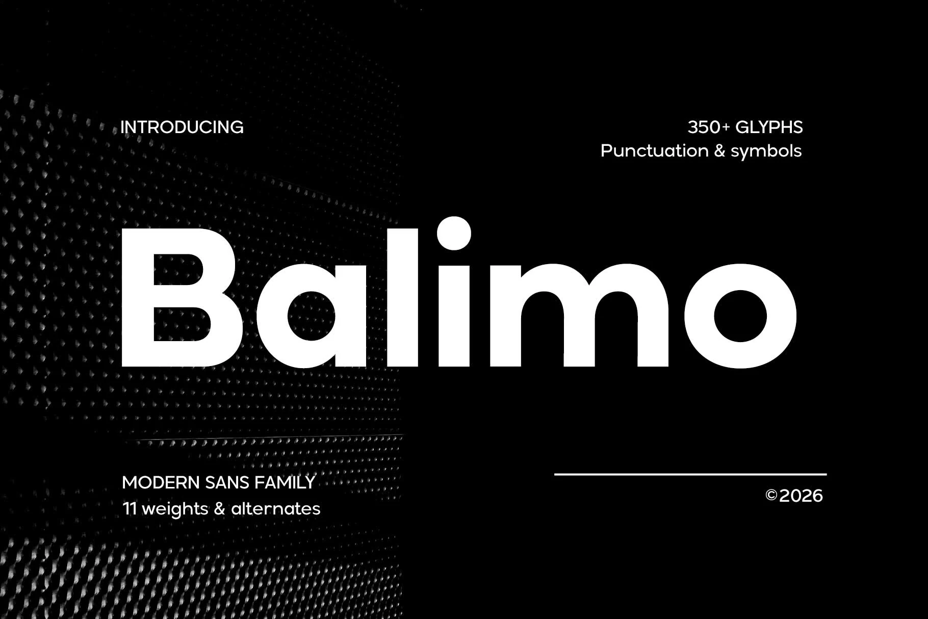
Best For: logos, branding, editorial designs, website headers
Balimo Font combines a bold geometric sans serif structure with rounded bowls, wide counters, and a steady stroke weight that keeps large lettering crisp and controlled. That balance of clarity and presence makes it a strong fit for Minimal Branding Fonts, especially when you want a modern identity that feels polished rather than cold.
Its even spacing and clean rhythm support both bold headlines and shorter supporting text without losing composure. Use it for logo systems, editorial titles, or web headers where simple hierarchy matters—the broad shapes hold attention well, while restrained layouts help the font stay sharp and professional.
Rankberg Font
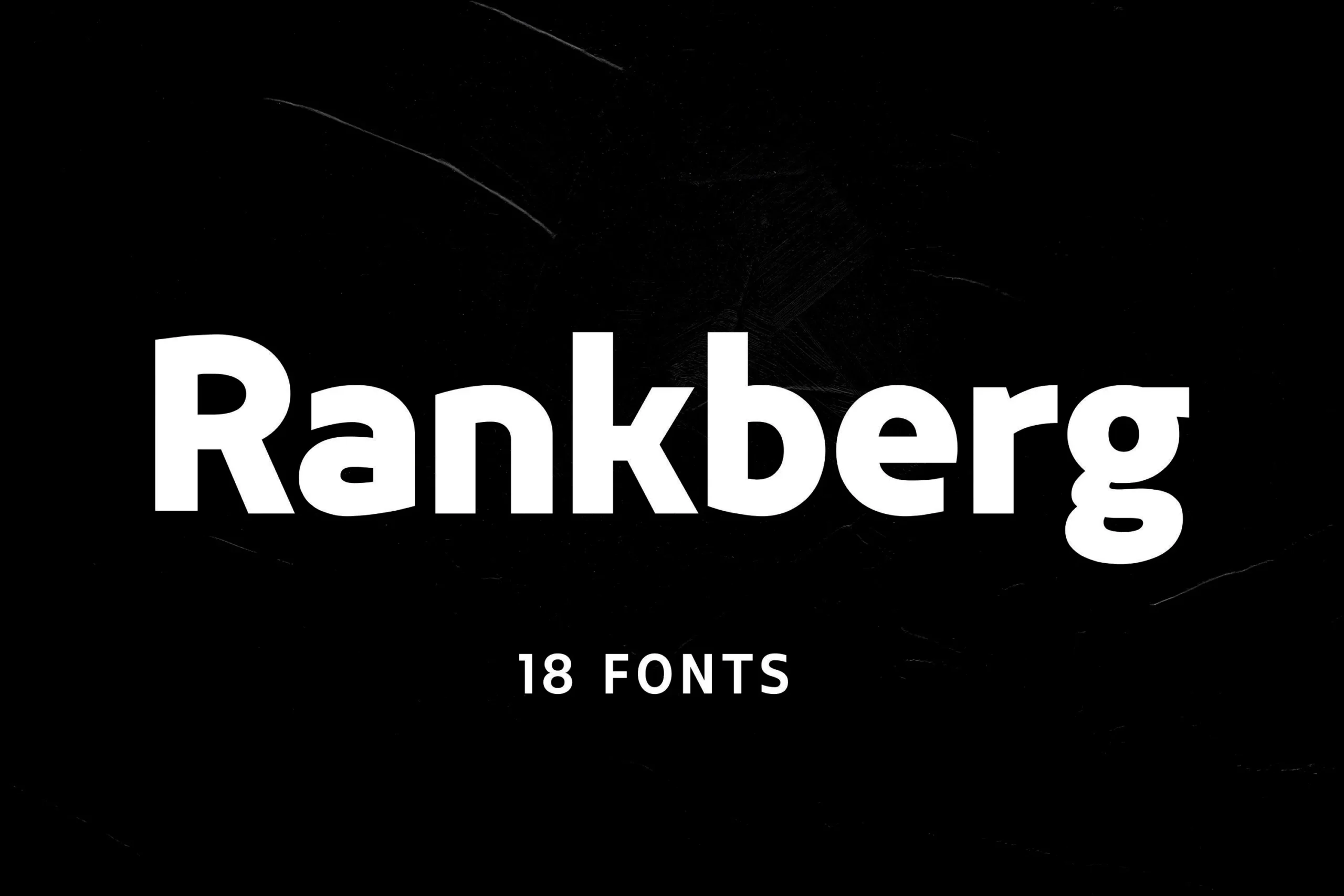
Best For: logos, branding, headlines, bold designs
Rankberg Font uses a heavy bold sans-serif structure with thick stems, blunt cuts, and rounded internal shapes that keep the wordmark forceful but still readable. Its compact rhythm and strong weight give Minimal Branding Fonts a tougher display edge without adding decorative noise.
Use it where the type needs to carry the composition: short logos, campaign headlines, posters, and high-contrast digital graphics. The dense letterforms benefit from clear spacing around the word and a lighter supporting typeface so the hierarchy does not become visually crowded.
Conclusion
Choose thin and elegant fonts when the brand needs space and restraint, bold geometric fonts when it needs stronger presence, condensed styles for compact impact, and rounded futuristic fonts for clean digital identities.