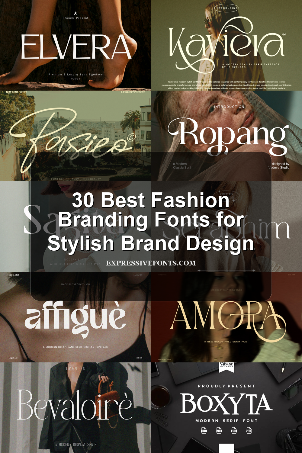
30 Best Fashion Branding Fonts for Stylish Brand Design
Looking for more branding fonts? Browse our complete Branding Fonts collection to compare luxury, elegant, modern, feminine, minimal, boutique, beauty, fashion, packaging, and serif styles.
Fashion Branding Fonts help fashion labels, beauty studios, boutiques, and editorial designers build a polished visual identity with type. This collection focuses on premium serif, script, sans serif, and display fonts for logos, packaging, lookbooks, magazine-style layouts, product labels, and social media visuals.
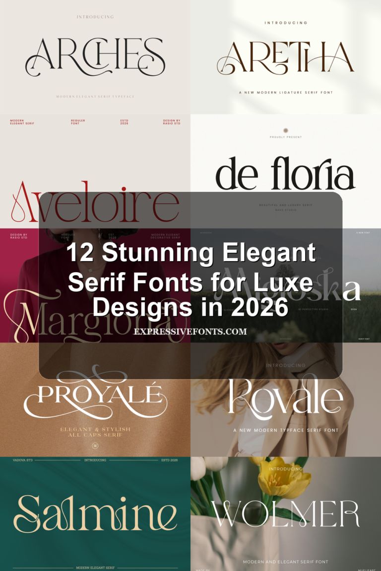
Elegant Serif Fashion Branding Fonts
These refined serif fonts use high contrast, clean spacing, and polished curves for fashion logos, beauty packaging, mastheads, and premium identity systems.
Swagume Font
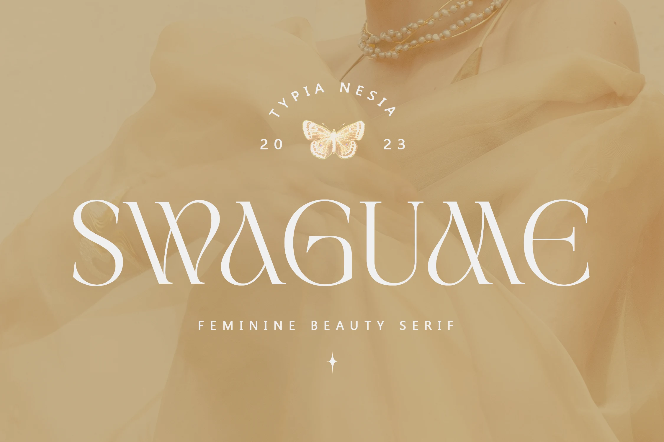
Best For: fashion branding, beauty branding, editorial designs, luxury designs
Swagume has a polished feminine serif structure with high contrast strokes, slim verticals, and rounded curves that fold into decorative joins. Its ligatures and alternates are the main buying point: they help a wordmark feel custom without adding extra ornaments around the type.
The wide, sculptural capitals make it strongest in short titles, beauty packaging, fashion labels, and editorial mastheads. For Fashion Branding Fonts, Swagume works best with generous spacing and controlled contrast, so the refined curves stay readable instead of turning into dense decoration.
Bevaloire Font
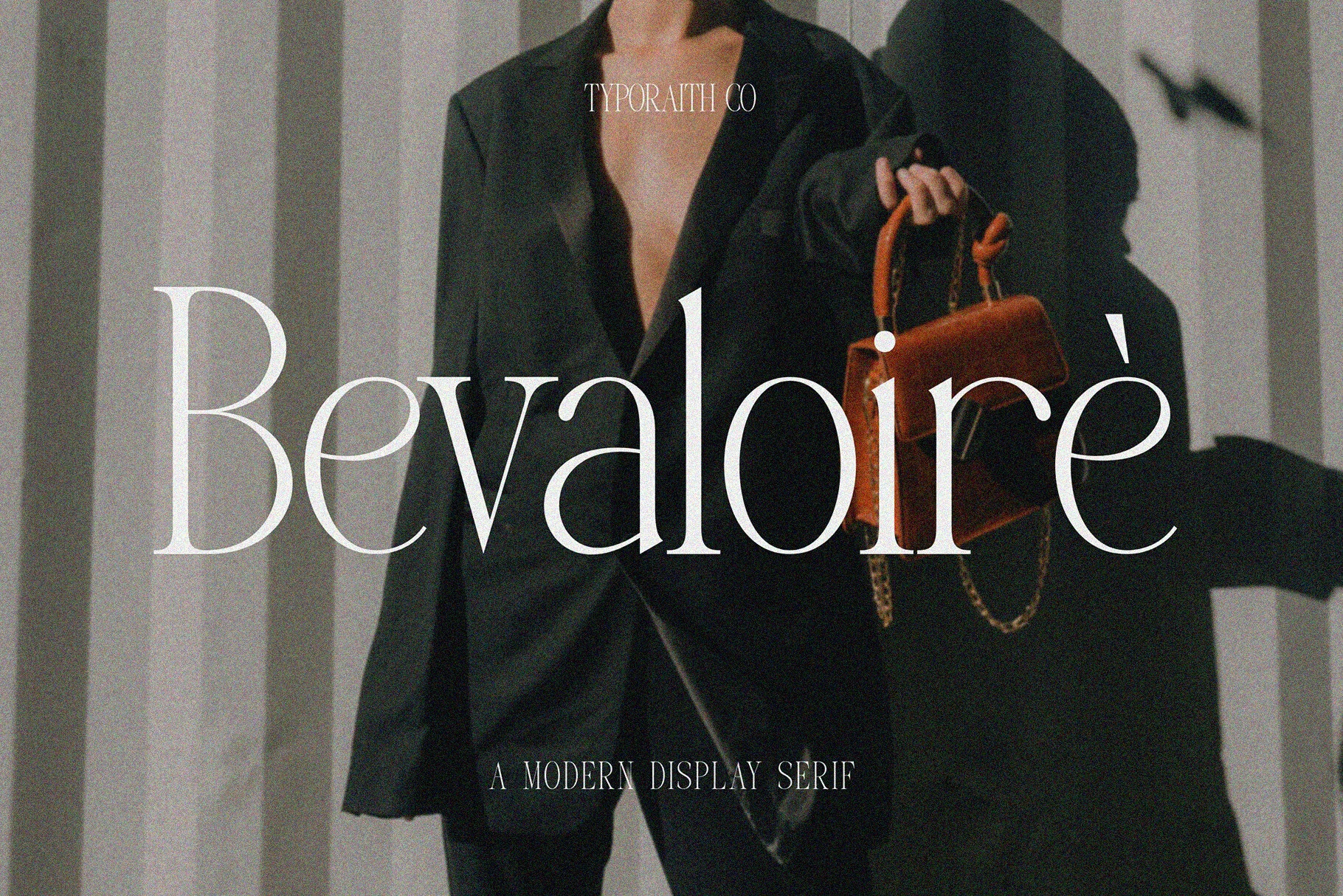
Best For: fashion branding, editorial designs, logos, packaging
Bevaloire has the kind of high-contrast serif structure that feels immediately editorial, with long verticals, fine hairlines, and rounded curves that give the letters a polished, elongated rhythm. It carries a stylish display presence without becoming stiff, so even a short wordmark looks composed and distinctive.
That makes it a strong fit for Fashion Branding Fonts, especially in logos, packaging, and cover-style layouts where the type needs to set the tone on its own. Use it at generous sizes with slightly open spacing, since its thin details and tall proportions read best when the composition has room to breathe.
Ethorys Font
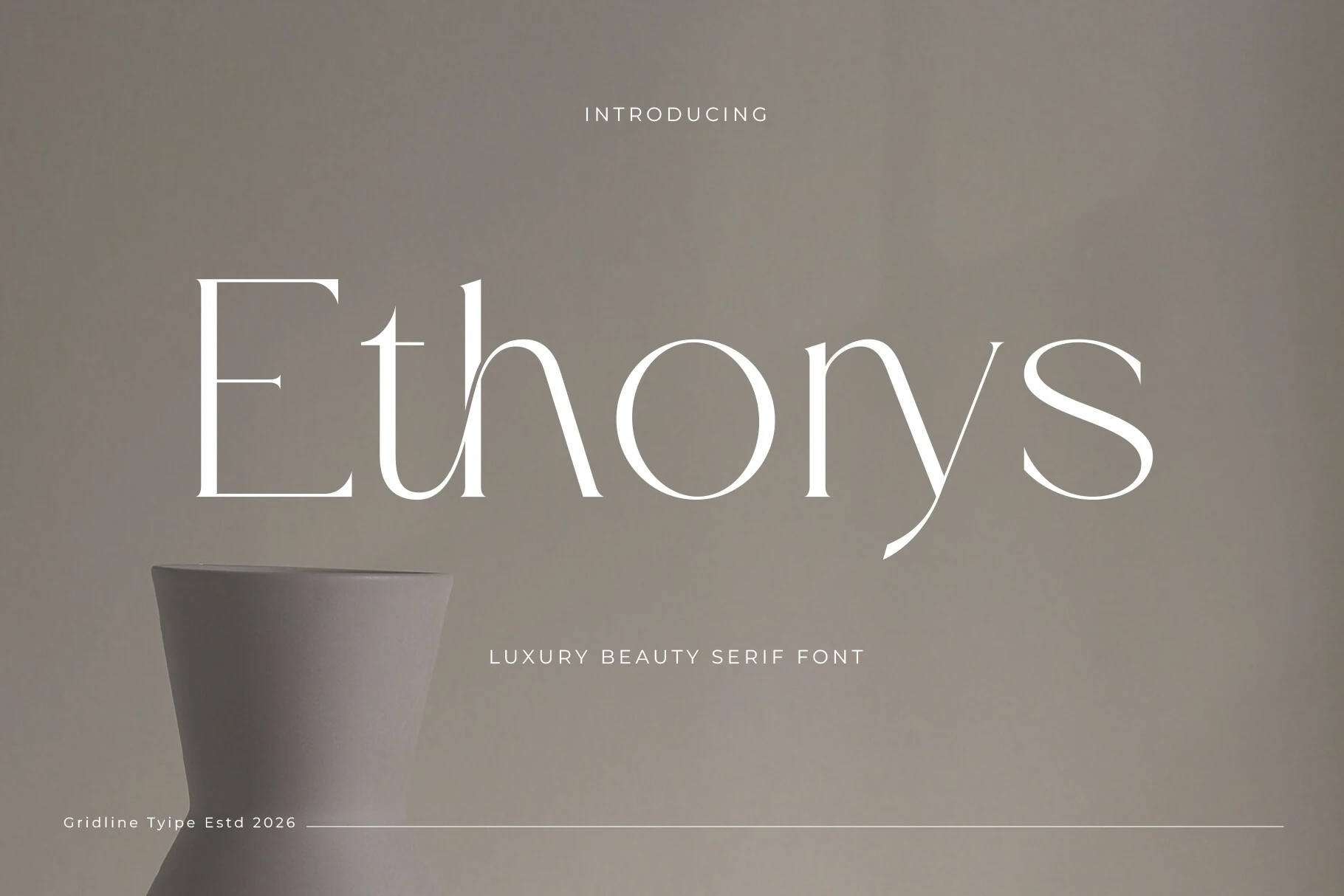
Best For: fashion branding, beauty branding, editorial designs, luxury designs
Ethorys has a quiet editorial elegance, with tall high-contrast strokes, slim serifs, and airy spacing that keeps the wordmark looking polished rather than heavy. The curved ligatures, especially in pairings like t-h, give it a seamless flow that makes short titles feel more considered and bespoke.
That balance suits Fashion Branding Fonts beautifully, especially for mastheads, beauty packaging, and refined brand signatures. It works best at larger sizes with a clean hierarchy around it, since the fine hairlines and delicate joins need room to stay crisp and expressive.
Kidora Font
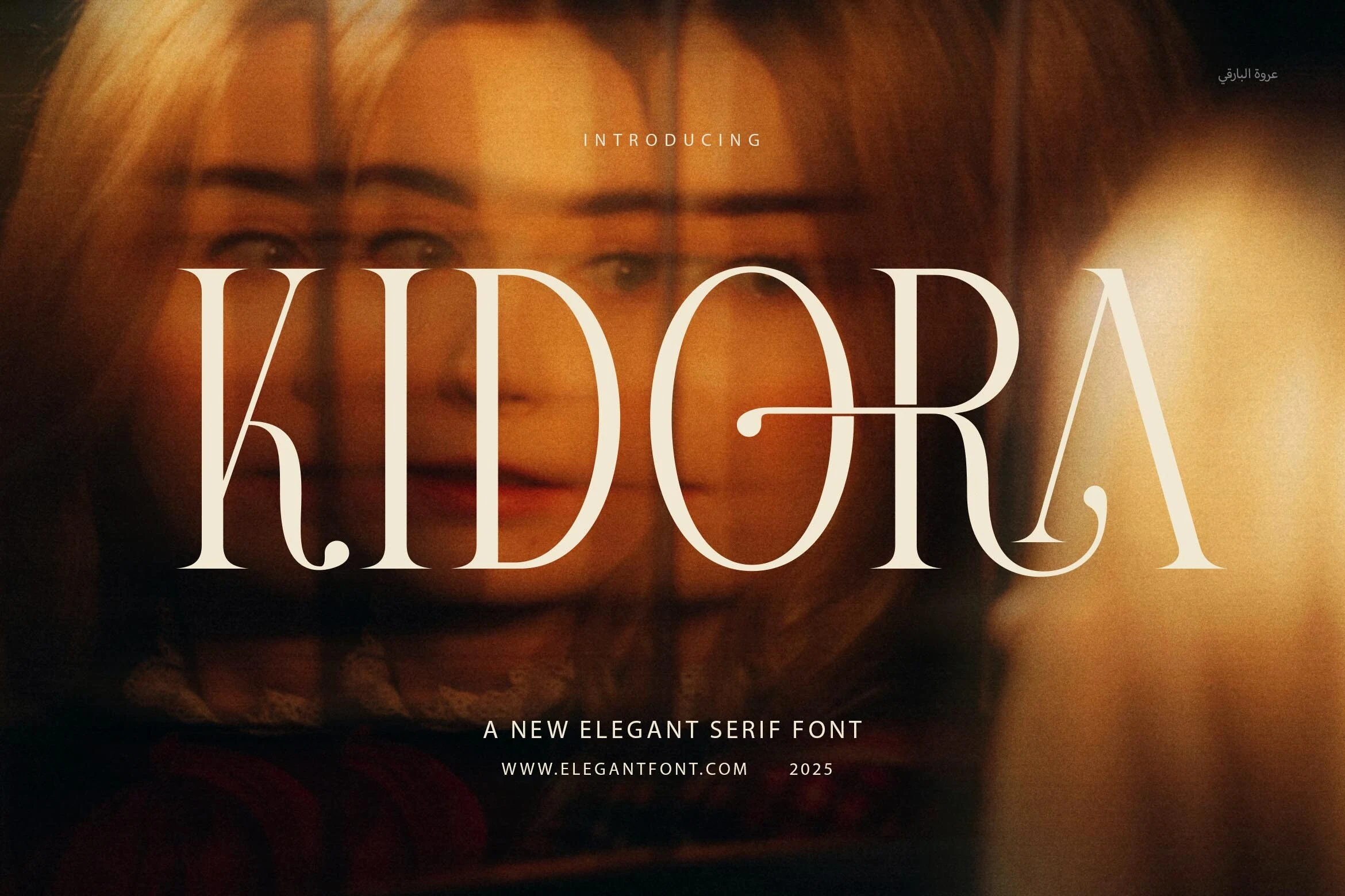
Best For: fashion branding, editorial designs, logos, packaging
Kidora has a clean modern serif structure with tall capitals, fine hairlines, and soft curves that keep the display style refined rather than severe. The balanced letter shapes give it enough clarity for polished titles, while the subtle curves in forms like R and A add a more distinctive brand finish.
For Fashion Branding Fonts, Kidora fits logos, packaging, and editorial headers where a quiet luxury tone is more useful than heavy ornament. Use it with controlled spacing and strong contrast, since the thin strokes and wide uppercase proportions need a clean hierarchy to stay sharp in print and digital layouts.
Drose Font
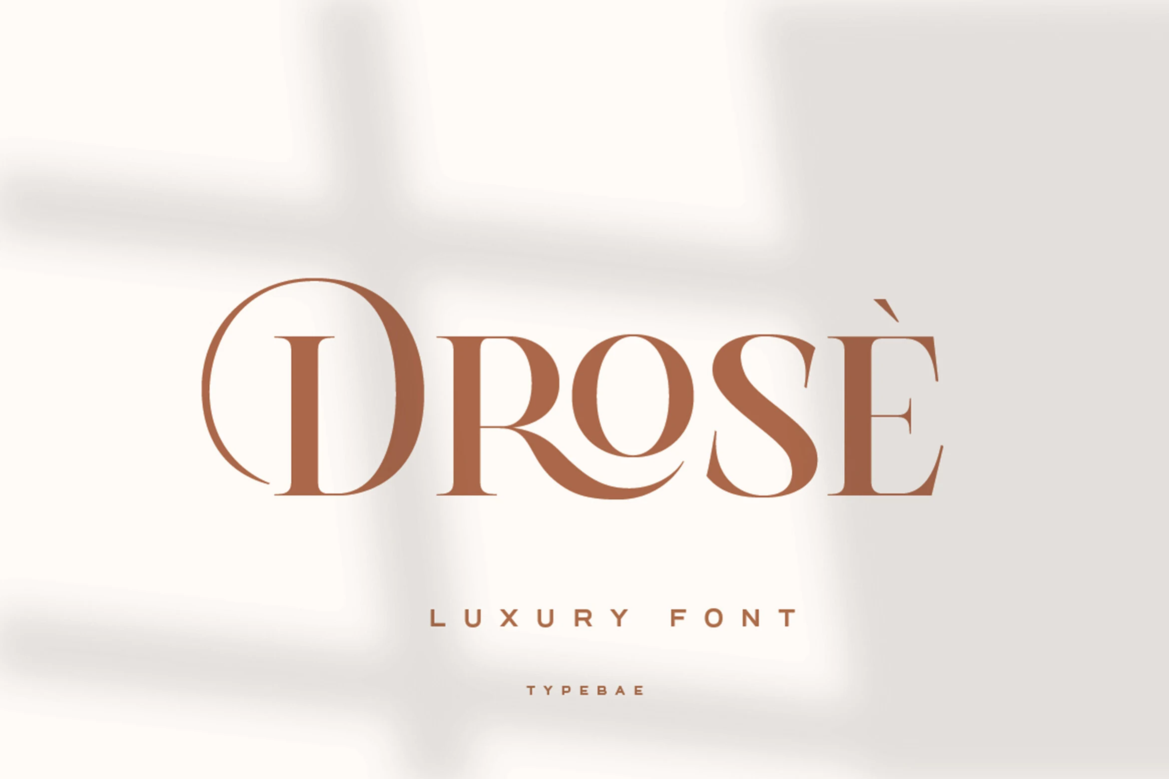
Best For: fashion branding, logos, editorial designs, packaging
Drose has a poised luxury serif look with tall proportions, crisp high-contrast strokes, and smooth curves that keep the wordmark feeling polished rather than ornate. The rounded bowls and sculpted leg of the R give it a softer rhythm, which helps large titles look refined and expressive at the same time.
For Fashion Branding Fonts, Drose works especially well in logos, magazine-style headers, and premium packaging where a clean upscale tone matters. Its shapes stay most elegant in short text with measured spacing, letting the contrast and curved details define the hierarchy without crowding the composition.
Noirvelle Font
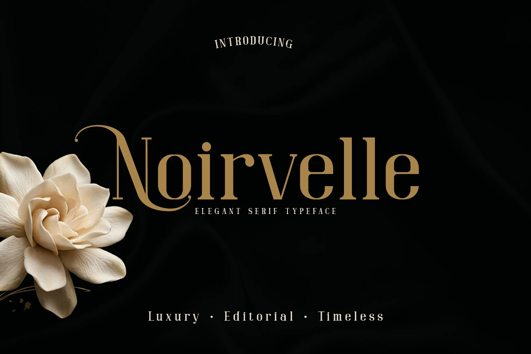
Best For: fashion branding, editorial designs, packaging, luxury designs
Noirvelle has a quiet luxury serif style with firm vertical stems, graceful contrast, and restrained decorative details. The capital N brings the strongest character through its long curved swash, giving the wordmark a romantic editorial accent without making the whole font feel overly ornamental.
For Fashion Branding Fonts, it suits refined logos, magazine headers, wedding-led branding, and premium packaging where the type needs a polished but calm presence. Keep spacing controlled and let one swashed capital lead the hierarchy, since too many decorative accents would weaken the clean Parisian rhythm.
Sagita Font
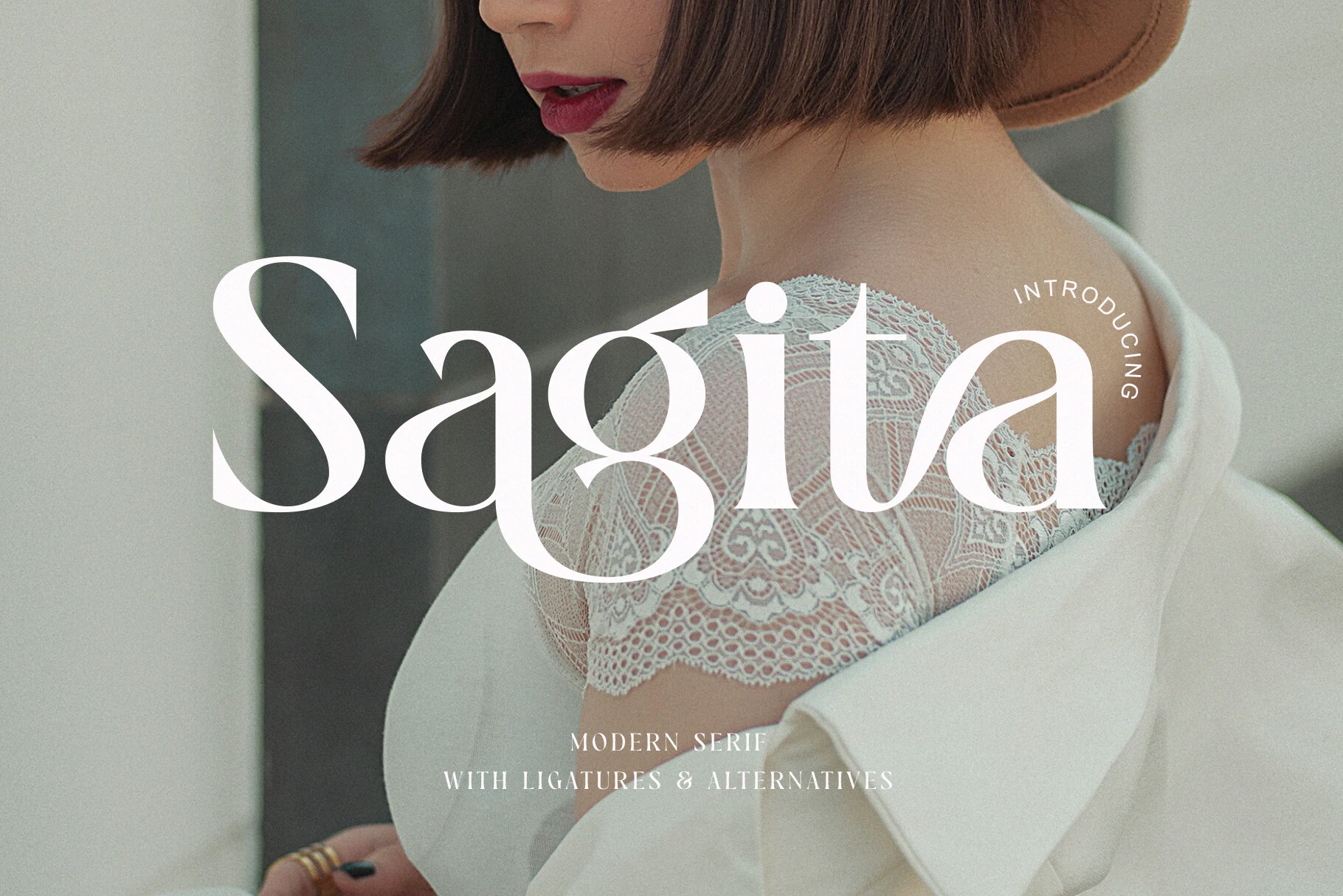
Best For: fashion branding, beauty branding, editorial designs, logos
Sagita Font has a poised editorial serif voice, with crisp contrast, broad curves, and sculpted details that give the wordmark a refined sweep. The open apertures and polished serifs make Fashion Branding Fonts feel luxurious without becoming hard or overly formal.
Its ligatures and stylistic alternates are most useful in short names, logos, and mastheads, where you can refine awkward joins and build a more custom silhouette. Keep it large with comfortable spacing, then pair it with restrained supporting text so the contrast and curved forms stay sharp.
Kimora Font
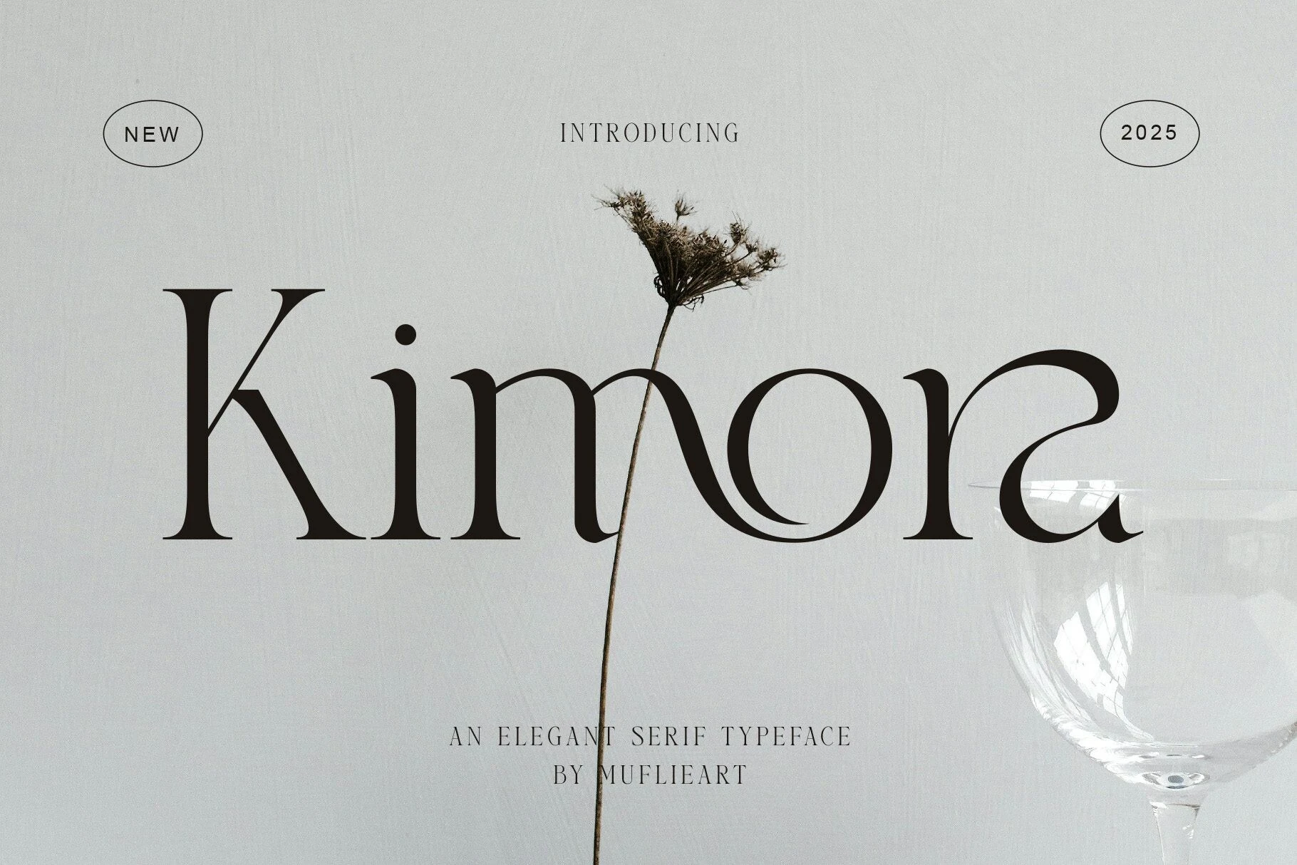
Best For: fashion branding, editorial designs, luxury designs, logos
Kimora Font mixes a classic Roman serif base with fluid, architectural linework. Tall stems, thin crossbars, and liquid ligature curves give Fashion Branding Fonts a refined editorial rhythm, while the wide spacing keeps the dramatic forms from feeling crowded.
Use it where a name or title needs a controlled luxury tone rather than heavy decoration. The fine horizontal strokes and curved joins need display scale, so keep wording short, leave generous margins, and let a quiet supporting font handle smaller information.
Swash & Script Fashion Branding Fonts
This group focuses on expressive swashes, flowing scripts, decorative terminals, and ligature-rich lettering for boutique, couture, and romantic fashion branding.
Regisha Font
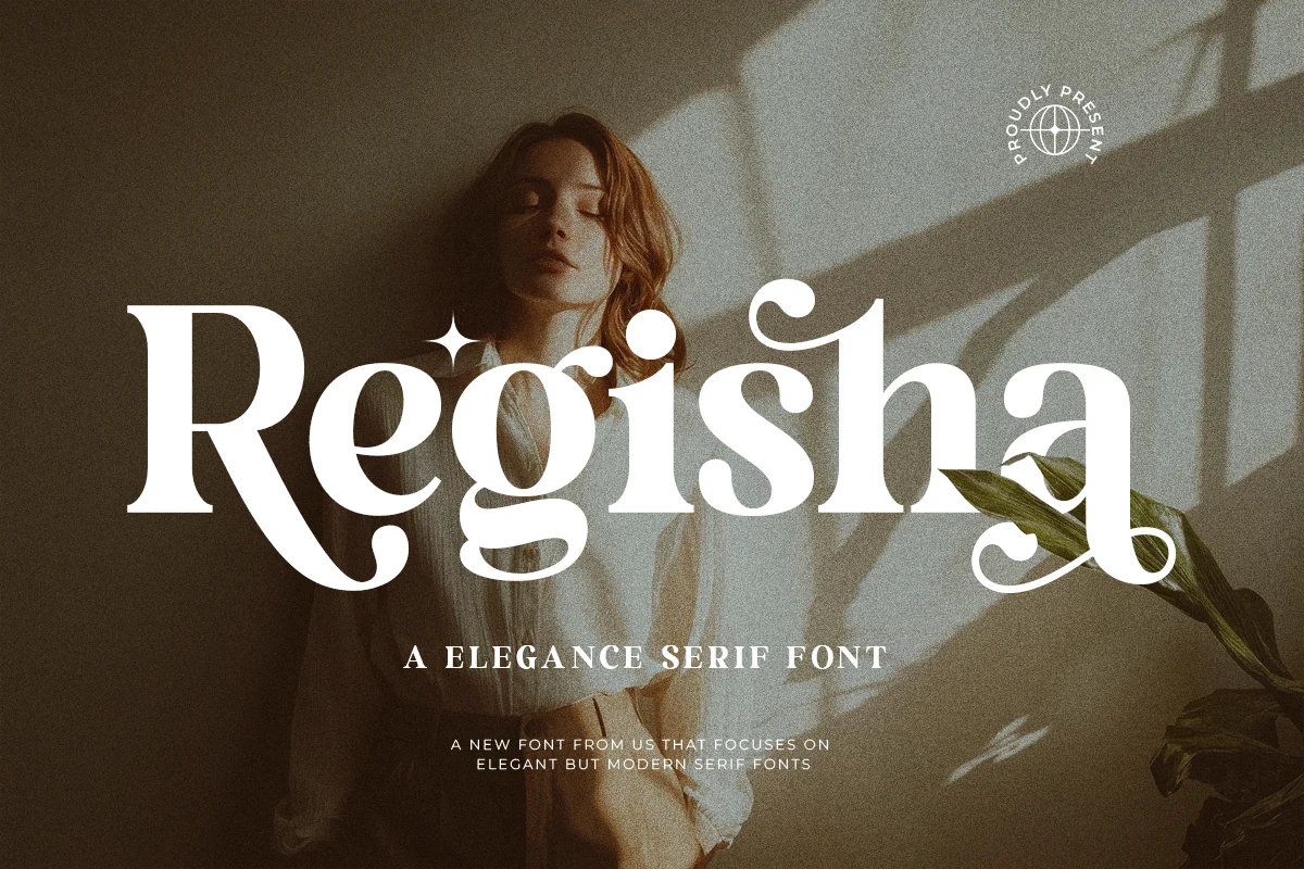
Best For: fashion branding, beauty branding, editorial designs, luxury designs
Regisha reads as a decorative display serif with a polished luxury feel, built from thick-to-thin contrast, rounded bowls, and dramatic terminals that curl into the letterforms. Those custom shapes give it a strong signature quality, so a single word can carry the whole visual identity without extra embellishment.
For Fashion Branding Fonts, it works especially well in logos, packaging, and editorial covers where the type is meant to lead. Keep it in short titles and give the larger letters enough space, since the sweeping details and refined proportions show best when the hierarchy is clean and the surrounding typography stays restrained.
Kaviera Font
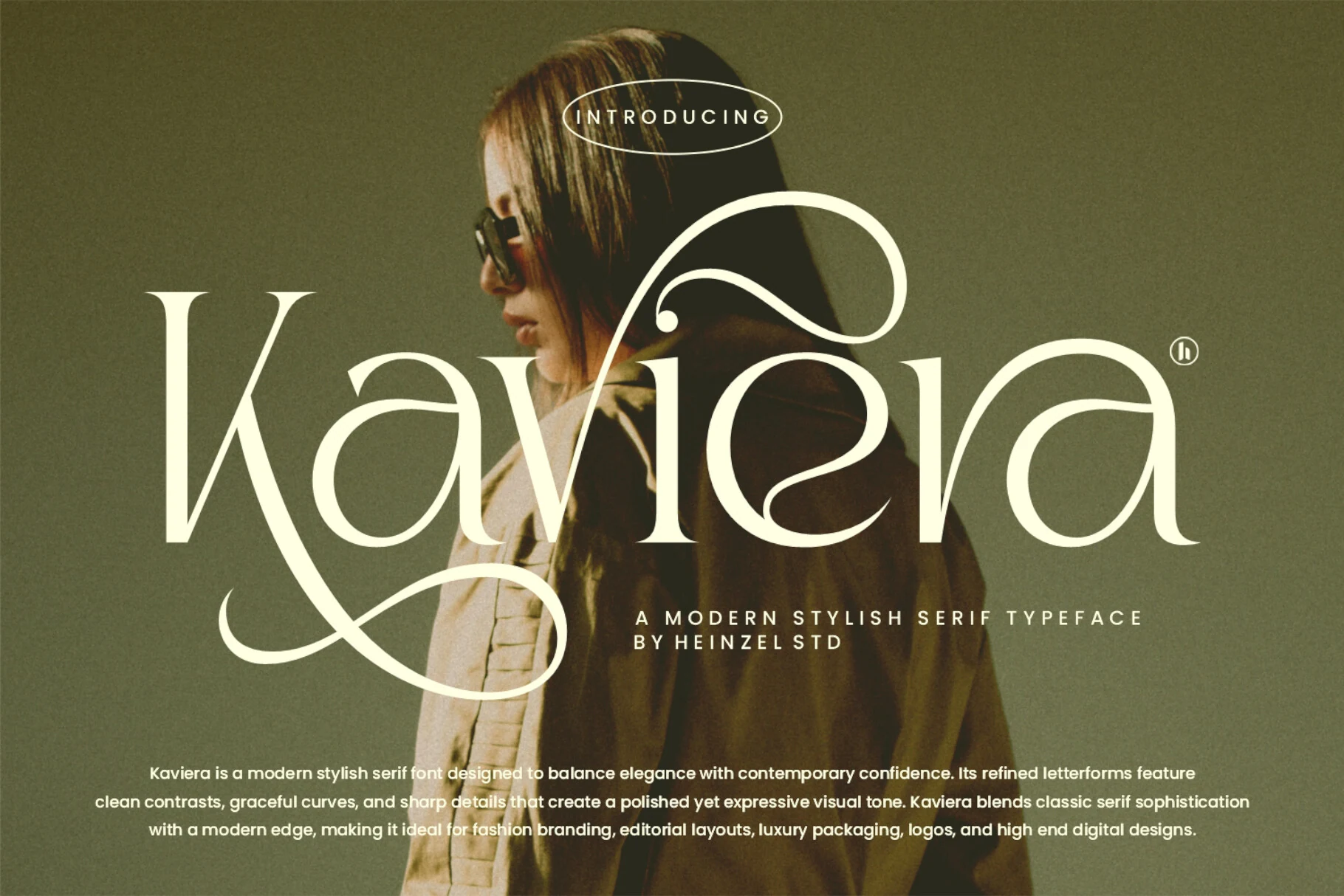
Best For: fashion branding, editorial designs, luxury designs, logos
Kaviera blends crisp serif contrast with oversized swashes, especially in the capital K and the flowing joins that give the lettering a couture feel. Tall stems, fine hairlines, and rounded curves create a polished rhythm that feels expressive without becoming fussy.
That balance makes it a natural fit for Fashion Branding Fonts, particularly for logos, mastheads, and packaging titles that need to set the tone fast. Use it in short lines and let the flourished capitals lead the hierarchy, since the decorative strokes need breathing room to stay sharp and elegant.
Francy Tiguan Font
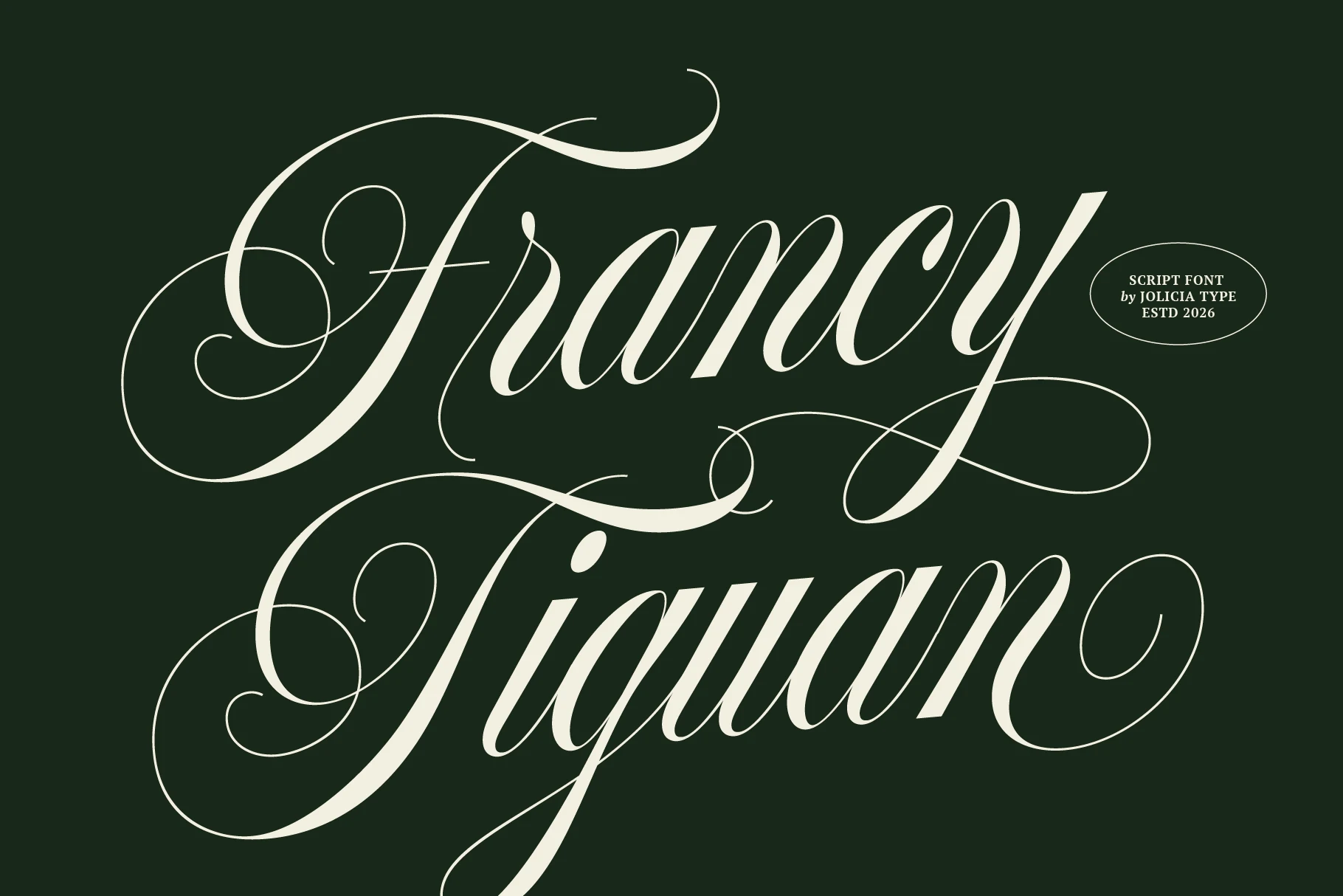
Best For: fashion branding, wedding designs, beauty branding, luxury designs
Francy Tiguan is a formal script with broad ribbon-like strokes, fine hairline loops, and oversized flourishes that give the capitals a theatrical sweep. The letter connections stay smooth, but the ornament is heavy enough to make the font clearly display-focused.
Use it where Fashion Branding Fonts need a romantic, high-end signature tone: labels, beauty packaging, invitation headers, or short editorial titles. Keep the words brief and the surrounding type quiet, because its long swashes need open margins and clear contrast to stay legible.
Gllasken Font
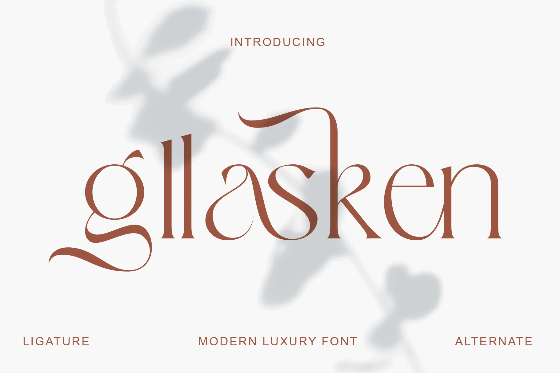
Best For: fashion branding, beauty branding, editorial designs, packaging
Gllasken pairs a slim serif skeleton with sweeping calligraphic swashes, so the letters feel fluid and editorial instead of rigid. The long entry and exit strokes, soft bowls, and narrow contrast give it a couture tone that reads as polished but still noticeably artistic.
For Fashion Branding Fonts, it works best in short titles, cosmetic labels, and boutique packaging where the flourishes can shape the composition. Keep spacing measured and pair it with restrained support type, because the decorative lowercase forms need a clear hierarchy to stay elegant and legible.
Pasieo Font
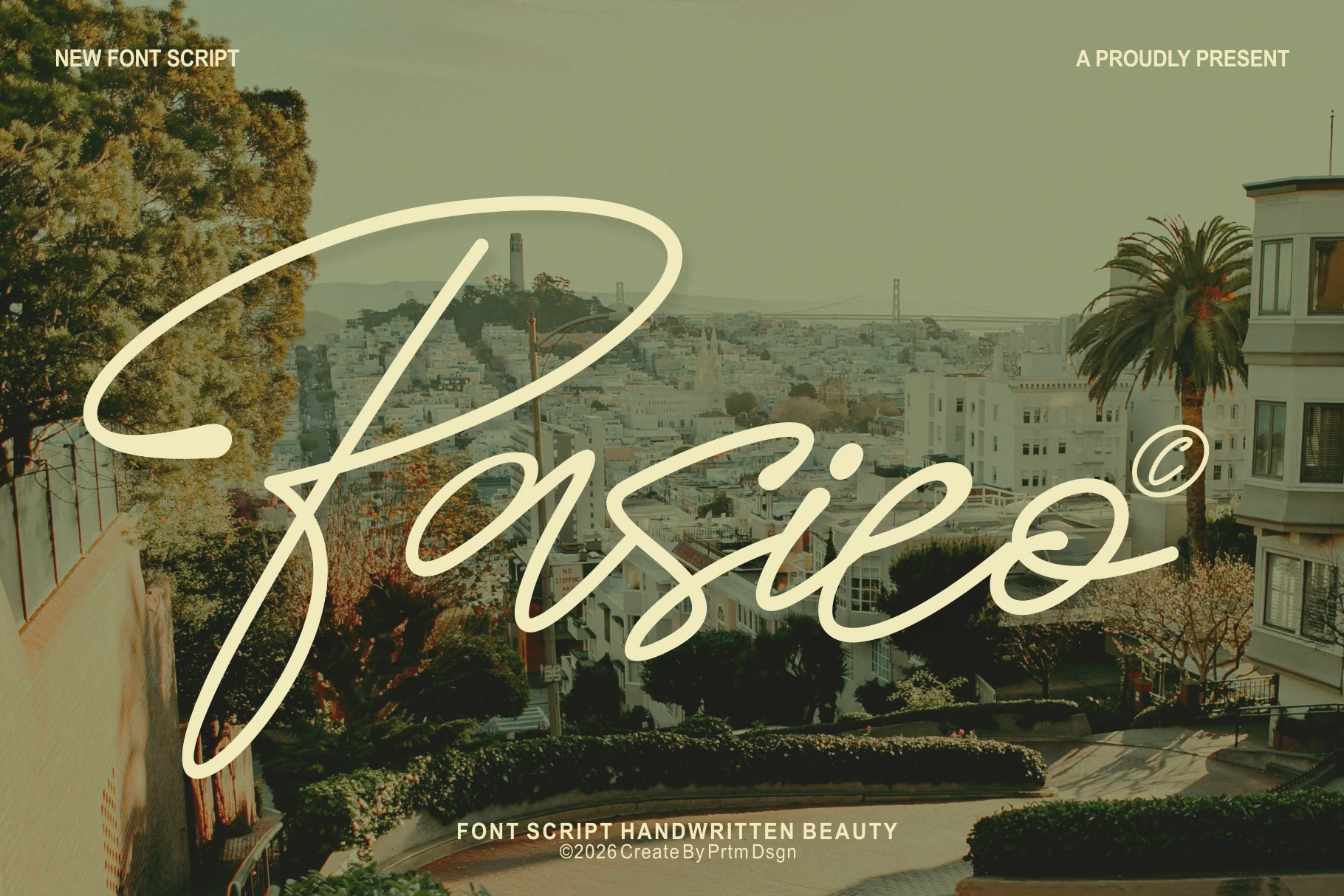
Best For: fashion branding, beauty branding, social media graphics, quotes
Pasieo has a graceful handwritten rhythm built from light strokes, smooth joins, and generous swashes that make the capital P instantly eye-catching. The script feels refined rather than casual, and the consistent line quality helps the word shapes stay readable even with all that flowing movement.
That makes it a strong pick for Fashion Branding Fonts when you want a signature-style headline, product name, or social graphic with a polished finish. It works best in short phrases with plenty of open space, so the long curves can extend cleanly without tangling the layout or competing with smaller supporting text.
Melarune Font
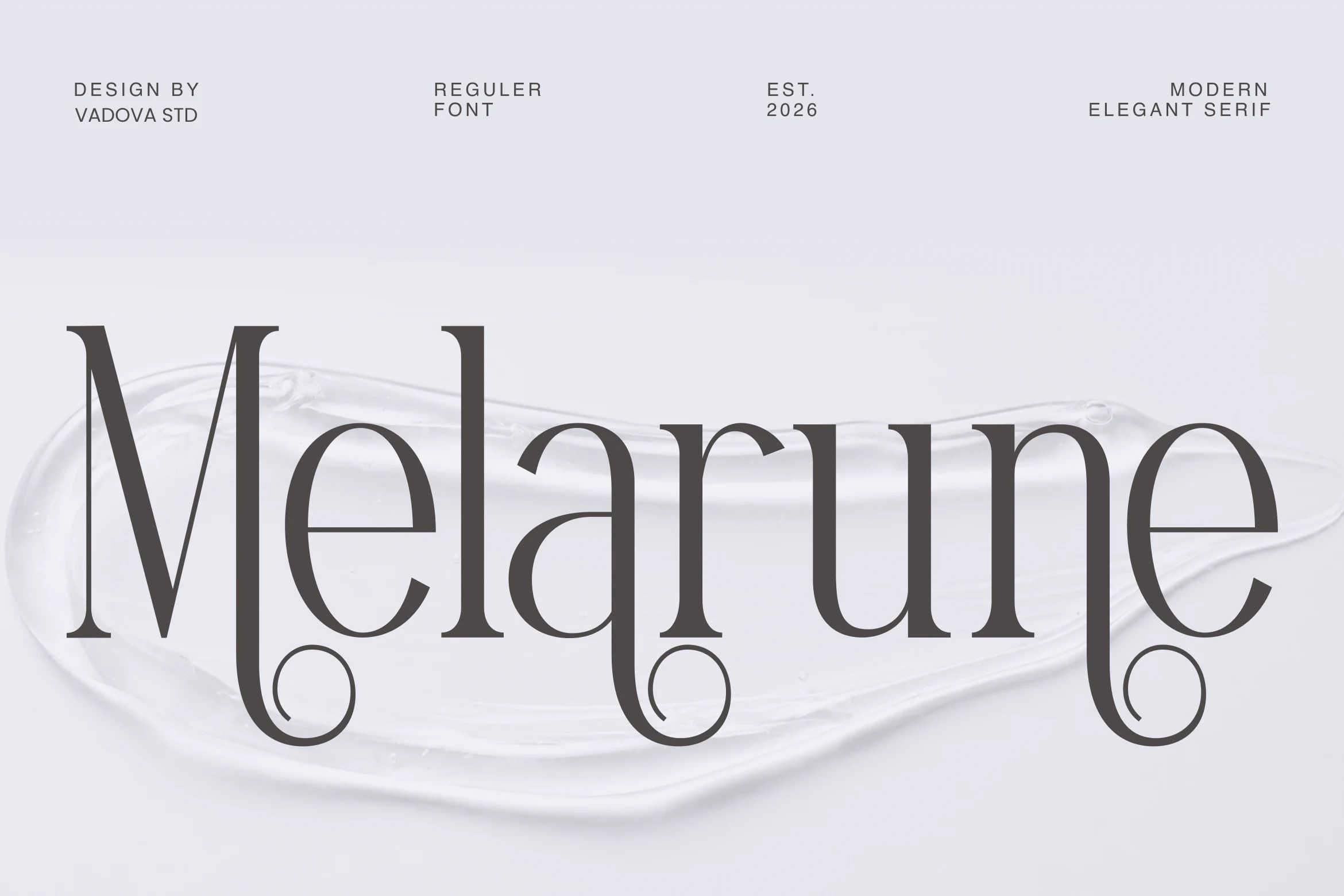
Best For: logos, packaging, editorial designs, fashion branding
Melarune Font has a polished editorial serif structure, with tall high-contrast stems, slim hairlines, and curled ornamental terminals that sit below the baseline. The open lowercase shapes keep the wordmark readable, while the rounded swashes give Fashion Branding Fonts a more expressive, boutique-level signature.
Use it where the name or headline needs clear hierarchy rather than dense text. The decorative curls need vertical clearance, so avoid tight line spacing; pair the display word with restrained small caps or a clean sans to let the contrast and terminal details carry the composition.
Wolmer Font
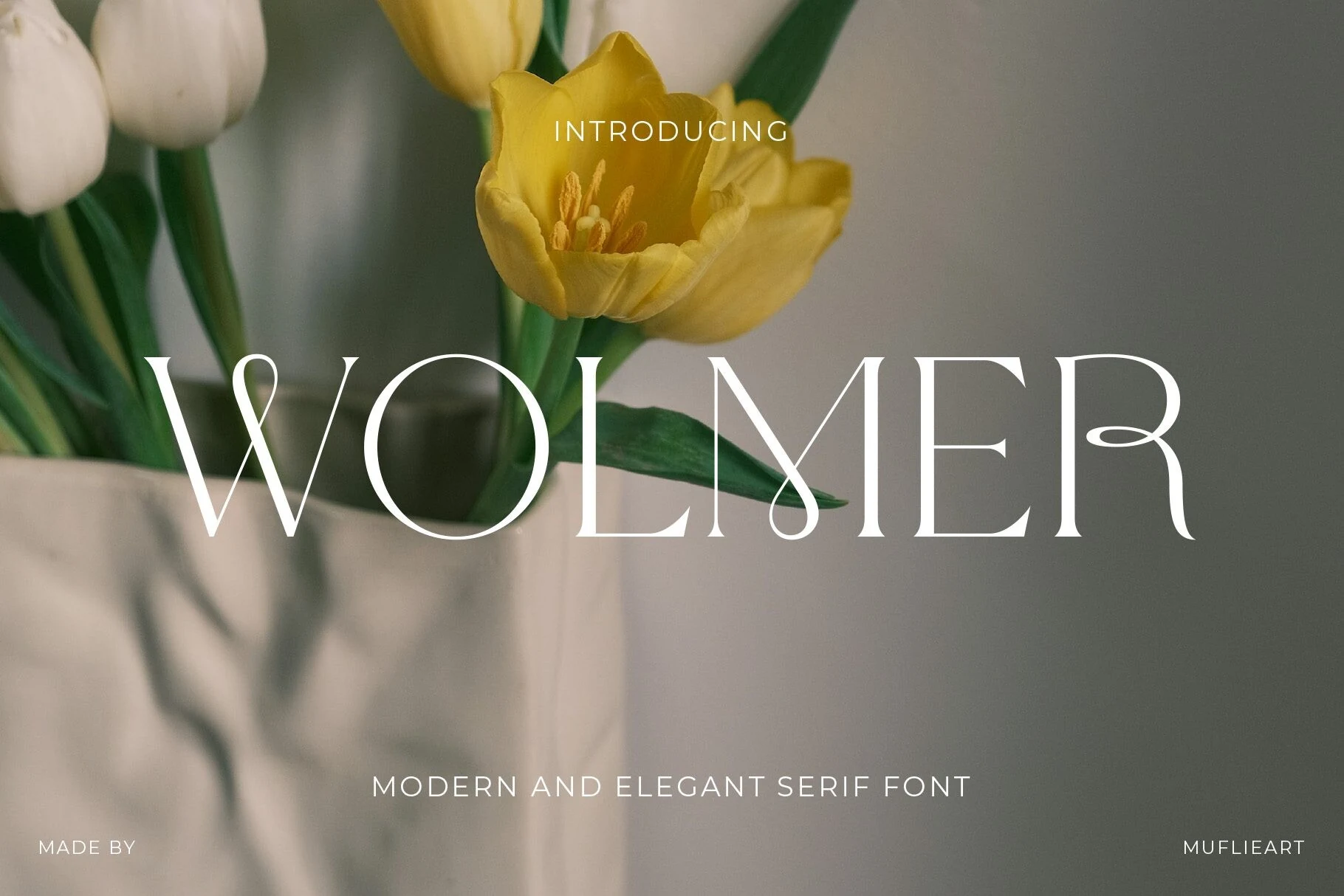
Best For: logos, fashion branding, editorial designs, luxury designs
Wolmer Font leans into a high-fashion serif silhouette, with sharp contrast, tall capitals, and distinctive teardrop loops that soften the structure without losing precision. Those curved terminals and interlocking details give Fashion Branding Fonts a more expressive, couture-minded tone while keeping the wordmark polished and clear.
It performs best at display size, where the fine hairlines and sculptural joins can stay crisp. Use it for short names, covers, or hero headlines, and keep line breaks spacious rather than tight so the elegant curves have room to read as part of the composition.
Seraphim Font
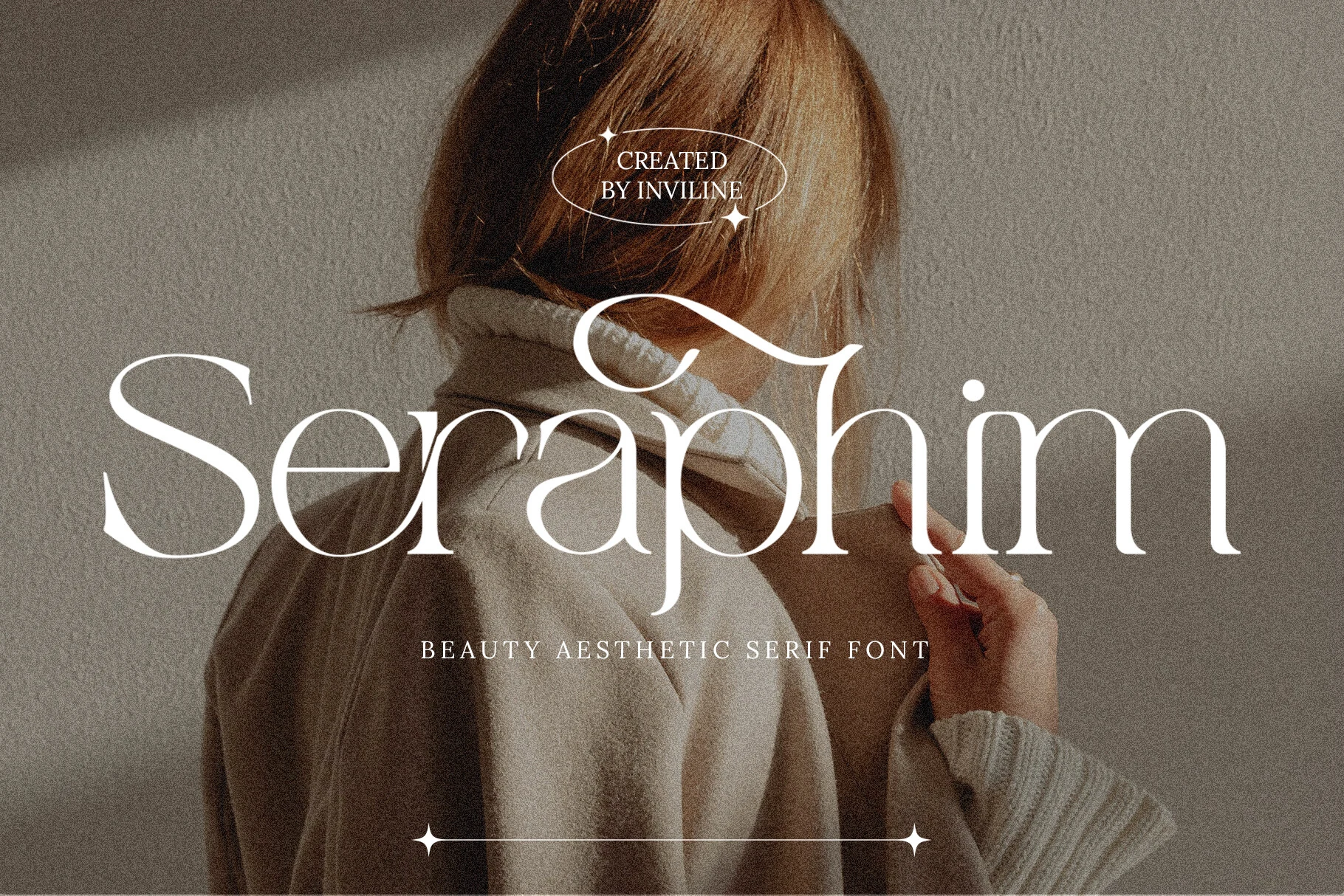
Best For: beauty branding, fashion branding, editorial designs, wedding designs
Seraphim Font has a soft, high-contrast serif look with slim hairlines, full curves, and elongated terminals that give the wordmark a floating rhythm. The sweeping connection through the middle letters adds a romantic accent, so Fashion Branding Fonts feel polished yet light instead of overly rigid.
This is a display-minded serif, best when the letterforms can stay large and breathe. Use wider margins and moderate tracking so the fine strokes and flourished details stay crisp, then pair it with a quiet supporting font to keep titles, invitations, or packaging hierarchy clean.
Abigale Font
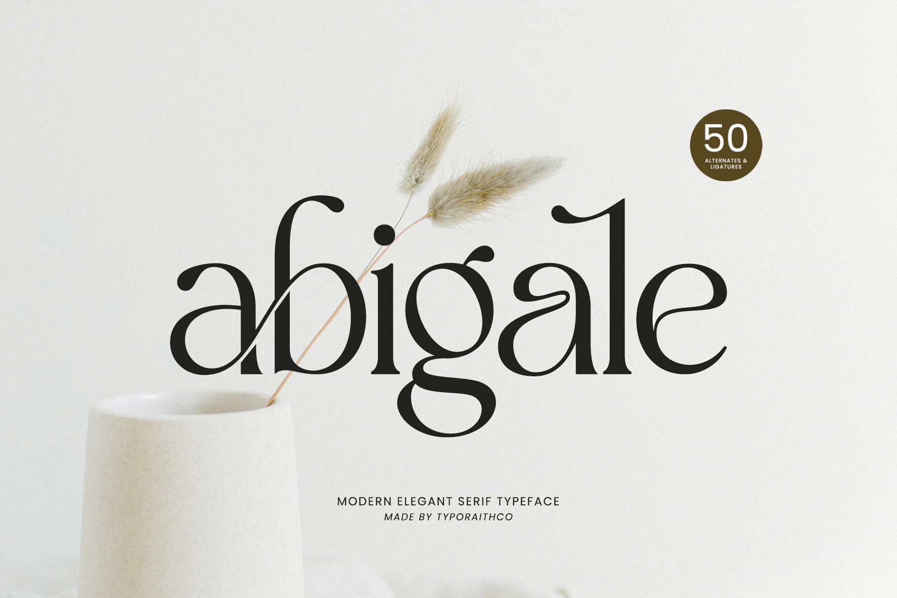
Best For: fashion branding, editorial designs, wedding designs, packaging
Abigale Font has a fluid serif shape with sweeping curves, sharp terminals, and a strong contrast between thick stems and fine connecting strokes. Its ligature-driven rhythm suits Fashion Branding Fonts where a wordmark needs to feel custom, soft, and editorial without becoming too ornamental.
The included ligatures and over 50 alternate characters help vary repeated letters and refine awkward joins in names, headers, or packaging text. Keep it at display scale with controlled spacing, because the long curves and delicate serifs need enough room to stay clean and intentional.
Amora Font
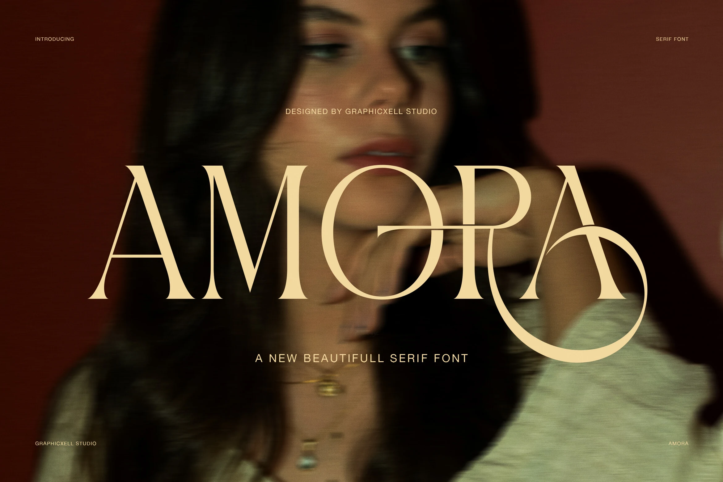
Best For: fashion branding, beauty branding, editorial designs, logos
Amora Font is built around sharp high-contrast strokes, tall uppercase proportions, and a dramatic looping terminal that gives the wordmark a polished, couture-like finish. That mix of crisp structure and fluid detail makes it especially effective for Fashion Branding Fonts that need to feel sleek, feminine, and editorial.
It shines in short titles, beauty marks, and packaging fronts where the contrast can stay visible and the curved ending has space to breathe. Keep line lengths brief and pair it with restrained secondary text, so the final flourish becomes a focal point rather than getting lost in a dense layout.
Ropang Font
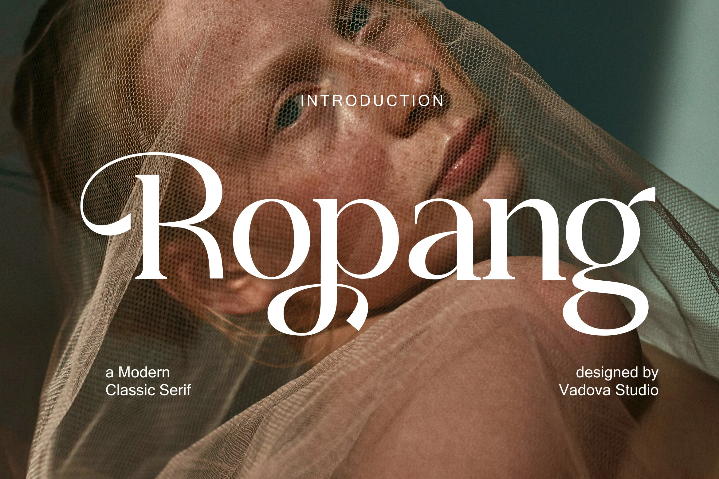
Best For: fashion branding, logos, editorial designs, social media graphics
Ropang Font has a medium-weight high-contrast serif shape, with rounded bowls, sharp terminals, and sweeping swashes that loop through the R, p, and g. The elongated forms give Fashion Branding Fonts a tailored editorial mood while keeping the wordmark softer than a rigid luxury serif.
Use it for short names, jewelry logos, cover lines, or social headers where the decorative strokes can read at scale. Keep tracking moderate and avoid cramped lines; the curved descenders and long entry strokes need clear margins, especially when layered over photography or textured backgrounds.
Bold Editorial Fashion Branding Fonts
These display fonts have stronger contrast, taller proportions, and cover-style presence for magazine layouts, campaign headers, product labels, and fashion logos.
Boxyta Font
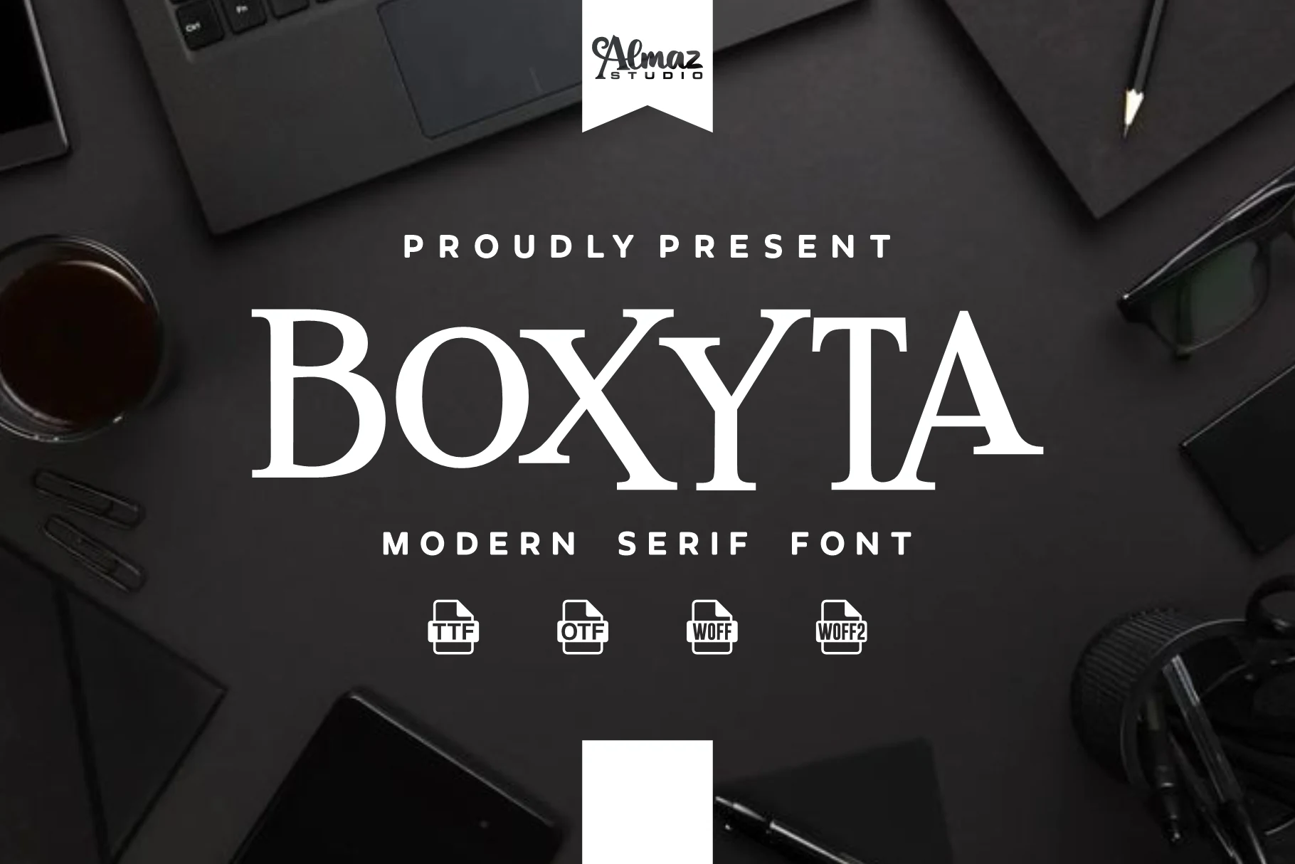
Best For: fashion branding, logos, editorial designs, headlines
Boxyta has a crisp modern serif look built around tall uppercase forms, sharp contrast, and clean spacing that keeps the lettering feeling structured rather than ornate. The refined terminals and broad proportions give it a composed editorial tone, so even a single title reads polished and intentional.
For Fashion Branding Fonts, Boxyta is strongest in logos, mastheads, and cover-style layouts where the type needs to carry authority on its own. Keep it in short lines and pair it with restrained supporting text, since the contrast and large capitals do the best work when the hierarchy stays clear.
Evorine Serif Font
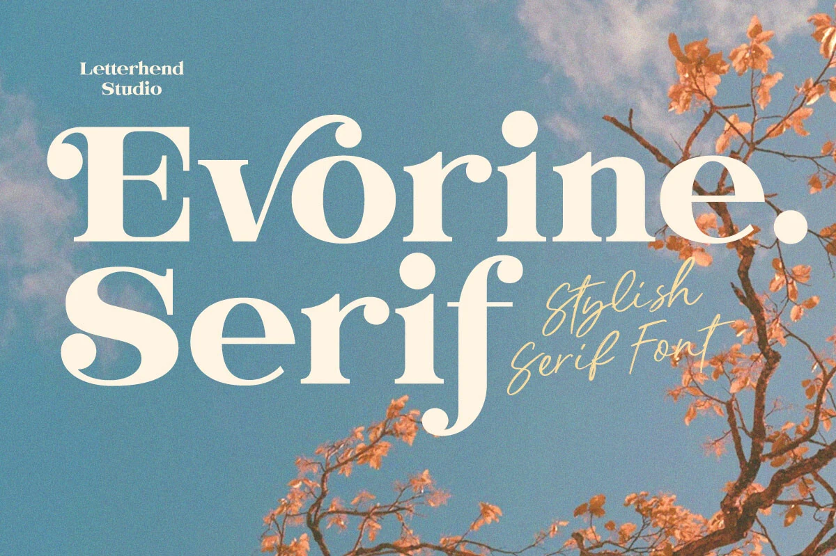
Best For: fashion branding, beauty branding, wedding designs, social media graphics
Evorine Serif has a bold high-contrast build with soft rounded bowls, chunky slab-like rhythm, and playful ball terminals that give the letters a vintage magazine feel. It is decorative without becoming fragile, so large words hold strong visual weight across branding and editorial layouts.
For Fashion Branding Fonts, Evorine Serif works when a brand needs charm rather than strict minimalism: beauty packaging, café-style identity work, wedding pieces, or aesthetic social posts. Keep the hierarchy simple and avoid tight tracking, since the rounded details need space to stay clean and expressive.
Patcher Font
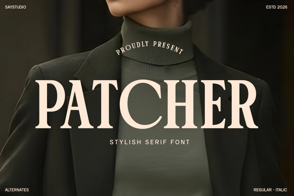
Best For: logos, fashion branding, packaging, magazine covers
Patcher Font has a confident serif voice, with sturdy verticals, generous proportions, and crisp bracketed serifs that keep the all-caps presentation polished rather than severe. The broad shapes feel composed and readable, which gives Fashion Branding Fonts a stronger editorial presence without losing refinement.
It works especially well when you want a headline or logotype to feel substantial on the page. Keep tracking fairly controlled so the letterforms stay cohesive, then pair it with a quieter sans or small text block to let the serif structure carry the hierarchy in both print and digital layouts.
Boserich Font
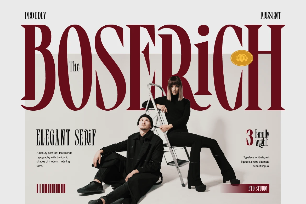
Best For: fashion branding, editorial designs, magazine covers, luxury designs
Boserich Font has the kind of tall, commanding serif silhouette that reads straight out of fashion editorials. The uppercase forms are narrow, high-contrast, and sharply styled, giving Fashion Branding Fonts a polished headline presence with just enough classic structure under the modern styling.
It works best when you let the proportions do the work. Use it large for covers, logos, or campaign headers, keep the wording short, and pair it with quieter secondary text so the elongated stems and crisp serif details hold the hierarchy without competing elements around them.
Personal Vogue Font
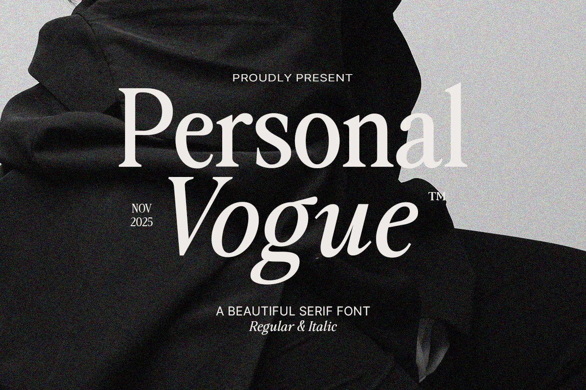
Best For: fashion branding, editorial designs, luxury designs, logos
Personal Vogue Font leans into sharp high-contrast serif drama, with tall stems, crisp hairlines, and sculpted curves that feel unmistakably editorial. The contrast between the upright and italic styling gives Fashion Branding Fonts a more layered title hierarchy, so names and taglines feel poised rather than flat.
This is a display serif first, best used where scale can show off the stroke contrast. Keep it for short mastheads, luxury wordmarks, or cover lines, and let the italic style carry emphasis while the roman shapes hold the main structure cleanly.
Brozeri Regular Font
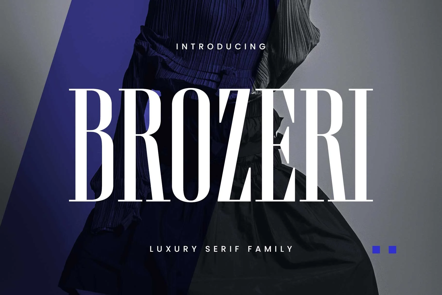
Best For: fashion branding, editorial designs, luxury designs, logos
Brozeri Regular Font makes an immediate statement with its tall condensed serif build, crisp contrast, and commanding vertical rhythm. The narrow proportions give it a strong editorial silhouette, while the sharp serifs keep the overall look polished rather than severe, making it a natural fit for Fashion Branding Fonts.
It works best when scale is part of the design. Use it for mastheads, campaign headlines, or logo lockups where the elongated forms can stretch across the layout; keep supporting text simpler and give the letters enough breathing room so the tight width and high contrast stay clean.
Positive Thinking Font
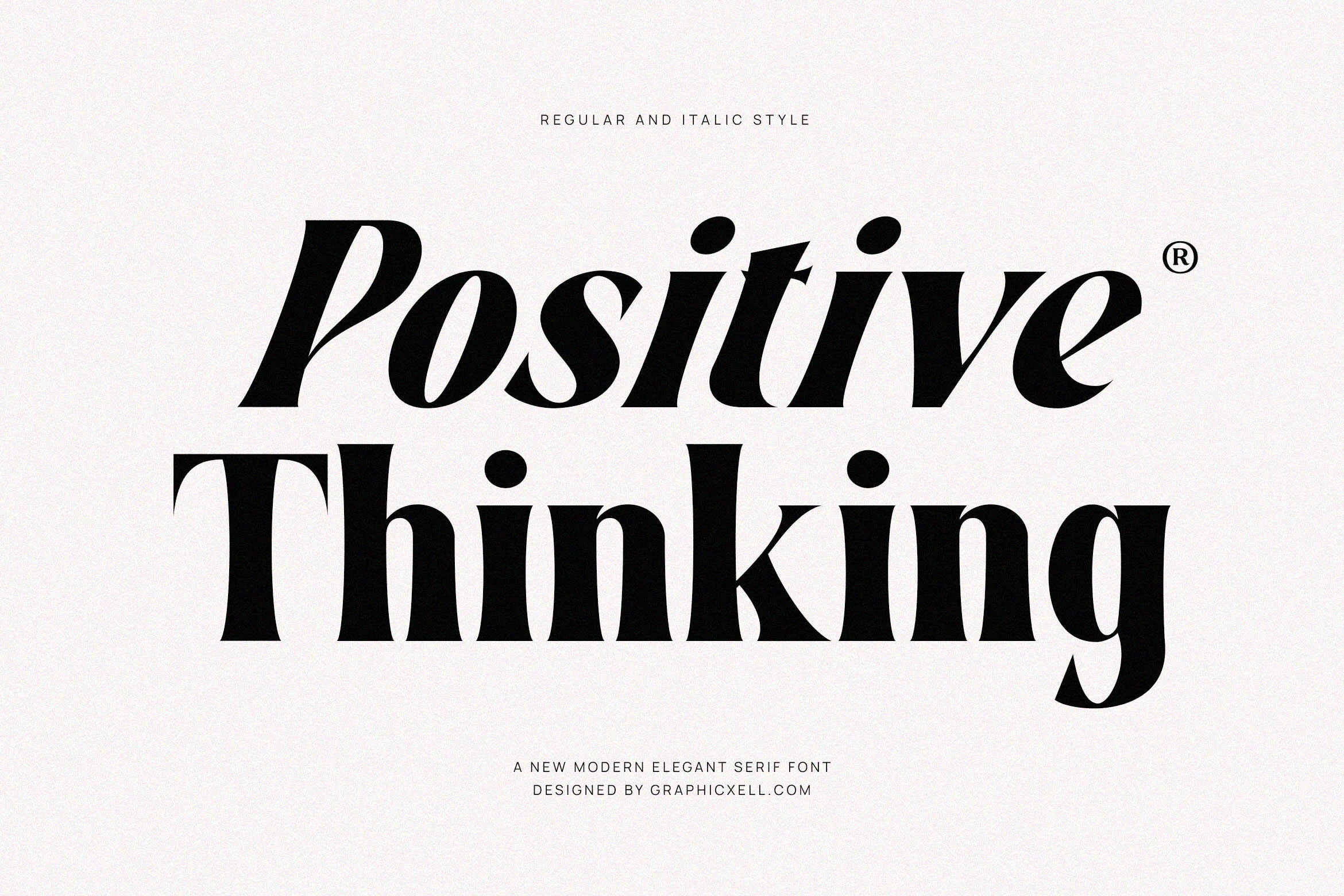
Best For: fashion branding, editorial designs, luxury designs, product labels
Positive Thinking Font has the confident shape of a modern fashion serif: heavy vertical mass, sharp bracketed cuts, tight counters, and a strong italic slant that gives the letters forward motion. The contrast is dramatic without becoming fragile, so short titles feel polished and assertive rather than delicate.
For Fashion Branding Fonts, this one works best where the wordmark needs impact at first glance—lookbooks, labels, campaign headers, or packaging with limited copy. Keep the tracking controlled in the regular style, then use the italic for hierarchy or emphasis so the composition does not become too dense.
Modern Sans Fashion Branding Fonts
These sans serif fonts bring cleaner geometry, minimal forms, and direct visual impact for modern fashion studios, social campaigns, logos, and editorial layouts.
Glamure Font
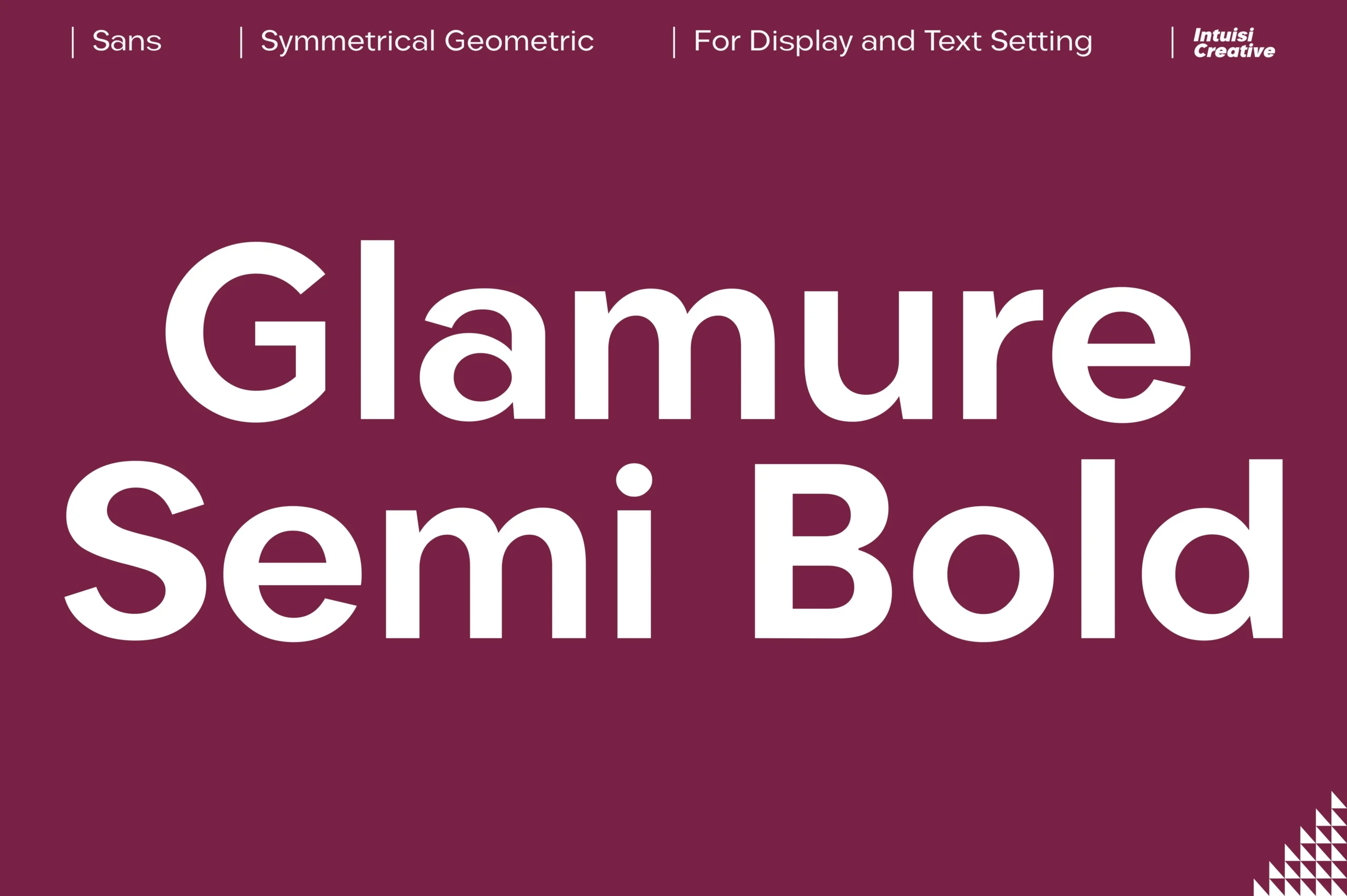
Best For: fashion branding, logos, editorial designs, social media graphics
Glamure has a geometric sans structure built from uniform strokes, broad circular counters, and crisp cuts that keep the letters feeling balanced and architectural. The semi-bold weight gives it real headline presence, while the clean proportions keep the tone polished instead of aggressive.
That makes it a strong fit for Fashion Branding Fonts when you want a modern identity without decorative excess. It works especially well for mastheads, studio-style logos, and clean editorial layouts, and a little breathing room between elements helps the wide curves and symmetrical forms hold the hierarchy clearly.
Affigue Font
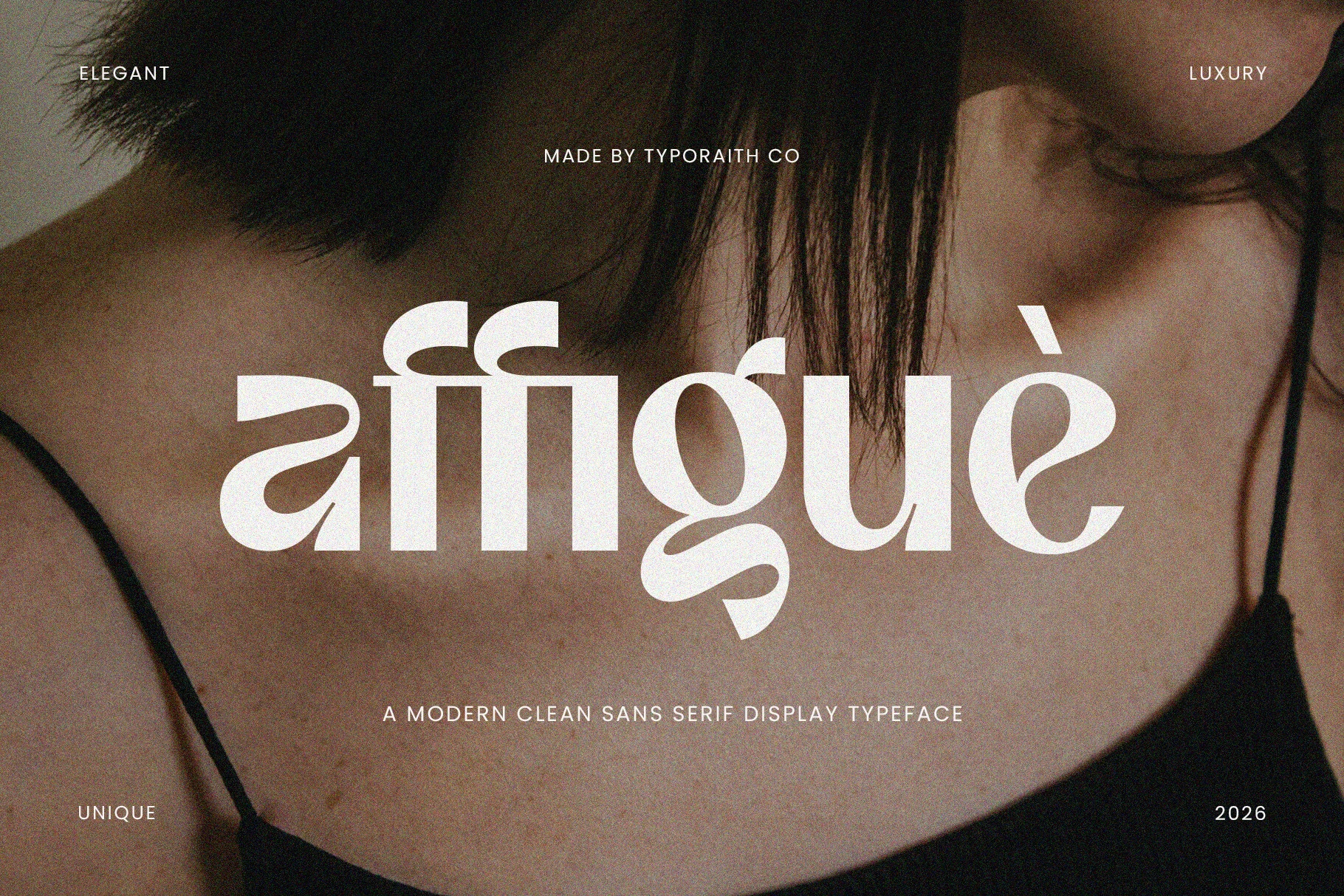
Best For: fashion branding, beauty branding, posters, magazine covers
Affigue is a bold clean sans display face with soft curves, heavy rounded forms, and stylized cuts that make the lowercase feel custom-built. The compact rhythm gives it impact, while details in the a, g, and e keep the wordmark from looking like a standard geometric sans.
For Fashion Branding Fonts, Affigue works best where the type needs to feel modern, direct, and image-led: beauty products, posters, magazine covers, or campaign logos. Use it in short phrases with strong contrast, since the unusual shapes need clear spacing to stay readable.
Elvera Font
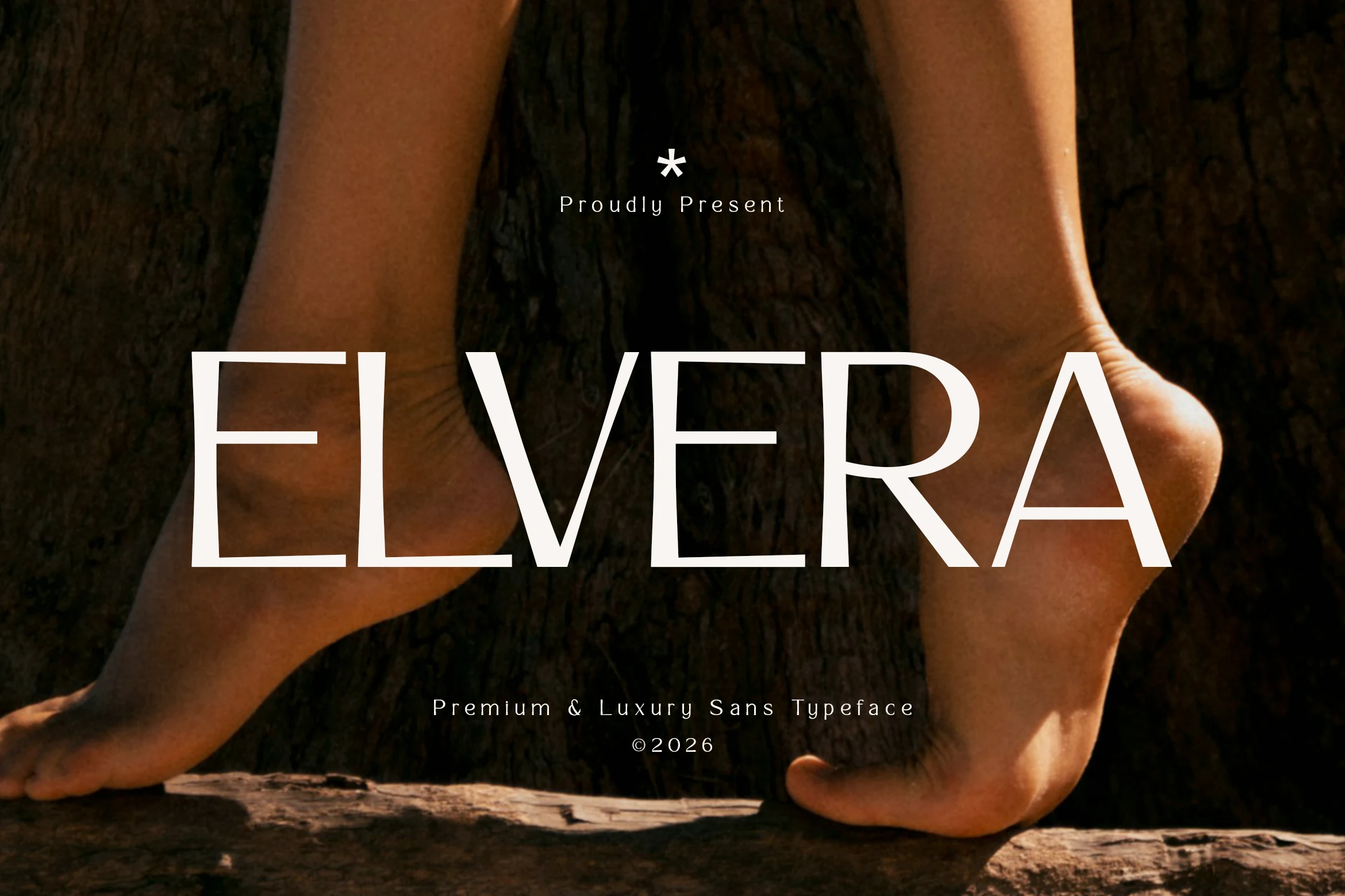
Best For: logos, fashion branding, editorial designs, beauty branding
Elvera Font keeps its impact through restraint: tall uppercase forms, even monoline strokes, and wide proportions give it a calm, expensive look on the page. The spacing feels airy rather than rigid, which makes it a strong fit for Fashion Branding Fonts that need presence without decorative excess.
Its clean geometric structure works best when you let scale and tracking do the heavy lifting. Use it for short names, mastheads, or packaging lines with generous negative space, and pair it with smaller body text that stays quiet so the sleek silhouette and elegant rhythm remain the focus.
Slimora Font
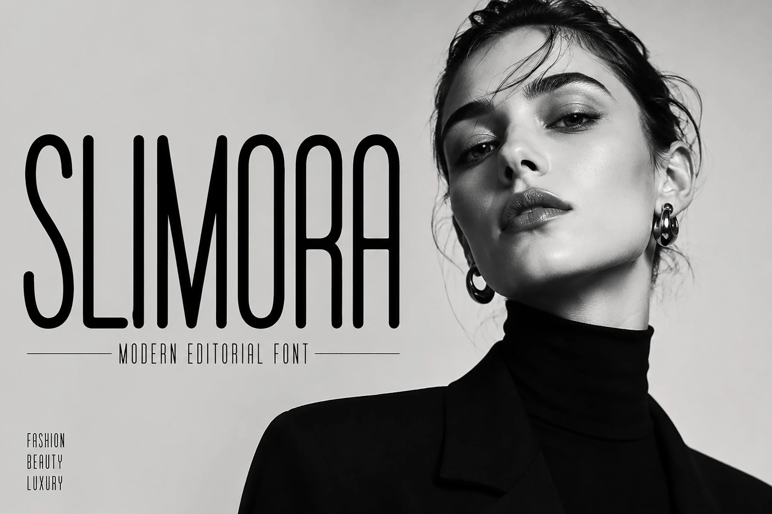
Best For: fashion branding, editorial designs, magazine covers, logos
Slimora Font relies on very tall condensed proportions, even stroke weight, and rounded vertical corners to create a clean editorial silhouette. The narrow spacing gives it instant presence, making it a sharp option for Fashion Branding Fonts that need to look sleek, modern, and quietly upscale rather than decorative.
Its strength is vertical rhythm, so it works best in short headlines, mastheads, and logo lines where the full height can stay visible. Keep tracking fairly tight and avoid long passages; paired with a calmer secondary font, the slim geometry carries hierarchy without making the layout feel heavy.
Conclusion
Choose elegant serif fonts for refined fashion identities, swash or script fonts for expressive boutique branding, bold editorial fonts for magazine-style impact, and modern sans serif fonts for clean contemporary labels.