20 Powerful Bold Sans Serif Fonts for Branding in 2026
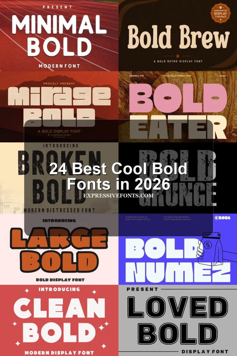
Bold sans serif fonts give headlines, logos, posters, packaging, and social graphics immediate visual weight. This collection brings together rounded, condensed, geometric, industrial, and retro options, helping designers find the right balance of impact, clarity, and personality for each project.
Rounded & Playful Bold Sans Serif Fonts
Soft corners, thick curves, and approachable shapes make these bold fonts ideal for friendly logos, playful posters, packaging, and upbeat headlines.
Roddo Font
Best For: logos, branding, headlines, bold designs
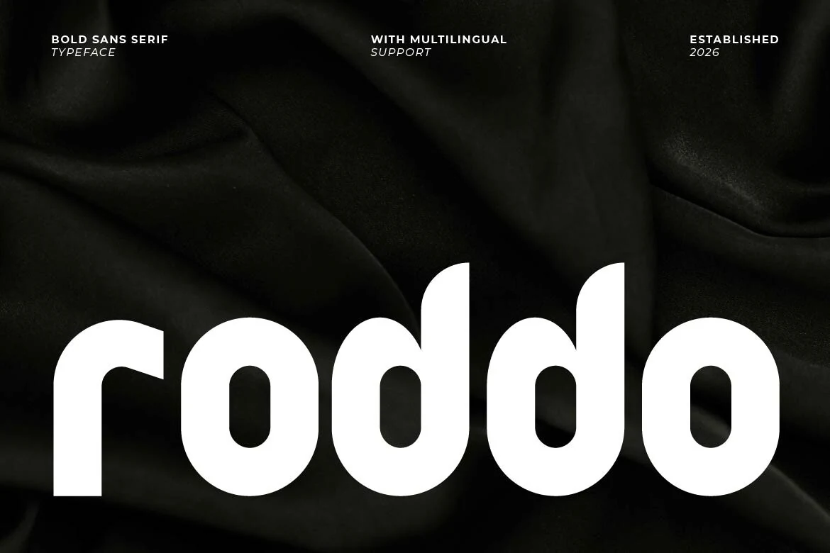
Roddo Font uses thick rounded strokes, compact spacing, and soft bowl shapes to give heavy lettering a less aggressive edge. The lowercase preview shows stable vertical stems and small counters, so the weight feels solid while the curves keep the rhythm smooth.
Roddo fits Bold Sans Serif Fonts when a logo or headline needs mass without sharp industrial tension. Keep contrast high and avoid overpacking the line; the dense forms work better in short words, where the rounded terminals and wide curves can stay clear.
Moulage Font
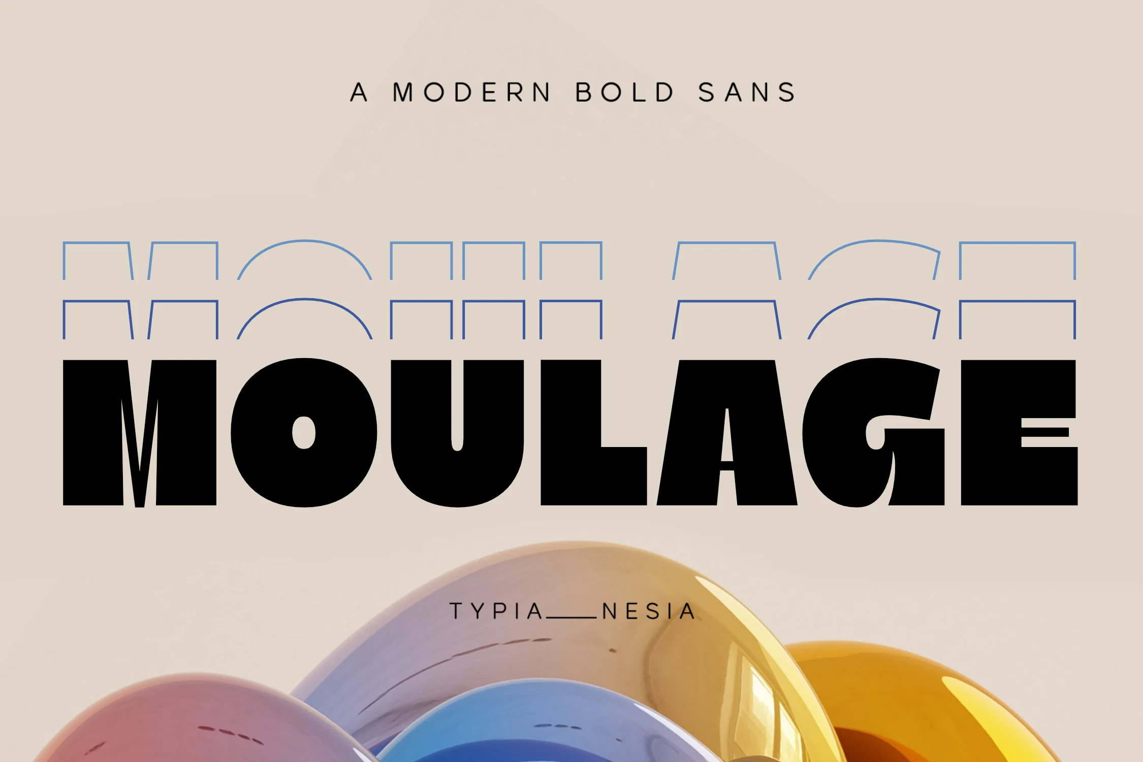
Best For: branding, packaging, headlines, eye-catching designs
Moulage Font leans into impact with chunky strokes, compact spacing, and broad rounded bowls that make every word feel planted and loud. The preview shows a sturdy silhouette with a near-circular O, a dense U, and a distinctive G that adds just enough personality to keep the heavy weight from feeling generic.
For Bold Sans Serif Fonts, this one works best when the headline is doing most of the visual work. Its dark texture suits branding and packaging especially well, but keep supporting copy lighter and more open so the thick forms can hold attention without making the layout feel crowded.
Nubolts Font
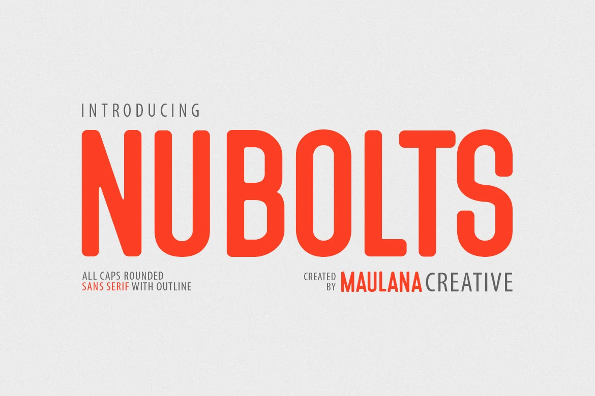
Best For: logos, headlines, posters, display text
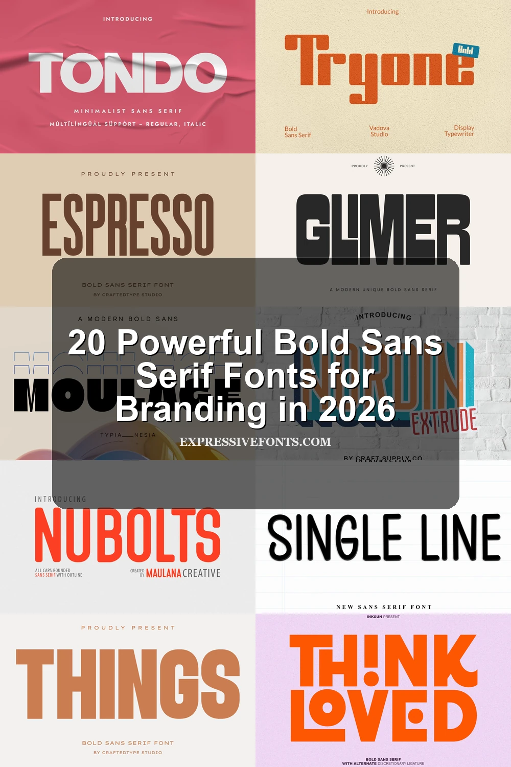
Nubolts Font has tall rounded caps, even stroke weight, and softly curved corners that make its heavy build feel clean rather than harsh. The narrow O, straight-sided U, and smooth terminals create a crisp vertical rhythm, while the outline, outline bold, and solid styles give you more than one way to push the same bold voice.
It fits Bold Sans Serif Fonts especially well when you need display type with a bright, approachable edge. Use the solid cut for the main headline and the outline style for a short subheading or accent word; that contrast builds hierarchy without pulling in a second typeface.
Bouldy Font
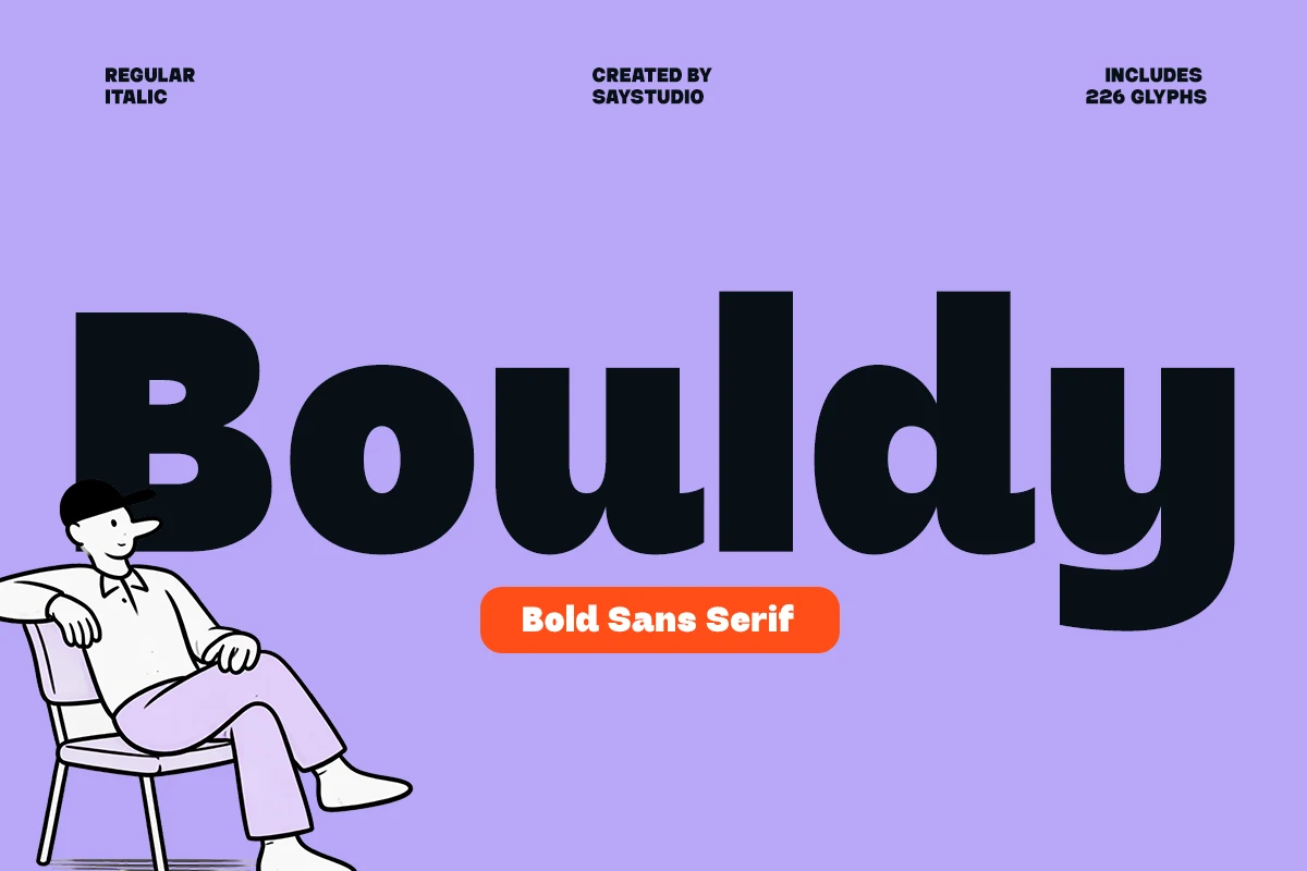
Best For: logos, posters, headlines, playful designs
Bouldy shows how Bold Sans Serif Fonts can feel welcoming as well as loud. Its oversized weight, inflated curves, and rounded terminals give the letters a soft, almost bouncy rhythm, while the wide bowls and sturdy strokes keep the word shapes clear even at a glance.
It works best when the type is allowed to dominate the layout—logos, posters, and short headline systems suit it naturally. Keep the tracking fairly neutral or slightly open, because the thick forms already create density; that helps the counters stay visible and the playful personality come through cleanly.
Rushel Font
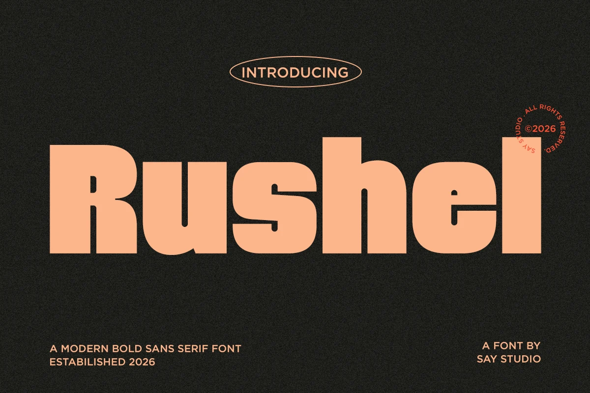
Best For: logos, branding, headlines, posters
Rushel Font has a broad, heavy build with soft corners, smooth bowls, and sturdy stems that make the word shape feel compact and confident. The rounded treatment keeps the weight approachable, so it reads less like a harsh industrial sans and more like a bold display face with clean, friendly pressure.
Within Bold Sans Serif Fonts, Rushel works especially well when you want impact without losing warmth. Its solid proportions suit logos, cover lines, and hero headlines, and it benefits from short wording with moderate tracking so the letters stay connected visually instead of drifting apart.
Condensed & Tall Bold Sans Serif Fonts
Narrow proportions and strong vertical forms help these fonts fit powerful headlines into posters, covers, signs, apparel, and space-limited layouts.
Neurox Font
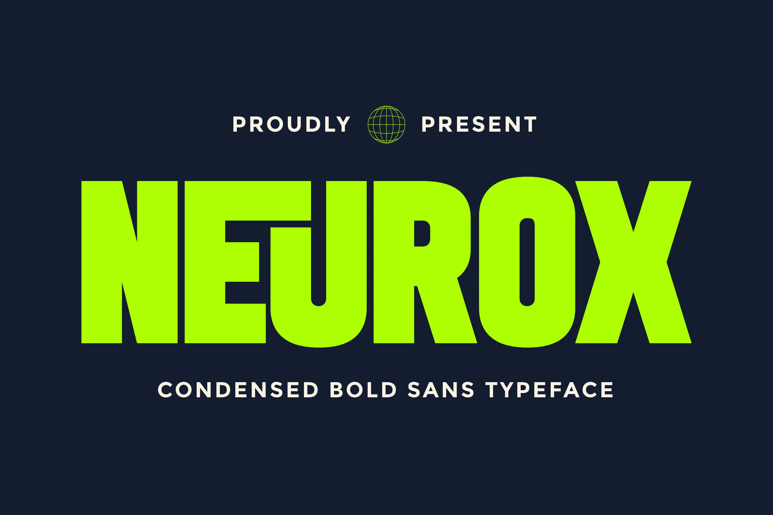
Best For: headlines, posters, branding, eye-catching designs
Neurox packs a lot of force into a narrow footprint. The preview shows tall, ultra-heavy letterforms with tight sidebearings, squared geometry, and compact counters, giving each word a dense, commanding rhythm that still reads cleanly at a glance.
It fits Bold Sans Serif Fonts when a layout needs instant pressure for posters, sports graphics, or branding. Keep the wording short and let the scale carry the message; Neurox already brings enough weight, so wider margins and a clear title hierarchy help the condensed shapes stay sharp.
Humbler Sans Font
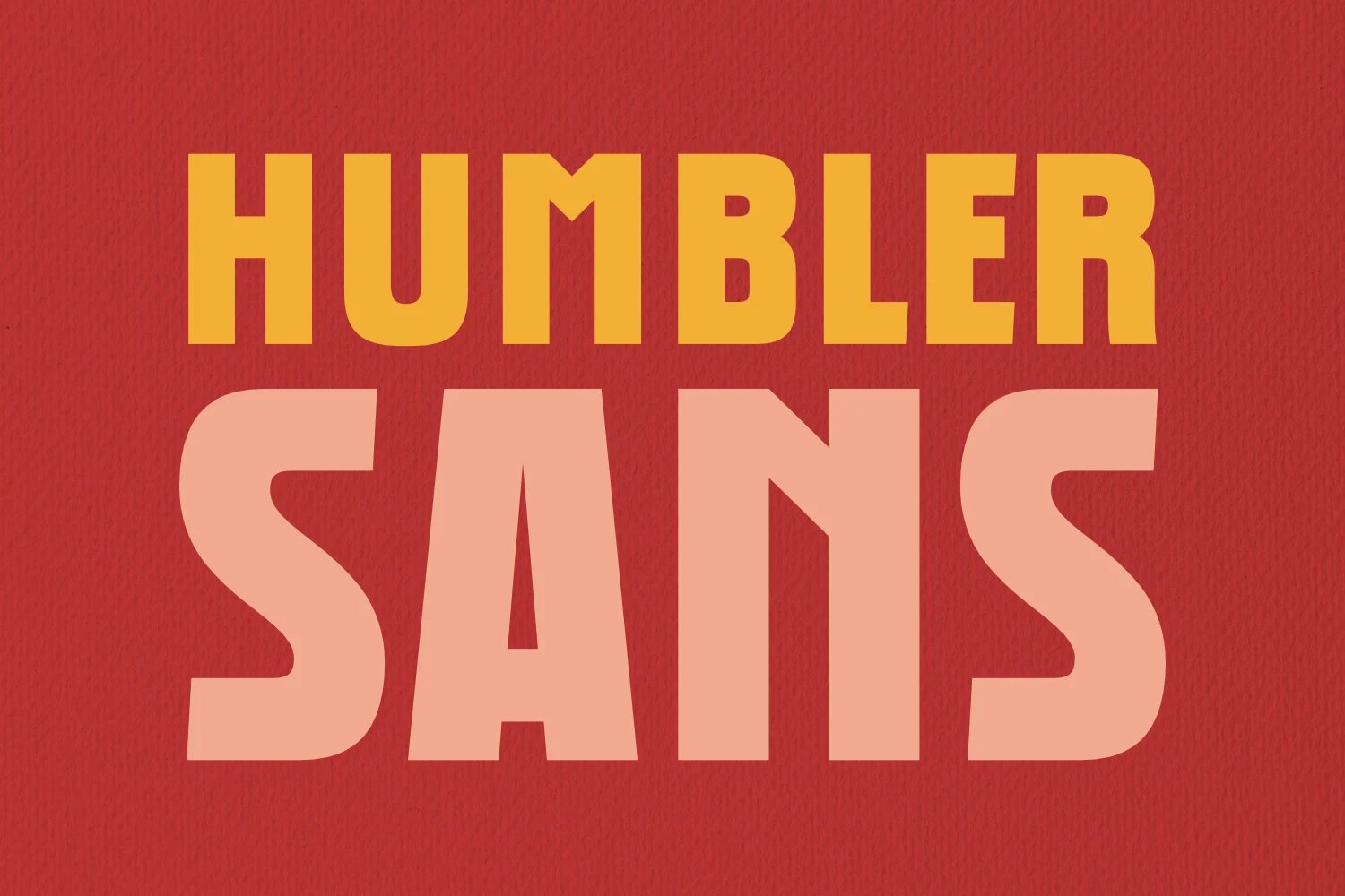
Best For: headlines, book covers, posters, bold designs
Humbler Sans Font has a dense, poster-sized presence built from tall uppercase forms, thick vertical strokes, and slightly softened corners. The wide shoulders and compact counters keep the texture heavy, while details like the angled A and curved S stop the blocky silhouette from feeling flat.
It sits comfortably among Bold Sans Serif Fonts when you want a headline to feel loud but still controlled. Short wording works best here; give it generous scale and a little breathing room, and pair it with lighter supporting text so the dark letterforms can carry the hierarchy without crowding the layout.
Gothis Font
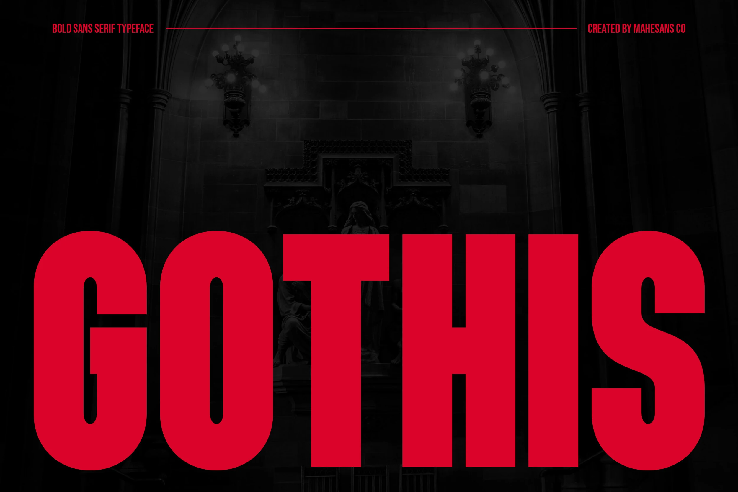
Best For: branding, posters, editorial designs, packaging
Gothis Font has a forceful display voice built from towering condensed capitals, heavy vertical strokes, and smooth geometric curves. In the preview, the narrow O, rigid T and H, and oversized S create a tight, uniform texture that feels industrial, while the clean edges keep the wordmark controlled rather than chaotic.
It stands out within Bold Sans Serif Fonts when you need scale and pressure in a headline. Use it for short titles, cover lines, or packaging fronts, and let spacing around the word do the work—because the letterforms are so dense, wider margins help the silhouette stay crisp and dramatic.
Proraman Font
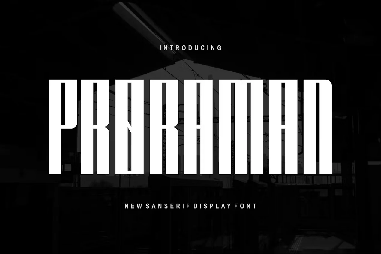
Best For: headlines, posters, display text, modern designs
Proraman Font has a tall, compressed silhouette with solid vertical strokes and crisp rectangular counters that make each letter feel architectural. The narrow proportions keep the texture tight, while the rounded outer curves stop the all-caps setting from looking too rigid.
Proraman stands out in Bold Sans Serif Fonts when you need a title to fill space without becoming bulky. It works best in short headlines and large display settings; let height and scale do the work, and keep tracking fairly controlled so the slim forms hold their strong, poster-like rhythm.
Avaboca Font
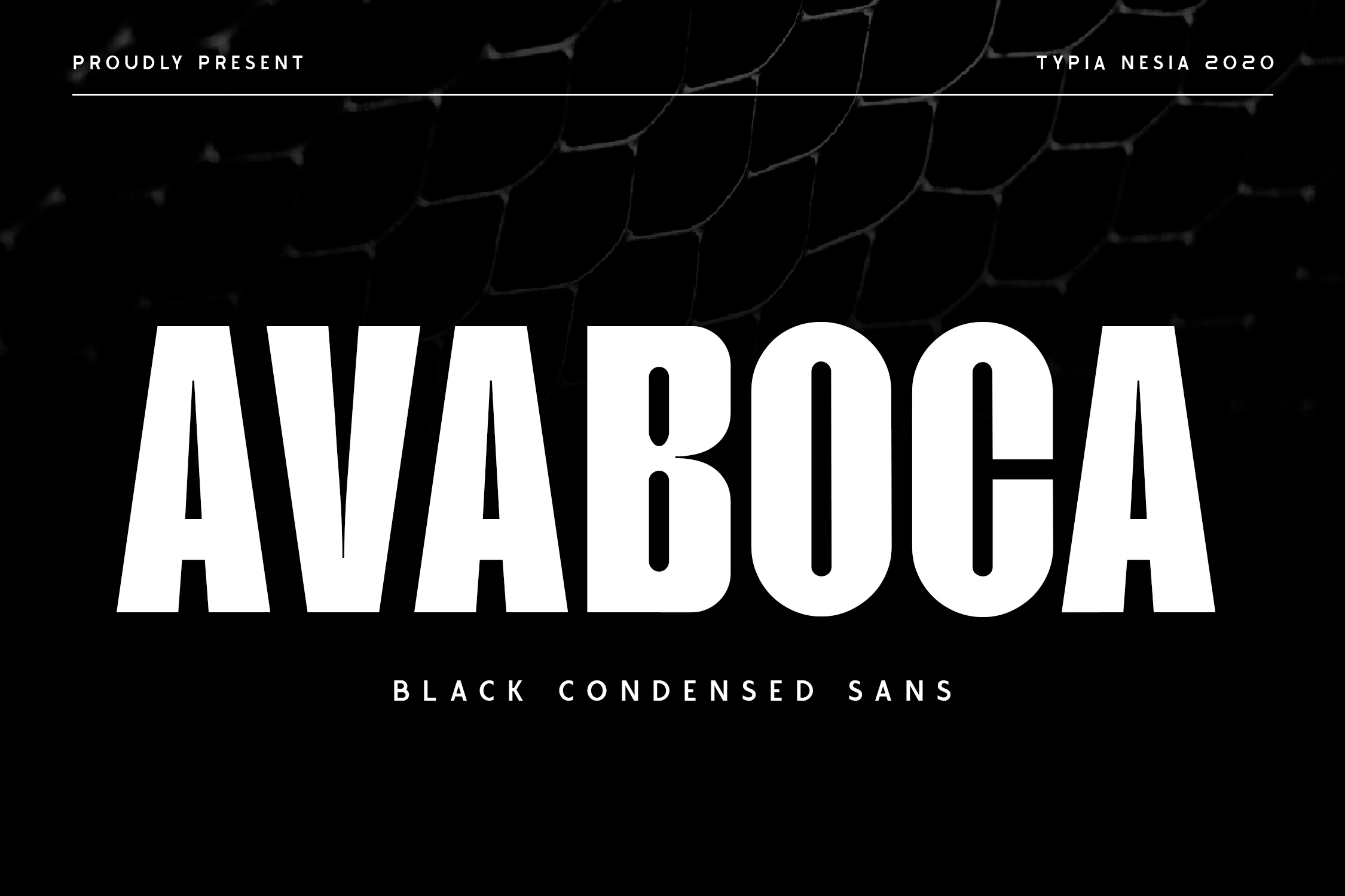
Best For: posters, headlines, logos, branding
Avaboca Font has a tall black-condensed build that fills space fast, with straight verticals, compact counters, and smooth inner curves that keep the weight from feeling too rigid. The broad A and V forms balance the tighter B and O shapes, giving the line a strong, even rhythm across all-caps settings.
Within Bold Sans Serif Fonts, this one is especially effective when a headline needs to look dense, loud, and controlled. Its narrow width helps you fit more letters into a tight layout, which is useful for posters, logo concepts, and cover titles, but it reads best when you keep the wording short and the tracking restrained.
Patriotic Font
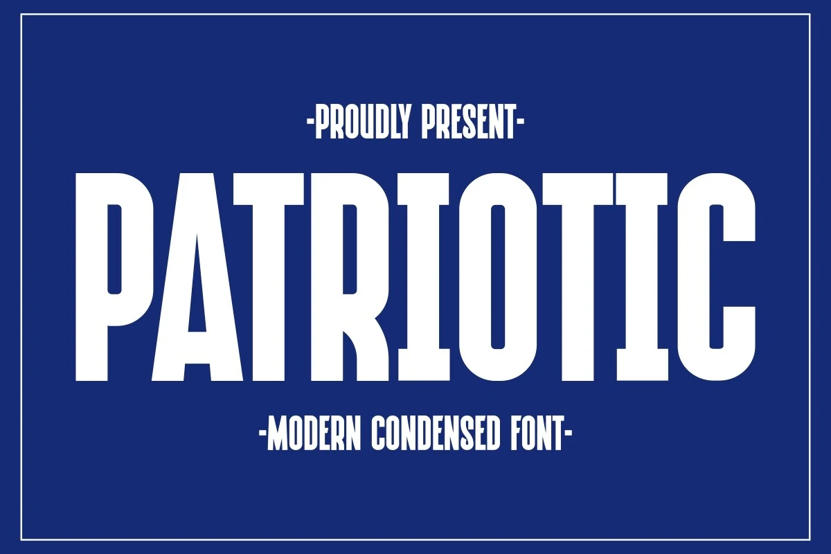
Best For: posters, quotes, T-shirts, signage
Patriotic Font has a tall condensed silhouette with thick vertical strokes, squared corners, and narrow counters that give it a firm, poster-ready presence. The straight-sided forms create a disciplined rhythm, while the rounded bowls soften the weight just enough to keep the line readable at large sizes.
If you are comparing Bold Sans Serif Fonts, this one leans strongly toward bold statements rather than neutral branding. Its narrow width helps longer words fit into tight spaces, so it works especially well for quotes, signage, and apparel graphics where short lines, stacked hierarchy, and restrained tracking make the most of its compact power.
Voltage Font
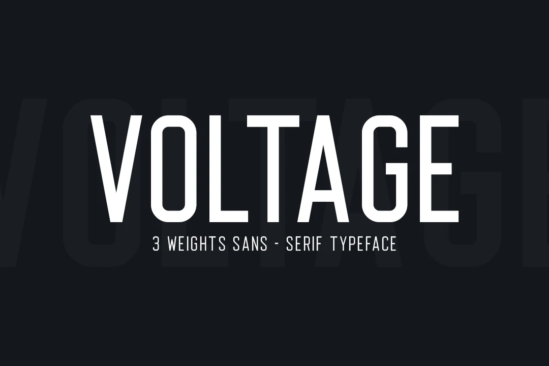
Best For: headlines, posters, logos, signage
Voltage Font has a tall, narrow build with clean monoline strokes and generous vertical reach, which gives it a crisp modern presence without unnecessary decoration. The counters stay open and the terminals are straightforward, so even with its condensed feel, the word shape reads clearly and keeps a sharp, urban rhythm.
For Bold Sans Serif Fonts, this one is especially useful when you want impact without bulky letterforms taking over the layout. Its slim proportions let you fit longer headlines into tighter spaces, and it pairs best with short supporting text and solid contrast so the condensed structure stays clear and striking.
Clean & Geometric Bold Sans Serif Fonts
Balanced spacing, controlled curves, and clear construction give this group a polished look for branding, editorial titles, wordmarks, and modern display work.
Single Line Font
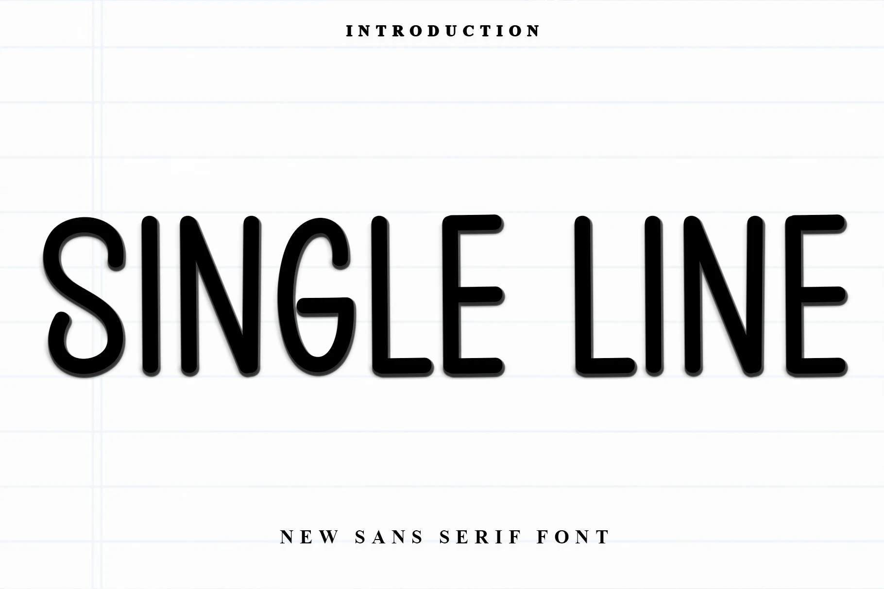
Best For: logos, headlines, short phrases, nostalgic designs
Single Line Font has a tall, narrow build with rounded corners, even stroke weight, and long verticals that give it a clean retro cadence. The soft-ended S, slim counters, and simplified curves keep the wordmark feeling friendly, while the condensed width makes a short title look stretched and striking.
It earns its place in Bold Sans Serif Fonts when you want headline type with a lighter visual texture than a blocky display face. For logos and short phrases, loosen the tracking slightly and let the height do the work; that extra space helps the thin interior openings stay clear at larger scales.
Rincoln Font
Best For: branding, headlines, editorial designs, modern designs
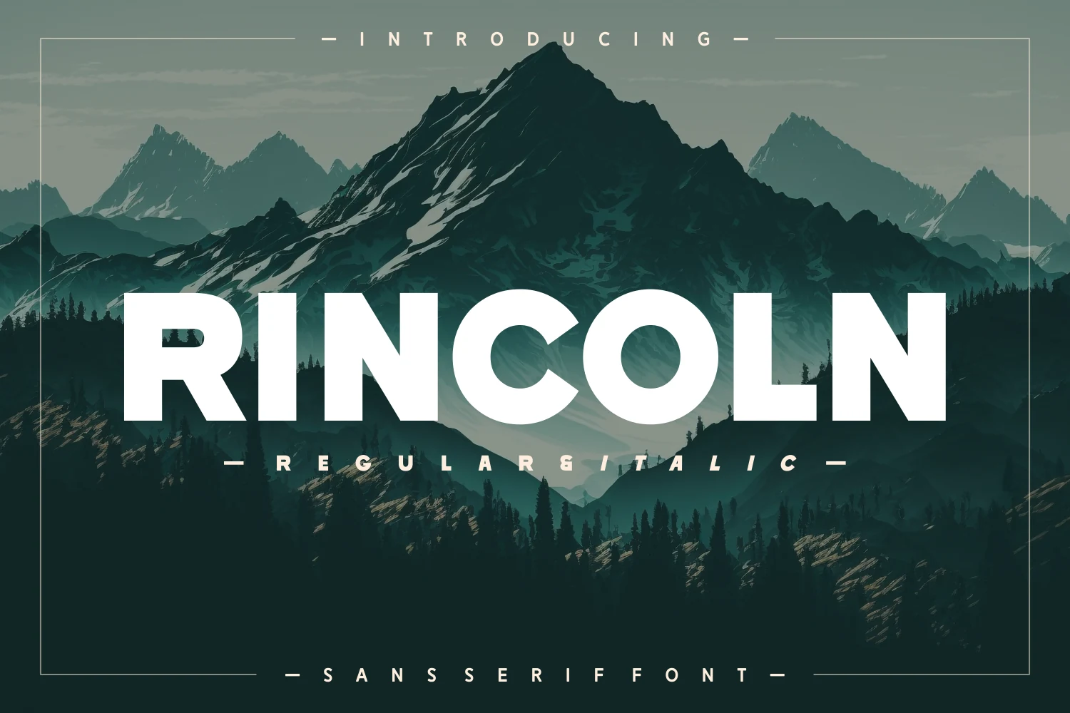
Rincoln Font has a broad, steady structure with clean verticals, round geometric bowls, and a firm overall weight that stays readable even at large scale. The open C, circular O, and balanced spacing keep the line from feeling cramped, while details like the angled leg of the R add a crisp modern edge.
It suits Bold Sans Serif Fonts when you need a headline or wordmark to feel confident without turning overly aggressive. For branding and editorial titles, keep the copy short and let the even proportions lead; a little extra space around the word helps the bold shapes hold their clarity and presence.
Things Font
Best For: logos, packaging, posters, T-shirts
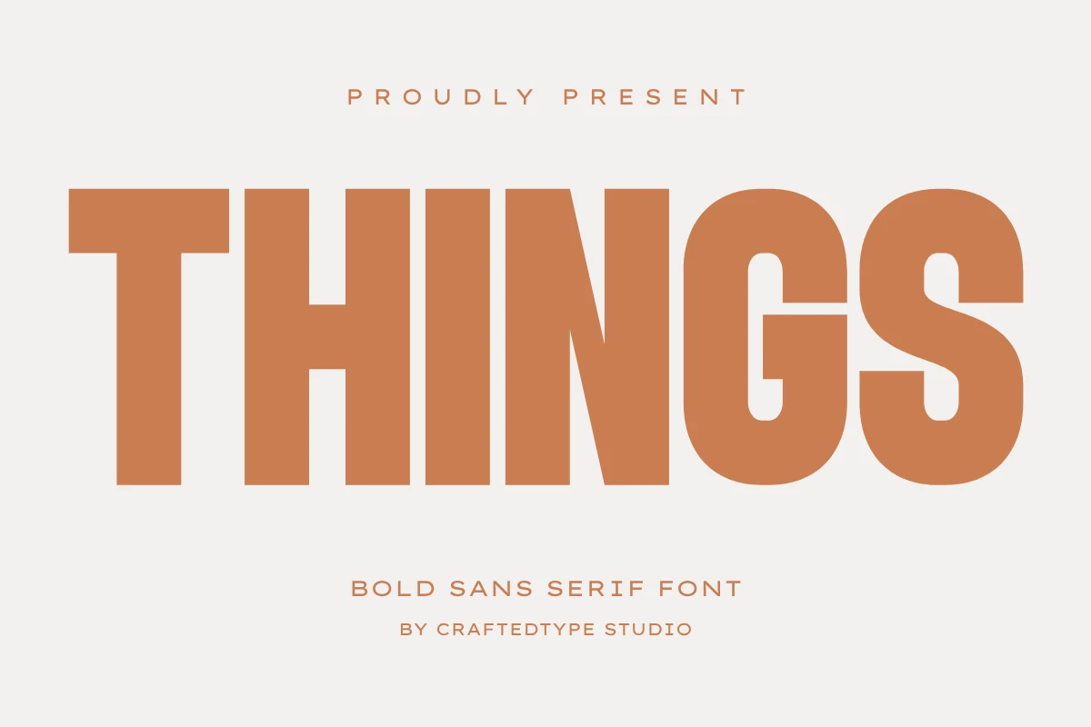
Things Font has tall, steady capitals with broad strokes, open counters, and a balanced rhythm that makes its weight feel polished rather than blunt. The round G and S soften the blocky structure, while the even spacing gives the word a calm, poster-ready presence.
Things fits Bold Sans Serif Fonts when you want strong display type that still feels clean and composed. Use it at generous scale for logos or packaging, then keep supporting text lighter; the heavy forms already establish the hierarchy, so short wording and clear margins help the shapes stay crisp.
Industrial & Retro Bold Sans Serif Fonts
Blocky cuts, nostalgic forms, and dimensional details give these display fonts a distinctive voice for posters, merch, music graphics, and statement branding.
Close Warning Font
Best For: posters, merch design, headlines, T-shirts
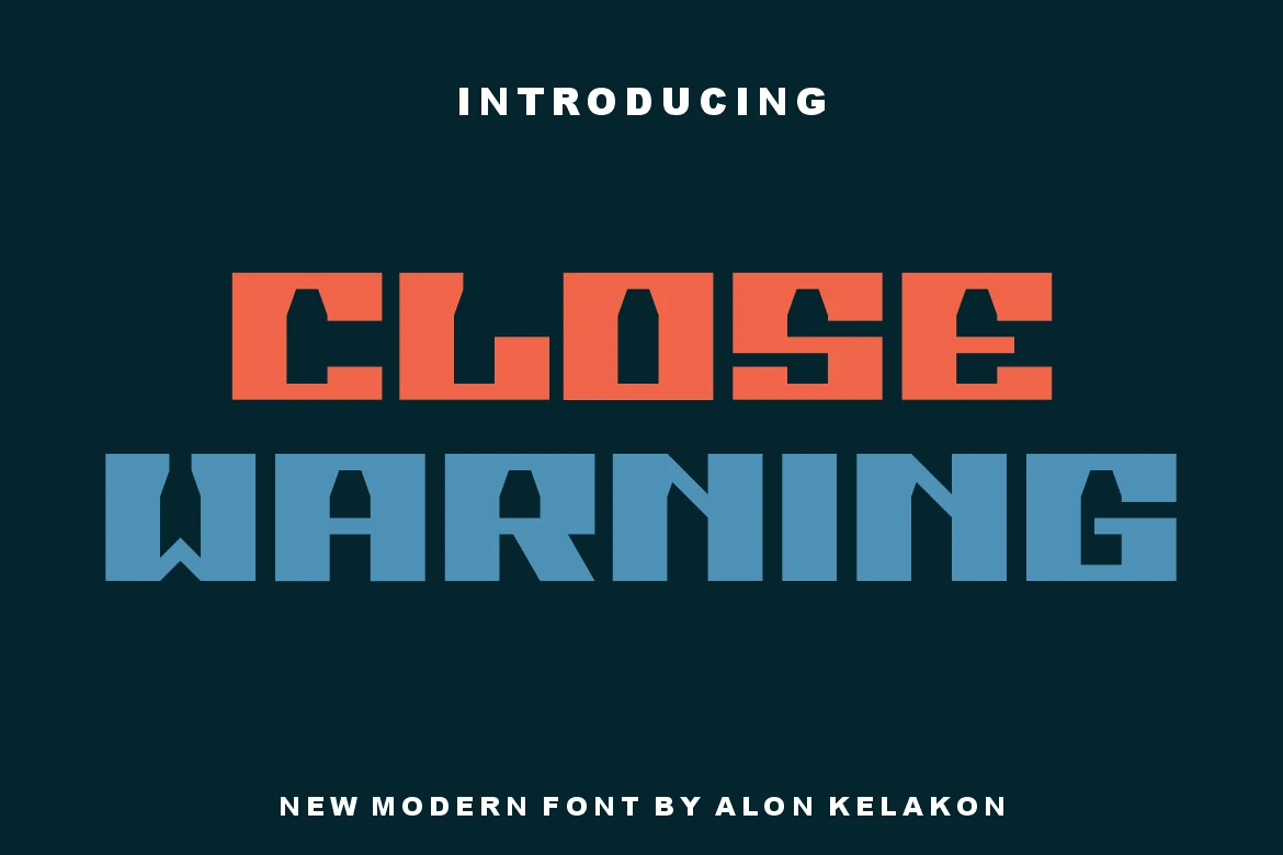
Close Warning pushes Bold Sans Serif Fonts toward a hard-edged, industrial display style, with heavy squared capitals, compressed counters, and sharp internal cutaways that make each word feel built rather than written. The letters carry a stencil-like rhythm without turning into a standard military look.
Use it where the title is the graphic asset: posters, gig flyers, album covers, labels, and apparel. Tight spacing gives the block more force, while strong color contrast keeps the angular cuts and narrow counters readable at headline scale.
Tryone Font
Best For: album covers, editorial designs, vintage designs, posters
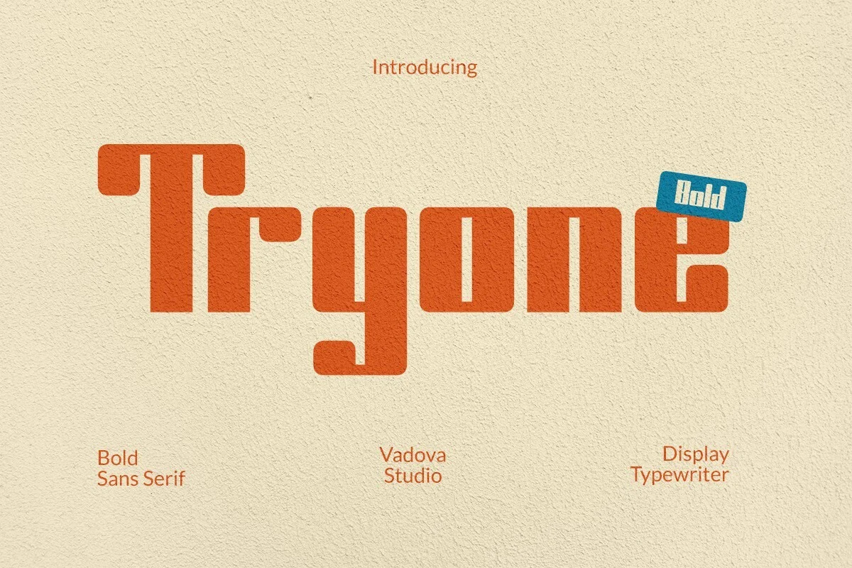
Tryone Font has a chunky retro structure, with squared strokes, softened corners, and rectangular counters that give the letters a stamped, typewriter-adjacent feel. The wide top bar on the T, blocky r, and descending y make the word shape distinctive without sacrificing headline clarity.
Tryone brings Bold Sans Serif Fonts into a more nostalgic display direction. Keep it to short titles, album names, or poster lines, and use generous spacing around the wordmark so the heavy rounded forms and compact interior shapes stay readable rather than crowded.
MISSING REQUIRED FIELD: kadence_font_block_template generation not possible in this chat output format.
MISSING REQUIRED FIELD: kadence_font_block_template generation not possible in this chat output format.
MISSING REQUIRED FIELD: kadence_font_block_template generation not possible in this chat output format.
Glimer Font
Best For: logos, branding, posters, headlines
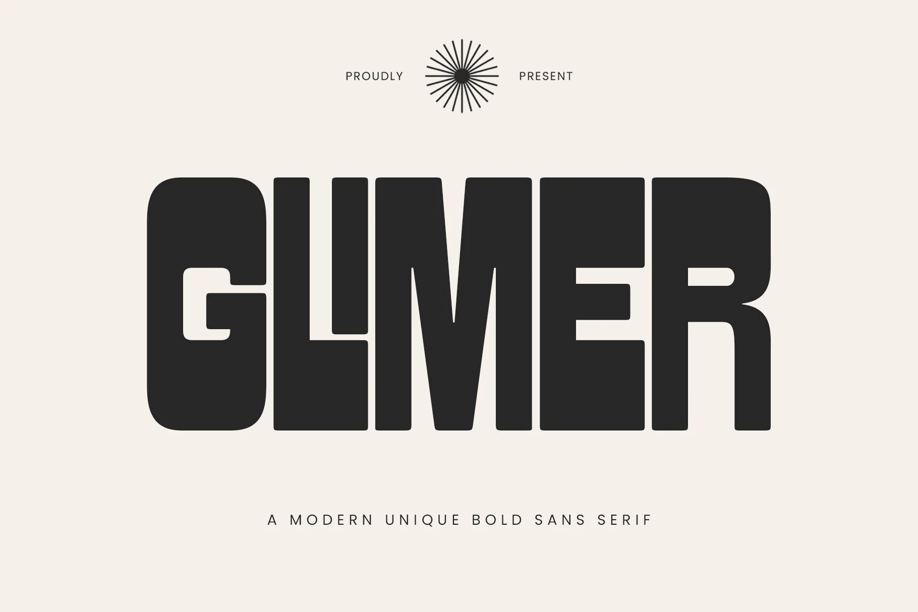
Glimer Font pushes a compact block shape with heavy verticals, rounded outside corners, and squared interior cuts, so the wordmark feels massive without turning into a rigid industrial slab. The G and E use clean horizontal bites while the M keeps narrow angled counters, giving headlines a dense, controlled rhythm.
Use it where Bold Sans Serif Fonts need to feel graphic rather than neutral: posters, packaging fronts, logo marks, and merch titles. Keep spacing fairly tight for impact, but give the surrounding layout strong contrast and clear margins because the thick strokes occupy a lot of visual space.
Think Loved Font
Best For: headlines, posters, fashion branding, social media graphics
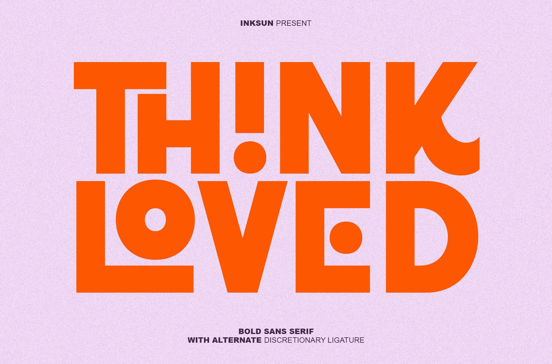
Think Loved Font is built like a graphic statement, with ultra-heavy geometric forms, tight spacing, and crisp verticals that give every word a solid blocky presence. Circular counters and dot-like cutouts break up the mass, while the curved leg on the K and the compact punctuation-style details keep the lettering from feeling static.
In Bold Sans Serif Fonts, this one stands out for the way its alternate discretionary ligatures can turn short phrases into a custom-looking lockup. It works best in big headline settings where the stacked shapes and dense weight can do the talking, especially if you pair it with simple supporting text and strong contrast around it.
Nordin Extrude Family Font
Best For: posters, signage, headlines, retro designs
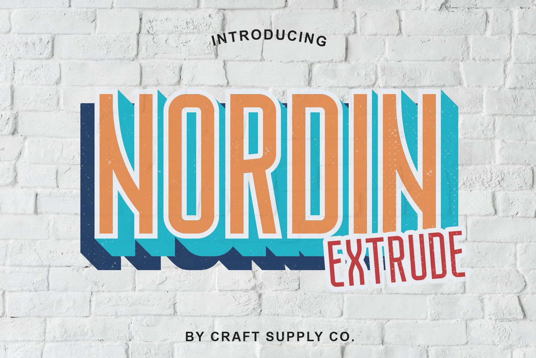
Nordin Extrude Family Font has a tall condensed structure with smooth rounded corners and narrow counters, but its real character comes from the stacked extrude layers that turn simple letterforms into a bold dimensional headline. The chromatic build gives the font a lively retro sign feel without losing the clean rhythm of the base shapes.
If you are browsing Bold Sans Serif Fonts for display work, this family gives you more room to experiment than a standard one-layer face. Its 7 layerable variations help you build depth, color contrast, and shadowed hierarchy, which is especially useful for posters or branding where a flat headline would feel too quiet.
Conclusion
Choose rounded bold sans serif fonts for warmth, condensed styles for narrow layouts, geometric options for polished branding, or industrial and retro faces for stronger character. Match the font’s density and proportions to the available space, then support it with simpler text so the main display type remains clear.