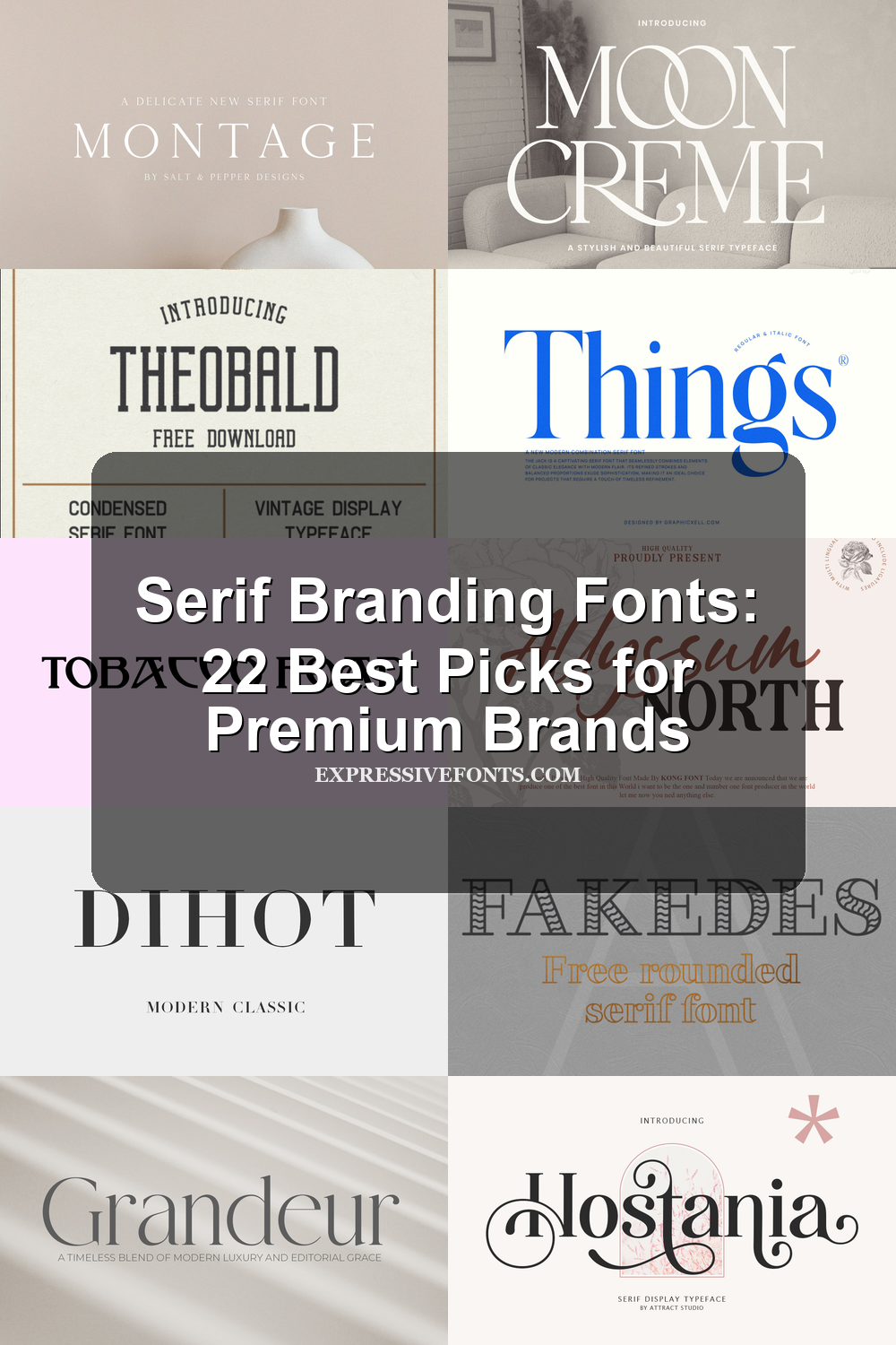
Serif Branding Fonts: 22 Best Picks for Premium Brands
Looking for more branding fonts? Browse our complete Branding Fonts collection to compare luxury, elegant, modern, feminine, minimal, boutique, beauty, fashion, packaging, and serif styles.
Serif Branding Fonts are built for designers who need polished typography for logos, packaging, labels, editorial layouts, and premium visual identities. This collection covers elegant, bold, retro, decorative, and playful serif styles so you can choose the right tone for a brand.
Elegant & Luxury Serif Branding Fonts
These refined serif branding fonts use fine contrast, airy spacing, and polished curves for beauty brands, fashion identities, invitations, and editorial-style logos.
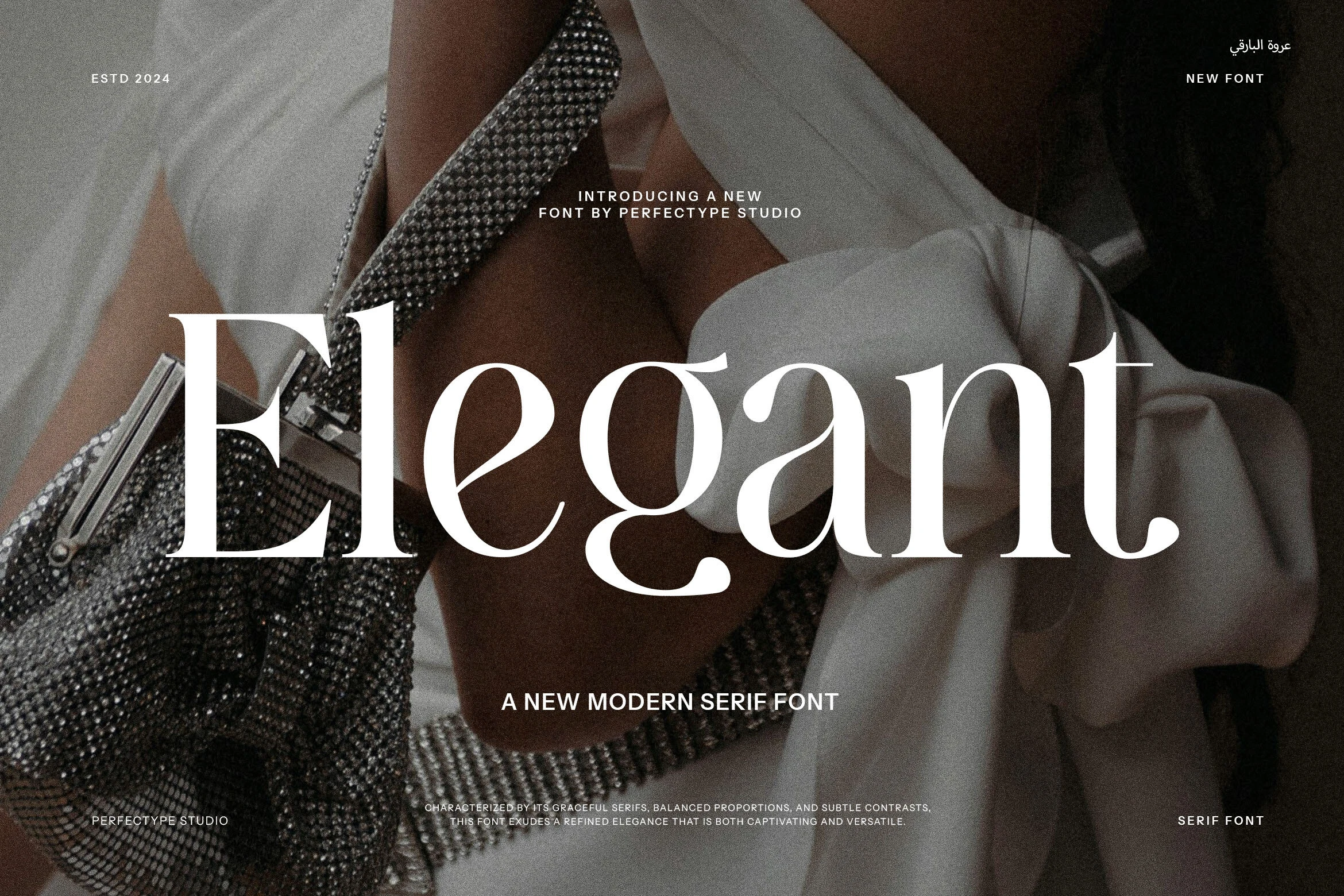
Things Font
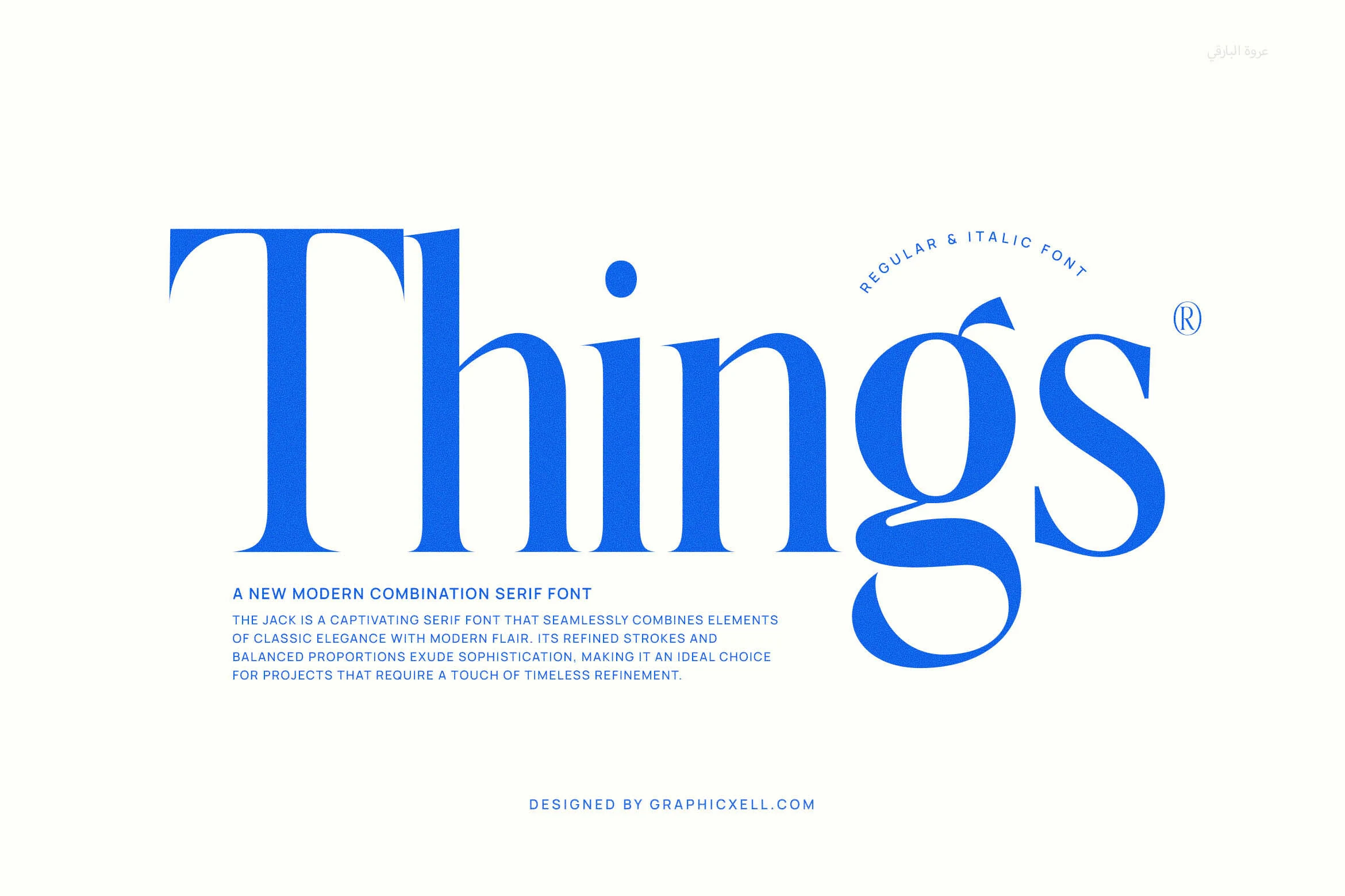
Best For: logos, branding, editorial designs, elegant designs
Things Font has a sculpted, high-contrast serif style with tall proportions, crisp vertical stress, and smooth curves that give it a polished editorial presence. The oversized capitals feel stately, while the rounded lowercase forms soften the look and keep it from reading too rigid or old-fashioned.
In Serif Branding Fonts, it works especially well when you want a classic tone with a cleaner modern finish. The dramatic lowercase g and refined joins give short names or mastheads more character, so it shines in large sizes where spacing and generous margins can show off the rhythm of the letterforms.
Elegant Font
Best For: branding, editorial designs, fashion branding, luxury designs
Elegant Font lives up to its name with high-contrast strokes, fine hairlines, and long, poised curves that give each word a polished editorial rhythm. The serifs feel delicate rather than sharp, and the wide bowls and sweeping joins create a refined silhouette that reads as dressy and assured.
In Serif Branding Fonts, it suits identities that need a lighter, more elevated tone instead of blunt impact. It looks strongest in large titles, logos, or packaging where the thin lines can breathe, and the graceful proportions help build a clear hierarchy without adding visual clutter.
Seraphim Font
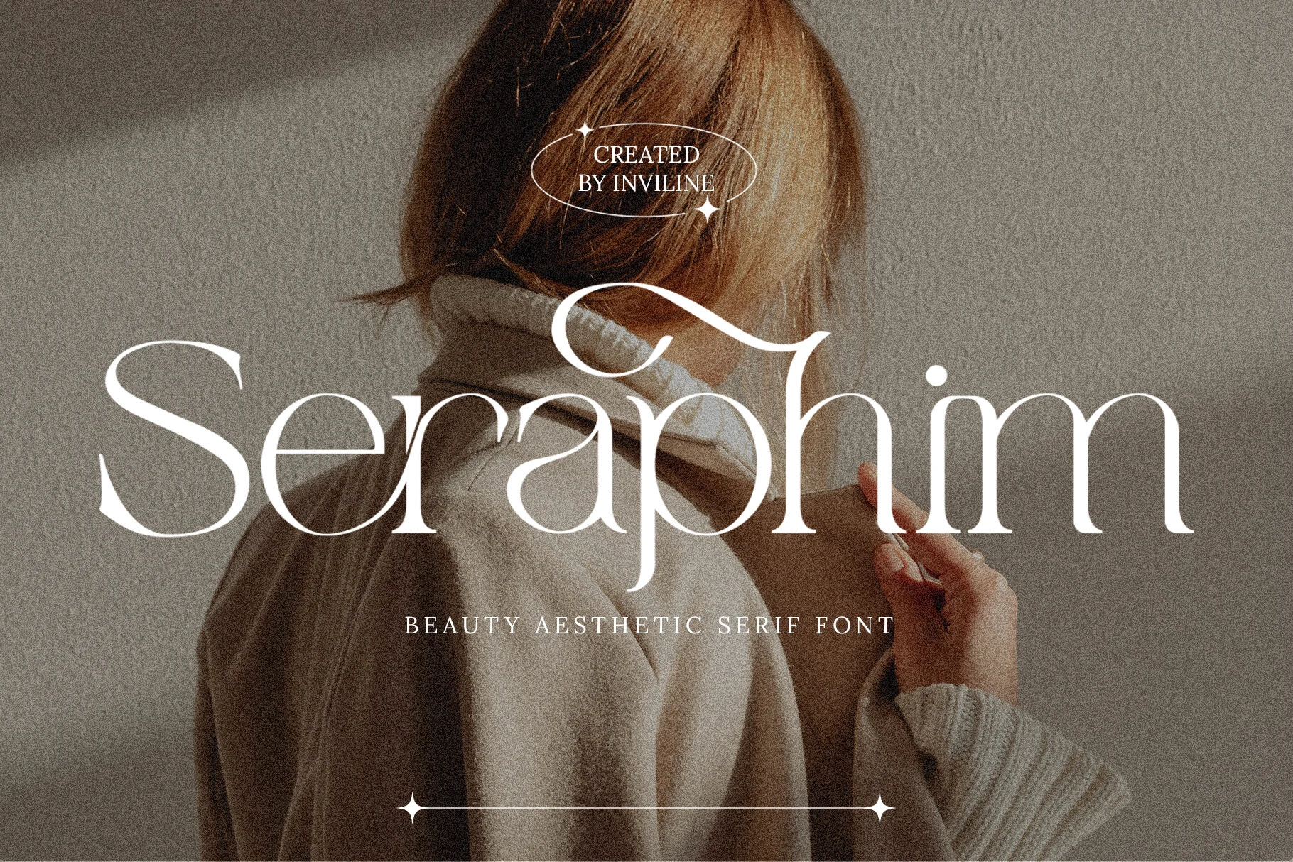
Best For: beauty branding, editorial designs, wedding designs, elegant designs
Seraphim Font has a high-contrast serif structure with long, tapering strokes and smooth curves that give the lettering a soft, polished rhythm. The large capital S sets the tone with a graceful flourish, while the open counters and slim joins keep the word shape airy rather than stiff.
For Serif Branding Fonts, it works especially well when you want a refined identity with a lighter touch. Its elegant proportions suit editorial layouts, beauty packaging, and invitation-style compositions, and it looks strongest in short lines with enough breathing room to let the delicate hairlines stay crisp.
Grandeur – Elegant Classic Serif Font
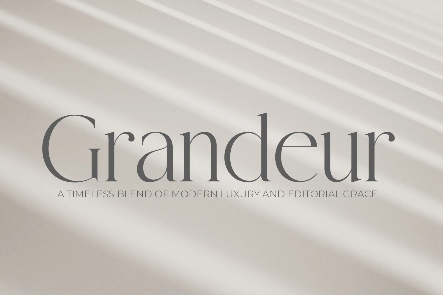
Best For: logos, branding, editorial designs, luxury designs
Grandeur – Elegant Classic Serif Font has a quiet, refined serif voice built from thin strokes, balanced contrast, and open lowercase shapes. The tall ascenders and restrained terminals give it a print-inspired rhythm, while the soft curves keep the wordmark modern rather than overly formal.
A Serif Branding Fonts project benefits from its calm title hierarchy: it can hold a luxury logo, editorial masthead, or packaging name without needing heavy decoration. Give the letters generous spacing and low-clutter backgrounds so the fine serif details and measured proportions stay clear.
Praise Font
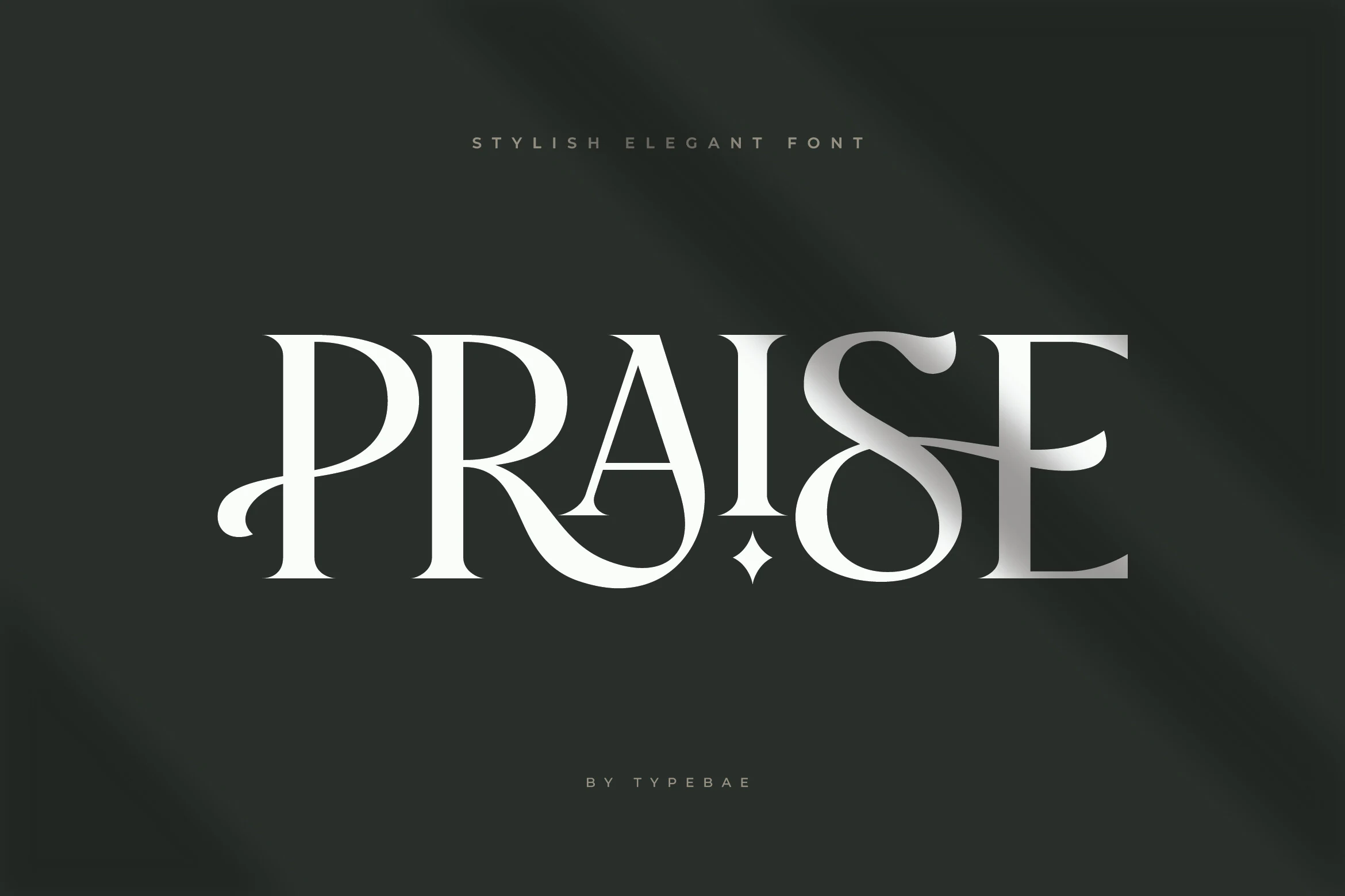
Best For: logos, branding, editorial designs, high-end designs
Praise Font has tall high-contrast serif forms with sharp hairlines, generous bowls, and dramatic swashes that turn simple letters into a statement. The sculpted S and sweeping leg on the R give it a polished display character that feels elegant, slightly fashion-led, and built to stand out.
For Serif Branding Fonts, it works best in wordmarks, packaging, and title treatments where one name needs clear presence. Use it at larger sizes and keep supporting text restrained, because the ornate curves and fine contrast read best when the layout gives the lettering room to lead.
Orchid Font
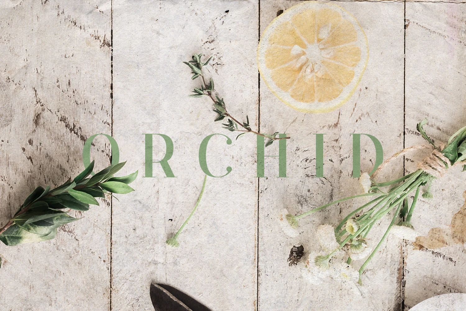
Best For: invitations, wedding designs, social media graphics, branding
Orchid Font uses delicate serif capitals with slim strokes, soft contrast, and generous spacing between each letter. The curved leg on the R and open C keep the design graceful rather than rigid, giving short words a quiet botanical, editorial feel.
For Serif Branding Fonts, it suits wedding stationery, refined labels, and calm social graphics where a light touch matters more than heavy impact. Keep the contrast clear and avoid crowded layouts, because its airy proportions work best when the spacing stays visible.
Montage Font
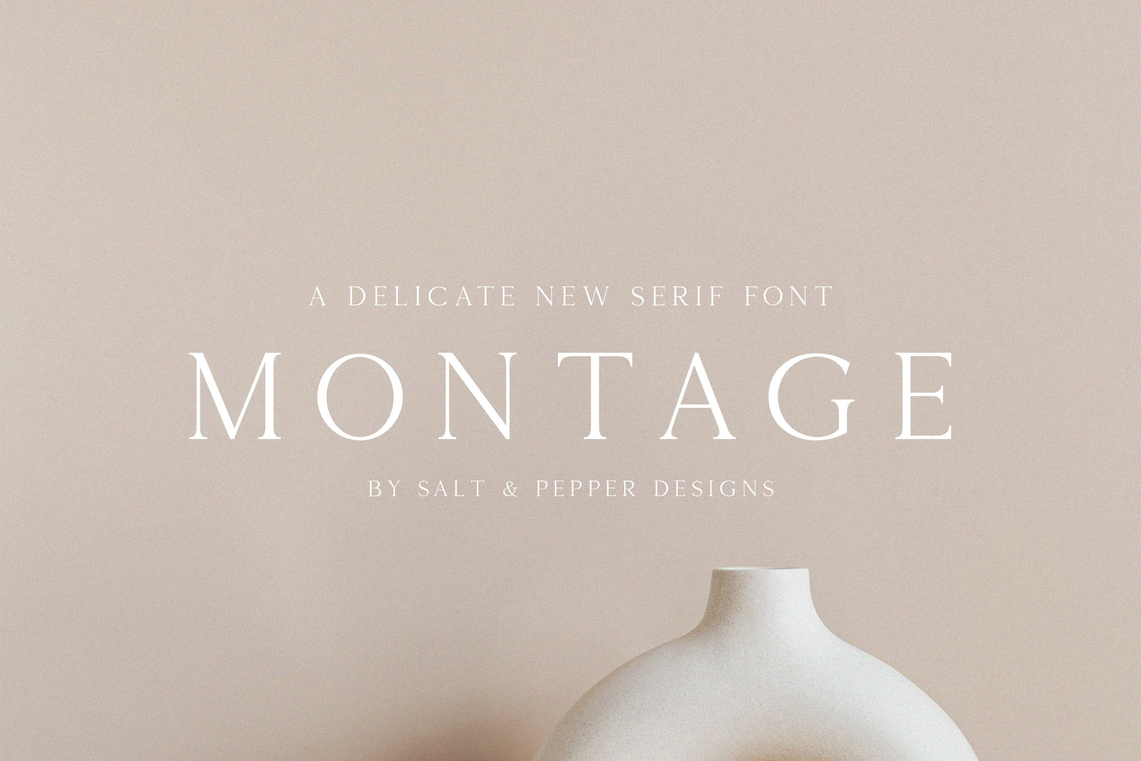
Best For: logos, branding, editorial designs, luxury designs
Montage Font is built from thin serif capitals with crisp contrast, long verticals, and wide spacing that gives each letter a calm, polished presence. The clean bowls and restrained terminals keep it elegant rather than ornate, which makes the overall look feel quietly luxurious.
In Serif Branding Fonts, Montage works especially well for beauty marks, refined packaging, and editorial headers where a light typographic texture matters. Give it room and pair it with simple supporting text, because its fine strokes and open tracking read best when the hierarchy stays clean.
Dihot Font
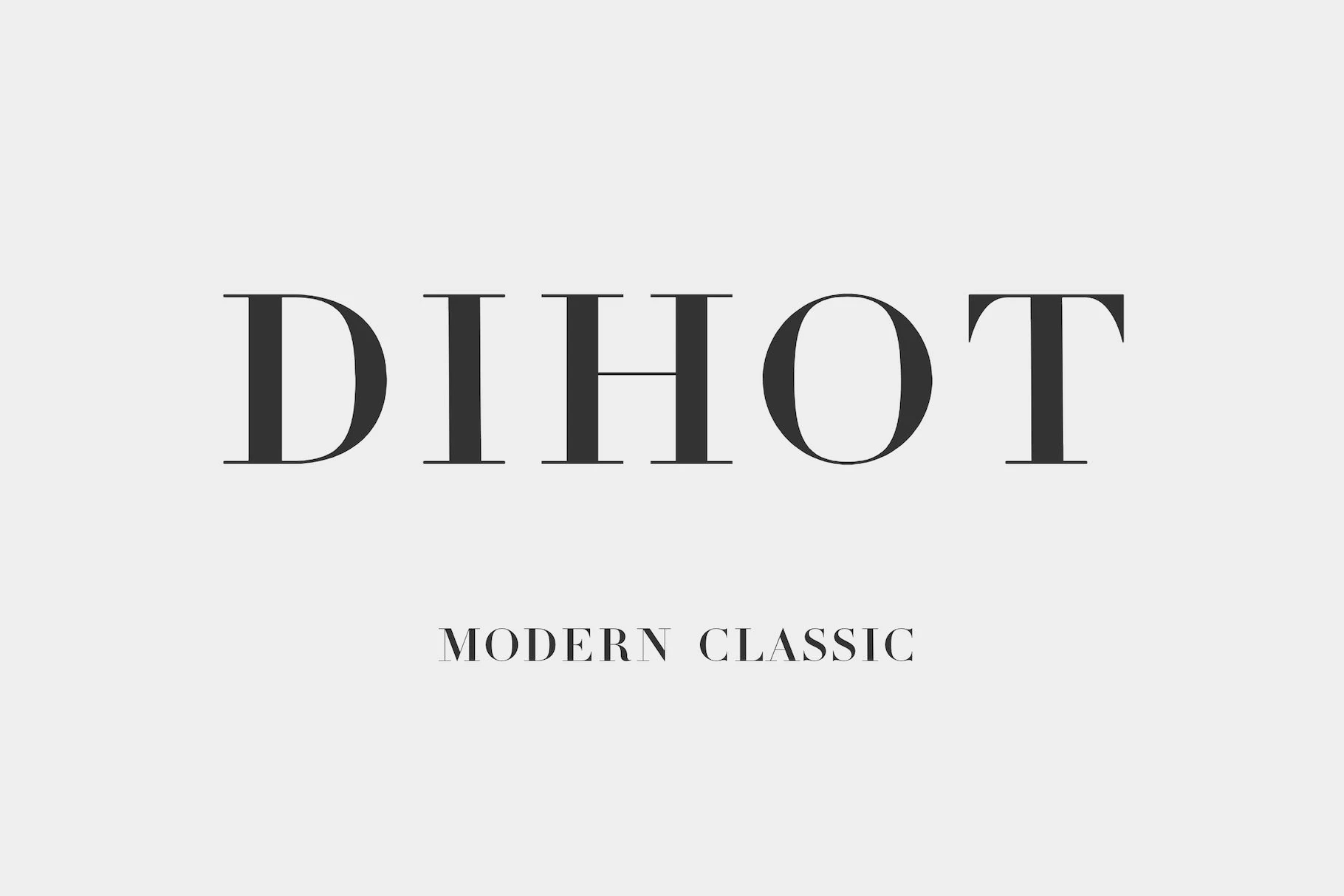
Best For: logos, branding, editorial designs, fashion branding
Dihot Font leans into crisp Didot-style contrast, pairing slim hairlines with broad vertical strokes and sharp, refined serifs. The capitals feel clean and architectural, so even a single word looks polished, with that unmistakable modern-classic tension between delicacy and structure.
For Serif Branding Fonts, it suits identity work that needs a controlled luxury feel rather than ornament. Use it for wordmarks, editorials, or packaging titles with strong scale contrast, and keep supporting text simple so the thin strokes and elegant proportions stay clear.
Bold & Editorial Serif Branding Fonts
These stronger serif branding fonts bring heavier strokes, sharper contrast, and confident proportions for mastheads, premium packaging, posters, and logo hierarchy.
Patcher Font
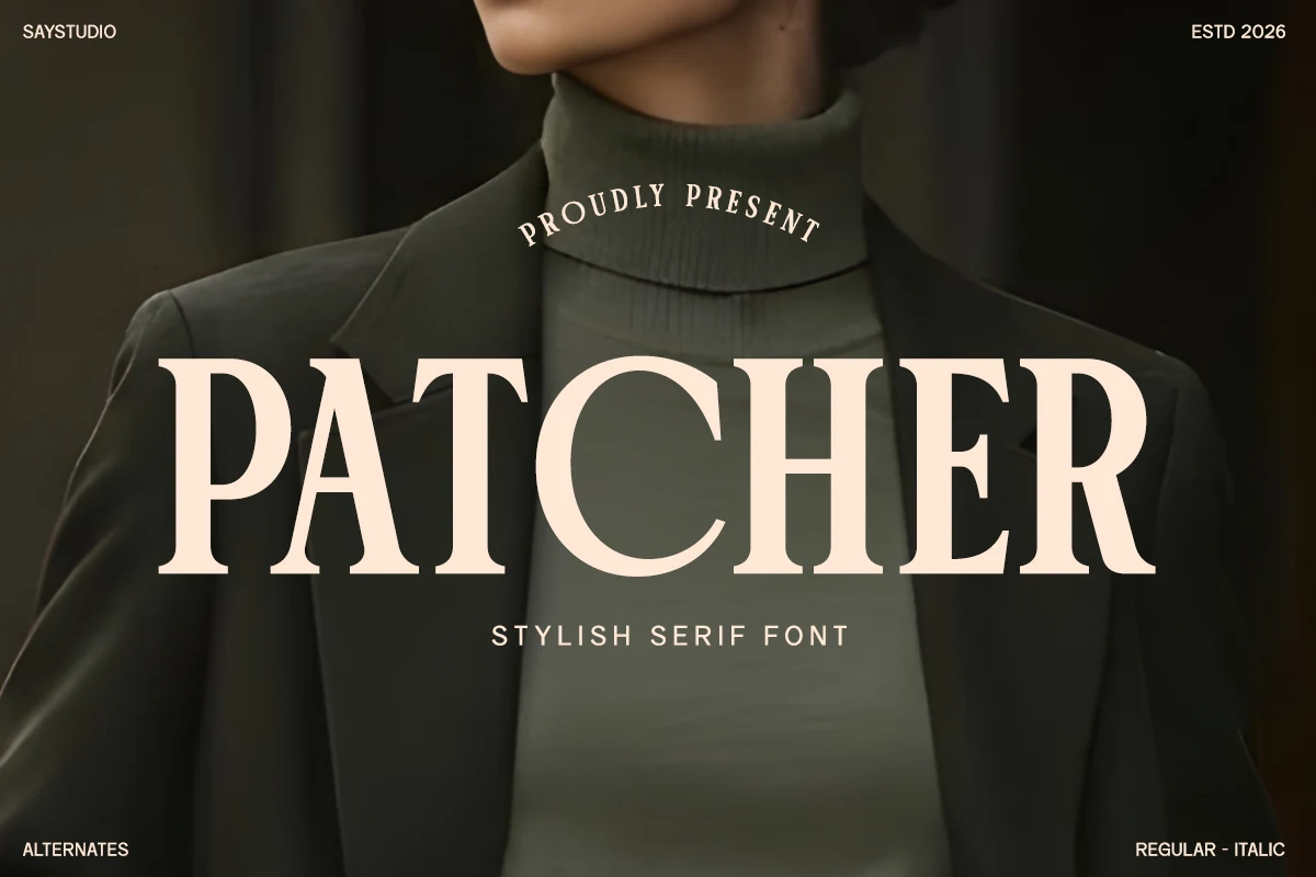
Best For: logos, branding, fashion branding, luxury designs
Patcher Font is built around broad uppercase forms, sharp wedge serifs, and a confident vertical rhythm. Its weight gives headlines a strong fashion-magazine presence, while the clean internal spacing keeps the letter shapes readable instead of overly ornamental.
For Serif Branding Fonts, it is strongest in logos, campaign titles, and premium packaging where one word needs to carry the hierarchy. Use restrained tracking and high contrast around the type; the sturdy strokes can sit over imagery, but crowded layouts will flatten its refined serif details.
Luxena Font
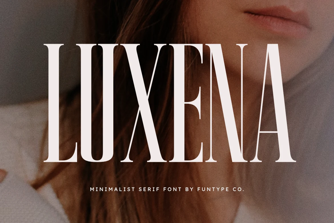
Best For: logos, headlines, fashion branding, luxury designs
Luxena Font uses a tall, condensed serif structure with firm vertical strokes, tight proportions, and fine contrast that creates a severe fashion-editorial mood. The uppercase shapes feel controlled and architectural, with just enough serif detail to avoid a plain modern look.
Its lean profile gives Serif Branding Fonts a sharp hierarchy for logos, posters, and premium packaging where the title needs height rather than decorative movement. Keep tracking moderate and contrast strong, because the narrow forms lose their precision when squeezed into busy layouts.
Fontrize Font
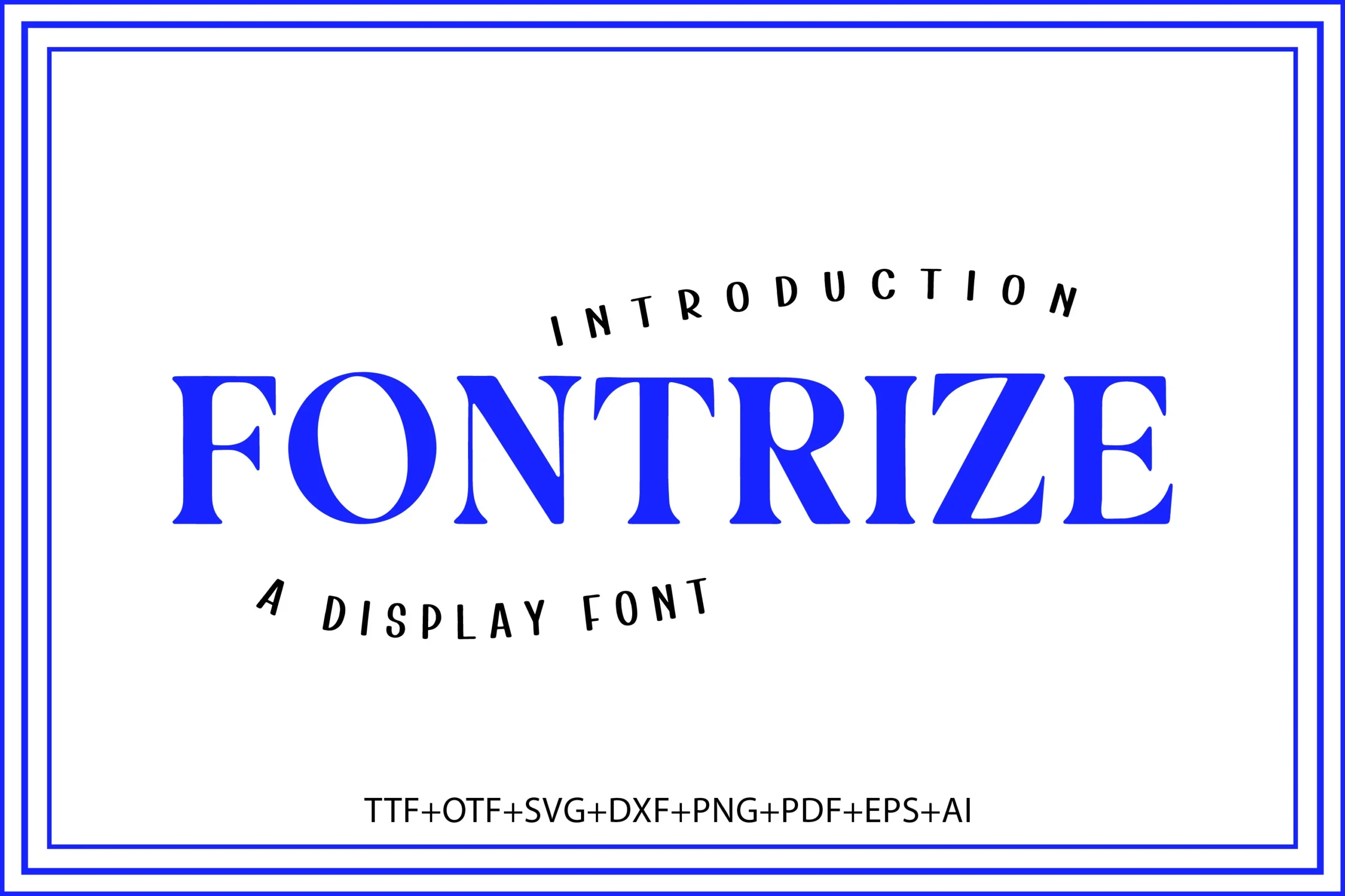
Best For: logos, branding, headlines, bold designs
Fontrize Font is a bold high-contrast serif with strong vertical stems, sharp bracketed serifs, and broad letter shapes that hold attention fast. The rounded O and open counters keep the display style clear, while the heavy blue preview shows how confidently it can anchor a clean headline layout.
For Serif Branding Fonts, it works best where the title needs immediate authority rather than subtle texture. Use it in short logo names, headline layouts, poster titles, and packaging marks where the strong serif structure can define the design without extra decoration.
Strong Font
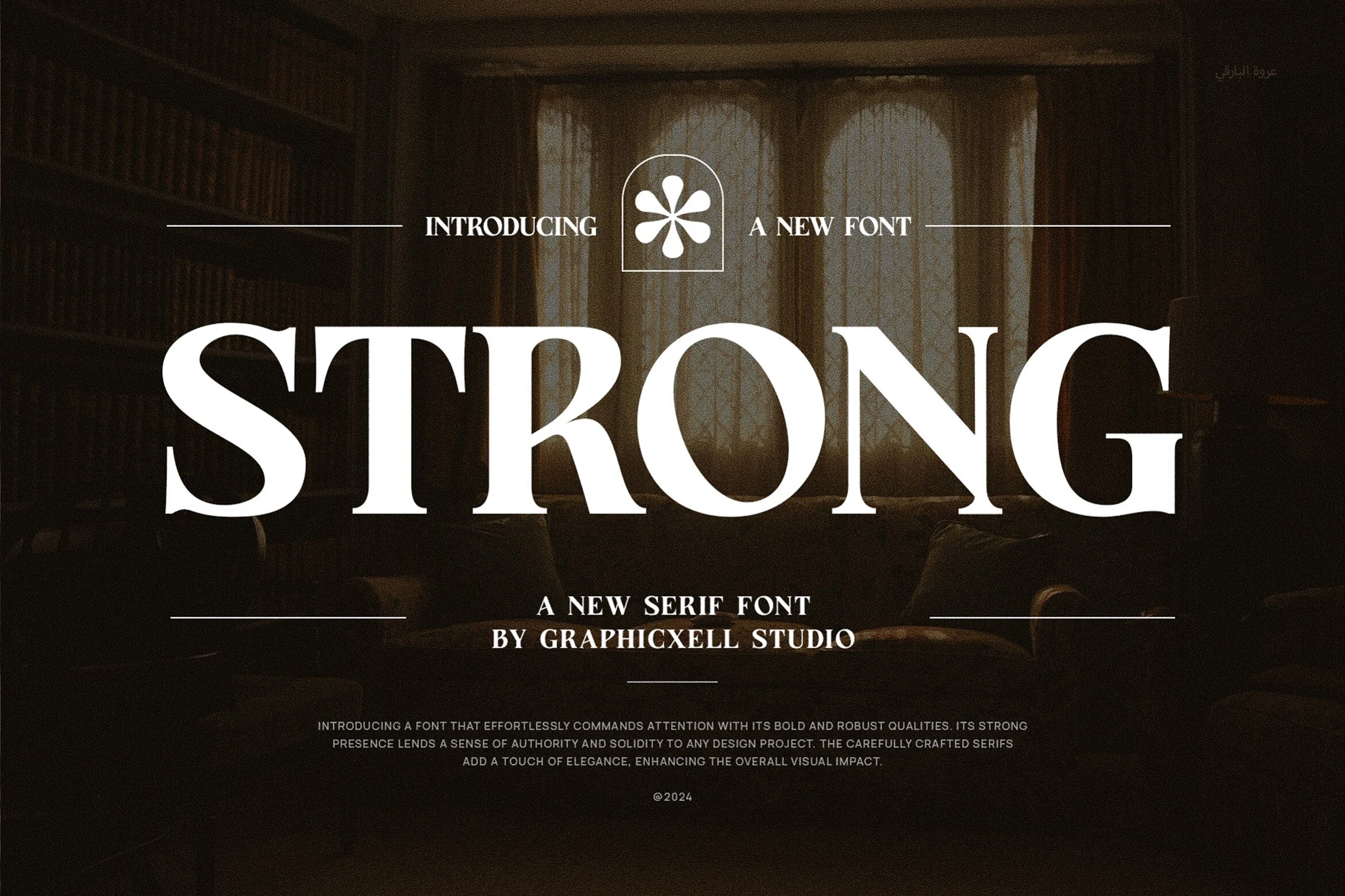
Best For: logos, branding, packaging, product labels
Strong Font uses broad uppercase proportions, firm vertical stems, and crisp tapered serifs to create a steady, authoritative tone. The letters feel solid rather than delicate, and the generous inner space keeps the word shape readable even when set large over textured imagery or darker backgrounds.
That makes it a natural fit for Serif Branding Fonts that need a classic, dependable presence in logos, packaging, or labels. Use it for short names and headline lines, then pair it with quieter supporting text; its sturdy structure carries hierarchy on its own, so overly tight tracking can make the composition feel heavy.
Moon Creme Font
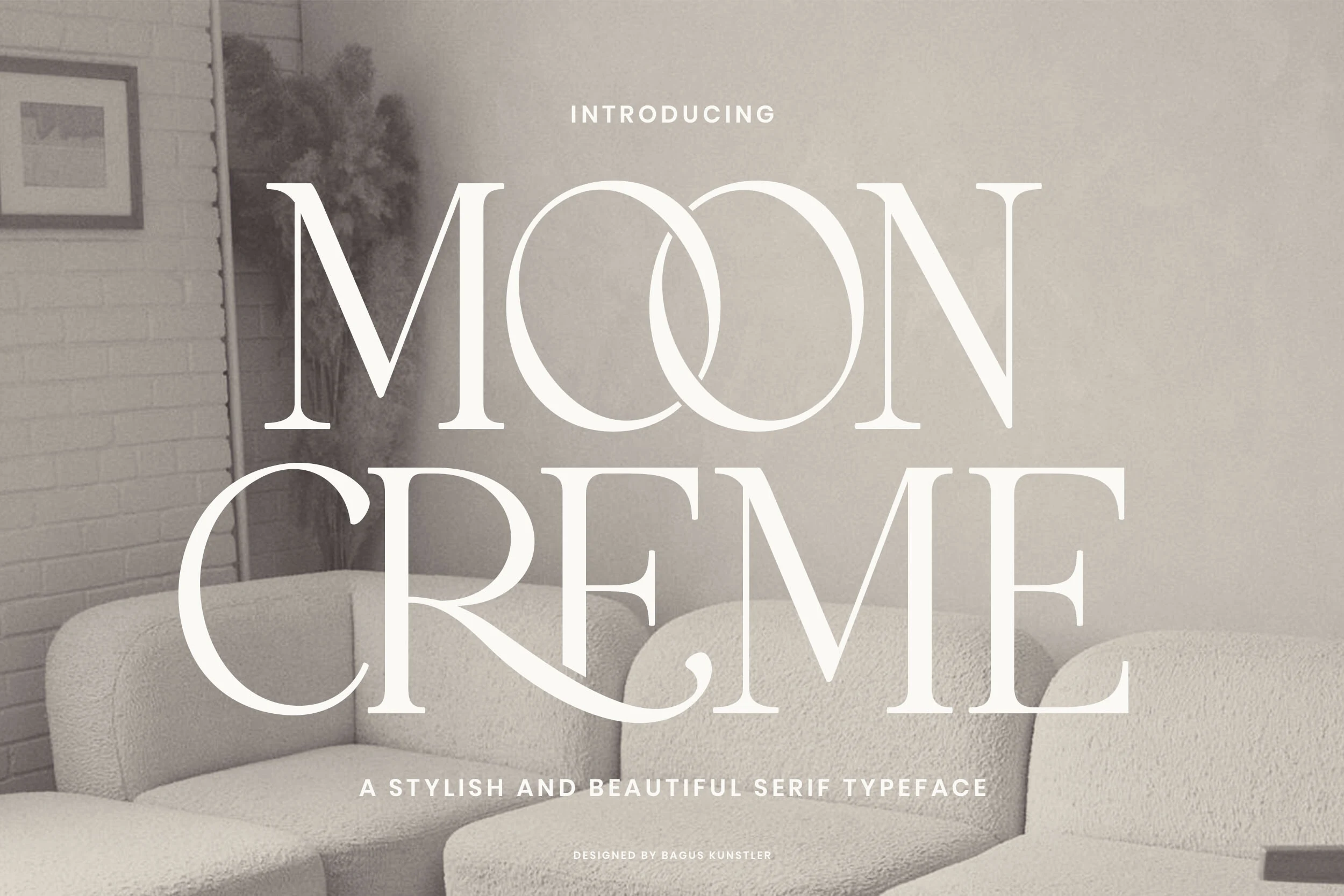
Best For: logos, branding, packaging, editorial designs
Moon Creme Font uses tall, high-contrast serif forms with fine hairlines, broad stems, and softly flared terminals. The oversized curves and interlocking O shapes give it a vintage editorial mood without making the letterforms feel old-fashioned.
For Serif Branding Fonts, it works best where the type can become the main visual asset: logo words, packaging fronts, magazine-style headers, and refined product names. Keep spacing controlled and avoid cramped compositions, because its thin strokes and wide curves need clear contrast to stay sharp.
Retro & Vintage Serif Branding Fonts
These vintage serif branding fonts use chunky shapes, condensed forms, swashes, and old-ad energy for labels, nostalgic logos, posters, and heritage-style packaging.
Kind Avenue Font
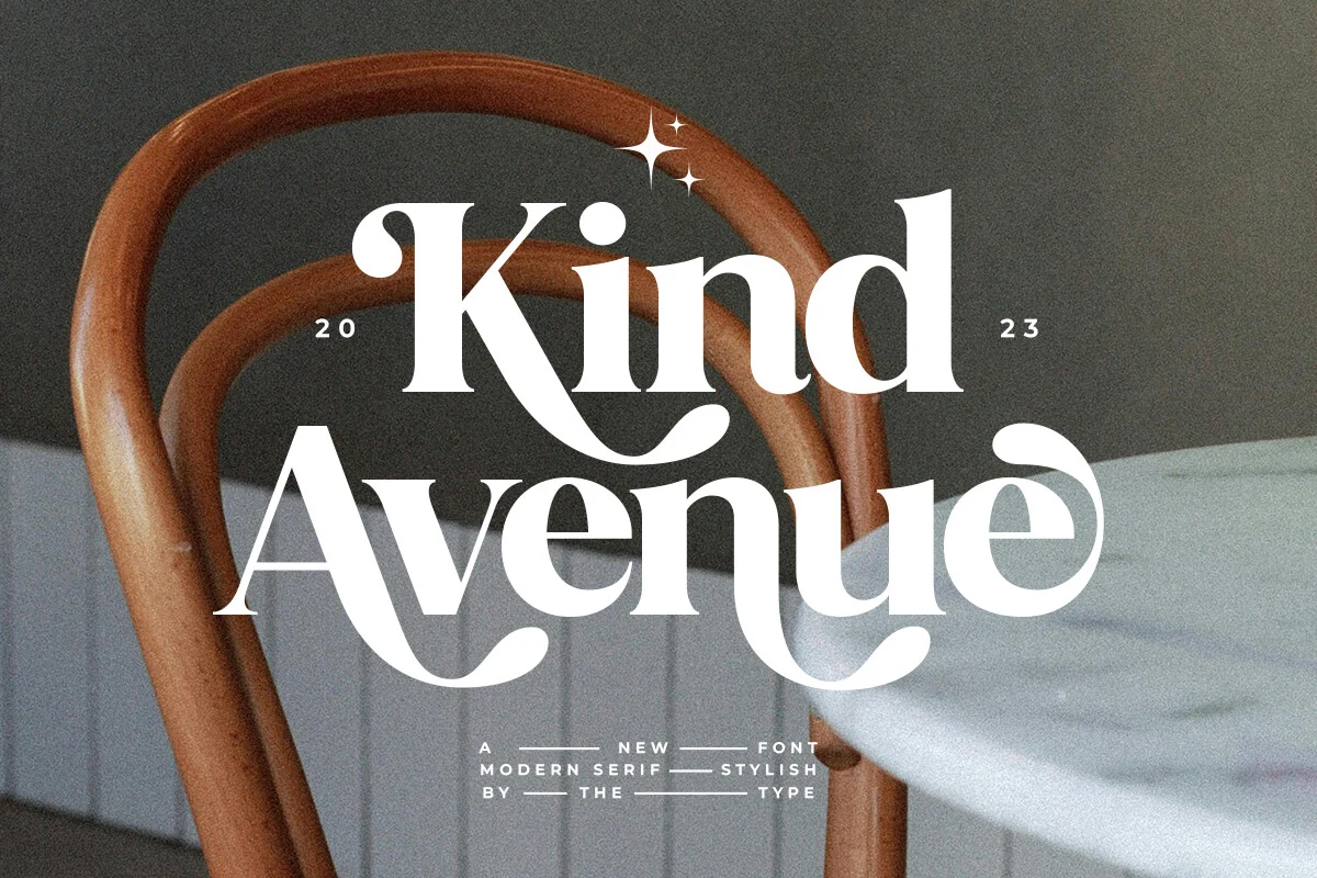
Best For: logos, branding, packaging, retro designs
Kind Avenue Font has the confident shape of a retro serif, with heavy verticals, crisp wedge-like serifs, and sweeping curves that pull attention into the wordmark. The contrast is strong enough for headline hierarchy, while the rounded terminals keep the mood softer than a strict traditional serif.
For Serif Branding Fonts, its alternate substitutes and ligatures give designers a practical way to shift the tone from conservative to more expressive. Use the decorative characters in short names or feature words, then keep spacing controlled so the swashes connect visually without crowding the composition.
Constantia Font
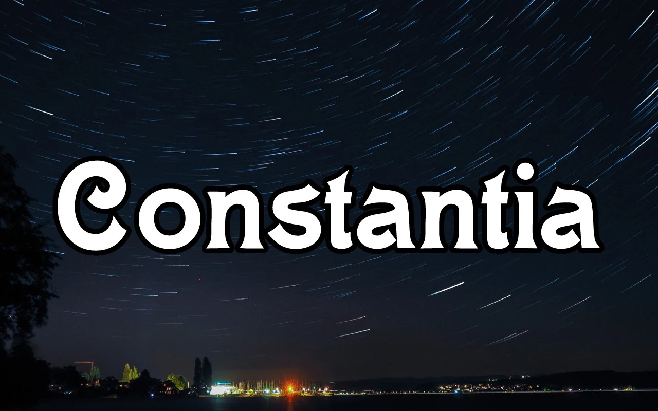
Best For: logos, branding, headlines, eye-catching designs
Constantia Font has a chunky serif build with soft curves, thick strokes, and compact counters that give it a friendly but assertive voice. The rounded terminals and curled uppercase C keep it decorative, while the overall weight makes the word shape read quickly even at a distance.
For Serif Branding Fonts, it works best when you let the bold silhouette lead in short names, headers, or packaging marks. Pair it with a simpler supporting face and leave a bit of space around the lettering, since the dense forms create a strong texture that carries plenty of visual energy on its own.
Theobald Font
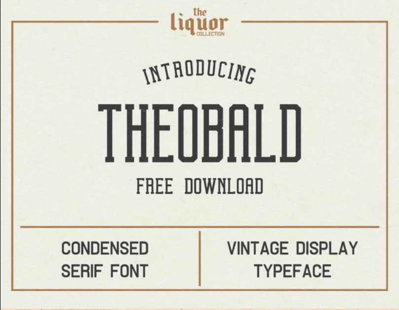
Best For: packaging, posters, product labels, vintage designs
Theobald Font has a narrow, all-caps serif structure with squared shoulders, slab-like serifs, and an old sign-painter rhythm that immediately reads vintage. The condensed proportions let it hold a lot of presence in a tight space, which is exactly why it feels so natural on label-style layouts and poster headings.
Within Serif Branding Fonts, it is a strong choice when you want packaging or advertising to feel rooted in classic trade design. Use it for short titles and stacked compositions, where the tall letterforms and even spacing can build a firm block of text without losing legibility.
Hostania Font
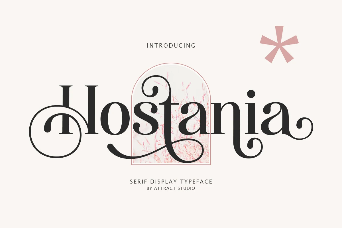
Best For: logos, branding, elegant designs, nostalgic designs
Hostania Font has a nostalgic serif character with graceful contrast, rounded bowls, and decorative swash terminals that give the wordmark a polished vintage rhythm. The flourished capitals and curling letter endings make it feel expressive, but the core letterforms stay clear enough to keep titles and short text readable.
For Serif Branding Fonts, it shines in logos and showcase headings where the ornamental details have room to breathe. Use the swash-heavy letters in short names or hero lines, then balance them with simpler supporting text so the elegant texture feels intentional rather than crowded.
Tobacco Road Font
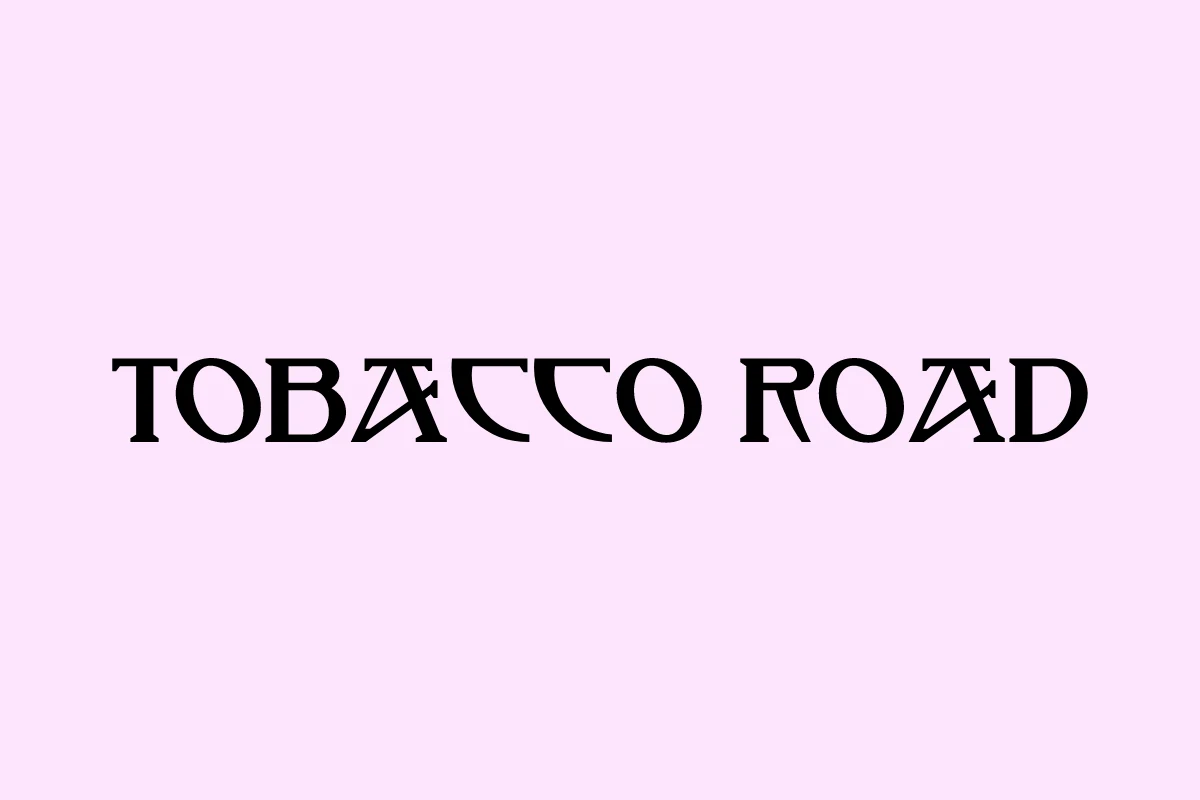
Best For: logos, branding, headlines, retro designs
Tobacco Road Font has a retro serif style with compact uppercase forms, blunt serifs, and sharp internal cuts that give the letters a slightly theatrical edge. The angled A shapes and sturdy curves make the wordmark feel old-school without relying on distressed texture or decorative extras.
It fits Serif Branding Fonts where a name needs vintage character but still has to read cleanly in logos, covers, or merchandise. Keep the wording short and the spacing even; the angular details are strongest at display size, especially when set with clear contrast and minimal surrounding type.
Hamburger Heaven Font
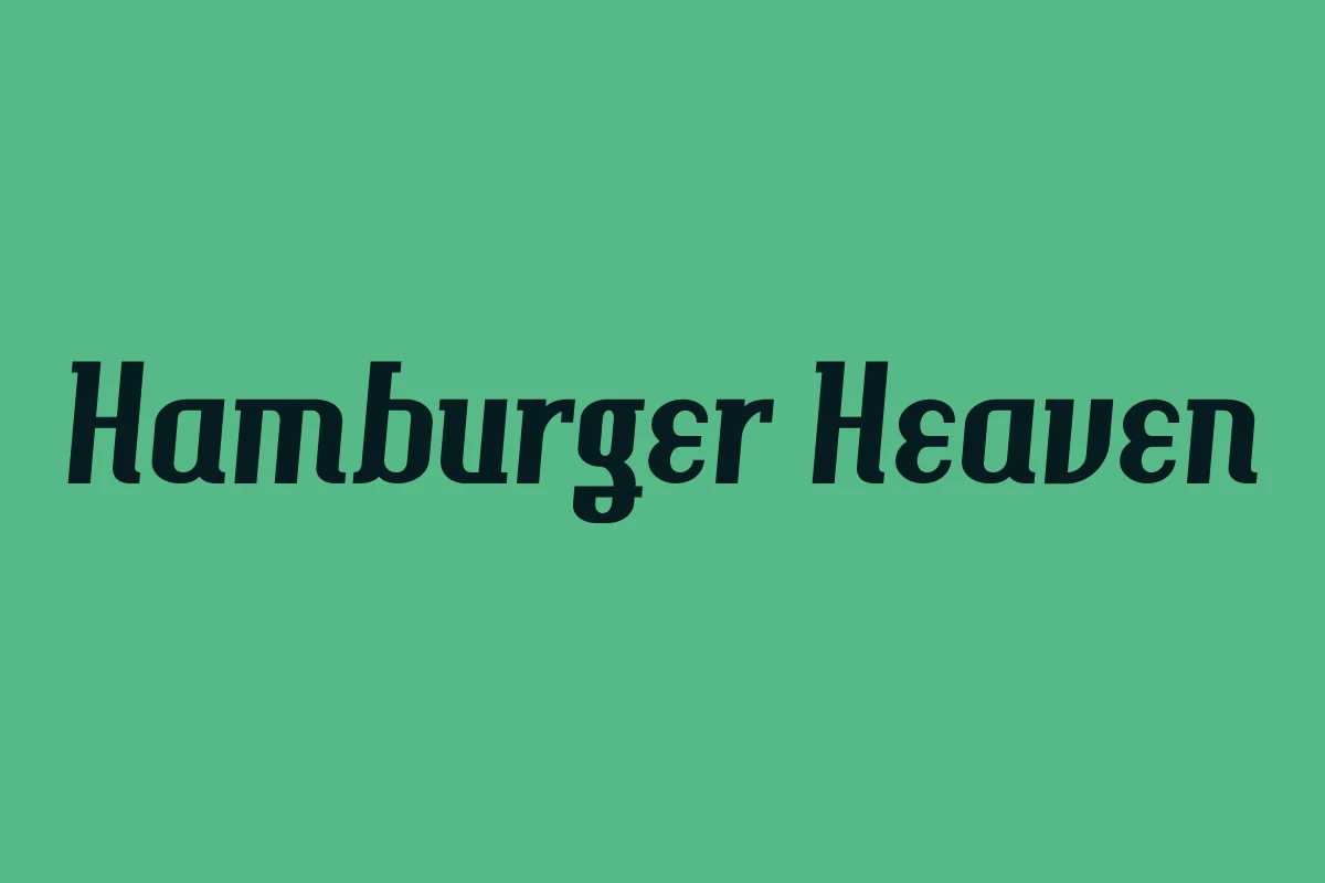
Best For: logos, headlines, retro designs, vintage designs
Hamburger Heaven Font has a slanted vintage serif style with chunky strokes, rounded corners, and compact counters that give it a lively old-ad feel. The broad capitals and forward lean add motion, while the softened serifs keep the bold shapes friendly rather than severe.
In Serif Branding Fonts, it works best when you want a retro logo or headline to feel punchy and memorable. Short words suit it especially well: the dense letterforms create a strong block of color, so a touch of extra spacing and a simpler secondary typeface help the name stay crisp on posters, tees, or packaging.
Decorative & Playful Serif Branding Fonts
These expressive serif branding fonts lean into outlines, curls, script pairings, and storybook details for playful packaging, boutique marks, and display headlines.
Allyssum North Font
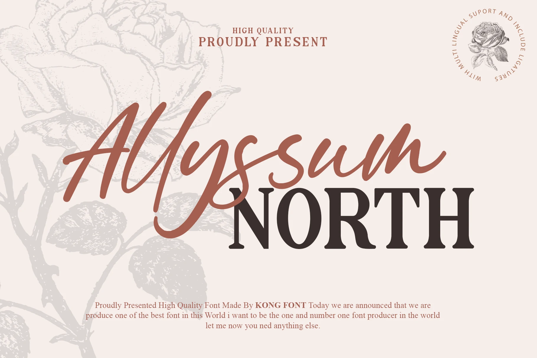
Best For: logos, branding, invitations, feminine designs
Allyssum North Font pairs a loose handwritten script with a sturdy serif, creating a layered contrast between movement and structure. The script line has long sweeping strokes and an easy rhythm, while the serif underneath adds weight, straight stems, and a grounded presence that keeps the duo from feeling too airy.
That mix gives Serif Branding Fonts a built-in hierarchy for more styled logos, invitations, and packaging. Let the script carry the expressive word and use the serif for the anchor line below; the combination works best when the second line stays short and the script has enough room for its wide overlaps and flowing endings.
Funny Pirates Font
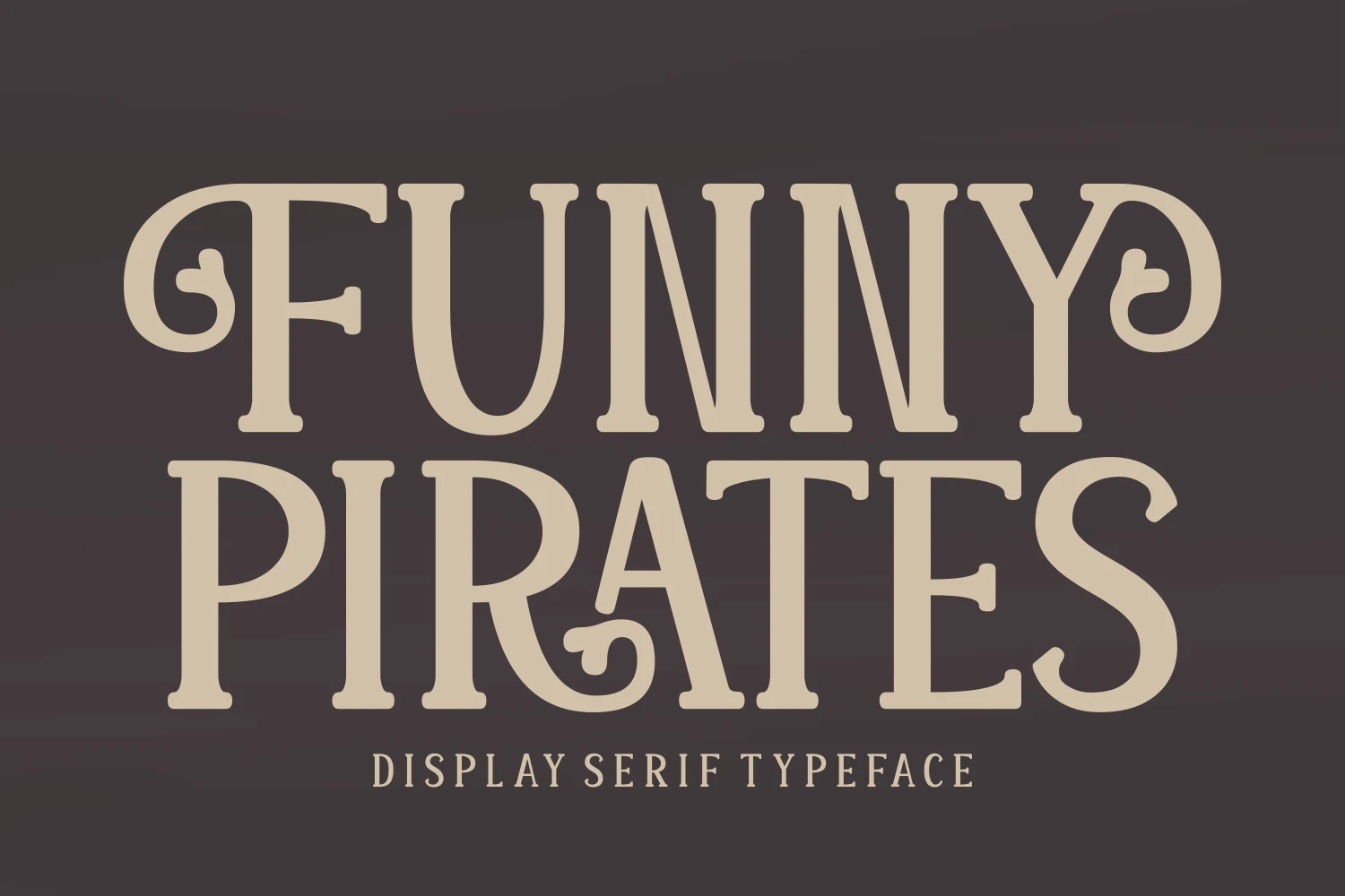
Best For: display text, headlines, children’s designs, playful designs
Funny Pirates Font has chunky serif shapes, rounded corners, and curly ornamental terminals that give the letters a cheerful old-storybook feel. The swashed F, looped R, and curled Y keep the texture lively, while the broad proportions make every word feel bold and friendly.
Within Serif Branding Fonts, this one is strongest in short names, kids-focused packaging, and headline-style graphics where the personality should do the work fast. Keep it large and let the spacing breathe, because the decorative curls can feel crowded if you squeeze too many words into one line.
Fakedes Font
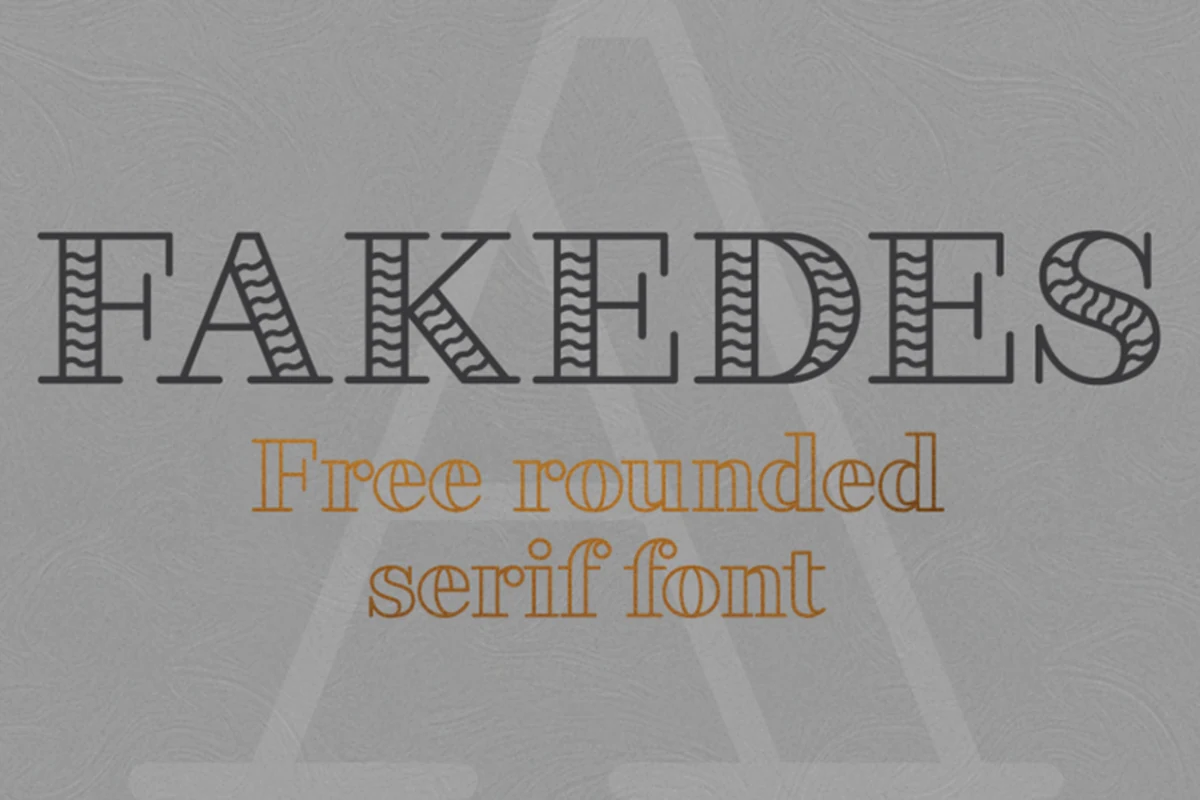
Best For: logos, branding, display text, decorative designs
Fakedes Font uses outlined serif letterforms with rounded terminals, narrow proportions, and a decorative wavy fill that adds movement inside the strokes. The mix of slim contours and stronger bold outline options gives it a polished display feel without losing its quirky edge.
For Serif Branding Fonts, it works best in short logo names, boutique labels, posters, and packaging titles where the outline itself becomes part of the identity. Keep backgrounds clean and contrast high, because the internal line detail needs enough scale to stay legible.
Conclusion
Choose an elegant serif when the brand needs polish, a bold editorial serif when hierarchy matters, a retro serif for heritage energy, or a decorative serif when the type itself should become the main visual hook.