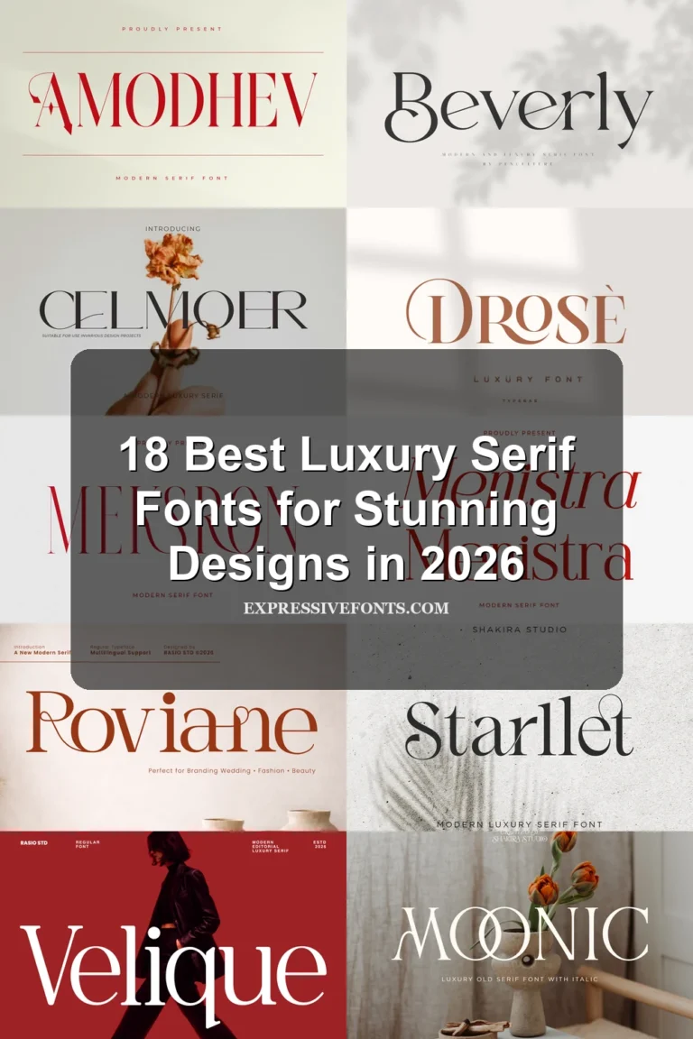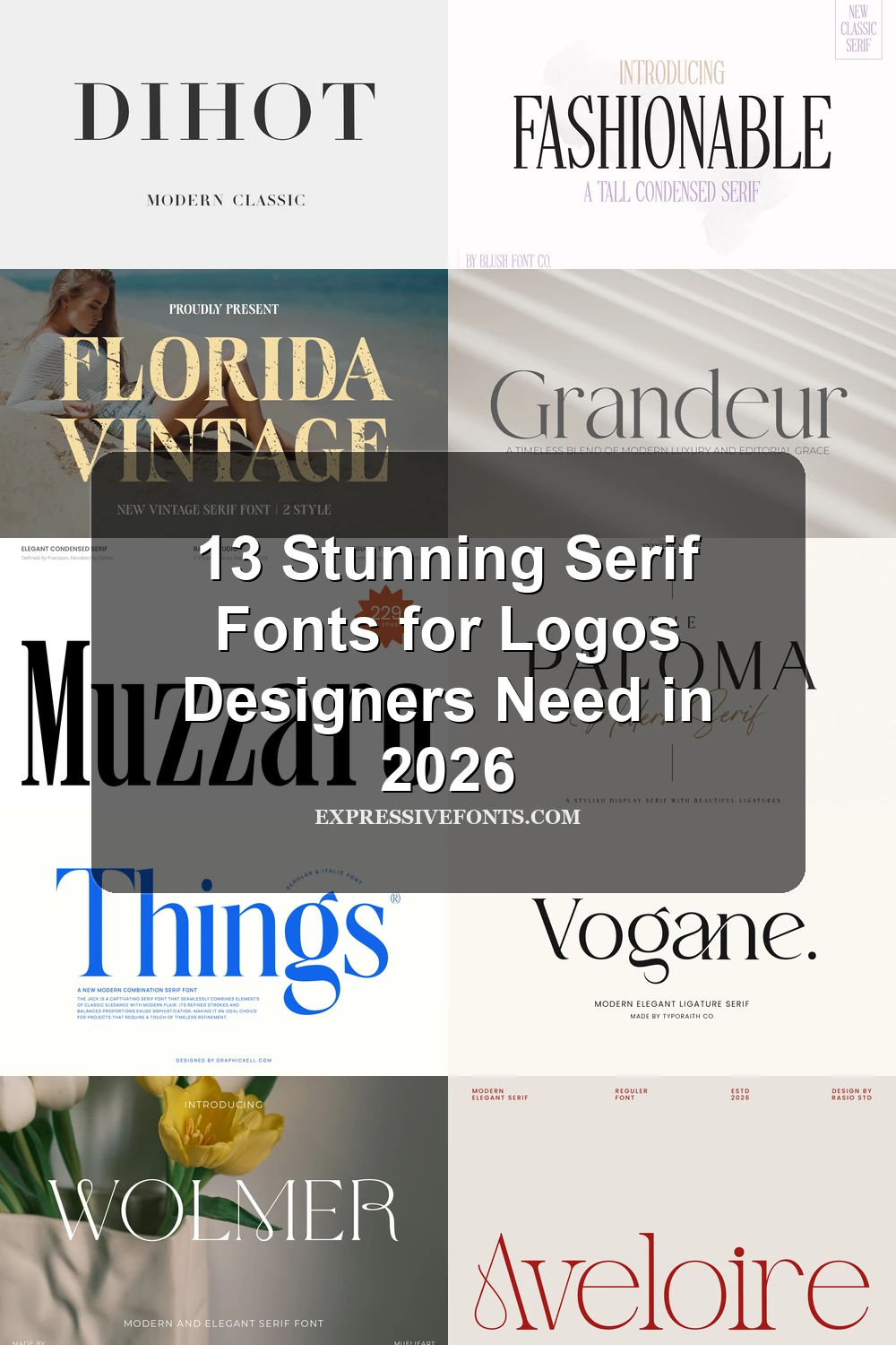
13 Stunning Serif Fonts for Logos Designers Need in 2026
Looking for more serif fonts? Browse our complete Serif Fonts collection to compare luxury, elegant, modern, vintage, editorial, display, bold, feminine, and logo serif styles.
Serif fonts for logos are built for brands that need authority, elegance, or a more editorial look. This collection is for designers working on fashion labels, beauty brands, packaging, magazines, and premium wordmarks where letter shape matters as much as readability.
Elegant & High-Contrast Serif Fonts for Logos
These refined logo serifs use thin hairlines, sharp contrast, and graceful curves for fashion, beauty, editorial, and luxury identities that need polish before weight.
Grandeur – Elegant Classic Serif Font
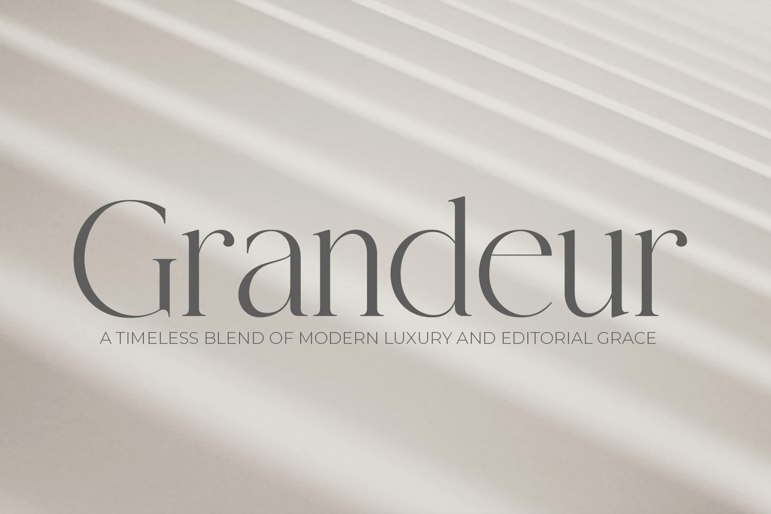
Best For: logos, editorial designs, luxury designs, fashion branding
Grandeur has the quiet structure of refined print typography: slim verticals, fine serifs, open curves, and a measured rhythm that keeps the wordmark calm rather than decorative. The large initial form and low-contrast gray preview show how the letters hold a polished editorial tone without needing heavy weight.
For Serif Fonts for Logos, its strength is restraint. Use it where the name itself needs to carry the identity, then support it with generous tracking in small uppercase details and strong background contrast so the hairline strokes stay clean.
Aveloire Font
Best For: logos, fashion branding, editorial designs, magazine covers
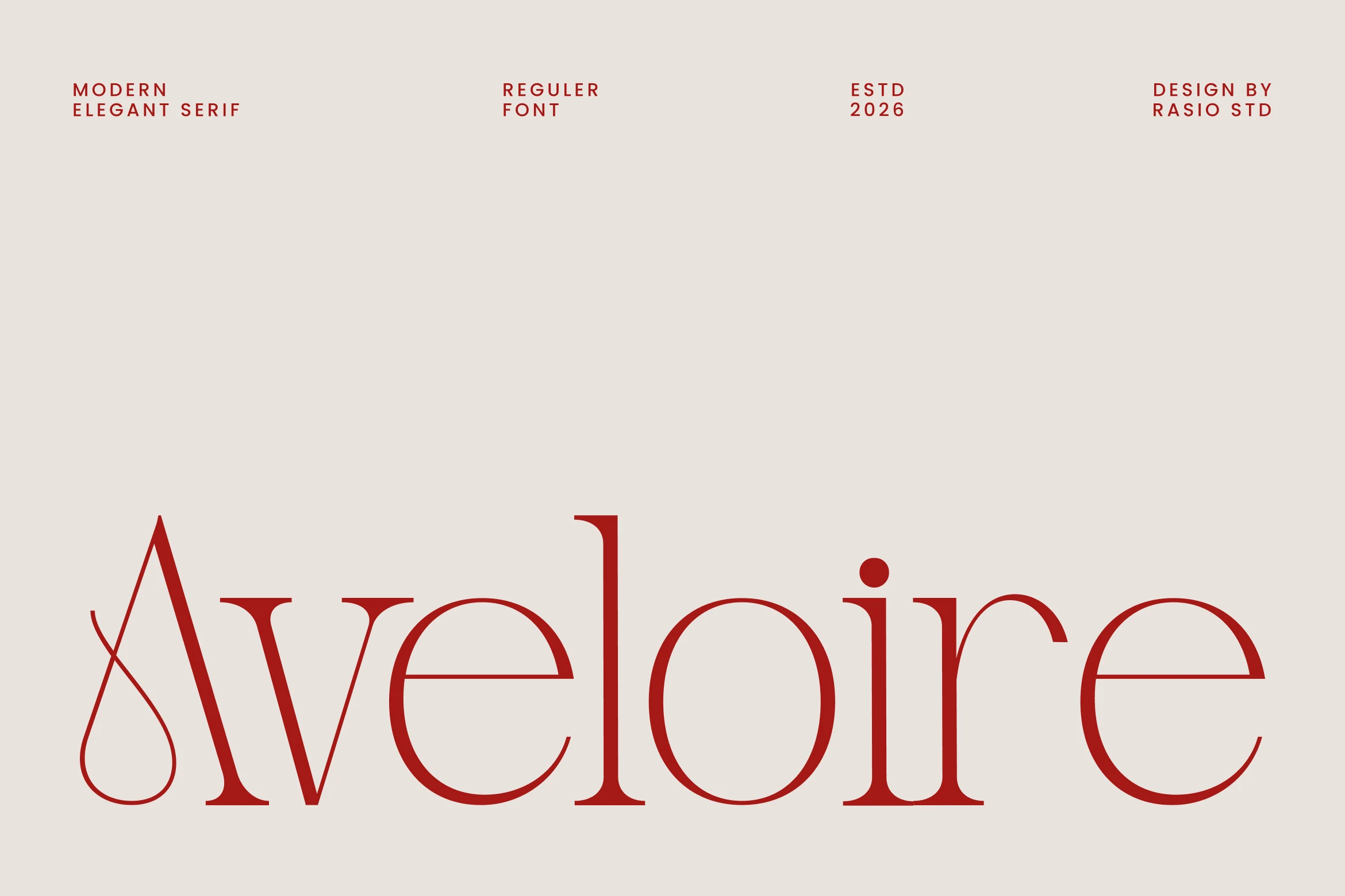
Aveloire pairs slender high-contrast strokes with smooth rounded counters, so it feels poised without becoming fragile. The sweeping capital A, crisp serifs, and clean horizontal cuts give it a polished fashion-editorial character, while the lowercase keeps a calm rhythm that reads clearly in a wordmark.
For Serif Fonts for Logos, its appeal is in the balance between flair and control. Keep it on short names or title lines, give the mark generous breathing room, and pair it with restrained sans support text so the refined proportions and elegant terminals stay front and center.
Wolmer Font
Best For: logos, fashion branding, editorial designs, luxury designs
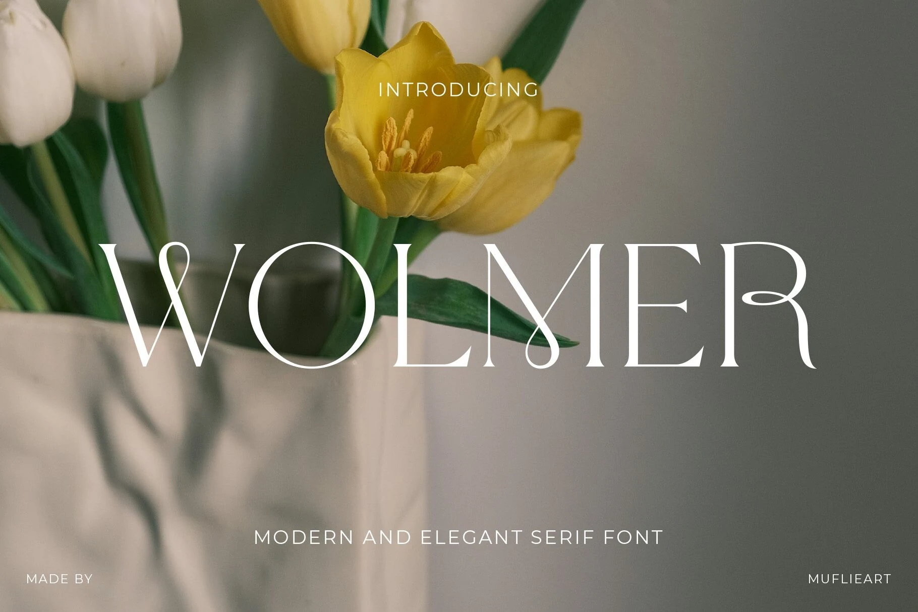
Wolmer leans into contrast and elegance, with tall stems, whisper-thin hairlines, and distinctive looped terminals that soften its otherwise structured serif frame. The curled joins inside letters like W and M give the wordmark a fluid, couture feel, while the broad capitals keep the overall silhouette clear and commanding.
Used as Serif Fonts for Logos, it works best when you let those decorative joins do the talking. Keep it to short names or title treatments, pair it with understated sans text, and allow generous spacing around the mark so the delicate loops and crossbars stay crisp.
Dihot Font
Best For: logos, branding, editorial designs, luxury designs
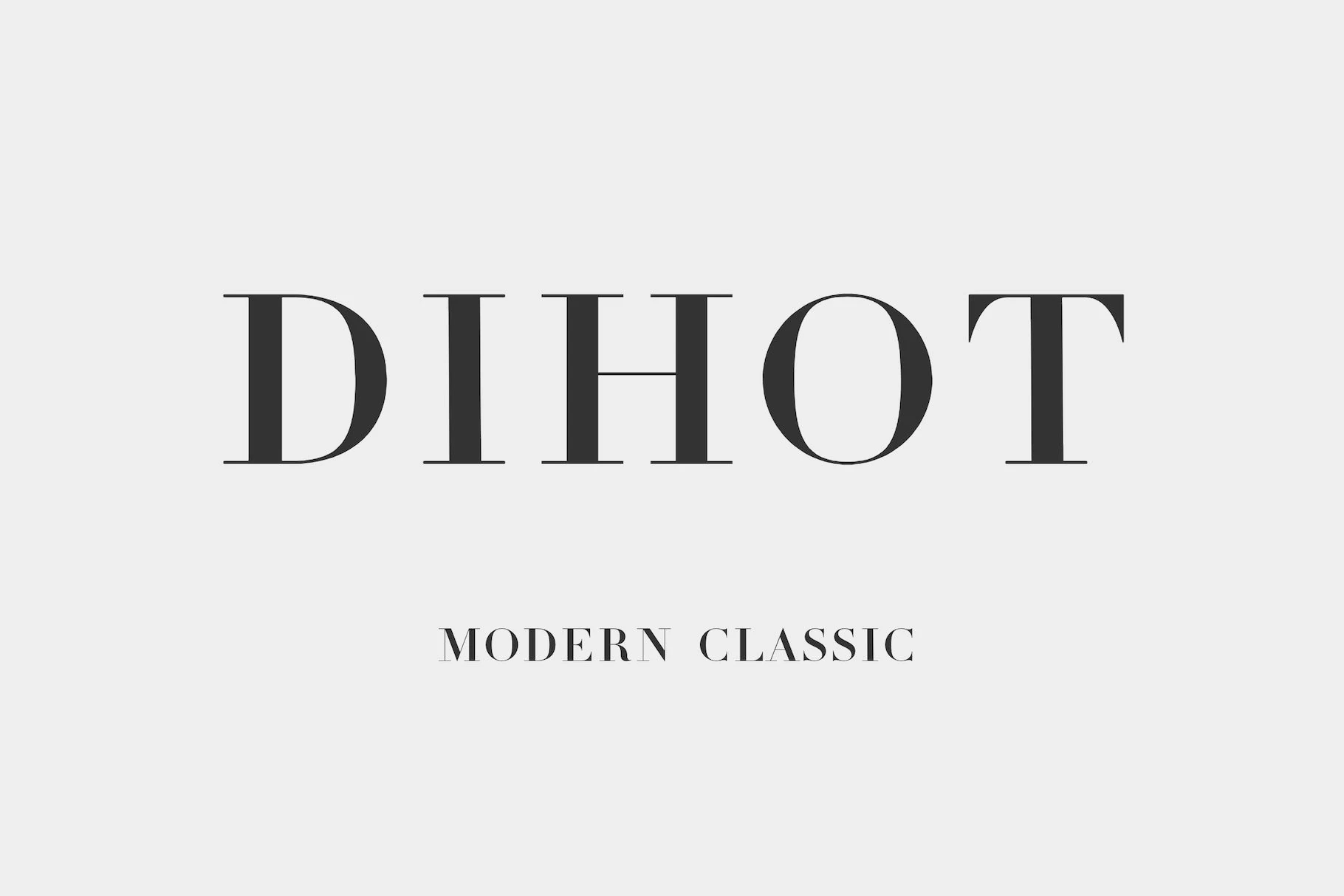
Dihot Font has the sharp vertical stress and fine hairline serifs associated with Didot-inspired typography. The tall capitals feel formal and controlled, with strong thick-to-thin contrast that gives the wordmark a clean fashion-editorial edge.
For Serif Fonts for Logos, its strength is precision rather than decoration: short names, spaced capitals, and restrained color palettes let the thin serifs stay crisp. Use it where the title needs hierarchy, but avoid crowding it with heavy textures or dense supporting type.
Vogane Font
Best For: logos, branding, invitations, packaging
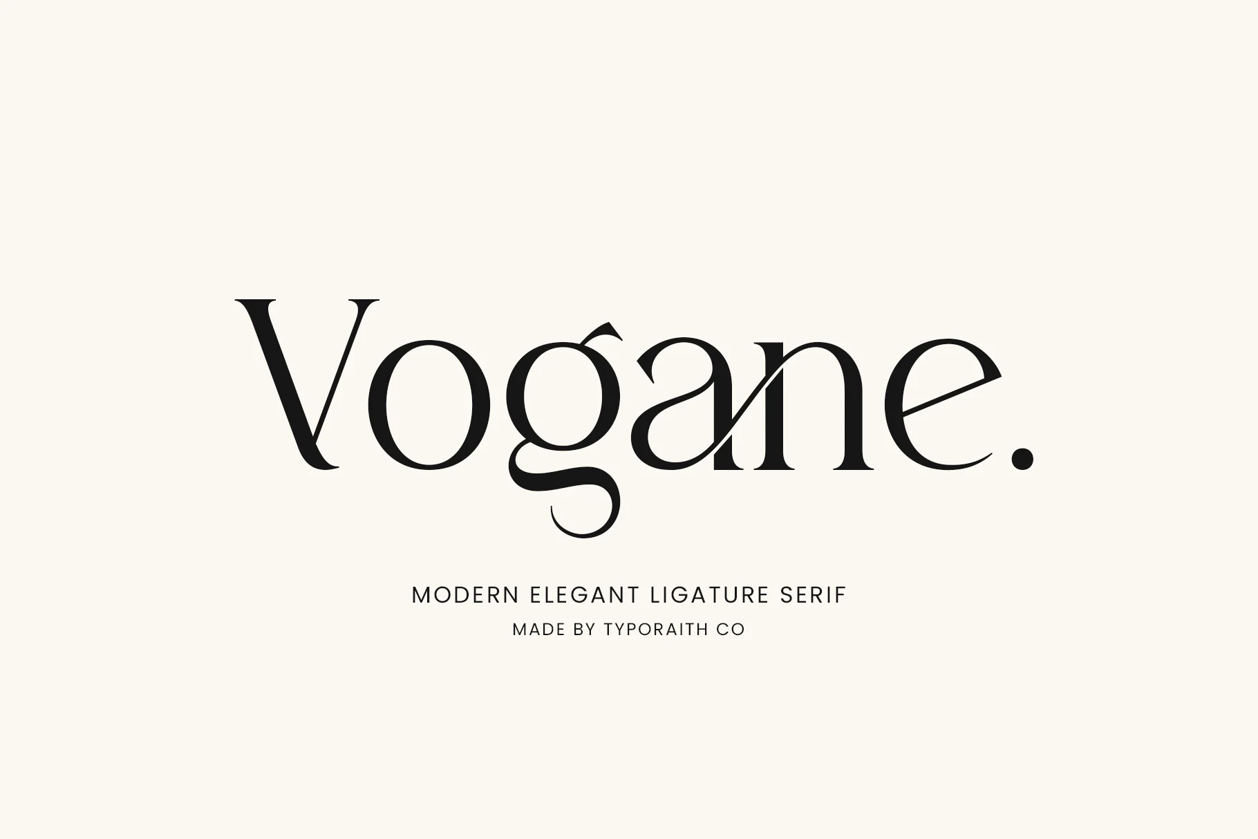
Vogane Font has a poised editorial feel, with thin hairlines, smooth contrast, and soft curves that keep the wordmark elegant without looking fragile. The sweeping lower bowl of the g and the refined terminals give it a polished rhythm that feels distinctly modern.
If you are browsing Serif Fonts for Logos, Vogane works best when you let those details lead the composition. Its ligatures and alternates help create a more custom-looking title, especially for beauty, fashion, or invitation branding where a graceful silhouette matters as much as readability.
The Paloma Font
Best For: logos, luxury designs, editorial designs, minimal designs
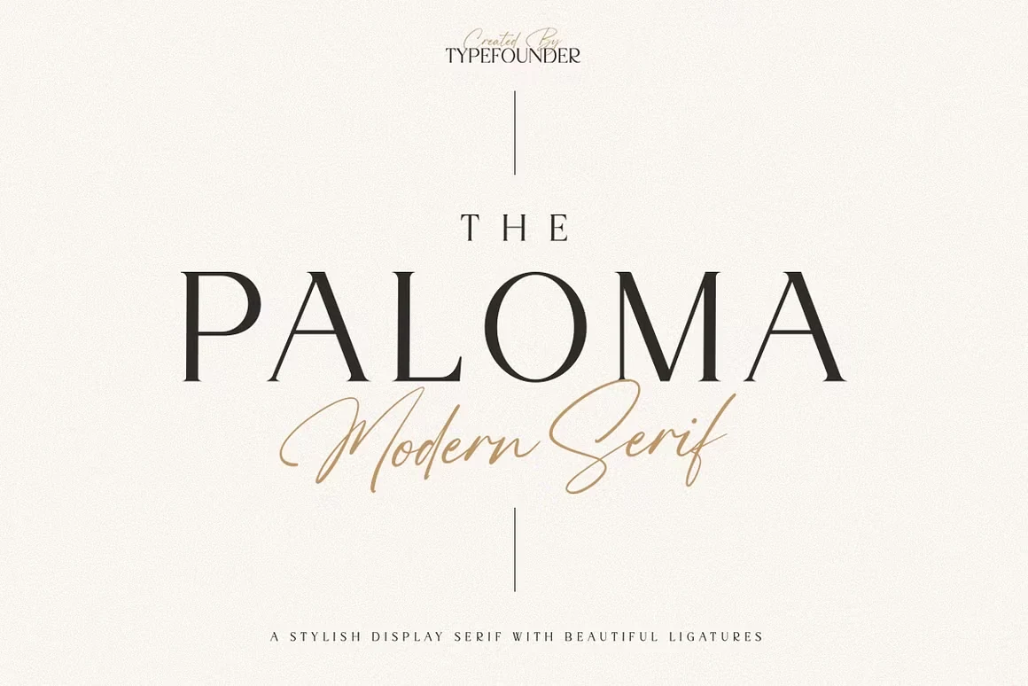
The Paloma Font has a composed display-serif structure with high contrast, thin hairlines, and sharply refined serifs. Its wide capital spacing gives the wordmark a calm editorial cadence, while the clean vertical stress keeps the letterforms polished rather than decorative.
For Serif Fonts for Logos, The Paloma works best in restrained compositions where spacing carries part of the identity. Use it for short names, premium title marks, and packaging headers that need contrast and elegance without heavy ornament or visual clutter.
Tall & Condensed Serif Fonts for Logos
These taller, narrower serif fonts help long names feel structured and premium, making them useful for fashion wordmarks, mastheads, posters, and vertical logo layouts.
Things Font
Best For: logos, fashion branding, editorial designs, magazine covers
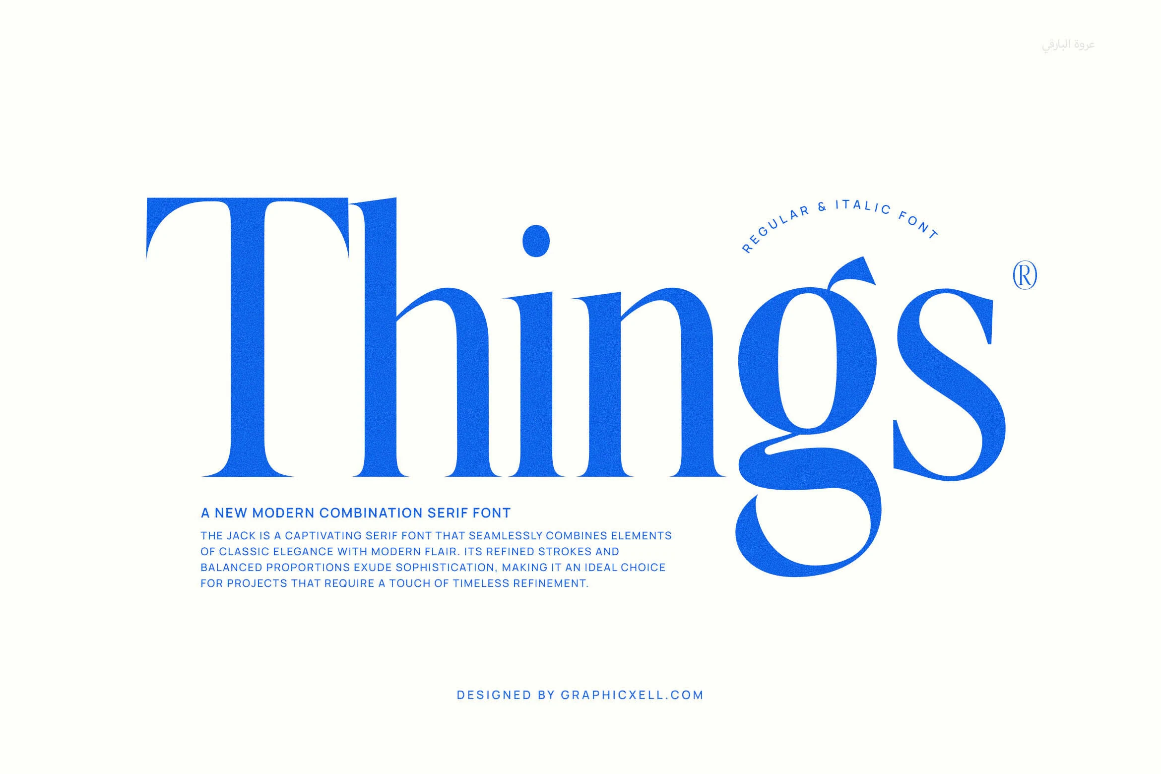
Things has a dramatic modern-serif silhouette, with a towering capital T, narrow stems, and rounded bowls that keep the wordmark sleek rather than stiff. In the preview, the oversized g and sweeping terminal add motion, while the contrast between fuller curves and finer joins gives the lettering a polished editorial tone.
For Serif Fonts for Logos, its strongest advantage is scale and proportion. Use it on short names or masthead-style titles, then pair it with restrained sans text so the tall verticals and curved descender stay clear instead of competing with too much surrounding detail.
Fashionable Font
Best For: logos, branding, invitations, fashion branding
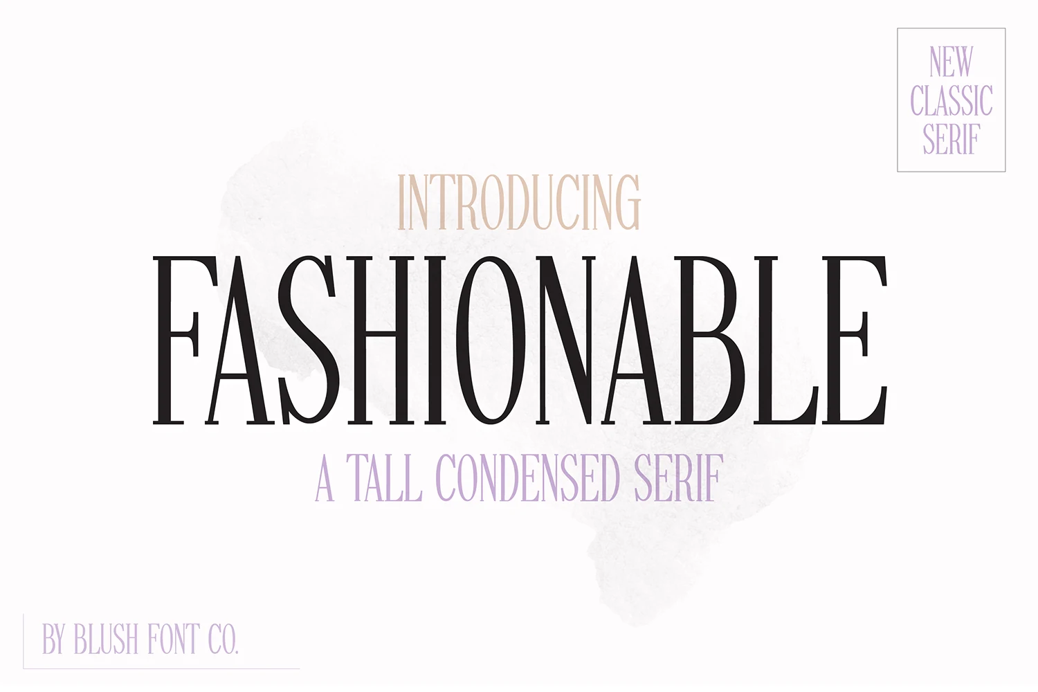
Fashionable Font is a tall condensed serif with long verticals, narrow proportions, and crisp contrast that give it a sleek runway feel. The letterforms look airy rather than heavy, so the overall texture stays graceful and polished even at large display sizes.
If you are browsing Serif Fonts for Logos, Fashionable Font works best when you lean into its height. Stacked layouts, short names, and generous margins help the slim strokes stay clear, while a quiet sans companion can sharpen the title hierarchy without competing with its feminine tone.
Luxena Font
Best For: logos, fashion branding, posters, luxury designs
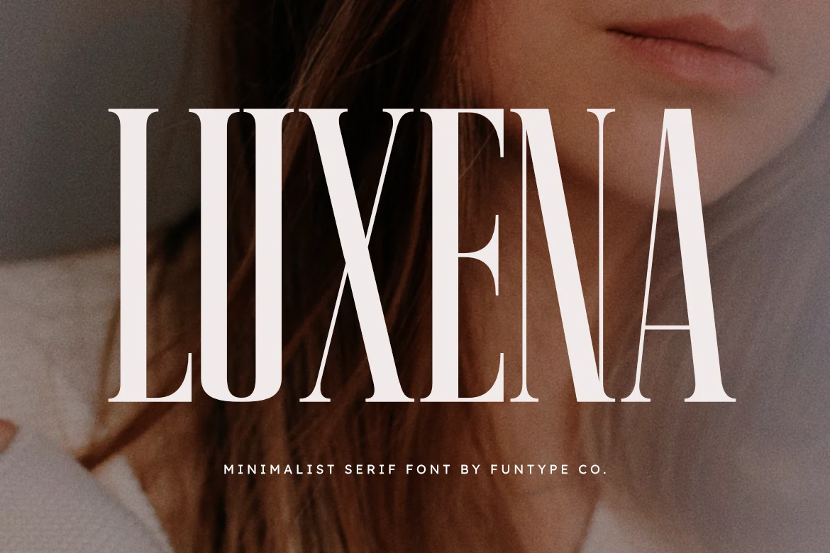
Luxena Font is a bold minimalist serif with tall capitals, tight vertical rhythm, and clean high-contrast strokes. The letterforms feel assertive rather than ornamental, using narrow spacing and sharp serif edges to create a polished fashion-logo presence.
For Serif Fonts for Logos, Luxena is strongest when the wordmark needs immediate scale and authority. Keep supporting text small and widely tracked, then give the main title enough contrast so the heavy stems, slim counters, and precise curves stay clean instead of compressed.
Muzzaro Font
Best For: logos, fashion branding, magazine covers, packaging
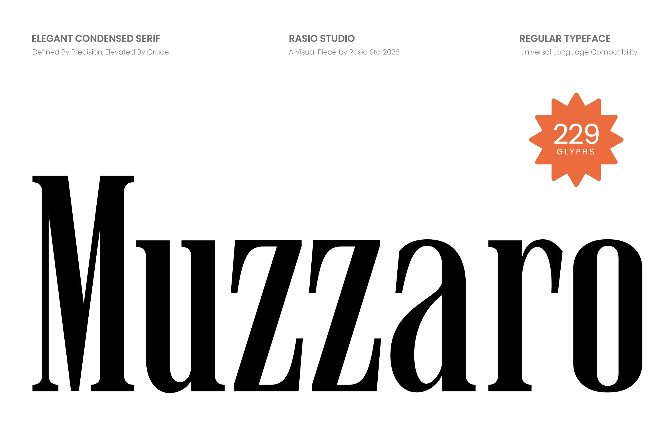
Muzzaro Font is a condensed serif with heavy vertical pressure, sharp slab-like terminals, and a polished contrast between thick stems and refined inner curves. Its narrow proportions give long brand names a controlled editorial rhythm without making the wordmark feel cramped.
For Serif Fonts for Logos, Muzzaro suits layouts that need height, weight, and a premium fashion tone in one line. Use wider tracking for smaller text, but keep headline spacing tighter when you want the bold stems and angular serif details to create a strong title block.
Bold & Vintage Serif Fonts for Logos
These heavier serif fonts bring stronger display impact, from clean authority to worn vintage texture, making them better for packaging, labels, posters, and bold brand marks.
Fontrize Font
Best For: logos, headlines, display text, posters
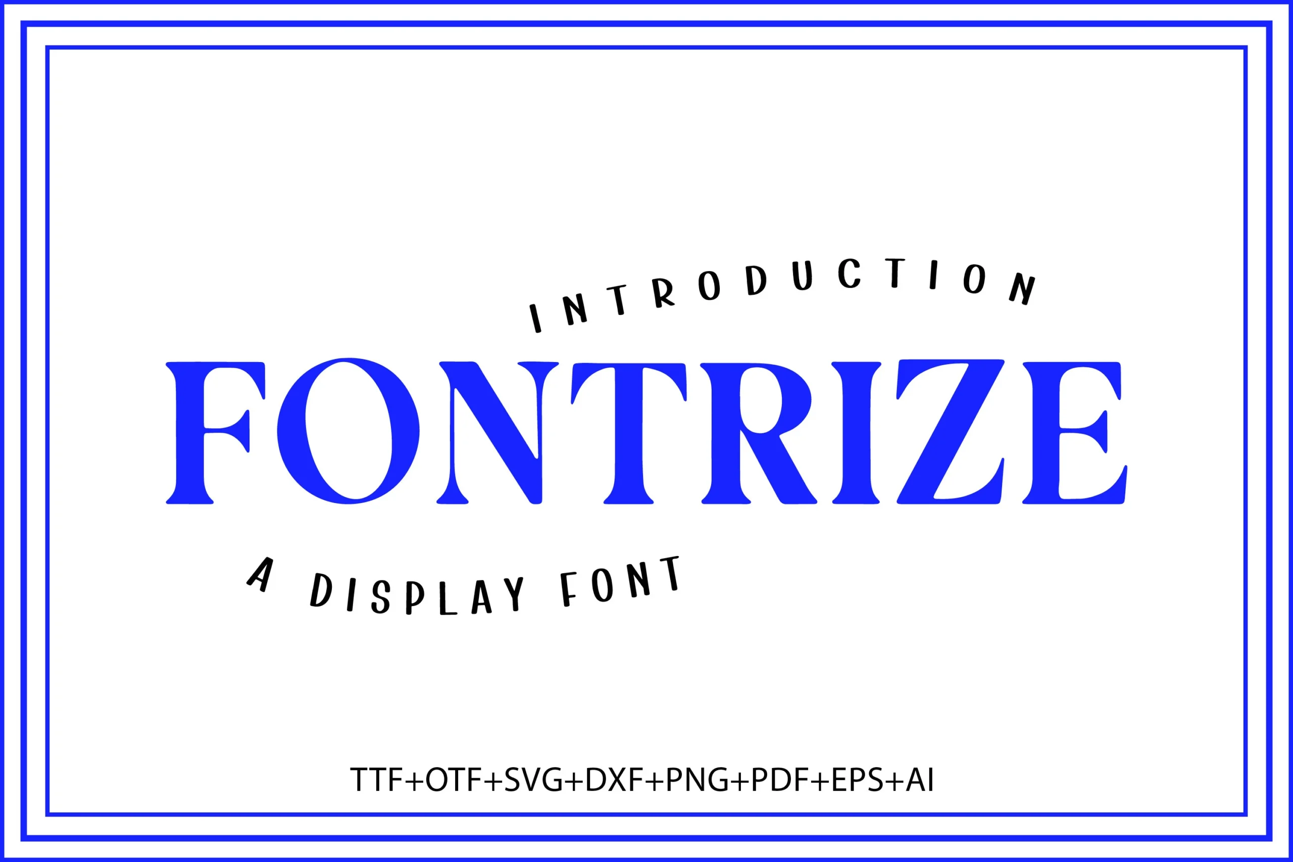
Fontrize has a bold display presence, built with thick verticals, sharp serifs, and clear stroke contrast that gives each letter a crisp, sculpted silhouette. The oversized uppercase setting in the preview shows how confidently it holds space, making even a single word feel graphic and deliberate.
For Serif Fonts for Logos, its strength is impact rather than subtlety. Keep it on short names, title lines, or hero placements, and balance it with simpler support text so the heavy stems and classic serif edges stay clean instead of visually crowded.
Strong Font
Best For: logos, branding, headlines, bold designs
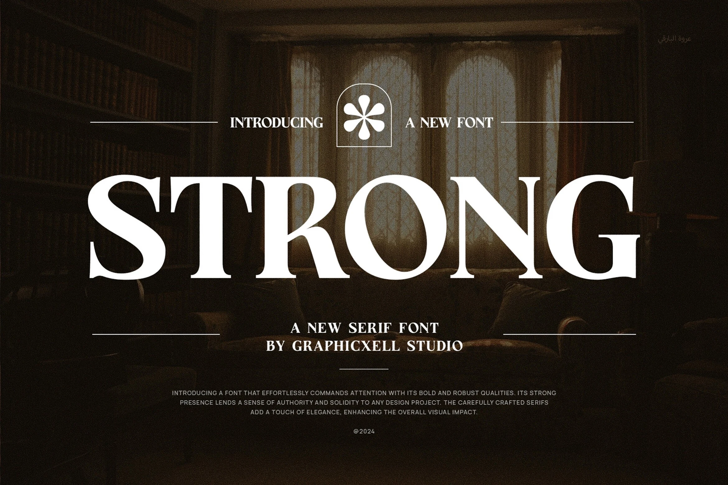
Strong Font uses a wide, commanding serif structure with heavy verticals, high contrast, and sharply cut terminals. The uppercase shapes feel formal rather than playful, with enough internal space in letters like O and G to keep the wordmark clear even at large display scale.
For Serif Fonts for Logos, it works best where the brand needs weight and authority without looking rough. Keep the spacing controlled but not tight; the thick strokes already create density, so extra contrast around the letters will help the serifs stay crisp in packaging, labels, and headline layouts.
Florida Vintage Font
Best For: logos, packaging, book covers, T-shirts
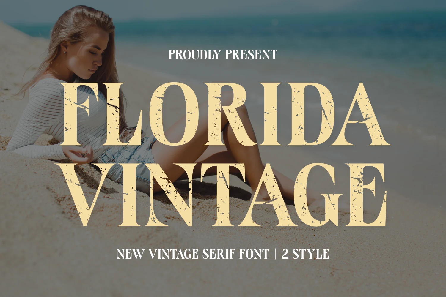
Florida Vintage Font uses broad all-caps serif letterforms with a worn, speckled texture that gives it an instantly aged print feel. The thick strokes and wide proportions make the headline look bold and steady, while the grunge accents break up the forms just enough to add personality.
For Serif Fonts for Logos, the sweet spot is short wording with a little extra tracking, so the distressed details stay visible instead of clogging together. It also handles covers and packaging well when you want a retro statement that feels strong, relaxed, and unmistakably display-led.
Conclusion
Choose elegant high-contrast serifs for luxury and editorial logos, tall condensed styles for fashion-led wordmarks, and bold or vintage serifs when the brand needs more visual weight. The strongest option is the one that stays readable at the size where the logo will actually be used.