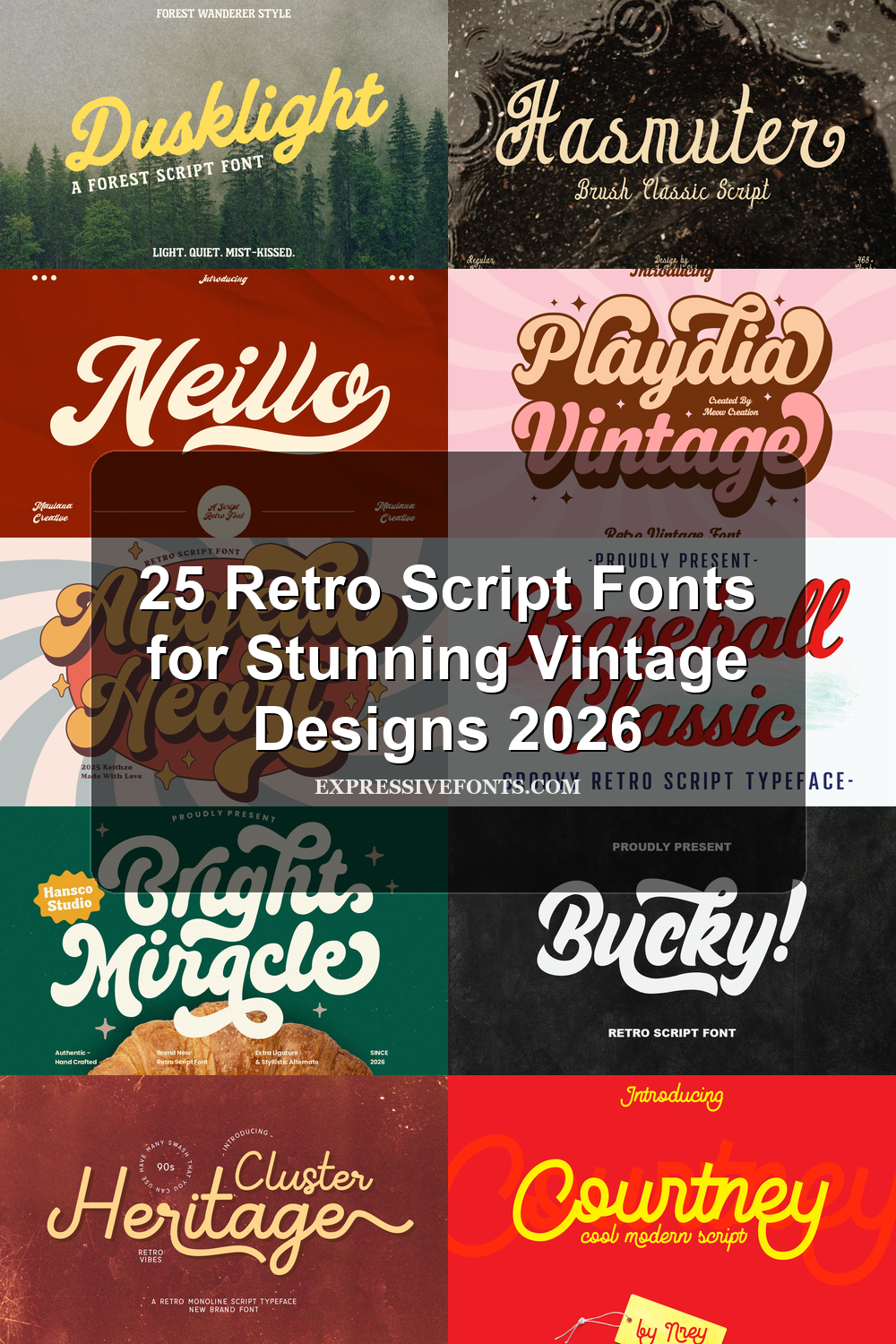
25 Retro Script Fonts for Stunning Vintage Designs 2026
Retro Script Fonts are built for designers who need vintage movement without losing display impact. This collection focuses on scripts for logos, packaging, posters, apparel, signage, stickers, and social graphics, from chunky 70s lettering to smoother mid-century wordmarks and relaxed vacation styles.
Bold Badge & Signage Retro Script Fonts
These heavy, shadow-ready scripts work best for logos, badges, apparel graphics, storefront-style signs, and designs that need strong vintage weight.
Bucky! Font
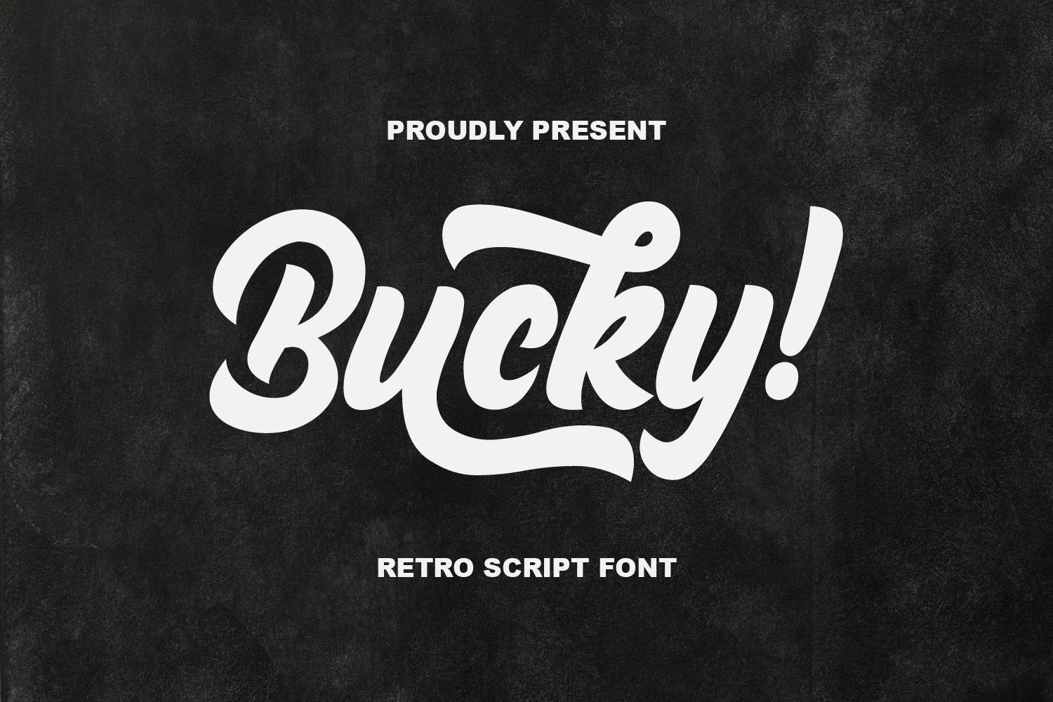
Best For: logos, signage, badges, retro designs
Bucky! pushes Retro Script Fonts into a heavy old-school signage style, with chunky connected letters, rounded curves, and a strong slanted rhythm. The oversized capital, curled loop details, and sweeping underline give the word shape a compact logo feel without losing the casual movement of hand-lettered script.
Keep it as the dominant headline element and avoid crowding the swashes with tight borders or busy secondary type. Its thick strokes work best with high contrast, while shorter words, badge layouts, and apparel graphics let the curves and exclamation mark read with enough impact.
Sunday Chillin Font
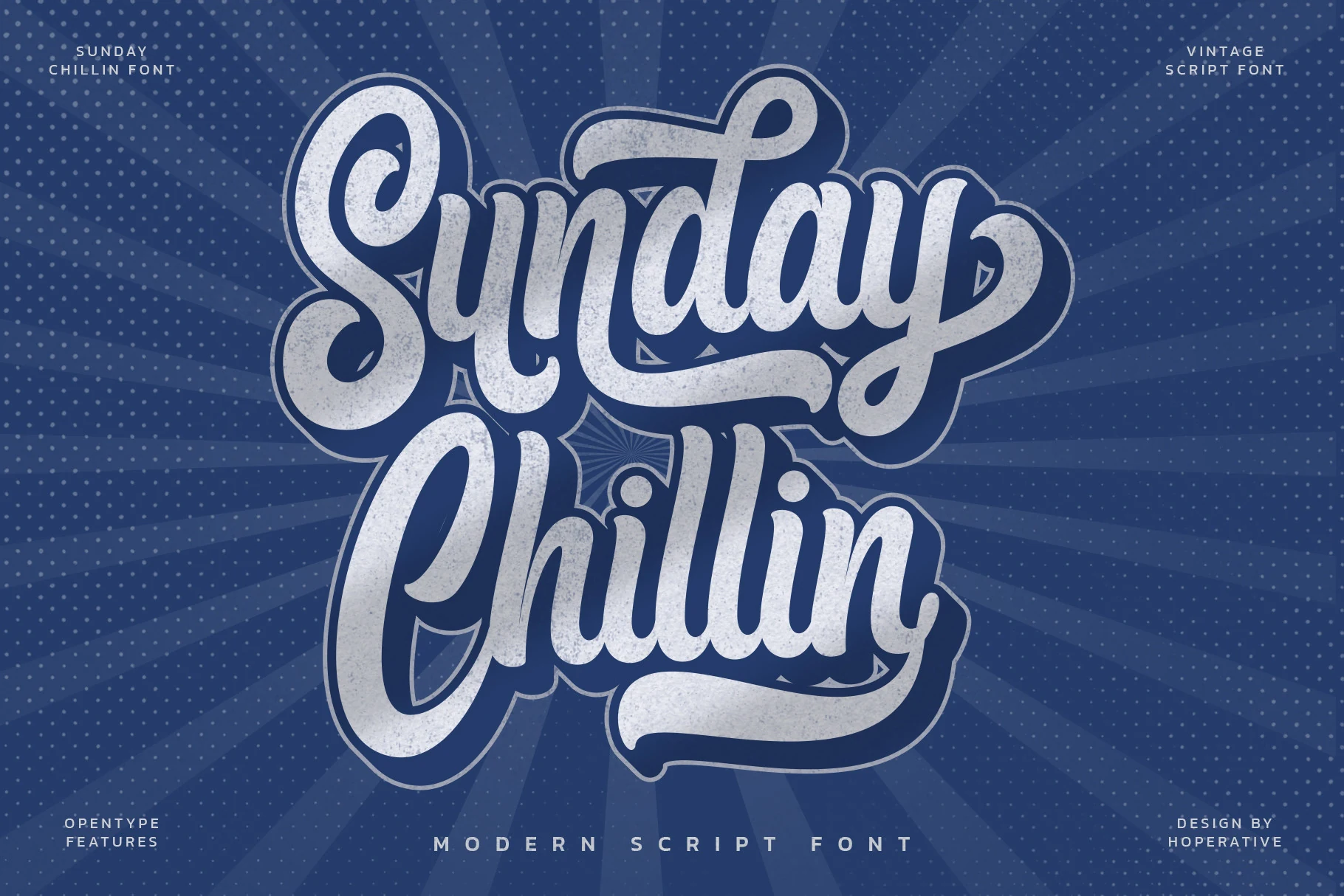
Best For: logos, posters, stickers, retro designs
Sunday Chillin takes Retro Script Fonts into a dense sticker-lettering direction, with fat connected strokes, tall loops, deep counters, and a stacked rhythm that feels built for emblems. The textured fill and outline-friendly shapes give it a vintage print effect, while the sweeping underline strokes help lock multi-word layouts into one bold mark.
Use it where the script can own the composition: logos, apparel graphics, poster titles, and social headers. The heavy shadows and overlapping swashes need generous margins, so keep supporting text small, tracked out, and secondary; short stacked phrases will preserve the chunky curves better than long sentences.
Medang Font
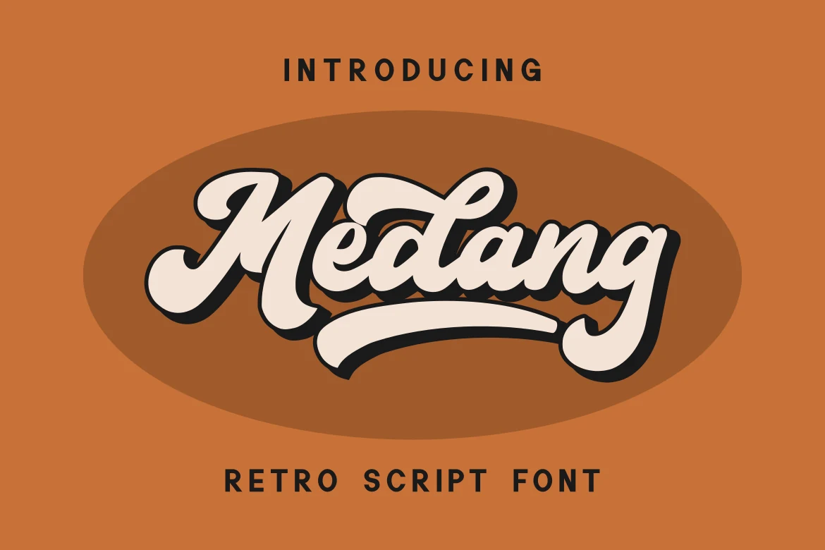
Best For: logos, signage, badges, retro designs
Medang brings the old-school confidence readers expect from Retro Script Fonts, using bold connected strokes, rounded terminals, and a strong black shadow that makes the cream lettering feel sign-painted. The capital has a chunky entrance stroke, while the sweeping underline gives the wordmark a compact badge-ready structure.
Its weight is built for short names, logo marks, storefront-style titles, and merchandise graphics rather than small text. Leave enough room below the baseline for the underline, and keep secondary typography simple and widely spaced so the script’s curves stay dominant instead of competing with the shadow.
Baseball Classic Font
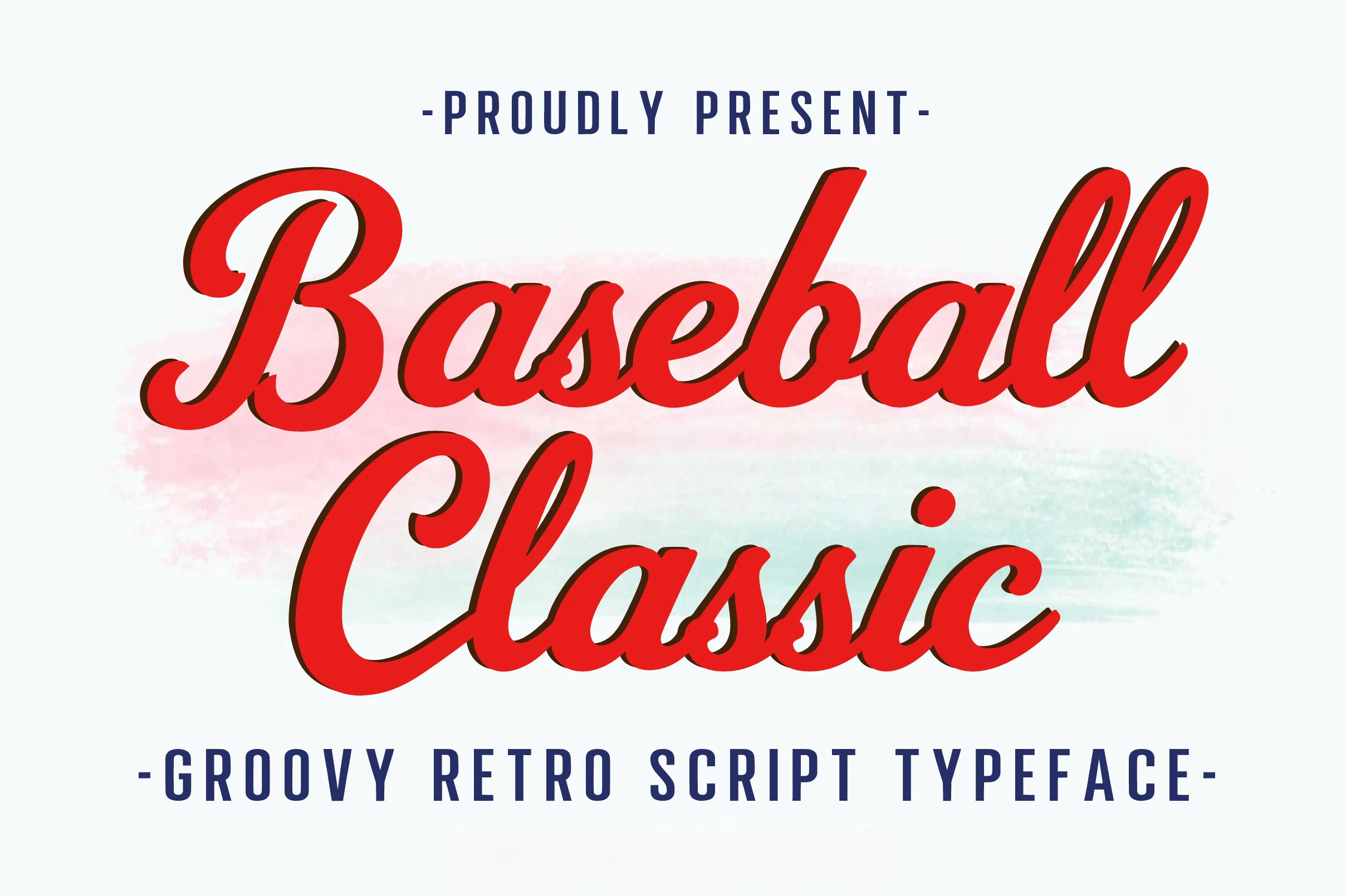
Best For: logos, T-shirts, posters, merch design
Baseball Classic brings Retro Script Fonts into a clean athletic lane, with red slanted lettering, thick-to-thin contrast, and a dark offset shadow that gives each word a stitched-patch feel. The oversized capitals, looping descenders, and connected lowercase shapes make it read like classic team lettering rather than casual handwriting.
Use it for team-style logos, shirt graphics, poster headlines, and merchandise where the script can sit large and central. The included uppercase, lowercase, numbers, and punctuation make dates, slogans, and roster-style details easier to build around the main wordmark, but keep spacing open so the shadow does not clog the joins.
Hasmuter Font
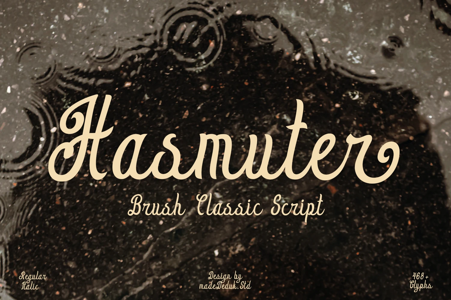
Best For: logos, posters, T-shirts, retro designs
Hasmuter Font has a rounded 70s script build, with heavy brush-style curves, looped capitals, and soft terminals that lean into a nostalgic display rhythm. The letters feel connected and decorative without becoming overly sharp, which gives it a warmer personality than cleaner modern scripts.
For Retro Script Fonts projects, Hasmuter works best when the wordmark is allowed to sit wide and fairly large, since its curled entry strokes and sweeping endings carry much of the character. Keep surrounding type quieter and watch the spacing around tall letters so the swashes stay intentional rather than crowded.
Bright Miracle Font
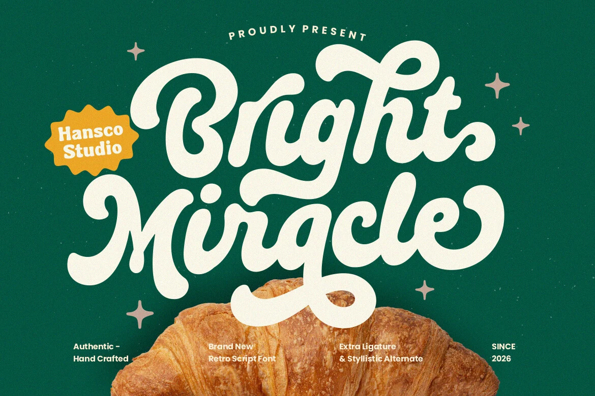
Best For: logos, packaging, retro designs, signage
Bright Miracle has the thick, rounded confidence people look for in Retro Script Fonts, with inflated curves, looping capitals, and soft terminals that make the lettering feel hand-painted rather than mechanically drawn. The heavy connected strokes give short words a strong logo-like presence.
Its oversized swashes and tight rhythm work best when the font is treated as the main title. Keep supporting type compact and plain, and leave extra baseline space around the lower loops so descenders and flourishes do not compete with smaller copy.
Standley Font
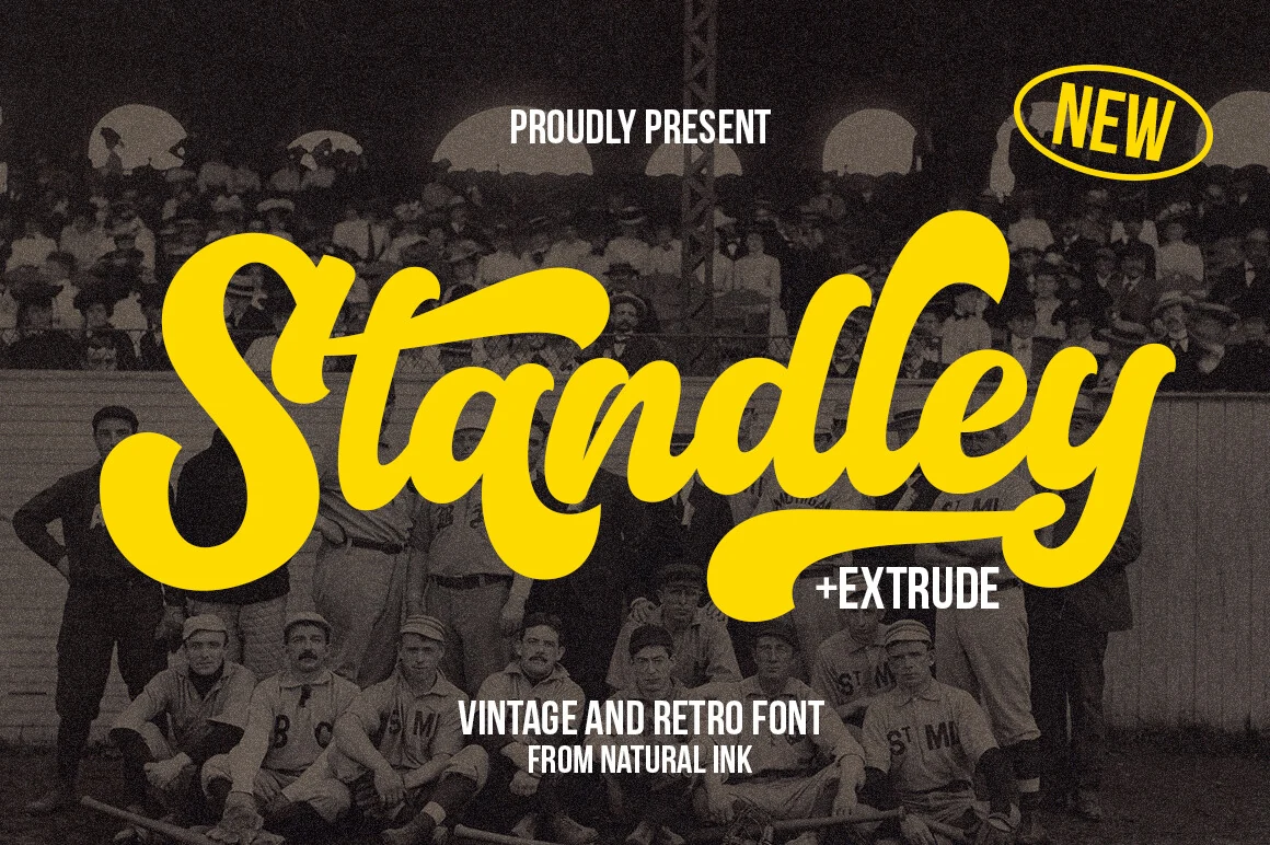
Best For: logos, stickers, vintage designs, signage
Standley sits comfortably with Retro Script Fonts, but its personality is more sporty and poster-like: a huge looping capital, compressed joins, and thick rounded strokes give the wordmark a fast left-to-right sweep. The letterforms feel playful without becoming loose or childish.
The extra glyphs give logo work more shape options, while the extrude style helps build a shadowed layer when the script needs stronger separation. Keep the supporting copy narrow and upright, and avoid long phrases because the swashes need horizontal room to read cleanly.
Groovy 70s Retro Script Fonts
This group uses inflated curves, playful swashes, and dense rounded shapes for posters, stickers, playful packaging, merch, and loud nostalgic artwork.
Vintage Children Font
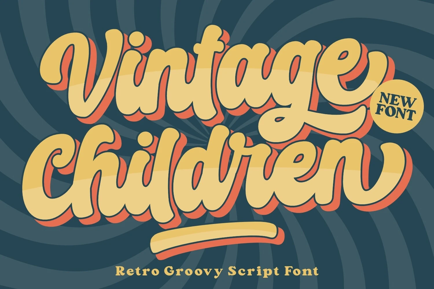
Best For: logos, posters, T-shirts, retro designs
Vintage Children sits in the louder end of Retro Script Fonts, with swollen connected strokes, rounded terminals, and exaggerated curves that lean toward psychedelic poster lettering. The forms are thick and bouncy, with a groovy baseline and compact spacing that make each word feel like a single illustrated shape.
Use it for short names, large titles, and merchandise graphics where the curves can dominate the layout. The heavy weight supports shadow or outline treatments, but those effects need extra margin around loops and descenders; keep supporting text simpler and more widely tracked so the script does not turn crowded.
Angela Heart Font
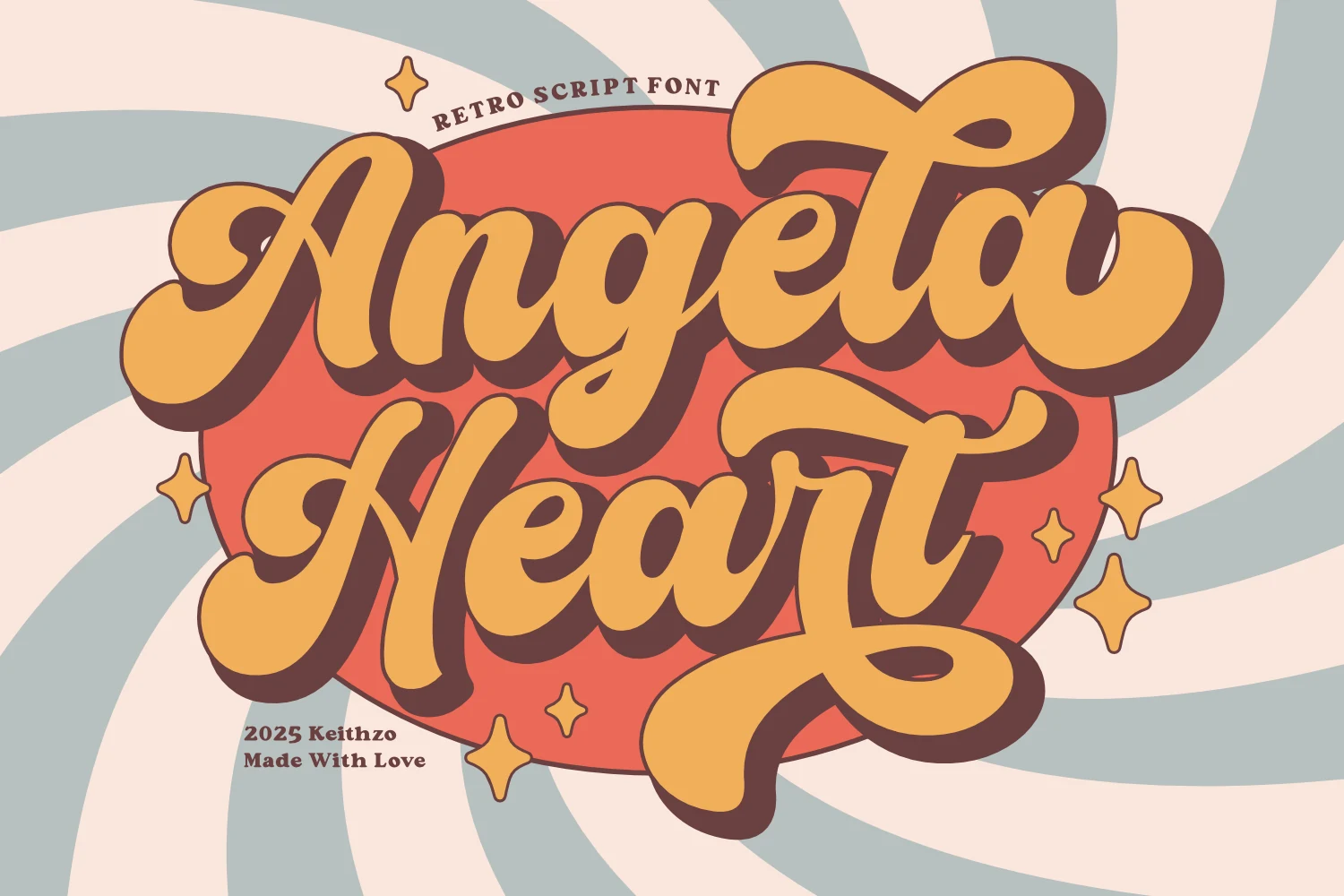
Best For: logos, posters, T-shirts, retro designs
Angela Heart pushes Retro Script Fonts into a groovy poster style, with chunky connected strokes, rounded bulb-like terminals, and playful swashes that curl into the word shape. The heavy shadow gives the lettering a sticker-like depth, while the stacked composition keeps the two words locked together as one bold graphic mark.
Use it for short names, retro event titles, T-shirt graphics, and logo layouts that need a lively 70s curve. The flourishes and shadow need extra margin around the edges, so keep supporting type outside the script mass and use strong color contrast to stop the thick joins from closing up.
Playdia Vintage Font
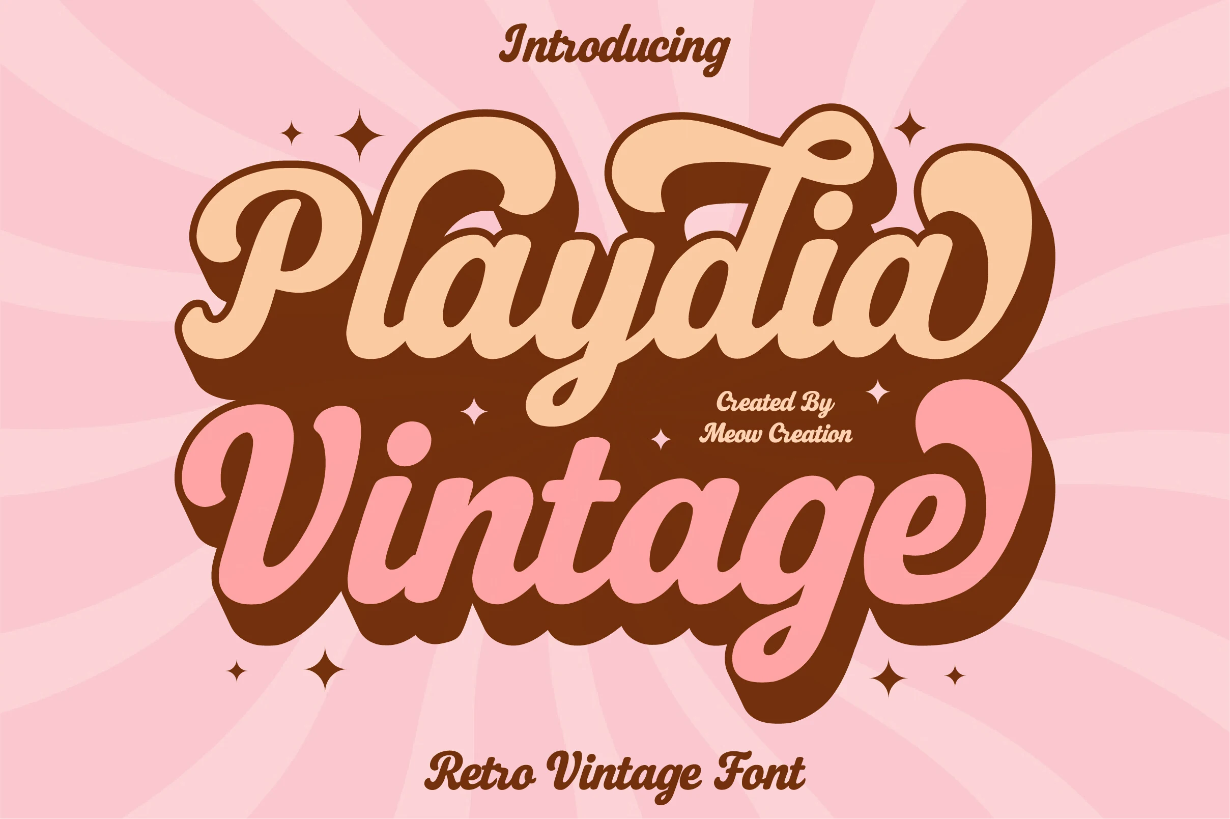
Best For: logos, packaging, posters, retro designs
Playdia Vintage Font pushes into full 70s lettering territory, with inflated rounded strokes, big looped capitals, and soft connected forms that feel deliberately chunky. The script has a friendly bounce, but the heavy weight and broad curves make it more useful as a dominant display mark than as delicate handwritten text.
In Retro Script Fonts layouts, it works best for short stacked words, playful product names, poster titles, and merch graphics where the lettering can carry the whole composition. Keep contrast high around the thick outlines and avoid tight supporting text near the descenders, since the large curves need clear edges to stay readable.
Retro Butterfly Font
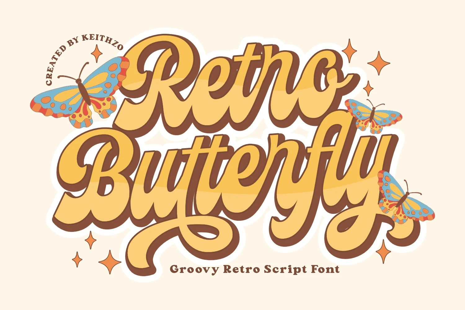
Best For: retro designs, vintage designs, posters, merch design
Retro Butterfly Font is built around fat connected strokes, swollen bowls, and long rolling curves that push the word shape into a 1970s poster rhythm. The letters feel hand-drawn rather than polished, with high-contrast loops and compressed joins that make short titles look dense, funky, and strongly graphic.
Use it for Retro Script Fonts projects where the lettering can carry the whole composition: poster headers, merch graphics, stickers, or nostalgic branding. Its exaggerated forms need generous margins and clear color contrast; tight line spacing or long phrases will make the swashes crowd each other.
Neillo Font
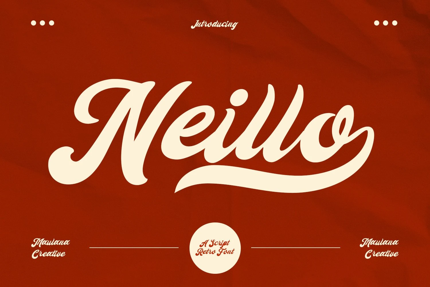
Best For: logos, packaging, posters, retro designs
Neillo Font uses wide, creamy brush-script strokes with a curled entry on the capital, rounded counters, and a long baseline swash that pulls the word into a single logo-like shape. Its weight is bold and smooth rather than gritty, so the retro character comes from the exaggerated curves and soft 70s proportions.
Use it in Retro Script Fonts layouts where one word needs to dominate—poster headers, badge-style marks, or playful packaging names. The thick joins and sweeping tail need clean negative space below the line; tight stacking or busy texture around the descenders will make the swash look accidental.
Violetta Font
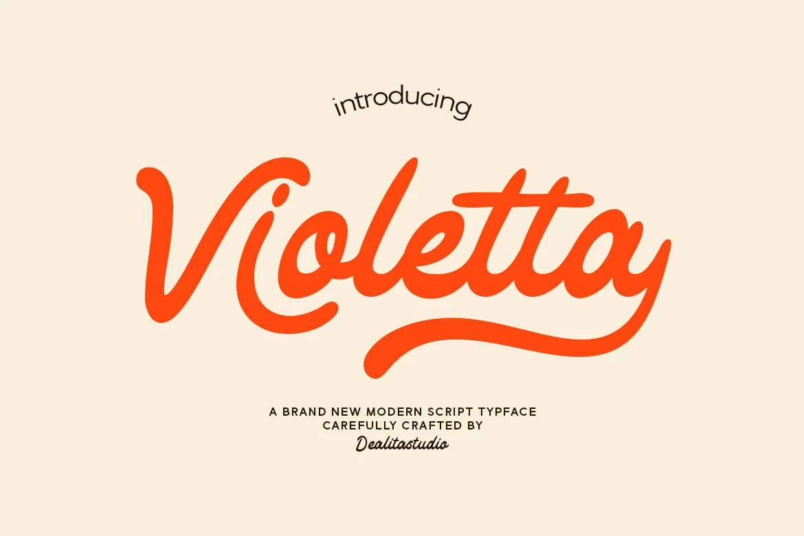
Best For: logos, posters, retro designs, vintage designs
Violetta Font has a confident retro script shape, with thick rounded strokes, a dramatic opening capital, and a smooth underline swash that gives the wordmark a finished badge-like base. The letterforms feel clean and polished, but the looping curves keep the vintage charm from becoming stiff.
For Retro Script Fonts layouts, Violetta suits short names, poster titles, and brand marks where the script can act as the main visual element. Let the underline sit clear of secondary text, and pair it with compact sans lettering so the wide curves and soft terminals keep control of the hierarchy.
Vriegbe Font
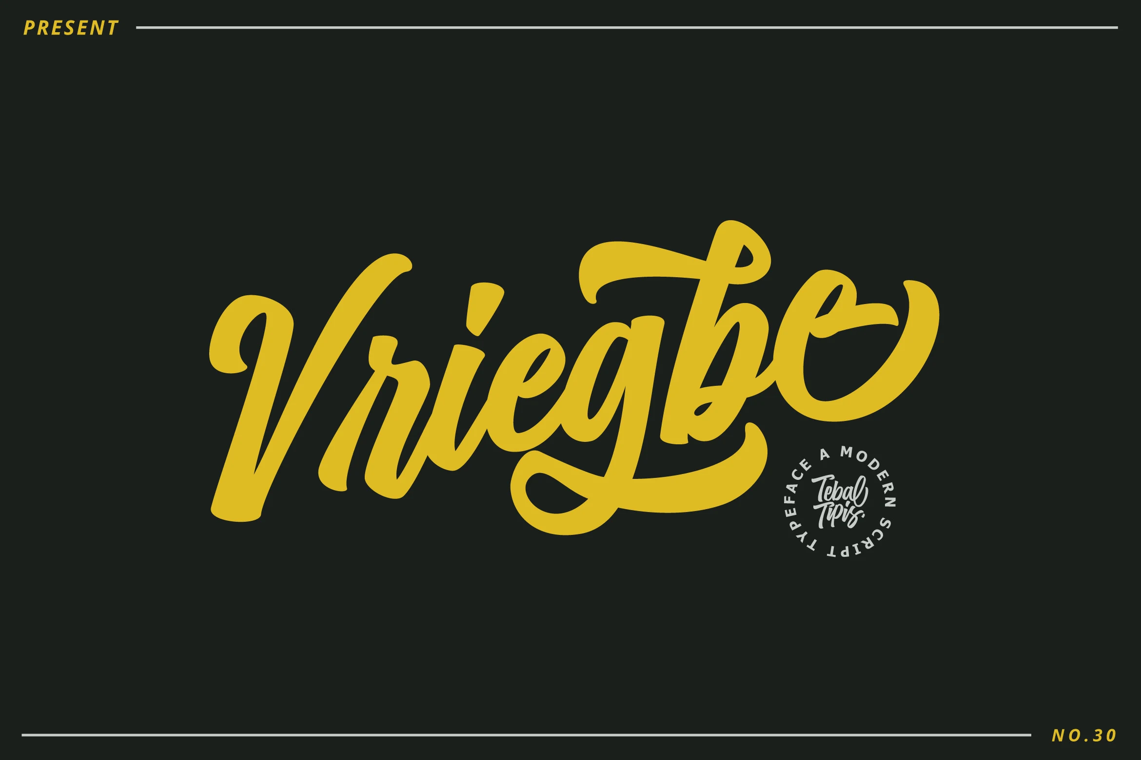
Best For: packaging, posters, invitations, retro designs
Vriegbe Font has a bold retro script rhythm, with thick rounded strokes, a forward-moving slant, and oversized loops that turn single words into compact lettering marks. The lowercase forms feel smooth and connected, while the high cross-stroke and long underline swash give it a packaging-label quality rather than a delicate calligraphy tone.
Its place in Retro Script Fonts is strongest where the main word needs to carry the layout—product packaging, flyers, posters, or invitation titles. The PUA-encoded glyph and swash access helps refine word endings and build more balanced lockups, especially when a short name needs extra movement without adding separate ornaments.
Smooth Logo Retro Script Fonts
These smoother scripts keep the retro mood cleaner and more controlled, making them useful for brand marks, labels, signage, and polished wordmarks.
Mavellin Font
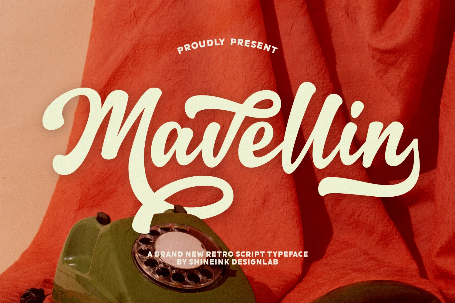
Best For: logos, branding, posters, retro designs
Mavellin gives Retro Script Fonts a smoother, more polished rhythm, with confident connected strokes, rounded terminals, and a wide looping capital that immediately sets up a logo-style wordmark. The long exit swash and low underline curve add movement without making the lettering feel crowded or overly decorative.
Use it for brand names, poster titles, and retro packaging where one expressive word needs to carry the composition. The generous loops need clear margins above and below the baseline, while compact supporting text should stay straight, small, and widely spaced so the script remains the visual anchor.
Starlake – Retro Script Font
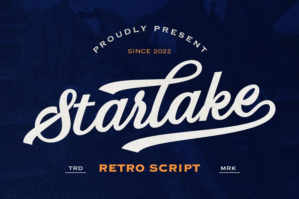
Best For: logos, branding, merch design, retro designs
Starlake – Retro Script Font has the fast, polished movement of old badge lettering, with a looping entry stroke, tight connections, and a long underline that turns the word into a ready-made mark. Its lightly textured fill keeps the smooth script from looking sterile, giving Retro Script Fonts a sharper apparel-and-branding edge.
The included alternates help adjust openings, endings, and swash behavior so a logo can feel more custom instead of simply typed out. Keep the script large enough for the narrow joins to stay clear, and use the ending swash as a built-in base line for small dates, location text, or a short uppercase descriptor.
Thaddefin Font
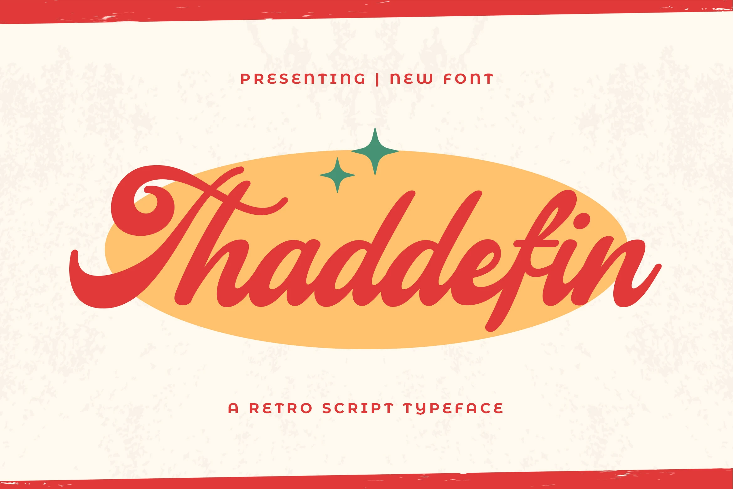
Best For: logos, signage, badges, vintage designs
Thaddefin moves Retro Script Fonts toward bright mid-century sign lettering, with a dramatic curled capital, smooth slanted strokes, and rounded terminals that keep the wordmark lively. The red script has enough contrast between thick curves and narrow joins to feel decorative without becoming hard to follow.
It suits short brand names, badge centers, and nostalgic packaging where one flowing word needs to sit inside a simple shape. Leave extra space on the left for the opening flourish and on the right for the exit stroke; straight uppercase support text works best when tracked out and kept clearly secondary.
Pregnant Font
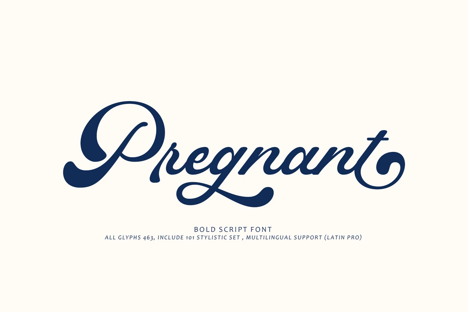
Best For: logos, headlines, classic designs, retro designs
Pregnant has a cleaner, more restrained take on Retro Script Fonts, built from bold navy strokes, compact lowercase connections, and a large looped capital that sets the whole word in motion. The contrast is moderate rather than flashy, so the script feels polished while still carrying a clear vintage sign-painting influence.
The long entry and exit strokes make it useful for logo names, premium labels, and headline treatments where one word needs a graceful horizontal sweep. Keep the surrounding layout quiet, give the opening capital enough left margin, and avoid tight line stacking so the lower loops and terminal curls stay readable.
Pattas Signature Font
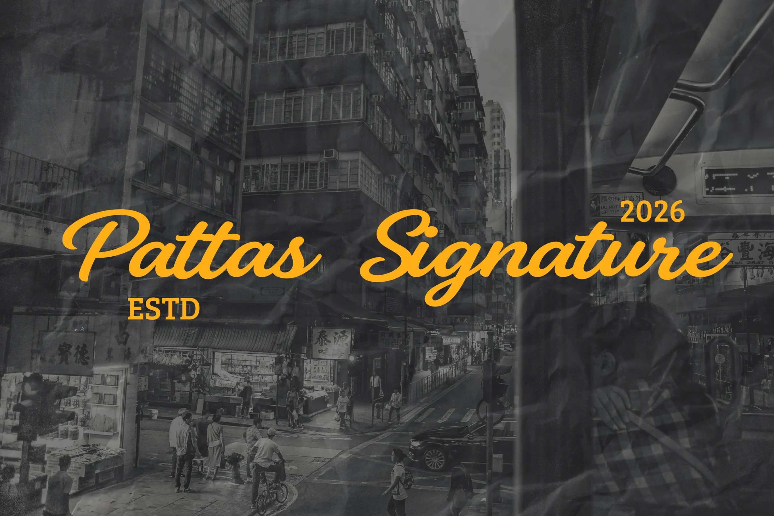
Best For: logos, branding, signage, retro designs
Pattas Signature brings Retro Script Fonts into a smooth urban signage style, with forward-slanted monoline strokes, relaxed baseline movement, and wide looping uppercase initials. The yellow lettering in the preview feels quick and continuous, more like confident marker lettering than a formal script.
Use it for logo names, streetwear graphics, storefront-style titles, and casual branding where the word needs to stretch across the layout. Its uniform weight keeps the rhythm steady, but the long capitals and descenders need clear side margins; pair it with blocky uppercase text for dates, locations, or short supporting labels.
Courtney Font
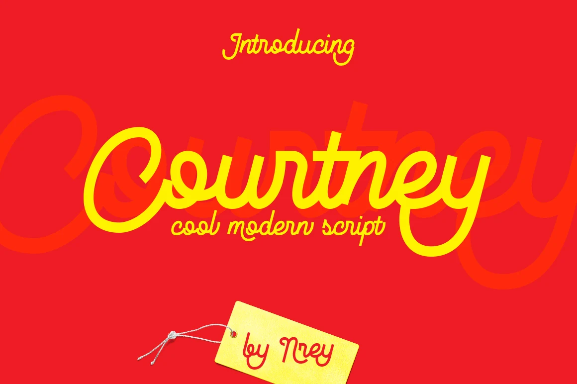
Best For: logos, headlines, retro designs, signage
Courtney brings a taut monoline rhythm to Retro Script Fonts, with a huge looped capital, narrow connected letters, and sharper turns that keep the cursive style from feeling too soft. The long entry and exit strokes give headlines a clean horizontal pull.
Because the stroke stays fairly even, the font holds contrast well against loud color or busy retro layouts. Use it for short names and title lines, then pair it with condensed upright copy so the script can carry the main hierarchy without crowding the composition.
Cluster Heritage Font
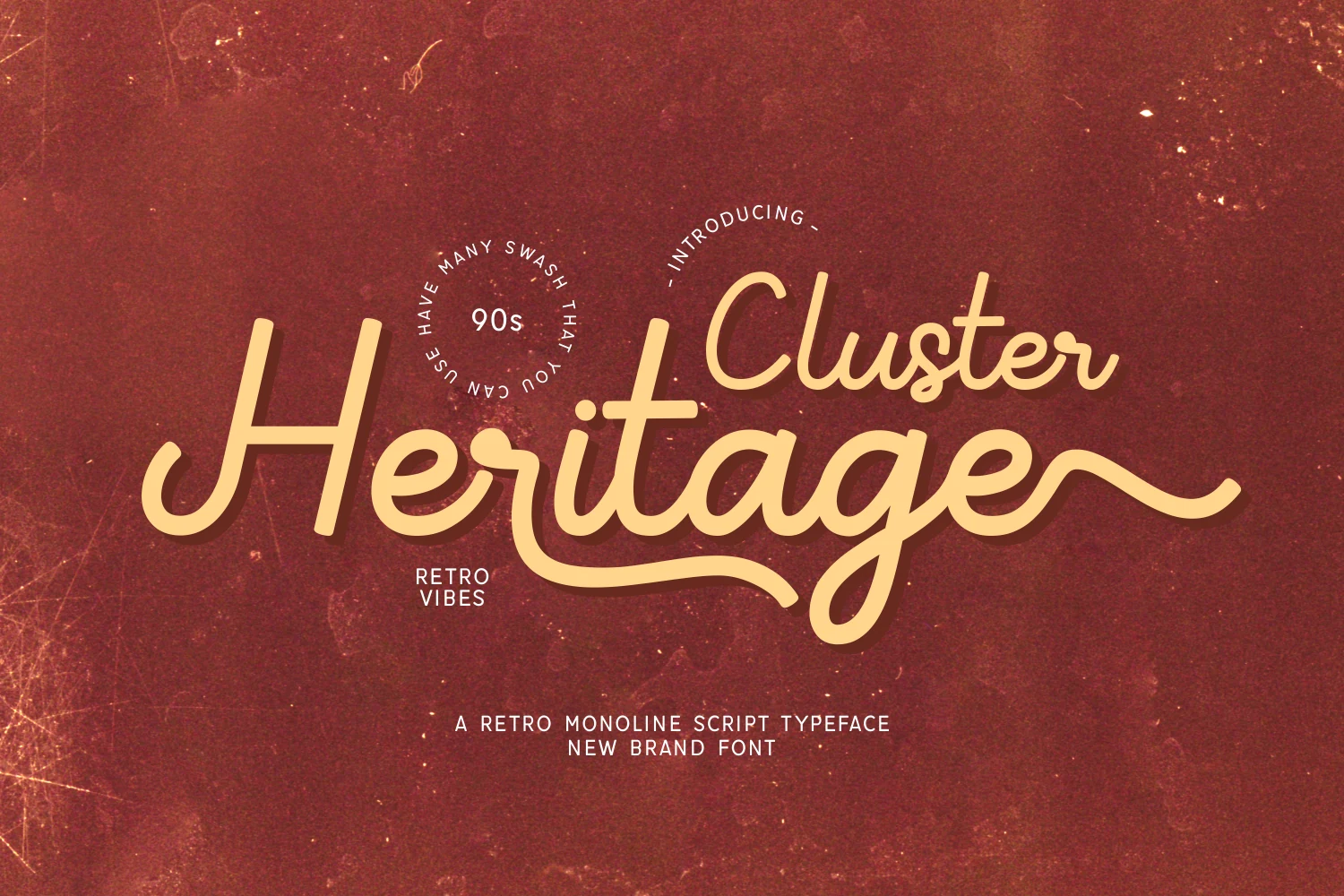
Best For: logos, branding, invitations, retro designs
Cluster Heritage offers a lighter, more restrained take on Retro Script Fonts, built from smooth monoline strokes, rounded joins, and a long underline-style swash that pulls the wordmark across the layout. The tall ascenders keep the script elegant without making it feel formal.
Its minimalist weight makes it useful when a design needs vintage character but not heavy display lettering. Use generous contrast behind it
Casual Vacation Retro Script Fonts
These relaxed scripts lean into coastal, outdoor, cinematic, and postcard-inspired moods for travel graphics, resort branding, social layouts, and posters.
Palm Bay Social Font
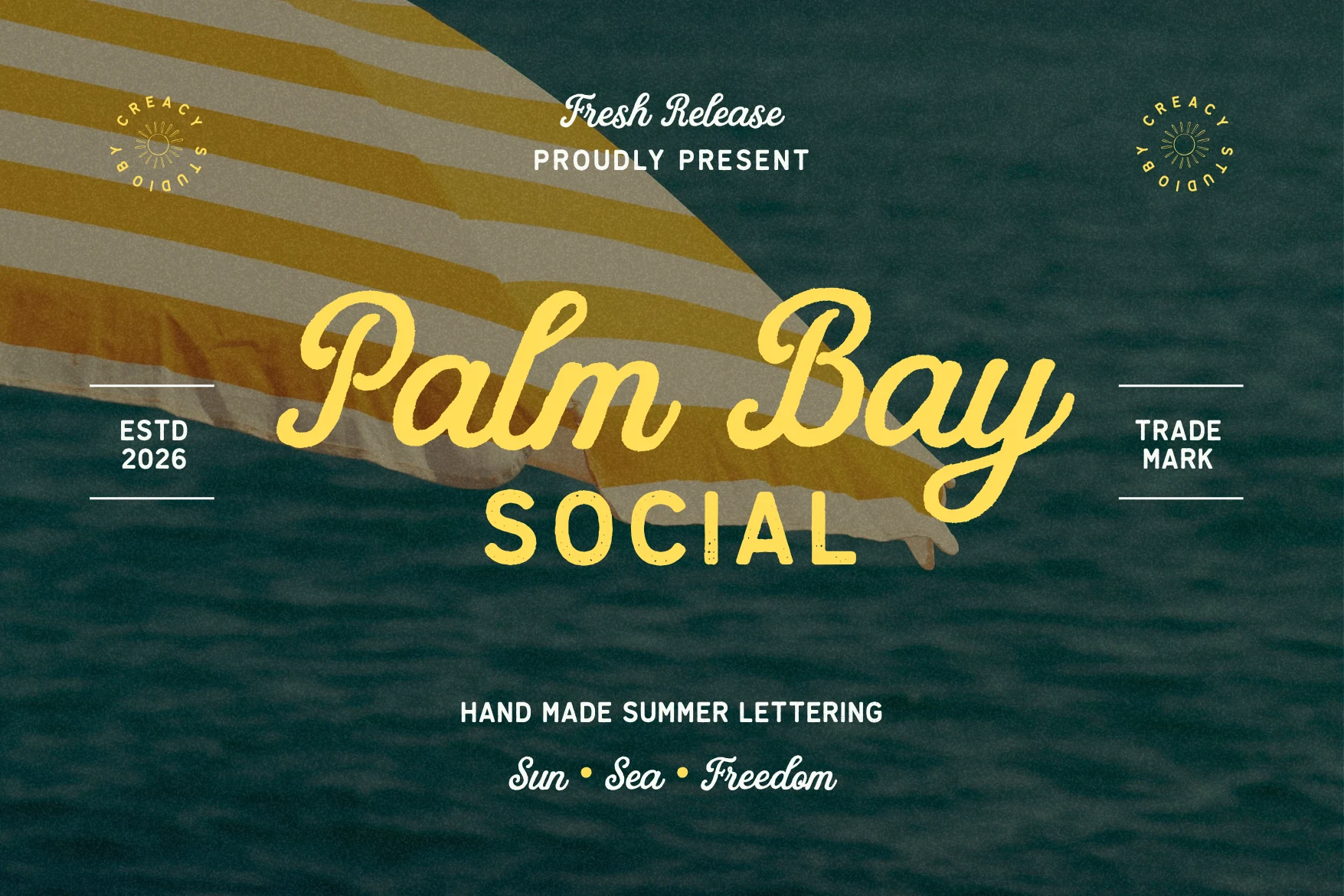
Best For: logos, posters, T-shirts, retro designs
Palm Bay Social gives Retro Script Fonts a beach-club attitude, with a thick connected script shaped by rounded terminals, looping capitals, and a relaxed left-to-right swing. The companion sans adds a crisp uppercase counterpoint, lightly distressed so the set keeps a handmade resort-poster texture rather than looking too polished.
Use the script for the main name or headline, then let the sans handle secondary words, dates, and small badge details. Its broad strokes need strong contrast against the background, while the sans benefits from extra tracking to keep the duo balanced across apparel graphics, coastal branding, and vintage-style social layouts.
Dusklight Font
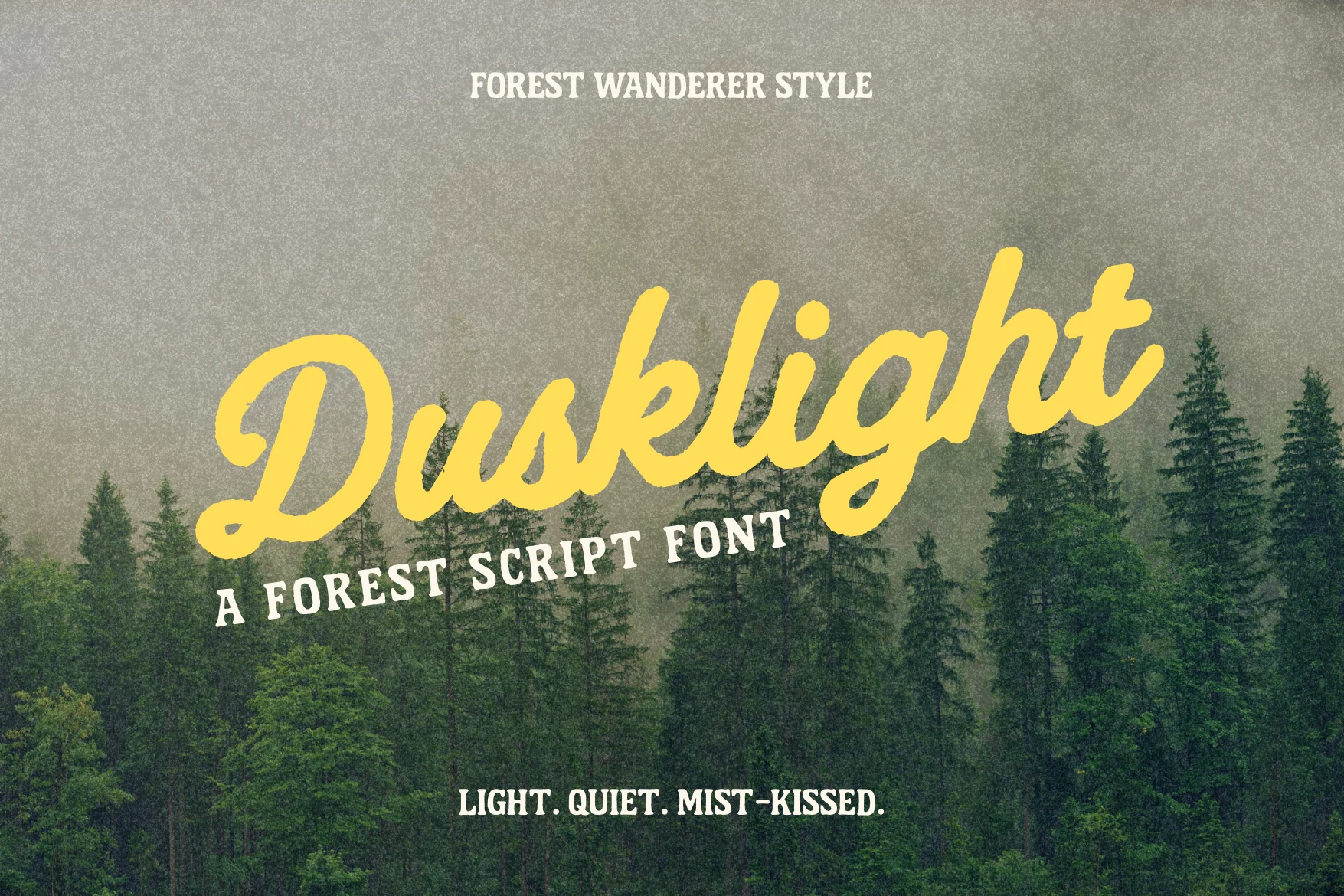
Best For: logos, posters, signage, vintage designs
Dusklight has the calm weight of outdoor vintage lettering, with a broad connected script, soft rounded joins, and a lightly uneven brush texture. Its slanted rhythm keeps the wordmark moving, while the thick yellow strokes in the preview show why Retro Script Fonts can feel nostalgic without becoming overly ornate.
The letterforms are strong enough for poster titles, trail-inspired logos, and rustic signage, but the connected shapes need clear spacing around descenders and entry strokes. Pair it with a sturdy uppercase serif or sans for supporting lines, and keep the script to short phrases where the texture and sweeping baseline stay readable.
Recordo Cinema Font
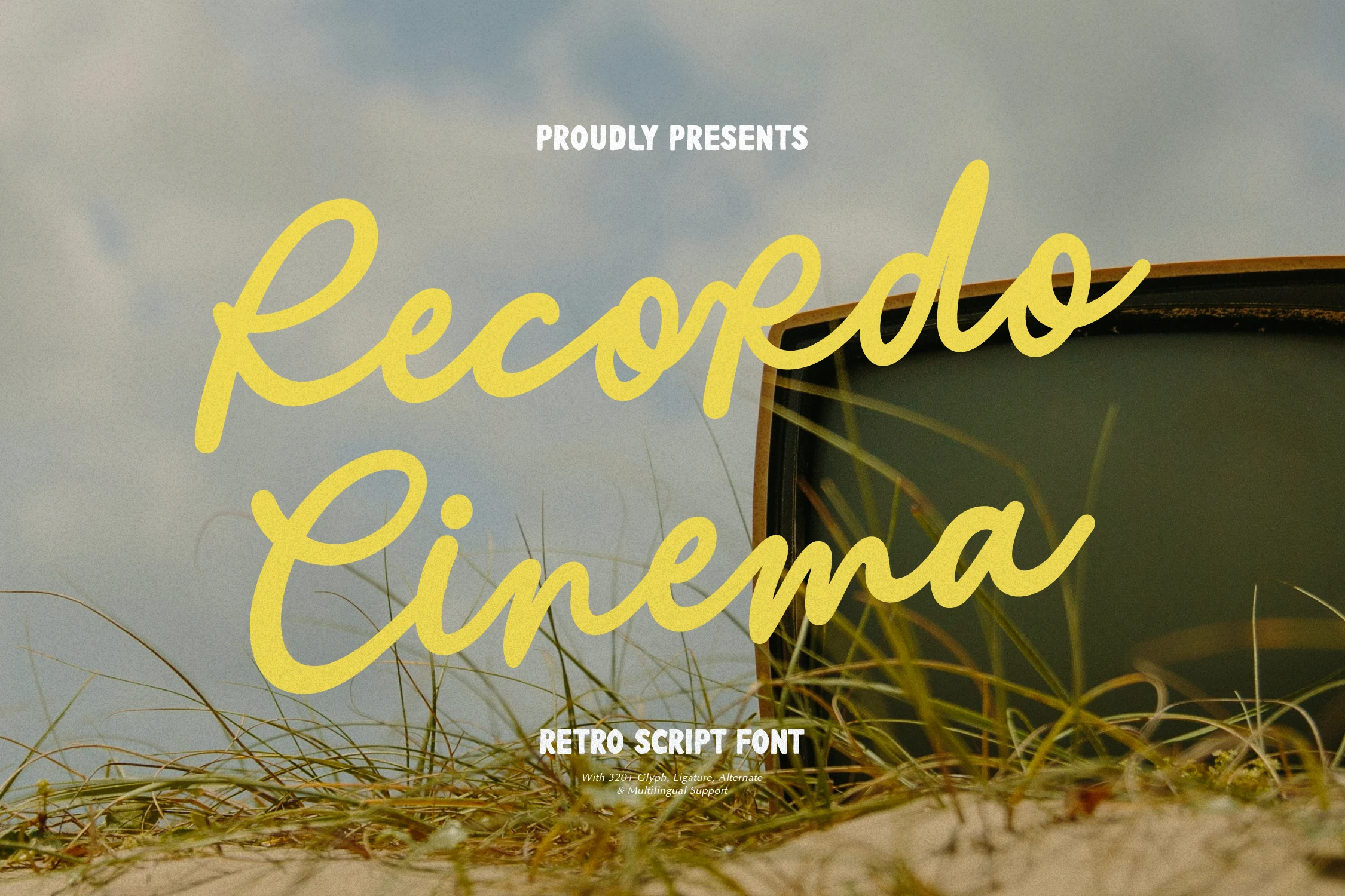
Best For: logos, posters, retro designs, nostalgic designs
Recordo Cinema brings Retro Script Fonts into a loose mid-century movie-poster style, with long entry strokes, open loops, and a casual handwritten flow. The yellow lettering in the preview shows a lighter, more breezy rhythm than chunky sign scripts, giving the words motion without turning them into dense badge shapes.
Use it for relaxed logo marks, poster titles, and nostalgic social graphics where the script can stretch across the layout. Its thin joins and wide loops need clean contrast and enough horizontal room, while small supporting text should stay upright and compact so the script keeps its cinematic sweep.
Vacation Sunday Font
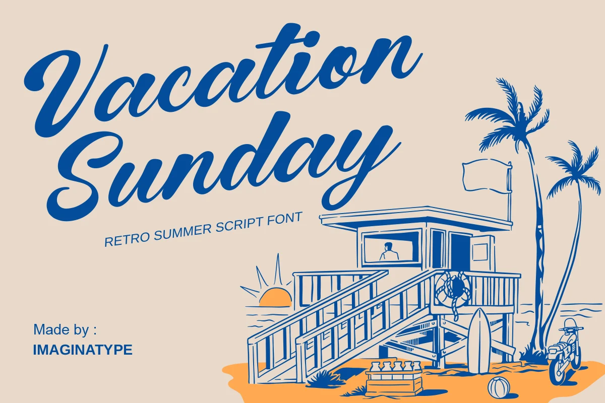
Best For: logos, posters, signage, nostalgic designs
Vacation Sunday gives Retro Script Fonts a sunny postcard character, with bold blue strokes, broad curves, and relaxed slanted letterforms that feel close to mid-century beach signage. The large capitals and sweeping descenders create an easy summer rhythm without the dense shadowing seen in heavier badge scripts.
Use it for resort logos, surf-inspired posters, travel graphics, and casual packaging where the script can stretch wide across the design. Its smooth connections need open horizontal spacing, while small supporting text works best as straight uppercase lettering placed below the main wordmark rather than squeezed into the curves.
Conclusion
Choose bold badge scripts for logos and merch that need weight, groovy 70s styles for posters and playful packaging, smooth logo scripts for cleaner branding, and vacation-inspired options for relaxed coastal or nostalgic layouts.