23 Stunning Vintage Serif Fonts for Retro Designs in 2026
Vintage Serif Fonts bring old-print character, retro curves, and aged display energy to branding, packaging, posters, badges, and editorial titles. This collection is built for designers who need serif type with stronger period style than a clean modern serif.
Elegant & Editorial Vintage Serif Fonts
These refined vintage serif fonts use high contrast, tall proportions, and polished curves for editorial titles, boutique branding, luxury labels, and elegant wordmarks.
Retro Dream Font
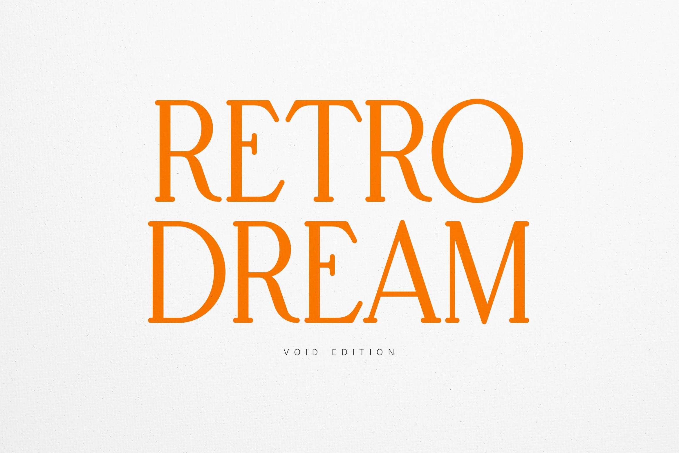
Best For: branding, editorial designs, luxury designs, classic designs
Retro Dream Font has a tall, refined serif structure with clean contrast, narrow proportions, and a polished rhythm that feels rooted in classic print. The letterforms look airy rather than heavy, which gives Vintage Serif Fonts a more graceful editorial tone instead of a rugged antique feel.
It shines in titles, branding, and packaging where a few well-spaced words can carry the composition. Give it room between lines and pair it with a quiet secondary sans or light serif, so its long verticals and elegant curves stay crisp and intentional.
Mayqueen Font
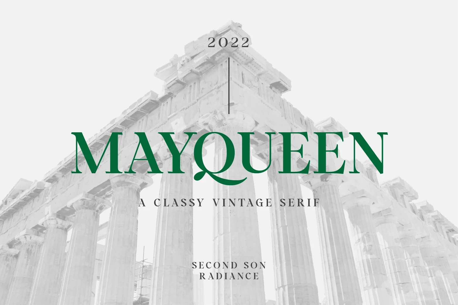
Best For: logos, editorial designs, beauty branding, book covers
Mayqueen Font balances classical restraint with a graceful display presence. Its high-contrast strokes, tapered serifs, and sweeping Q tail give the letters a cultured rhythm that feels polished rather than ornate. For Vintage Serif Fonts, it offers a stately look that still reads cleanly in large headings.
It is especially effective when you want a refined title or wordmark to carry the layout, from editorial covers to boutique branding. Pair it with generous spacing and understated secondary text so the sharp serifs and elongated curves stay elegant instead of crowded.
Cantero Font
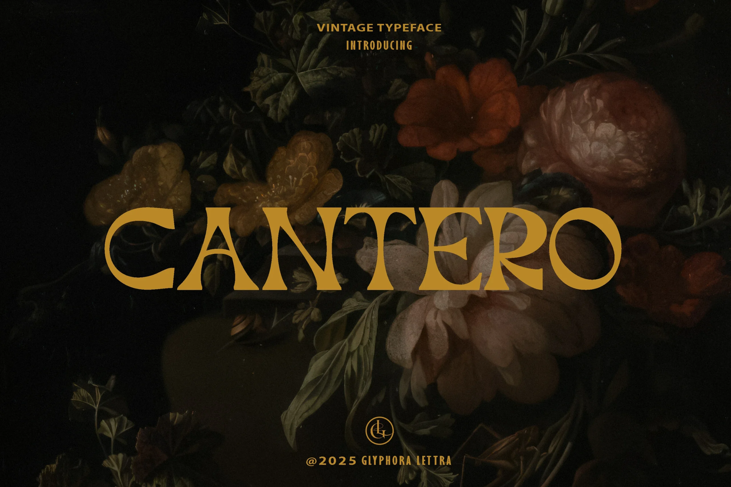
Best For: logos, editorial designs, luxury designs, vintage designs
Cantero Font has a cultivated vintage serif voice, with wide-set capitals, high contrast, and wedge-like terminals that create a stately rhythm. The C and O stay broad and open while the A, N, and T feel sharply cut, giving Vintage Serif Fonts a refined historical-print mood without adding rough texture.
Use it for wordmarks, editorial titles, gallery-style branding, and packaging where one line needs to feel deliberate. Keep tracking modest and contrast high; the long horizontal strokes and carved curves work best when the supporting typography stays restrained.
Eagles Font
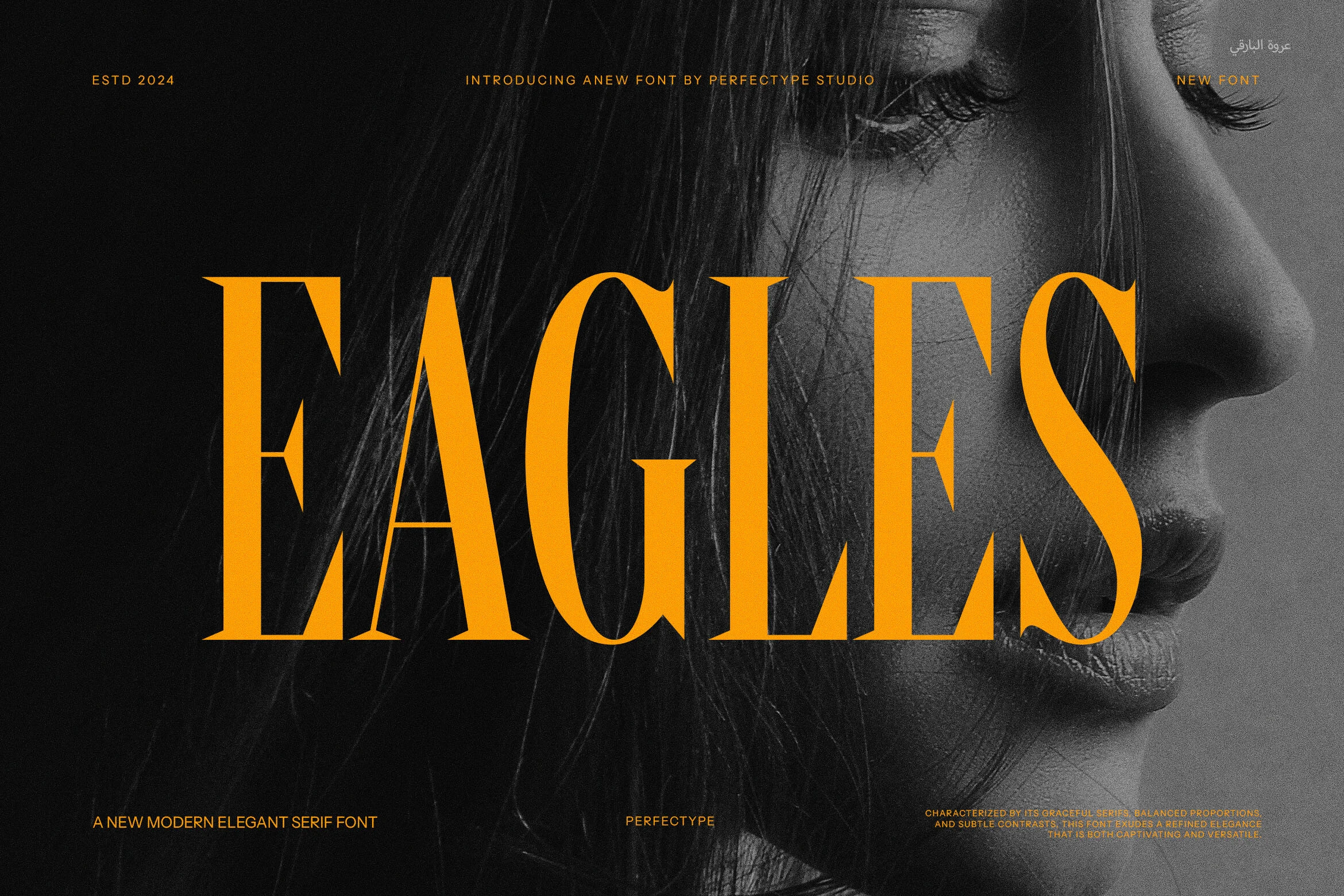
Best For: logos, editorial designs, fashion branding, luxury designs
Eagles Font reads as a tall, high-contrast serif with narrow proportions, sharp triangular terminals, and long vertical strokes that create a polished vintage mood. The letterforms are detailed without becoming fussy, giving short words a firm editorial presence.
Use it where Vintage Serif Fonts need an old-fashioned tone with a cleaner fashion-led finish. It works strongest in logos, magazine-style headers, packaging titles, and poster layouts; keep the surrounding type restrained so the sharp contrast and vertical rhythm carry the hierarchy.
Parandea Font
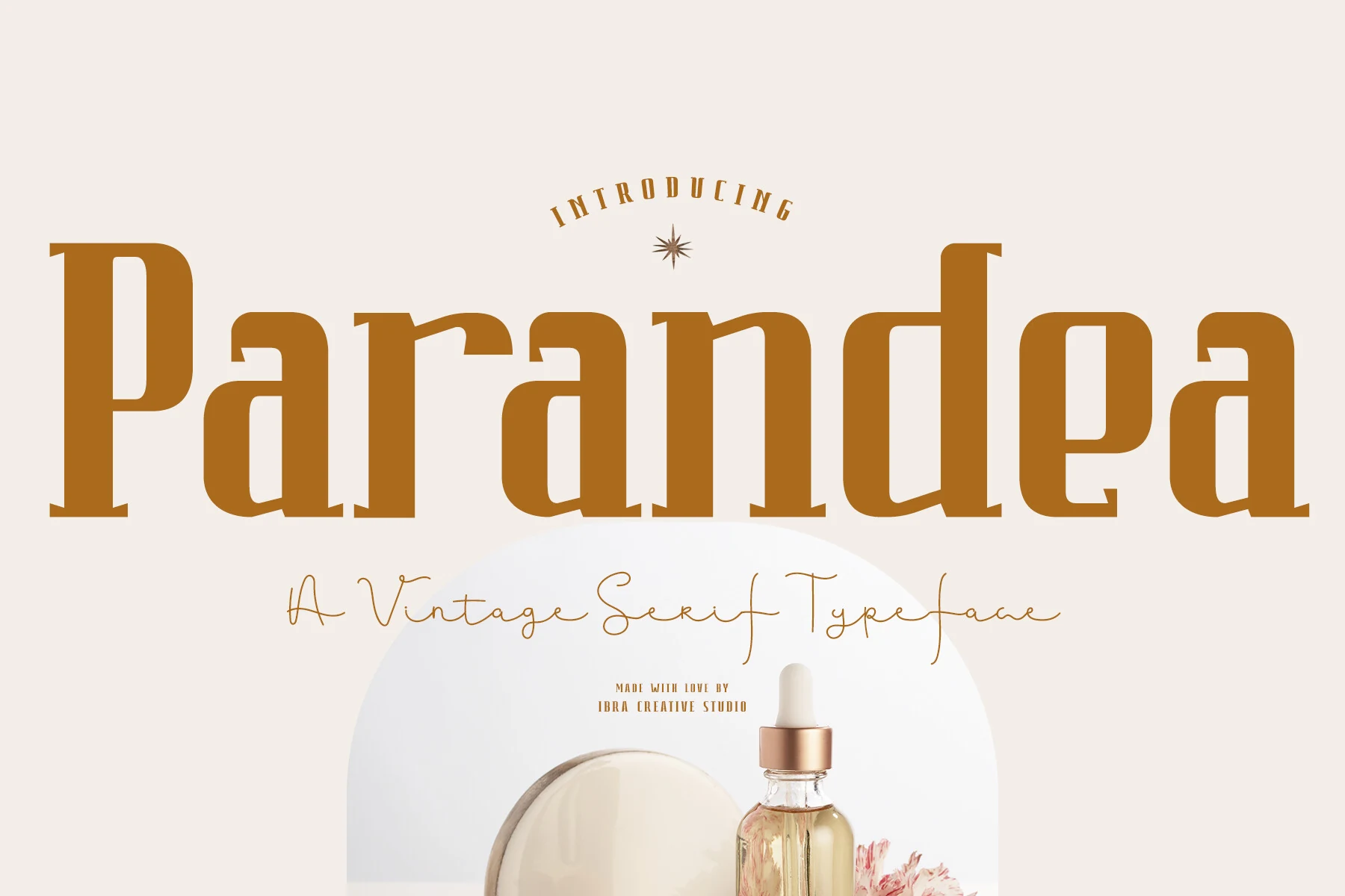
Best For: logos, beauty branding, product labels, packaging
Parandea Font has a broad vintage serif shape with tall upright stems, rounded counters, and soft slab-like terminals. Its curves are graceful rather than ornate, giving the wordmark a nostalgic structure while keeping the overall impression clean and composed.
Parandea fits Vintage Serif Fonts for branding that needs warmth without rough texture. Keep the main name large and fairly tight, then use lighter supporting text with wider spacing; this contrast lets the heavy serif forms anchor packaging, beauty labels, and refined logo layouts.
Bold Retro Vintage Serif Fonts
These bold retro serif fonts favor rounded forms, broad caps, and strong display rhythm, making them useful for logos, packaging names, social graphics, and punchy poster titles.
Gecko Font
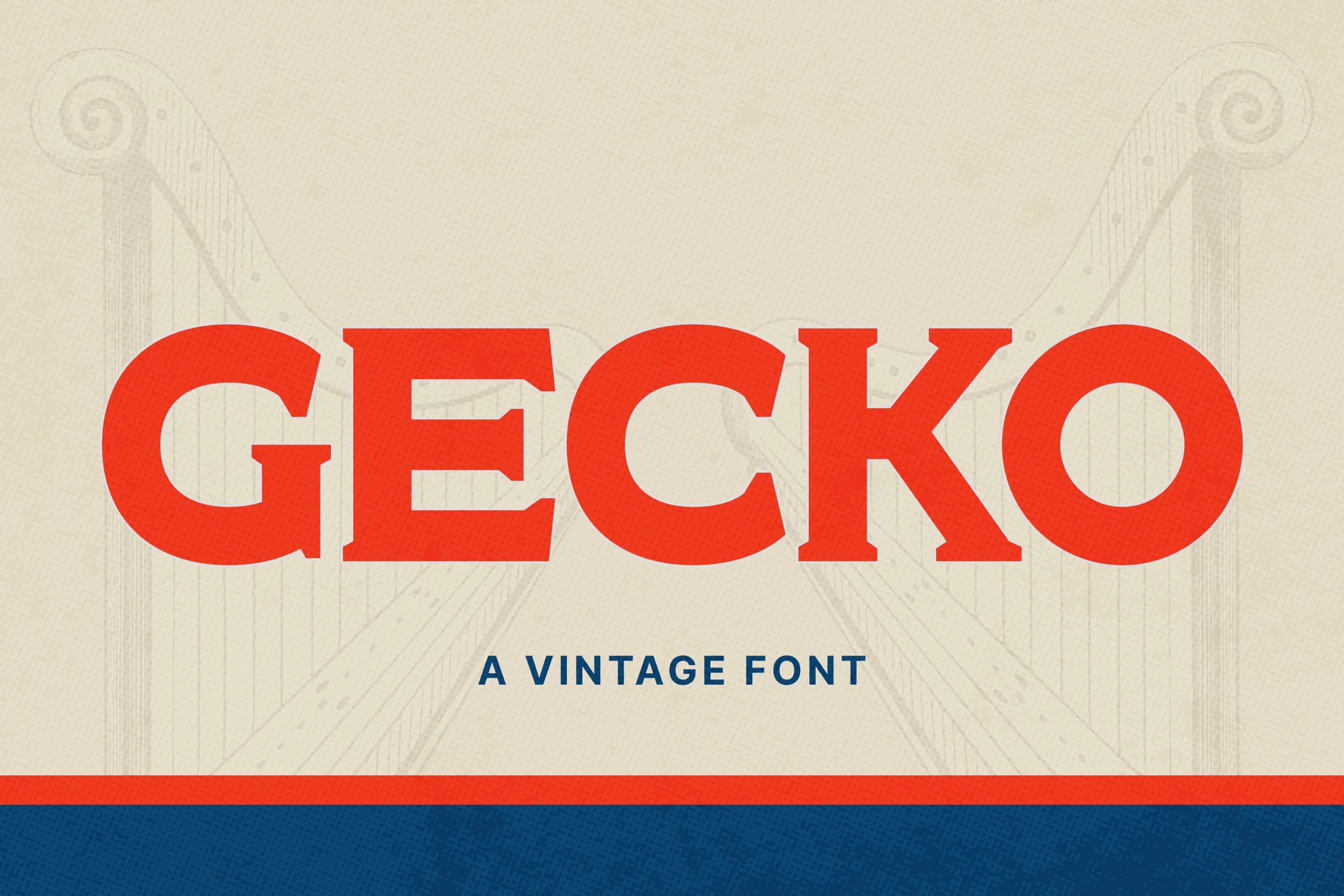
Best For: logos, branding, posters, vintage designs
Gecko Font has a bold retro presence built from broad serif forms, soft curves, and a steady, balanced weight. The capitals feel friendly rather than formal, with chunky shapes that echo 70s print design without slipping into novelty. If you like Vintage Serif Fonts with warmth and clarity, Gecko lands in a very usable middle ground.
It works especially well for short titles, logos, and packaging where a strong single word needs to carry the design. Keep the tracking fairly controlled and pair it with a simpler secondary face, so Gecko’s wide proportions and rounded serifs stay punchy instead of overwhelming the composition.
Ravelo Font
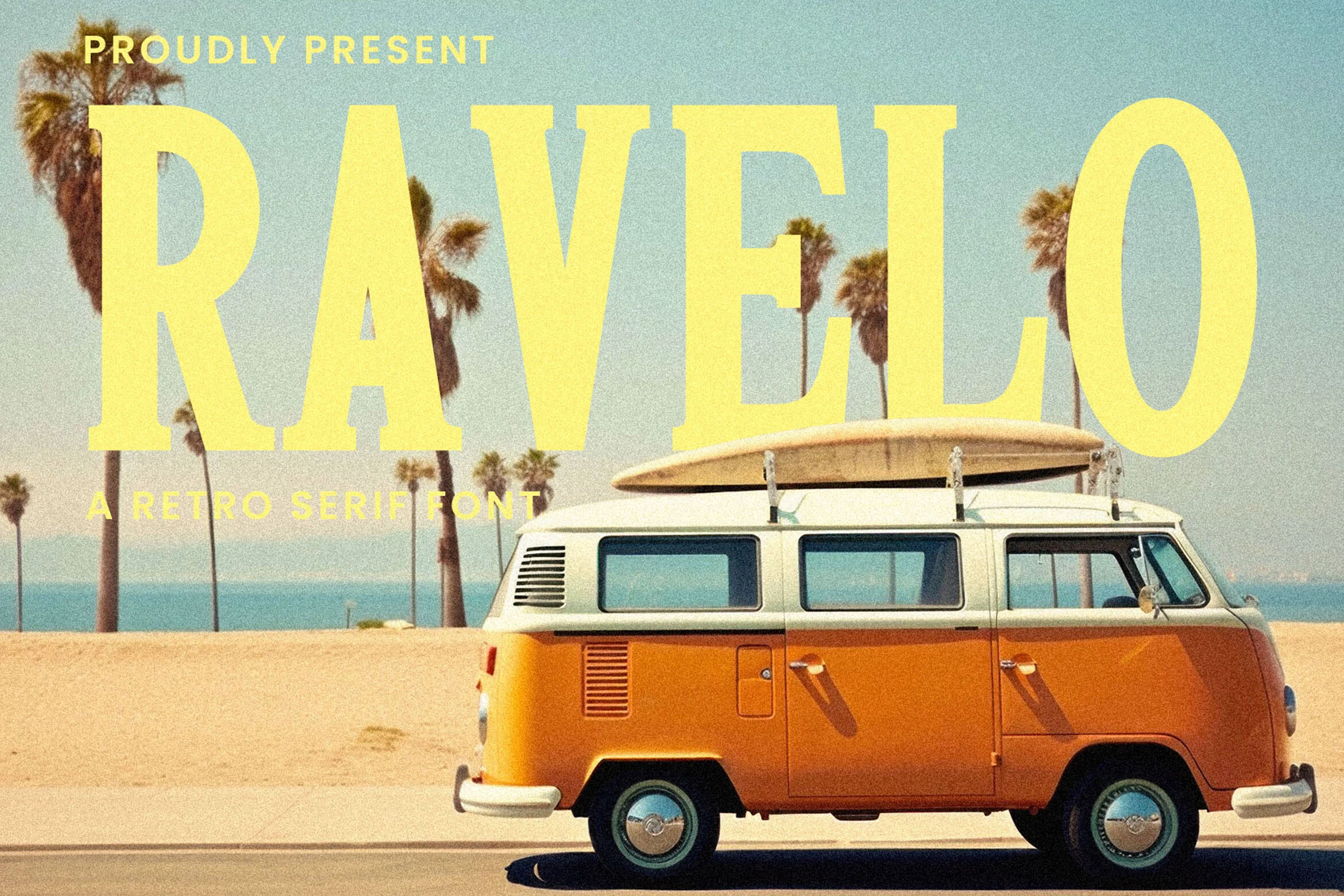
Best For: logos, social media graphics, product packaging, vintage designs
Ravelo Font has a clean retro serif look with broad capitals, soft curves, and steady weight that keeps the letters bold without feeling heavy. The shapes are simple and open, which gives it an easygoing 70s flavor and makes it a strong fit for Vintage Serif Fonts that need charm without too much ornament.
Its strength is display use, especially when a short word or headline needs to set the tone fast. Ravelo works well in branding, packaging, and social posts when paired with smaller supporting text, and its wide proportions look best when you build a clear title hierarchy instead of stacking too many large lines together.
Silver Stone Font
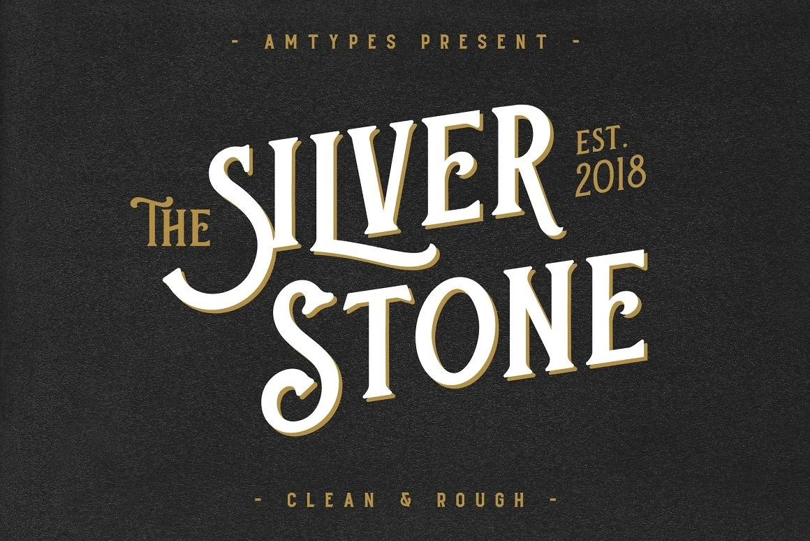
Best For: logos, branding, product packaging, vintage designs
Silver Stone Font leans into old-package character with tall serif forms, curved stress, and lively terminals that give each word a stamped, collectible feel. The sweeping detail on the capitals adds personality without making the letterforms hard to read, so it fits naturally into Vintage Serif Fonts with a more decorative, display-led voice.
It works best when the main title does the heavy lifting, especially in branding, labels, and cover-style layouts. Keep the supporting type plain and compact, and let Silver Stone sit at a generous size so its vintage curves and slightly theatrical rhythm stay crisp instead of crowded.
Forence Font
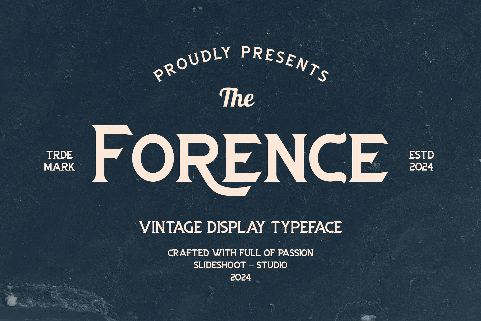
Best For: logos, signage, badges, display text
Forence Font uses broad vintage display shapes with flared serifs, rounded counters, and a few expressive curves that make the wordmark feel custom rather than plain. Its contrast is moderate enough to stay readable, while the wide caps give short titles a sturdy old-signage presence.
Forence brings a cleaner logo-focused angle to Vintage Serif Fonts, especially when the layout needs classic structure without looking stiff. Alternate characters and ligatures help vary key letters in a title, so it works well for badges, storefront-style signage, packaging names, and compact brand marks.
Manbort Font
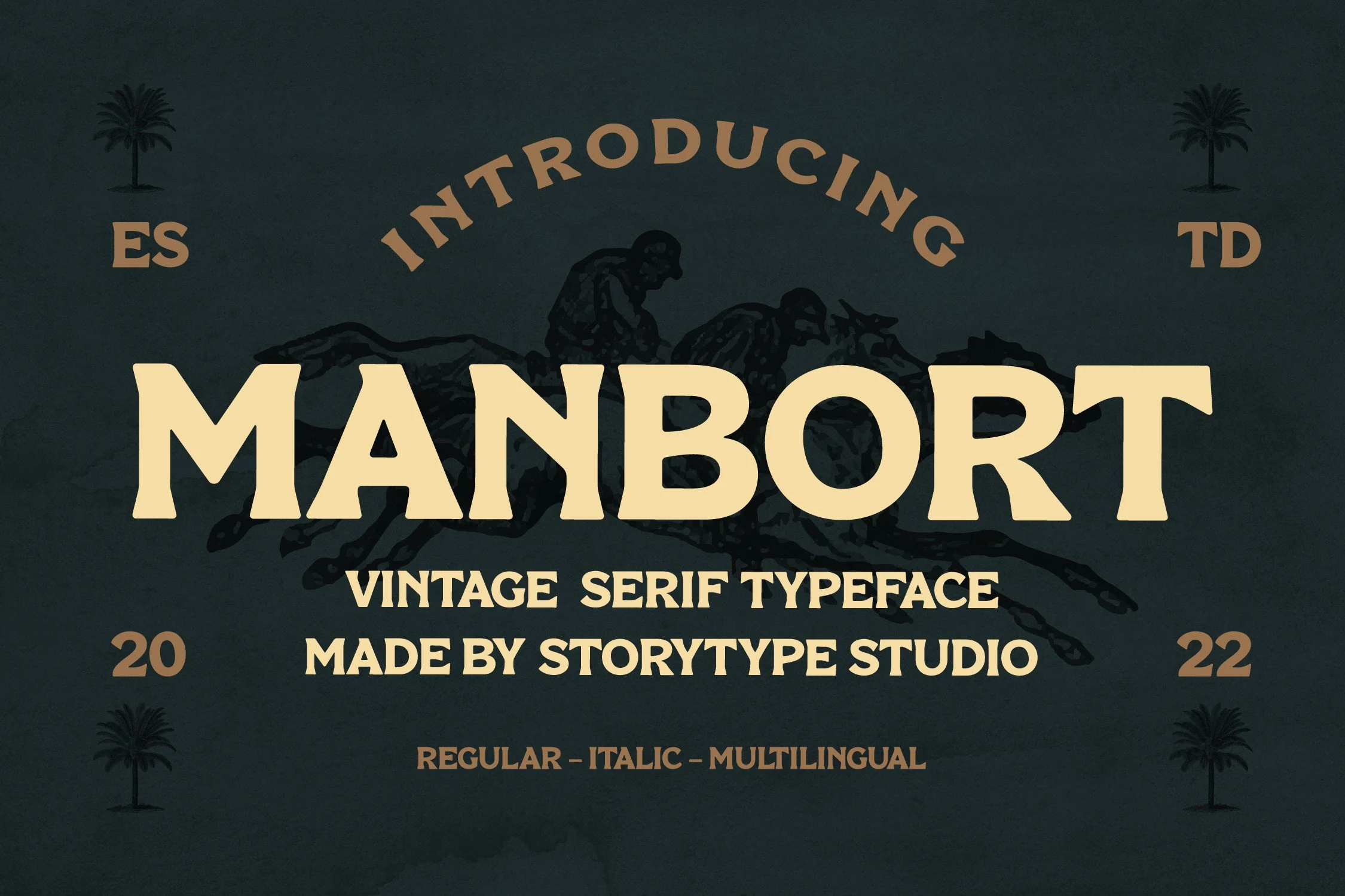
Best For: logos, packaging, signage, badges
Manbort Font has a heavy old-era serif build with broad caps, chunky wedge serifs, and slightly uneven curves that keep the display style from feeling too polished. The compact counters and thick strokes create a strong block of type, especially in short uppercase words.
For Vintage Serif Fonts that need a firm emblem or sign-painter mood, Manbort works best when the hierarchy is simple: one dominant word, tight supporting text, and enough contrast to hold the rough-edged silhouette. It suits logos, packaging, signage, mugs, and print pieces where the type is meant to lead.
Chromes Font
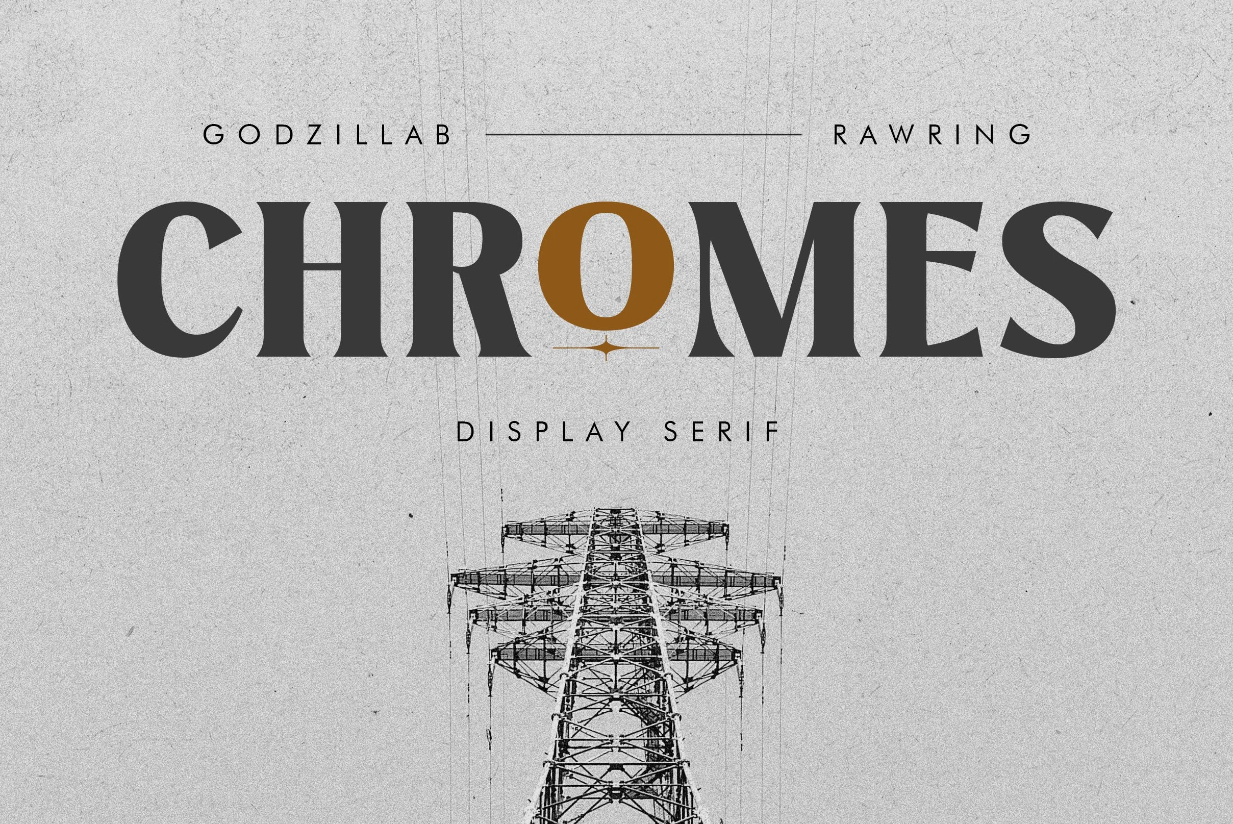
Best For: logos, packaging, product labels, headlines
Chromes Font has a hard display-serif build with thick vertical strokes, sharp wedge serifs, and aggressive curved terminals. The caps feel wide and forceful, while the clean spacing keeps the wordmark readable despite the heavy contrast and pointed details.
Chromes gives Vintage Serif Fonts a darker modern-classic edge, closer to rock packaging and high-impact label design than soft retro branding. Use it for short headlines, logos, and product names where the hierarchy needs one dominant word; smaller support text should stay simple so the sharp serif rhythm does not compete.
Western & Signage Vintage Serif Fonts
These western and signage serif fonts bring slab weight, flared terminals, and frontier energy to badges, saloon-style marks, cowboy posters, and rugged logo systems.
Watern Font
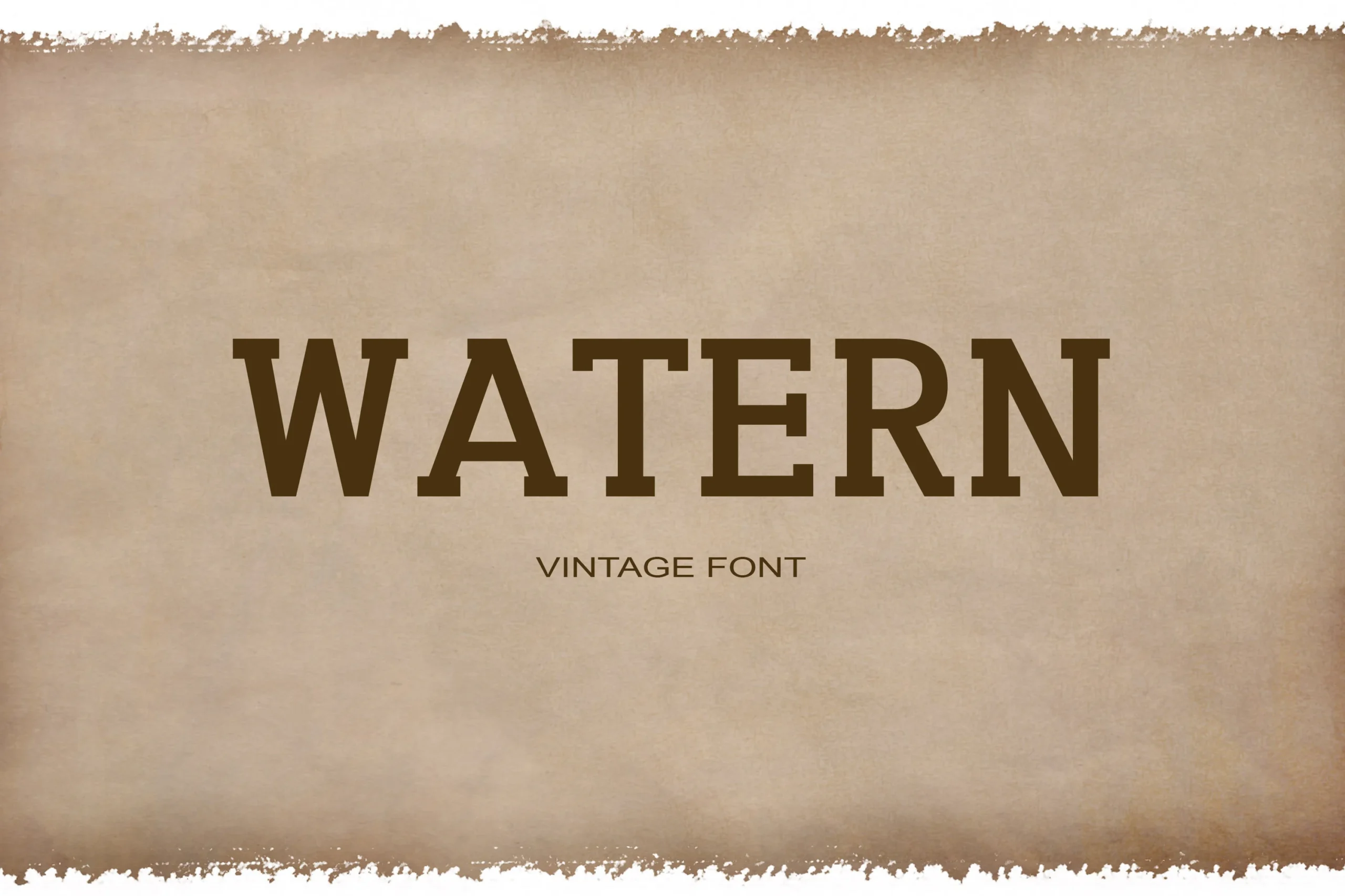
Best For: logos, posters, signage, vintage designs
Watern Font has the sturdy, no-nonsense feel of old western signage, with blocky serif forms, squared terminals, and a broad stance that reads clearly at a glance. It brings a frontier mood without extra ornament, which gives Vintage Serif Fonts a more rugged and straightforward direction.
This is a strong choice for short titles, badges, and cowboy-themed branding where you want the headline to feel solid and familiar. Its heavy capitals create a firm visual anchor, so it works best when paired with smaller, simpler supporting text that keeps the hierarchy clear.
Western Finalist Font
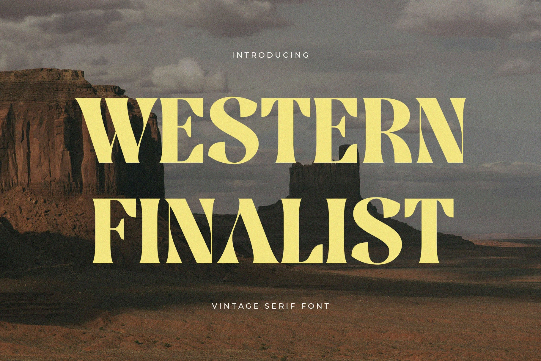
Best For: logos, posters, signage, vintage designs
Western Finalist Font has the big-sky drama of an old cowboy poster, with broad high-contrast strokes, sharp flared serifs, and wide capitals that fill the line with confidence. Its letterforms feel polished rather than distressed, giving Vintage Serif Fonts a cleaner frontier look that still carries plenty of retro character.
It is strongest in short display settings where the title needs to lead the whole composition, from branding to saloon-style headlines. Keep the wording brief and let the line spacing open up a little, so the sweeping curves and heavy verticals stay crisp instead of crowding together.
District Font
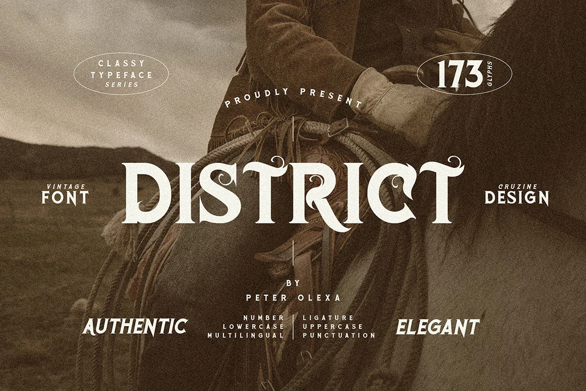
Best For: branding, editorial designs, signage, vintage designs
District Font brings a decorative old-west serif mood through heavy capitals, firm slab-like stems, and curled terminals that turn key letters into focal points. Its shapes feel compact and confident, placing it among Vintage Serif Fonts with a more ornamental, sign-painted character.
Use it where the wordmark or headline needs a clear classic identity, especially in branding, editorial layouts, and signage. Keep surrounding type narrow and understated; the curled details already create movement, so strong spacing and a simple hierarchy will keep the title readable.
Rustem Font
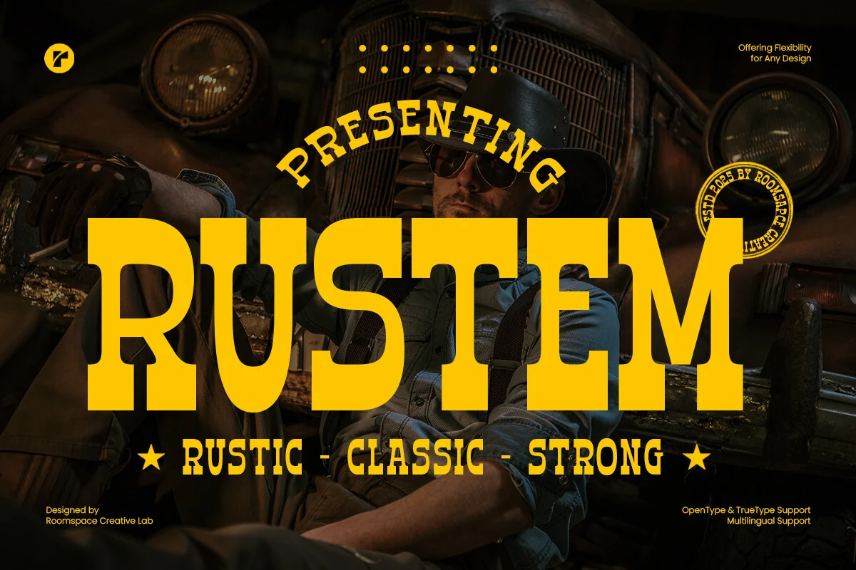
Best For: logos, signage, badges, headlines
Rustem has the weight and posture of old Western display type: wide slab serifs, squared shoulders, compressed counters, and a hard vertical rhythm. The letters feel blunt rather than ornamental, so the rugged character comes from proportion and mass instead of surface texture.
Rustem pushes Vintage Serif Fonts toward frontier-style branding where the wordmark needs to hit first. Keep spacing tight enough to preserve its blocky silhouette, then give it strong contrast against the background; it suits logos, signage, badges, and headline systems better than long reading copy.
Ornate & Layered Vintage Serif Fonts
These decorative vintage serif fonts use shadows, scalloped details, and layered forms for theatrical posters, statement logos, display packaging, and standout signage.
Dustone Font
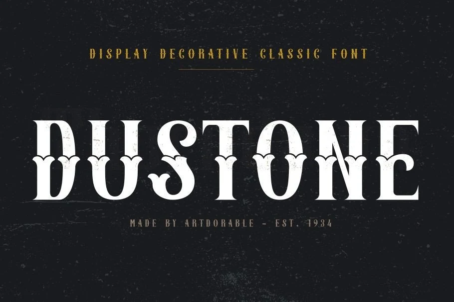
Best For: logos, posters, magazine covers, badges
Dustone Font has a bold display serif structure with sharp contrast, tall capitals, and unusual scalloped details cutting through the middle of several letters. That ornamental treatment gives it an old-print flair with real stage presence, pushing Vintage Serif Fonts toward a more dramatic headline style.
Use it when the main word needs instant character, whether for logos, poster mastheads, labels, or cover lines. Because the letterforms are decorative, keep the wording short and pair it with a quieter companion face so Dustone stays striking without making the layout feel crowded.
Heralon Font
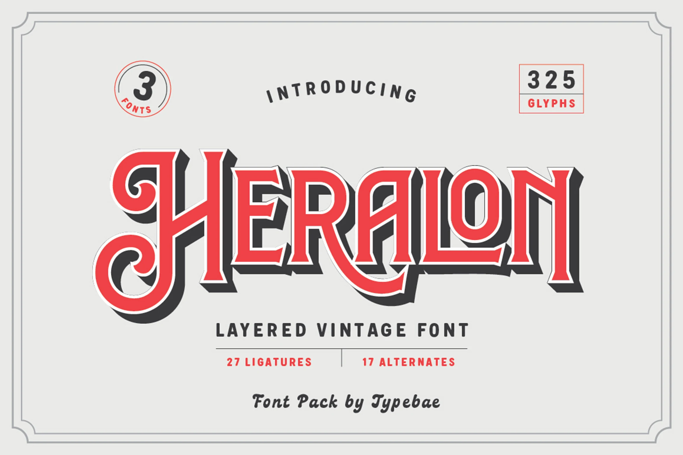
Best For: logos, posters, packaging, signage
Heralon Font has the bold stage presence of an old poster title, with ornate entry strokes, crisp serifs, and a layered build that adds real depth. The shadowed look in the preview gives it a punchy retro personality, so within Vintage Serif Fonts it feels more theatrical and decorative than quiet or refined.
Because it includes Regular, 3D, and Outline styles, you can stack or separate the layers to control contrast in logos, posters, and packaging. The ligatures and stylistic alternates help smooth big display words, but this one is strongest in short headlines where its embellished shapes have room to show.
Wooden Okadio Font
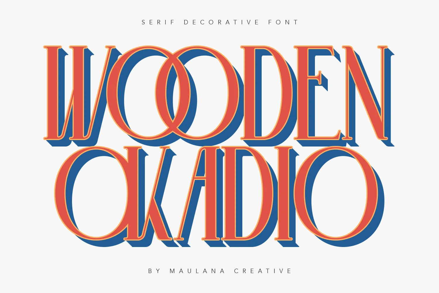
Best For: logos, posters, signage, vintage designs
Wooden Okadio Font has a decorative vintage serif structure with tall proportions, broad rounded bowls, and crisp tapered serifs that give the letters a poster-like presence. The overlapping O forms and layered shadow styling push Vintage Serif Fonts toward a louder, more graphic direction, so it reads best as display typography rather than body copy.
It works especially well for logos, signage, and poster headlines where a few words need instant personality. Keep the wording short and let the line spacing breathe, because the stacked depth effect and narrow vertical rhythm look strongest when the composition stays simple.
Rough & Textured Vintage Serif Fonts
These textured vintage serif fonts include distressed ink, rough edges, and worn print effects for old badges, archival covers, merch, posters, and gritty brand marks.
Balverd Font
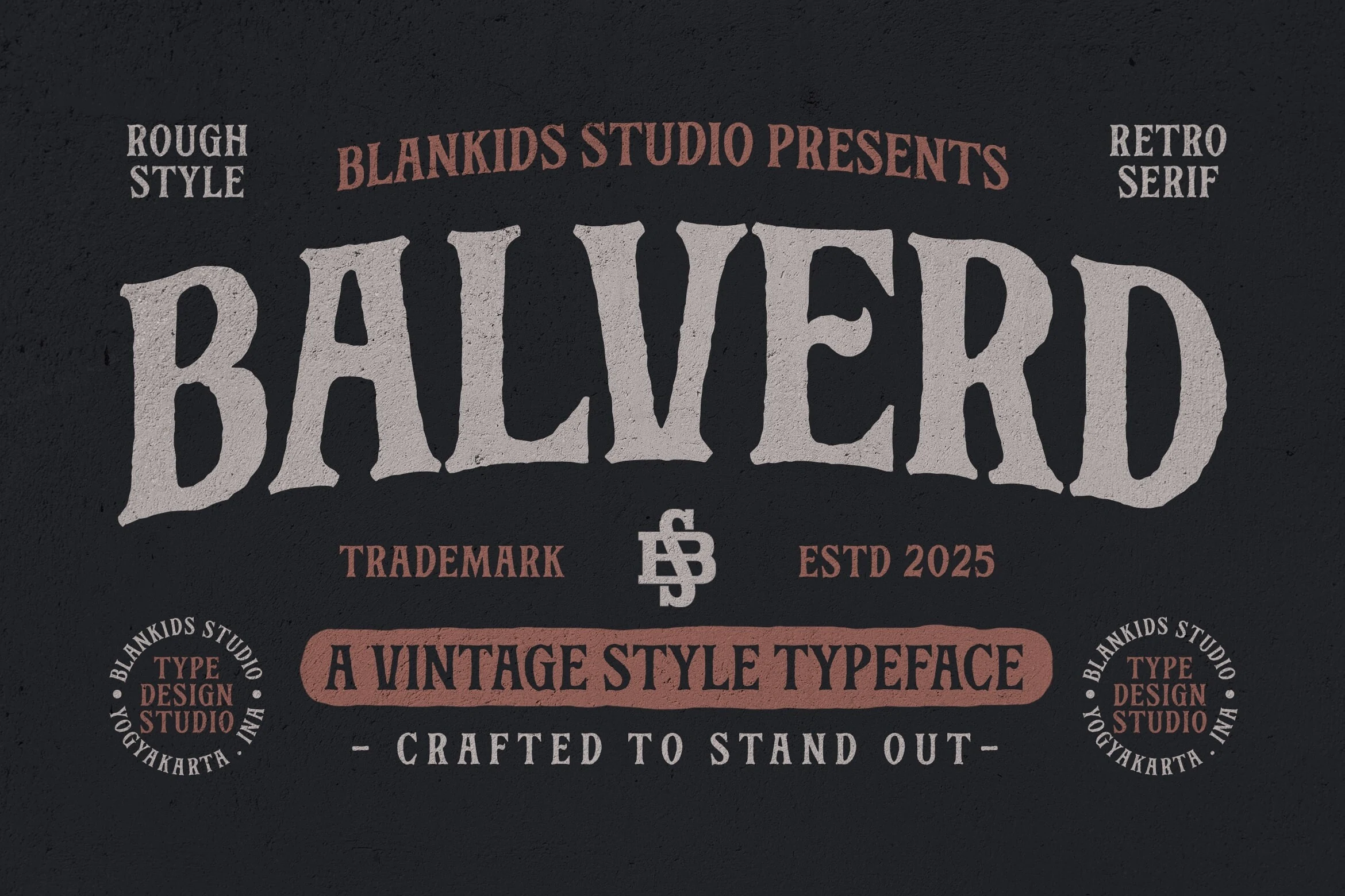
Best For: logos, posters, badges, vintage designs
Balverd Font has a rough-cut serif voice with chunky verticals, flared wedge serifs, and uneven edges that feel closer to hand-printed signage than polished editorial type. The distressed texture gives its large caps a weathered brand-stamp character, making it a strong pick for Vintage Serif Fonts with a bolder, less delicate mood.
Use it where the main word needs to dominate the layout: logotypes, poster titles, packaging marks, and badge-style compositions. Keep supporting text tighter and cleaner so Balverd’s irregular contours stay readable instead of turning the whole design into visual noise.
Retro Typewriter Font
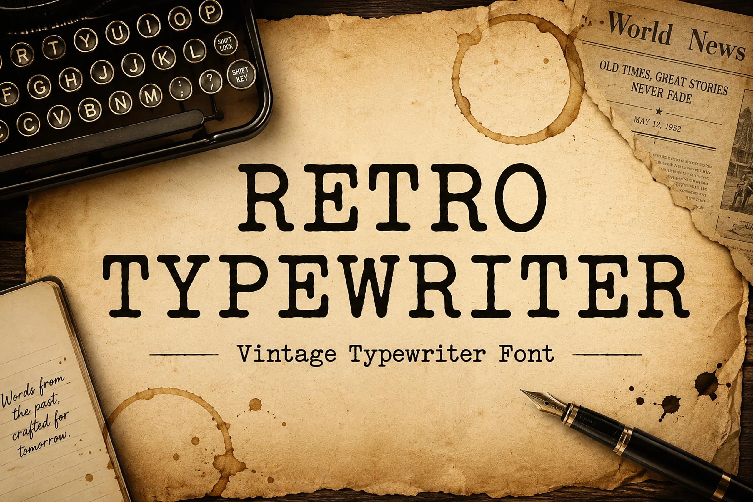
Best For: posters, book covers, quotes, vintage designs
Retro Typewriter Font has the blunt, inked character of classic machine typing, with slabby serifs, rounded corners, and a slightly worn rhythm that feels convincingly archival. It stands apart from more polished Vintage Serif Fonts by channeling a newsroom and manuscript mood rather than polished editorial glamour.
It works best in short headlines, quote layouts, and cover treatments where the texture of the letters is part of the story. Keep line lengths controlled and give it generous margins or simple divider rules, because the dense letterforms read more clearly when the composition stays spare.
Golden Dragon Font
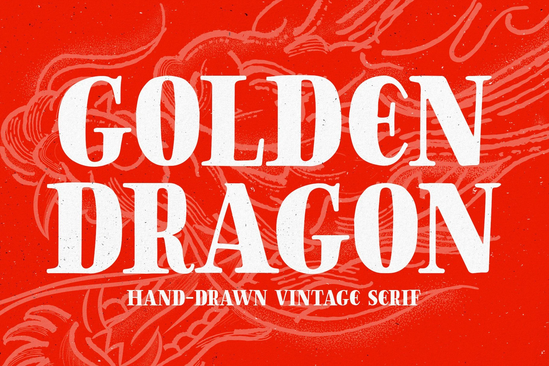
Best For: branding, posters, merch design, vintage designs
Golden Dragon Font has a heavy hand-drawn serif build with rounded slab weight, uneven ink texture, and sharp interior cuts that give the letters a strong poster rhythm. Its vintage character feels bold and graphic, making it a good fit for Vintage Serif Fonts when the design needs an organic, illustrated edge.
The letterforms pair well with rough textures because the small irregularities make the type feel printed rather than sterile. Use it for headlines, emblems, merchandise, and themed branding, keeping the words short so the thick strokes and carved serifs stay readable at full impact.
Catacombe Font
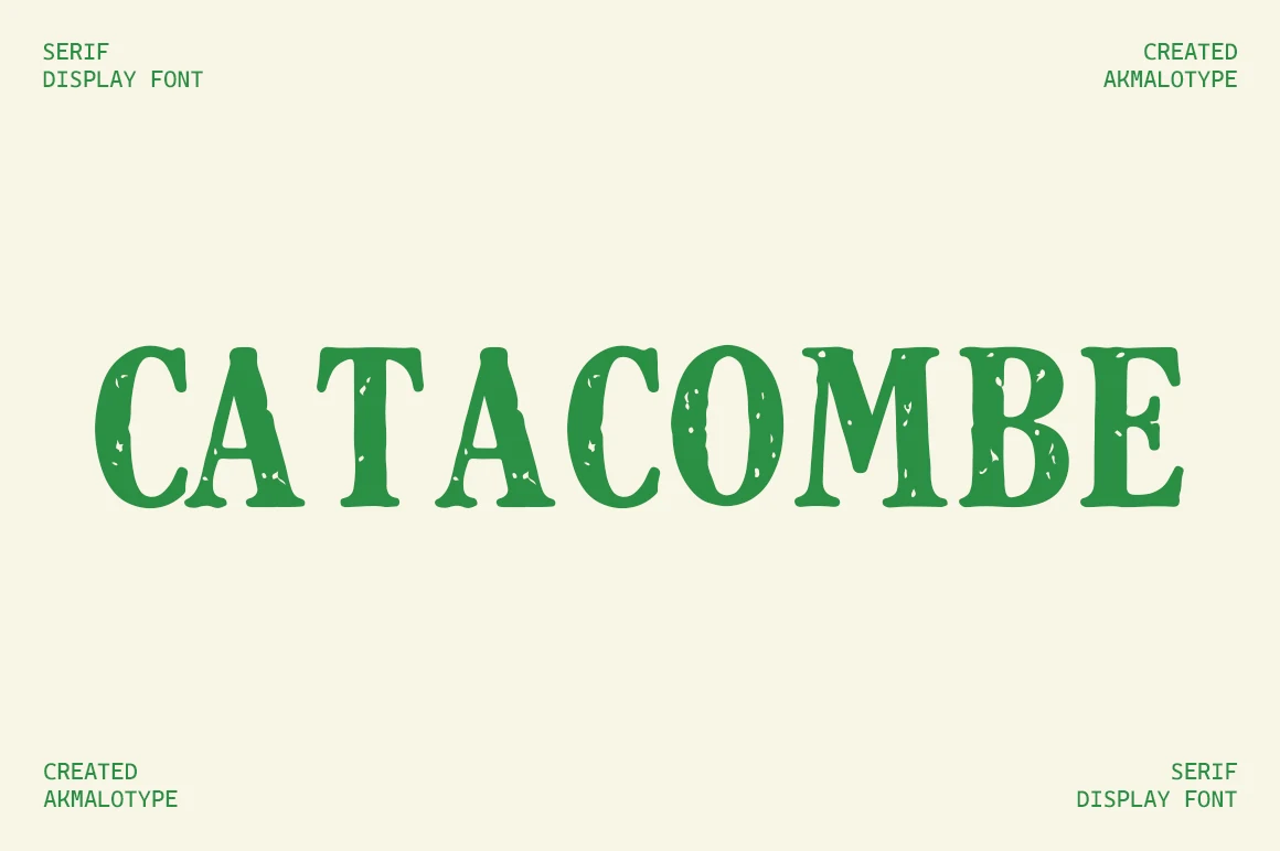
Best For: logos, quotes, display text, artistic designs
Catacombe Font has a bold serif structure with rounded slab-like weight, soft bracketed joins, and a worn stamp texture running through the strokes. The distressed gaps give the letters an aged printed feel while the broad uppercase shapes keep the wordmark easy to recognize.
Within Vintage Serif Fonts, Catacombe is best for layouts that need texture built directly into the type rather than added afterward. Use it at display sizes for logos, quotes, poster titles, and digital artwork; avoid tight small text, because the internal distress needs room to stay intentional.
Oldink Font
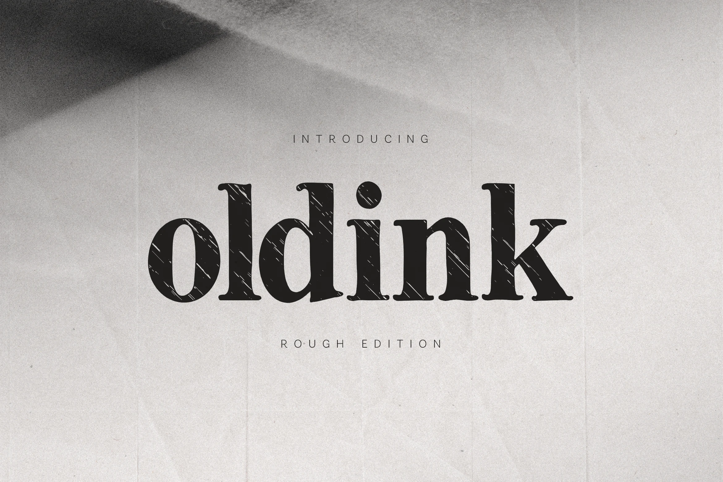
Best For: logos, book covers, quotes, display text
Oldink Font has a sturdy classic serif base with soft bracketed serifs, rounded bowls, and a dark worn-ink texture cut through the strokes. The rough scratches give each letter a printed, letterpress-like surface while the underlying shapes stay clear and readable.
Oldink is useful when Vintage Serif Fonts need real aged texture rather than a clean retro outline. Let it work in short titles, book-cover lettering, quotes, and logo marks; avoid dense small copy, because the distressed finish reads best when the letters have enough scale and contrast.
Conclusion
Choose refined vintage serif fonts for editorial and luxury layouts, bold retro serifs for posters and packaging, western styles for rugged signage, and textured serifs when the design needs an aged printed finish.