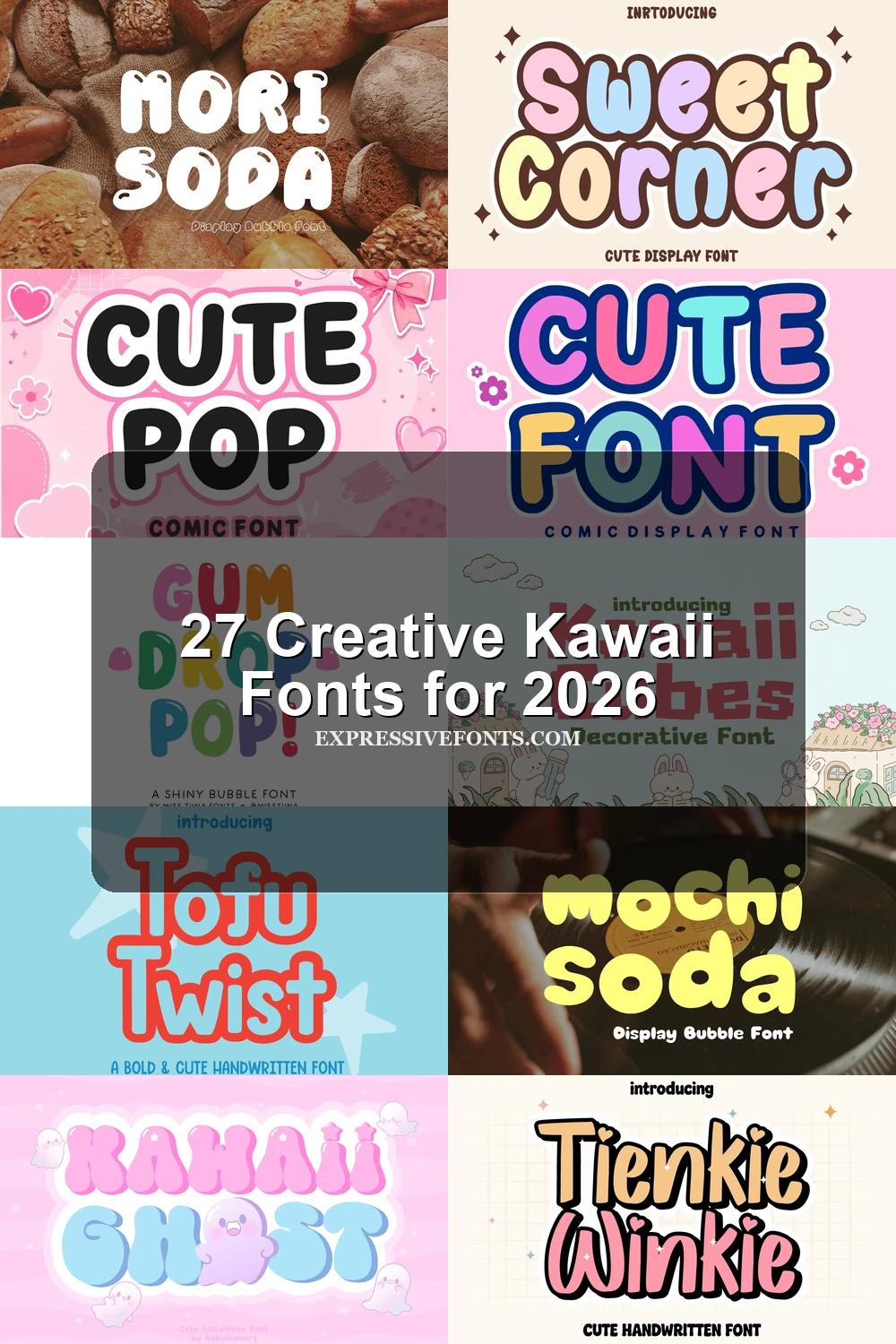
26 Creative Kawaii Fonts for 2026
This collection of Kawaii Fonts brings together cheerful bubble lettering, friendly handwritten styles, and playful character-inspired displays. Whether you are designing stickers, packaging, children’s projects, branding, social media graphics, invitations, or short headline text, these fonts add warmth and personality. Explore the categories below to find a soft, chunky, casual, or novelty style that suits your next creative project.
Browse by Category
Rounded Bubble Kawaii Fonts
These bold, inflated letterforms use soft curves and chunky proportions to create instantly cheerful displays for stickers, packaging, labels, branding, and children’s designs.
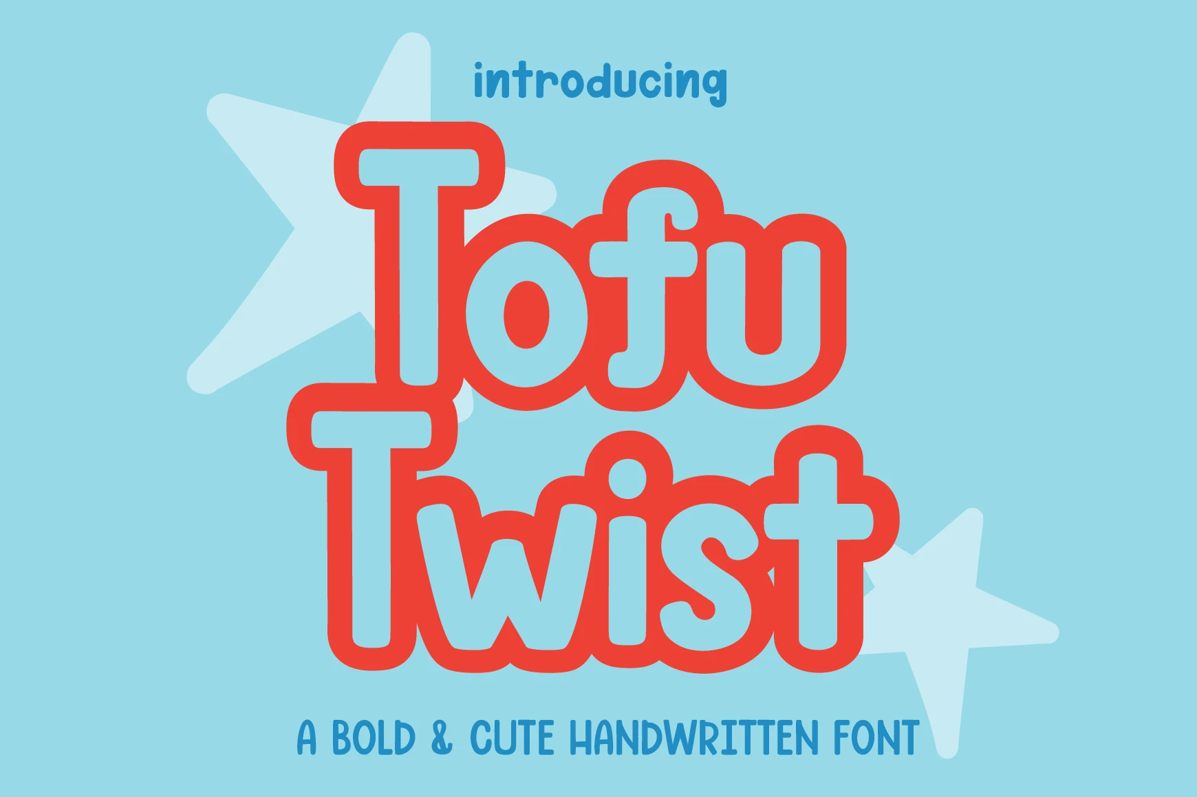
Tofu Twist Font
Best For: stickers, packaging, children’s designs, cute designs
Tofu Twist is a chunky handwritten display face with thick, monoline strokes, rounded terminals, and sturdy slab-like ends. Its upright forms and friendly proportions keep letters clear while giving titles, stickers, and children’s designs a cheerful, tactile presence.
That bubbly character makes it a natural fit for Kawaii Fonts collections, especially on short phrases, packaging, and social media graphics. Keep tracking slightly open so the heavy shapes do not crowd one another, and use a clean, contrasting background when the lettering needs to read quickly.
Pipo Soda Font
Best For: cute designs, playful designs, stickers, product labels
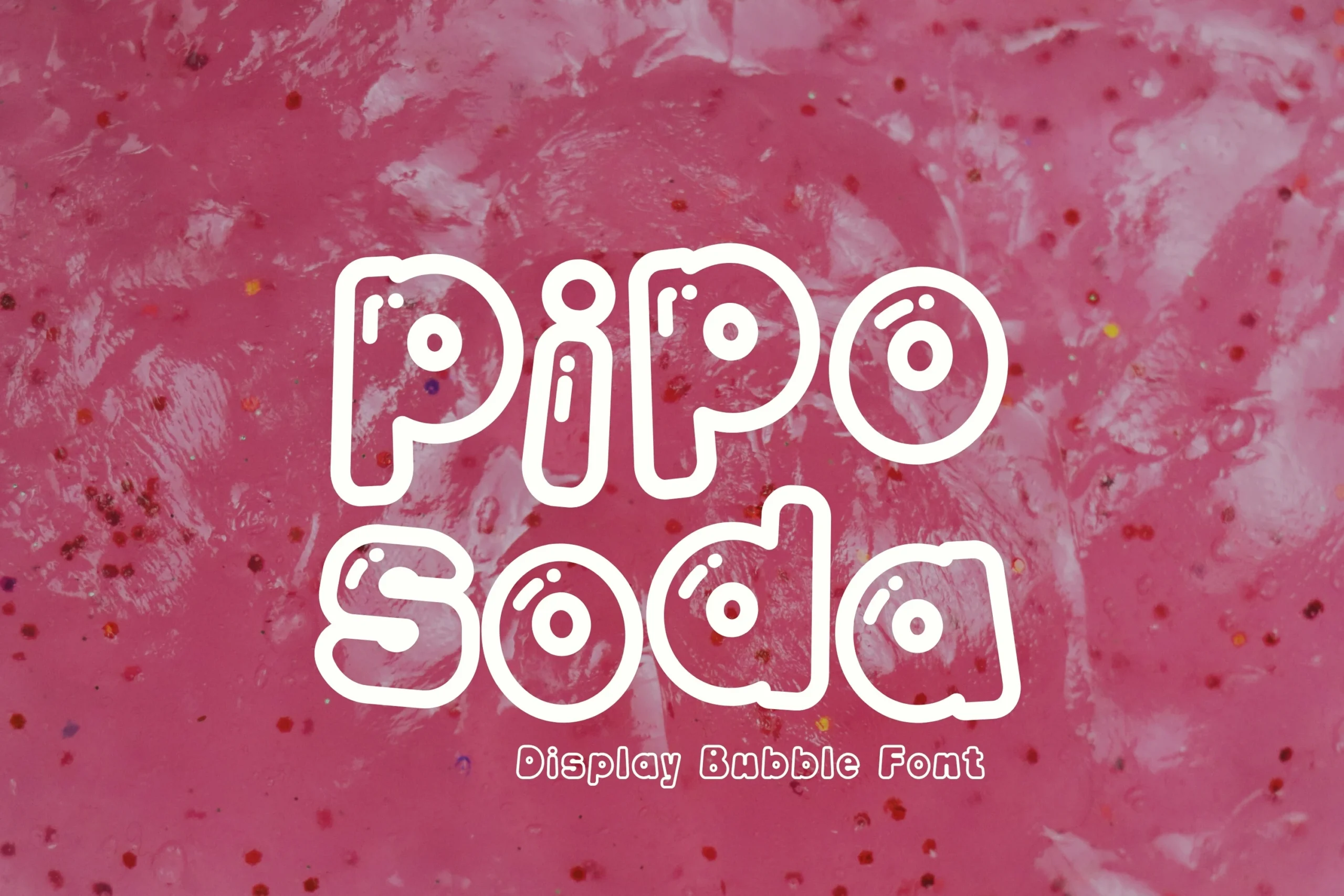
Pipo Soda is a cheerful bubble display font built from thick, monoline letterforms with soft rounded corners and pronounced circular cutouts. Its upright, disconnected shapes create a youthful cartoon feel, making it a natural fit within Kawaii Fonts and other playful visual styles.
The generous interior spaces keep short words clear at display sizes, though dense paragraphs may feel crowded. Use it for titles, stickers, or labels, and pair it with a lighter supporting sans serif to create a clear title hierarchy without competing with its rounded forms.
Bubblu Font
Best For: logos, branding, packaging, product labels
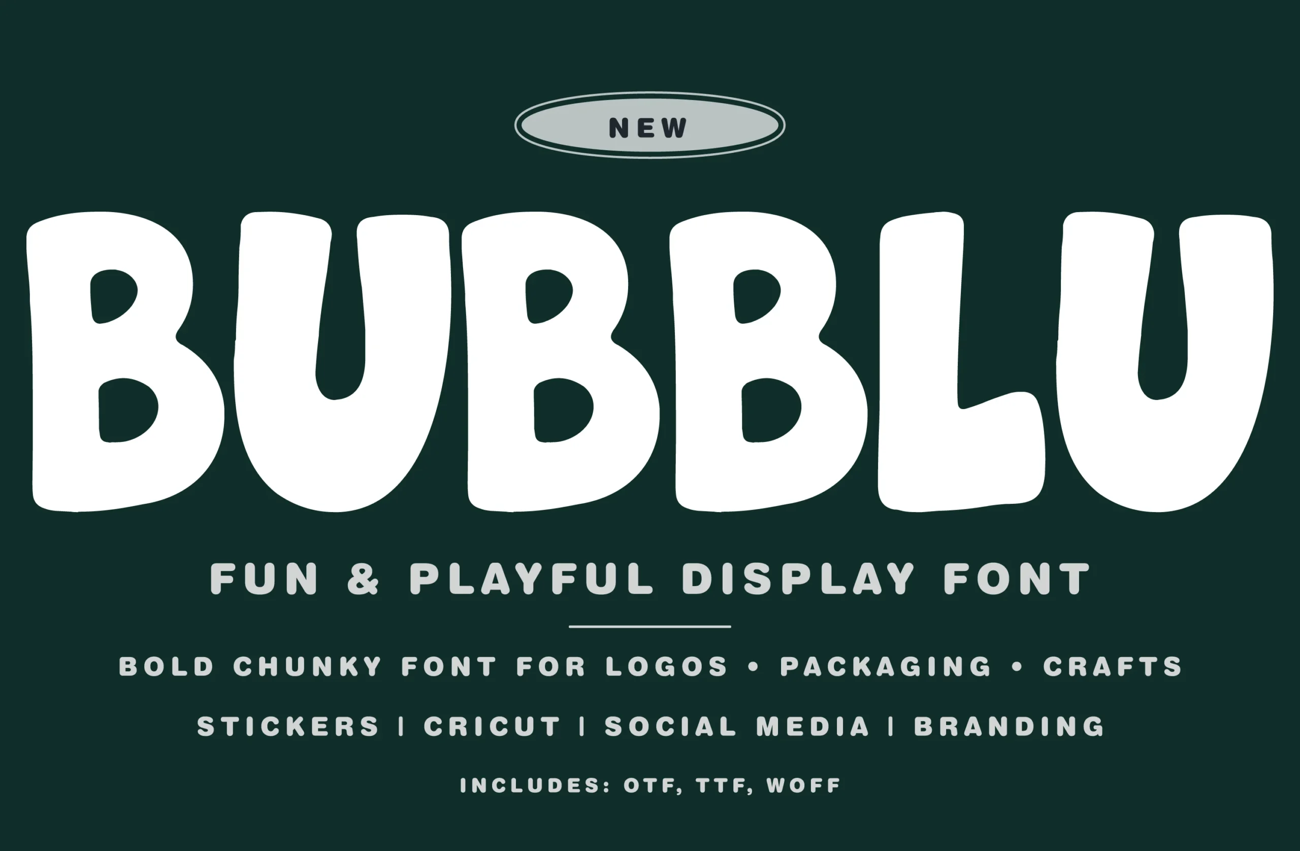
Bubblu Font turns thick, monoline strokes into wide, chunky lettering with soft rounded terminals and irregular organic curves. Its friendly bubble shapes and steady vertical structure give headlines a playful presence, making it a natural fit among Kawaii Fonts for cheerful visual work.
The heavy forms stay clear at display sizes, while their broad proportions can crowd narrow layouts. Keep tracking slightly open and use a lighter, clean supporting weight to preserve hierarchy; for small text, choose simpler lettering so Bubblu remains the visual anchor.
Kawaii Ghost Font
Best For: cute designs, children’s designs, logos, stickers
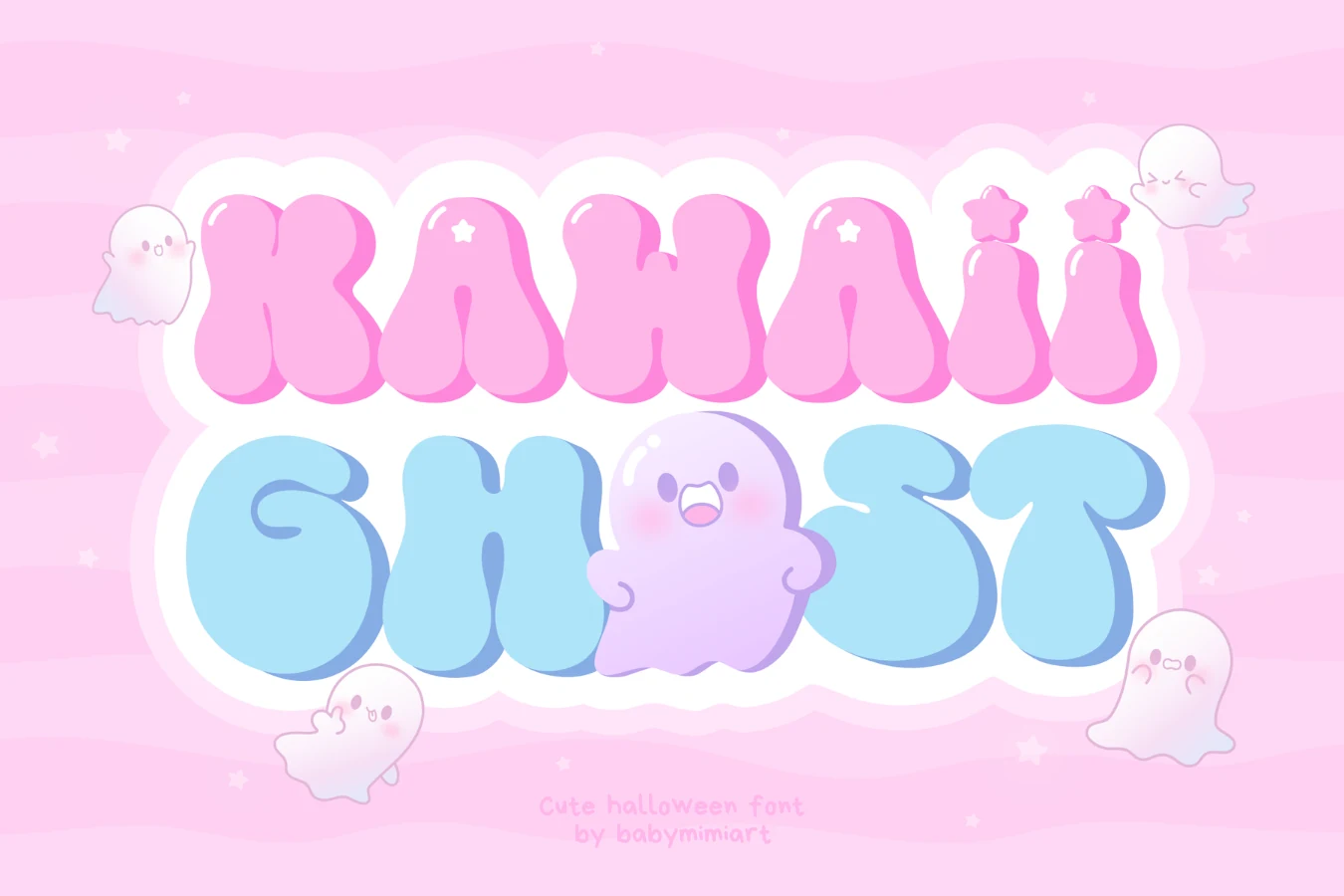
Kawaii Ghost Font captures the playful appeal associated with Kawaii Fonts through thick, rounded bubble letters and soft, irregular contours. The uniform weight keeps the shapes bold, while star-shaped accents on the lowercase i add a whimsical detail suited to children’s books, friendly logos, and greeting cards.
Its inflated forms are clearest at display sizes, as the limited interior space can reduce readability when scaled down. Use modestly open tracking and strong background contrast, especially for short headings, stickers, packaging, or other compact compositions.
Kai Font
Best For: children’s designs, playful designs, social media graphics, display text
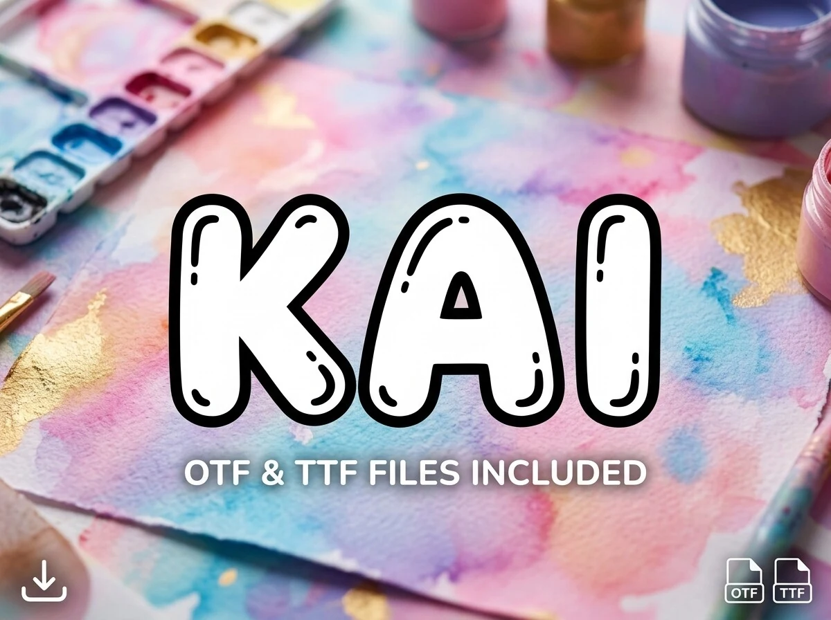
Kai Font turns lettering into rounded, inflated shapes with a monolinear weight, soft corners, inward-curving stems, and bold outer and inner outlines. Glossy balloon-like highlights add a cheerful 3D effect, while the disconnected characters keep the style casual and cartoon-inspired. It fits naturally among Kawaii Fonts when a design needs a friendly, youthful voice.
The heavy silhouette stays clear at display sizes, but its thick outline can crowd counters when reduced. Keep tracking slightly open and reserve Kai for short titles, labels, or prominent headers; use a lighter supporting text weight to maintain hierarchy and preserve contrast against the background.
Cute Pop Font
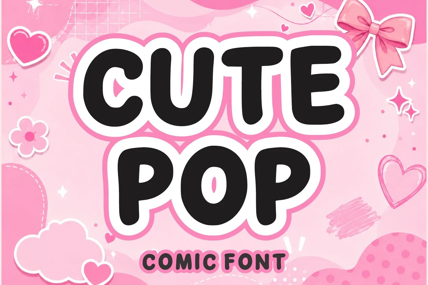
Best For: stickers, children’s designs, packaging, playful designs
Cute Pop Font brings a cheerful comic feel through bold, monoline letterforms, rounded terminals, and compact proportions. Its soft, bubbly shapes stay clear in headlines and short phrases, while the upright structure gives the lettering a steady, friendly rhythm.
A natural fit for Kawaii Fonts projects, it works especially well in stickers, children’s designs, packaging, and playful branding. The close spacing can look crowded at small sizes, so add a little tracking when setting longer words or placing the type over detailed backgrounds.
Gum Drop Pop Font
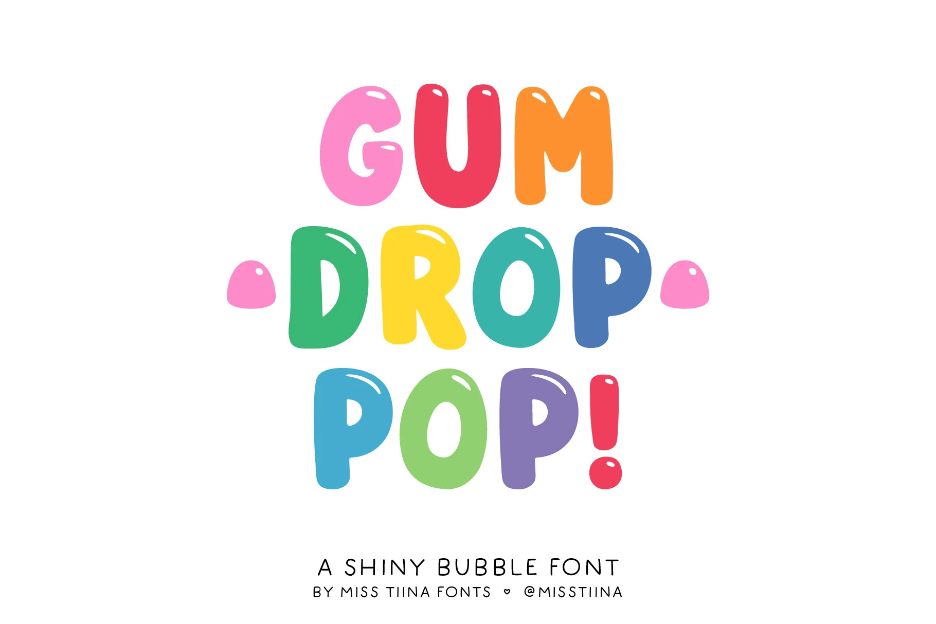
Best For: playful designs, cute designs, stickers, packaging
Gum Drop Pop turns lettering into chunky, inflated shapes with soft curves, closed apertures, and a steady monoline weight. Glossy internal highlights reinforce the candy-like volume, while the disconnected letters keep the mood cheerful and informal—an exuberant entry among Kawaii Fonts.
The broad forms read clearly in large display settings, but tight spacing can blur at smaller sizes. Open the tracking slightly for short titles, then pair the bold lettering with lighter supporting text and strong background contrast.
Noby Font
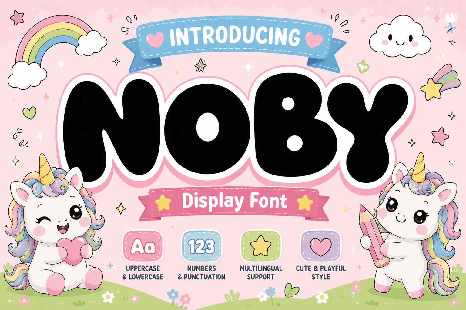
Best For: children’s designs, cute designs, playful designs, stickers
Noby brings the rounded energy associated with Kawaii Fonts through wide, bubble-like letters, heavy monoline strokes, and soft, blunt terminals. The generous proportions and cheerful rhythm give it a friendly, childlike presence that suits bold visual statements.
Use it for short titles, labels, and display text rather than dense copy, where its thick construction can reduce clarity at small sizes. Pair the lettering with lighter supporting text and a contrasting background to preserve hierarchy and keep the rounded forms easy to read.
Mochi Soda Font
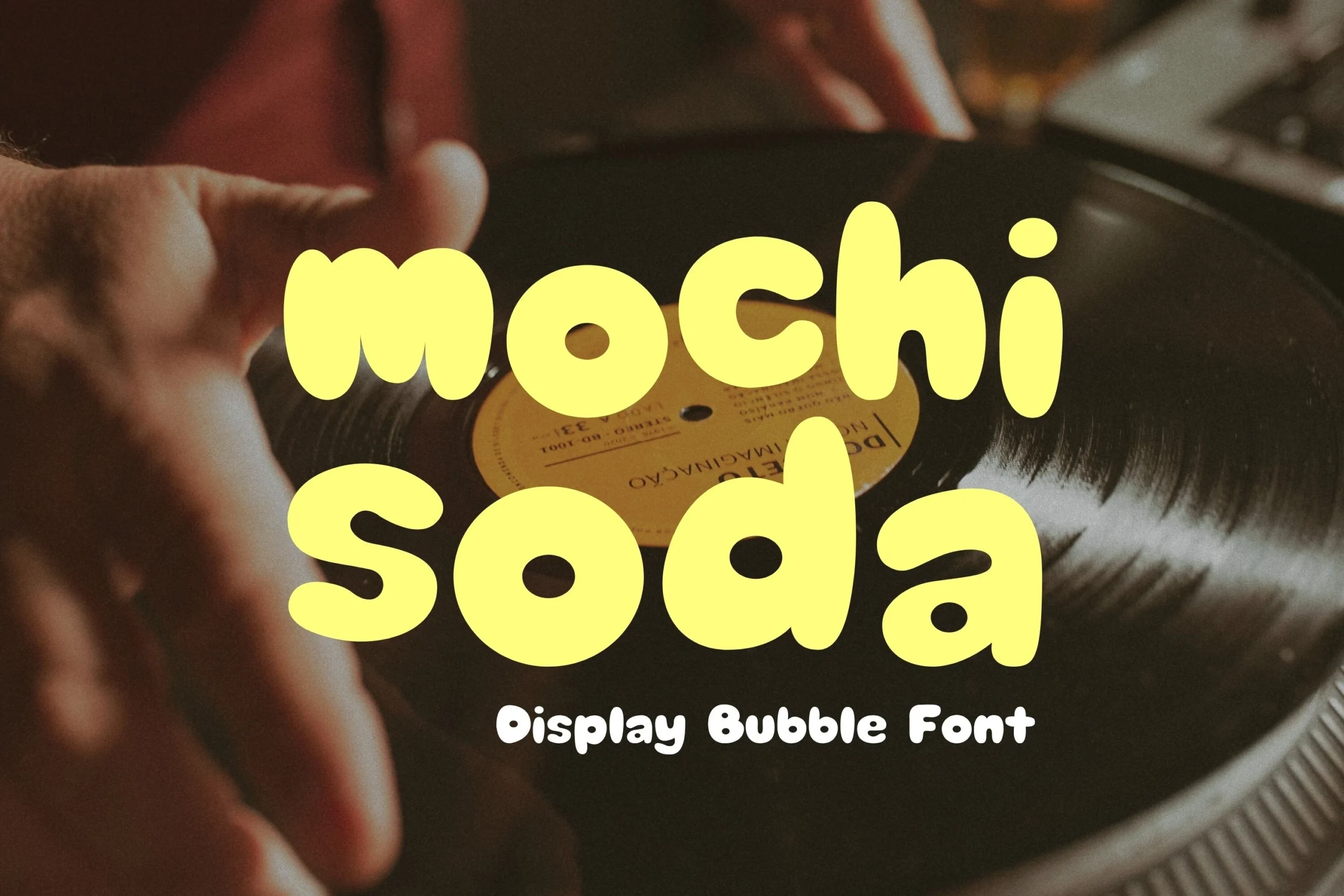
Best For: cute designs, playful designs, stickers, display text
Mochi Soda Font brings a soft, cartoon-inspired feel to Kawaii Fonts with ultra-bold, pill-shaped letters, bulbous terminals, and enclosed circular counters. Its even stroke weight and low contrast create a friendly, approachable look with strong visual presence.
The rounded forms stay clear at display sizes, while tight spacing and thick strokes can reduce clarity when scaled down. Keep tracking slightly open in compact titles and use a lighter supporting weight to preserve hierarchy in busy layouts.
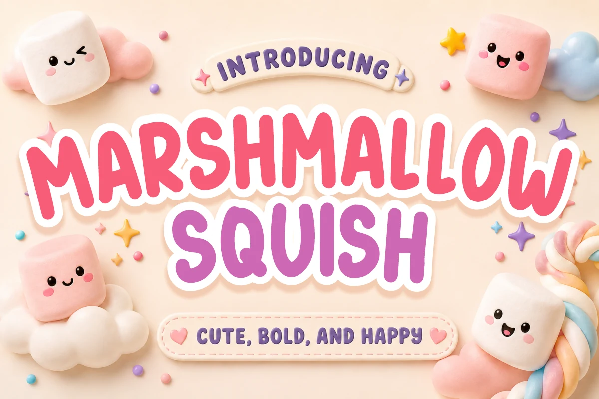
Marshmallow Squish Font
Best For: packaging, stickers, children’s designs, playful designs
Marshmallow Squish is a plump display sans-serif with chunky geometric proportions, rounded terminals, and a consistent monoline stroke. Its exaggerated curves and soft edges create the cheerful, approachable character associated with Kawaii Fonts, while the bold shapes remain clear in prominent lettering.
Use it for short headlines, labels, and other display work rather than dense copy, since the heavy forms can lose detail at small sizes. Slightly increased tracking can keep rounded letters from feeling crowded, while a lighter supporting text weight and strong background contrast will preserve hierarchy and readability.
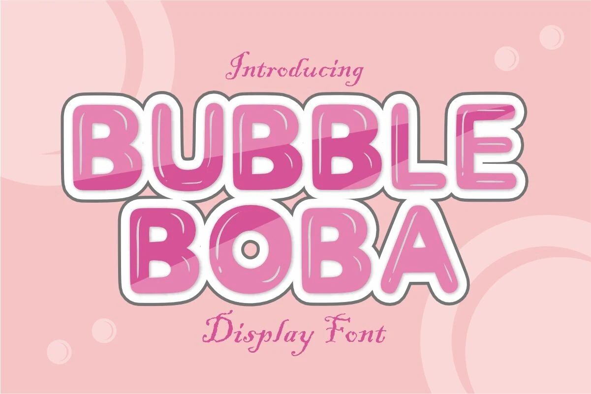
Bubbleboba Regular Font
Best For: packaging, product labels, children’s designs, playful designs
Bubbleboba Regular Font turns oversized, rounded letters into glossy balloon-like shapes, with thick strokes, soft curves, gradient shading, and bright highlights that suggest gummy candy. The white outline and subtle shadow help each character stay distinct, while the inflated proportions give Kawaii Fonts a cheerful, youthful personality.
Best suited to display text, it reads clearly in large headlines but can lose detail when reduced because of its dimensional highlights and shadows. Keep tracking moderate and place it on a calm, contrasting background so the glossy texture remains visible without crowding nearby supporting text.
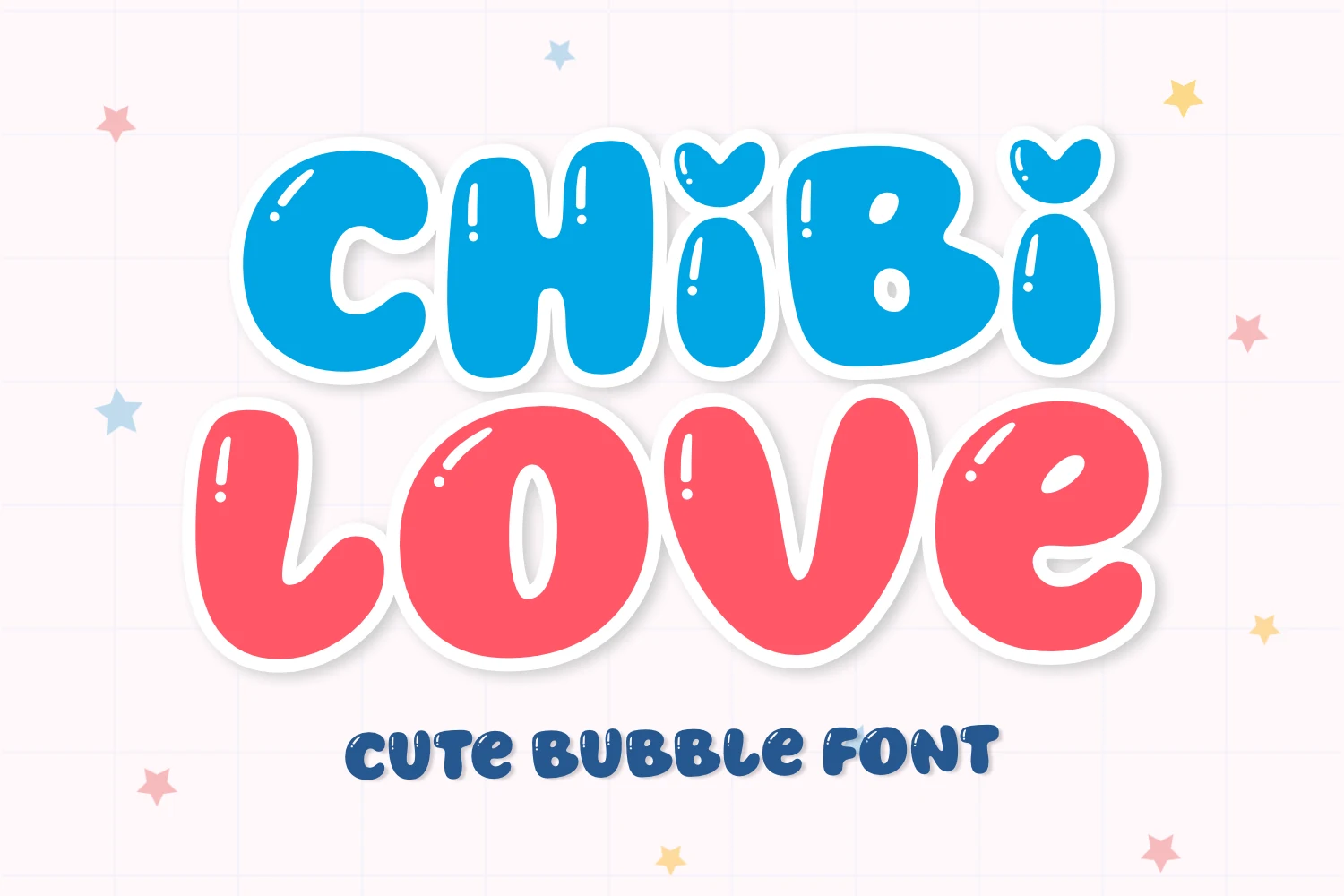
Chibi Love Font
Best For: cute designs, playful designs, social media graphics, invitations
Chibi Love brings inflated, bubble-like letters, soft curves, and a heavy, even stroke to expressive display work. Heart-shaped accents on the ascenders add a cheerful detail, while the compact counters and rounded construction give it a distinctly whimsical character. Chibi Love fits the Kawaii Fonts aesthetic especially well for affectionate, upbeat messages.
Because its forms are dense and highly rounded, it reads best in large titles, short phrases, and bold graphics rather than paragraphs. Give the letters modest extra tracking so adjacent shapes do not crowd together, and place them against a clear, contrasting background; a lighter, simpler supporting text style will preserve the title hierarchy.
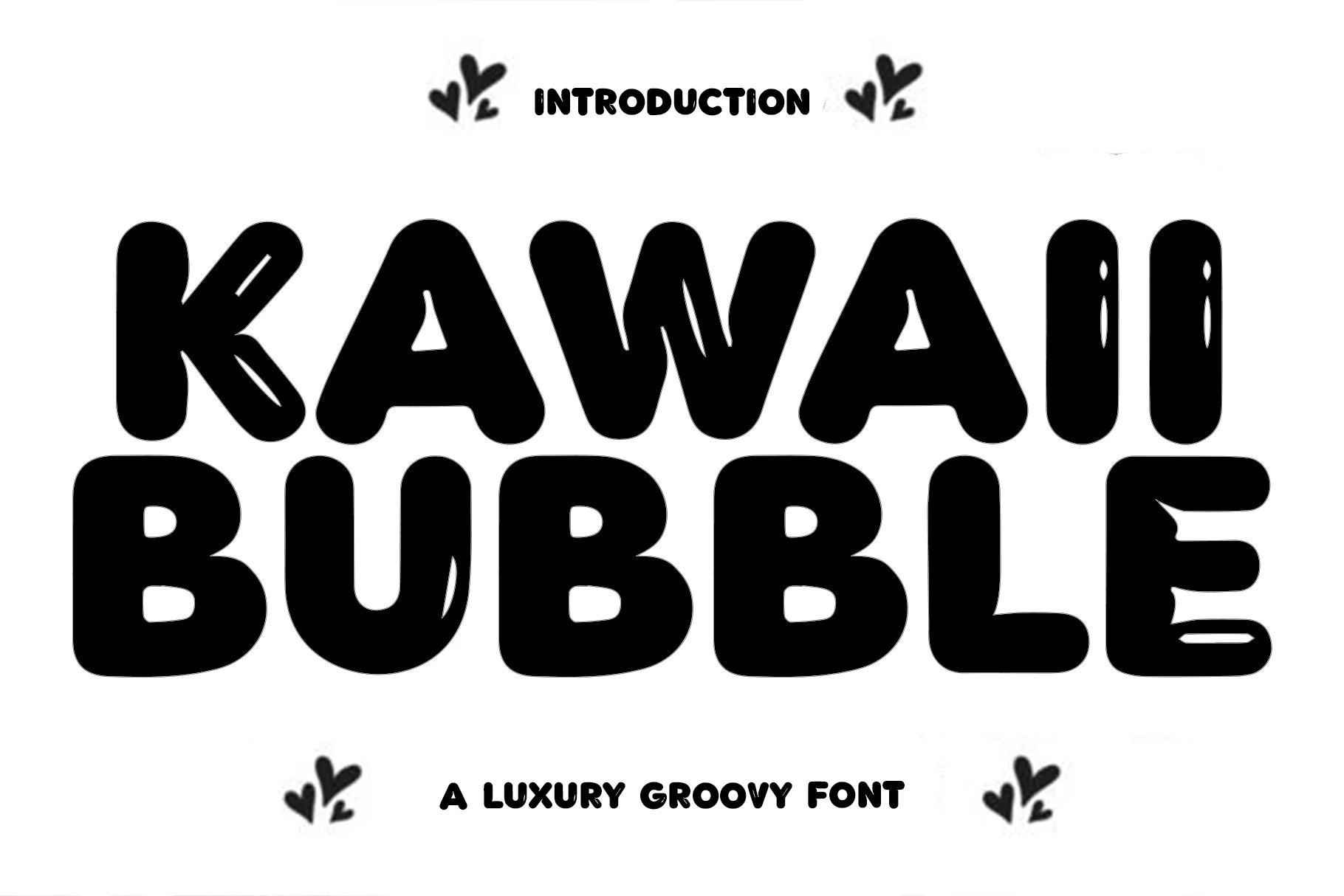
Kawaii Bubble Font
Best For: cute designs, playful designs, social media graphics, posters
Kawaii Bubble Font packs a friendly, hand-drawn feel into compact, blocky letters with rounded terminals and a heavy, even stroke. Small highlight accents cut through the forms, giving the lettering a playful sense of volume while keeping the shapes clear at display sizes.
Its place among Kawaii Fonts comes from the bold, bubbly rhythm and slightly retro personality. Open the tracking a little when setting several words together, since the naturally tight spacing can reduce clarity at smaller sizes; it works best for short, prominent phrases supported by lighter text.
Cute Bubbly Font
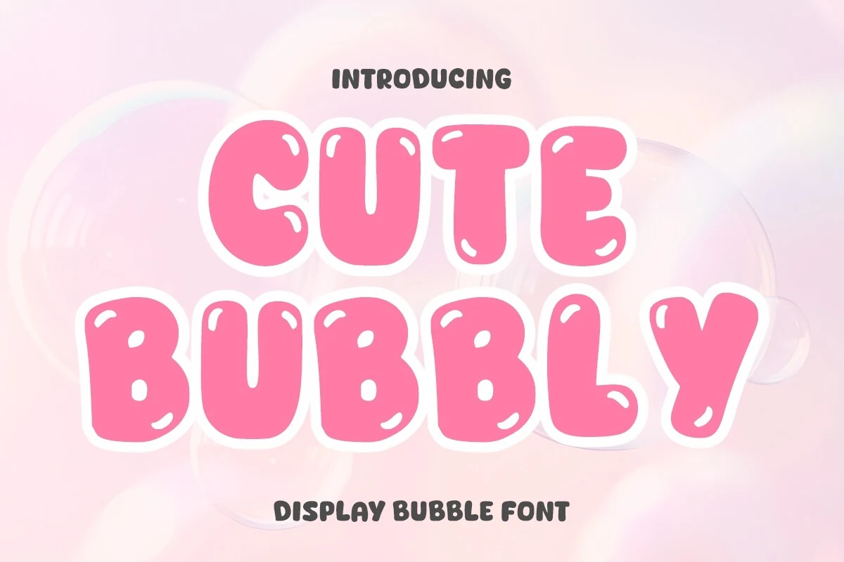
Best For: logos, packaging, posters, children’s designs
Cute Bubbly brings the rounded cheer associated with Kawaii Fonts through thick, monoline uppercase letters, bulbous curves, soft terminals, and generous counters. Small highlight accents inside the strokes reinforce its inflated, glossy character, while the wide proportions keep short titles lively and easy to recognize.
Use it for short titles rather than dense copy, since the simplified shapes lose some clarity at small sizes. Keep tracking slightly open, pair the heavy lettering with lighter supporting text, and maintain strong background contrast so its rounded forms stay crisp.
Sweet Corner Font
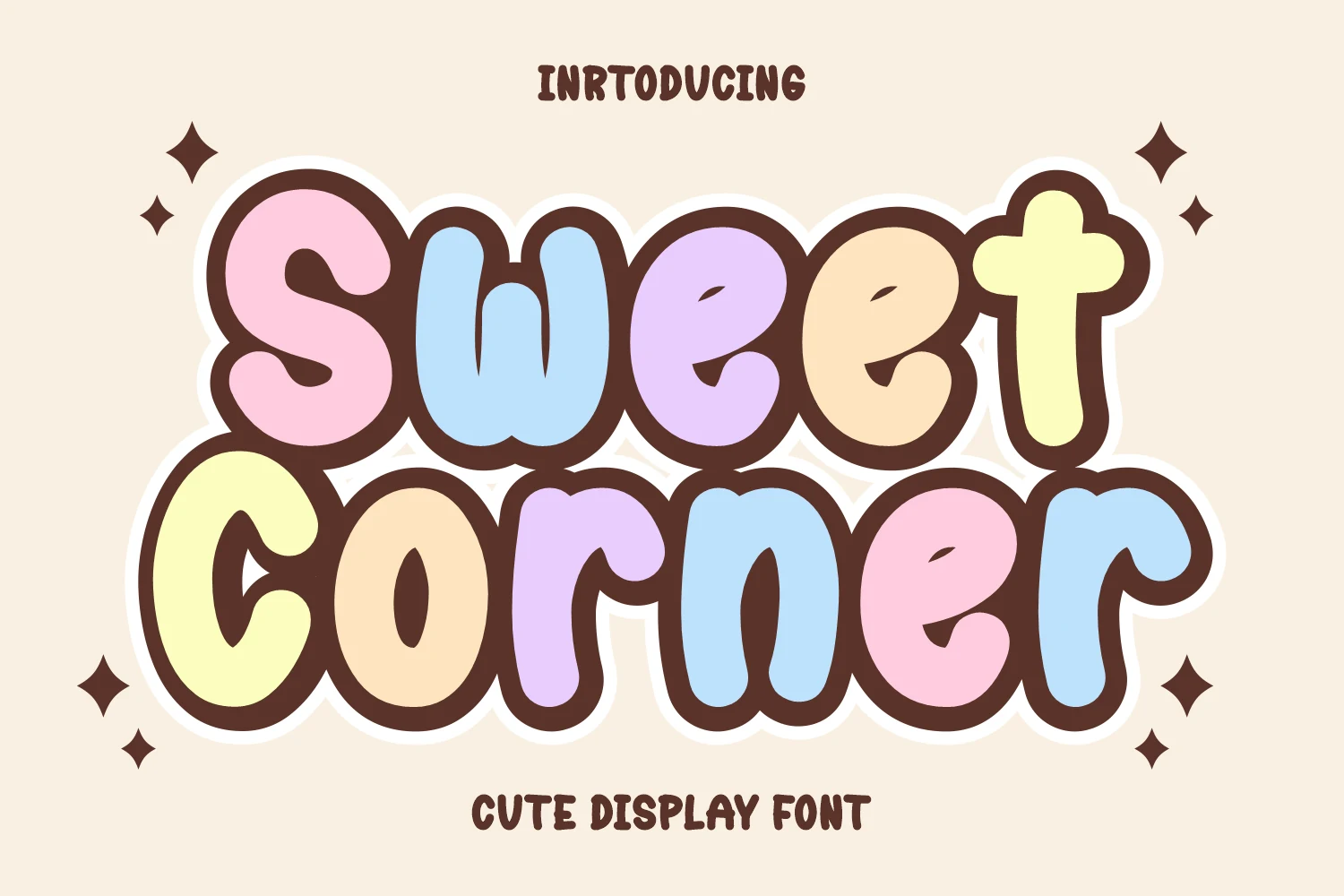
Best For: cute designs, playful designs, stickers, display text
Sweet Corner brings oversized, blob-like letters with a bold, even stroke and pastel fills framed by a thick dark outline. Its rounded shapes and cheerful proportions make it a natural fit for Kawaii Fonts, especially when a title needs a friendly, youthful personality.
The heavy outline and tight spacing give the lettering strong display impact, but some counters nearly disappear at small sizes. Keep tracking slightly open and reserve it for short phrases, pairing longer supporting copy with a lighter, cleaner typeface for contrast.
Mori Soda Font
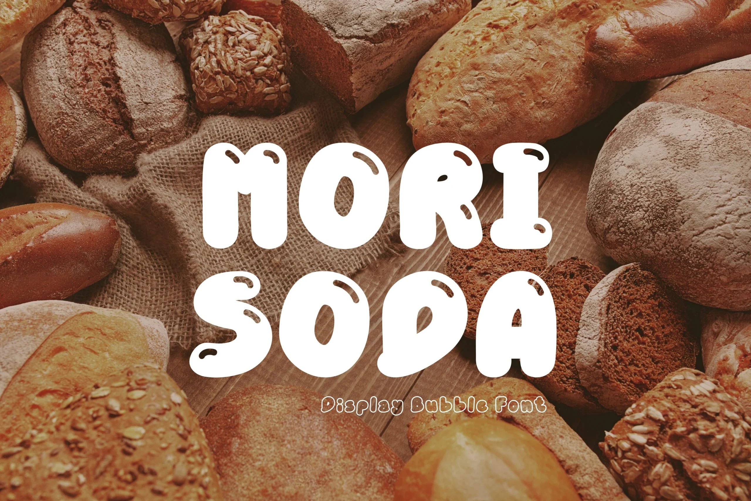
Best For: branding, packaging, social media graphics, stickers
Mori Soda uses chunky, upright letterforms with uniformly thick strokes, rounded edges, and an inflated bubble shape. Its very high x-height and enclosed counters create a soft, youthful look, while the disconnected glyphs keep each character clear and distinct.
A natural choice for Kawaii Fonts, it brings friendly energy to logos, stickers, packaging, and social media graphics. Keep the lettering prominent and give it generous spacing; its small apertures can lose clarity when reduced, so pair it with lighter supporting text and strong background contrast.
Handwritten Kawaii Fonts
With bouncy baselines, informal shapes, and approachable details, these softer styles bring a personal touch to quotes, stickers, apparel, invitations, planners, and social content.
Berlien Cupcake Font
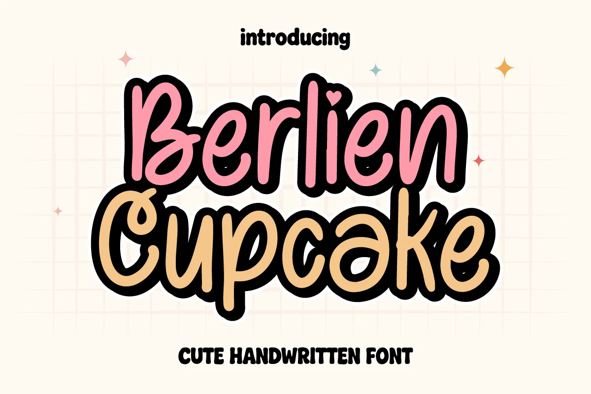
Best For: cute designs, stickers, merch design, short phrases
Berlien Cupcake Font is a cheerful handwritten option for Kawaii Fonts, with thick monoline strokes, rounded terminals, and a bouncy baseline that keeps each word lively. Its disconnected, bubble-like characters create a casual rhythm, while the strong outline contrast helps the lettering hold its shape in display compositions.
Use it for short phrases, stickers, or merch design where its playful proportions can be read clearly. Slightly generous tracking will help separate the rounded characters, especially when the lettering is layered over a busy background or reduced from a large title size.
Tienkie Winkie Font
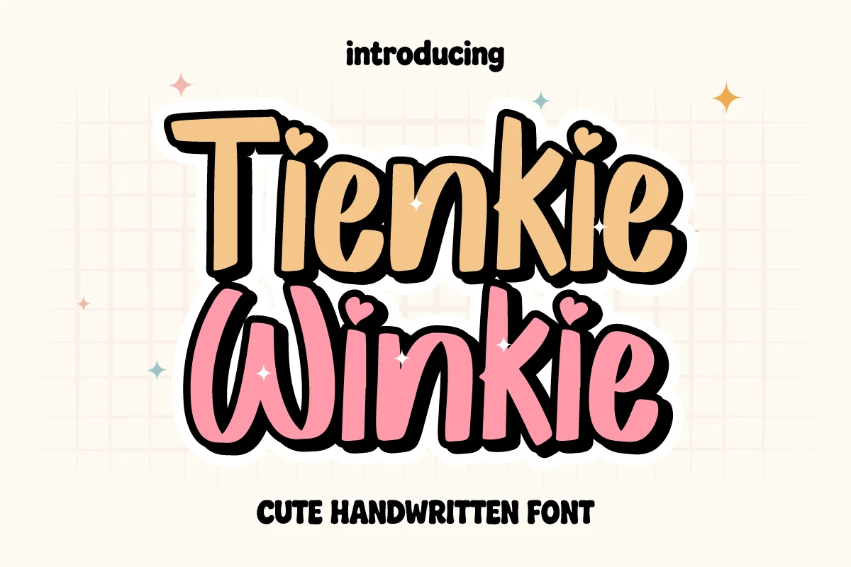
Best For: cute designs, stickers, T-shirts
Tienkie Winkie uses chubby, rounded letterforms with thick strokes, soft terminals, and an informal hand-drawn rhythm. Disconnected characters sit on gently varied baselines, while tiny heart-shaped accents replace the dots on letters such as i and j, giving the lettering a cheerful Kawaii Fonts feel.
Its bold shapes stay clear in large display settings, making it well suited to short phrases rather than dense text. Keep tracking slightly open when letters are scaled down, and use strong background contrast so the rounded forms and heart details remain easy to see.
Kawaii Font
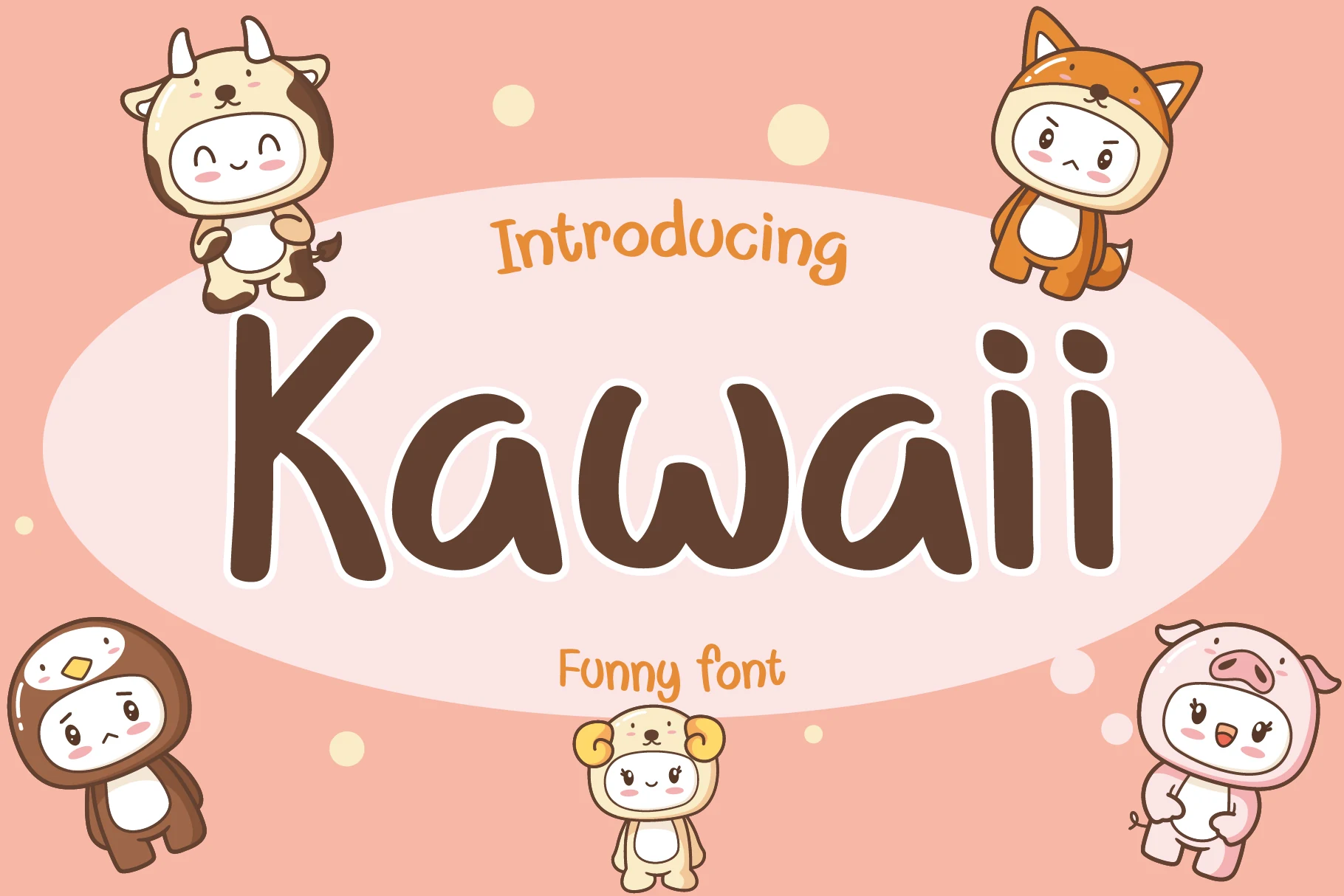
Best For: cute designs, playful designs, display text, social media graphics
Kawaii is a bold, rounded display sans-serif with uniform strokes, soft terminals, and an upright shape that feels playful and approachable. Its clear letterforms and open, friendly proportions make Kawaii Fonts a natural fit for short, high-impact wording.
Use it for titles, labels, and cheerful graphic text where a casual handwritten spirit is welcome without sacrificing readability. Keep tracking slightly open and pair the strong weight with lighter supporting text to create a clear title hierarchy, especially in compact layouts.
Shortcake Strawberry Font
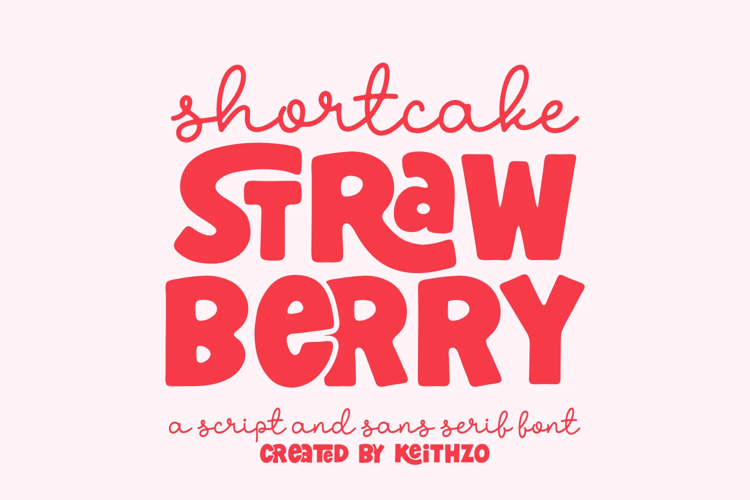
Best For: cute designs, packaging, stickers, children’s designs
Shortcake Strawberry Font brings a cheerful kawaii character to the page with thick, bubbly strokes, soft rounded edges, and irregular hand-drawn proportions. Its organic curves and friendly shapes give headings, labels, and short phrases an upbeat, homemade feel without losing the bold presence needed for display work.
As a standout among Kawaii Fonts, it suits cute packaging, stickers, and children’s designs. Keep tracking slightly open when the rounded forms appear crowded, and set the lettering against a clean, high-contrast background so its chunky shapes remain clear at smaller display sizes.
Characterful Kawaii Fonts
These distinctive displays add pixel-inspired structure, comic energy, decorative accents, or whimsical silhouettes to headlines, posters, logos, stickers, and playful branding.
Kawaii Cubes Font
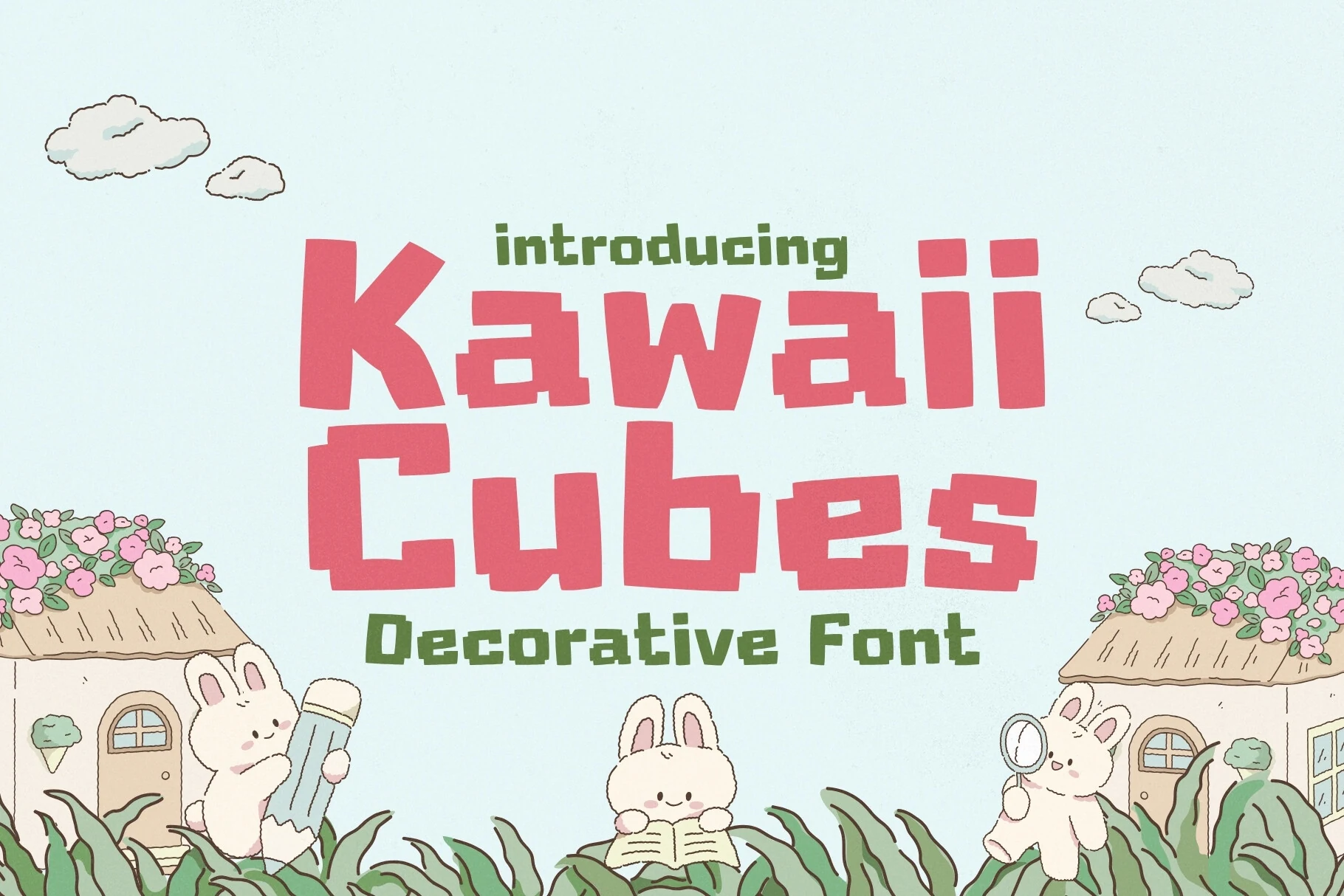
Best For: stickers, children’s designs, social media graphics, playful designs
Kawaii Cubes Font turns classic pixel geometry into a friendly display style. Its thick, uniform strokes, square-based forms, and right-angle terminals create a bold retro-digital look, while the softened proportions keep the lettering cheerful rather than harsh. The chunky shapes read clearly in titles and short phrases.
Its playful pixel character suits Kawaii Fonts projects such as stickers, children’s designs, and social graphics. Keep tracking modest and align the lettering carefully to preserve its block rhythm; at very small sizes, fine details can merge, so use strong scale contrast and a lighter supporting weight for secondary copy.
Chibi Eminem Font
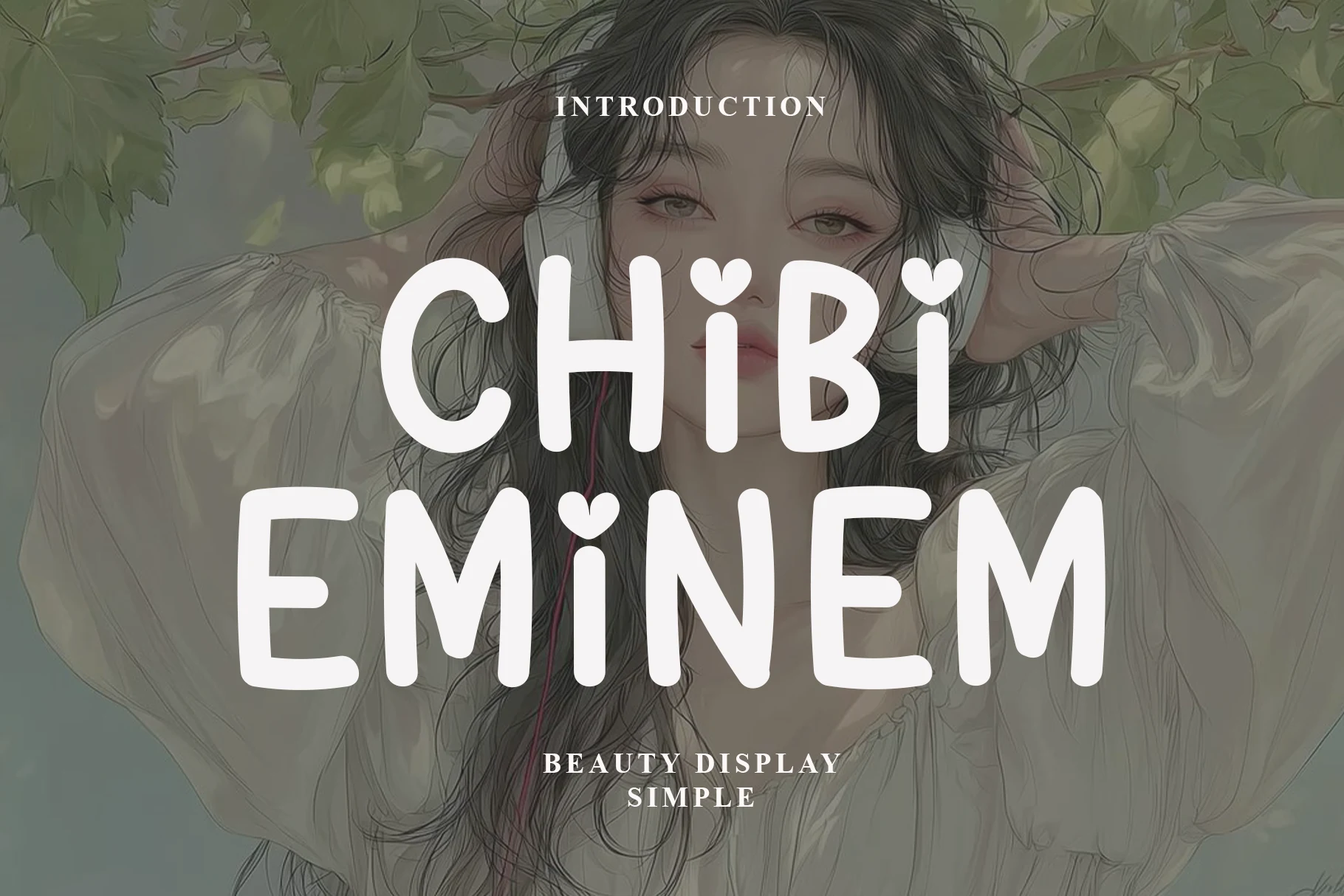
Best For: logos, branding, playful designs, cute designs
Chibi Eminem has a rounded sans-serif shape, uniform monoline strokes, and softly curved terminals that keep each character clear and approachable. Heart-shaped dots over the i add the cheerful charm associated with Kawaii Fonts, giving titles, quotes, and logo lettering a playful signature.
Its simple proportions support strong readability in display settings, while the informal details keep the mood friendly rather than formal. Use moderate tracking to preserve the rounded rhythm, and pair it with lighter supporting text so the featured lettering remains the focus in branding or short phrases.
Fox Chibi Font
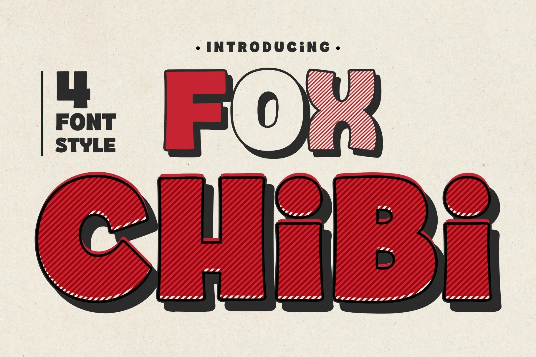
Best For: cute designs, playful designs, stickers, children’s designs
Fox Chibi Font has chunky, wide sans-serif letters with heavy, even strokes, rounded corners, and cheerfully exaggerated proportions. The disconnected forms and dimensional shadow give it a comic-book presence, making it a lively choice among Kawaii Fonts for titles, labels, and other display work.
Its solid, outlined, and diagonal-hatched treatments add graphic variety, while the dense shapes stay clearest at generous sizes. Keep tracking slightly open and use strong background contrast; the bold forms suit short wording better than compact paragraphs or busy layouts.
Cute Font
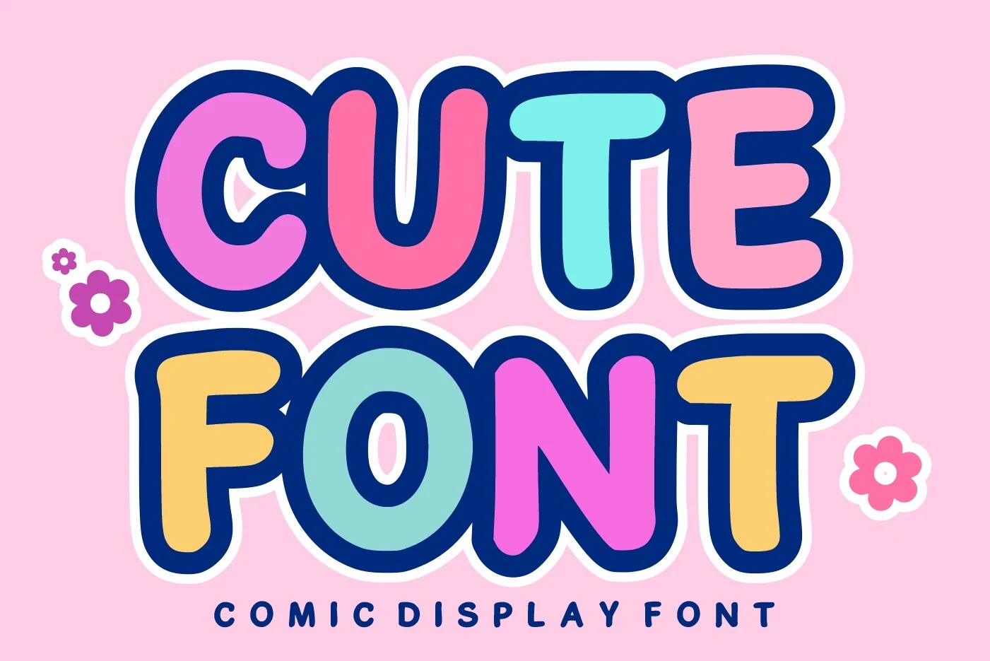
Best For: playful designs, cute designs, children’s designs, stickers
Cute Font uses oversized, bubble-like letterforms with rounded terminals, closed shapes, and a bold monoline stroke. Its upright structure and cheerful cartoon character make it a natural fit for Kawaii Fonts projects that need a friendly, attention-grabbing voice.
The compressed spacing keeps titles compact, but the heavy strokes can crowd together when reduced. Loosen the tracking slightly and use Cute Font for prominent headlines, labels, or short phrases, with a lighter supporting sans serif to establish clear hierarchy.
Kawaii Cloud Font
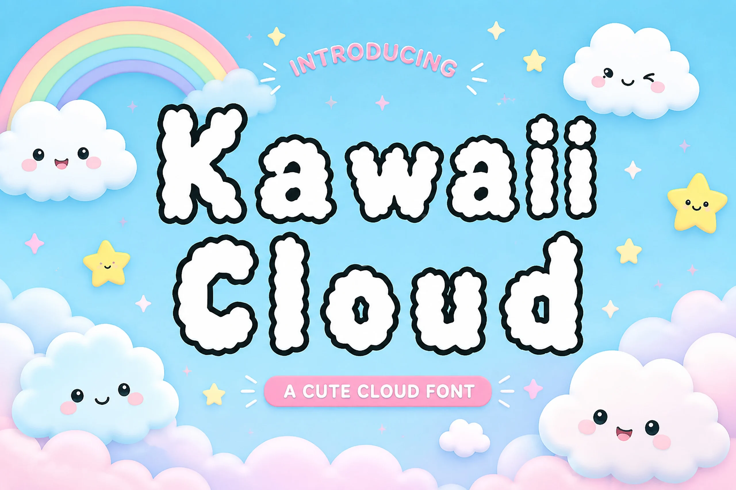
Best For: cute designs, children’s designs, stickers, headlines
Kawaii Fonts often lean sweet and rounded, and Kawaii Cloud captures that mood with thick, upright letters shaped by puffy contours and irregular, bumpy edges. Its bold, uniform strokes and hand-drawn character create a cheerful display style, while the separated forms keep each letter visually distinct.
Because the cloud-like silhouettes reduce legibility in compact settings, reserve Kawaii Cloud for headlines, stickers, logos, and other short phrases. Use generous spacing and strong background contrast, then set supporting text in a simpler, lighter-weight style so the rounded title remains the clear focal point.
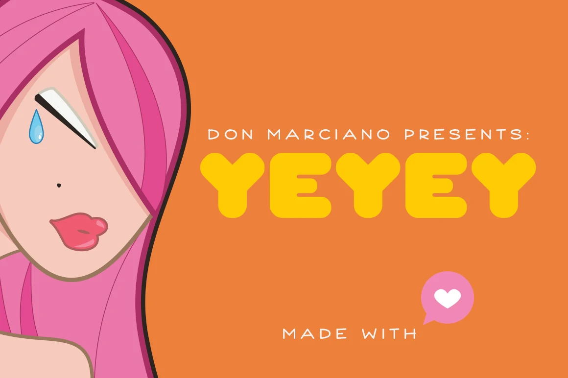
Yeyey Font
Best For: cute designs, playful designs, stickers, headlines
Yeyey Font is a kawaii revival display face shaped by the chubbiness of iconic kawaii characters. Its heavy monolinear strokes, rounded terminals, and broad geometric curves create a friendly bubble-like silhouette with clear, sturdy letterforms.
For Kawaii Fonts, slightly generous tracking helps separate the substantial shapes without weakening their compact rhythm. Keep Yeyey Font in a strong title hierarchy with lighter supporting text, using it for headlines, logos, stickers, and other short display phrases rather than dense copy.
Conclusion
Choose the rounded bubble category for bold, sugary display lettering, the handwritten group for a warmer personal feel, or the characterful styles for more distinctive visual personality. Together, these Kawaii Fonts make it easy to match playful typography with everything from children’s designs and packaging to stickers, branding, and social graphics.