19 Stunning Elegant Sans Serif Fonts to Use in 2026
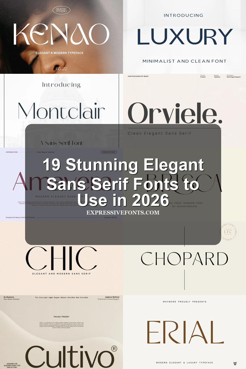
Elegant Sans Serif Fonts bring refined curves, clean structure, and fashion-led character to logos, packaging, invitations, magazine covers, and digital branding. This collection helps designers compare bold sculpted faces, Art Deco styles, minimal letterforms, and high-contrast display options for polished visual identities.
Bold & Sculpted Elegant Sans Serif Fonts
These confident display faces combine substantial strokes with sculpted curves, making them effective for statement logos, packaging, headlines, and prominent brand names.
Affigue Font
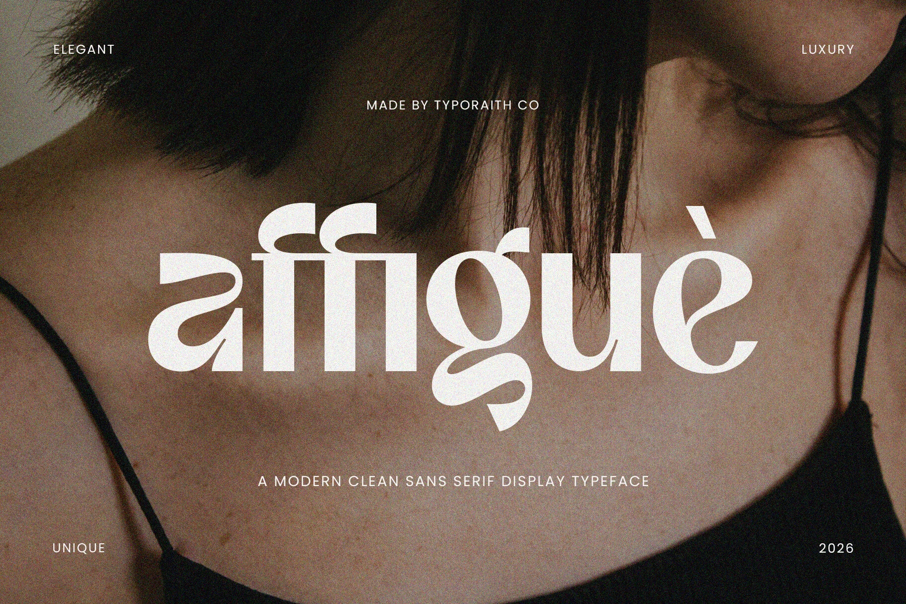
Best For: fashion branding, beauty branding, luxury designs, editorial designs
Affigue Font has a bold, soft display structure with sculpted curves, compact vertical stems, and decorative cuts that give the lowercase forms a polished fashion-editorial rhythm. Its rounded counters and sweeping terminals keep the wordmark feeling refined rather than rigid, placing it firmly within Elegant Sans Serif Fonts for luxury-facing layouts.
Use it where the type needs to act as the main visual element: logos, magazine covers, beauty packaging, and short poster titles. The tight, ornamental shapes work best with controlled letter spacing and strong contrast, so avoid crowding it with busy supporting text or long copy blocks.
Heroes Font
Best For: logos, branding, invitations, wedding designs
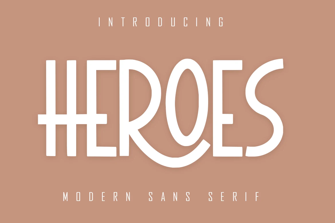
Heroes Font has a bold modern sans shape with wide vertical strokes, clean white-space cuts, and a theatrical curve through the R and O. The letters feel polished rather than neutral, with enough Art Deco tension to fit Elegant Sans Serif Fonts without becoming ornate.
Use it where the wordmark needs a clear focal point: logos, invitations, and social media headers. The heavy shapes benefit from generous tracking around short words, while lighter supporting text should stay secondary so the main letterforms keep a controlled hierarchy.
Orviele Font
Best For: logos, beauty branding, fashion branding, editorial designs
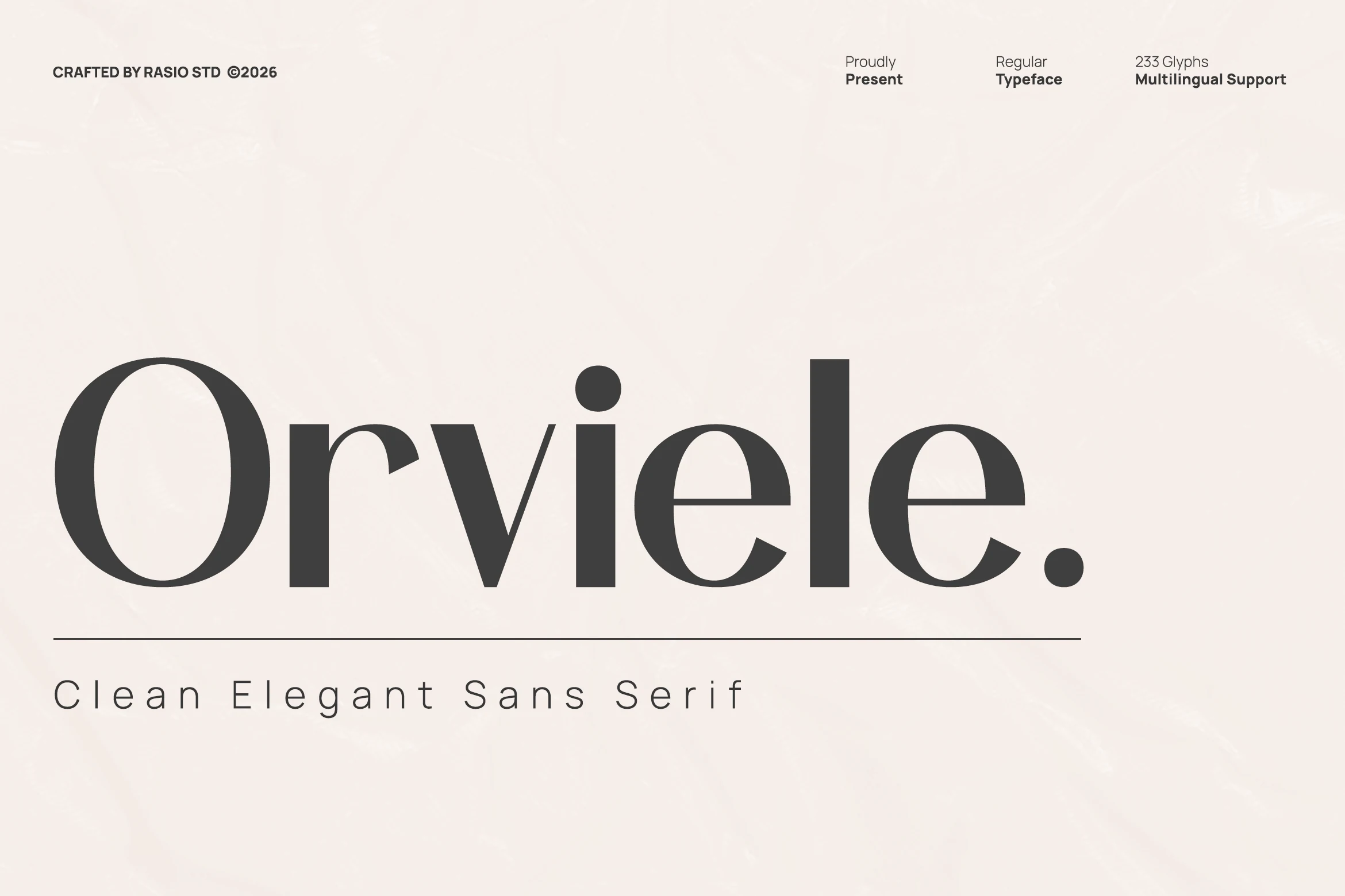
Orviele Font has the kind of sharp restraint that makes a wordmark feel expensive at a glance. Its tall proportions, deep stroke contrast, and broad curves give the letters a polished editorial rhythm, placing it comfortably among Elegant Sans Serif Fonts with a more fashion-led edge.
The design works best when you let the silhouette lead: short names, large titles, and clean layouts show off its sweeping bowls and sturdy verticals. For packaging or magazine-style compositions, keep surrounding text simple and lighter in weight so Orviele can hold the main hierarchy without visual clutter.
Grandeur Font
Best For: fashion branding, logos, headlines, editorial designs
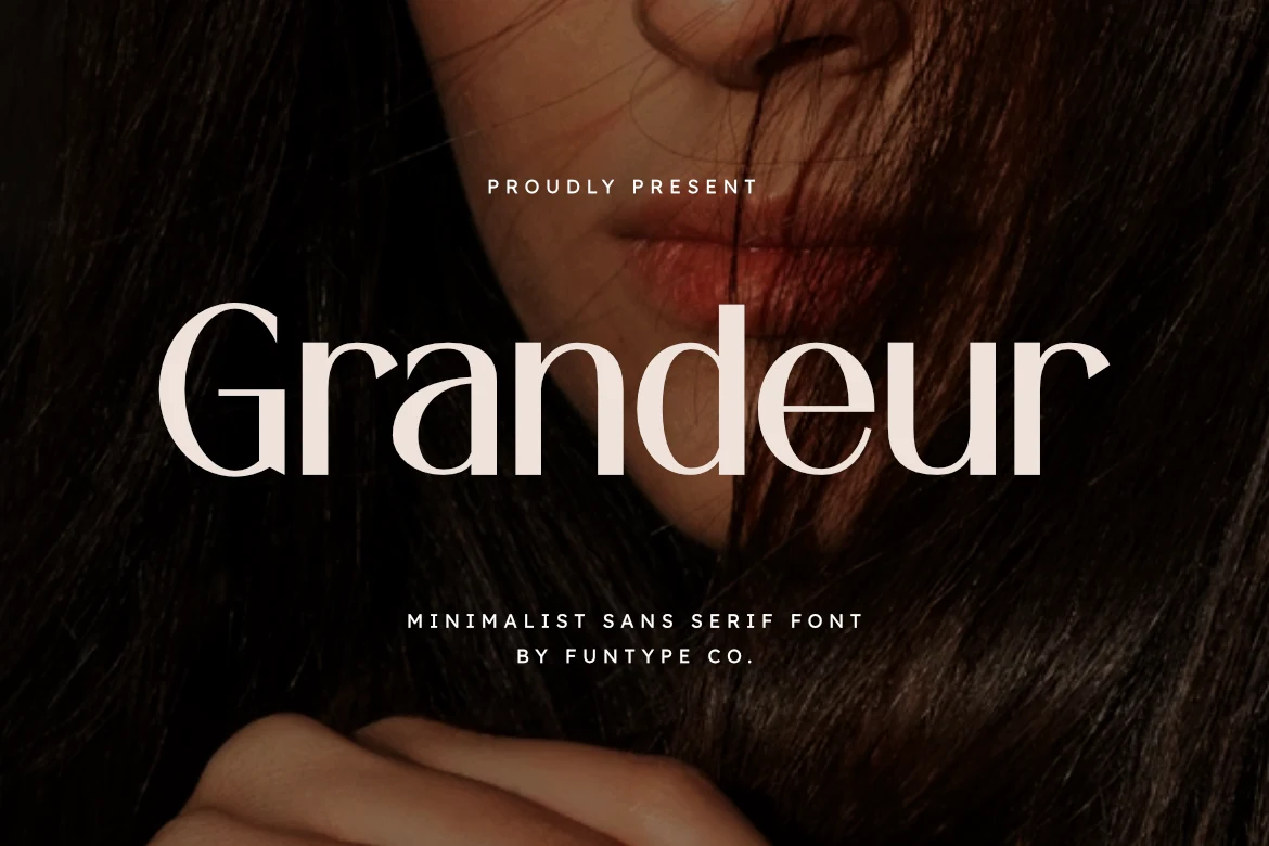
Grandeur Font has a dramatic display presence built from clean sans forms, tall stems, and noticeably refined stroke contrast. The wide curves in letters like G and d keep it elegant rather than severe, which makes it a strong option within Elegant Sans Serif Fonts for branding that needs authority with polish.
This is the kind of typeface that works best when the wording stays short and the scale does the talking. Use it for mastheads, fashion logos, or statement headlines, and keep supporting text simpler and lighter so Grandeur can hold the hierarchy without losing the crisp rhythm of its bold verticals and delicate joins.
Cultivo Font
Best For: branding, website headers, editorial designs, high-end designs
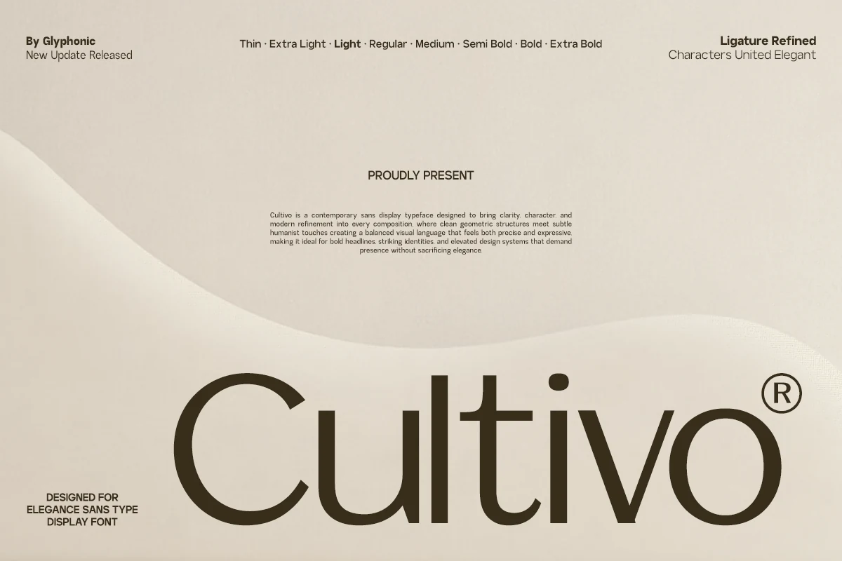
Cultivo Font has a broad, contemporary silhouette with smooth bowls, generous counters, and a grounded geometric structure softened by humanist curves. That balance gives it a confident editorial tone, making it a strong option in Elegant Sans Serif Fonts when you want clarity without a cold feel.
The high x-height keeps headlines readable, while refined spacing and selective ligatures help larger wordmarks feel polished rather than rigid. Use it for brand systems, website headers, or editorial titles, and pair it with lighter supporting text so the bold rhythm stays clean.
Art Deco Elegant Sans Serif Fonts
Geometric construction, dramatic capitals, and period-inspired details give this group a polished Art Deco character suited to invitations, mastheads, logos, and luxury campaigns.
Bacher Font
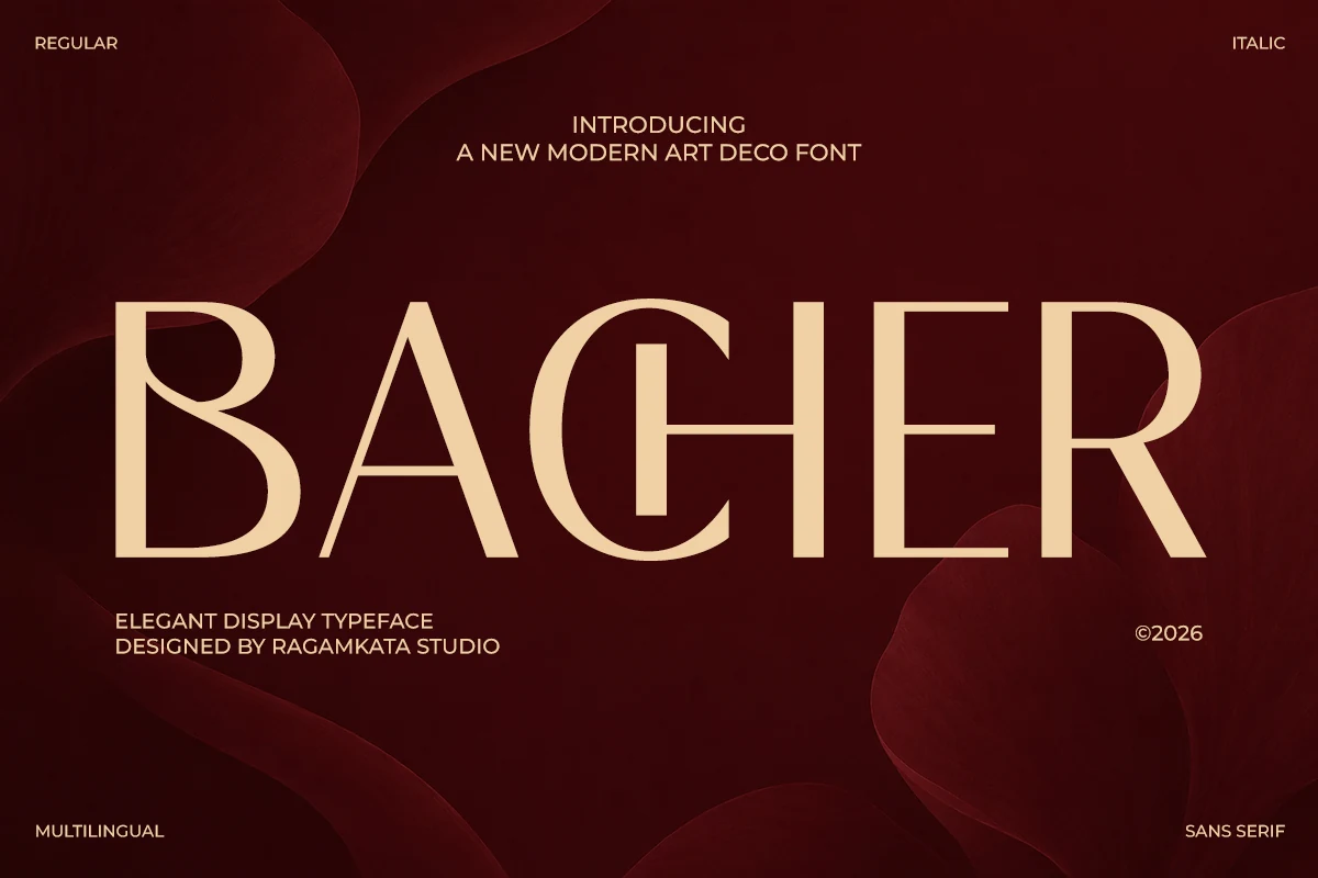
Best For: logos, headlines, editorial designs, luxury designs
Bacher Font brings a distinctly Art Deco rhythm to the page, with tall verticals, hairline joins, and broad geometric curves that feel poised rather than rigid. That mix of contrast and symmetry gives Elegant Sans Serif Fonts a more theatrical, high-fashion direction.
It is most effective in short headlines where the open structure of letters like A, C, and R can stay crisp at scale. For logos or editorial titles, keep spacing slightly generous and pair it with a quieter sans underneath so Bacher’s decorative proportions remain the focal point.
Chic Font
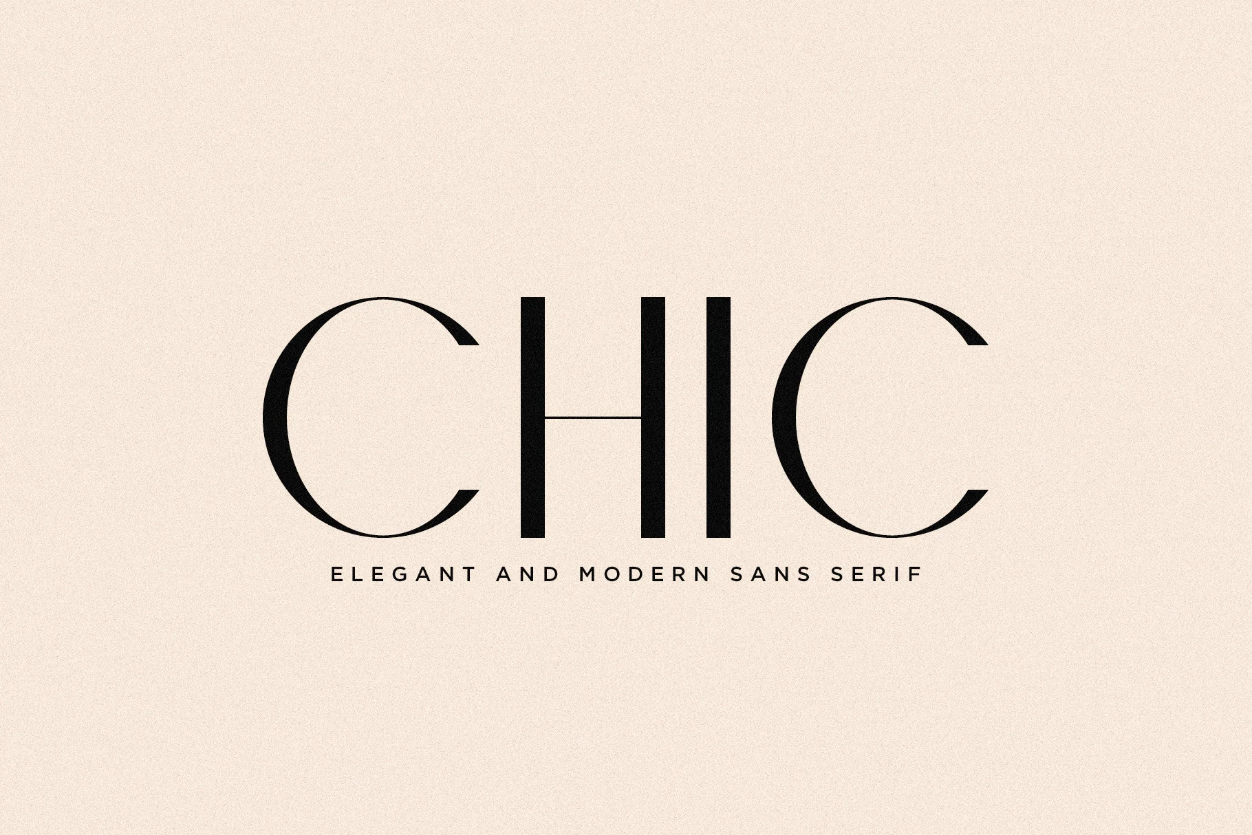
Best For: fashion branding, magazine covers, logos, editorial designs
Chic Font has a distinctly fashion-led voice, with oversized curved C forms, tall vertical strokes, and a razor-thin H crossbar that adds tension without clutter. That mix of softness and precision makes it a memorable entry in Elegant Sans Serif Fonts, especially for layouts that need a polished French editorial feel.
It performs best at display size, where the contrast and narrow joins stay crisp and intentional. Use it for short mastheads, logos, or cover titles, and keep supporting text simpler and smaller so the main wordmark holds the hierarchy without losing its airy rhythm.
Erial Font
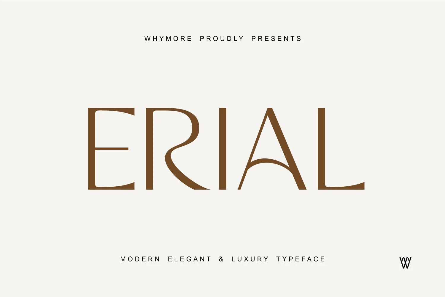
Best For: branding, invitations, wedding designs, luxury designs
Erial Font has a sculpted, high-fashion silhouette, with tall verticals, squared terminals, and a flowing R that softens the geometry. It brings a more decorative edge to Elegant Sans Serif Fonts, balancing Art Deco restraint with enough curve to feel polished and memorable.
The large capitals work best in short names or headings, where the open A and elongated strokes have room to read clearly. For invitations or branding, keep spacing even and pair it with a quieter secondary font so Erial can lead the hierarchy without its stylized forms competing with smaller text.
Chopard Font
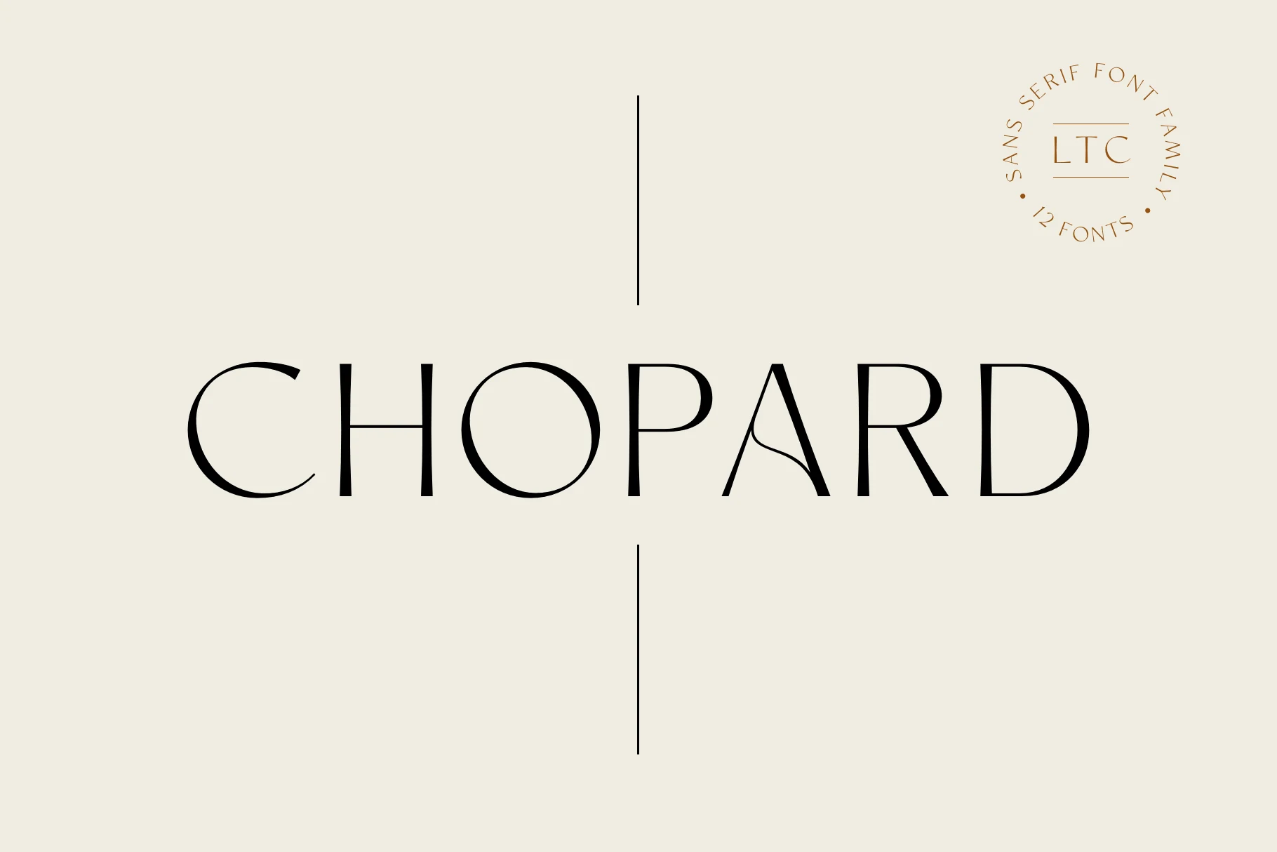
Best For: logos, branding, editorial designs, luxury designs
Chopard Font has a graceful display rhythm, with slim verticals, broad circular curves, and a distinctive A that adds just enough personality. It sits comfortably among Elegant Sans Serif Fonts, giving layouts a polished, fashion-aware tone without becoming overly ornate.
The letterforms look strongest in short titles where the contrast and spacing can stay crisp. For branding or editorial work, let it lead the hierarchy and keep companion text simple; that restraint helps the sculpted C, O, and R shapes stay clear and memorable.
Minimal & Airy Elegant Sans Serif Fonts
Light strokes, open counters, and generous spacing create a restrained look for minimalist identities, beauty packaging, social graphics, websites, and sophisticated editorial layouts.
Harmonie Font
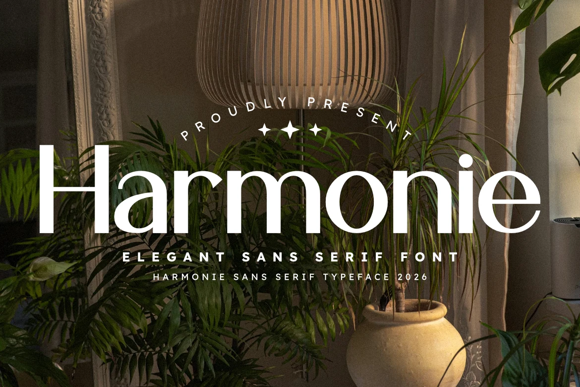
Best For: logos, branding, social media graphics, editorial designs
Harmonie Font leans on broad, open letterforms and a smooth, even stroke weight, giving it a calm upscale presence. The rounded counters and generous spacing keep the wordmark airy, which makes it a strong fit for Elegant Sans Serif Fonts when you want polish without stiffness.
It works especially well in beauty packaging, social headers, or editorial mastheads where a single line needs to feel clean and composed. Keep tracking slightly open and pair it with smaller neutral text below; that contrast helps Harmonie hold the title hierarchy while preserving its soft, refined rhythm.
Luxury Font
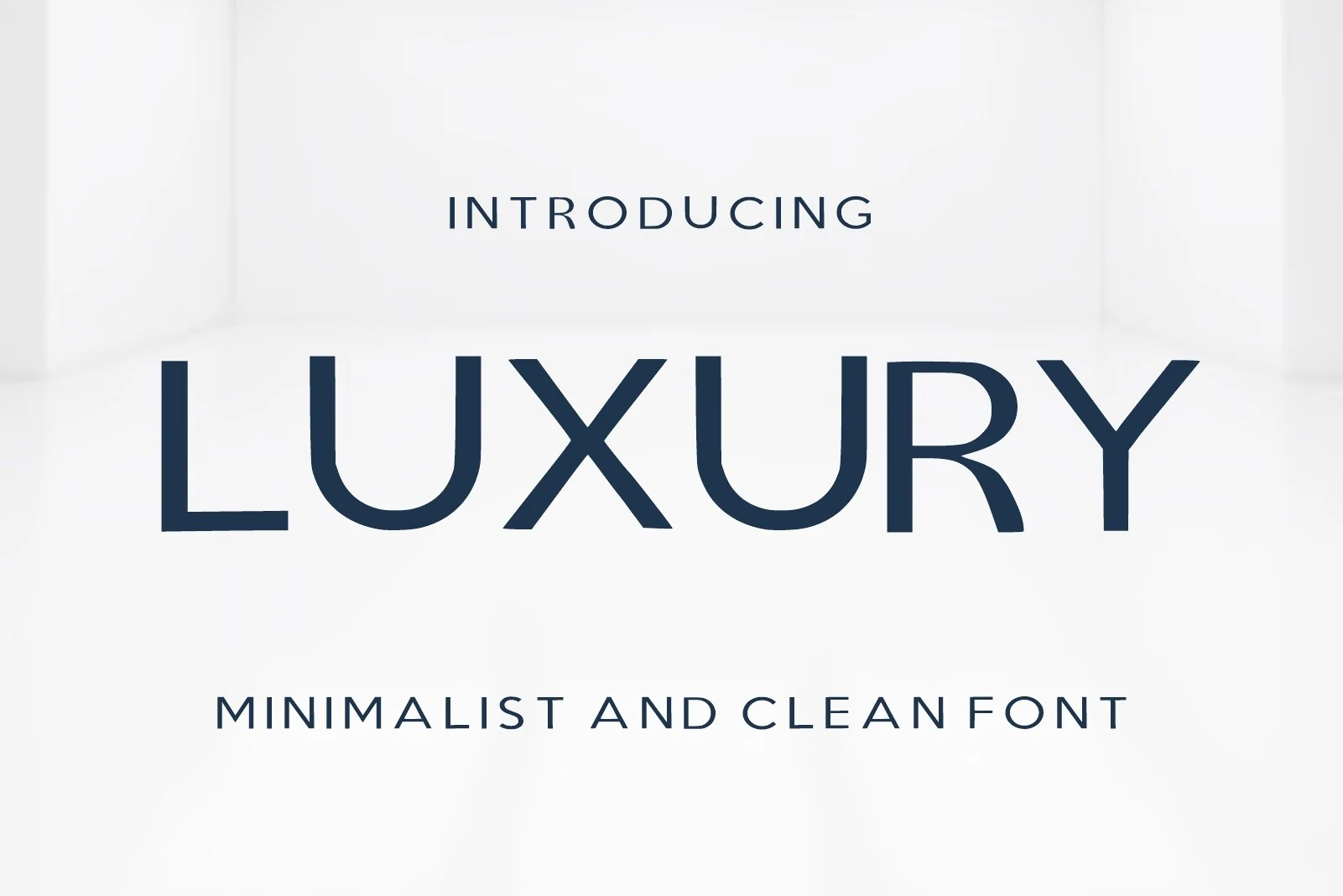
Best For: logos, branding, website headers, minimal designs
Luxury Font has a restrained, polished look built from slim strokes, broad curves, and generous open space inside the letters. The wordmark feels calm and expensive rather than flashy, which gives it a natural place in Elegant Sans Serif Fonts aimed at modern branding.
Its clean structure works best when the layout stays equally minimal. Give it room around short titles or logos, and use tracking with intention so the wide forms stay balanced instead of drifting apart. A smaller neutral subheading underneath helps the main line keep its refined hierarchy.
Montclair Font
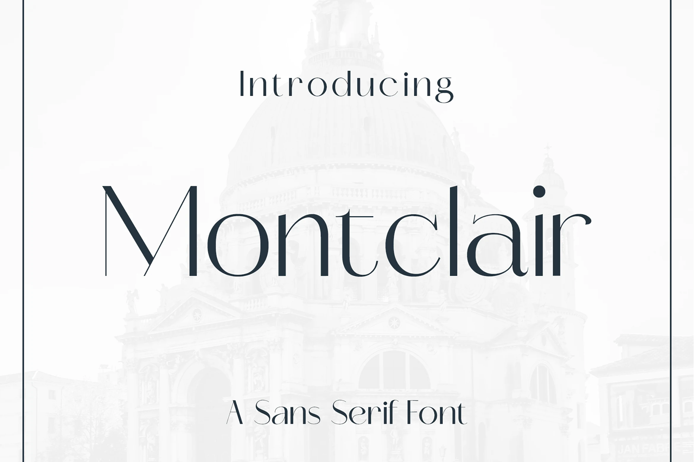
Best For: logos, branding, editorial designs, magazine covers
Montclair Font stands out for its slim vertical stress, soft curves, and measured contrast, which give the letters a polished editorial voice. It fits naturally into Elegant Sans Serif Fonts when you want something graceful and modern without losing clarity.
The proportions feel refined rather than rigid, so it works especially well for logos, cover lines, and elevated branding. Leave a little space around it and avoid crowded pairings; a quieter secondary font helps Montclair keep its clean rhythm and subtle contrast visible.
Carla Font
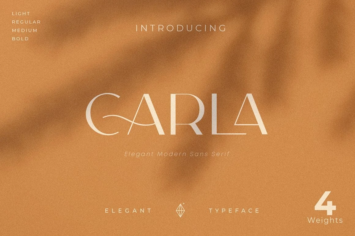
Best For: logos, branding, invitations, editorial designs
Carla Font has a light, airy presence built from slim strokes, wide proportions, and carefully shaped curves. The sweeping C and narrow crossbars give it a graceful rhythm, making it a natural fit for Elegant Sans Serif Fonts that need a soft editorial tone rather than a heavy statement.
It works best in short titles, logo lines, and invitation layouts where its fine detail can stay visible. Give it enough scale and breathing room, and pair it with a quieter supporting font for body copy so Carla keeps its refined texture without fading into the background.
Amavera Font
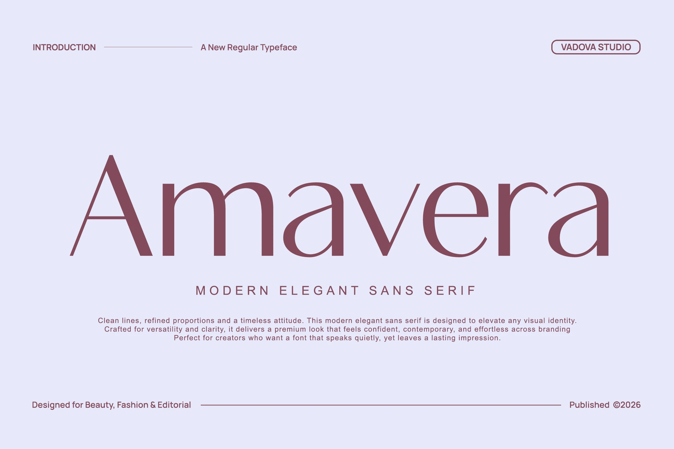
Best For: logos, beauty branding, fashion branding, editorial designs
Amavera Font has a light, fashion-led rhythm built from clean strokes, open counters, and softly rounded curves. The tall A, generous bowls, and even spacing keep the wordshape calm and polished, giving headlines an upscale presence without leaning on heavy contrast.
Amavera gives Elegant Sans Serif Fonts a quieter, more editorial direction. It works especially well for logos and covers where generous tracking and short line lengths let the refined proportions breathe, helping beauty and lifestyle branding feel precise rather than cold.
High-Contrast Fashion Elegant Sans Serif Fonts
Slim hairlines, sweeping curves, and dramatic stroke contrast give these fonts a fashion-forward finish for beauty labels, magazine covers, boutique logos, and campaign headlines.
Baner Font
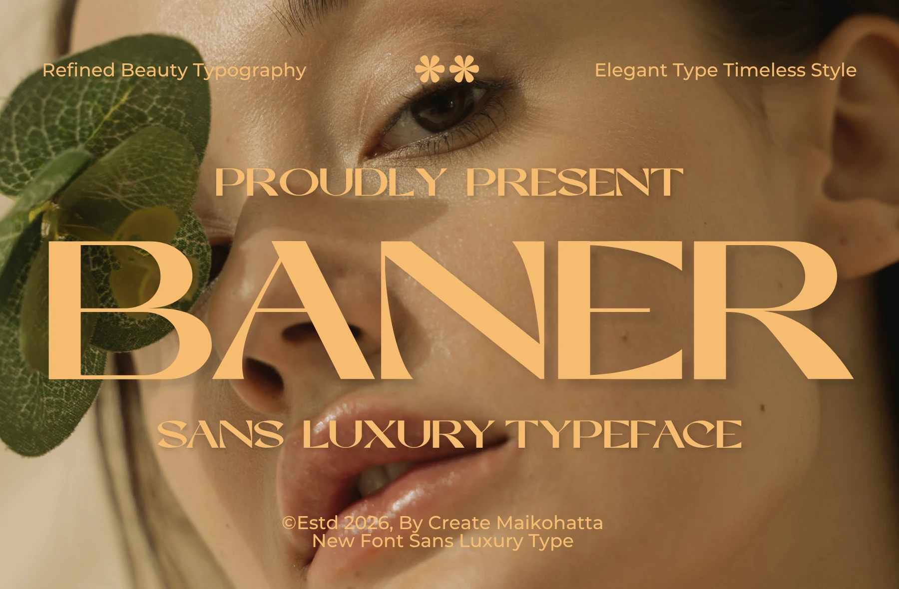
Best For: beauty branding, editorial designs, luxury designs, logos
Baner Font pairs tall, high-contrast letterforms with broad elegant proportions, giving the wordmark a polished beauty-editorial feel. The sharp joins and sweeping curves make it a strong pick within Elegant Sans Serif Fonts, especially when a layout needs softness and authority at the same time.
It shines in branding, cover titles, and luxury packaging where short wording can sit large and clean. Keep surrounding typography restrained and use generous spacing in supporting lines; that contrast lets Baner hold the hierarchy while its refined shapes stay crisp.
Weakfive Font
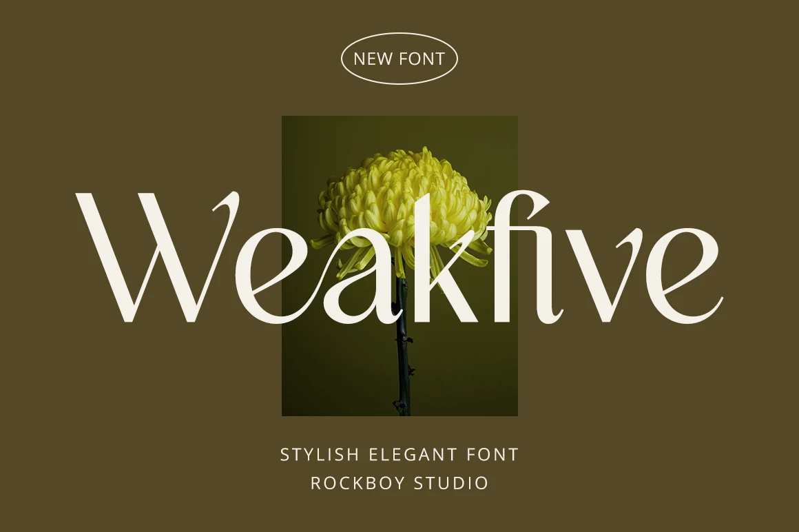
Best For: branding, editorial designs, invitations, wedding designs
Weakfive Font pairs slim high-contrast strokes with softly flared curves, giving the letterforms a graceful editorial mood and a slightly romantic finish. The tall proportions and clean counters keep it polished, so searches for Elegant Sans Serif Fonts may still lead designers to this more delicate display option.
It works best in short titles, logo concepts, and invitation layouts where the contrast can stay crisp and visible. Give it generous spacing and avoid dense copy, especially around the sweeping k and v shapes, so the texture stays refined rather than crowded.
Brisca Font
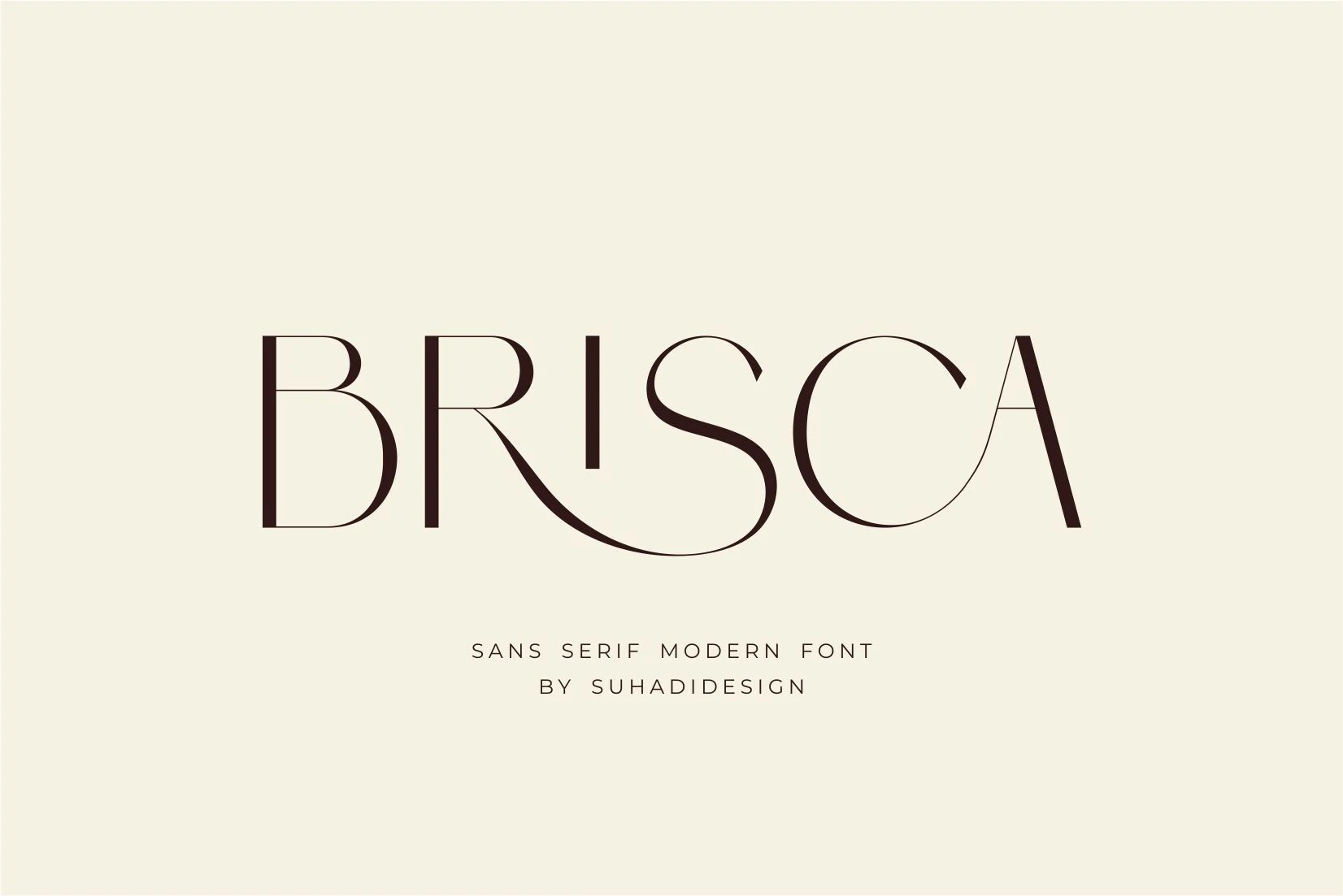
Best For: beauty branding, logos, magazine covers, editorial designs
Brisca Font has a sleek display look shaped by tall stems, slim hairlines, and broad rounded bowls, with a flowing ligature that gives the wordmark extra movement. It brings a more fashion-led attitude to Elegant Sans Serif Fonts, balancing clean structure with a distinctly polished finish.
The letterforms are most effective in short names and headlines where the long R-to-S connection can read clearly and add rhythm. For beauty branding or magazine styling, keep the surrounding text simpler and slightly tighter so Brisca stays the focal point without losing its delicate contrast.
Kenao Font
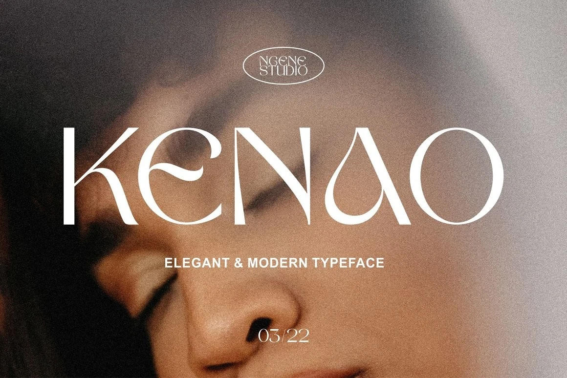
Best For: logos, beauty branding, fashion branding, editorial designs
Kenao Font uses slim vertical stems, sculpted curves, and high-contrast cuts to create a polished fashion-editorial tone. The wide spacing keeps the unusual E curve, teardrop A counter, and oval O readable instead of letting the decorative shapes crowd each other.
For Elegant Sans Serif Fonts, Kenao works best when the wordmark is short and centered, with enough negative space around the letters. Its refined proportions suit beauty labels, magazine-style titles, and boutique branding where contrast and restraint matter more than heavy visual weight.
Once After Font
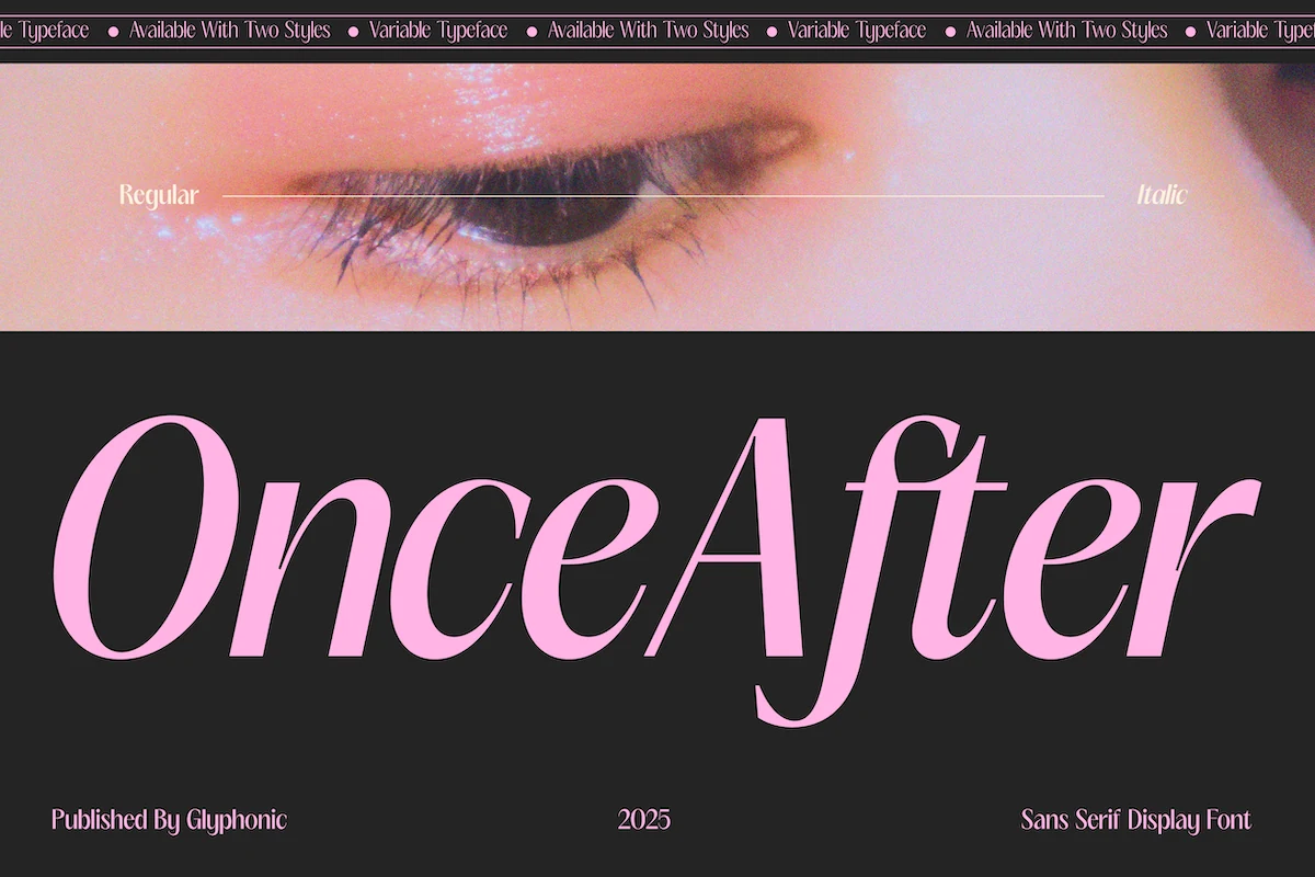
Best For: logos, beauty branding, fashion branding, editorial designs
Once After Font has a dramatic editorial silhouette, with high-contrast curves, narrow joins, and generous apertures that make each letter feel fluid and poised. The italic styling in the preview adds movement, while the long terminals and clean structure keep it polished rather than overly decorative.
In Elegant Sans Serif Fonts, this one is strongest when used large and sparingly. Its variable setup and regular plus italic styles help build hierarchy across a layout, so you can use the upright cut for calm structure and the slanted version for emphasis in mastheads, logos, and beauty-led campaigns.
Conclusion
Choose bold sculpted styles for dominant logos and headlines, Art Deco forms for decorative luxury work, minimal options for restrained brand systems, or high-contrast fashion fonts for editorial and beauty-focused designs. Match the font’s detail and weight to its final display size so the letterforms remain clear.