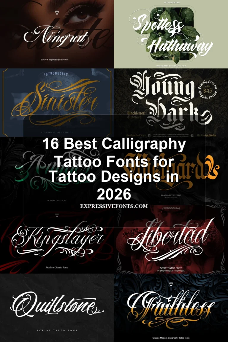
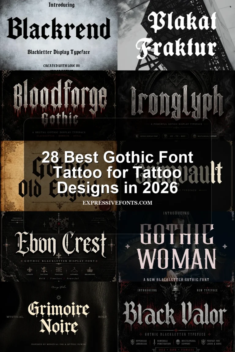
10 Best Traditional Tattoo Font for Tattoo Designs in 2026
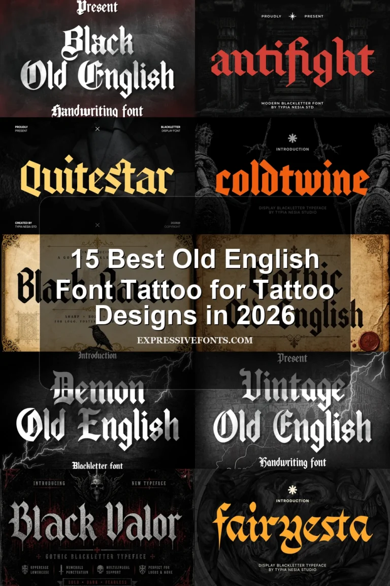
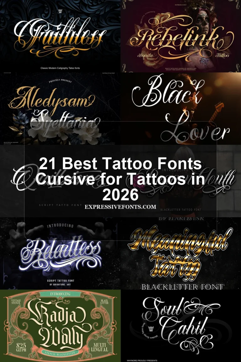
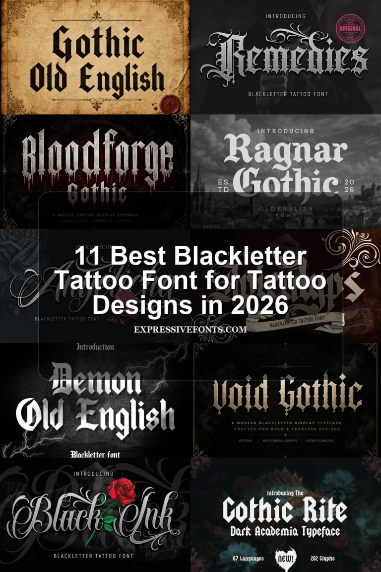
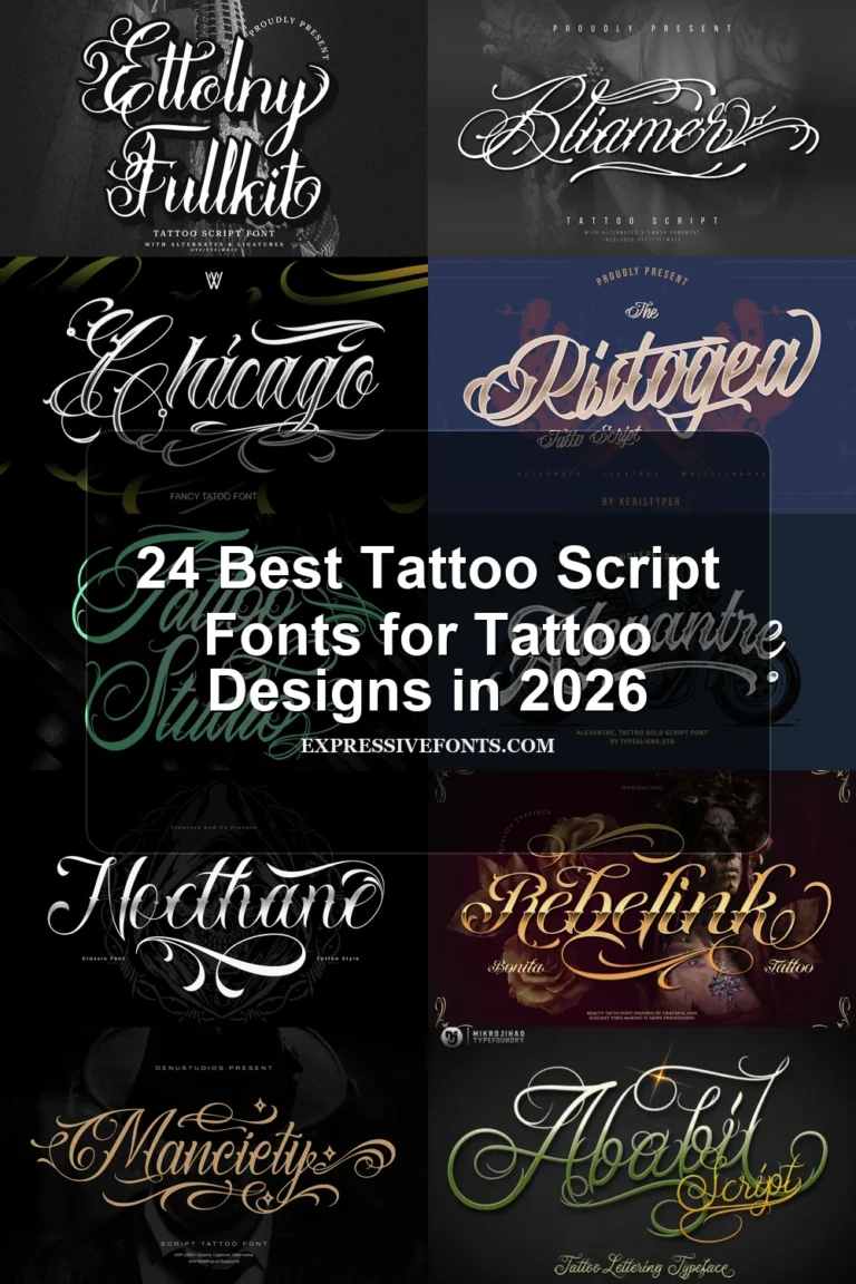
This collection spans condensed blackletter, curled and serrated display forms, graphic inline treatments, sturdy slab structures, and wider geometric faces. Each Traditional Tattoo Font is aimed at practical design roles such as logos, posters, apparel, labels, packaging, and large tattoo-inspired lettering rather than continuous reading.
Looking for more tattoo fonts? Browse our complete Tattoo Fonts collection to compare calligraphy, lettering, cursive, gothic, and script tattoo styles.
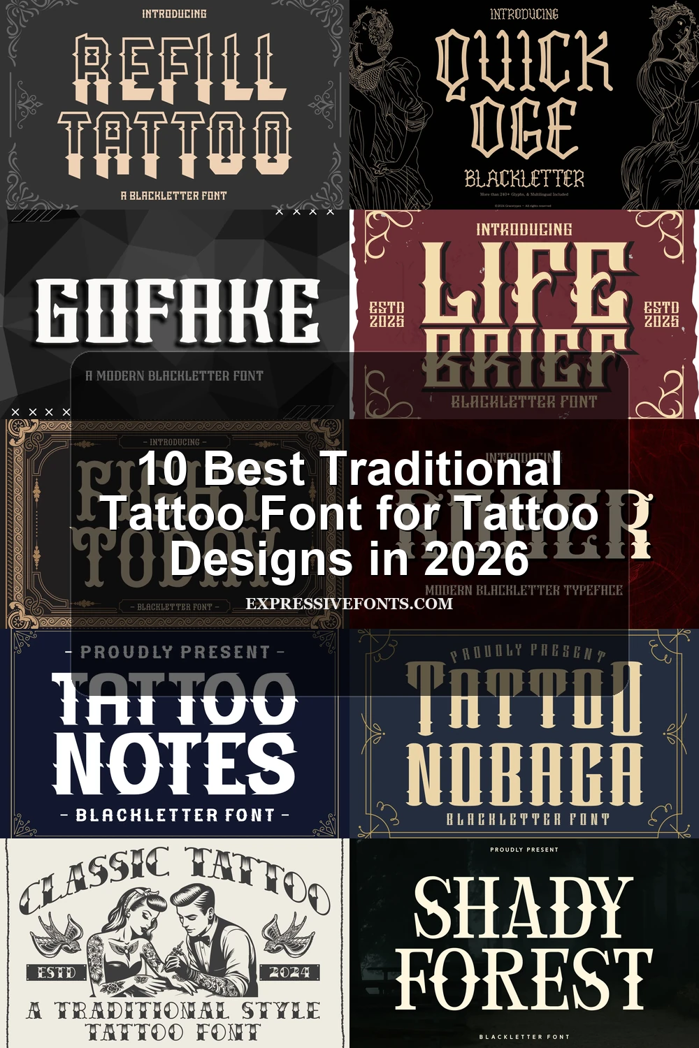
Traditional Tattoo Font: Condensed Blackletter
This Traditional Tattoo Font group emphasizes condensed proportions, sharp contrast, and dense vertical construction, creating compact headline shapes that feel more forceful and space-efficient than the wider or more textured categories.
Quick Oge Font
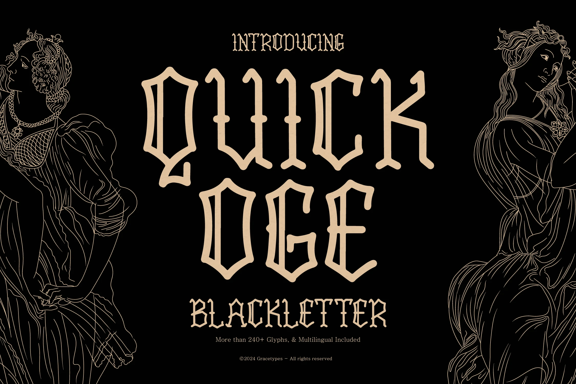
Best For: branding, posters, book covers, vintage designs
Quick Oge Font brings sharp, high-contrast blackletter into a condensed, upright structure with unusually open counters. That breathing room gives its intricate terminals a clearer internal rhythm, though the detail still needs large sizing for logos, headlines, and titles.
Tattoo Nobaga Font
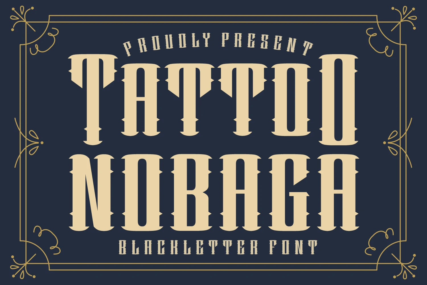
Best For: logos, branding, display text, headlines
Tall, narrow forms define Tattoo Nobaga Font, where notch-like serifs and flat, square terminals add a rugged Western character to its blackletter construction. The thick stems and thin connectors create strong display contrast for logos, band identities, and tattoo-parlor branding, but sharp detailing fades at smaller sizes.
Life Brief Font
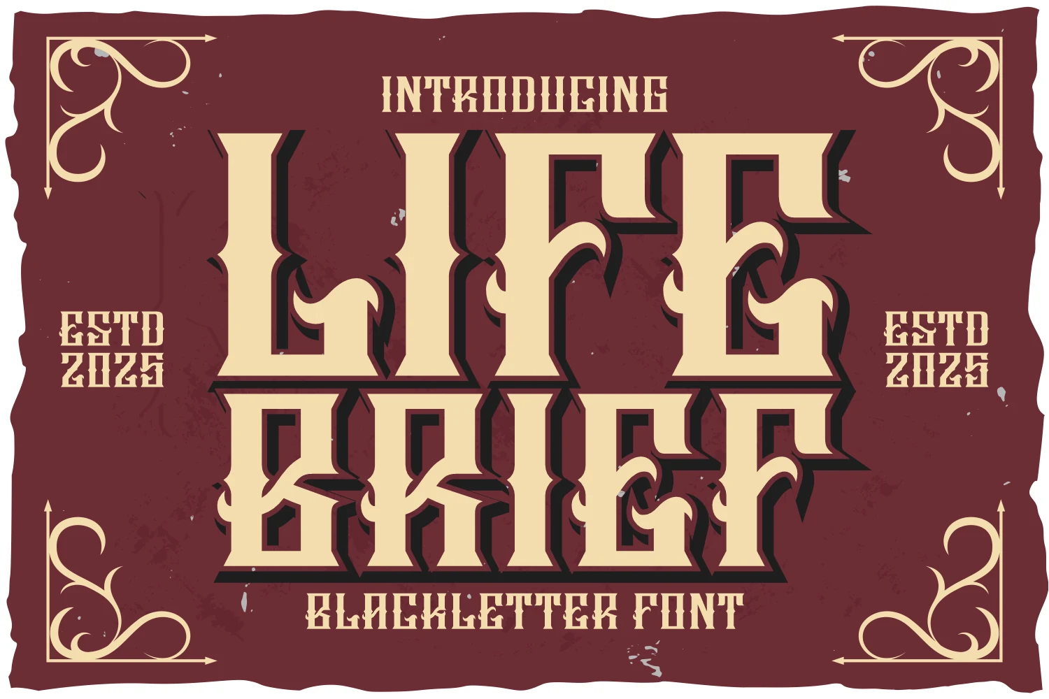
Best For: posters, branding, product labels, fashion branding
Life Brief Font layers flame-like spikes, blocky slab-influenced forms, distressed detailing, and a heavy drop shadow into a highly dimensional treatment. That construction can strengthen product labels, posters, and alternative-fashion graphics, but the shadow and surface texture reduce legibility faster than a simpler flat design.
Ornate Gothic Display Lettering
These faces share elaborate terminals, flared or squared serifs, and strongly vertical stems. Their added flourishes and angular edges make them more theatrical for titles than the cleaner condensed options.
Roger Font

Best For: logos, display text, headlines, posters
Roger Font separates itself with rigid vertical stems, high contrast, and curled terminals that soften its squared slab serifs. The combination works well for formal logos and titles, but its flourishes and sharp curves make it a display choice rather than a practical face for extended reading.
Fight Today Font
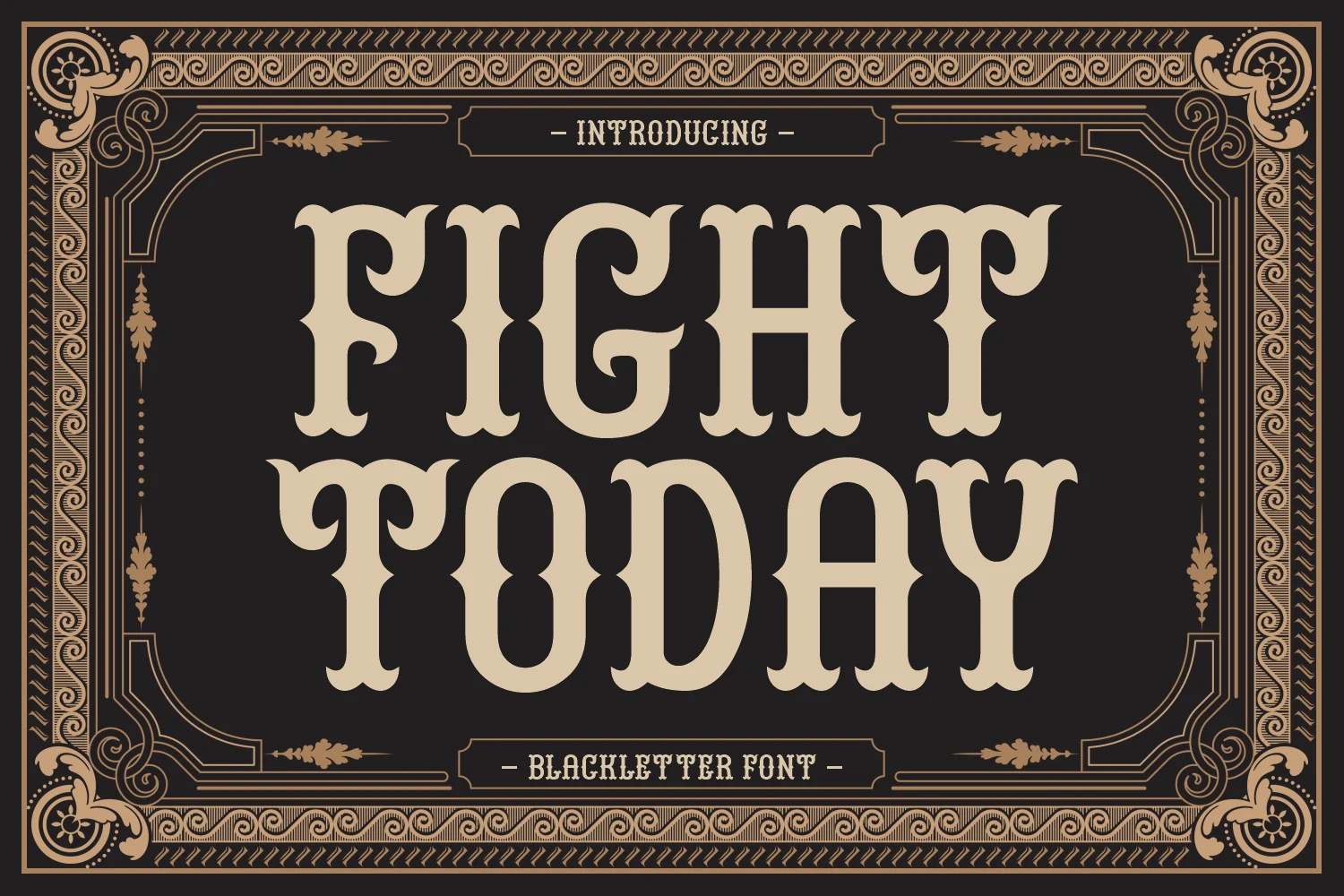
Best For: wall art, signage, posters, display text
Fight Today Font uses blocky, regular-width proportions and flared serifs to suggest sturdy Western signage. Its broader footprint is more comfortable for wall art, event decor, and sign-style layouts than narrow faces, although the sharp internal angles still need large headline sizing.
Gofake Font
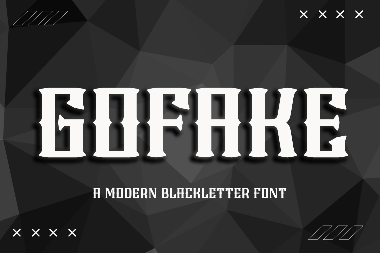
Best For: posters, branding, logos, T-shirts
For posters and branding that need quick recognition, Gofake Font offers a cleaner modern-angular reading of tattoo blackletter. Heavy vertical strokes, pointed terminals, and high contrast keep the overall structure direct, though the sharp terminal details still depend on display scale and can lose clarity when reduced.
Tattoo Notes Font
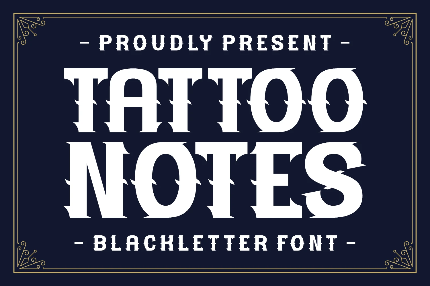
Best For: posters, T-shirts, display text, headlines
Tattoo Notes Font makes serrated angular terminals its defining feature, pairing them with wide geometric letters, heavy flared stems, and high contrast. The structure remains clear on large posters and shirt graphics, but the toothed edges can blur when the lettering is reduced.
Textured, Slab, and Wide Forms
Wider proportions, slab-like structures, inline effects, and interior texture define this group. Compared with the other categories, these designs offer more horizontal presence and surface detail for prominent graphics.
Refill Tattoo Font
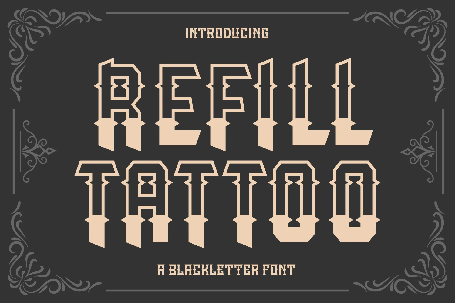
Best For: branding, posters, T-shirts
Refill Tattoo Font suits apparel and poster graphics when a flat letterform needs extra surface interest. Its heavy angular construction uses diamond-shaped mid-stroke notches and a horizontal two-tone split, producing a graphic inline effect. Those features need generous display scale, since the split and notches can crowd smaller lettering.
Classic Tattoo Font
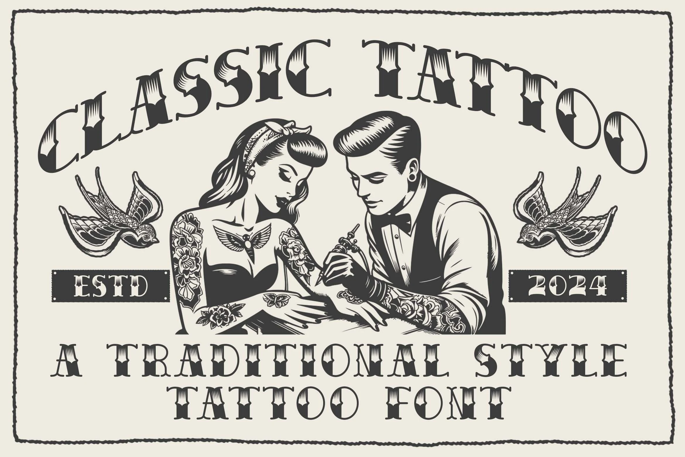
Best For: logos, branding, packaging, posters
Wedge-shaped serifs and interior filigree give Classic Tattoo Font a tattoo-style surface without relying on connected script. Its sturdy, geometric slab-serif framework makes it useful for logotypes, packaging, and branding. As a Traditional Tattoo Font, it is most effective at large sizes, where internal hatching remains distinct.
Shady Forest Font
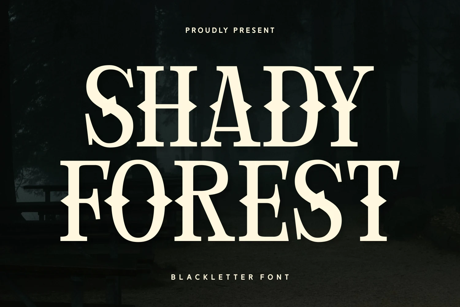
Best For: logos, posters, display text, headlines
Shady Forest Font gives tattoo lettering extra horizontal presence through wide, sturdy proportions and diamond-shaped middle bars. Its spurred terminals and high contrast suit prominent logos, posters, and headlines, while the ornate middle segments make it unsuitable for body copy or compact text.
How to Choose the Right Font
Choose condensed faces when a logo or headline must occupy limited width, and choose wider forms when horizontal presence matters more. Compare flat versus shadowed treatments for reproduction, then check counters, joins, serrations, and interior texture at the intended size. The right Traditional Tattoo Font should preserve its construction without sacrificing readability.