28 Best Gothic Font Tattoo for Tattoo Designs in 2026
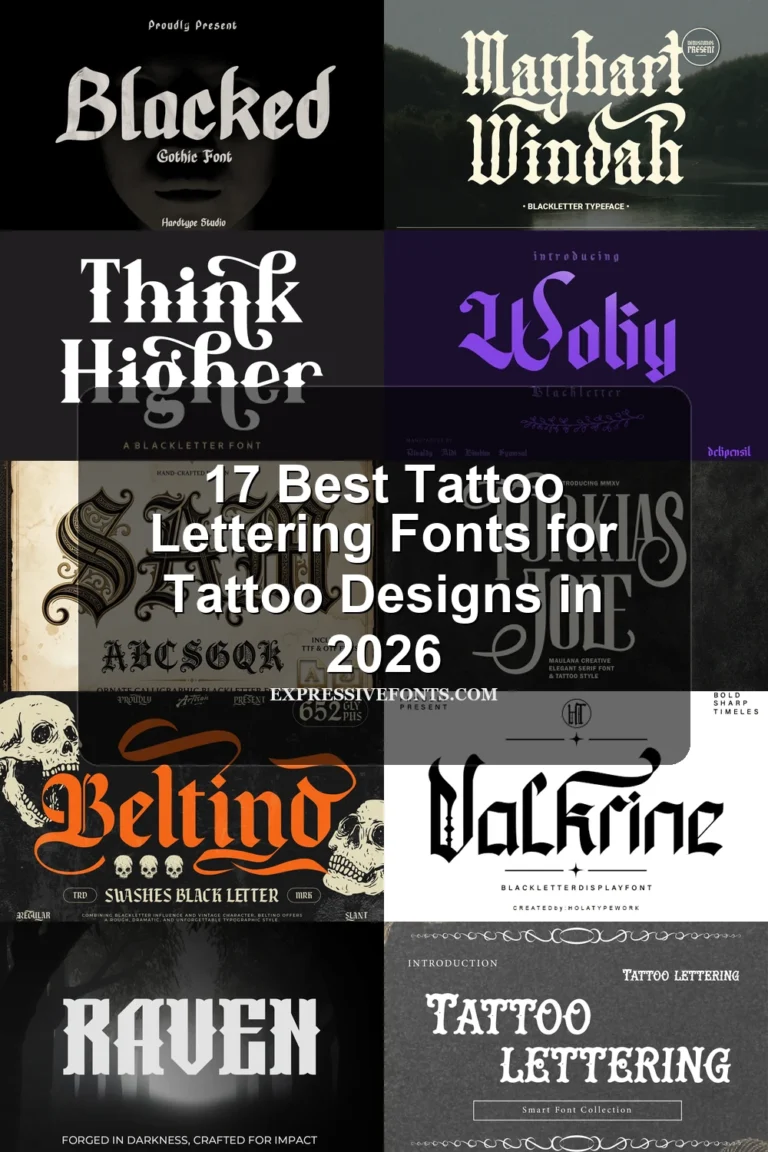
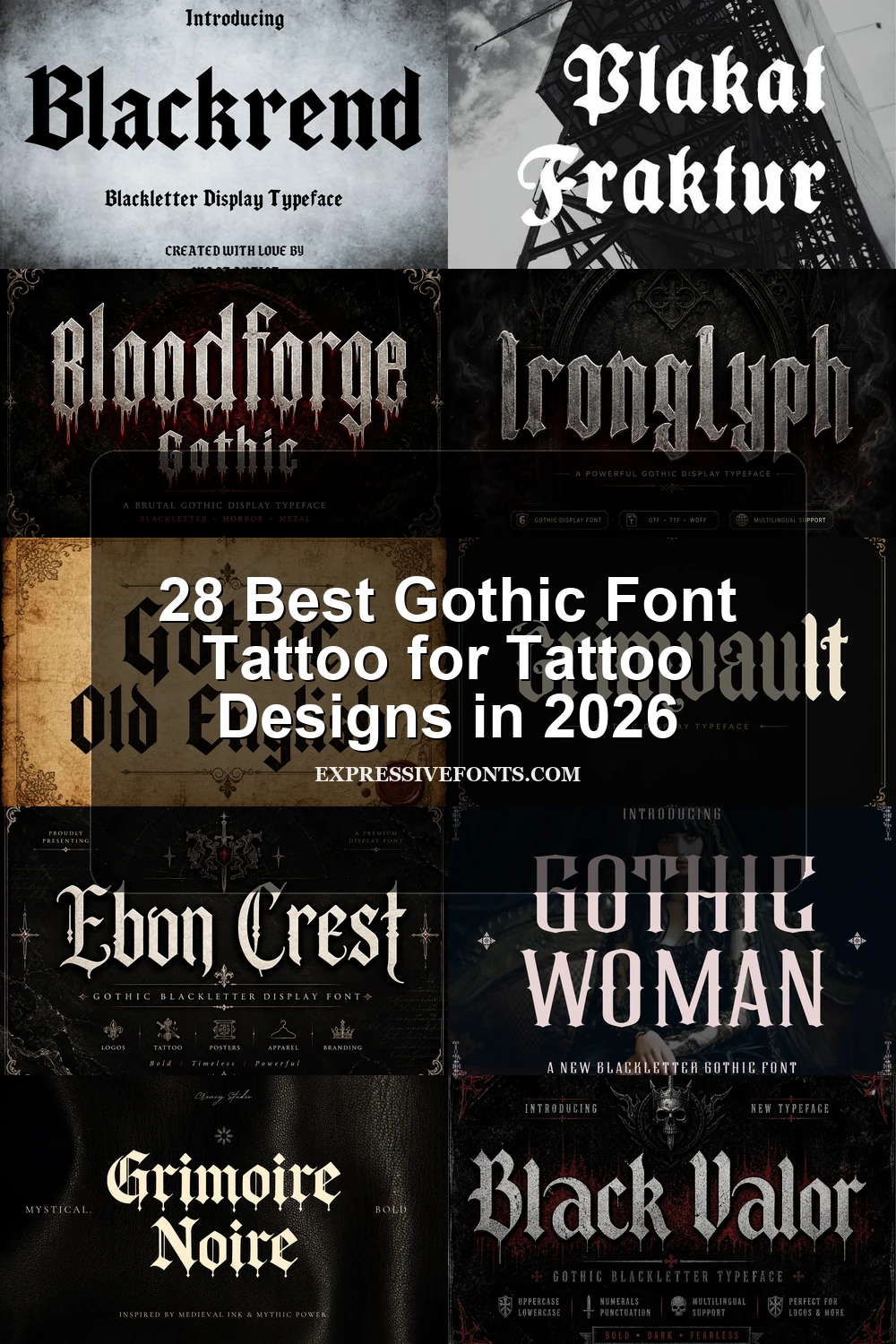
This collection spans dense Old English silhouettes, flourished medieval forms, weathered textures, and cleaner angular blackletter constructions. For a Gothic Font Tattoo, those differences matter: some designs prioritize recognizable lettering, while others work best as large emblems, monograms, logos, or short display phrases.
Looking for more tattoo fonts? Browse our complete Tattoo Fonts collection to compare calligraphy, lettering, cursive, gothic, and script tattoo styles.
Gothic Font Tattoo Essentials
These essentials focus on recognizable Old English and Fraktur structures, condensed proportions, and strong vertical rhythm. They are generally more immediately readable than the heavily textured or highly flourished groups.
Gothic Old English Font
Best For: posters, headlines, display text, T-shirts
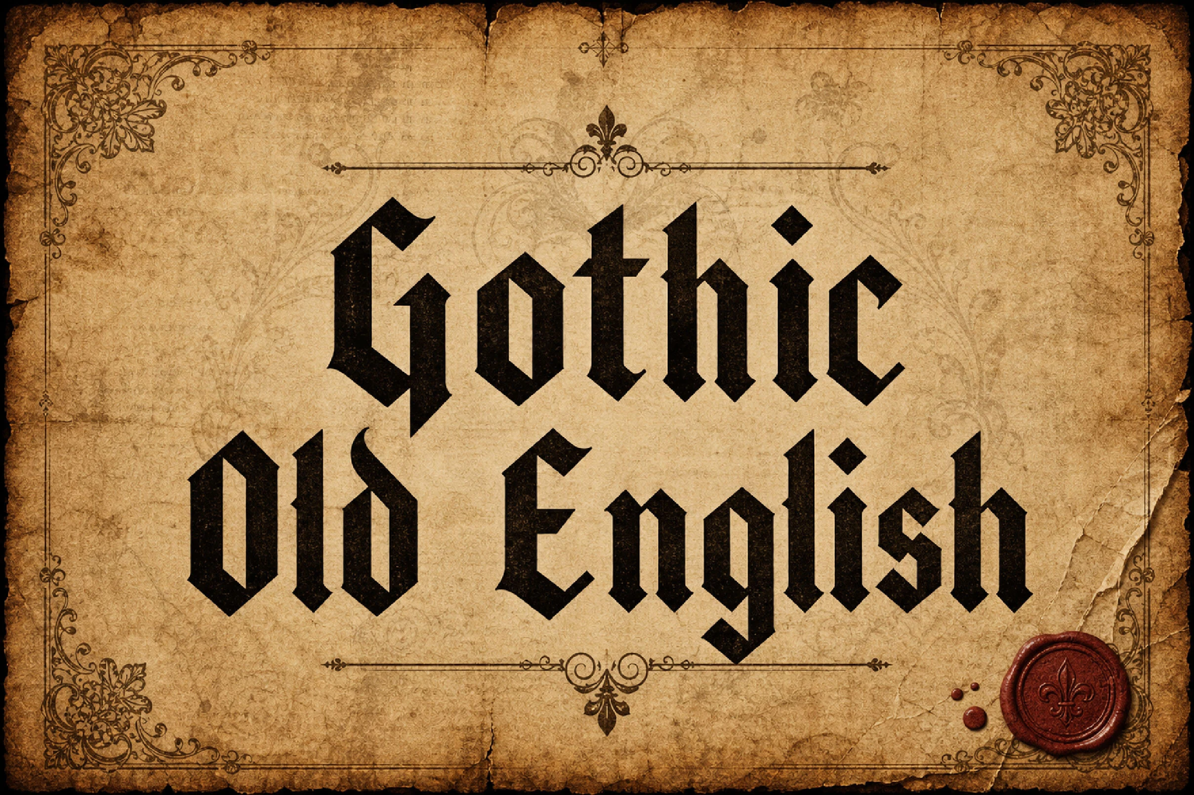
Gothic Old English Font delivers the clearest familiar Old English silhouette here, with dense vertical spacing, pointed arches, angular terminals, and diamond finishes. It is a dependable choice for a short Gothic Font Tattoo headline, but lengthy wording will quickly become crowded.
Black Raven Font
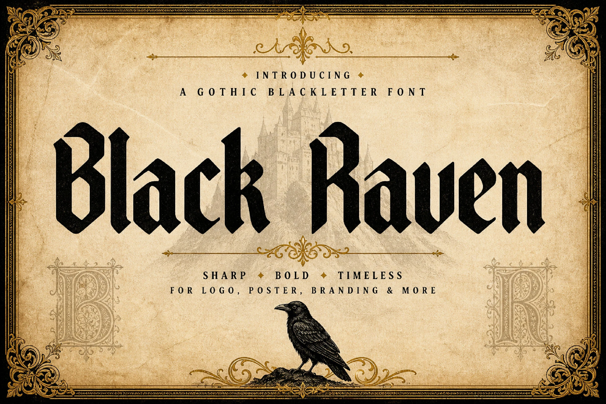
Best For: posters, headlines, display text, bold designs
Black Raven Font compresses fractured angular forms into a narrow Old English silhouette. Its heavy vertical strokes can fit a forceful Gothic Font Tattoo word across a horizontal placement, but the jagged terminals need sufficient size and spacing to avoid turning adjacent letters into a dark texture.
Plakat Fraktur Font
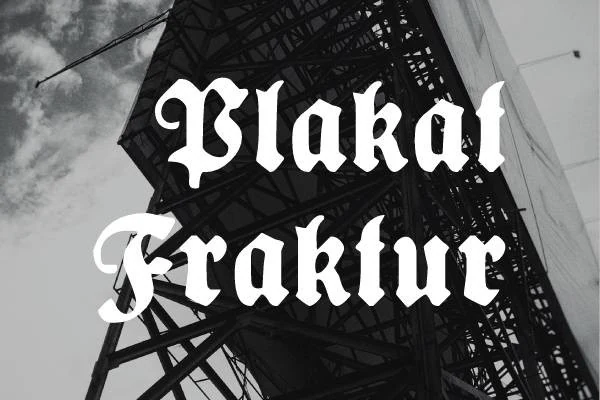
Best For: display text, headlines, posters, logos
Plakat Fraktur Font creates tightly packed texture through compressed strokes, pointed serifs, and complex terminals. That density makes it suitable for a compact Gothic Font Tattoo header, emblem, or crest, especially with its available glyphs and swashes. It is a poor fit for body-like wording or long readable text.
Gothic Castle Font
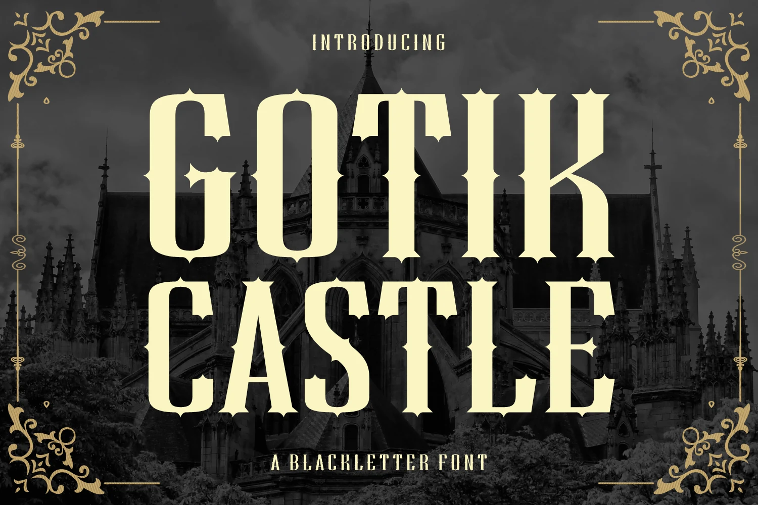
Best For: headlines, posters, display text, artistic designs
Gothic Castle Font turns condensed blackletter into a theatrical mark with thorn-like details, spiked serifs, thick vertical strokes, and rigid proportions. It suits a short Gothic Font Tattoo motto or crest, but the spikes need a large application to stay distinct instead of merging into the surrounding strokes.
Kingsbridge Font
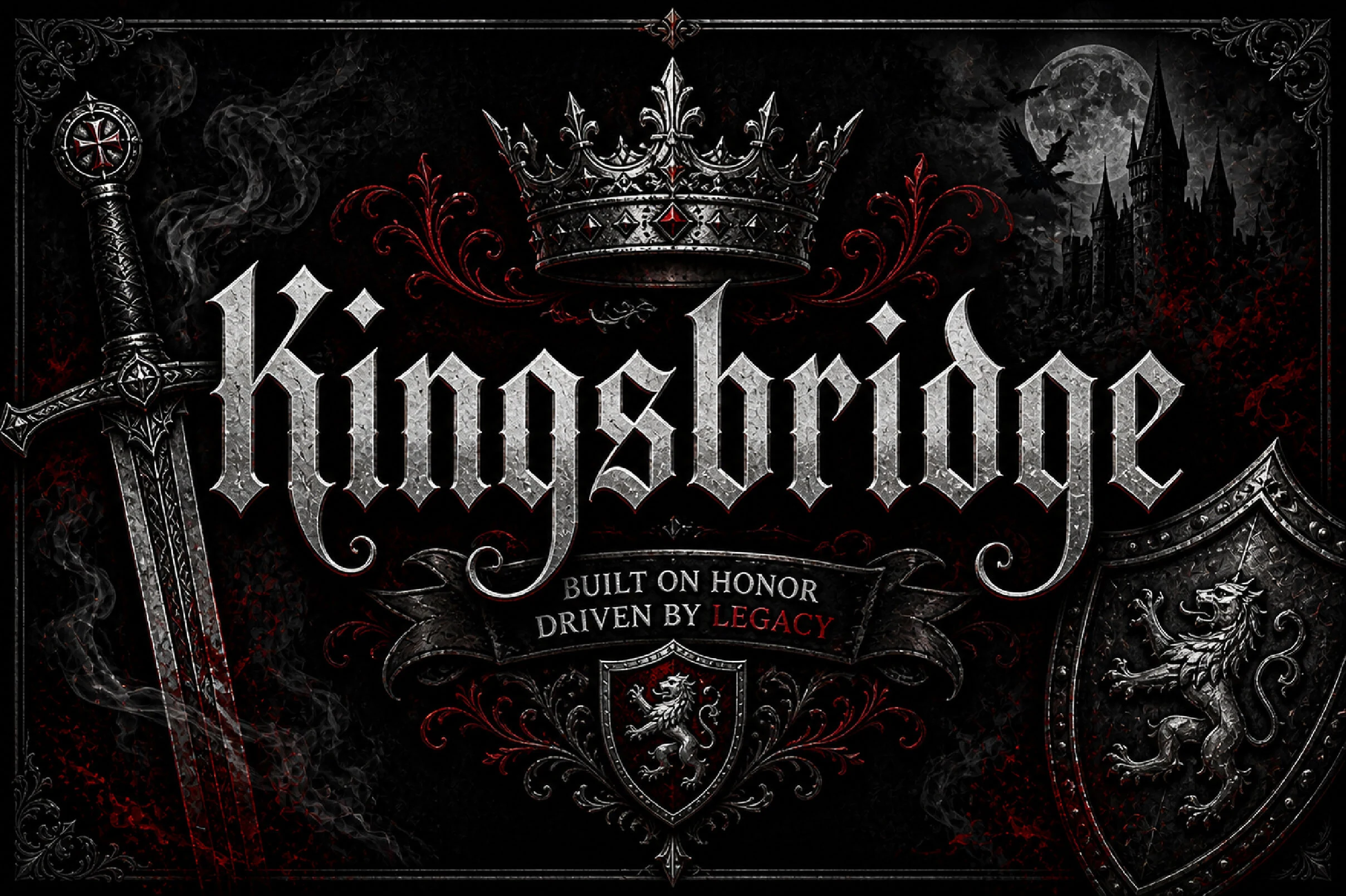
Best For: logos, branding, headlines, display text
Kingsbridge Font combines slightly condensed medieval forms with diamond terminals, decorative flicks, and hooks. That construction makes a readable Gothic Font Tattoo name or logo more achievable than with denser alternatives, though it still needs display scale. The sharp letterforms and swash details add visual distinction without requiring a full flourish on every character.
Ebon Crest Font
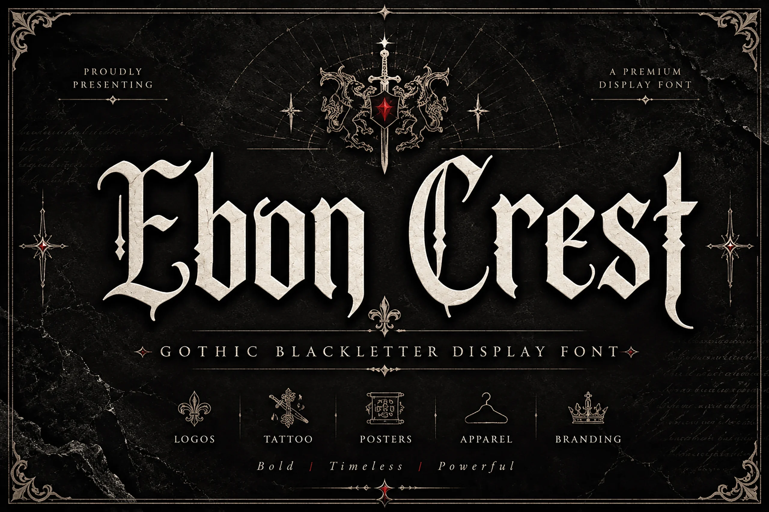
Best For: logos, branding, posters, headlines
Ebon Crest Font packs fractured stroke endings and ornamental crossbars into a narrow manuscript-like construction. Its compact silhouette can fit a vertical or restricted Gothic Font Tattoo area, but decorative details need careful sizing. Thick stems and thin connectors create useful contrast while also making small text less forgiving.
Black English Font
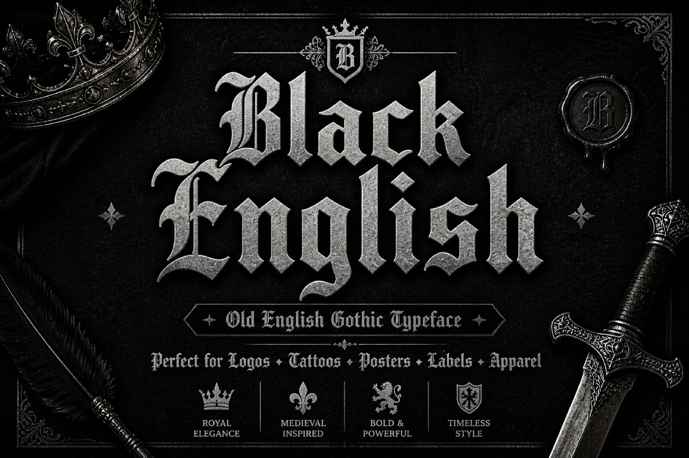
Best For: logos, posters, packaging, headlines
Black English Font combines Old English and Gothic influences with pointed terminals, ornamental serifs, and dense stone-like texture. It makes an imposing Gothic Font Tattoo title or crest at large scale, but textured ornament is a liability for fine compact lettering, where counters and joins can disappear.
Blackrend Font
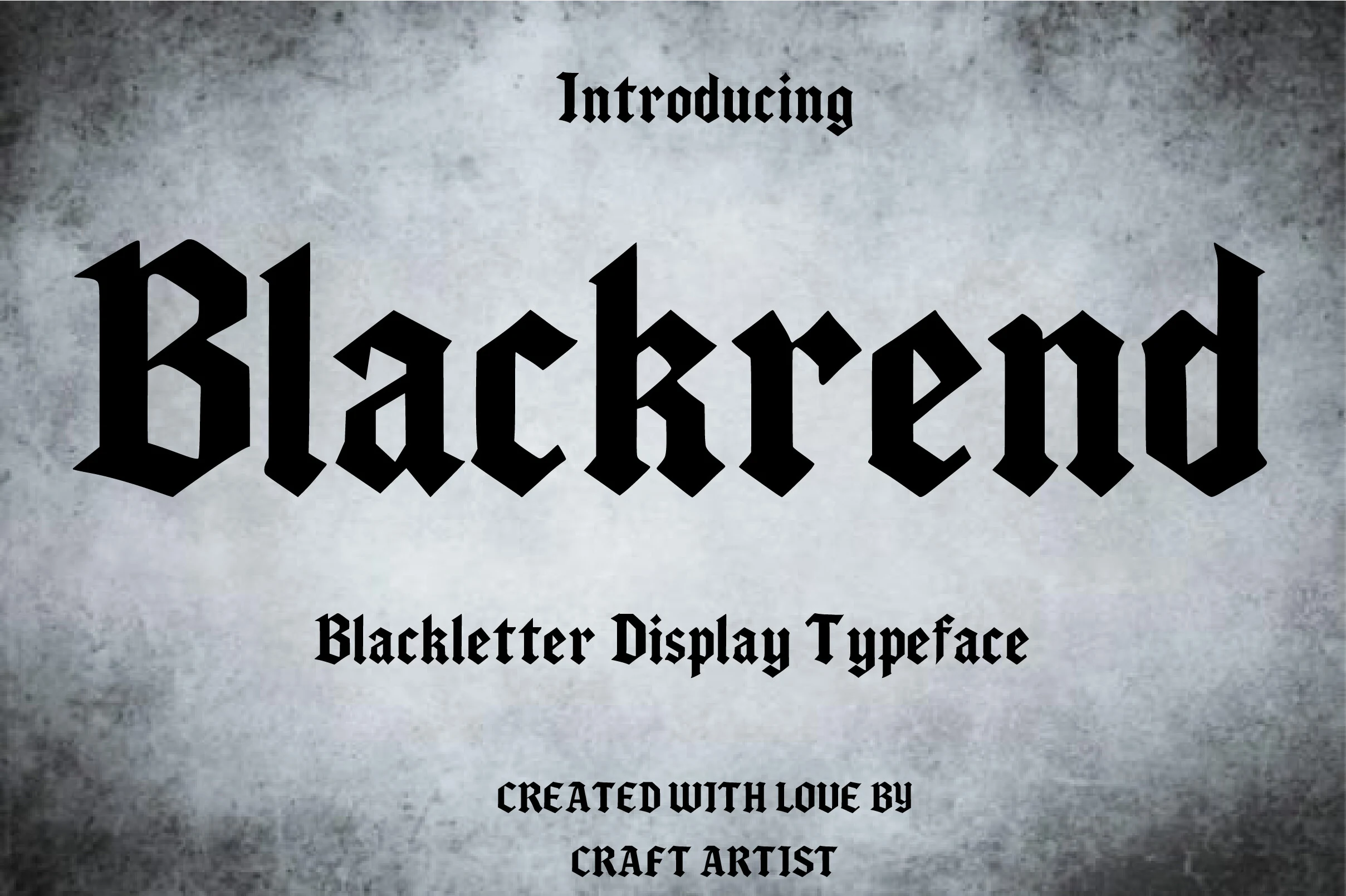
Best For: headlines, posters, display text, bold designs
Blackrend Font reinforces a narrow blackletter frame with heavy strokes, high contrast, and sharply angular terminals. It preserves impact in a large Gothic Font Tattoo headline or title, but offers less delicacy than lighter or more serif-led options, making it a poor choice for small intricate wording.
Ornate Medieval Lettering
Ornate medieval lettering adds swashes, hooks, flourishes, and decorative terminals to formal blackletter frameworks. It offers more personalization and ceremony, but requires greater size and spacing than simpler constructions.
Crownspire Font
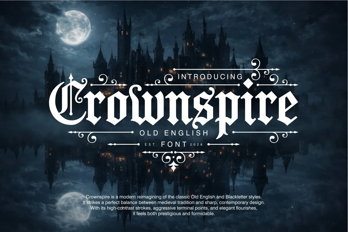
Best For: logos, branding, posters, display text
Crownspire Font uses high-contrast blackletter strokes, elongated condensed proportions, angular terminals, and flourishes across ascenders and crossbars. Its authoritative silhouette suits a large Gothic Font Tattoo title or emblem, but the fine ornament needs generous scale to remain clear.
Paganini Font
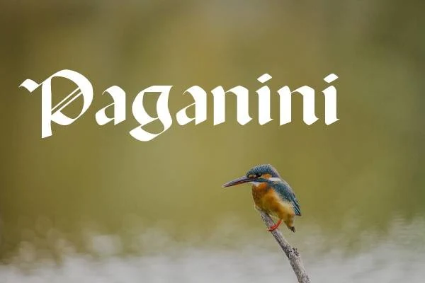
Best For: display text, headlines, posters, logos
For short Gothic Font Tattoo lettering, Paganini Font brings repetitive stems, pointed terminals, and pronounced stroke contrast into a formal blackletter cadence. Its disconnected structure feels historically rooted, while the included glyphs and swashes allow some customization. Keep it large, since decorative strokes lose definition when compressed.
Hellios Gothic Font
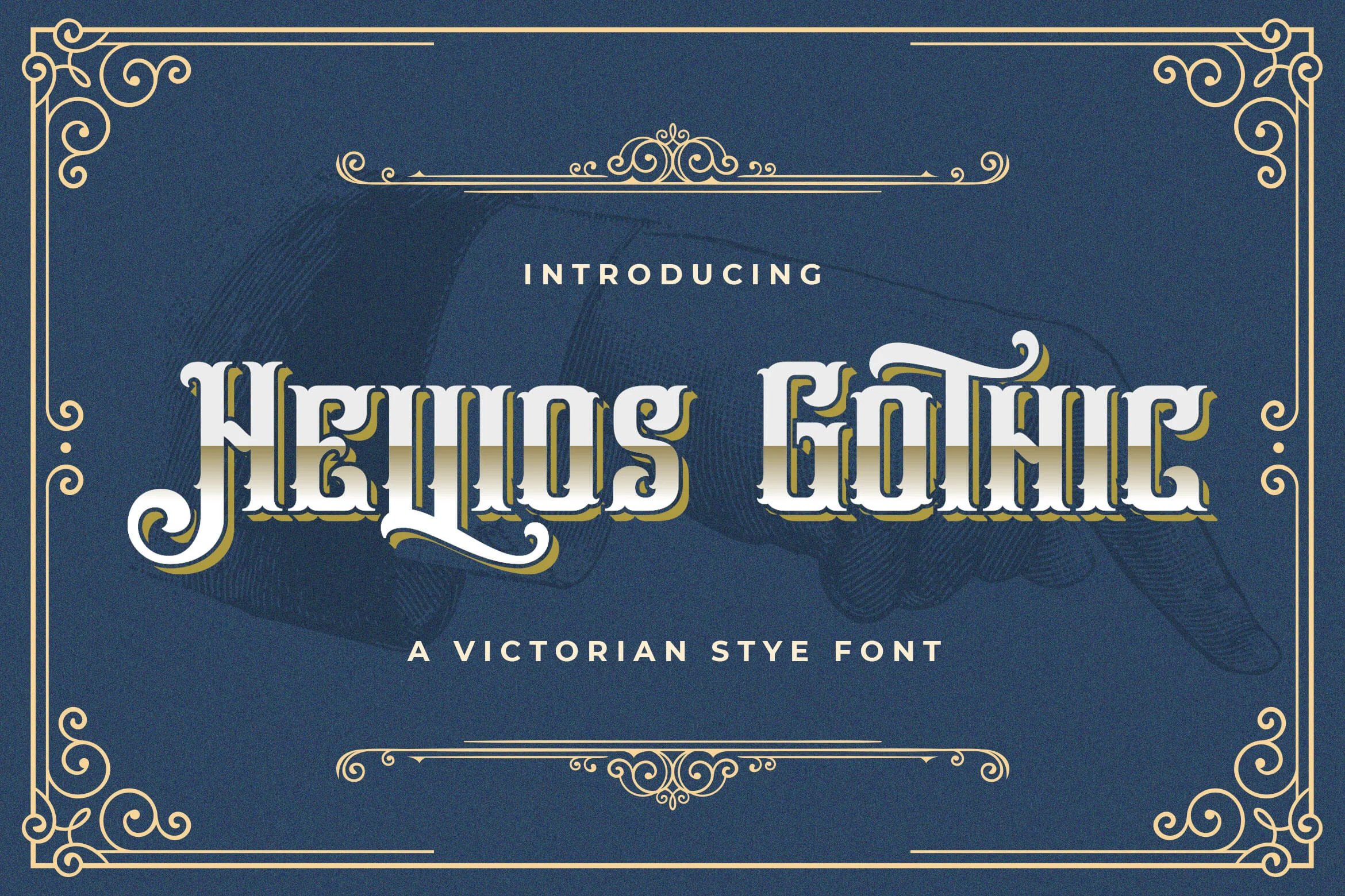
Best For: product labels, packaging, headlines, vintage designs
Hellios Gothic Font builds its Victorian blackletter appearance from thick vertical strokes, sharp flared terminals, and sweeping swashes on opening and closing characters. Those swashes can frame a tattoo phrase, although smaller settings may tangle the lettering and reduce quick recognition.
Ragnar Gothic Font
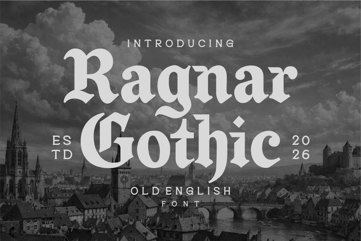
Best For: branding, logos, posters, display text
Ragnar Gothic Font offsets heavy vertical stress with sweeping ornamental curves and pointed terminals. At a generous size, those curves give a Gothic Font Tattoo more movement without abandoning its formal blackletter base. Small or tightly packed text, however, will sacrifice the font's clean readability.
Black Male Font
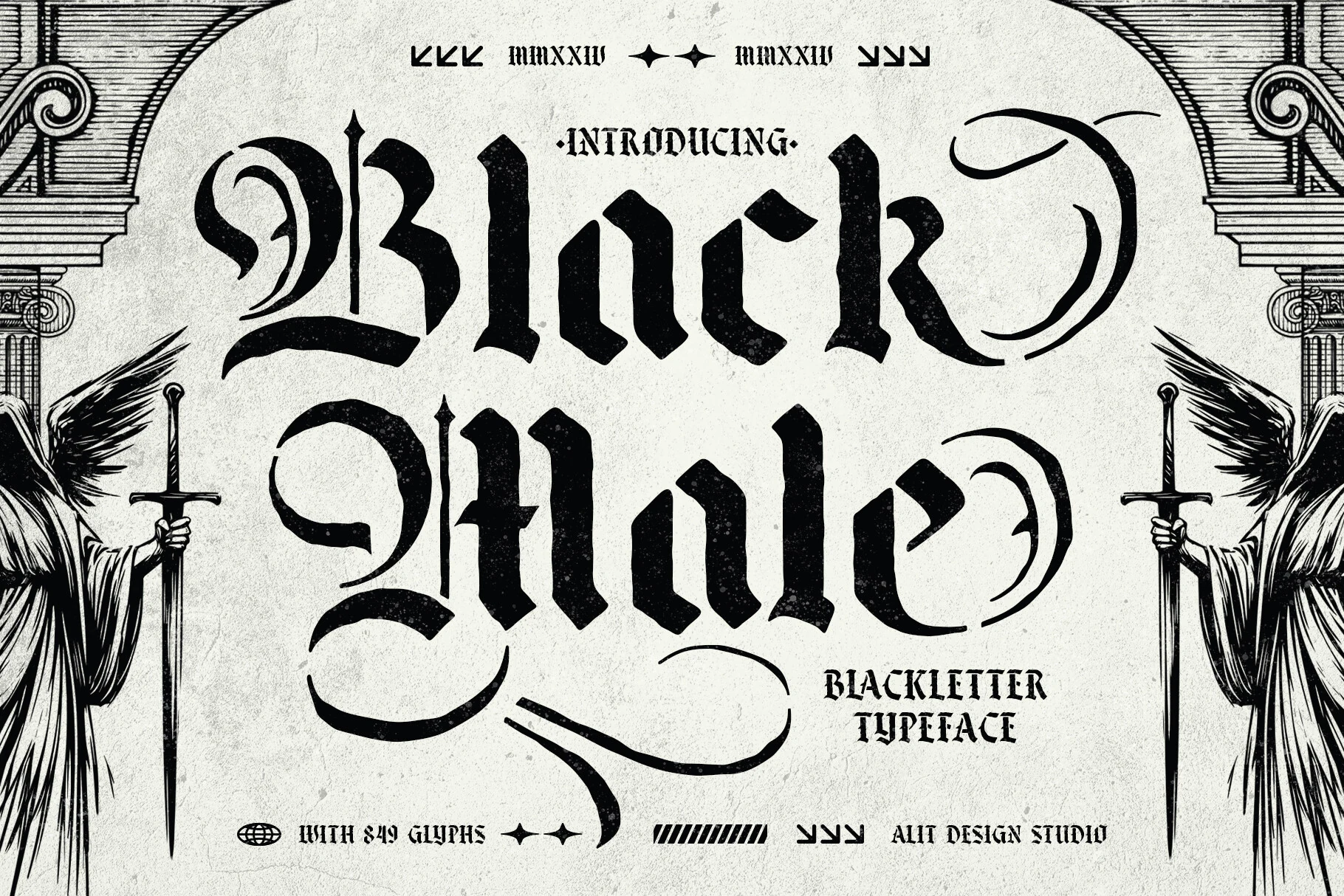
Best For: headlines, posters, display text, decorative designs
Black Male Font is a dense stencil-like blackletter with high contrast, angular terminals, and an unusually broad decorative toolkit. Its 849-glyph set includes alternates, swashes, and ligatures, making it useful for customizing a Gothic Font Tattoo name. Use display sizing so the intricate defaults do not collapse.
Brother Gothic Font
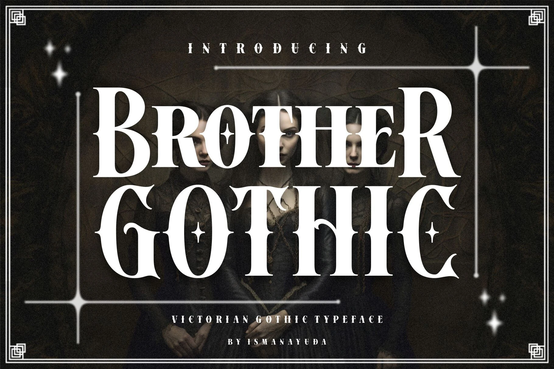
Best For: logos, branding, headlines, posters
Brother Gothic Font separates itself from fuller blackletter through Victorian serif construction, thin hairlines, pointed wedge serifs, and occasional star details. That contrast can give a Gothic Font Tattoo logo or short inscription a tailored formal edge, though the ornament and high contrast limit small-scale clarity.
Black Kiyrand Font
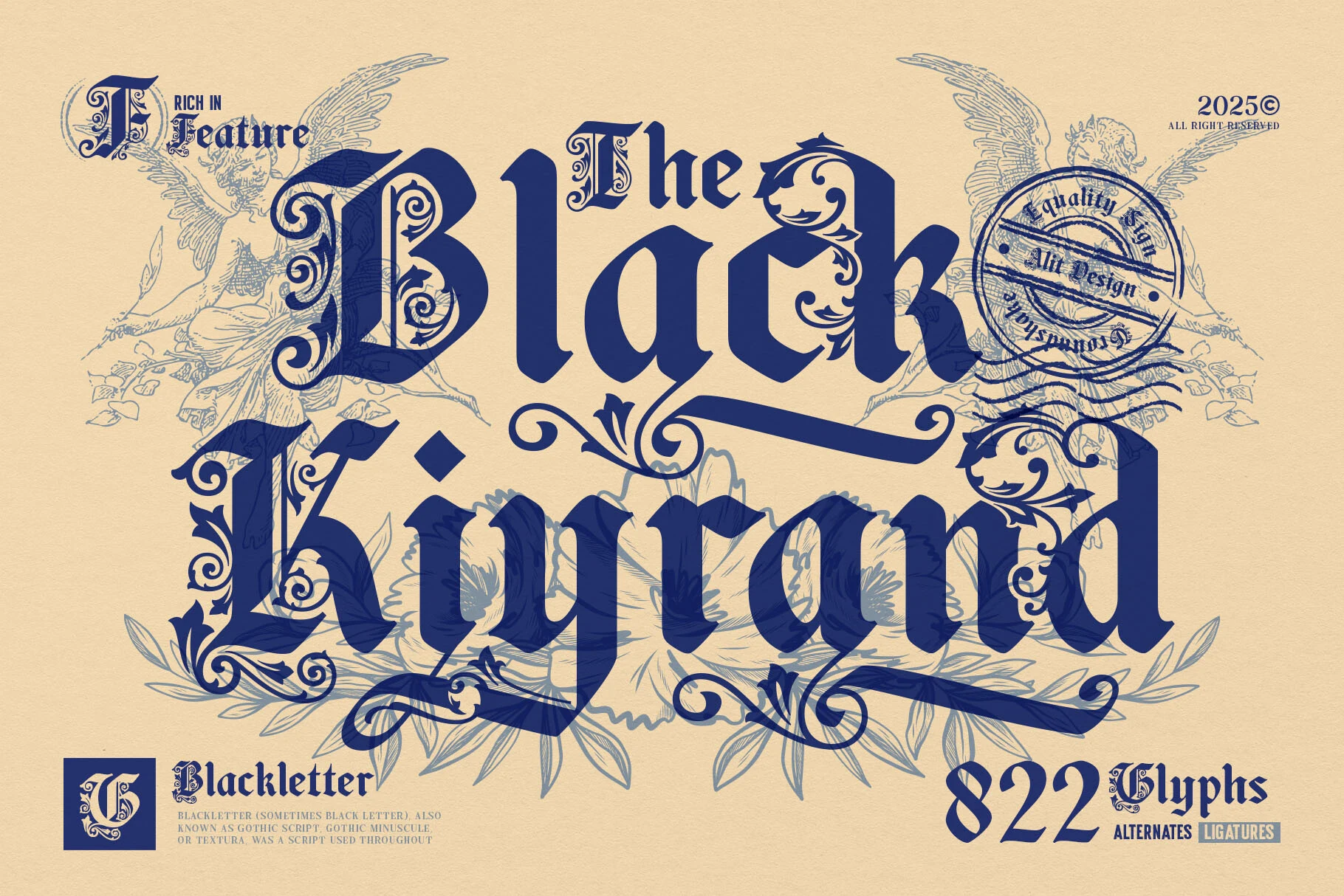
Best For: logos, posters, signage, quotes
Black Kiyrand Font keeps a heavy blackletter framework but makes medieval-inspired swashes and flourishes the main visual event. It can personalize a Gothic Font Tattoo initial, name, or short quote, provided the lettering is large enough for the dense decoration to remain separable during quick reading.
Grimvault Font
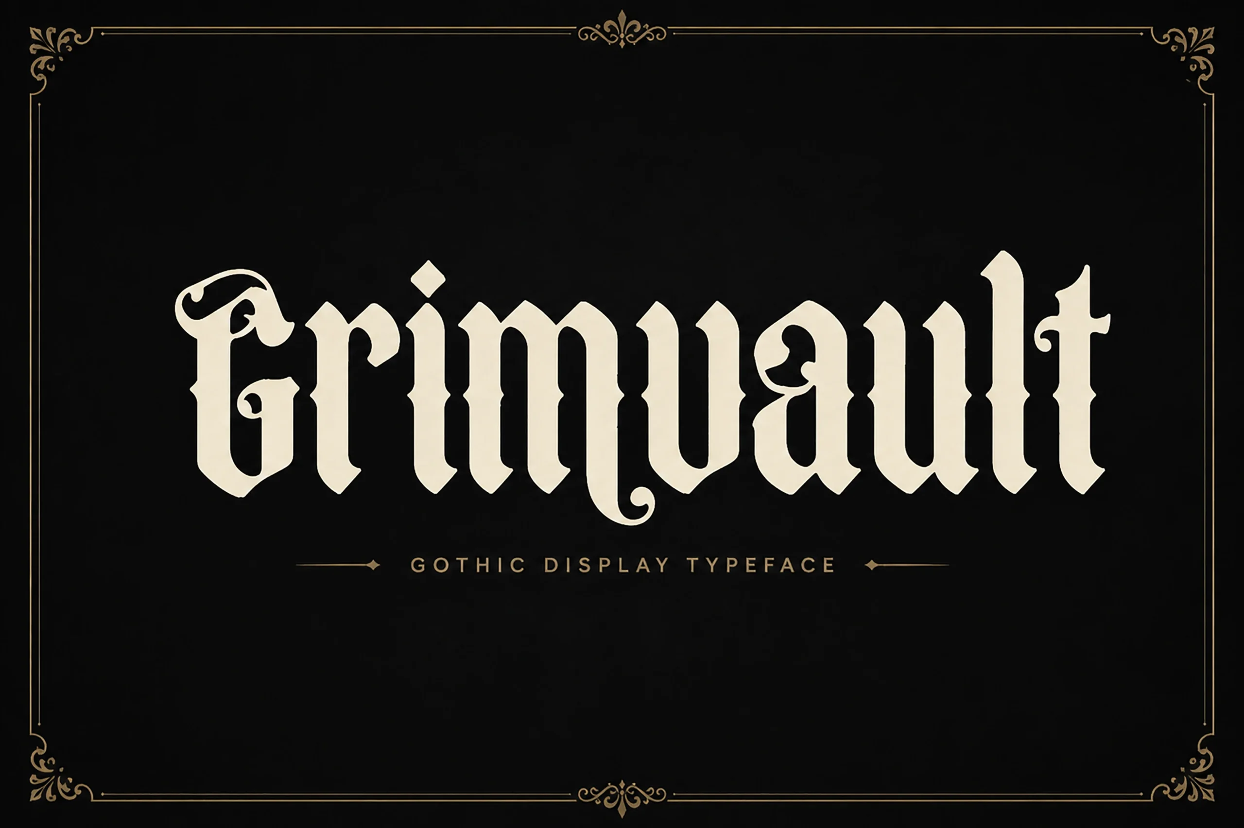
Best For: logos, packaging, book covers, merch design
Grimvault Font centers its otherwise formal blackletter design on a flourished initial G. That focal letter makes it particularly useful for a monogram, first name, or Gothic Font Tattoo built around one signature character. The remaining high-contrast forms stay display-oriented and become less comfortable to read when reduced.
Drachenveil Font
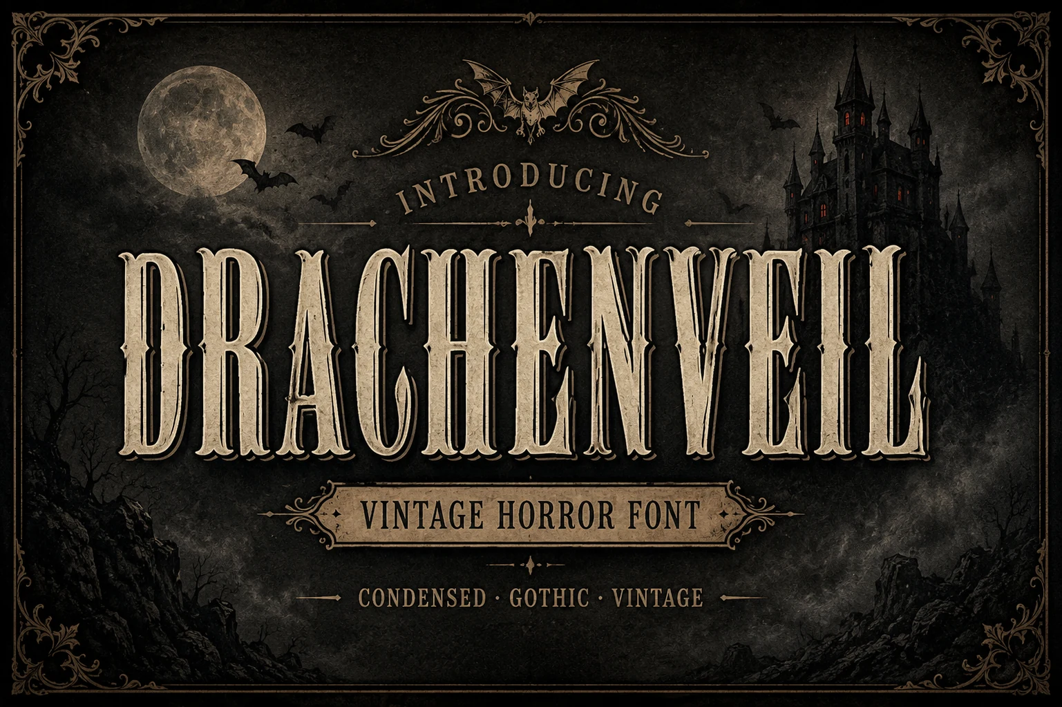
Best For: posters, headlines, display text, vintage designs
Drachenveil Font sits closer to a condensed Gothic display serif than full blackletter, using sharp wedge serifs, bold verticality, and aged engraved texture. It suits a vintage Gothic Font Tattoo treatment when the surface detail is part of the concept, though high contrast and narrow forms limit dependable reading at small sizes.
Gothic Woman Font
Best For: luxury designs, book covers, posters, headlines
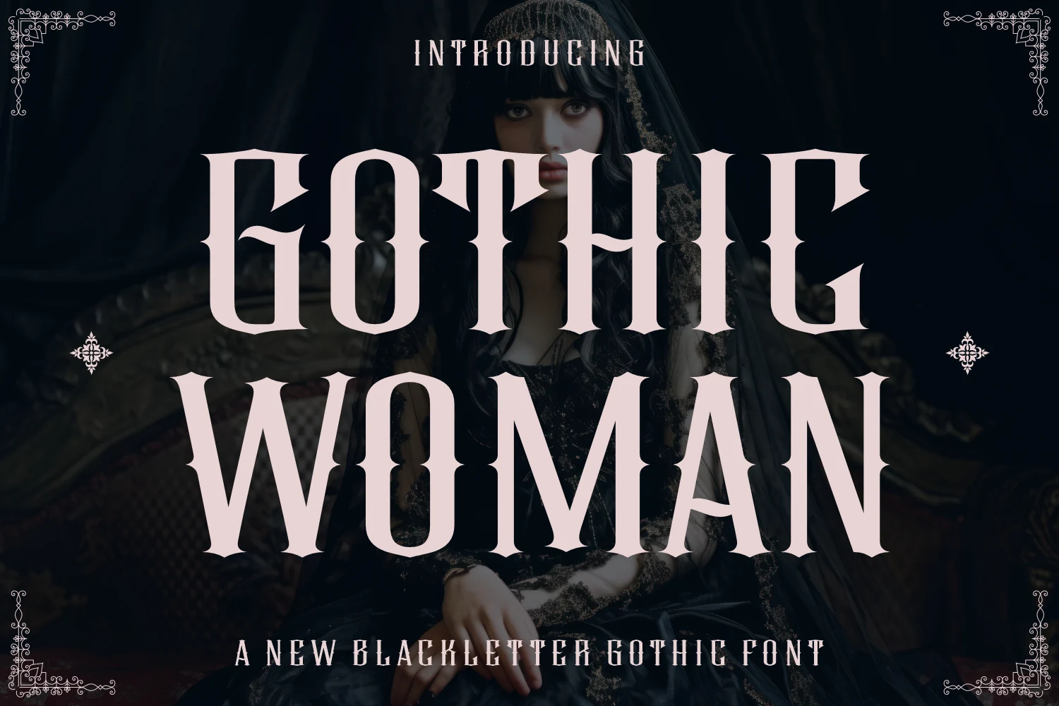
Gothic Woman Font softens severe blackletter geometry with Victorian ornament, flared terminals, and a strong contrast between thick strokes and thin details. That makes it suitable for a decorative Gothic Font Tattoo phrase or bookish motif, but the delicate terminals need generous scale and should not carry too much wording.
Distressed Dark Lettering
Distressed dark lettering combines blackletter skeletons with drips, weathering, metallic effects, stone textures, or irregular baselines. These surface treatments create atmosphere, though they can muddy counters and fine details.
Grimoire Noir Font
Best For: posters, book covers, retro designs
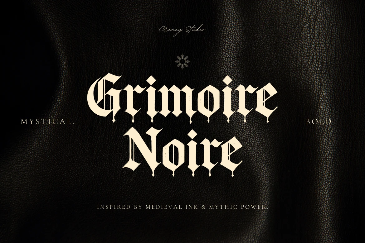
Grimoire Noir Font pushes manuscript-inspired blackletter toward dark-fantasy territory through drip-like extensions, sharp construction, and narrow proportions. It can make a Gothic Font Tattoo feel ominous and atmospheric, but the dripping terminals need room and may overpower a delicate concept or compact inscription.
Ironglyph Font

Best For: posters, headlines, T-shirts
Ironglyph Font layers distressed metallic texture over an angular, high-contrast blackletter skeleton. Its sharply finished terminals and robust angles support an aggressive Gothic Font Tattoo concept, while the textured surface favors large titles. At small sizes, that effect can muddy edges and reduce reliable reading.
Black Valor Font
Best For: headlines, posters, T-shirts, old-school designs
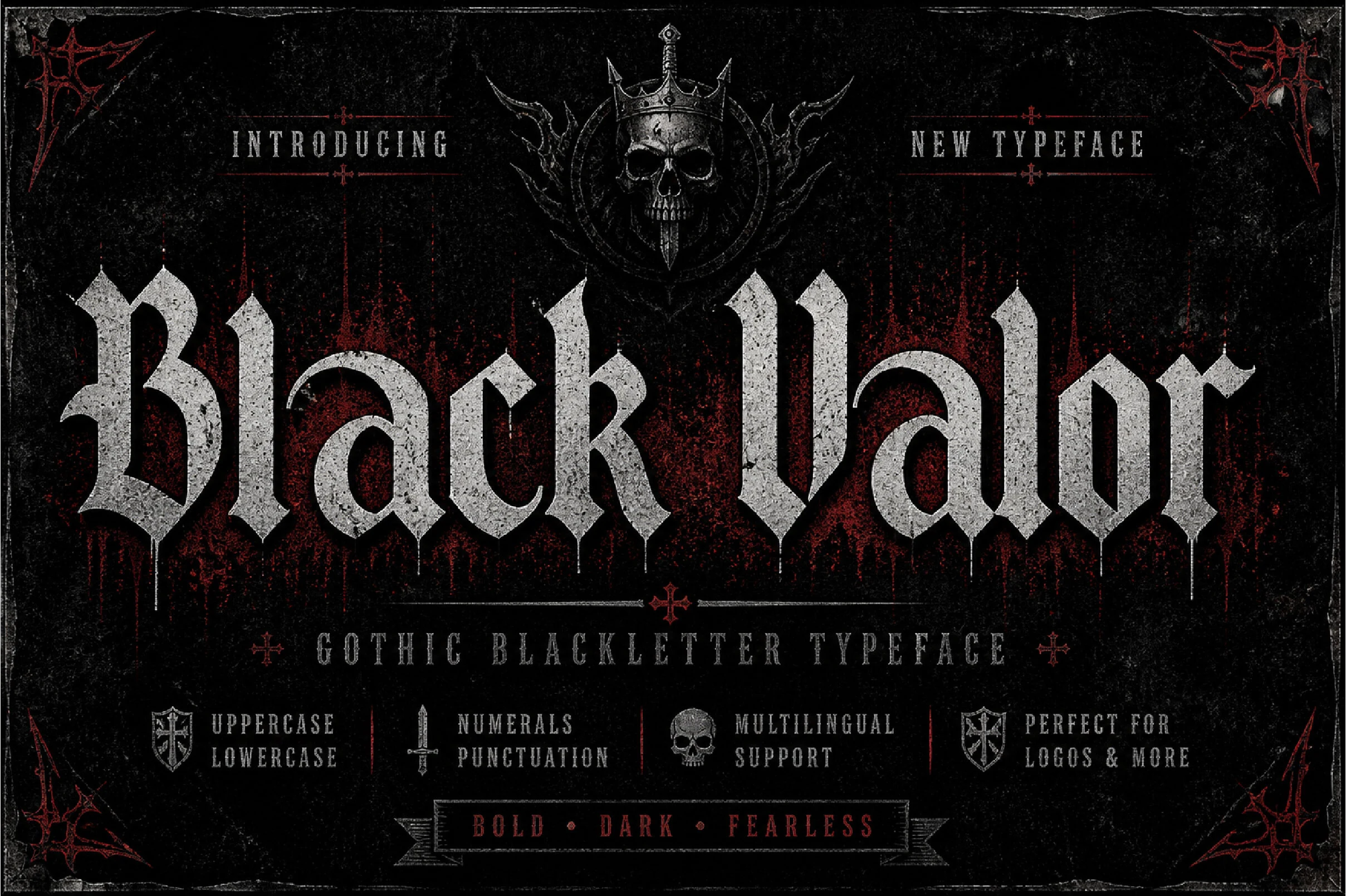
Black Valor Font uses architectural Gothic framing, pointed vertical accents, condensed proportions, and distressed texture to create a structured silhouette. It can make a Gothic Font Tattoo phrase feel imposing without requiring a wide layout, although the decorative wear reduces fine-text readability and favors short wording.
Bloodforge Gothic Font
Best For: logos, posters, display text, headlines
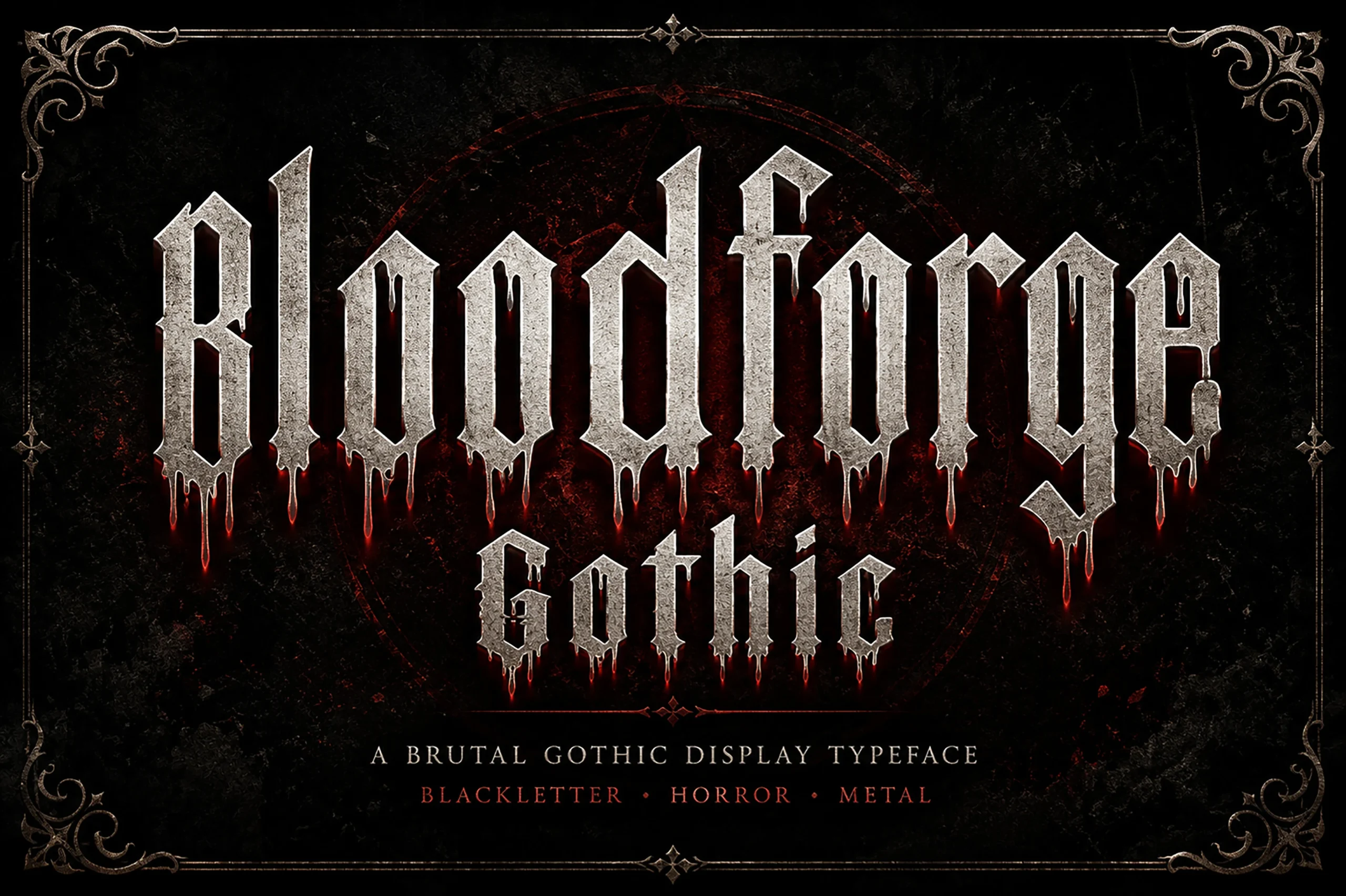
Bloodforge Gothic Font is visibly fluid because its baseline is irregular and its weathered blackletter forms extend below it with dripping details. That treatment works for a large Gothic Font Tattoo centerpiece or logo-like design, but it is unsuitable for small inscriptions carrying several words or fine information.
Beltina Font
Best For: logos, posters, display text, headlines
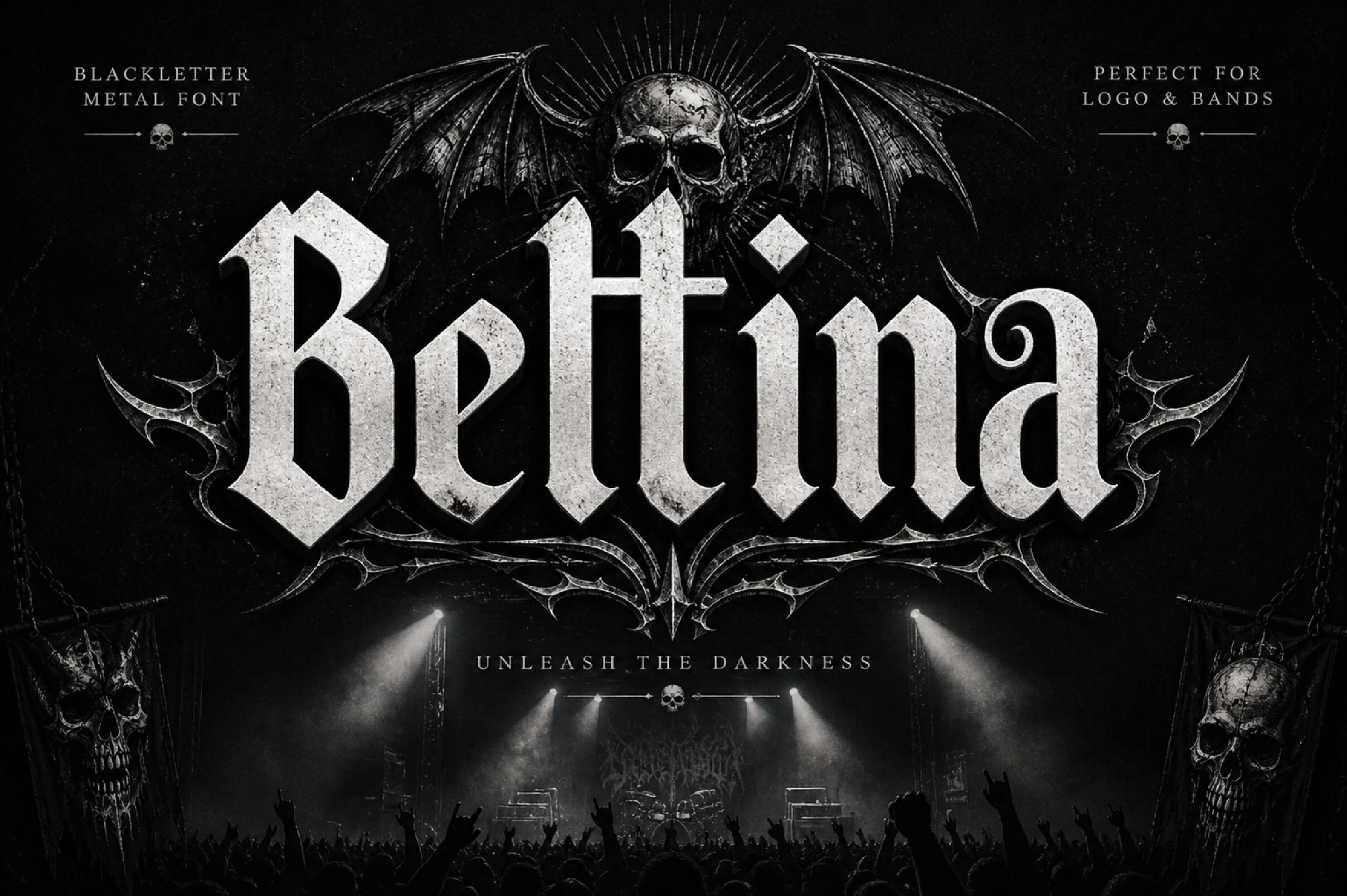
Beltina Font makes its vertical blackletter appear physically carved through faceted terminals, strong stroke emphasis, and stone-like surface texture. It is well suited to a monument or memorial Gothic Font Tattoo theme, but the material effect can compromise small counters, so choose a large placement and short text.
Modern Angular Lettering
Modern angular lettering reduces curved movement in favor of rigid alignment, faceted joins, and engineered terminals. It feels cleaner and more geometric than the medieval and distressed alternatives, while remaining display-oriented.
Obsidian Black Font
Best For: product labels, packaging, book covers, posters
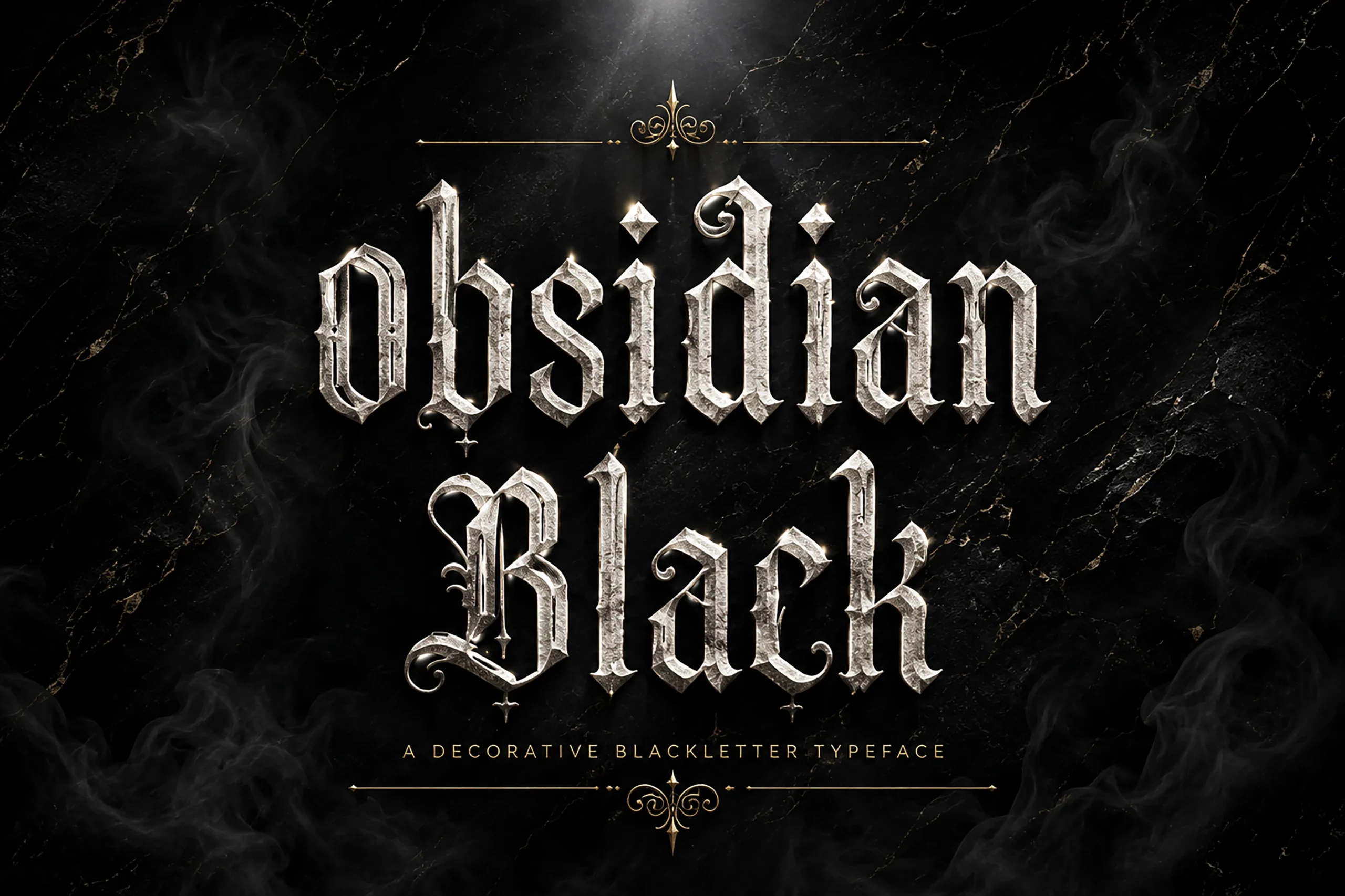
Rigid disconnected shapes, diamond terminals, and a narrow vertical rhythm give Obsidian Black Font a carved, cinematic appearance. The dense construction is most effective for a prominent Gothic Font Tattoo wordmark or short title, not a long inscription where its decorative forms become difficult to parse.
Grimvora Font
Best For: branding, packaging, display text, headlines
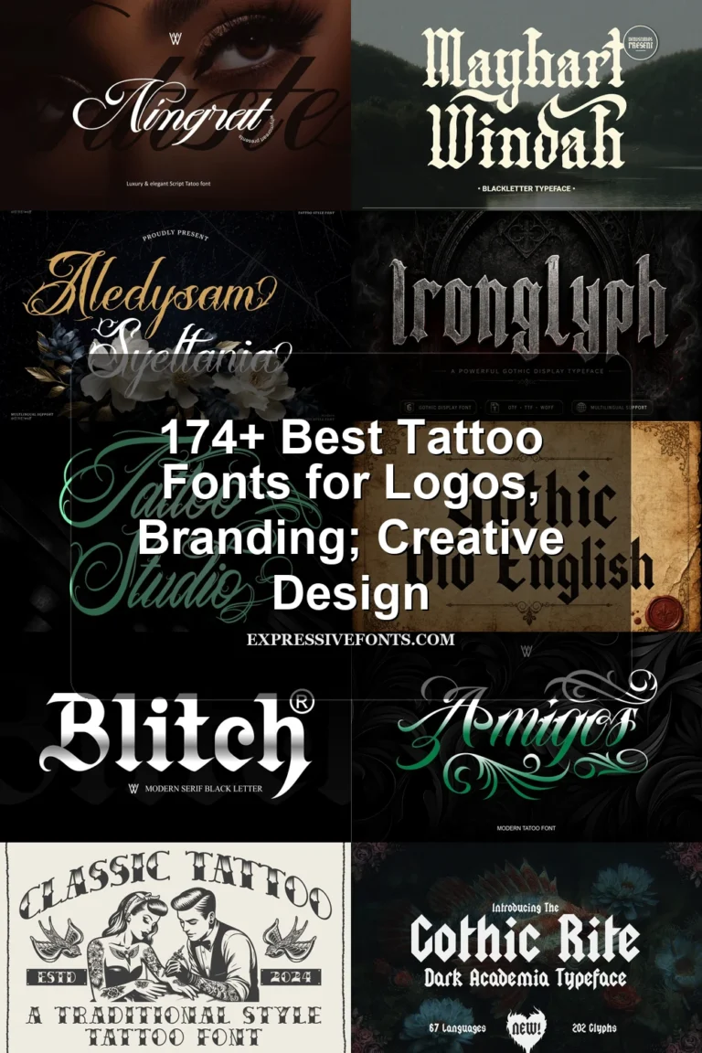
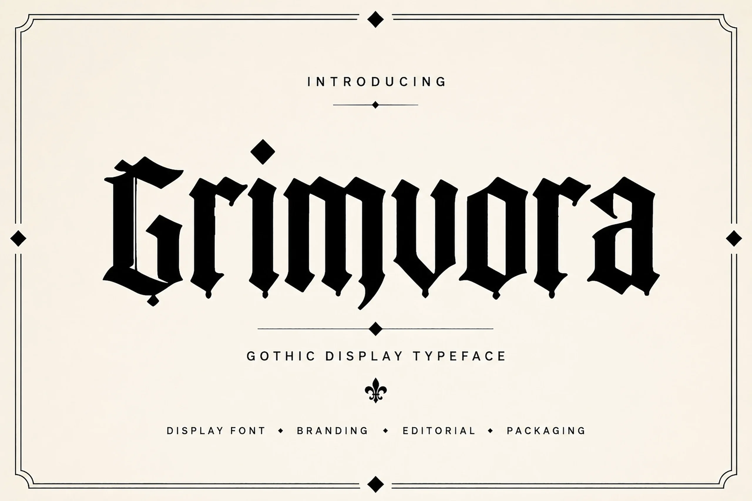
Grimvora Font gives blackletter a chiseled, textured surface rather than a smooth historical finish. Its condensed proportions and pointed terminals can anchor a rugged Gothic Font Tattoo centerpiece, while the surface treatment adds material presence. Reduce it too far, however, and fine counters may become obscured.
Metal Gothic Font
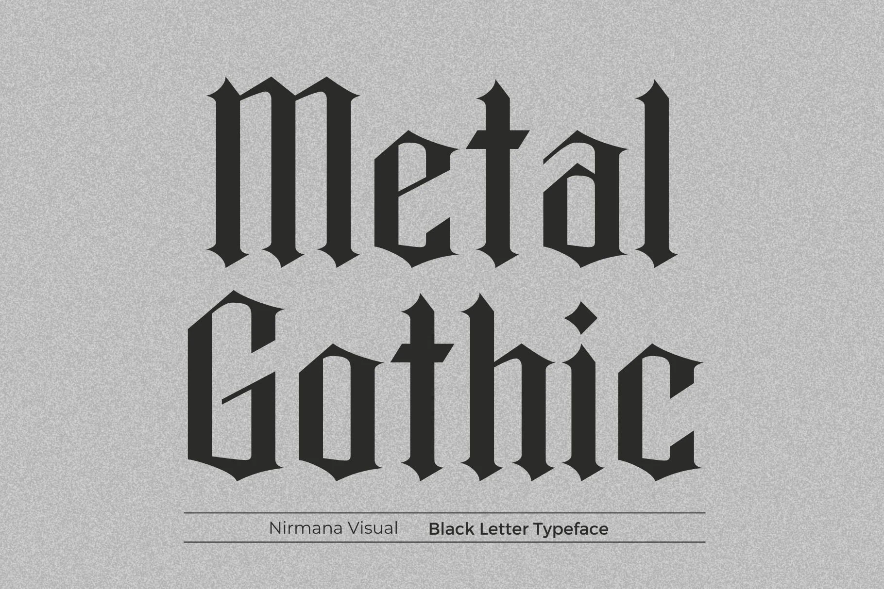
Metal Gothic Font replaces much of blackletter's curved movement with straight-edged transitions, diamond terminals, and compressed vertical proportions. That engineered construction can give a Gothic Font Tattoo logo a cleanly severe appearance, but its complex high-contrast forms still work best for short display wording rather than extended reading.
Void Gothic Font
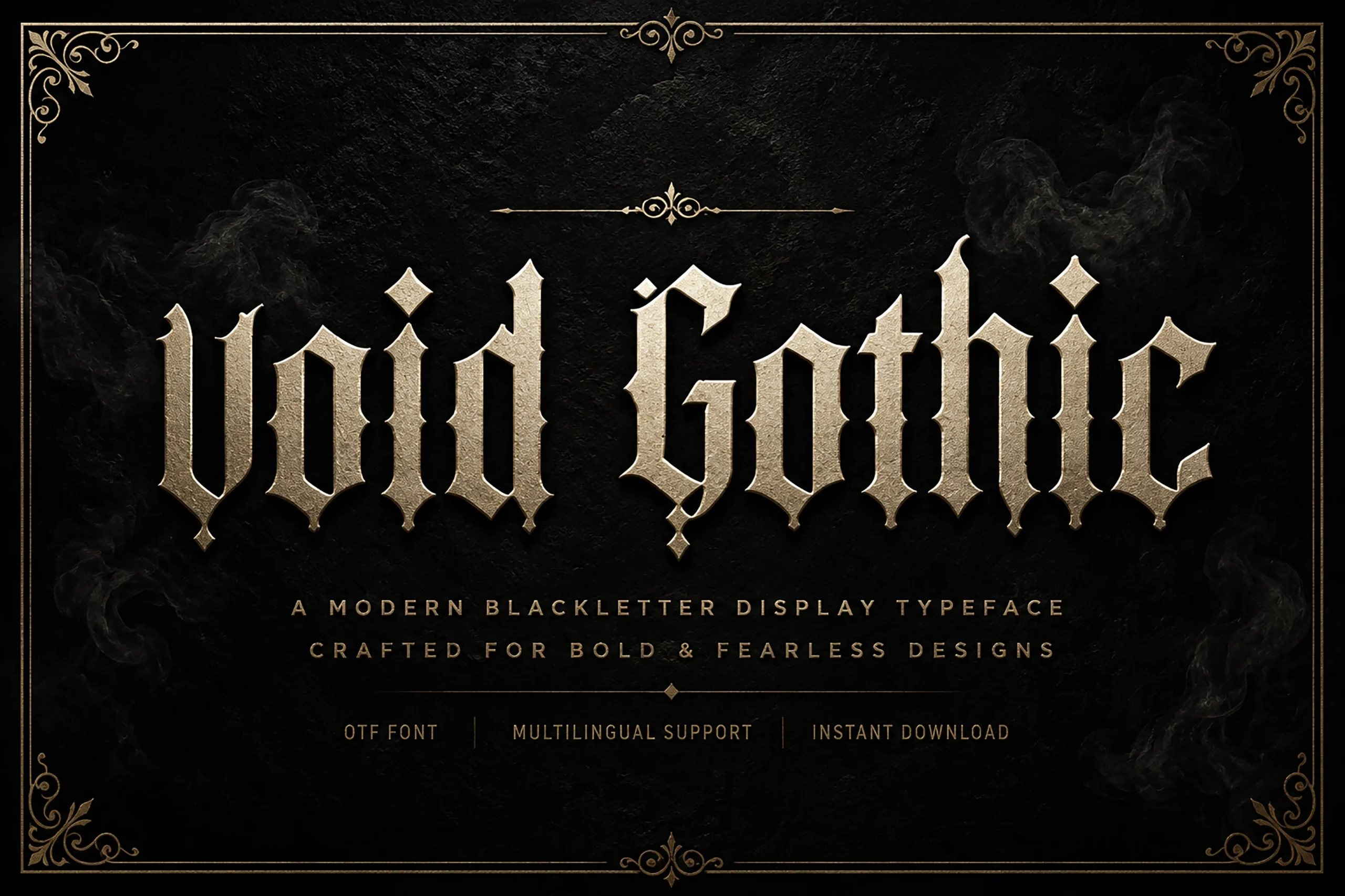
Best For: logos, branding, posters, headlines
Void Gothic Font trims its pointed, high-contrast blackletter skeleton with a cleaner edge, making it a practical Gothic Font Tattoo choice for a contemporary logo or compact wordmark. It remains a display face rather than a reading face, since condensed decorative forms become tiring across extended text.
Antifight Font
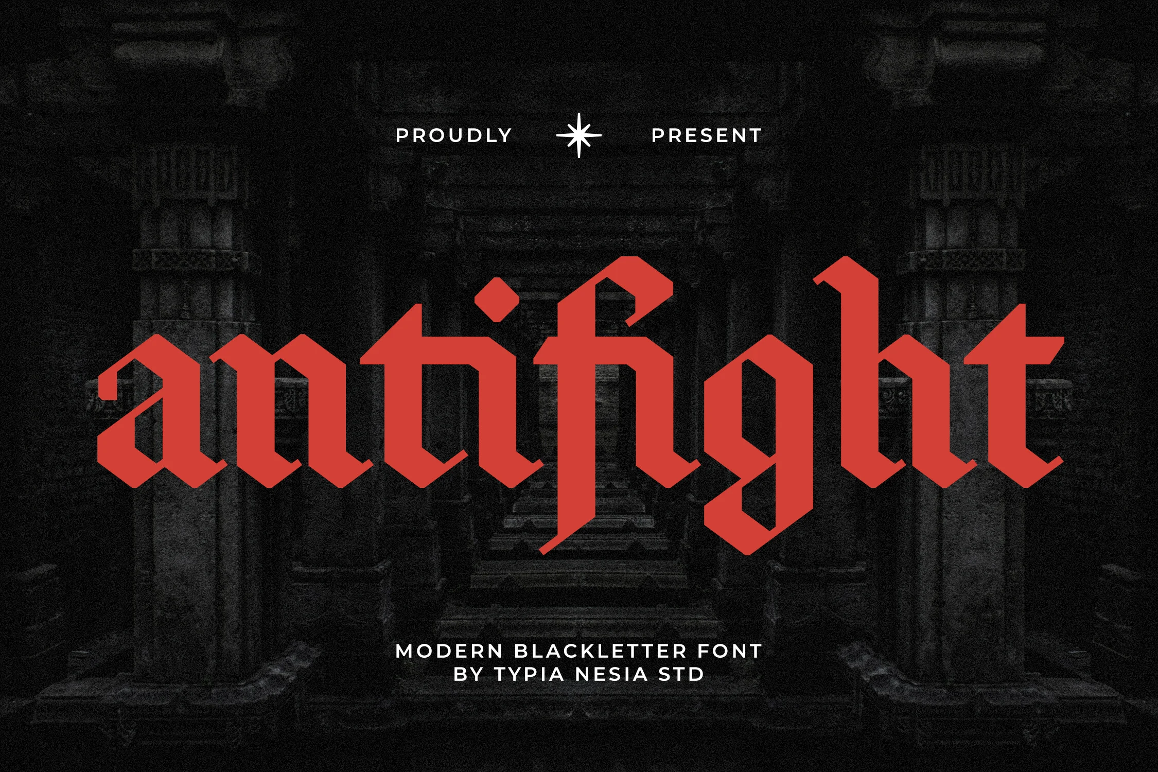
Best For: logos, display text, headlines, vintage designs
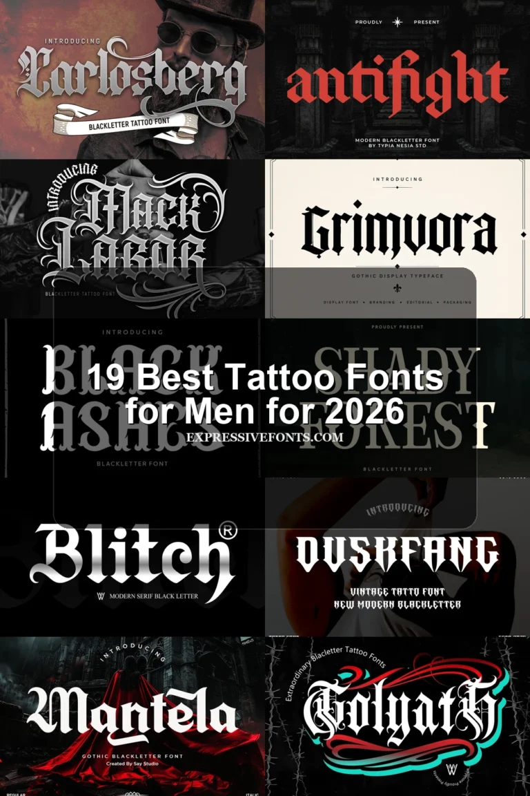
Antifight Font is especially geometric, with faceted junctions, diamond terminals, rigid vertical alignment, and condensed proportions. Those construction choices help hold a compact Gothic Font Tattoo wordmark together as a unified shape, while the numerous angles favor short phrases and a larger application over small detailed lettering.
How to Choose the Right Font
Choose first by reading distance and tattoo scale: simpler condensed forms are safer for names and short horizontal layouts, while swashes, drips, texture, and fractured terminals need larger applications. For a Gothic Font Tattoo, inspect joins, counters, flourishes, and weight at the final size, then reserve the most intricate faces for titles, crests, initials, or logos.