14 Best Elegant Aesthetic Fonts in 2026
Elegant Aesthetic Fonts span sharp high-contrast serifs, connected scripts, weathered textures, and narrow display forms. Together, they serve practical roles in logos, covers, packaging, invitations, posters, social graphics, and other short text where construction and readability matter.
Looking for more aesthetic fonts? Browse our complete Aesthetic Fonts collection to compare modern, elegant, bold, vintage, and retro aesthetic styles.
Elegant Aesthetic Fonts: High-Contrast Serif Core
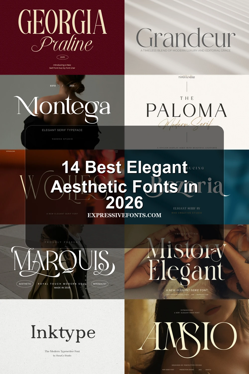
This Elegant Aesthetic Fonts core is connected by upright, high-contrast serif construction, but ranges from clean traditional forms to swashed, ligature-rich display faces.
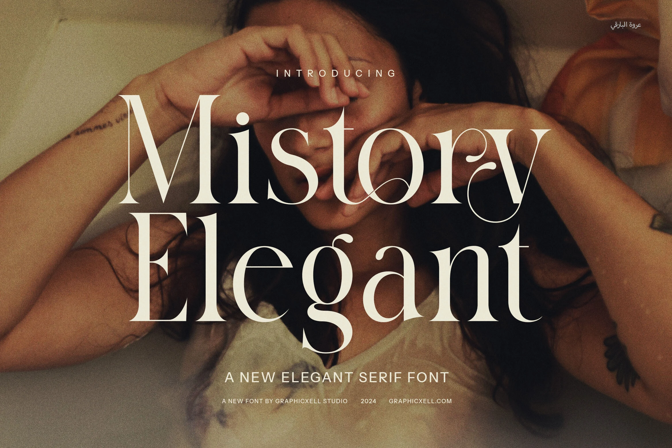
Mistory Elegant Font
Best For: logos, branding, headlines
Mistory Elegant Font builds headline presence through tight kerning, intertwining letters, alternate forms, and distinctive ligatures. Sharp serifs, high contrast, elongated curves, and teardrop terminals make it highly customized, though overlapping details are best reserved for large titles, logos, and short branding lines.
Amsio Elegant Serif Font
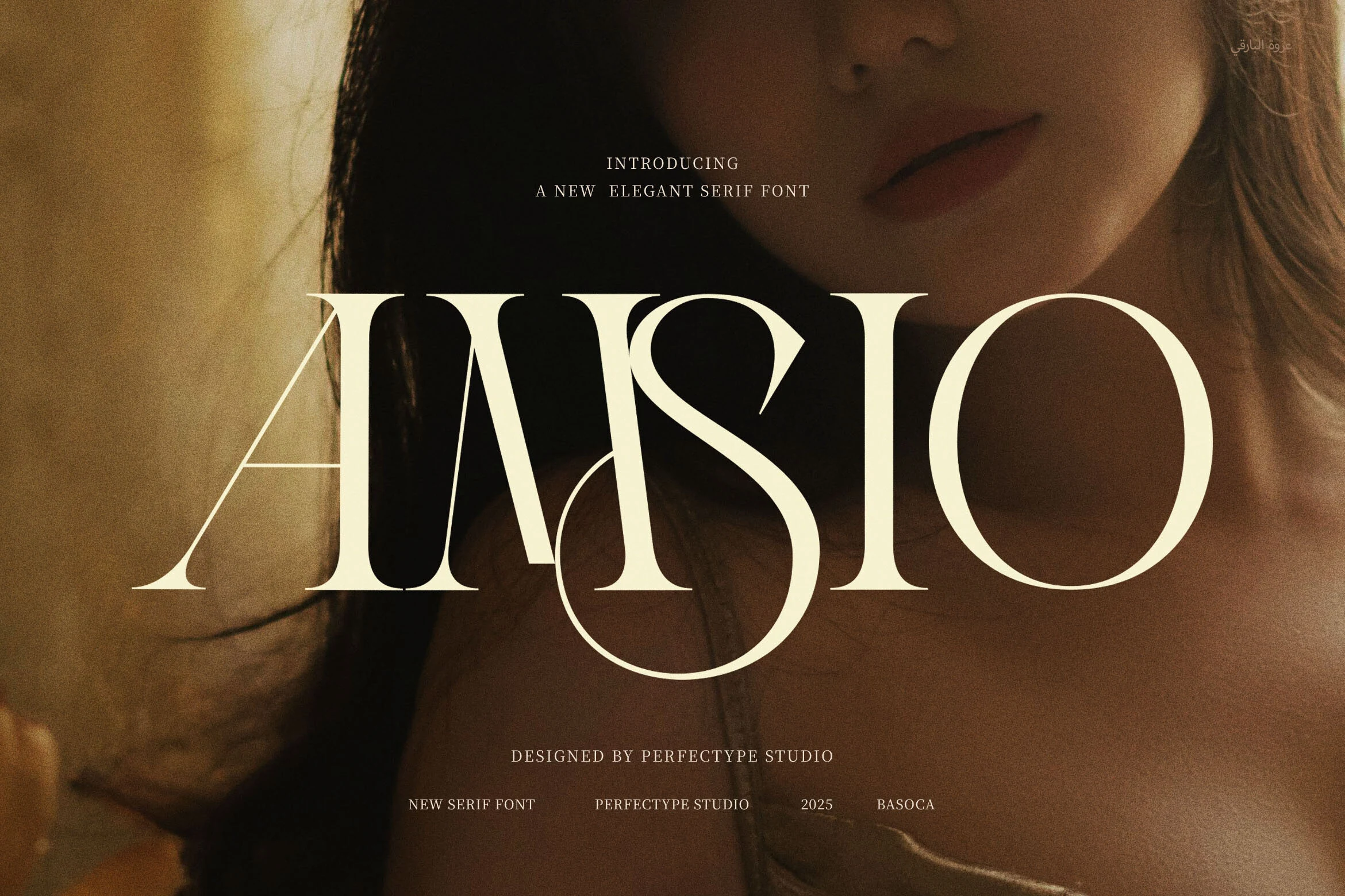
Best For: logos, packaging, magazine covers, display text
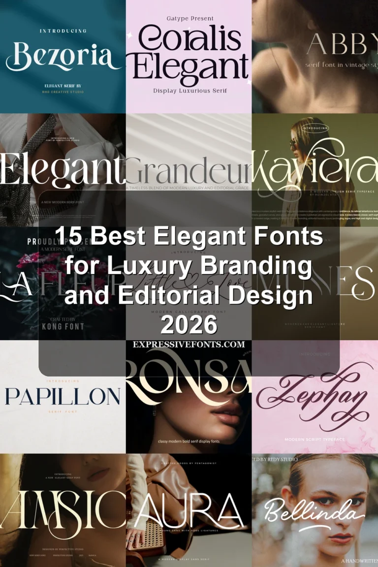
Amsio Elegant Serif Font uses wide proportions, open circular counters, bold verticals, and very fine hairlines to create an airy editorial impression. Its balanced letterforms suit magazine covers, packaging, logos, and other display applications, while the delicate contrast calls for generous sizing rather than small copy.
Grandeur – Elegant Classic Serif Font
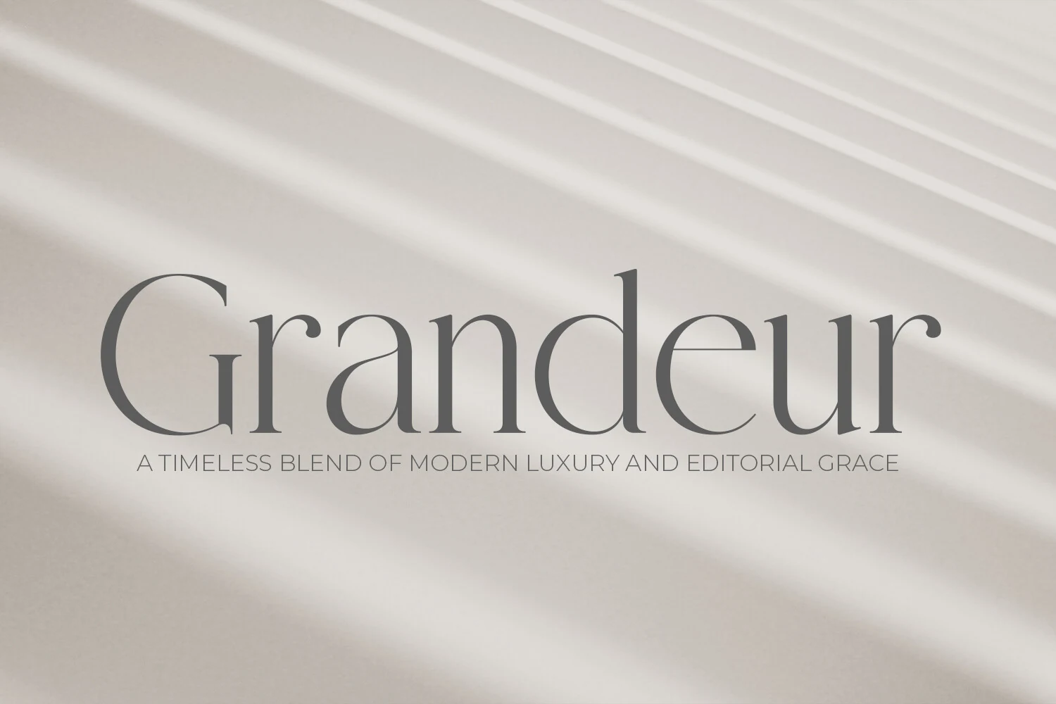
Best For: headlines, book covers, editorial designs
Grandeur – Elegant Classic Serif Font is a dependable choice for composed headlines and book covers, thanks to open counters, pointy bracketed serifs, and a steady upright posture. Its strong thick-to-thin contrast remains clear at display sizes, delivering a traditional structure without decorative swashes or a slanted stance.
The Paloma Font
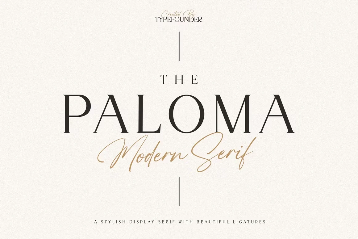
Best For: logos, branding, magazine covers, minimal designs
The Paloma Font gives prominent text a polished presence through wide proportions, strong vertical strokes, sharp elongated serifs, and pronounced contrast. It reads clearly in logos, magazine covers, and structured layouts, but its display-focused weight is better for short branding and cover text than extended reading.
Bezoria – Elegant Serif Font
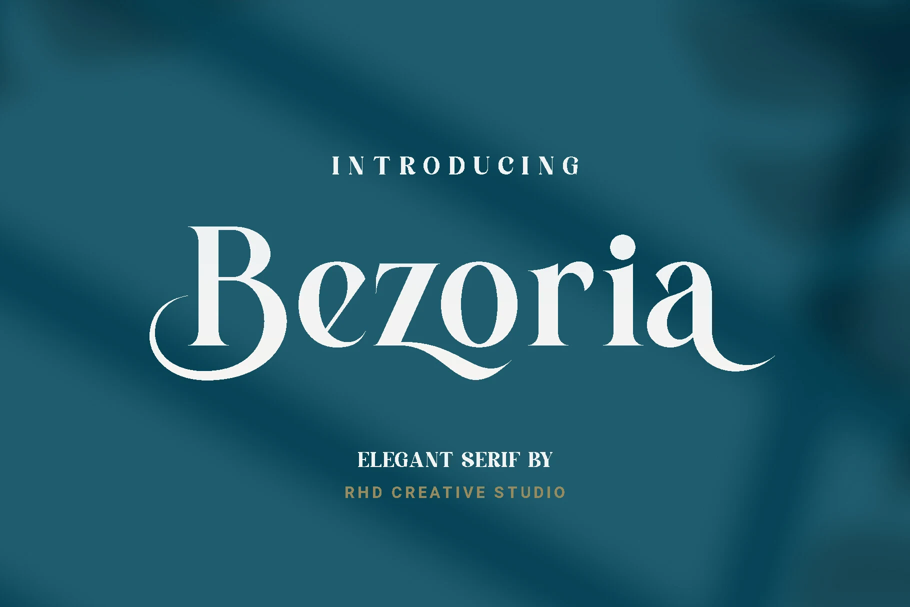
Best For: logos, branding, wedding designs, editorial designs
Bezoria – Elegant Serif Font keeps a serif foundation but adds curved swash extensions to the B and a. Its tall x-height helps larger lettering hold together in logos, branding, wedding stationery, and editorial designs, although the high contrast and flourishes are less practical for compact copy.
Semika Font
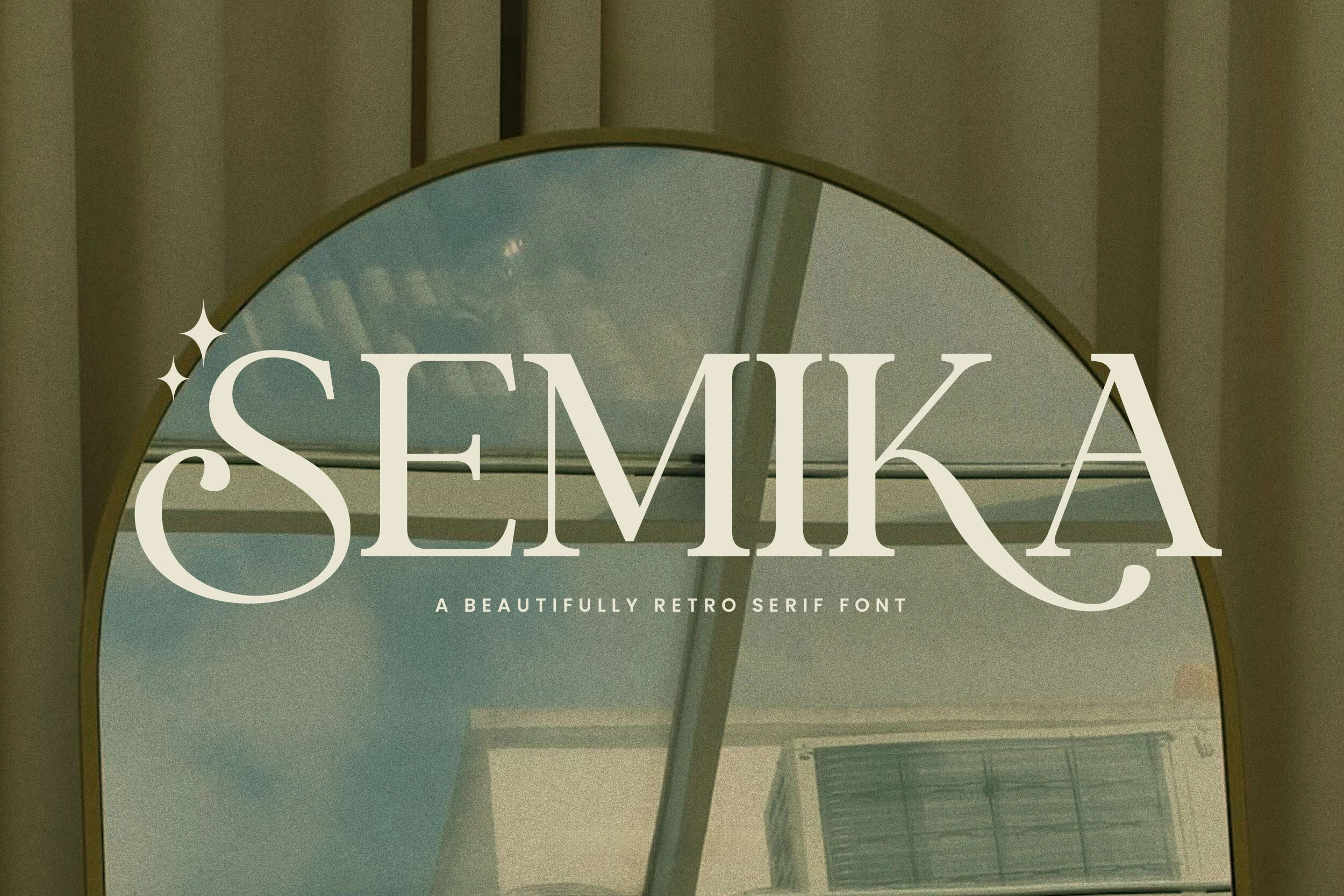
Best For: logos, packaging, wedding designs, romantic designs
Semika Font combines sharp serifs and high stroke contrast with soft curves, a swash-like S terminal, and extended flourishes. That period-led construction works well for logos, packaging, wedding designs, and similarly short compositions, but thin strokes and decorative terminals can lose clarity when reduced too far.
Marquis – Elegant Modern Serif Font
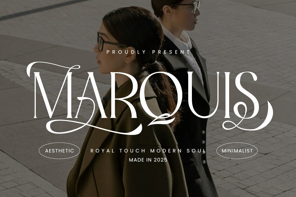
Best For: logos, branding, headlines, display text
Marquis – Elegant Modern Serif Font uses a calligraphic-inspired baseline, terminal swashes, sharp elongated serifs, and stylish ligatures to distinguish headlines and logos. The upright structure remains organized, but its high contrast and flourishes need display scale, making it a poor fit for compact text blocks.
Wolles Elegant Modern Serif Font
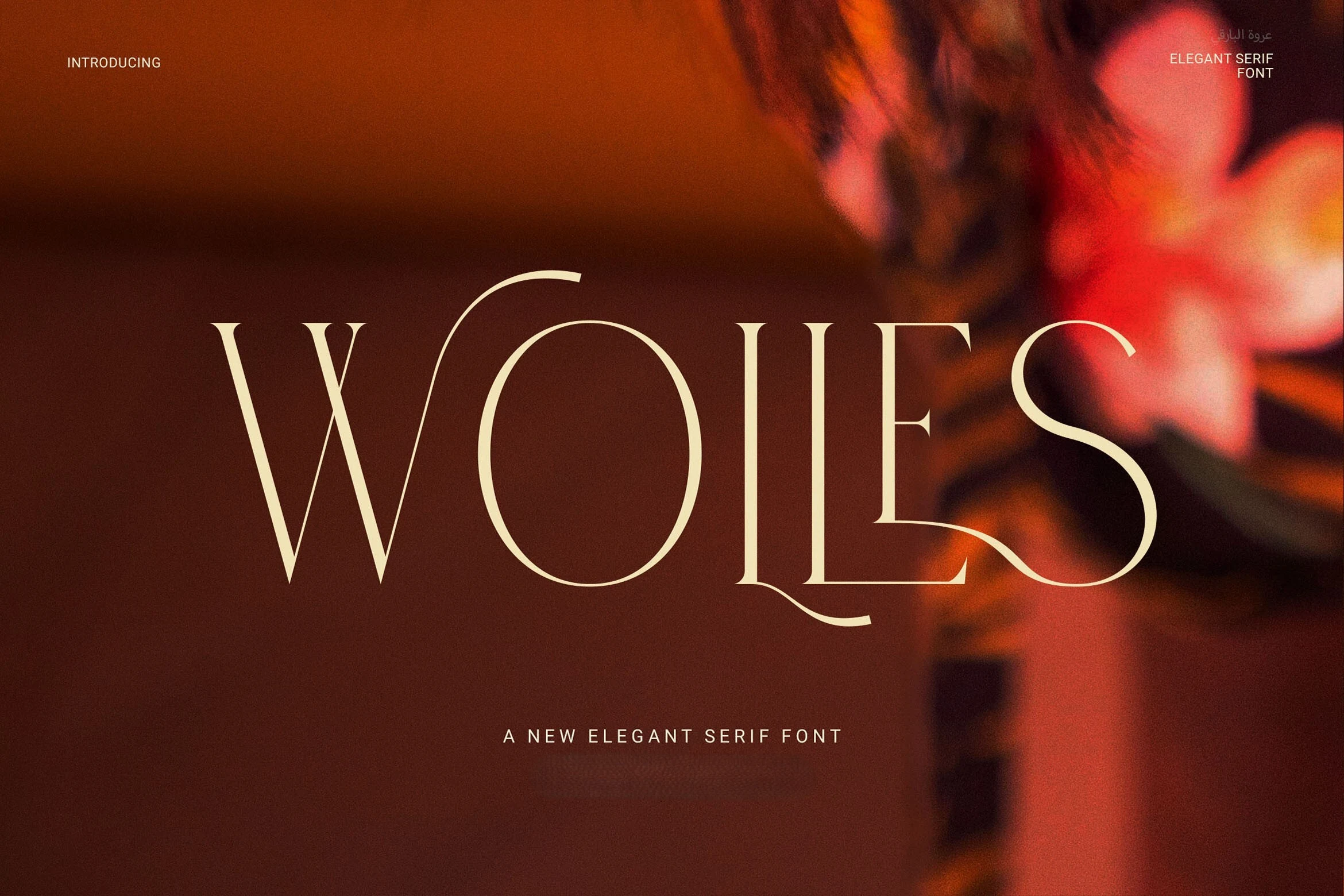
Best For: logos, branding, headlines, editorial designs
Wolles Elegant Modern Serif Font combines tall proportions, geometric construction, fine-point serifs, and sweeping W and S terminals. Delicate hairlines balance bold vertical stems for controlled headings, logos, and editorial designs, while the extreme contrast keeps it firmly in display territory rather than body text.
Montega Font
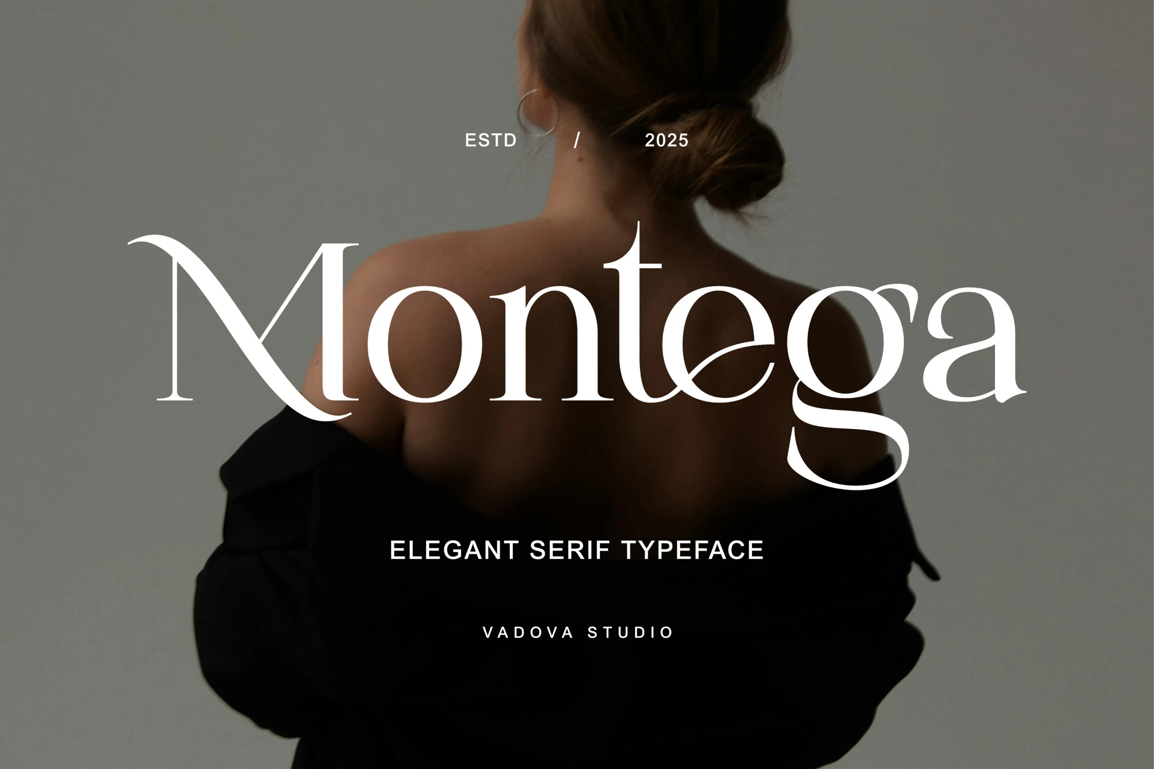
Best For: logos, fashion branding, editorial designs, headlines
Montega Font uses sharp pointed serifs, delicate strokes, and selected swash-like curves to create a signature-led direction for fashion, beauty, and editorial branding. It works particularly well in large headlines and marks, where its ornamental details remain visible; smaller settings reduce its clarity.
Elegant Font
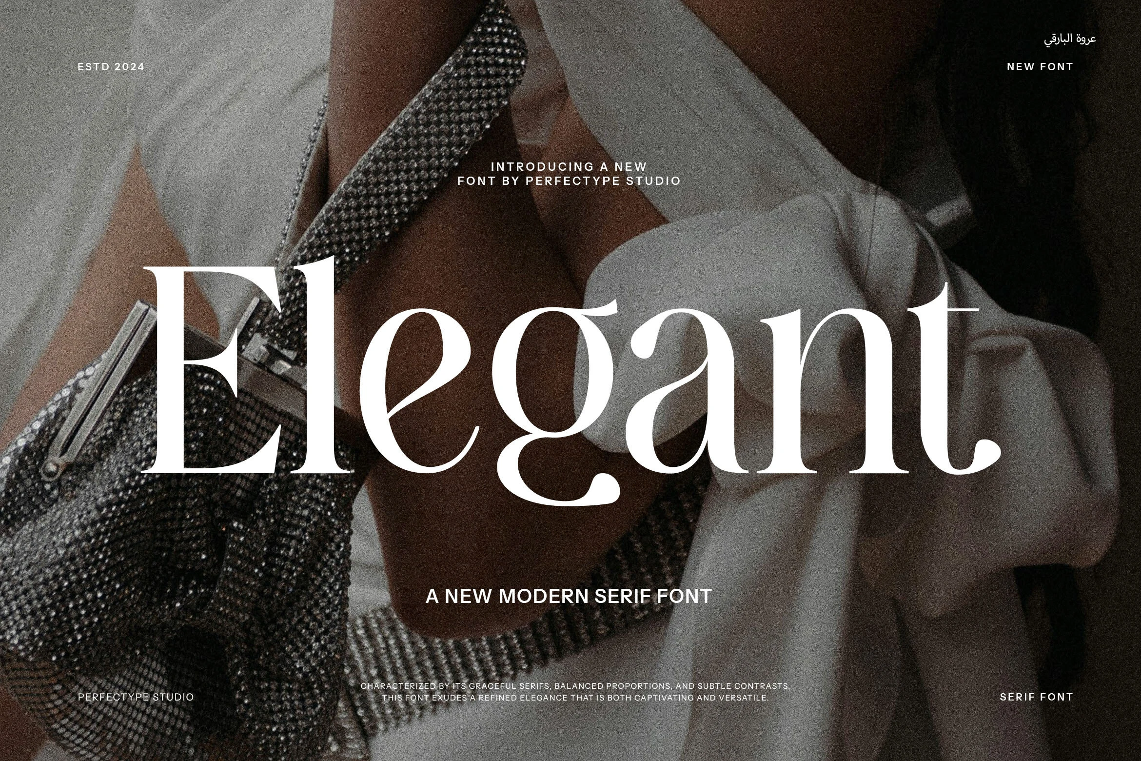
Best For: headlines, editorial designs, invitations
Elegant Font offers a cleaner traditional route through tapered, slightly flared serifs, open counters, smooth curves, and sharp terminals. Its display headlines and invitations stay clear without extensive flourishes, although thin strokes and high contrast make it less suitable for extended body copy.
Connected Script And Serif Duos
These pairings contrast structured serif lettering with connected scripts, giving branding and stationery projects separate voices for clarity, personality, and emphasis.
Georgia Praline Font
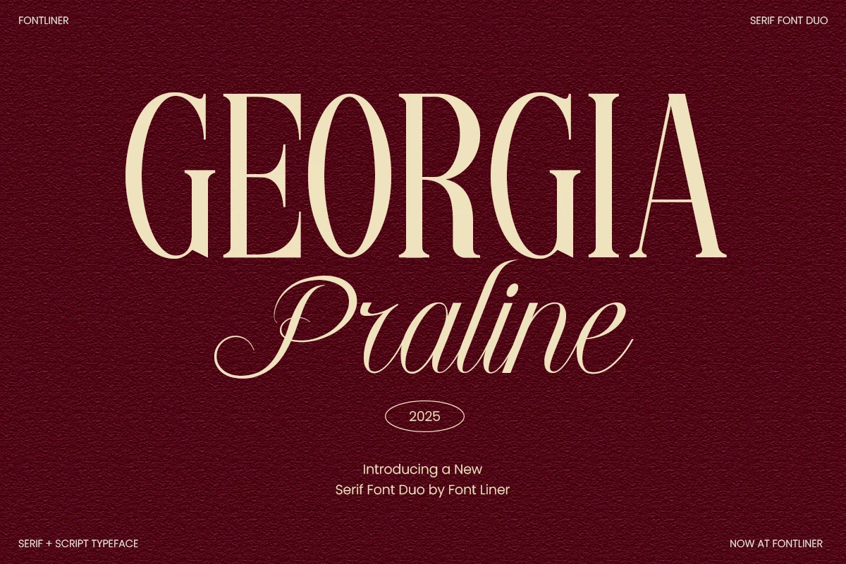
Best For: logos, branding, wedding designs, editorial designs
Georgia Praline Font pairs a sharp high-contrast serif with a separate flowing connected script. The serif supplies structure while swashed capitals and elongated ascenders add personality, making the duo useful for logos, branding, wedding designs, and editorial compositions that can support large sizing.
Elegant Font
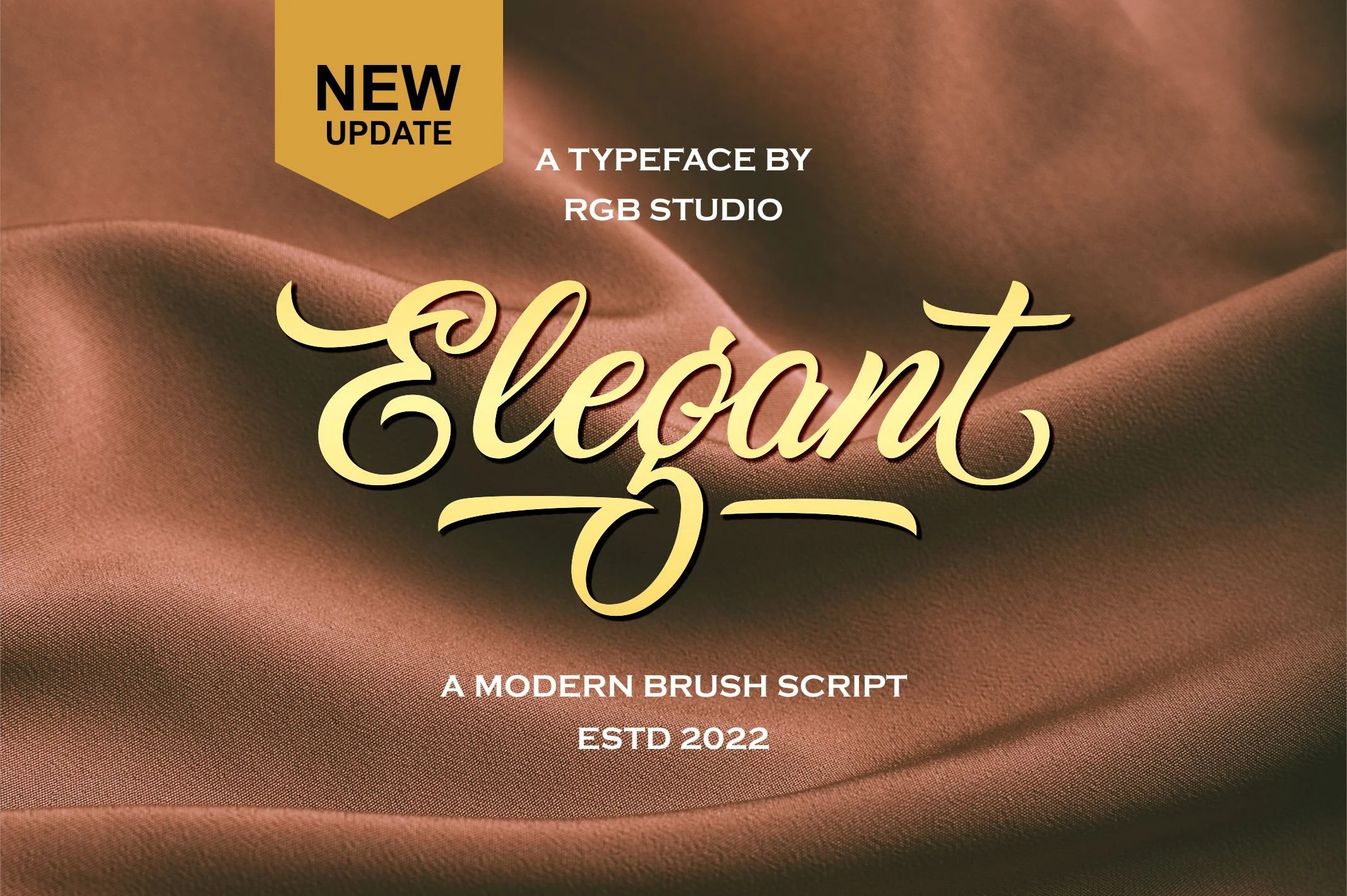
Best For: logos, branding, social media graphics, display text
Elegant Font is a right-leaning connected brush script with bold high-contrast strokes and swashes on the initial E and final t. Its intricate joins bring energy to logos, branding, social media graphics, and display text, but the slanted construction needs generous size for reliable readability.
Textured And Condensed Display Forms
Texture and compressed proportions define this group: one relies on irregular inked edges, while the other uses extreme vertical narrowness for compact visual impact.
Inktype Font
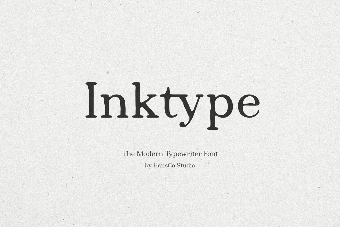
Best For: branding, posters, quotes, invitations
Inktype Font separates itself with slightly irregular, ink-blotted edges around a hand-drawn serif structure. Its upright traditional letterforms remain readable, while the weathered surface adds character to posters, invitations, quotes, and branding that can be set large enough for the texture to register.
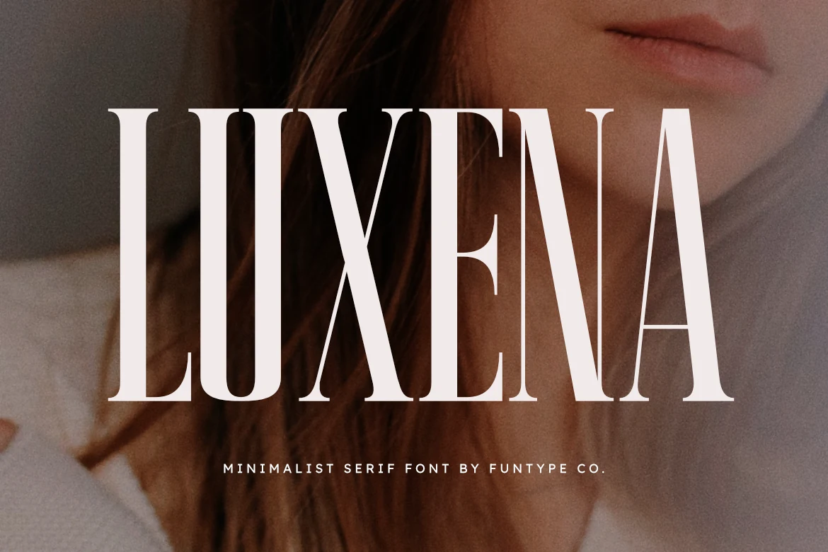
Luxena Font
Best For: logos, branding, posters, display text
Luxena Font creates the narrowest silhouette here with extremely condensed proportions, elongated vertical stems, sharp bracketed serifs, and high contrast. That compressed width fits posters, logos, branding, and short display lines, while the verticality and delicate details make small text difficult to read.
How to Choose the Right Font
Choose among these Elegant Aesthetic Fonts by matching construction to scale: use open counters and restrained serifs when readability matters, and reserve tight joins, swashes, ligatures, or brush connections for short large text. Wide faces suit covers and packaging, while condensed forms work best when a poster or logo needs a narrow silhouette.