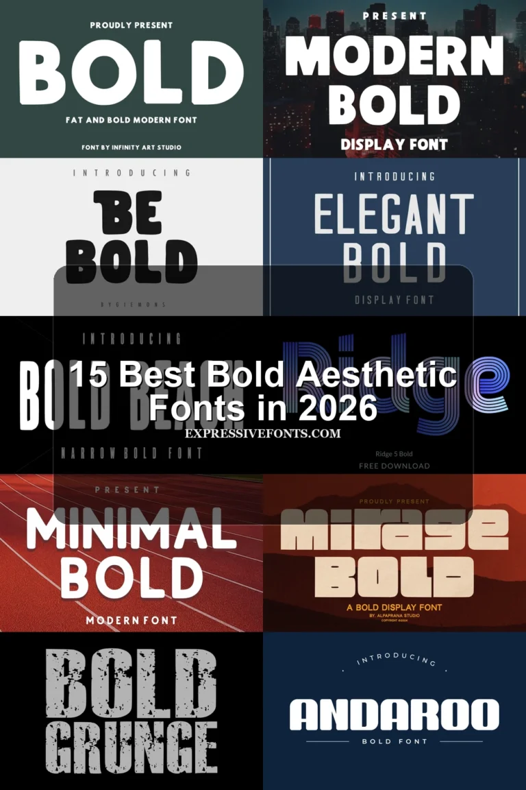
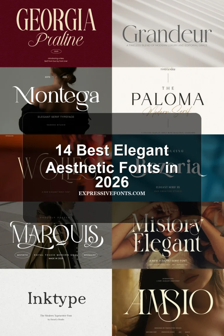
15 Best Cursive Aesthetic Fonts in 2026
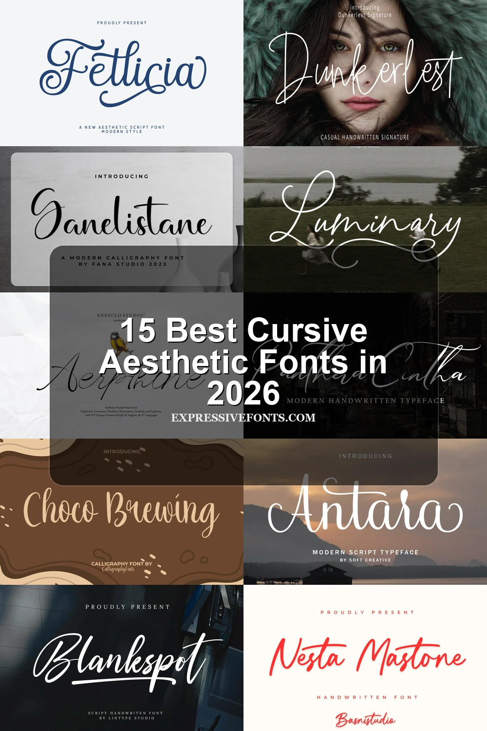
This collection moves from clean, monolinear connections and informal signature rhythms to high-contrast joins, extended loops, and expressive terminal swashes. These Cursive Aesthetic Fonts are best used for logos, invitations, packaging, stationery, social graphics, and other short display text where flowing movement can remain legible.
Looking for more aesthetic fonts? Browse our complete Aesthetic Fonts collection to compare modern, elegant, bold, vintage, and retro aesthetic styles.
Cursive Aesthetic Fonts
Cursive Aesthetic Fonts in this group emphasize connected, low-contrast strokes, clear slant, and controlled flourishes. They feel more adaptable and readable than the heavily ornamented or artisanal alternatives.
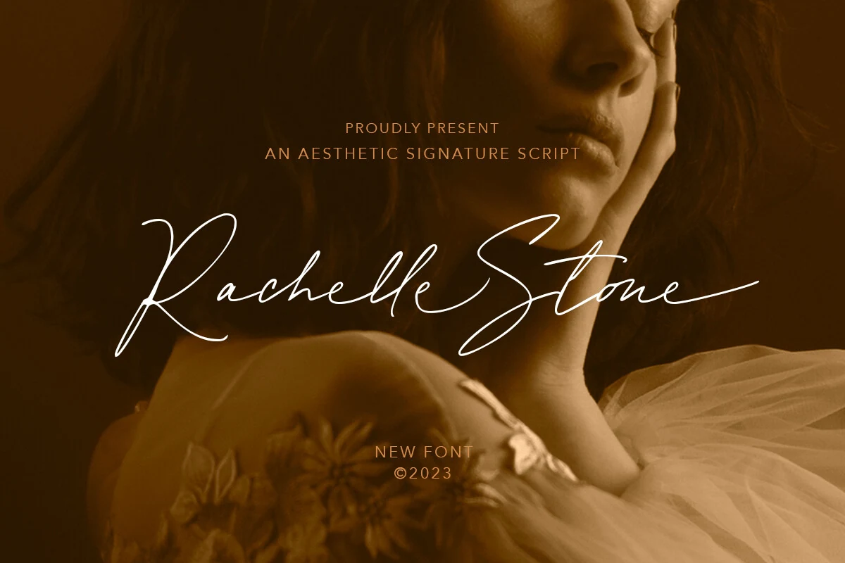
Rachelle Stone Font
Best For: logos, branding, personal branding
Rachelle Stone Font uses tightly joined monolinear forms, with elongated uppercase letters and terminal swashes adding reach. Ligatures and alternates support customized logos, signatures, and branding, but the dense connections work best at large display sizes.
Rathilya Font
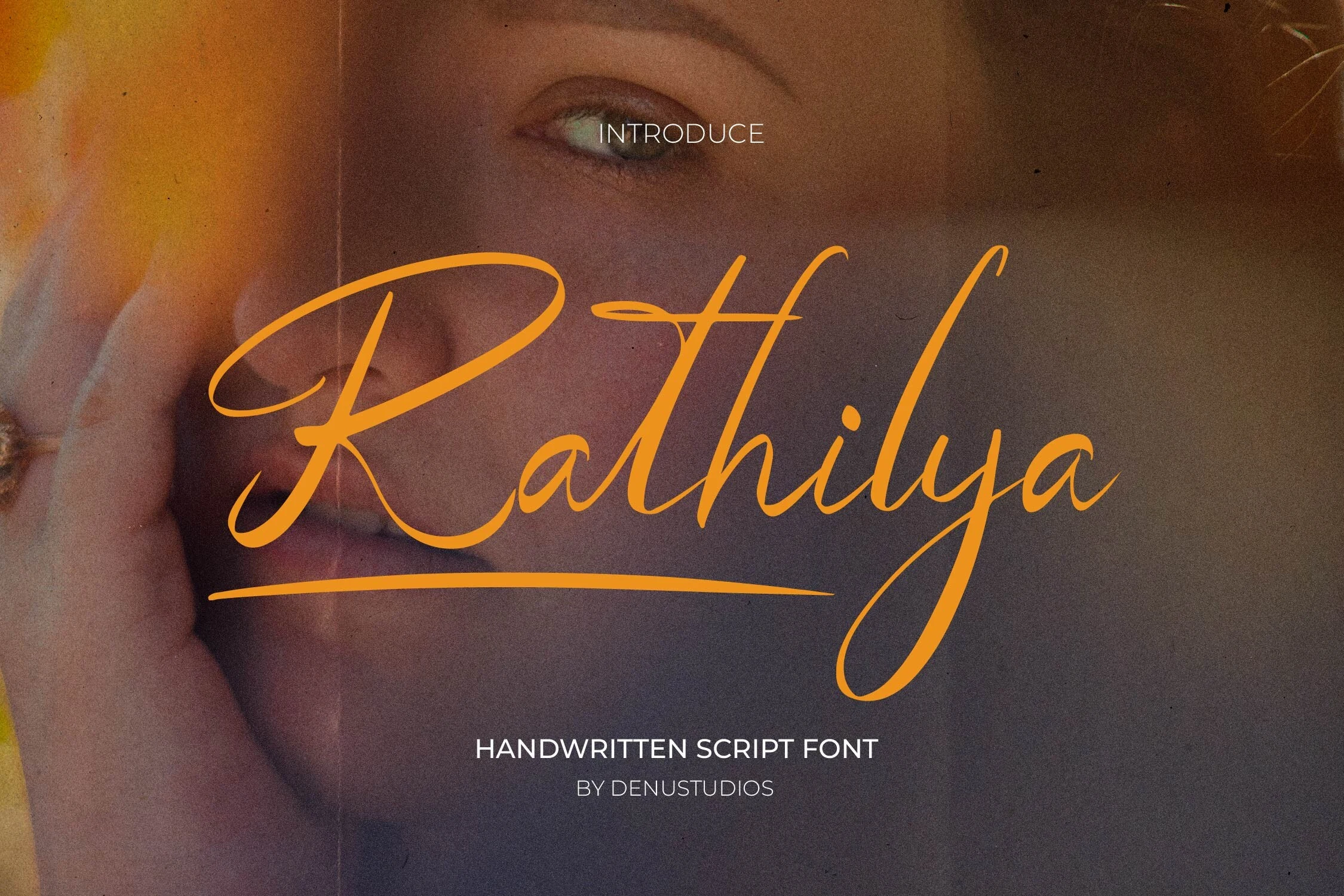
Best For: logos, branding, invitations, wedding designs
For wedding marks and headline words, Rathilya Font brings pronounced rightward motion through a steady monolinear stroke and extended tails. Its connected forms feel fluid and personal at display scale, although the slant and swashes can merge when reduced.
Luminary Font
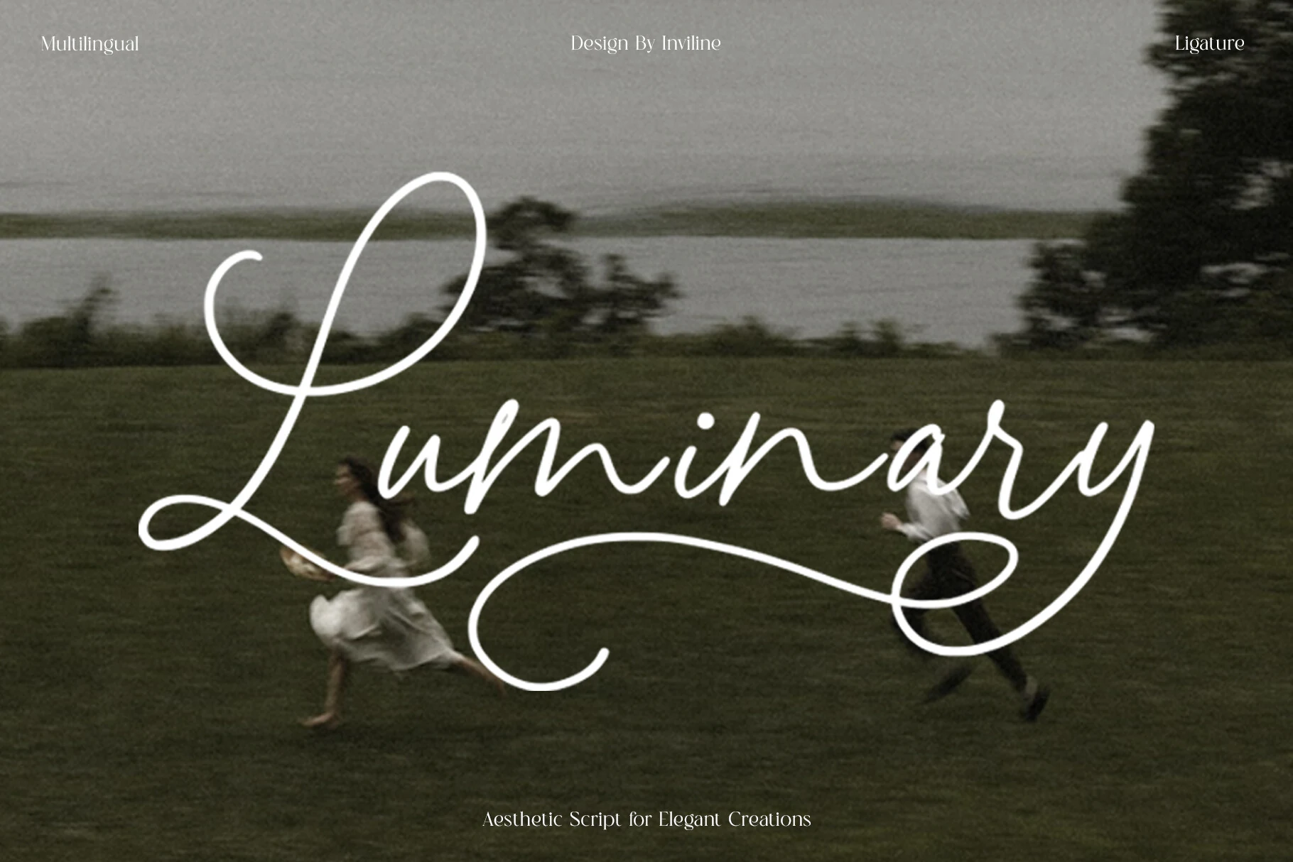
Best For: wedding designs, branding, luxury designs, social media graphics
Luminary Font suits customized wedding designs and packaging where vertical rhythm can become part of the composition. High-reaching ascenders, low-descending loops, monolinear joins, and pronounced swashes create height and movement; alternates, ligatures, and multilingual support add flexibility, though the flourishes need generous display scale.
Nesta Mastone Font
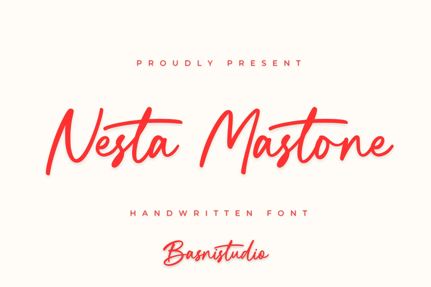
Best For: logos, branding, personal branding, wedding designs
Nesta Mastone Font gets its informal cadence from varied baseline alignment within a regular monolinear construction. The connected characters reinforce personal branding and wedding designs, but shifting line positions require large sizing so neighboring letters remain distinct.
High-Contrast Flourished Cursive
These scripts pair connected movement with pronounced thick-thin contrast, loops, and extended swashes. Their formal display character separates them from the simpler signature forms and warmer, less mechanically polished handwriting.
Belleriana Font
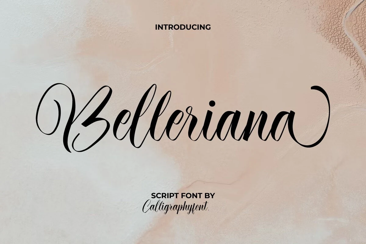
Best For: logos, invitations, product labels, restaurant menus
Belleriana Font builds its connected lettering around strong thick-thin contrast, rounded curves, and ornamental strokes at the beginning and end of words. Its hairlines need room, making it a stronger choice for invitations, product labels, and restaurant menus than compact text.
Aerpthine Font
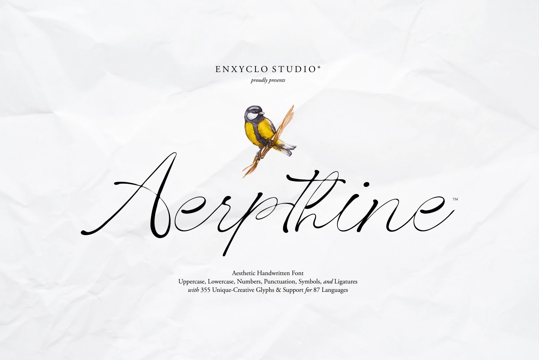
Best For: logos, invitations, wedding designs, headlines
Aerpthine Font creates a formal display effect with calligraphic loops, sweeping flourishes, and high thick-thin contrast. Its connected terminals and thin strokes reward generous sizing, while included glyphs and ligatures help shape invitations, wedding designs, and headline words.
Diana William Font
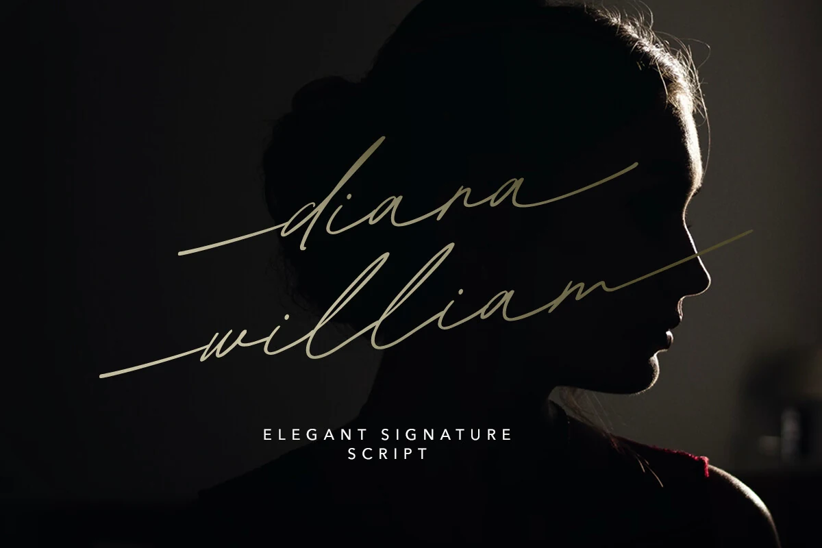
Best For: logos, branding, quotes, personal branding
Diana William Font combines a strong right lean with high-contrast signature strokes and elongated lowercase tails. Terminal alternates expand its branding potential, but variable weights and tight joins make large logos, quotes, and personal branding safer than small text.
Panthera Cintha Font
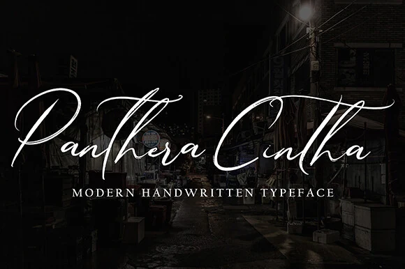
Best For: logos, invitations, wedding designs, display text
Panthera Cintha Font pushes connected lettering toward expressive display use with a pronounced right slant, high contrast, and extensive ornamental flourishes. The elaborate joins can lose definition when small, so reserve it for logos, invitations, wedding designs, and short display text.
The Dearling Font
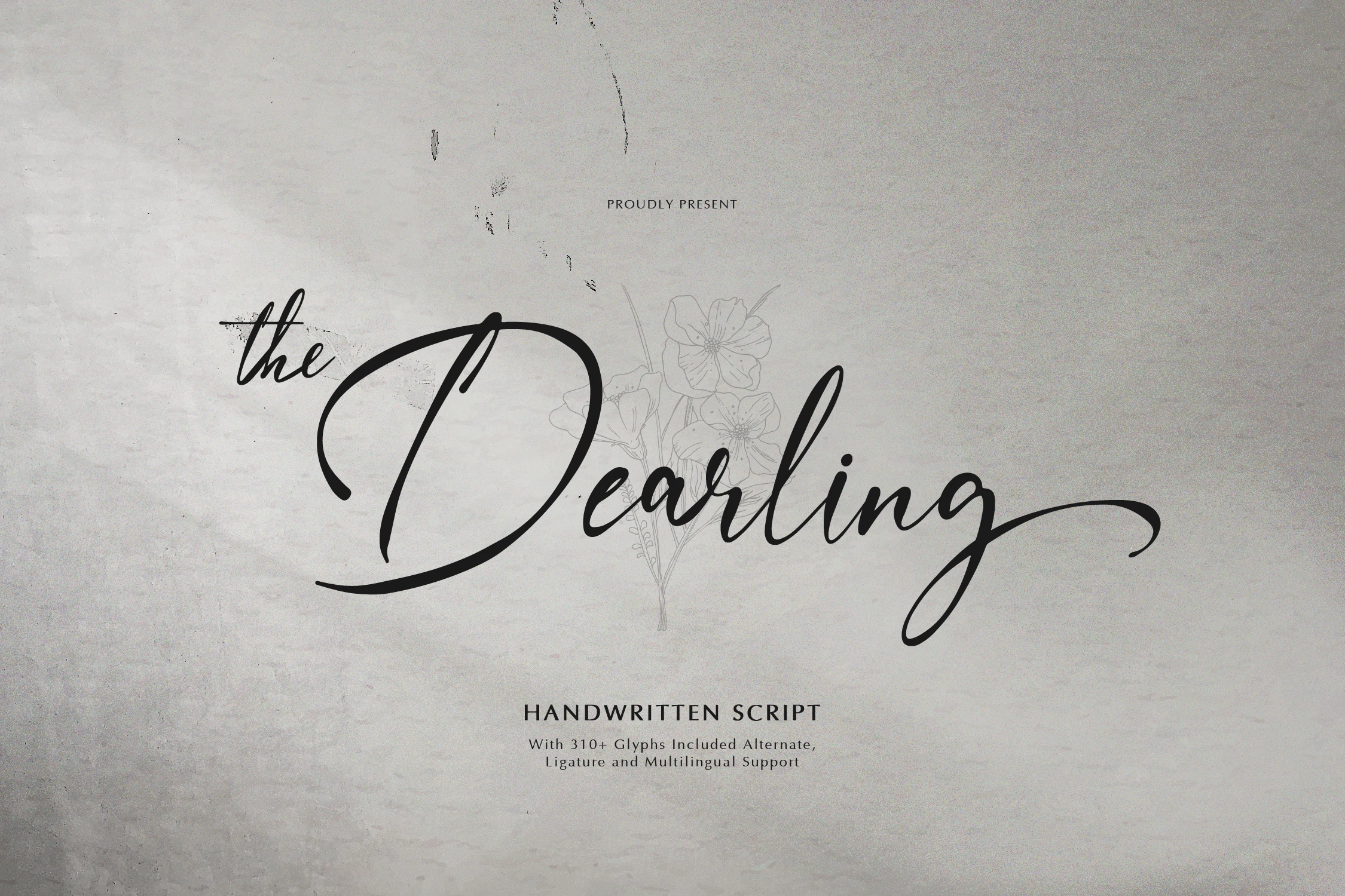
Best For: wedding designs, personal branding, packaging, invitations
The Dearling Font adds personal movement through an irregular baseline, high-contrast joins, and swash terminals on capitals. Its 310-plus glyphs, alternates, ligatures, and multilingual support help with custom branding, while its stylization remains best suited to large wedding, packaging, or invitation lettering.
Ganelistane Font
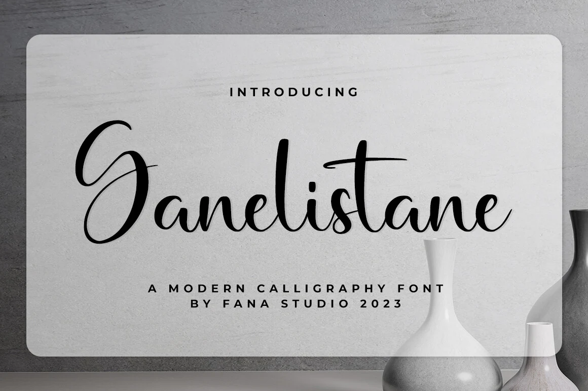
Best For: logos, branding, headlines, display text
Ganelistane Font softens high-contrast connected lettering with rounded terminals and smoothly curved joins. That balance suits headings, logos, and identity work, while its complex connections call for larger sizing rather than continuous reading or compact supporting copy.
Antara Font
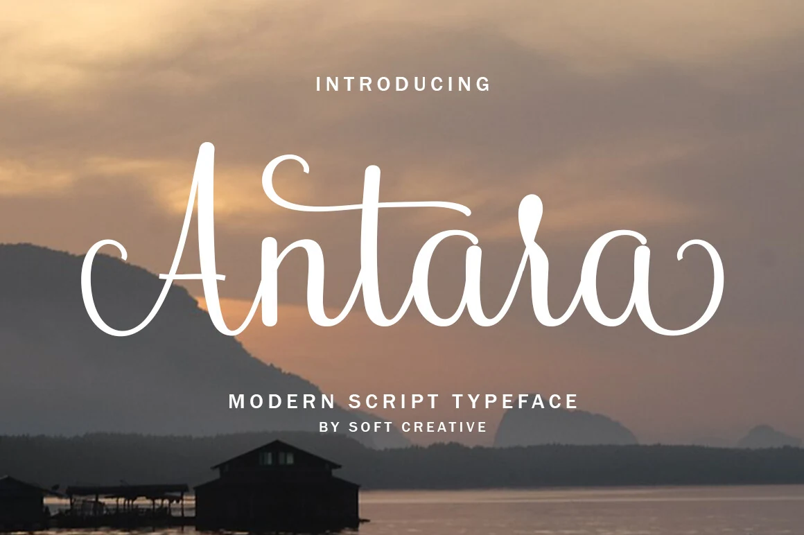
Best For: logos, branding, headlines, short phrases
Antara Font preserves some internal clarity with open counters, even as high-contrast strokes and extended entry and exit swashes keep it firmly display-oriented. It is most effective for logos, branding, headlines, and short phrases rather than body copy.
Fetlicia Font
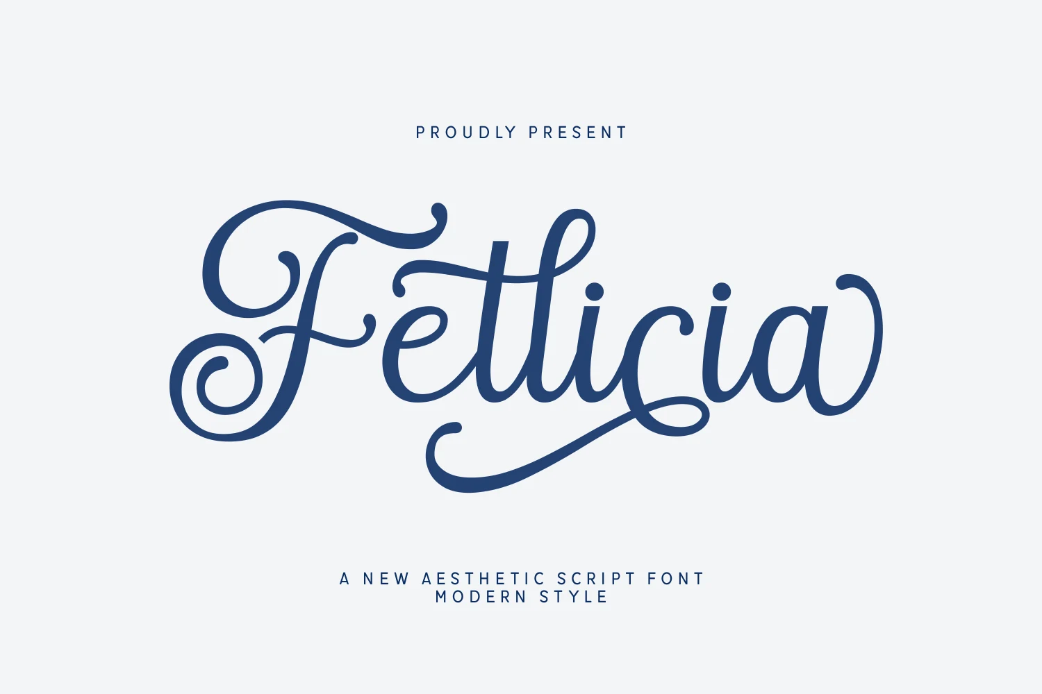
Best For: logos, branding, packaging, social media graphics
Fetlicia Font uses bold weight, a pronounced right slant, and high-contrast connected curves to stand apart from lighter signature styles. Heavy loops and initial or terminal swashes give logos, packaging, and social graphics presence, but the density rules out body-length text.
Casual and Artisanal Cursive
Casual and artisanal styles favor approachable connections, lighter construction, upright forms, or organic terminals. They bring more warmth and informality than the formal flourished group while remaining display-focused.
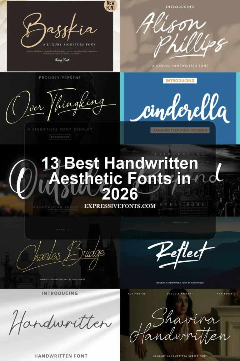
Blankspot Font
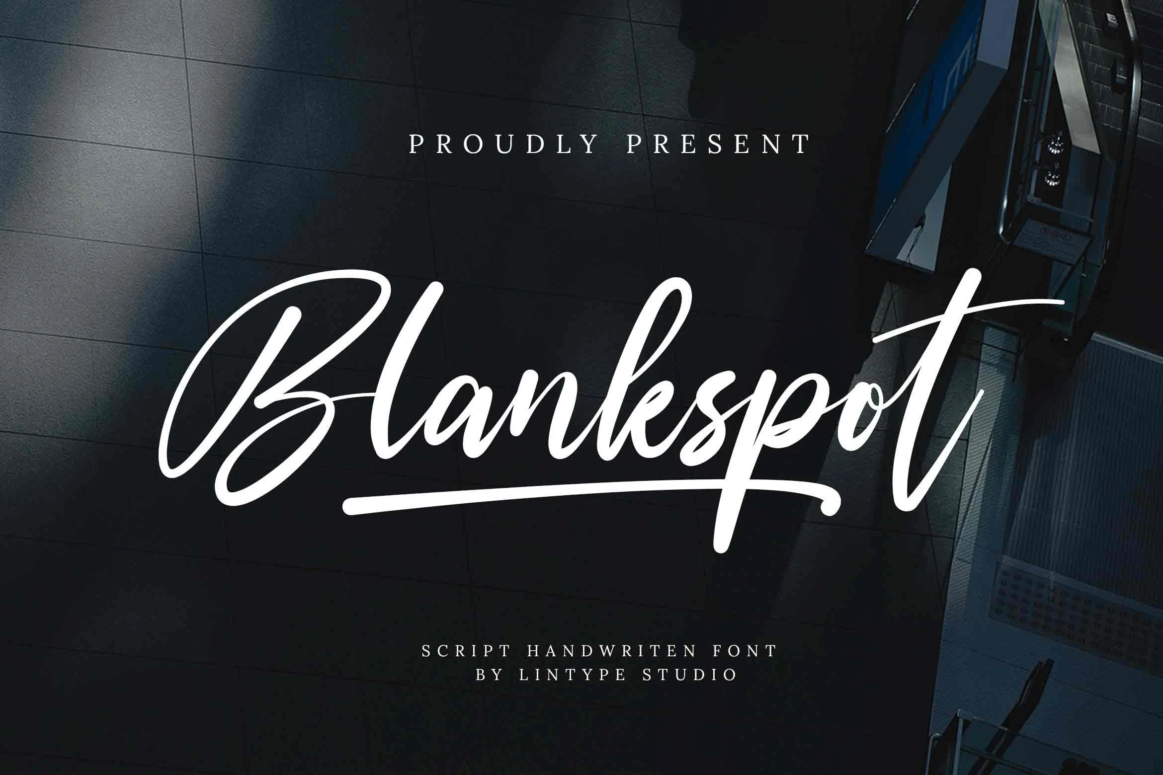
Best For: wedding designs, branding, social media graphics, business cards
Blankspot Font keeps connected handwriting approachable through monolinear strokes and a clear rightward slant. Beginning and ending swashes add emphasis without changing its casual structure, making it useful for wedding designs, branding, social graphics, and business cards.
Dunkerlest Signature Font
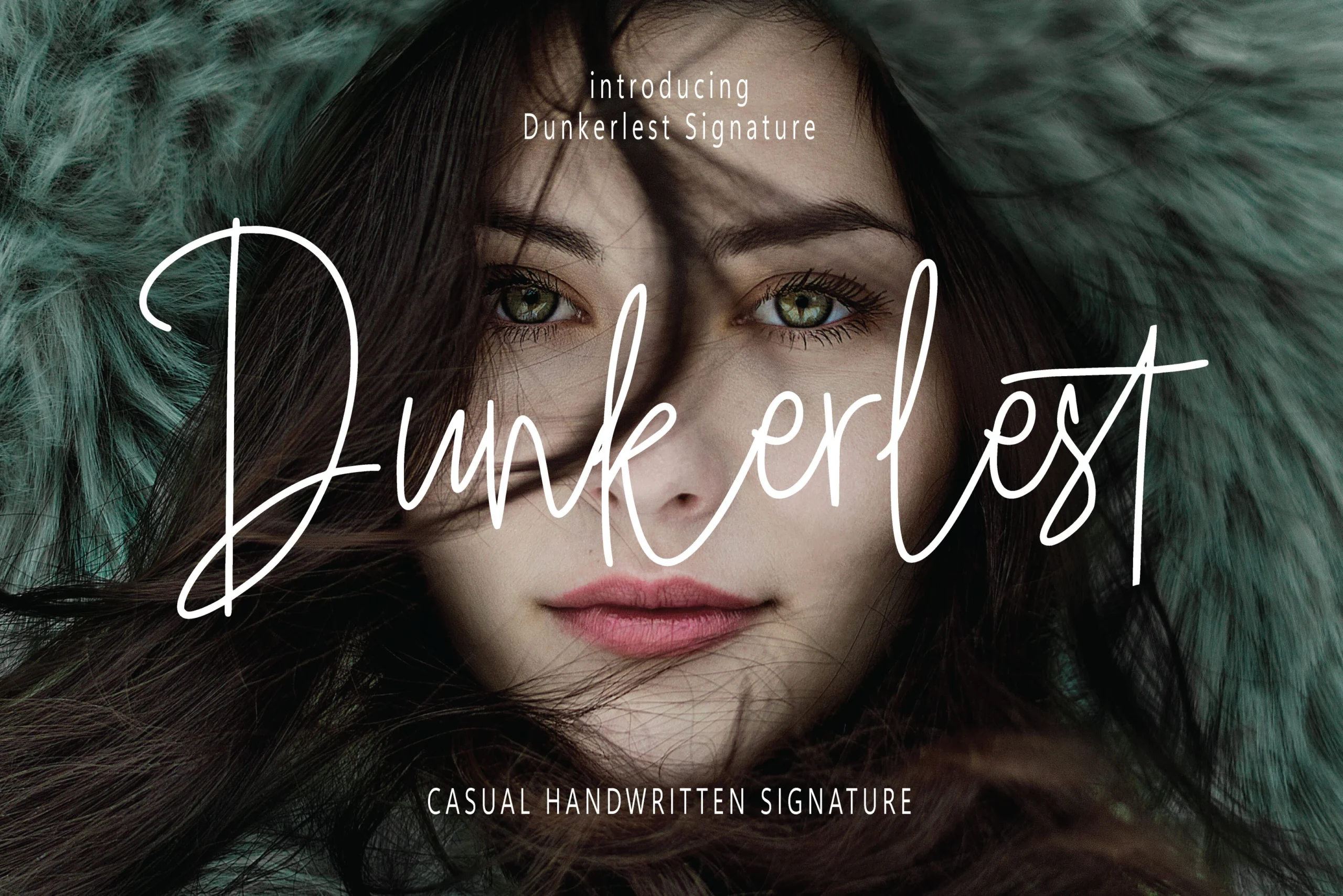
Best For: logos, branding, invitations, product labels
Dunkerlest Signature Font uses light monolinear strokes, a rightward slant, and long ascender-descender loops to create a recognizable signature effect. Clean lines keep it usable across stationery, invitations, packaging, and digital media, but thin connections need adequate display size.
Choco Brewing Font
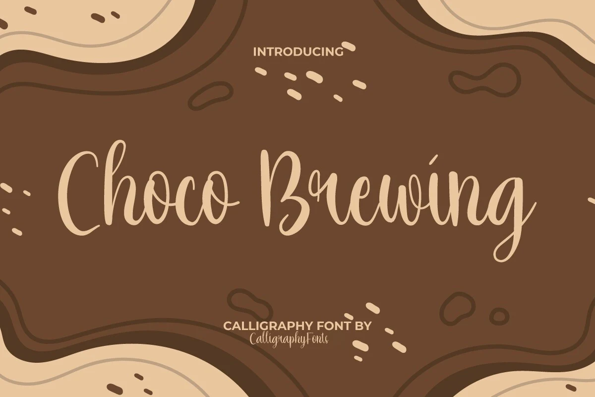
Best For: branding, packaging, product labels, headlines
For product labels and friendly branding, Choco Brewing Font offers an upright alternative to strongly slanted scripts. Its connected lowercase forms, organic terminals, and mixed stroke contrast suggest handmade goods, while thin joins still need display sizing for dependable readability.
How to Choose the Right Font
Choose among these Cursive Aesthetic Fonts by starting with scale and reading distance: monolinear options generally separate more cleanly, while high-contrast styles need larger words and stronger contrast. Check slant, baseline movement, counters, joins, and swash length against the application, then reserve the most elaborate designs for short phrases, logos, and prominent headings.