20 Best Cool Display Fonts in 2026
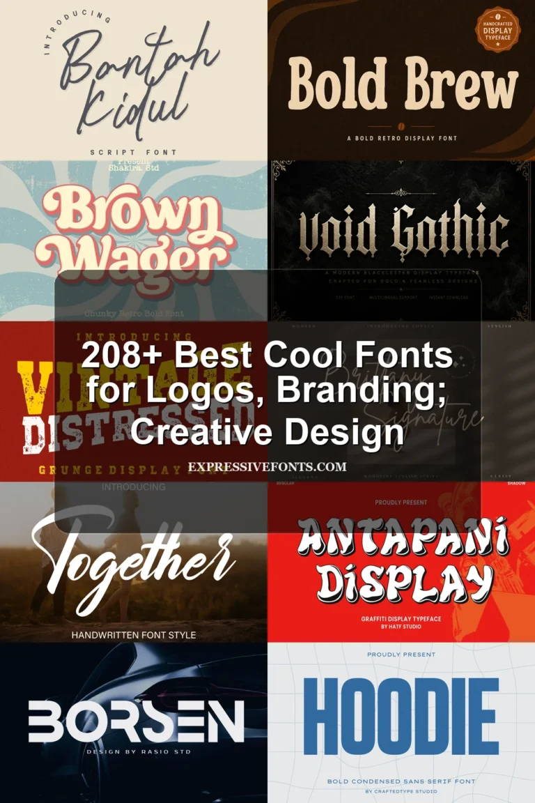
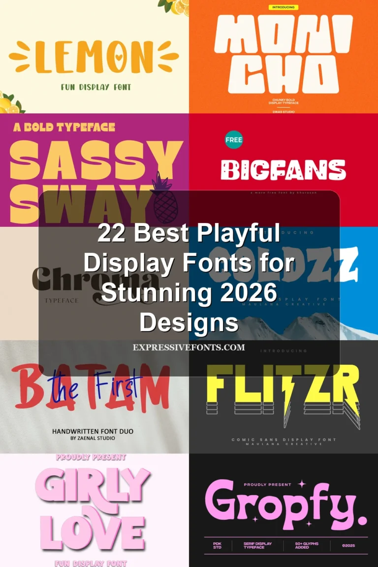
Cool Display Fonts span rounded bubble lettering, hard-edged geometric blocks, dimensional effects, layered textures, and expressive scripts. Together, they serve logos, posters, packaging, invitations, social graphics, signage, and website headers, with readability depending heavily on construction, scale, spacing, and decorative detail.
Looking for more cool fonts? Browse our complete Cool Fonts collection to compare bold, vintage, retro, script, and gothic cool styles.
Cool Display Fonts: Rounded, Retro, and Playful
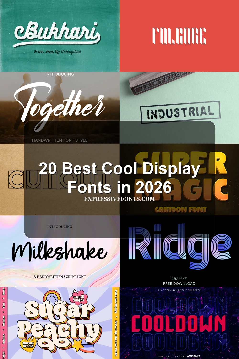
These Cool Display Fonts share rounded corners, soft curves, thick monoline strokes, or connected lettering. Their approachable nostalgic forms differ from the sharper, more engineered structures elsewhere.
Gient Font
Best For: logos, branding, posters
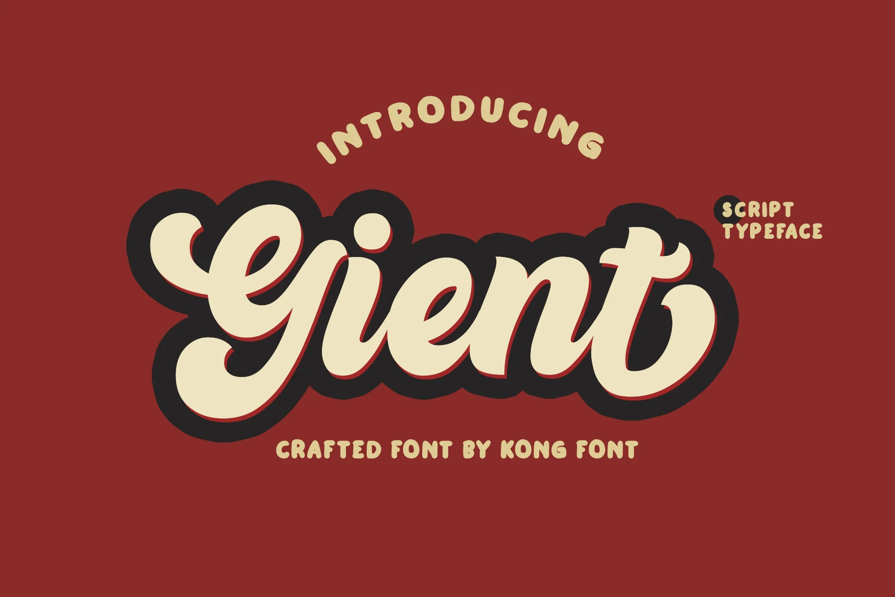
Gient Font uses connected, right-leaning cursive with rounded terminals, a heavy monoline stroke, and a prominent drop shadow. The added depth gives logos and posters immediate nostalgic character, while the shadow can crowd very small lettering.
Happy Summer Font
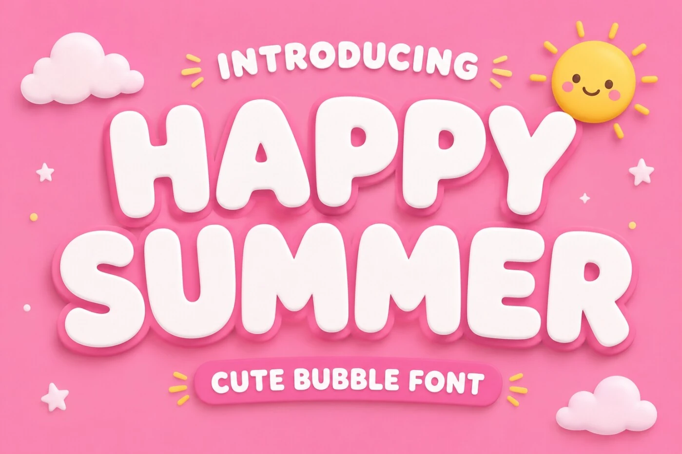
Best For: children’s designs, packaging, social media graphics
For children’s packaging and social media graphics, Happy Summer Font supplies inflated bubble forms with thick rounded strokes and a three-dimensional shadowed appearance. The simple silhouettes read well at headline size, but the heavy treatment loses definition when scaled down.
Bukhari Script Font
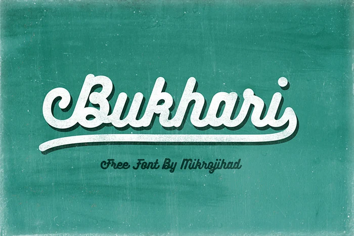
Best For: logos, branding, display text
Bukhari Script Font keeps a consistent monoline weight through its connected cursive forms, making this retro script clearer than its ornament might suggest. A prominent terminal swash supplies recognition, while the joins still work best at display sizes.
Sugar Peachy Font
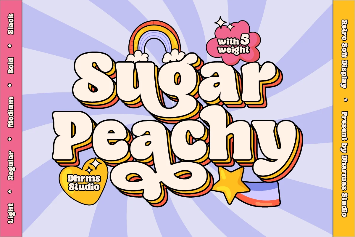
Best For: logos, website headers, headlines
Sugar Peachy Font turns thick monoline strokes and soft bulbous curves into a 1970s bubble display style. It delivers readable nostalgic headers, website titles, and logos, although heavy thickness and decorative layering can overwhelm small text.
Super Magic Font
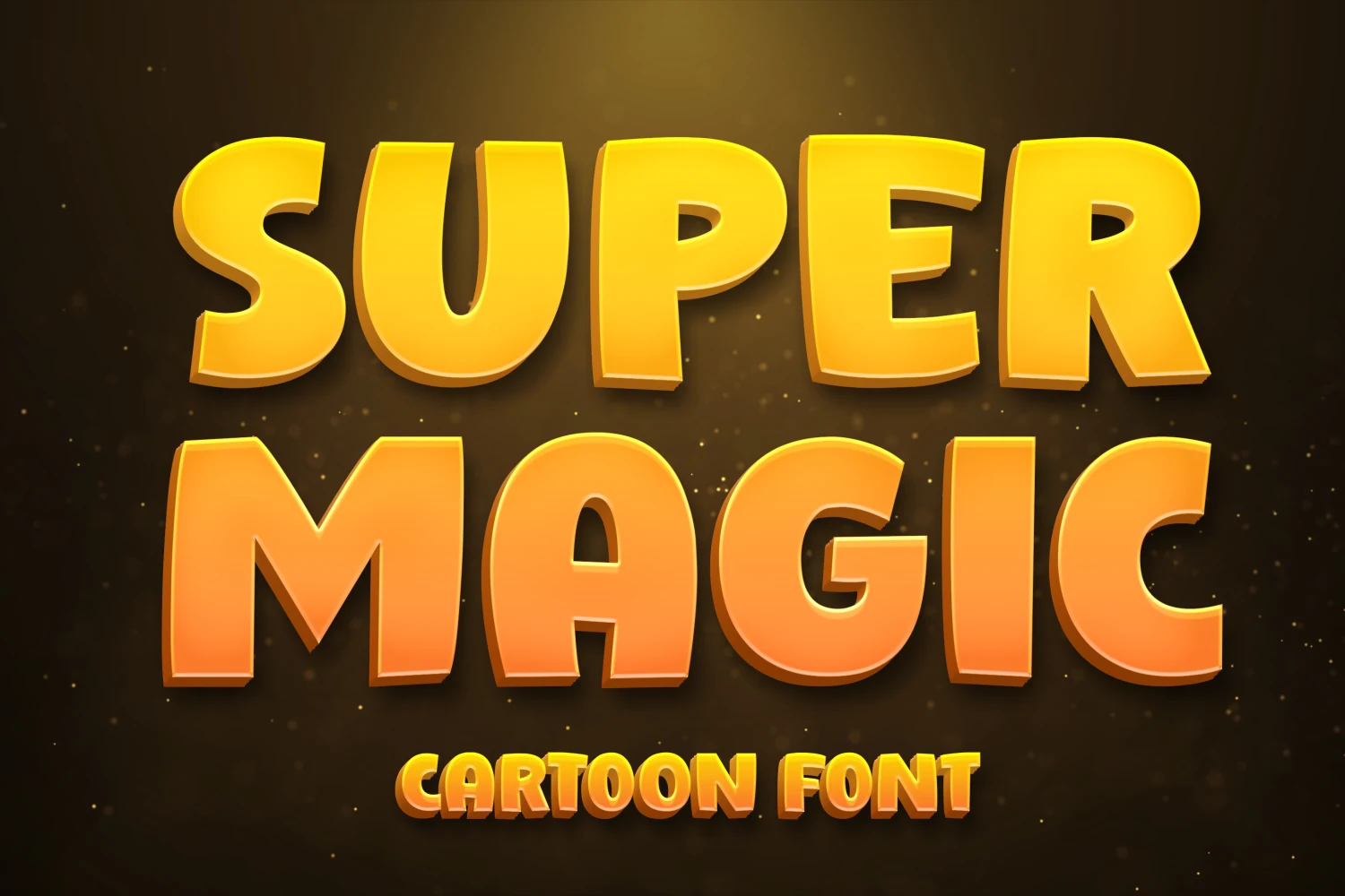
Best For: children’s designs, creative projects, headlines
Super Magic Font combines rounded corners, uniform heavy strokes, and a pronounced 3D-like extrusion. Its simple cartoon lettering stays readable for children’s projects at headline sizes, although the dense treatment naturally dominates the surrounding layout.
Milkshake Font
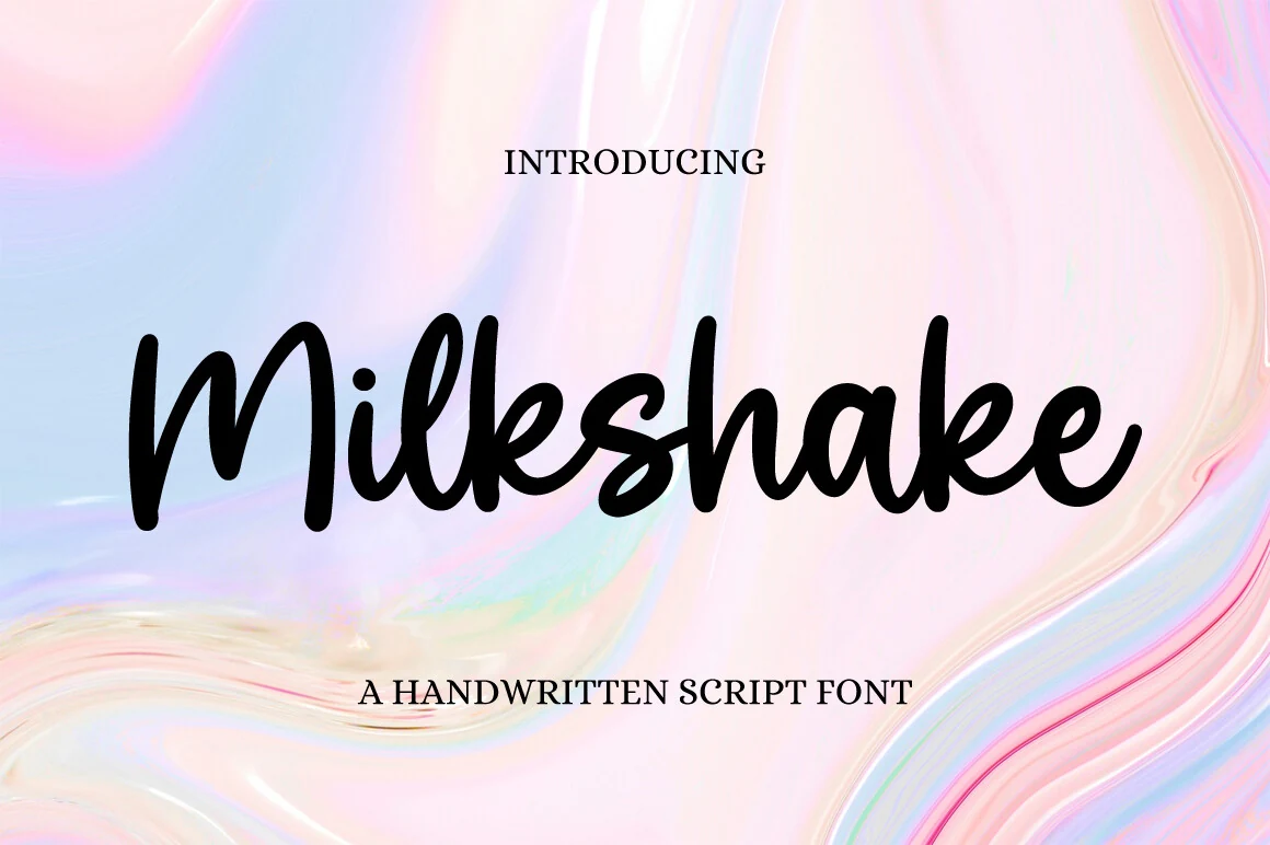
Best For: invitations, social media graphics, romantic designs
Milkshake Font forms fluid connected letters with a steady monoline stroke and rounded terminals. Its consistent weight supports medium-to-large invitations and social posts, while its lower contrast makes it less formal than calligraphic alternatives.
Angular and Industrial Displays
Angular terminals, stencil breaks, square proportions, and rigid framing connect this group. Compared with rounded displays, these faces create a more structured presence for posters, marks, and signage.
Cooldown Font
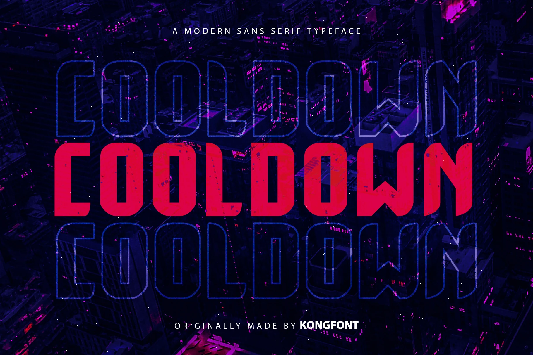
Best For: headlines, display text, posters
Cooldown Font builds condensed upright letters from uniform strokes, sharp cut terminals, and a tall x-height. Its narrow footprint suits athletic or futuristic headlines and posters, although tight spacing becomes less comfortable when the type is reduced.
Order Font
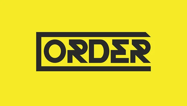
Best For: logos, branding, packaging
Order Font combines geometric letter construction with stencil-like segmentation, sharp corners, and an integrated frame. Among these Cool Display Fonts, it makes a particularly mark-like choice for branding and packaging, but enclosed angular details need generous sizing.
Propaganda Font
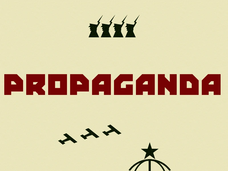
Best For: posters, display text, signage
Propaganda Font uses wide, square-proportioned blocks, uniform strokes, severe right angles, and minimal curves. Its solid silhouette carries clearly across posters and signage; among Cool Display Fonts, it is less forgiving when extreme blockiness is reduced.
Industrial Font

Best For: logos, signage, product labels
Industrial Font layers a rough stamp texture over condensed, uniform block lettering with a high x-height. The underlying geometry stays clear for labels and signage, while the surface treatment adds a utilitarian finish without relying on complex forms.
Cut out Font
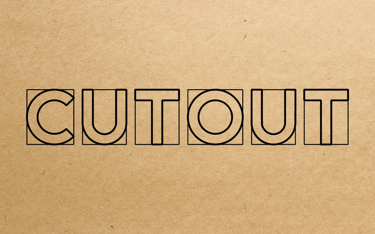
Best For: logos, branding, posters
For logos and posters needing a modular structure, Cut out Font encloses each uppercase letter in a square frame and builds it from monoline geometric strokes. The consistent spacing supports display clarity, but the units are awkward for dense text.
Zero Hour Font
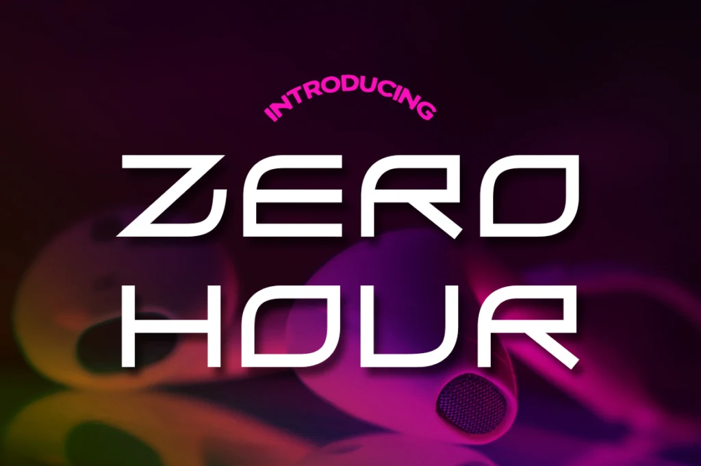
Best For: posters, website headers, headlines
Zero Hour Font creates a wide all-caps digital silhouette from sharp corners, heavy strokes, and expansive proportions. This Cool Display Fonts choice gives posters and website headers immediate impact, though its broad characters consume considerable horizontal space.
Layered and Textured Displays
Dimensional extrusion, multiline outlines, and internal contour patterns make these fonts visibly layered. They add graphic surface treatment beyond the flatter construction of the other display groups.
Folgore Font
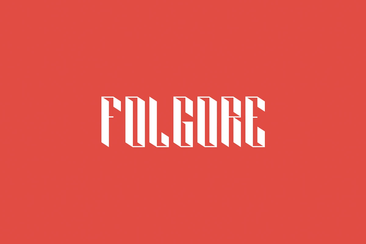
Best For: logos, headlines, posters
Folgore Font combines tall condensed geometry with angular, faceted joints and an integrated 3D extrusion. This Cool Display Fonts option saves headline width while adding architectural depth, but its dimensional structure needs generous scale for clear reading.
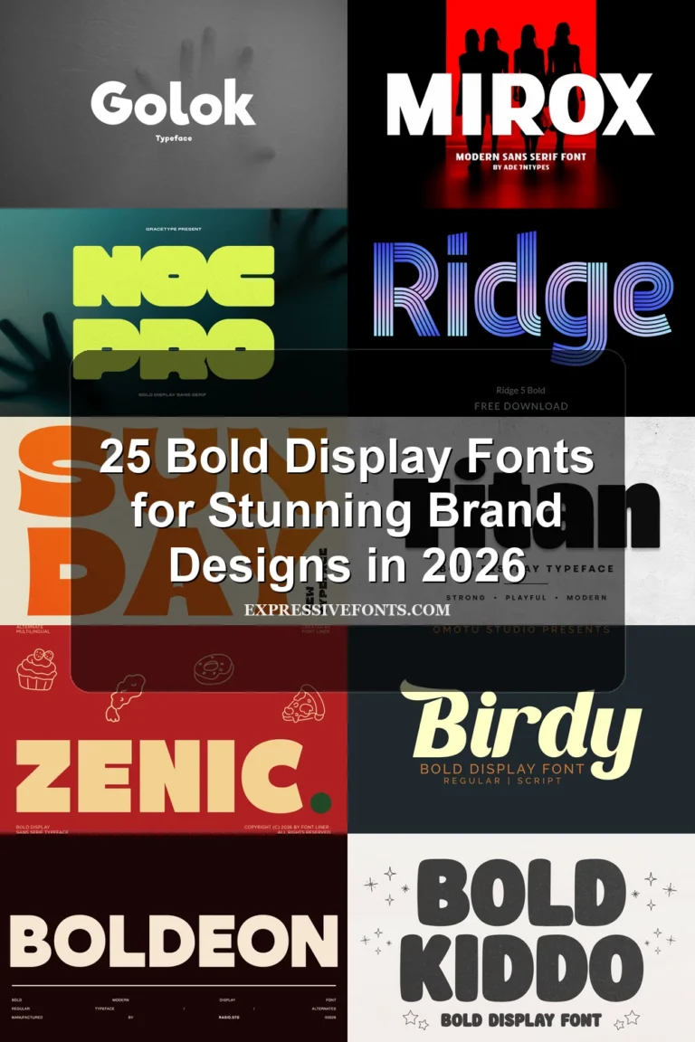
Ridge 5 Bold Font
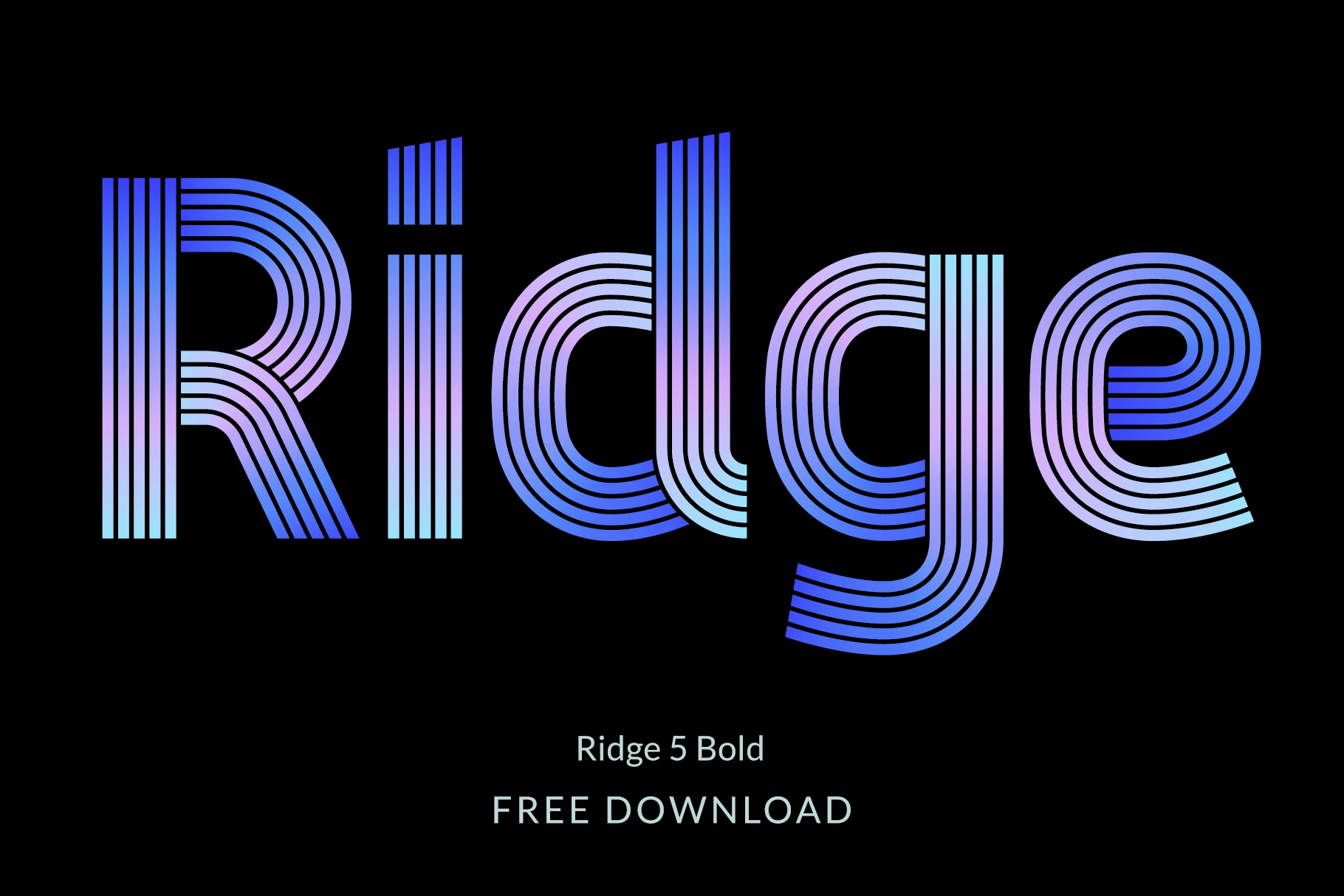
Best For: display text, headlines, posters
Ridge 5 Bold Font gives geometric curves a multiline outline effect, with rounded terminals and alternate characters. Uppercase, lowercase, and European diacritics expand its poster usefulness, but the layered lines require large headings to remain distinct.
Baltic Beach Font
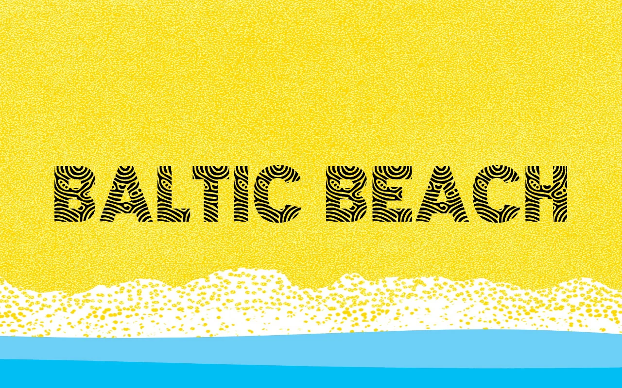
Best For: posters, packaging, display text
Baltic Beach Font embeds concentric contour lines inside heavy block sans-serif letters. The topographic texture adds a thematic graphic layer to packaging and posters, while the interior pattern can lose clarity at small sizes.
Flourished and Aggressive Scripts
Connected calligraphy, interlocking graffiti forms, and dry-brush edges define this most ornamental group. Flourishes and irregular contours create personality, but they demand larger sizes than simpler display lettering.
Luxodia Signature Font
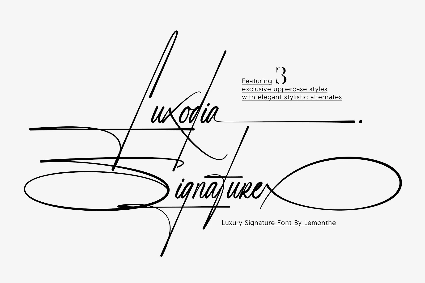
Best For: logos, branding, packaging
Luxodia Signature Font pairs connected high-contrast script with overlapping horizontal and diagonal swashes. Its three uppercase styles can be combined for a distinctive signature treatment, though the flourishes are too intrusive for extended wording.
Together Font
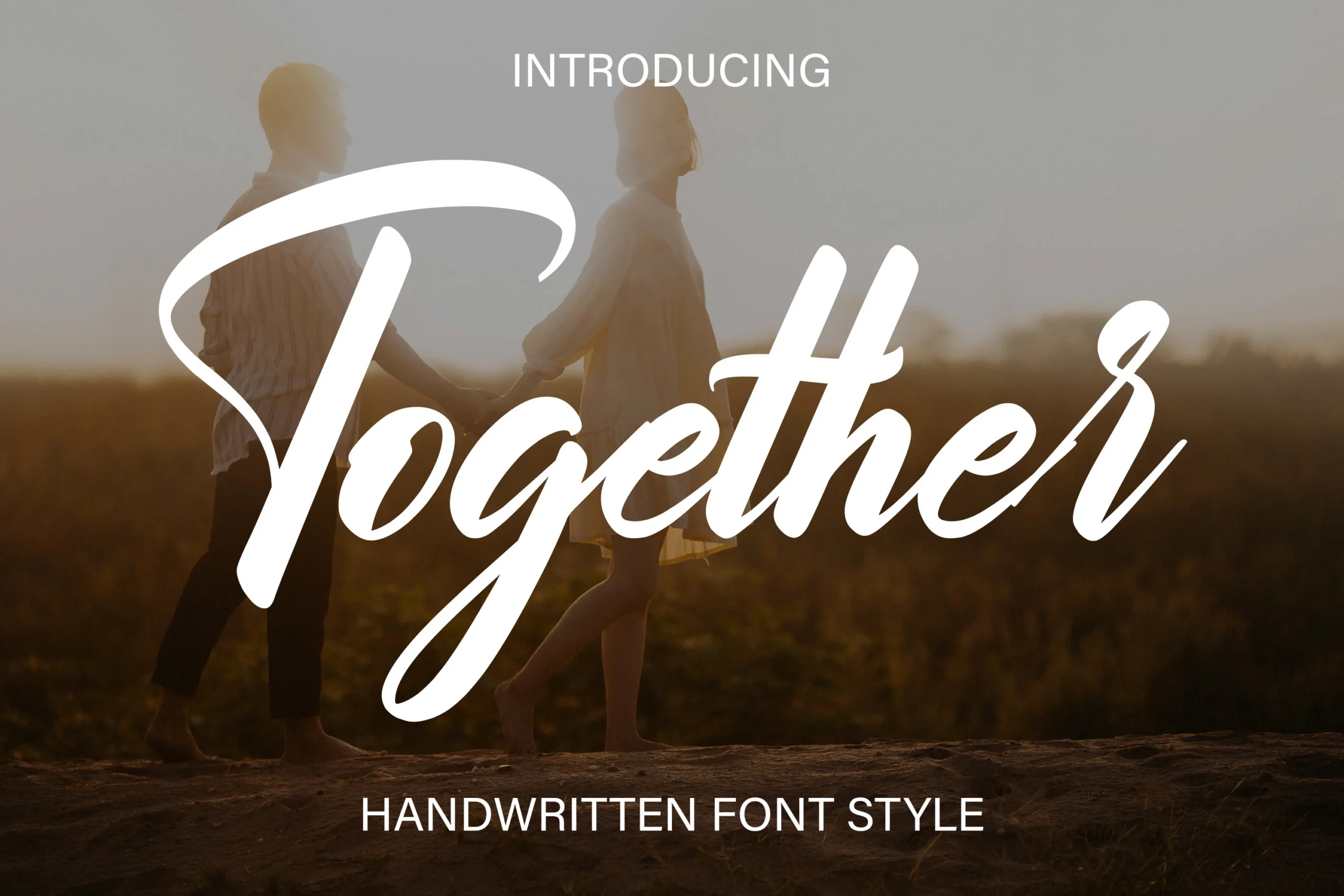
Best For: logos, branding, invitations
Together Font is suited to invitations and ceremonial branding, where its high-contrast connected strokes, flourished capital T, and sweeping terminals can be appreciated. Those long swashes slow reading, so the design is better for short, prominent phrases.
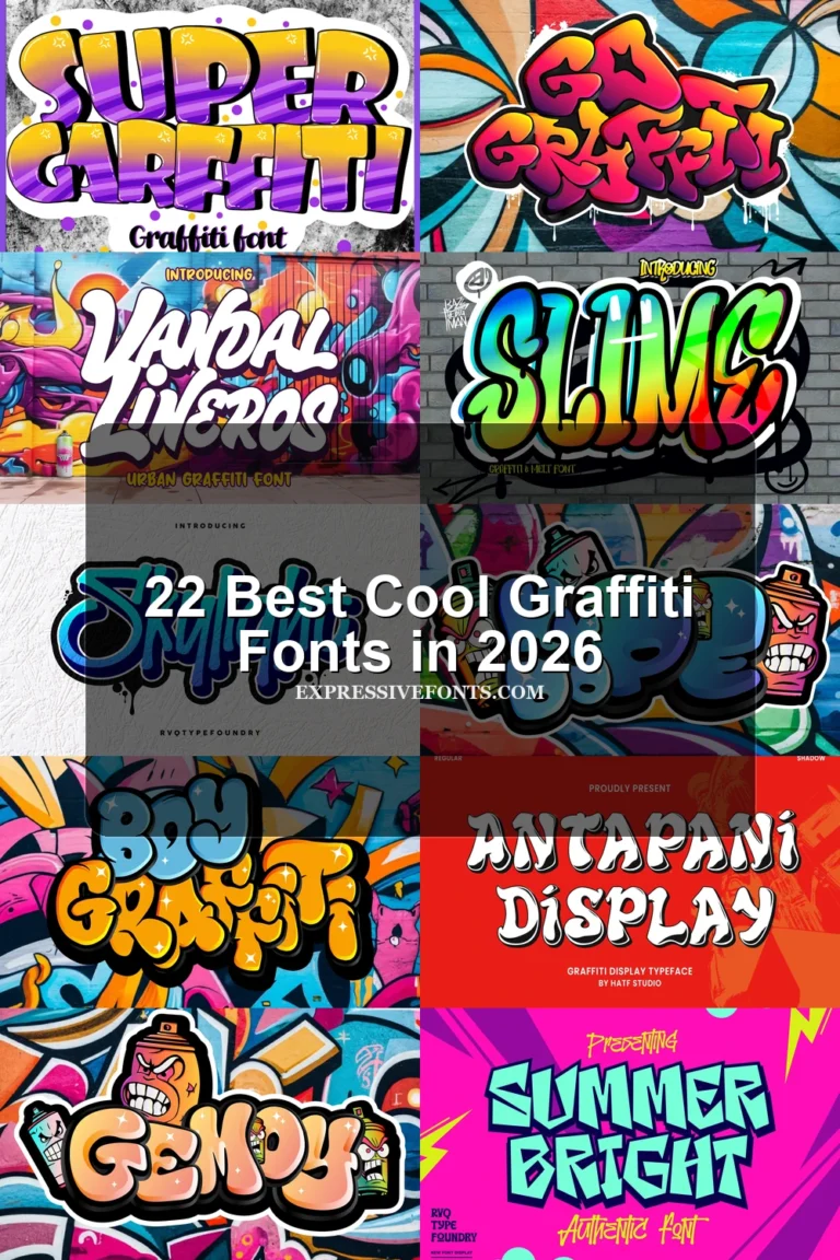
Notress Font
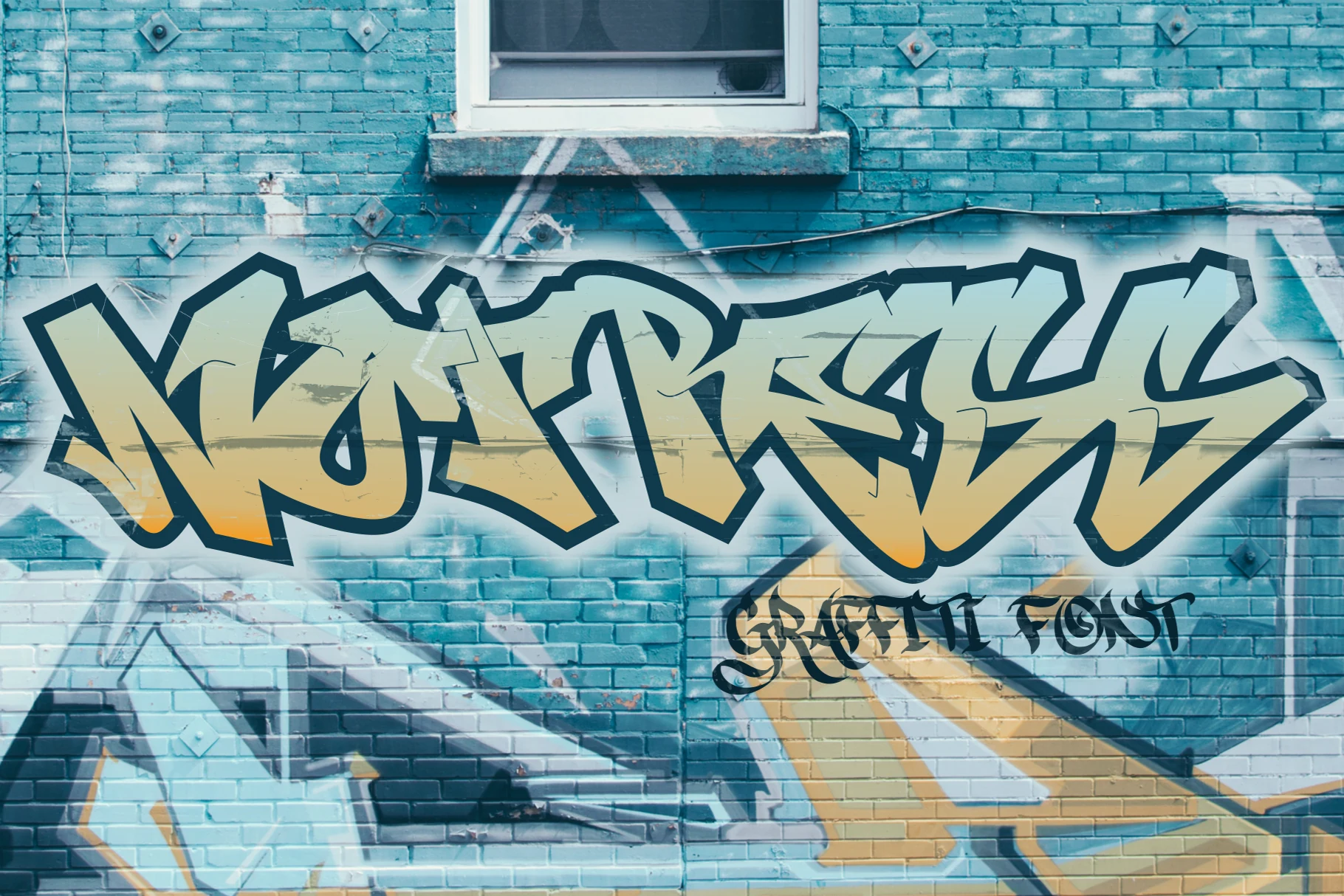
Best For: logos, T-shirts, posters
Notress Font fuses sharp, high-contrast letterforms into an interlocking graffiti word shape. That dense construction gives T-shirts and logos a forceful street-art presence, but the overlap sharply reduces readability in compact applications.
Gastonia Script Font
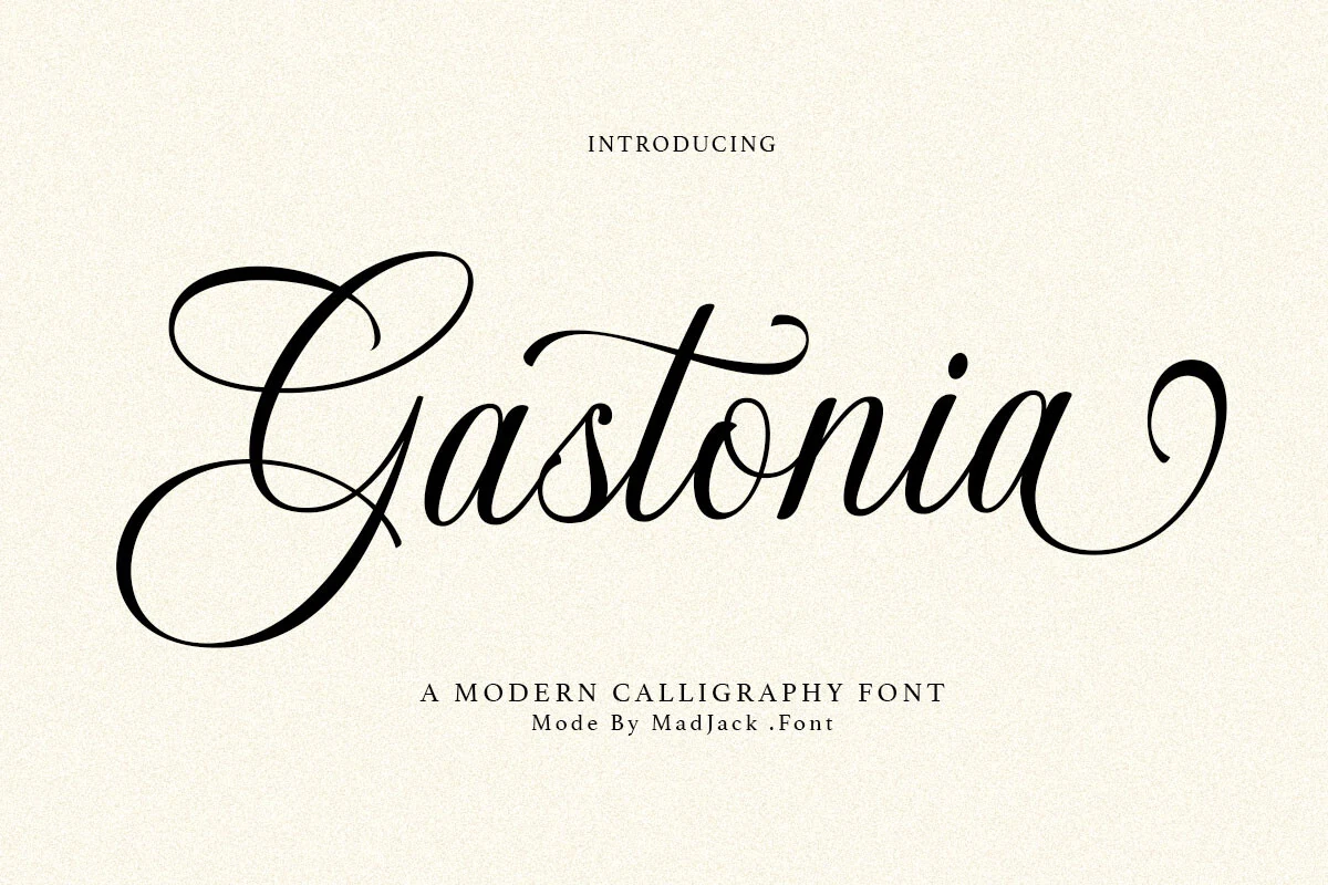
Best For: branding, packaging, wedding designs
Gastonia Script Font uses deeply looped ascenders, high contrast, connected calligraphy, and sweeping swash terminals. Among Cool Display Fonts, it belongs to the most ornamental end of the range, making it suitable for wedding work and upscale packaging rather than long reading.
Gendry Font
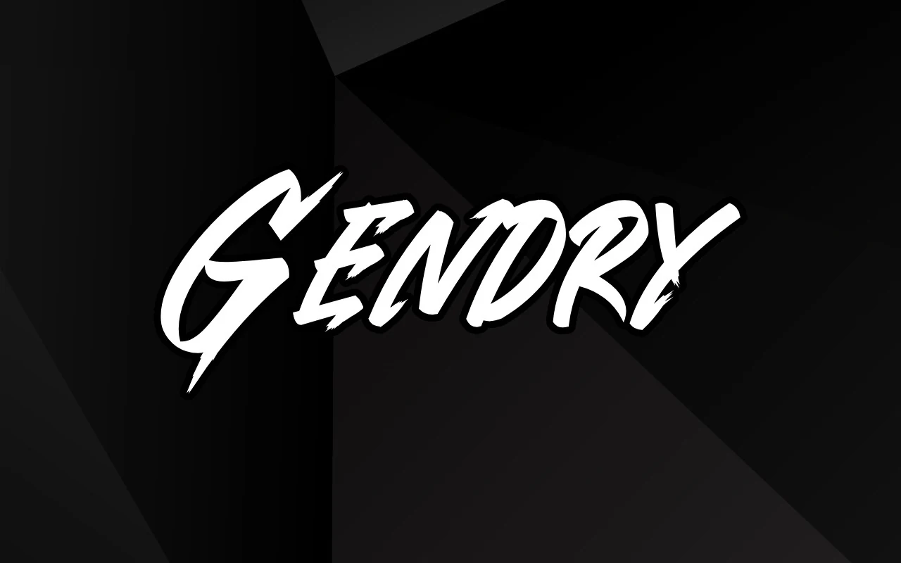
Best For: posters, headlines, T-shirts
Gendry Font applies dry-brush texture, jagged terminals, and disconnected high-contrast strokes to a forceful script display. The irregular edges add motion to posters and T-shirts, but they reduce clarity when the lettering is used small.
How to Choose the Right Font
Choose rounded monoline styles when readability and approachable nostalgia matter, and select condensed or framed constructions when space, structure, or signage presence leads. Reserve shadows, extrusion, contour lines, and flourishes for larger type. For Cool Display Fonts with rough or interlocking details, test the full word at its final size before committing.