22 Best Cool Graffiti Fonts in 2026
This collection spans rounded bubble lettering, sharp block construction, connected scripts, dripping terminals, and layered shadow or halftone effects. These Cool Graffiti Fonts are chiefly suited to posters, logos, apparel, stickers, headlines, and other large display work where visible construction matters more than paragraph-length readability.
Looking for more cool fonts? Browse our complete Cool Fonts collection to compare bold, vintage, retro, script, and gothic cool styles.
Cool Graffiti Fonts
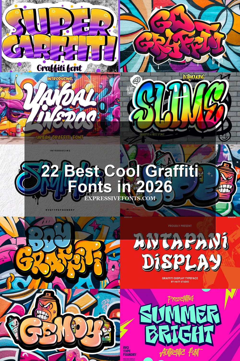
These Cool Graffiti Fonts center on rounded, disconnected bubble forms, from clean inflated silhouettes to dripping, outlined, or three-dimensional treatments. They feel softer than the angular group and usually suit short display wording.
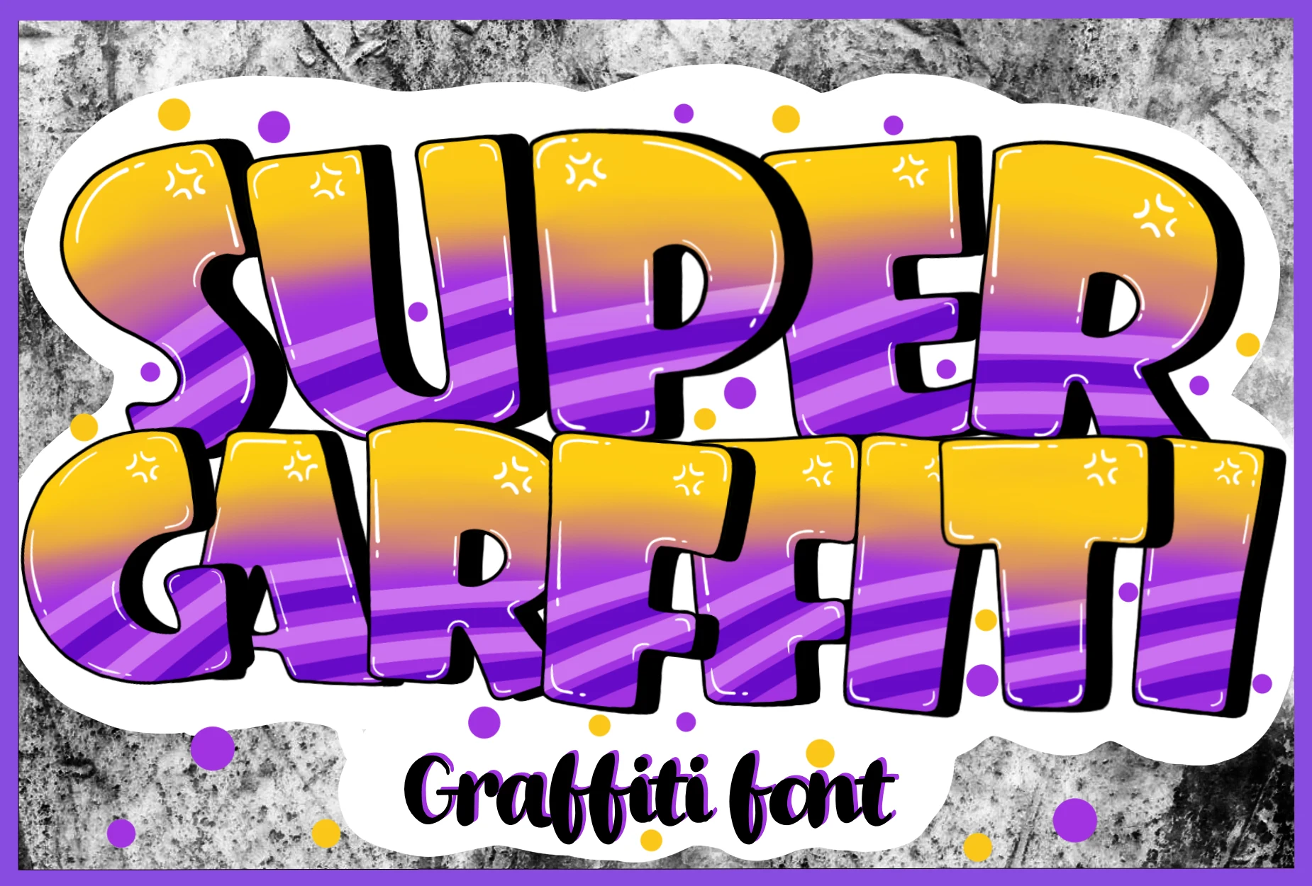
Super Graffiti Font
Best For: book covers, posters, quotes
Super Graffiti Font uses rounded bubble letters, thick uniform strokes, and a heavy black drop shadow. Among Cool Graffiti Fonts, its main lettering stays clear in large display sizes, making it useful for book covers, posters, and quotes; the separate script is better as secondary labeling.
Blockbomb Font
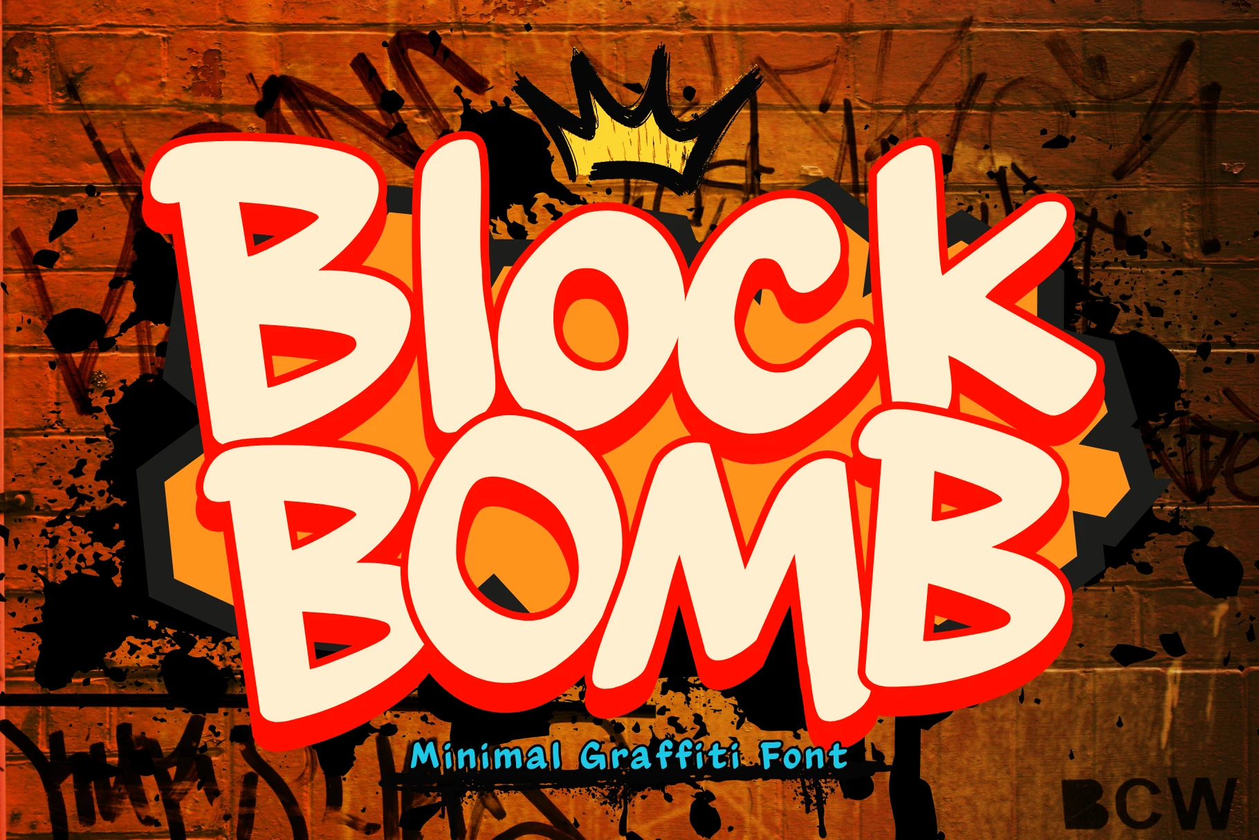
Best For: logos, branding, invitations
Blockbomb Font combines thick, blocky bubble characters with irregular organic outlines instead of precise geometric edges. This tagging-inspired shape makes it a useful choice among Cool Graffiti Fonts for logos, branding, and invitations, while its uneven contour loses definition at smaller sizes.
Boy Graffiti Font
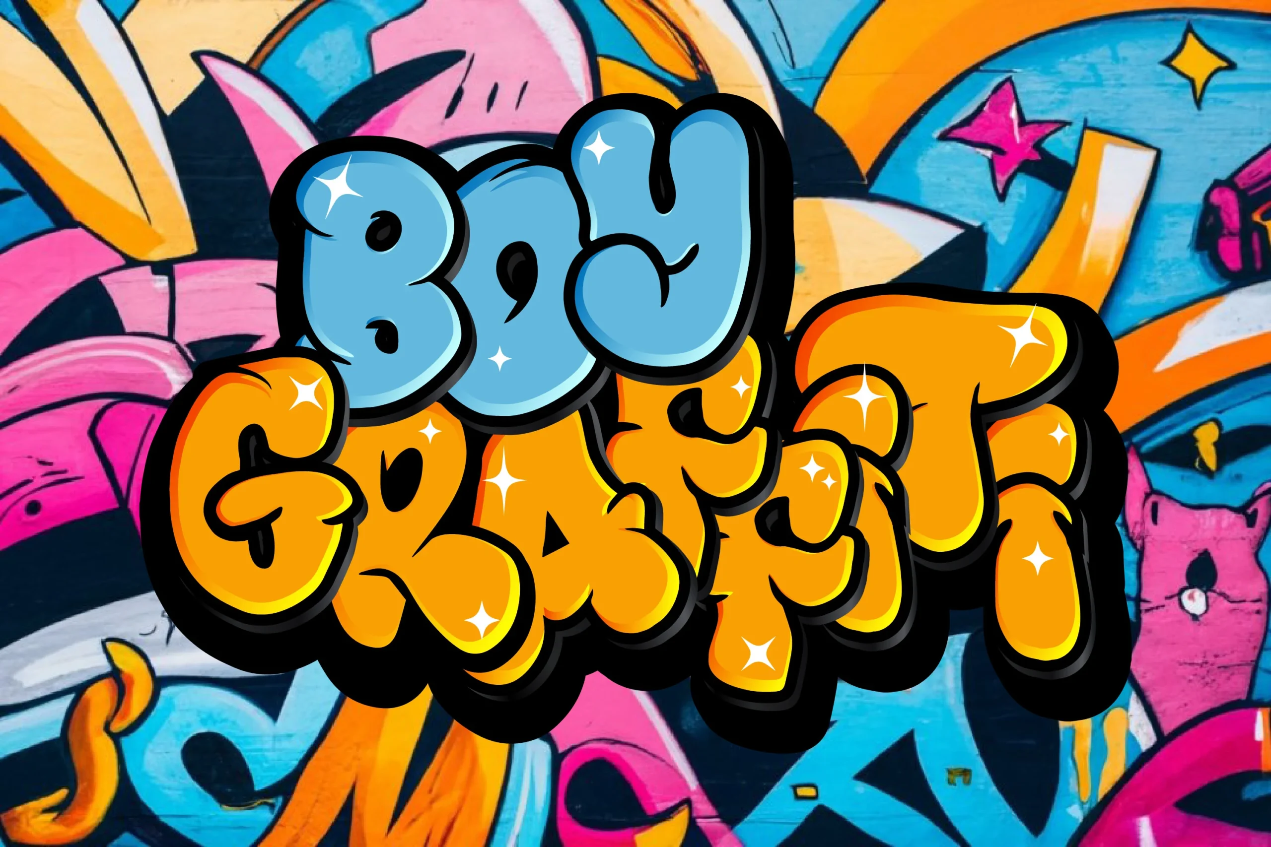
Best For: posters, social media graphics, T-shirts, short phrases
Boy Graffiti Font compresses rounded bubble letters into a tight, overlapping arrangement with very little internal space. This makes Cool Graffiti Fonts of this type effective for short poster titles, social graphics, and T-shirts, but longer phrases can quickly become crowded.
Antapani Font
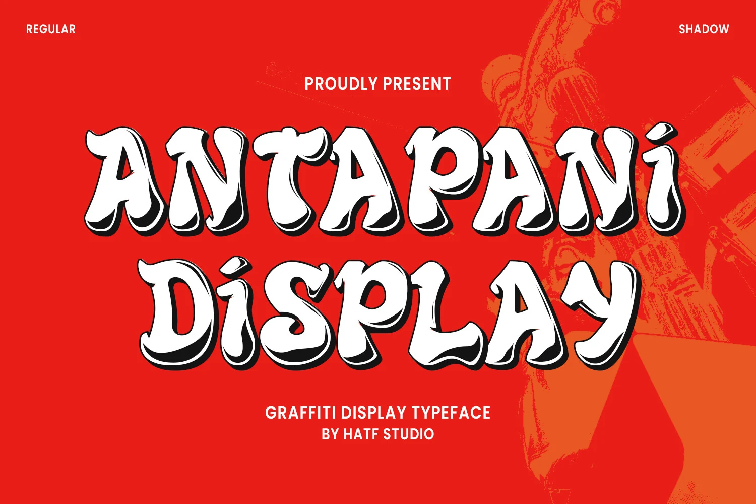
Best For: posters, T-shirts, stickers
Antapani Font presents stable, upright bubble forms with exaggerated curves, bulbous terminals, and a disconnected structure. Among Cool Graffiti Fonts, its predictable silhouette supports posters, stickers, and T-shirts, although restricted internal space reduces clarity in smaller reproductions.
Go Graffiti Font
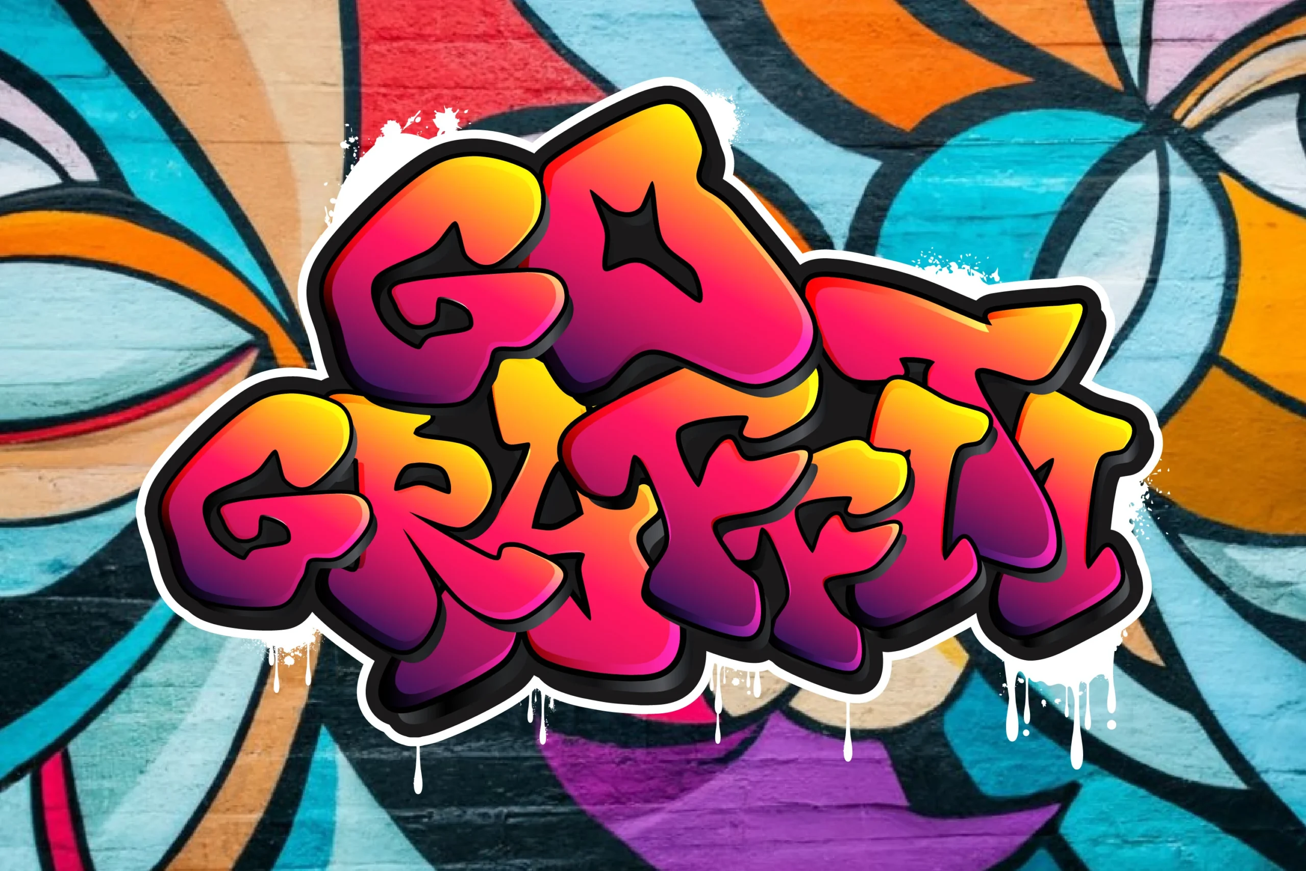
Best For: logos, posters, display text, headlines
Go Graffiti Font inflates rounded letter segments and reinforces them with overlapping three-dimensional shadowing. This treatment gives Cool Graffiti Fonts a layered title or logo role, but the overlaps limit it to large display text where the dimensional construction can be read clearly.
Gahir Font
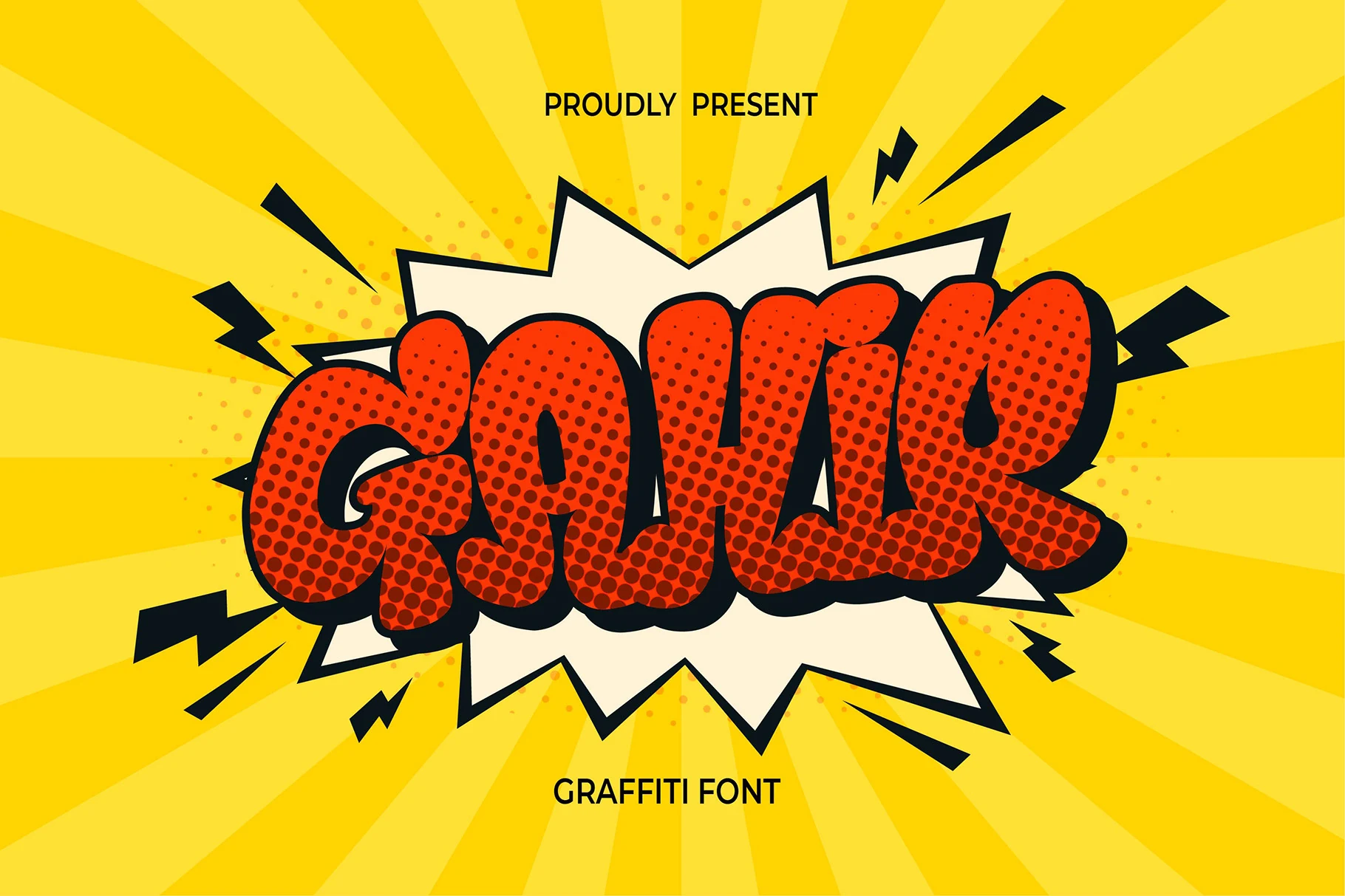
Best For: logos, T-shirts, display text, bold designs
Gahir Font layers rounded bubble components with 3D shadowing and halftone texture for a pop-art finish. Cool Graffiti Fonts with this treatment work well on apparel, logos, and advertising, where surface effects matter, but the shading sacrifices small-size legibility.
Quick Money Font
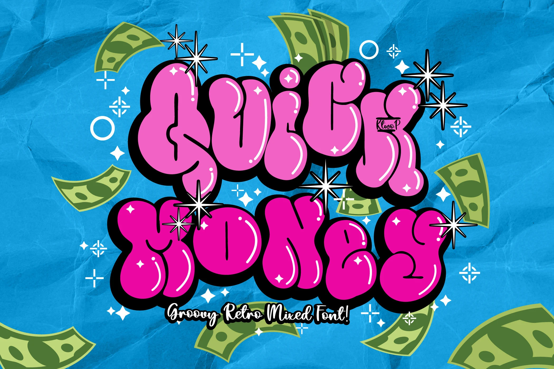
Best For: T-shirts, logos, display text, posters
For shirts, posters, and logos, Quick Money Font offers inflated rounded forms, thick bubble strokes, heavy black outer outlines, and a three-dimensional appearance. The silhouette remains clear at large sizes, while the contour becomes excessive for small text.
Gemoy Font
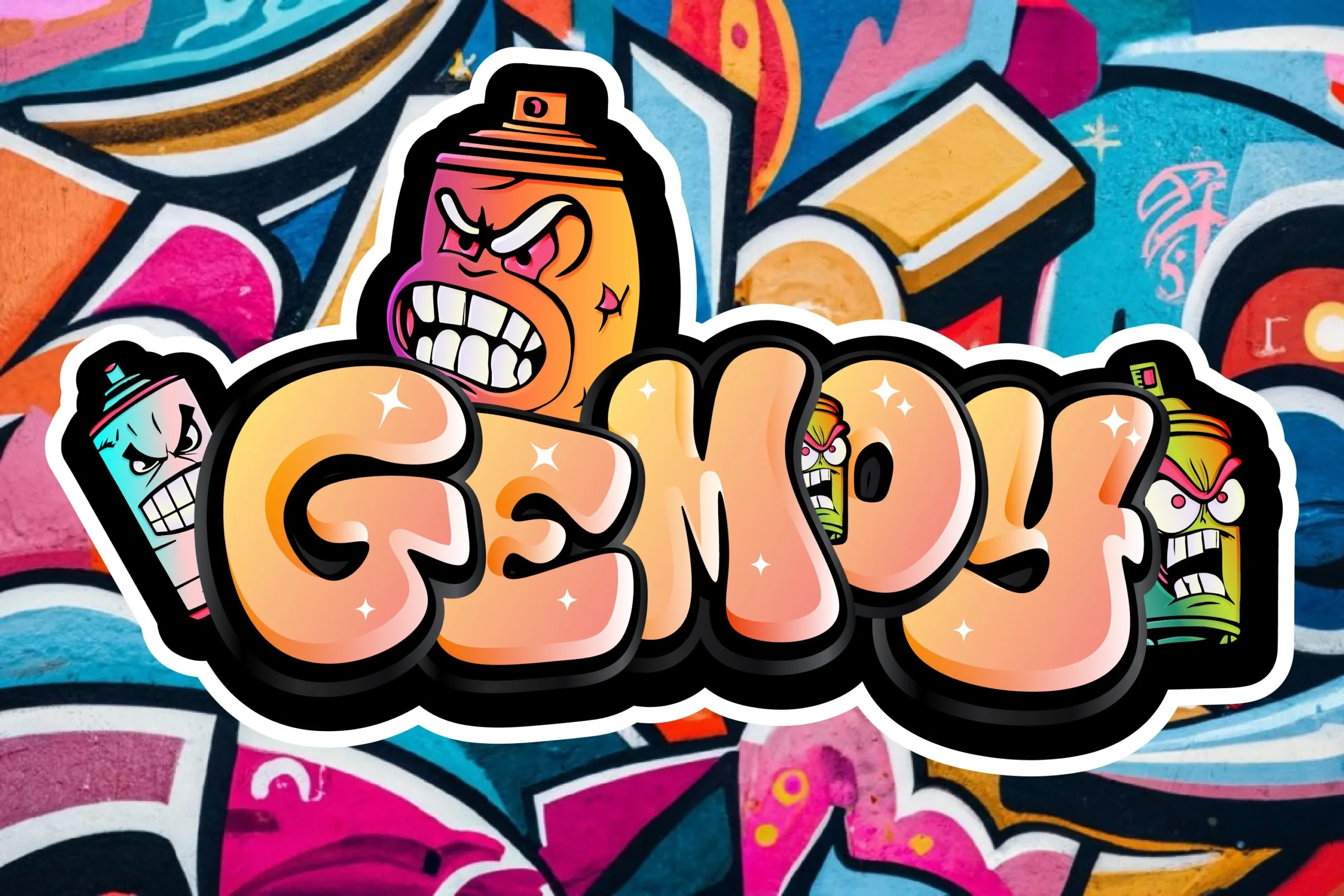
Best For: posters, merch design, display text, bold designs
Gemoy Font drives its bubble lettering with thick outlines and pronounced extruded drop shadows. The dimensional treatment suits posters, merch design, and display text, but the layered effects reduce immediate reading ease and should be reserved for larger lettering.
Slime Font
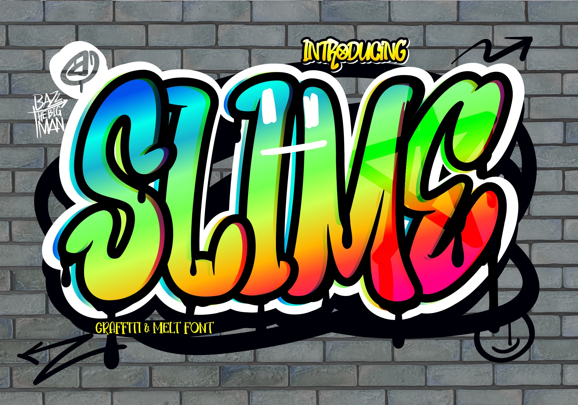
Best For: logos, T-shirts, display text
Slime Font keeps its rounded, disconnected letters upright while adding deliberate dripping, melt-style terminals and a slight baseline bounce. This liquid finish gives logos and T-shirts a distinct motif, though the drip details make smaller lettering less clear.
Hype Dope Font
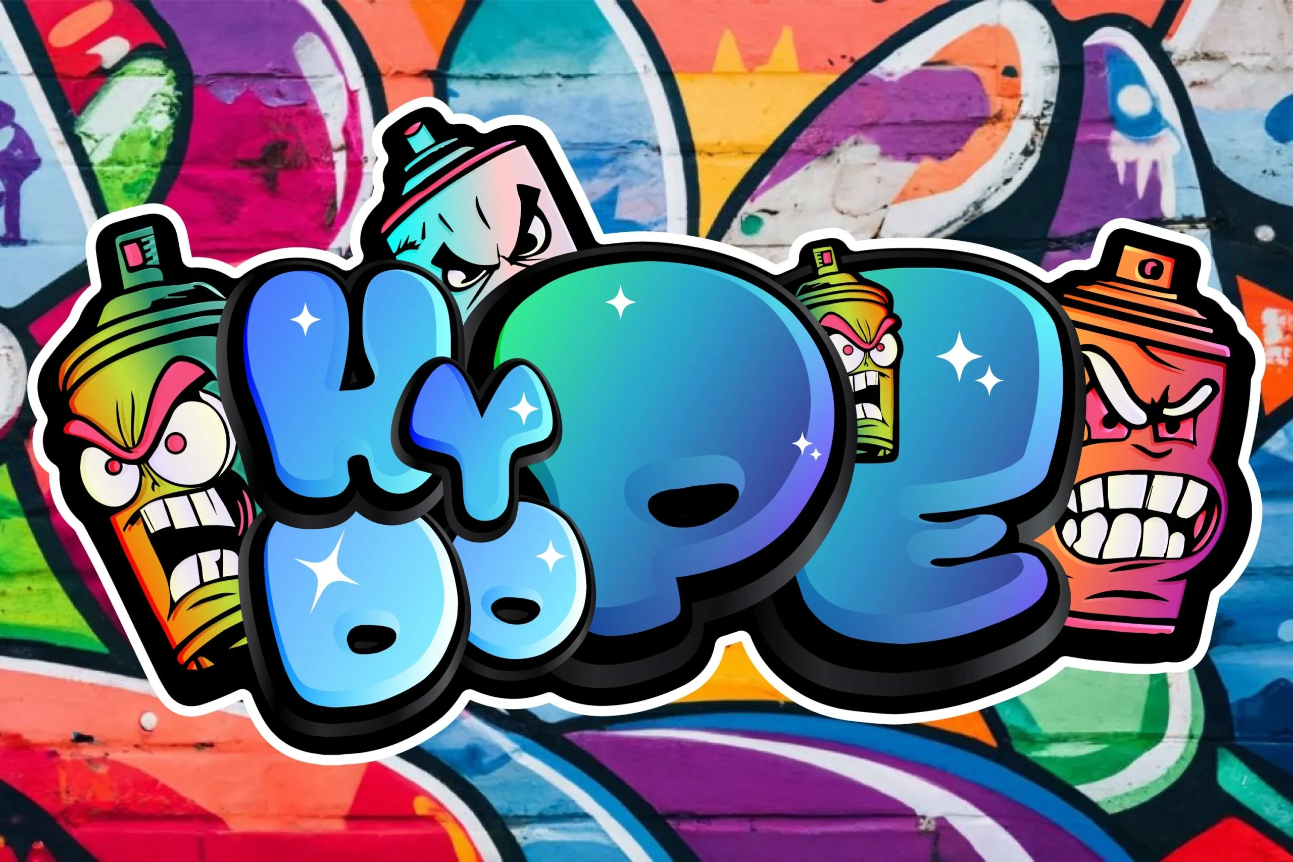
Best For: posters, display text, bold designs, expressive designs
Hype Dope Font interlocks rounded bubble characters into a dense arrangement with very limited negative space. The compressed construction makes an expressive poster mark, but Cool Graffiti Fonts this dense need large display treatment before the word becomes immediately recognizable.
Angular Block Graffiti
This group uses heavy disconnected blocks, sharp terminals, compressed proportions, and distressed or extruded surfaces. Its rigid silhouettes suit branding and merchandise, but corners, texture, and shadows demand larger sizing than the bubble forms.
Thorm Block Font
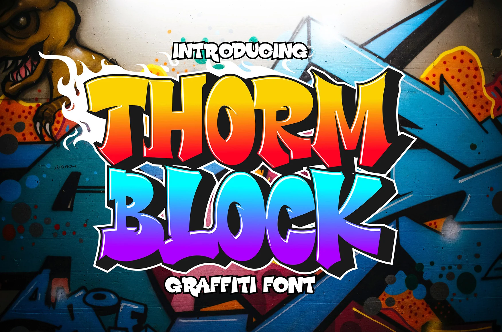
Best For: branding, logos, headlines, wall art
Thorm Block Font builds square-proportioned, disconnected letters with sharp angular terminals and consistently heavy strokes. That rigid construction gives logos, branding, headlines, and wall art a firm silhouette, although the angles become less readable when the design is reduced.
Funky Dream Font
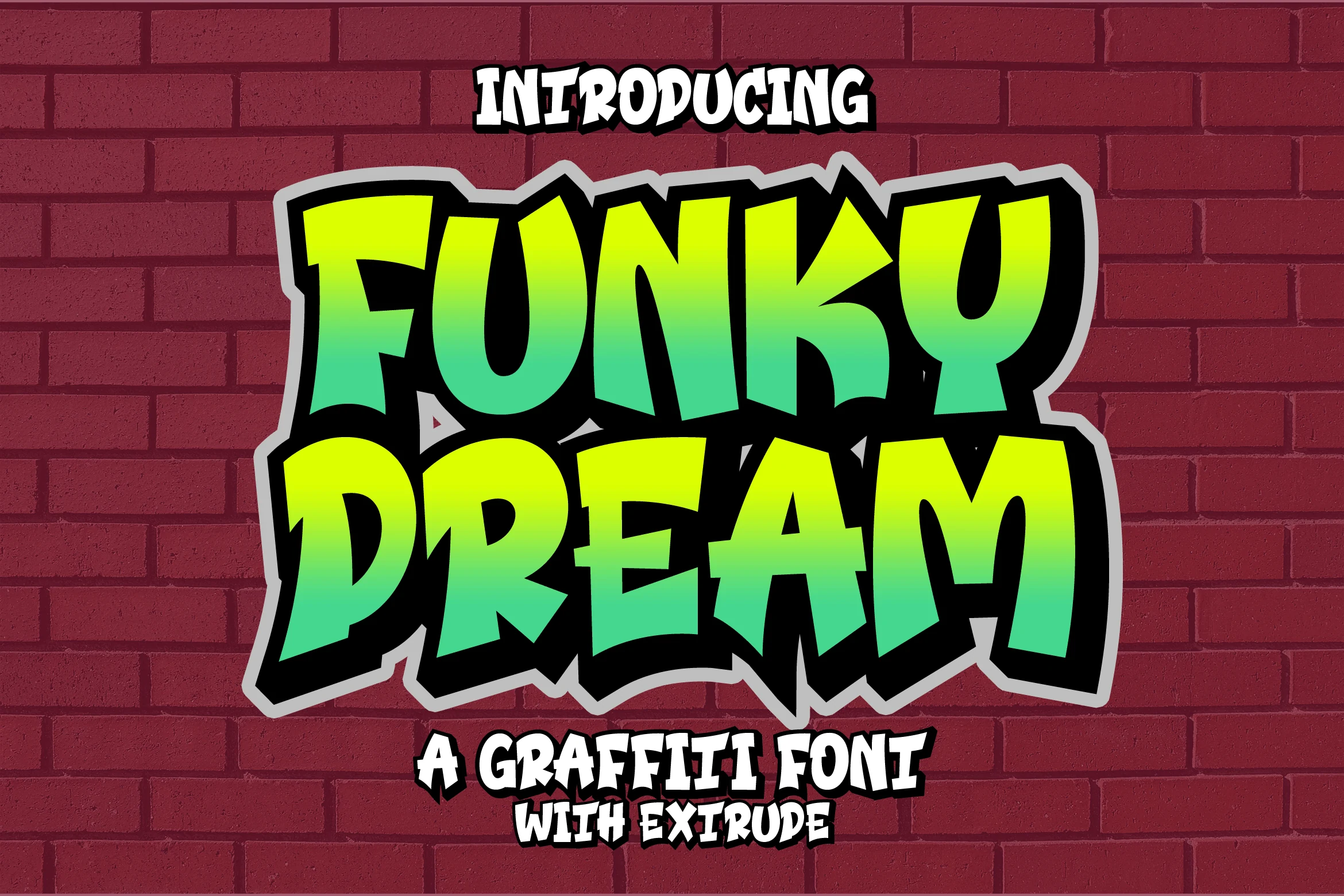
Best For: T-shirts, logos, merch design
Funky Dream Font mixes thick angular blocks with irregular character widths and a jagged extruded edge. The added depth gives T-shirts, sportswear, logos, and other merch graphics a substantial outline, though the edge effect can compromise clarity when the lettering is not large.
Kissi Font
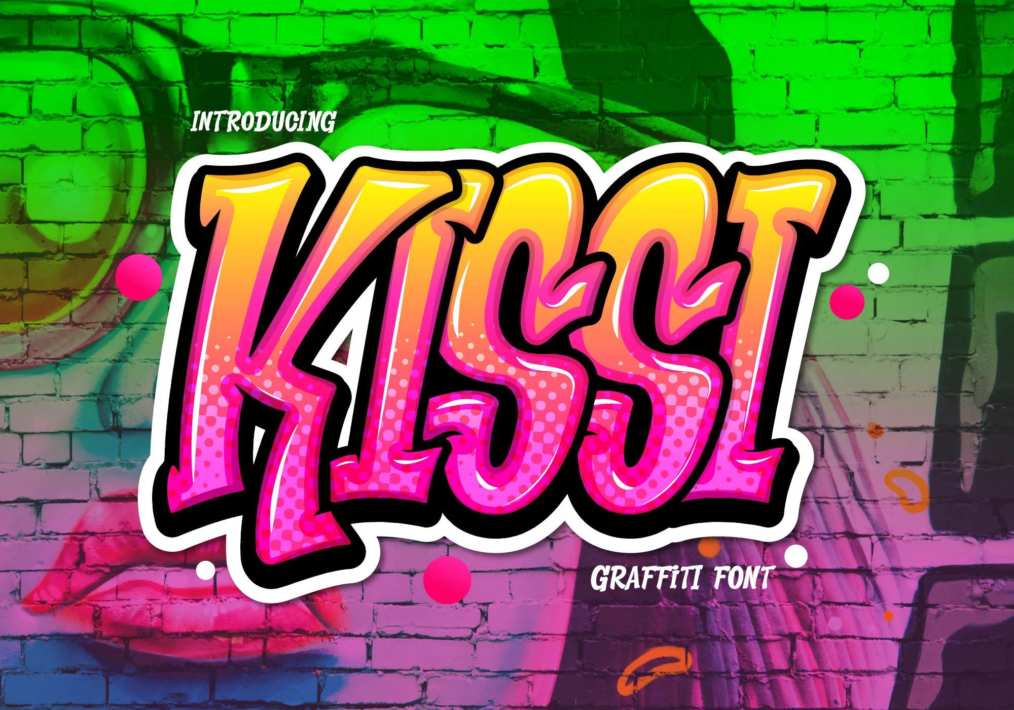
Best For: logos, T-shirts, merch design, display text
Kissi Font uses disconnected heavy letters with sharp terminals and an internal halftone texture. That printed surface adds a graphic layer for logos, T-shirts, sportswear, and advertisements, but the texture and angular detailing make large display sizing essential.
Clash Font
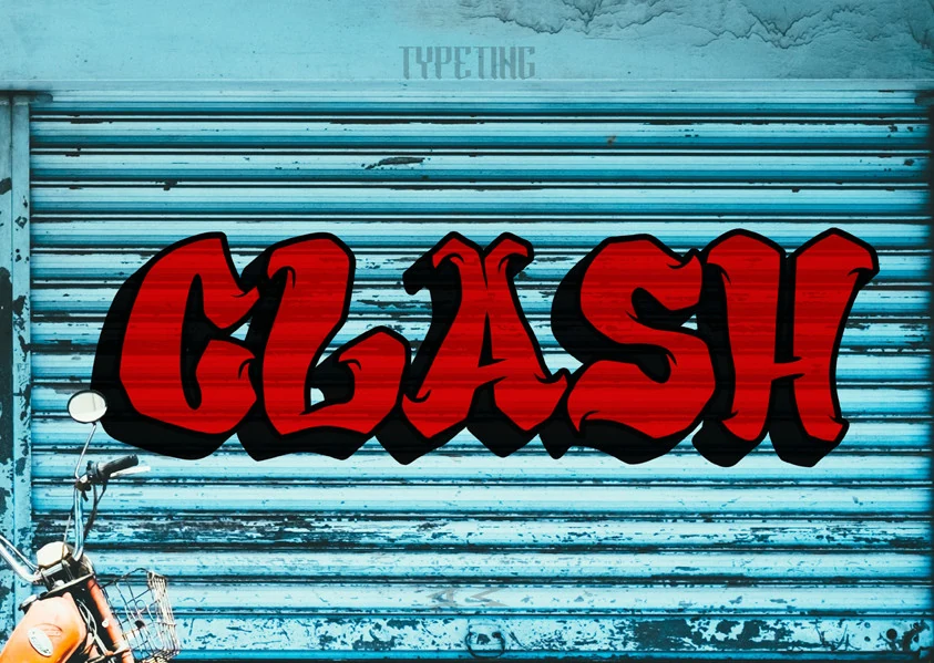
Best For: headlines, display text, branding, posters
Clash Font pairs compressed block proportions and sharp points with a substantial drop shadow. Its narrow footprint helps headlines and posters occupy less width, while the shadow can crowd counters and reduce clarity in smaller layouts.
Broadmen Font
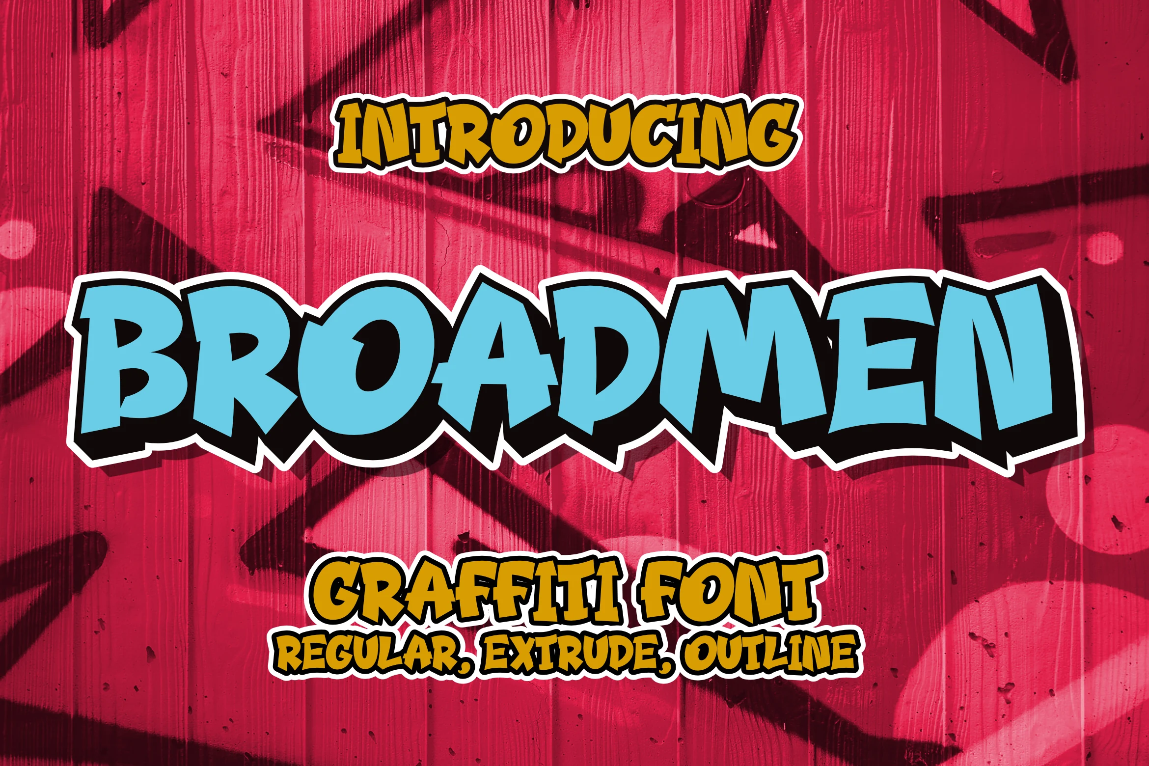
Best For: logos, T-shirts, display text, posters
Broadmen Font cuts chunky block letters with sharp joints, irregular heights, and an uneven baseline. The interruptions give logos, T-shirts, and posters a hand-built outline, but the broken line and changing proportions make extended wording difficult to scan.
Gear Four Font
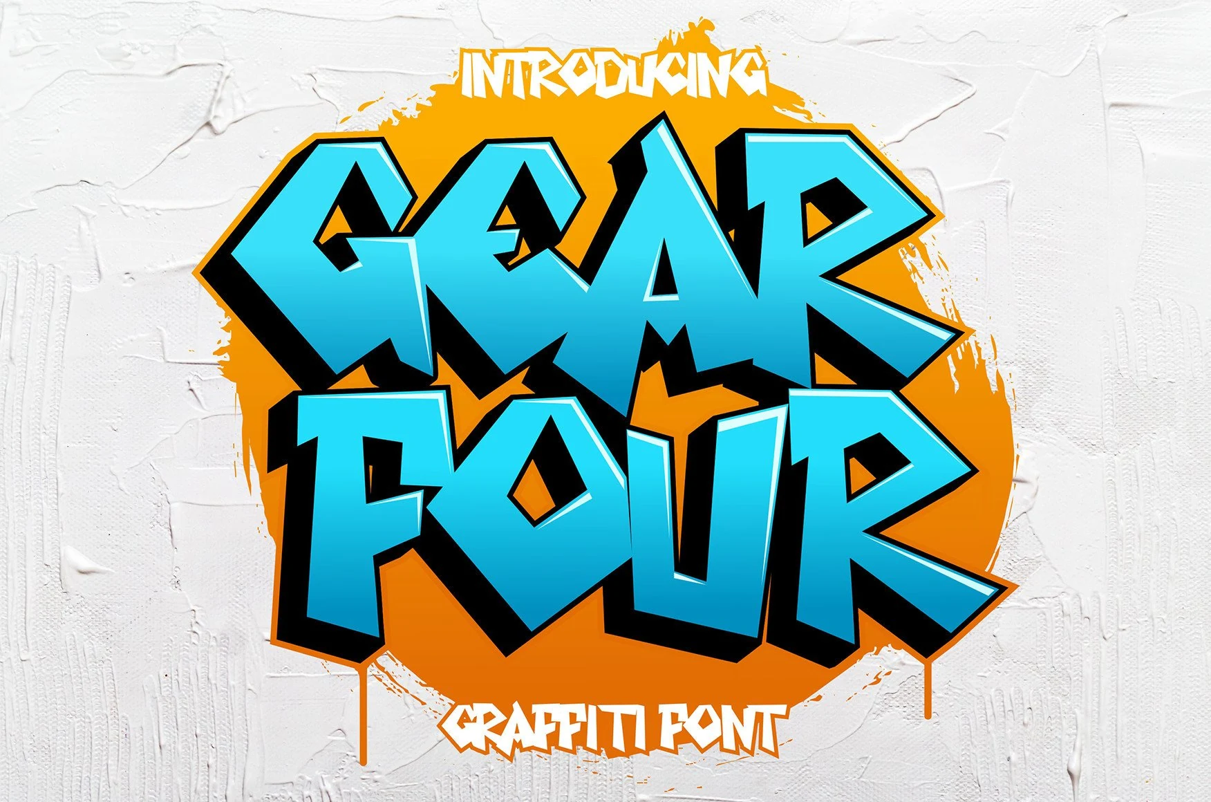
Best For: branding, headlines, invitations
Gear Four Font leans right with angular blocks, consistent stroke thickness, and clearly separated characters. That separation helps preserve headline clarity for branding, apparel, and invitations, although tight spacing and sharp corners lose definition when scaled down.
Thorm Floxy Font
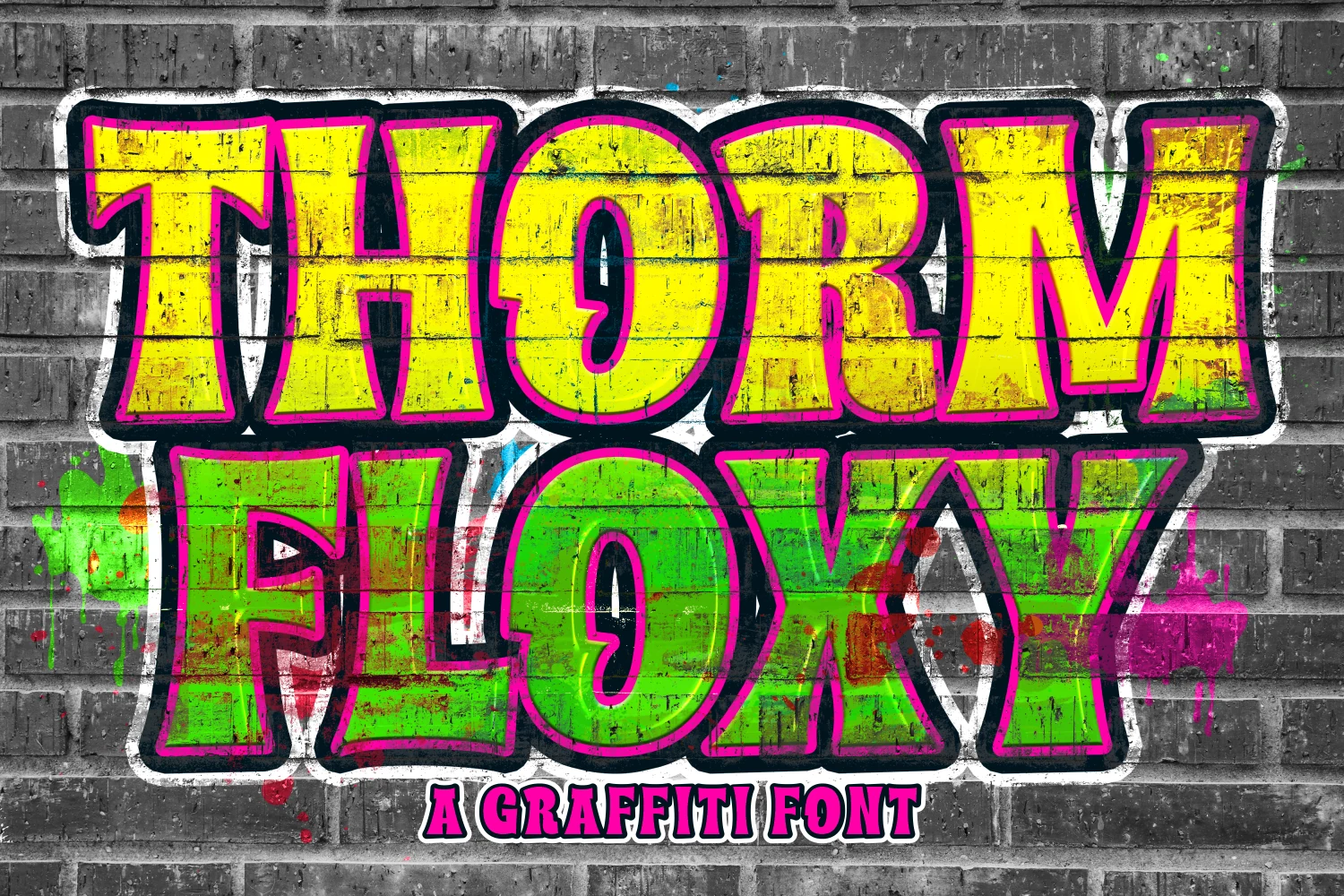
Best For: display text, headlines, posters, signage
Thorm Floxy Font relies on straight-edged, chunky block construction finished with a distressed texture. Its heavy silhouette stays readable from a distance, making it practical for display text, posters, headlines, and signage; the surface texture has the most effect at large scale.
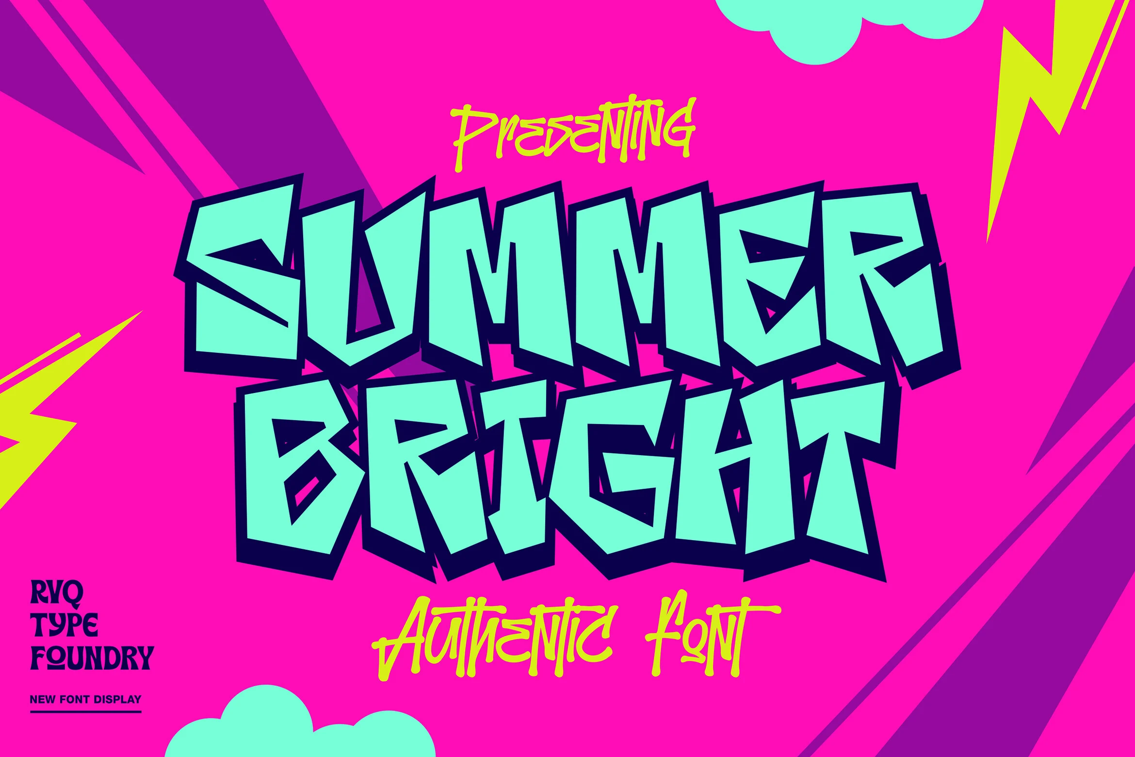
The Summer Bright Font
Best For: logos, posters, display text, headlines
The Summer Bright Font uses jagged block letters, irregular proportions, and consistently thick strokes. Its uneven geometry gives logos, posters, and headlines a confrontational outline, but the limited reading ease restricts it to short display wording rather than longer copy.
Connected Graffiti Scripts
Connected scripts and handwritten constructions define this category through joins, slant, irregular baselines, swashes, and decorative extensions. They create more directional movement than the block groups, while their linked strokes make small text harder to scan.
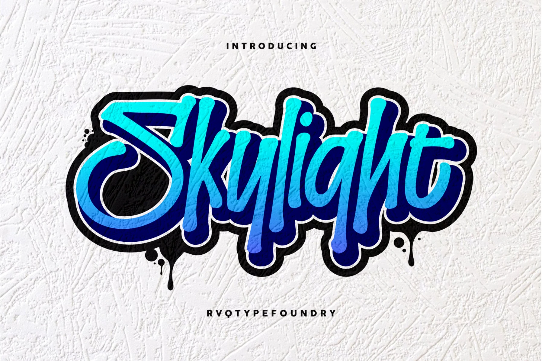
Skylight Font
Best For: logos, posters, display text
For posters and logos, Skylight Font offers connected, right-leaning script with jagged edges, drip-like vertical extensions, and a heavy black outline. Its decorative joins create a strongly marked headline, but the irregular structure and outline need generous scale to remain readable.
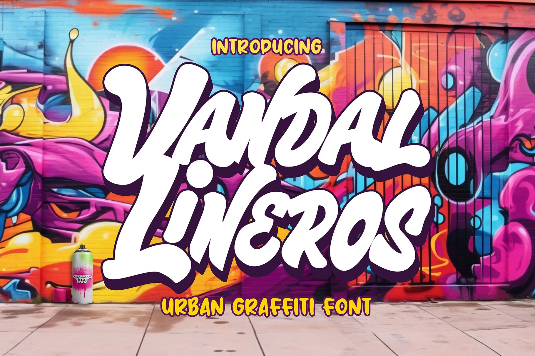
Vandal Lineros Font
Best For: posters, display text, headlines, stickers
Vandal Lineros Font gets its distinctive mark from heavy rounded strokes, bulbous terminals, a pronounced rightward slant, and interconnected cursive forms. Cool Graffiti Fonts with this much joined movement work best in large posters, headlines, or stickers rather than compact wording.
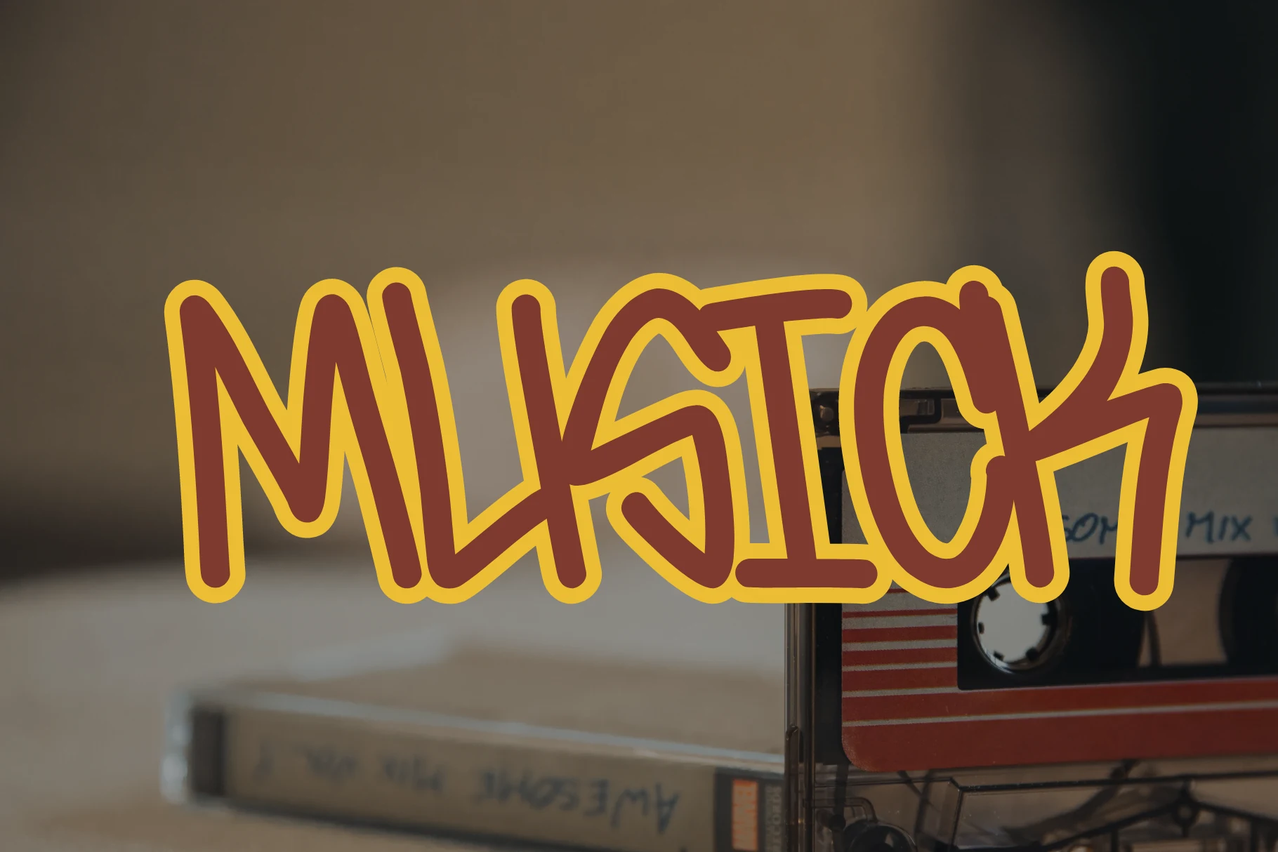
Musick Font
Best For: logos, packaging, social media graphics, invitations
Musick Font uses a monolinear handwritten construction, loose interconnected shapes, rounded terminals, and an irregular baseline. Its informal rhythm adapts well to logos, packaging, social media graphics, and invitations, but connected forms become less comfortable when used in dense paragraphs.
Gangstown Font
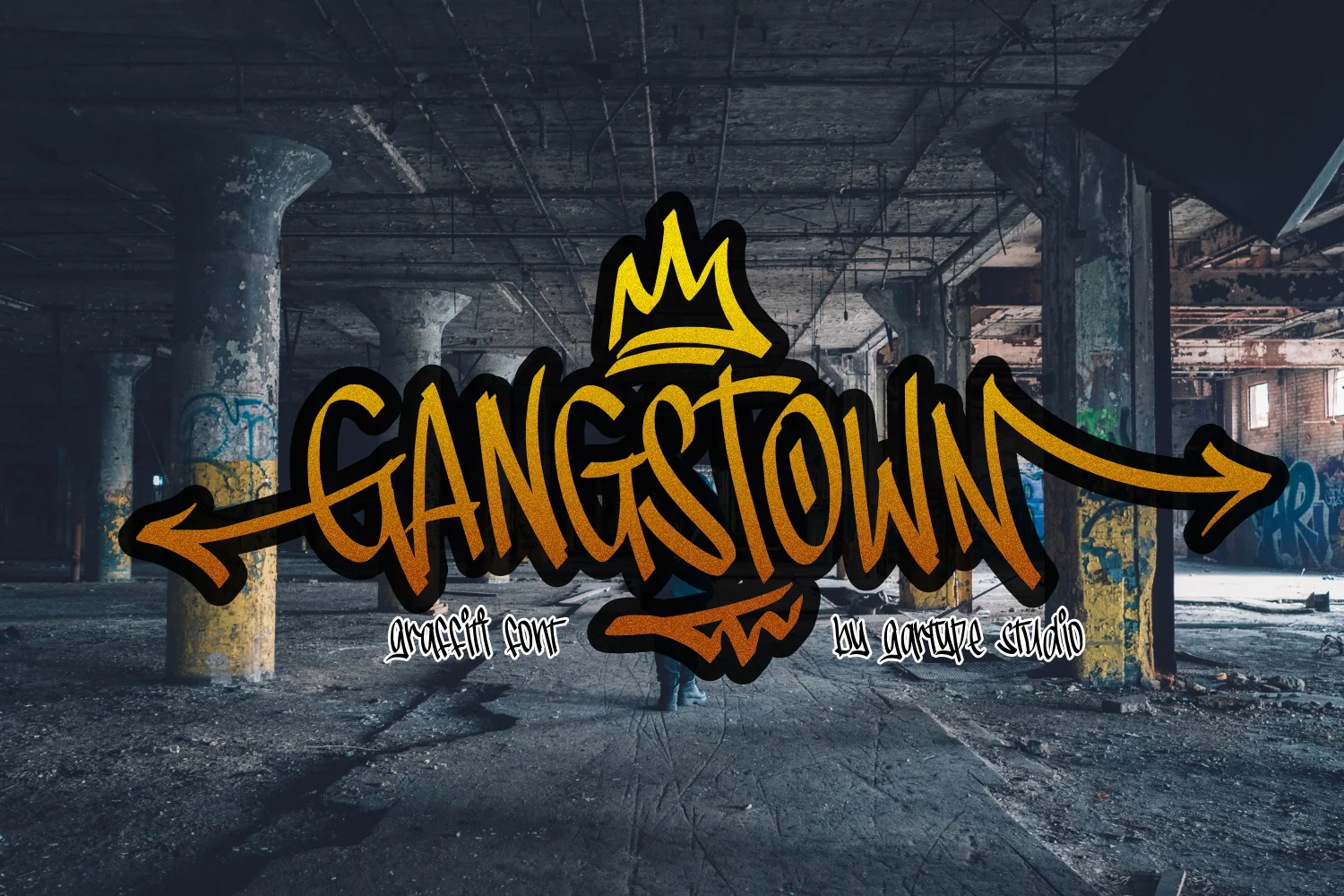
Best For: posters, display text, headlines, creative projects
For a directional poster headline, Gangstown Font connects heavy letters through angular joints and arrow-like horizontal swashes. The high stroke variation and extended gestures create a complex outline, so reading ease drops noticeably at smaller sizes.
How to Choose the Right Font
Choose rounded disconnected forms when you want softer silhouettes, and choose angular blocks when logos or headlines need sharper structure. Connected scripts and handwritten joins add directional movement but require more space. Check counters, spacing, shadows, drips, and texture at the final size: most Cool Graffiti Fonts are strongest as short, large display statements rather than body copy.