20 Luxury Branding Fonts for Stunning Premium Designs
Looking for more branding fonts? Browse our complete Branding Fonts collection to compare luxury, elegant, modern, feminine, minimal, boutique, beauty, fashion, packaging, and serif styles.
Luxury Branding Fonts help premium visuals look deliberate before a viewer reads the copy. This collection is for designers building logos, packaging, beauty labels, fashion identities, wedding brands, and editorial layouts that need polished serif, script, or display typography.
Script & Calligraphy Luxury Branding Fonts
These script and calligraphy fonts use flowing strokes, sweeping capitals, and polished curves for premium logos, wedding brands, beauty packaging, and elegant wordmarks.
Glamoury Font
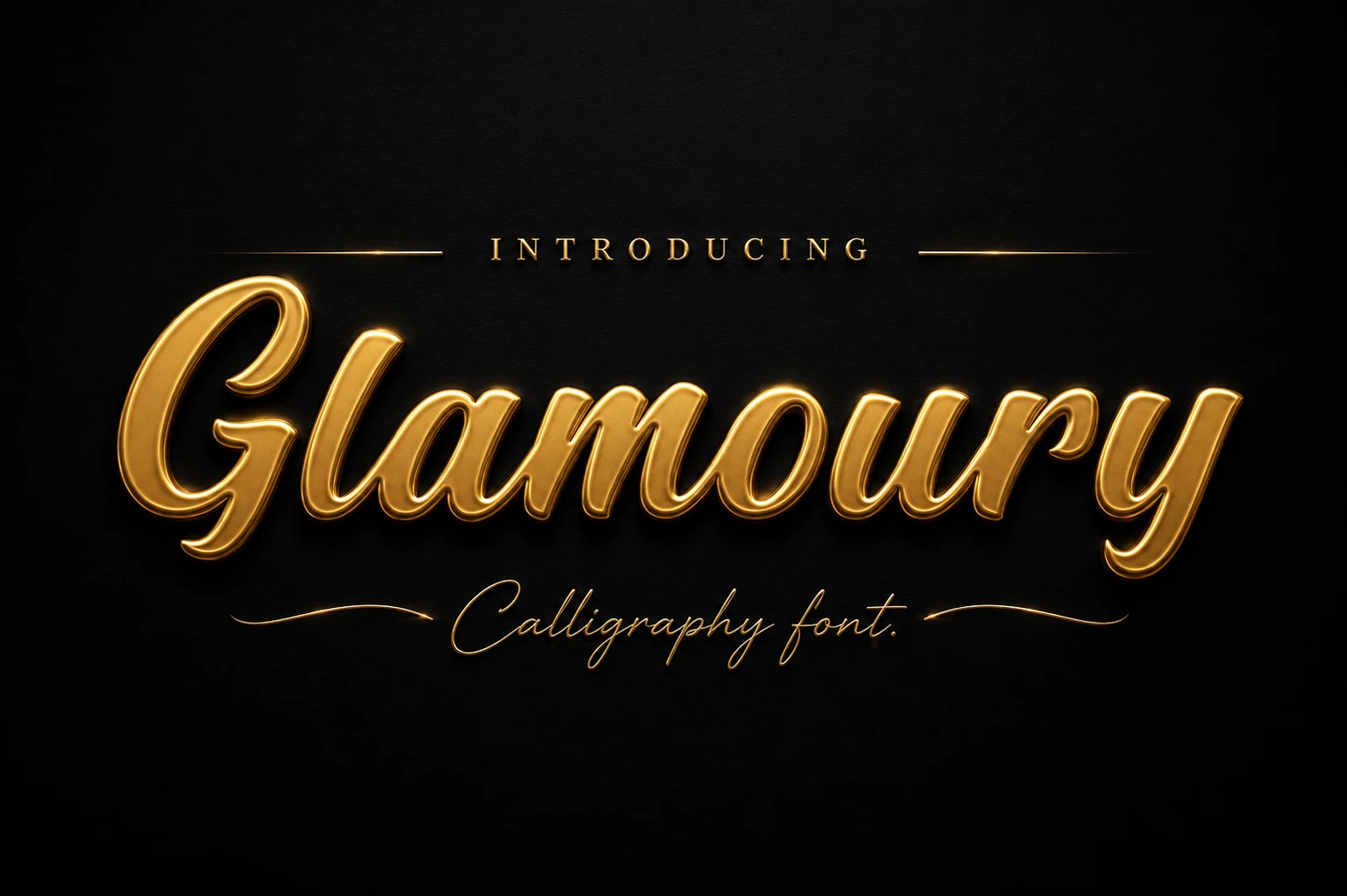
Best For: logos, packaging, beauty branding, high-end designs
Glamoury Font has a broad, connected calligraphy rhythm with rounded downstrokes, a sweeping capital G, and soft looped terminals. Its polished script makes the strongest case for Luxury Branding Fonts when a logo, label, or editorial headline needs a confident wordmark instead of a quiet text face.
The letters carry enough weight to hold a premium layout, but the curves need clean contrast around them. Use it for short names or title lines, keep supporting type restrained, and avoid squeezing the spacing so the loops and joins stay crisp at display size.
Avonia Font
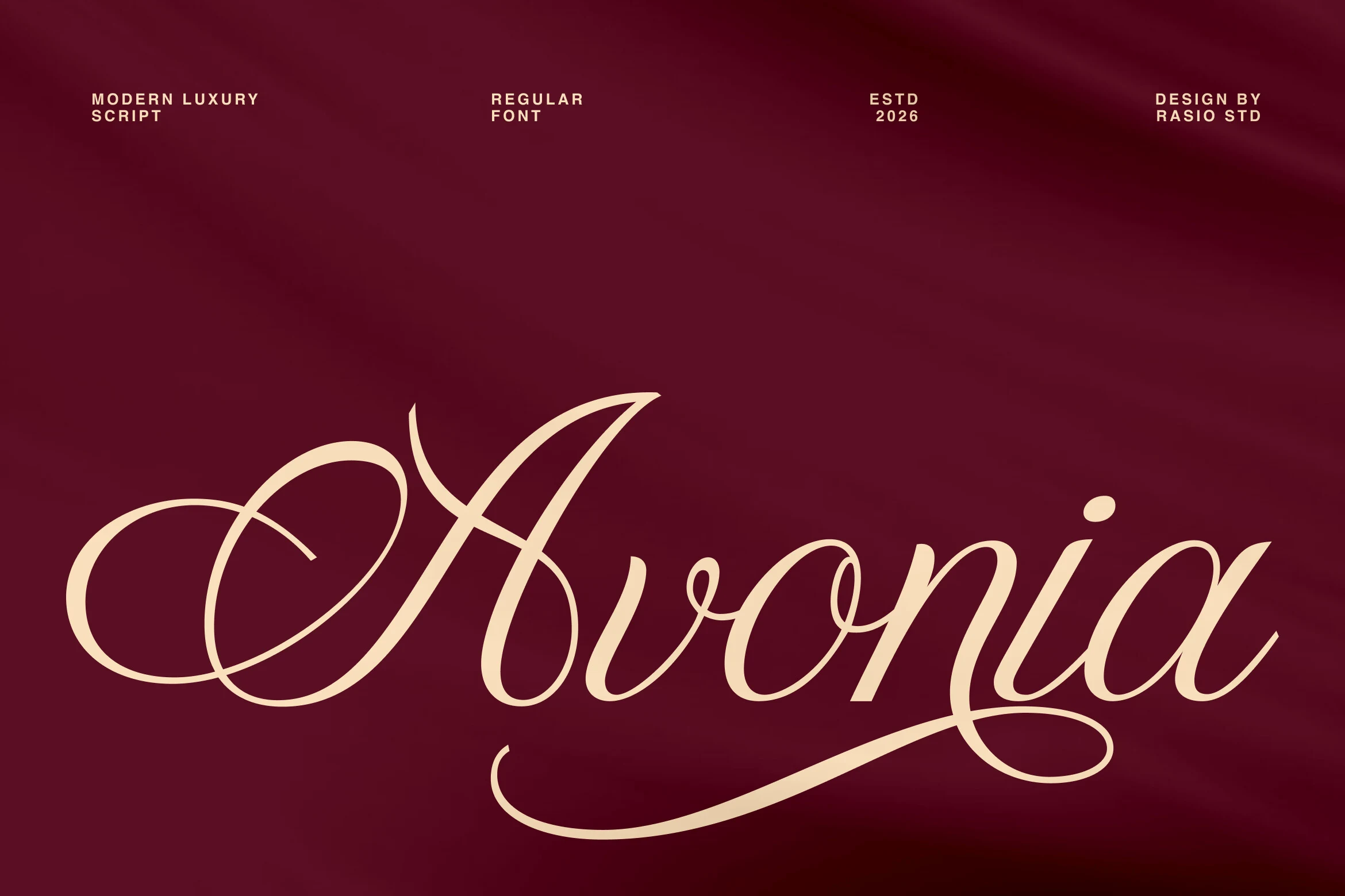
Best For: logos, branding, editorial designs, luxury designs
Avonia Font leans into contrast, pairing fine connectors with fuller downstrokes and a sweeping capital A that instantly sets a formal tone. For Luxury Branding Fonts, it delivers refined movement that feels polished on sight, especially when a wordmark needs elegance without becoming stiff.
The long swashes and smooth joins give it clear display strength, so it works best in short names, covers, and title lines where the curves have space to read cleanly. Its alternates can add extra flair, but the layout should stay simple and the spacing deliberate so the rhythm feels graceful rather than crowded.
Violyn Wedding Thivoria Font
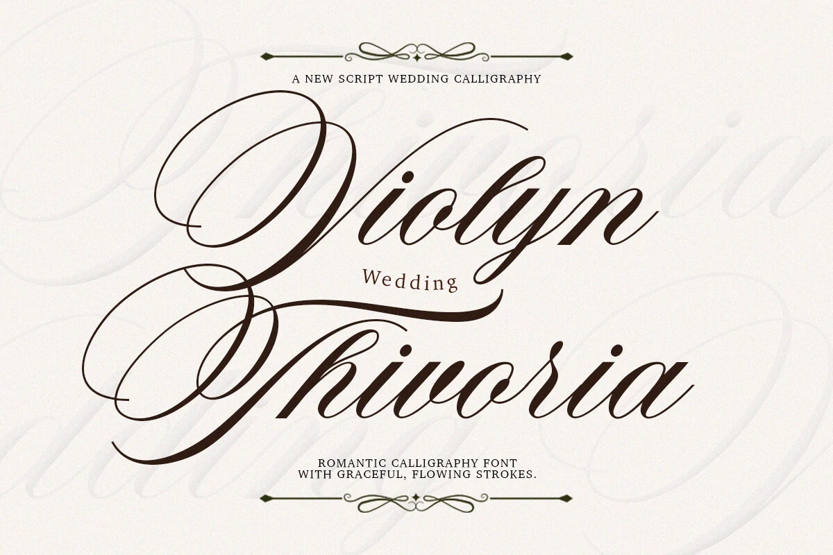
Best For: logos, invitations, wedding designs, luxury designs
Violyn Wedding Thivoria Font is a formal calligraphy face with dramatic looped capitals, narrow slanted lowercase, and strong thick-to-thin contrast. Its ornamental rhythm gives Luxury Branding Fonts a romantic edge, especially when the design needs a name or headline to feel ceremonial rather than minimal.
The flourishes are large and visually dominant, so this font should be treated as a display choice for short wording. Keep line spacing open, avoid crowded borders, and pair it with small caps or a restrained serif so the sweeping entry strokes and descenders stay controlled.
Luxurimo Font
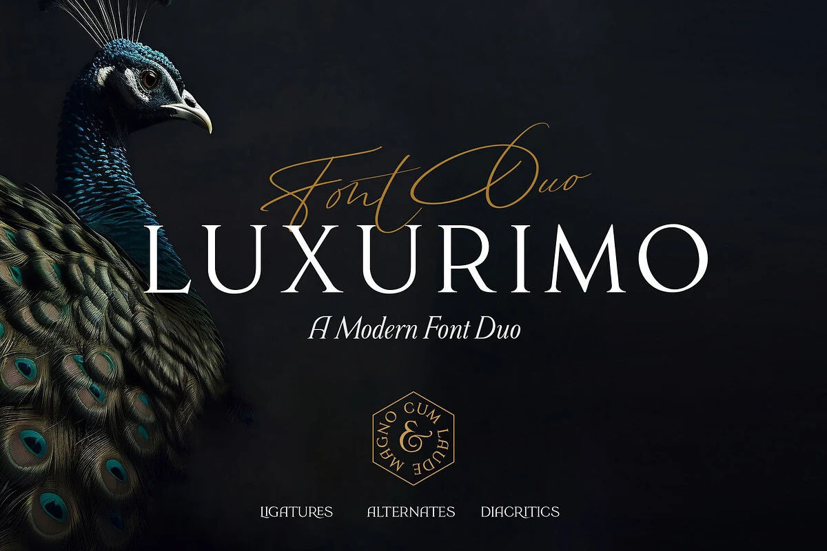
Best For: logos, fashion branding, wedding designs, luxury designs
Luxurimo Font combines a tall, high-contrast serif with a fine signature script, giving Luxury Branding Fonts a ready-made hierarchy for polished wordmarks. The serif side feels wide, clean, and composed, while the script adds a lighter handwritten accent without overpowering the main title.
This duo works best when the serif carries the brand name and the script is kept to a short descriptor, tagline, or secondary mark. Give the capitals measured tracking and strong background contrast; the thin strokes look sharper when the layout avoids busy textures and cramped spacing.
Refined Serif Luxury Branding Fonts
These refined serif fonts rely on clean contrast, graceful proportions, and restrained details for boutique logos, editorial headers, labels, and minimal premium branding.
The Paloma Font
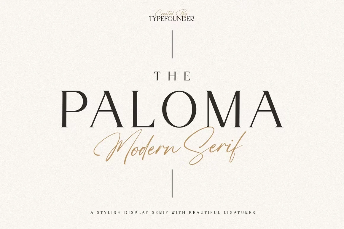
Best For: logos, editorial designs, minimal designs, luxury designs
The Paloma Font pairs classical serif structure with a distinctly polished finish. The tall capitals, sharp serifs, and high-contrast strokes give it the kind of composed presence Luxury Branding Fonts need when the goal is refined, minimal impact rather than decoration.
Its letterforms feel crisp and architectural, which makes it especially strong for logos, mastheads, and editorial titles. Leave generous tracking and plenty of white space around it, and pair it with a quiet sans or simple script so the contrast and proportions stay clean and intentional.
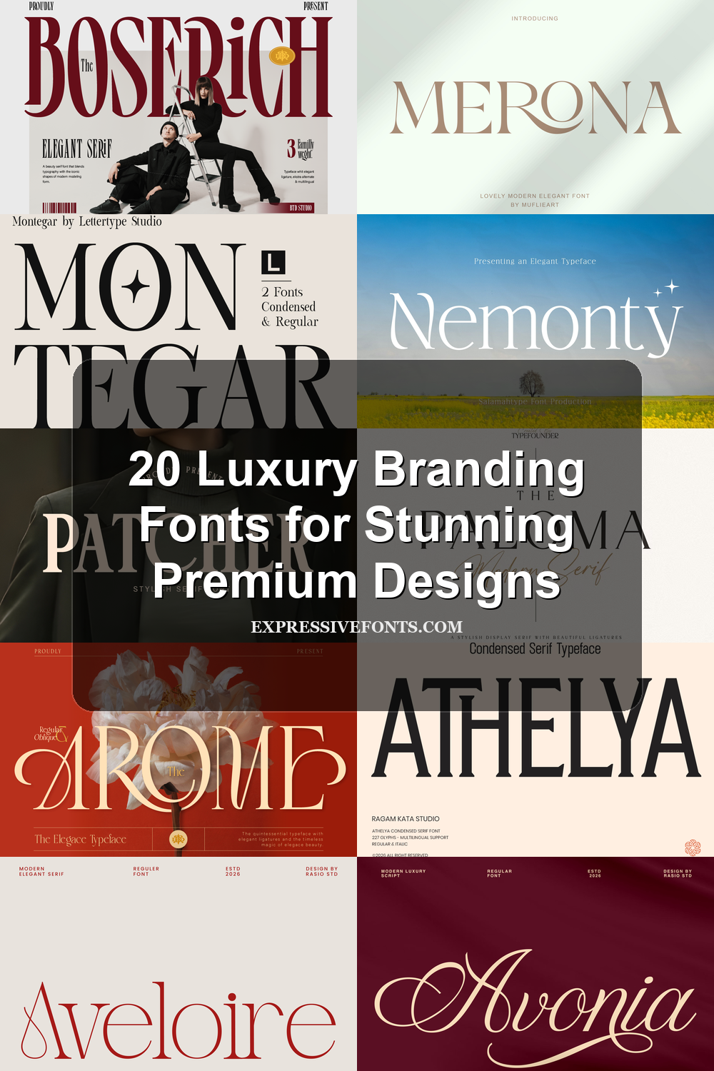
Aveloire Font
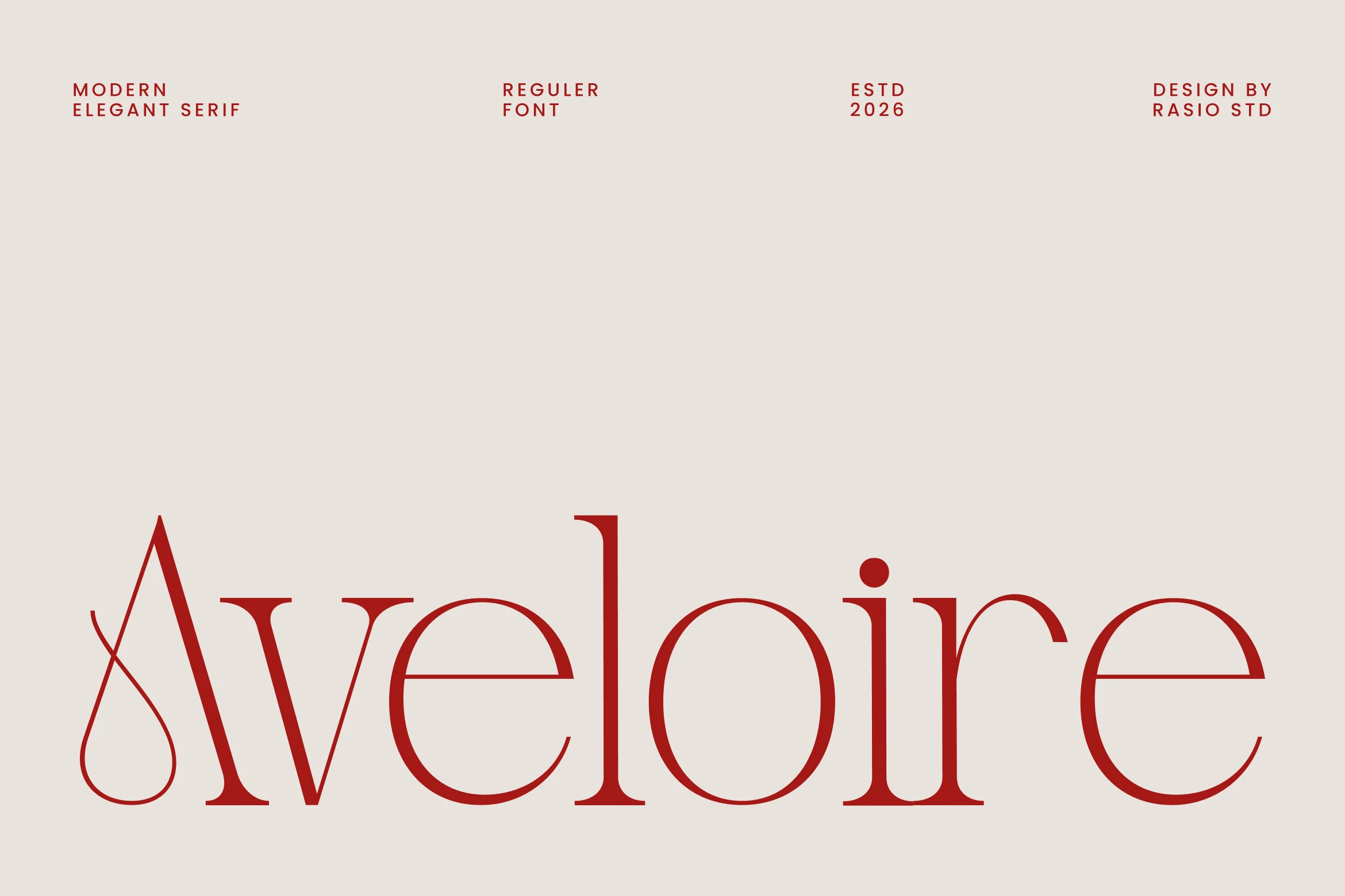
Best For: logos, editorial designs, fashion branding, luxury designs
Aveloire Font uses a refined serif structure with delicate contrast, rounded curves, and a distinctive swash-like entry on the capital A. Its slim, polished rhythm fits Luxury Branding Fonts where a logo or editorial title needs modern elegance without heavy ornament.
The letterforms are spacious and controlled, but the thin strokes and long horizontal details need clean scale and contrast. Use it for short brand names, magazine-style headers, and premium visual systems, with measured tracking so the graceful terminals stay sharp instead of blending together.
Arome Font
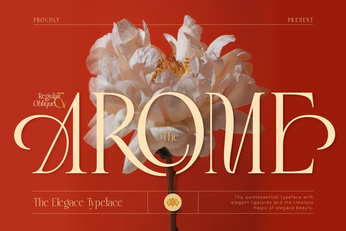
Best For: logos, packaging, wedding designs, luxury designs
Arome Font is a high-contrast serif with elongated strokes, soft curves, and a distinctly romantic silhouette. The oversized capitals give it a poised, decorative presence, making it a strong choice for Luxury Branding Fonts when a wordmark needs elegance without feeling overly ornate.
Its thin joins and tall proportions read best in short names, titles, and packaging where the letterforms can stay crisp. Give it generous scale, clean spacing, and restrained supporting type so the refined contrast and graceful terminals carry the hierarchy.
Nemonty Font
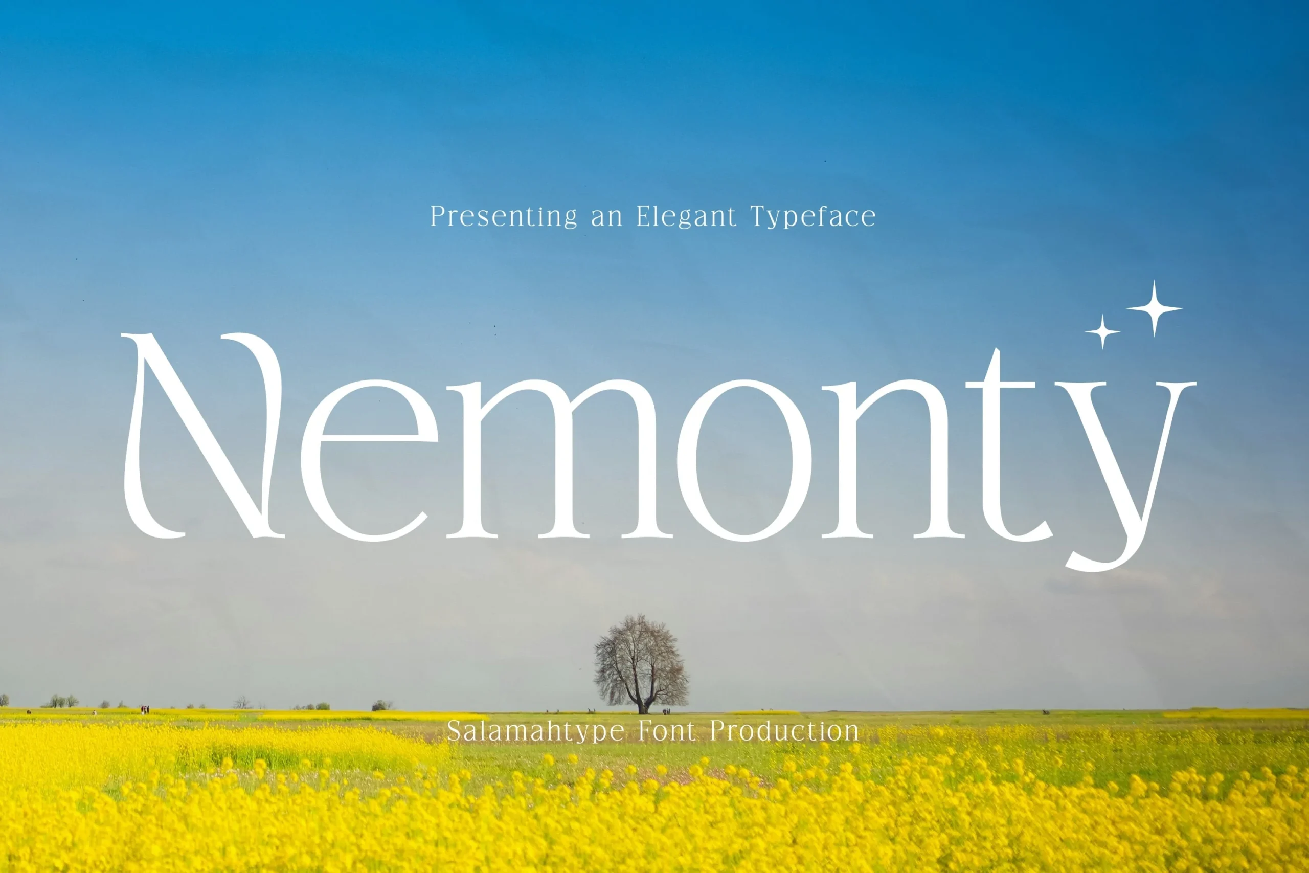
Best For: logos, branding, minimal designs, luxury designs
Nemonty Font is a thin serif with airy proportions, soft contrast, and lightly tapered terminals that keep the letterforms poised without feeling stiff. For Luxury Branding Fonts, it offers a clean boutique look that feels refined through restraint rather than decorative detail.
The open counters and balanced spacing help it read clearly at display size, especially in logos, labels, and polished editorial headings. Keep it to short names or brief title lines, give it plenty of white space, and pair it with simple supporting text so the delicate strokes stay crisp.
Together Font
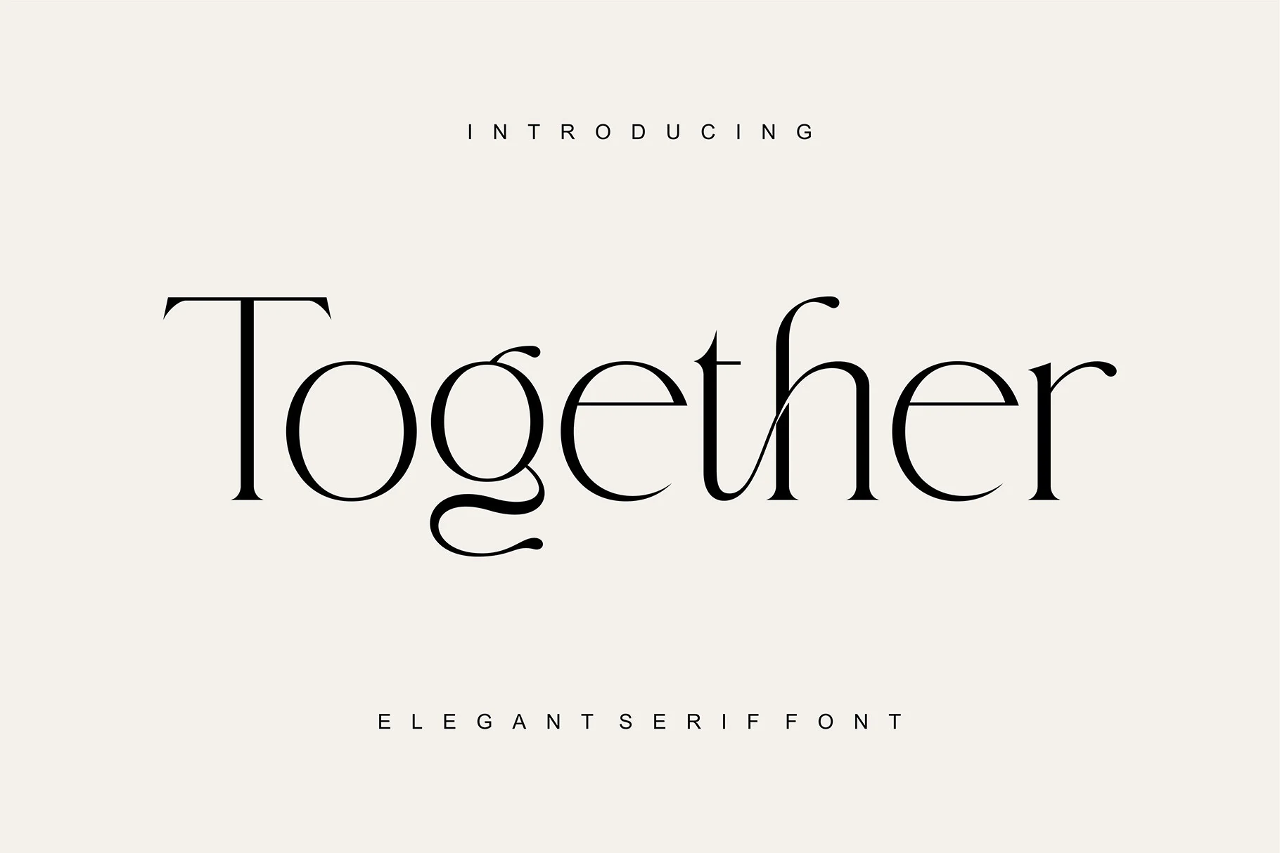
Best For: logos, invitations, beauty branding, editorial designs
Together Font has a poised editorial structure with tall serif stems, fine hairlines, rounded bowls, and a distinctive lowercase g that adds personality without breaking the calm rhythm. It suits Luxury Branding Fonts when a wordmark needs refinement that feels clean and assured rather than overly decorative.
The contrast is delicate, but the shapes still hold their own in headings, invitations, and cosmetic labels. Use it at generous sizes, keep surrounding typography restrained, and give the counters and long terminals enough room so the elegant rhythm stays crisp.
Merona Font
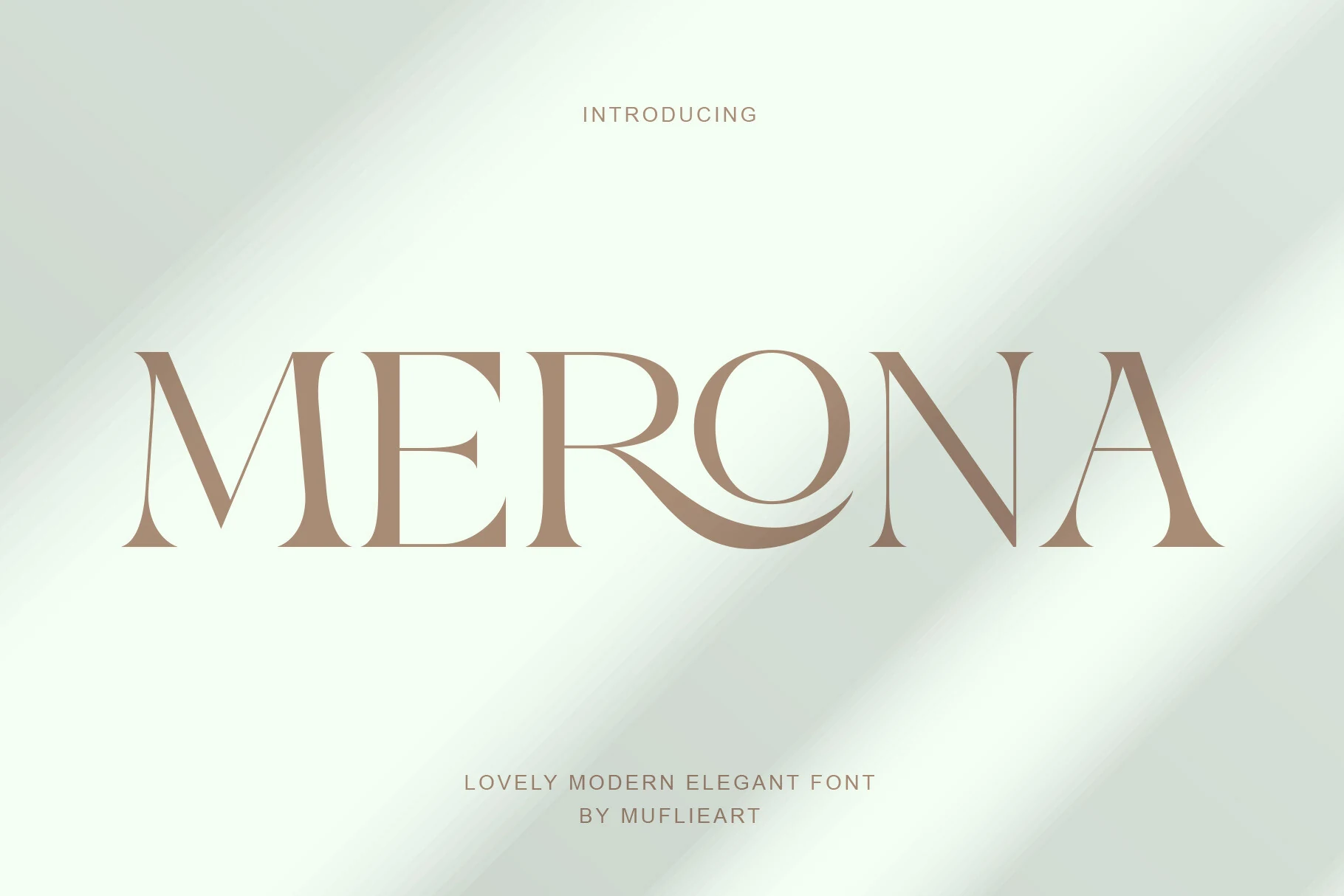
Best For: branding, editorial designs, fashion branding, luxury designs
Merona Font balances crisp Roman structure with a graceful softness that shows most clearly in its flowing wave ligature and airy proportions. The contrast is refined rather than harsh, so the letters feel poised and cinematic—an elegant direction for Luxury Branding Fonts when you want polish without stiffness.
Its wide spacing and clean shapes suit wordmarks, editorial titles, and fashion-facing packaging where the curves can stay visible at display size. Keep supporting type restrained and let Merona carry the top of the hierarchy; it works best with generous margins and short, well-spaced lines.
Fashion Editorial Luxury Branding Fonts
These fashion-led serif fonts bring tall proportions, strong contrast, and polished editorial structure to mastheads, brand systems, cover lines, and high-end packaging.
Boserich Font
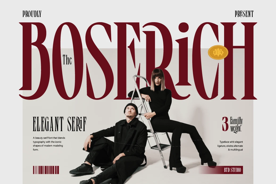
Best For: logos, editorial designs, fashion branding, luxury designs
Boserich Font has tall, narrow capitals, sharp serif cuts, and a clean vertical rhythm that immediately reads as fashion-led and editorial. That balance of classic structure and modern proportions makes it a strong fit for Luxury Branding Fonts, especially when the design needs presence without relying on decoration.
The condensed shapes give headlines a polished silhouette, so it performs best in large titles, logo concepts, and cover-style layouts. Leave enough space between lines and keep supporting text restrained; the font looks strongest when its slim width and contrast carry the hierarchy on their own.
Geista Mond Font
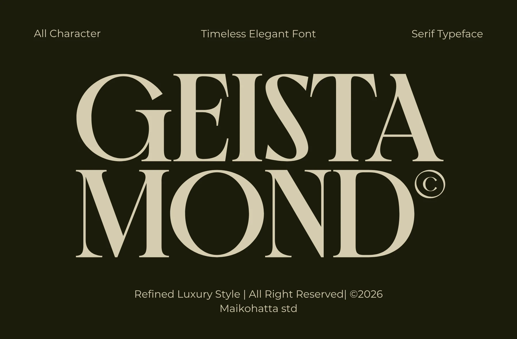
Best For: logos, editorial designs, fashion branding, luxury designs
Geista Mond Font leans into grand editorial drama with tall serif capitals, strong thick-to-thin contrast, and generous curves that feel poised rather than severe. It suits Luxury Branding Fonts when a masthead or wordmark needs a polished, fashion-led presence with clear visual authority.
The wide capitals create a stable premium silhouette, so it performs best in short names, cover lines, and packaging where the spacing can stay open. Let the type run large, keep surrounding elements quiet, and use clean contrast so the refined joins and elegant stress stay crisp.
Montegar Font
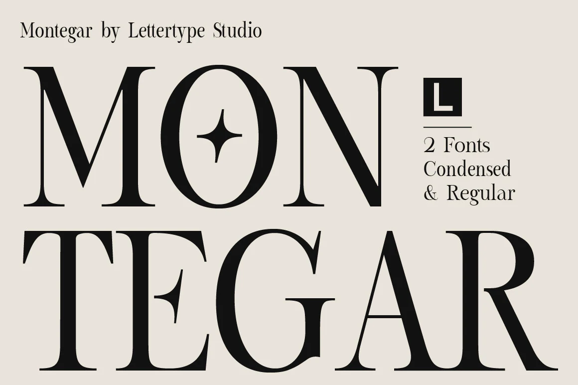
Best For: logos, branding, editorial designs, luxury designs
Montegar Font uses oversized high-contrast capitals, sharp serif brackets, and slim internal spaces to create a formal editorial voice. The letterforms feel architectural rather than decorative, with a strong vertical stress that suits Luxury Branding Fonts without drifting into ornate script territory.
Use it for mastheads, logo wordmarks, fashion titles, and cinematic cover lines where scale can show the thick-to-thin contrast. Moderate tracking keeps the wide caps controlled; pair it with a neutral sans for secondary copy so the serif details hold the top level of the hierarchy.
Luxena Font
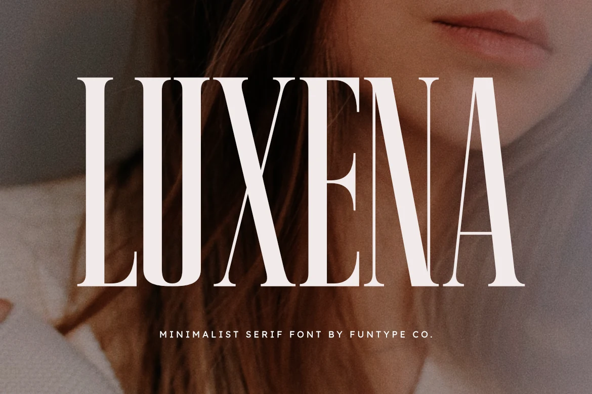
Best For: logos, headlines, fashion branding, luxury designs
Luxena Font has a tall, condensed stance that immediately feels poised and commanding. The high contrast between its thick stems and fine hairlines gives it a polished editorial finish, while the restrained serif shapes keep the overall look minimal rather than ornate, making it a strong fit for Luxury Branding Fonts.
This is the kind of serif that works best when you let the height do the work—large headlines, fashion logos, and poster titles suit it especially well. Keep the spacing slightly open and avoid crowding it with busy secondary type; a clean sans serif alongside it helps preserve the sharp hierarchy and sleek tone.
Patcher Font
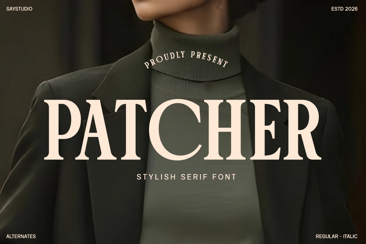
Best For: logos, editorial designs, packaging, fashion branding
Patcher Font has a polished serif structure with broad capitals, gentle contrast, and confident curves that keep it refined without feeling delicate. The letterforms read clearly at a glance, but still carry enough character to suit Luxury Branding Fonts with a more classic editorial tone.
It works especially well for mastheads, logo lines, and packaging titles where the sturdy proportions can anchor the layout. Keep the tracking slightly open and use quieter secondary type beneath it; that contrast helps Patcher hold the main headline role without making the composition feel heavy.
Bold & Decorative Luxury Branding Fonts
These bold and decorative fonts add stronger shapes, ornamental details, and dramatic display energy for standout headlines, premium packaging, and memorable logo concepts.
Emerale Font
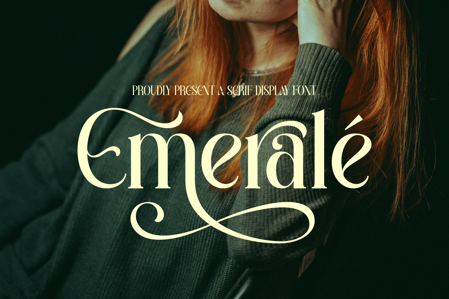
Best For: logos, headlines, luxury designs, high-end designs
Emerale Font is a high-contrast display serif with sculpted terminals, a dramatic entry stroke on the E, and a sweeping flourish that turns the word into a statement. It suits Luxury Branding Fonts when a logo or headline needs classical structure with a more expressive finish.
The letterforms feel elegant without looking fragile, so the font works best in short names, covers, and hero text where the ornamental curves have space to breathe. Keep the surrounding layout restrained and the tracking slightly open to help the fine joins stay crisp and the flourishes read cleanly.
Wackers Font
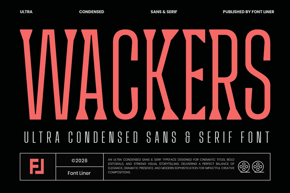
Best For: headlines, editorial designs, fashion branding, packaging
Wackers Font is built for vertical impact: ultra-condensed letterforms, squared shoulders, and wedge-like serif cuts create a loud editorial silhouette. Within Luxury Branding Fonts, it suits brands that want compact drama rather than delicate elegance, especially for titles where every inch of width matters.
The serif and sans-serif pairing gives designers a sharper hierarchy system, with the wide display voice supported by cleaner condensed text. Use strong contrast, avoid tight line stacking, and keep words short enough for the tall proportions to feel intentional rather than cramped.
Athelya Font
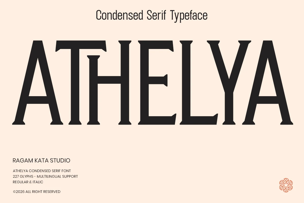
Best For: logos, headlines, packaging, luxury designs
Athelya Font is a bold condensed serif with heavy vertical stems, compact widths, and sharp wedge serifs that give the wordmark a firm editorial bite. It brings strength to Luxury Branding Fonts where a logo, title, or package front needs authority without taking up excessive horizontal space.
The condensed proportions create a strong block of type, so it works best in large headlines and short names rather than long copy. Use controlled tracking and clear margins around it; too much compression between letters can dull the crisp serif cuts and weaken the vertical rhythm.
Calteo Font
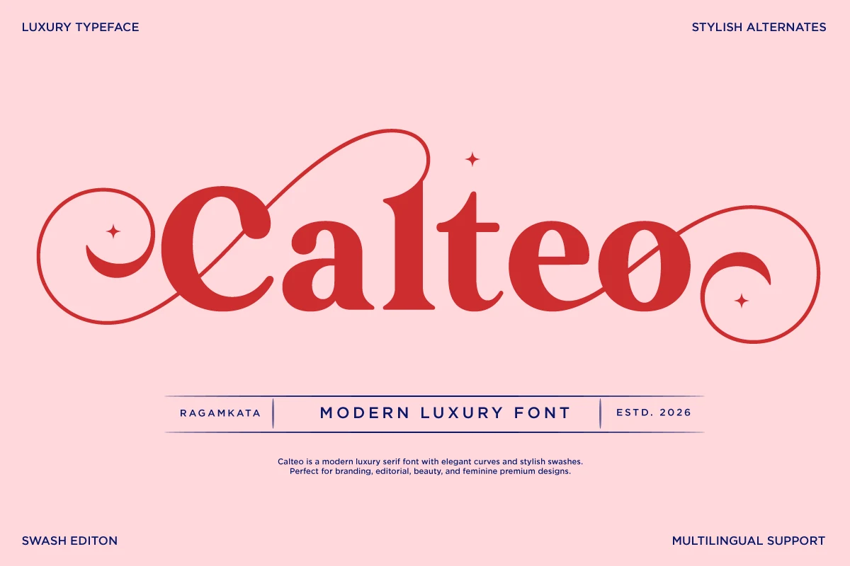
Best For: logos, beauty branding, feminine designs, luxury designs
Calteo Font is a modern luxury serif with full rounded bowls, high-contrast strokes, and oversized swashes that frame the word like a decorative mark. It gives Luxury Branding Fonts a feminine display voice, especially for beauty labels, boutique logos, and polished editorial headlines.
The long curls are part of its identity, so the font needs open margins and short wording rather than dense layouts. Let the main name carry the hierarchy, then keep supporting type narrow and clean so the decorative curves stay intentional instead of competing with the rest of the composition.
Faresty Font
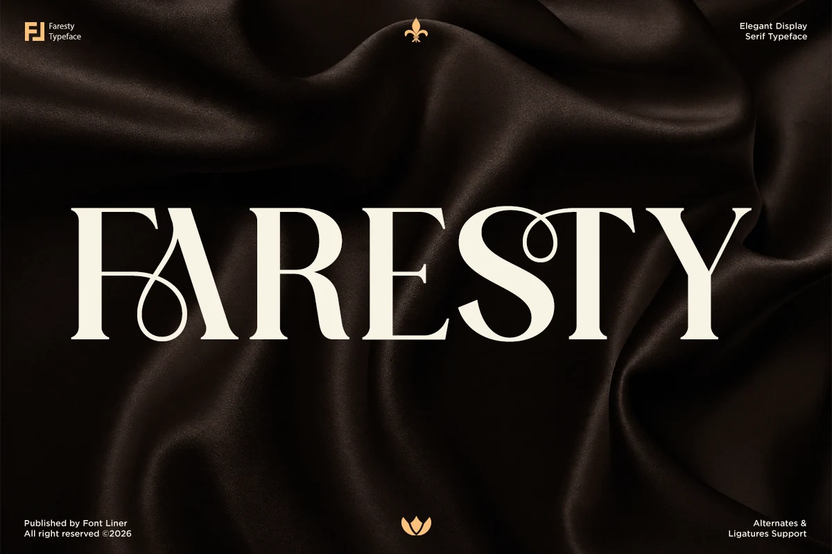
Best For: logos, packaging, fashion branding, luxury designs
Faresty Font is a display serif with sharp high-contrast stems, broad uppercase forms, and decorative loop details that cut through the otherwise classic structure. Its artistic ligatures give Luxury Branding Fonts a more distinctive signature, especially when a short wordmark needs one memorable typographic gesture.
The decorative alternates are best used selectively, not across every letter, so the composition stays refined rather than crowded. Use Faresty for fashion mastheads, premium packaging, and logo titles with tight visual hierarchy; keep spacing controlled and let the ornament sit where it can be noticed without breaking readability.
Conclusion
When choosing from these Luxury Branding Fonts, start with the role of the type: scripts for expressive wordmarks, refined serifs for quiet premium systems, editorial serifs for fashion-led layouts, and decorative display fonts for high-impact packaging or headlines.