30 Best Cool Gothic Fonts in 2026
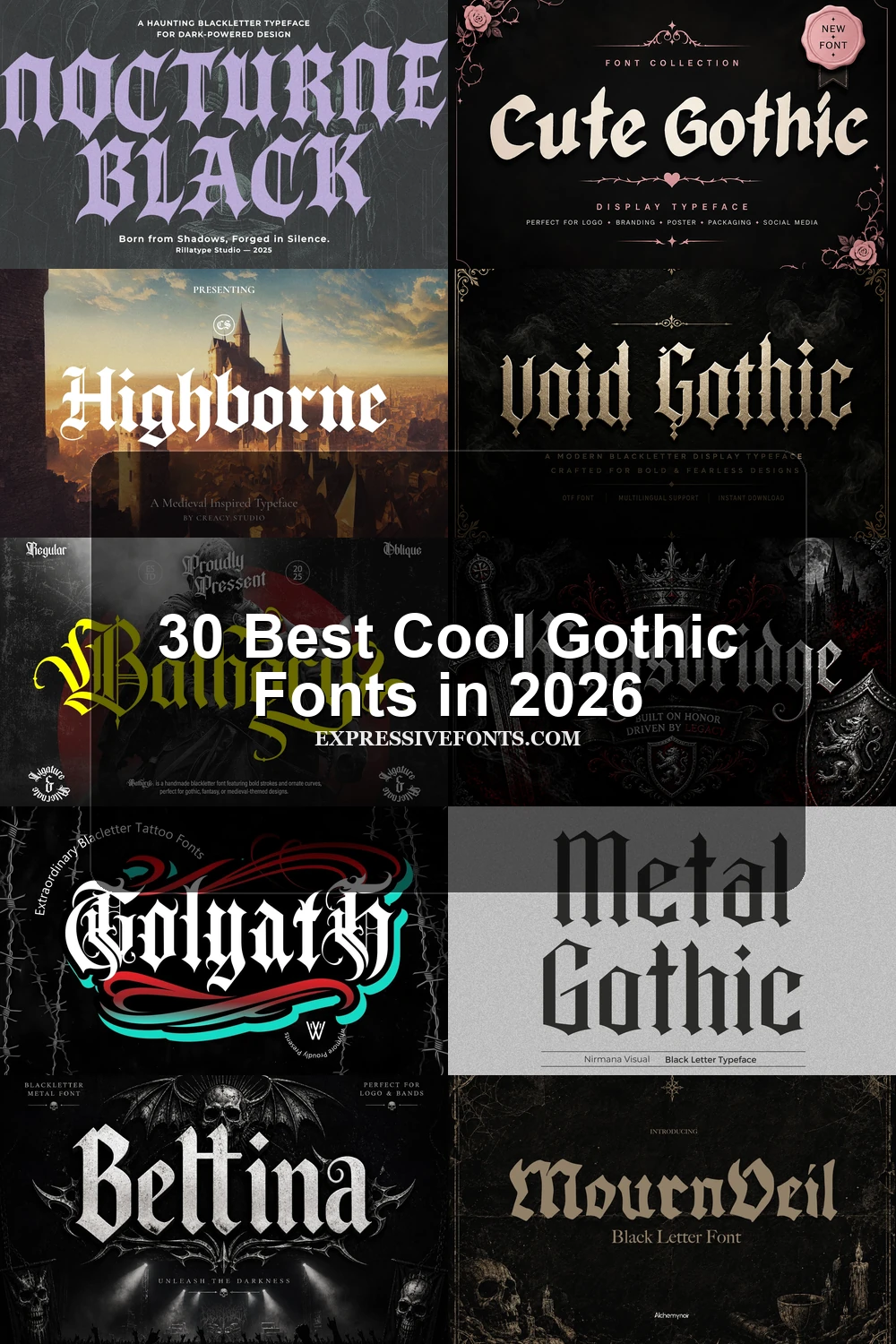
Cool Gothic Fonts span compressed blackletter, flourished display faces, distressed surfaces, and sharper modern hybrids. Together, they serve logos, posters, apparel, packaging, signage, and short headlines, with construction and scale determining whether a design feels readable, formal, playful, or aggressively dramatic.
Looking for more cool fonts? Browse our complete Cool Fonts collection to compare bold, vintage, retro, script, and gothic cool styles.
Cool Gothic Fonts: Traditional Blackletter
Cool Gothic Fonts in this group emphasize upright, compressed blackletter construction, diamond terminals, and dense vertical rhythm. They feel more formal and historically rooted than the lighter or distressed categories.
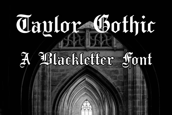
Taylor Gothic Font
Best For: display text, headlines, posters
Taylor Gothic Font uses bold, condensed upright blackletter with disconnected angular strokes and diamond terminals. Its dense vertical rhythm gives Cool Gothic Fonts a formal historical presence in short headings and posters, but intricate angles make it unsuitable for long-form reading.
Plakat Fraktur Font
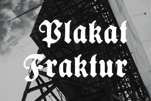
Best For: display text, headlines, signage
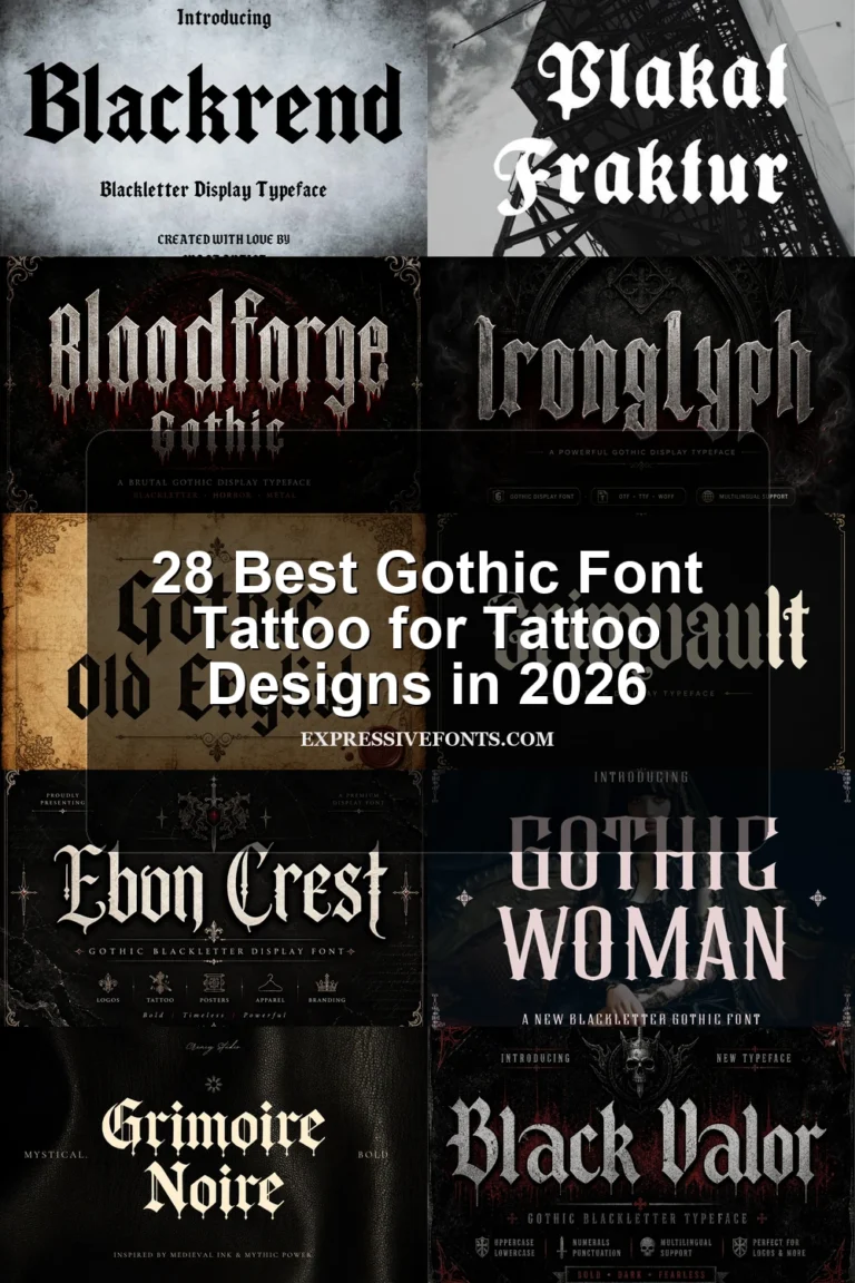
Plakat Fraktur Font builds an ornamental, condensed silhouette from sharp-edged strokes, strong contrast, and decorative terminals. Its PUA-encoded glyphs and swashes offer useful customization for signage, headlines, and posters, provided the lettering is given generous display size.
Humbold Fraktur Font
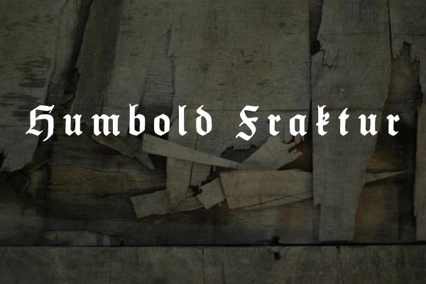
Best For: posters, headlines, vintage designs
Humbold Fraktur Font takes a pointed German blackletter approach, combining ornamental serif structures with dense, high-contrast strokes. PUA glyphs and swashes expand its display possibilities for vintage designs and posters, though its complex characters become unclear quickly at small sizes.
Black Raven Font
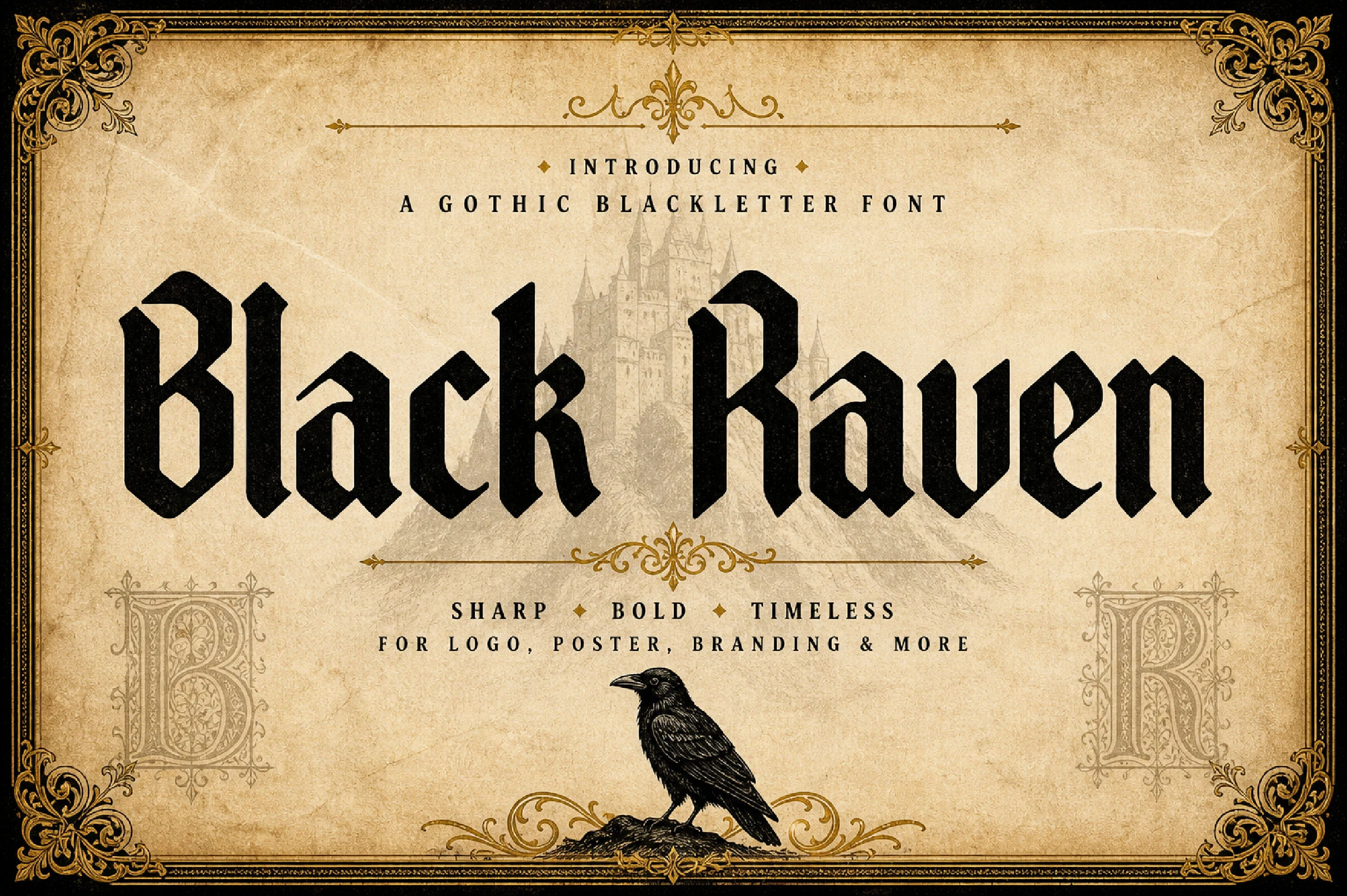
Best For: posters, display text, signage
Large signage and poster titles are where Black Raven Font performs best. Its Cool Gothic Fonts character comes from rigid vertical strokes, compressed proportions, and diamond terminals influenced by Old English typography; reduced captions expose the narrow counters and dense structure.
Highborne Font
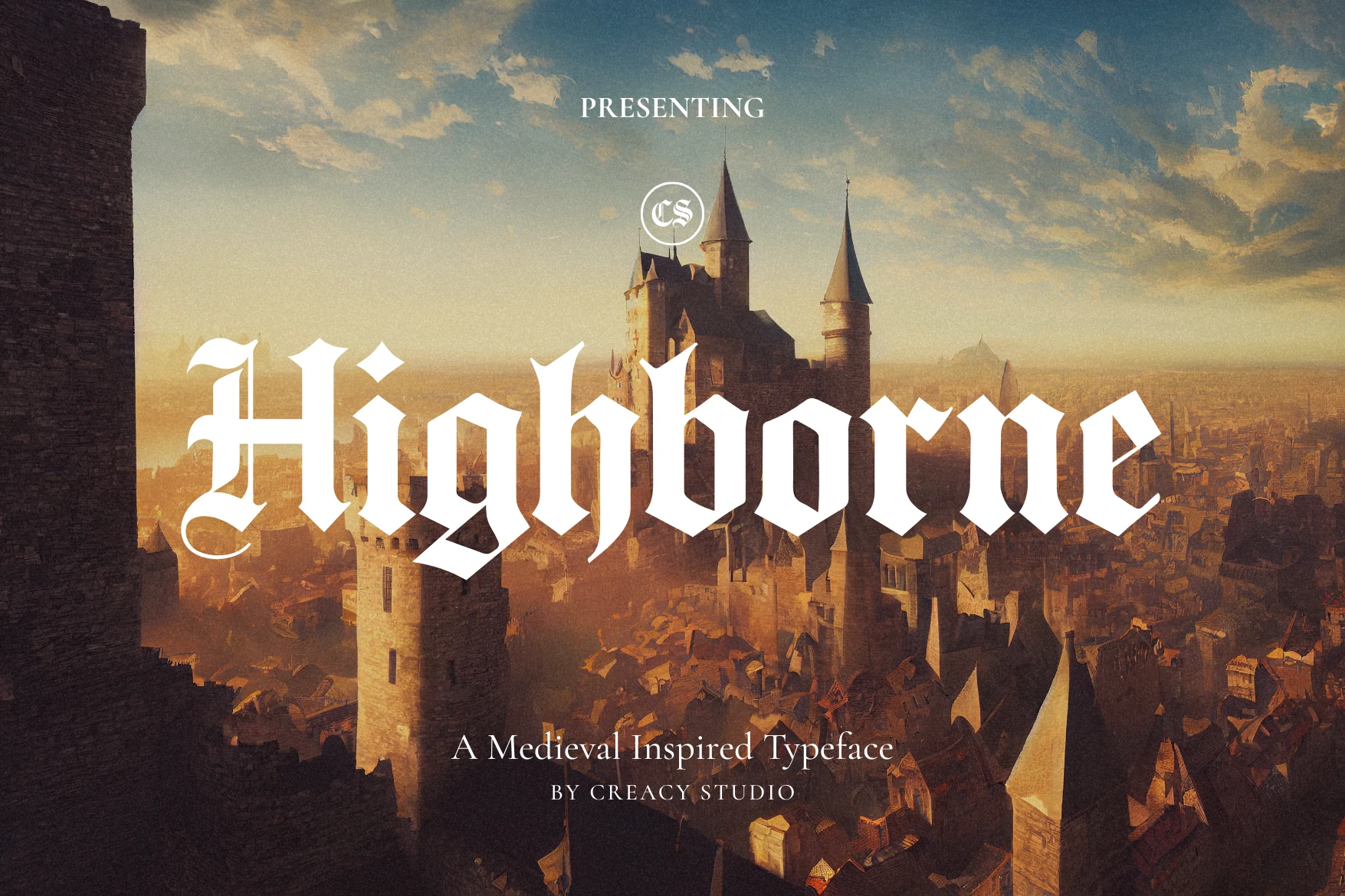
Best For: headlines, posters, signage
Highborne Font combines compressed characters, diamond terminals, and sharply architectural forms for a formal display profile. It remains recognizable in headlines, posters, and signage, but its high contrast and narrow width make sustained reading a poor fit.
Ebon Crest Font
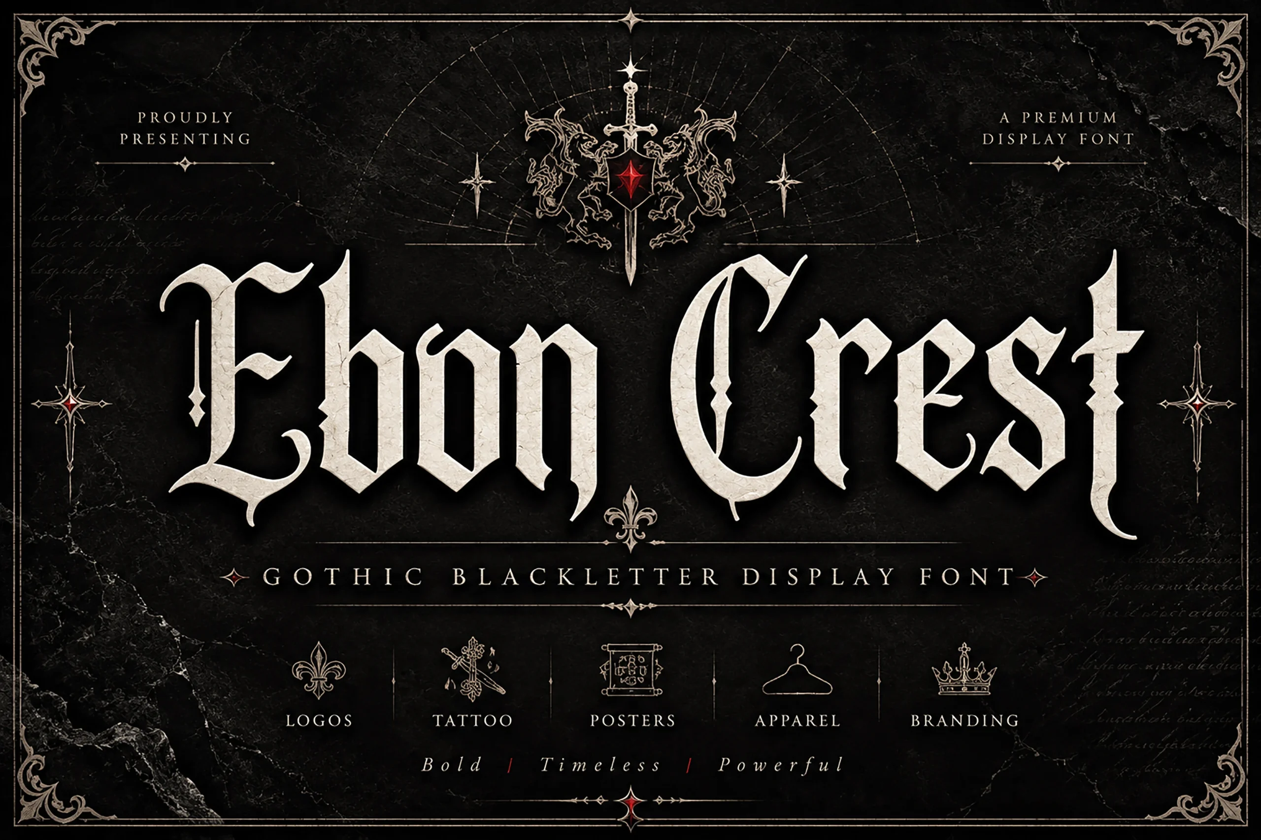
Best For: posters, logos, T-shirts
Ebon Crest Font uses narrow letterforms, diamond terminals, angled stems, and intricate flourishes to intensify logos and T-shirts. Its tight gaps and sharp serifs create immediate display impact, but scaling down quickly compromises clarity.
Crownspires Font
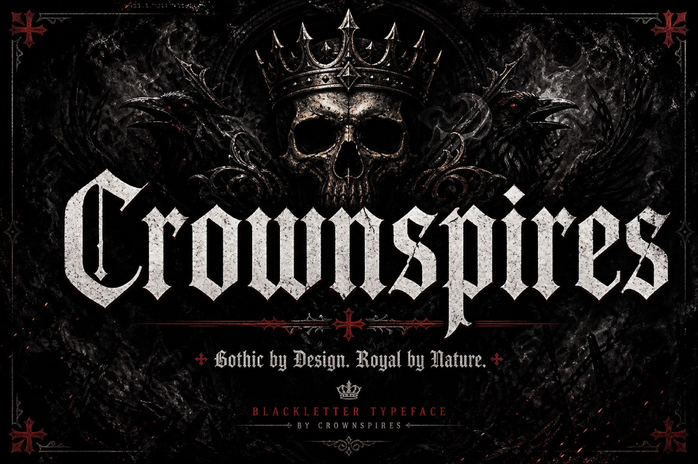
Best For: headlines, display text, signage
Crownspires Font uses broken strokes, spearhead-like forms, narrow proportions, and high contrast to create a highly assertive silhouette. Its authoritative construction is effective for signage and headings, though narrow counters resist small text.
Gothic Old English Font
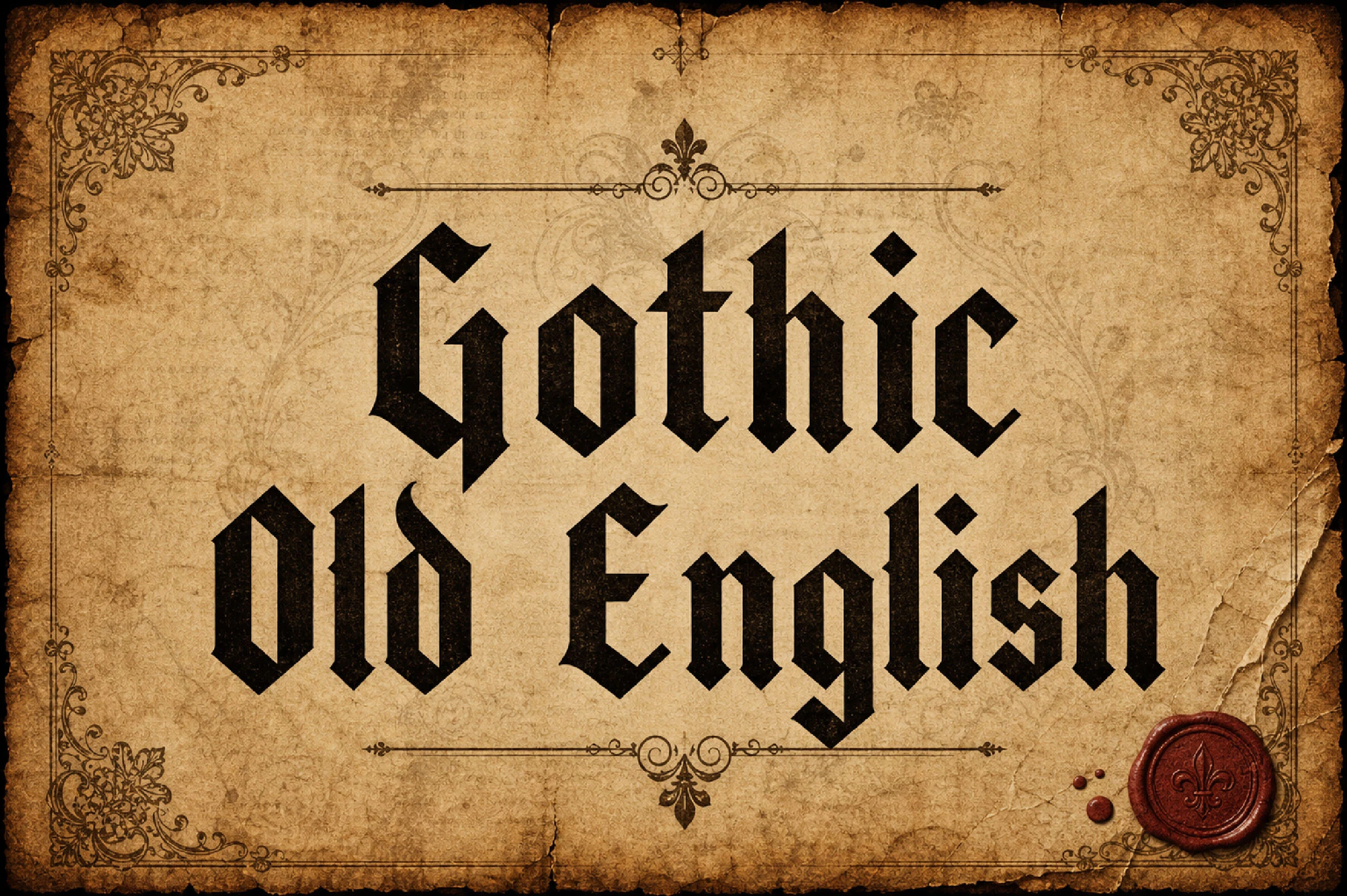
Best For: headlines, posters, logos
Gothic Old English Font maintains a strict profile through dense vertical strokes, minimal horizontal curvature, and pointed terminals. Its formal construction produces strong headlines and logos, but offers little flexibility for smaller or longer copy.
Kingsbridge Font
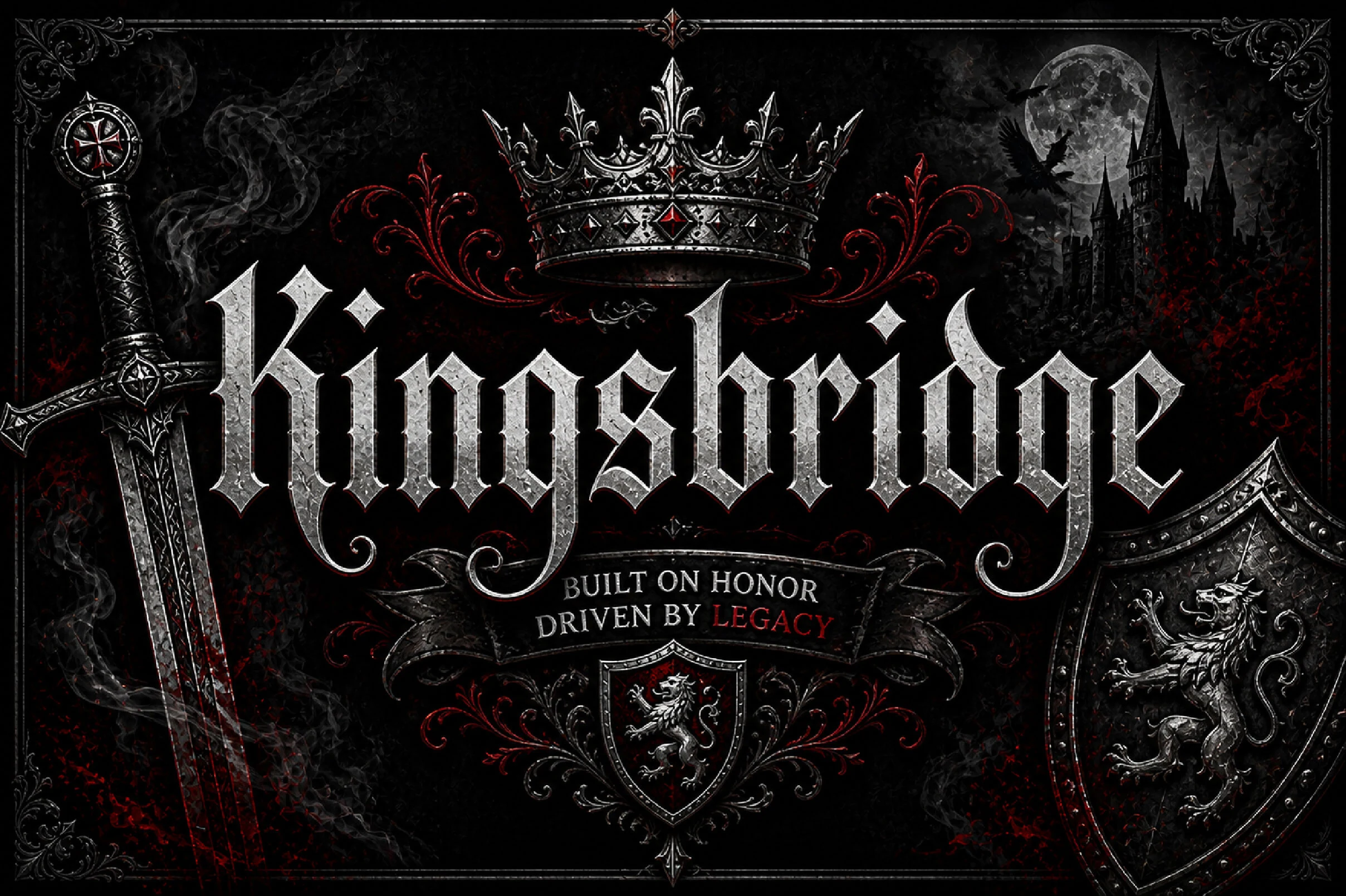
Best For: logos, branding, headlines
Kingsbridge Font closes the collection with narrow proportions, blade-like serifs, dramatic contrast, and controlled swash details. This polished option among Cool Gothic Fonts supports logos, branding, and headlines, but intricate terminals keep it dependent on display scale.
Ornate Flourished Gothic
These styles add swashes, curls, flourished glyphs, and selective ornament to gothic frameworks. Their expressive terminals create more personalized branding and editorial display than the stricter blackletter group.
Underdove Font
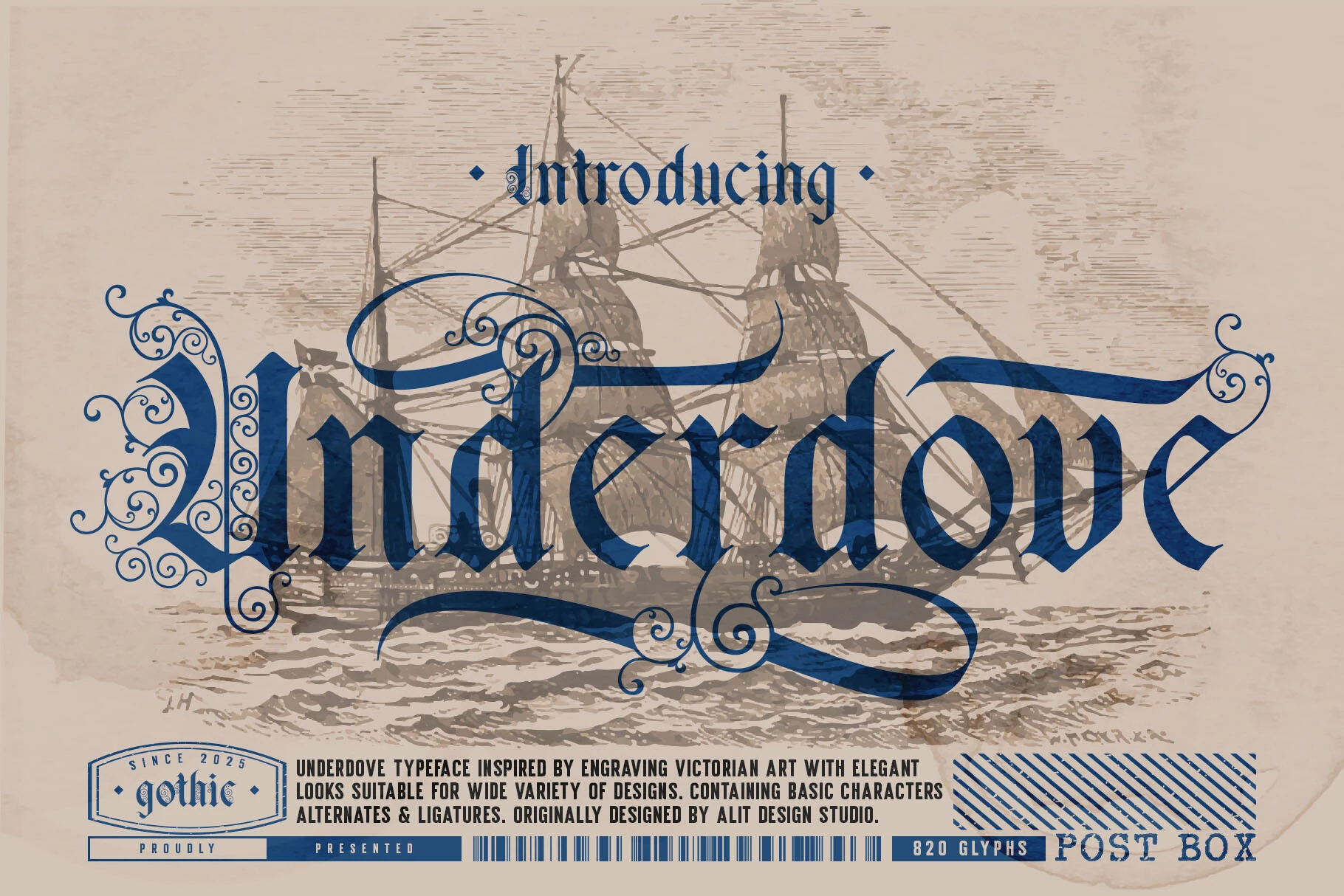
Best For: branding, editorial designs, packaging
Underdove Font layers flourished swashes and distressed texture over a bold angular framework. Among Cool Gothic Fonts, it leans especially toward engraved elegance, making it effective for packaging and editorial designs, though flourishes compete with smaller wording.
Divaro Gothic Font
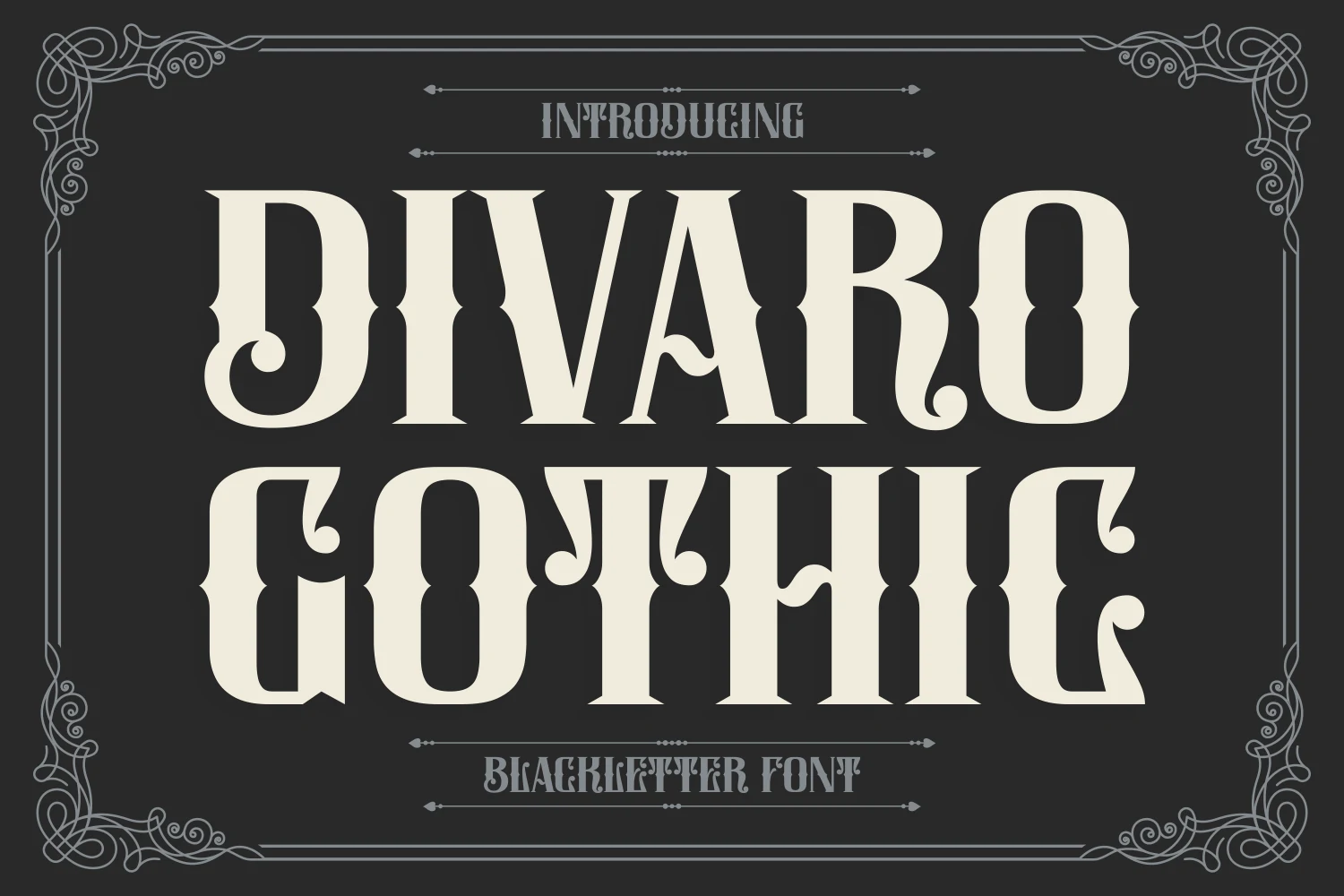
Best For: display text, headlines, book covers
Divaro Gothic Font combines condensed upright blocks with notched terminals and curls reserved for select characters. That controlled distribution keeps headlines less elaborate than fully swashed faces, but high contrast and complex terminals still discourage small text.
Bathory Font
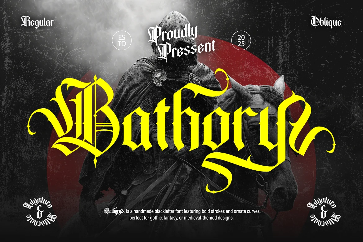
Best For: logos, branding, posters
Bathory Font intensifies angular blackletter joints with sweeping swashes, sharp curves, and high-contrast strokes. Regular and Oblique styles let logos and posters shift attitude, but the flourishes sharply reduce clarity whenever the type is set small.
Mournveil Font
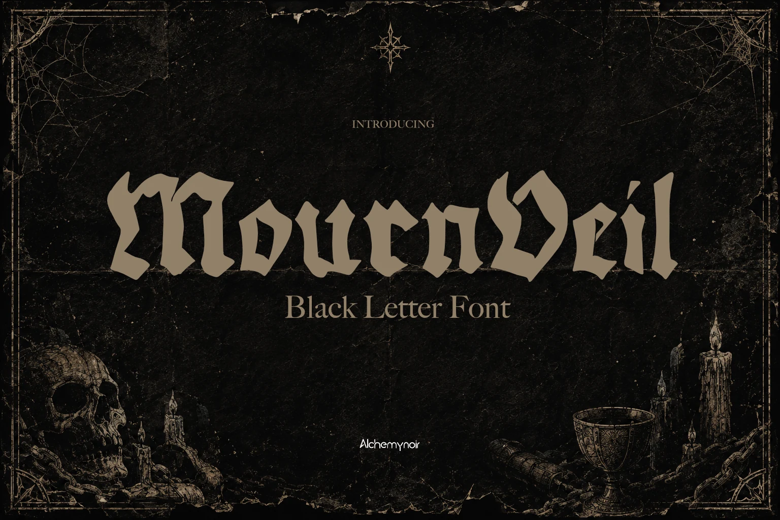
Best For: logos, posters, social media graphics
Mournveil Font pairs compressed gothic architecture with angled terminals and flared strokes instead of relying on prominent swashes. Its dark vintage profile suits titles, logos, and social graphics, while dense proportions limit its usefulness in paragraphs.
Mozathia Font
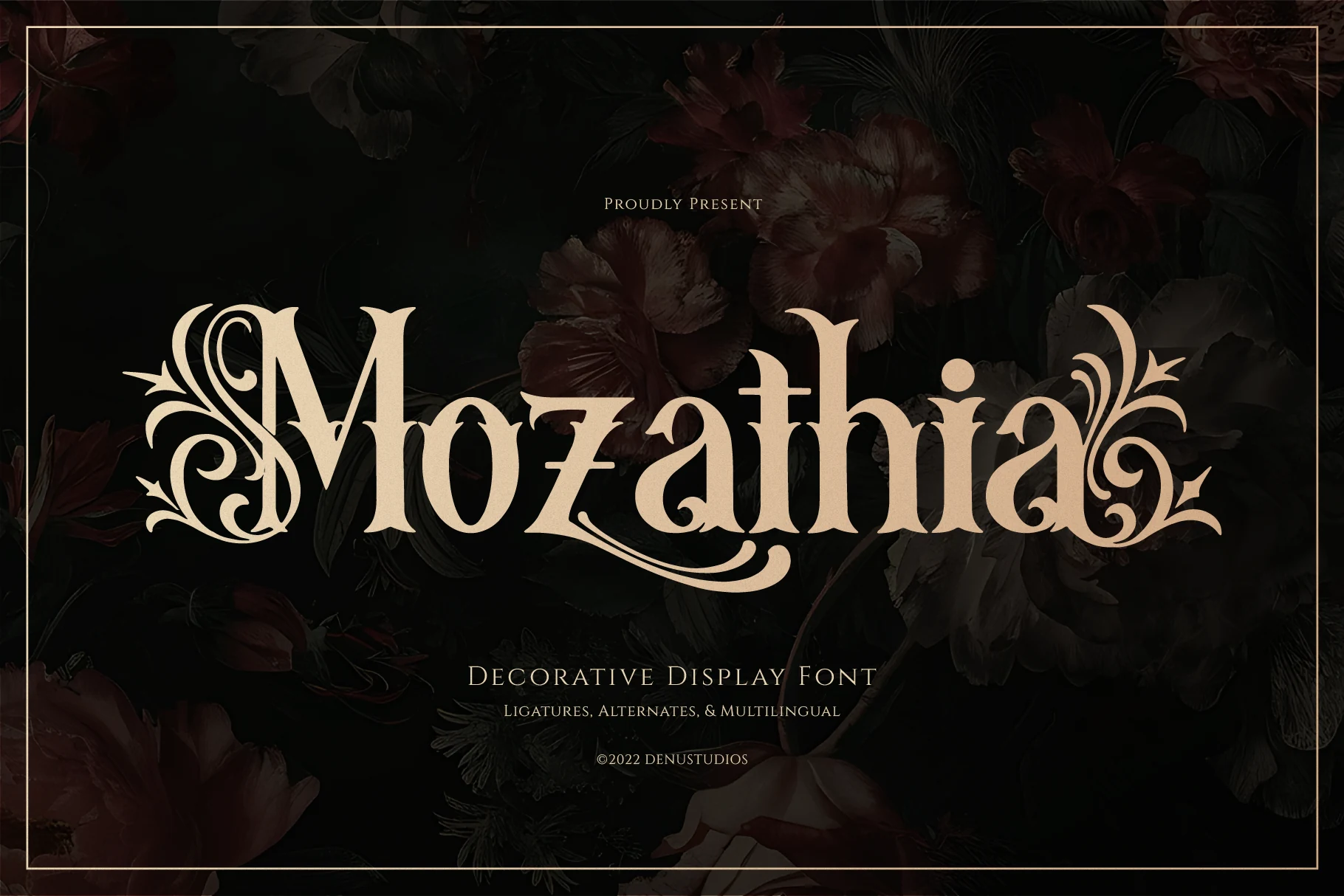
Best For: logos, branding, headlines
Mozathia Font interprets gothic lettering through triangular wedge serifs, vertical stress, and vine-like swashes. Initial and terminal flourishes support refined branding and headlines, while high contrast makes compact wording fragile and better suited to display scale.
Golyath Font
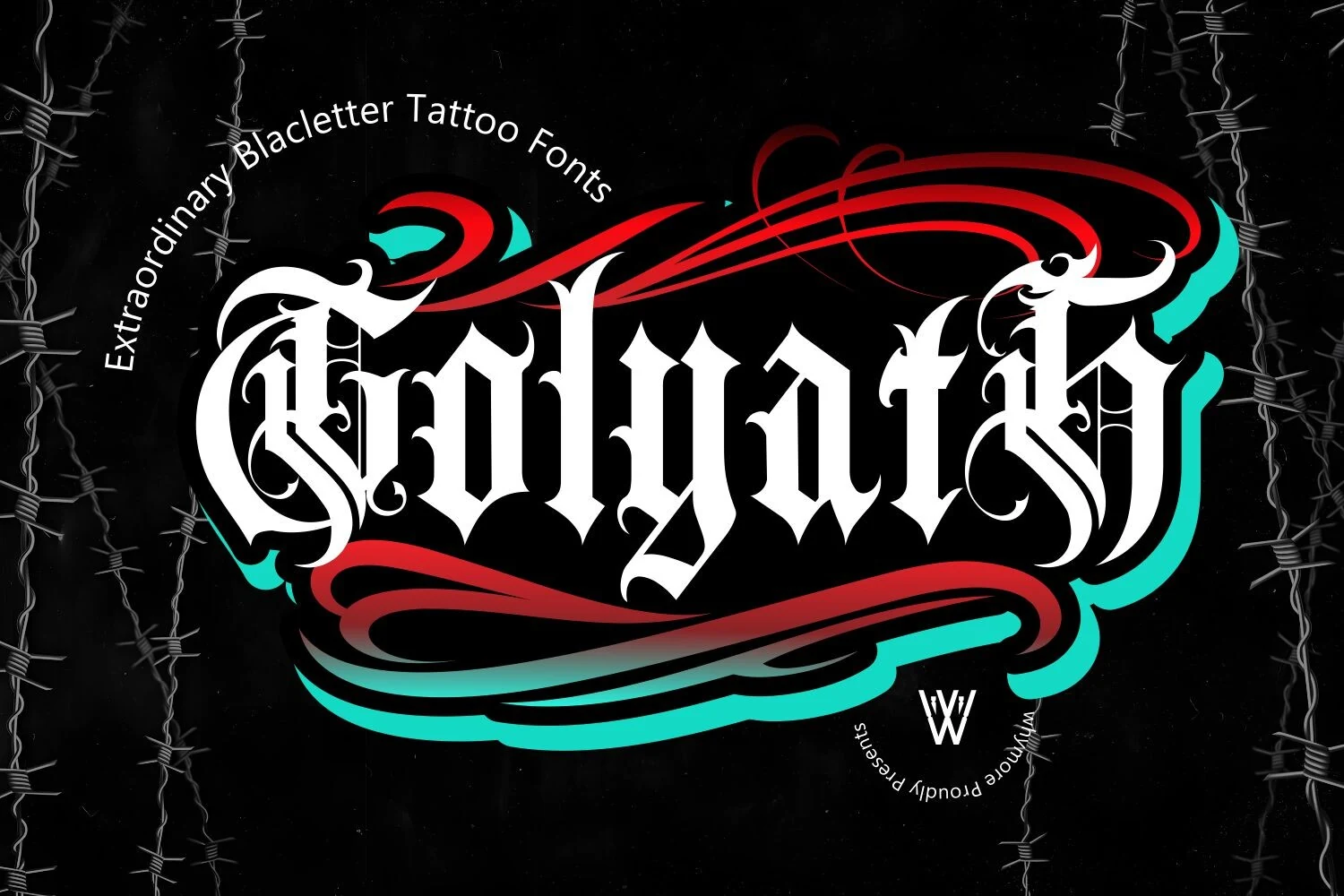
Best For: logos, posters, merch design
Golyath Font combines sharp terminals, high contrast, and decorative flourishes in a blackletter structure suited to logos and merchandise. Its OTF and TTF availability supports production flexibility, but complex characters remain difficult to read when reduced.
Textured Distressed Gothic
Weathered fills, chiseled edges, dripping terminals, and stone-like surfaces define this group. Texture supplies the mood, making these fonts more material and distressed than clean traditional or modern angular designs.
Nightforge Gothic Font
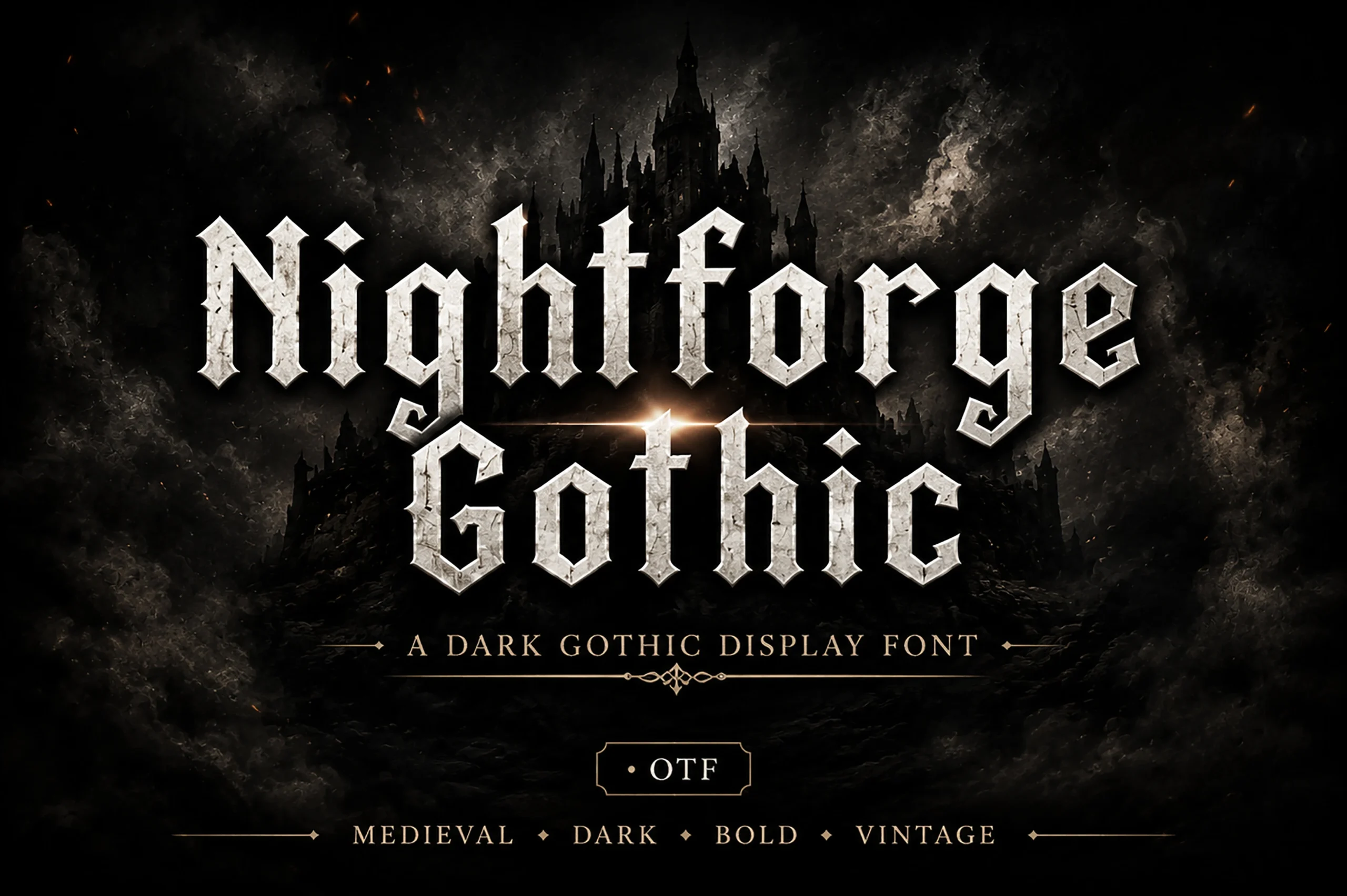
Best For: logos, branding, headlines
Nightforge Gothic Font gives upright blackletter a weathered, chiseled surface, with fractured terminals and pronounced vertical strokes. That treatment suits ominous logos, headlines, and heavy branding, but the broken details should remain large enough to preserve character recognition.
Beltina Font
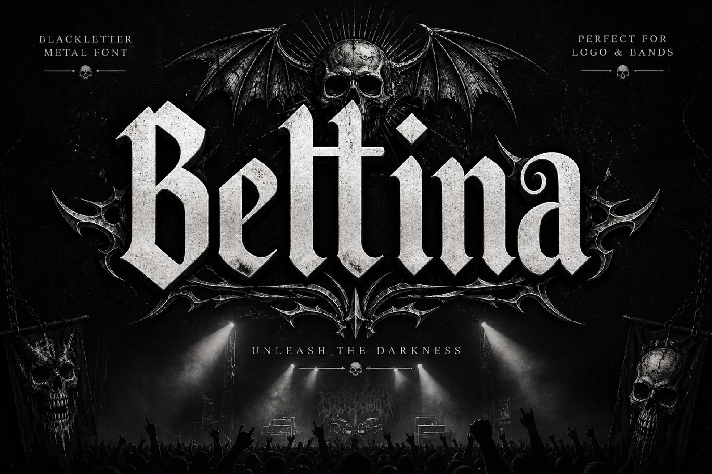
Best For: logos, posters, headlines
Beltina Font distinguishes its thick gothic stems with defined edges and chiseled three-dimensional distress. Conventional letterforms help retain headline presence, but the stone-like surface adds parsing effort, so logos, posters, and other large display uses are safest.
Nocturne Black Font
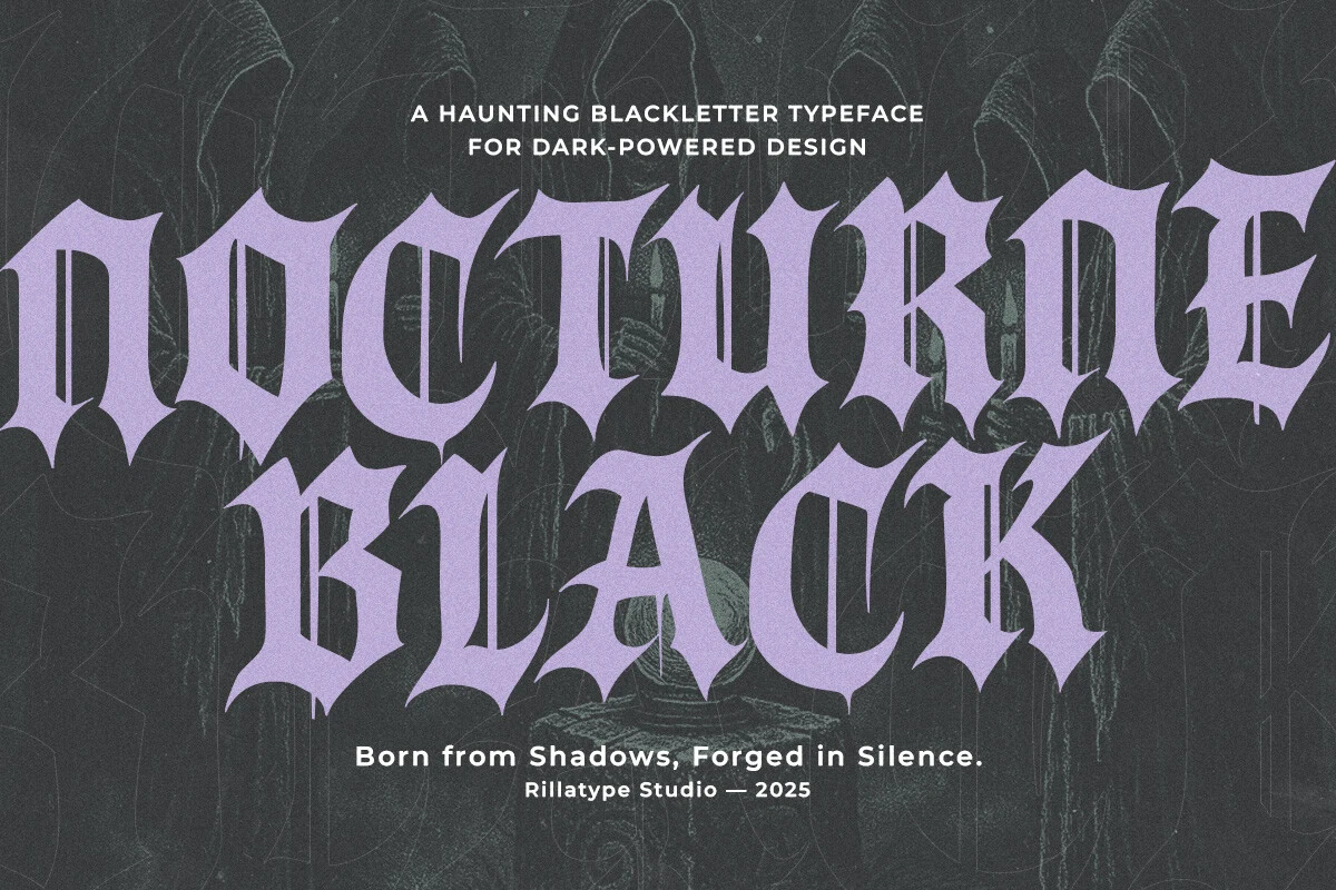
Best For: posters, branding, invitations
Nocturne Black Font offers four styles—Regular, Slanted, Inked, and Inked Slant—within a jagged condensed structure. The inked versions introduce hand-drawn texture for posters and invitations, while every variation remains primarily display-oriented because of its heavy contrast.
Bloodforge Gothic Font
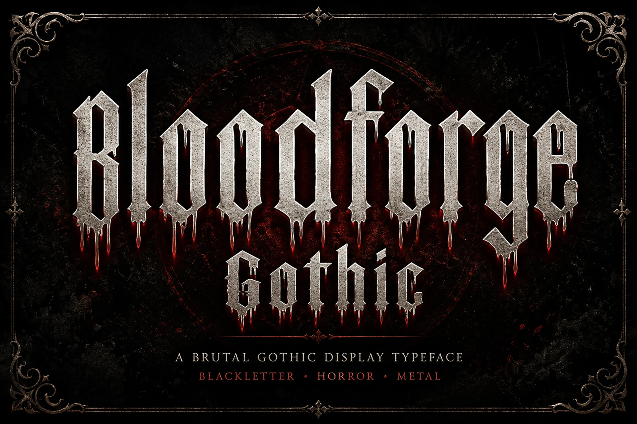
Best For: posters, headlines, T-shirts
Bloodforge Gothic Font adds dripping lower terminals and weathered stone surfaces to a jagged blackletter structure. The irregular treatment gives Cool Gothic Fonts a specialized horror-poster role and works on shirts, but can disrupt recognition outside large display sizes.
Ironcrest Gothic Font
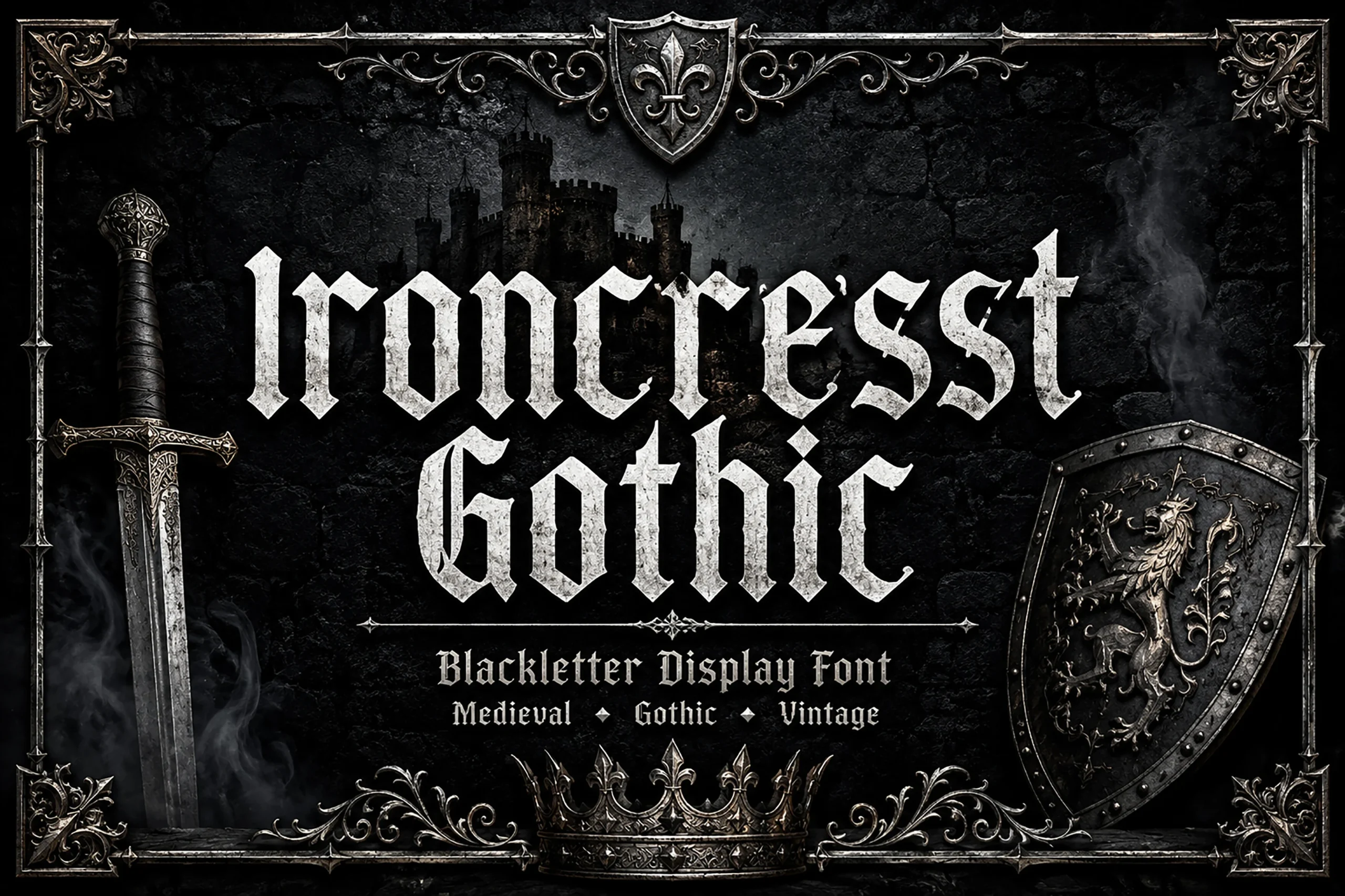
Best For: posters, display text, T-shirts
Ironcrest Gothic Font places a stone-like surface inside a condensed structure with sharp edges and dramatic vertical strokes. The material fill reinforces posters, headlines, and apparel graphics, although textured interiors can blur at smaller display sizes.
Modern Aggressive Gothic
Modern aggressive styles push gothic structure toward jagged geometry, street influence, Victorian serif cues, or heavy-metal attitude. They prioritize immediate impact and brand character over historical consistency or extended reading.
Void Gothic Font
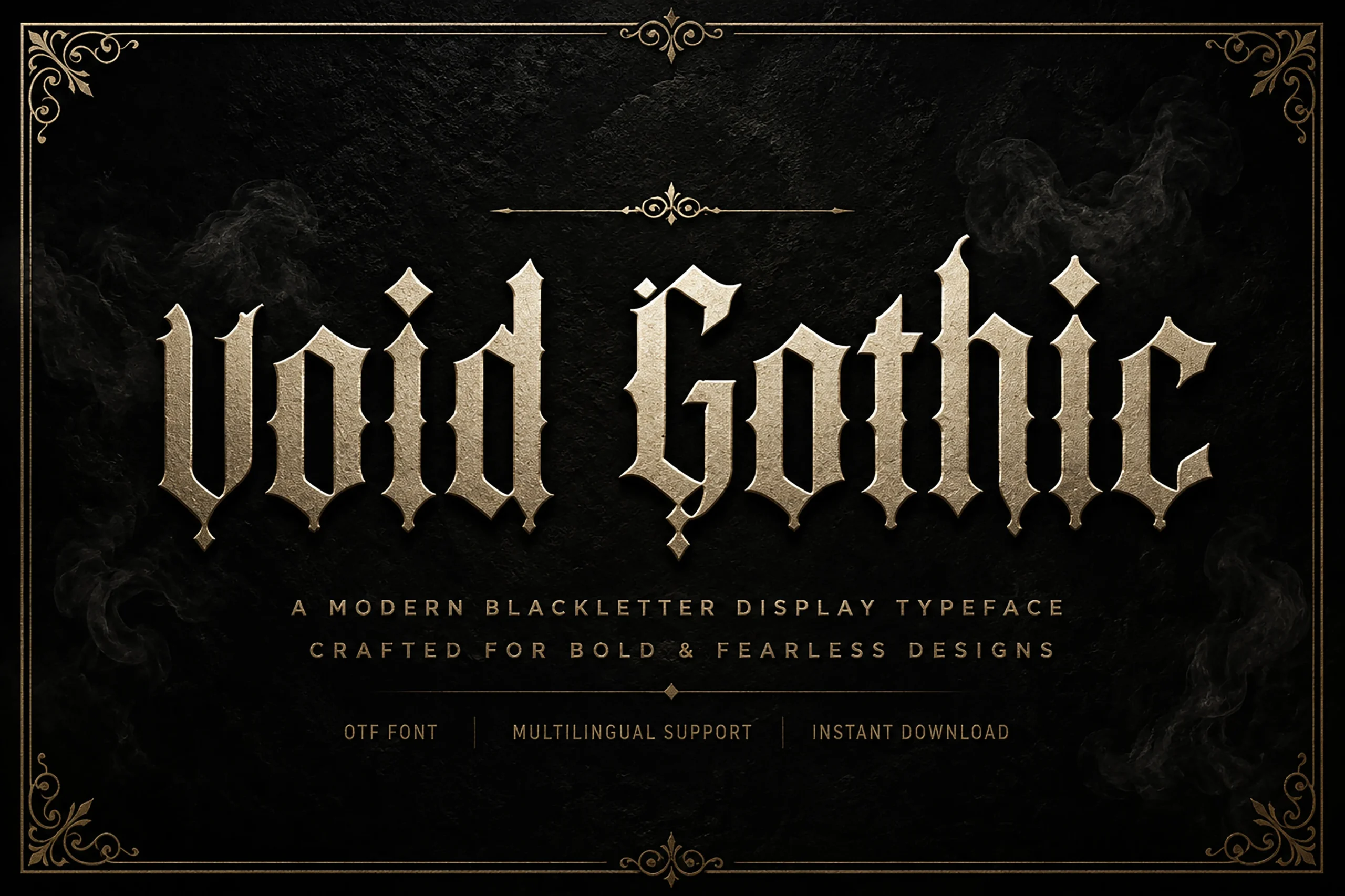
Best For: logos, posters, headlines
For logos and posters, Void Gothic Font delivers a heavy, narrow blackletter with spiked terminals, compressed flourishes, and dense high-contrast stems. Its stated modern edge makes short messages immediately forceful, while the intricate construction loses efficiency in extended reading.
Stackwin Font
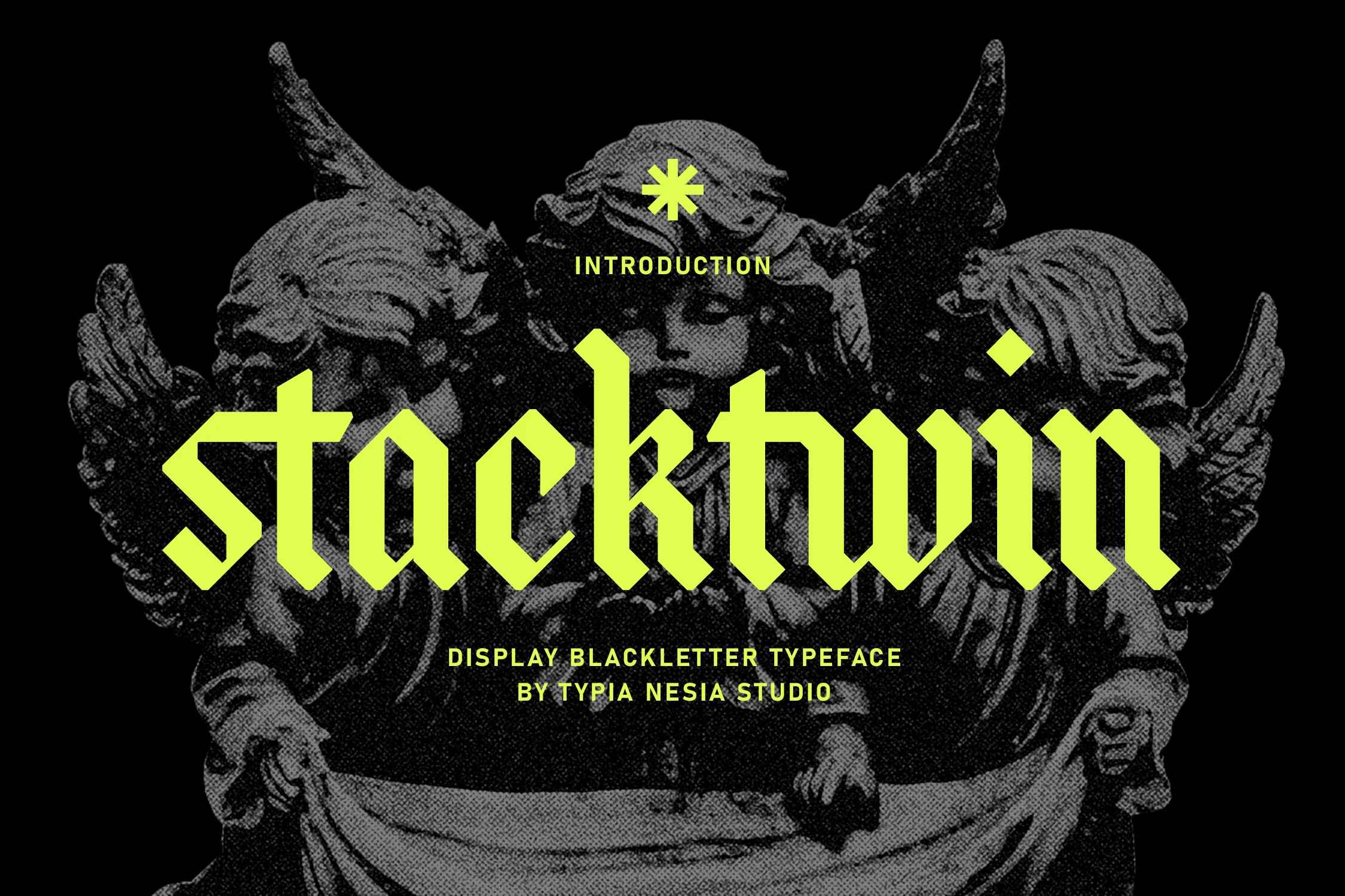
Best For: logos, branding, headlines
Stackwin Font sharpens its angular blackletter silhouette through heavy weight, condensed proportions, and pointed terminals. The compact joins create strong branding and headline presence, but their complexity leaves little room for body copy or other small-scale information.
Cute Gothic Font
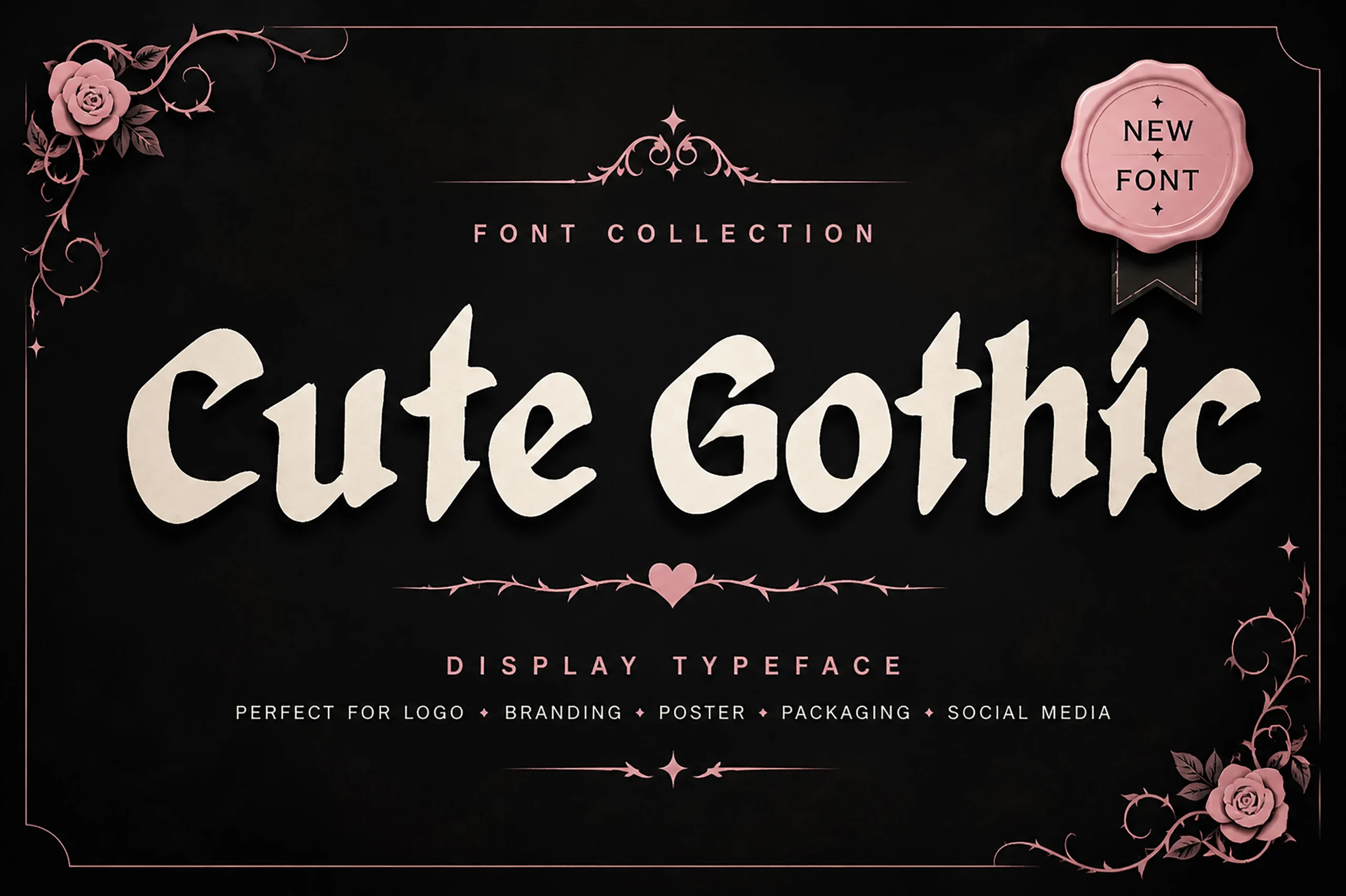
Best For: branding, packaging, social media graphics
Cute Gothic Font softens heavy pointed construction with rounded, simplified shapes and carefree curves. The mixed slant gives packaging, branding, and social graphics a less severe attitude, although its high-contrast ornament still needs large sizing for dependable clarity.
Metal Gothic Font
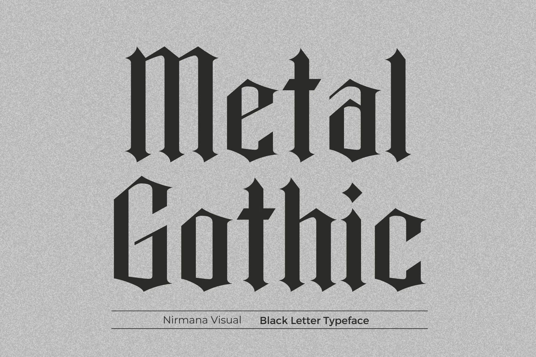
Metal Gothic Font uses heavy vertical stems, pointed terminals, and high stroke contrast to create an aggressive formal tone. Its verified applications in logos, branding, advertisements, and product designs favor bold short messages rather than small informational text.
Drachenveil Font
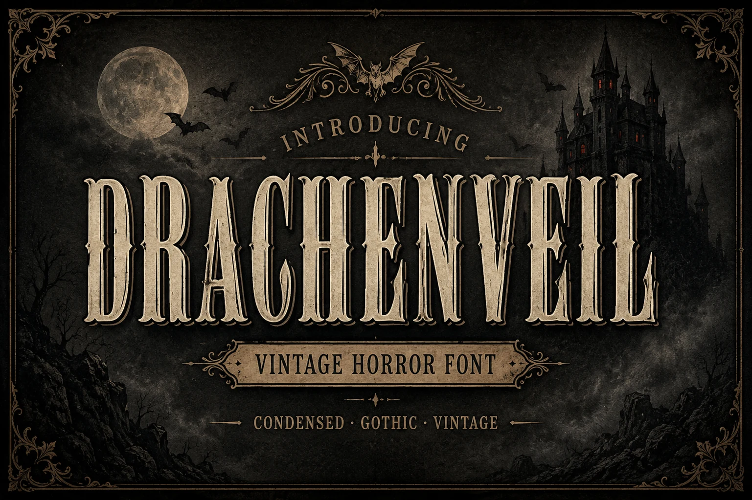
Best For: posters, headlines, vintage designs
Drachenveil Font departs from blackletter through a condensed Victorian horror serif construction, spurred terminals, and clear stroke hierarchy. Its engraved textures reinforce vintage posters, while the stronger structure keeps large headers more legible than heavily flourished alternatives.
Brother Gothic Font
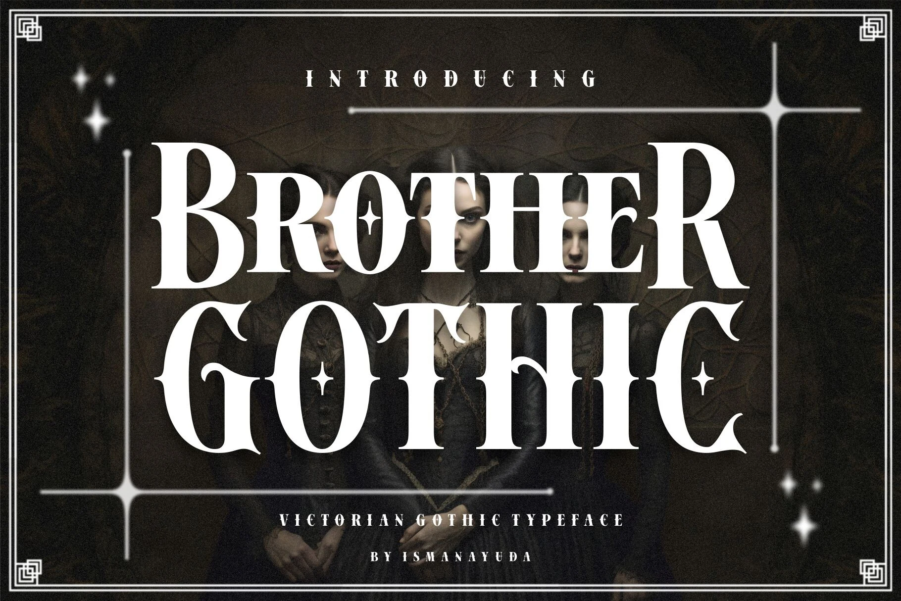
Best For: headlines, posters, T-shirts
Brother Gothic Font combines tall Victorian proportions, pointed serifs, and high-contrast strokes with star-shaped ornaments. Its biker-leaning attitude works for headers, posters, and apparel graphics, while those extra marks make small body applications impractical.
Gothic Graffiti Font
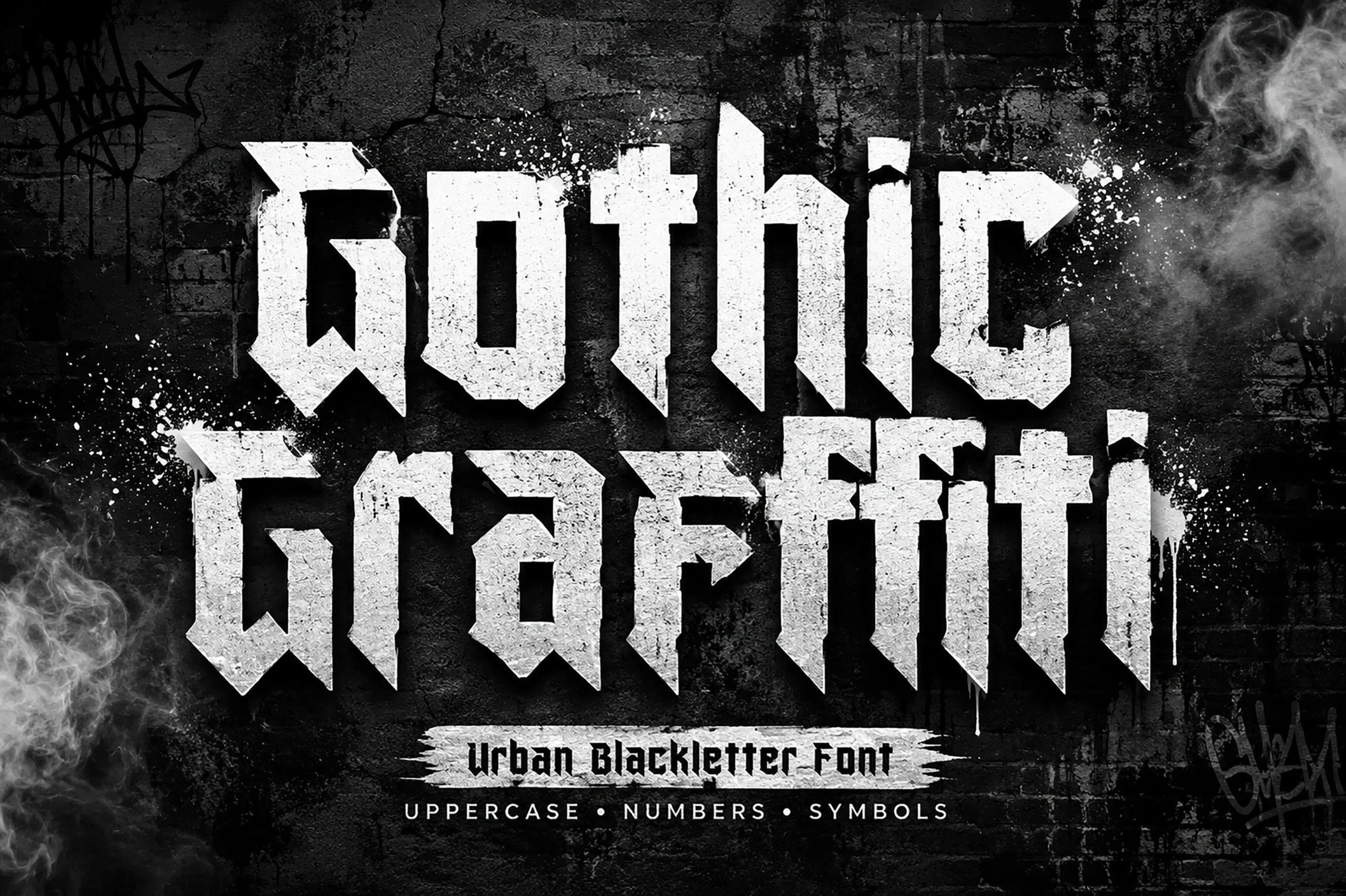
Best For: posters, T-shirts, merch design
Gothic Graffiti Font brings Cool Gothic Fonts into a narrow, block-heavy street-art direction, using wedge terminals and jagged geometric edges. It suits posters, T-shirts, and merchandise with a strong urban stance, though reduced sizes crowd its counters.
Break Roman Font
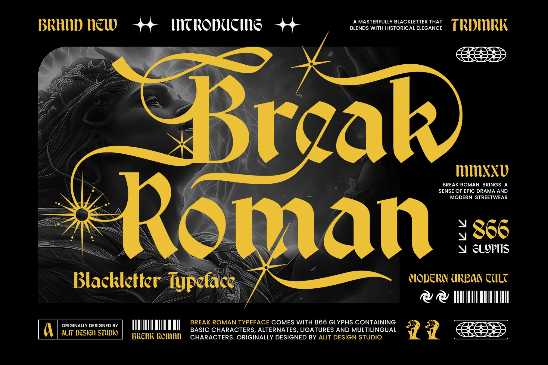
Best For: headlines, posters, logos
Break Roman Font fractures its gothic base with modern serif cues and large uppercase swash terminals. The hybrid construction gives logos and headlines a distinctive break from tradition, but compact proportions and elaborate capitals complicate reading.
Grave Shade Font
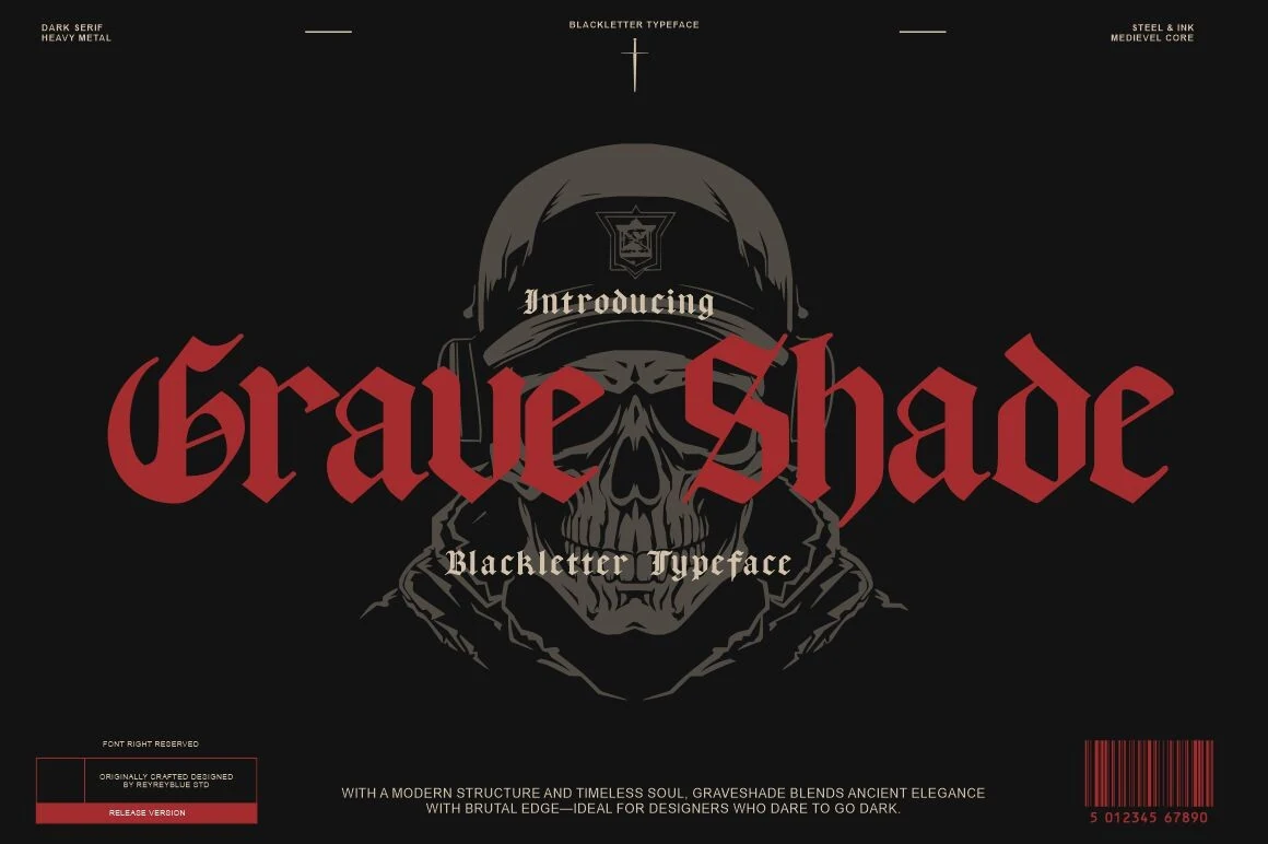
Best For: posters, logos
For horror posters, band logos, and occult merchandise, Grave Shade Font offers a regular-width blackletter with angular construction, pointed terminals, and heavy vertical strokes. Its reading performance is moderate, making large display treatment more dependable than extended copy.
Antifight Font
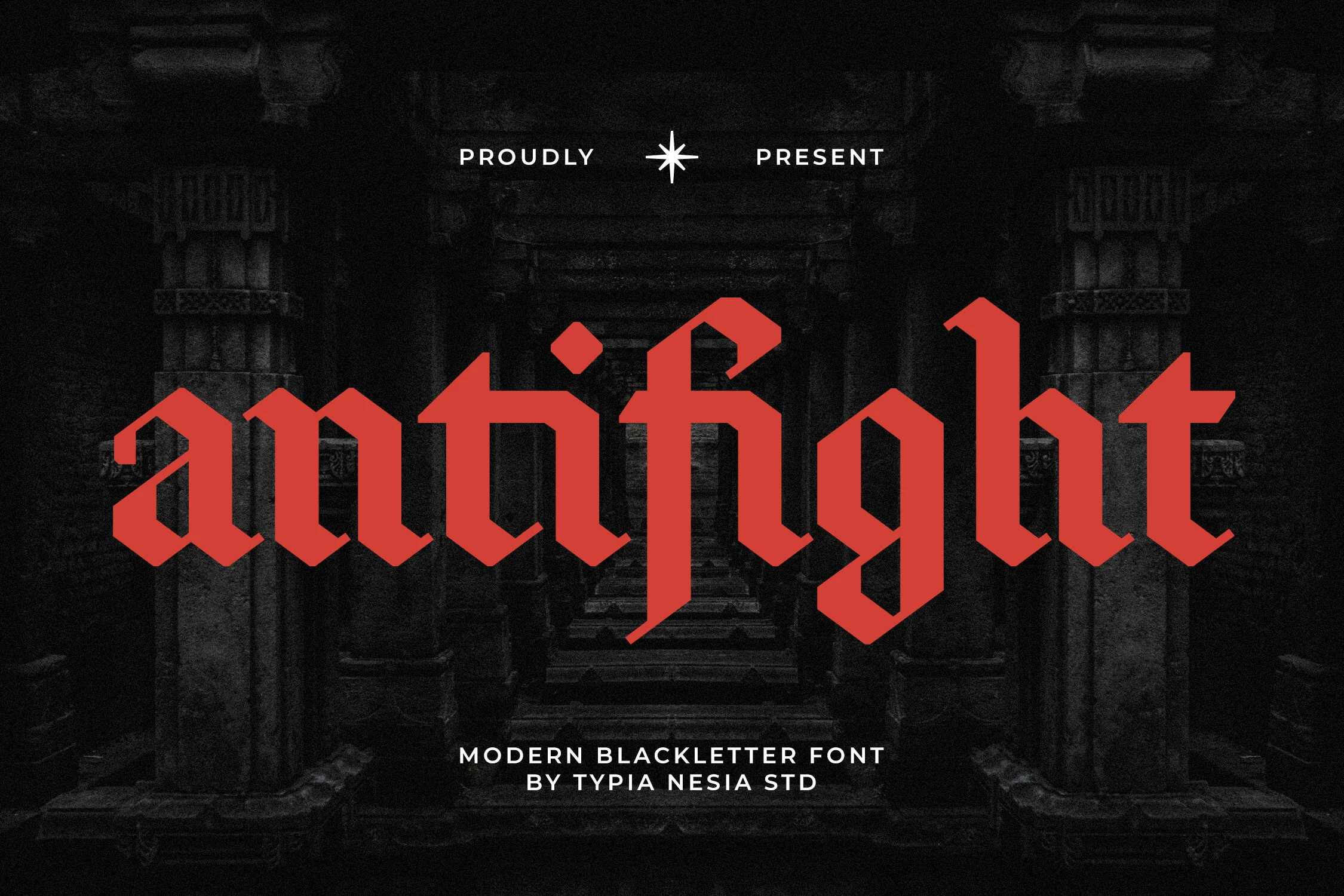
Best For: logos, display text, vintage designs
Antifight Font presents fractured geometric letterforms through pointed vertical structures and diamond-like terminals. It is particularly credible for vintage logo display, but the complex shapes limit it to short text set at a generous size.
How to Choose the Right Font
Choose by construction before mood: condensed disconnected strokes create the tightest, most formal headings; swashes add personality but reduce clarity; distress and texture need extra size; and regular-width or serif hybrids offer slightly clearer structure. For Cool Gothic Fonts, test the actual wording at its final scale, reserving body copy for a separate, more readable companion face.