21 Powerful Geometric Logo Fonts for Modern Branding
Geometric Logo Fonts help designers build clean, structured wordmarks for brands that need clarity, balance, and modern visual weight. This collection is built for logos, packaging, posters, website headers, and identity systems where the typeface needs to look intentional from the first glance.
Bold & Rounded Geometric Logo Fonts
These fonts use thick strokes, rounded geometry, and strong silhouettes for logo marks that need to feel bold, clean, and approachable without relying on extra decoration.
Pogonia Font
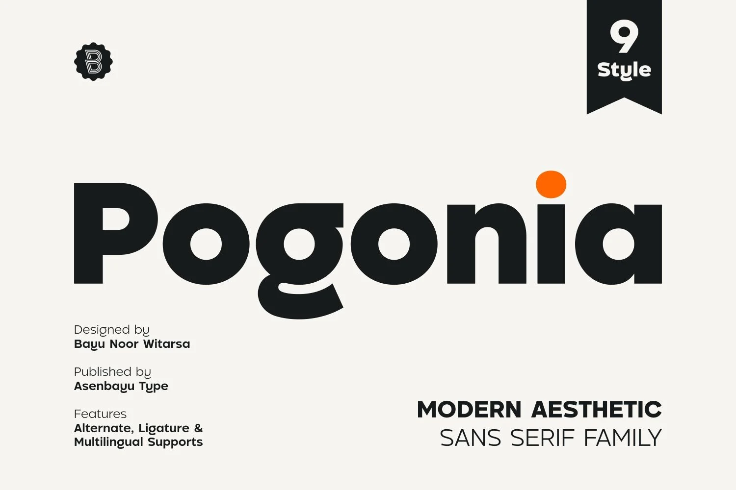
Best For: logos, branding, posters, website headers
Pogonia Font is a heavy geometric sans with humanist softness, built around broad circular bowls, rounded joins, and a compact lowercase rhythm. The weight feels assertive without turning rigid, while the small curves in letters like g and a keep the wordmark more approachable than a purely mechanical sans.
Use Pogonia when Geometric Logo Fonts need a bold mark that stays simple at a glance. Its dense strokes work best with generous tracking in all caps or careful spacing in lowercase; pair it with thin secondary type to keep the hierarchy clear rather than adding more heavy shapes.
Torsena Font
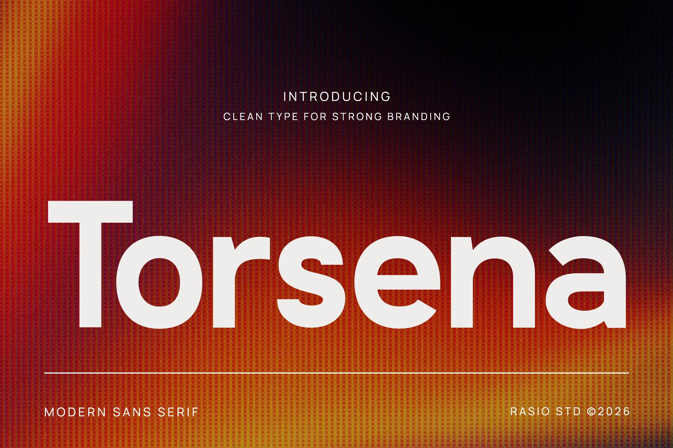
Best For: logos, branding, headlines, website headers
Torsena Font is a bold geometric sans with an oversized x-height, wide counters, and smooth curves that keep the heavy weight clean rather than clumsy. The structure feels solid and controlled, giving short words a strong blocky silhouette while staying easy to read at display size.
If you’re comparing Geometric Logo Fonts for a brand mark with real authority, Torsena stands out through proportion instead of decoration. It works best when the weight carries the hierarchy on its own, so pair it with lighter supporting type and leave enough space around the lines to keep the shapes crisp.
Cottem Font
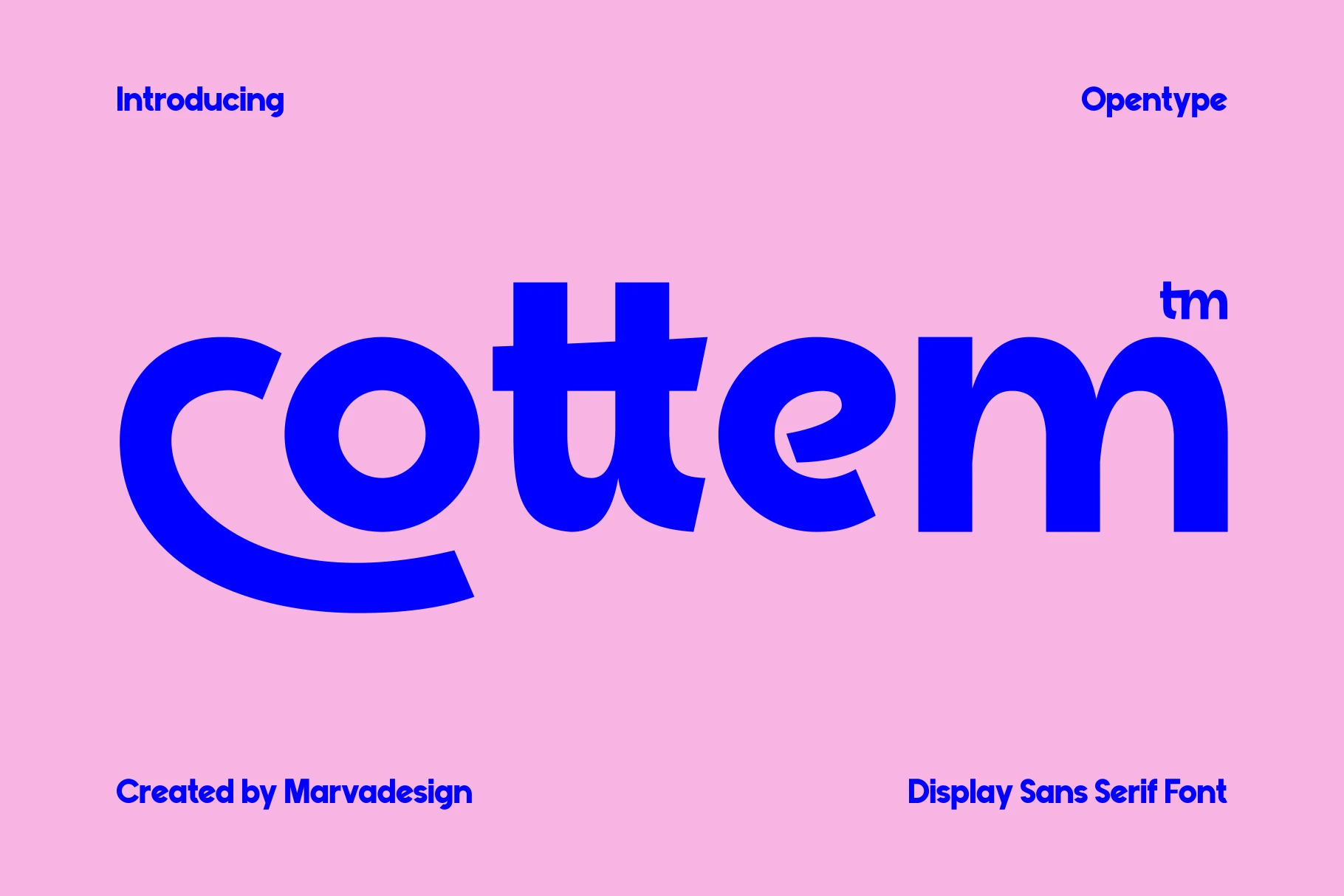
Best For: logos, branding, bold designs, playful designs
Cottem Font is a bold rounded display sans with wide proportions, soft edges, and exaggerated curves that make the heavy weight feel friendly rather than harsh. The open o, sweeping c, and chunky lowercase rhythm give it a strong graphic presence while keeping the word shape easy to read.
Use Cottem when Geometric Logo Fonts need a warmer, more approachable tone. Its large curves carry the personality, so keep spacing fairly tight, use short brand names or headlines, and balance it with a clean lightweight sans to stop the layout from becoming too dense.
Terra Naro Font
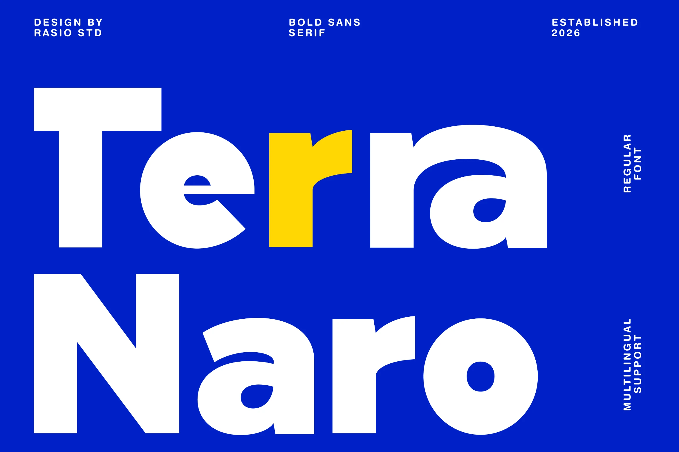
Best For: logos, branding, posters, headlines
Terra Naro Font is a bold sans serif with dense weight, rounded counters, and chunky geometric curves that create a loud but readable display voice. The letters feel compact and energetic, with the curved a and r adding movement against the heavier block forms.
Use Terra Naro when Geometric Logo Fonts need a confident, high-contrast identity for posters, ads, or digital headers. It works best in short names and big title settings; keep spacing controlled and use a lighter supporting sans so the heavy shapes do not flatten the hierarchy.
Cenura Font
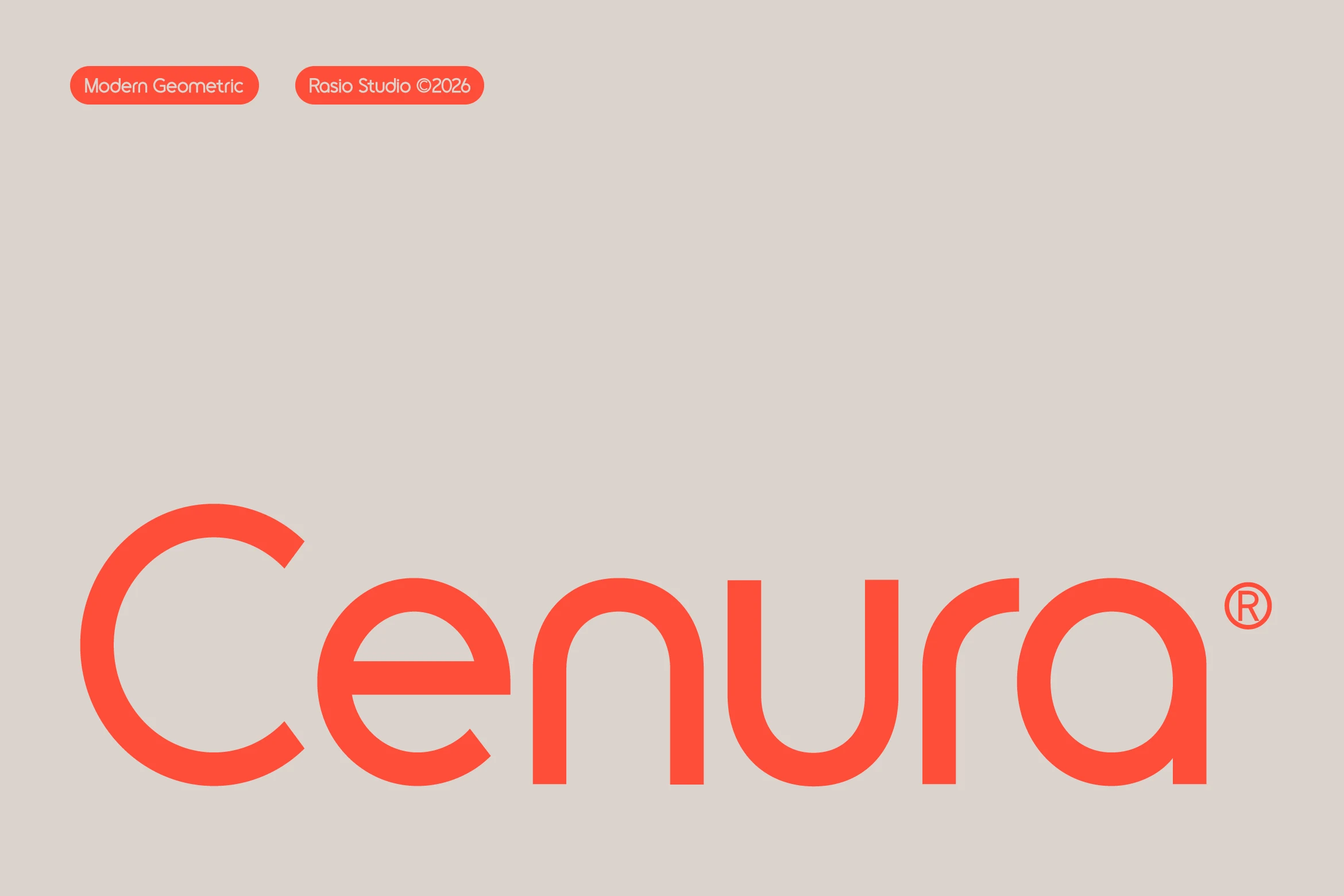
Best For: logos, branding, modern designs, professional designs
Cenura Font has a smooth, disciplined presence built from near-monoline strokes, broad circular bowls, and firm vertical stems. Its geometry feels soft rather than mechanical, which makes it a strong fit for Geometric Logo Fonts when you want a mark to read as polished, current, and quietly premium.
The rounded rhythm keeps large wordmarks calm and stable, while the open shapes help short names stay clear at display size. It works best with generous whitespace and a clean hierarchy, especially when paired with restrained supporting text so the balanced proportions remain the main visual signal.
Condensed & Tall Geometric Logo Fonts
These condensed fonts create height, compression, and headline force, making them useful for compact wordmarks, posters, merch graphics, and editorial titles.
Kopile Font
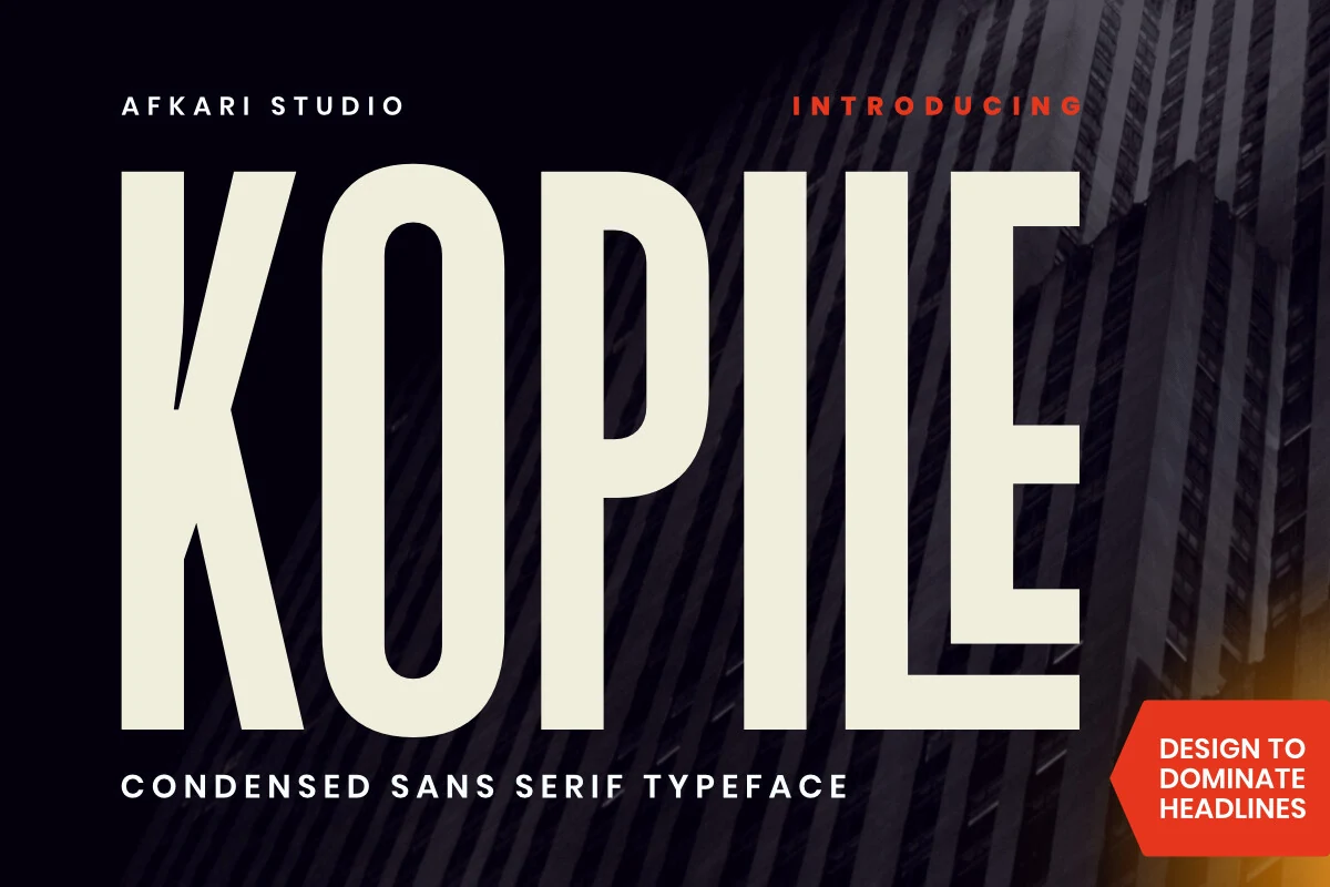
Best For: logos, branding, editorial designs, headlines
Kopile Font has a tall condensed build with near-monoline strokes, squared terminals, and a disciplined vertical rhythm that gives it immediate authority. The narrow proportions let large words fill space efficiently, while the clean counters keep it readable instead of feeling cramped.
Geometric Logo Fonts often need impact without extra decoration, and Kopile handles that balance well. It works especially well for wordmarks, covers, and display lines where height and compression create presence; pair it with a wider neutral sans and add a little line spacing so the condensed shapes stay crisp.
Chrones Font
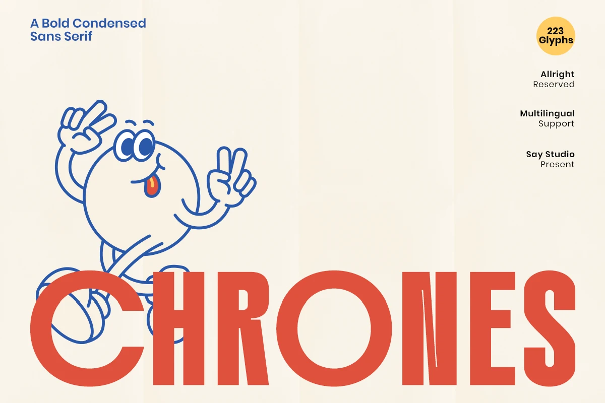
Best For: logos, posters, headlines, editorial designs
Chrones Font is a bold condensed sans with tall vertical proportions, dense stroke weight, and clean circular geometry that keeps the lettering forceful without feeling clumsy. The narrow fit and tight rhythm make it look instantly energetic, while simple shapes in letters like O, R, and N help it stay readable at display size.
Among Geometric Logo Fonts, Chrones works especially well when you need strong headline presence in a compact width. It suits short brand names, posters, and campaign titles where space is limited; keep tracking slightly open and pair it with a lighter neutral sans so the condensed forms do not crowd the hierarchy.
Blush Font
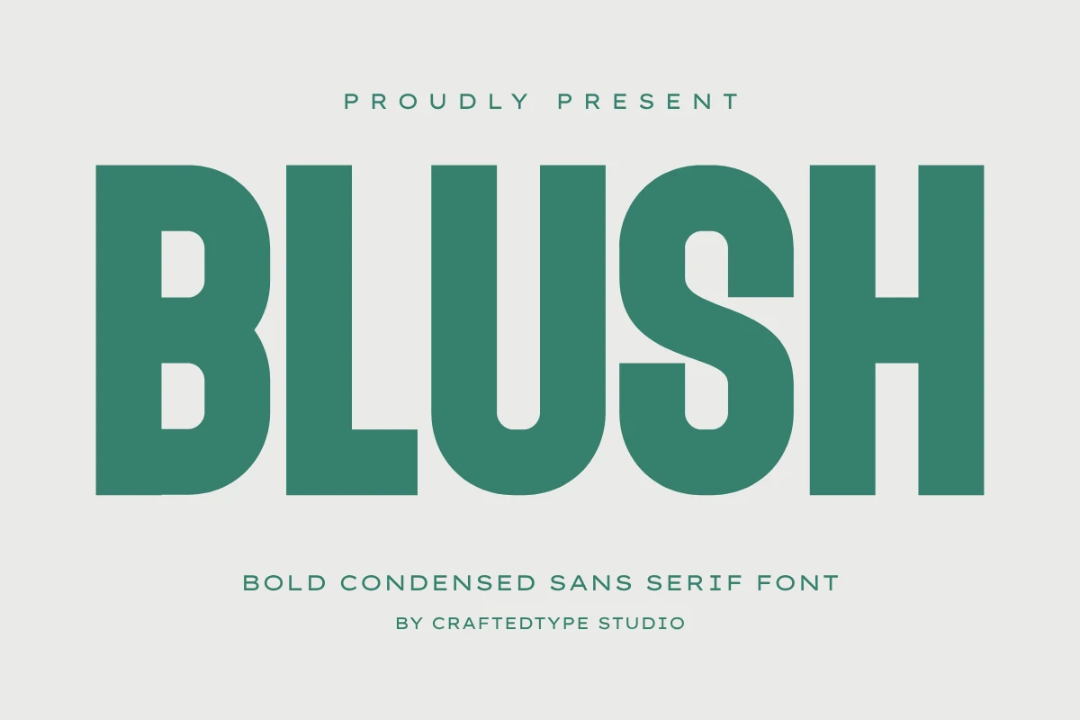
Best For: logos, branding, T-shirts, posters
Blush Font has a tall condensed build with heavy strokes, squared shoulders, and broad interior counters that keep the letters bold but readable. The compressed proportions give it a poster-like punch, while the clean geometric shapes stop the weight from feeling clumsy or overworked.
For Geometric Logo Fonts that need instant impact, Blush works best on short names, merch graphics, and strong editorial titles. Let the height do the work: add a little tracking, keep line lengths short, and pair it with a quieter sans so the narrow forms stay crisp instead of crowded.
Extended & Sport-Tech Geometric Logo Fonts
These wide and speed-driven fonts use extended proportions, slanted forms, or sport-tech cuts for brands that need motion, power, and mechanical polish.
Mirano Extended Font
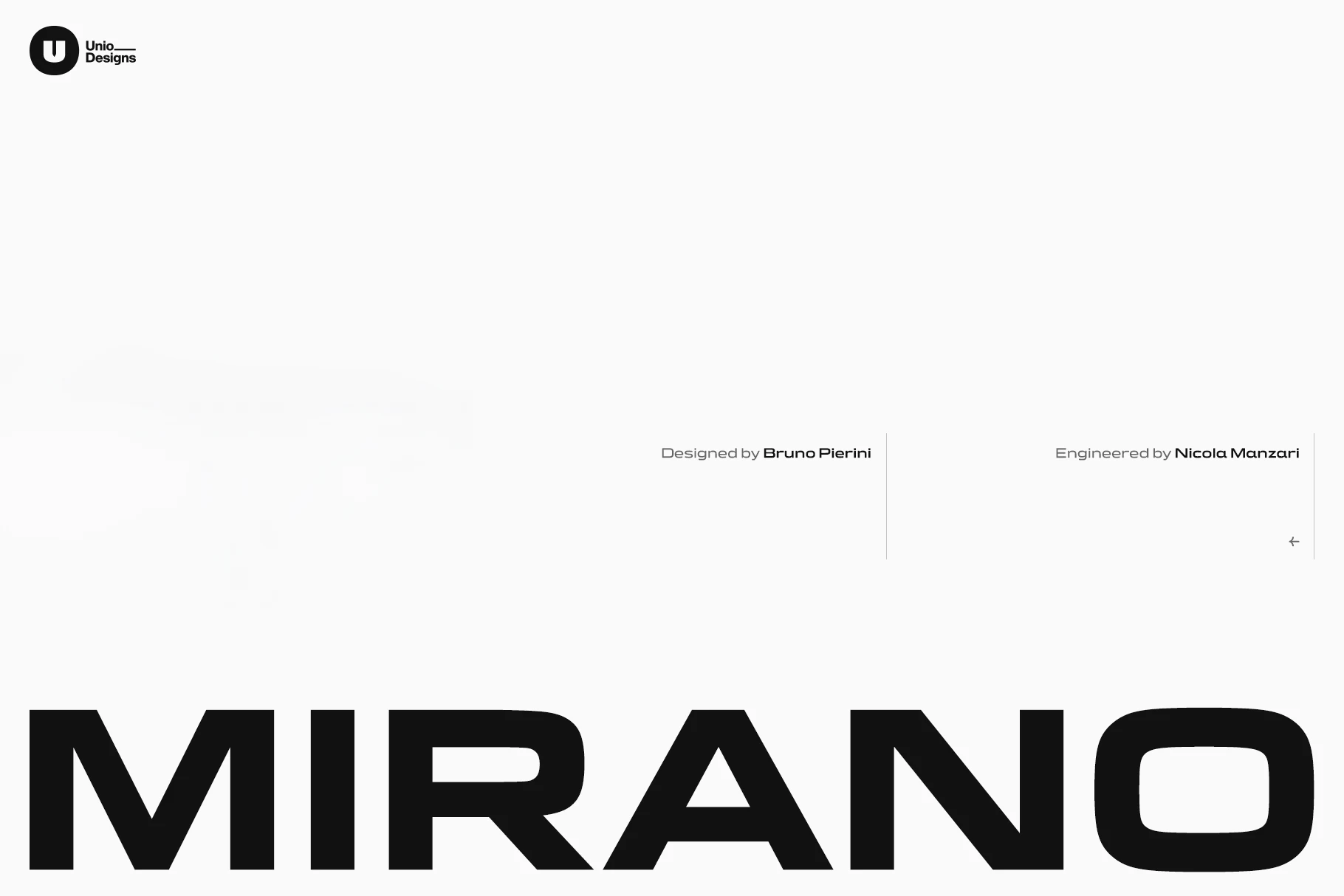
Best For: logos, branding, masculine designs, modern designs
Mirano Extended Font has a stretched uppercase structure with hard horizontal emphasis, angular cuts, and rounded rectangular counters that suggest automotive badging without looking retro-heavy. The broad proportions give each word a low, engineered stance, especially in letters like M, A, N, and O.
Use it when Geometric Logo Fonts need speed, width, and mechanical polish. Its extended forms need compact word choices and careful tracking; too much spacing weakens the connected visual line, while strong contrast and a smaller supporting sans help the logo hierarchy stay sharp.
One More Font
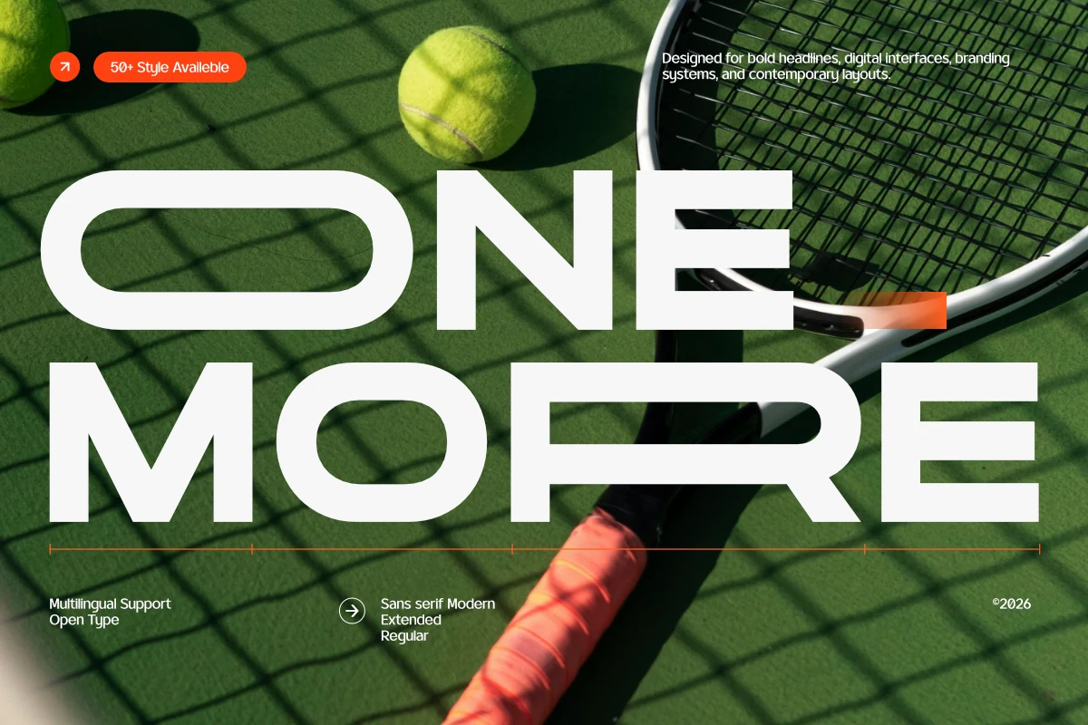
Best For: logos, branding, website headers, modern designs
One More Font has a wide extended skeleton with rounded rectangular counters, even stroke weight, and a smooth geometric rhythm that keeps the design crisp rather than cold. The long horizontals and softened corners give it a clean contemporary voice, while the open shapes help large words stay readable across bold layouts.
For Geometric Logo Fonts, One More is especially useful when you want a broad wordmark that feels modern and controlled. Its extended width fills space quickly, so it works best with short names, roomy margins, and lighter supporting text to keep the hierarchy sharp instead of overly heavy.
Cornero Font
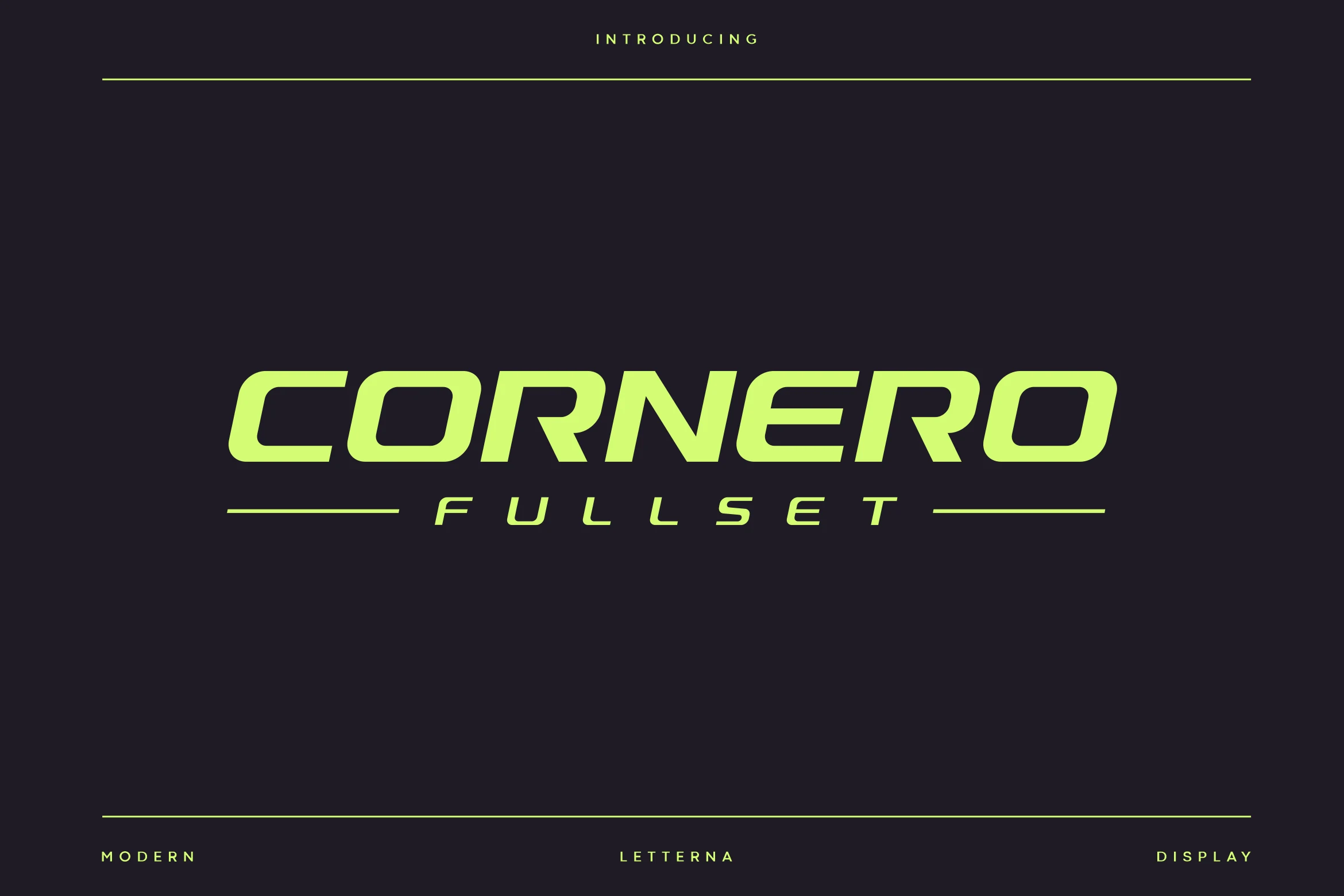
Best For: logos, branding, headlines, website headers
Cornero Font is built for speed. Its heavy wide proportions, aggressive forward slant, and chamfered corners create a strong aerodynamic silhouette, while the streamlined apertures keep the letters clean instead of bulky. The result feels engineered and forceful, with the kind of visual momentum that suits high-energy display work.
For Geometric Logo Fonts with an automotive or tech-driven edge, Cornero works best in short names and bold headers where the stance can stay uninterrupted. Keep tracking controlled, pair it with a quieter secondary sans, and give it enough horizontal room so the cut corners and slanted rhythm stay sharp.
Zero Sky Font
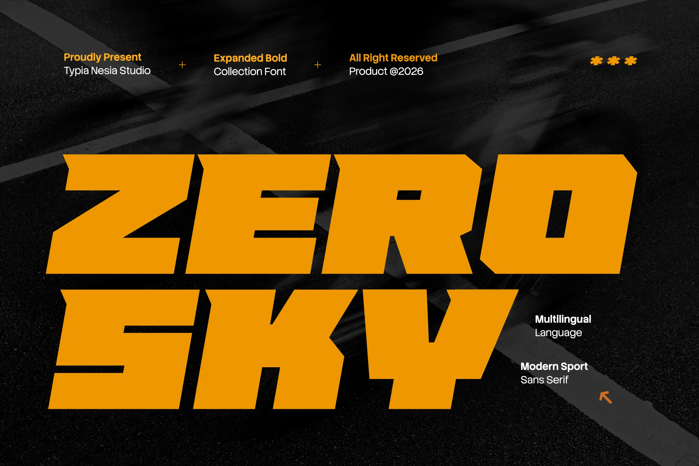
Best For: logos, posters, headlines, bold designs
Zero Sky Font is built for impact: expanded block capitals, hard slants, clipped corners, and heavy horizontal mass give it a racing-panel feel. It sits well within Geometric Logo Fonts, but the tone is more sport-tech than minimal, with dense letterforms that push speed and force before refinement.
Use it for short names, team-style marks, game titles, and poster headers where the word needs to dominate the layout. The wide proportions need firm spacing control; keep tracking tight enough to preserve momentum, and place lighter supporting text away from the main line so the heavy geometry stays readable.
Futuristic & Angular Geometric Logo Fonts
These fonts push geometric construction toward digital, angular, or experimental shapes, making them best for tech identities, bold posters, and graphic display work.
Digital Geometric Font
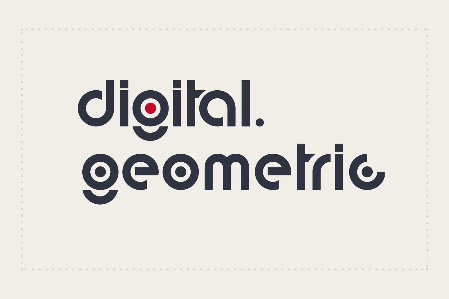
Best For: logos, website headers, business cards, modern designs
Digital Geometric Font uses thick modular lowercase forms with circular counters, clipped curves, and dot-like details that create an immediate techno mood. The shapes are rounded but assertive, so the font feels engineered rather than playful, with enough repetition to make short words look structured and intentional.
For Geometric Logo Fonts with a digital edge, this one works best in compact marks, web headers, and identity pieces where the lettering can stay large. Keep spacing controlled rather than loose; too much tracking breaks the circular rhythm, while strong contrast against a plain background helps the interior cutouts stay sharp.
Agilov Font
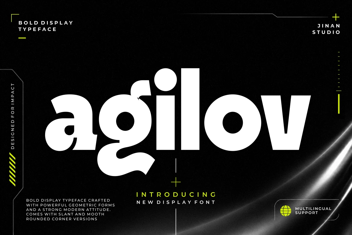
Best For: logos, branding, headlines, posters
Agilov Font blends bold geometric construction with smooth organic curves, creating a display style that feels futuristic without turning rigid. The thick strokes, soft corners, and unusual letter shapes—especially the rounded a and sweeping g—give it a graphic, expressive rhythm that stands out fast.
Within Geometric Logo Fonts, Agilov works best when a wordmark needs weight and personality at the same time. Use it for short names or punchy headlines, then keep the supporting type plain and well spaced so the heavy forms and distinctive curves stay clear instead of crowding the layout.
Exima Geometric Font
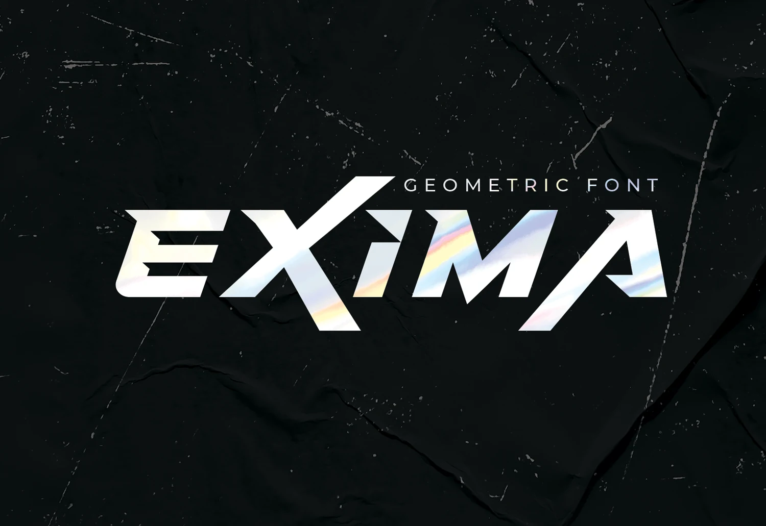
Best For: logos, posters, headlines, modern designs
Exima Geometric Font pushes the hard-edged side of Geometric Logo Fonts, using heavy block strokes, steep diagonals, and sliced interior cuts to create a fast, angular word shape. The letters feel engineered rather than neutral, with sharp joins and compact counters that give headlines immediate force.
Use it where the typography can act as the main graphic element: posters, flyers, print titles, and bold identity marks. Keep tracking fairly tight so the diagonal rhythm stays connected, and pair it with a quieter supporting typeface to stop the sharp geometry from competing with smaller text.
Minimal & Professional Geometric Logo Fonts
These cleaner geometric fonts focus on restraint, spacing, and professional balance, which suits branding systems, packaging, editorial layouts, and premium identities.
Begob Font
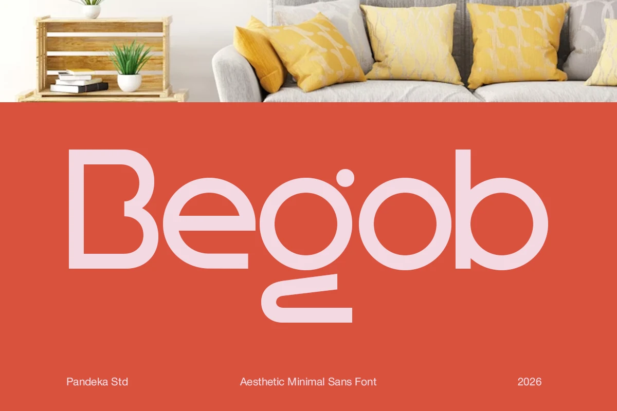
Best For: branding, packaging, editorial designs, modern designs
Begob Font pairs clean circular bowls with slim monoline strokes and a distinctive geometric g that drops into a soft underline-like form. The spacing feels airy and the proportions stay balanced, so the overall look is minimal but not sterile—closer to modern product branding than a purely neutral sans.
For Geometric Logo Fonts, Begob works especially well when you want a calm, design-led identity with a friendly edge. Its lighter weight benefits from scale and contrast, so use it in logos, catalogue titles, or packaging with generous white space and a simpler secondary sans for supporting copy.
Hugos Font
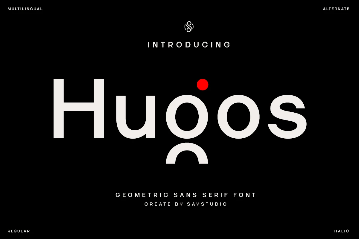
Best For: logos, branding, website headers, clean designs
Hugos Font is a clean geometric sans with open rounded bowls, straight vertical stems, and a distinctive lowercase g that adds character without breaking the minimal structure. The spacing is calm and controlled, giving the wordmark a professional tone while the soft curves keep it from looking too mechanical.
For Geometric Logo Fonts that need clarity in branding and digital layouts, Hugos is strongest in short names, headers, and identity systems. The regular and italic styles support contrast inside a simple composition, while generous margins and restrained tracking help the circular forms stay sharp.
Montreal Font
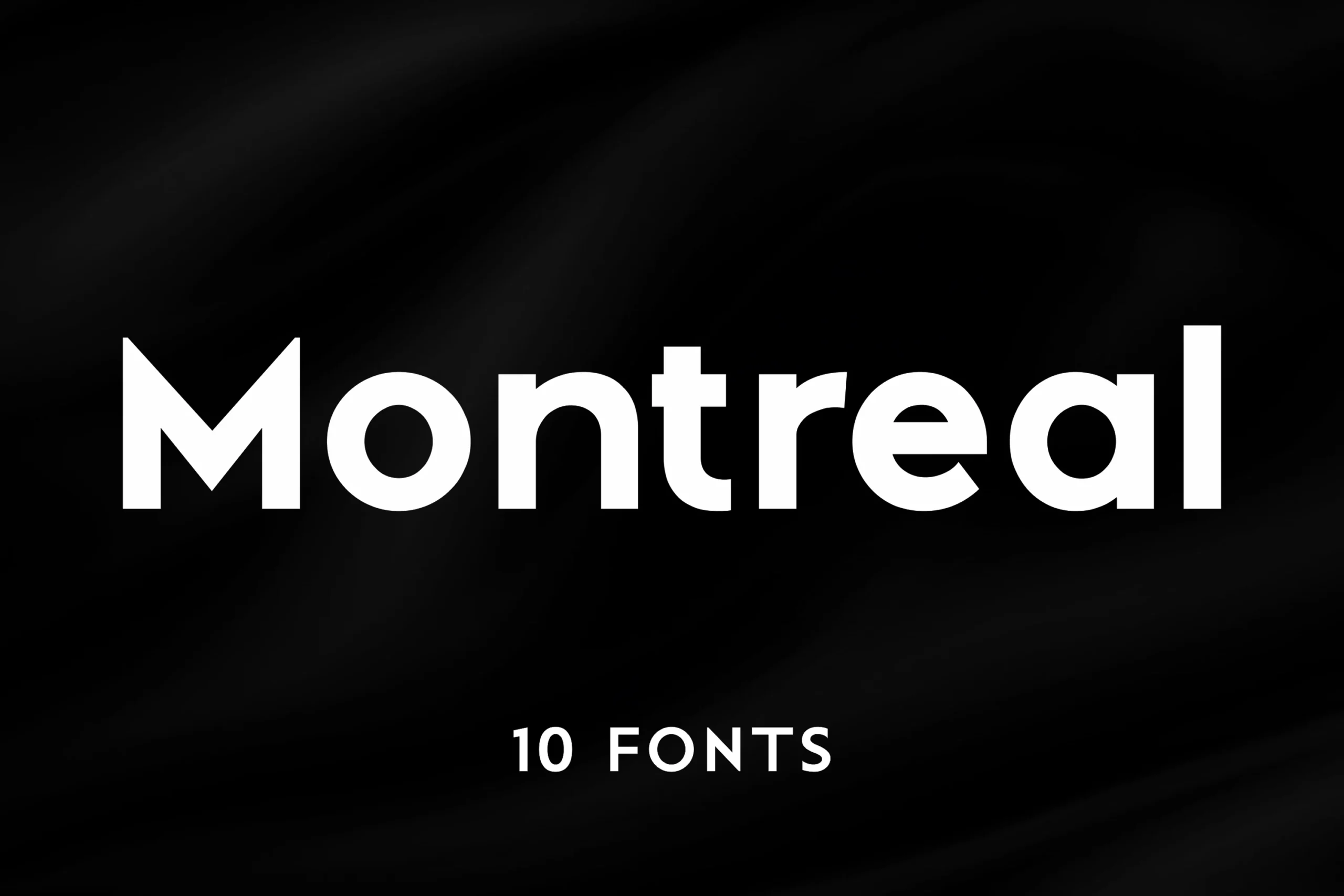
Best For: logos, branding, editorial designs, website headers
Montreal Font has the kind of geometric sans structure that feels polished at first glance: clean lines, even proportions, and crisp joins balanced by smooth rounded bowls. The overall rhythm is restrained and modern, which makes the wordmark look confident without relying on decorative detail.
Geometric Logo Fonts often depend on proportion more than personality quirks, and Montreal handles that well. Its 10 styles give you room to build clearer hierarchy across a full identity or editorial system, while the simple shapes pair best with generous spacing and short, well-placed headlines.
Balimo Font
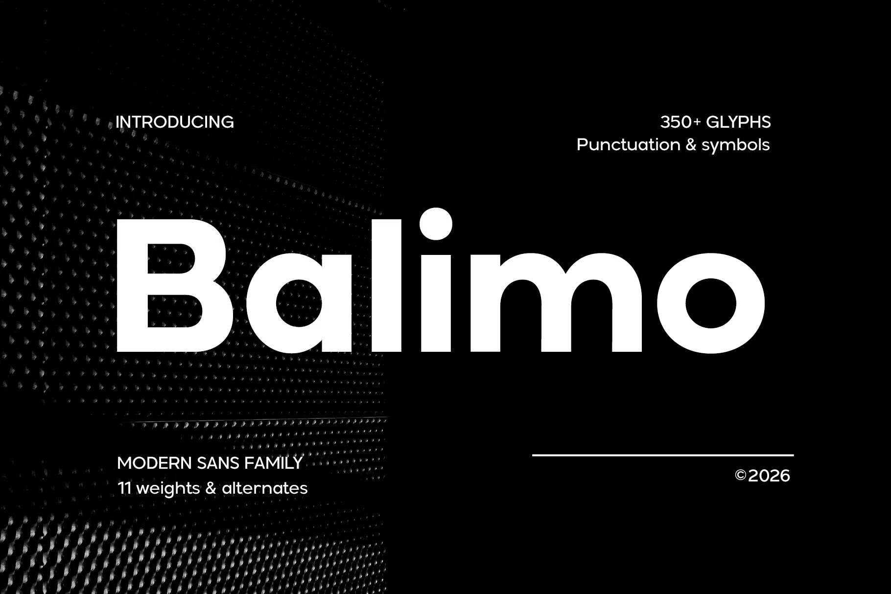
Best For: logos, branding, editorial designs, website headers
Balimo Font has a calm, confident voice shaped by rounded geometric forms, even stroke weight, and generous counters that keep each letter open and stable. That balance makes it a natural choice within Geometric Logo Fonts, especially for brands that want a minimal look without feeling cold or rigid.
Its clean rhythm lets it move from bold headlines into longer supporting text more easily than many display-led sans serifs. Use tighter hierarchy rather than decorative effects: Balimo holds up best when spacing is consistent, contrast is simple, and the smooth proportions are allowed to define the layout.
Meigan Font
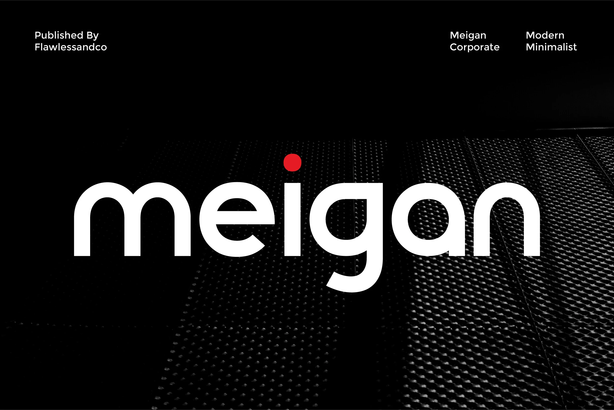
Best For: logos, branding, professional designs, minimal designs
Meigan Font is a clean geometric sans with bold lowercase forms, rounded shoulders, broad counters, and a stable baseline. It fits Geometric Logo Fonts when the goal is corporate and minimal rather than aggressive, using soft curves and controlled proportions to keep the wordmark clear without losing presence.
The spacing feels measured enough for business identities, UI headers, and polished brand systems where readability matters. Keep the hierarchy simple and avoid overly decorative pairings; Meigan works best when its smooth rhythm, open shapes, and confident weight carry the visual structure.
Tanod Font
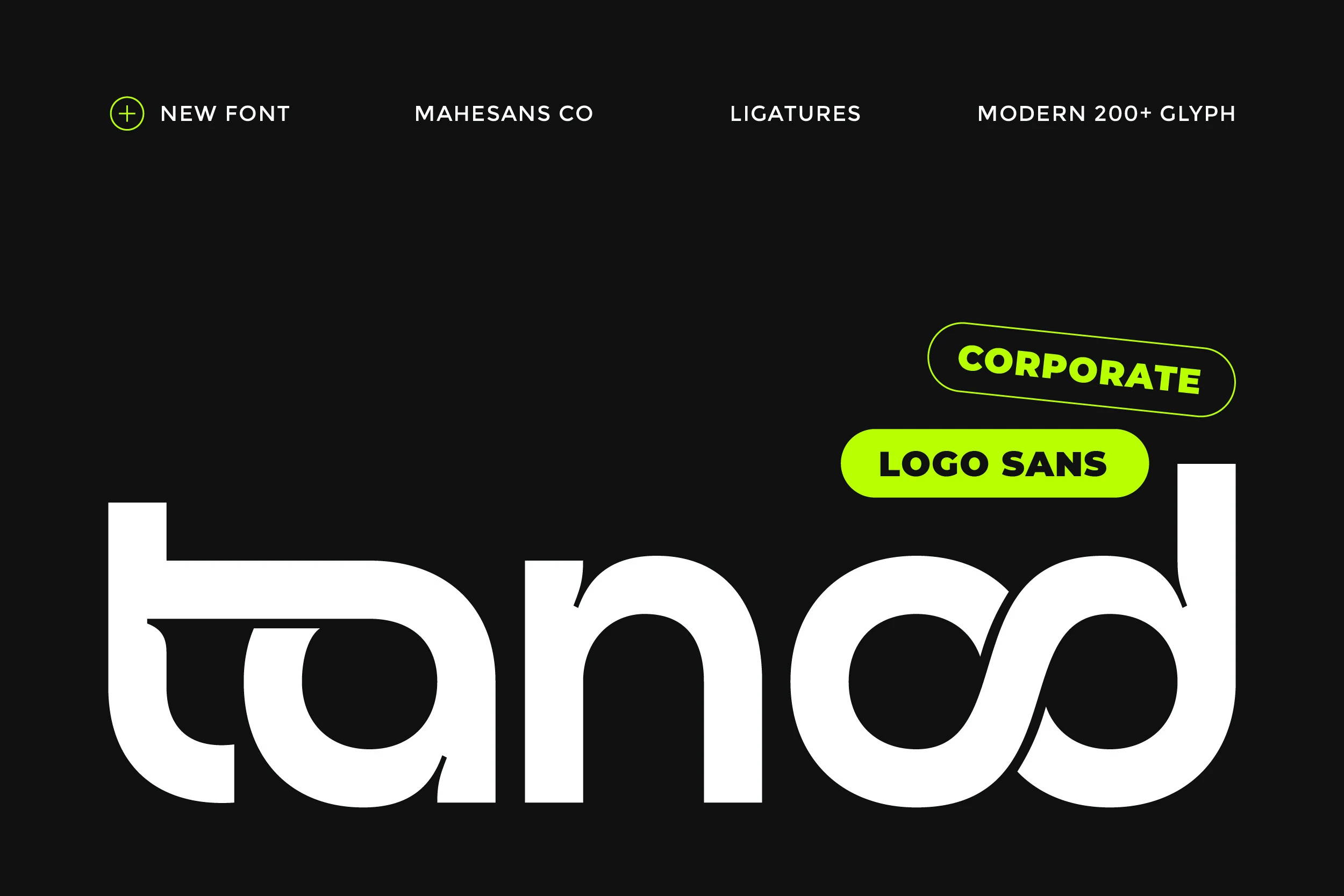
Best For: logos, branding, minimal designs, high-end designs
Tanod Font gives Geometric Logo Fonts a smoother, more upscale mood, built from broad rounded curves, even weight, and a striking continuous sweep through the opening letters. The shapes feel pared back but intentional, which helps the wordmark look expensive without leaning on decorative detail.
It suits short brand names and identity work where the type needs to carry the polish on its own. Leave enough space around it and keep the supporting palette restrained; Tanod holds its premium effect best when the curved rhythm stays clean and the hierarchy is not overcrowded.
Conclusion
Choose bold rounded fonts when the logo needs immediate weight, condensed fonts when space is tight, extended sport-tech fonts for motion, futuristic styles for sharper visual impact, and minimal professional options for cleaner brand systems.