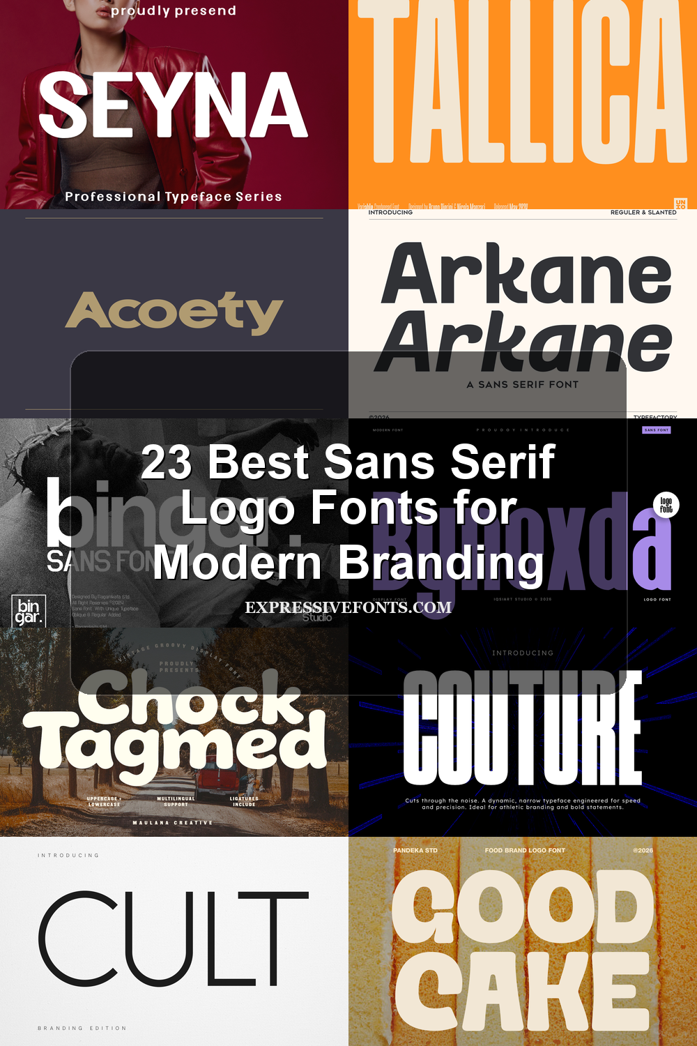
23 Best Sans Serif Logo Fonts for Modern Branding
Sans Serif Logo Fonts are a practical choice for designers who need clean, readable wordmarks with strong visual range. This collection covers bold geometric, condensed, editorial, futuristic, and retro sans serif styles for logos, branding systems, packaging, posters, website headers, and modern identity projects.
Bold & Geometric Sans Serif Logo Fonts
These fonts use strong structure, balanced proportions, and clean geometric weight, making them useful for modern wordmarks, brand systems, headers, signage, and polished identity work.
Pogonia Font
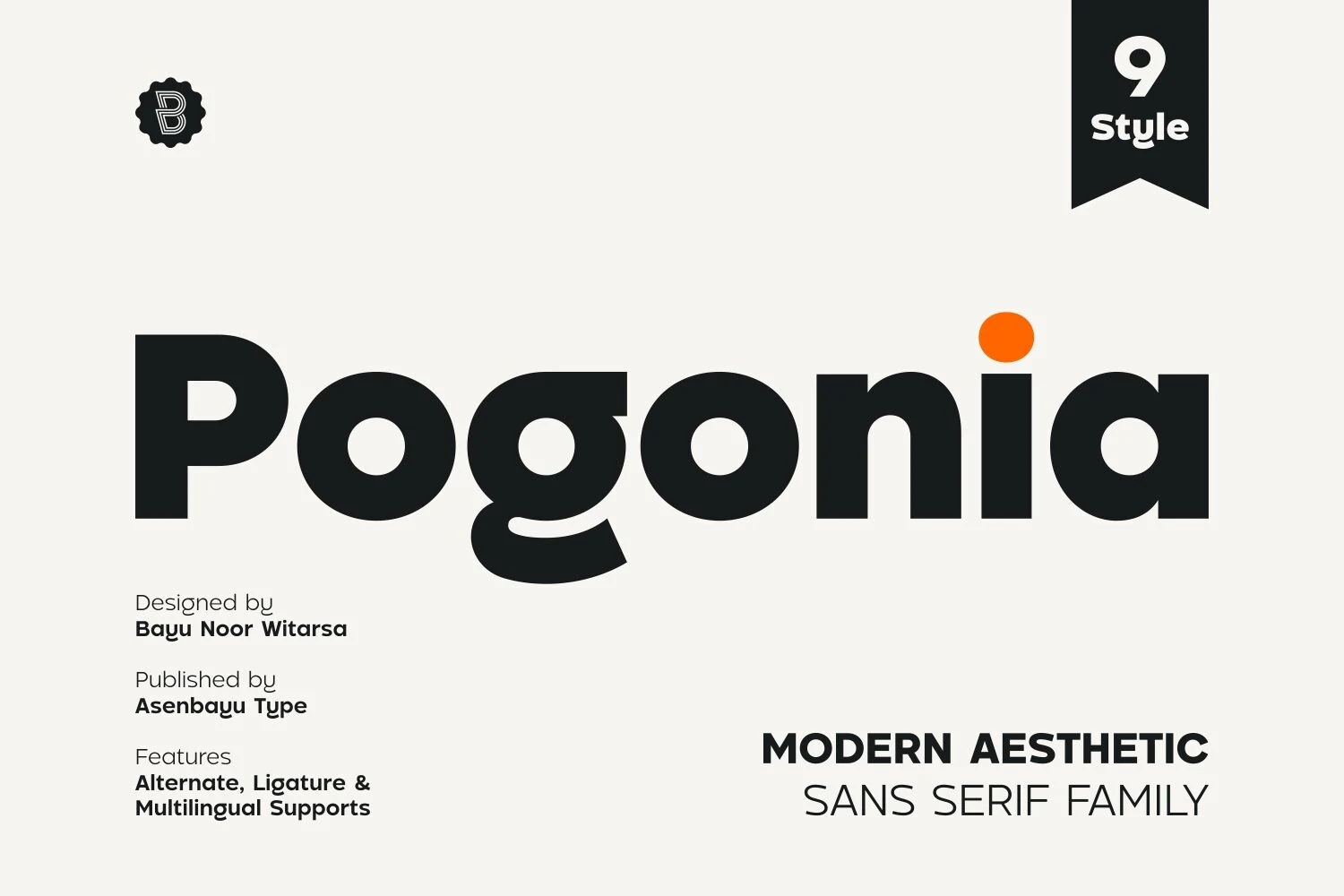
Best For: logos, branding, website headers, modern designs
Pogonia Font has a heavy geometric build softened by rounded counters and humanist curves, so the letters feel clean without turning mechanical. The broad shapes, low-contrast weight, and compact rhythm give it strong presence for Sans Serif Logo Fonts where the wordmark needs to look modern, direct, and easy to recognize.
Its bold style works best when spacing is kept deliberate rather than loose; too much tracking can weaken the rounded mass that gives the font its character. Use contrast through scale and hierarchy, pairing the heavier cuts with lighter supporting text so headlines, logos, and web headers stay structured instead of bulky.
Romansa Font
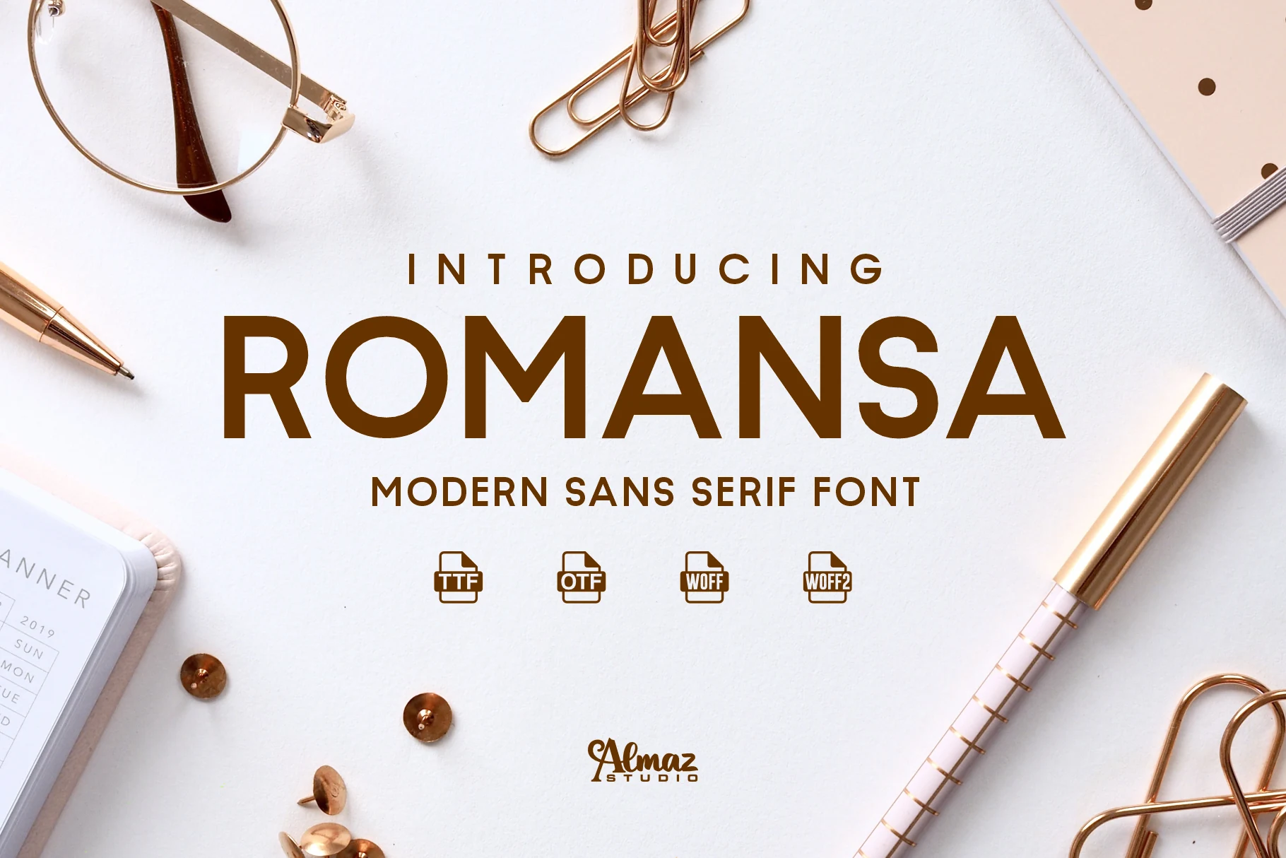
Best For: logos, branding, posters, website headers
Romansa Font leans on crisp uppercase forms, even stroke weight, and open counters that give the design a polished, contemporary feel. It suits Sans Serif Logo Fonts particularly well because the letterforms look confident and orderly without becoming sterile, making brand names read clearly at a glance.
The wide stance and simple geometry help it hold up in posters and web headers, especially when the layout stays clean and the spacing is allowed to do part of the work. Use it for short lines or title hierarchy, then pair it with lighter supporting text so the bold structure stays sharp rather than heavy.
Nura Font
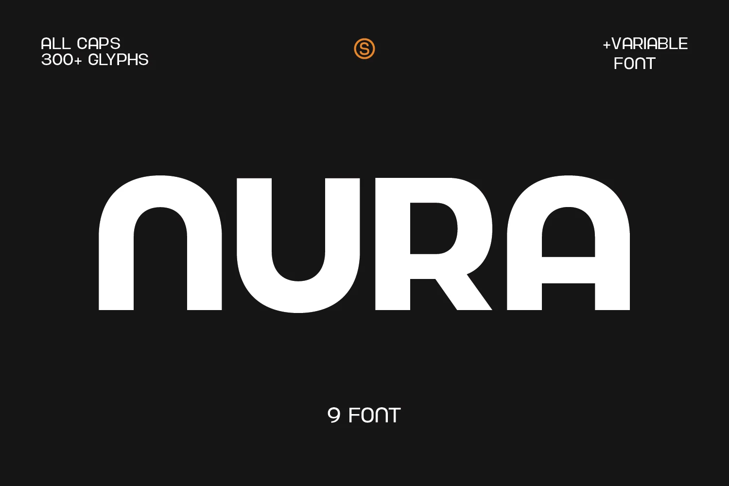
Best For: logos, branding, headlines, posters
Nura Font is a bold rounded sans serif with wide letterforms, soft corners, and a compact all-caps rhythm. Its clean block structure gives Sans Serif Logo Fonts a direct, modern look, while the curved joins keep the heavy weight from feeling too rigid.
The font works best in short names, poster titles, and large headline settings where its thick strokes can define the layout. Keep spacing controlled rather than loose, and use strong contrast with lighter secondary text so the rounded mass stays sharp and readable.
Acoety Font
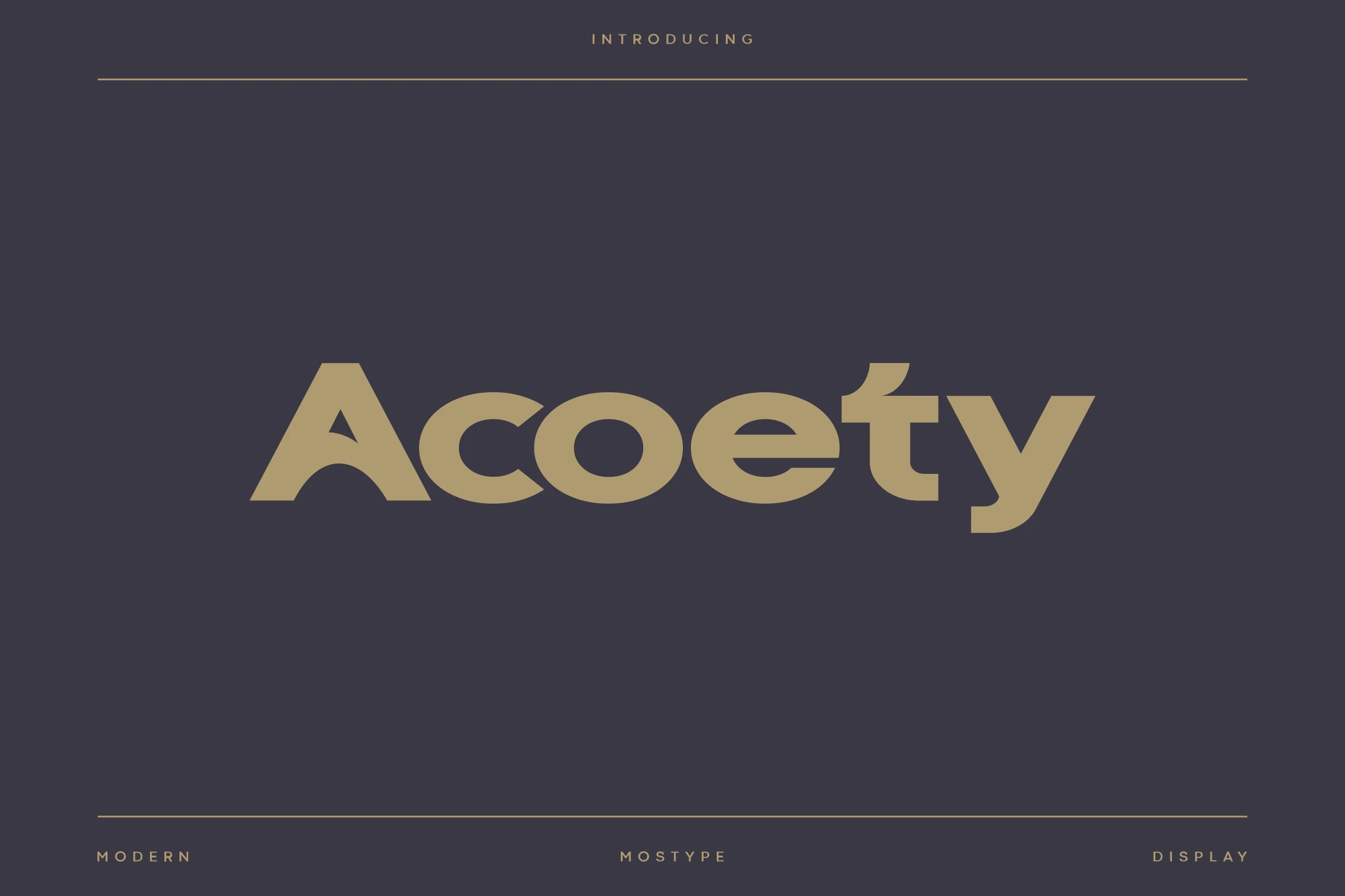
Best For: logos, branding, packaging, signage
Acoety Font has a compact geometric build with softened corners, open counters, and a distinctive arched A that gives the wordmark its own identity. It stands out in Sans Serif Logo Fonts because the slightly condensed proportions let names lock up tightly while still feeling smooth, premium, and easy to read.
The single-story a and wedge-like terminals add a crisp snap to headlines, so the font performs best when you keep the spacing controlled instead of tracking it too wide. Use it when you want a clean, tech-aware tone in branding, packaging, or signage, then pair it with quieter supporting text to keep the display shapes doing the work.
Arkane Font
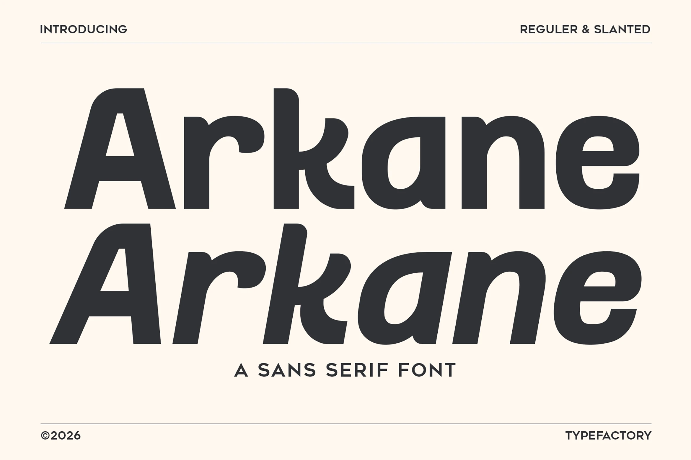
Best For: logos, branding, packaging, editorial designs
Arkane Font combines bold geometric weight with rounded curves and a compact, controlled rhythm, giving the letterforms a polished but approachable edge. It works especially well in Sans Serif Logo Fonts because the shapes feel solid and memorable without becoming stiff, and the regular/slanted duo adds built-in variation for stronger brand systems.
The slanted style is useful when a layout needs movement or contrast, while the upright cut keeps headlines and wordmarks steady and clean. Keep the text short and let the heavy forms carry the hierarchy; Arkane has enough presence for packaging, editorial titles, and signage without needing extra decoration.
Davetica Font
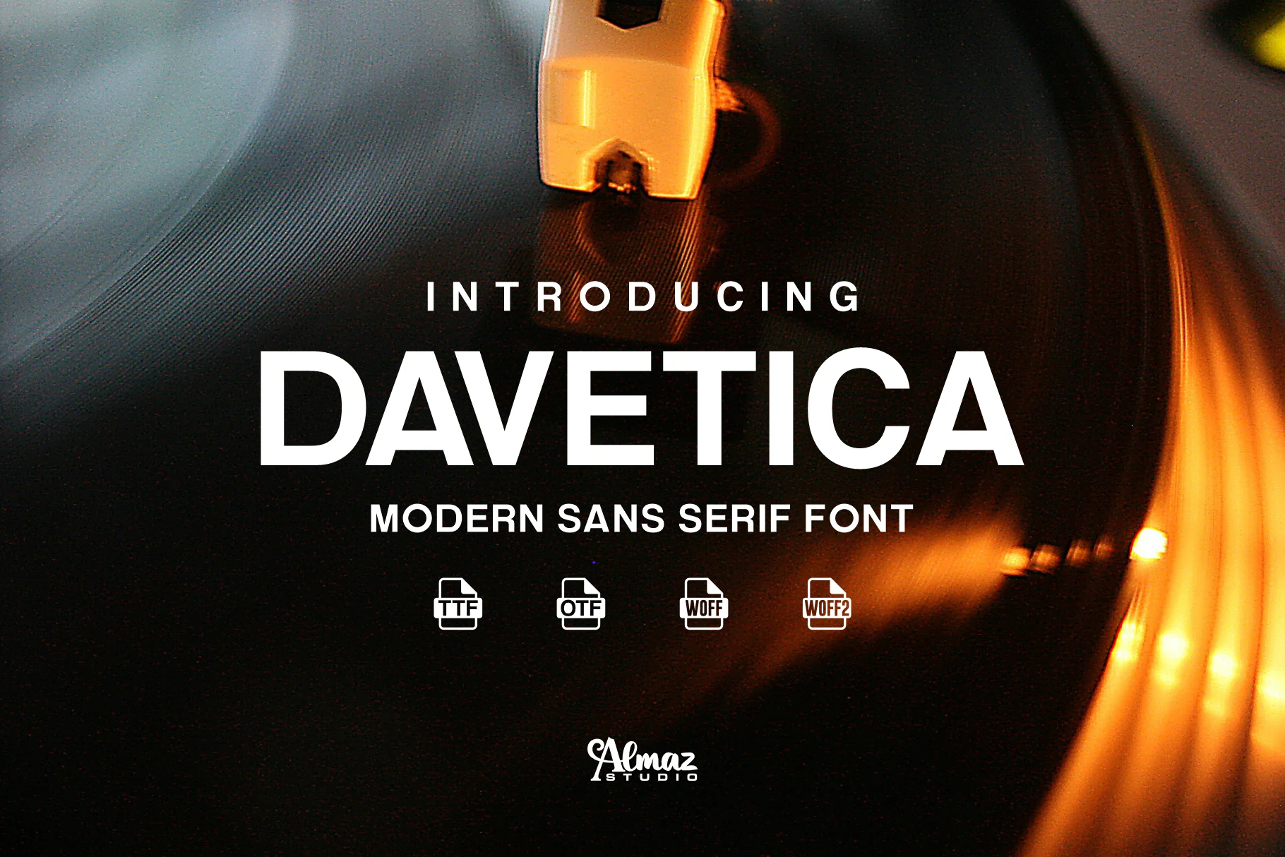
Best For: logos, branding, posters, website headers
Davetica Font has a clean uppercase structure with firm verticals, sharp diagonals, and balanced spacing that keeps the wordmark clear even over busier visuals. Its modern sans serif build gives Sans Serif Logo Fonts a straightforward professional tone, with enough weight for headlines but not so much mass that the letters feel blocky.
The restrained geometry works well for logos, posters, web graphics, and signs where the message needs to stay readable at speed. Its Latin-based language support helps broader brand systems stay consistent, while moderate tracking and strong contrast will keep the crisp letter shapes from looking too plain.
Montreal Font
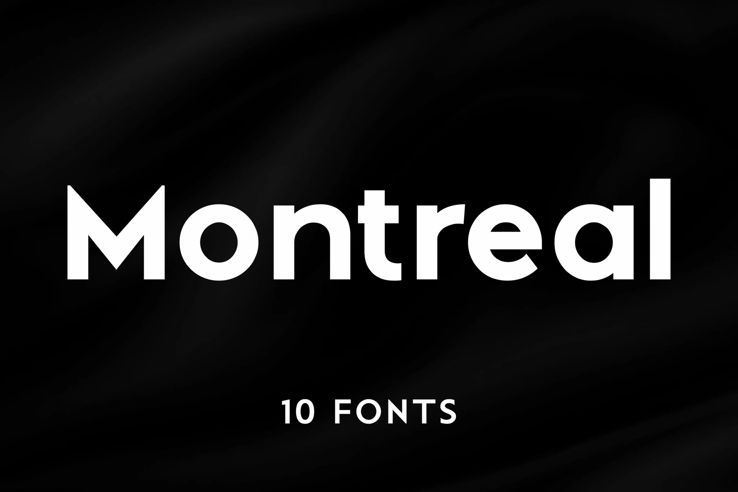
Best For: logos, branding, website headers, minimal designs
Montreal Font has a clean geometric build with even proportions, rounded counters, and a smooth, controlled rhythm that feels contemporary without looking cold. It suits Sans Serif Logo Fonts especially well when you want a polished wordmark with crisp structure and a minimalist edge.
The 10-style family gives you more room to build hierarchy across branding and digital layouts, from bold names to quieter supporting text. Keep spacing fairly measured rather than overly wide, so the geometry stays cohesive and the letters hold their sharp, modern presence in logos and headers.
Mansfield Font
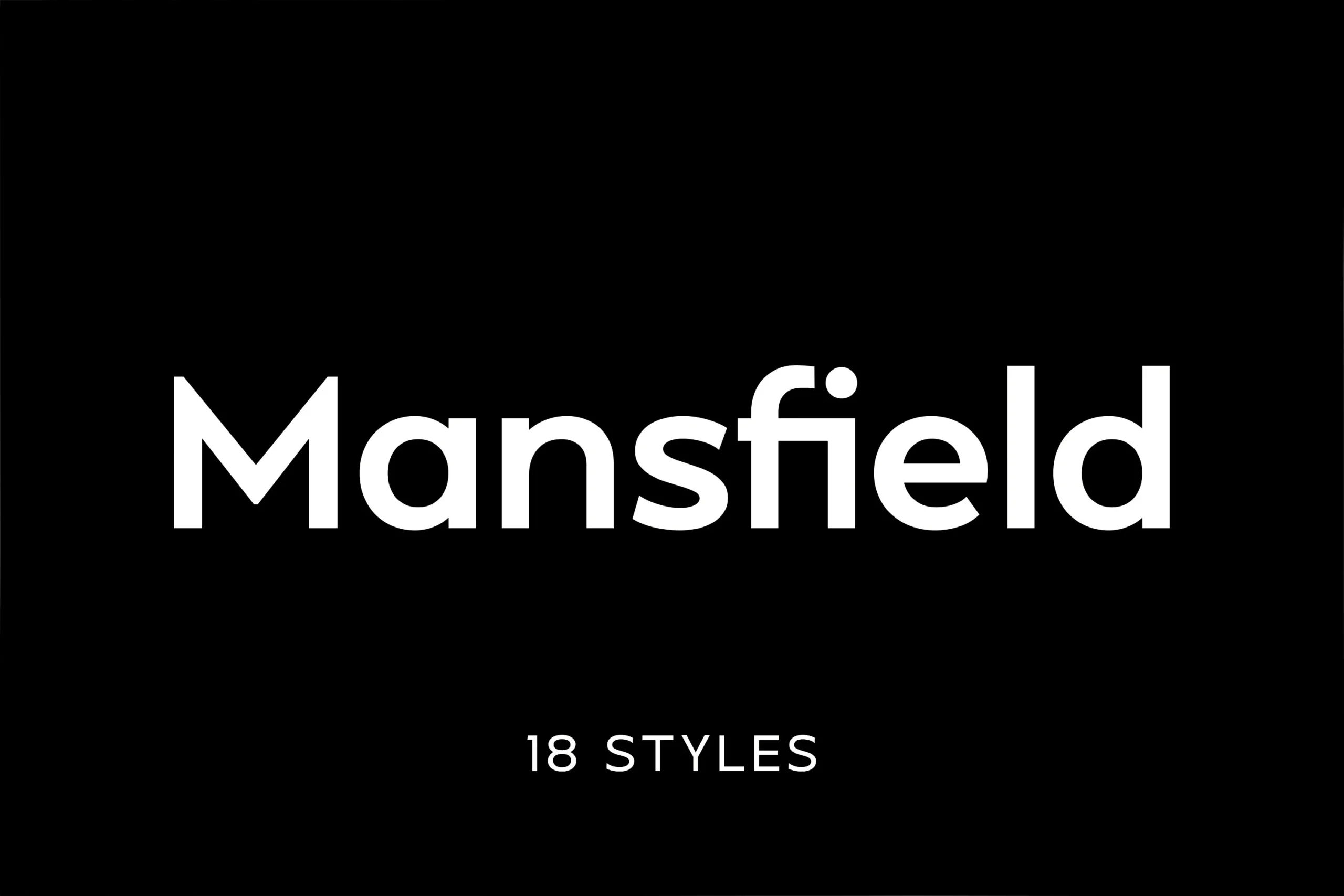
Best For: logos, branding, editorial designs, minimal designs
Mansfield Font has tall geometric letterforms, clean joins, and very low contrast, which gives it a crisp neo-grotesque feel. It works especially well in Sans Serif Logo Fonts when a brand needs something modern and orderly, with enough height and precision to feel confident without becoming cold.
The even rhythm helps short names and editorial titles hold together cleanly, while the sharp edges keep the texture polished at larger sizes. Pair it with quieter supporting text and avoid overly loose tracking so the geometric structure stays compact, controlled, and easy to read.
Condensed & Futuristic Sans Serif Logo Fonts
This group focuses on tall, narrow, modular, and engineered letterforms that work best when a logo needs compact width, sharp impact, or a more technical display voice.
Moni Font
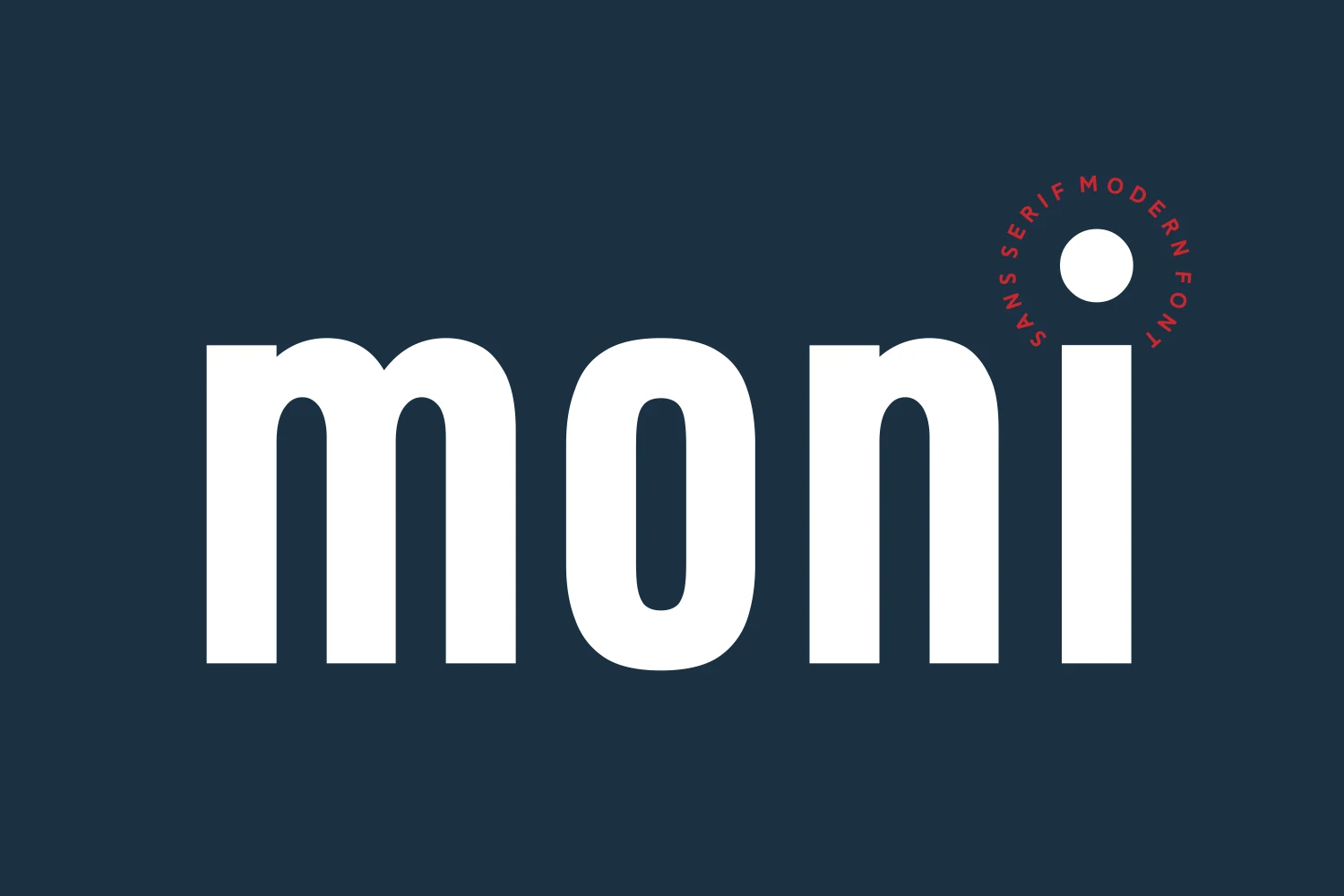
Best For: logos, branding, headlines, website headers
Moni Font has a striking display presence built from thick strokes, tall proportions, and rounded inner shapes that keep the weight feeling smooth rather than blunt. It fits Sans Serif Logo Fonts especially well when a brand needs something bold and modern, but not cold or overly rigid.
The narrow width and heavy rhythm give short names and headlines strong visual control, so it performs best when the wording stays concise. Pair it with lighter supporting text or generous negative space to keep the composition balanced, especially in logos, mastheads, and clean website hero sections.
Couture Font
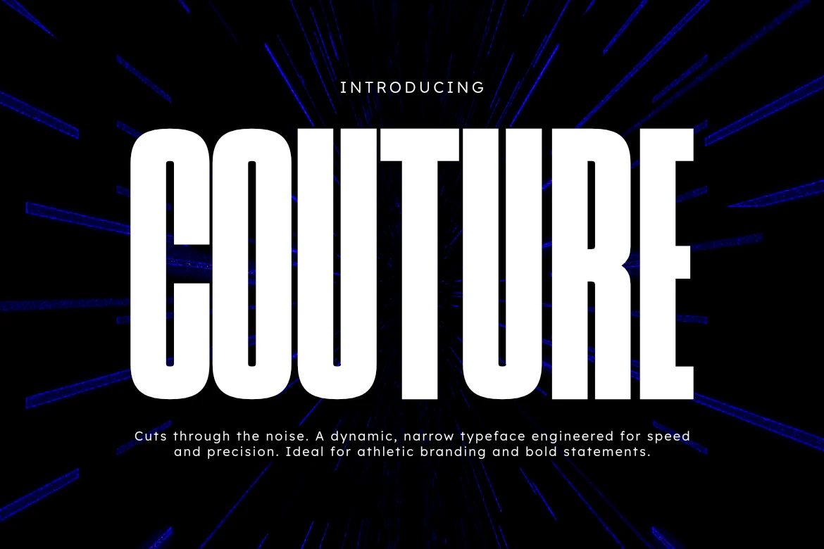
Best For: logos, branding, headlines, posters
Couture Font uses very tall, condensed uppercase forms, blunt terminals, and even stroke weight to create a sharp forward rhythm. That structure gives Sans Serif Logo Fonts a more forceful voice, especially when a wordmark needs to feel fast, disciplined, and unmistakably modern.
Because the letters are so narrow, Couture works best in short names and strong title settings where vertical scale can do the heavy lifting. Keep tracking fairly tight and pair it with a quieter secondary font so posters, branding, and editorial headlines stay sleek instead of stretched.
Bynoxda Font
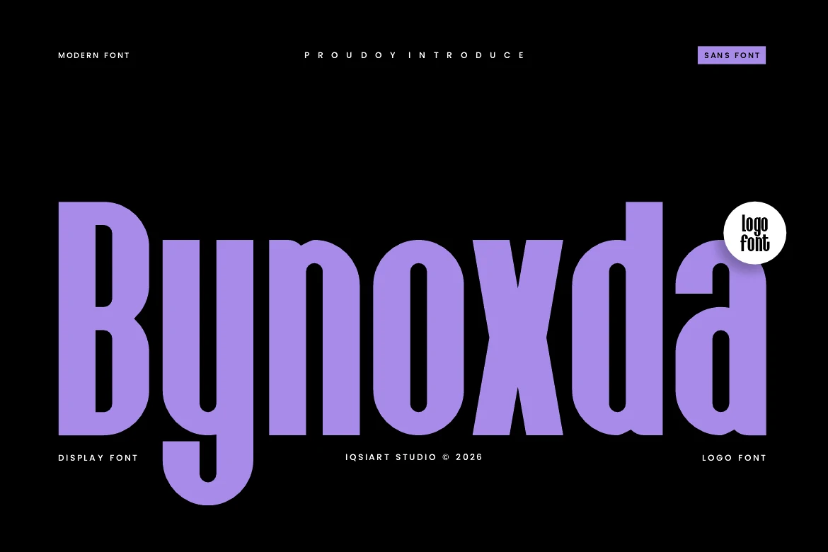
Best For: logos, branding, display text, bold designs
Bynoxda Font is built around tall, heavy sans serif forms with tight horizontal width and strong vertical pressure. The rounded counters and thick stems keep the letters bold without turning rigid, while the condensed proportions give short words a striking poster-scale presence.
For Sans Serif Logo Fonts, it works best when the brand name needs impact more than subtlety. Use high contrast and controlled tracking so the narrow shapes stay readable, especially in wordmarks, display headers, apparel graphics, and compact packaging layouts.
Tallica Font
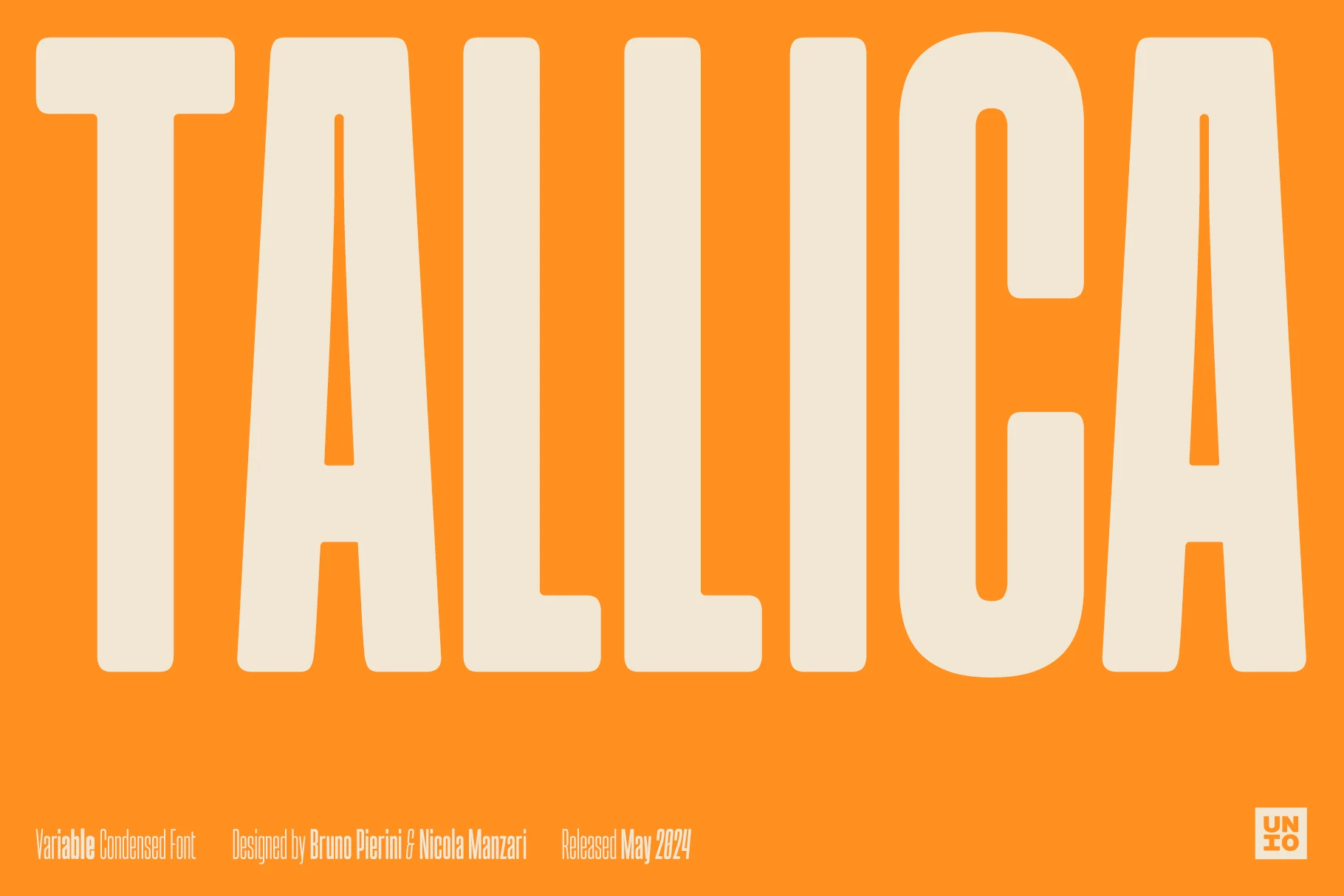
Best For: logos, headlines, posters, display text
Tallica Font pushes condensed design to the limit with towering, tightly compressed letterforms and a sturdy grotesque structure. The broad stems and narrow inner spaces give it an immediate billboard feel, so even a single word can dominate the layout without taking much horizontal room.
For Sans Serif Logo Fonts, this is a strong choice when space is tight but the name still needs to hit hard. It performs best in short wordmarks, mastheads, and stacked headline systems, and a little extra tracking can help the ultra-compressed shapes breathe without losing their impact.
Ceoma Font
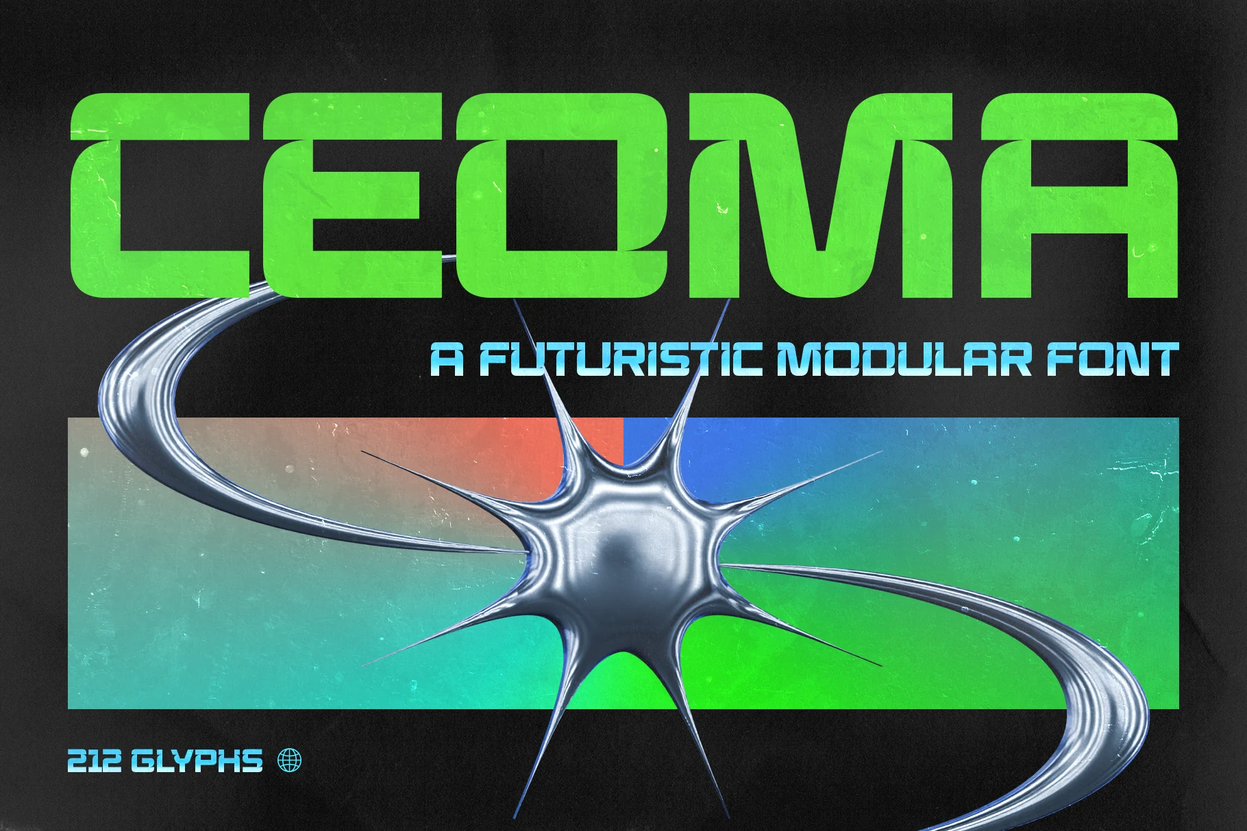
Best For: logos, branding, posters, signage
Ceoma Font is built from heavy modular blocks, squared inner cuts, and low-profile proportions that push it firmly into futuristic display territory. Its capsule-like geometry gives Sans Serif Logo Fonts a sharp Y2K and sci-fi edge, especially for brands that need a technical, high-impact wordmark.
The wide stance makes the font strongest in short names, poster titles, and signage where each letter can act like a graphic unit. Keep tracking controlled and use strong contrast around it; too much surrounding detail will compete with the architectural cuts that give Ceoma its main visual force.
Unesa Font
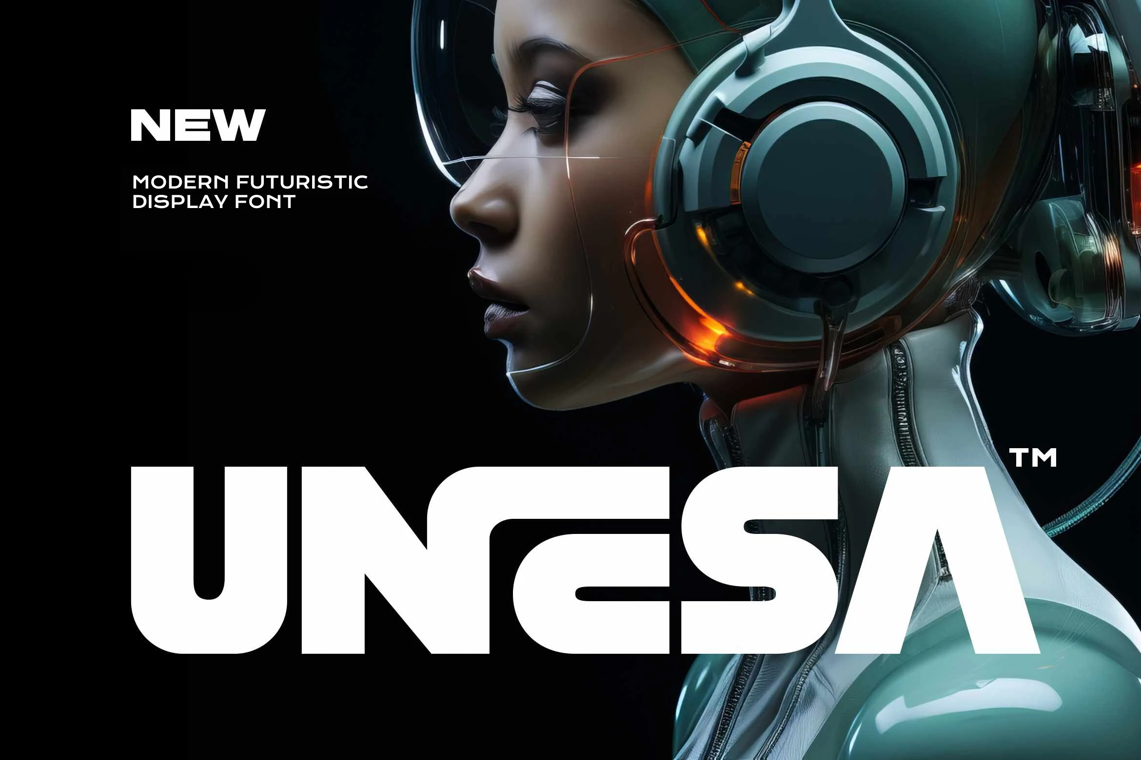
Best For: logos, posters, display text, T-shirts
Unesa Font has a heavy futuristic build with broad letter widths, clipped corners, and smooth internal curves that give it a sleek engineered feel. The shapes look sharp and contemporary, but the rounded sections stop it from feeling stiff, which helps large words stay bold and readable.
If you want Sans Serif Logo Fonts with real headline power, this one works best in short names and high-visibility layouts. Use it where the type needs to carry the mood on its own, and give the thick forms enough space so the custom structure stays crisp on posters, apparel, and hero branding.
Minimal & Editorial Sans Serif Logo Fonts
These lighter and more refined fonts suit fashion branding, beauty marks, magazine-style headers, portfolio logos, and clean layouts where restraint matters more than bulk.
Cloud Font
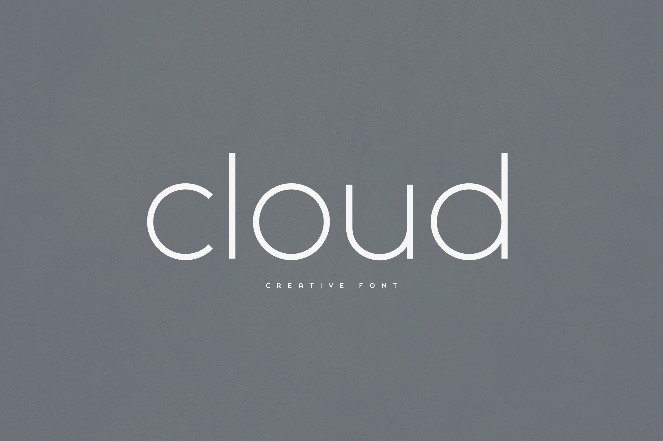
Best For: logos, branding, website headers, minimal designs
Cloud Font has a light monoline structure with rounded lowercase curves, tall ascenders, and generous open spacing. Its airy rhythm gives Sans Serif Logo Fonts a quiet, refined tone, especially for brands that need clarity without the weight of a heavy geometric wordmark.
The thin strokes need enough contrast against the background, so it works best in clean layouts, large wordmarks, and spacious headers rather than crowded compositions. Keep letter spacing moderate: the forms already feel open, and too much tracking can make the word lose its smooth continuous line.
Minimalist Sans Font
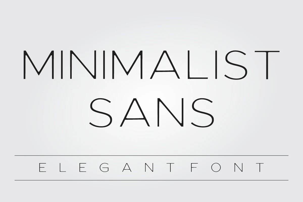
Best For: logos, branding, minimal designs, elegant designs
Minimalist Sans Font uses a very thin monoline structure with wide, airy spacing and sharp geometric turns. The tall capitals give names and short phrases a calm editorial look, while the light stroke weight keeps the design refined rather than heavy.
For Sans Serif Logo Fonts, this one works best where restraint is the point: wordmarks, beauty branding, fashion headers, and clean portfolio marks. Keep contrast high and avoid cramped layouts, because the fine lines need space to stay readable at smaller sizes.
Little Chailos Font
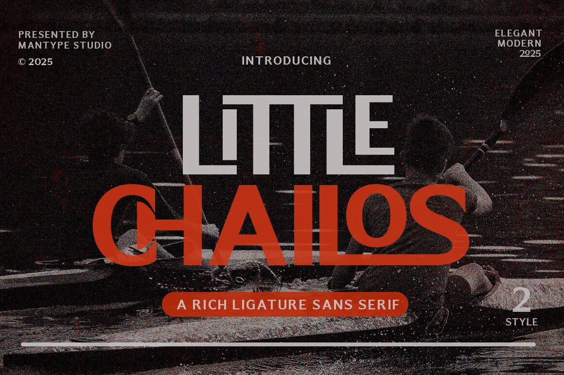
Best For: logos, branding, fashion branding, editorial designs
Little Chailos Font has the kind of sharp, fashion-led presence that reads instantly on a cover or wordmark. The letterforms mix clean sans geometry with a distinctive binding style, and the contrast between slimmer and heavier strokes gives the text a polished editorial rhythm.
If you are collecting Sans Serif Logo Fonts with a more styled personality, this one stands out in branding without feeling decorative. It works especially well for short names, mastheads, and packaging where the linked details can stay visible, so give it enough size and spacing to let the structure read clearly.
Cult Font
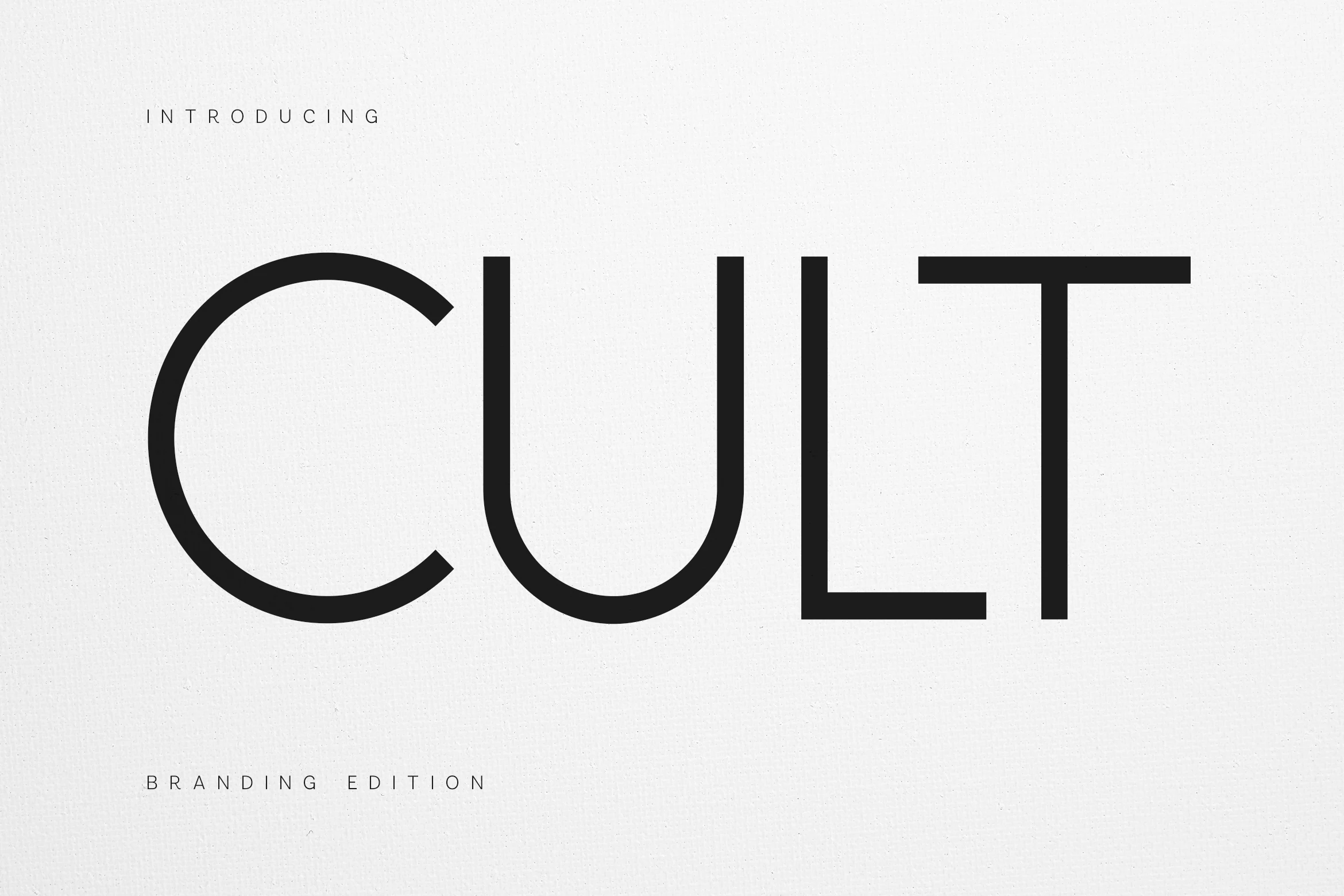
Best For: logos, branding, minimal designs, editorial designs
Cult Font has a refined geometric build that feels crisp and controlled without looking sterile. The wide open curves, deep rounded base on the U, and long horizontal top of the T create a sleek silhouette that reads especially well in clean, contemporary layouts.
For Sans Serif Logo Fonts, it suits identity work that needs a modern, understated presence. Use it for short brand names, editorial headers, or packaging where generous spacing can emphasize the balanced proportions and keep the shapes looking calm and intentional.
Bingar Font
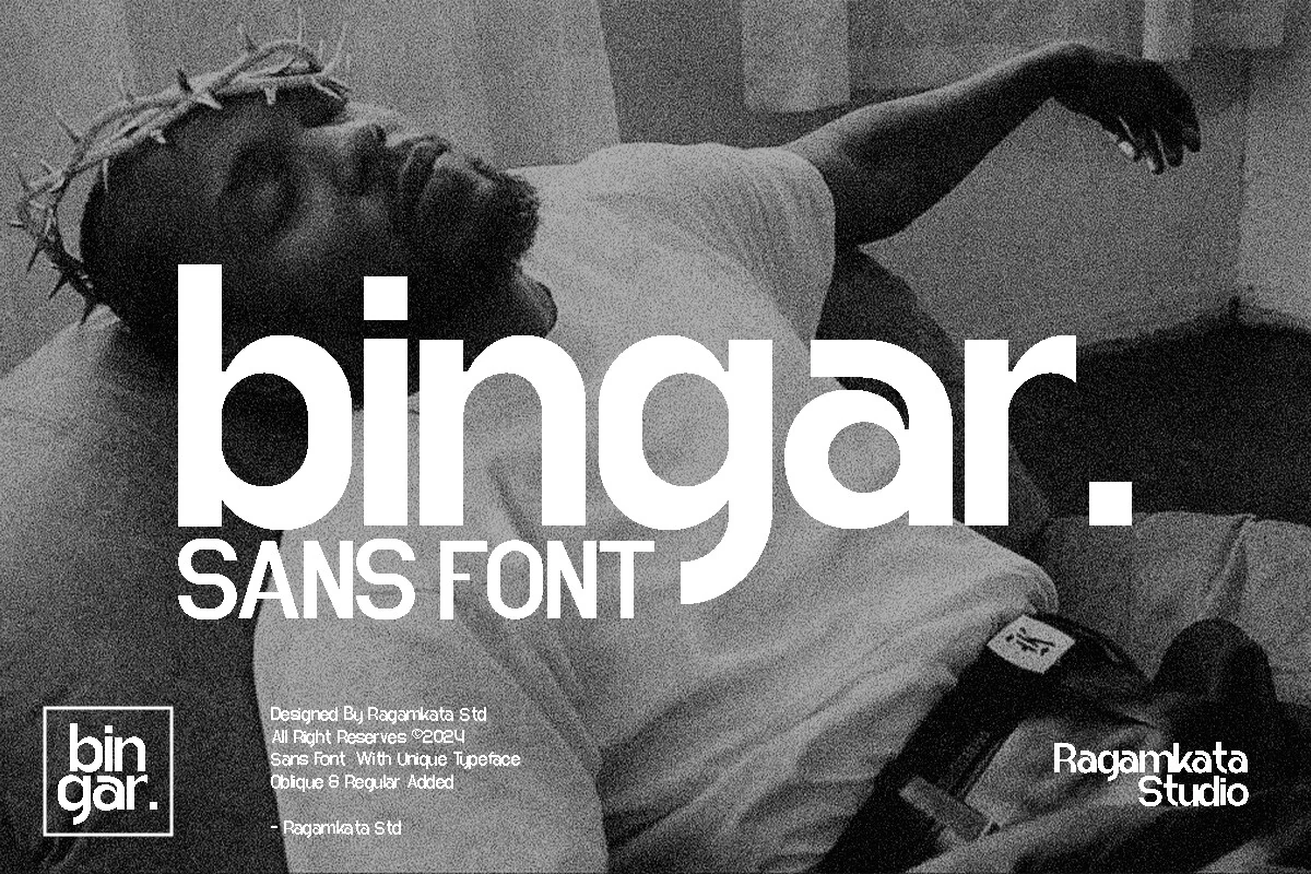
Best For: logos, branding, magazine covers, packaging
Bingar Font has smooth rounded sans serif shapes, tall vertical stems, and compact lowercase forms that create a polished display rhythm. Its soft curves and clean counters make it useful for Sans Serif Logo Fonts when the goal is modern branding with a slightly editorial, design-studio feel.
The letters sit close together visually, so avoid pushing the tracking too far; the strength comes from the connected mass and rounded negative space. Use it for short names, covers, packaging, or poster headlines, then bring in a simpler text font underneath to keep the composition readable.
Seyna Font
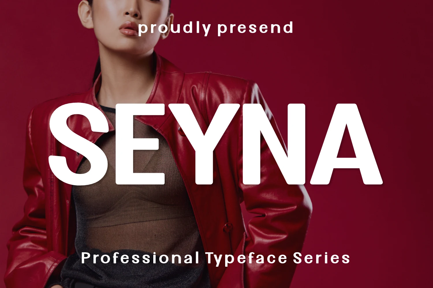
Best For: logos, branding, posters, fashion branding
Seyna Font brings a bold fashion-editorial tone through wide uppercase forms, rounded corners, and clean vertical strokes. The heavy display weight gives Sans Serif Logo Fonts a sharper presence, while the softened curves keep the letters from looking too industrial or flat.
Its strong wordmark style works best when the main title is kept large and the supporting text is spaced wider for contrast. Use it for short names, posters, and brand headers where the typography needs to anchor the layout; crowded text blocks will weaken its clean, graphic impact.
Playful & Retro Sans Serif Logo Fonts
These fonts bring rounded shapes, chunky rhythm, and warmer retro personality, making them a better fit for packaging, stickers, food brands, casual logos, and bold merch.
Good Cake Font
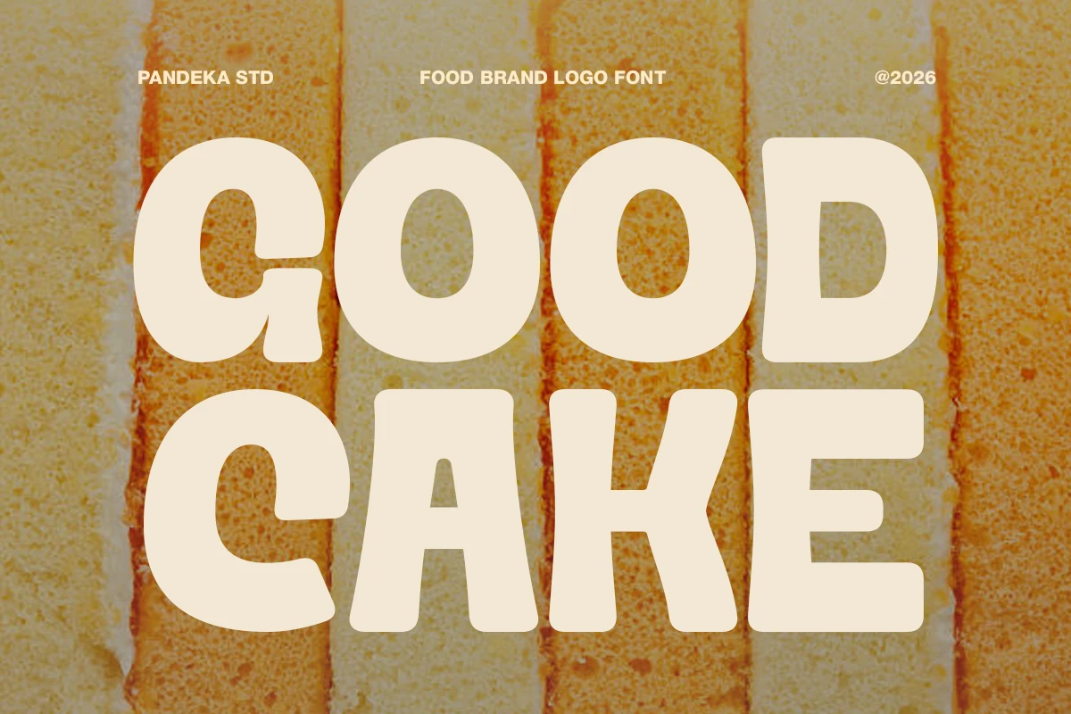
Best For: logos, packaging, restaurant menus, stickers
Good Cake Font has chunky, rounded letterforms with soft corners and a slightly handmade rhythm that makes the words feel warm and instantly approachable. It’s a lively take on Sans Serif Logo Fonts, with broad shapes and low contrast that give bakery and snack branding a sweet retro punch without losing readability.
Because the forms are so full and playful, it works best in short names, package fronts, and menu headings where the font can carry the personality on its own. Keep the supporting text simpler and a bit tighter so the main wordmark stays light on its feet rather than overly heavy.
Tremor Font
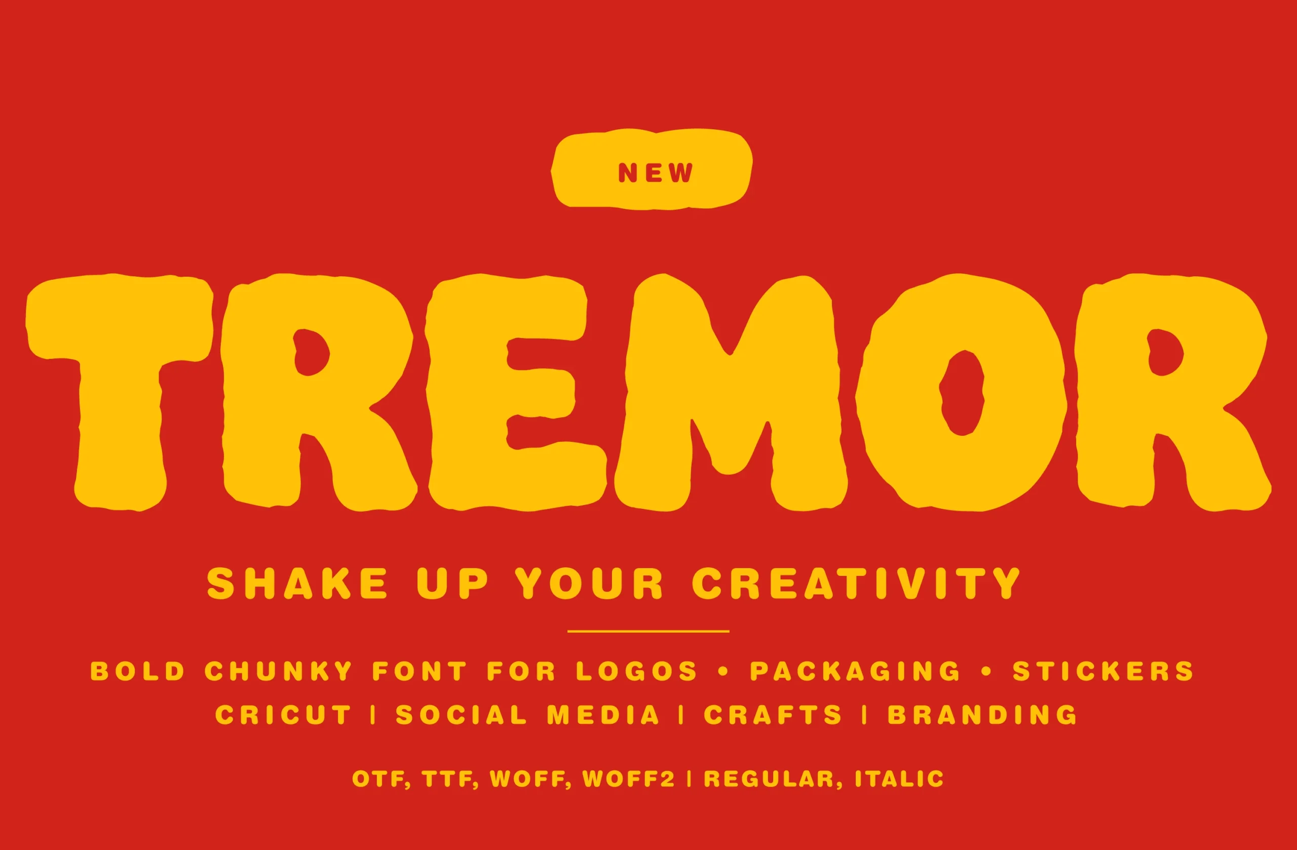
Best For: logos, packaging, stickers, bold designs
Tremor Font is a chunky display face with hand-shaped edges, soft organic curves, and a deliberately uneven rhythm. The rounded terminals and swollen letterforms make each word feel loud and physical, closer to sticker art or retro snack packaging than a polished corporate mark.
For Sans Serif Logo Fonts, this is the option to use when the logo needs instant personality rather than restraint. Keep it large, use strong color contrast, and avoid long phrases; the heavy shapes work best when the composition lets the playful irregular edges stay clear.
Chock Tagmed Font
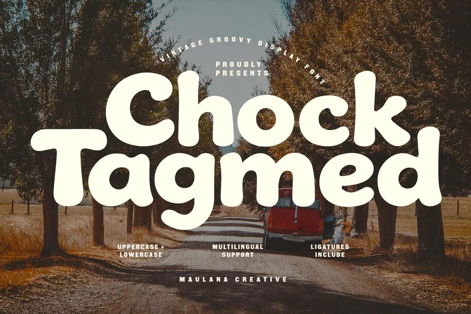
Best For: logos, packaging, posters, retro designs
Chock Tagmed Font has a full, rounded build with soft corners and a cheerful 70s groove. The thick strokes and bouncy curves make each word feel warm and slightly handmade, while the generous counters stop the heavy shapes from becoming muddy at display size.
If you want Sans Serif Logo Fonts with a friendlier retro voice, this one works especially well for short names and bold packaging panels. The included ligatures can help the lettering lock together more smoothly, and a simple layout lets the chunky rhythm carry the personality without visual clutter.
Conclusion
Choose bold geometric fonts when the logo needs clear strength, condensed styles when space is tight, minimal and editorial fonts for refined branding, and playful retro fonts when personality matters more than restraint.