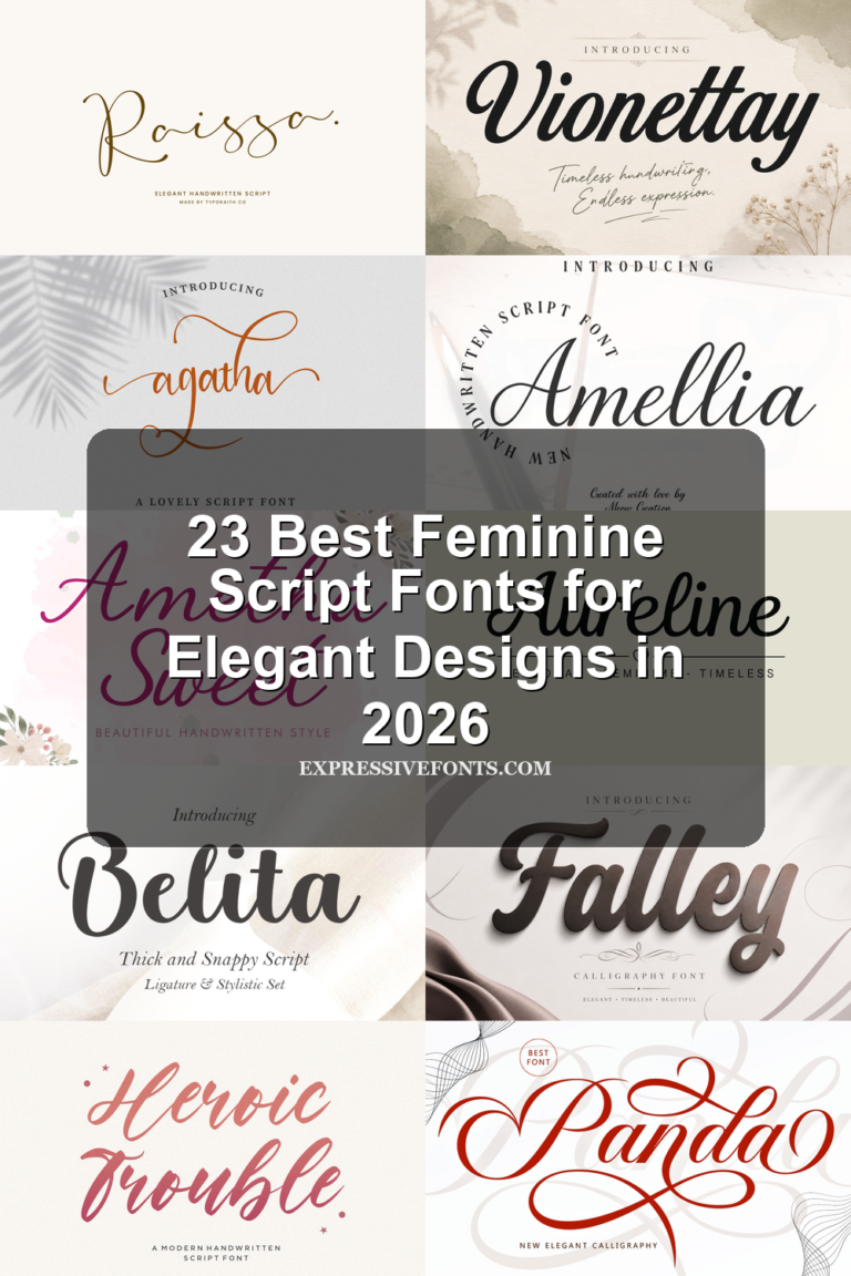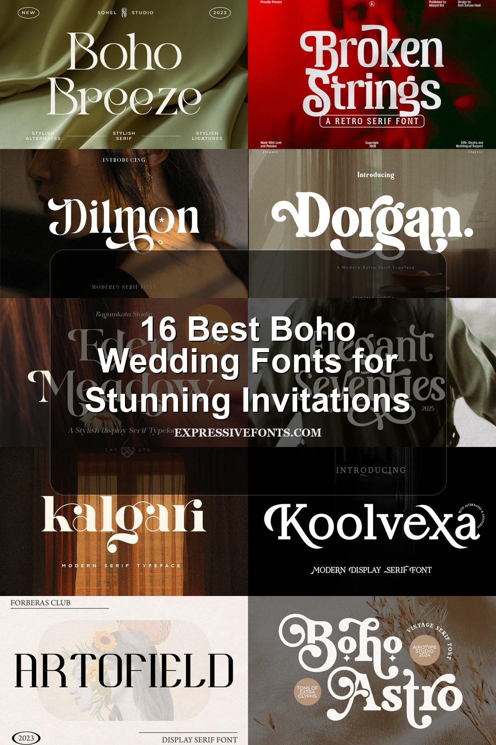
16 Best Boho Wedding Fonts for Stunning Invitations
Boho Wedding Fonts are useful for couples, stationery designers, and brand owners who want wedding typography with natural warmth, soft elegance, or vintage character. This collection focuses on display serifs with graceful swashes, retro curves, and editorial contrast for invitations, logos, signage, packaging, and romantic event branding.
Looking for more wedding fonts? Browse our complete Wedding Fonts collection to compare elegant, romantic, modern, vintage, boho, script, and calligraphy styles.
Elegant & Airy Boho Wedding Fonts
These refined boho wedding fonts use slim serifs, graceful contrast, and light decorative movement for invitations, names, stationery, and romantic brand marks.
Boho Breeze Font
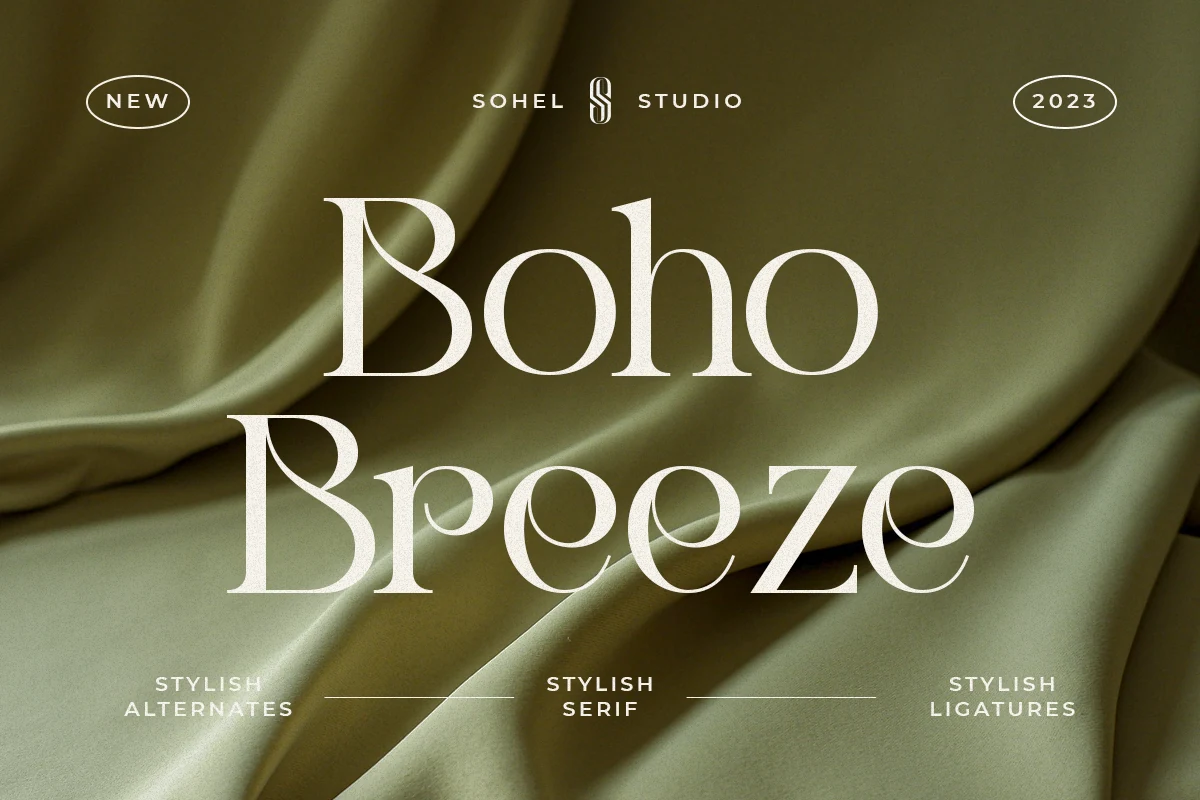
Best For: wedding designs, invitations, elegant designs, branding
Boho Breeze Font has a polished serif structure with tall capitals, fine hairlines, and rounded bowls that feel smooth without becoming soft. The dramatic curves in the B and the narrow internal spaces give it a boutique editorial tone, placing it on the refined side of Boho Wedding Fonts.
Its unique alternatives are useful when a title needs one distinctive letterform rather than constant decoration. Keep the tracking measured and let the contrast do the work; the perfect kerning helps short names, invitation headings, and brand marks sit cleanly, while multilingual support makes it more practical for cross-language wedding stationery.
Artofield Font
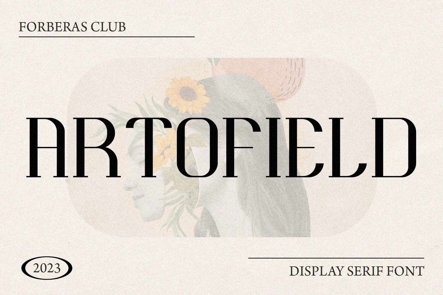
Best For: invitations, wedding designs, branding, editorial designs
Artofield Font leans into a tall display serif style with narrow proportions, crisp contrast, and fine horizontal crossbars that keep the wordmark airy despite its scale. The long vertical rhythm gives it a poised, gallery-like feel, making it a refined choice for Boho Wedding Fonts.
It works best in names, cover lines, and invitation titles where the height of the letters can create a clean hierarchy. Give it generous margins and lighter supporting text, since the elongated forms and close spacing look strongest when the composition has room to breathe.
Veloria Grace Font
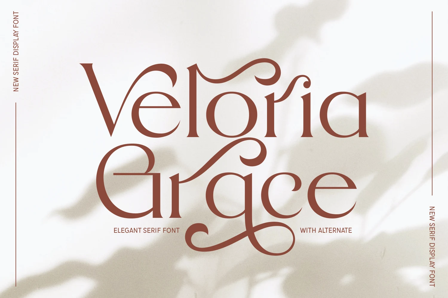
Best For: invitations, wedding designs, elegant designs, branding
Veloria Grace Font is an elegant display serif with slim stems, open counters, and sweeping decorative strokes that curl through the word without turning it into a script. The long horizontal movement and soft contrast make it a graceful match for Boho Wedding Fonts, especially where the typography needs to feel airy rather than rustic.
Use it for names, invitation headers, and refined brand marks where one or two words can carry the ornament. The swashes need clear margins, so keep supporting text smaller and simpler, and avoid tight line stacking that would interrupt the font’s flowing upper and lower curves.
Harlynia Font
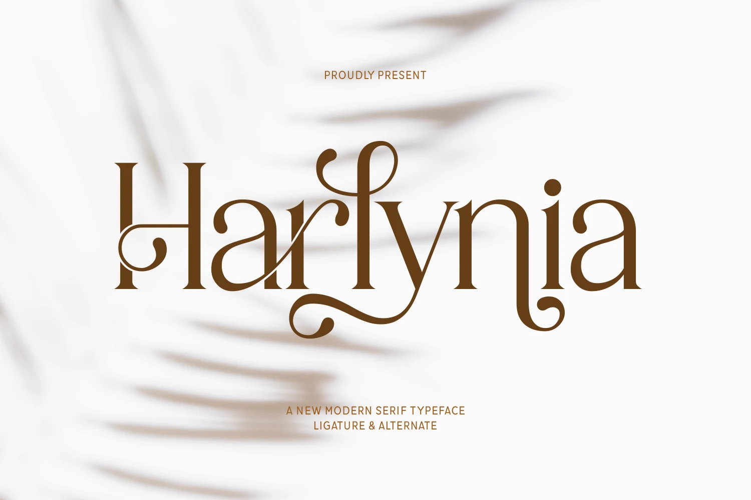
Best For: invitations, wedding designs, branding, elegant designs
Harlynia Font has a graceful modern serif structure with slim stems, smooth contrast, and long looping swashes that weave through the word without overwhelming it. The ornamental H and sweeping y give it a refined bohemian mood, so it fits naturally into Boho Wedding Fonts with a softer, more polished edge.
This kind of display serif works best in short names, invitation titles, and brand signatures where the flourishes can stay visible. Leave generous side margins and keep supporting text simpler; the extended curves create movement on their own, so a clean hierarchy helps the details feel intentional instead of crowded.
Serene Bliss Font
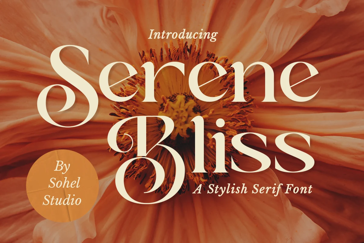
Best For: wedding designs, invitations, editorial designs, logos
Serene Bliss Font has a high-contrast serif voice with swollen curves, knife-thin joins, and dramatic curled terminals. The oversized S and B give it a 1970s editorial rhythm, while the open counters keep the display letters from turning heavy.
Use it where Boho Wedding Fonts need more structure than loose script. It works best in short names, monograms, and title lines; keep tracking fairly tight, pair it with small restrained text, and let the thick-thin contrast carry the hierarchy.
Modern & Editorial Boho Wedding Fonts
These sharper boho wedding fonts combine display-serif structure, crisp curves, and fashion-led contrast for stylish invitations, logos, packaging, and editorial layouts.
Kalgari Font
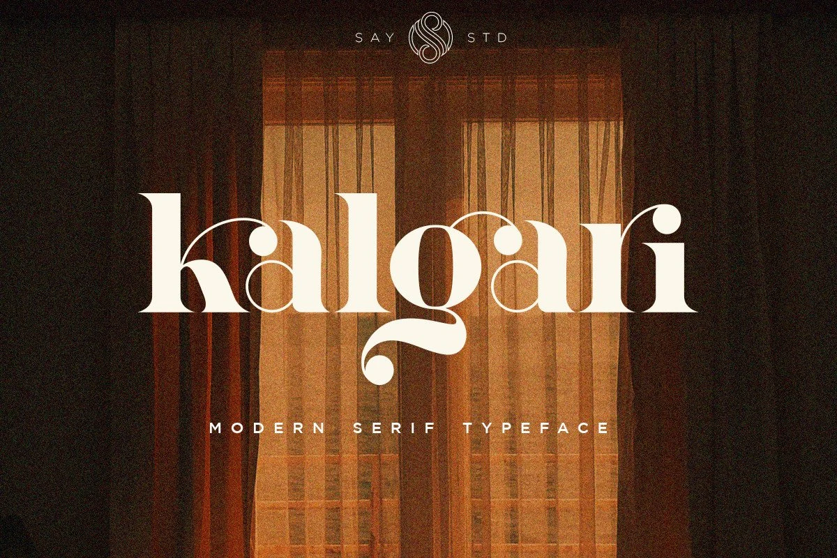
Best For: branding, editorial designs, invitations, wedding designs
Kalgari Font has a strong display presence built around crisp contrast, broad curves, and sculpted serif details. The rounded counters and the dramatic curled descender on the g give it a slightly free-spirited edge, so it fits naturally into Boho Wedding Fonts while still feeling polished enough for editorial styling.
It works best when you let one line carry the personality, whether in a logo, invitation title, or magazine-style heading. The generous shapes keep short text readable at larger sizes, and its mix of softness and structure helps branding and packaging feel styled rather than overly ornate.
Koolvexa Font
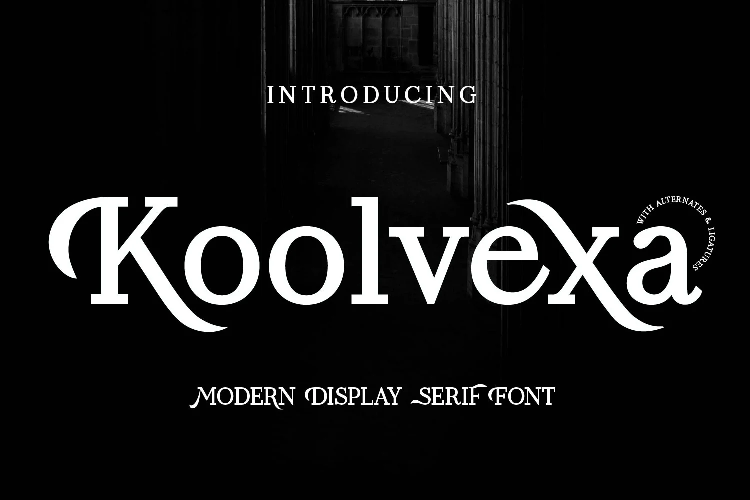
Best For: branding, logos, editorial designs, wedding designs
Koolvexa Font pushes a modern serif into display territory with high contrast, heavy verticals, and blade-like curves that give the word shape real tension. The sweeping entry stroke on the K and the extended forms around the x keep it distinctive, making it a sharper option within Boho Wedding Fonts.
Use it where one headline has to carry the hierarchy: logo marks, invitation names, packaging titles, or editorial-style overlays. The font’s embedded letters are accessible in programs such as Photoshop and Illustrator, which helps when refining a title lockup without breaking the polished serif rhythm.
Eden Meadow Font
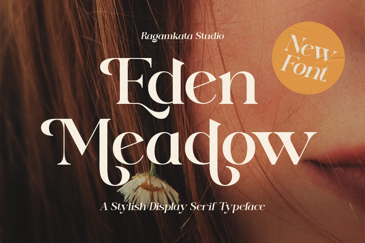
Best For: invitations, wedding designs, editorial designs, branding
Eden Meadow Font is a stylish display serif with sharp contrast, broad curves, and decorative terminals that sweep without becoming overly delicate. The oversized M and curled E details give it a free-spirited editorial tone, which suits Boho Wedding Fonts where the typography needs character instead of softness alone.
Use it for invitation names, fashion-led branding, and magazine-style titles where a few words can sit large and centered. Its high-contrast strokes need enough scale to stay clean, while measured spacing keeps the dramatic curves from tangling with nearby text or imagery.
Dilmon Font
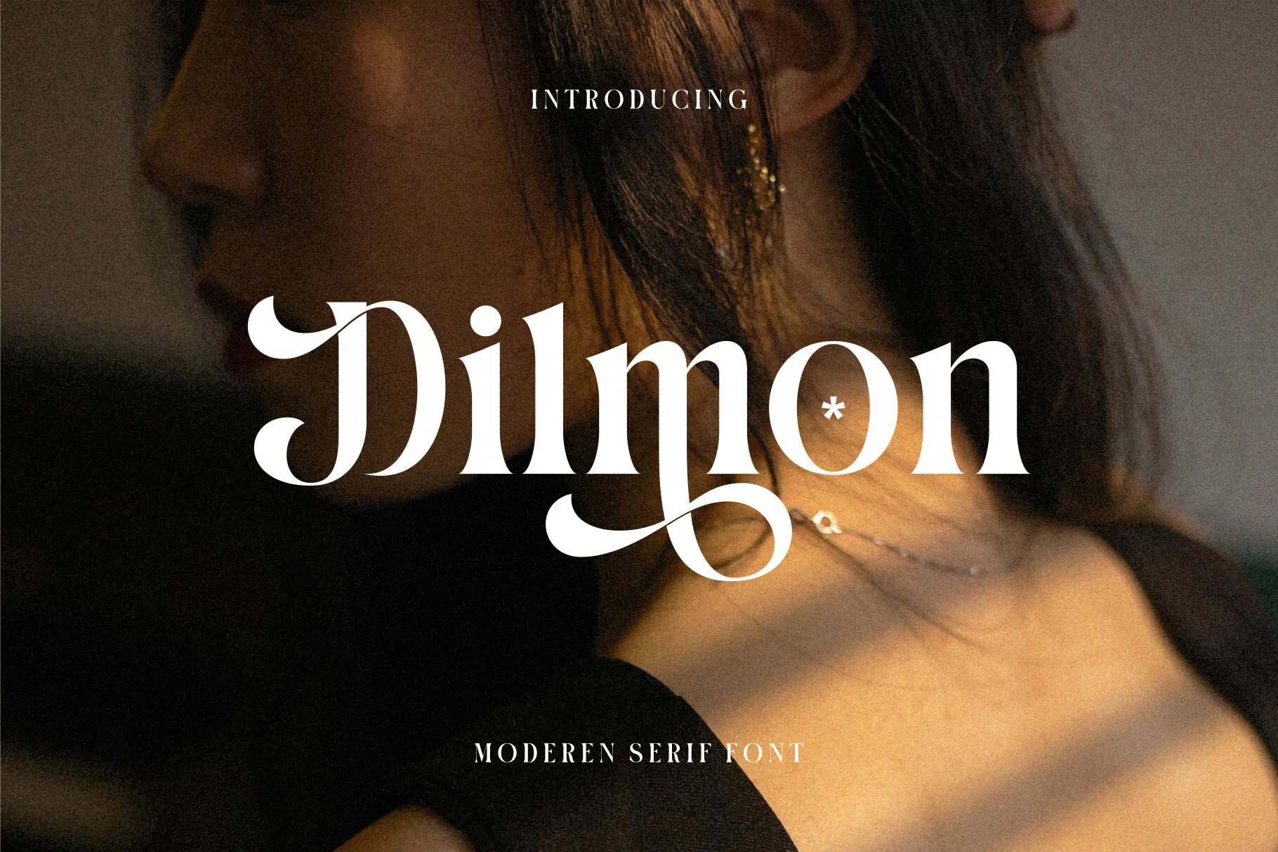
Best For: logos, editorial designs, posters, branding
Dilmon Font mixes retro serif structure with crisp contrast and expressive curls, especially in the sweeping D and the long descending stroke through the middle of the word. Those dramatic details give it a fashion-led presence, making it a striking option within Boho Wedding Fonts when you want something bolder than a quiet classic serif.
The funky ligatures and whimsical swashes work best in short titles, logos, and cover-style layouts where the letterforms can stay fully visible. Let it lead the hierarchy and keep nearby text restrained; extra breathing room below the line helps the deep curves and looping strokes read cleanly instead of tangling.
Retro & Groovy Boho Wedding Fonts
These warm boho wedding fonts lean into rounded serifs, curled terminals, and vintage movement for posters, signage, playful invitations, and nostalgic branding.
Broken Strings Font
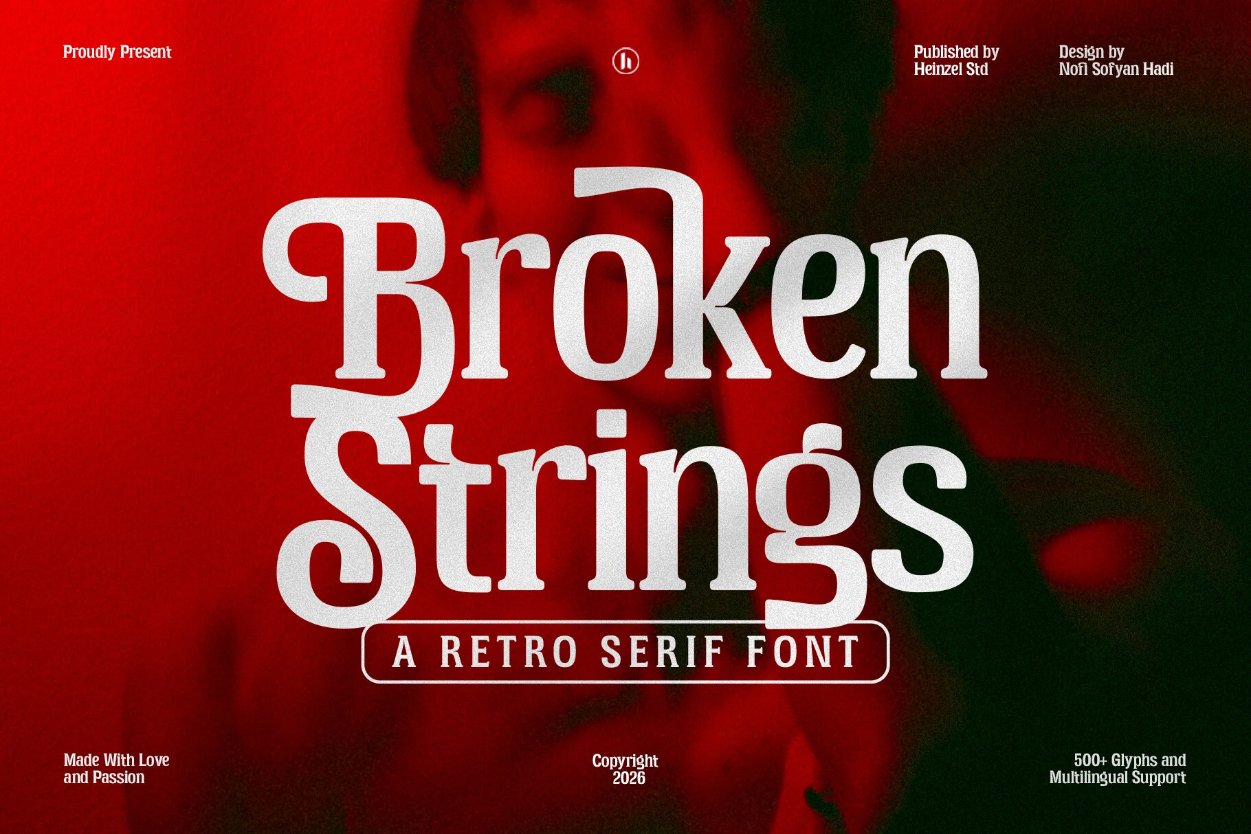
Best For: branding, logos, headlines, retro designs
Broken Strings Font has a bold retro serif look with weighty stems, rounded corners, and exaggerated curves that give each word a poster-like presence. The oversized capitals and chunky S forms bring real nostalgic charm, but the proportions stay controlled enough to make it an unexpected fit for Boho Wedding Fonts with a stronger, moodier edge.
This is a display face that works best when the text stays short and confident. Use it for logos, covers, or statement headings, and keep supporting copy quieter so the expressive character shapes can lead; a little extra space around the line helps the dense forms read cleanly instead of feeling cramped.
Boho Astro Font
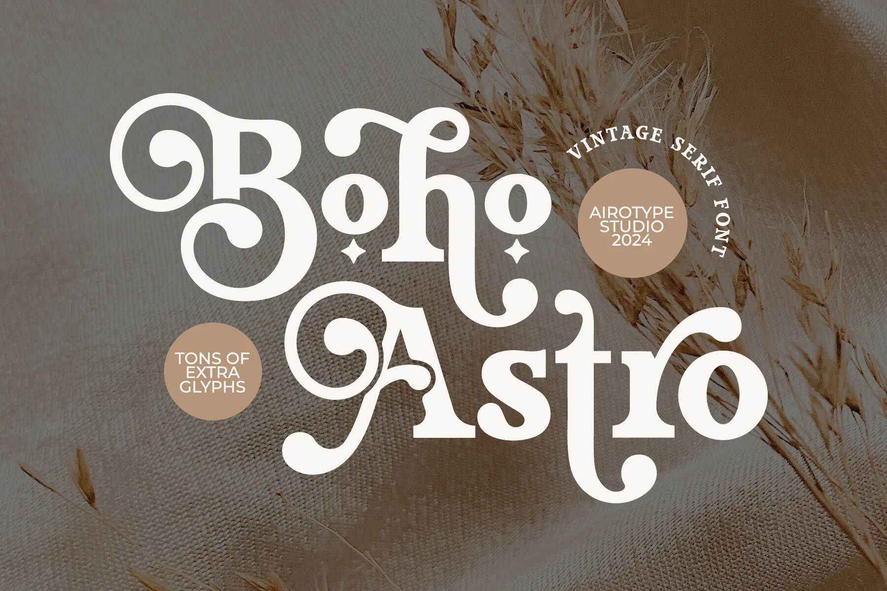
Best For: invitations, wedding designs, vintage designs, branding
Boho Astro Font blends a bold serif skeleton with playful vintage detailing. The rounded bowls, chunky stems, and curled terminals on letters like B, h, and t create a decorative rhythm that feels expressive rather than fussy, making it a characterful choice for Boho Wedding Fonts.
It works best when you let the letterforms do most of the styling in short titles, invitation names, or statement branding. Because the strokes are heavy and the flourished ends take visual space, pair it with simpler supporting text and leave comfortable margins so the ornate shapes stay crisp instead of crowded.
Sunny Paradise Font
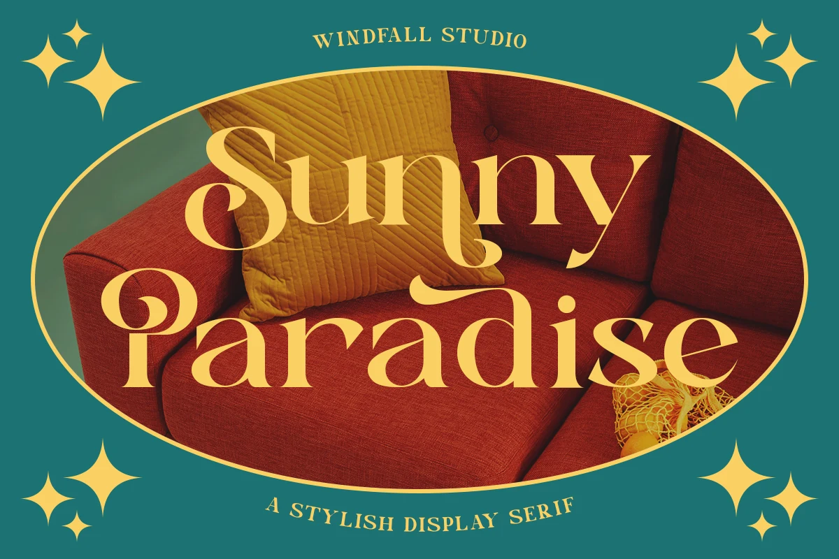
Best For: branding, headlines, posters, retro designs
Sunny Paradise Font has a retro display serif look with broad curves, tapered stems, and lively swashes that give each word a sun-soaked rhythm. The curled terminals and stretched letter shapes lean more playful than formal, making it a bolder, more expressive take on Boho Wedding Fonts.
It works best in short, high-impact titles where the sculpted forms can stay open and readable. Use it large for posters, branding, or statement headings, and keep the tracking slightly relaxed so the sweeping descenders and rounded bowls do not crowd each other.
Palm Shine Font
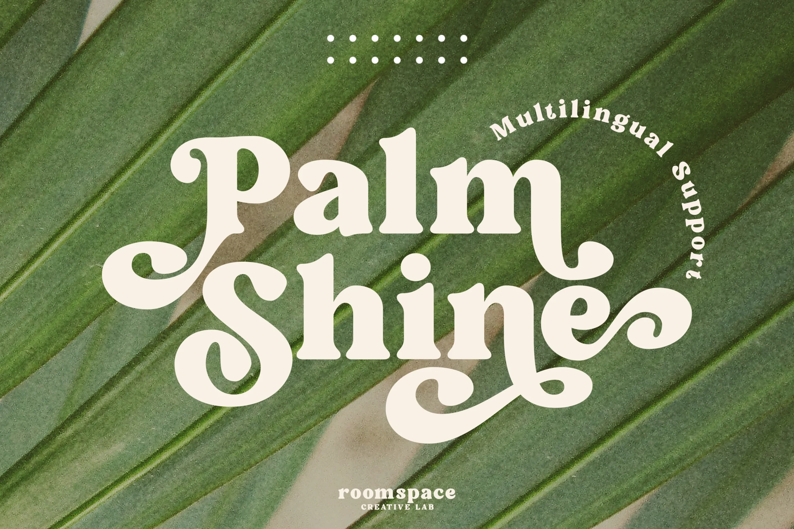
Best For: logos, branding, retro designs, wedding designs
Palm Shine Font leans into a retro serif mood with thick strokes, rounded counters, and oversized spiral terminals that give the letters a groovy, hand-shaped rhythm. That playful structure makes it a distinctive pick for Boho Wedding Fonts when you want something warmer and more expressive than a polished editorial serif.
The swashes on the P, S, and e need room to breathe, so it works best in short names, logos, and statement headings rather than dense copy. Try slightly looser spacing and a simple secondary font nearby to keep the decorative curves clear while preserving the font’s vintage, timeless feel.
Dorgan Font
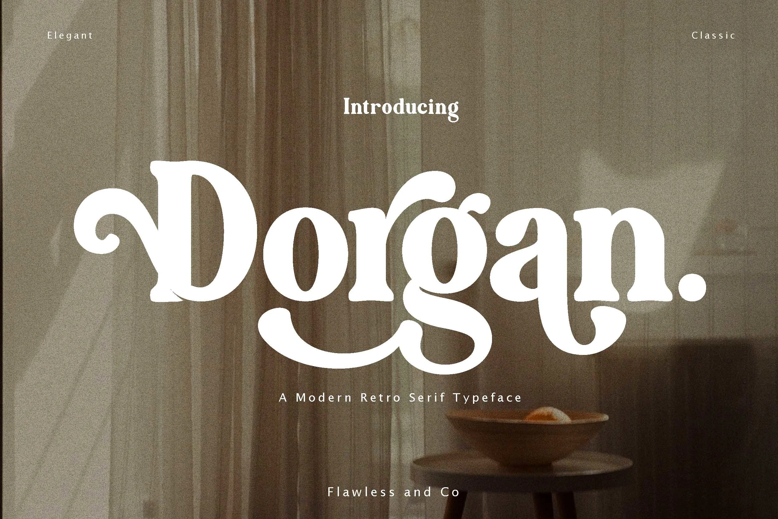
Best For: posters, branding, logos, wedding designs
Dorgan Font has a bold retro serif look with rounded terminals, thick strokes, and a broad, friendly rhythm that feels lively rather than stiff. The oversized swash on the g gives it a playful anchor, making it a strong option for Boho Wedding Fonts when you want a statement piece with vintage warmth.
It works best in short titles, logos, and poster-style compositions where the chunky shapes can stay open and confident. Try alternate characters when a heading needs a more custom silhouette, and keep the surrounding copy simpler so the decorative curves hold the visual hierarchy without overcrowding the layout.
Elegant Seventies Font
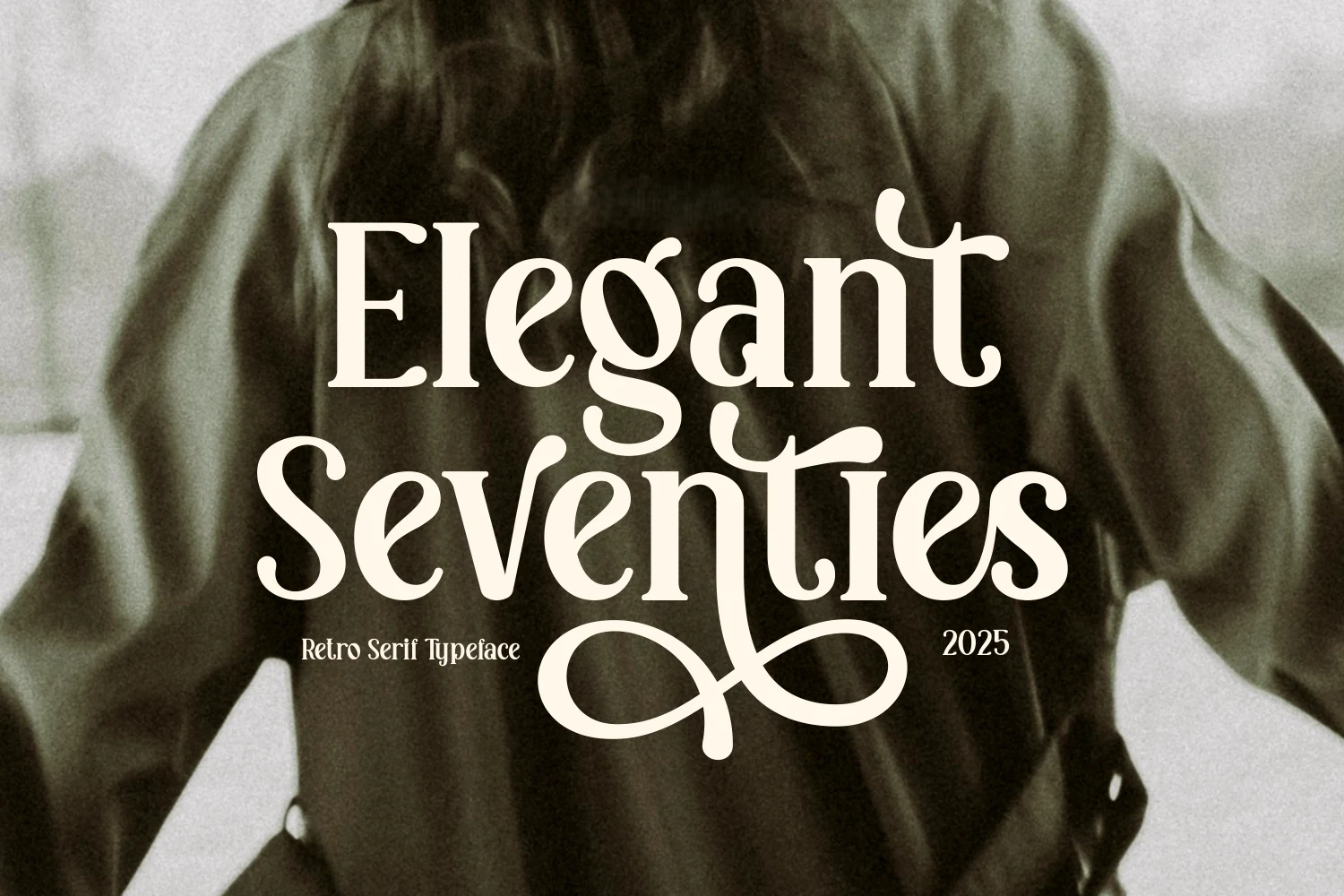
Best For: logos, editorial designs, posters, branding
Elegant Seventies Font brings a true retro serif mood with high-contrast strokes, soft rounded joins, and oversized swashes that turn each word into a focal point. The looping terminals and playful rhythm feel expressive without losing structure, which makes it a striking choice for Boho Wedding Fonts with a more fashion-led, nostalgic edge.
Its funky ligatures and whimsical swashes work best in short titles, logos, and cover-style layouts where the letterforms have room to show. Let it sit large in the hierarchy and keep extra space below the line, since the long descenders and decorative curls can crowd nearby text if the composition is too tight.
Mango California Font
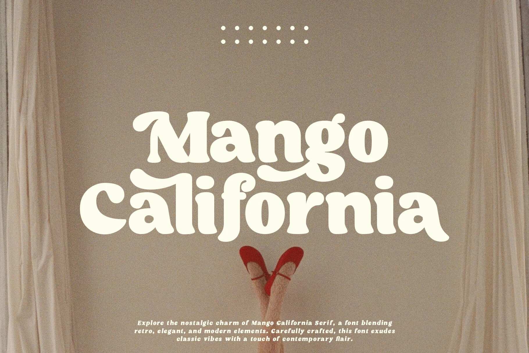
Best For: logos, branding, retro designs, wedding designs
Mango California Font has a soft retro serif voice, with chunky curves, rounded terminals, and slightly inflated letterforms that feel playful without losing structure. The curled entry and exit strokes give the words a laid-back rhythm, making it an easy fit for Boho Wedding Fonts when a design needs warmth rather than a formal editorial finish.
It works especially well in short names, signage, and logo-style titles where the broad shapes can stay clear and charming. Keep supporting text simpler and give the line a little space, since the compact weight and decorative joins already create plenty of personality on invitations, labels, or custom DIY pieces.
Conclusion
Choose elegant and airy boho wedding fonts for polished invitations, modern editorial serifs for sharper brand-led layouts, and retro groovy styles when the design needs warmer vintage character. Use the most decorative options in short headings so swashes and curled details stay readable.