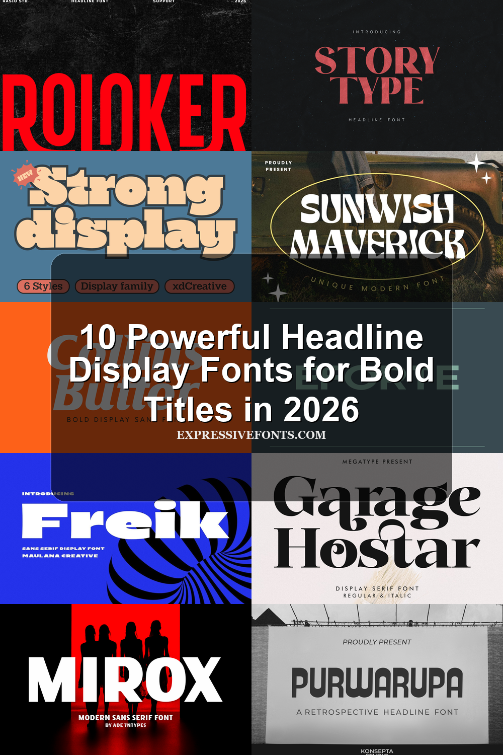
10 Powerful Headline Display Fonts for Bold Titles in 2026
Headline Display Fonts are built for titles that need to be seen first, from poster layouts and magazine covers to logos, packaging, web headers, and social media graphics. This collection groups 10 bold, condensed, retro, and editorial styles so you can choose a headline font by mood, scale, and use case.
Looking for more display fonts? Browse our complete Display Fonts collection to compare bold, retro, playful, poster, groovy, creative, vintage, cartoon, headline, and decorative display styles.
Browse by Category
- Bold Sans Headline Display Fonts
- Condensed & Retro Headline Display Fonts
- Editorial Serif Headline Display Fonts
Bold Sans Headline Display Fonts
These bold sans headline display fonts use heavy weight, wide shapes, and clean geometry for logos, posters, packaging, web headers, and brand titles that need instant impact.
Collins Butter Font
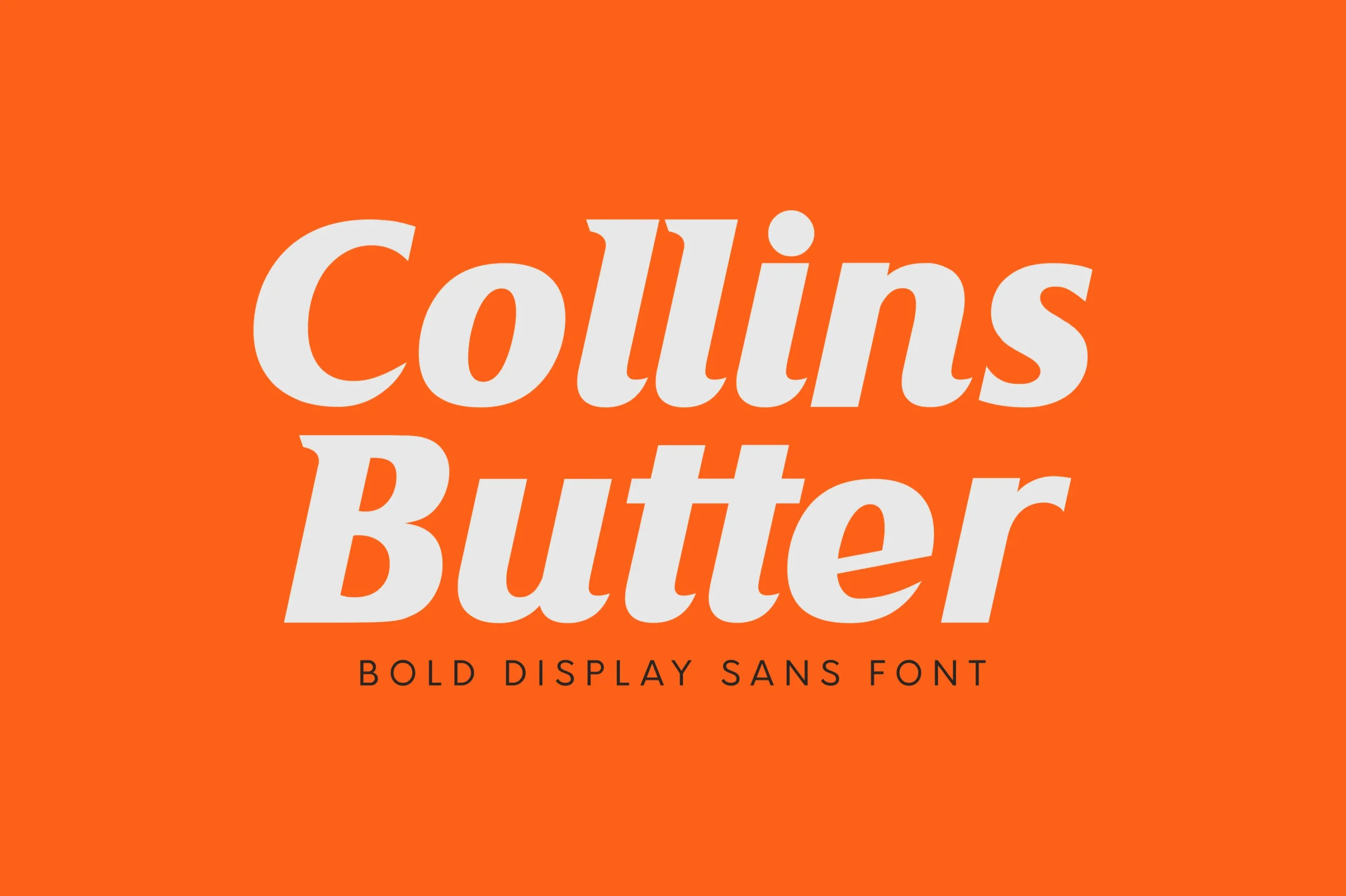
Best For: headlines, logos, branding, packaging
Collins Butter Font has a heavy italic stance with rounded bowls, broad shoulders, and softly flared terminals that make each word feel dense without turning stiff. Its slanted rhythm and tight, buttery curves give it the force needed for Headline Display Fonts, especially when a title has to carry the page before any supporting copy appears.
The solid and hollow styles give designers two hierarchy levels from the same voice: use the filled cut for the main brand word, then bring in the outline style for secondary packaging panels or poster callouts. Keep tracking moderate rather than loose, because the weight works best when the letters hold together as one block.
Eforte Font
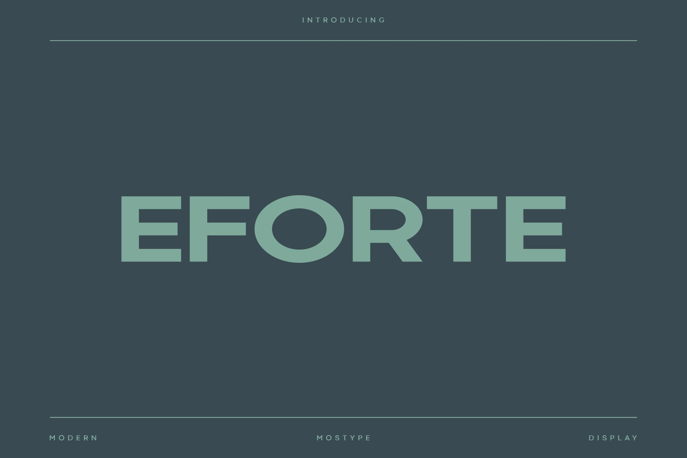
Best For: logos, branding, headlines, modern designs
Eforte Font has a broad geometric sans serif build, with squared terminals, heavy horizontal bars, and a clean circular rhythm in the round letters. Its all-caps preview feels corporate and controlled rather than decorative, giving Headline Display Fonts a sharper, more engineered option for brand-led layouts.
The wide proportions make it strongest when the title has room across the line. Keep spacing measured rather than tight, and use strong contrast against the background so the heavy strokes stay clean on logos, posters, screen graphics, and product branding.
Freik Font
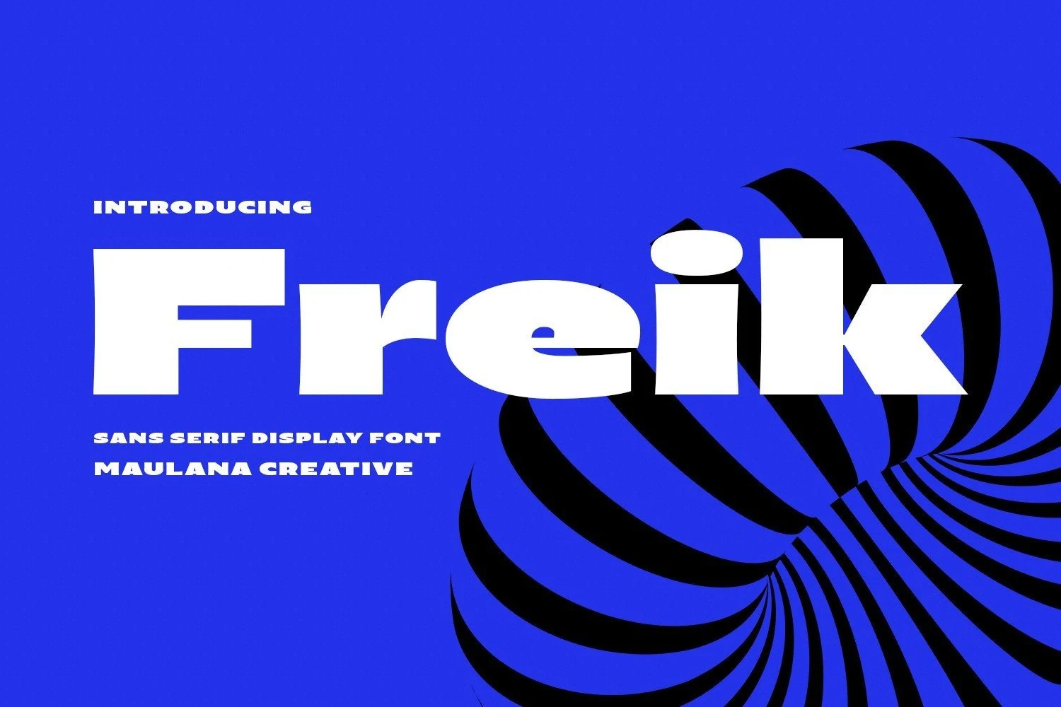
Best For: headlines, logos, display text, bold designs
Freik Font is built around wide, heavy sans serif letters with blunt horizontal force and sharp cut edges. The flattened proportions make each word feel loud and architectural, while the small counters keep the rhythm compact enough for dense title settings.
For Headline Display Fonts that need immediate impact, Freik works best with tight title hierarchy and strong color contrast. Its ligatures and alternates give designers room to break repetition in logos or short covers without weakening the solid block structure.
Mirox Font
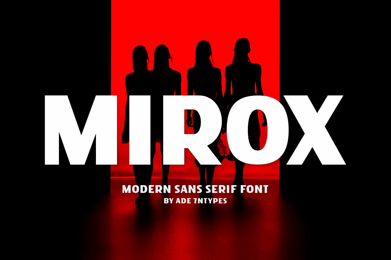
Best For: headlines, posters, display text, bold designs
Mirox Font uses a blunt modern sans structure with oversized capitals, dense spacing, and heavy vertical mass. The rounded O softens the blocky rhythm slightly, while the sharply cut X gives the wordmark a more cinematic, high-pressure finish.
Within Headline Display Fonts, Mirox is strongest when the title needs to dominate the layout with minimal decoration. Keep supporting text smaller and tightly aligned, because the wide strokes and compact counters already create enough contrast for posters, covers, and visual headers.
Condensed & Retro Headline Display Fonts
These condensed and retro headline display fonts create taller, louder, and more nostalgic title blocks for posters, signage, music graphics, and vintage-inspired branding.
Roloker Font
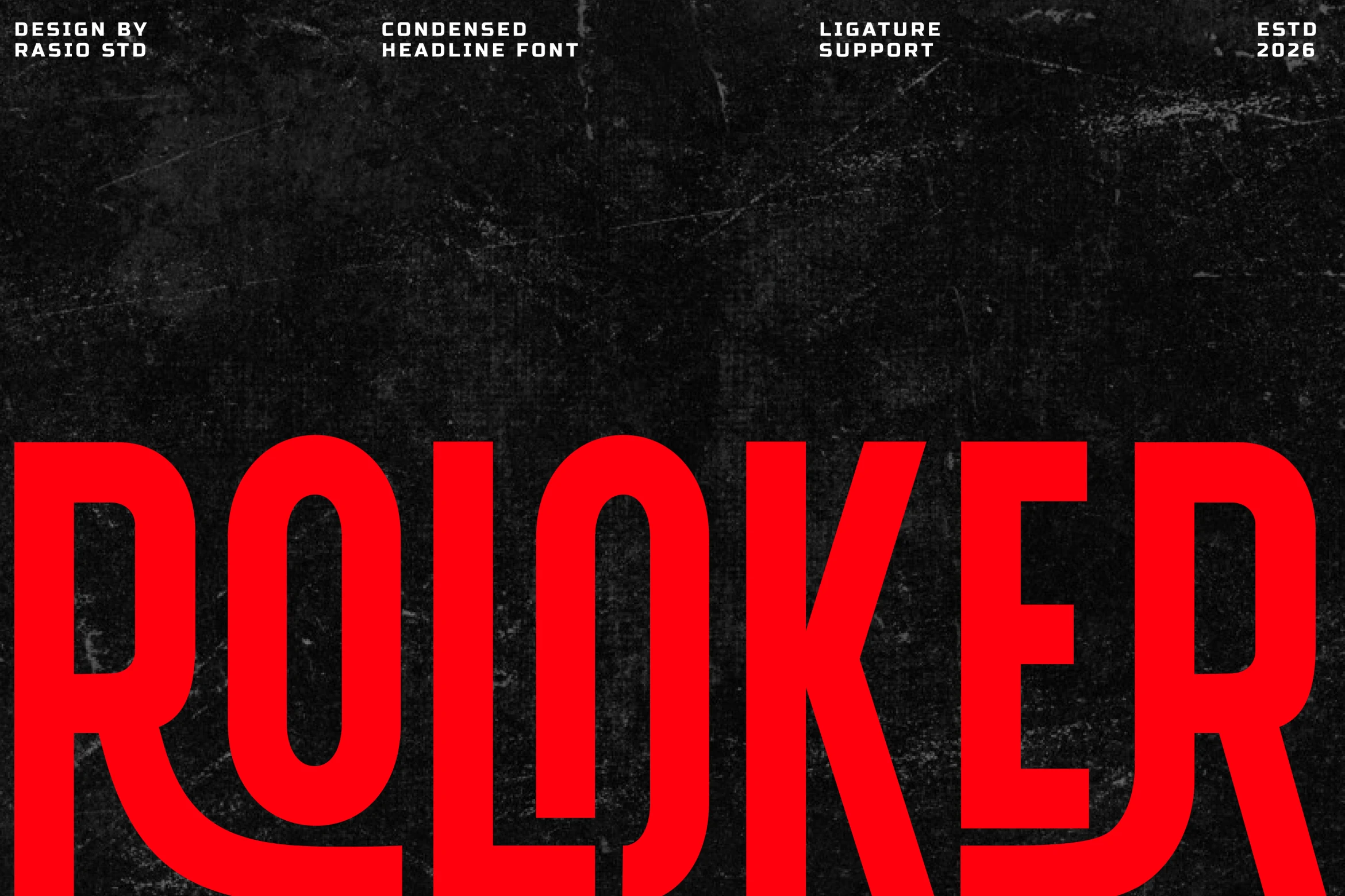
Best For: posters, headlines, website headers, bold designs
Roloker Font pushes condensation to the limit with towering capitals, narrow set widths, and heavy geometric strokes that stay clean and forceful. The rounded inner counters balance the hard verticals, giving big words a disciplined, industrial presence instead of a messy compressed look.
For Headline Display Fonts, Roloker works best when you let its vertical economy do the work in short lines, stacked titles, and tight poster layouts. Pair it with a wider secondary face so the main heading keeps all the pressure while the supporting text restores breathing room.
Purwarupa Font
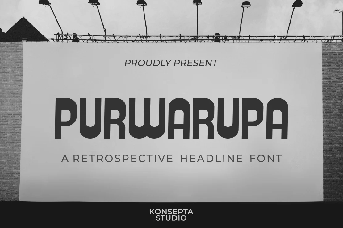
Best For: headlines, signage, posters, retro designs
Purwarupa Font has a retrospective headline style with tall, rounded sans serif forms and a steady geometric rhythm. The squared stems keep the letters firm, while the deep U-shaped curves give the wordmark a softened retro character without turning it decorative.
Use it where Headline Display Fonts need a clean vintage mood rather than heavy ornament. Its broad letter shapes hold well on billboard-style layouts, but the supporting type should use wider tracking or lighter weight so the main title remains the visual anchor.
Sunwish Maverick Font
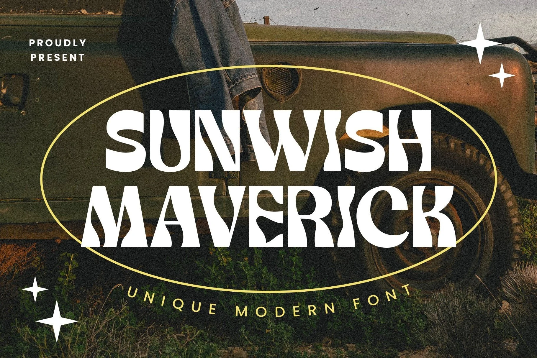
Best For: headlines, posters, vintage designs, expressive designs
Sunwish Maverick Font has a distinctly psychedelic build, with swelling verticals, pinched joins, and thick-thin curves that make each letter feel elastic. The sharp inner cuts and sculpted counters keep the retro mood lively rather than soft, giving words a bold, poster-ready silhouette.
If you want Headline Display Fonts with real personality, this one works best in short phrases where its unusual rhythm can stay readable. Leave a bit of breathing room around the title and keep supporting text simple, so the decorative shapes carry the vintage energy without competing for attention.
Editorial Serif Headline Display Fonts
These serif headline display fonts bring contrast, texture, and magazine-style authority to covers, editorial layouts, luxury graphics, and refined brand systems.
Strong Display Font
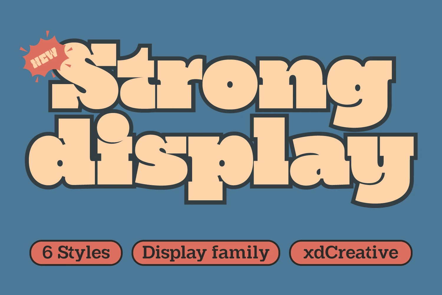
Best For: headlines, posters, signage, bold designs
Strong Display Font turns slab serif influence into a chunky, high-impact display style with thick strokes, soft corners, and broad counters. The letters feel weighty without becoming stiff, and the dark outline in the preview shows how well the shapes hold together when you want a bold, layered headline.
If you want Headline Display Fonts with a more approachable punch, this one works especially well in short titles where its wide curves and blocky rhythm can stay clear. Give it enough scale and slightly looser line spacing, and the heavy forms keep their character instead of crowding each other.
Garage Hostar Font
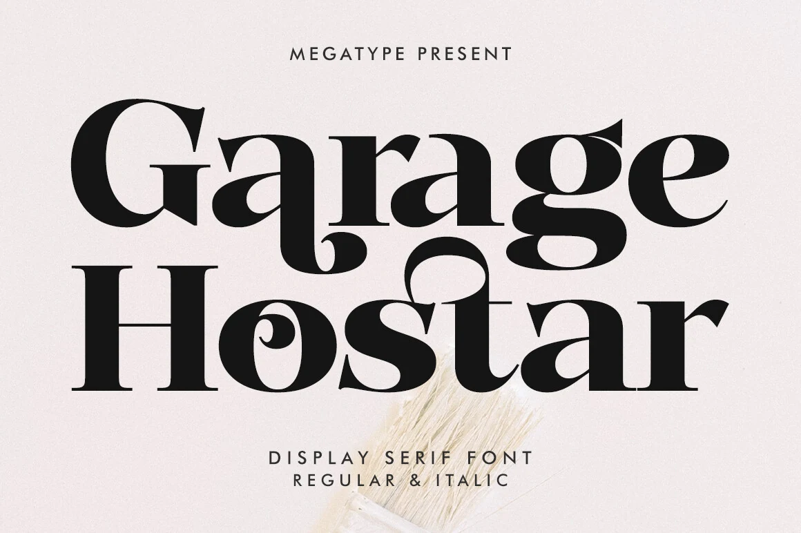
Best For: headlines, editorial designs, magazine covers, luxury designs
Garage Hostar Font leans into Didone drama with crisp vertical stress, sharp thick-to-thin contrast, and oversized curves that feel both polished and mischievous. The teardrop terminals and looping details give the letterforms a theatrical pull, so even a short word carries plenty of visual movement.
When Headline Display Fonts need a more fashion-led attitude, Garage Hostar works beautifully in large titles with generous margins and restrained supporting type. Keep spacing deliberate and let the flourished characters lead the hierarchy, especially in editorial layouts where one expressive line needs to set the tone fast.
Story Type Font
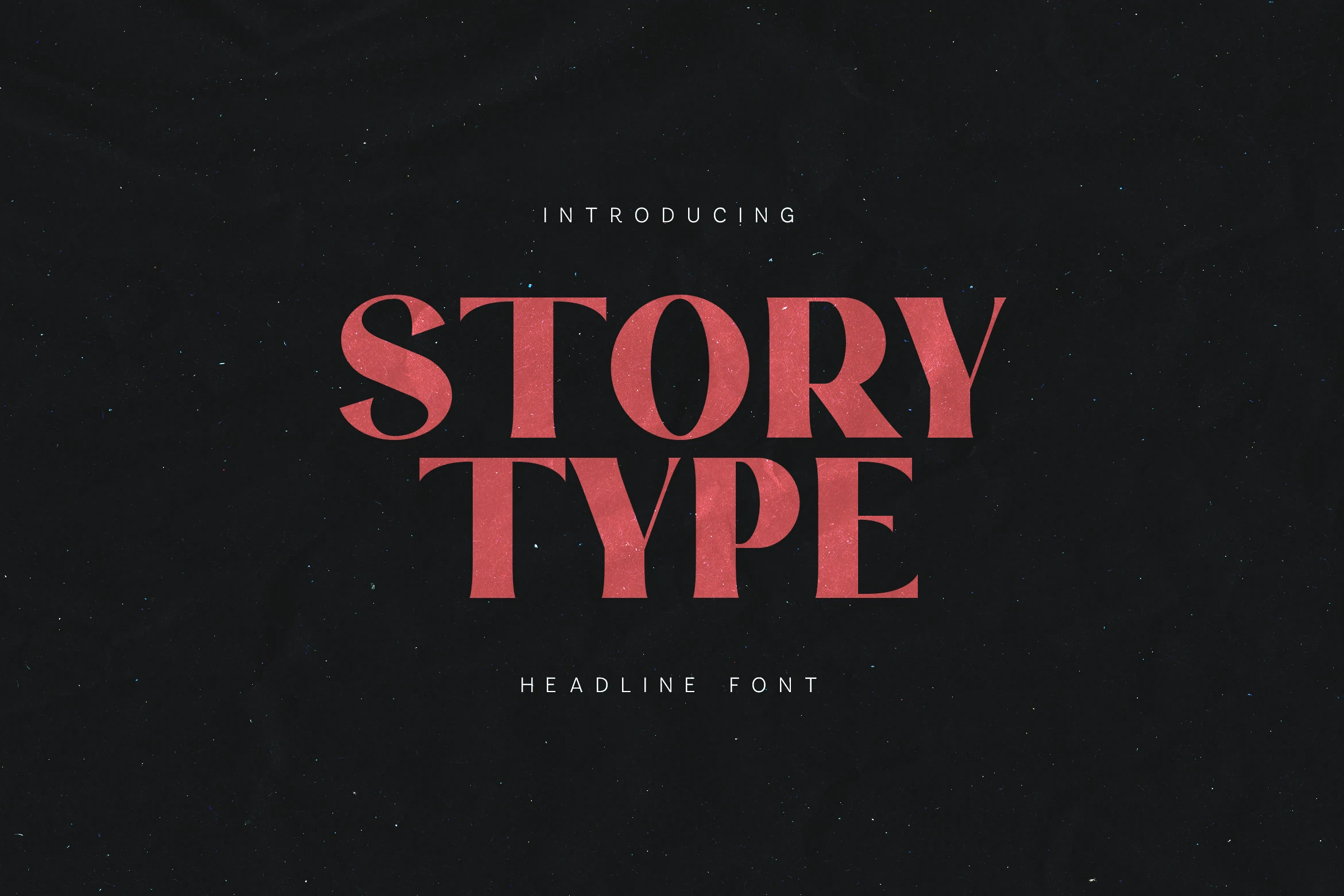
Best For: headlines, editorial designs, book covers, magazine covers
Story Type Font has a sturdy editorial serif build with broad capitals, sharp bracketed serifs, and a controlled thick-to-thin contrast. The slightly textured finish keeps the red headline from feeling too polished, adding a printed, human edge to its otherwise formal structure.
For Headline Display Fonts that need authority without looking cold, Story Type works best in stacked titles, cover lines, and feature headers. Keep the spacing firm rather than airy; its confident proportions are strongest when the words lock together into a compact title block.
Conclusion
Choose bold sans styles for direct impact, condensed or retro fonts for taller poster energy, and editorial serif fonts when the headline needs contrast, authority, or a more refined visual tone.