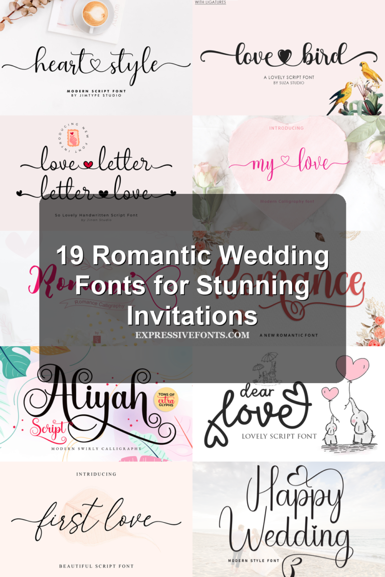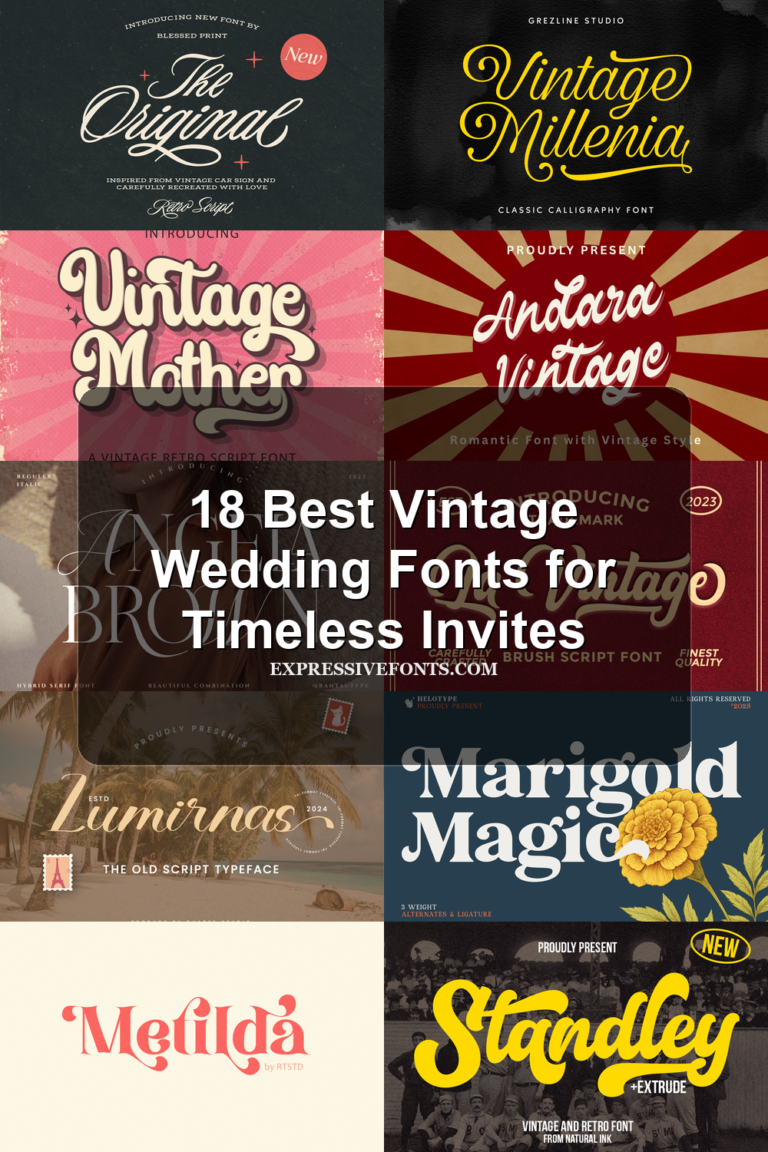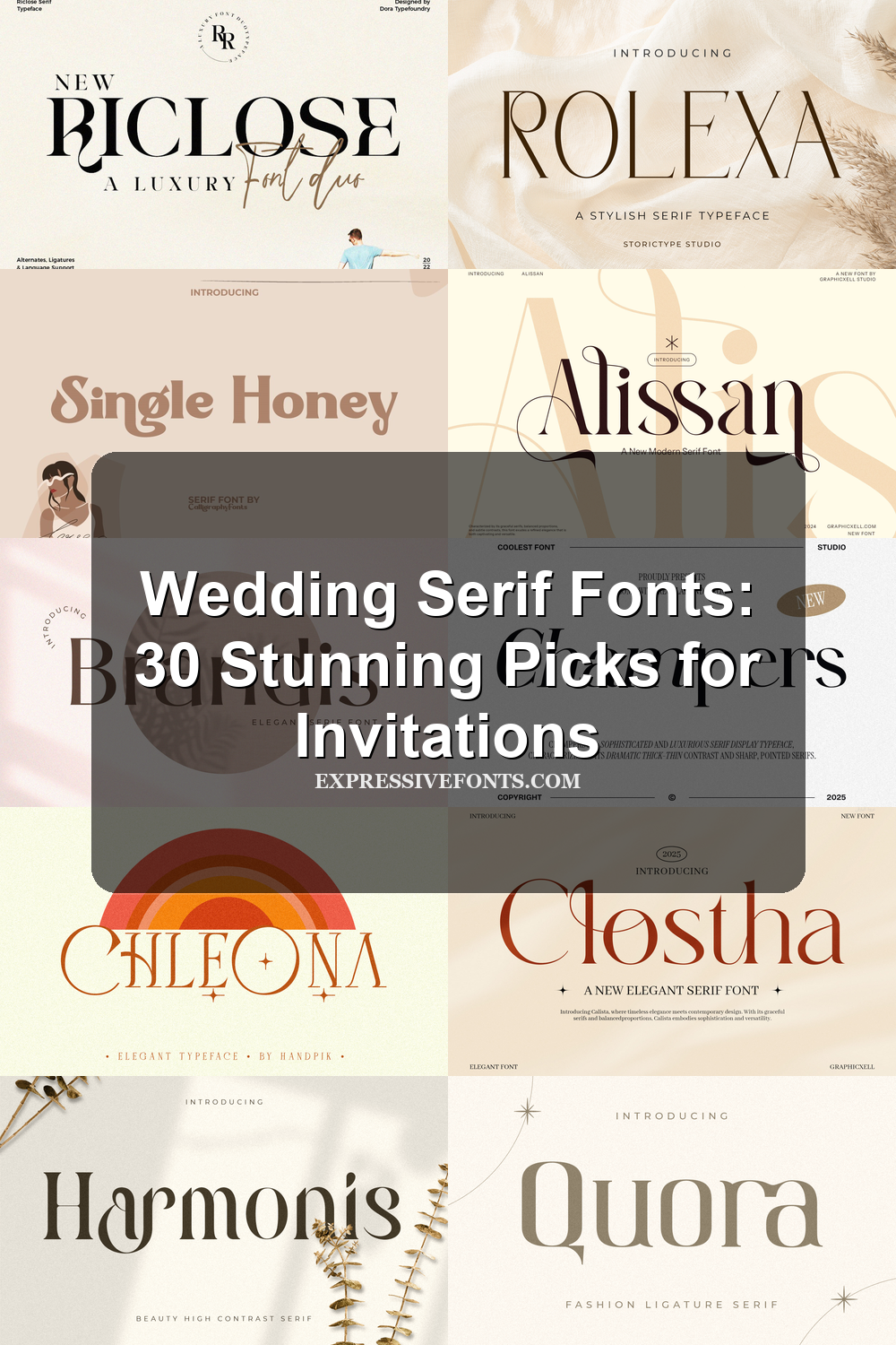
Wedding Serif Fonts: 30 Stunning Picks for Invitations
Wedding Serif Fonts are built for couples, designers, and stationers who need refined type for invitations, logos, menus, place cards, packaging, and bridal branding. This collection focuses on elegant serif styles with editorial contrast, romantic swashes, vintage warmth, and serif-script pairings.
Looking for more wedding fonts? Browse our complete Wedding Fonts collection to compare elegant, romantic, modern, vintage, boho, script, and calligraphy styles.
Editorial & High-Contrast Wedding Serif Fonts
These polished serif fonts use sharp contrast, clean proportions, and editorial structure for elegant invitation headers, logos, and bridal brand systems.
Brandis Font
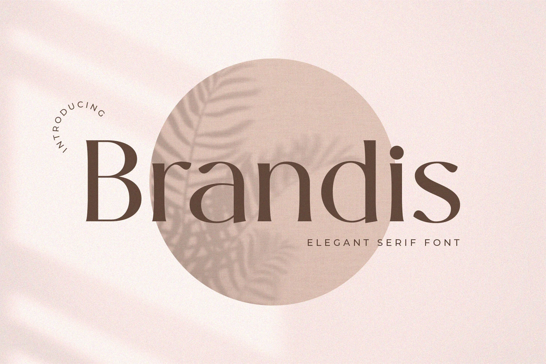
Best For: logos, branding, packaging, wedding designs
Brandis Font has the calm polish of a high-contrast display serif: a tall capital B, tapered curves, and broad vertical strokes that keep the wordmark grounded. The lowercase letters sit with generous spacing and clean proportions, so the style feels refined without becoming fragile.
Use Brandis where Wedding Serif Fonts need a stronger editorial structure than a script. It suits logo marks, invitation headers, packaging names, and fashion stationery; keep the setting short, let the contrast do the hierarchy, and avoid crowding the side bearings.
Gafilen Font
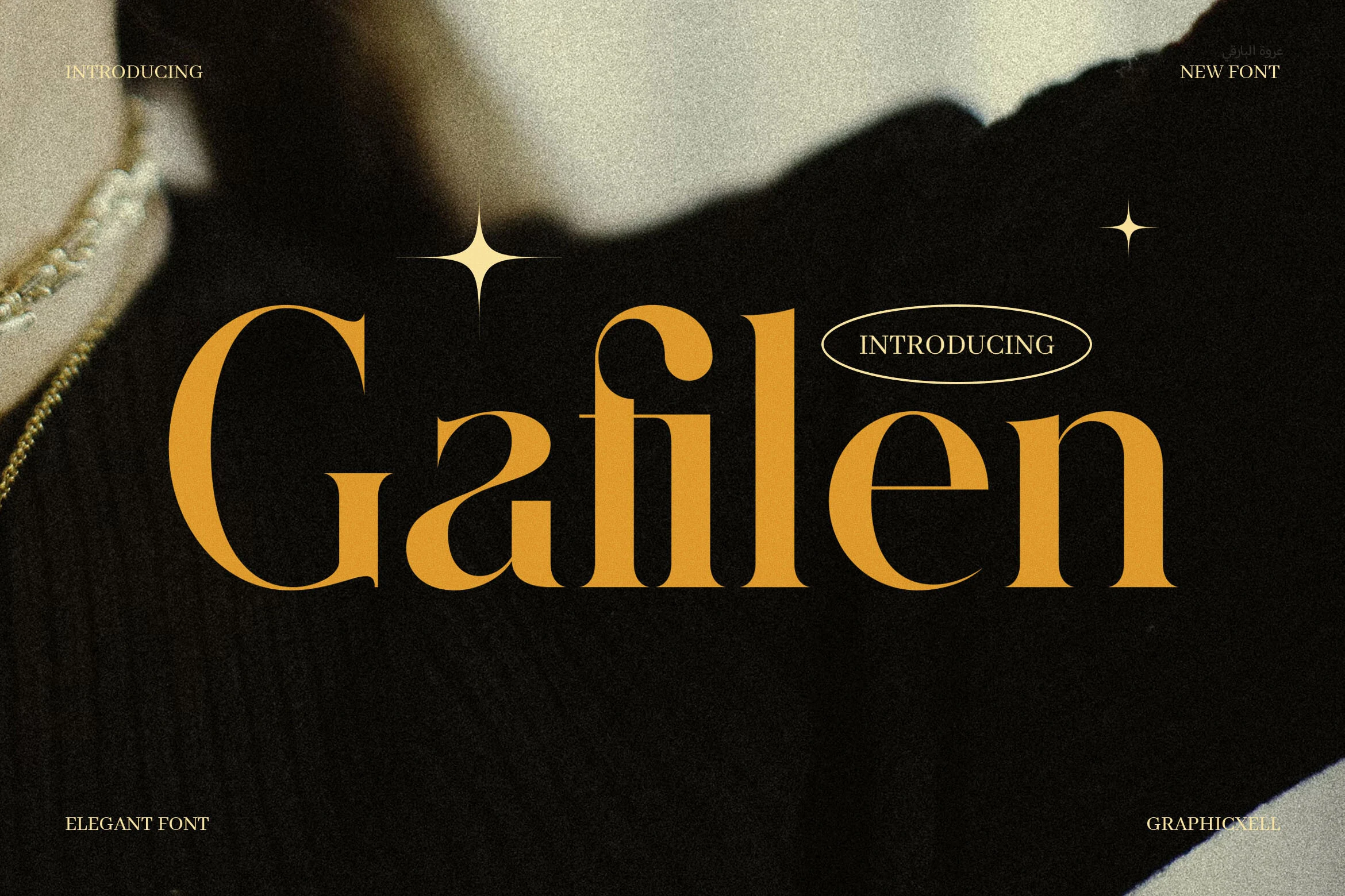
Best For: logos, branding, editorial designs, wedding designs
Gafilen Font leans into contrast with confidence: the capital G feels sweeping and sculpted, while the lowercase forms stay narrow, crisp, and poised. The result is a serif that reads polished and fashion-forward rather than overly ornate, with enough clarity to keep large titles clean.
If you want Wedding Serif Fonts with a more editorial mood, Gafilen gives names and headings a strong focal point. It works especially well for logo treatments, invitation covers, and refined brand pieces; keep the spacing slightly open and let the dramatic thick-to-thin rhythm carry the hierarchy.
Glamor Font
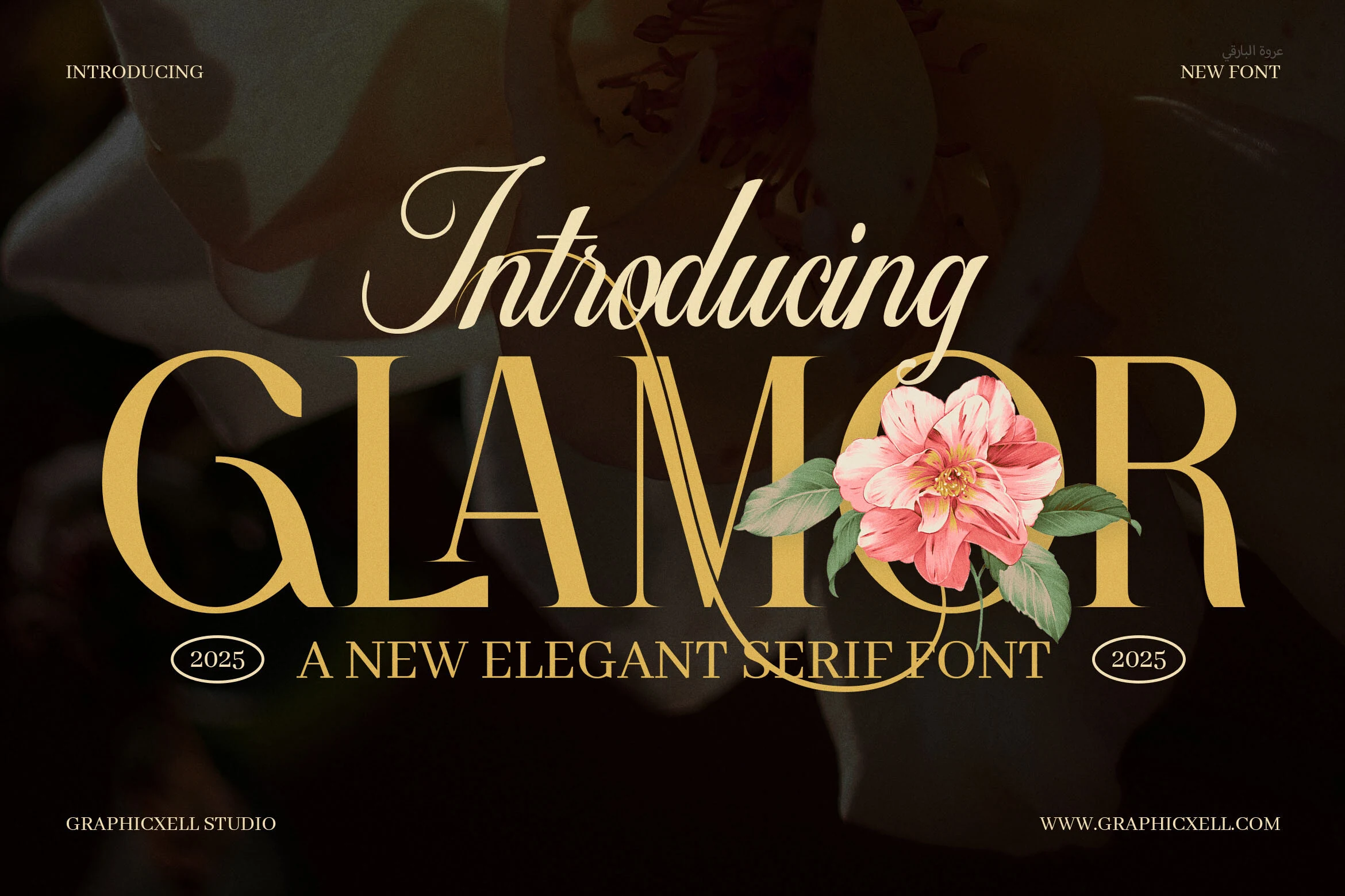
Best For: luxury designs, editorial designs, wedding designs, headlines
Glamor Font fits the Wedding Serif Fonts category with wide display capitals, high-contrast strokes, sharp serif cuts, and smooth curves that give each word a polished editorial profile. The letterforms feel formal without looking antique, especially when the thin stems and heavy verticals are allowed to stand clearly against a quiet background.
Use it for names, monograms, masthead-style titles, or invitation headers where the serif contrast can carry the hierarchy. Avoid crowding the capitals; a little extra tracking helps the sharp details read cleanly and keeps the luxury tone from turning dense at smaller sizes.
Fringk Font
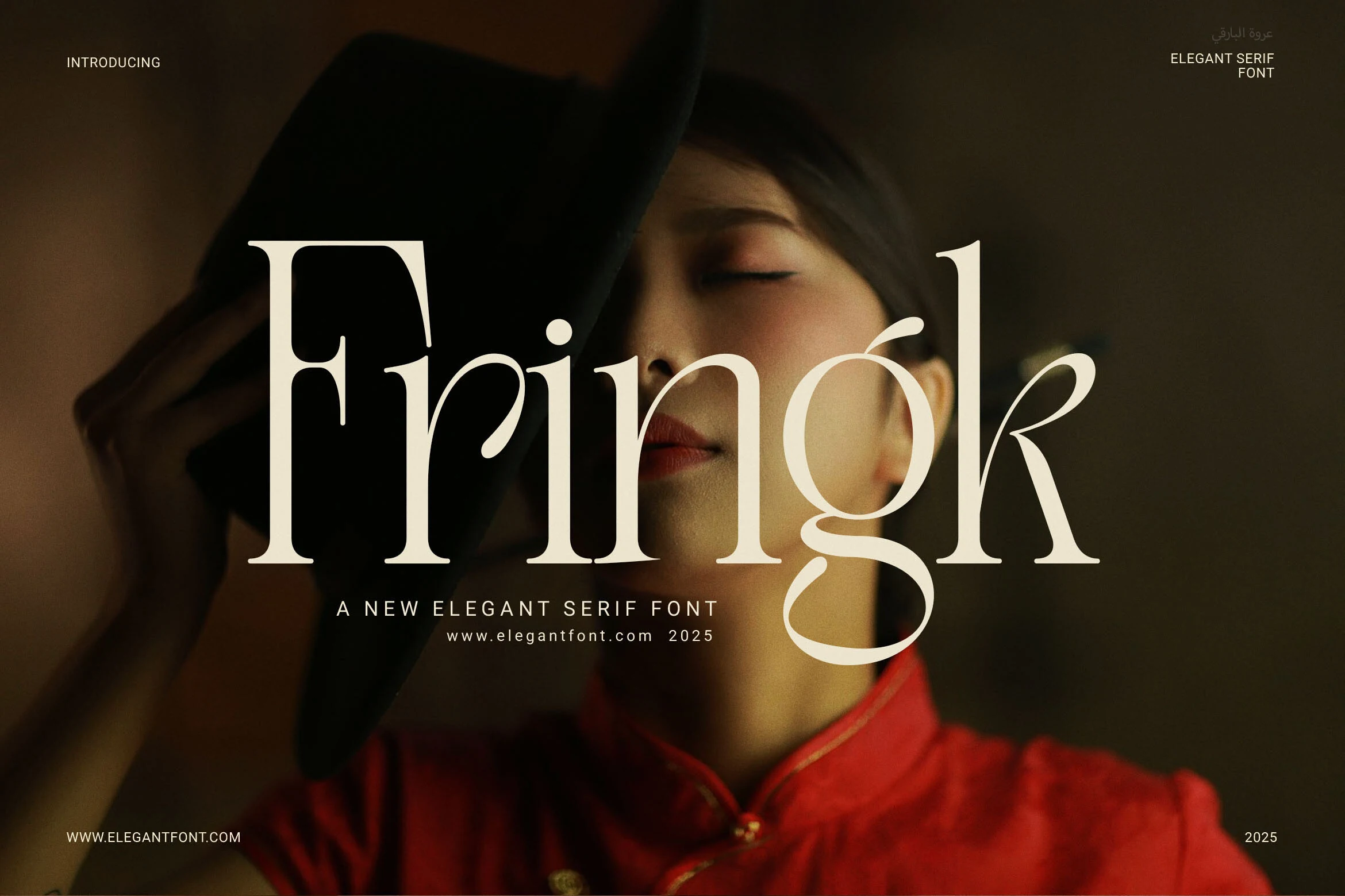
Best For: wedding designs, branding, packaging, editorial designs
Fringk Font gives Wedding Serif Fonts a dramatic editorial edge, with high-contrast strokes, sharp serifs, and long curved terminals that make each word feel poised and luxurious. The letterforms look refined rather than stiff, so the font carries a formal tone while still feeling current.
Its tall proportions and clean structure work especially well for invitation titles, logos, packaging, and other display lines where you want elegance without losing clarity. Use it with generous spacing and a clear title hierarchy, and let surrounding text stay restrained so the contrast and sculpted details remain crisp.
Champers Font
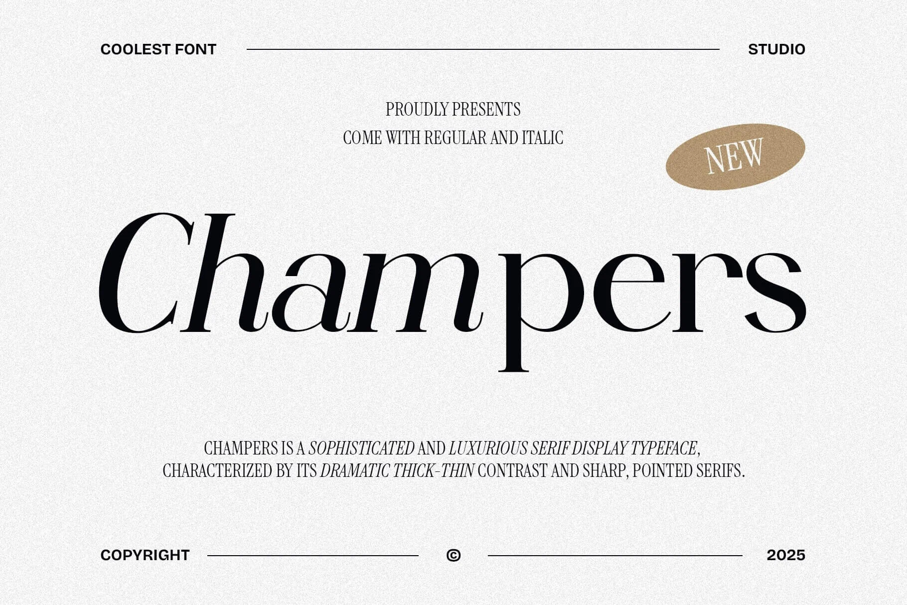
Best For: wedding designs, invitations, editorial designs, headlines
Champers Font gives Wedding Serif Fonts a polished editorial character through dramatic thick-thin contrast, pointed serifs, and broad, flowing curves. The letters feel elegant but not fragile, with enough weight in the main strokes to keep large titles striking and readable.
It works especially well for invitation names, statement headings, and refined social graphics where the contrast can do the styling for you. Give it room in the layout and keep supporting text quieter; the sharp serif details and wide proportions look strongest when the hierarchy is clear.
Brugenfield Font
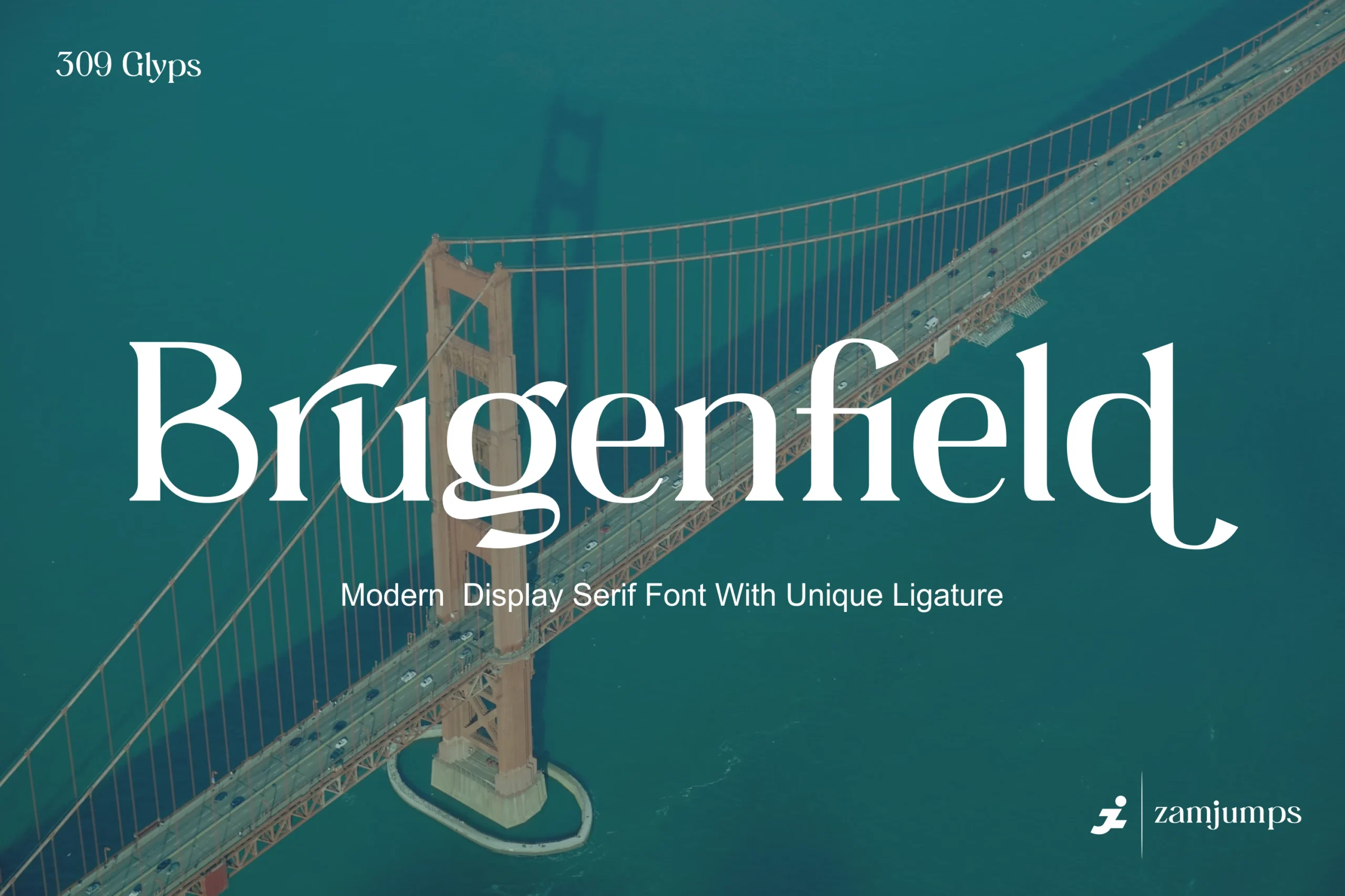
Best For: logos, headlines, invitations, packaging
Brugenfield Font gives Wedding Serif Fonts a clean modern voice, with tall proportions, sharp contrast, and sculpted curves that keep the letterforms elegant without feeling fragile. The serif structure looks polished and formal, while the distinctive ligature detail adds just enough personality to make names and titles feel more custom.
It works especially well for logos, invitation headings, and cover-style titles where the display scale lets those refined shapes stay visible. Keep the main wording short and let the font lead the hierarchy, because the graceful curves and ligature styling have the strongest impact when they are not crowded by dense supporting text.
Clostha Font
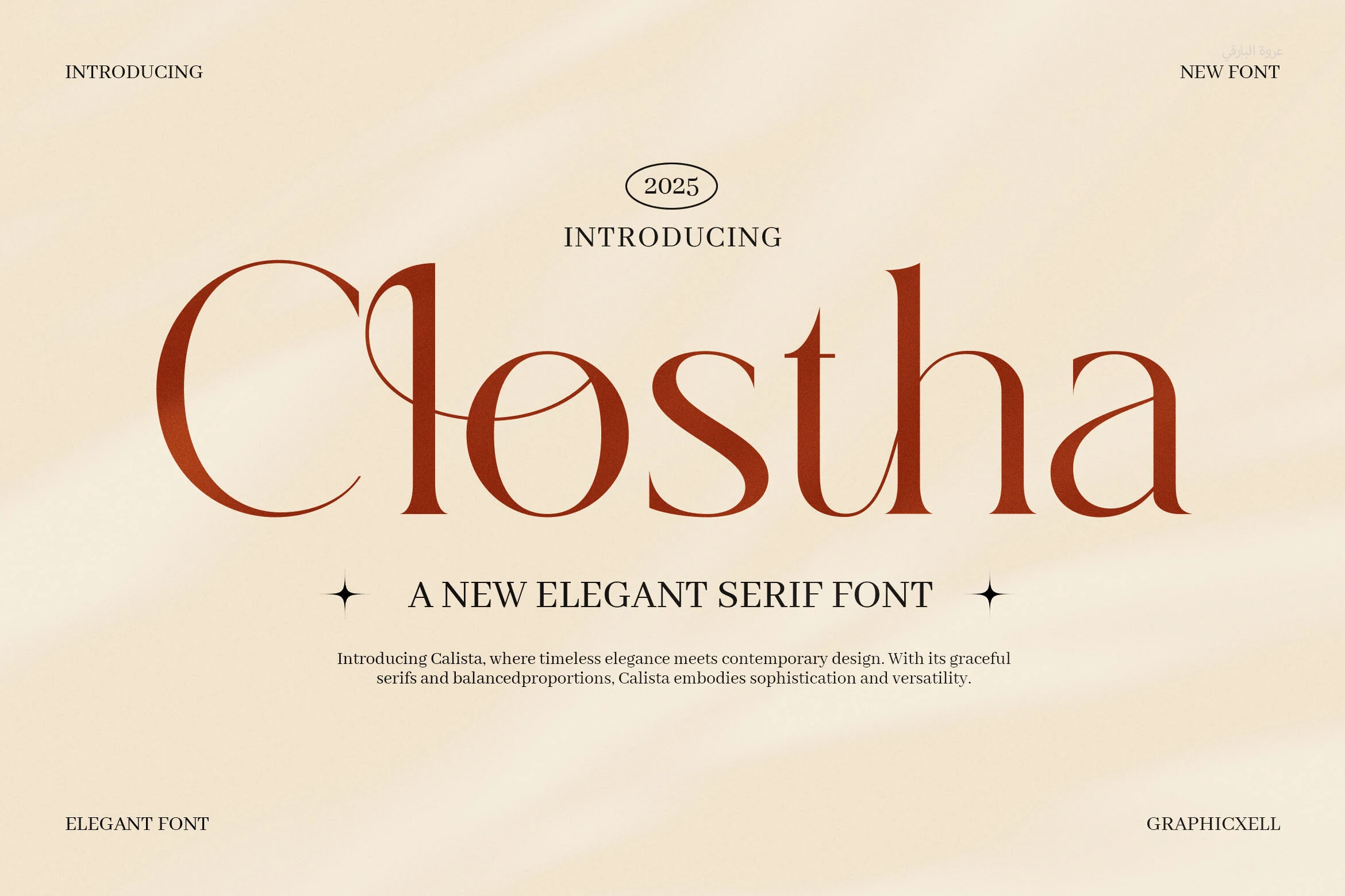
Best For: branding, logos, wedding designs, magazine covers
Clostha Font has a refined editorial presence built on dramatic thick-to-thin contrast, tall proportions, and sharply finished serifs. In the preview, the letters feel airy yet assertive, with delicate joining curves that soften the structure just enough to keep the style elegant rather than severe.
It suits Wedding Serif Fonts when you want names, initials, or headline lines to look polished and current. The thin hairlines and sweeping details read best at generous sizes, so pair Clostha with a quieter body font and let it carry the main title or logo without crowding the layout.
Alora Font
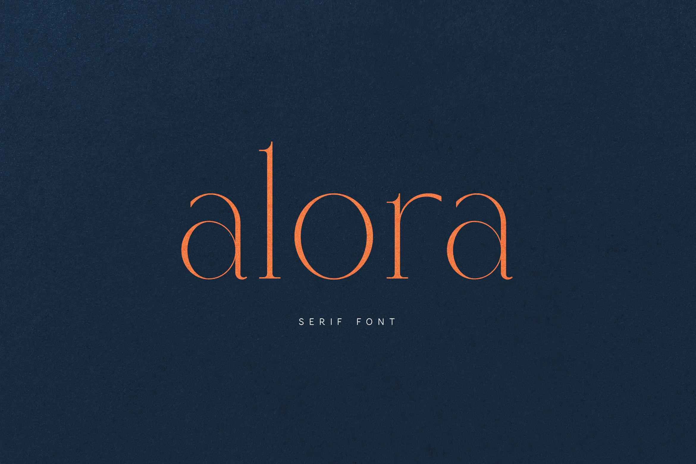
Best For: branding, editorial designs, wedding designs, logos
Alora Font is a restrained high-contrast serif with slim stems, soft round bowls, and clean lowercase proportions. The long vertical l gives the wordmark a quiet anchor, while the open counters and fine terminals keep the lettering refined rather than decorative-heavy.
For Wedding Serif Fonts, Alora works best when the design needs calm sophistication instead of swashes or ornate flourishes. Use it with generous negative space and controlled line lengths; its thin details and elegant spacing are strongest in logos, editorial headers, and invitation titles.
Quora Font
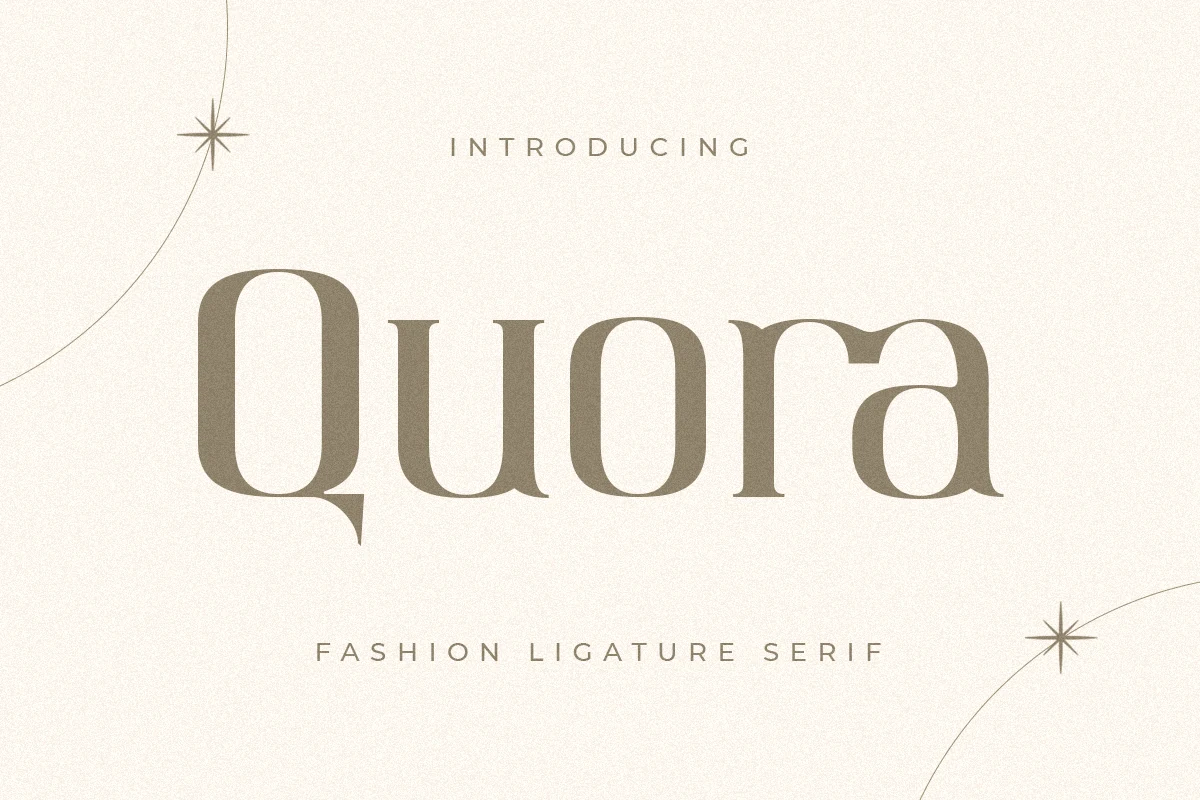
Best For: wedding designs, logos, business cards, quotes
Quora Font has a polished fashion-serif look, with tall vertical stress, softly bracketed serifs, and rounded bowls that keep the wordmark smooth rather than rigid. The oversized Q and its pointed descending tail give the face its signature motion, while the even lowercase shapes help short titles stay calm and refined.
Quora suits Wedding Serif Fonts when you want invitations or small branding pieces to feel elegant without heavy ornament. Use it for short lines and keep the spacing slightly open, so the broad curves and long Q descender stay visible on logos, business cards, and quote layouts.
Romantic & Swash Wedding Serif Fonts
This group focuses on graceful curves, ligatures, and swash details for romantic names, feminine branding, refined stationery, and softer wedding layouts.
Meritta Font
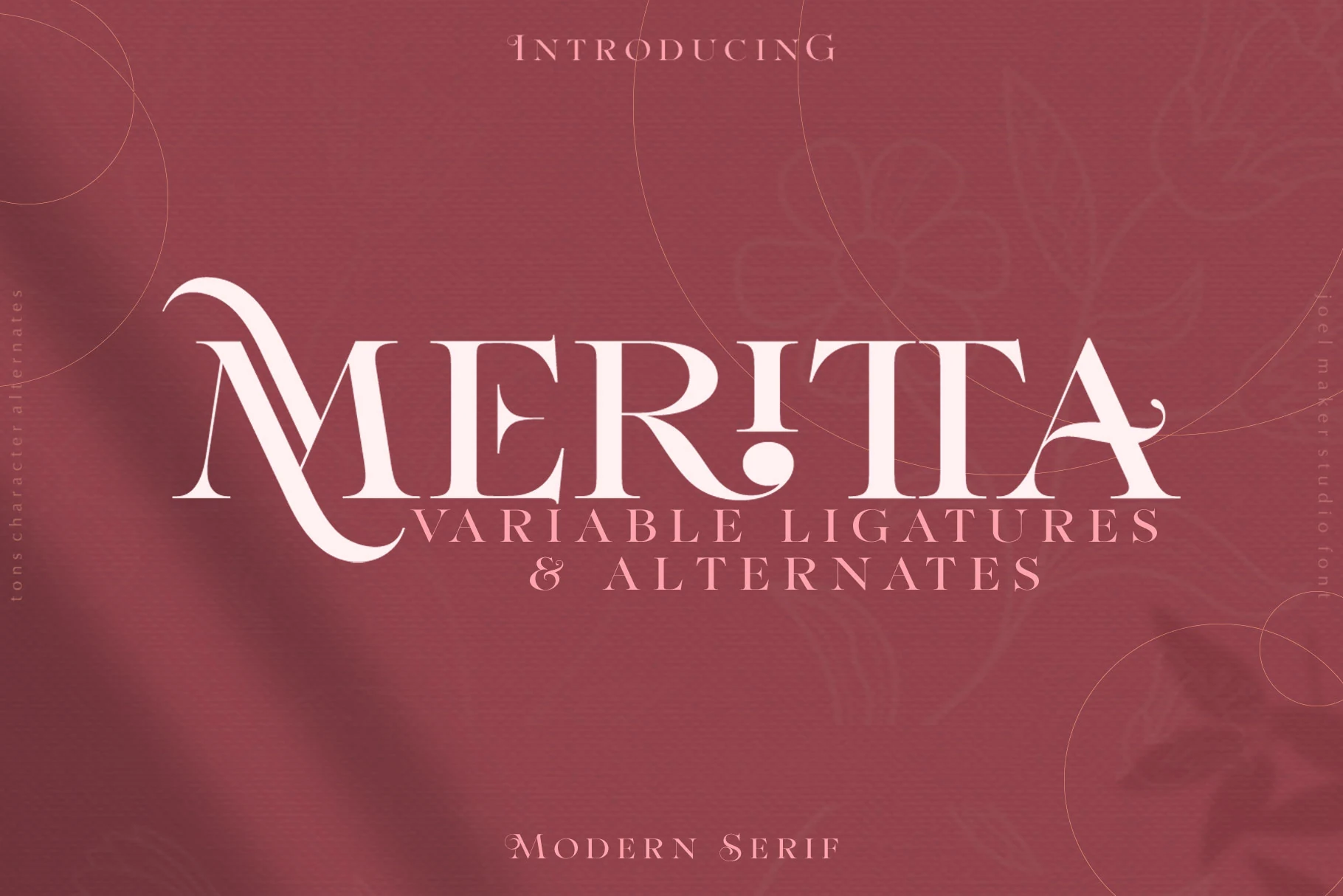
Best For: wedding designs, invitations, logos, business cards
Meritta Font brings a refined, romantic tone to Wedding Serif Fonts with tall high-contrast strokes, crisp serifs, and graceful swash details that soften the structure. The capital forms feel poised and decorative, while the overall rhythm stays clean enough to keep short lines polished rather than fussy.
It works especially well for invitation names, thank you cards, and logo-style wording where you want a formal serif with a lightly handwritten feel. Keep it in short phrases or title lines, and give the wider letters a bit of breathing room so the delicate curves and sharp terminals stay clear.
Holge Mirace Font
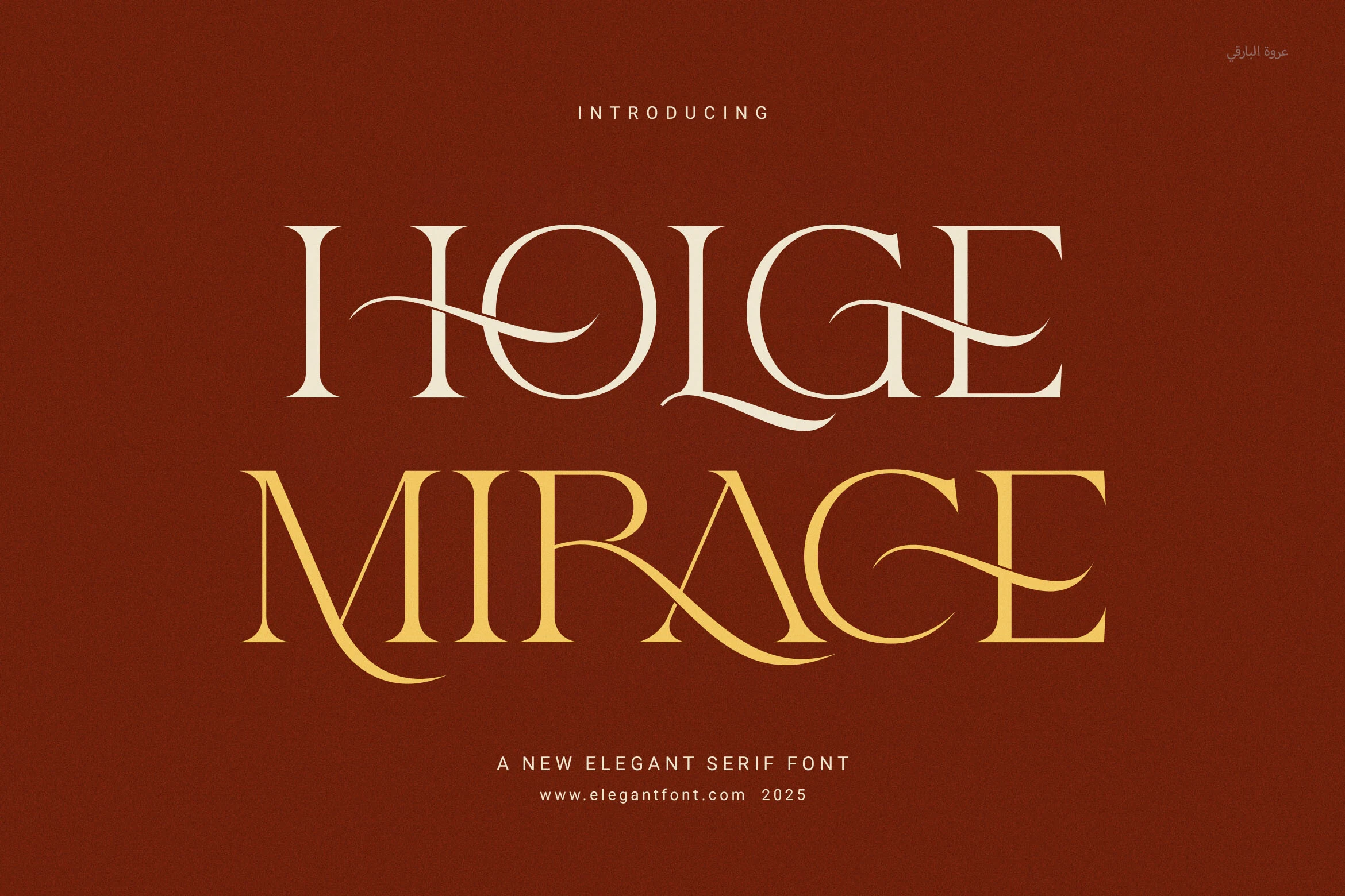
Best For: wedding designs, luxury designs, editorial designs, logos
Holge Mirace Font sits in the Wedding Serif Fonts space with high-contrast capitals, smooth curves, and sweeping horizontal strokes that cut through the letterforms with a controlled ornamental feel. The proportions are balanced and formal, but the extended swashes give titles a more expressive luxury rhythm.
Use it for couple names, invitation covers, editorial-style headers, or logo marks where the serif shapes can carry the main visual weight. Keep tracking moderate and avoid stacking too many words; the decorative strokes need clear space so the curves stay graceful rather than tangled.
Minelle Font
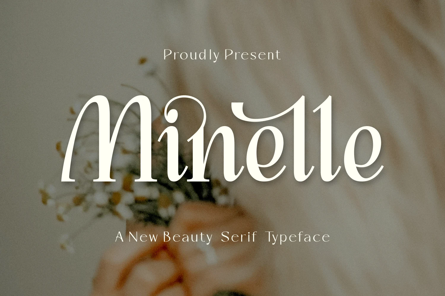
Best For: beauty branding, fashion branding, wedding designs, logos
Minelle Font brings a softer, more romantic mood to Wedding Serif Fonts, with tall rounded stems, delicate contrast, and sweeping serif terminals that give the lettering an organic, hand-touched flow. The curled opening stroke and fluid lowercase shapes make it feel graceful and distinctive rather than rigid or traditional.
That slight calligraphic quality makes it especially strong for bridal logos, beauty packaging, and invitation titles where elegance needs a bit of personality. Its ligatures help longer names read more naturally, but the font looks best in short headlines and logotypes where the curved details have room to stay clear.
Harmonis Font
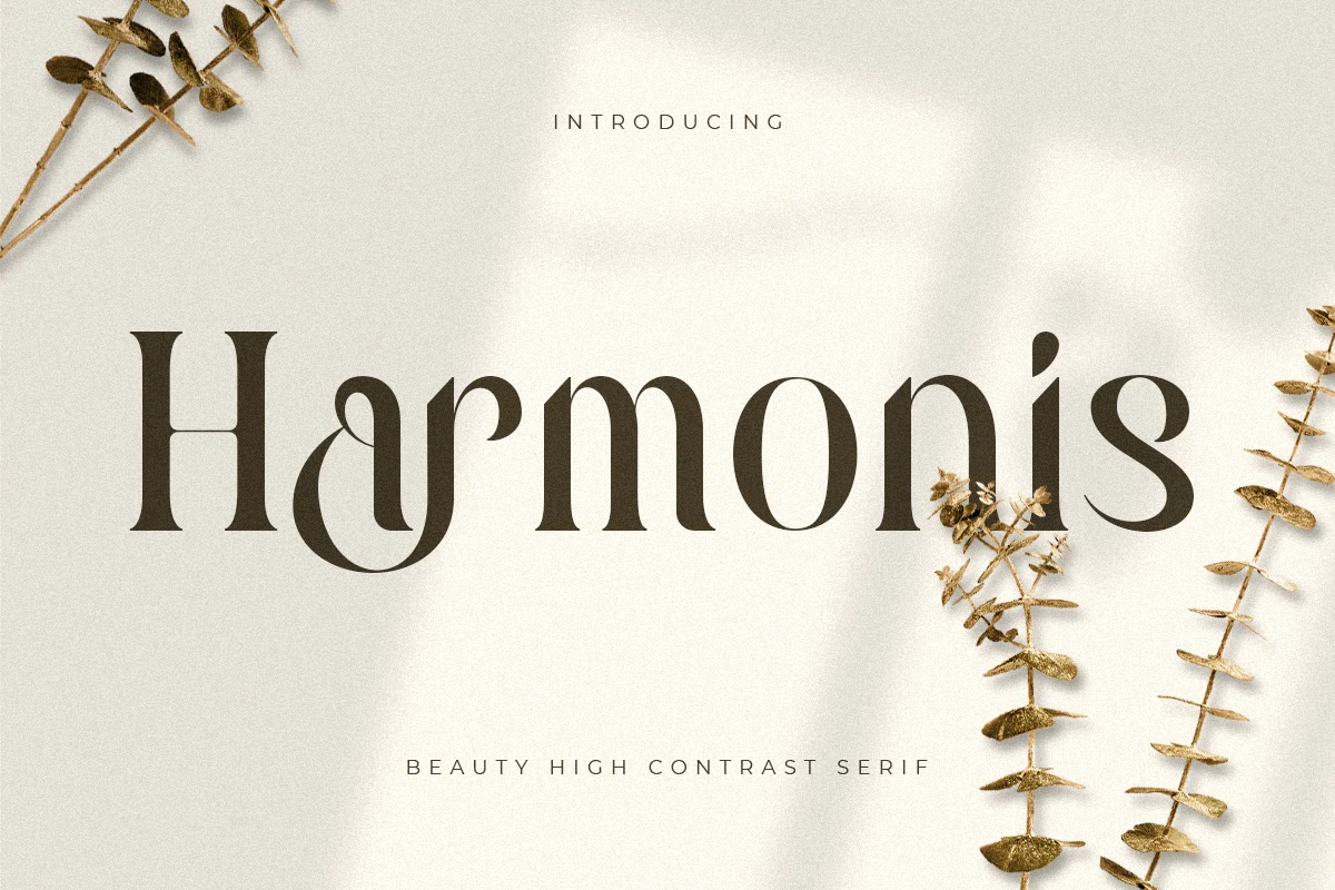
Best For: wedding designs, logos, business cards, greeting cards
Harmonis Font gives Wedding Serif Fonts a poised, fashion-led feel with strong contrast, smooth round bowls, and tapered terminals that curl into the letters with a soft handcrafted rhythm. The tall stems keep it polished, while the sculpted curves stop it from feeling too severe.
It suits invitation names, thank you cards, and logo-style wording where you want elegance with a little personality. The letterforms have enough detail to carry a headline on their own, so keep supporting text simpler and let spacing around the wordmark do the work.
Alissan Font
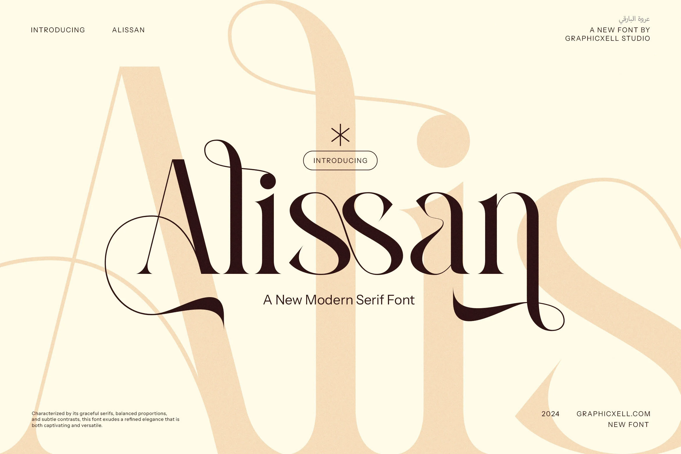
Best For: logos, invitations, fashion branding, beauty branding
Alissan Font brings a fashion-led edge to Wedding Serif Fonts with tall contrast, fine hairlines, and flowing ligature-style connections that make the letterforms feel almost custom drawn. The graceful serifs and extended curves give it a premium editorial character, while the overall structure stays polished and controlled.
It shines in logos, invitation titles, labels, and magazine-style headings where those distinctive joins can stay visible. Keep it on short words or clear title lines, and let the decorative ligatures lead the hierarchy rather than competing with busy secondary text.
Neastone Font
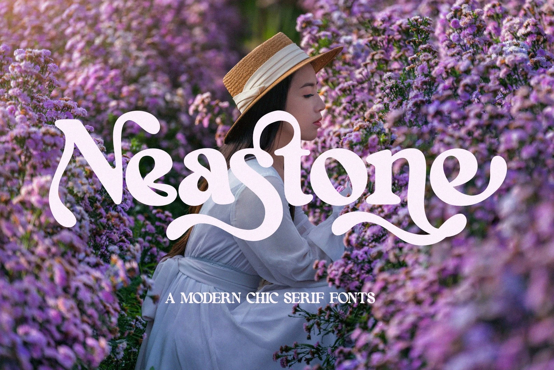
Best For: wedding designs, feminine designs, beauty branding, packaging
Neastone Font has a soft decorative serif shape with swelling strokes, rounded bowls, and long curling terminals that make the wordmark feel fluid rather than formal. Its chic serif structure keeps the letters anchored, while the looped details add a feminine display quality without pushing it fully into script territory.
Neastone brings a softer option to Wedding Serif Fonts, especially for short titles, monograms, cosmetic labels, and beauty-led branding. Keep the tracking fairly controlled because the internal loops and sweeping endings depend on close rhythm; PUA encoding helps access its glyphs and ligatures when refining a headline.
Mango Font
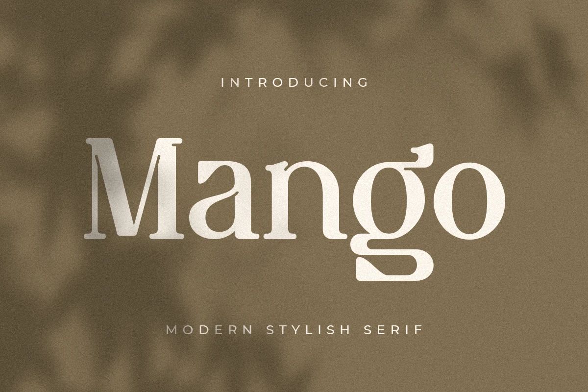
Best For: wedding designs, invitations, logos, quotes
Mango Font has a calm, stylish serif voice with broad forms, softened corners, and a standout lowercase g that drops into a long sculpted tail. The strokes feel smooth rather than sharp, so the design reads polished and approachable, with just enough irregularity to bring in a handwritten touch.
For Wedding Serif Fonts, Mango works best in names, invitation titles, quotes, and small branding pieces where its character can stay visible. Keep it in short lines and give the descenders room below the baseline; that distinctive g can become a focal detail in logos, place cards, or card fronts.
Gelgira Font
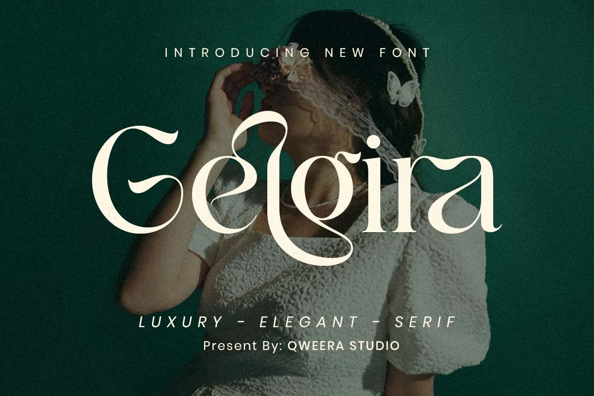
Best For: wedding designs, editorial designs, beauty branding, high-end designs
Gelgira Font has a poised romantic look built on tall high-contrast strokes, crisp serifs, and generous swashes that curl through the capitals and descenders. The letterforms feel refined rather than fussy, giving the type a luxury editorial tone while keeping names and short titles clear at display size.
For Wedding Serif Fonts, Gelgira works best when you want the main name to feel formal and feminine without losing readability. Give the sweeping terminals extra space and pair it with restrained supporting text, letting the headline carry the visual drama on invitations, covers, or sophisticated branding.
Beinora Font
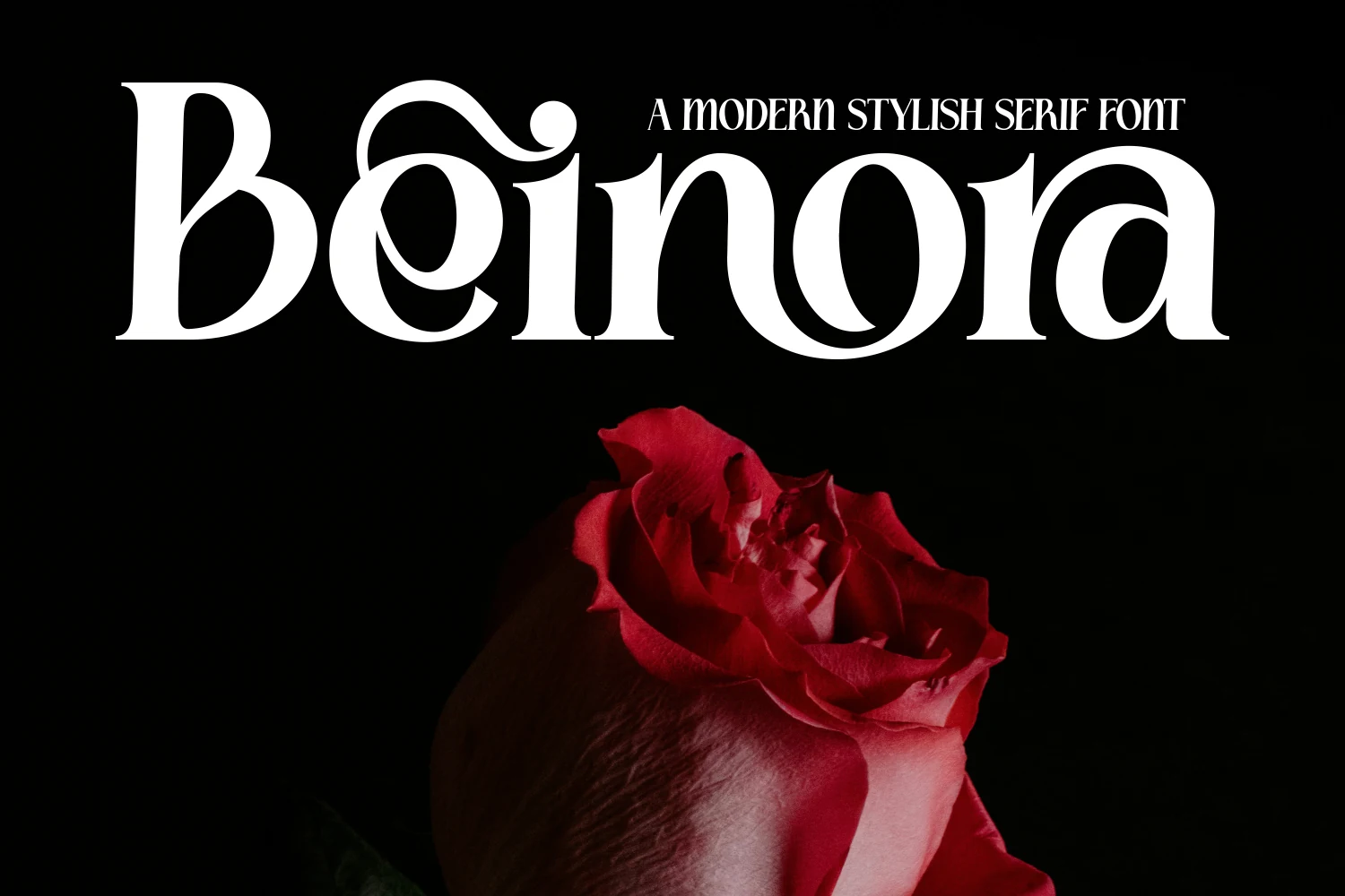
Best For: wedding designs, logos, headlines, editorial designs
Beinora Font leans into dramatic contrast, with thick main strokes, very thin hairlines, and a sculpted silhouette that feels both crisp and ornamental. In the preview, the rounded counters and curled flourish give the wordmark a softer rhythm, so the font reads elegant without losing its sharp editorial edge.
It suits Wedding Serif Fonts when you want names or short titles to feel polished and a little theatrical. Because the contrast is so pronounced, Beinora looks strongest in larger settings with enough spacing around the decorative curves, especially in logos, covers, and statement headings.
Rigena Font
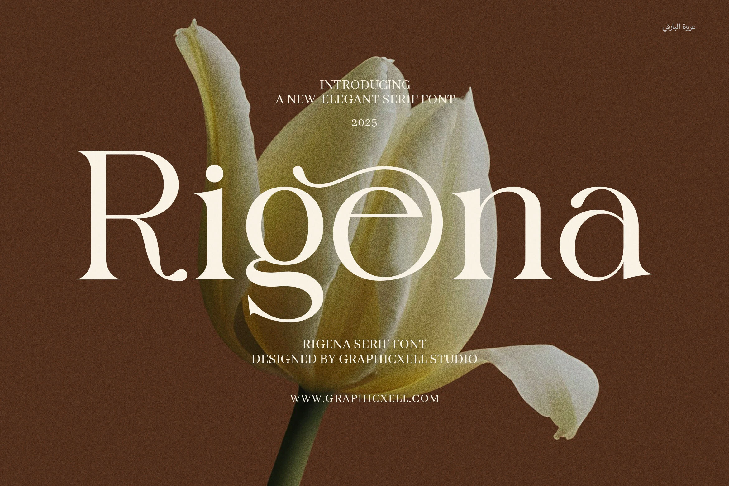
Best For: wedding designs, branding, logos, editorial designs
Rigena Font has a graceful modern serif build, with high-contrast strokes, rounded counters, and a few controlled flourishes that keep the wordmark refined rather than overly ornate. The large R sets a formal tone, while the soft g descender and swash over the e add movement across the baseline.
Rigena fits Wedding Serif Fonts when the design needs a polished title with enough personality for names, logos, or invitation headers. Use it in short display lines and leave space around the longer curves; the contrast and flourishes need clean margins to stay crisp and intentional.
Rolexa Font
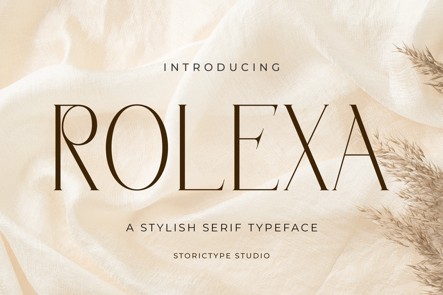
Best For: wedding designs, invitations, logos, editorial designs
Rolexa Font brings a calm, architectural finish to Wedding Serif Fonts, built around tall capitals, sharp contrast, and very fine hairline strokes. Its narrow letterforms and sculpted curves give the font a formal editorial presence, while the open spacing keeps the large serif shapes from feeling heavy.
Use it for invitation headers, couple names, minimalist logos, or stationery titles where the thin strokes can stay crisp. It performs best with generous tracking and strong background contrast; cramped layouts will weaken the delicate stems and reduce the refined vertical rhythm.
Serif & Script Duo Wedding Serif Fonts
These font duos combine a structured serif with a handwritten or calligraphic accent, making them useful for invitations, logos, packaging, and layered title designs.
Artia Duo Font
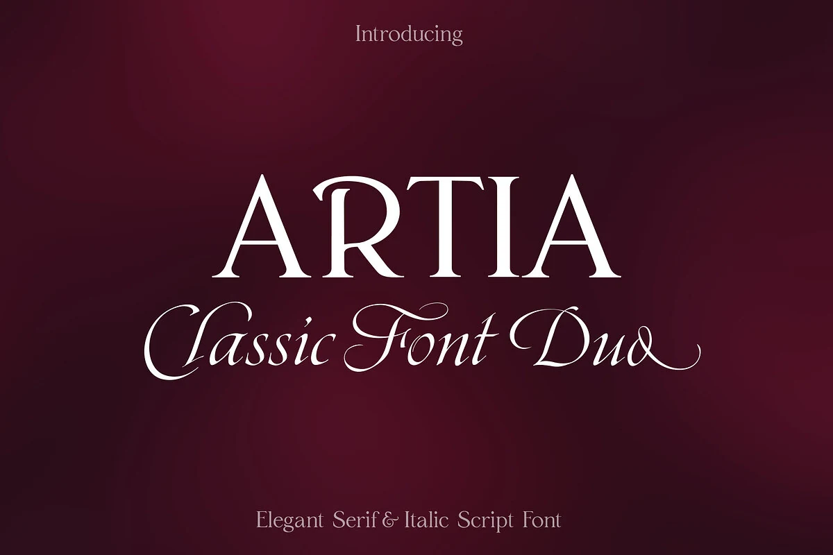
Best For: invitations, wedding designs, luxury designs, editorial designs
Artia Duo Font pairs a sharp high-contrast serif with a sloped calligraphic italic, giving the preview a formal title-and-signature rhythm. The serif capitals are wide and clean with bracketed transitions, while the script line brings long entry strokes, looped joins, and ornamental ligatures that help short phrases feel composed rather than crowded.
For Wedding Serif Fonts, this duo is useful when a design needs hierarchy built into the type itself: serif for names, script for supporting lines. Keep the italic at display size, give swashes clear margins, and use the serif for the more readable anchor text in invitations, menus, packaging, or editorial layouts.
Cornelia Font Duo Font
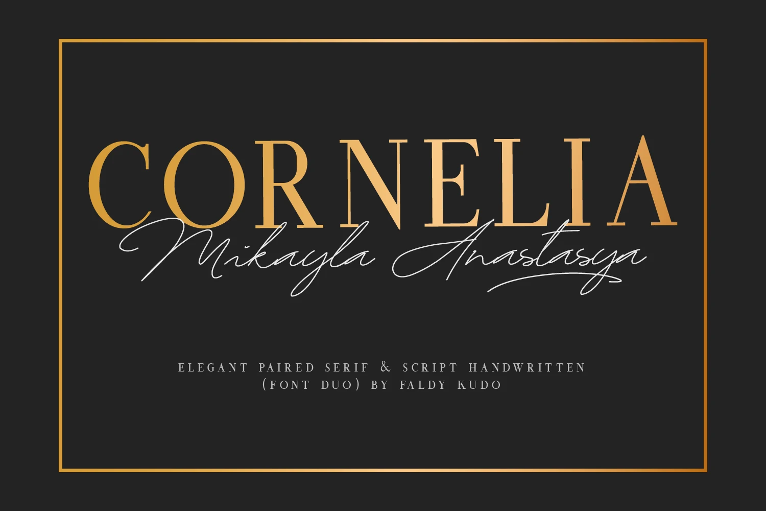
Best For: wedding designs, invitations, social media graphics, logos
Cornelia Font Duo Font pairs a stately serif with a flowing handwritten script, giving Wedding Serif Fonts a more layered and expressive look. The serif capitals are tall and high-contrast with a polished luxury feel, while the script adds soft movement through long entry strokes and sweeping signature-style lines.
This contrast works especially well when you let each style handle a different role: use the serif for names or headlines, then bring in the script for a subtitle or accent line. Keeping the script to short words helps its loops stay graceful, and the serif holds the composition together with clear title hierarchy.
Riclose Duo Font
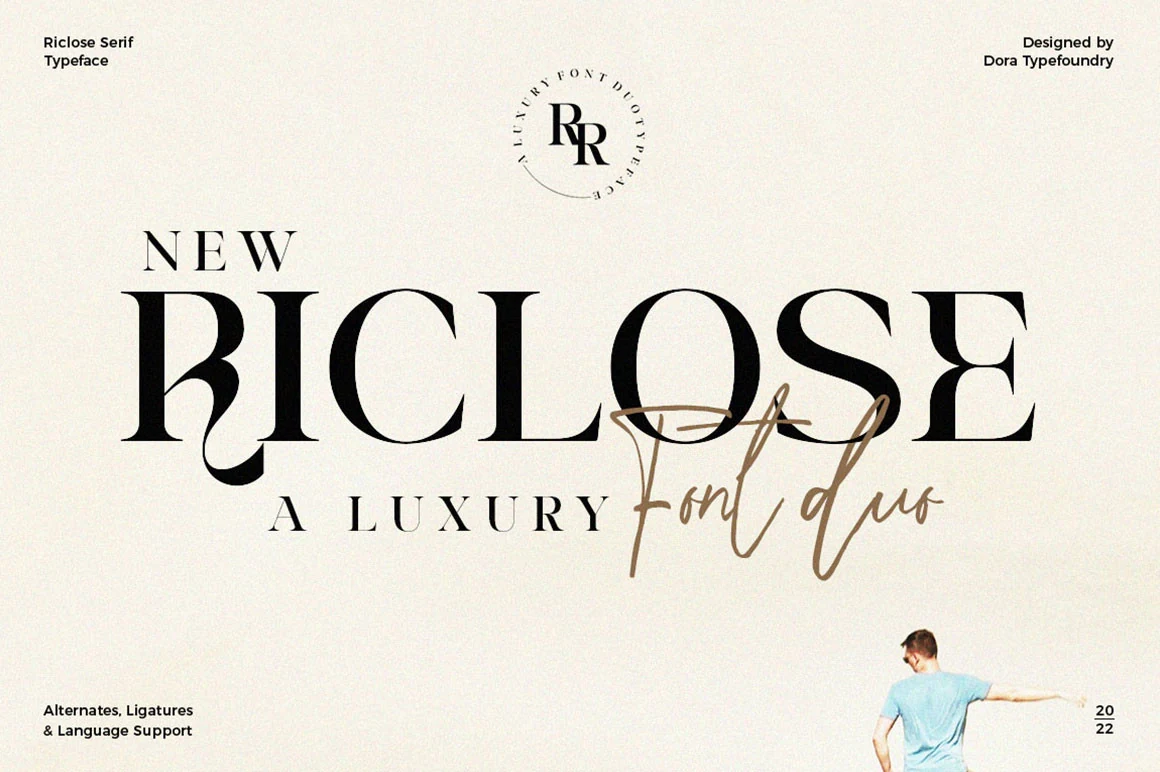
Best For: logos, branding, wedding designs, social media graphics
Riclose Duo Font gives Wedding Serif Fonts a more layered, editorial feel by pairing a dramatic high-contrast serif with a loose signature script. The serif brings strong vertical stress and sculpted curves, while the handwritten overlay adds motion through long, airy strokes that soften the composition without losing its formal structure.
The duo works best when the serif carries the main name and the script handles a short accent line or romantic emphasis. Its ligatures help the lettering feel more connected, and keeping the script in brief phrases preserves clarity while creating a clear hierarchy for logos, invitation headings, and brand pieces.
Paris Signature Font
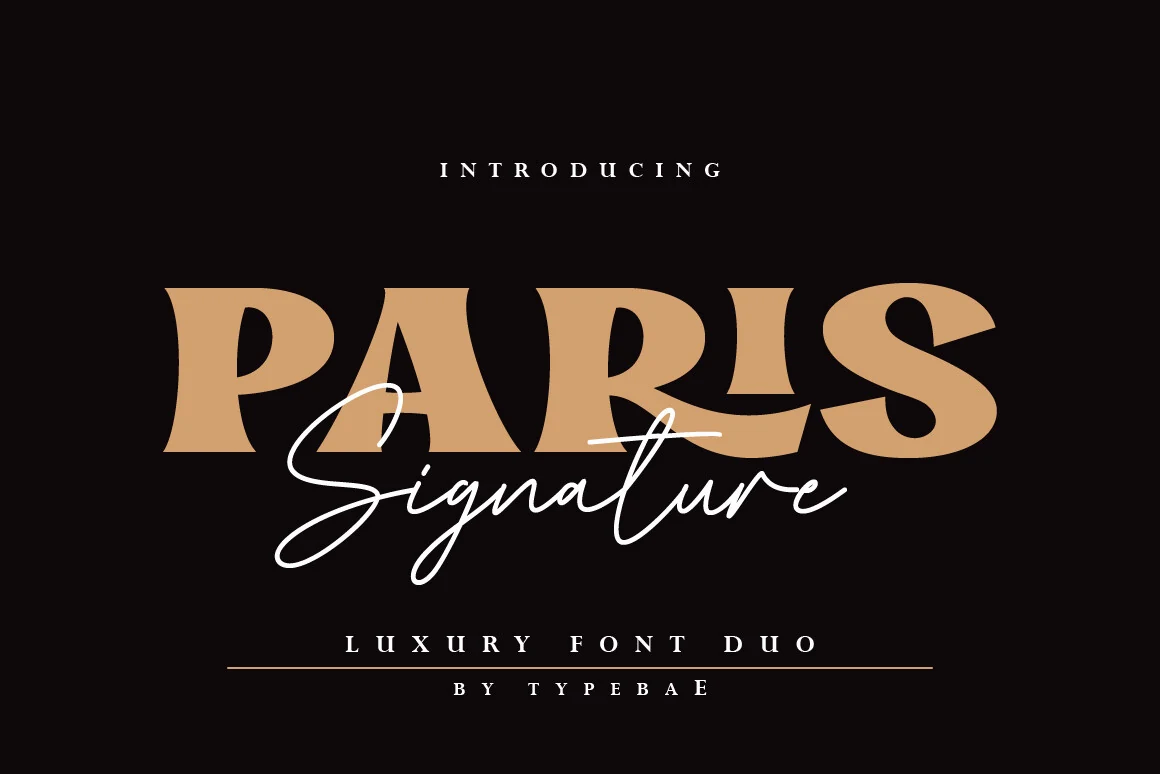
Best For: wedding designs, branding, packaging, editorial designs
Paris Signature Font adds a bold luxury-duo angle to Wedding Serif Fonts, combining heavy serif capitals with a thin, flowing handwritten script. The serif has wide proportions, soft curves, and strong display weight, while the script cuts across it with long signature strokes that add movement and contrast.
Use the serif for the main name or headline, then let the script handle a short accent word where its loops can stay legible. The pairing works best with clear scale separation and strong contrast, especially for invitation covers, packaging marks, and editorial-style branding.
Solarie Halsy Font
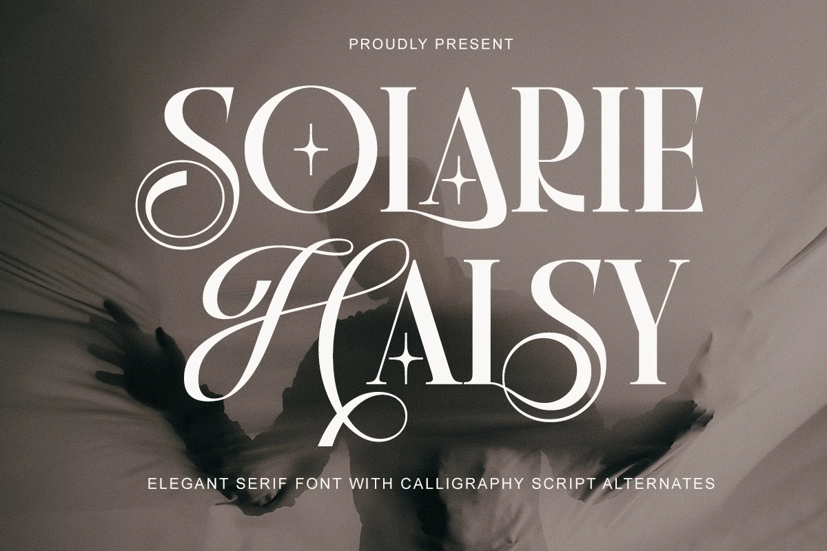
Best For: wedding designs, logos, packaging, editorial designs
Solarie Halsy Font combines high-contrast serif capitals with calligraphic script alternates, giving the preview a layered title system rather than a single static wordmark. The serif forms are tall and polished, while the looping S, H, and y shapes add movement through long curves and open counters.
For Wedding Serif Fonts, it works best where names or short headline phrases need ceremony and editorial weight. Use the serif letters as the stable anchor and reserve the script alternates for emphasis; that contrast keeps logos, packaging, and invitation titles decorative without turning the whole composition into a swirl.
Precious Font
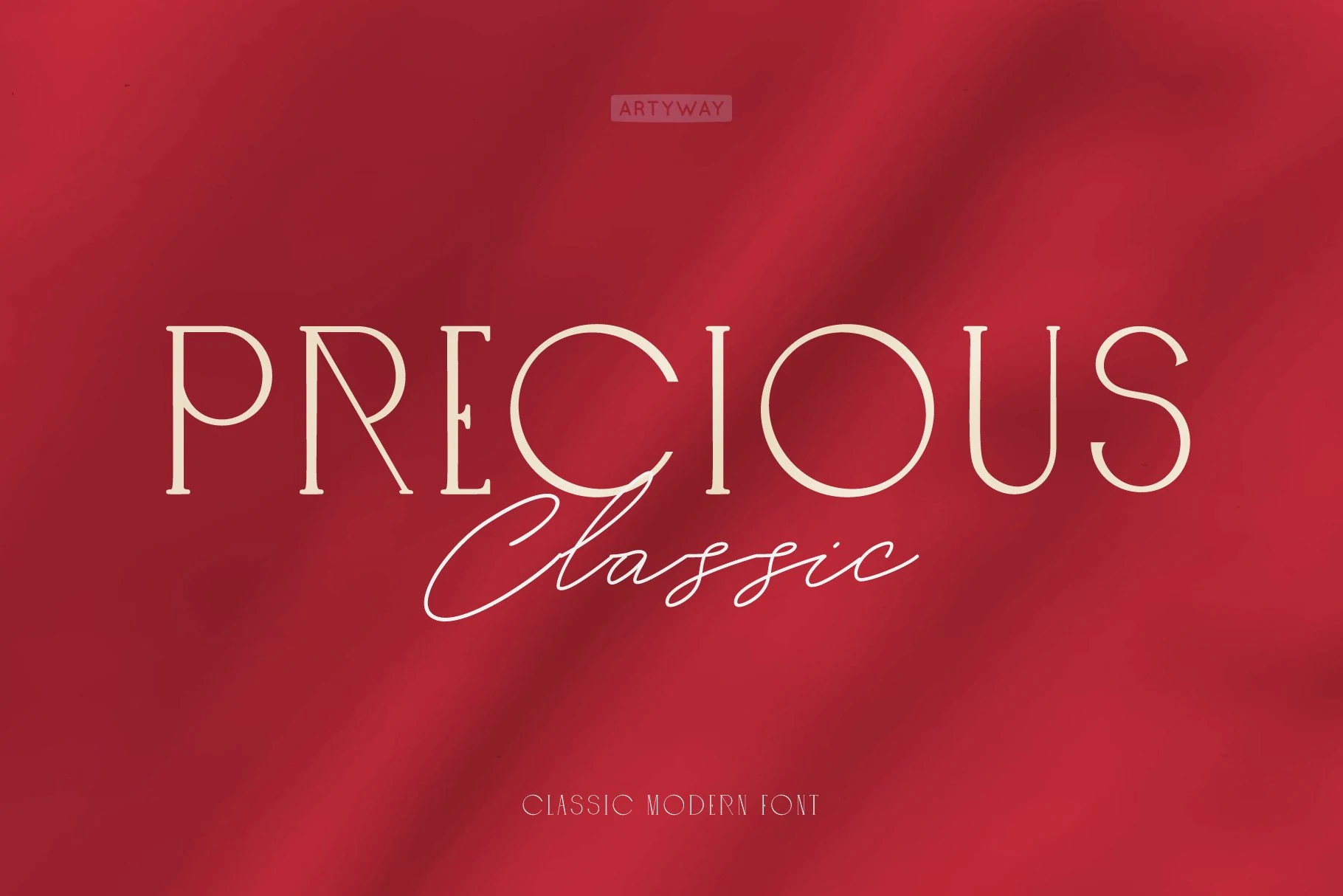
Best For: wedding designs, branding, logos, invitations
Precious Font pairs a classic serif with a clean hand-drawn script, creating a title style that feels formal without looking stiff. The serif side uses narrow, high-contrast capitals with thin stems and restrained bracketed details, while the script brings a lighter handwritten line with long, fluid connections.
It fits Wedding Serif Fonts when a layout needs both structure and a softer signature accent. Use the serif for the main name or headline, then let the script sit as a secondary word below it; this hierarchy keeps invitations, logos, and branding polished while avoiding too much decorative competition.
Ornate & Vintage Wedding Serif Fonts
These decorative serif fonts lean into retro warmth, theatrical swashes, and nostalgic display shapes for statement invitations, signs, labels, and short headlines.
History of Miracles Font
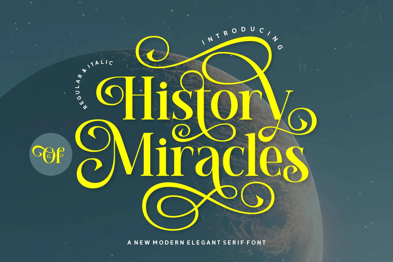
Best For: display text, headlines, decorative designs, wedding designs
History of Miracles Font is a dramatic ornamental serif with heavy contrast, sharp bracketed serifs, and oversized looping swashes. The letterforms have a theatrical rhythm: tall stems and compact counters keep the words anchored, while the extended curls turn the composition into a decorative centerpiece.
Use it when Wedding Serif Fonts need a strong display voice rather than quiet refinement. It works best for short names, cover titles, invitation headers, and logo-style marks; leave wide margins around the flourishes and avoid tight line stacking, since the loops need clear space to stay legible.
Single Honey Font
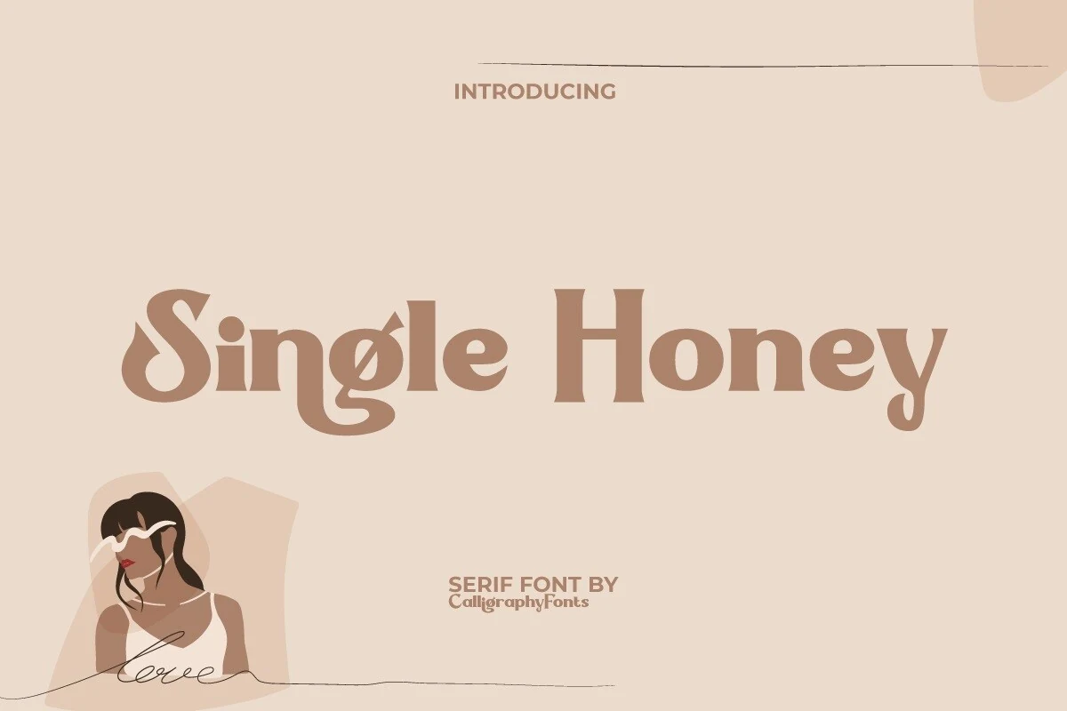
Best For: invitations, vintage designs, branding, wedding designs
Single Honey Font brings a softer retro mood to Wedding Serif Fonts, with rounded serif forms, compact weight, and a looping descender on the g that gives the lettering a warm nostalgic rhythm. The shapes feel sturdy and friendly rather than formal, which keeps the vintage character inviting.
It works especially well for invitation headings, label-style branding, and short quote lines where the decorative curves can do the styling. Keep it in larger sizes and let supporting text stay simpler, so the bold silhouette and old-school details remain clear instead of crowding the layout.
Chleona Font
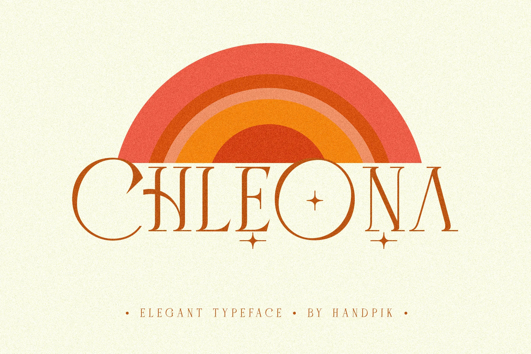
Best For: wedding designs, retro designs, logos, quotes
Chleona Font brings a playful vintage note to Wedding Serif Fonts with elongated high-contrast stems, delicate serifs, and rounded counters that feel both refined and nostalgic. The sharp inner cuts and tiny star accents give the letterforms a retro personality, while the open spacing keeps the overall look light rather than heavy.
It works best for invitation titles, logo-style names, and short quote lines where those details can stay visible. Use it at larger sizes and pair it with simpler supporting text, so the thin strokes and decorative rhythm remain crisp instead of getting lost in a crowded layout.
Magrina Font
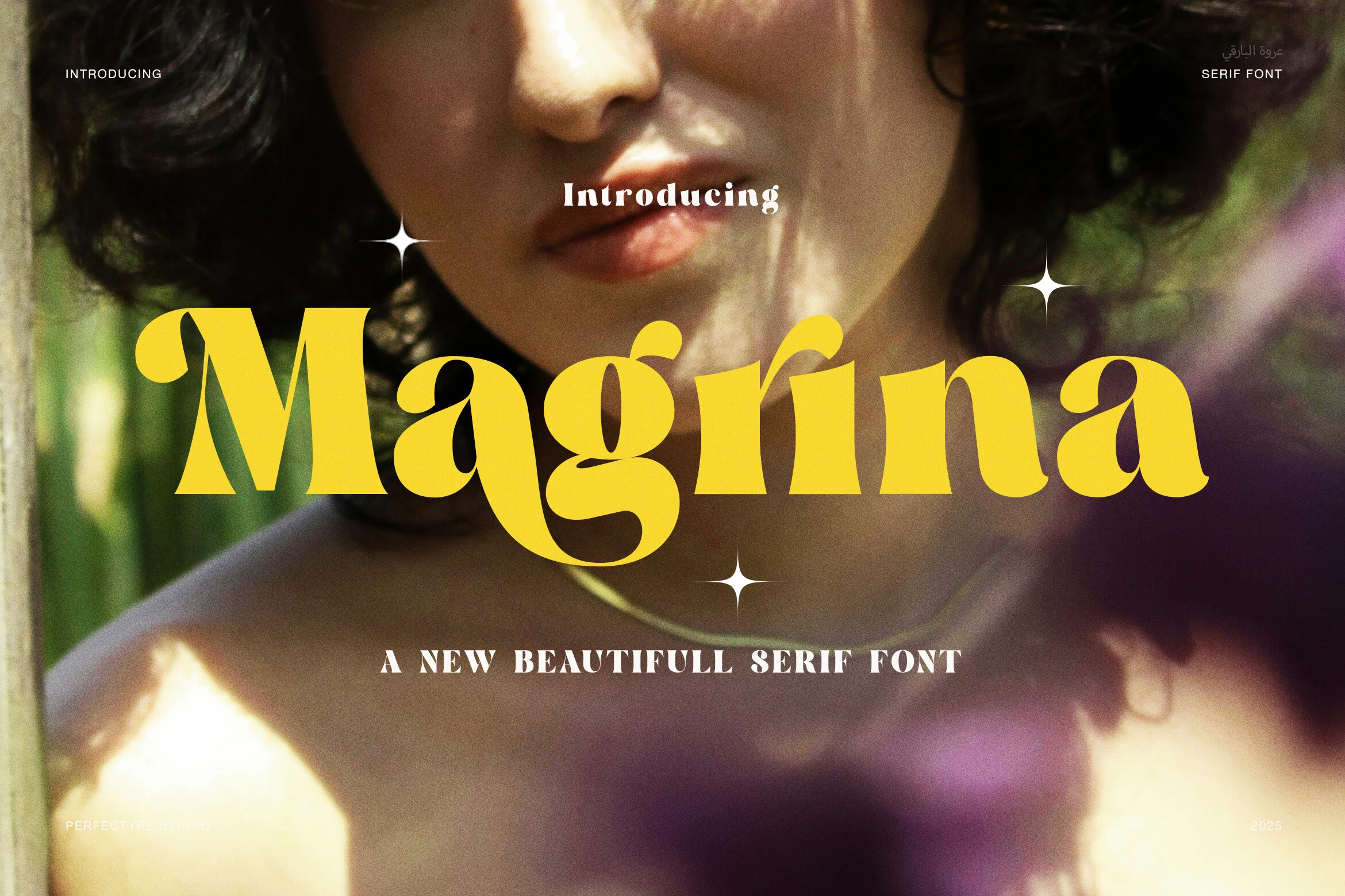
Best For: wedding designs, vintage designs, invitations, logos
Magrina Font leans into vintage display charm with broad sculpted serifs, soft curves, and compact counters that give each letter a warm, poster-like presence. The capital M and the sweeping g show off its personality best, balancing weighty shapes with rounded terminals so the wordmark feels bold but still graceful.
Within Wedding Serif Fonts, Magrina works especially well for invitation titles, welcome signs, and logo-style names that need a nostalgic accent. Keep it for short lines and let the heavier forms lead the hierarchy; a simpler supporting face will keep the layout clear while Magrina carries the decorative mood.
Conclusion
Choose high-contrast serif fonts for clean editorial elegance, swash styles for romantic display lines, duo fonts for built-in hierarchy, and vintage serifs when the design needs warmer character.