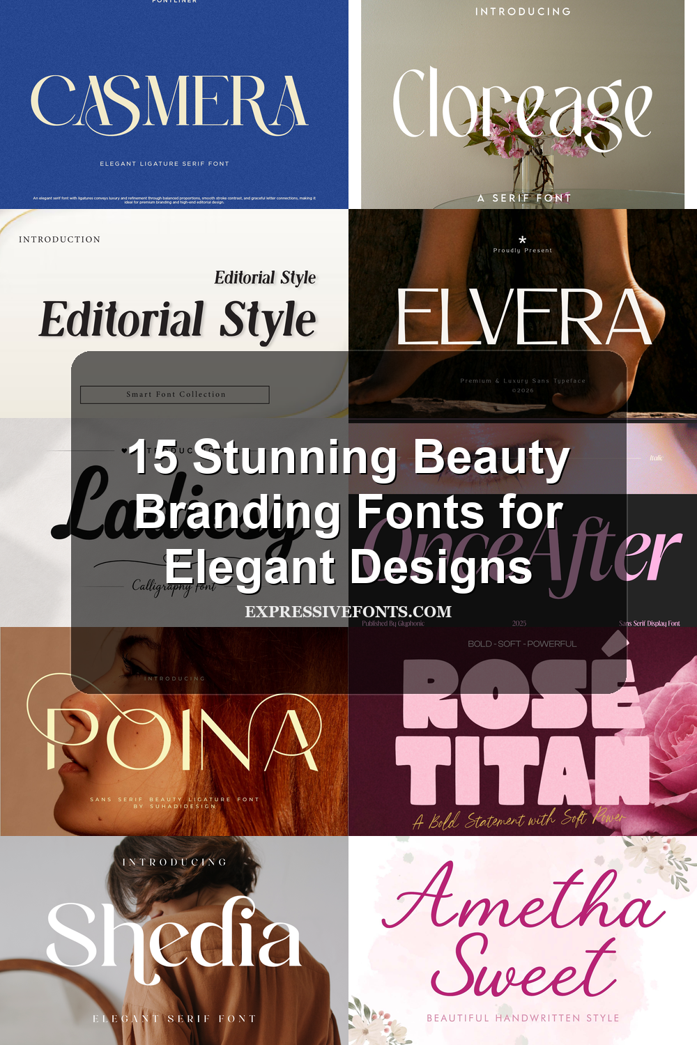
15 Stunning Beauty Branding Fonts for Elegant Designs
Looking for more branding fonts? Browse our complete Branding Fonts collection to compare luxury, elegant, modern, feminine, minimal, boutique, beauty, fashion, packaging, and serif styles.
Beauty branding fonts help skincare, cosmetics, salon, and boutique brands look polished from the first glance. This collection is built for logos, packaging, labels, social graphics, and editorial layouts where typography needs to feel elegant, feminine, modern, or premium.
Elegant Serif Beauty Branding Fonts
These high-contrast serif fonts suit luxury beauty logos, skincare packaging, boutique labels, and editorial headers that need refinement, contrast, and a premium finish.
Aroms Font
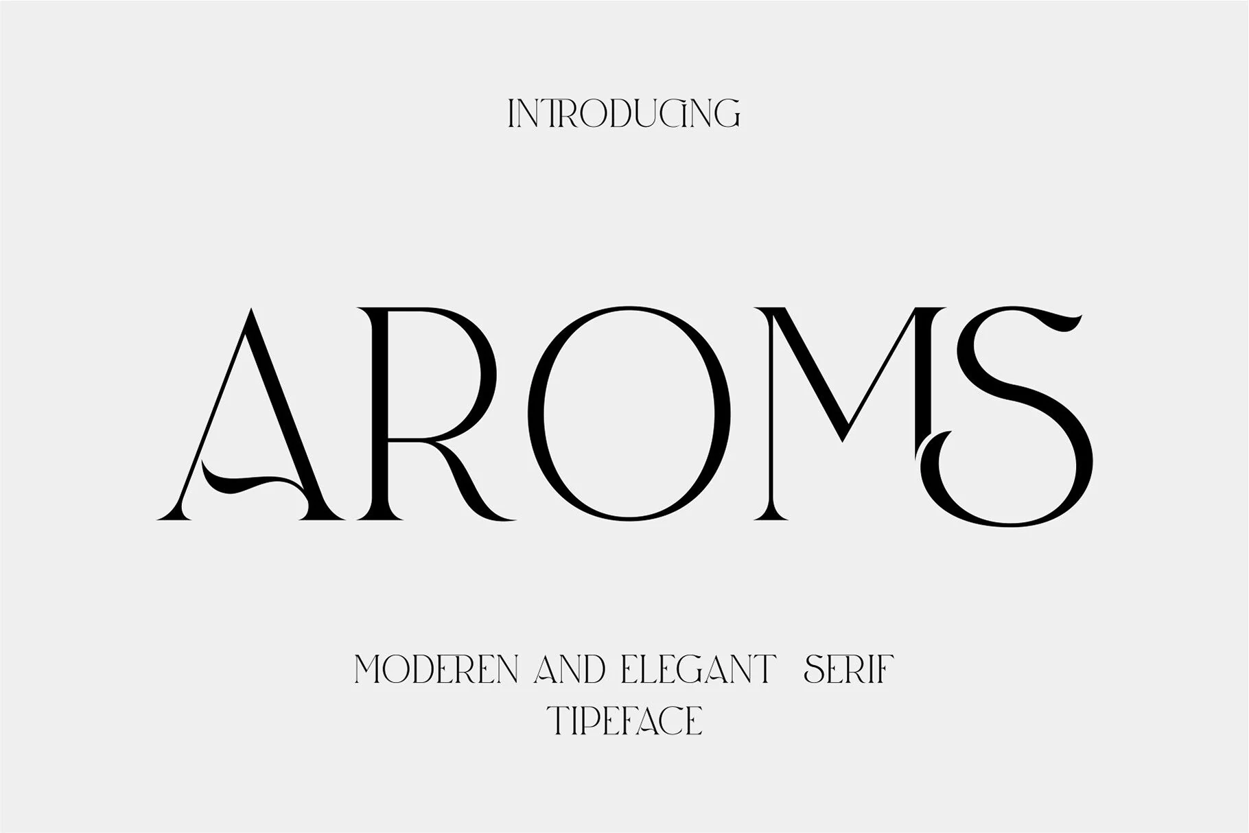
Best For: beauty branding, logos, packaging, editorial designs
AROMS Font has a high-contrast serif voice with razor-thin hairlines, heavy vertical stems, and rounded bowls that keep the wordmark polished rather than decorative. The preview shows a sculptural A with a curved interior stroke, a broad circular O, and a dramatic S that gives short words a luxury editorial silhouette.
For Beauty Branding Fonts, its ligature-driven style is most useful in logos, cosmetic labels, and magazine-style headers where the type can carry the identity on its own. Keep the tracking moderate and avoid cramped small text; the fine strokes and sharp terminals need clean contrast to stay crisp.
Shedia Font
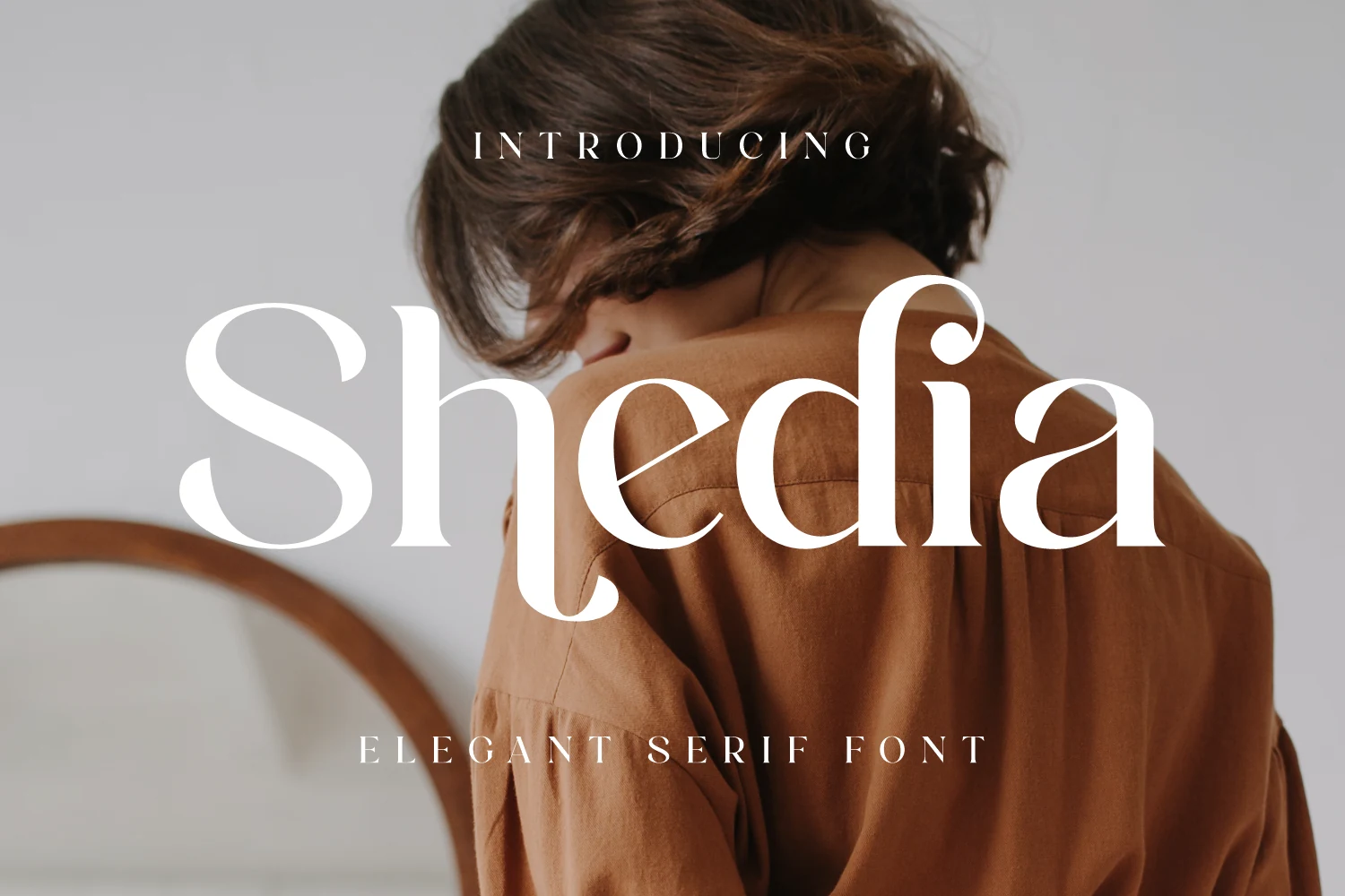
Best For: beauty branding, packaging, wedding designs, premium designs
Shedia Font is a polished serif with fine contrast, smooth curves, and flowing terminals that give each word a soft editorial finish. The oversized preview shows a wide, sweeping S, rounded counters, and elegant descenders, so the font feels refined without becoming stiff or overly formal.
For Beauty Branding Fonts, Shedia works best where the name needs to feel premium but still readable: cosmetic marks, packaging titles, wedding stationery, and lifestyle headers. Use clear contrast behind the letters and keep title hierarchy simple, because the curled terminals already provide the visual movement.
Zacorsea Font
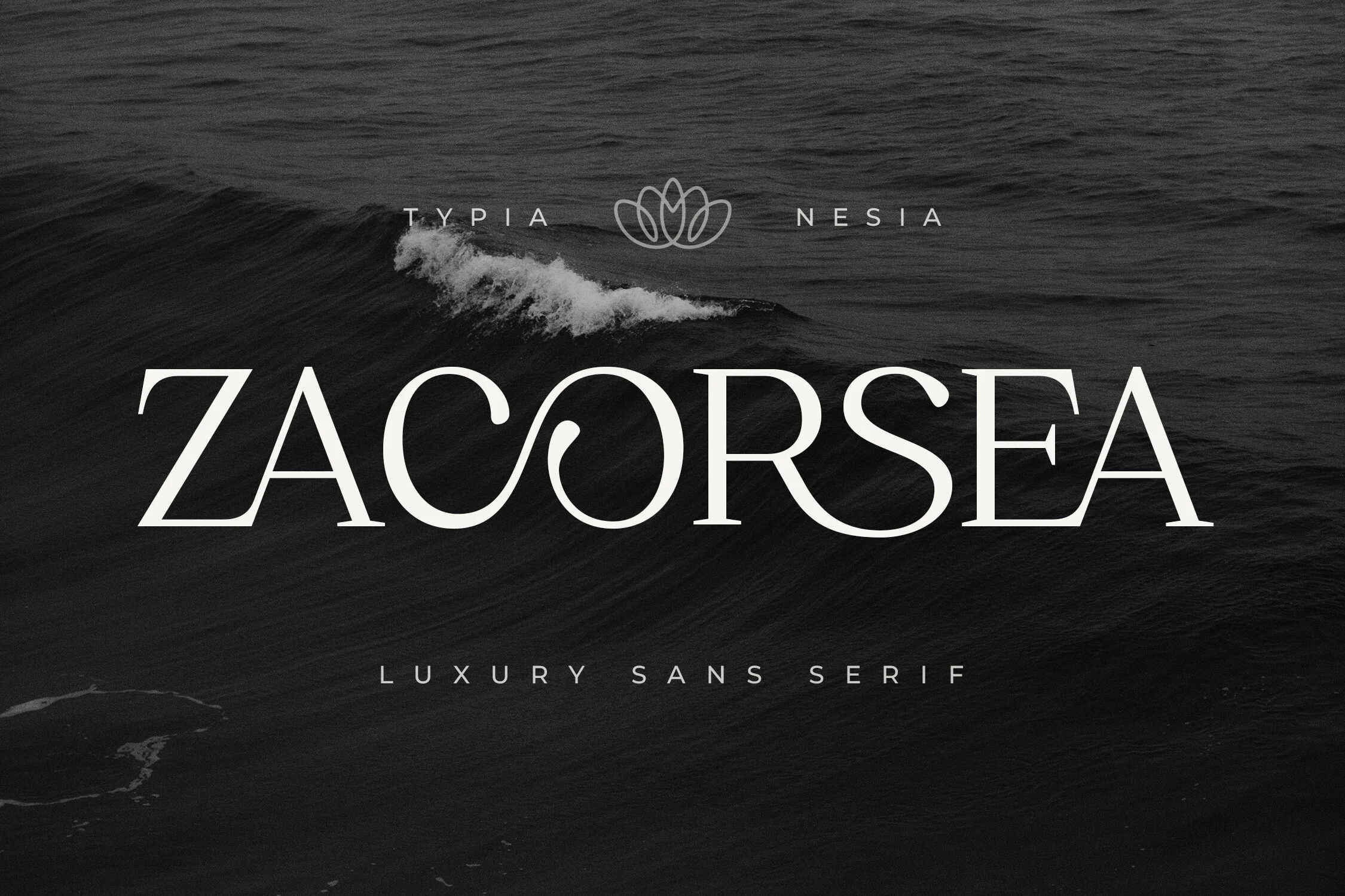
Best For: beauty branding, packaging, logos, luxury designs
Zacorsea Font has the kind of poised contrast that immediately reads premium: tall capitals, fine hairlines, and smooth sweeping curves balanced by crisp serif details. In the preview, the generous spacing and the distinctive linked curve through the middle letters give the wordmark a calm, expensive rhythm rather than a rigid formal feel.
If you’re building Beauty Branding Fonts into a visual identity, Zacorsea is especially strong for skincare names, luxury logos, and refined packaging where a few words need to carry the whole mood. Its ligatures help headlines feel polished, but the font looks best with room to breathe and simple supporting type that doesn’t compete with the elegant shapes.
Editorial Style Font
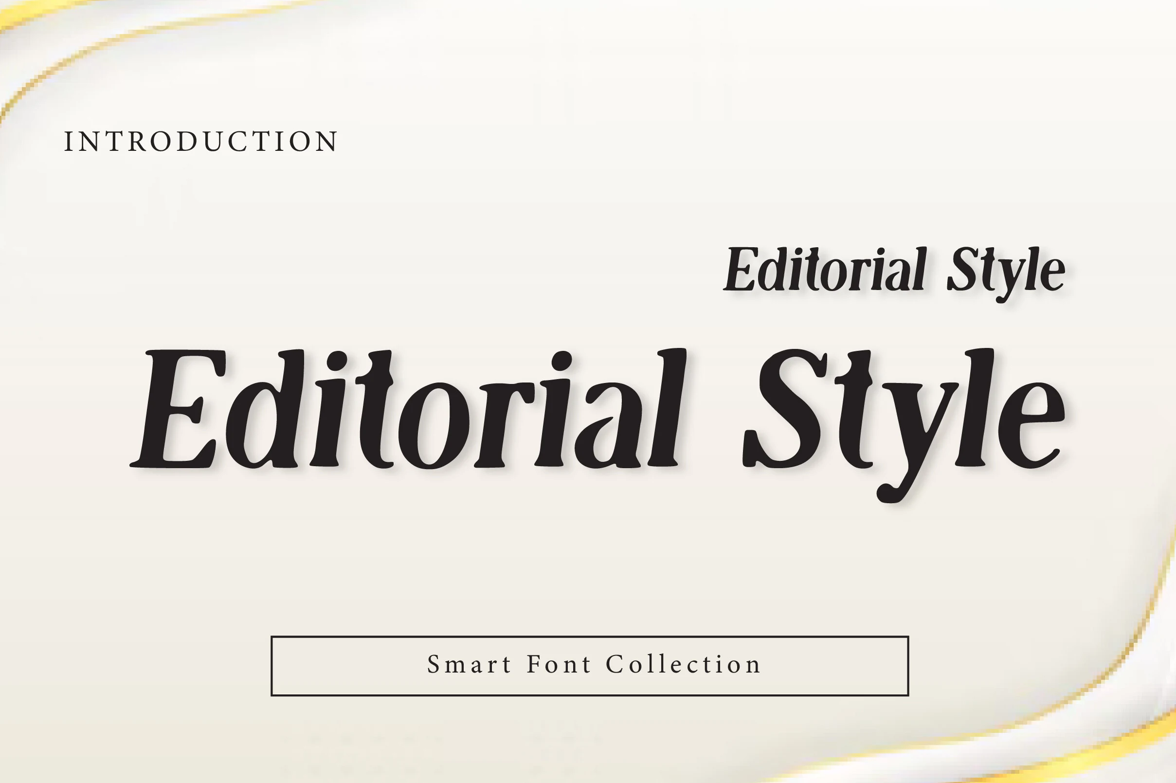
Best For: beauty branding, editorial designs, logos, high-end designs
Editorial Style Font is a display serif with strong magazine character: angled stress, sturdy verticals, crisp serif cuts, and enough contrast to feel polished without becoming fragile. The preview shows a slanted rhythm and compact spacing, so the type reads fashionable and direct rather than overly ornamental.
For Beauty Branding Fonts, it works well on labels, campaign titles, and refined wordmarks where the text needs authority with a softer editorial edge. Keep tracking controlled instead of loose; the italic movement already adds energy, while quiet supporting type will keep the hierarchy clean.
Cloreage Font
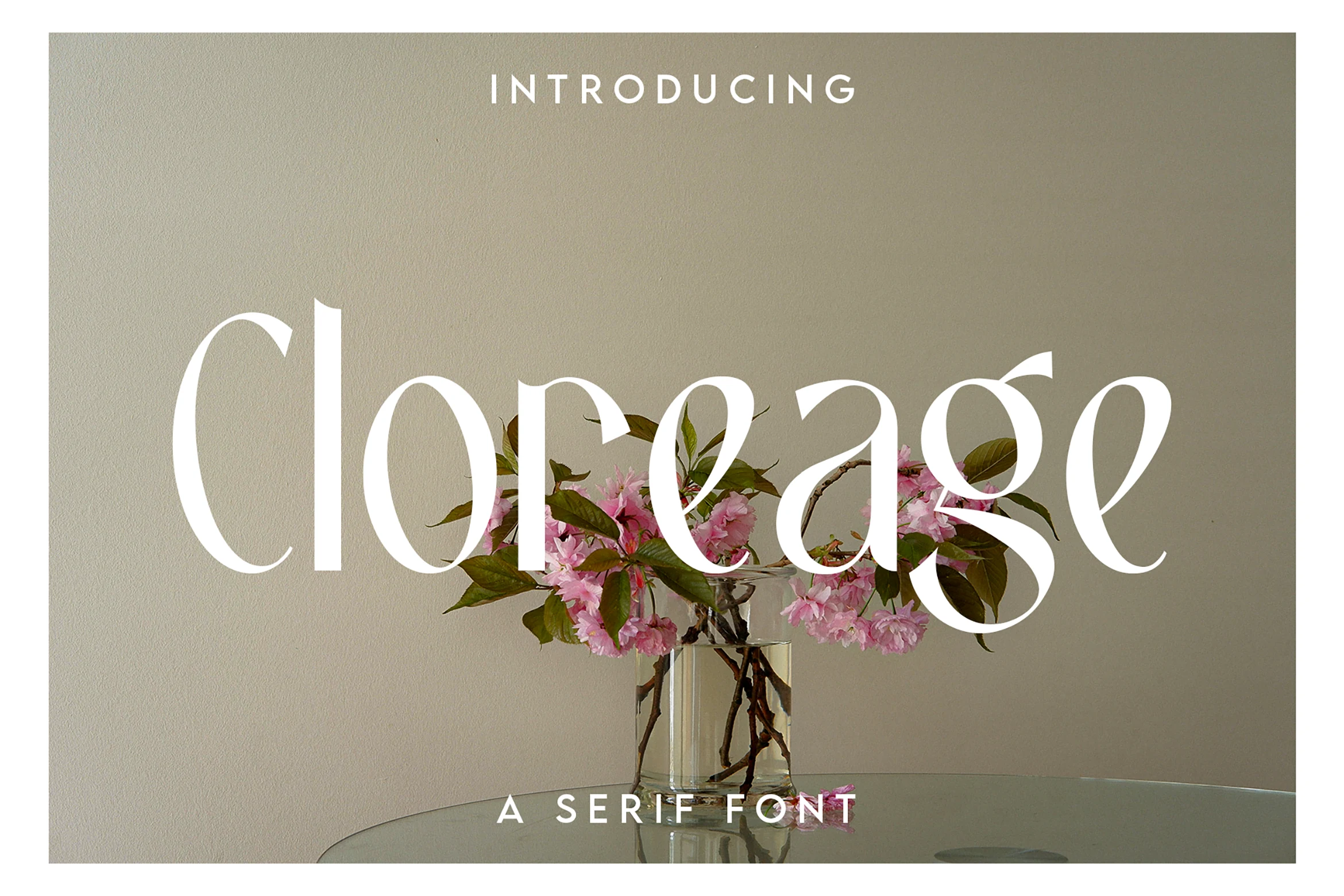
Best For: beauty branding, logos, editorial designs, wedding designs
Cloreage Font leans into quiet editorial elegance, with tall proportions, fine hairlines, and smooth curves that keep the serif structure light rather than rigid. The narrow stems, rounded bowls, and graceful sweep of the g give the wordmark a polished rhythm that feels soft, airy, and considered.
That balance makes it a strong choice for Beauty Branding Fonts, especially in logos, invitation headings, and lifestyle packaging where a few words need to carry the mood. It performs best at display size with generous margins and restrained supporting type, so the contrast and delicate terminals stay crisp.
Beinora Font
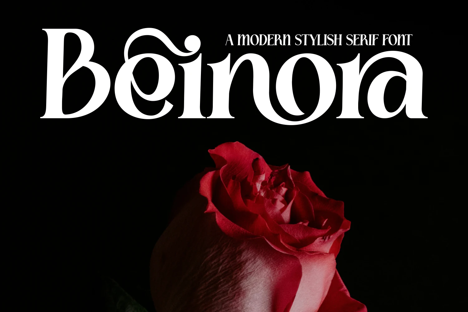
Best For: beauty branding, logos, packaging, luxury designs
Beinora Font is built around sharp thick-to-thin contrast, with broad rounded bowls, narrow hairlines, and curled serif details that make the letters feel dramatic but controlled. The preview shows a heavy capital B, looping inner curves, and a teardrop-style accent on the i, giving the wordmark a rich cosmetic-campaign presence.
For Beauty Branding Fonts, Beinora is strongest in short logos, premium labels, and display headlines where the contrast can stay crisp. Use a clean background and avoid tight tracking; the ornamental curves already create movement, so restrained spacing keeps the composition polished instead of crowded.
Casmera Font
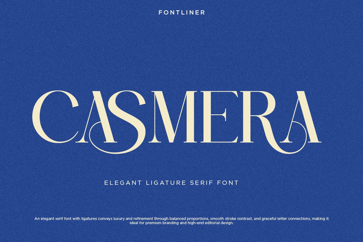
Best For: beauty branding, logos, editorial designs, luxury designs
Casmera Font has a poised editorial look, with tall serif capitals, crisp stroke contrast, and elegant looped ligature details that soften the structure without making it fussy. In the preview, the sweeping curves inside the A forms and the broad, balanced spacing give the word a polished rhythm that feels classic and high-end.
For Beauty Branding Fonts, that mix of refinement and clarity works especially well in luxury logos, boutique packaging, and magazine-style headings. Keep it for short lines where the ligatures can stand out, and pair it with restrained supporting text so the decorative connections stay sharp and intentional.
Minimal & Modern Beauty Branding Fonts
These cleaner display fonts use slim strokes, open spacing, and graphic ligatures for modern cosmetic identities, fashion marks, and refined package fronts.
Once After Font
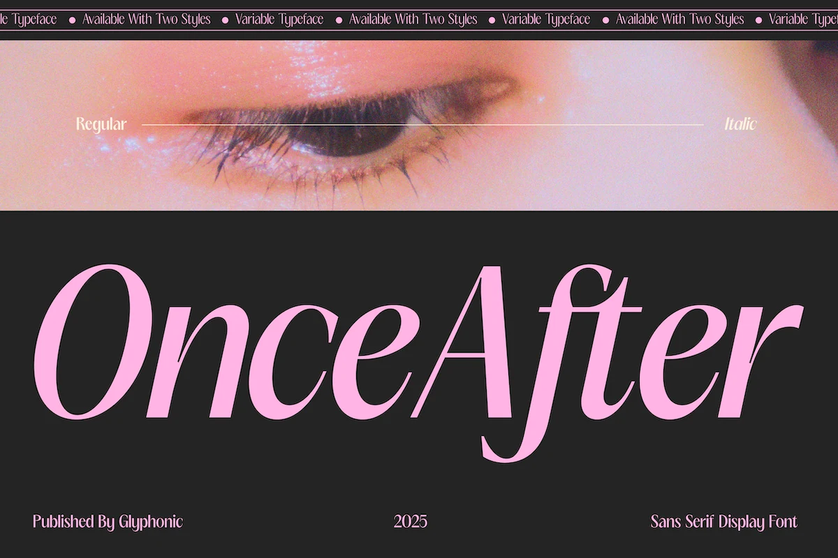
Best For: beauty branding, logos, headlines, editorial designs
Once After Font has a sleek display presence built on high-contrast strokes, wide open apertures, and smooth curved terminals that keep the letterforms airy even at large scale. The preview shows a refined sans structure with a fashion-led rhythm, especially in the tall A and the long, tapering descender on the f.
That balance makes it a smart pick for Beauty Branding Fonts when a wordmark needs to feel polished without slipping into a traditional serif look. The regular and italic styles give you clean hierarchy for campaigns or packaging, and the font works best when paired with generous spacing and restrained supporting text.
Poina Font
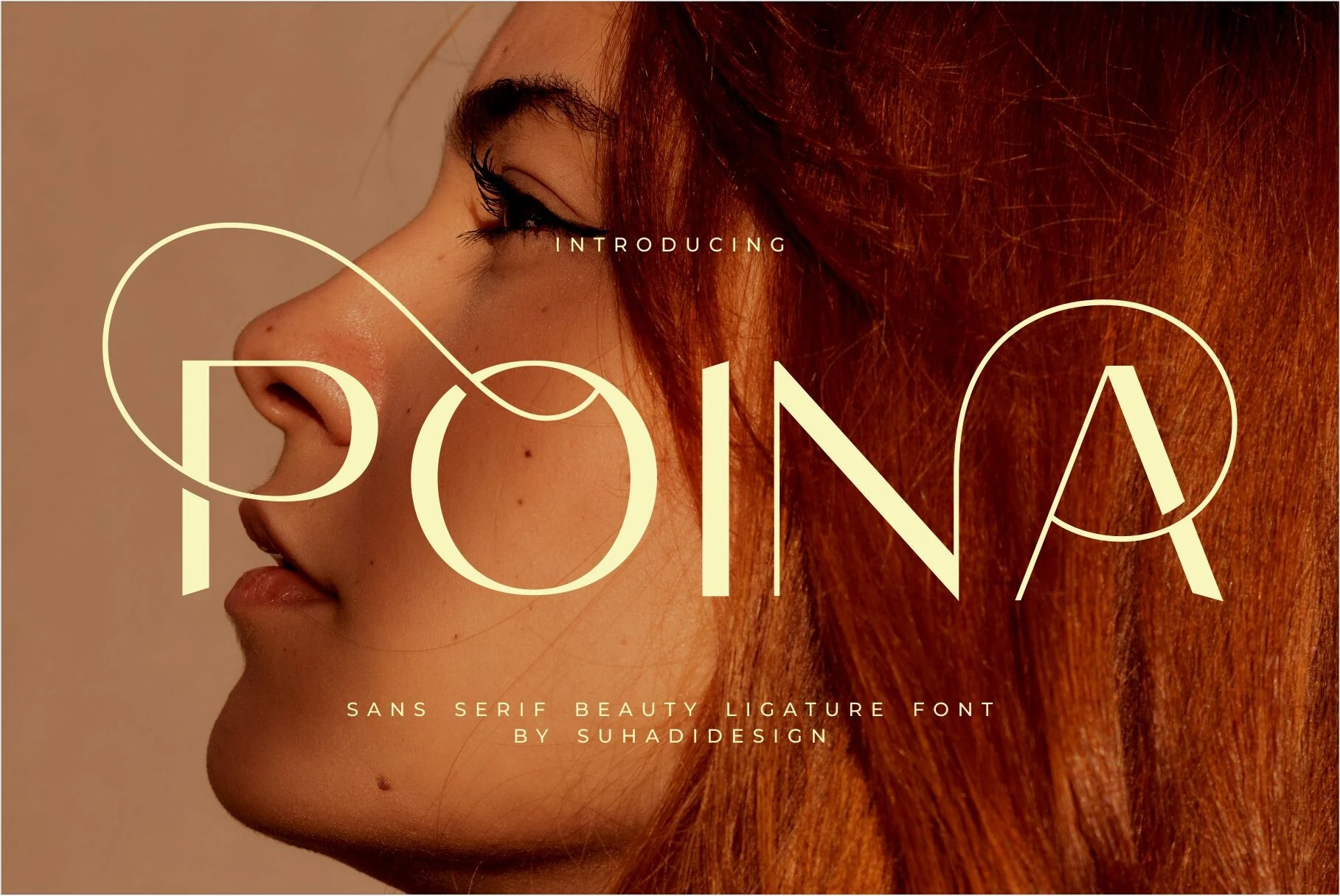
Best For: beauty branding, logos, packaging, social media graphics
Poina Font has a sleek beauty-editorial feel built from clean verticals, broad curves, and unusual circular ligature loops that turn the wordmark into a graphic element. In the preview, the sweeping loop from the P into the O and the ring around the A give the letters a custom, high-fashion rhythm while the overall spacing stays airy and modern.
That makes it especially effective for Beauty Branding Fonts when a logo or package front needs to look distinctive with very little decoration. Use it for short names and headlines rather than long copy, and let the ligatures breathe inside simple layouts so the overlapping curves stay crisp instead of crowded.
Elvera Font
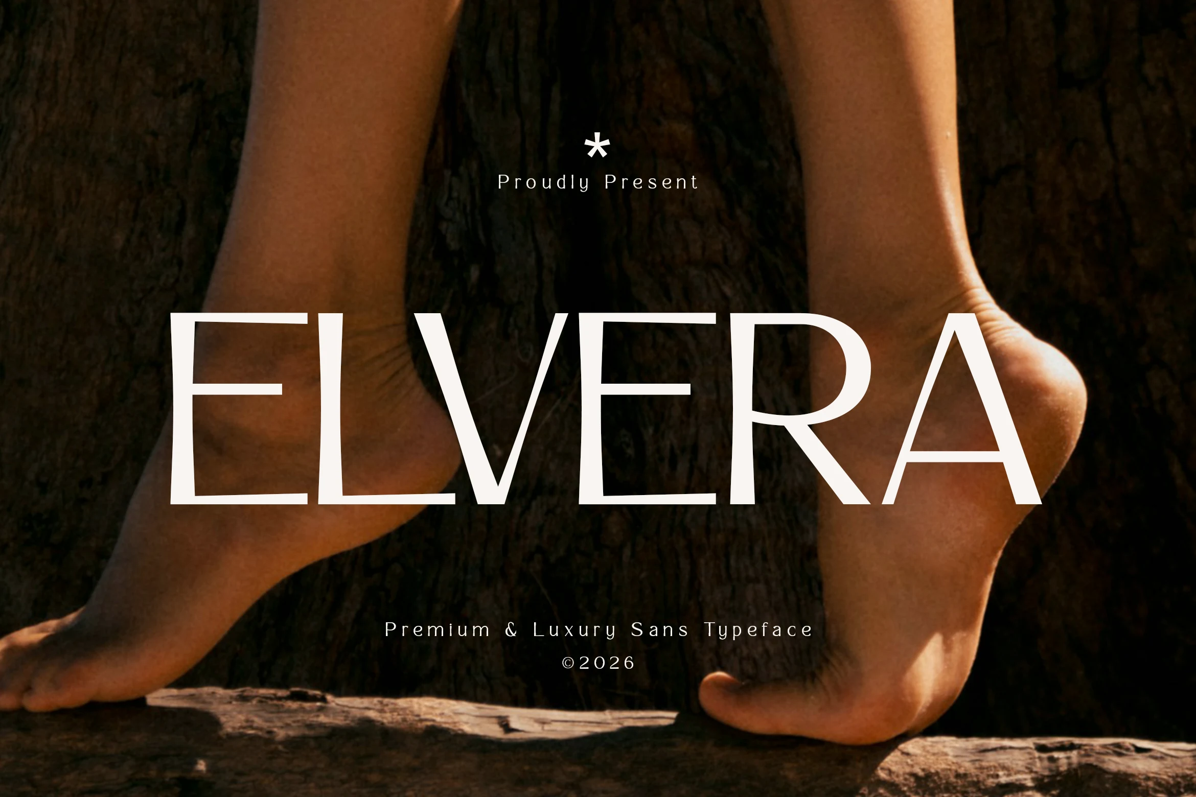
Best For: beauty branding, logos, fashion branding, luxury designs
Elvera Font has a quiet luxury feel built on slim strokes, clean geometric construction, and generous proportions. The all-caps preview shows long horizontals, open counters, and steady spacing, so the type reads polished and modern without looking cold or overly technical.
That restraint makes it a natural fit for Beauty Branding Fonts, especially for fashion marks, cosmetic packaging, and editorial mastheads that need a calm premium voice. Use it at medium to large sizes and keep surrounding typography minimal; a little extra tracking and clear margins help the slender shapes hold their elegance.
Script & Signature Beauty Branding Fonts
These flowing handwritten and calligraphy fonts work for personal beauty brands, salon logos, feminine packaging, and social graphics that need warmth and polish.
Ametha Sweet Font
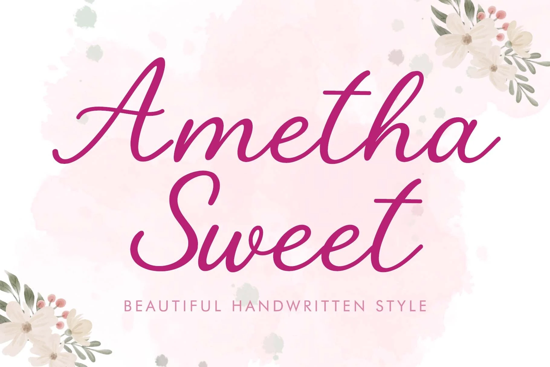
Best For: beauty branding, logos, social media graphics, feminine designs
Ametha Sweet Font has a light, easy rhythm that feels genuinely handwritten rather than formal. The letterforms are rounded and open, with long entry strokes, soft joins, and a clean baseline flow that keeps the script readable while still giving it a bright, feminine personality.
For Beauty Branding Fonts, this style works especially well when you want a logo or packaging title to feel personal and polished without looking overly ornate. It handles short names best, and a little extra line spacing helps the tall ascenders and sweeping capitals stay graceful in stacked layouts.
Justine Signature Font
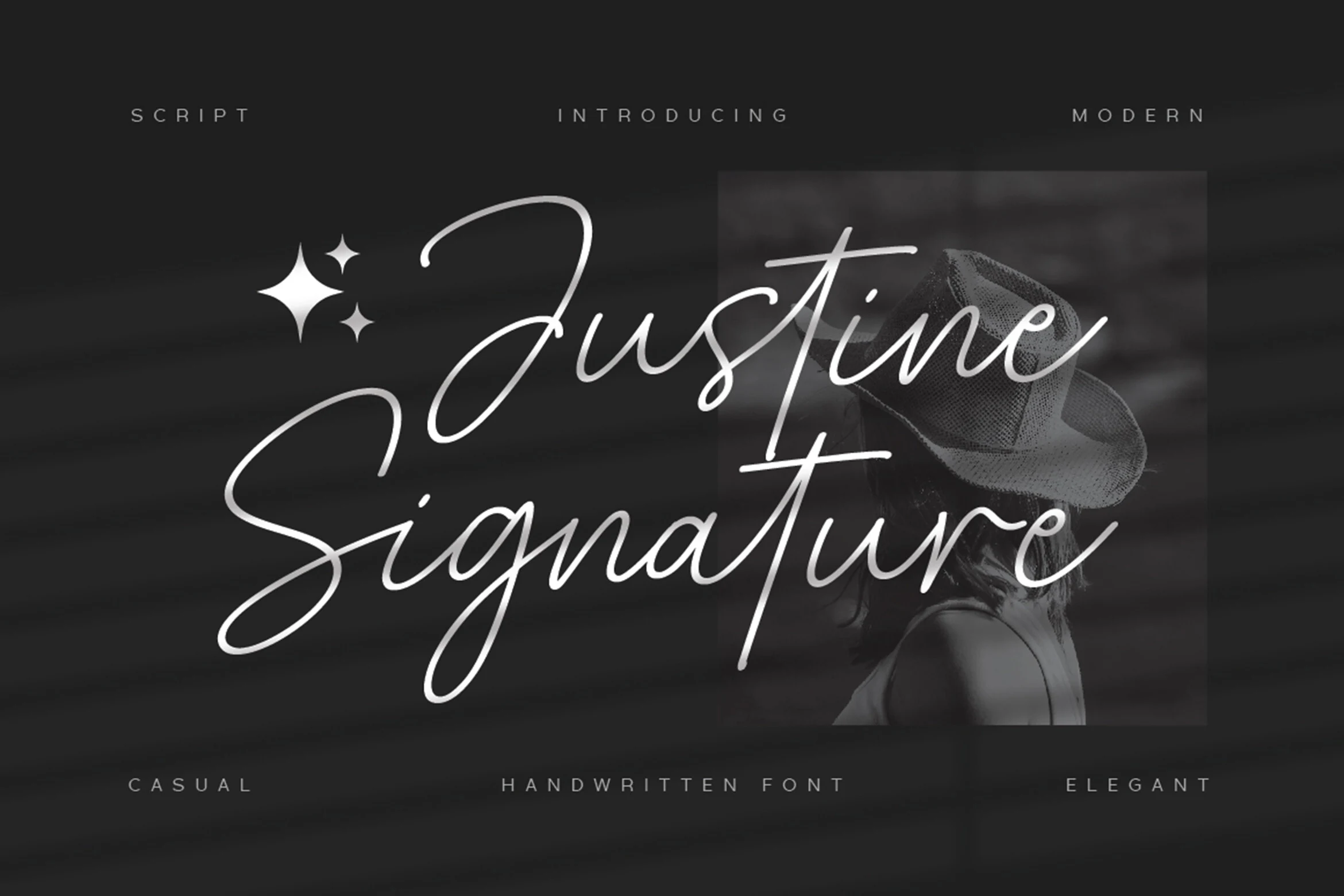
Best For: beauty branding, logos, packaging, personal branding
Justine Signature Font has a slim handwritten flow with long entry strokes, airy loops, and sharp vertical accents that give the script a modern signature feel. The large capitals stretch wide across the line, while the lighter stroke weight keeps the lettering refined instead of heavy or overly decorative.
For Beauty Branding Fonts, it works best in short names, personal logos, packaging marks, and social graphics where the text should feel personal but still polished. Give the swashes enough horizontal space and avoid tight line stacking, because the long curves are the main visual feature.
Ladiesy Font
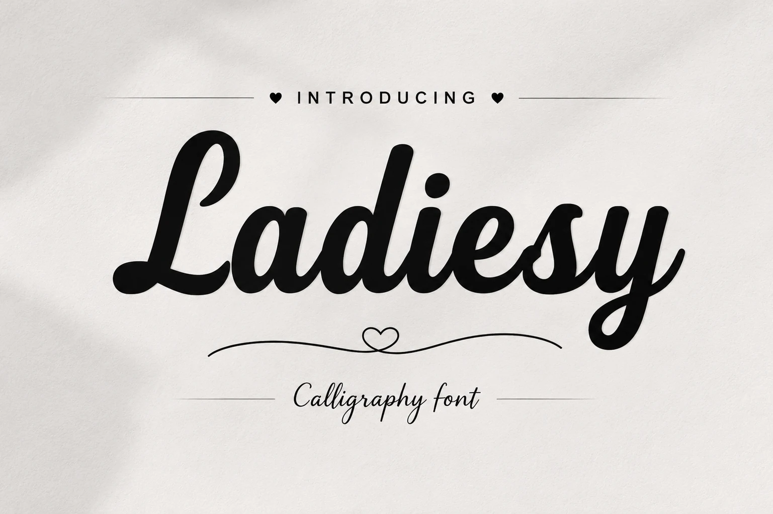
Best For: beauty branding, logos, invitations, feminine designs
Ladiesy Font has a bold calligraphy rhythm with rounded strokes, thick downstrokes, and smooth joins that keep the script flowing as one confident line. The capital L opens with a soft loop, the counters stay full and readable, and the ending y adds a graceful finish without making the word feel overly ornate.
That balance makes it especially effective for Beauty Branding Fonts that need warmth and polish at the same time. It works best in short names, invitations, and logo-style headings, where the connected forms can stay clear; give it enough width in the layout so the curves and swashes don’t feel cramped.
Bold & Retro Beauty Branding Fonts
These heavier retro styles fit product names, campaign headlines, and standout packaging where a beauty brand needs a playful, memorable display voice.
Violetta Font
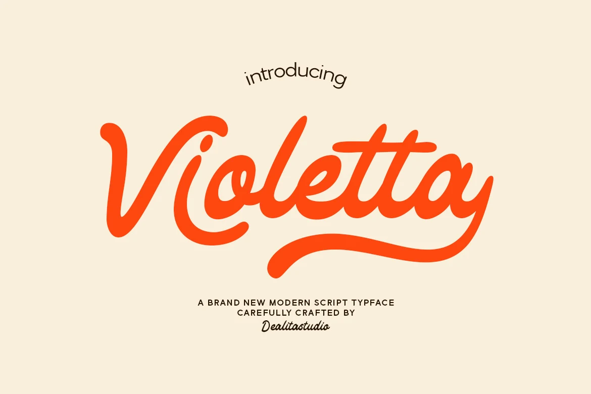
Best For: beauty branding, logos, packaging, retro designs
Violetta Font has a bold retro script voice with smooth connected strokes, rounded terminals, and a wide looping rhythm that feels both nostalgic and polished. The capital V opens with a generous curve, while the finishing swash stretches far beneath the word, giving short names a confident, handcrafted silhouette.
That makes it a strong fit for Beauty Branding Fonts when you want a mark that feels warm, feminine, and instantly recognizable. Use it for logos, jar labels, or social graphics at display size, and leave extra horizontal space so the long tail and compact joins don’t crowd the layout.
Rose Titan Font
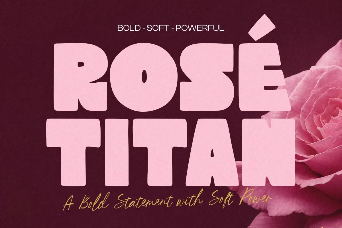
Best For: beauty branding, packaging, headlines, retro designs
Rose Titan Font is a heavyweight display style with broad proportions, rounded corners, and dense counters that make the letters feel plush instead of rigid. The preview leans into a retro poster mood, with a blocky R, a nearly circular O, and sculpted inner cuts that give the word a playful, high-impact rhythm.
Within Beauty Branding Fonts, it stands out when you want packaging, campaign headlines, or product names to feel bold and feminine at the same time. Keep the supporting type simple and give it generous breathing room, because the thick shapes and compact spacing already do most of the hierarchy work.
Conclusion
Choosing beauty branding fonts depends on the role of the type. Use high-contrast serifs for luxury skincare and editorial packaging, clean modern styles for fashion-led identities, scripts for personal or feminine brands, and bold retro fonts when the design needs stronger product-shelf impact.