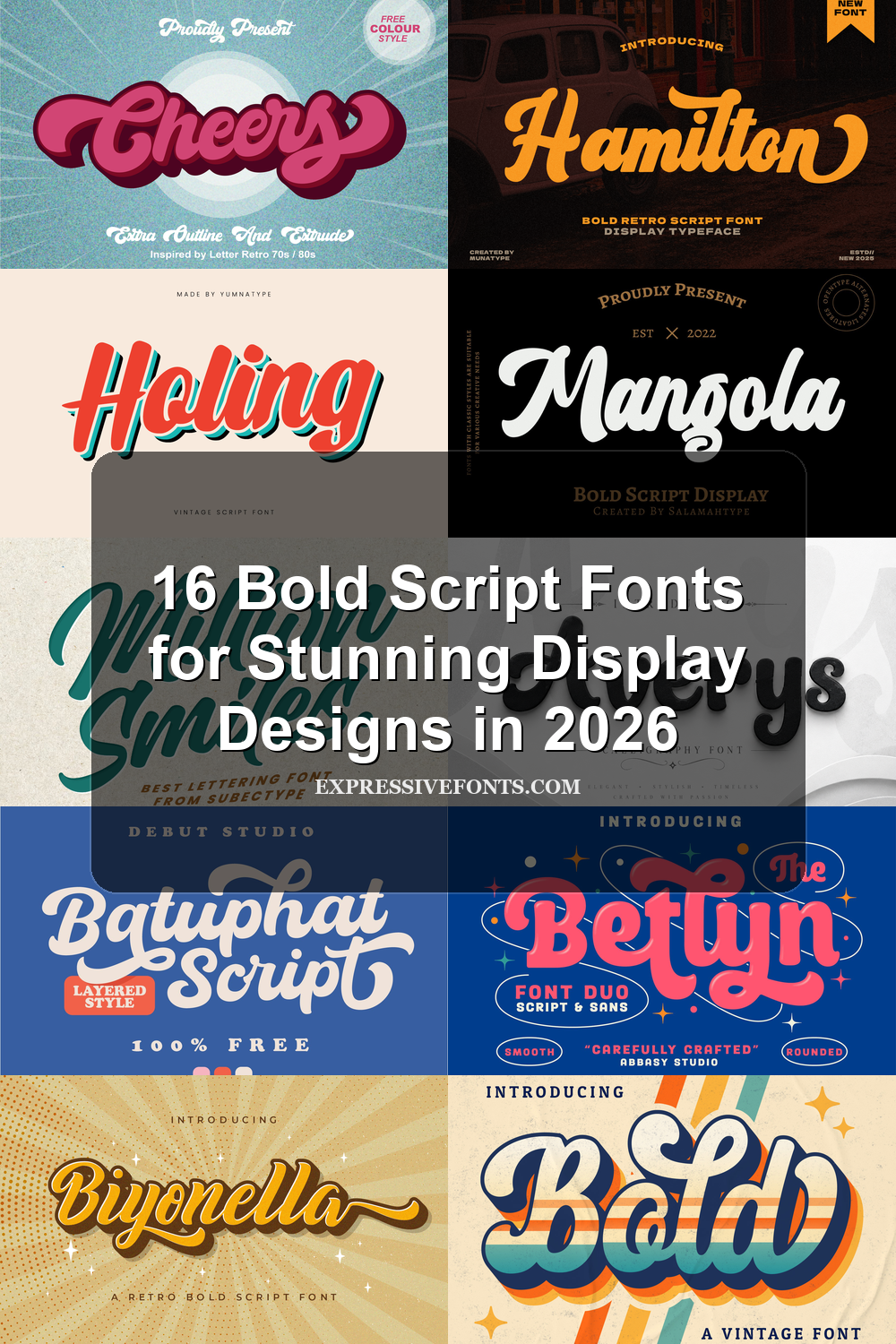
16 Bold Script Fonts for Stunning Display Designs in 2026
Bold Script Fonts bring thick connected strokes, expressive curves, and strong display weight to visual projects. This collection is built for designers choosing fonts for logos, posters, packaging, stickers, merch, invitations, and social graphics. Use the categories below to compare retro, playful, rounded, and polished script styles without scanning every font one by one.
Retro & Layered Bold Script Fonts
These bold script fonts use vintage curves, shadows, inline details, and sign-painter energy, making them strong choices for posters, merch, signage, and nostalgic logo marks.
Price Mart Duo Font
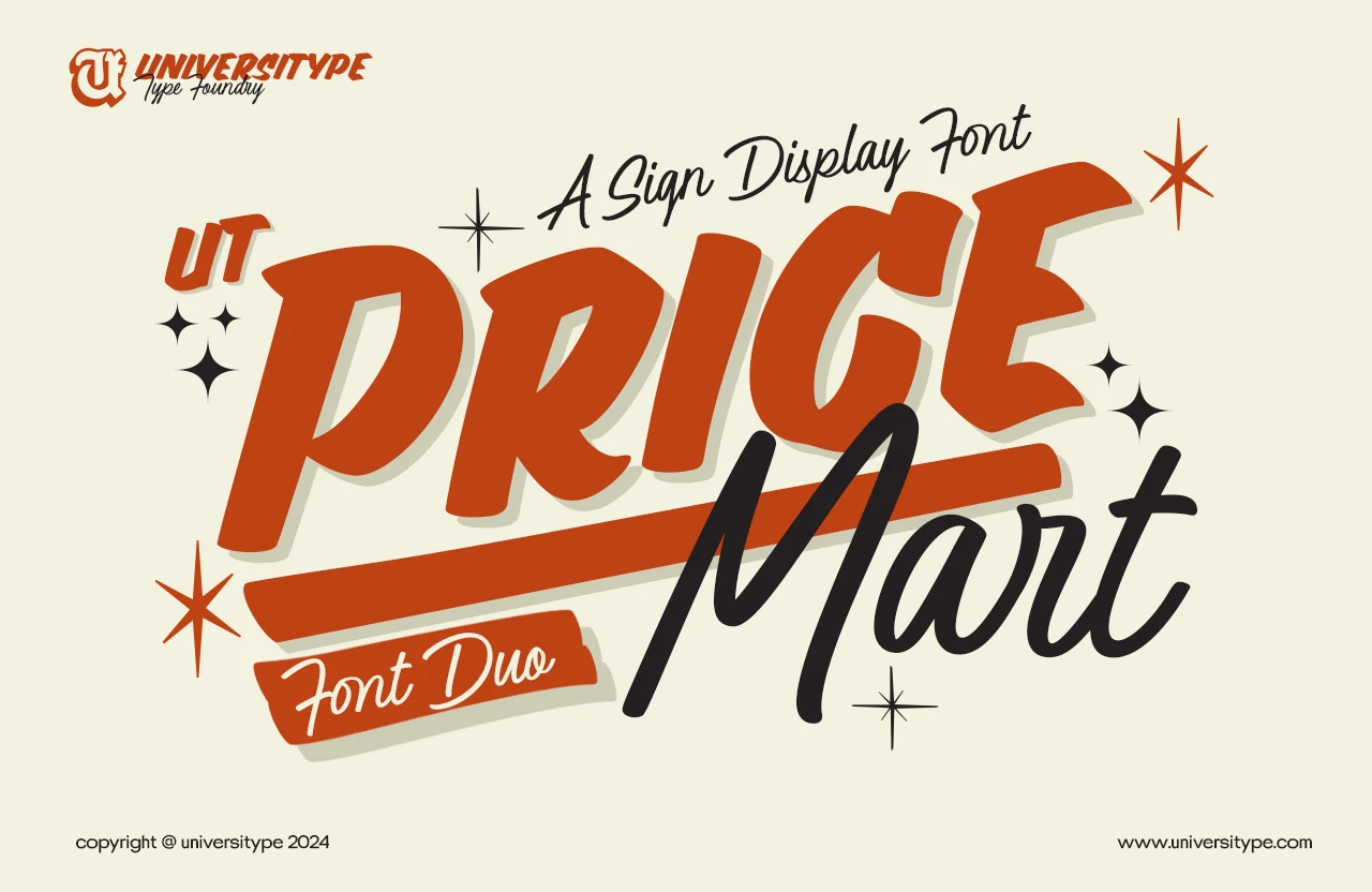
Best For: signage, posters, logos, retro designs
Price Mart Duo Font pairs a chunky slanted display style with a loose script, giving the layout a clear sign-painter rhythm. The bold caps have angled cuts, tight counters, and a slightly irregular hand-drawn edge, while the script adds long looping strokes suited to Bold Script Fonts with a retro commercial feel.
The practical strength is hierarchy: use the heavy sans for the main word, then let the script act as a secondary name, tag, or modifier. Keep contrast high and avoid crowding the script beneath dense headlines, because its tall loops need room to stay readable against the blockier lettering.
Cheers Font
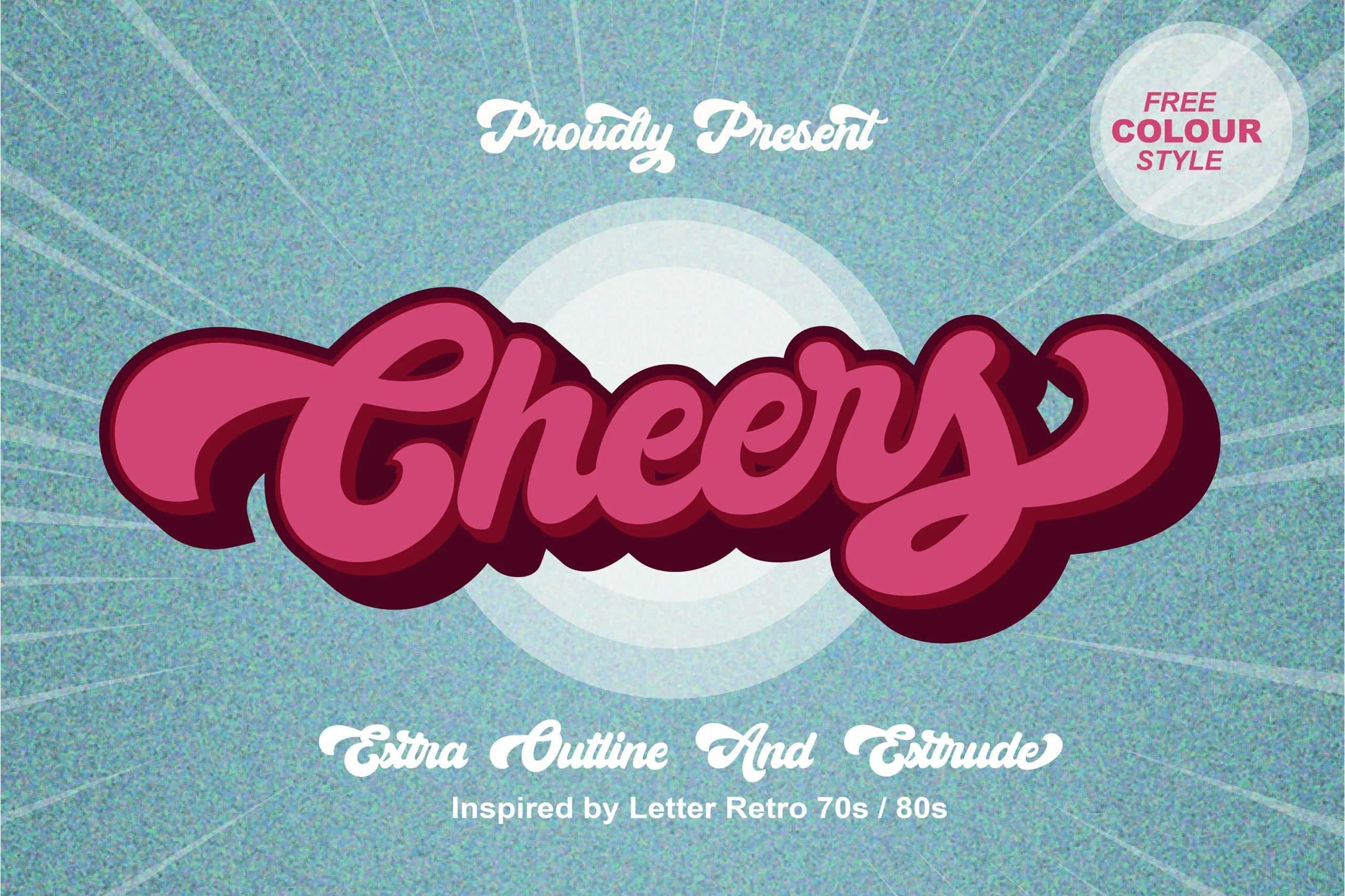
Best For: logos, posters, stickers, retro designs
Cheers Font pushes a 70s and 80s sign-lettering mood through thick connected strokes, inflated curves, and oversized entry and exit swashes. Its rounded script shape feels upbeat rather than polished, giving Bold Script Fonts a strong retro display voice with plenty of logo-ready weight.
The style works best when the main word is short and allowed to dominate the layout. Use the outline or extruded treatment to separate it from busy backgrounds, and keep supporting text simpler and smaller so the heavy script remains the visual focus.
Holing Font
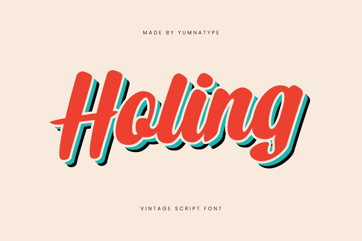
Best For: logos, signage, posters, vintage designs
Holing Font has a vintage sign-script build: heavy rounded strokes, a steady forward slant, and smooth joins that keep the word moving without turning sharp. The tall initial forms and compact inner loops give it enough structure for Bold Script Fonts that need a clear retail or poster headline.
Its weight carries the message well, but the layered shadow effect needs consistent offset and strong color separation to stay clean. Use it for short names or display phrases where the thick curves can sit large, and keep secondary type narrow and simple so it does not compete with the script’s broad rhythm.
Biyonella Font
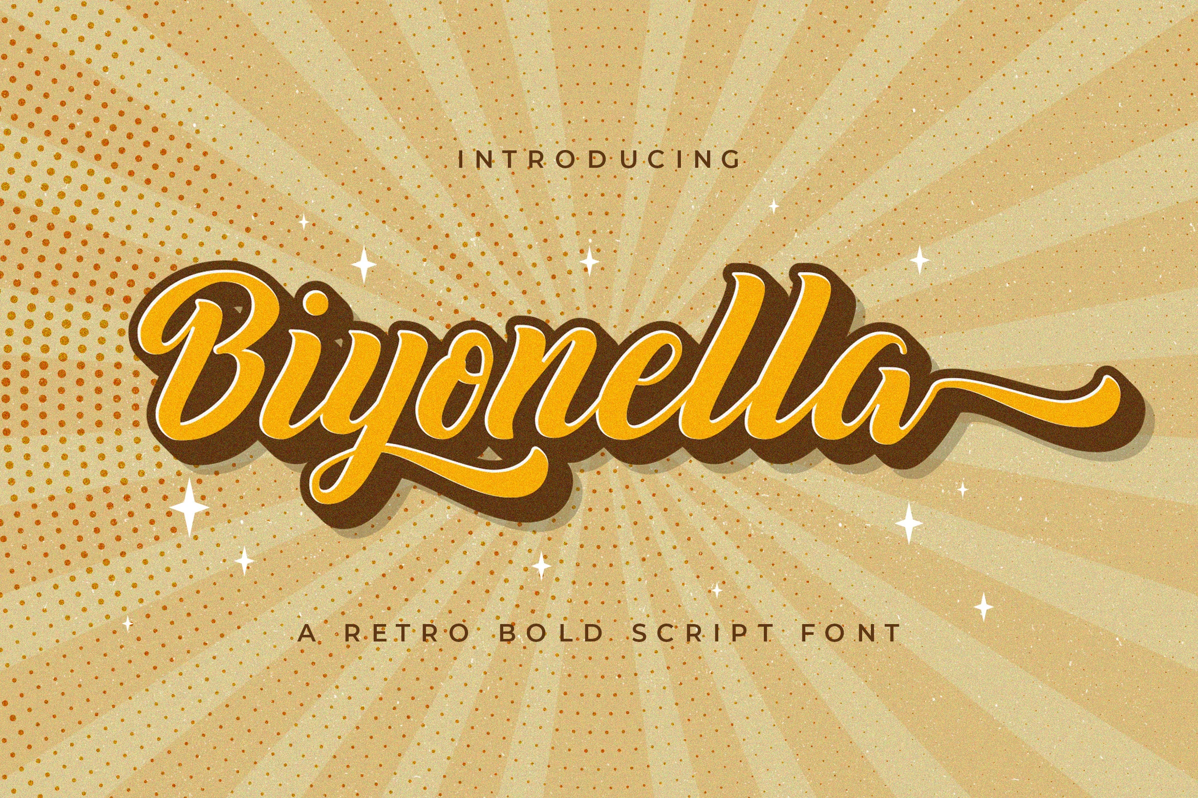
Best For: logos, branding, posters, retro designs
Biyonella Font has a rounded retro script build with thick connected strokes, a high-contrast inline effect, and a long exit swash that gives the word a vintage badge or poster feel. The large looped capital and smooth lowercase joins make it a strong fit for Bold Script Fonts with clear display energy.
The brown shadow and white outline treatment show how well it handles layered color, but the spacing still needs room around the descenders and terminal swash. PUA encoding helps reach glyphs and swashes for custom wordmarks, especially when shaping logos, packaging names, or short retro headlines.
Hamilton Font
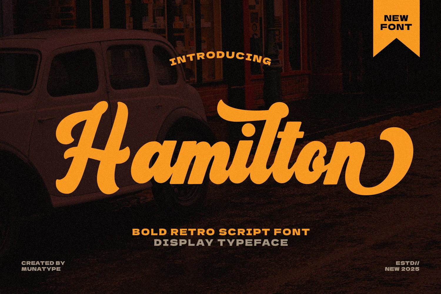
Best For: logos, signage, posters, retro designs
Hamilton Font has a bold retro script rhythm with thick slanted strokes, rounded terminals, and a broad capital H that gives the word an immediate sign-painter feel. Its smooth joins and curled final stroke make it a strong choice for Bold Script Fonts where the headline needs motion without losing weight.
The lettering is compact through the middle, so the strongest use is a short name or main brand word with enough space around the first and last swashes. Keep supporting text squared-off or condensed, and use high contrast so the heavy orange script stays readable over darker vintage-style compositions.
Bold Script Font
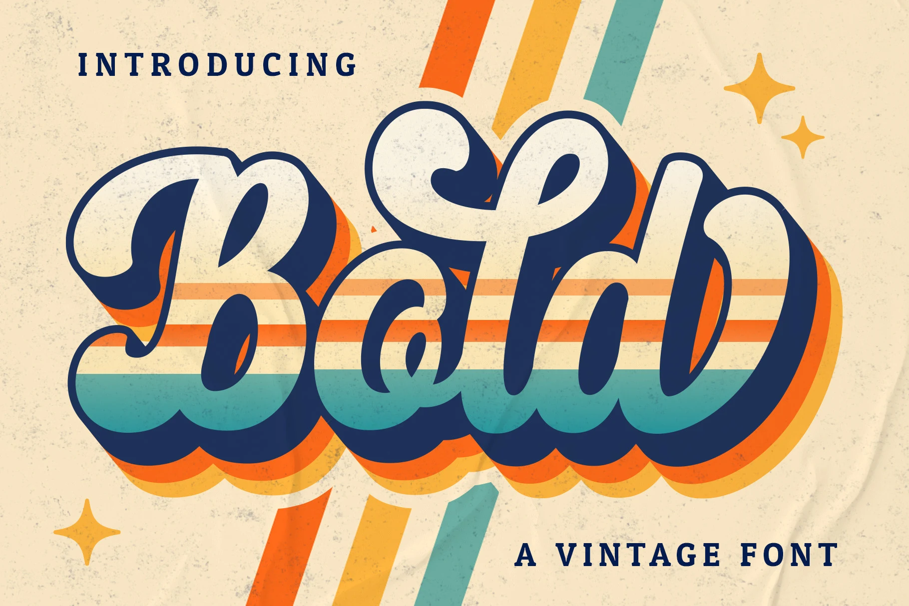
Best For: logos, branding, posters, vintage designs
Bold Script Font uses a thick vintage script structure with cream letterforms, a dark shadow, and layered color that gives the wordmark a poster-ready feel. Its rounded connections and heavy rhythm make it suitable for Bold Script Fonts that need instant display weight.
Use it for short brand names, retro packaging, badges, and headline graphics where the shadow can separate the script from the background. Keep the word large, avoid dense copy, and pair it with simple sans or serif support text.
Platina Script Font
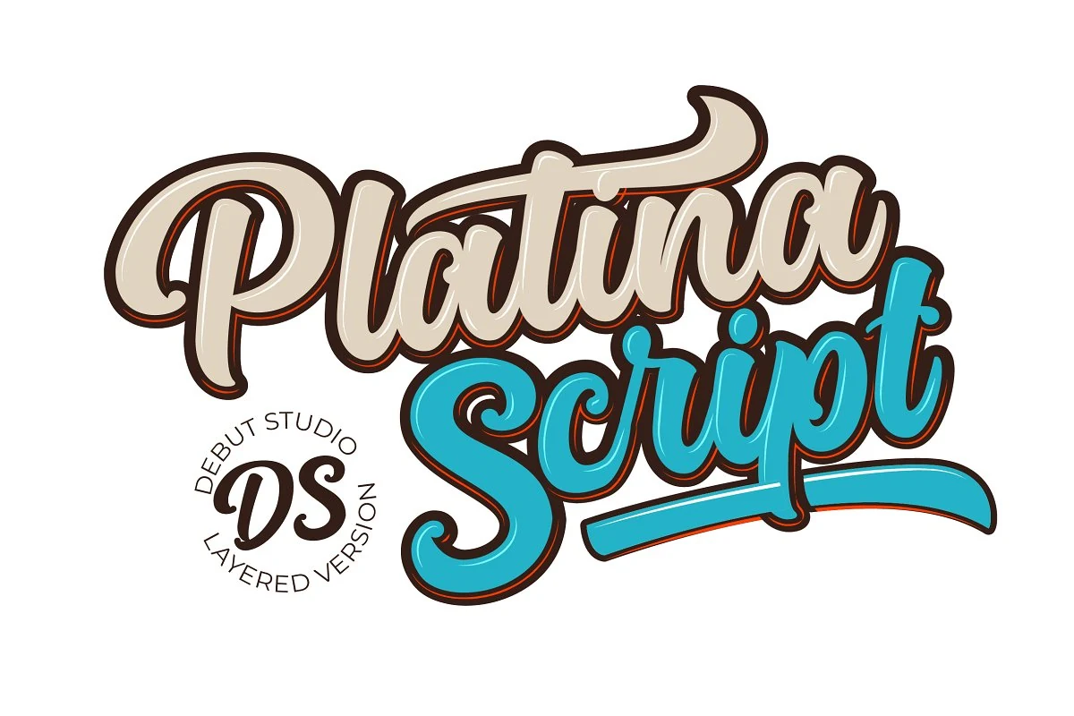
Best For: logos, posters, T-shirts, retro designs
Platina Script Font has a chunky retro script build with rounded strokes, deep curves, and long swashes that make the words feel locked into one bold display shape. Its connected rhythm and thick letter bodies give it the assertive presence expected from Bold Script Fonts without losing the casual hand-lettered flow.
The style works best when treated as a headline graphic rather than small text. Keep word count short, let the swashes define the outer silhouette, and use strong color contrast or layered effects to preserve the separation between tight loops, counters, and overlapping strokes.
Rounded & Playful Bold Script Fonts
This group focuses on softer bold script fonts with inflated curves, friendly terminals, and approachable movement for stickers, packaging, casual logos, and upbeat social graphics.
Roses Font
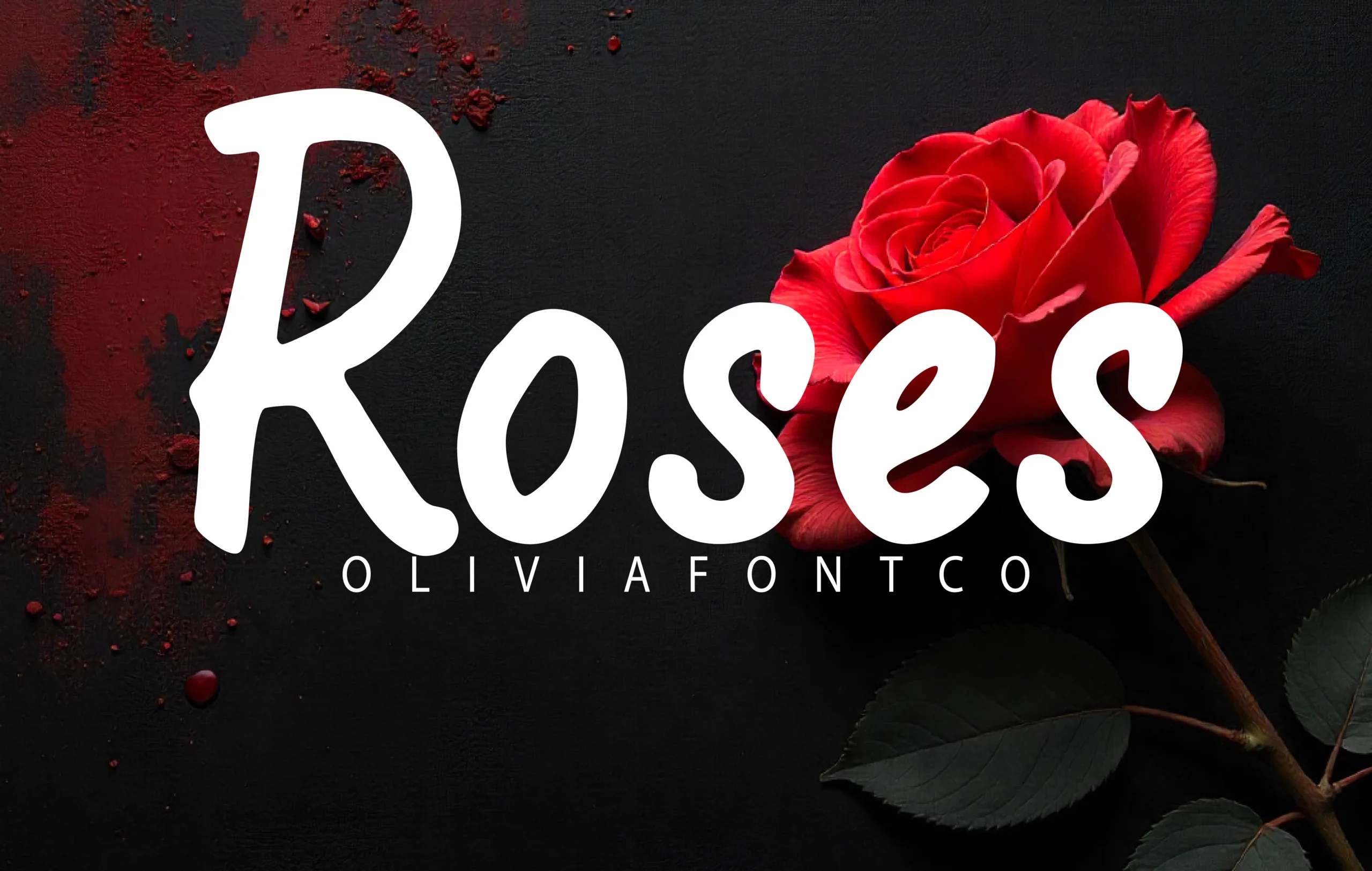
Best For: logos, packaging, posters, short phrases
Roses Font uses a heavy handwritten script shape with rounded bowls, soft internal counters, and smooth curves that feel more drawn than calligraphic. Its thick white strokes carry strong contrast against dark or saturated layouts, which suits Bold Script Fonts where the word needs to land immediately.
The letters sit close together with a flowing baseline, so it works best when the composition gives the word enough horizontal space. Use it for short names, romantic packaging, or poster titles, and avoid dense copy where the broad strokes and tight rhythm would start to crowd the message.
Million Smiles Font
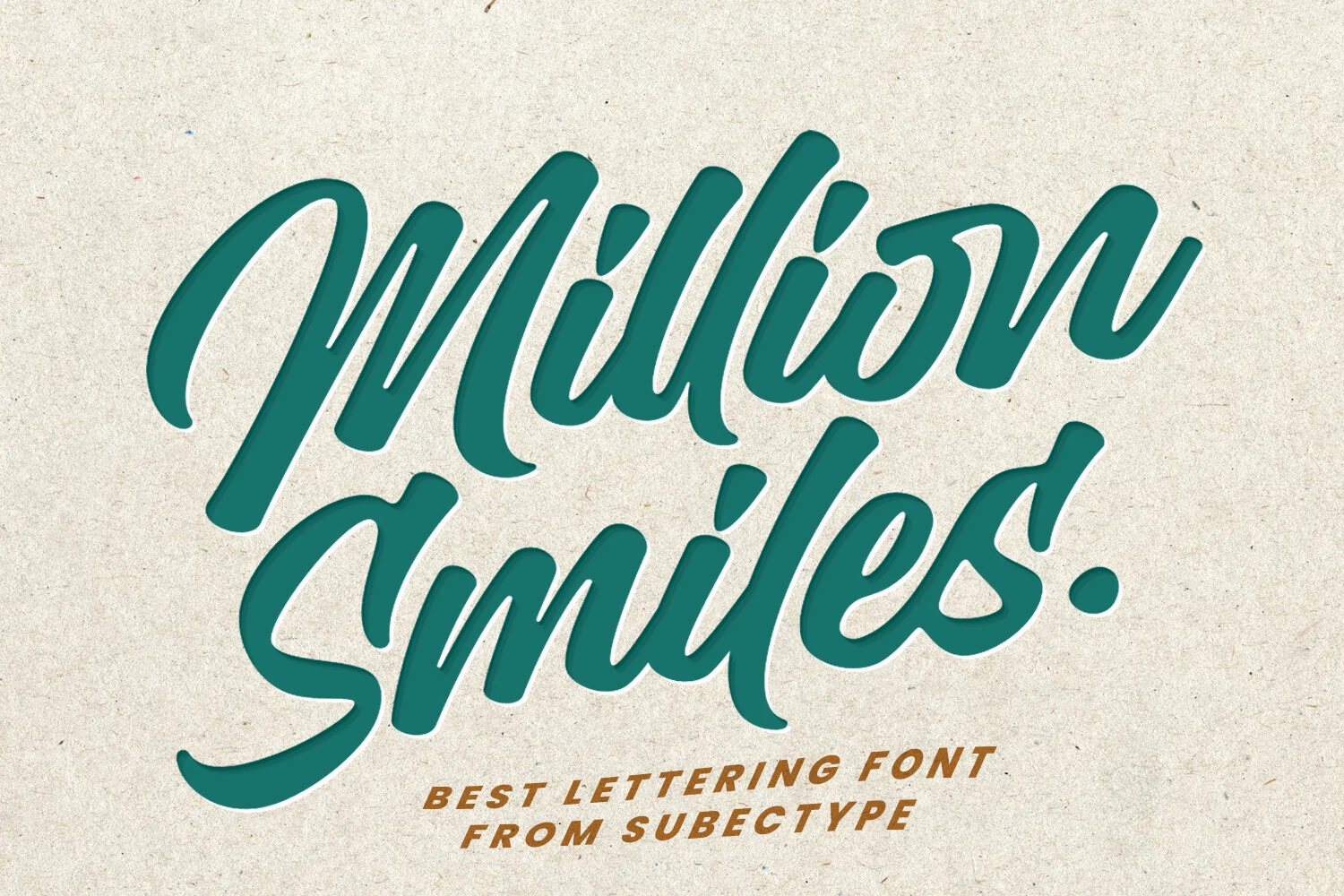
Best For: logos, signage, T-shirts, bold designs
Million Smiles Font has a dense hand-lettered rhythm, with thick connected strokes, rounded terminals, and long sweeping entries that make each word feel active. Its softened edges keep the heavy weight from turning harsh, which gives Bold Script Fonts a more casual and approachable display voice.
The letters lean into each other with tight joins and tall loops, so it works strongest in short phrases where the shape can stay large. Use clear spacing around the wordmark and strong background contrast; the broad strokes create impact quickly, but crowded layouts will flatten the inner counters.
Nebyla Font
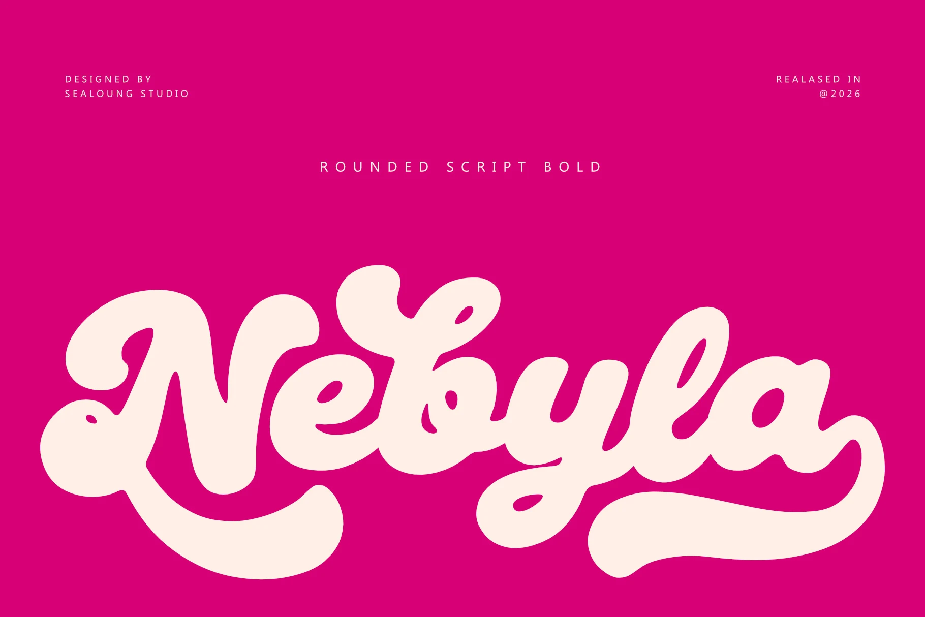
Best For: logos, posters, stickers, playful designs
Nebyla Font uses thick rounded script forms with swollen curves, soft terminals, and large sweeping underlines that give the word shape a strong retro-pop silhouette. For Bold Script Fonts, its appeal comes from the balance between heavy display weight and friendly, readable letter construction.
The counters stay mostly open, but the broad strokes and connected rhythm still need generous spacing around the wordmark. Use it for short names, poster titles, or playful packaging where one large script line can lead the hierarchy without competing with dense secondary text.
Betlyn Font
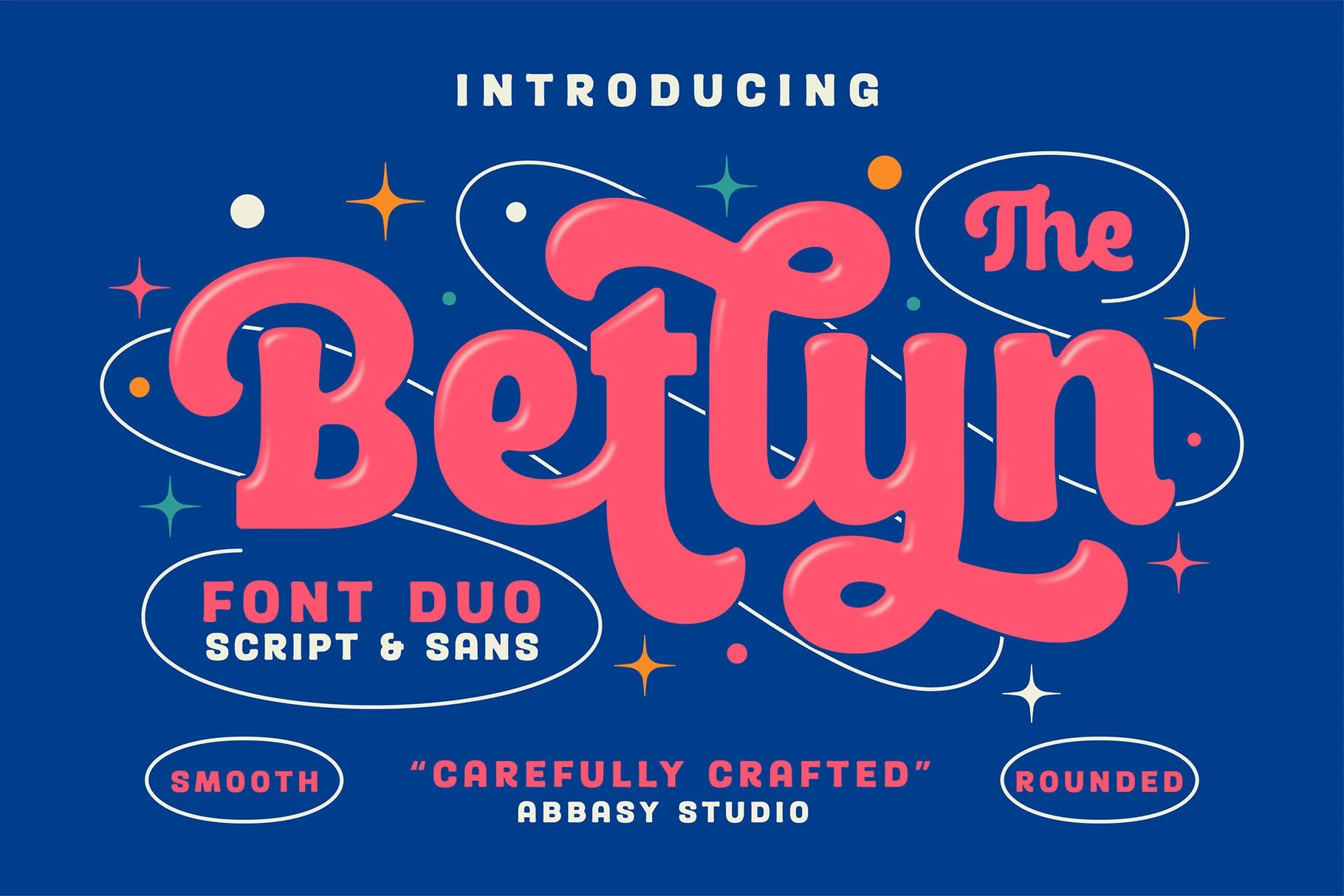
Best For: logos, posters, stickers, fun designs
Betlyn Font combines a thick rounded script with a compact smooth sans, giving the duo a bright retro poster personality. The script’s cushioned bowls, looped y, soft terminals, and open counters keep the main word readable while still carrying the heavy presence expected from Bold Script Fonts.
Use the script as the main brand word and let the sans handle small labels, badges, or supporting copy. Its broad connected forms benefit from clean outlines, generous edge spacing, and clear color separation; cramped compositions will make the strokes feel heavier than intended.
Rogade Font
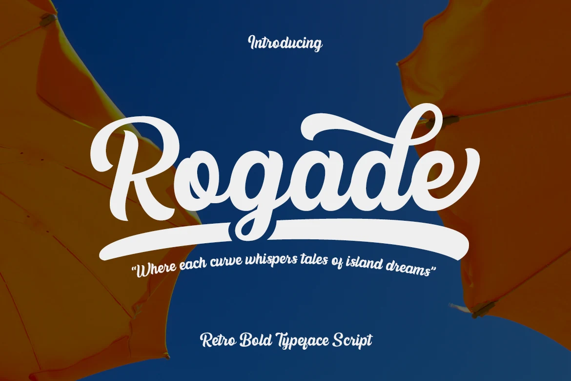
Best For: logos, posters, packaging, retro designs
Rogade Font has a groovy retro script shape with thick rounded strokes, a looped capital R, compact connected lowercase, and a long underline swash that turns the word into a ready-made headline mark. It fits Bold Script Fonts where the goal is a nostalgic, sunny, high-impact display style.
The wide swash is part of the composition, so leave enough horizontal space and avoid stacking it too tightly with secondary text. Use strong contrast behind the white forms, keep phrases short, and let smaller sans lettering handle captions or details while the script carries the logo, poster, or packaging title.
Elegant & Calligraphic Bold Script Fonts
These bold script fonts lean cleaner and more polished, with smooth calligraphic strokes suited to invitations, refined branding, greeting cards, and premium display headings.
Rachy Font
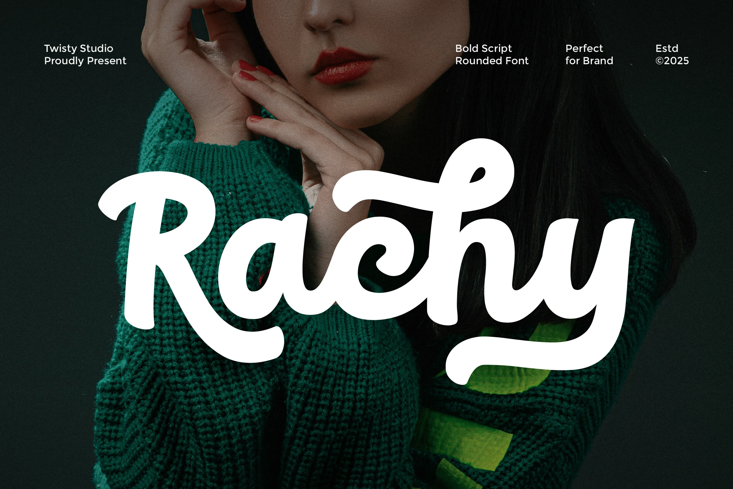
Best For: logos, packaging, social media graphics, fashion branding
Rachy Font is a bold rounded script with smooth connected strokes, open counters, and a long terminal sweep under the final y. The capital R has a broad loop and sturdy downstroke, giving Bold Script Fonts a confident brand-focused shape without making the word feel rigid.
Its clean curves stay readable at logo scale, but the thick forms need strong contrast and clear margins around the baseline swash. Use short names, product marks, or fashion-led social graphics, pairing it with restrained sans text so the script remains the main visual weight.
Mangola Font
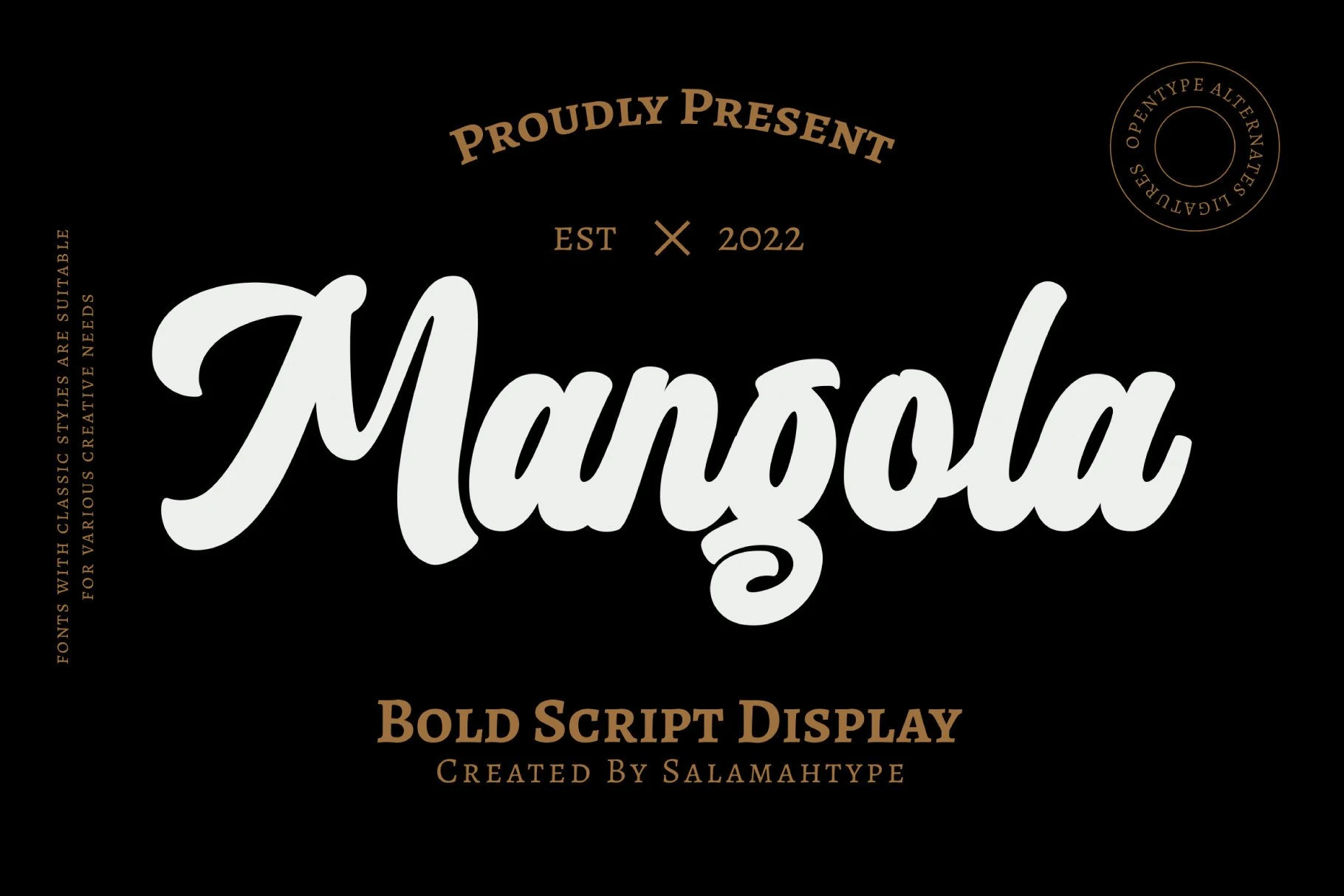
Best For: logos, invitations, greeting cards, quotes
Mangola Font has a classic bold script structure with thick connected strokes, rounded terminals, and a smooth handwritten flow. The large capital M gives the word a strong entry, while the curled g descender adds a decorative focal point that suits Bold Script Fonts with a more traditional display feel.
Its weight works well for names, card headings, and short quote lines, especially when paired with small serif or restrained uppercase support text. Keep the baseline clear around the descenders and avoid tight stacking, since the broad strokes need contrast and clean negative space to stay polished.
Batuphat Font
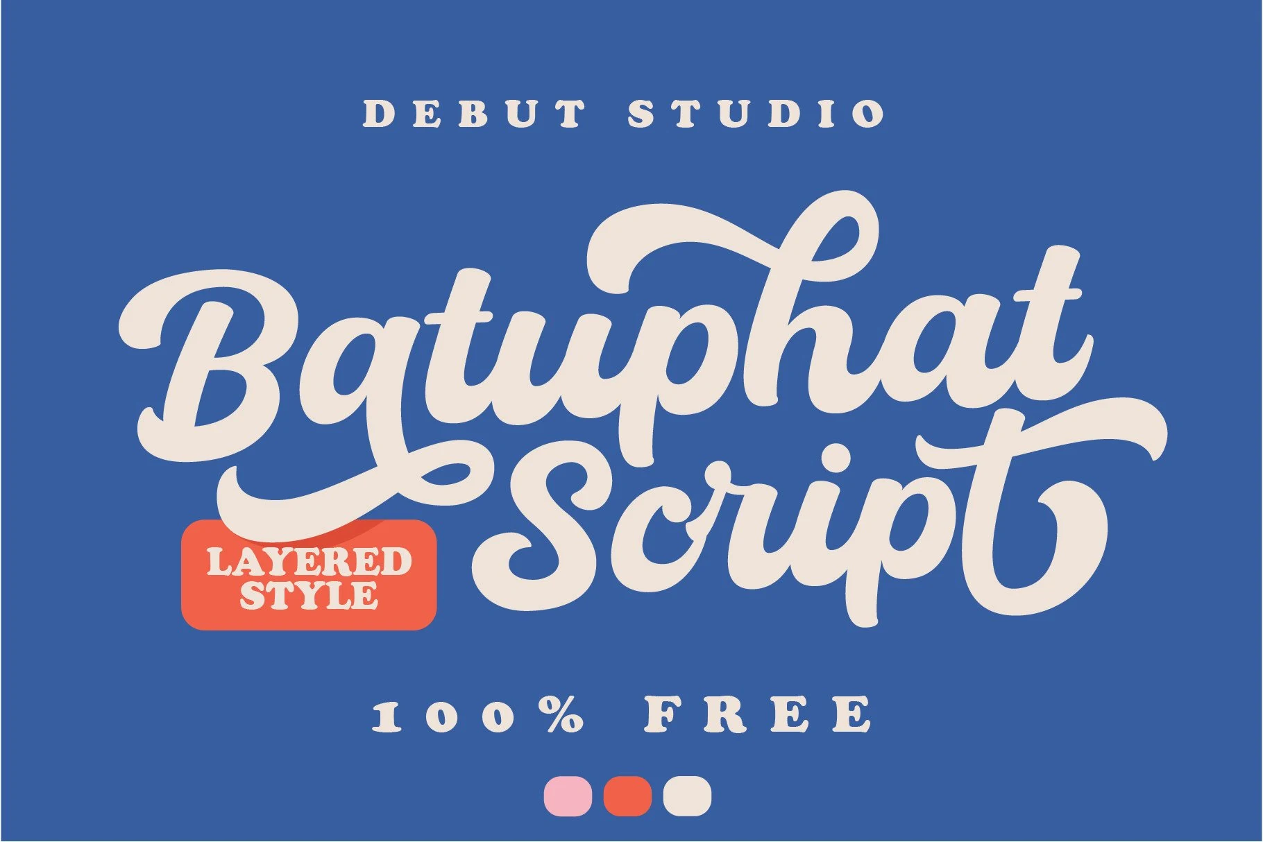
Best For: logos, posters, display text, classic designs
Batuphat Font carries a smooth calligraphic script shape with broad cream strokes, soft curves, looped descenders, and a looping ascender that turns the wordmark into one continuous display form. It gives Bold Script Fonts a polished but still playful look, especially when the layered color treatment is used to add depth.
The letter spacing is tight through the middle, so it performs best as a large headline, logo, or short phrase rather than long copy. Keep the swashes away from nearby text, and pair it with blocky or slab-like support type to make the rounded script feel intentional instead of crowded.
Averys Font
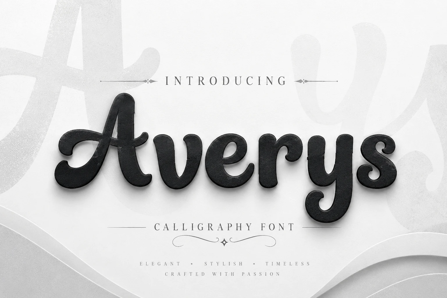
Best For: logos, invitations, elegant designs, luxury designs
Averys Font has a polished calligraphy-script shape with rounded monoline strokes, soft terminals, and curled details on the capital A, r, and y. Its heavier forms give Bold Script Fonts a calmer, more formal direction, closer to refined display lettering than loud retro signage.
The rhythm is clean and readable because the counters stay open and the connections avoid sharp angles. Use it for names, elegant headings, or invitation-style branding, keeping generous spacing around the descenders and pairing it with thin serif or spaced uppercase text for hierarchy.
Conclusion
For fast impact, start with retro and layered bold script fonts for posters, signage, and merch. Choose rounded and playful scripts for stickers or casual packaging, and use elegant calligraphic styles when the design needs a heavier script that still feels clean, polished, and readable.