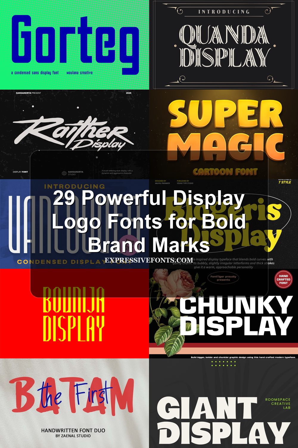
29 Powerful Display Logo Fonts for Bold Brand Marks
Display Logo Fonts help designers build sharper brand marks, poster titles, packaging headers, and identity graphics with stronger visual personality. This collection covers bold blocks, retro curves, brush lettering, elegant serifs, and futuristic styles for logos that need to stand out fast.
Bold & Condensed Display Logo Fonts
These fonts use heavy strokes, tight width, rugged texture, or compact block shapes for logos that need strong hierarchy in limited horizontal space.
Bounija Display Font
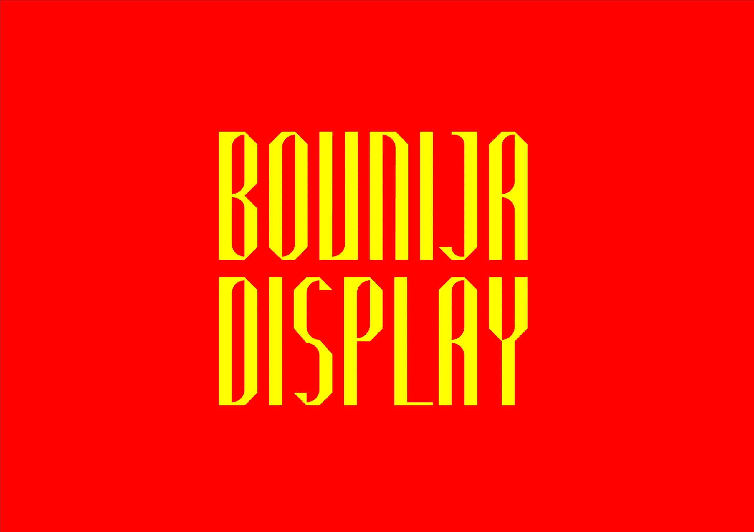
Best For: logos, branding, posters, display text
Bounija Display Font uses tall, narrow letterforms with sharp angled cuts and a clean decorative rhythm. Its vertical proportions give the words a strong sign-like presence, while the quirky interior shapes keep it from feeling like a standard condensed sans.
For Display Logo Fonts, this works best when the layout needs compact height, bold contrast, and a distinctive title mark. Keep tracking controlled rather than loose; the tight upright shapes rely on their column-like spacing to hold the logo together.
Giant Display Font
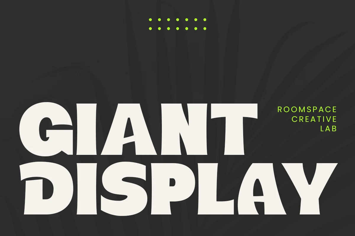
Best For: logos, branding, posters, bold designs
Giant Display Font is built for heavy visual force, with oversized sans serif capitals, broad stems, and compressed counters that make each word feel solid. The slight irregularity in the edges keeps the blocky structure from looking too mechanical.
For Display Logo Fonts, it suits direct brand marks, poster titles, packaging headers, and any layout that needs immediate weight. Use it in short phrases with firm line spacing; the massive forms create impact quickly but leave little tolerance for cramped composition.
Chunky Display Font
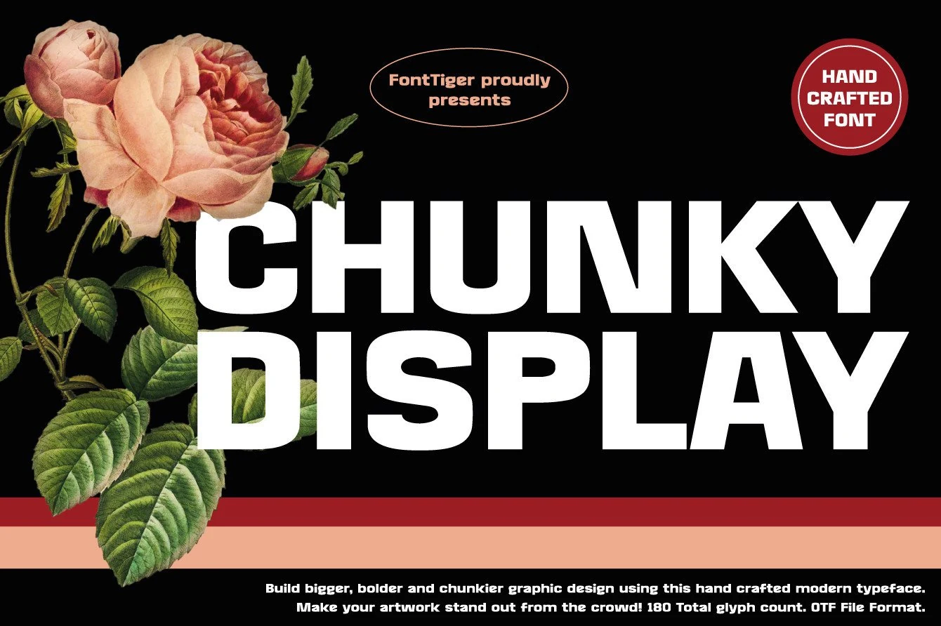
Best For: logos, branding, posters, bold designs
Chunky Display Font uses massive block sans serif letters with thick stems, compact counters, and a squared modern build. The wide white forms in the preview feel blunt and graphic, while angled cuts in letters like K and Y keep the weight from becoming plain.
For Display Logo Fonts, it works when the mark needs to look heavy, direct, and hard to ignore. Use short wording, firm contrast, and generous line spacing; the chunky proportions create impact quickly but can crowd a layout if stacked too tightly.
Lumber Font
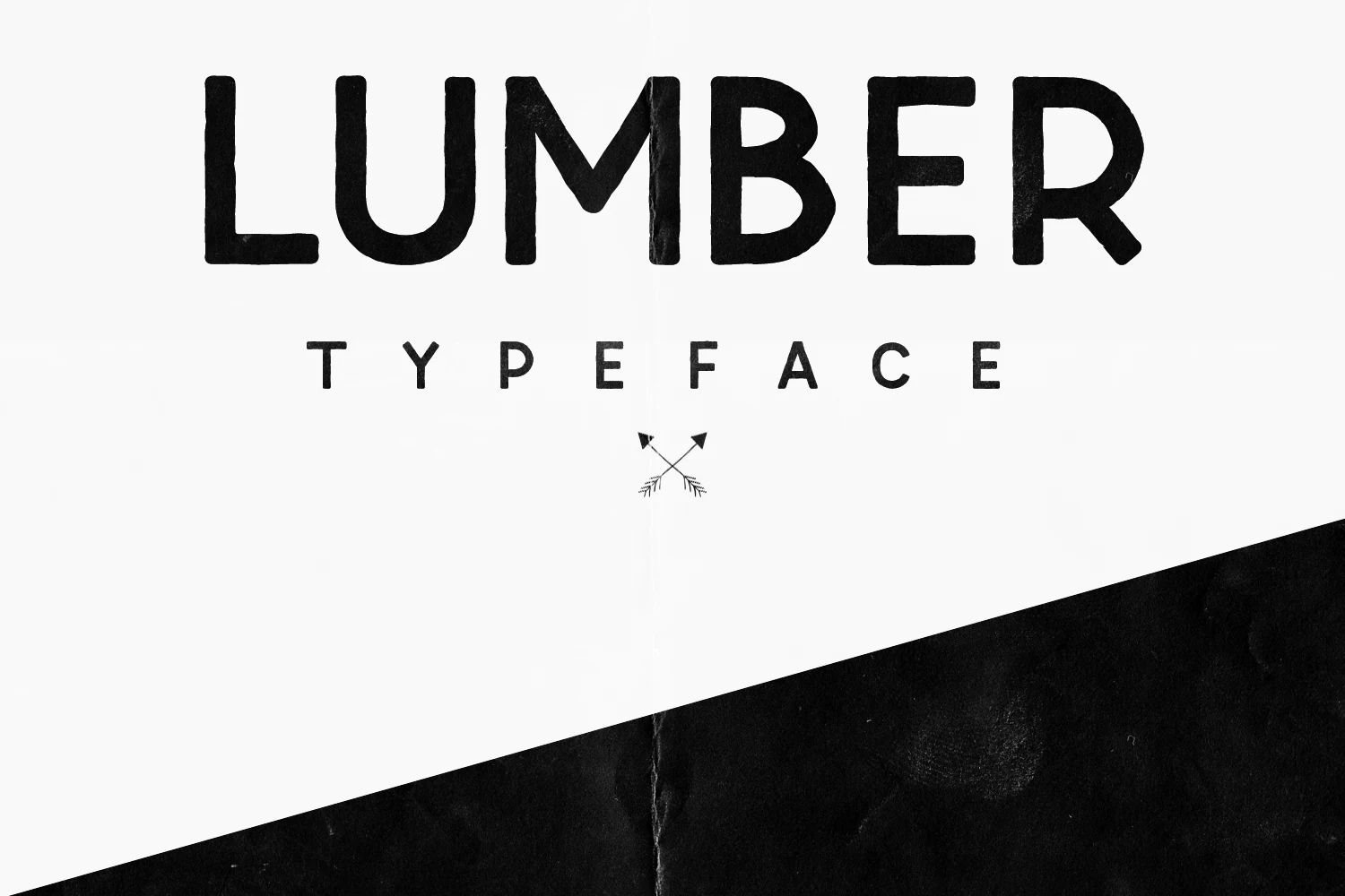
Best For: logos, headlines, badges, handmade designs
Lumber Font has a tall, blocky display build with roughened edges, rounded corners, and a stamped texture that keeps the letters from looking too mechanical. The uppercase forms feel sturdy and handmade, while the open spacing in the smaller sample helps the rugged texture stay readable.
Use Lumber for Display Logo Fonts where the mark needs a raw, outdoor, or workshop-style tone. It works best with short names, firm alignment, and enough contrast for the uneven outlines to show; tight tracking can make the heavy vertical strokes feel cramped.
Gorteg Condensed Sans Display Font
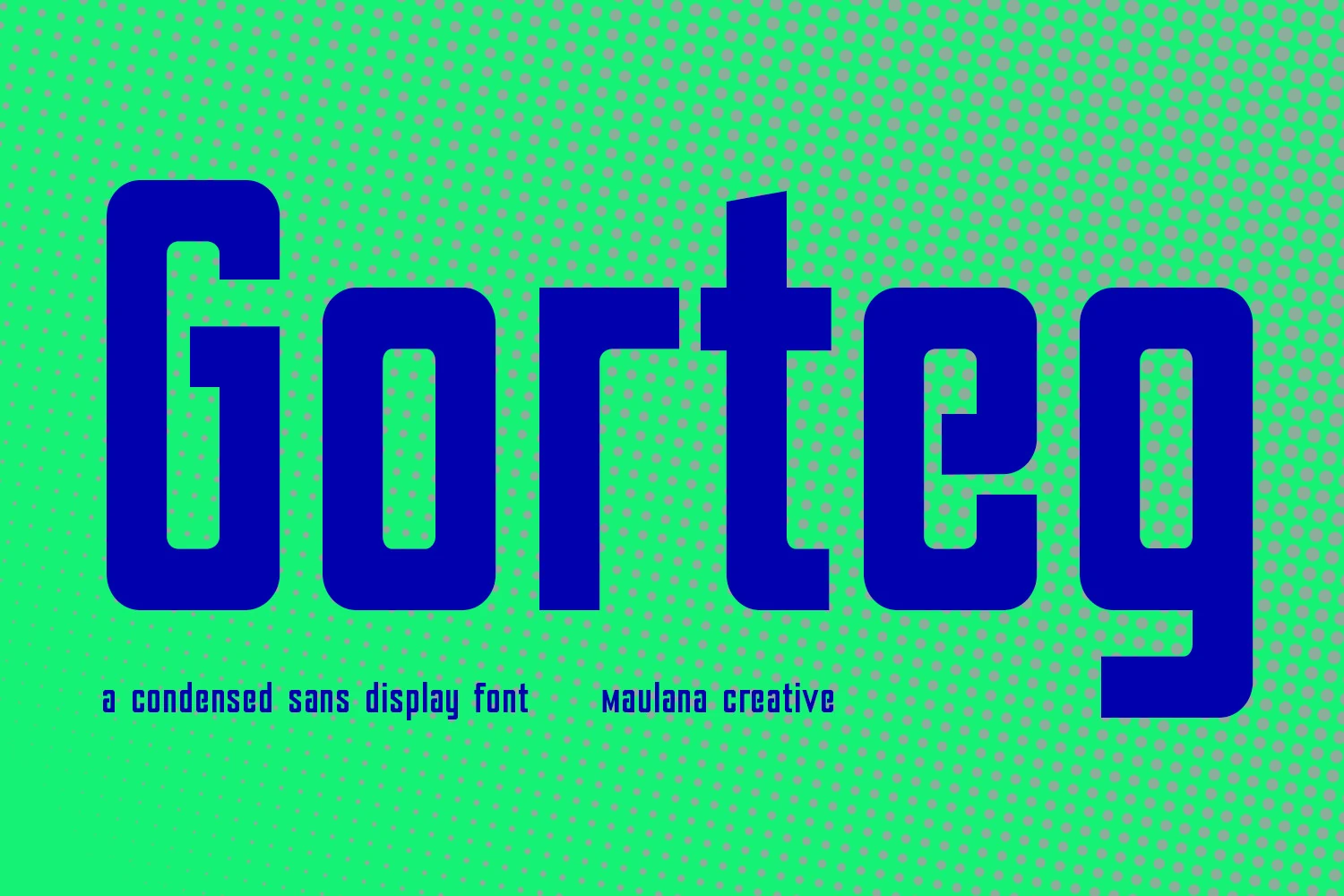
Best For: logos, headlines, posters, bold designs
Gorteg Condensed Sans Display Font uses tall, compressed sans letters with thick vertical strokes, squared shoulders, and softened inside corners. The narrow proportions create a strong industrial tone, while the rounded joins keep the type from feeling too rigid or purely mechanical.
For Display Logo Fonts, Gorteg works well when space is tight but the name still needs weight and authority. Use clear tracking, strong color contrast, and short stacked layouts; the dense letter mass can handle bold headlines, but cramped spacing will close the counters and reduce clarity.
Retro & Rounded Display Logo Fonts
These rounded and bubbly display logo fonts fit friendly brands, merch, packaging, and casual identities where the logo needs warmth, weight, and instant recall.
Super Magic Font
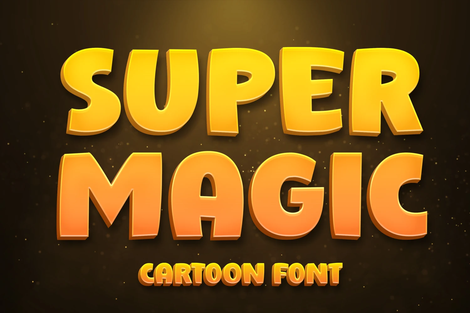
Best For: logos, display text, children’s designs, fun designs
Super Magic Font uses oversized cartoon capitals with rounded corners, thick stems, and slightly inflated proportions. The letters feel heavy but not rigid, with soft curves and open counters that make short words look loud, friendly, and easy to catch.
For Display Logo Fonts, it fits playful titles, school graphics, kids’ branding, and game-style headers that need immediate impact. Keep the hierarchy simple and avoid narrow spacing; the chunky forms work better when the word has enough room to show its full shape.
Retro Display Font
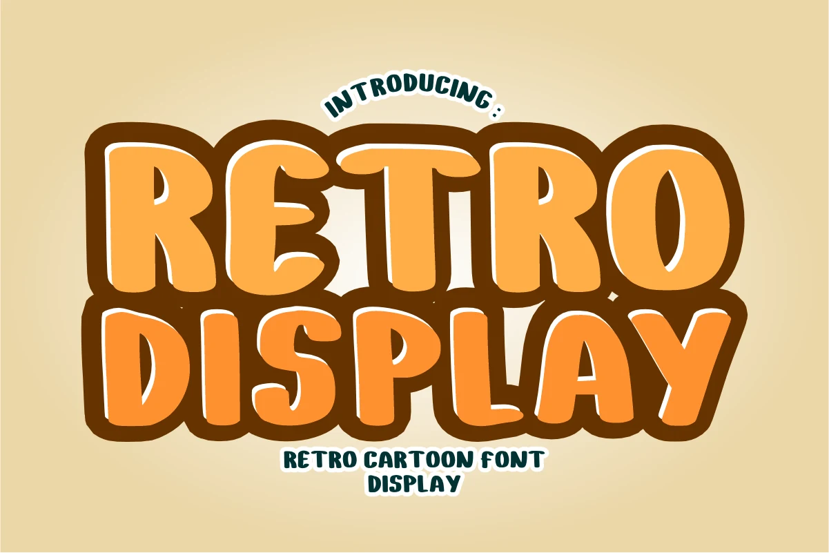
Best For: logos, display text, retro designs, fun designs
Retro Display Font has thick puffy capitals, soft rounded corners, and a cartoon-like weight that makes each word feel loud and approachable. The uneven curves add a vintage handmade flavor without turning the letters messy or hard to recognize.
Use it for Display Logo Fonts when the design needs playful impact, especially in short names, poster titles, and nostalgic brand marks. Keep the outline contrast strong and avoid squeezing the line height; the rounded forms need space to show their full bubble shape.
Sernest Display Font
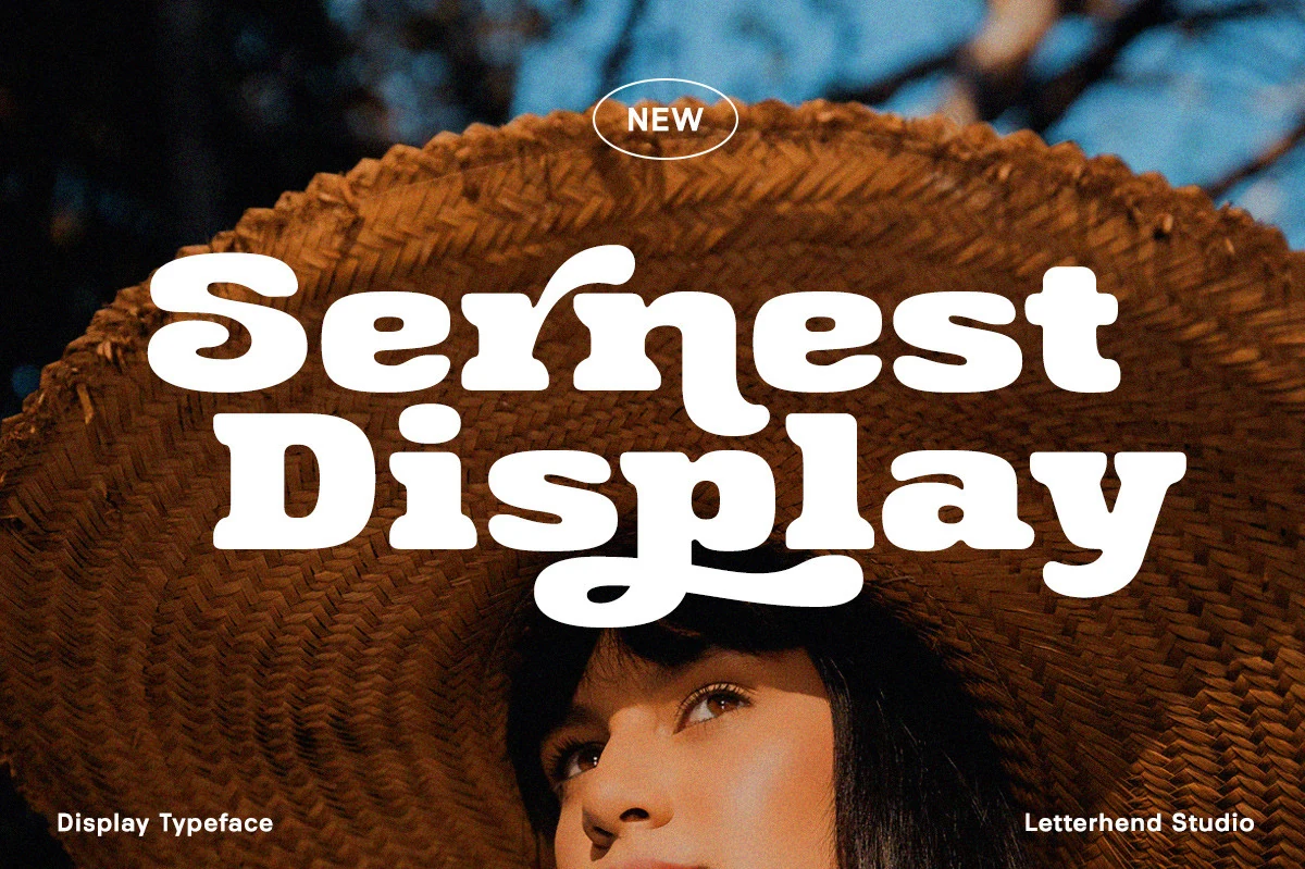
Best For: logos, headlines, packaging, vintage designs
Sernest Display Font uses heavy rounded letterforms, soft slab-like serifs, and a loose vintage rhythm that gives the type a strong poster presence without turning sharp or rigid. The wide curves, tucked counters, and playful descenders make it feel built for bold title settings rather than quiet supporting text.
For Display Logo Fonts, Sernest works best when the words are short enough to let the chunky shapes stay legible. Keep spacing slightly open, use strong contrast behind the white-space-heavy letters, and place it high in the title hierarchy so the curved terminals and retro weight carry the identity clearly.
Sunwing Display Font
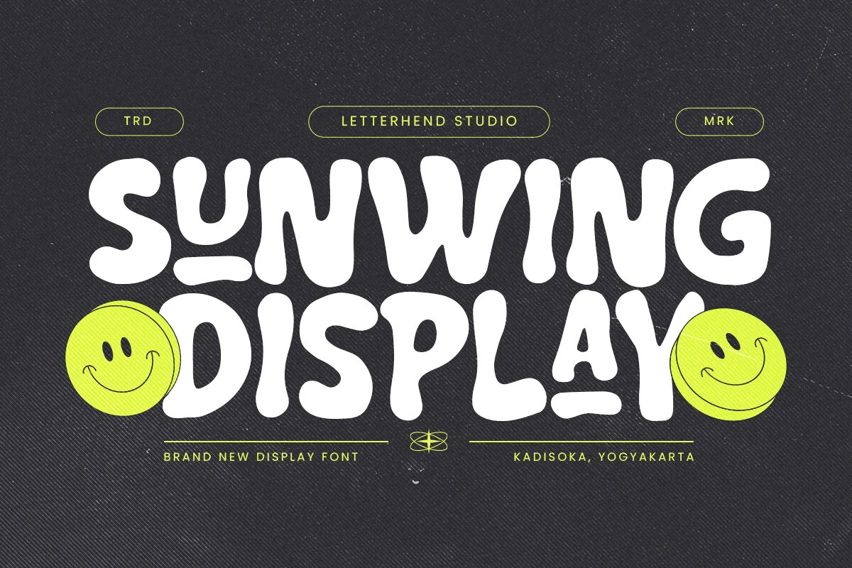
Best For: logos, headlines, packaging, playful designs
Sunwing Display Font has inflated retro letterforms with soft corners, uneven stroke widths, and rounded terminals that make the words feel loose and animated. The chunky shapes create instant impact, while the irregular curves keep the style closer to hand-cut lettering than a clean geometric display face.
Use it for Display Logo Fonts when the design needs a cheerful 70s-style rhythm without thin details. Short names, generous spacing, and a simple supporting font help the heavy white shapes stay readable, especially where the underline-like curves and tight counters start to crowd the composition.
Himenz Font
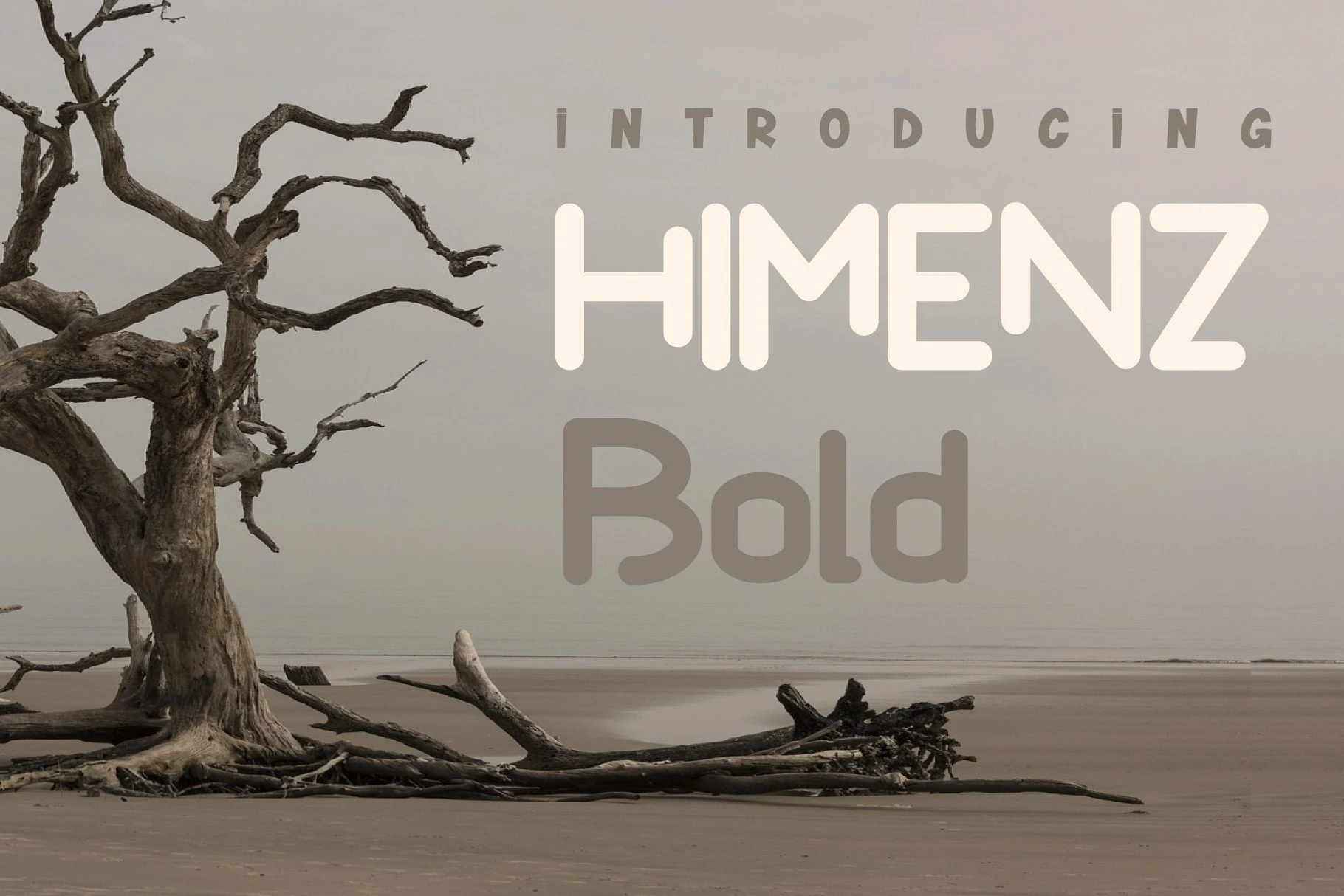
Best For: logos, display text, soft designs, clean designs
Himenz Font has a smooth rounded display structure with softened corners, wide curves, and a low-contrast build that keeps the letterforms calm and approachable. The uppercase sample feels more geometric and spaced out, while the bold style shows fuller counters and heavier, pill-shaped terminals.
For Display Logo Fonts, Himenz fits clean brand marks, simple craft layouts, and soft headline systems where clarity matters more than ornament. Use moderate tracking in uppercase settings and strong background contrast; the rounded strokes lose definition when the color contrast is too muted.
Blogeris Display Font
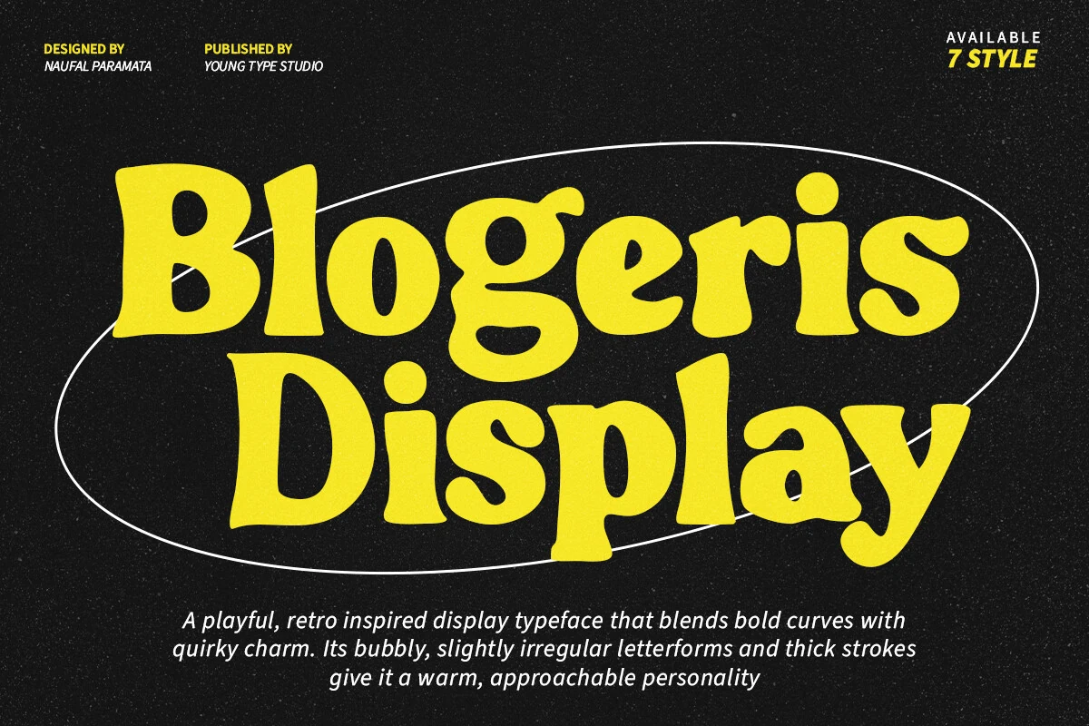
Best For: logos, headlines, retro designs, playful designs
Blogeris Display Font has thick bubbly strokes, soft swollen curves, and slightly uneven letter shapes that give it a handmade retro character. The rounded counters and loose baseline rhythm make the words feel friendly and bold, while the heavy weight keeps the silhouette strong for title use.
For Display Logo Fonts, Blogeris suits short names, food labels, merch graphics, and poster-style branding that needs warmth without looking polished. Keep spacing open enough for the thick curves to breathe, and pair it with a narrow simple sans when the layout needs supporting details.
Krembo Display Font
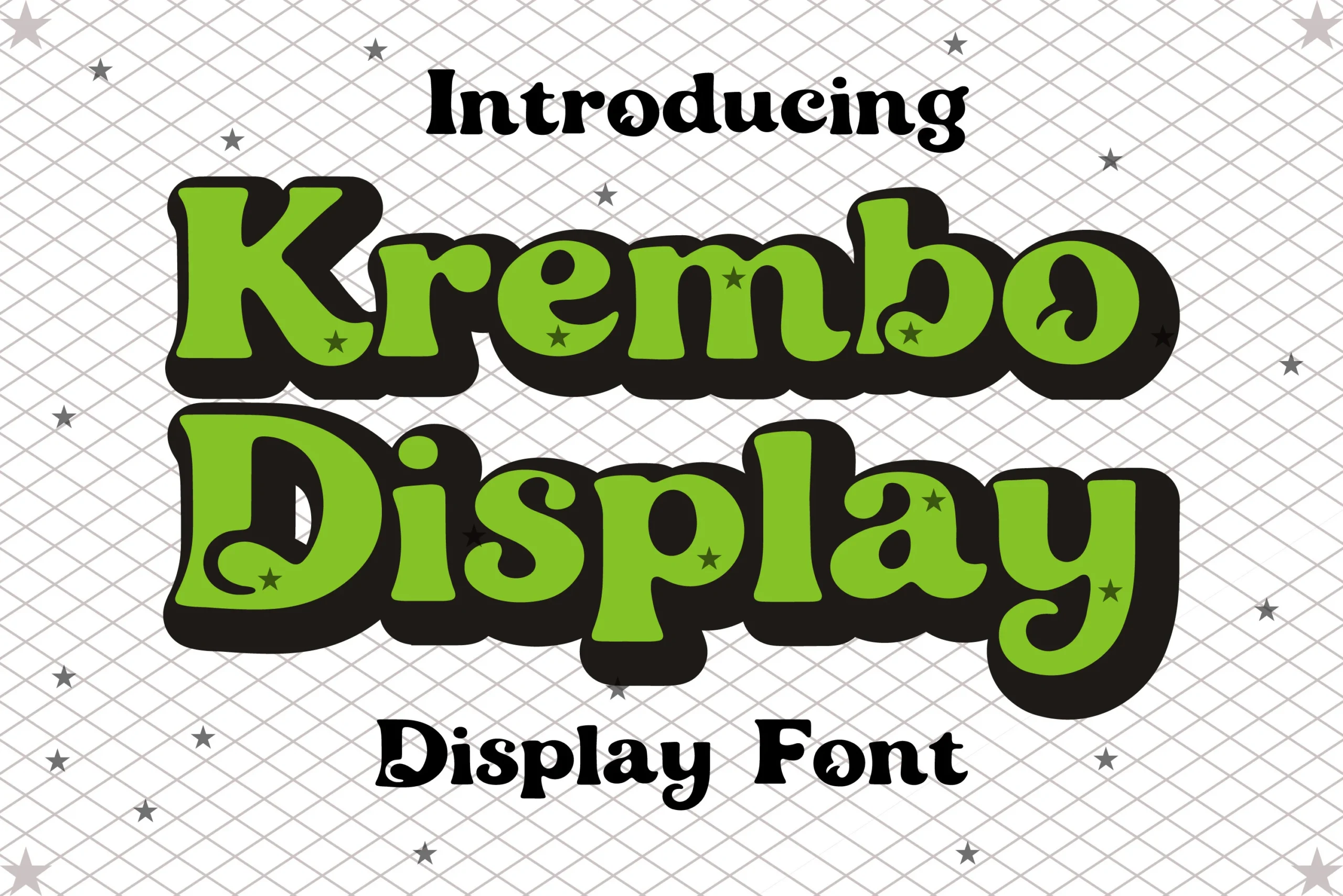
Best For: logos, packaging, headlines, playful designs
Krembo Display Font has a chunky retro shape with soft swollen curves, playful serif details, and a thick offset shadow that makes the letters feel sticker-like. The uneven rhythm, rounded counters, and small star accents push it toward decorative headline use rather than neutral branding.
Use it for Display Logo Fonts when the design needs a bold, cheerful mark with strong shelf presence. Short names, generous spacing, and simple supporting text work best; the heavy shadow and bubbly forms can quickly overcrowd a layout if the word count is too high.
Truth Dare Font
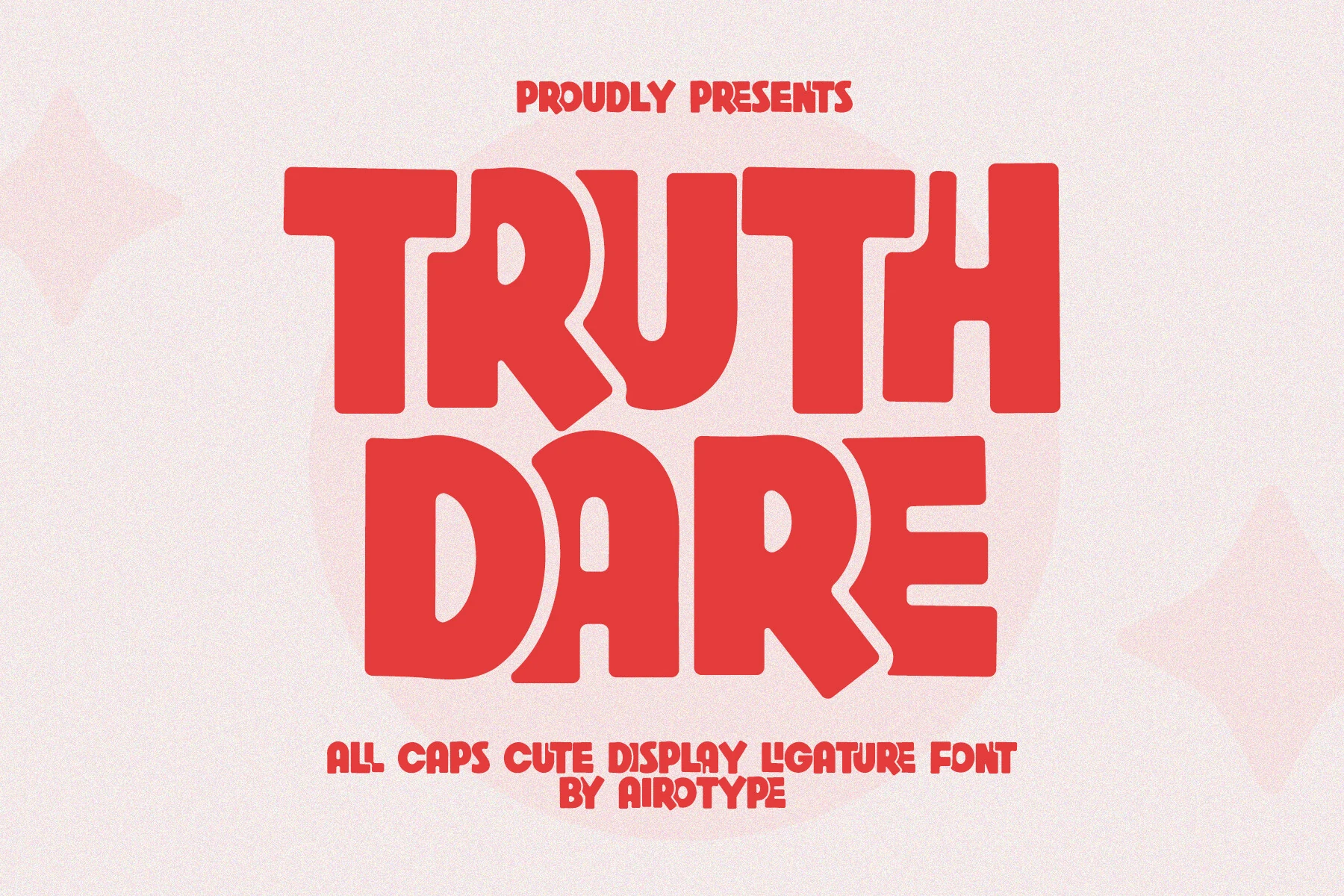
Best For: logos, T-shirts, stickers, cute designs
Truth Dare Font uses heavy all-caps letters with rounded corners, thick block strokes, and playful cut-in shapes that make the words feel bold but not severe. The chunky proportions give it strong display impact, while the softened edges keep the tone closer to cute sticker lettering than hard poster type.
For Display Logo Fonts, Truth Dare works best in short names, merch graphics, craft designs, and quote layouts that need a loud friendly voice. Its ligatures help vary the rhythm of all-caps text, but spacing still needs control so the broad letters and internal curves do not crowd each other.
Brush & Hand-Drawn Display Logo Fonts
These brush and hand-drawn styles bring speed, texture, and handmade movement to logos, posters, sports marks, and expressive identity systems.
Gendry Font
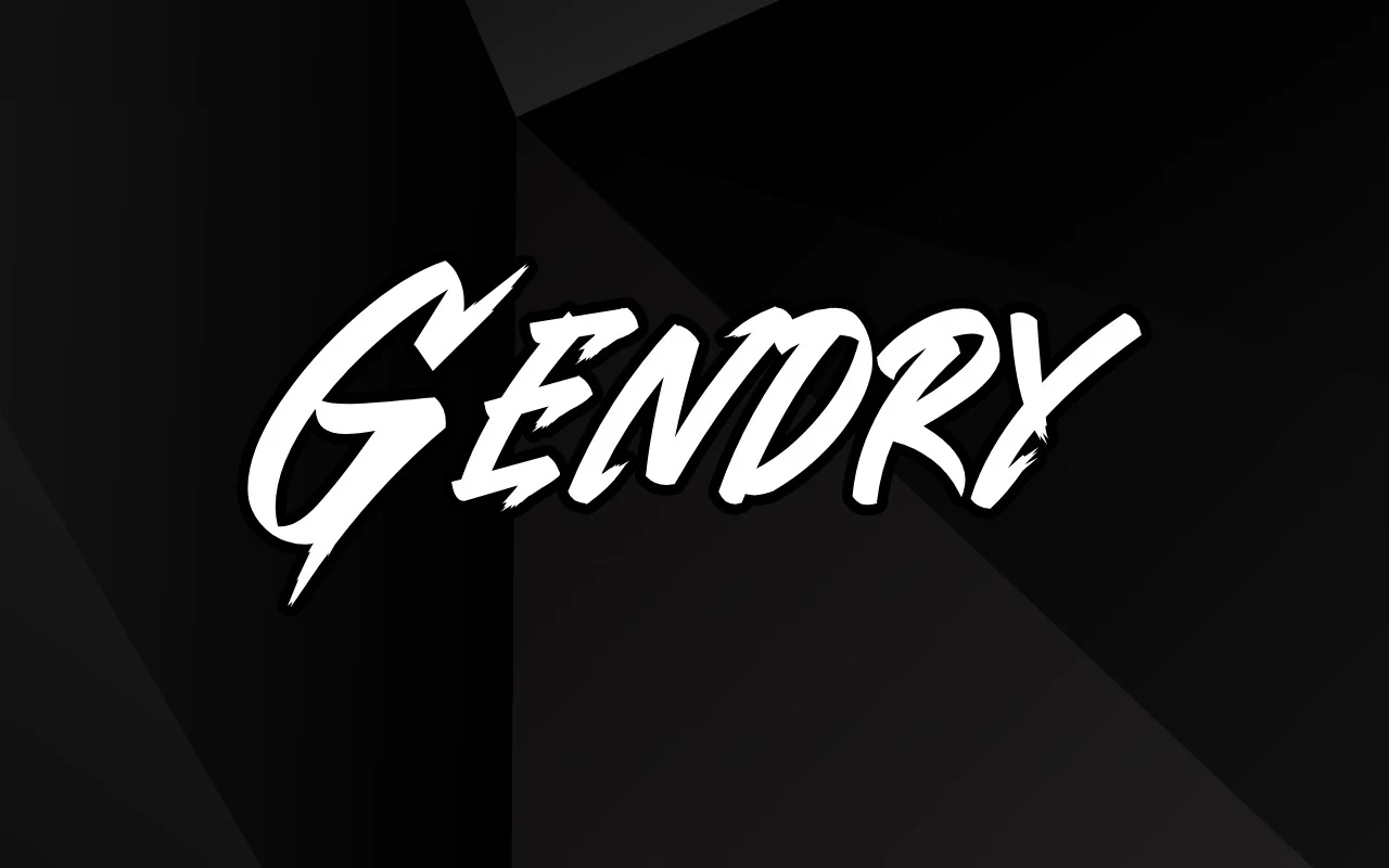
Best For: logos, display text, posters, eye-catching designs
Gendry Font has a sharp brush-built look, with slanted strokes, rough cuts, and pointed terminals that make each letter feel fast and aggressive. The oversized opening G sets the tone, while the tighter middle letters keep the wordmark compact and forceful.
Use it for Display Logo Fonts when the design needs impact rather than quiet polish. It works best in short names or titles, with strong background contrast and enough side space for the sweeping entry and exit strokes to stay readable.
Raither Display Font
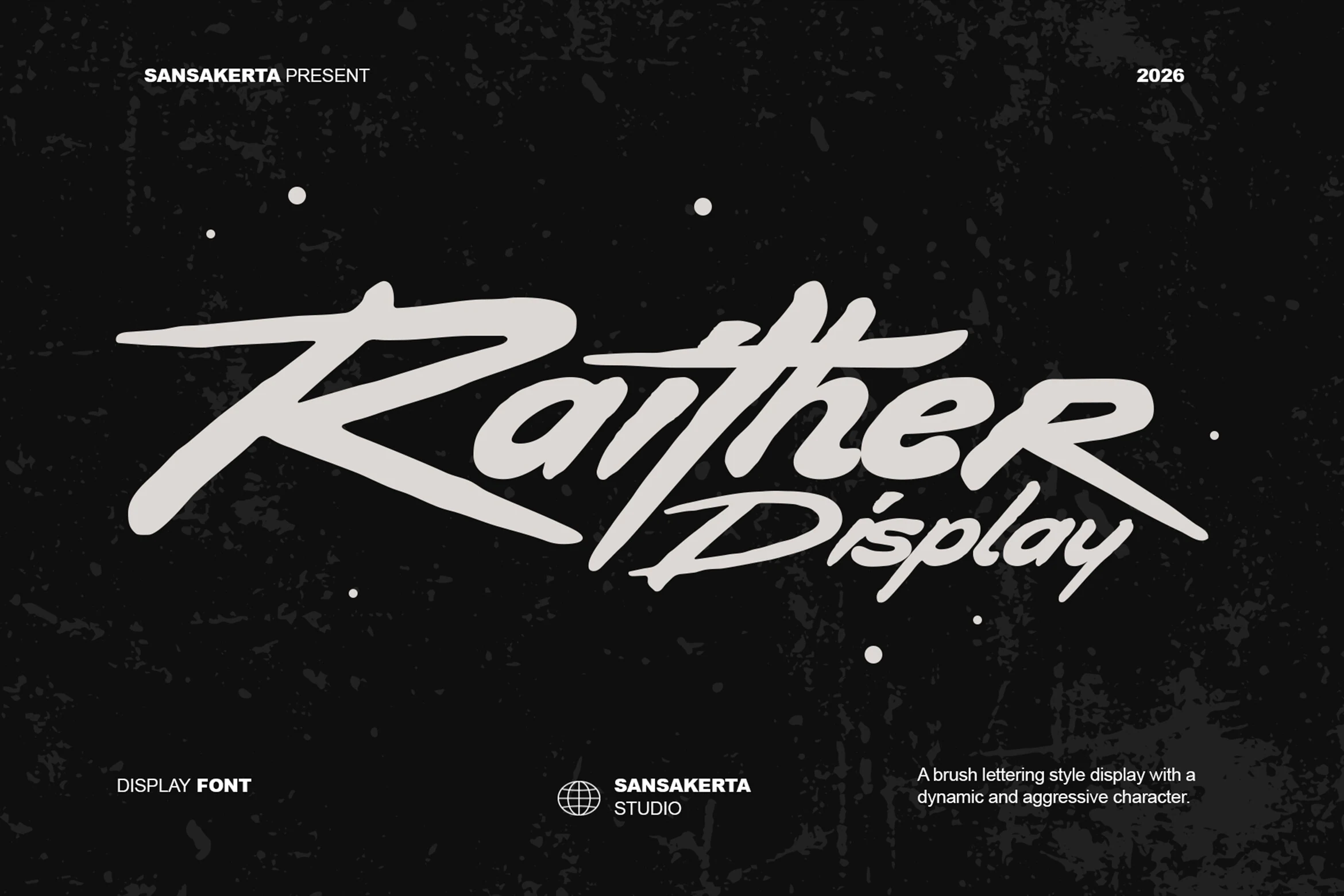
Best For: logos, branding, posters, eye-catching designs
Raither Display Font is a bold brush lettering style with a fast forward slant, heavy strokes, and long horizontal sweeps. The oversized entry stroke on the R and sharp lower cuts give the wordmark an automotive, street-racing feel rather than a soft handwritten mood.
Use it for Display Logo Fonts when the layout needs speed, pressure, and a rebellious display voice. Keep copy short and avoid tight vertical stacking; the extended swashes and connected brush rhythm need room to stretch without clipping or crowding nearby elements.
First Batam Font
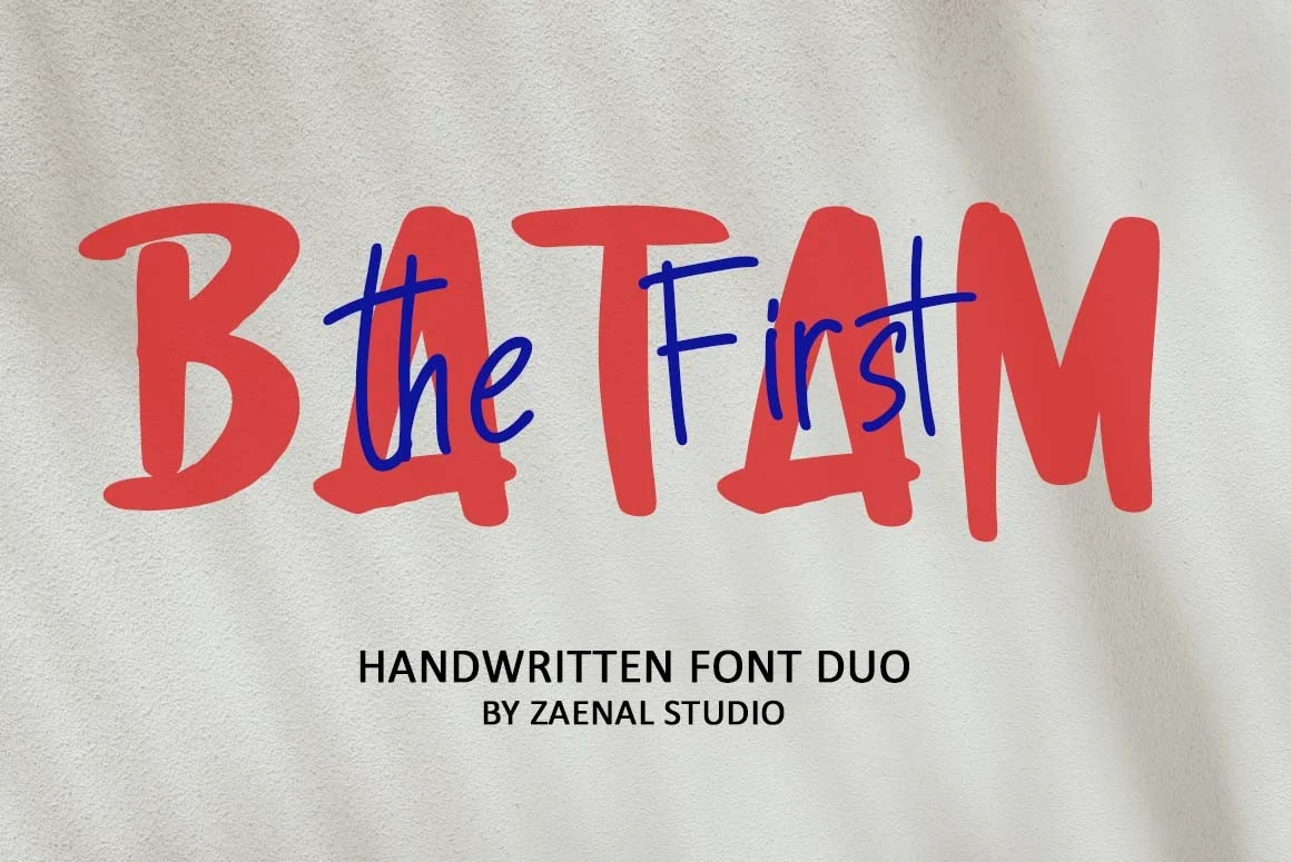
Best For: logos, social media graphics, cute designs, fun designs
First Batam Font mixes a chunky hand-painted display style with a thinner handwritten companion, creating a casual duo that feels loose and energetic. The red block letters carry the main weight, while the script layer adds quick movement and a more personal rhythm.
For Display Logo Fonts, this works best when the design needs a friendly, handmade voice rather than polished symmetry. Use the bold style for the main title and the lighter script as an accent; too much overlap can make the thinner strokes harder to read.
Display Howdy Font
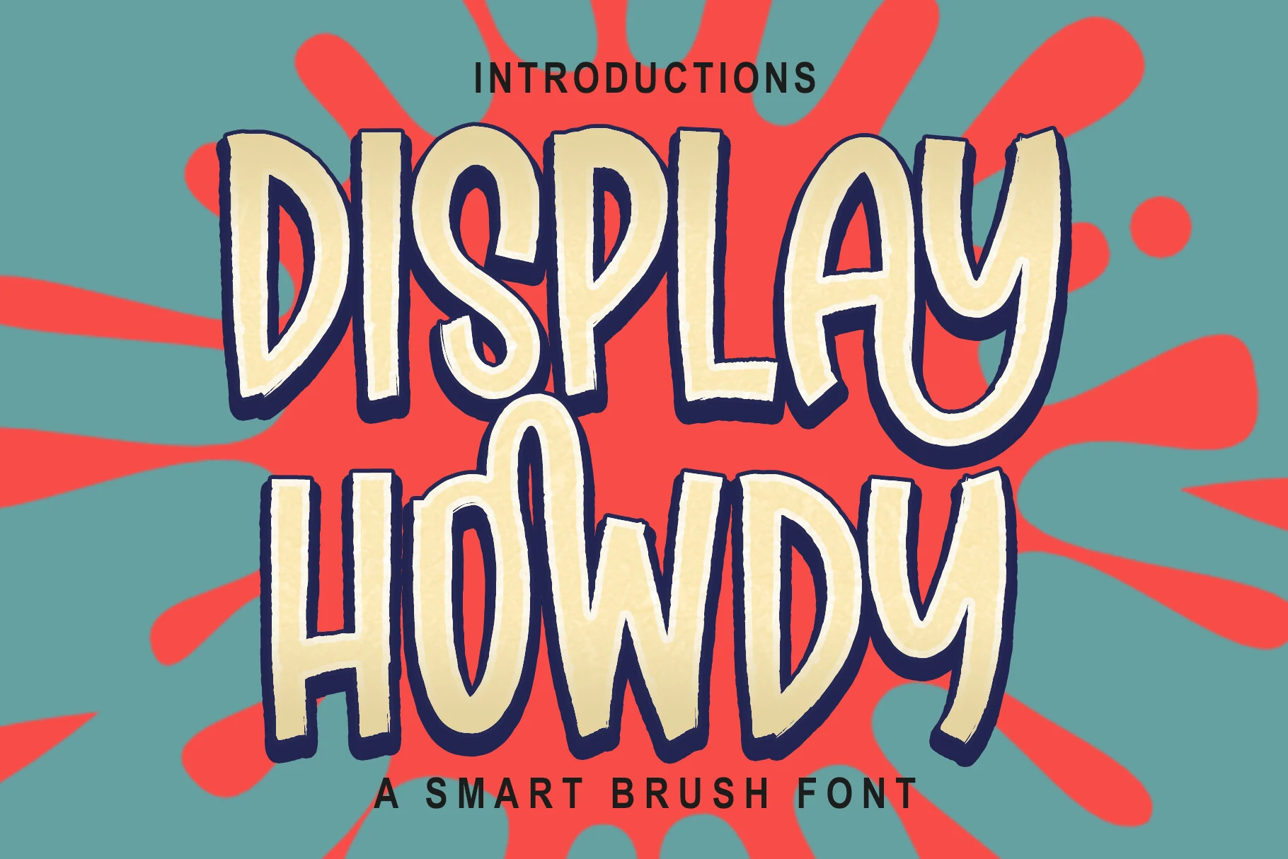
Best For: logos, headlines, posters, playful designs
Display Howdy Font uses thick brush-built letters with uneven outlines, soft vertical swelling, and a dark offset shadow that gives the words a hand-painted poster effect. The tall uppercase shapes stay bold, but the wavy rhythm and casual joins make the type feel energetic rather than polished.
Use Display Howdy for Display Logo Fonts when the layout needs a loud illustrated headline or playful brand mark. It performs best with short phrases, strong color contrast, and relaxed spacing; dense copy would fight the heavy strokes, shadow layer, and irregular letter widths.
Elegant & Serif Display Logo Fonts
These serif-led display logo fonts use contrast, fine details, and editorial rhythm for fashion, beauty, luxury packaging, and polished brand marks.
Cheque Font
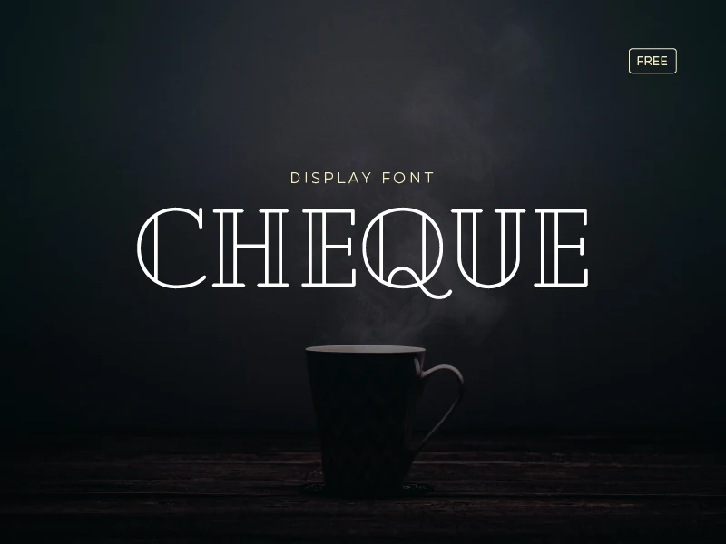
Best For: logos, branding, display text, elegant designs
Cheque Font has a refined display structure built from slim strokes, tall capitals, and decorative inline cuts. The round characters feel especially distinctive, with open circular forms that give the wordmark a polished, almost editorial rhythm.
For Display Logo Fonts, Cheque suits short names, boutique titles, and brand marks that need elegance without heavy ornament. Keep it large and give the letters moderate spacing; the thin strokes and internal linework need contrast to stay readable.
Kindel Display Edition Font
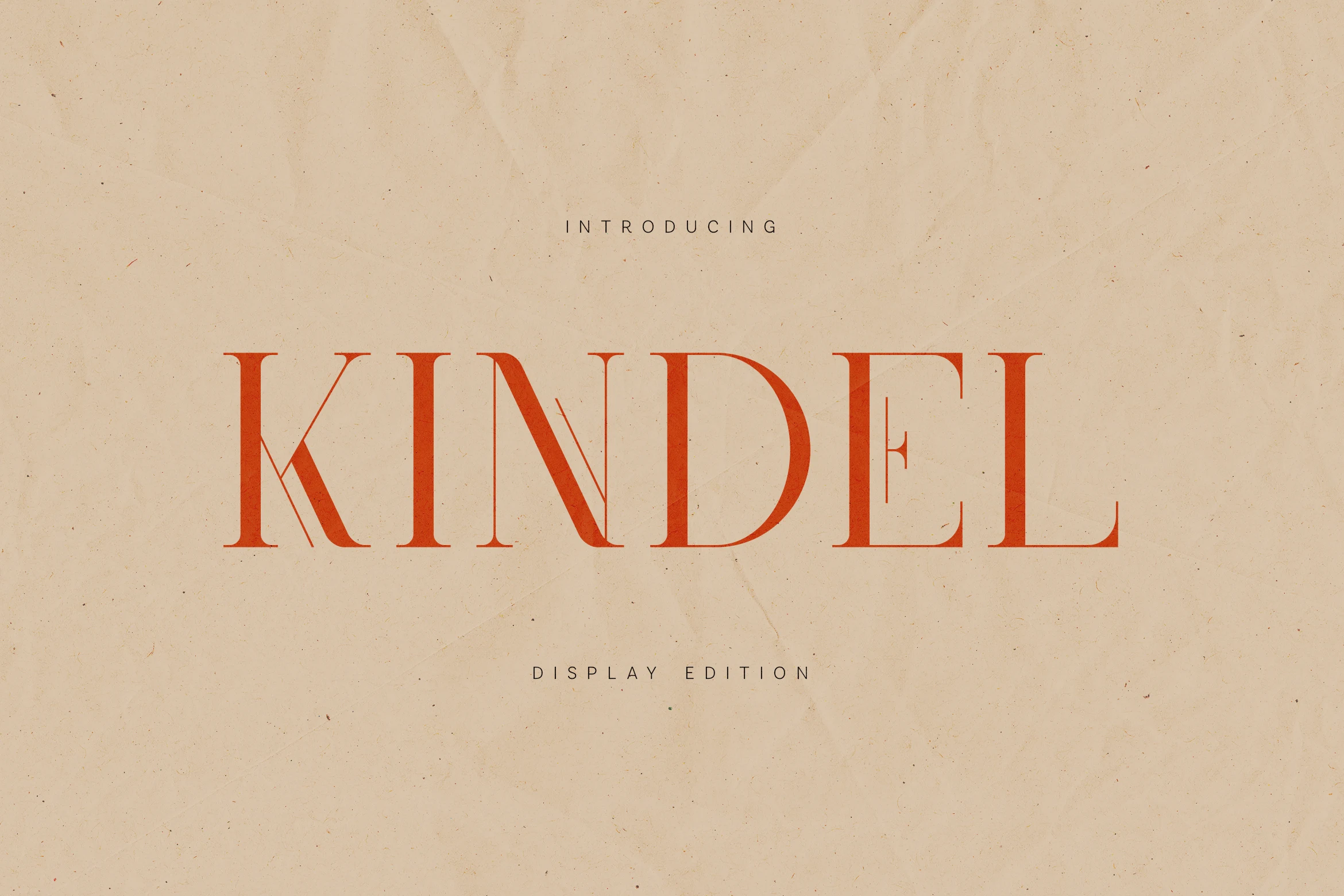
Best For: logos, luxury designs, editorial designs, high-end designs
Kindel Display Edition Font has a refined high-contrast serif structure, with slim hairlines, tall capitals, and sharp vertical stress. Subtle internal cuts in letters like K, N, and E add a contemporary editorial detail without disrupting the quiet, luxury-facing rhythm.
For Display Logo Fonts, Kindel suits boutique identities, magazine titles, and premium packaging where restraint matters more than loud decoration. Use generous tracking and high background contrast; the fine strokes need space and scale to keep their elegance intact.
Internal Display Font
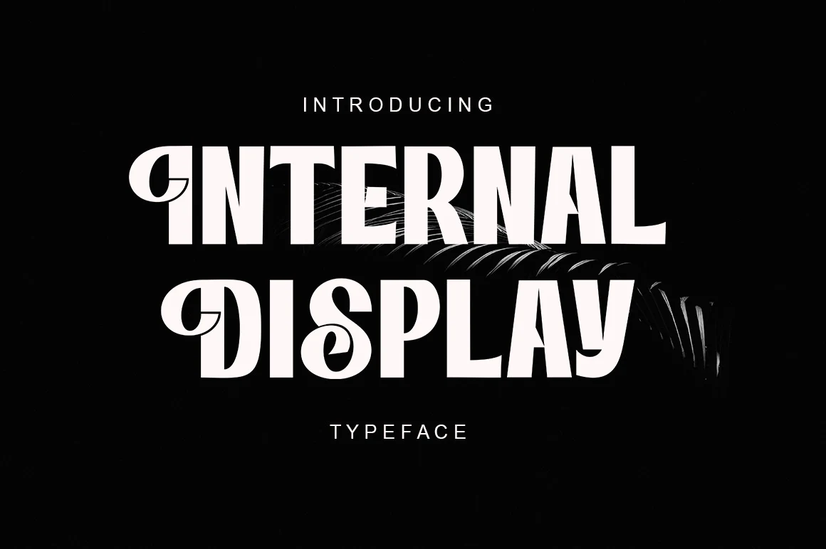
Best For: logos, headlines, fashion branding, elegant designs
Internal Display Font has a polished display serif style with heavy vertical stems, sharp contrast, and sculpted curves that give the letters a dramatic editorial profile. The decorative cuts and curled details add personality without breaking the main word shape, so the type still reads clearly at headline scale.
For Display Logo Fonts, Internal works best in refined marks for fashion, beauty, packaging, and magazine-style titles. Keep the surrounding typography restrained and avoid cramped tracking; the tall forms and ornamental curves need controlled spacing to keep the logo sharp rather than crowded.
Boreck Display Font
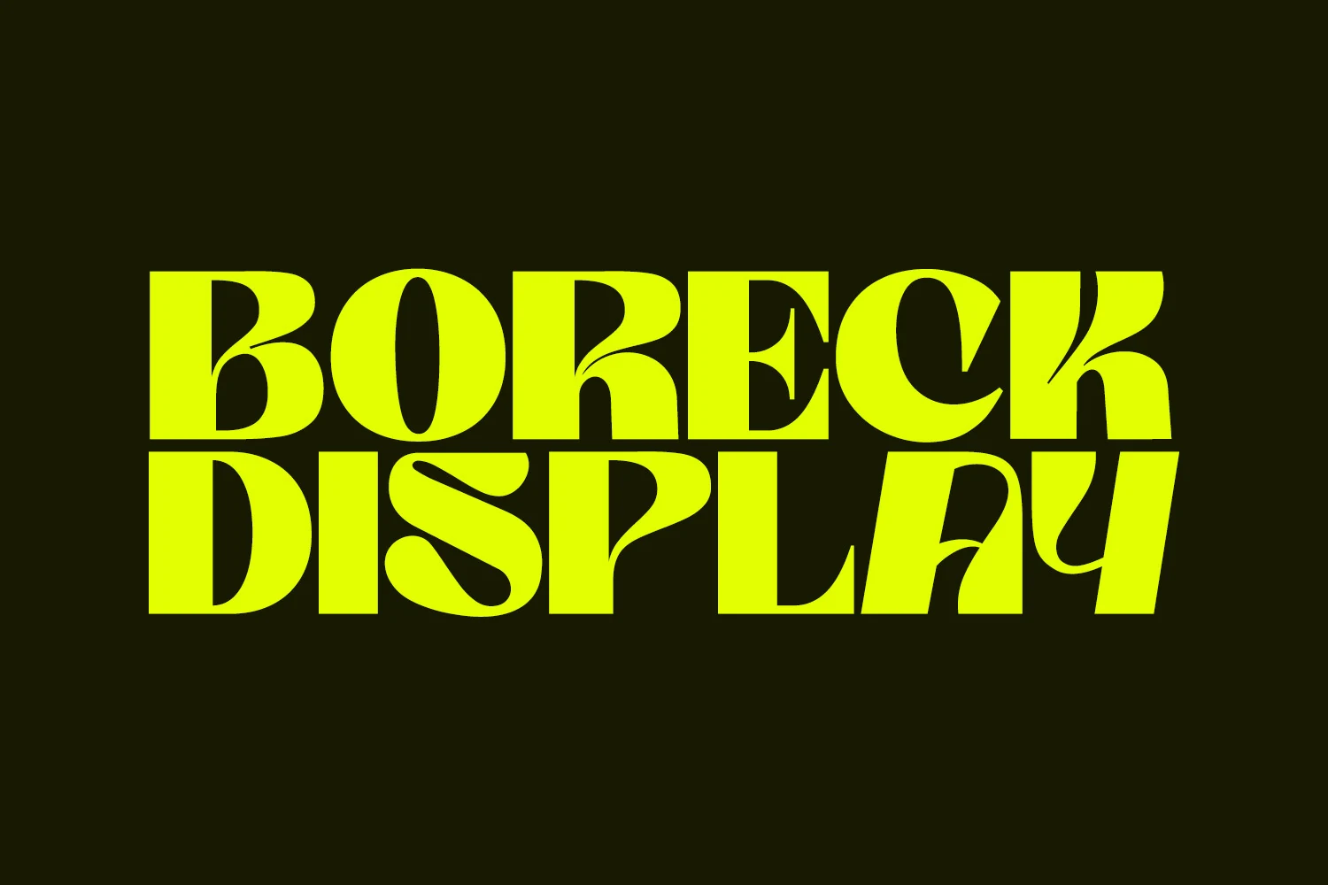
Best For: logos, headlines, magazine covers, posters
Boreck Display Font pushes heavy contrast into wide block letters, with thick verticals, thin carved curves, and oversized counters that create a loud editorial silhouette. The sharp internal cuts and sweeping bowl shapes give it a contemporary display feel without losing the crisp structure of a bold serif.
For Display Logo Fonts, Boreck works when the mark needs impact before detail: magazine mastheads, poster titles, and short brand names. Keep tracking controlled but not tight, and use strong background contrast so the thin inner curves do not collapse inside the heavier letter mass.
Grangeus – Creative Display Font
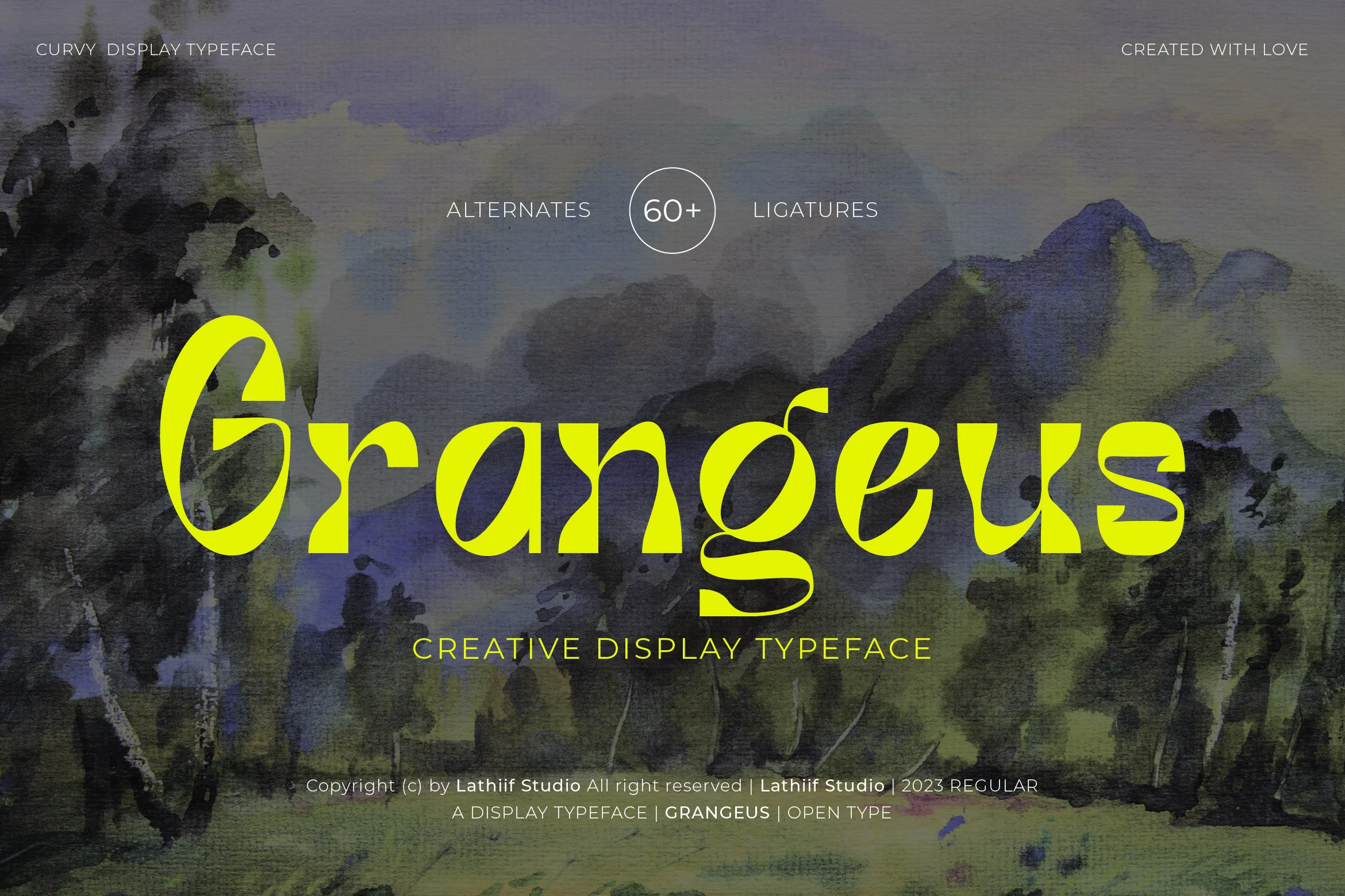
Best For: logos, headlines, invitations, elegant designs
Grangeus – Creative Display Font has a curvy serif structure with high contrast strokes, long tapered terminals, and calligraphic movement through the lowercase forms. The oversized G, looped g, and rounded bowls give it a refined ornamental tone while keeping the word shape smoother than a heavy decorative face.
Use it for Display Logo Fonts where the identity needs elegance, softness, and a clear headline silhouette. It benefits from generous spacing and strong contrast; the thin curves and extended terminals need room, especially in longer names or layered editorial compositions.
Futuristic & Geometric Display Logo Fonts
These geometric and technical display logo fonts use modular cuts, angular forms, and engineered spacing for tech, gaming, sci-fi, and digital branding.
Sandbox Steel Font
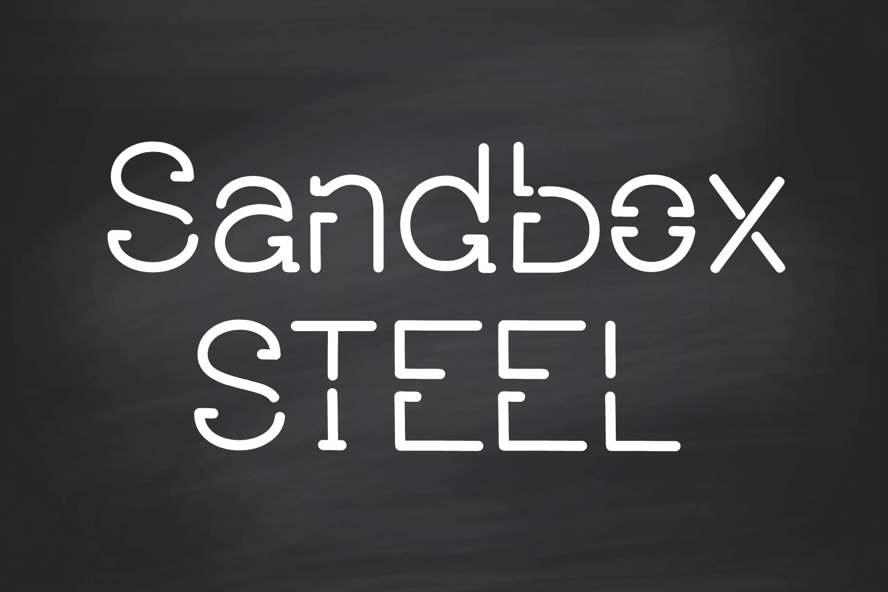
Best For: logos, website headers, display text, modern designs
Sandbox Steel Font has a robotic display style built from rounded monoline strokes, open cuts, and modular letter parts. The softened terminals keep it cleaner than a hard industrial typeface, while the broken forms give each word a coded, technical rhythm.
For Display Logo Fonts, it fits tech branding, digital headers, and short identity marks that need a futuristic edge. Use generous spacing and strong contrast; the segmented construction is distinctive, but cramped layouts can make the gaps compete with the letter shapes.
Enigma Display Font
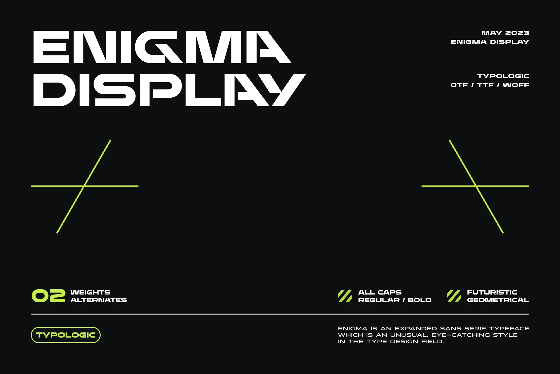
Best For: logos, branding, display text, modern designs
Enigma Display Font uses an expanded all-caps sans serif build with broad horizontal reach, squared curves, and sharp diagonal cuts inside key letters. The even optical weight keeps the system consistent, while the angled breaks give the wordmark a technical, futuristic edge.
For Display Logo Fonts, Enigma works when a brand needs width, tension, and a strong geometric signature. Its alternate characters support more customized identity marks; use controlled spacing and short wording so the wide forms stay assertive rather than stretched.
Folgore Font
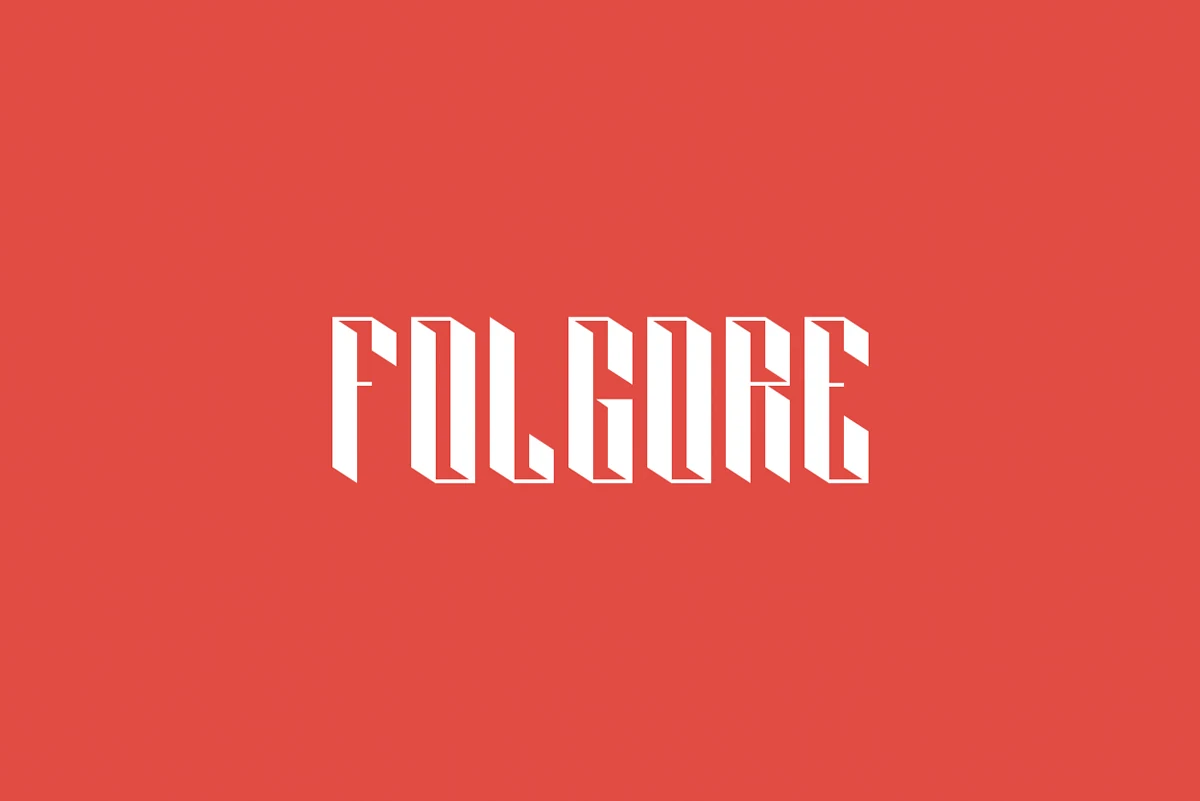
Best For: logos, headlines, posters, bold designs
Folgore Font is built from narrow vertical strokes, sharp diagonal cuts, and folded 3D interior shadows that give each letter a carved, architectural feel. Its abstract angles make the word shape assertive, but the tight apertures and compressed proportions keep it firmly in display territory.
Use Folgore for Display Logo Fonts when you want a hard-edged mark with depth rather than softness. It needs high contrast, short wording, and careful tracking; too much text will flatten the 3D effect and make the angular joins harder to read.
Bruteforce Display Font
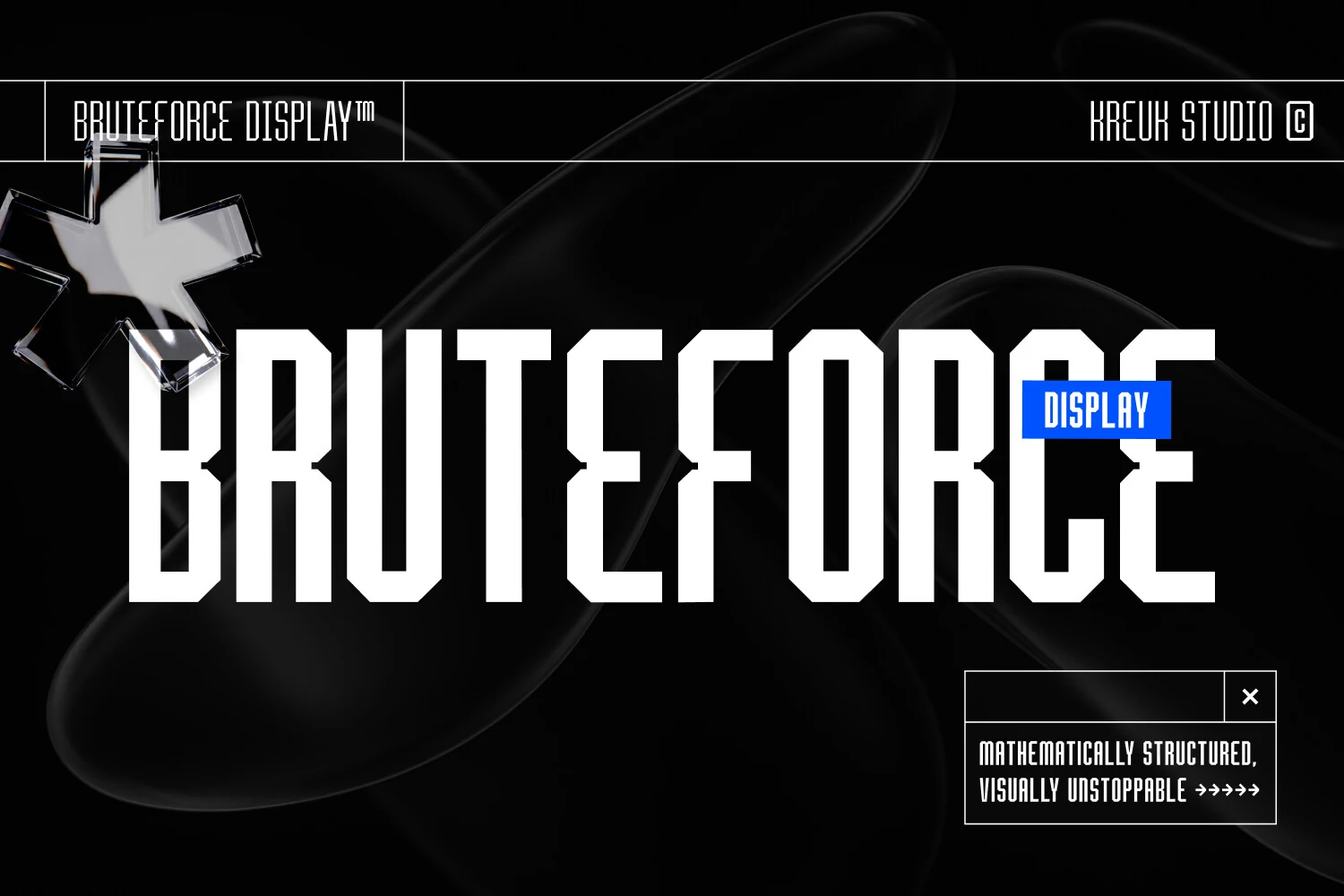
Best For: logos, headlines, posters, bold designs
Bruteforce Display Font is a tall geometric face with compressed proportions, squared counters, and sharp chamfered corners. The heavy vertical strokes give it a rigid engineered structure, while the angled cuts add enough movement to stop the letters from feeling like plain industrial blocks.
For Display Logo Fonts, Bruteforce suits tech marks, gaming titles, event posters, and high-impact branding that needs a hard mechanical voice. Keep tracking slightly open and use clean horizontal alignment; the narrow letterforms gain authority from precision but lose clarity if packed too tightly.
Vintage & Decorative Display Logo Fonts
These vintage decorative fonts use ornate serifs, script curves, and poster-style detail for badges, labels, event titles, and nostalgic brand identities.
Back to Vintage Font
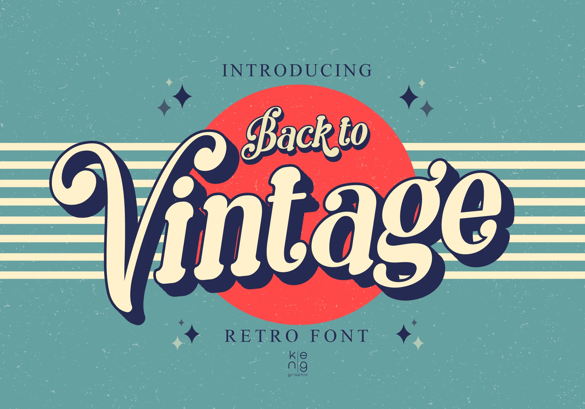
Best For: logos, branding, retro designs, vintage designs
Back to Vintage Font has a bold retro script shape, with rounded terminals, deep curves, and a large sweeping V that gives the wordmark a strong 60s and 70s flavor. The cream letterforms and heavy shadow effect in the preview emphasize its soft-cornered, nostalgic display character.
For Display Logo Fonts, it works best in short brand names, badge-style titles, and poster headers where the swashes can become part of the composition. Keep surrounding text quieter and leave space around the first and last letters, since the curved strokes need room to stay readable.
Quanda Display Font
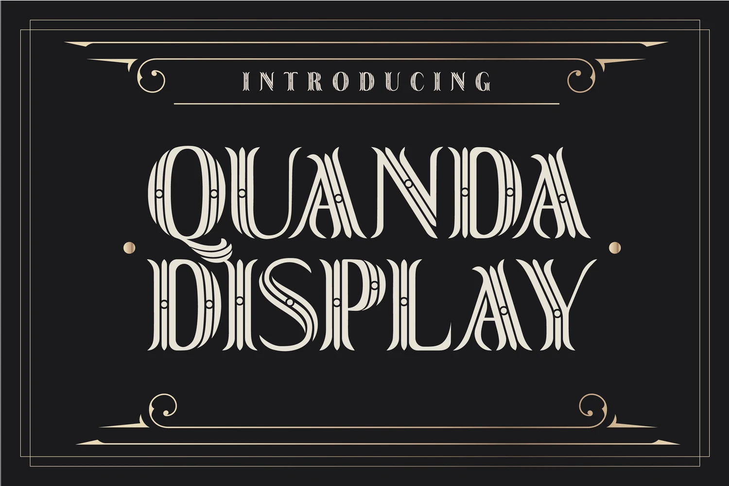
Best For: logos, posters, decorative designs, vintage designs
Quanda Display Font is an ornate circus-style display face with tall decorative capitals, split inline strokes, curled terminals, and small dot details. Its layered stripe construction gives the letters a theatrical rhythm, closer to vintage poster lettering than a clean serif.
For Display Logo Fonts, Quanda works best in short names, event titles, badges, and carnival-inspired branding. Keep supporting type simple and avoid small sizes; the internal linework needs scale and contrast so the ornament reads as detail instead of noise.
Ransock Display Font
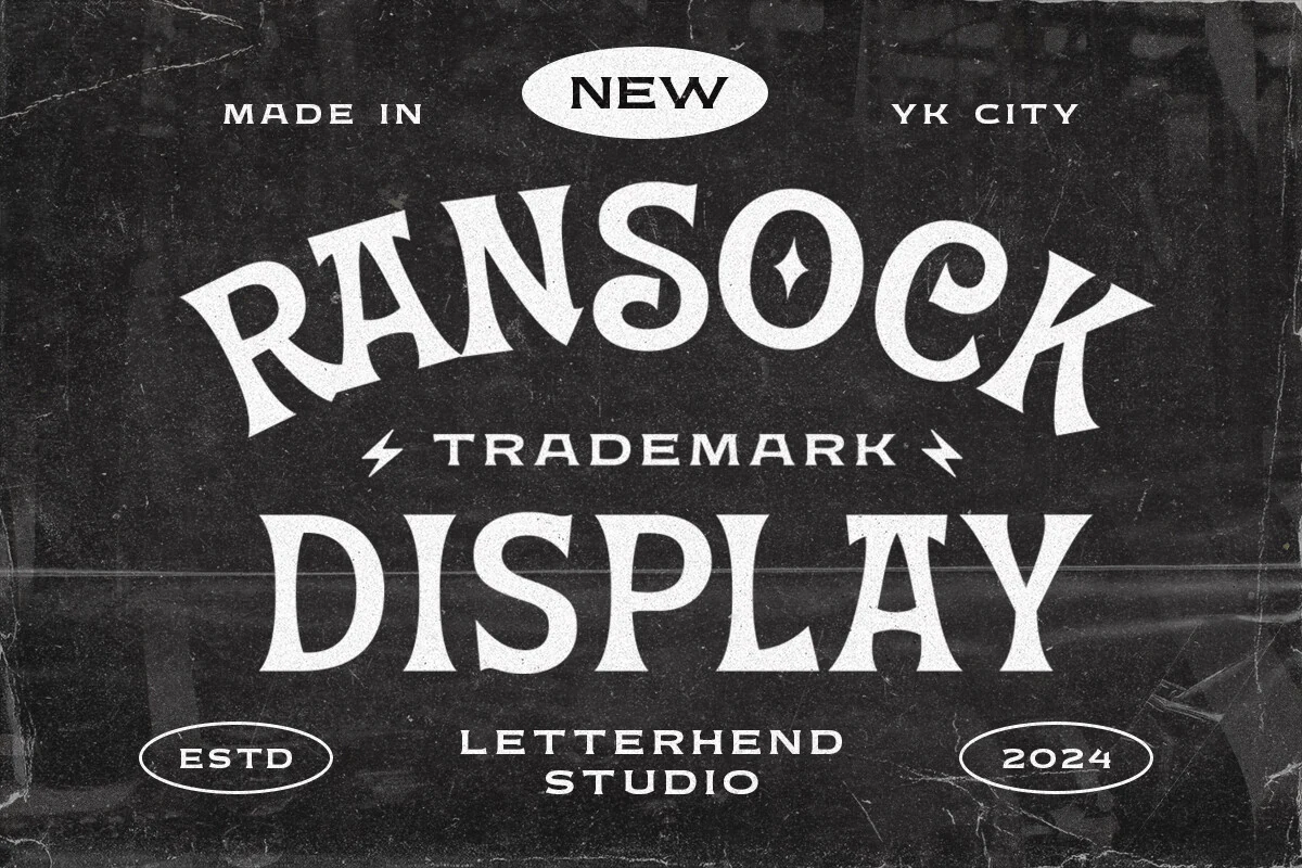
Best For: logos, labels, packaging, vintage designs
Ransock Display Font leans into vintage label lettering with flared wedge serifs, curved baseline energy, and chunky forms that hold a strong silhouette. The carved curves, uneven decorative stress, and star-like counter detail in the O make the wordmark feel closer to custom signage than a plain serif.
For Display Logo Fonts, it suits short brand names, badges, packaging fronts, and editorial titles that need a classic storefront or trademark feel. Keep supporting type simpler and control the arc or alignment carefully; the wide serifs and ornamental counters need clean spacing to stay legible.
Conclusion
For maximum impact, start with bold block or condensed display fonts. Choose retro rounded styles for playful brands, elegant serifs for premium identities, brush fonts for movement, and futuristic forms for tech-focused logos.