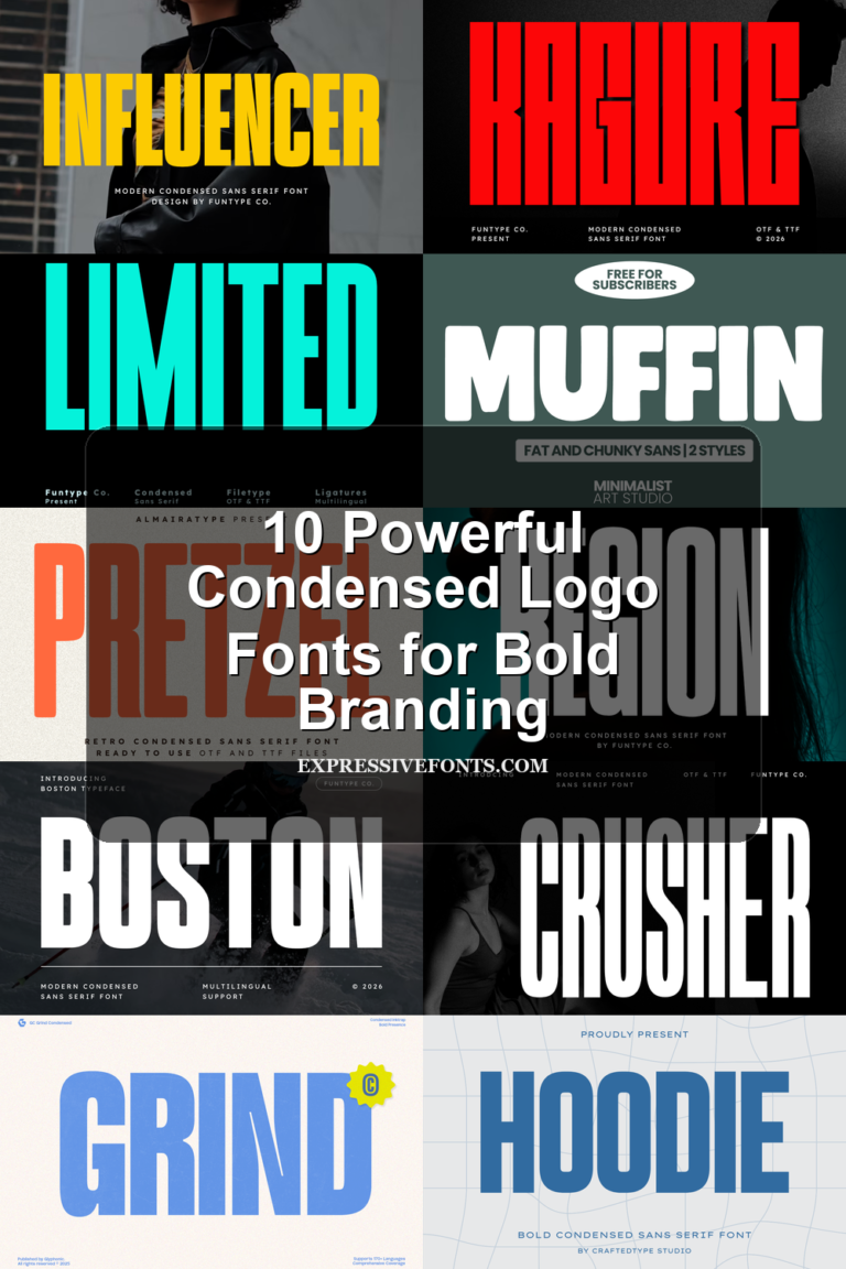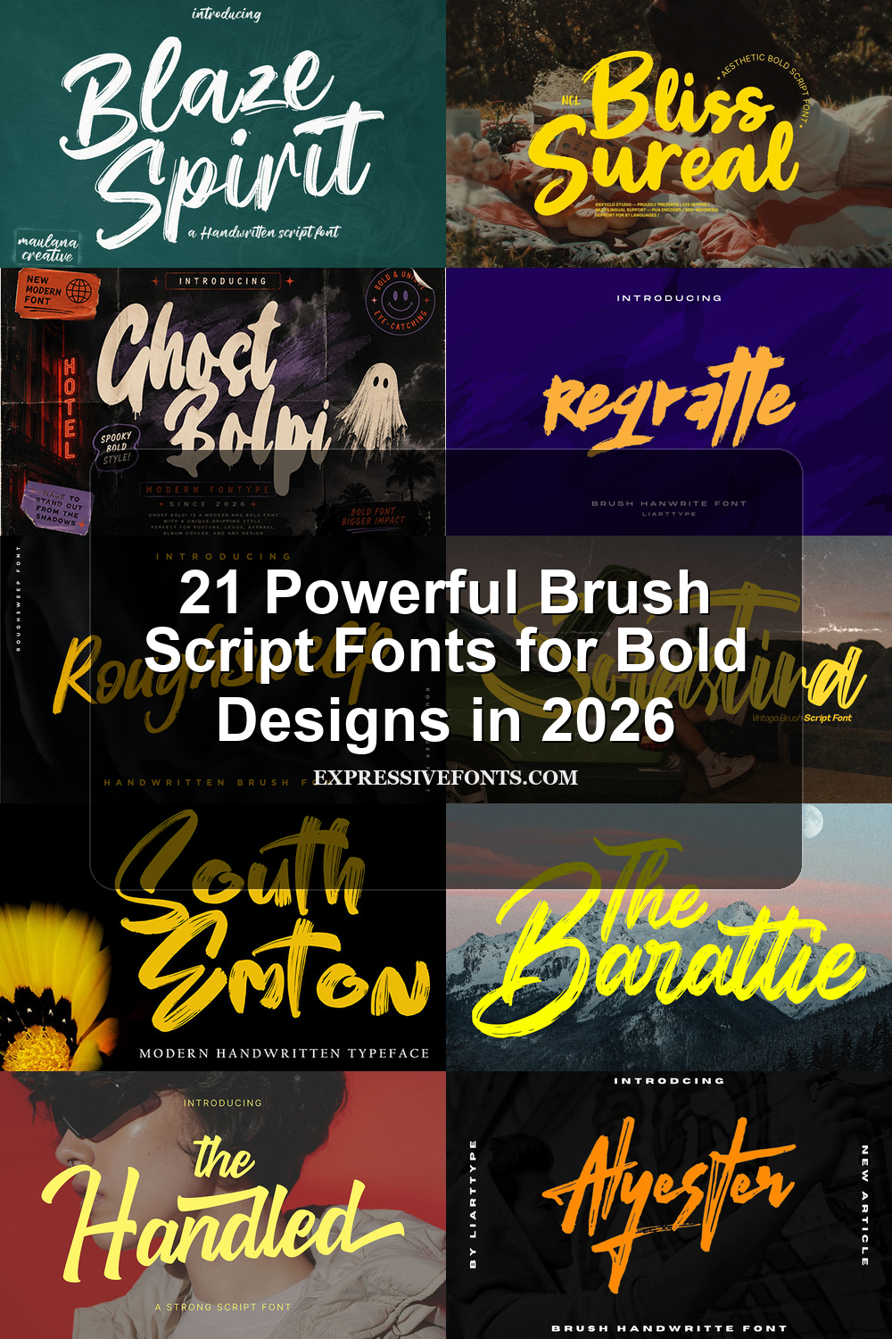
21 Powerful Brush Script Fonts for Bold Designs in 2026
Brush Script Fonts give logos, posters, packaging, merch, and social graphics a hand-painted look without losing display impact. This collection is built for designers who need bold script lettering, rough brush texture, retro sign-painter energy, or playful handwritten motion for short titles and brand-focused visuals.
Bold & Textured Brush Script Fonts
These brush script fonts use heavy strokes, visible texture, and strong wordmark shapes for logos, packaging, posters, book covers, and display-led branding.
The Handled Font
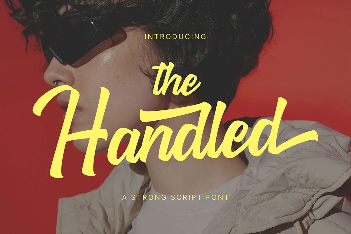
Best For: logos, posters, merch design, headlines
The Handled Font has the forceful rhythm expected from Brush Script Fonts, with thick connected letters, angled movement, and extended terminals that pull the wordmark across the line. Its rounded brush pressure gives the script a confident, poster-ready shape without turning the forms overly rough.
This is a display script for short names, titles, and apparel graphics where the lettering needs to carry the main visual weight. Give the long entry and exit strokes enough side space, then use compact uppercase support text to build hierarchy without competing with the script’s wide horizontal sweep.
Brownless Font
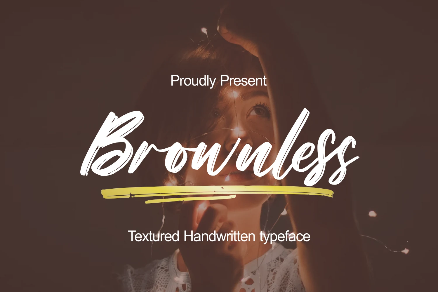
Best For: logos, posters, packaging, book covers
Brownless Font brings Brush Script Fonts into a textured handwritten space, using long connected strokes, sharp brush exits, and dry ink breaks inside the heavier letterforms. The script has a wide, sweeping rhythm, so it reads more like a confident title treatment than a quiet signature.
Use it for logos, packaging labels, posters, and book cover titles where the texture can stay visible. Keep the supporting type clean and small in hierarchy, and give the descenders and underline-style strokes enough lower margin so the brush movement does not feel clipped.
Midnight Font
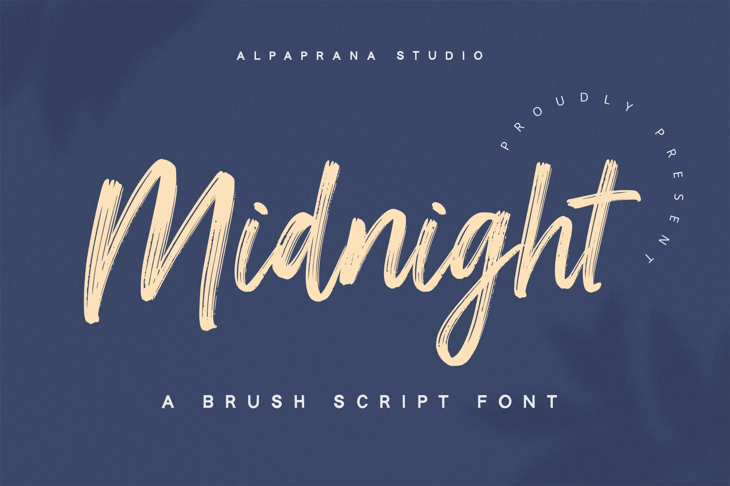
Best For: logos, branding, packaging, posters
Midnight Font has a loose modern rhythm, with tall brush-built letters, dry streaks through the strokes, and a long descending loop that gives the wordmark clear motion. It sits within Brush Script Fonts that feel handmade but still controlled enough for polished branding work.
The texture is strongest when the lettering is used large, especially on logos, packaging, posters, and apparel graphics. Keep the surrounding typography spaced out and restrained, because Midnight already carries a wide horizontal movement and its rough brush edges need contrast to stay readable.
Blaze Spirit Font
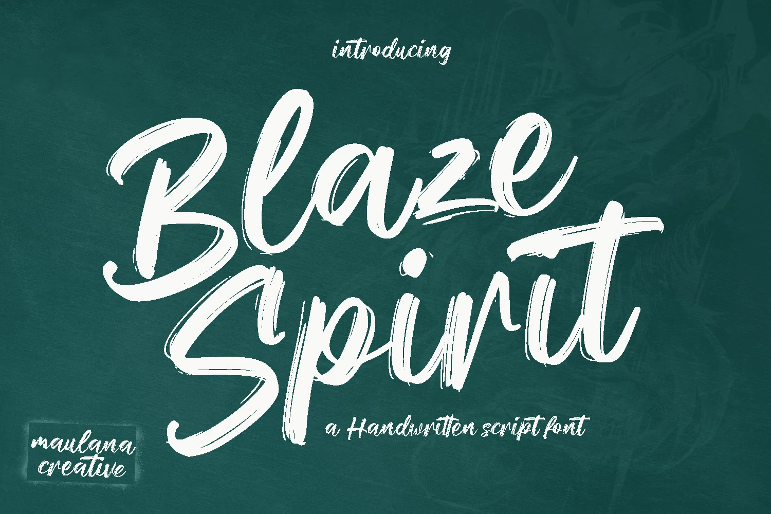
Best For: logos, social media graphics, book covers, display text
Blaze Spirit Font pushes Brush Script Fonts toward a bold handwritten look, with oversized capitals, high-contrast brush pressure, and rough dry edges that keep the strokes from feeling too polished. The wide loops and fast exits make it strongest as display lettering for short names, titles, and logo marks.
Use it with a clean sans or restrained serif when the script needs to lead the hierarchy without carrying every line of text. Its ligature support can smooth selected joins, while multilingual support helps keep the same brush voice across broader branding, social media, and book title layouts.
Freeday Font
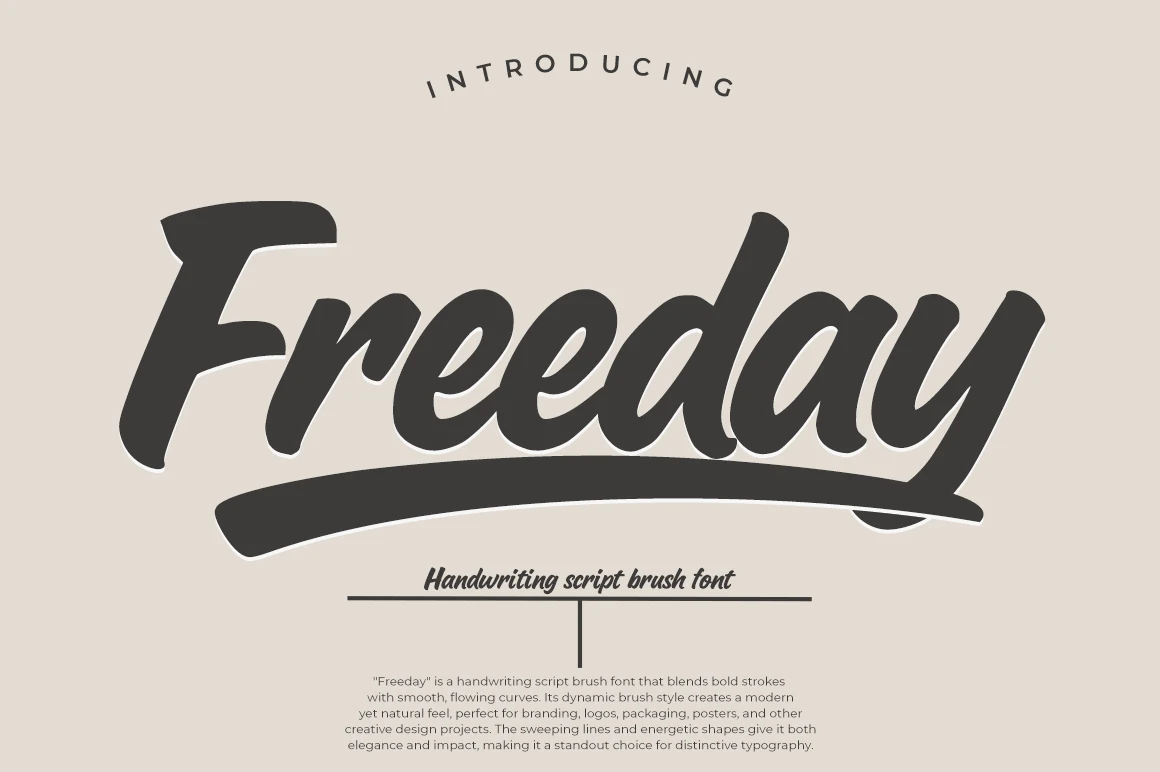
Best For: logos, branding, packaging, posters
Freeday Font brings Brush Script Fonts into a clean, heavy wordmark style, with thick slanted letters, smooth rounded joins, and a broad underline that anchors the whole composition. Its curves are more polished than gritty, giving the lettering a strong commercial feel rather than a raw paint texture.
Use it for logos, packaging, poster titles, and brand graphics where one bold script word needs to dominate the layout. The long underline and wide exit strokes need generous side and bottom spacing, while small uppercase support text can add structure without weakening the script’s main impact.
Brighter Brush Font
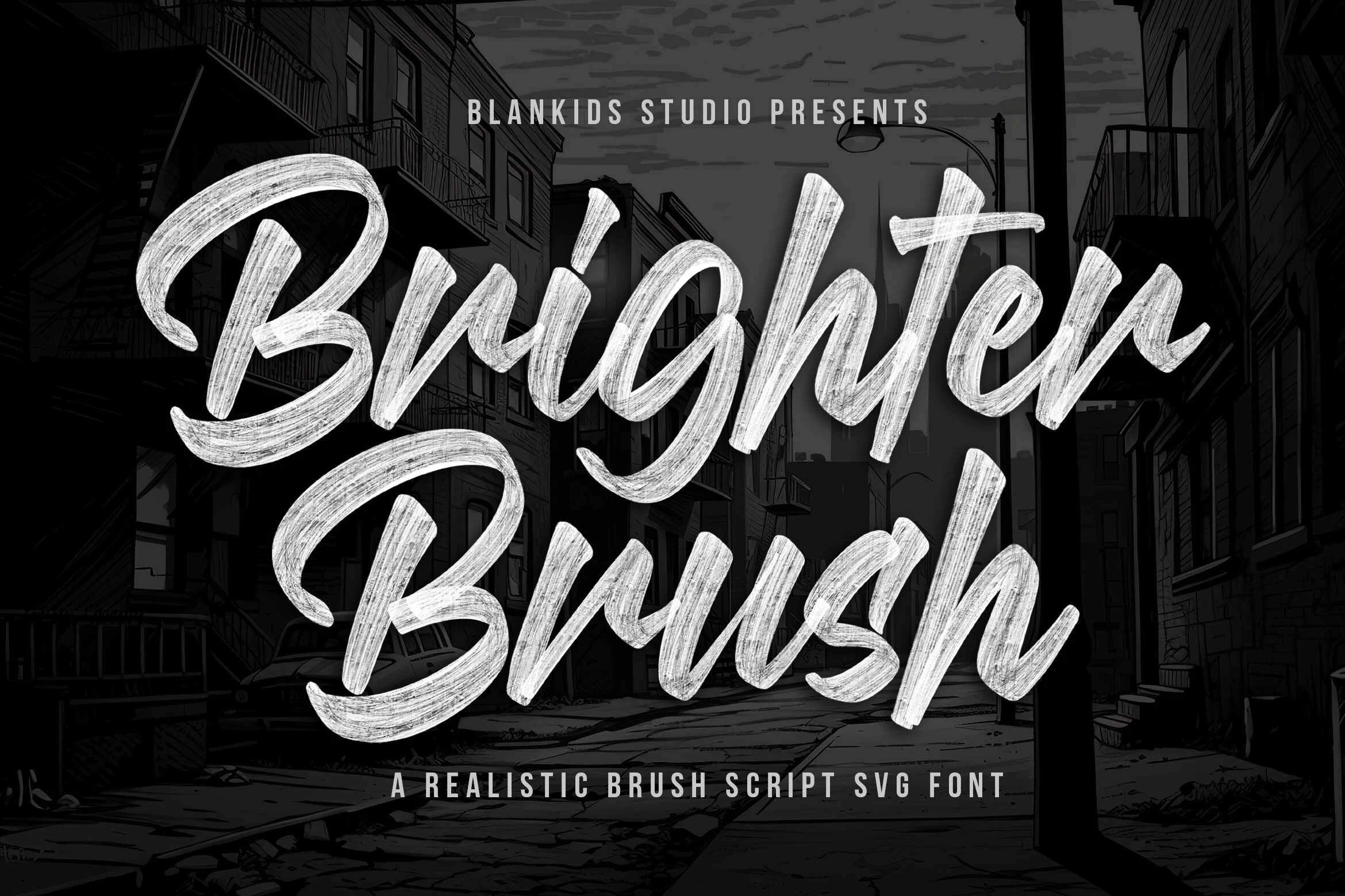
Best For: logos, branding, product packaging, posters
Brighter Brush Font gives Brush Script Fonts a realistic painted surface, with broad sweeping loops, thick pressure shifts, and dry bristle streaks visible through nearly every stroke. The large capitals have a strong sign-painter presence, while the connected lowercase keeps the words moving in one continuous rhythm.
Use it for logotypes, comic titles, poster graphics, product packaging, and promotional layouts where brush texture should be part of the message. Keep phrase length controlled and avoid low-contrast backgrounds, because the fine scratch marks need enough scale and clarity to read as texture rather than visual blur.
The Barattie Font
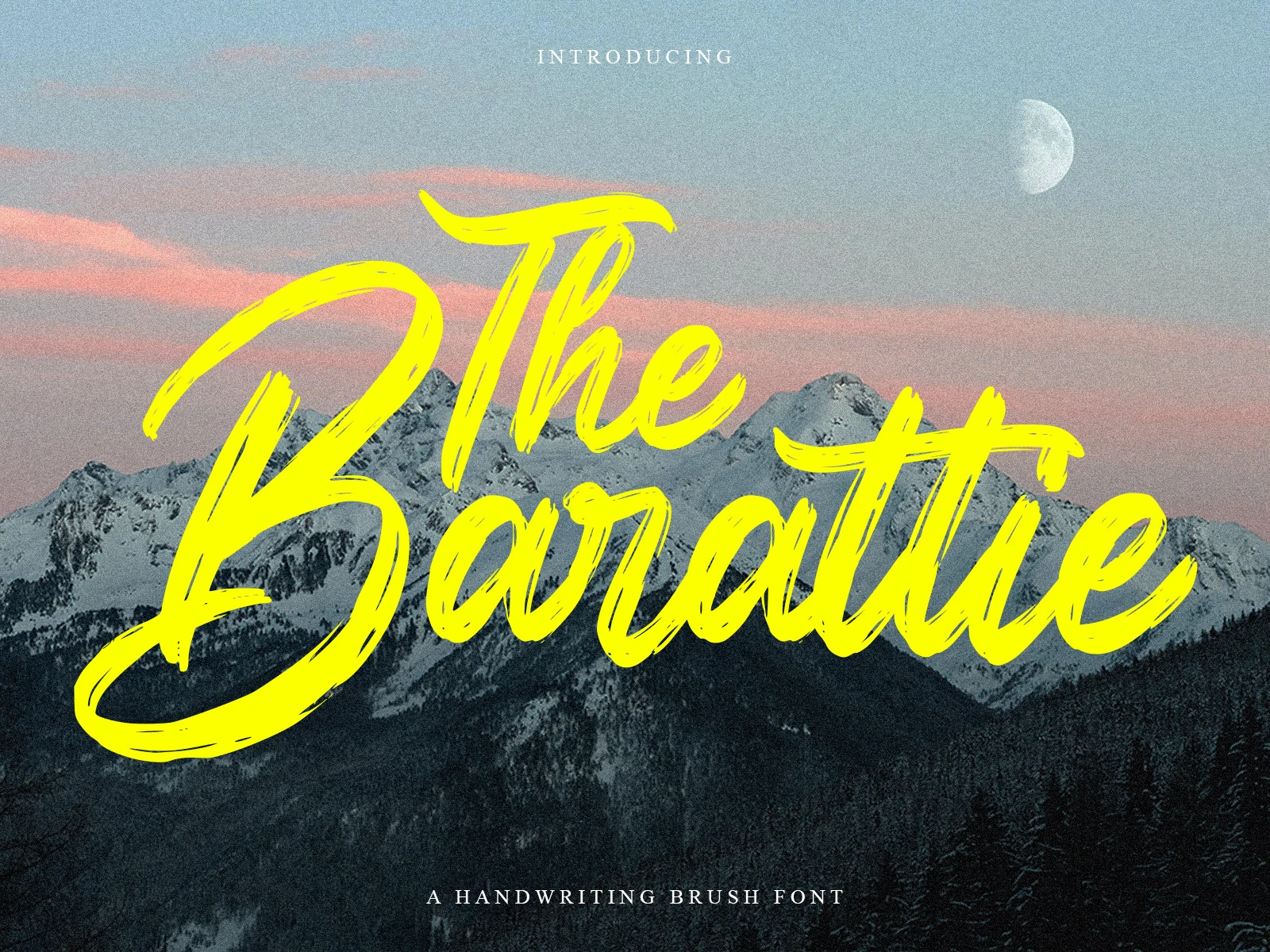
Best For: logos, posters, headlines, bold designs
The Barattie Font brings Brush Script Fonts into a large, high-impact display style, with thick painted strokes, sweeping curves, and dry brush cuts that show through the bright letterforms. The oversized capital shapes and long horizontal movement make the script feel forceful without losing its handwritten flow.
Use it for logos, poster titles, and headlines that need a strong focal word. Keep the background simple and the phrase short, because the wide loops, sharp exits, and textured interiors need enough scale and contrast to stay clean rather than crowded.
Rattin Font
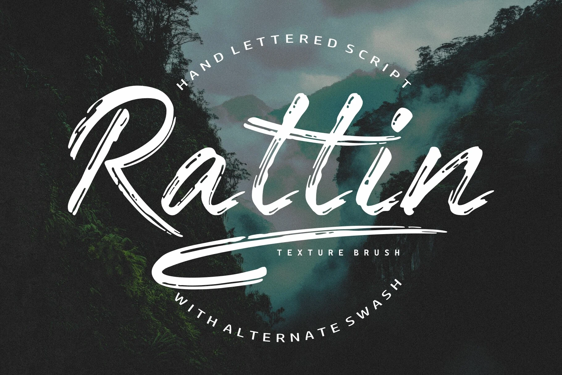
Best For: logos, posters, display text, eye-catching designs
Rattin Font pushes Brush Script Fonts into a sharp hand-lettered style, with long angled strokes, open ink gaps, and a dramatic underline swash that stretches the word into a full logo shape. The thin-to-thick brush rhythm gives it speed, while the scratched texture keeps the lettering raw and handmade.
Use it for title marks, outdoor branding, posters, and display graphics where one expressive word can lead the composition. The alternate swashes help adjust the final silhouette, but the long entry strokes and underline need wide margins and strong contrast to avoid crowding the layout.
Roughsweep Font
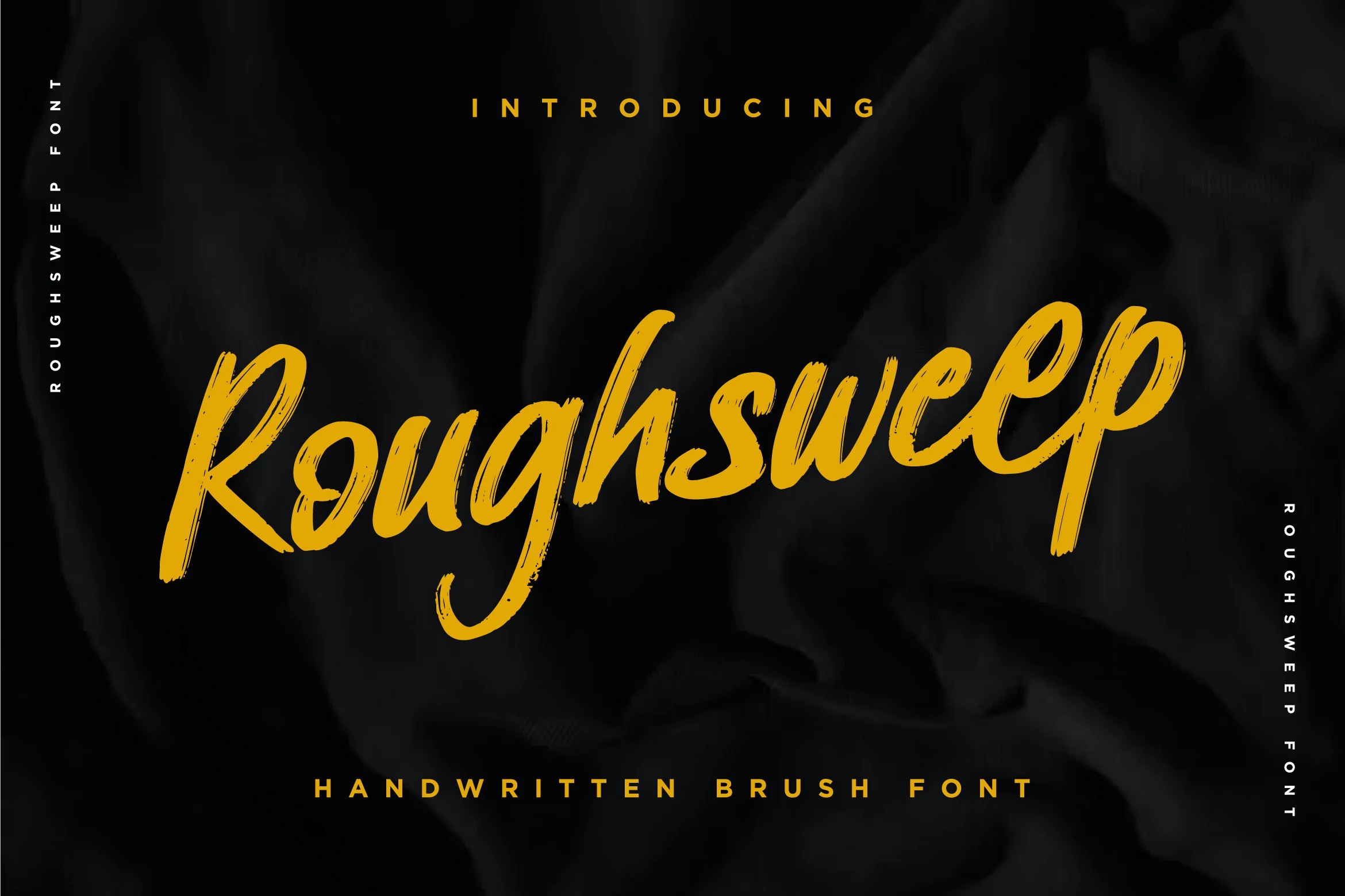
Best For: posters, T-shirts, branding, book covers
Roughsweep Font has a casual brush rhythm with rounded joins, uneven stroke edges, and visible dry marks that keep the lettering from looking too polished. The long descender on the “g” and lifted ending strokes add motion, while the broad letter shapes keep the word readable at display scale.
Its brush-on-paper origin suits Brush Script Fonts where the design needs a natural mark rather than a clean digital script. Use it for compact titles, apparel graphics, and branding pieces with strong contrast; loose tracking is unnecessary, but the taller loops need enough vertical space to avoid a cramped layout.
Rough & Street Brush Script Fonts
This group covers sharper, rougher brush scripts with horror, street, and handmade poster energy for merch graphics, event titles, and aggressive display layouts.
Ghost Bolpi Font
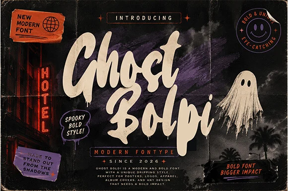
Best For: posters, merch design, headlines, eye-catching designs
Ghost Bolpi pushes Brush Script Fonts into horror-poster territory with thick, slanted brush forms, rounded cartoon curves, and paint-like drips hanging from the lower strokes. The letters feel heavy and loud, but the open counters and broad internal shapes keep short words readable at display size.
Use it where the title needs to dominate the layout: event posters, apparel graphics, comic-style headers, or Halloween branding. Its drips and uneven brush edges work best with generous vertical spacing, while a plain supporting typeface keeps the composition from turning visually crowded.
South Emton Font
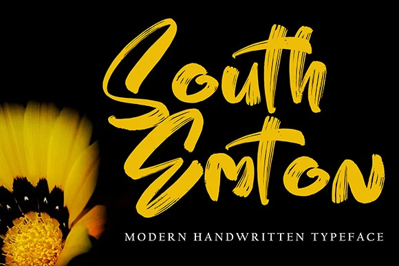
Best For: posters, merch design, headlines, eye-catching designs
South Emton Font sits on the louder side of Brush Script Fonts, with thick painted strokes, abrupt directional turns, and visible bristle streaks running through the letterforms. The uneven baseline and stacked rhythm give it a fast handmade feel rather than a polished calligraphic one.
Use it for short titles, poster words, apparel graphics, and logo marks that need a rough burst of energy. Keep the phrase length tight and increase contrast around the letters, because the dense brush texture and compressed connections can lose clarity when scaled down or placed over busy artwork.
Morria Font
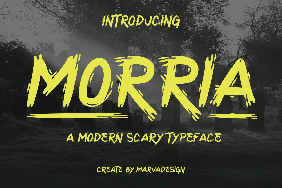
Best For: posters, headlines, display text, eye-catching designs
Morria Font takes Brush Script Fonts into a sharper horror-display direction, with heavy uppercase strokes, torn brush edges, and scratch-like gaps that cut through the letterforms. The wide capitals have enough mass for strong visibility, while the ragged terminals give each word a nervous, aggressive texture.
Use it for scary posters, event titles, merch graphics, and short headline treatments where impact matters more than refinement. Keep phrases brief, leave space around the underline-style strokes, and pair it with plain supporting text so the jagged brush texture stays readable instead of becoming visual noise.
Vibe Shift Font
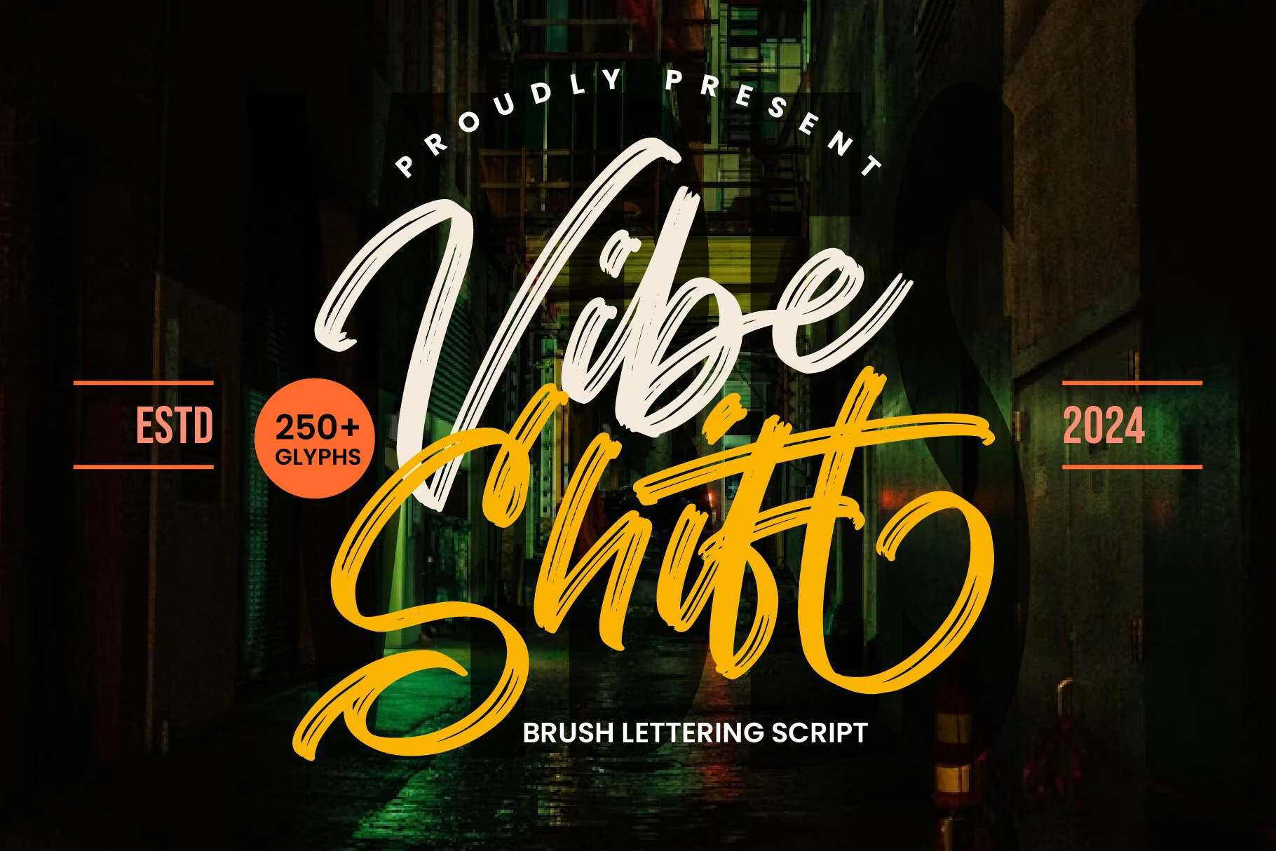
Best For: logos, branding, posters, merch design
Vibe Shift Font turns Brush Script Fonts toward street-led branding, with oversized loops, fast diagonal movement, and rough bristle streaks cutting through the strokes. The contrast between the loose upper word and heavier lower word gives the lettering a layered, poster-like hierarchy.
Use it for brand marks, music graphics, apparel prints, and urban event posters where the script needs to feel expressive rather than tidy. Its long swashes demand generous side margins, and the textured stroke edges work best against simple backgrounds with strong value contrast.
Wavy Brick Font
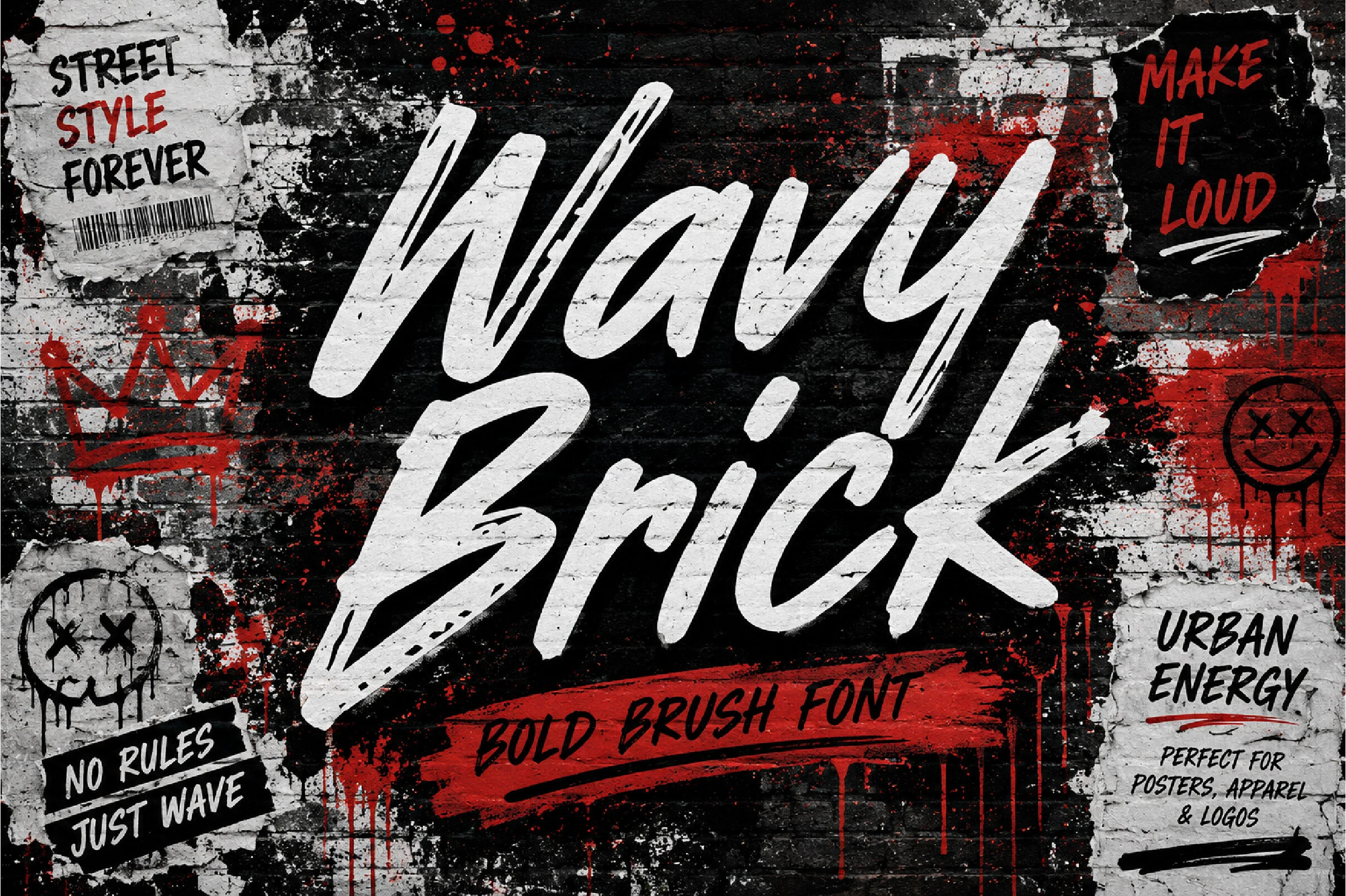
Best For: posters, T-shirts, logos, expressive designs
Wavy Brick Font is built around heavy brush pressure, sharp slanted motion, and rough dry-brush cuts inside the strokes. The large capitals feel fast and aggressive, while the connected lowercase keeps the word shape moving like hand-painted street lettering.
For Brush Script Fonts that need impact rather than polish, this one belongs in short display text. Use strong contrast, tight title hierarchy, and generous margins around the longest strokes, because its wide forms and scraped texture lose force when crowded into small copy.
Alyester Font
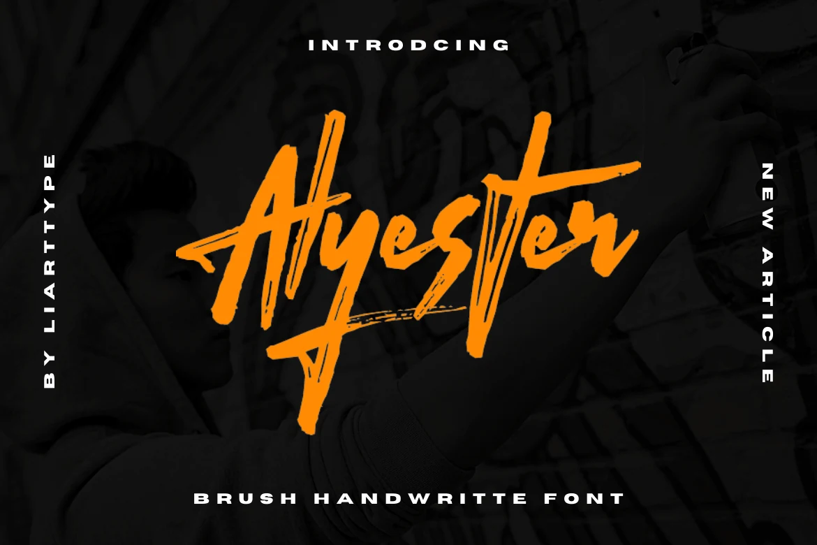
Best For: posters, quotes, invitations, expressive designs
Alyester Font has a marker-like brush structure with sharp vertical cuts, rough inner streaks, and angular cross-strokes that give the word shape a quick handwritten charge. The tall letters and extended terminals make it more assertive than soft, with a compact rhythm suited to display use.
For Brush Script Fonts aimed at quotes, cards, and bold social graphics, Alyester works best when the text is short and the contrast is high. Keep supporting type simple and spaced out, because the script already carries strong direction through its slashes, underlines, and broken brush texture.
Retro & Playful Brush Script Fonts
These brush scripts lean into sign-painter rhythm, casual marker texture, and upbeat retro curves for social graphics, vintage branding, quotes, and seasonal designs.
Summer Brush Font
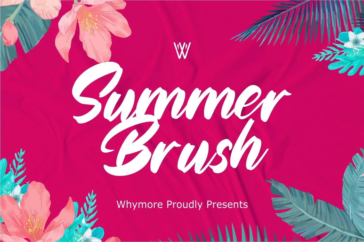
Best For: logos, signage, packaging, social media graphics
Summer Brush Font has the upbeat sign-painter energy of Brush Script Fonts, with thick connected strokes, rounded pressure changes, and broad swashes that make the words feel fast and handmade. The letterforms stay fairly open for a brush script, so short names and seasonal titles remain clear.
Its marker-style flow works best where the lettering can act as the main graphic element: boutique logos, café signage, packaging, or social posts. Let the large capitals and lower loops take the visual lead, then use small, widely spaced support text to keep the layout balanced.
Advance Glowing Font
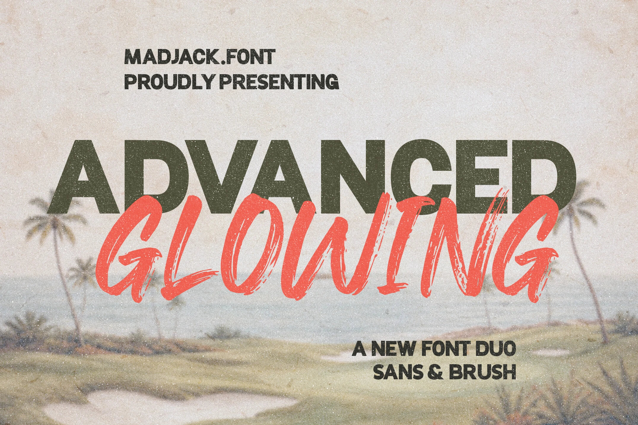
Best For: logos, branding, posters, retro designs
Advance Glowing Font gives Brush Script Fonts a ready-made duo structure, pairing a heavy distressed sans with a loose coral brush script full of dry ink streaks. The sans carries the main block weight, while the script adds motion and texture across the foreground.
This setup is useful for poster titles, retro logos, quotes, and brand graphics where contrast between solid type and hand-painted lettering does most of the work. The script alternates, ligatures, and line elements help build custom lockups, especially when the brush word needs an underline or a stronger title break.
Regratte Font
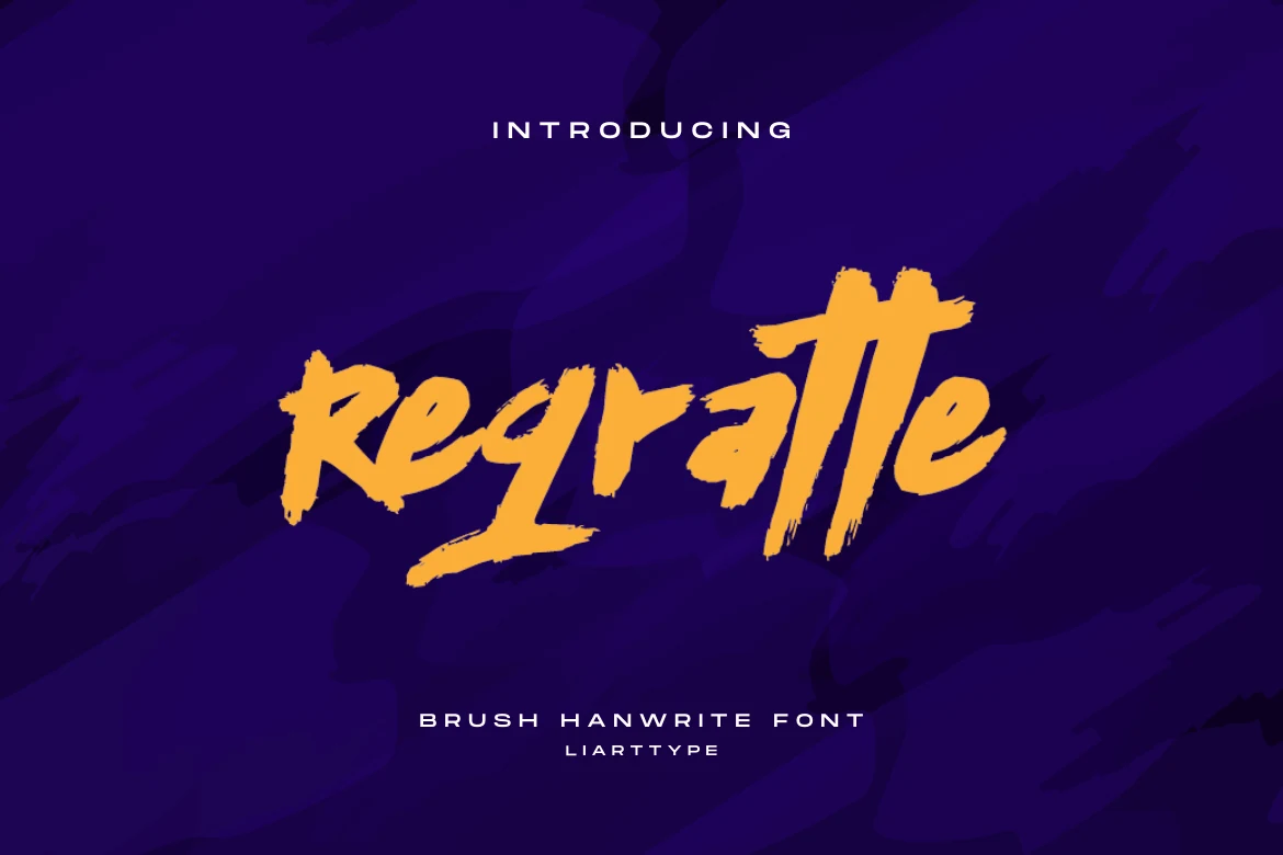
Best For: invitations, quotes, social media graphics, casual designs
Regratte Font gives Brush Script Fonts a compact marker-board attitude, with blunt brush starts, rough cut edges, and a slightly uneven handwritten rhythm. The letters stay fairly simple in structure, so the texture adds energy without making short words difficult to read.
Use it for invitations, greeting-card headlines, quote graphics, and casual social posts where the message should feel quick and direct. Keep the line count low and pair it with spaced uppercase text, because Regratte’s choppy stroke edges need clean surrounding space to keep the title sharp.
Sorastina Font
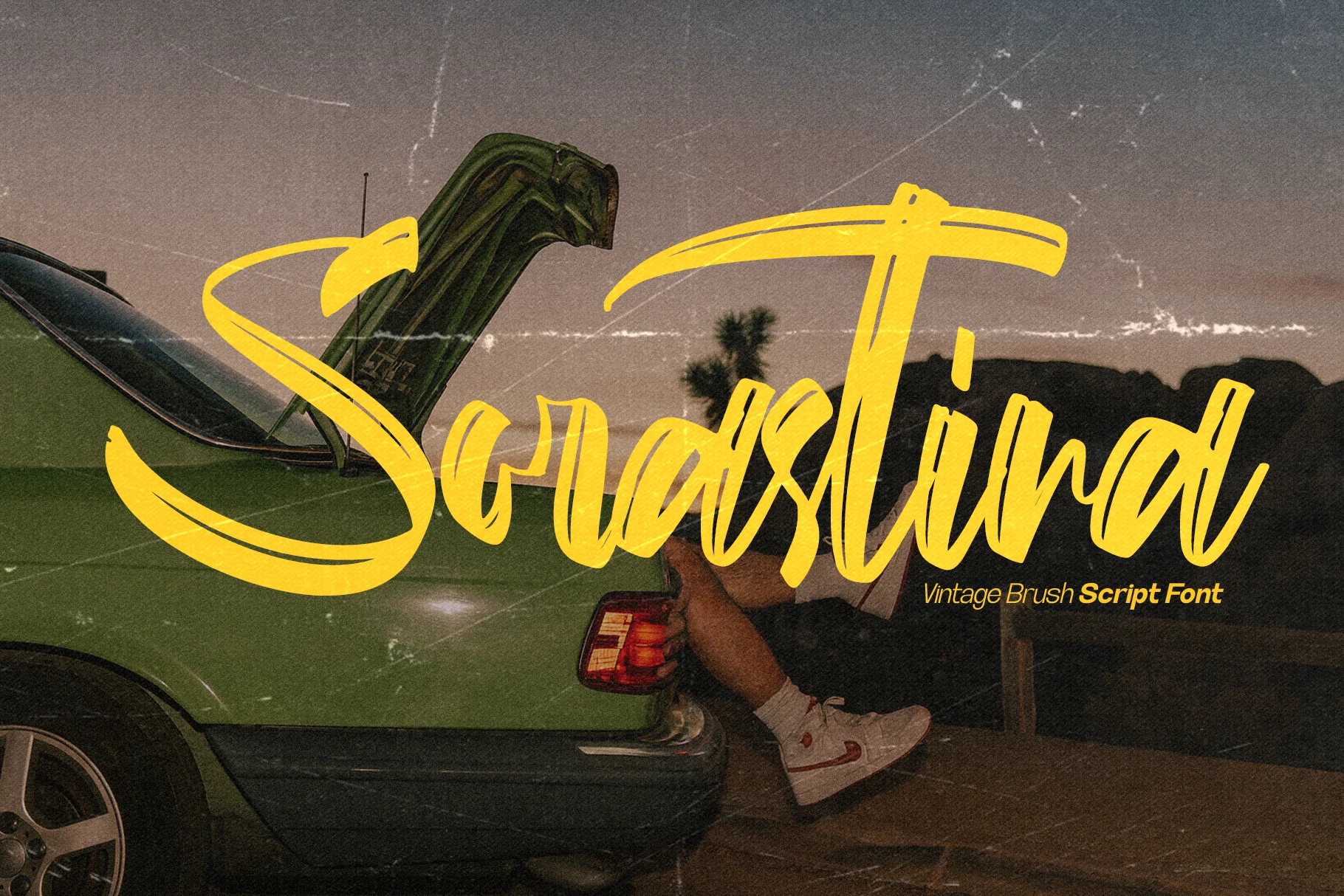
Best For: retro designs, vintage designs, posters, logos
Sorastina Font has the punch of hand-painted signage: wide brush pressure, fast curves, and long sweeping entry and exit strokes that give each word a strong retro rhythm. The tall verticals and compact joins keep the lettering energetic without losing the handcrafted edge.
Use it where Brush Script Fonts need to feel nostalgic rather than delicate. It works best in short titles, logo marks, posters, and apparel graphics, with enough surrounding space for the large swashes and enough contrast to keep the thin interior cuts from disappearing.
Gloucester Script Font
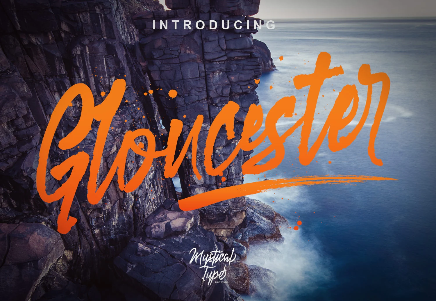
Best For: posters, T-shirts, logos, merch design
Gloucester Script Font pushes a loose brush style with tall upright strokes, uneven paint edges, and a long sweeping underline that turns a wordmark into a full display composition. The letterforms feel fast and handmade, with narrow joins that contrast against the heavier downstrokes.
Use it when Brush Script Fonts need a loud headline voice rather than quiet handwriting. The bonus swashes are useful for building underlines and directional accents, while the paired marker font can handle small supporting text so the main script stays focused on short titles, logos, and apparel graphics.
Bliss Sureal Font
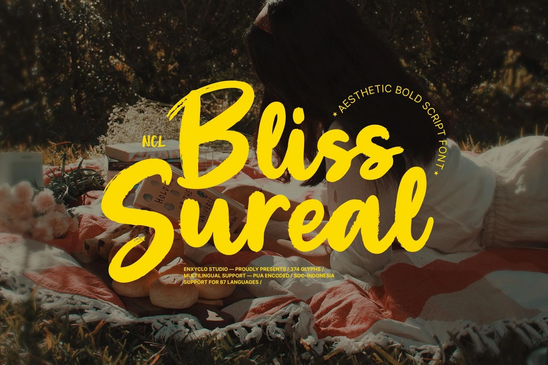
Best For: logos, posters, social media graphics, fun designs
Bliss Sureal Font leans into thick rounded brush shapes, inflated curves, and a bouncy baseline that makes the lettering feel casual and upbeat. The large capitals create strong entry points, while the softer joins keep the script friendly instead of sharp or aggressive.
It fits Brush Script Fonts that need a bold lifestyle look for short names, upbeat quotes, and social graphics. Keep the wording compact and give the descenders enough room; the heavy strokes hold color well, but crowded layouts can flatten its playful rhythm.
Conclusion
Choose bold and textured brush scripts when the font needs to lead a brand mark or poster. Use rough and street styles for stronger attitude, and pick retro or playful scripts when the design needs a warmer handmade rhythm.