17 Best Cool Script Fonts in 2026
This collection moves from textured marker lettering and brush-built forms to polished signatures, flowing calligraphy, and dimensional retro display scripts. These Cool Script Fonts can shape logos, posters, invitations, social graphics, packaging, and short headlines, with readability and scale varying widely across the group.
Looking for more cool fonts? Browse our complete Cool Fonts collection to compare bold, vintage, retro, script, and gothic cool styles.
Cool Script Fonts: Connected and Flowing Styles
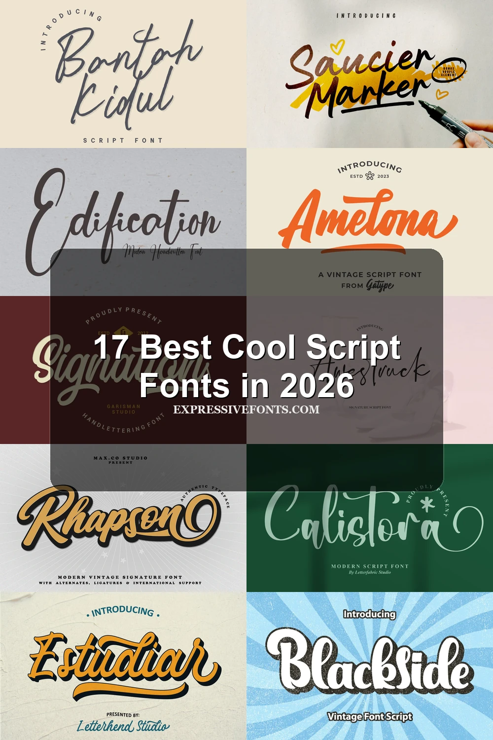
These Cool Script Fonts use connected or partly connected handwriting, but their tones range from marker-textured and irregular to restrained monoline forms, setting them apart from heavier brush and swash-led styles.
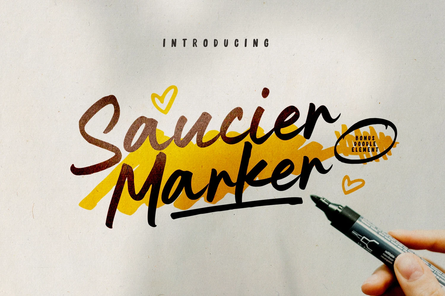
Saucier Marker Font
Best For: social media graphics, posters, display text, short phrases
Saucier Marker Font brings connected letters, marker texture, slight stroke variation, and irregular terminals together in a casual flow. Its moderately legible forms suit large headings, short social graphics, posters, and brief display wording better than extended text.
Rhythm Font
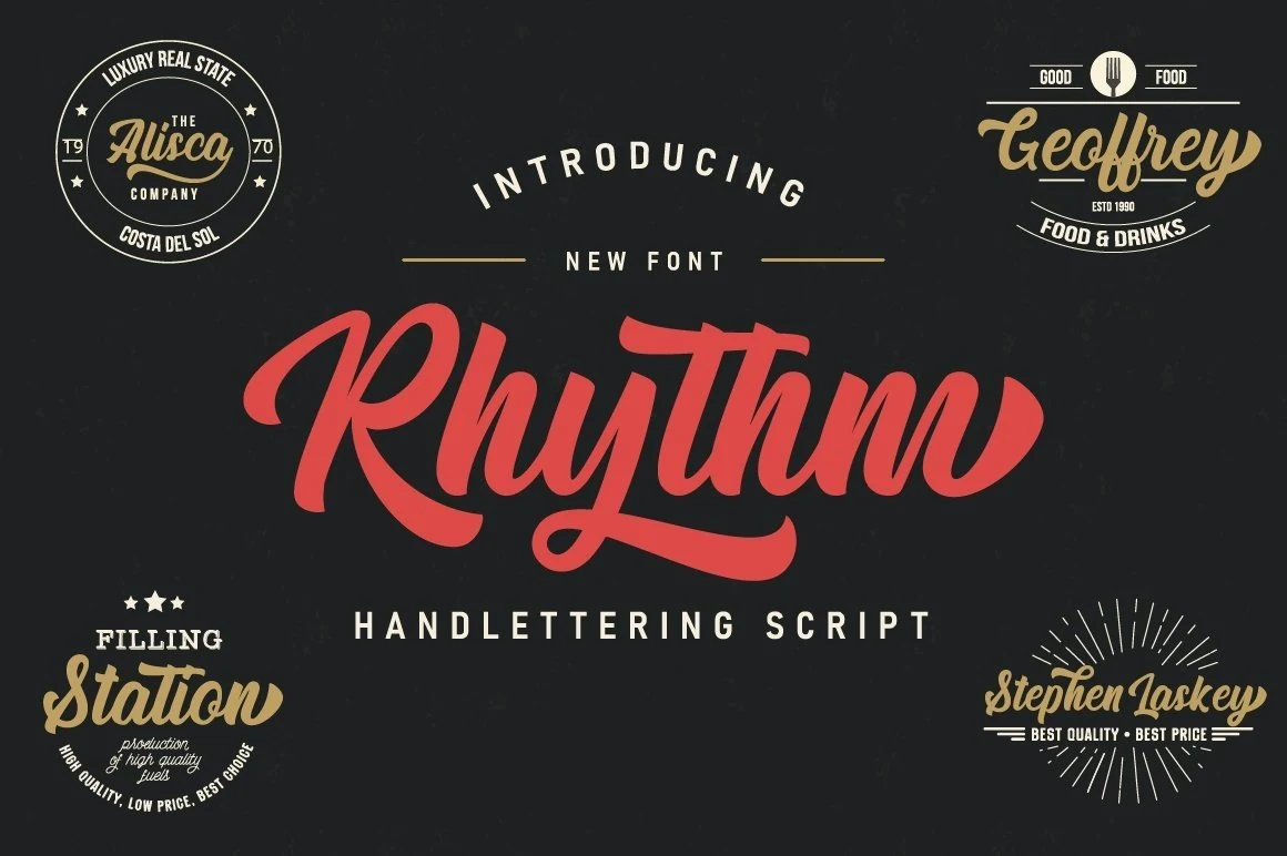
Best For: display text, short phrases, creative projects
Rhythm Font controls its energetic slant with a stable baseline, rounded terminals, and a clear thick-to-thin rhythm. It suits display text, short phrases, and creative projects such as cards, while connecting strokes and contrast become more difficult to read when reduced.
Edification Font
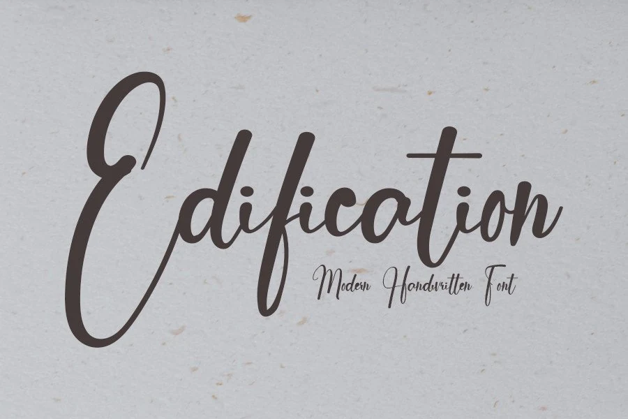
Best For: logos, branding, social media graphics, display text
Edification Font takes a more restrained approach through monoline construction, a stable baseline, and largely connected forms with a slight inclination. Its balanced medium weight supports logos, branding, social media graphics, and display text, though informal shapes can blur when significantly reduced.
Bantah Kidul Font
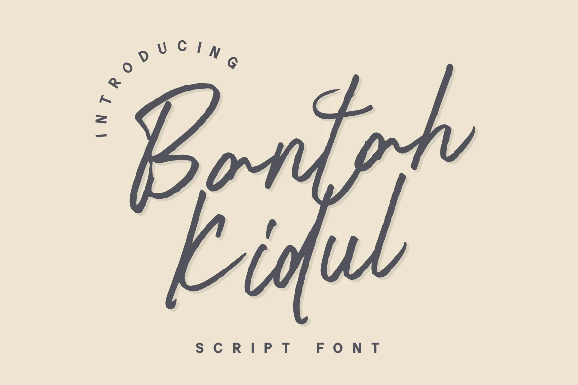
Best For: headlines, signage, display text, short phrases
Bantah Kidul Font interrupts its connected construction with occasional gaps and asymmetrical character shapes, preserving a spontaneous handwriting impression. The irregularity gives headlines, signage, display text, and short phrases individual character, but recognition can weaken considerably at very small sizes.
Brush-Led Statement Scripts
Dense, textured strokes define this group, with brush weight, contrast, shadows, and underlines doing much of the visual work. They make stronger statements than the lighter signature scripts.
Kabeh Black Font
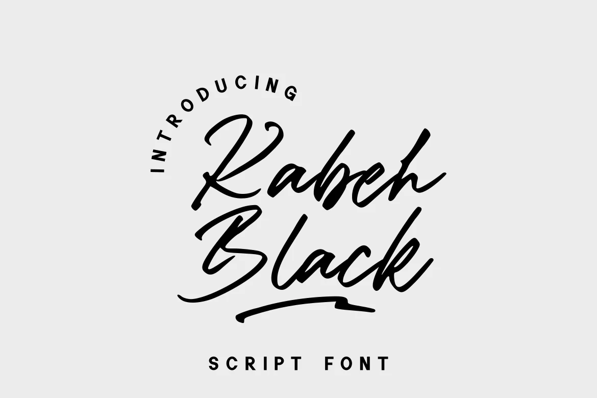
Best For: logos, branding, display text, wedding designs
For logos, branding, display text, and wedding designs, Kabeh Black Font offers dense connected lettering with high contrast, a pronounced slant, and calligraphic tails. Its intricate joins create a carefully shaped mark, but they demand large sizing and brief wording rather than continuous reading.
Balletic Font
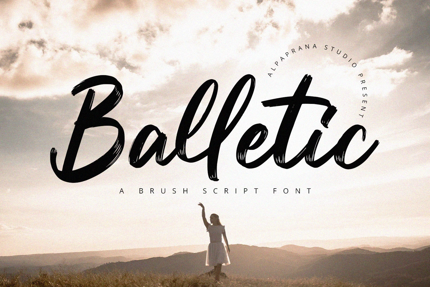
Best For: logos, branding, posters, display text
Balletic Font uses visible brush texture, high contrast, a slanted appearance, and an irregular baseline to suggest physically written lettering. Its connected forms make a forceful impression in large logos, branding, posters, and display text, but the surface texture is demanding at small sizes.
Estudiar Font
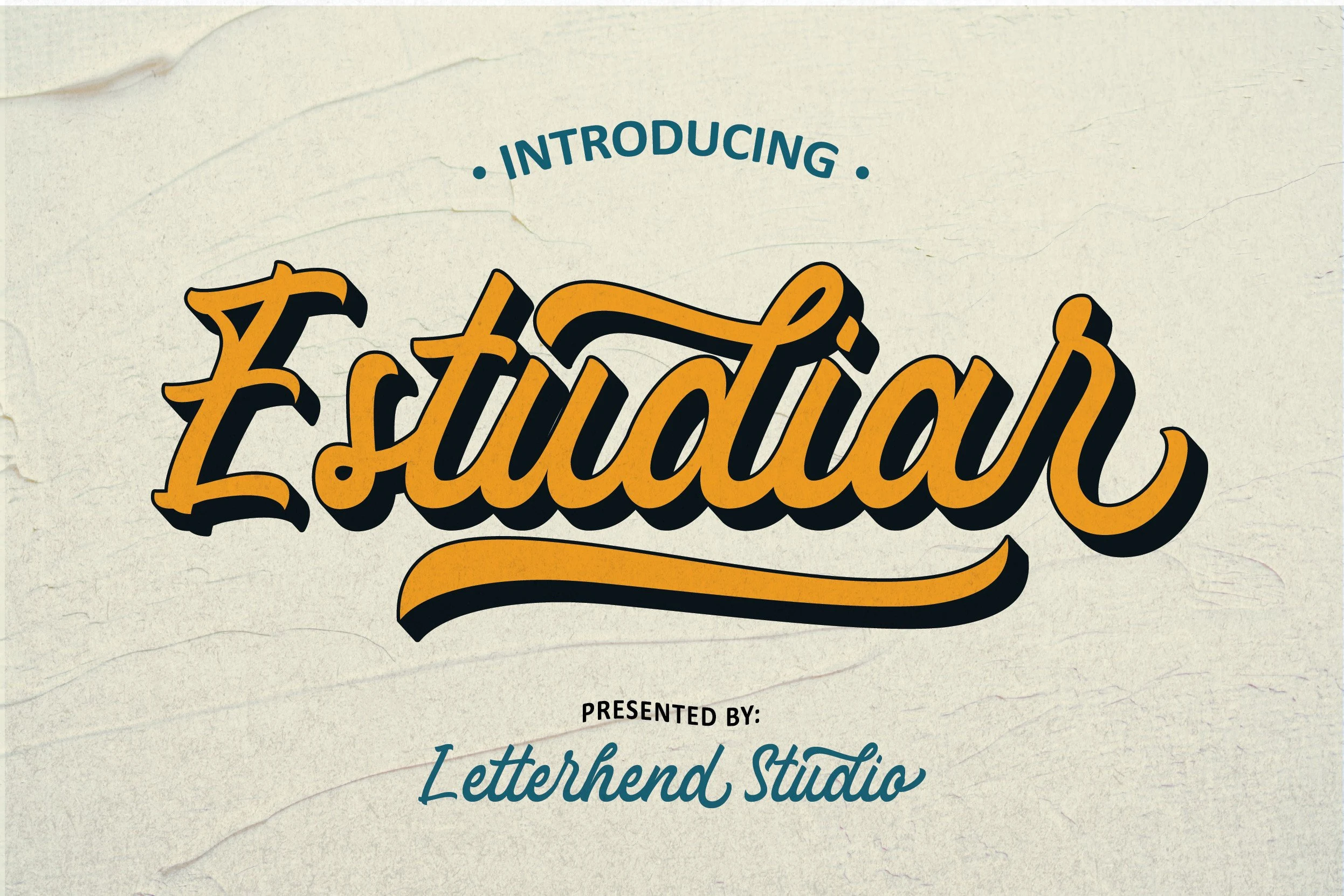
Best For: logos, headlines, display text, social media graphics
Estudiar Font combines connected, right-leaning brush lettering with high contrast, a layered drop shadow, and a distinctive under-swash on the final letter. That built-in finishing gesture suits logos, headlines, display text, and social media graphics, provided the composition leaves room for its decorative ending.
Amelona Font
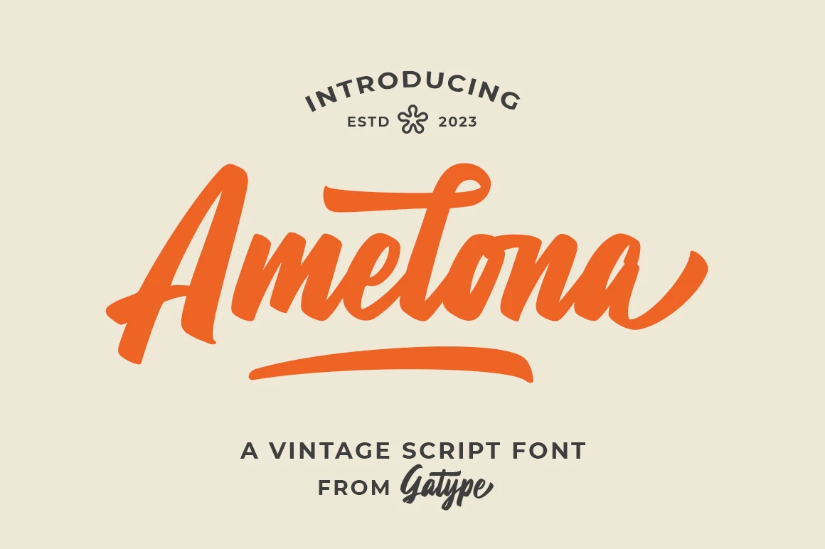
Best For: logos, posters, headlines, retro designs
Amelona Font drives its connected lettering with heavy brush-like strokes, high contrast, a rightward slant, and a pronounced underline extension. The finishing gesture holds together in logos, posters, headlines, and retro designs, while the thick forms are too forceful for body copy.
Signature and Swash Scripts
Signature and swash designs prioritize slant, loops, tails, and decorative endings. Some remain connected while others separate letters, giving branding and invitation work more customization than casual handwriting styles.
Belmonth Font
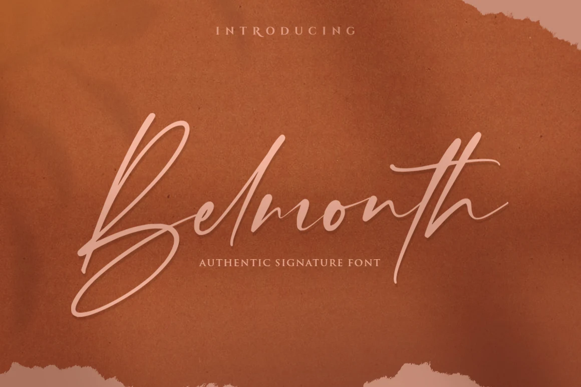
Best For: logos, branding, headlines, short phrases
Belmonth Font leans sharply right, joining flowing letterforms with long swashes and tails. The polished, personal construction can give logos, branding, and short headlines an editorial look, but its flourishes need generous sizing and quickly become unsuitable for paragraphs.
Signation Font
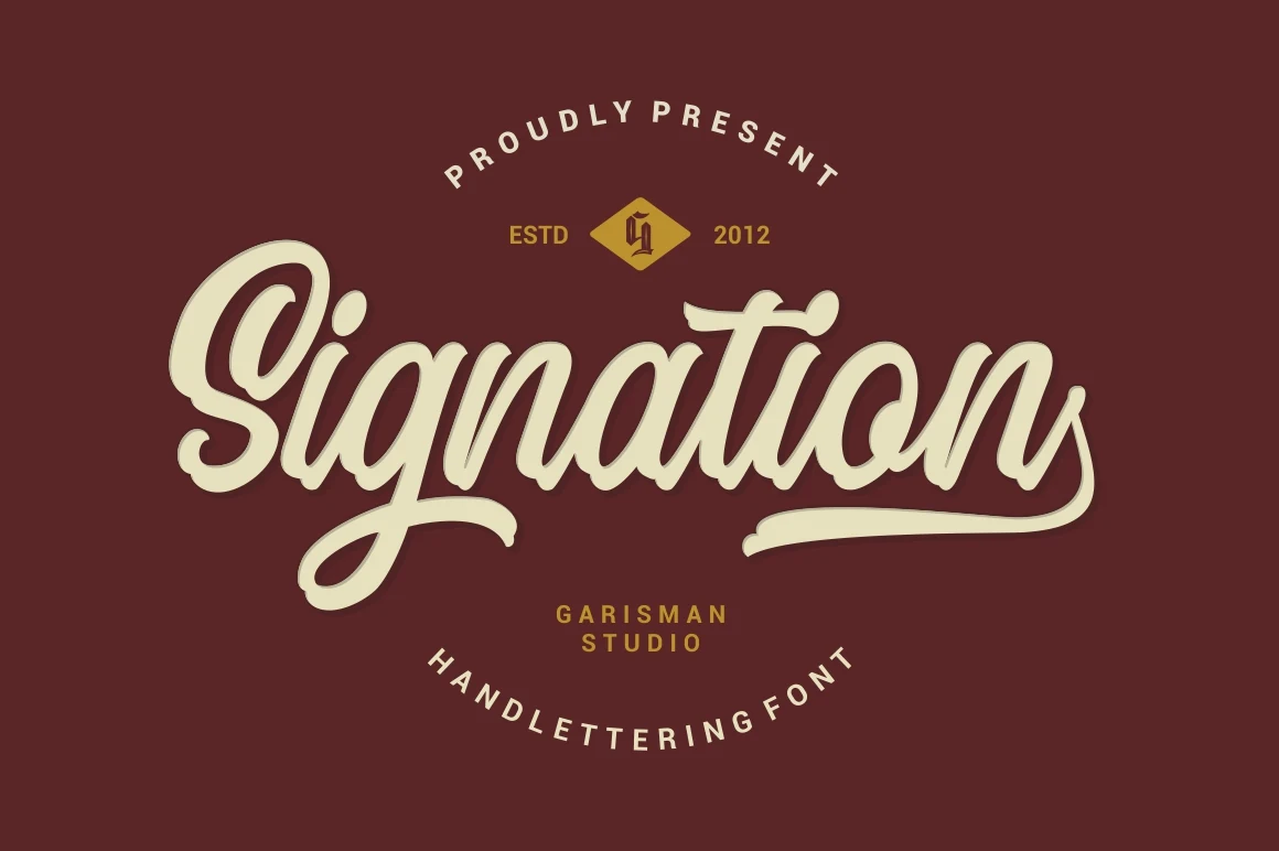
Best For: logos, branding, display text, short phrases
Signation Font pairs high contrast with a strong rightward lean and extended swashes, producing a formal display voice. Its connected details are most dependable at large sizes, where logos, branding, display text, and short phrases can preserve the lettering’s structure.
Awestruck Font
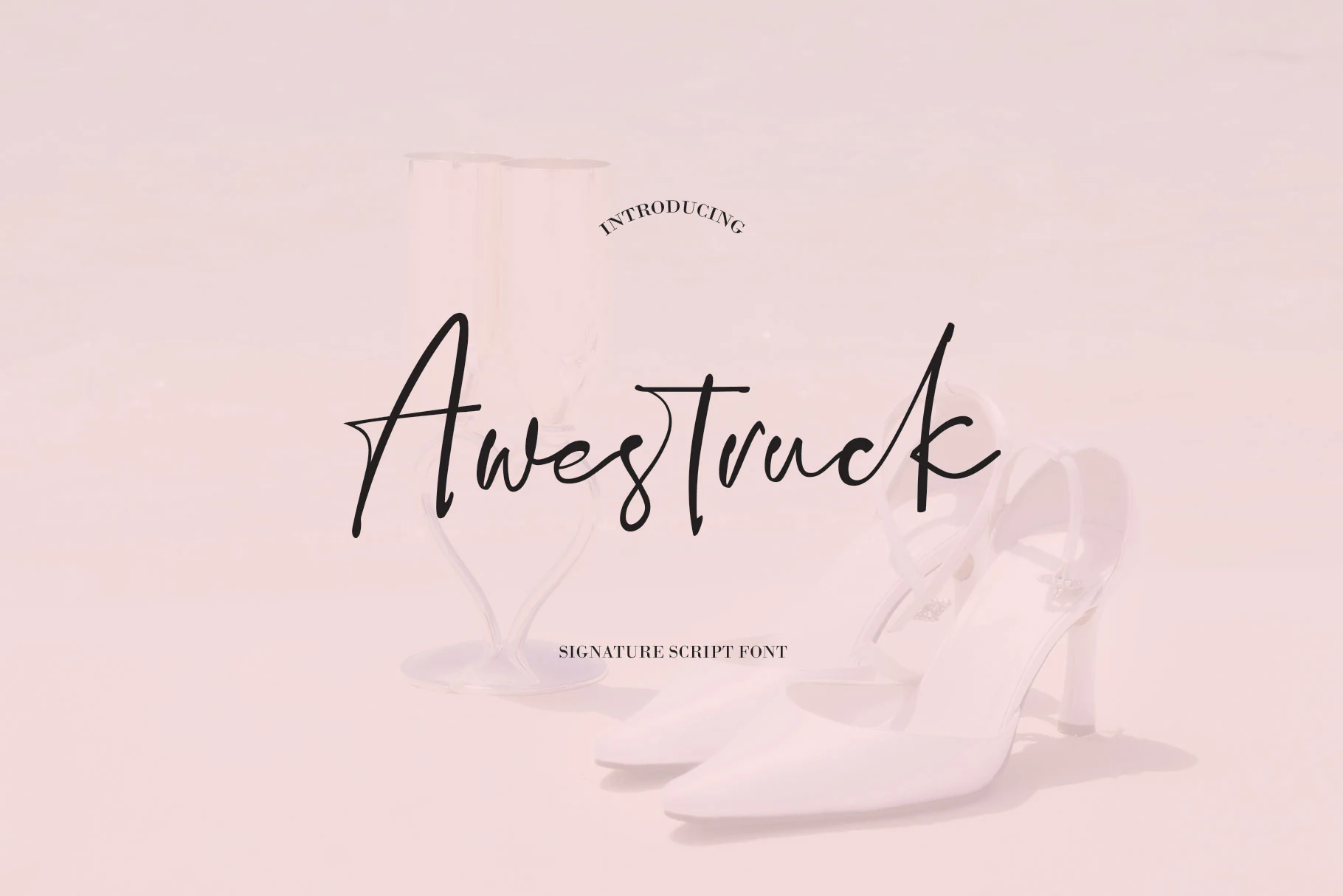
Best For: logos, branding, wedding designs, short phrases
Awestruck Font takes a different route from fully joined scripts: its light signature letters are disconnected, yet sweeping curves, loops, and elongated tails remain. That separation helps clarify individual forms for logos, branding, wedding designs, and short phrases, though it remains a title specialist.
Calistora Font
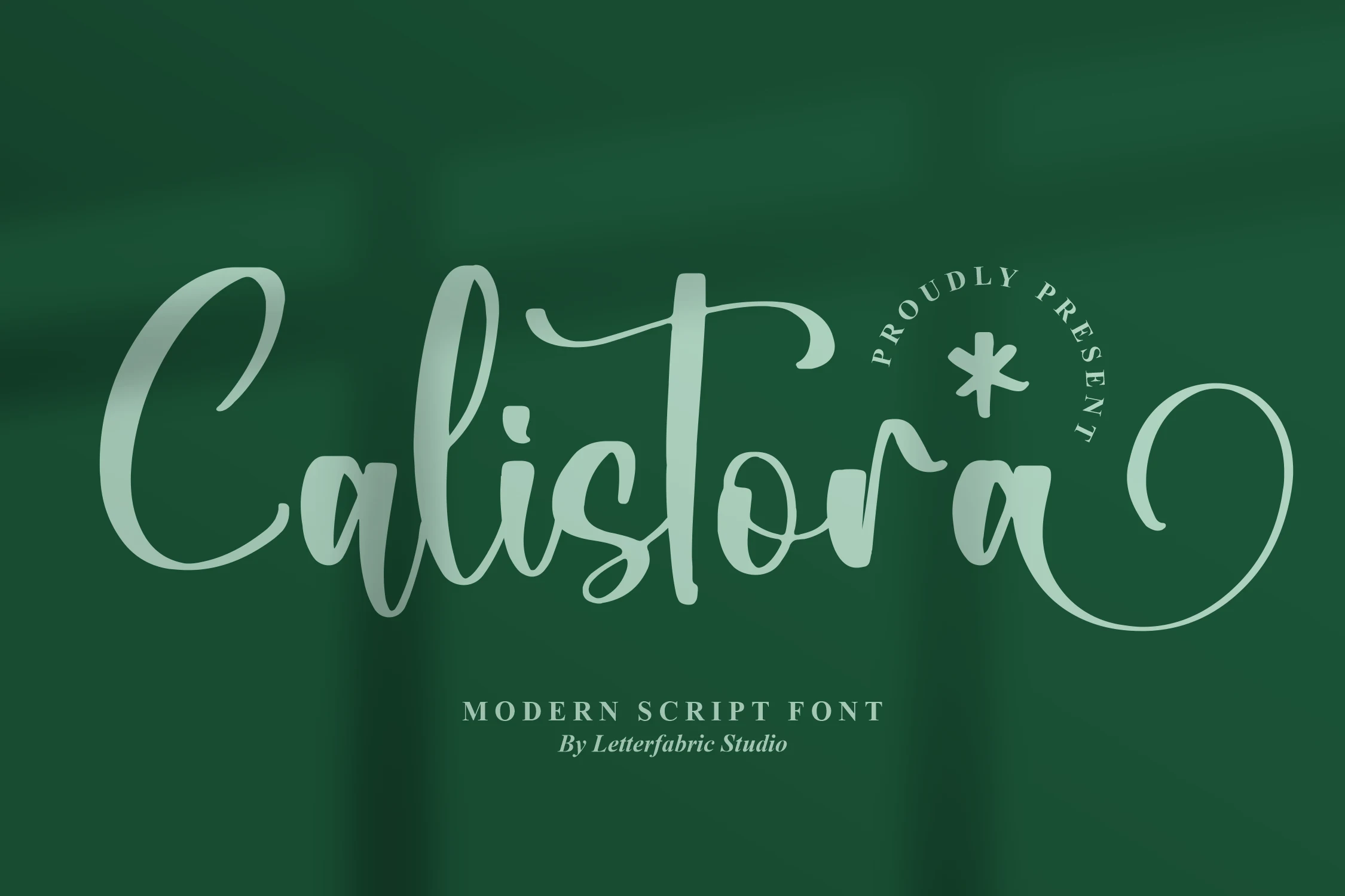
Best For: logos, invitations, wedding designs, personal branding
Calistora Font shapes its calligraphy with variable line weight, flowing ascenders and descenders, connected forms, and terminal swashes. The stylization gives logos, invitations, wedding designs, and personal branding a carefully composed presence, while compact or continuous reading is less reliable.
Collega Font
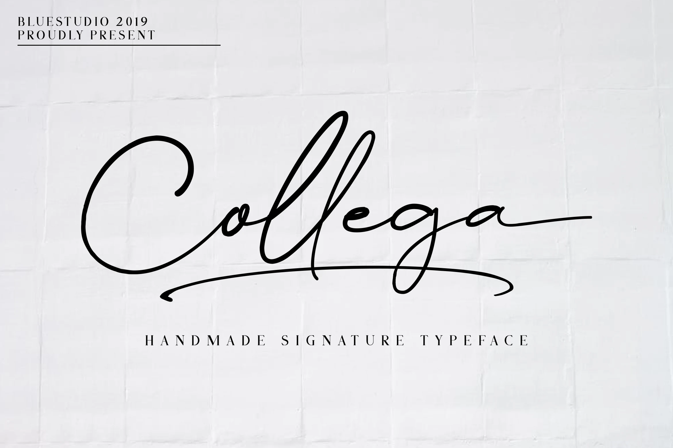
Best For: logos, branding, website headers, short phrases
Collega Font keeps its connected structure solid with bold monoline strokes and a pronounced rightward slant, then adds a distinctive swash to the final “a.” It works well for logos, branding, website headers, and short phrases, although that ending needs room to finish cleanly.
Gondess Font
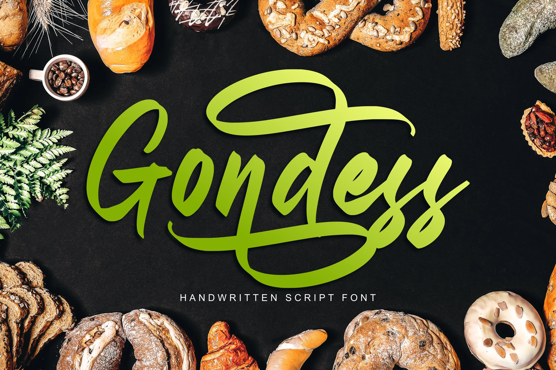
Best For: logos, branding, packaging, display text
Gondess Font is built around exaggerated loops, long swash tails, high contrast, and an unusually broad range of alternates. That customization helps tailor logos, branding, packaging, and display text, but the many flourishes make large-scale use more practical than readable text blocks.
Retro Shadowed Scripts
These display scripts build their identity through shadow, extrusion, heavy contrast, and rounded connected forms. Their sign-like treatments distinguish them from unembellished brush and calligraphic lettering.
Rhapson Script Font
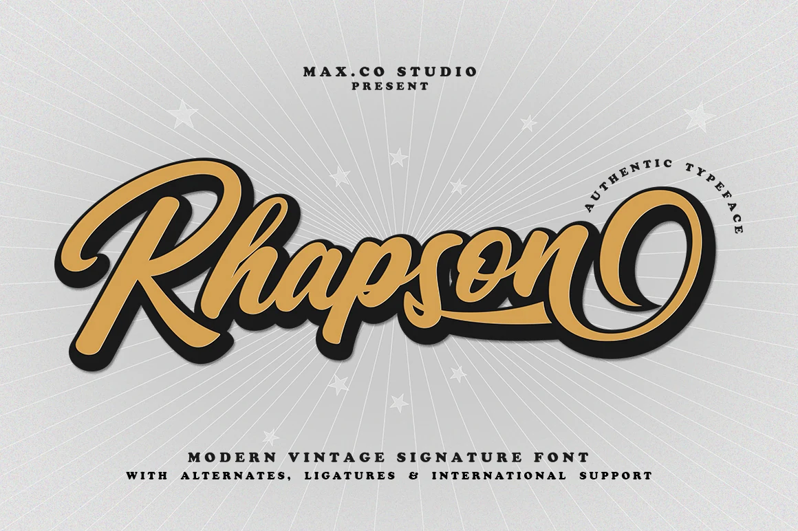
Best For: logos, branding, posters, short phrases
Rhapson Script Font is built for prominent display use, combining heavy, high-contrast strokes, a pronounced rightward slant, tight connections, and a large terminal swash. Those calligraphic details create a bold retro voice for logos, branding, posters, and short phrases, while reduction can compromise clarity.
Cheers Font
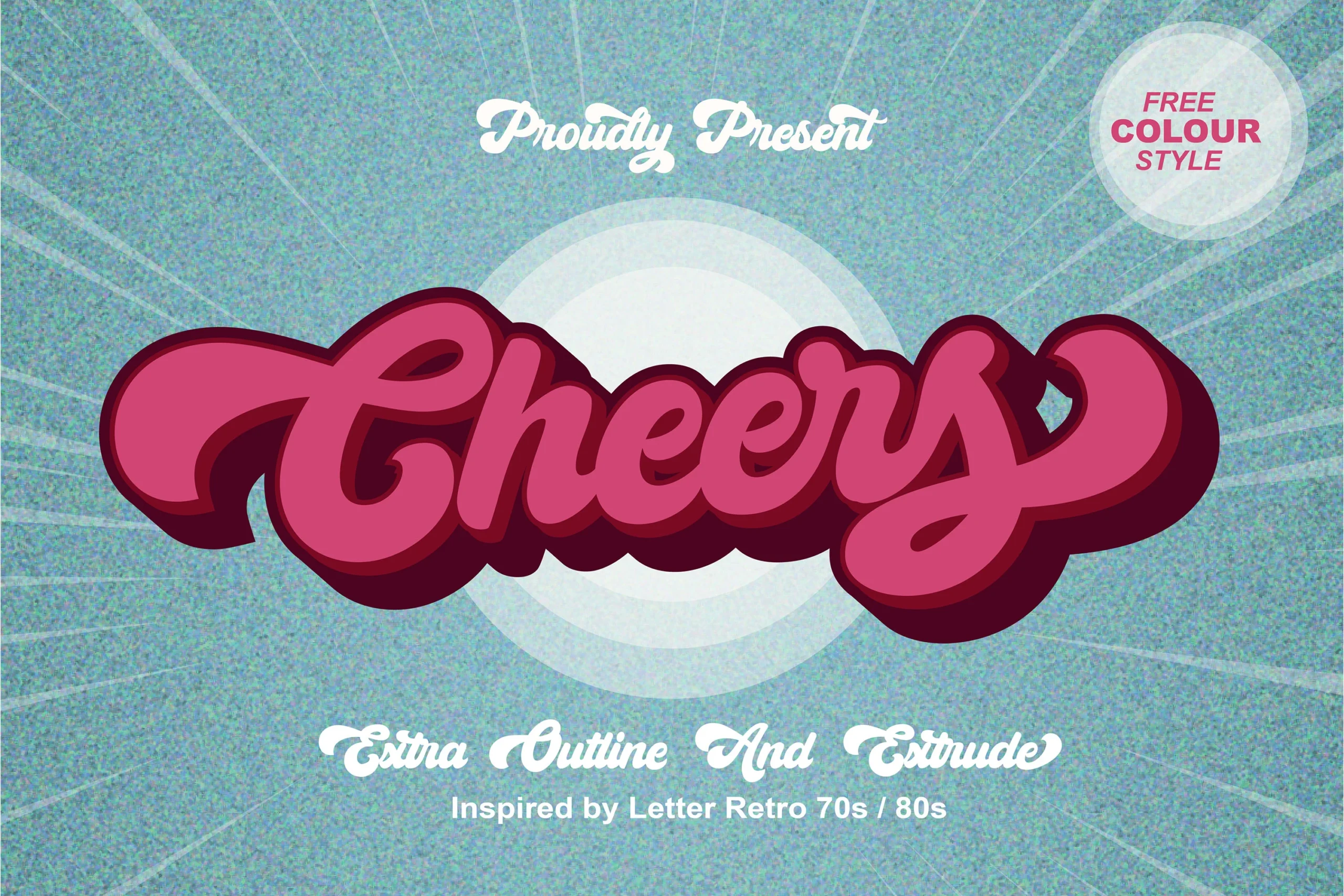
Best For: logos, posters, headlines, retro designs
Cheers Font arrives with its visual treatment already in place: thick connected lettering, rounded terminals, 3D extrusion, and a drop shadow. The dimensional construction reads clearly on large posters, headlines, logos, and other retro designs, though smaller settings may crowd letter interiors.
Blackside Font
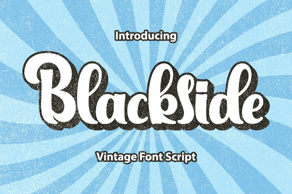
Best For: posters, headlines, signage, retro designs
Blackside Font softens its heavy construction with rounded loops, smooth curves, and consistent spacing. A pronounced drop shadow adds signage character for posters, headlines, signage, and retro designs, but the extra layer makes smaller applications harder to parse.
How to Choose the Right Font
Choose by construction before mood: marker and monoline options generally offer clearer shapes, while dense brush strokes, tight joins, shadows, and flourishes need more space. Use lighter or separated signatures when individual letters matter, reserve heavy dimensional scripts for display scale, and test every selection at its final size before committing to branding or headlines. For Cool Script Fonts, readability should guide the final decision as much as tone.