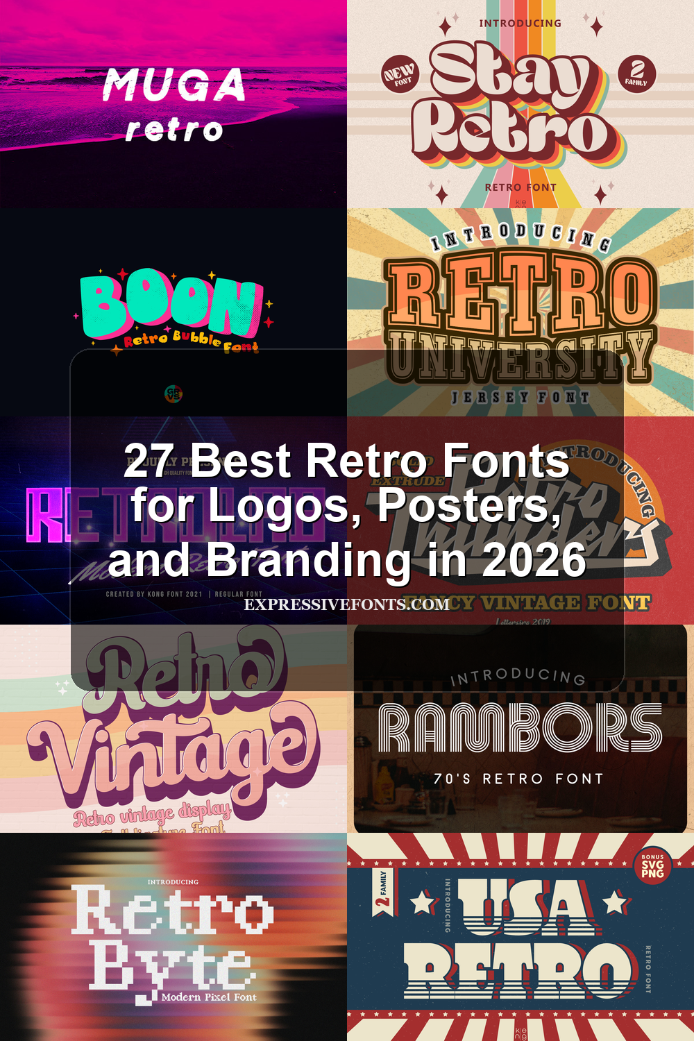
27 Best Retro Fonts for Logos, Posters, and Branding in 2026
Retro Fonts are still a strong choice in 2026 because they bring instant personality to logos, posters, packaging, merch, and social graphics. This collection focuses on typefaces with visible character: groovy curves, distressed print texture, bubble shapes, slab serifs, neon linework, and old-school display energy.
Use these fonts when your design needs nostalgia, warmth, or bold visual impact without relying on generic modern typography.
Retro Bold Font
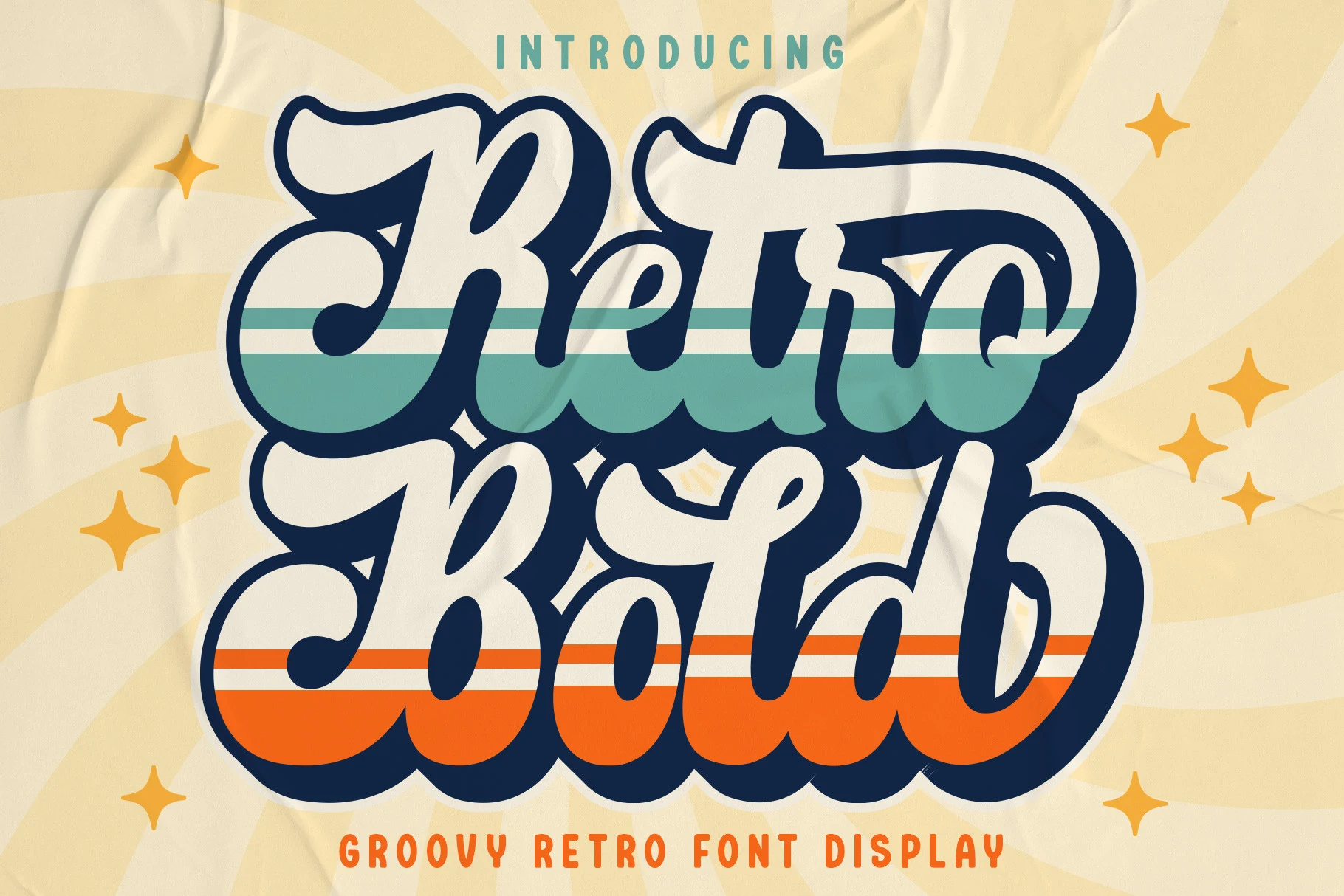
Best For: logos, branding, retro designs, display text
Retro Bold Font has the oversized confidence of a groovy handwritten display face, with swollen script strokes, deep looping swashes, and heavy rounded forms that lock together like a compact logo mark. The dramatic outline-ready shapes give it strong impact among Retro Fonts without making the letters feel stiff.
Use it where the wording is short and the hierarchy needs to feel loud: badges, packaging, social graphics, invitations, and brand marks. Its tight curves and dense weight work best with generous margins and clear contrast, while stacked layouts help control the wide swashes and keep the composition balanced.
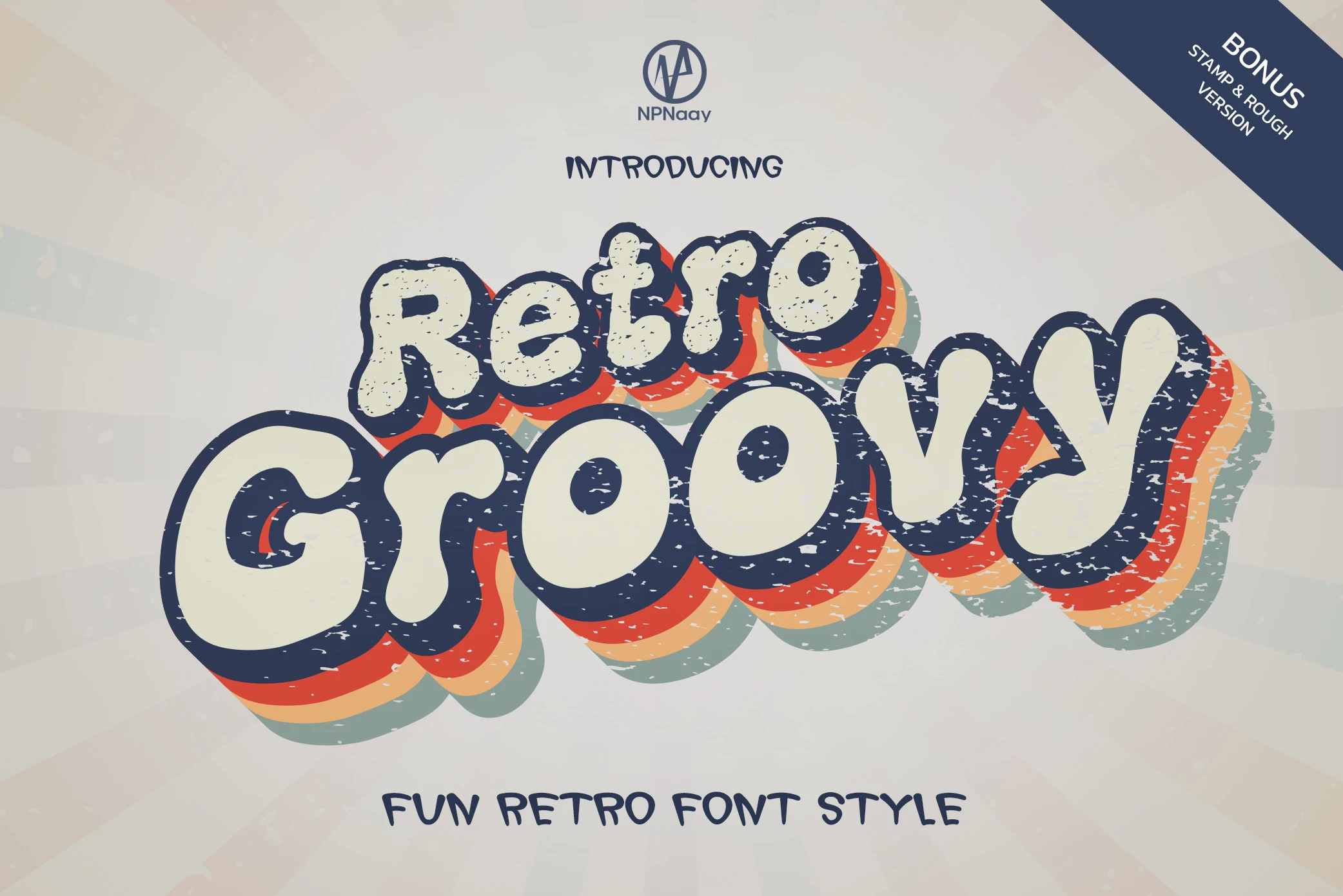
Retro Groovy Font
Best For: headlines, stickers, playful designs, retro designs
Retro Groovy Font leans into the bubbly side of Retro Fonts, with oversized rounded letters, soft uneven contours, and a worn texture that keeps the display style feeling loose rather than polished. The thick outline and stacked color shadowing give it that cheerful 70s bounce, so even a single word feels lively and attention-grabbing.
It works best when the wording stays short and bold, letting the chunky shapes and layered depth carry the composition. Use it where personality matters more than precision, and give it enough open space around the letters; a plain companion font helps the playful texture stand out without making the layout feel crowded.
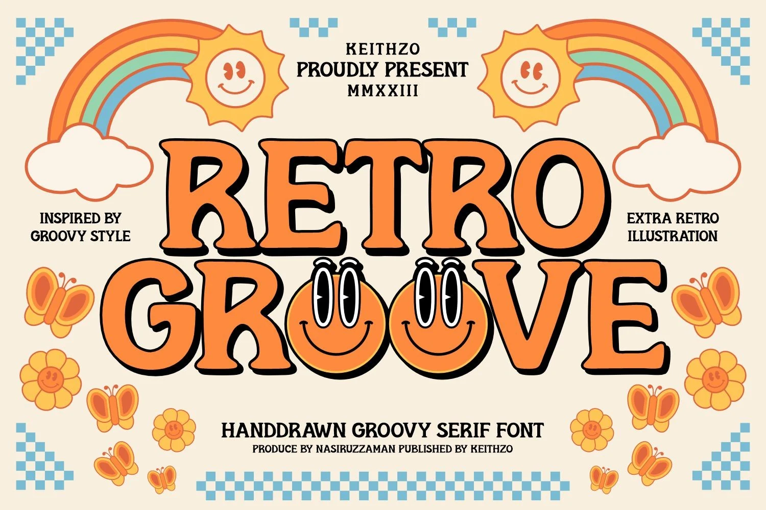
Retro Groove Font
Best For: logos, posters, headlines, retro designs
Retro Groove Font turns a 70s display serif into a loud, cartoonish title face, with thick orange letterforms, uneven wedge serifs, dark drop shadows, and slightly warped verticals. Its chunky rhythm gives Retro Fonts a more poster-like, hand-drawn attitude than a clean geometric throwback.
The face is built for short phrases where the black shadow can create hierarchy without extra effects: logos, posters, stickers, and headline graphics. Keep tracking fairly tight, use strong color contrast, and avoid long copy; the playful angles and dense weight need space around the wordmark to stay readable.
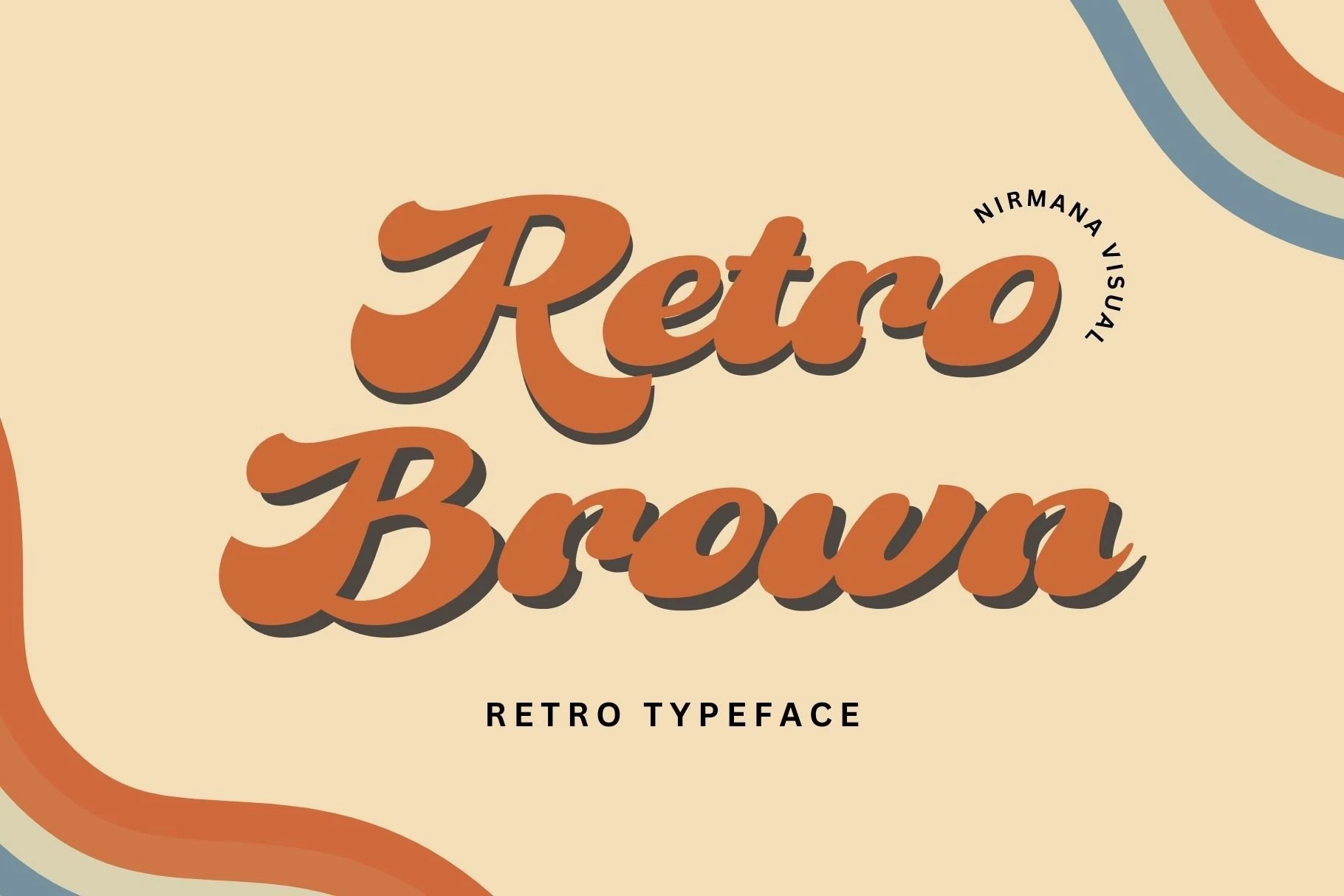
Retro Brown Font
Best For: logos, branding, social media graphics, retro designs
Retro Brown Font takes a smoother route through Retro Fonts, with thick brushy letterforms, rounded joins, and broad swells that give each word a relaxed 70s rhythm. The soft slant and chunky terminals keep it friendly and bold, while the shadowed presentation shows how well the shapes hold up in warm, nostalgic layouts.
It shines most in short lines where the flowing script can stay clear, especially for logos, product graphics, and promotional posts. Keep the supporting text simple and let the main wordmark do the work; this style reads best when you avoid tight stacking and give the descenders enough room to keep the silhouette open.
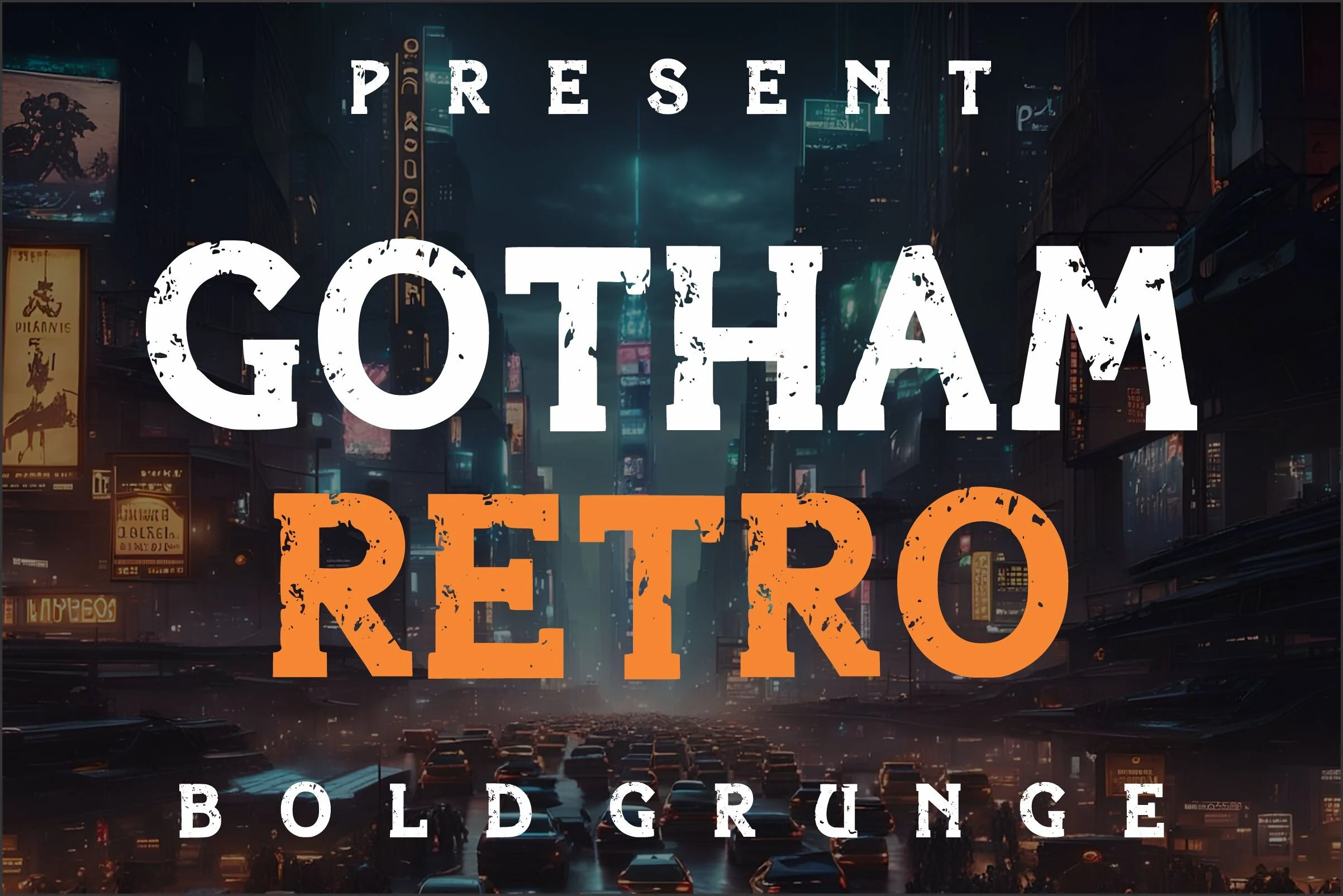
Gotham Retro Font
Best For: posters, headlines, display text, retro designs
Gotham Retro Font uses a heavy all-caps slab structure with squared serifs, broad counters, and a rough worn texture that breaks up the solid weight. Its gritty surface pushes Retro Fonts toward cinema titles, comic-inspired covers, and urban poster work rather than soft nostalgic branding.
The letterforms are built for impact at headline scale, especially when set with strong contrast and deliberate spacing. Keep supporting text clean and secondary, because the distressed edges and blocky proportions already carry enough visual noise for title hierarchy, posters, and cover-style layouts.
Retro Lab Font
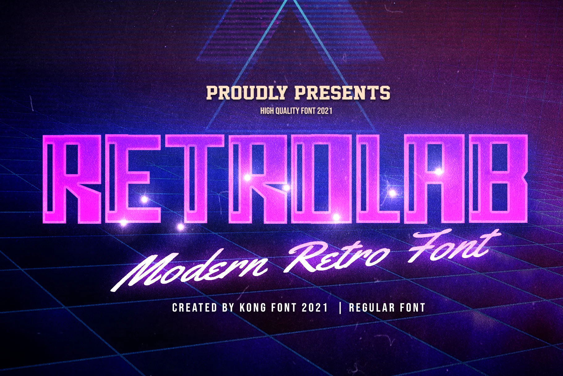
Best For: headlines, posters, social media graphics, retro designs
Retro Lab Font channels the neon side of Retro Fonts with tall condensed capitals, squared corners, and an outlined interior structure that gives the letters a lit-sign feel. The proportions are narrow but forceful, so headlines stay compact while still reading with plenty of impact.
It works best when you let the vertical rhythm do the heavy lifting in posters, title cards, and social graphics. Use it at larger sizes and keep surrounding text simple; the dense block shapes and internal line detail create their own texture, so extra effects are rarely needed.
Square Retro Font
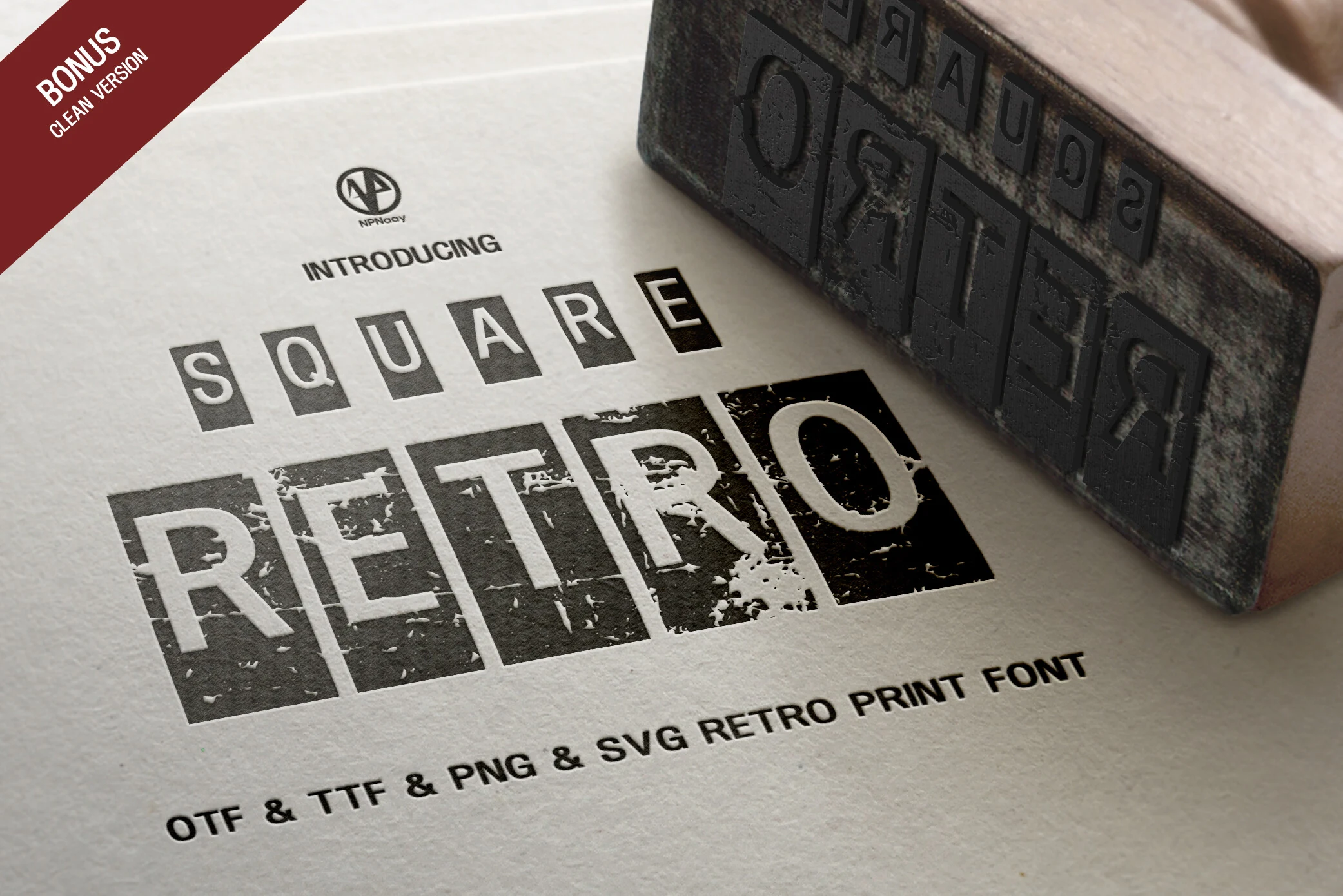
Best For: product labels, badges, vintage designs, retro designs
Square Retro Font has a stamped, block-built look, with uppercase letters sitting inside rigid square panels and rough ink gaps cutting through the strokes. Its grunge texture gives Retro Fonts a more industrial print-shop character, closer to old labels, ticket marks, and worn packaging than soft 70s lettering.
The structure works best in compact words where the boxed rhythm can stay even across the line. Keep the spacing controlled and use clean surrounding type; the distressed surface already adds enough texture, so simple layouts help the square forms stay readable in badges, labels, and vintage-style graphics.
Retro Vintage Font
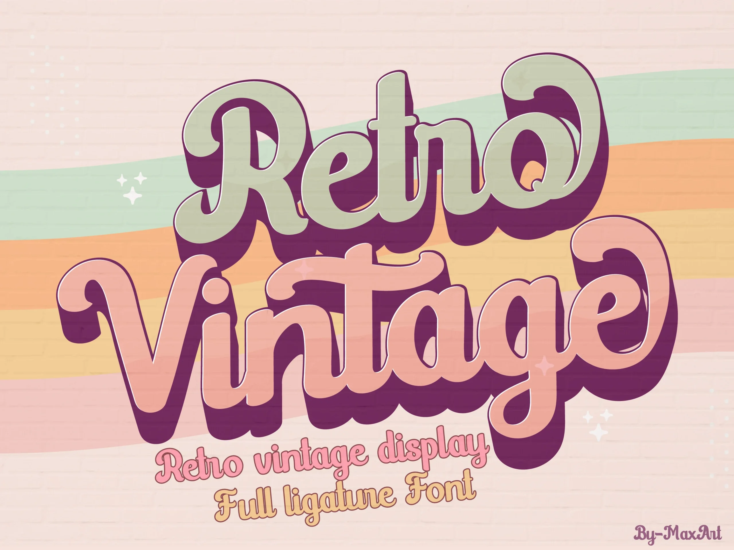
Best For: logos, branding, social media graphics, retro designs
Retro Vintage Font has a rounded, high-impact script style with thick connected strokes, curled terminals, and a soft 1970s display rhythm. The letters feel inflated and friendly rather than delicate, giving Retro Fonts a bolder, more poster-ready personality.
Its heavy curves work best when the composition lets the capitals and long swashes lead the hierarchy. Keep wording short, increase contrast around the outlines, and avoid cramped spacing so the stacked script shapes stay readable in logos, social posts, and nostalgic branding.
Lazy Retro Font
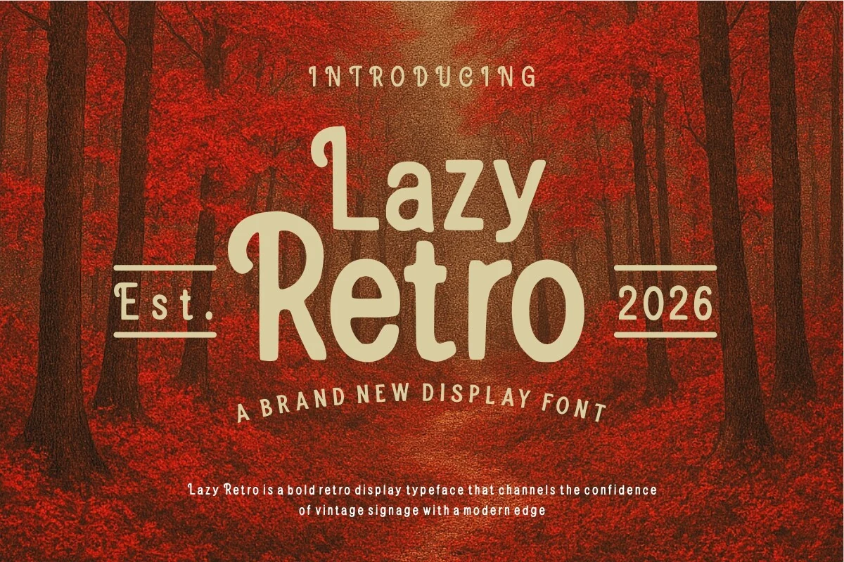
Best For: posters, magazine covers, signage, retro designs
Lazy Retro Font leans into a chunky hand-drawn display style with rounded corners, soft monoline strokes, and slightly irregular proportions that give it an easy vintage warmth. It captures the bold side of Retro Fonts, closer to old signage than delicate script, so the letters feel approachable, sturdy, and built for attention.
This one works best when you keep the wording short and let the large letterforms carry the composition. Pair it with a narrow sans or simple uppercase support text to create contrast, and use it for titles where the broad curves and compact spacing can hold a strong headline without feeling stiff.
Rambors – Nostalgic Retro Font
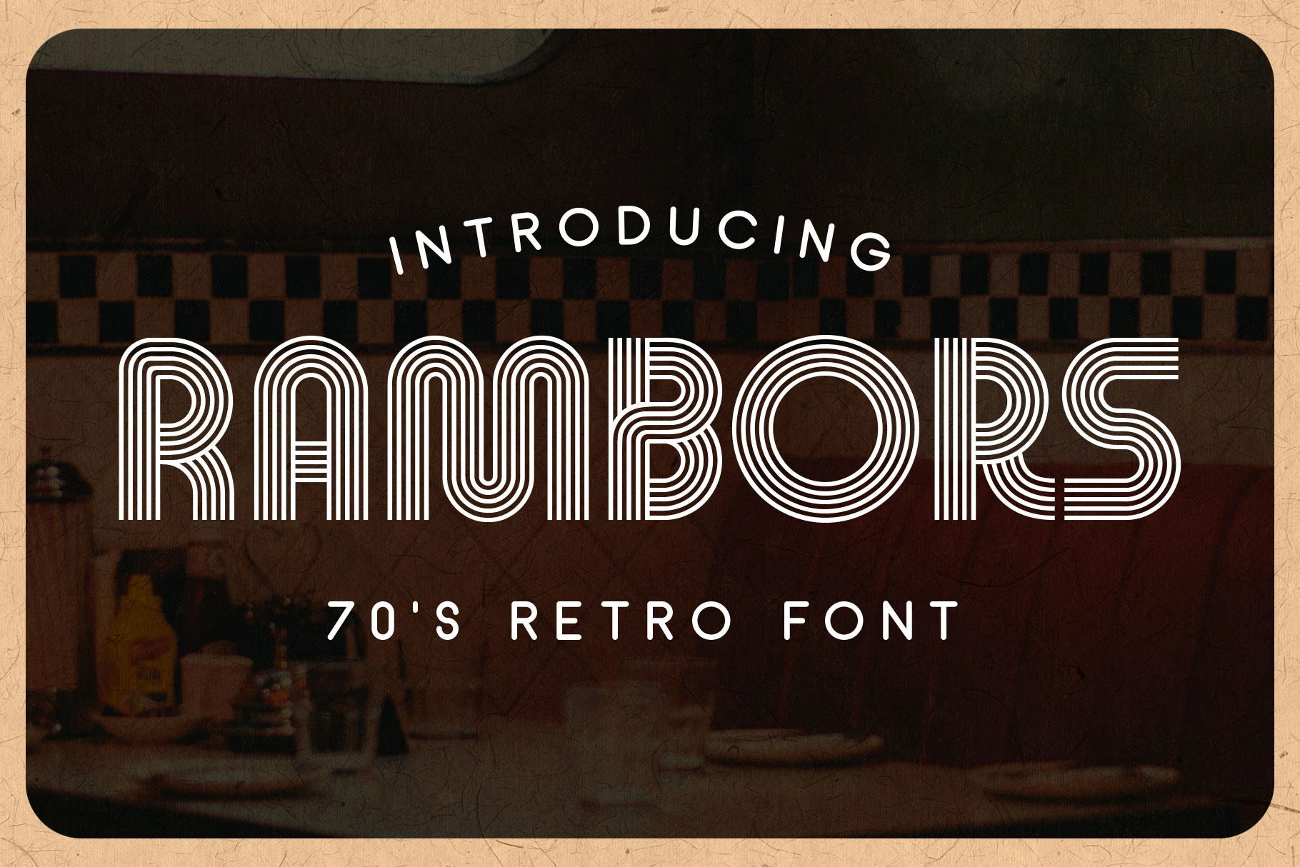
Best For: posters, display text, retro designs, nostalgic designs
Rambors – Nostalgic Retro Font uses stacked inline strokes to build wide, rounded letters with a strong 70s rhythm. The repeated linework gives Retro Fonts a futuristic graphic edge, while the soft corners and open counters keep the display style from feeling too rigid.
Use it where the typography needs to behave like the main visual element, not supporting text. Short words, generous spacing, and high contrast backgrounds help the parallel stripes stay clean, especially in posters, headline layouts, signage-inspired graphics, and contemporary nostalgic branding.
Retro Letter Font
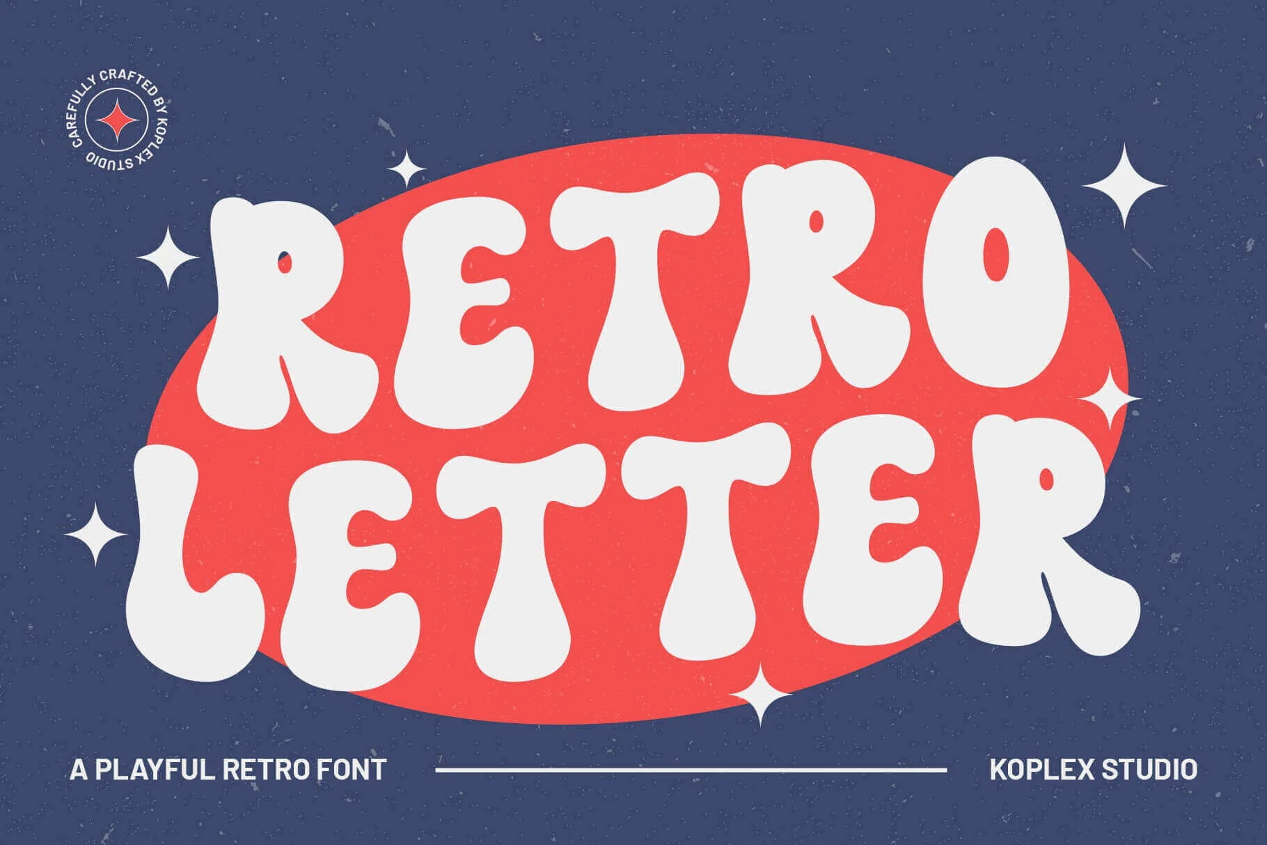
Best For: posters, headlines, playful designs, retro designs
Retro Letter Font leans into soft, inflated letterforms with thick rounded strokes, loose curves, and a friendly groovy silhouette. It captures the brighter side of Retro Fonts, where the shapes feel cheerful and bold rather than polished or restrained.
This is a display face that works best when the wording stays short and the letterforms get space to breathe. Use it for stacked headlines or punchy titles, then pair it with a plain sans serif for supporting text so the bubbly shapes keep their impact without making the layout feel crowded.
Retro Rush Font
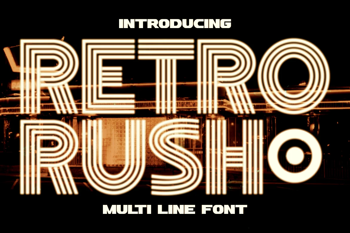
Best For: posters, headlines, signage, retro designs
Retro Rush Font is a bold multiline display typeface with geometric letterforms, stacked stripe construction, and a neon-sign rhythm. Its art deco influence gives Retro Fonts a sharper, more structured look than bubbly groovy styles, while the rounded curves keep the lettering readable at headline scale.
The layered lines need contrast and clean spacing to avoid visual noise, especially around dense letters like R, E, and S. Use it for short titles, poster headers, signage-inspired branding, or event graphics where the type can act as the main illuminated focal point.
Old Retro Stamp Font
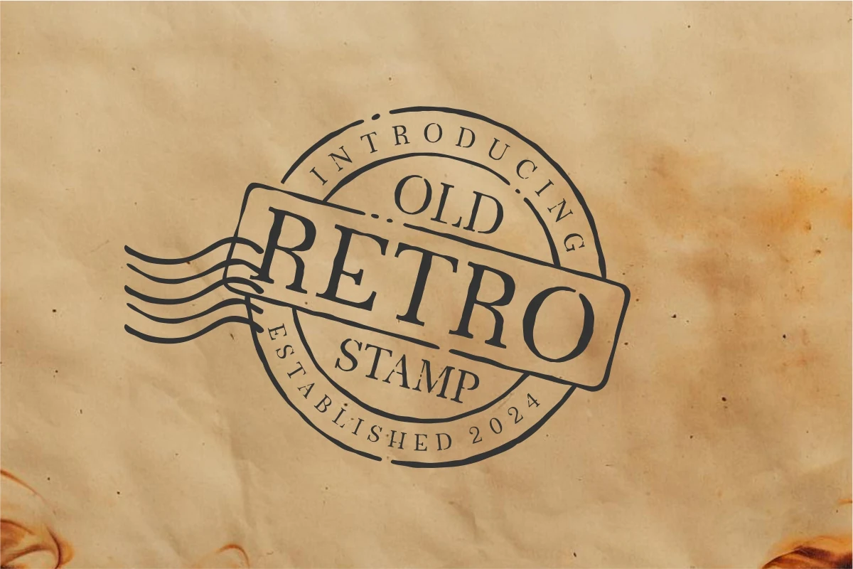
Best For: invitations, posters, product labels, vintage designs
Old Retro Stamp Font has a classic stamp-style character, with narrow serif capitals, modest contrast, and a slightly handmade rhythm that keeps it from feeling too polished. Within Retro Fonts, it reads more like old print ephemera than flashy signage, which gives the lettering a grounded vintage tone.
It works especially well when you build the layout around badges, seals, and short lines of text instead of long copy. Pair it with paper texture, curved text, or simple framing elements, and keep the spacing measured so the old-school personality stays crisp on invitations, posters, and label-style compositions.
Retro Thunder Font
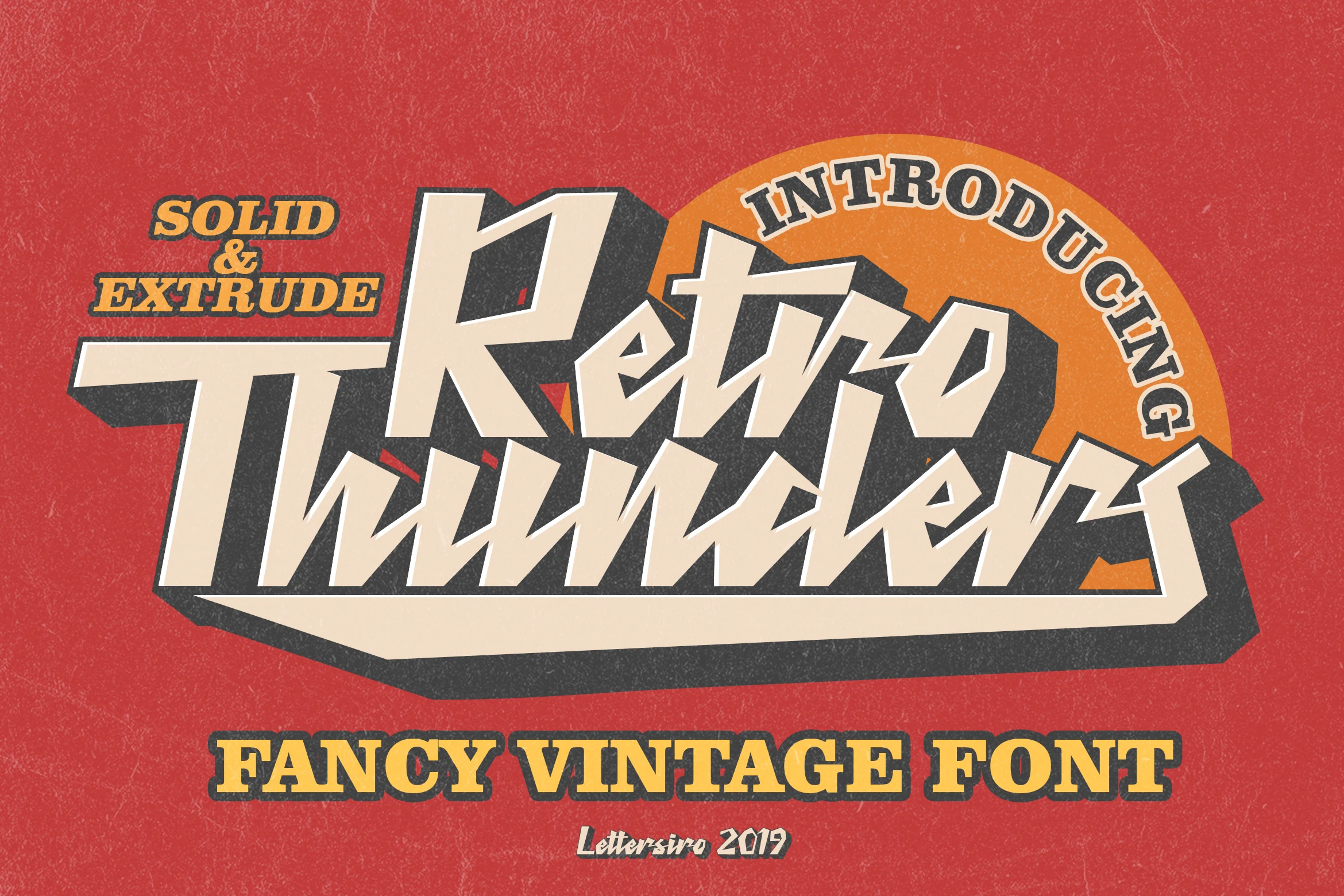
Best For: logos, posters, product labels, merch design
Retro Thunder Font has a sharp vintage display style with slanted letterforms, angular cuts, and a heavy extruded shadow that gives the type a strong dimensional punch. It sits on the louder side of Retro Fonts, built for impact rather than subtle editorial texture.
The solid and extrude styles help create logo marks and poster titles that already feel layered, but they need enough surrounding space to keep the jagged strokes clear. Use it for short names, music-inspired graphics, labels, and merch layouts where bold outlines and shadow depth can drive the hierarchy.
Parallel Retro Font
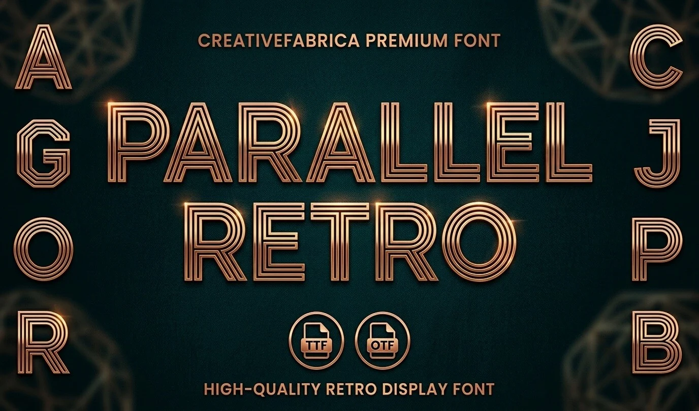
Best For: display text, headlines, signage, retro designs
Parallel Retro Font has a clean multiline structure with tall geometric proportions, rounded corners, and an art deco edge that feels polished rather than playful. The repeated linework gives Retro Fonts a more architectural rhythm, so even simple words pick up a luminous, sign-like presence.
It performs best in short display settings where the internal stripes stay crisp and readable. Use it for titles, signage, or branding that needs a sleek focal point, then pair it with a plain sans so the parallel strokes remain the strongest element in the hierarchy.
Retro Extra Font
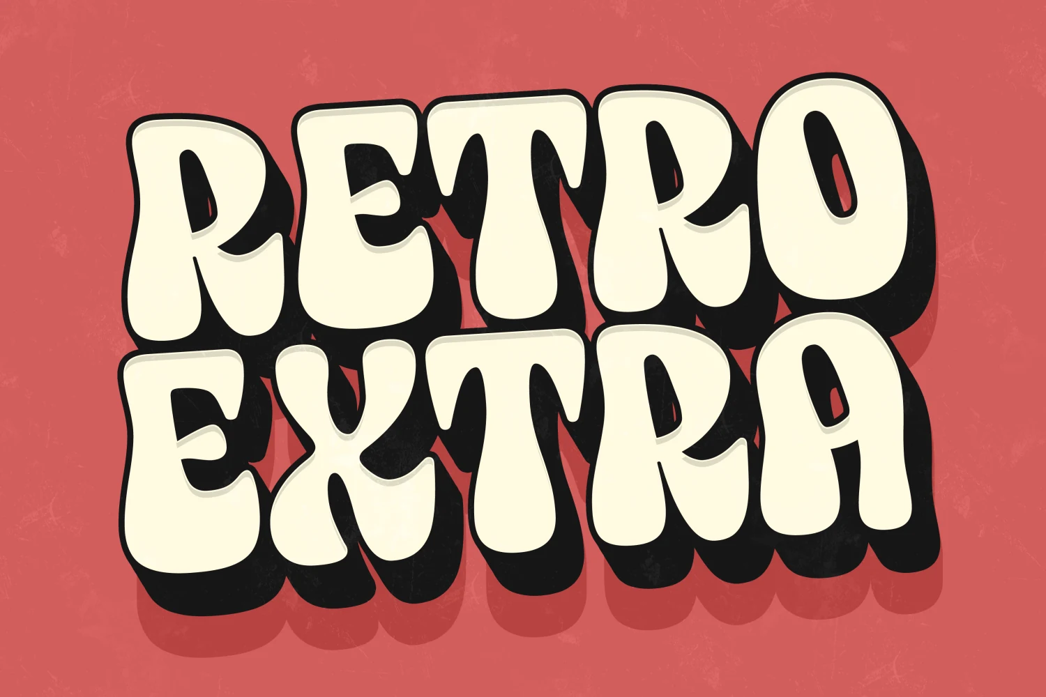
Best For: posters, headlines, branding, merch design
Retro Extra Font uses thick, rounded display letters with soft corners, compact spacing, and a heavy offset shadow that gives each word a stacked poster effect. It fits the bolder side of Retro Fonts, with cheerful 70s curves and enough weight to dominate a headline.
The inflated shapes need short wording and clear contrast, especially when the black shadow is part of the layout. Keep supporting text simple, avoid tight line breaks, and let the wide cream letterforms carry posters, apparel graphics, website headers, and brand titles.
Retro 1960 Font
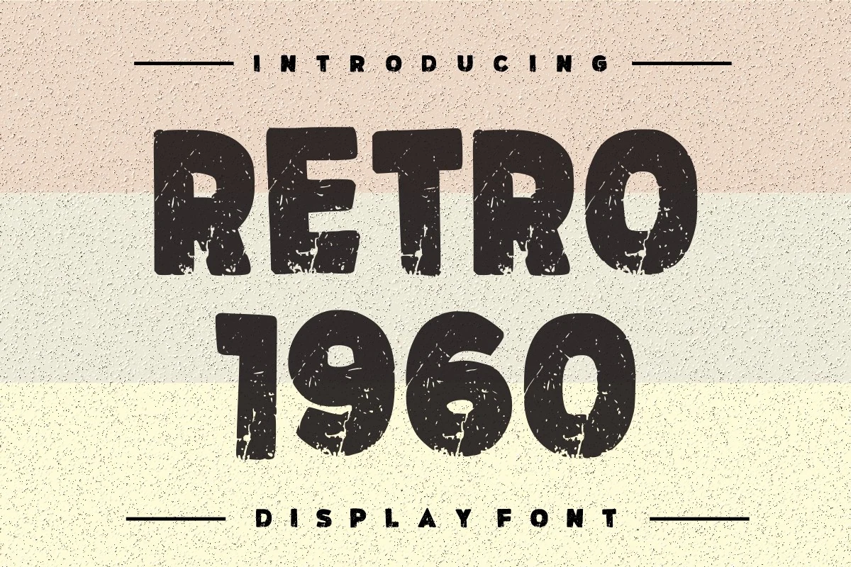
Best For: logos, posters, branding, vintage designs
Retro 1960 Font is a bold distressed display face with chunky block capitals, rounded corners, and a worn print texture that instantly recalls mid-century packaging and poster work. Within Retro Fonts, it feels loud and sturdy rather than ornamental, giving short words a direct old-school presence.
It works best in headlines where the rough texture can stay visible instead of shrinking into noise. Keep the supporting text clean and the spacing straightforward, because the weathered surface already brings enough character to carry logos, posters, and branding without making the layout feel busy.
Retro Byte Font
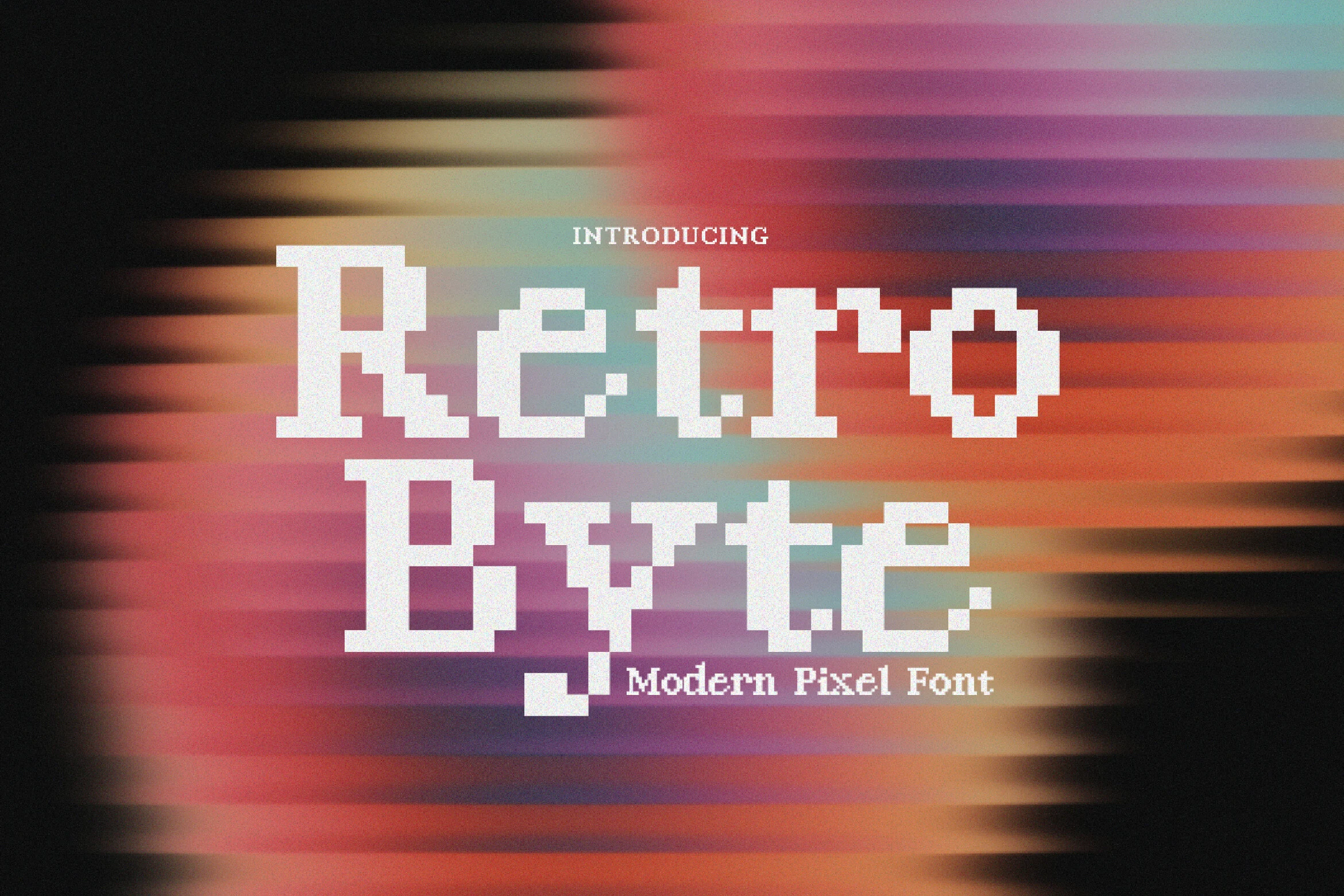
Best For: display text, headlines, website headers, modern designs
Retro Byte Font takes Retro Fonts into a more digital direction with crisp pixel-built serifs, stepped edges, and a clean bitmap rhythm that echoes early screen graphics. The squared construction gives the letters a sharp, coded feel, but the proportions stay balanced enough to keep short words readable.
It works best when you keep the wording brief and let the blocky silhouette carry the impact. Use it for titles, hero headers, or poster-style callouts, then pair it with a simple sans or restrained UI text so the pixel structure stays intentional instead of turning into visual noise.
Usa Retro Font
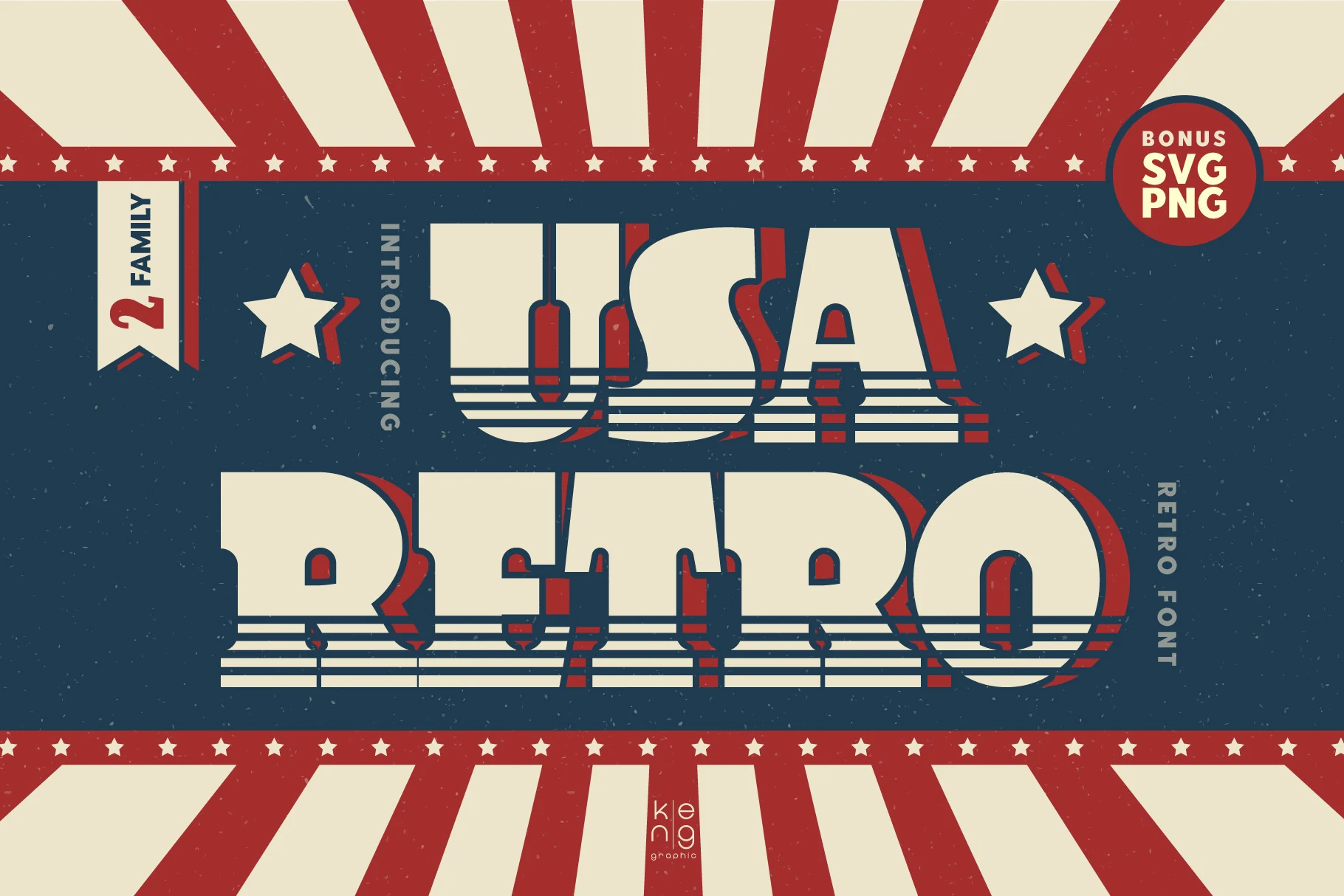
Best For: logos, posters, merch design, retro designs
Usa Retro Font has a bold block display style with wide letterforms, squared curves, and horizontal stripe cuts that give the lower strokes a fast, vintage print feel. Its red offset shadow adds depth, placing it among Retro Fonts that lean into 60s, 70s, and 80s poster energy.
The heavy shapes work best as the main title rather than supporting copy. Use strong contrast, keep the wording compact, and avoid crowding the stripe details so the letters stay readable in logos, posters, merch graphics, and attention-driven retro branding.
Retro Script Font
Best For: logos, branding, social media graphics, retro designs
Retro Script Font has a bold connected script look with swollen curves, rounded terminals, and thick low-contrast strokes that give the lettering a soft 70s bounce. The oversized capitals and smooth joins make it feel closer to vintage sign painting than delicate pen lettering, bringing a warmer, more graphic character to Retro Fonts.
It works best when you let one or two words take the spotlight and keep the supporting text simple. The broad loops and compact rhythm hold up nicely in logos and brand marks, especially when you use color bands, outlines, or shadow to build hierarchy without crowding the script.
Retro Rumble Font
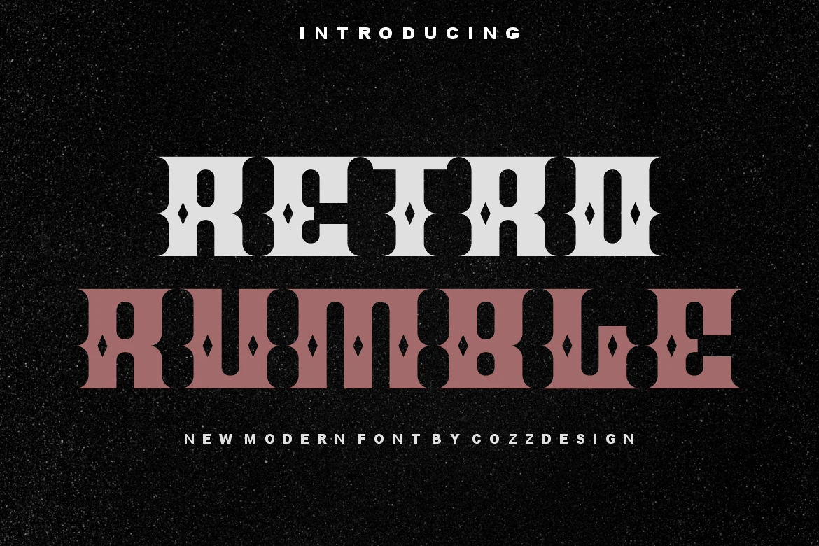
Best For: logos, headlines, display text, retro designs
Retro Rumble Font has a bold decorative display style with slab-like weight, rounded internal cutouts, and small diamond details that create a patterned vintage rhythm. It gives Retro Fonts a darker, more ornamental edge than simple groovy lettering, with strong shapes built for short visual statements.
The dense interior shapes need room to stay readable, especially in stacked titles or tightly cropped logo marks. Use it at large sizes, keep supporting text restrained, and let the contrast between heavy strokes and cutout details drive the headline hierarchy.
Muga Retro Font
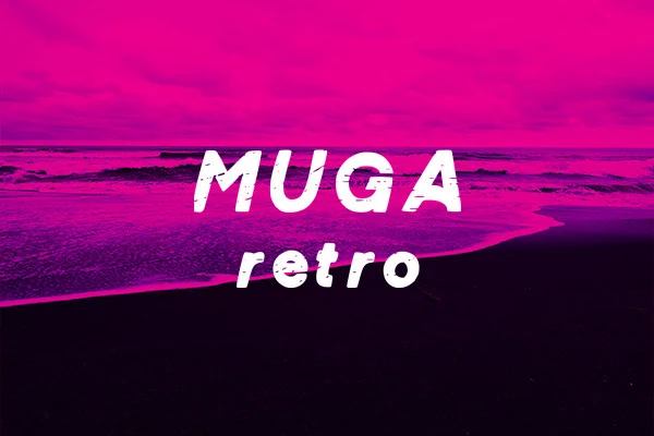
Best For: logos, branding, T-shirts, bold designs
Muga Retro Font has thick, slightly slanted display letters with rounded terminals and a rough printed texture that gives the strokes extra bite. It brings a more casual, punchy feel to Retro Fonts, with enough weight to stand out quickly in bold wordmarks and short promotional lines.
The texture is part of the appeal, so it works best at sizes where the distressed edges stay visible instead of turning muddy. Leave a bit of breathing room between lines, and pair it with a plain secondary font when you need supporting text under a logo, shirt graphic, or sporty header.
Stay Retro Font
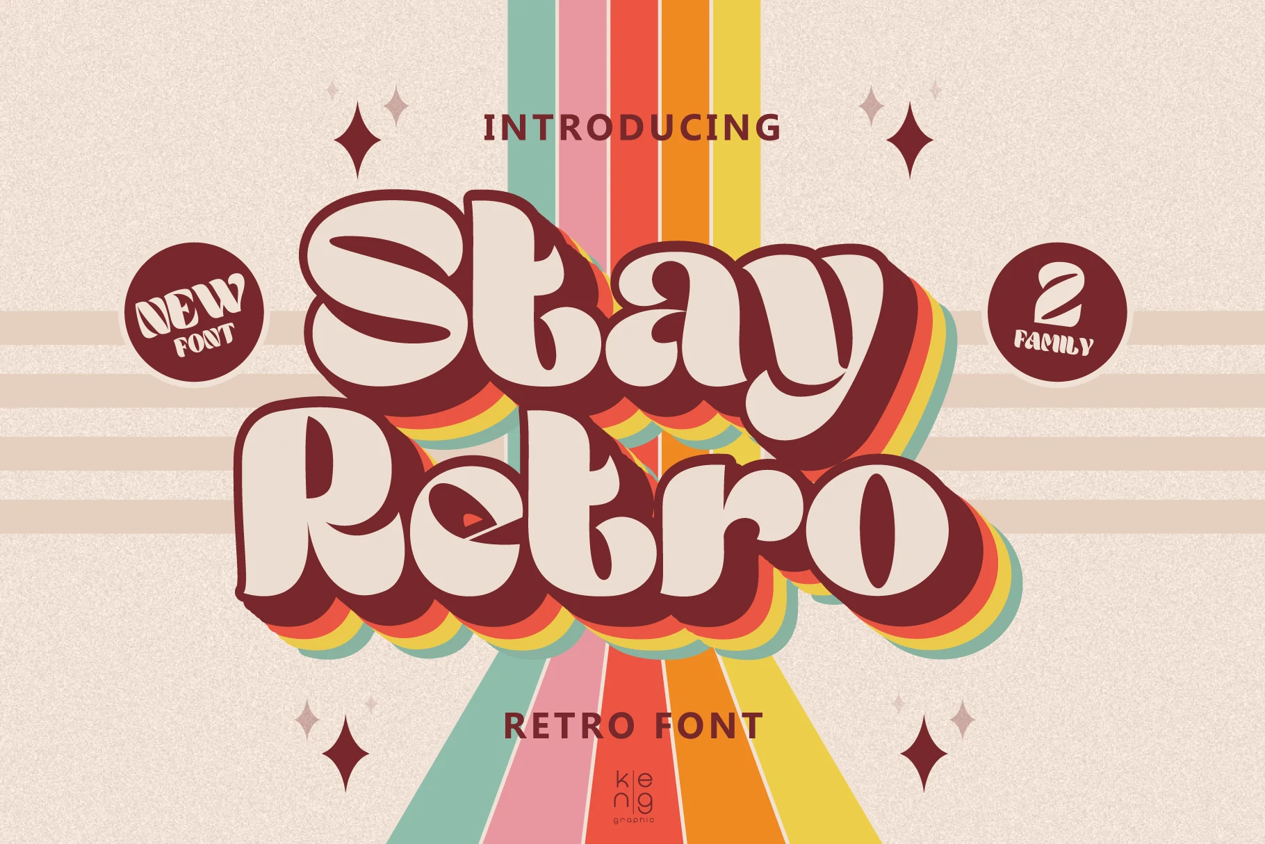
Best For: logos, branding, posters, retro designs
Stay Retro Font has a chunky vintage script style with soft rounded corners, swollen curves, and thick shadow layers that give the letters a stacked 70s feel. It brings a bright, friendly side to Retro Fonts, with enough weight to turn a short word into the main graphic element.
The rounded joins and wide script shapes need clean spacing around them, especially when outlines, shadows, or color stripes are part of the layout. Use it for compact logos, poster titles, and brand graphics where the headline can stay large and the supporting text remains simple.
Grvs Boon Retro Bubble Display Font
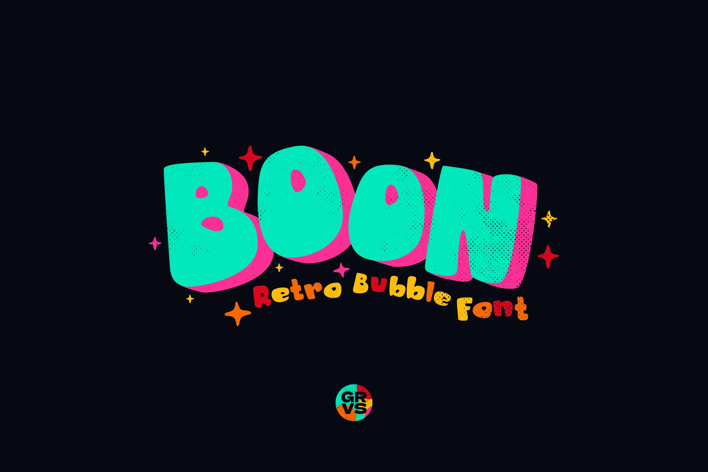
Best For: logos, children’s designs, fun designs, playful designs
Grvs Boon Retro Bubble Display Font uses oversized bubble letters with rounded corners, heavy weight, and a speckled texture that keeps the shapes from feeling flat. The thick pink offset shadow adds lively depth, giving Retro Fonts a more playful, toy-like personality that reads instantly at display size.
This one works best with short words and simple layouts, because the swollen counters and chunky proportions are the whole point. Use it for team logos, kids graphics, or cheerful community branding, and pair it with a plain sans when you need smaller supporting text.
Retro Signature Font
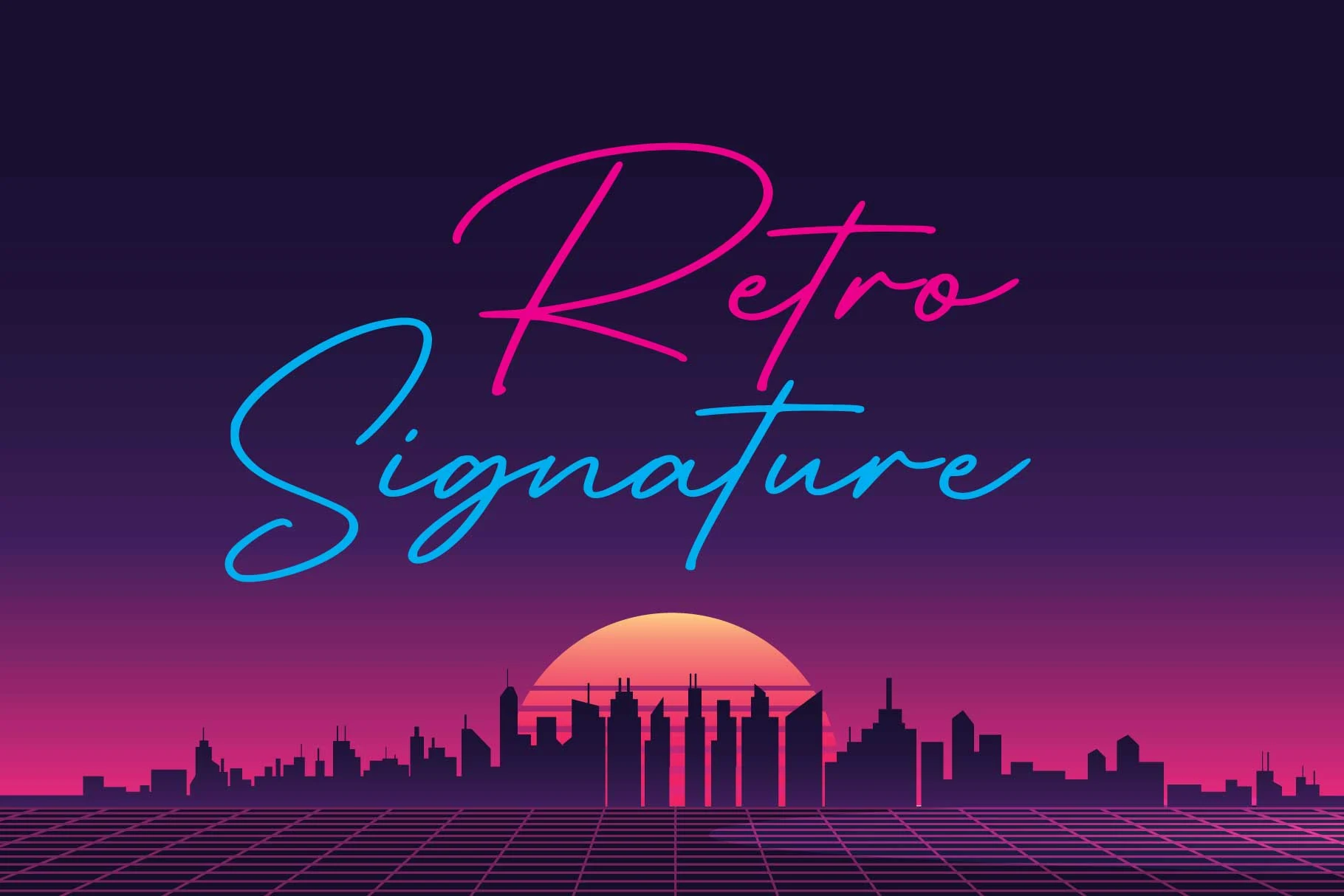
Best For: logos, branding, personal branding, social media graphics
Retro Signature Font is a slim handwritten script with long sweeping strokes, loose connections, and a clean neon-like flow. It brings a lighter side to Retro Fonts, trading heavy block shapes for fast signature movement and a polished personal-brand feel.
The thin monoline structure needs contrast and open space around the capitals, especially where the large loops stretch across the word. Use it for short names, logo signatures, social graphics, or headers, and keep secondary text simple so the extended strokes remain the focus.
Retro University Font
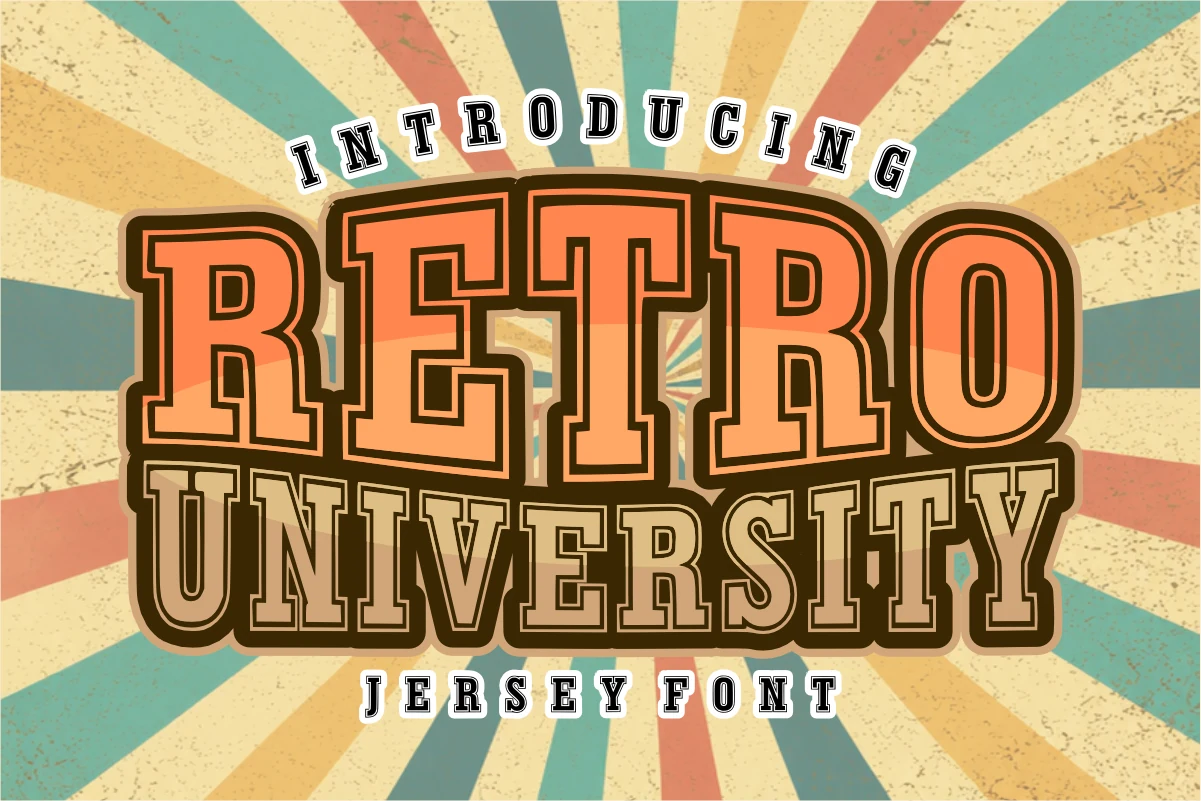
Best For: logos, posters, T-shirts, old-school designs
Retro University Font has tall slab serif letters, boxed counters, and a heavy layered outline with a deep shadow that gives every headline a classic varsity lift. It stands out within Retro Fonts for its campus-team character, combining blocky authority with enough internal contrast to keep big words crisp.
The outlines and shadow already create strong depth, so compact wording works better than long phrases. Use generous scale and clear color separation to keep the inner strokes readable, especially on logos, posters, and jersey-style merch where the type needs to carry the whole identity.
Retro Smile Font
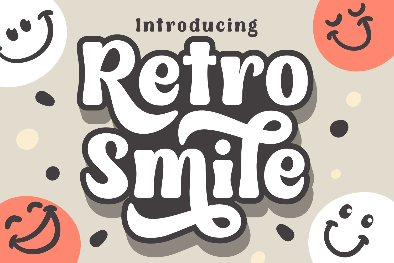
Best For: logos, headlines, packaging, playful designs
Retro Smile Font has a playful script display style with thick white strokes, soft rounded terminals, and a dark outline that makes the letters feel sticker-like and bold. Its swooping curves and quirky counters give Retro Fonts a cheerful, cartoon-leaning character without losing headline clarity.
The broad loops and heavy shadow need space, so it works better for short phrases than dense text. Use clear contrast, keep line breaks loose, and let the script carry logos, packaging titles, or friendly headlines while simpler supporting type handles the smaller details.
The right Retro Fonts can quickly shift a design from plain to memorable, especially when the typography becomes the main visual element. This roundup gives you options for logos, posters, packaging, branding, stickers, merch, and social media layouts, with styles ranging from playful groovy scripts to rough vintage display fonts.
All fonts in this collection are available on Creative Fabrica, so you can choose the style that fits your project and start building a stronger retro-inspired design.