20 Best Premium Fonts for Elegant Branding and Editorial Design in 2026
Premium Fonts are a strong choice for projects that need refined typography, clear hierarchy, and a more polished visual tone. This collection brings together 20 elegant serif, signature script, duo, and minimal sans serif styles for branding, logos, packaging, editorial design, wedding stationery, and high-end creative work.
Aurelia Font
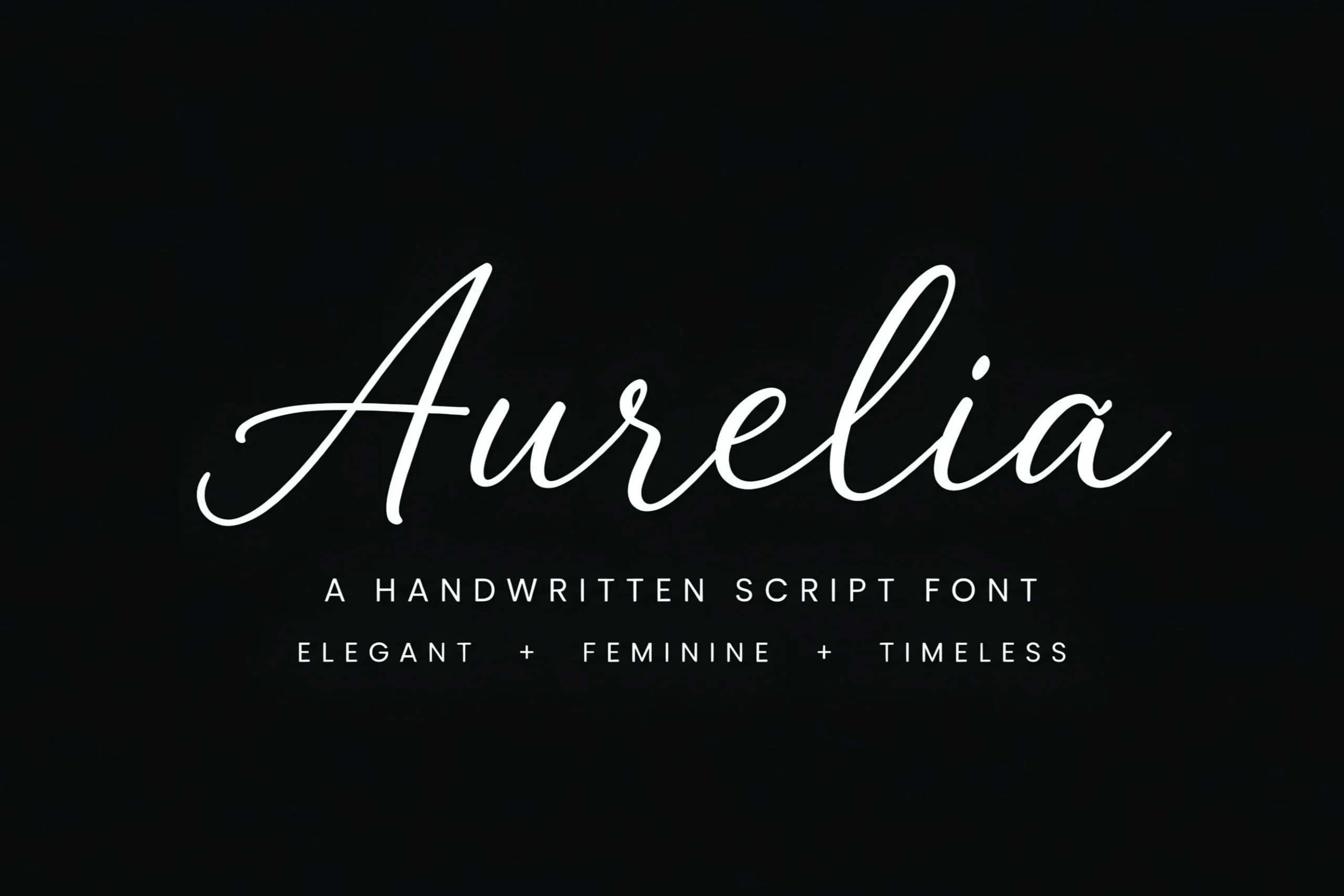
Best For: logos, premium designs, feminine designs, wedding designs
Aurelia Font has a fine signature-script line with long ascending loops, smooth joins, and a light stroke that keeps the wordmark airy rather than heavy. Its thin curves and extended entry strokes give it a refined handwritten rhythm, so it sits naturally with Premium Fonts for beauty, wedding, and personal-brand layouts.
Use Aurelia where the name itself is the main visual element: logos, packaging marks, invitations, or header signatures. The delicate weight needs strong contrast against the background, and the long swashes work best with generous side spacing so the first and last letters do not feel cropped.
Vogalis Font
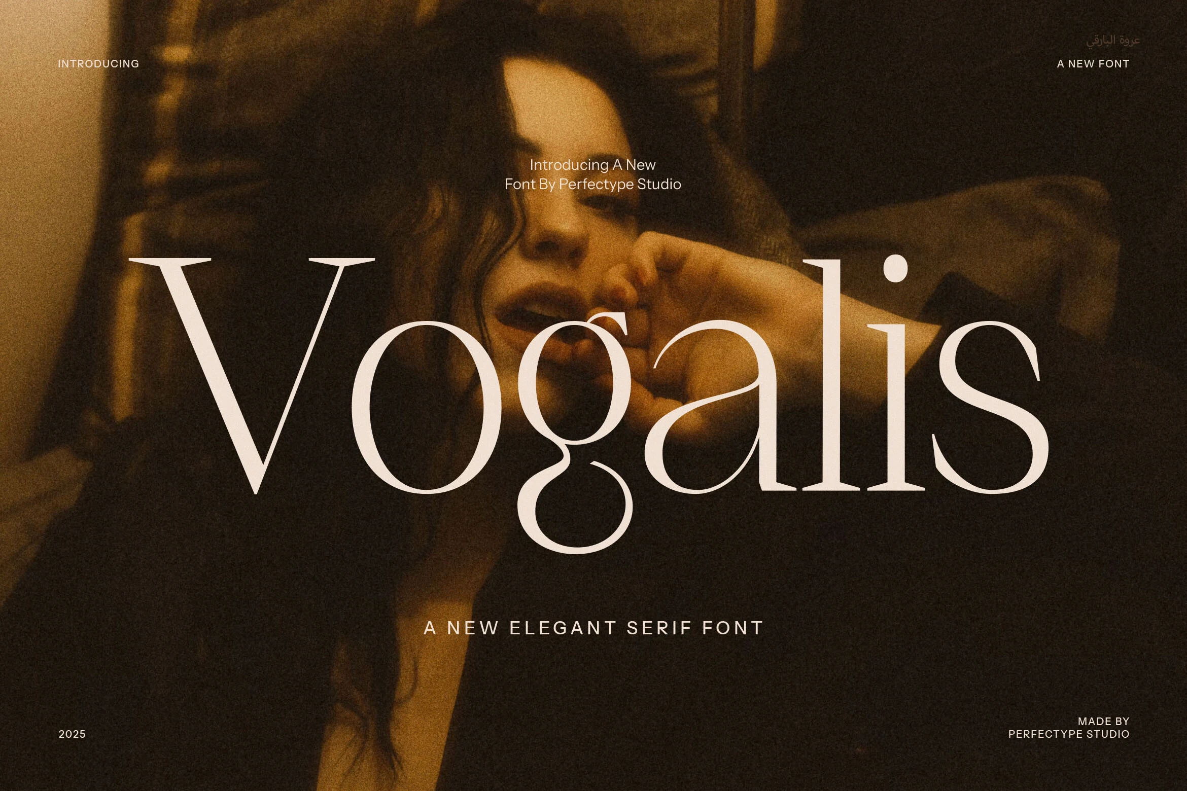
Best For: branding, magazine covers, website headers, high-end designs
Vogalis Font has a sleek editorial presence, with tall serif proportions, fine hairlines, and broad rounded bowls that give the wordmark both drama and restraint. The contrast feels polished rather than ornate, which makes it a strong fit within Premium Fonts when you want a clean luxury tone instead of heavy decoration.
Its ligatures and alternate forms are useful for refining logos and headline lockups, especially when you want smoother joins or a more custom silhouette. Keep Vogalis at display size, let the letters breathe, and pair it with understated supporting text so the delicate stroke contrast stays crisp across covers, hero sections, and brand marks.
Luxurimo Font
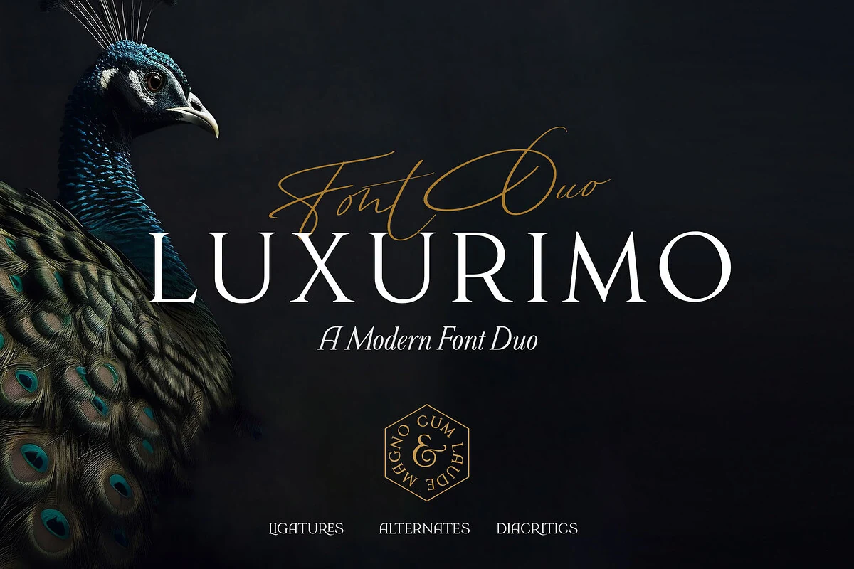
Best For: luxury designs, wedding designs, fashion branding, premium designs
Luxurimo Font combines a sharp modern serif with a thin signature script, giving designers two contrasting voices inside one refined pairing. The serif style uses tall capitals, clean hairlines, and wide spacing, while the script layer brings long swashes and a more fluid rhythm that suits Premium Fonts collections with a polished luxury angle.
The duo format works well when a brand mark needs hierarchy without adding another typeface: use the serif for the main name and the script for a short accent line. Keep generous tracking in the capitals, reserve the script for brief words, and use strong background contrast so the fine strokes and ligatures stay readable.
Migilen Font
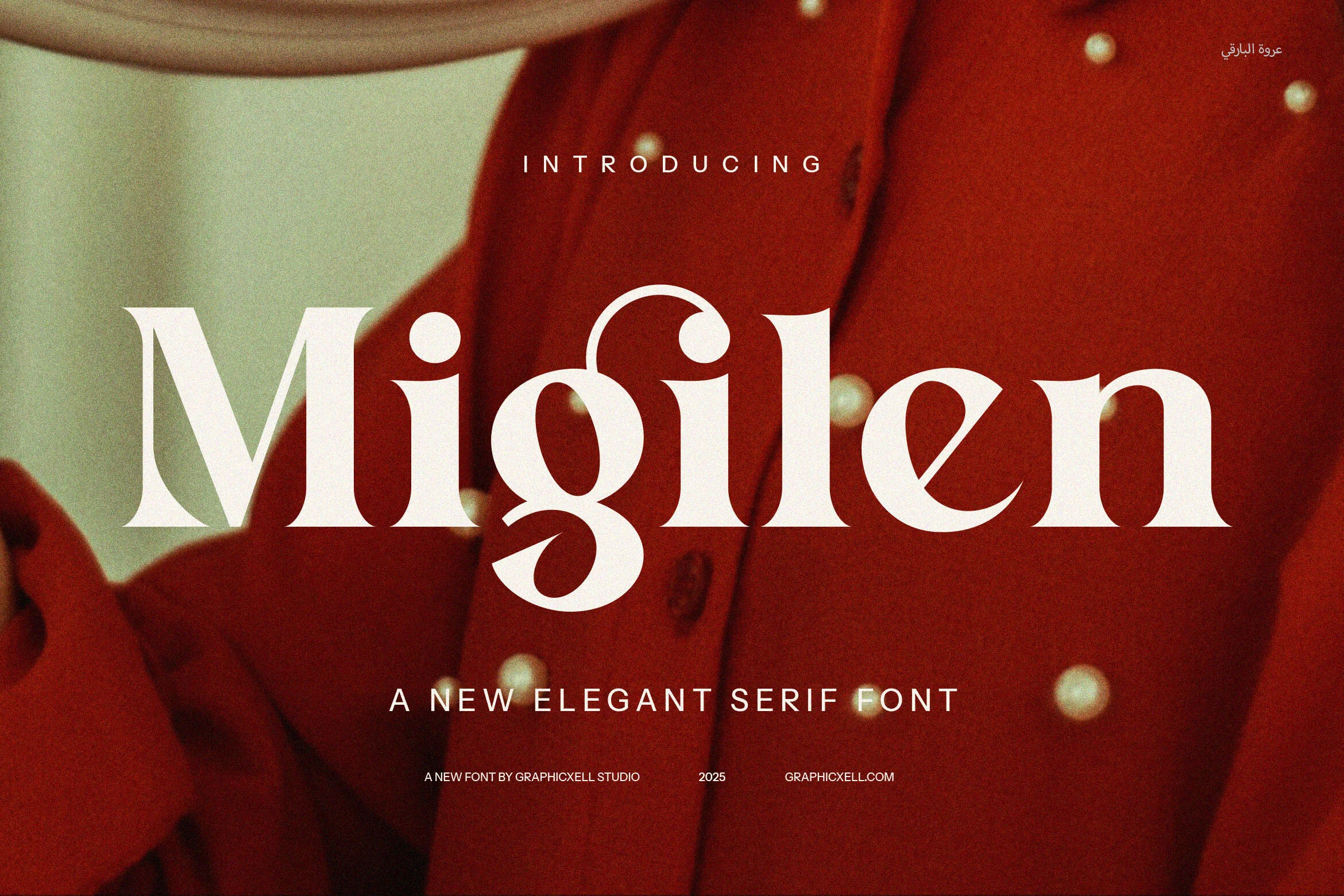
Best For: branding, website headers, magazine covers, high-end designs
Migilen Font has a confident editorial look, with broad serif shapes, crisp contrast, and a sculpted lowercase g that gives the wordmark a distinctive focal point. The mix of classic serif structure and modern proportions makes it a natural fit for Premium Fonts where the goal is polished impact rather than ornament-heavy styling.
Its ligatures and alternate forms help fine-tune logos and headline settings, especially when you want a smoother rhythm across large display text. Migilen works best when you let it lead the hierarchy: use it for short, prominent lines, keep supporting copy restrained, and give the letterforms enough space so their sharp curves and weight changes stay clear.
Aulisse Font
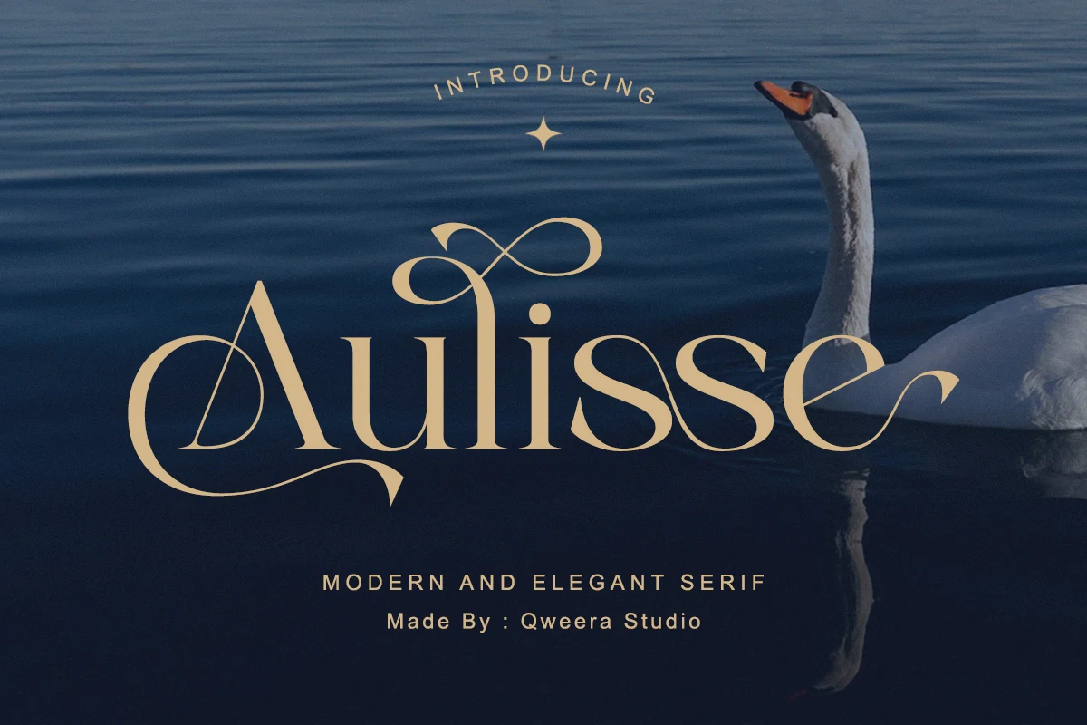
Best For: logos, luxury designs, premium designs, wedding designs
Aulisse Font uses high-contrast serif strokes with slender hairlines, rounded bowls, and decorative flourishes that turn the main word into a display mark. Its sweeping initials and extended curves give Premium Fonts collections a more ornamental, romantic edge without losing the clean structure of a modern serif.
Use Aulisse for short names, logo marks, invitations, and elegant headers where the flourishes have enough room to stretch. The thin strokes need strong contrast, and the ornate shapes work best with restrained supporting text so the title hierarchy stays clear rather than crowded.
Raffined Font
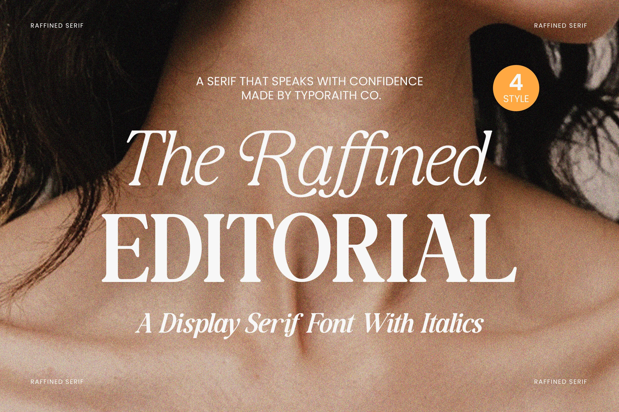
Best For: branding, magazine covers, editorial designs, premium designs
Raffined Font pairs a commanding display serif with a graceful italic voice, using sharp serifs, tall contrast, and smooth curves to create a polished editorial mood. The upright capitals feel assertive, while the italic style softens the texture with a more fluid rhythm, which places it naturally among Premium Fonts for fashion-led branding and luxe layouts.
Use Raffined when you need clear hierarchy: the roman style works well for headlines and mastheads, while the italics add emphasis without introducing a second family. It performs best at display size, with enough spacing around the forms so the contrast stays crisp and the italic details do not crowd adjacent text.
Afterglow Font
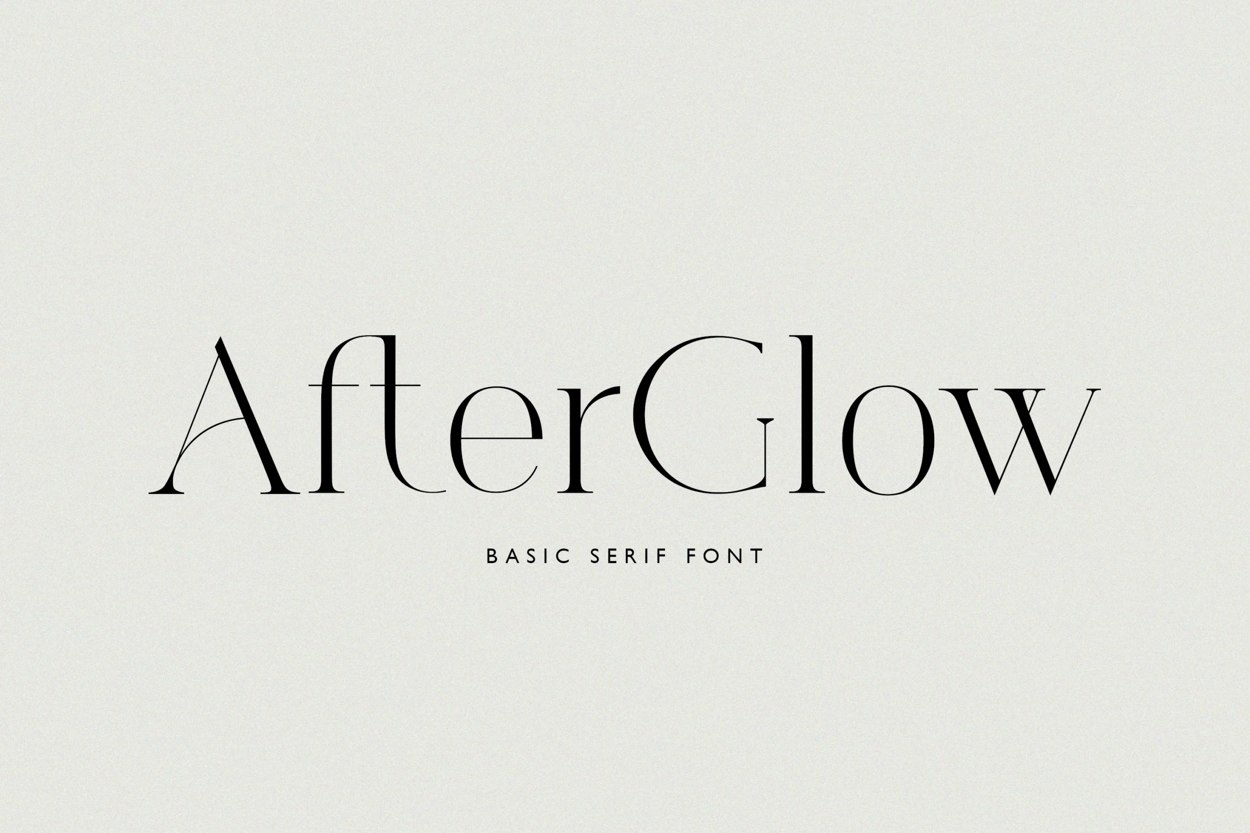
Best For: logos, invitations, minimal designs, premium designs
Afterglow Font has a restrained serif profile with fine hairlines, narrow curves, and clean vertical rhythm. The letterforms feel polished without heavy decoration, giving Premium Fonts collections a lighter fashion-editorial option for brands that need elegance but not excess ornament.
Its thin strokes and open spacing work best in short names, invitation headings, and logo marks where the typography can stay large and uncluttered. Pair it with quiet supporting text and keep background contrast high so the delicate crossbars and slim terminals remain sharp.
Chatos Original Font
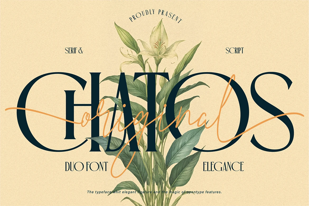
Best For: branding, invitations, wedding designs, artistic designs
Chatos Original Font pairs a tall, elegant serif with a loose handwritten script, creating a layered look that feels romantic without becoming overly ornate. The serif brings structure through its high contrast and narrow proportions, while the script adds movement with long sweeping strokes, making it a distinctive pick within Premium Fonts.
This duo works best when each style has a clear job: use the serif for the main title and the script as a soft accent across names, taglines, or short phrases. Keep the script brief, give the composition generous spacing, and let the contrast between the two styles build hierarchy instead of crowding the layout.
Things Font
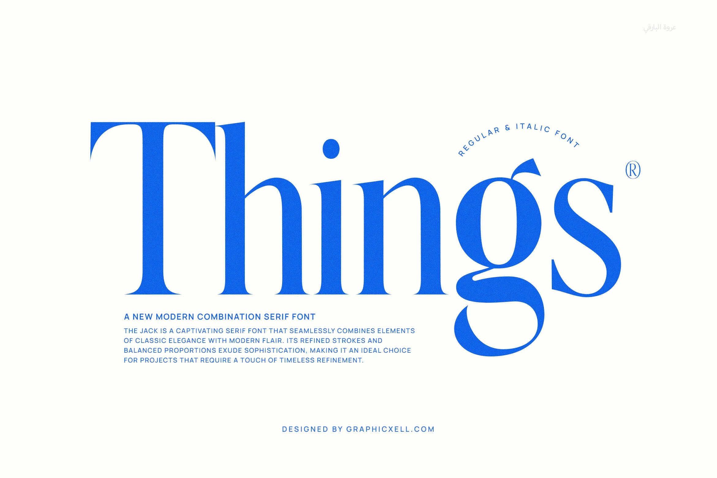
Best For: logos, branding, website headers, premium designs
Things Font has a bold modern serif structure with strong verticals, soft curves, and sharp bracketed details that keep the letterforms polished without looking overly traditional. The large x-height and confident contrast give Premium Fonts collections a clean editorial option for brands that need clarity with a refined edge.
Use Things for short names, logo marks, website headers, and packaging titles where the type can take visual priority. Its wide shapes and heavy stems benefit from generous spacing around the wordmark, while simple supporting text helps the curved terminals and high-contrast strokes stay crisp.
Begia Font
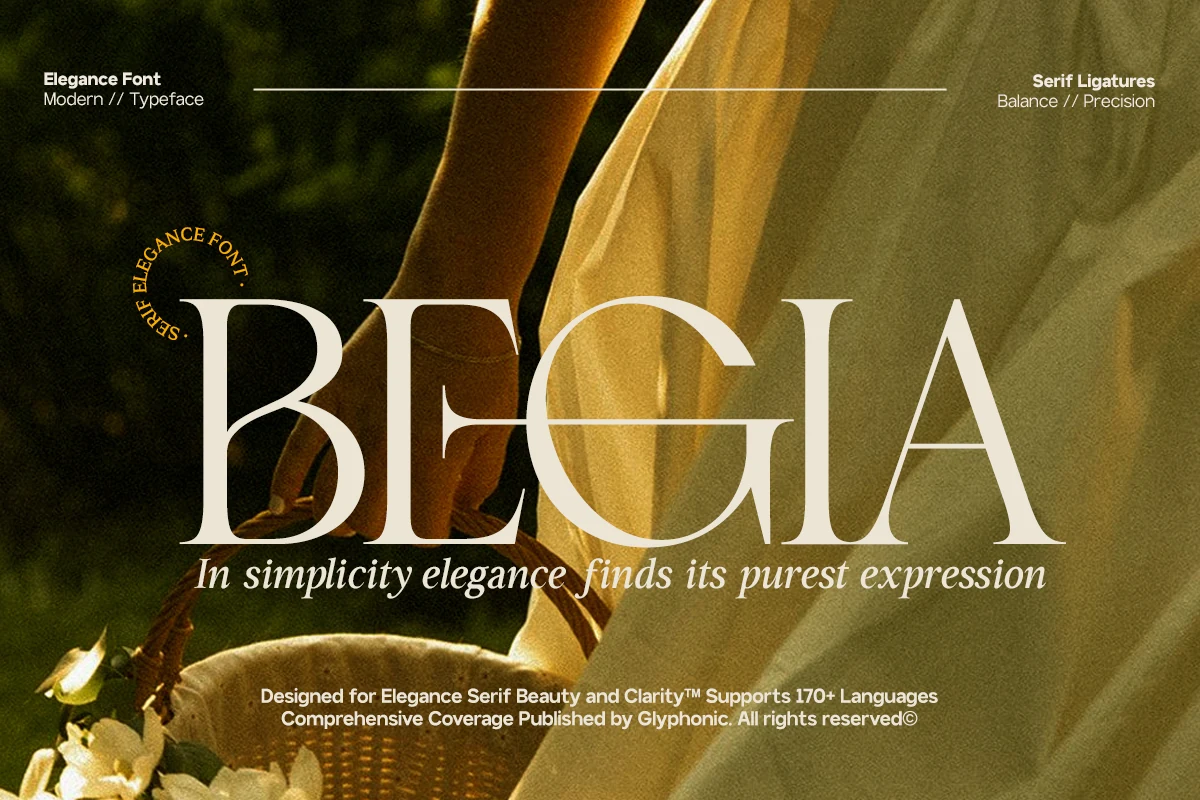
Best For: logos, fashion branding, beauty branding, high-end designs
Begia Font has tall high-contrast serif forms, crisp hairlines, and broad curves that give the main wordmark a poised luxury feel. The capitals look calm and expensive rather than flashy, which makes Begia an easy fit for Premium Fonts collections aimed at fashion labels, beauty packaging, and polished brand identities.
It works best when the typography carries the composition, especially in logos, editor-style headlines, and refined packaging fronts. Use it at generous size, keep surrounding copy restrained, and leave enough breathing room around the letterforms so the thin strokes and graceful proportions stay sharp.
Broken Walken Font
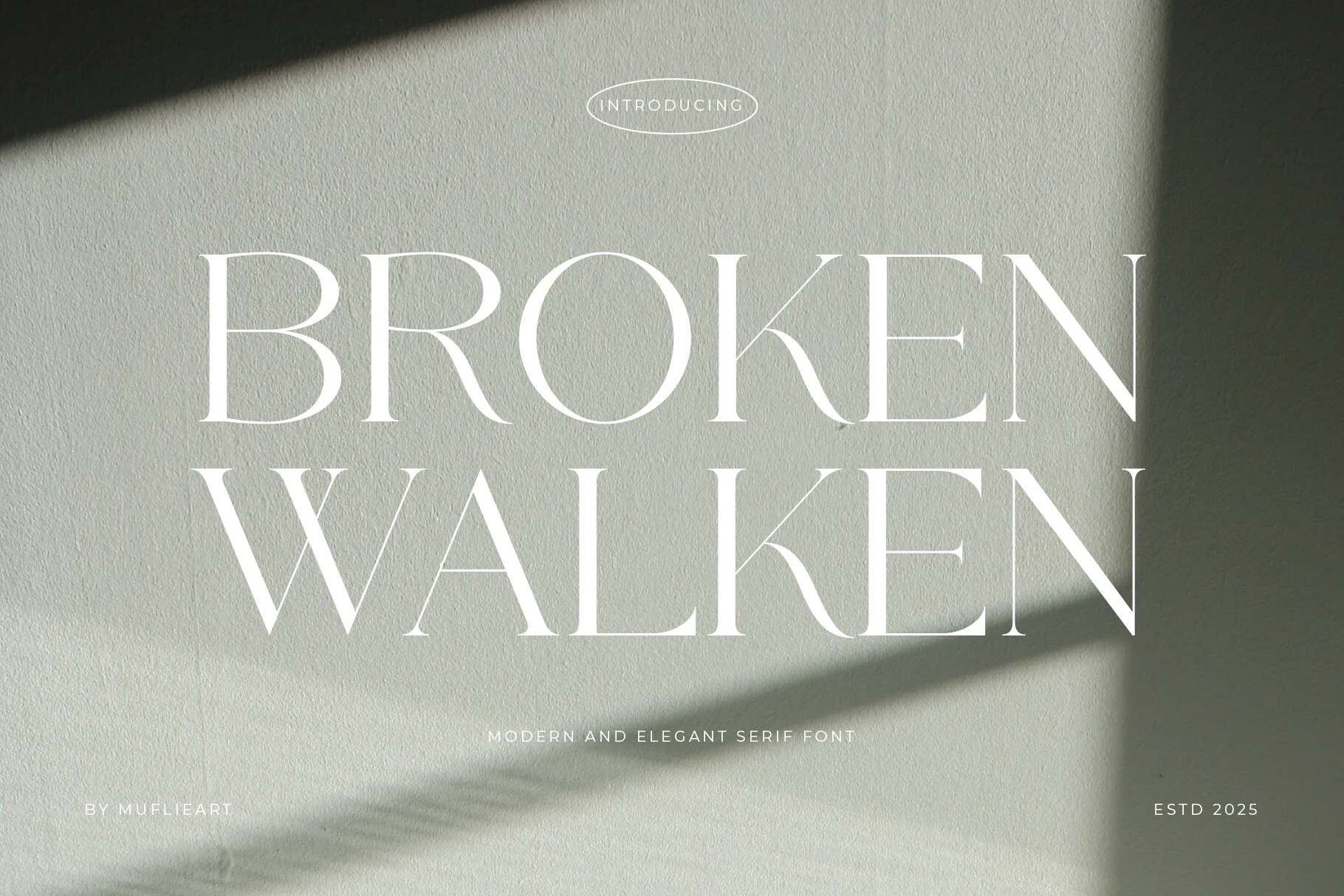
Best For: branding, magazine covers, signage, premium designs
Broken Walken Font uses tall serif capitals, razor-thin hairlines, and strong vertical stems to create an architectural editorial look. The broken stencil-style openings give the letters a sharper, more avant-garde personality, placing it firmly among Premium Fonts for brands that need restraint with visible character.
Use Broken Walken for short headlines, hotel signage, packaging fronts, and magazine-style mastheads where the type can stay large and spacious. Its fine internal cuts need high contrast and clean backgrounds, while generous tracking helps the narrow proportions feel deliberate rather than compressed.
Premium Signature Font
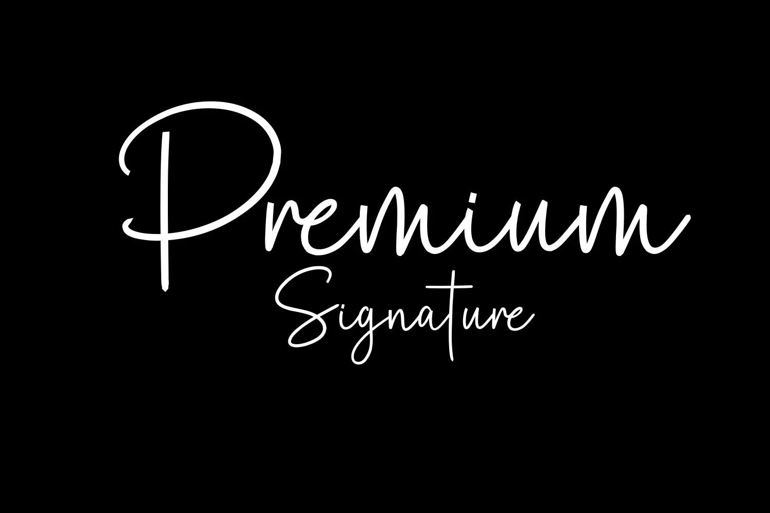
Best For: logos, wedding designs, personal branding, beauty branding
Premium Signature Font has a clean monoline signature look, led by a tall looping capital P, rounded joins, and smooth handwritten movement that feels polished rather than ornate. Its open rhythm gives it an intimate, personal tone, making it a natural fit in Premium Fonts when you want elegance without formal calligraphy weight.
It works best for short names, logo signatures, wedding details, and watermark-style branding where the lettering can stay visible and uncluttered. Keep it at display size, give the ascenders and descenders room to breathe, and pair it with simple supporting text so the handwritten line remains crisp.
Twoswash Font
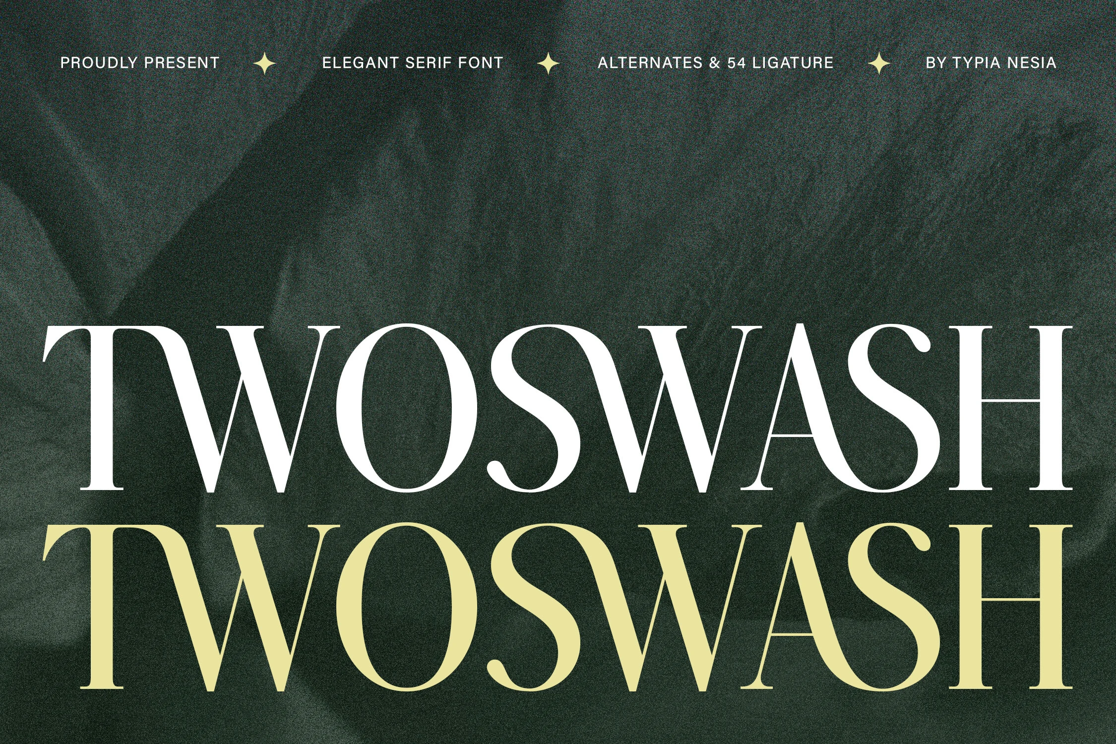
Best For: logos, luxury designs, premium designs, fashion branding
Twoswash Font has a refined serif structure with strong contrast, slim vertical cuts, and curved swash details that give the wordmark a controlled luxury feel. The wide capitals and graceful S shapes make it a strong fit for Premium Fonts when the design needs elegance with a slightly decorative edge.
Use Twoswash for logo marks, fashion titles, packaging fronts, and short editorial headlines where the letterforms can stay large and spacious. Its ligature-style rhythm works best with restrained supporting text, clean alignment, and enough tracking to keep the dense curves from feeling cramped.
Dihot Font
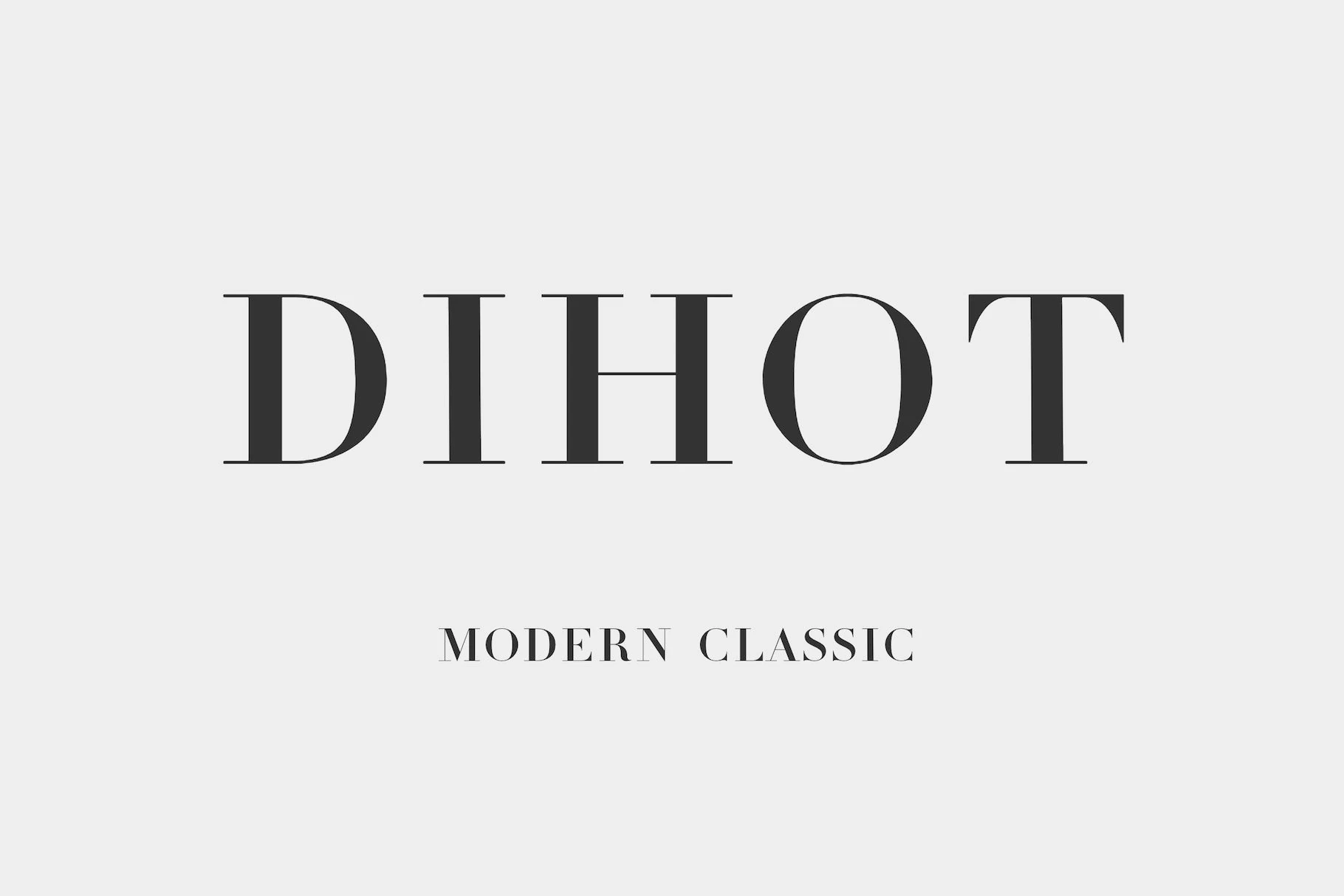
Best For: branding, magazine covers, editorial designs, classic designs
Dihot Font leans into a crisp Didot-style serif look, with strong vertical stems, very fine hairlines, and clean classical proportions. The sharp contrast gives the letters a polished editorial finish, so it fits naturally into Premium Fonts roundups focused on refined branding and modern classic typography.
This is the kind of serif that works best when scale does the work. Use it for mastheads, logo concepts, or short cover lines where the contrast stays visible, and keep spacing measured so the thin strokes and elegant rhythm do not get lost in crowded layouts.
Lathenia Font
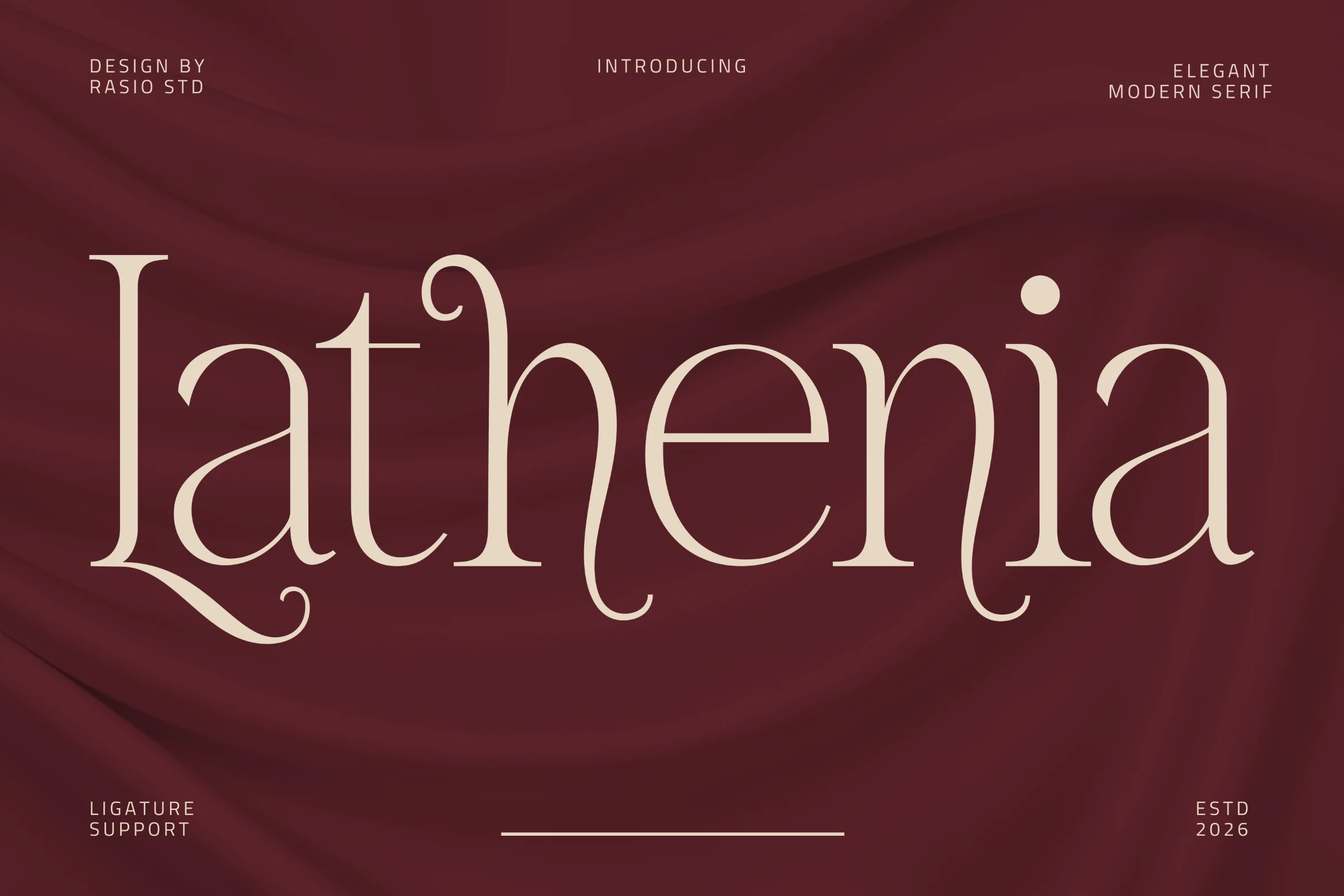
Best For: logos, book covers, wedding designs, premium designs
Lathenia Font has a fluid modern serif style, with wide proportions, delicate stroke contrast, and curled ligature details that make the wordmark feel romantic and editorial. Its long descenders and soft geometric curves give Premium Fonts a graceful option for lifestyle branding, winery marks, and refined stationery.
The ligature support is useful when a headline needs a more custom rhythm without building extra lettering by hand. Use Lathenia for short names and display titles, keep the spacing generous around the swashes, and pair it with quiet supporting text so the ornate joins stay readable rather than crowded.
Avendro Font
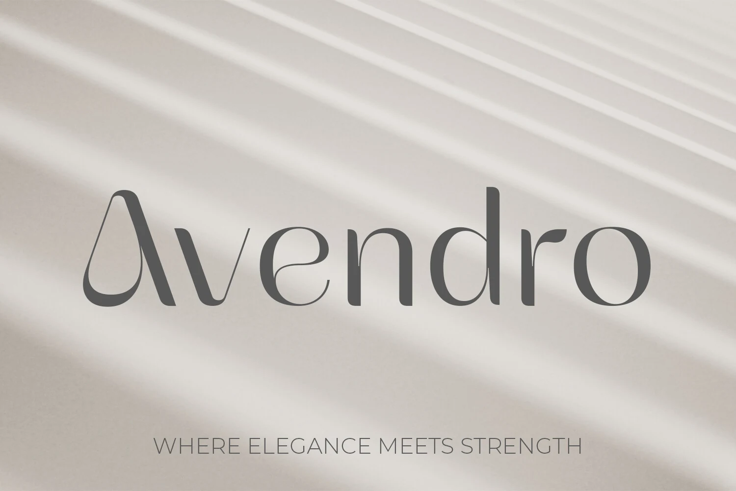
Best For: logos, branding, website headers, premium designs
Avendro Font has a bold display serif voice, with high-contrast strokes, rounded bowls, and sharply cut geometric terminals that give the wordmark a sculpted modern edge. The stylized capital A and compact lowercase forms feel polished and assertive, so it fits naturally within Premium Fonts when a brand needs elegance with real presence.
It works especially well in logos, brand marks, and website headers where a short line has to do most of the visual work. Keep the composition spacious and pair it with quiet supporting text, so the heavy verticals and crisp terminals stay clear instead of competing for attention.
Camenia Font
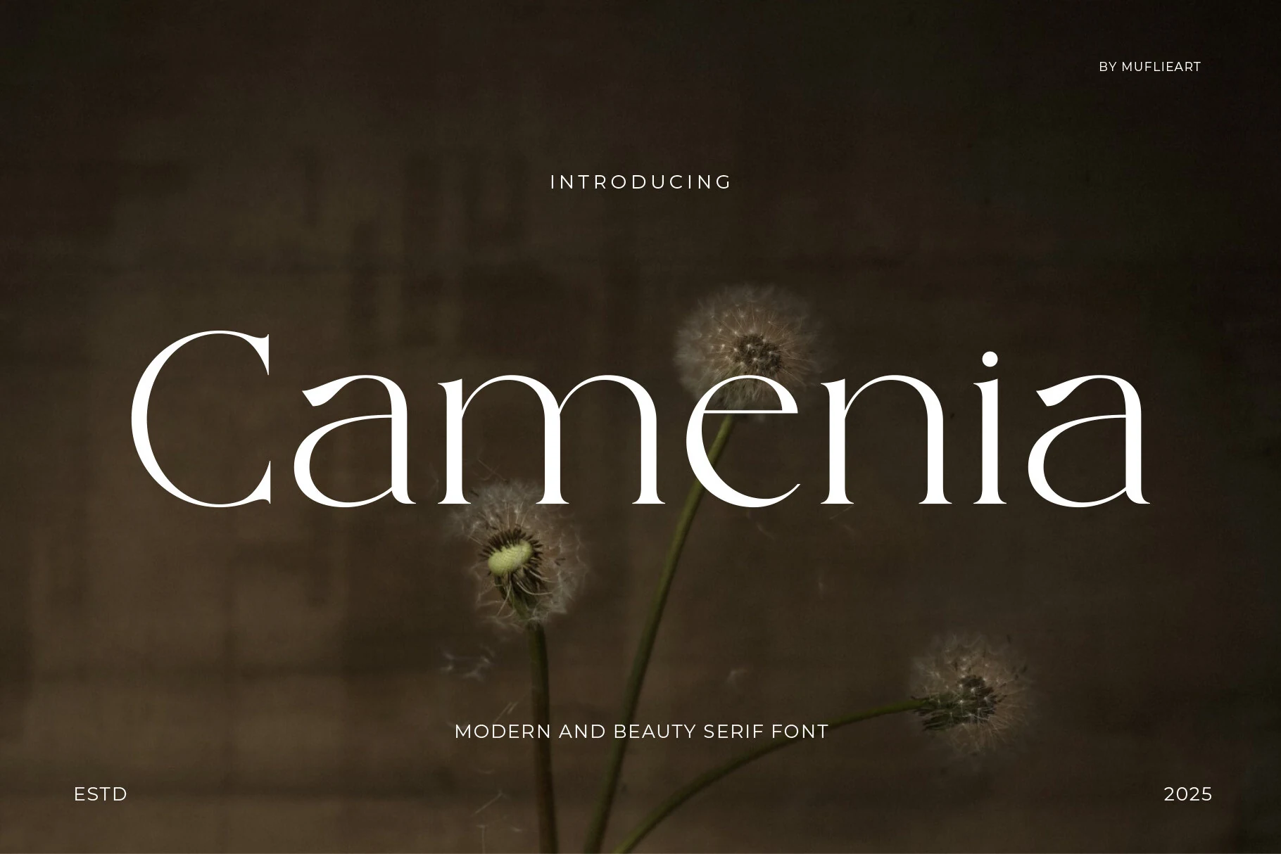
Best For: beauty branding, packaging, editorial designs, premium designs
Camenia Font has a soft modern serif shape, with slender high-contrast strokes, open spacing, and curved apertures that give the wordmark a calm organic rhythm. Its airy proportions make it a strong choice for Premium Fonts where the design needs refinement without becoming rigid or overly formal.
Use Camenia for lifestyle branding, wellness packaging, editorial titles, and social media headers where the typography can stay spacious and serene. The fine strokes need steady contrast, and the elongated forms work best with restrained supporting text so the title keeps its quiet visual authority.
Brooklyn Font
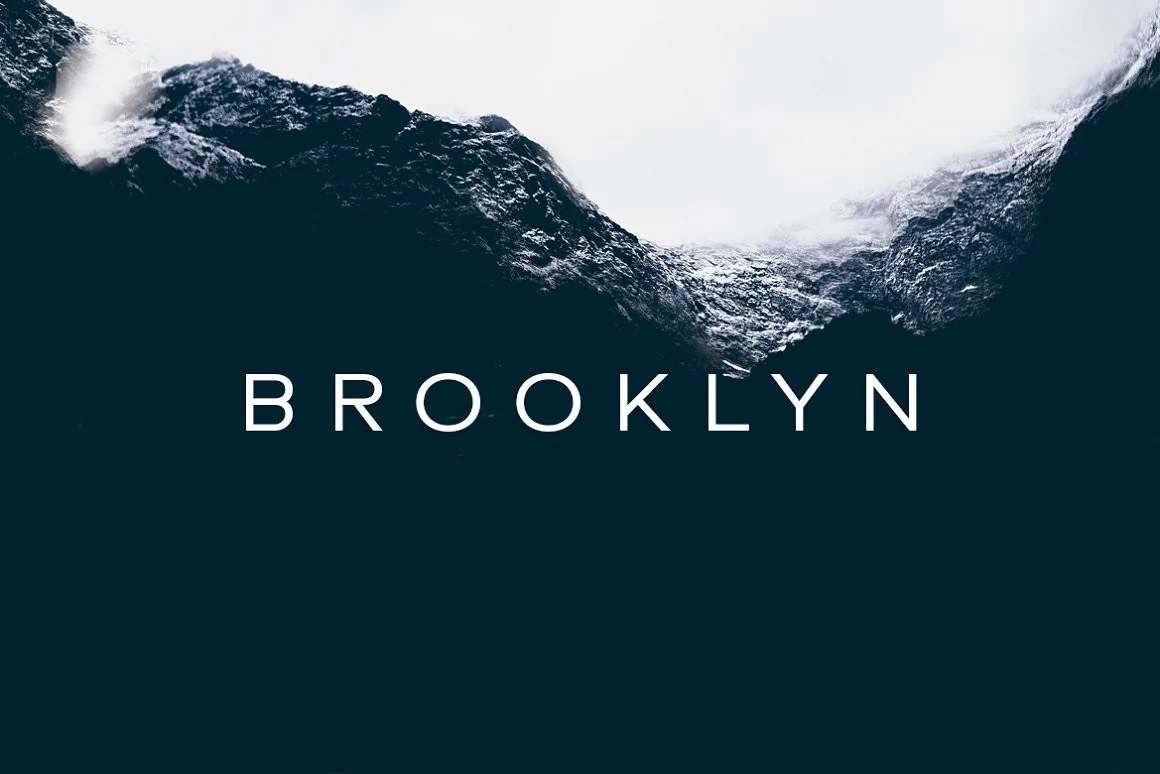
Best For: branding, website headers, minimal designs, clean designs
Brooklyn Font has a crisp all-caps sans serif look with even strokes, rounded counters, and generous tracking that gives the wordmark a calm, modern rhythm. The letterforms feel clean and understated rather than technical, which makes it a useful choice in Premium Fonts when you want a polished minimal tone.
It works especially well for branding, headers, and short display lines where spacing is part of the style. Let the letters breathe, keep surrounding elements simple, and use it on uncluttered layouts so the neat proportions and wide-set structure stay sharp and intentional.
Royal Font
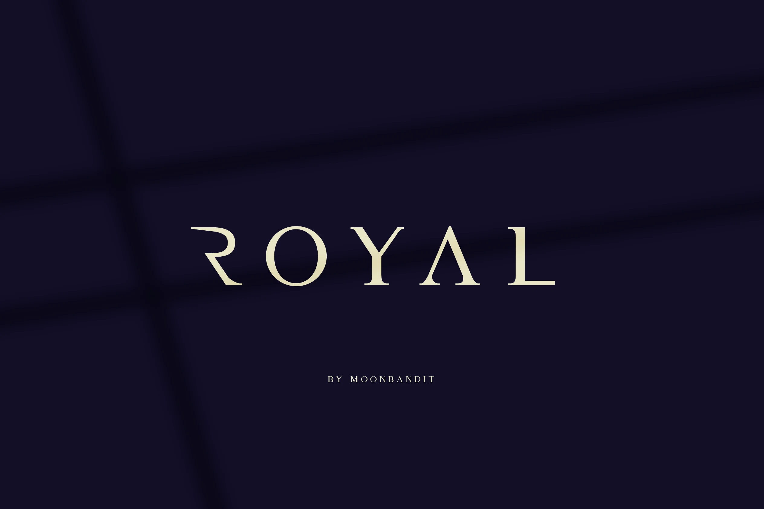
Best For: logos, headlines, luxury designs, premium designs
Royal Font uses spaced serif capitals with sharp wedge details, slim inner cuts, and a restrained luxury rhythm. The letterforms feel formal but not heavy, giving Premium Fonts collections a clean option for projects that need a delicate, upscale tone without ornate decoration.
Use Royal for headlines, greeting cards, logo marks, and short display text where the wide tracking can become part of the composition. Keep the wording brief, preserve strong contrast against the background, and avoid crowded supporting type so the elegant spacing remains intentional.
Murise Font
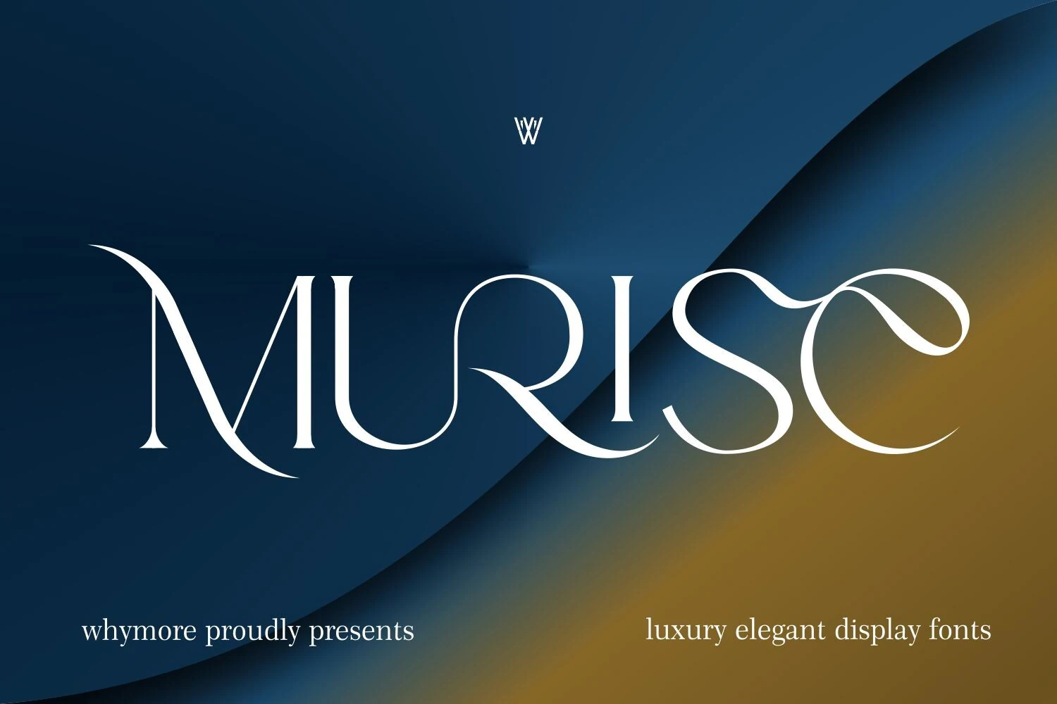
Best For: logos, branding, luxury designs, high-end designs
Murise Font has a polished display-serif look, with sharp contrast, slim hairlines, and flowing curves that give the letters a poised luxury feel. The sweeping terminals in the capitals and the elegant rhythm across the wordmark make it a strong fit for Premium Fonts with a fashion-led, upscale tone.
It works best when the typography is the focal point, especially in logos, beauty branding, and short headline treatments. Keep Murise at display size, leave generous space around the letterforms, and pair it with restrained supporting text so the curved details and fine stroke transitions stay crisp.
The right Premium Fonts can change how a brand, headline, or product presentation is perceived before the viewer reads a single word. These Creative Fabrica fonts cover refined serif styles, graceful scripts, modern display faces, and clean minimalist options, giving you a practical starting point for luxury branding, editorial layouts, invitations, packaging, and premium visual identities.