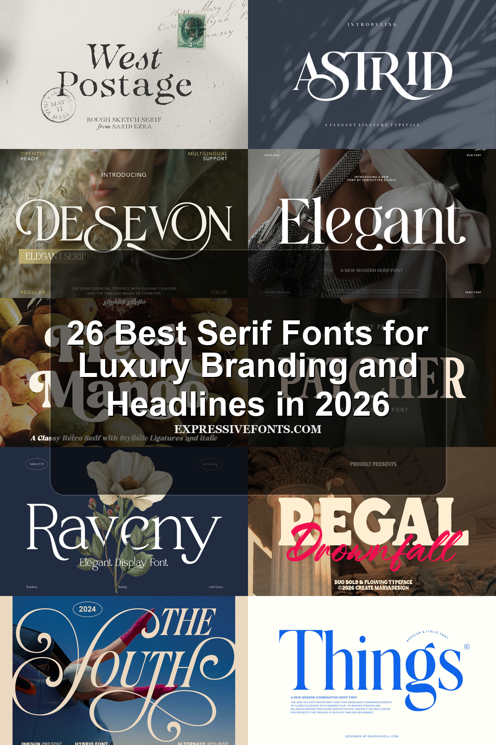
26 Best Serif Fonts for Luxury Branding and Headlines in 2026
Serif Fonts remain one of the strongest choices for polished branding in 2026, especially when a project needs structure, contrast, and a refined editorial tone. This collection brings together 26 elegant, retro, luxury, and display-ready serif styles to help you find the right typeface faster for logos, packaging, headlines, invitations, and editorial layouts.
Evorine Serif Font
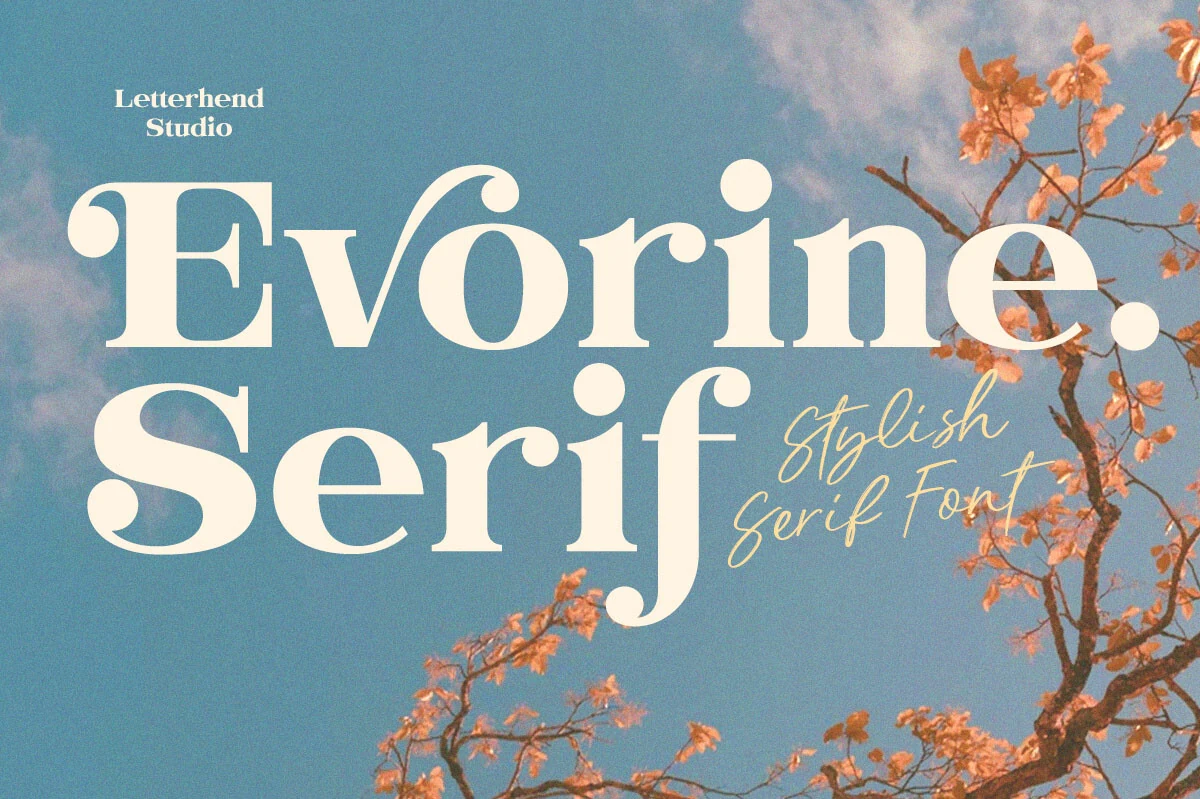
Best For: fashion branding, beauty branding, wedding designs, editorial designs
Evorine Serif Font has a high-contrast display shape with thick vertical strokes, thin hairlines, and rounded ball terminals that give the letters a soft vintage glamour. The oversized curves and curled details make it more expressive than a neutral editorial serif, while the broad spacing keeps the word shapes clear in large titles.
Use it when your Serif Fonts section needs a stylish headline face for fashion marks, café menus, wedding stationery, or beauty packaging. It works best as the main typographic feature, with tight control over line length and enough contrast around the lettering so the delicate thin strokes do not disappear.
Astrid Font
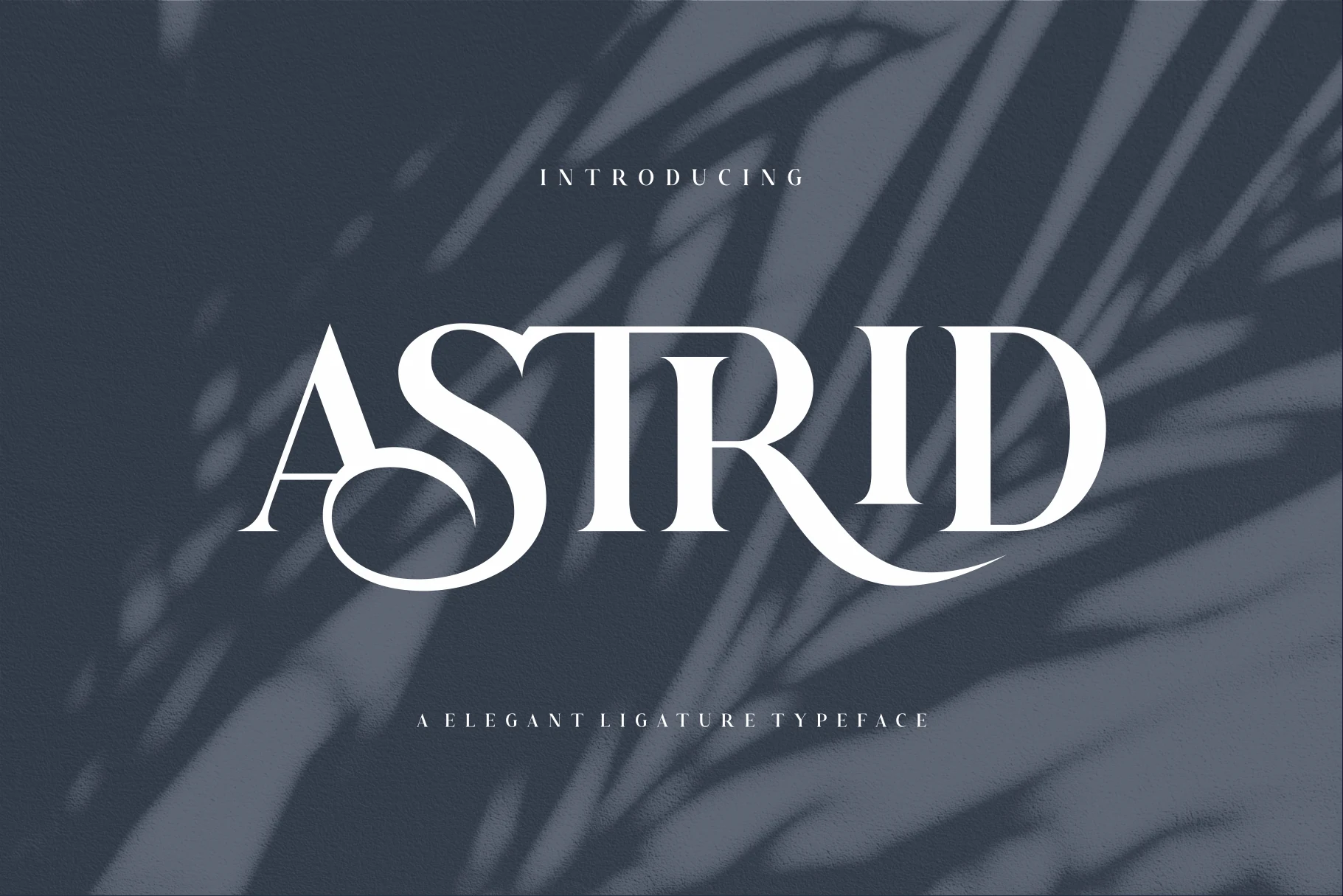
Best For: logos, editorial designs, fashion branding, high-end designs
Astrid Font is a refined display serif with crisp contrast, narrow stems, and smooth curves that give the capitals a sculpted, elegant presence. The shapes feel polished rather than fussy, so the dramatic style still reads cleanly in a headline, logo, or short brand name.
If your Serif Fonts selection needs a dressier editorial option, Astrid works best when the type is allowed to lead the layout. Keep the supporting text restrained and leave enough space around the letterforms so the thin details and flowing curves stay sharp at display size.
Silkydusk Font
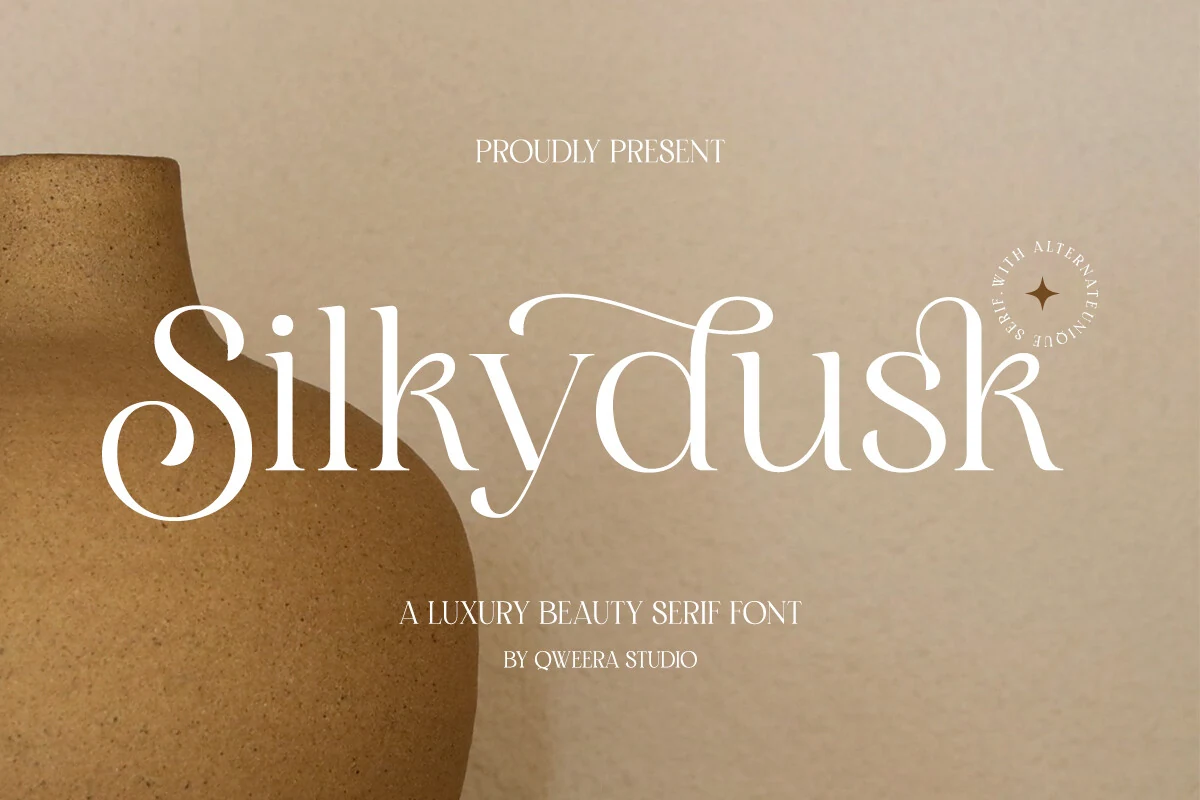
Best For: beauty branding, logos, packaging, luxury designs
Silkydusk Font is a luxury display serif with thin hairlines, rounded curves, and long sweeping details that make each word feel deliberately composed. Its graceful alternates and delicate ligatures help short names look more custom, especially when a single swash is used as the visual anchor.
For a Serif Fonts roundup, this is a strong choice for beauty logos, premium packaging, and minimal brand marks where the type needs to look refined without becoming heavy. Keep spacing measured and avoid crowded layouts, because the fine strokes need contrast and clean surrounding space to stay sharp.
Ethereal Font
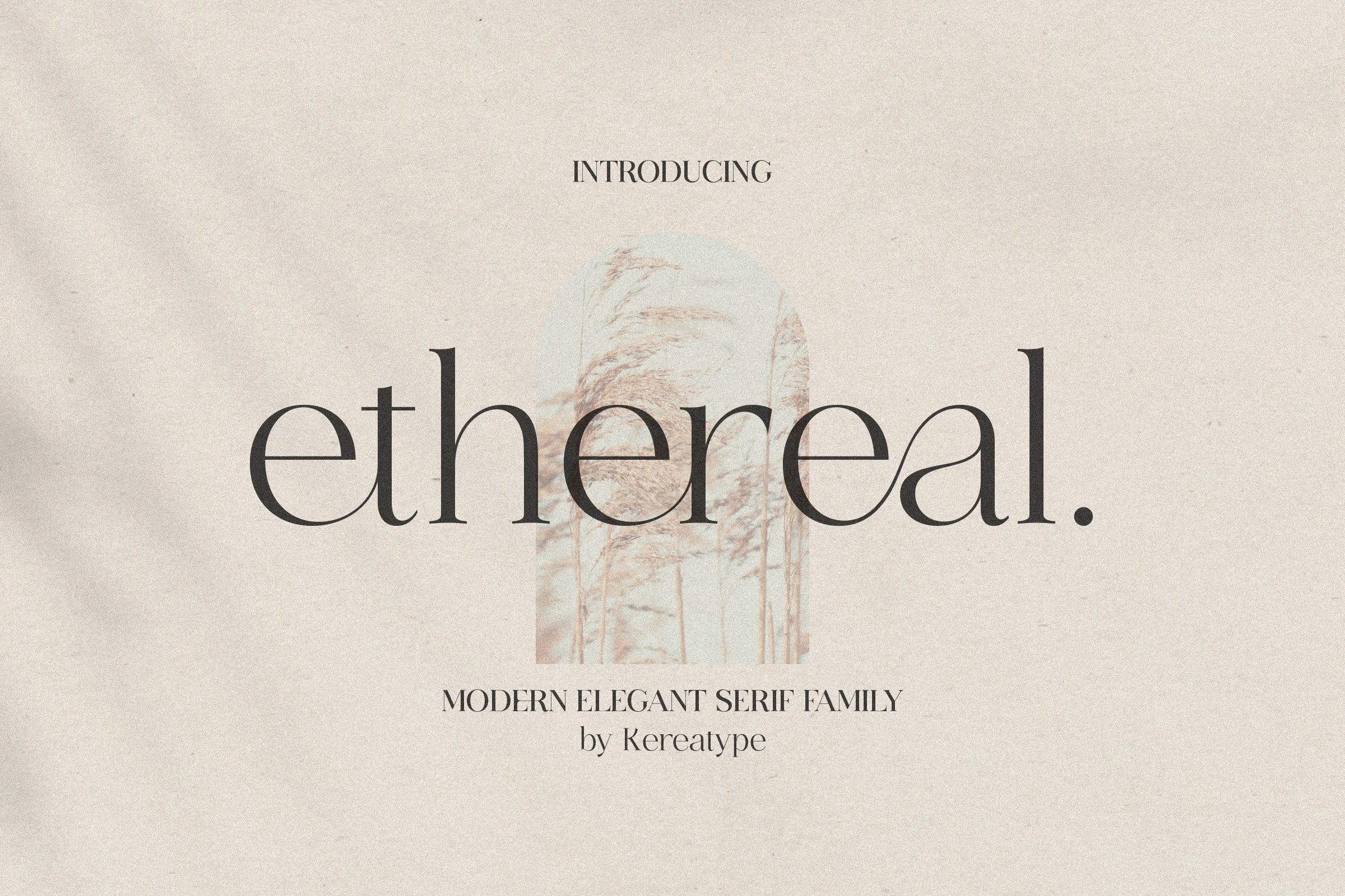
Best For: logos, editorial designs, fashion branding, website headers
Ethereal Font has a sleek high-contrast structure with very thin hairlines, tall stems, and wide, airy curves that give the lowercase a light editorial rhythm. The letterforms feel polished and fashion-led rather than ornate, and the soft tension between sharp verticals and rounded bowls keeps headlines elegant without looking stiff.
In a collection of Serif Fonts, this one stands out for clean branding and refined page titles, especially when you want a quiet luxury mood. Its range of weights helps build hierarchy across a layout, while the finer details look best with generous spacing and short lines so the delicate strokes stay crisp.
West Postage Font
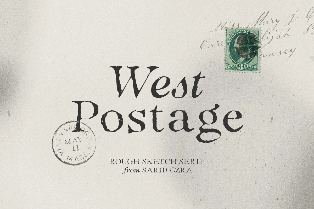
Best For: logos, invitations, quotes, vintage designs
West Postage Font has a rough sketch serif style with uneven edges, slightly weathered strokes, and an organic rhythm that feels closer to ink on old paper than polished editorial type. The irregular texture gives short words a handmade, archival character without making the basic letter shapes hard to read.
Use it in a Serif Fonts roundup when a design needs a postal, heritage, or handwritten-brand mood for logos, invitations, quotes, and rustic branding. The included true italic helps create softer secondary lines, while larger sizes and measured spacing keep the distressed contours from turning muddy.
Fresh Mango Font
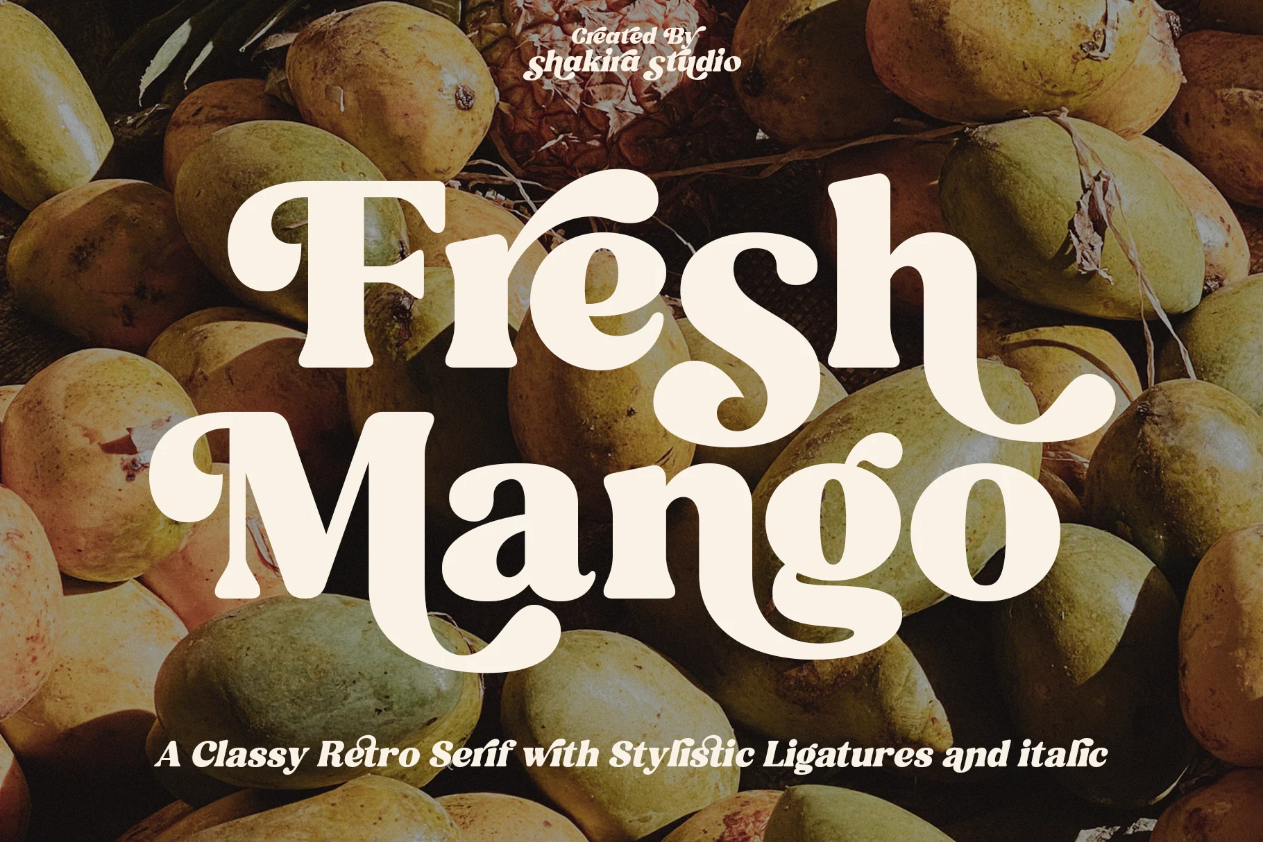
Best For: logos, headlines, retro designs, wedding designs
Fresh Mango Font is a chunky retro serif with bold rounded strokes, high contrast, and curled terminals that make the words feel upbeat and poster-ready. The letterforms have a soft vintage rhythm, with large curves and playful joins that give headlines more personality than a standard display serif.
Use it in a Serif Fonts roundup when a project needs warm retro impact for logos, cards, invitations, quotes, or advertising-style layouts. It works best as the main title face; keep supporting text simpler and control spacing carefully so the heavy curves stay lively rather than crowded.
Luxurimo Font
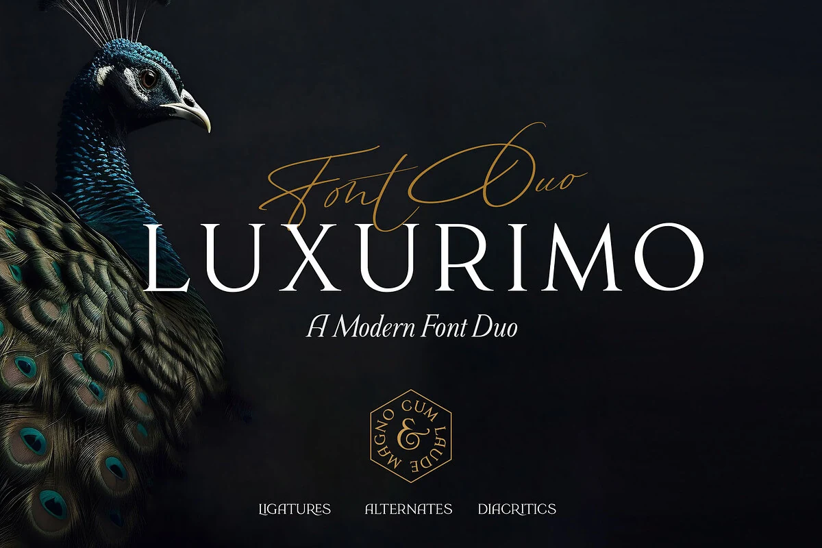
Best For: logos, wedding designs, fashion branding, luxury designs
Luxurimo Font pairs a crisp high-contrast serif with a flowing signature script, giving layouts both structure and ornament in one set. The serif has long, elegant proportions and clean uppercase authority, while the script adds a softer sweep that feels polished rather than overly decorative.
For Serif Fonts collections, this duo works especially well when the serif carries the main title and the script is reserved for small accents, taglines, or names. That contrast keeps luxury branding, invitations, and fashion graphics refined, with enough hierarchy to look composed instead of crowded.
Moon Creme Font
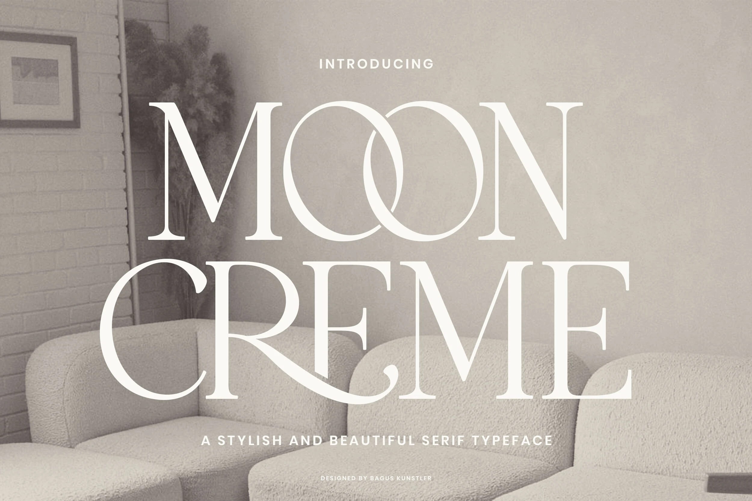
Best For: logos, branding, editorial designs, luxury designs
Moon Creme Font has a tall, high-contrast serif structure with slim vertical stress, sharp bracketed serifs, and wide uppercase proportions. The oversized curves in the double O create a calm focal point, while the clean stroke contrast keeps the vintage influence controlled rather than decorative.
Use it in a Serif Fonts roundup when a layout needs quiet sophistication for brand titles, editorial covers, boutique logos, or refined website headers. It performs best with generous spacing and short headline lines, letting the thin strokes and open counters stay crisp instead of compressed.
Desevon Font
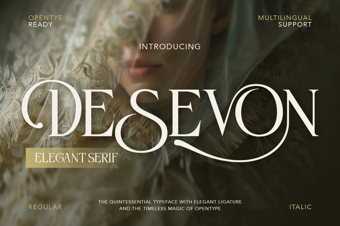
Best For: logos, editorial designs, beauty branding, luxury designs
Desevon Font has a high-contrast display serif structure with slender stems, sculpted bowls, and a dramatic sweeping terminal that turns a wordmark into the main visual feature. The curves feel refined rather than fragile, and the long finishing swash gives the letters a polished, fashion-led rhythm.
For Serif Fonts roundups, Desevon is a strong pick when you want a luxe title face for branding, editorial covers, or beauty-led layouts. Its ligatures help short names read more fluidly, and the fine stroke contrast stays cleaner when you give the letters breathing room and keep the supporting type restrained.
Elegant Font
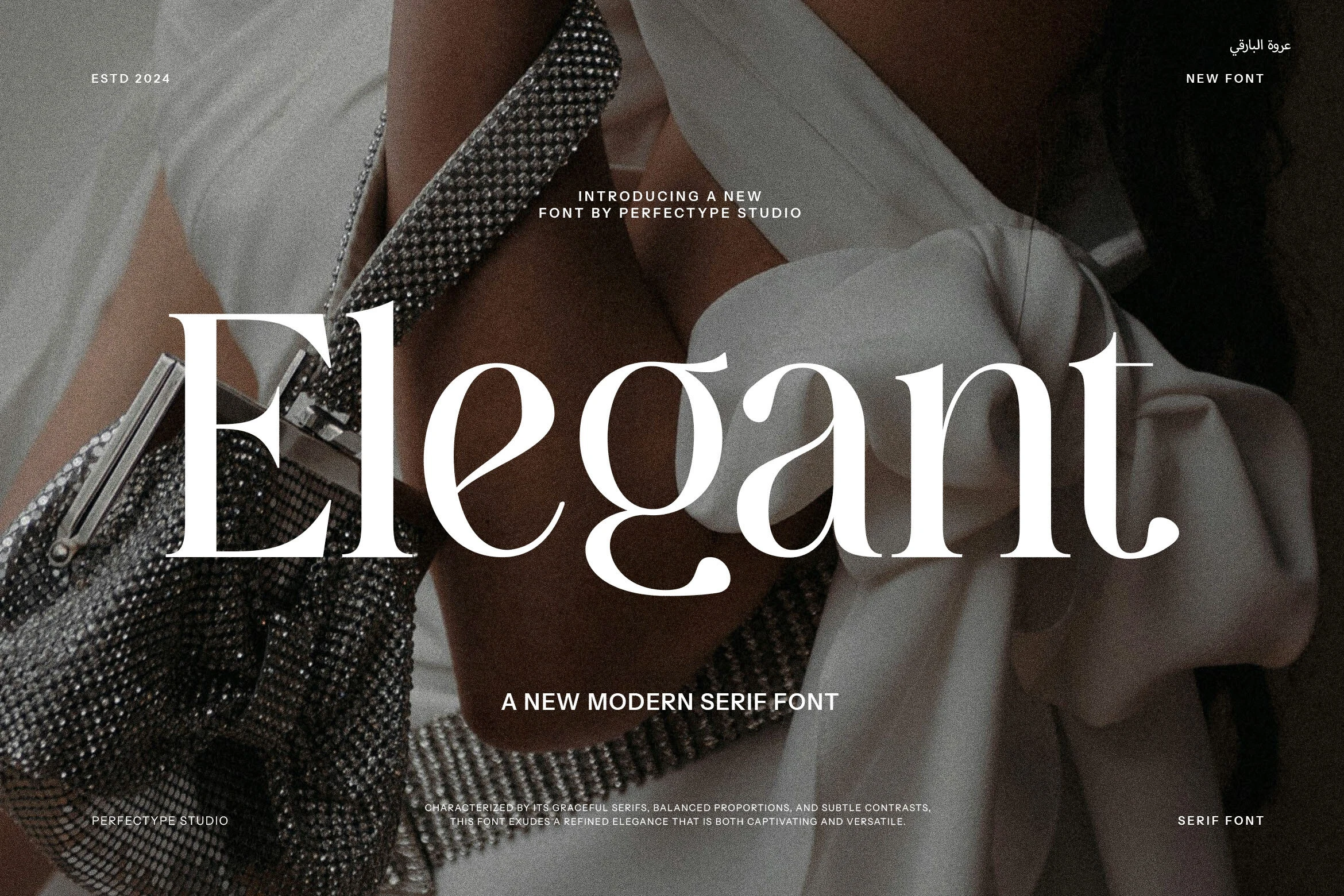
Best For: logos, fashion branding, editorial designs, luxury designs
Elegant Font is a modern serif with thin hairlines, graceful curves, and tall, balanced proportions that give the word shapes a polished fashion-editorial tone. The contrast is strong but not overly sharp, so the letters feel refined while still carrying enough weight for large titles and logo-style compositions.
Use it in a Serif Fonts roundup when a design needs a clean luxury mood for brand marks, magazine-style headings, beauty visuals, or high-end social graphics. It works best with short wording, controlled spacing, and plain supporting type so the curved terminals and slim strokes stay clear.
Montage Font
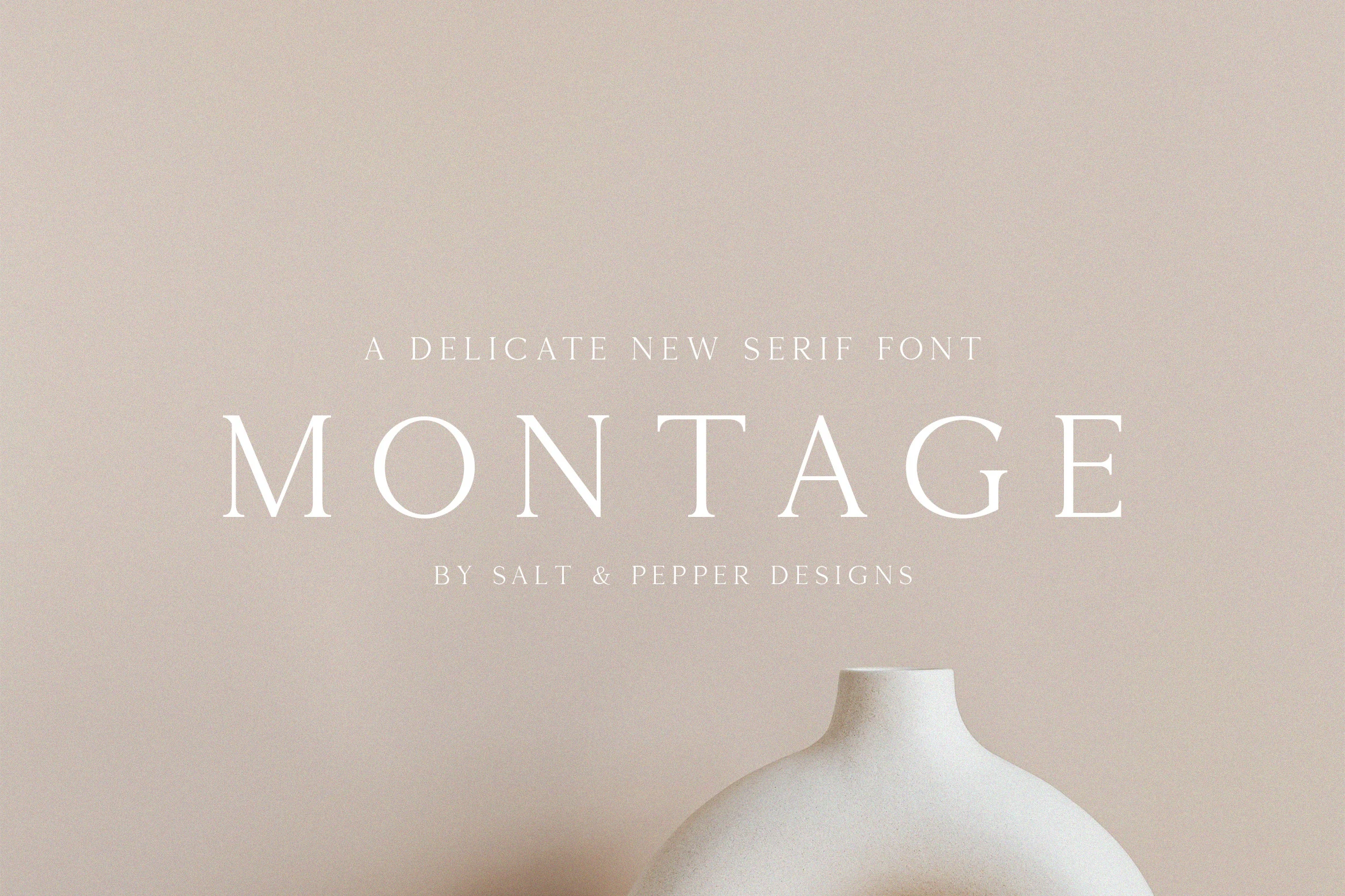
Best For: logos, branding, editorial designs, luxury designs
Montage Font is a thin display serif with airy spacing, fine hairlines, and crisp tapered serifs that give the capitals a calm, polished presence. The wide-set letterforms feel minimal rather than ornate, so the font reads cleanly while still carrying a quiet luxury mood.
In Serif Fonts collections, Montage works especially well for logos, editorial headings, and upscale packaging where a short line of type needs to feel light and intentional. Give it room in the layout and keep the supporting typography restrained, because the delicate stroke contrast does its best work when nothing competes with it.
Bride Font
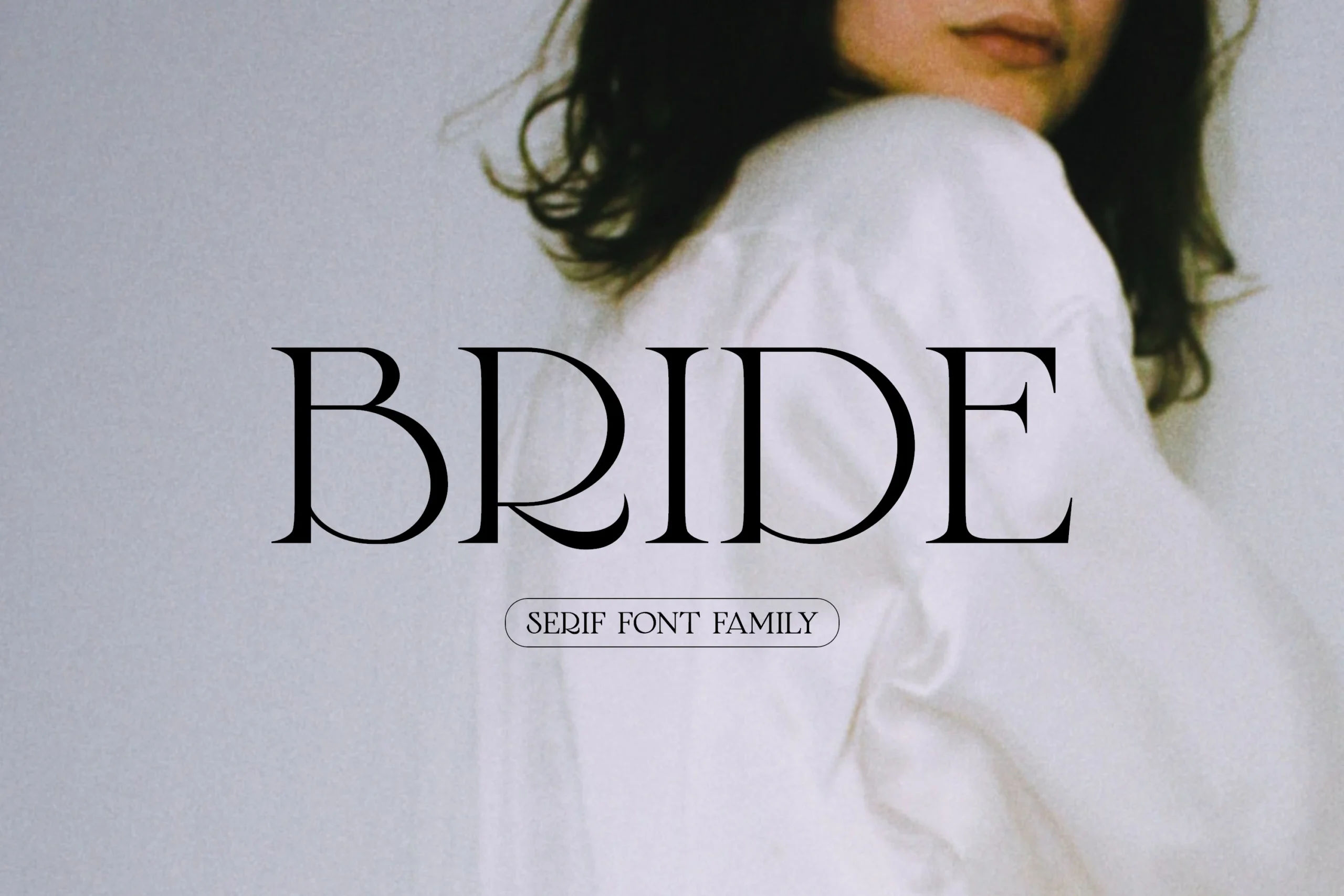
Best For: wedding designs, logos, editorial designs, fashion branding
Bride Font is a refined serif with tall elegant capitals, slim vertical contrast, and soft curves that give each word a quiet editorial polish. The rounded bowls and delicate serifs keep the style graceful, while the open spacing helps the letterforms stay clean in large title settings.
Use it in a Serif Fonts roundup when a project needs a romantic but restrained headline face for wedding branding, fashion layouts, boutique logos, or refined stationery. Keep the wording short and the surrounding type simple so the curved terminals and thin strokes remain sharp.
Aretha Font
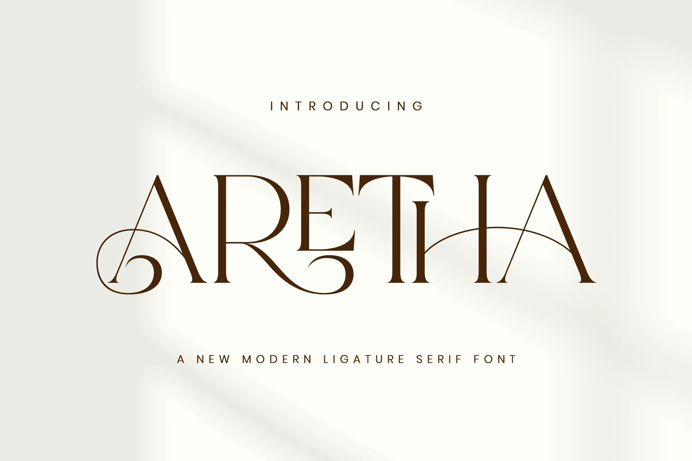
Best For: fashion branding, beauty branding, logos, luxury designs
Aretha Font is a modern ligature serif with sharp vertical contrast, long tapered serifs, and sweeping connectors that make the capitals feel custom-built. The large open forms keep the wordmark readable, while the looping details add a high-fashion rhythm without turning the composition into script.
Within a Serif Fonts roundup, Aretha fits luxury branding, beauty packaging, editorial titles, and fashion logos that need one strong typographic centerpiece. Use the ligatures selectively in short names, then pair them with quiet supporting text so the thin strokes and extended curves stay controlled.
Dihot Font
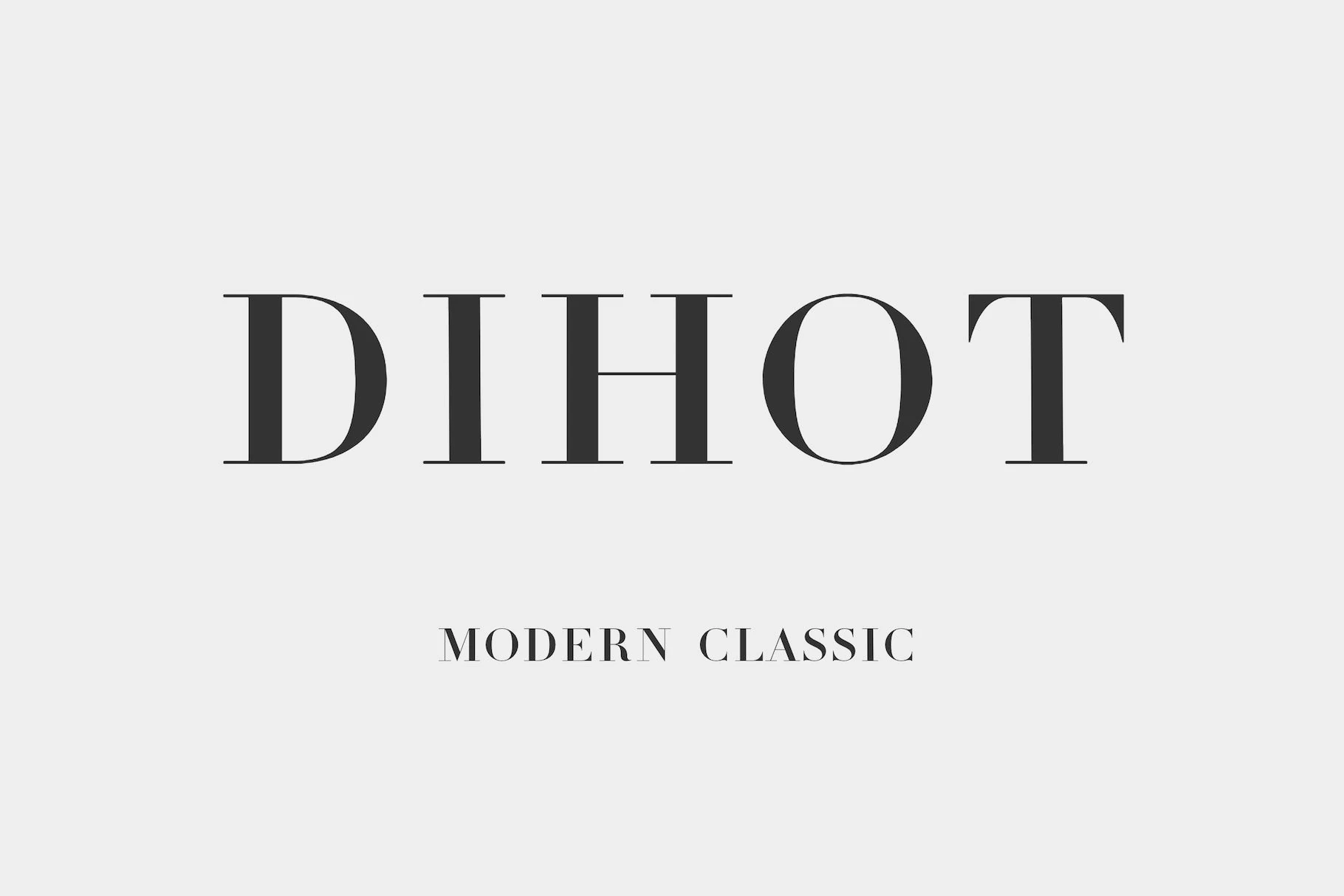
Best For: logos, editorial designs, fashion branding, luxury designs
Dihot Font has tall elegant capitals, razor-thin hairlines, and strong vertical contrast that give it a crisp editorial edge. The letterforms feel disciplined and polished, with the kind of clean tension that makes a classic serif look sharp rather than decorative.
Within Serif Fonts, this one works best in short headlines, mastheads, and upscale brand marks where its contrast can stay visible and precise. Pair it with quieter supporting text and give the spacing a little room, so the fine strokes and narrow proportions keep their refined rhythm.
The Youth Font
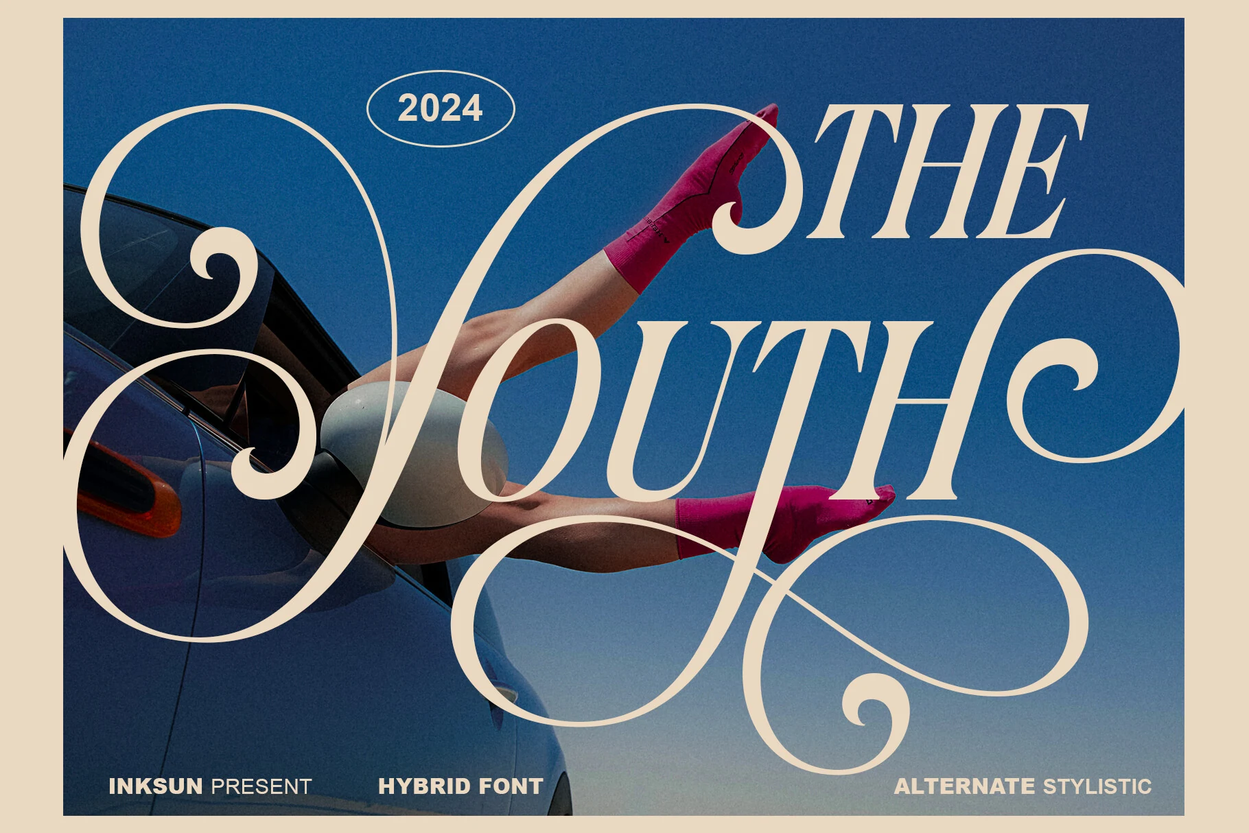
Best For: fashion branding, editorial designs, headlines, artistic designs
The Youth Font is a hybrid display serif with oversized swashes, sharp italic movement, and ultra-fine hairlines that push the letters into a more experimental editorial space. The dramatic loops dominate the composition, so it works less like a quiet text serif and more like a fashion poster signature.
Use it in a Serif Fonts roundup when a layout needs a bold typographic centerpiece for photography overlays, luxury lifestyle branding, or magazine-style covers. Keep the wording short, let the swashes cross open space, and avoid dense supporting elements so the ornamental curves stay intentional.
Hostania Font
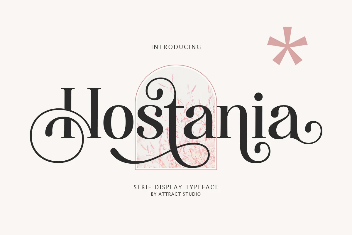
Best For: logos, headlines, branding, nostalgic designs
Hostania Font leans into a nostalgic display serif mood, pairing sturdy classic shapes with looping swashes and rounded terminals that give the wordmark a warm, ornamental rhythm. Those curled details make it feel more expressive than a standard serif, while the broad letterforms keep titles readable and full of character.
In a roundup of Serif Fonts, it stands out for logos and headlines that need a softer vintage accent without becoming fussy. Use the decorative forms as the main attraction, then keep spacing measured and supporting text simpler so the flourished capitals and curled endings do not crowd the layout.
Patcher Font
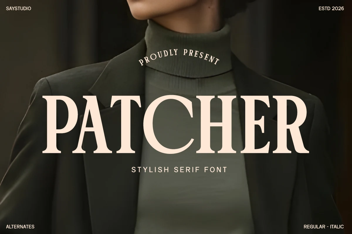
Best For: fashion branding, editorial designs, luxury designs, logos
Patcher Font uses broad, high-contrast serif letters with heavy vertical stems, sharp bracketed details, and a polished fashion-editorial rhythm. Its capitals feel formal without becoming stiff, which gives the typeface enough presence for refined headlines, logos, and premium visual systems.
Within a Serif Fonts roundup, Patcher works best where the title needs authority and restraint at the same time. Keep tracking slightly open in all-caps settings, pair it with quiet supporting text, and let the strong proportions lead the hierarchy on packaging, magazine covers, or brand presentations.
Kaviera Font
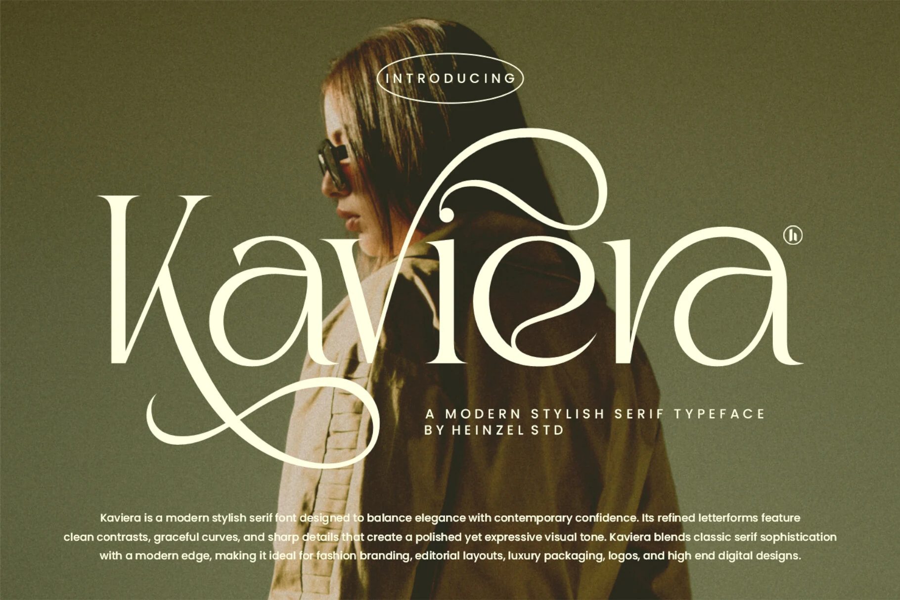
Best For: fashion branding, logos, luxury designs, editorial designs
Kaviera Font has the kind of high-contrast serif structure that feels instantly polished, but its real character comes from the sweeping swashes and elongated curves woven through the capitals. Those flourished strokes give the face a graceful fashion tone, while the sharp terminals and clean rhythm keep it poised rather than overly ornamental.
In a roundup of Serif Fonts, Kaviera stands out when you let one word carry the drama. Use it for short titles, mastheads, or logo lines, and give the wide flourishes enough breathing room so they do not collide with nearby text or tight crop edges.
Raveny Font
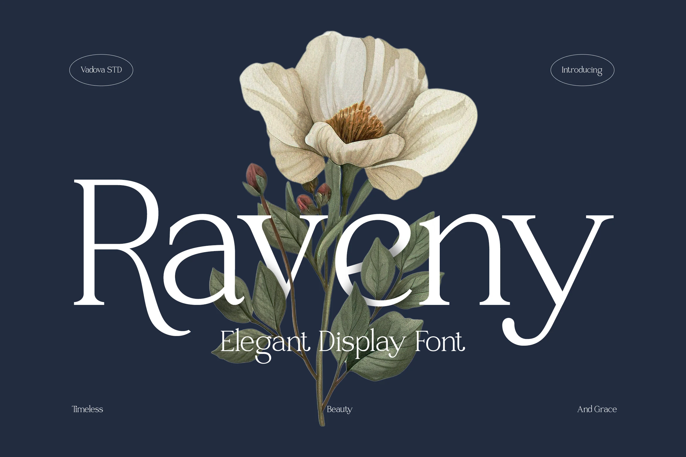
Best For: editorial designs, wedding designs, luxury designs, packaging
Raveny Font draws attention with clean high-contrast strokes, long tapering serifs, and a dramatic capital R that drops into a sweeping leg. The rounded bowls and slim hairlines make the word shapes graceful, while the open spacing keeps the refined style readable in polished branding or editorial compositions.
Use it when Serif Fonts need softness rather than heavy authority: wedding titles, luxury packaging, magazine covers, and short logo marks. Keep supporting copy smaller and quieter, because Raveny’s thin joins and extended descenders need contrast and space to stay crisp.
Kind Avenue Font
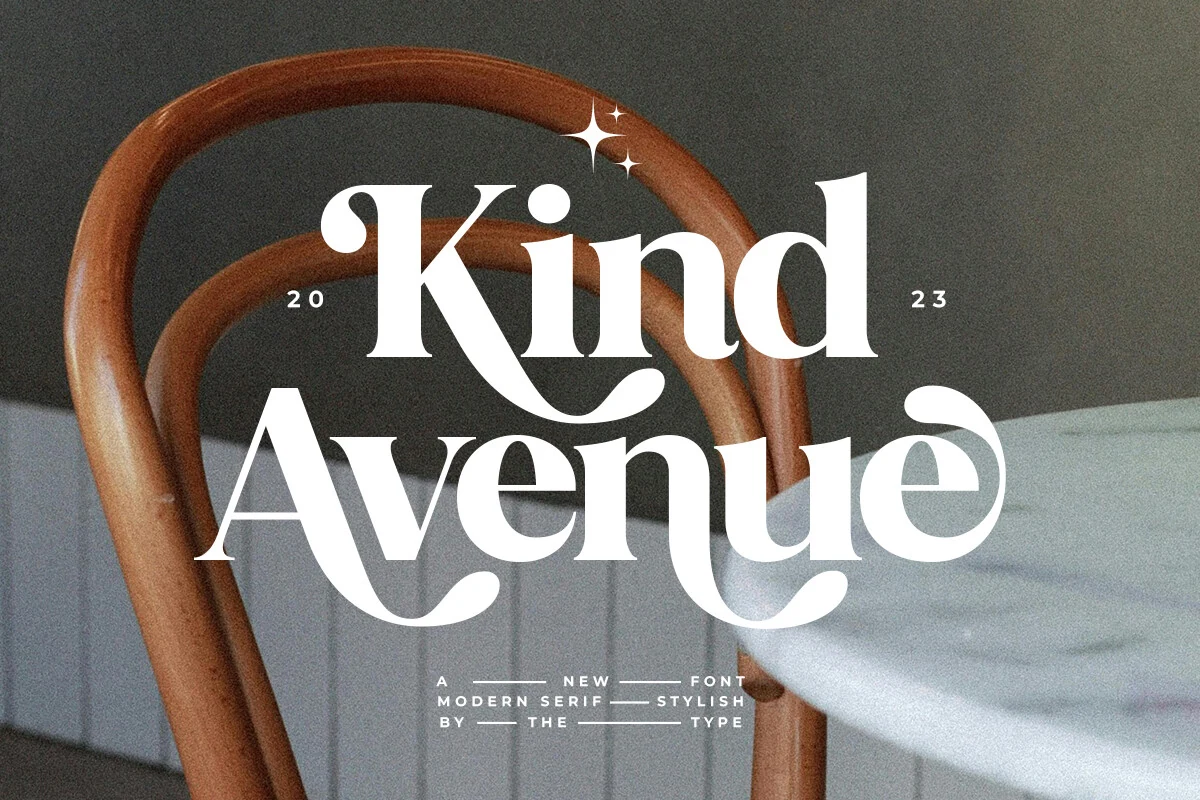
Best For: branding, headlines, posters, retro designs
Kind Avenue Font has a soft retro serif voice, with rounded terminals, thick-to-thin contrast, and oversized curves that make the capitals feel warm rather than rigid. The sweeping leg of the K and the looping strokes in the lower line give it a stylish 70s-inflected rhythm that reads well at display size.
Within Serif Fonts, this one can shift from calmer text settings to more expressive branding when you bring in its alternate forms and ligatures. Let it lead short titles, covers, or poster lines, and keep spacing balanced so the decorative swashes have room to shape the composition instead of tangling with nearby elements.
Sparky Dream Font
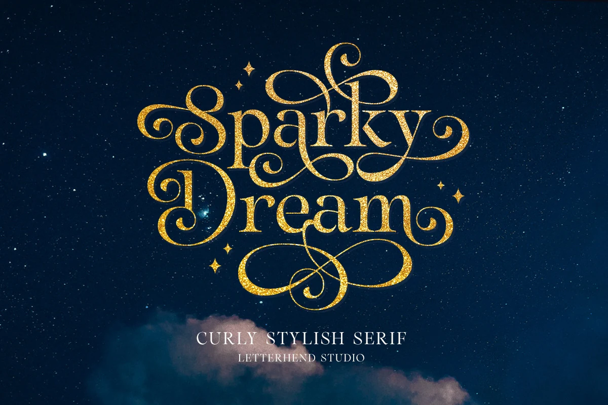
Best For: decorative designs, display text, invitations, logos
Sparky Dream Font is an ornate curly serif with tall contrast, rounded terminals, and looping swashes that wrap around the words like decorative lettering. The letters keep a classic serif base, but the extended curls and flourished capitals make the style strongly display-focused rather than quiet or text-heavy.
Use it when Serif Fonts need a festive, theatrical headline with built-in movement. It works best for short phrases, invitations, logos, and decorative title art; give the swashes generous spacing and avoid tight line breaks so the loops can frame the composition cleanly.
Things Font
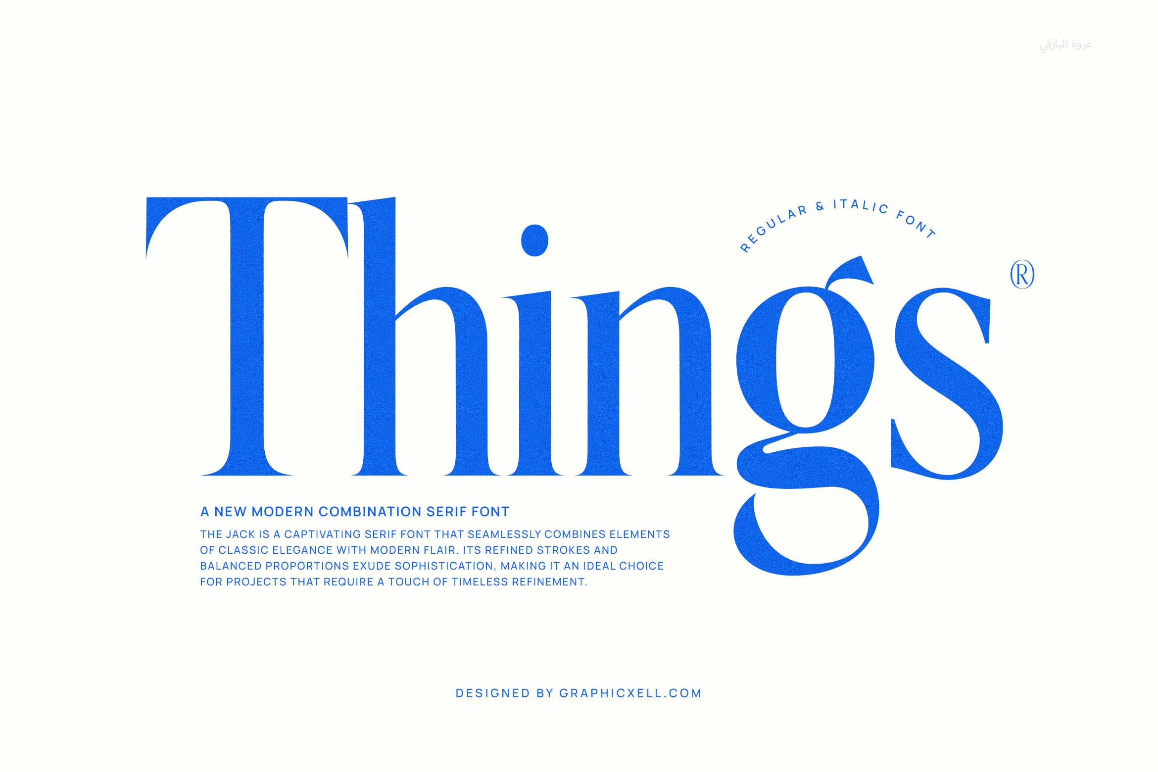
Best For: branding, website headers, headlines, modern designs
Things Font has a striking modern serif look built on tall proportions, crisp contrast, and sculpted terminals that feel both classic and graphic. The oversized T sets the tone immediately, while details like the flowing tail on the g and the sharp, clean curves keep the letterforms polished and memorable.
In a roundup of Serif Fonts, Things stands out when you want a title to feel elegant without losing impact. It works best at generous sizes, where the refined stroke shifts stay visible, and it pairs especially well with restrained secondary text so the dramatic proportions can carry the hierarchy cleanly.
Typewriter Font
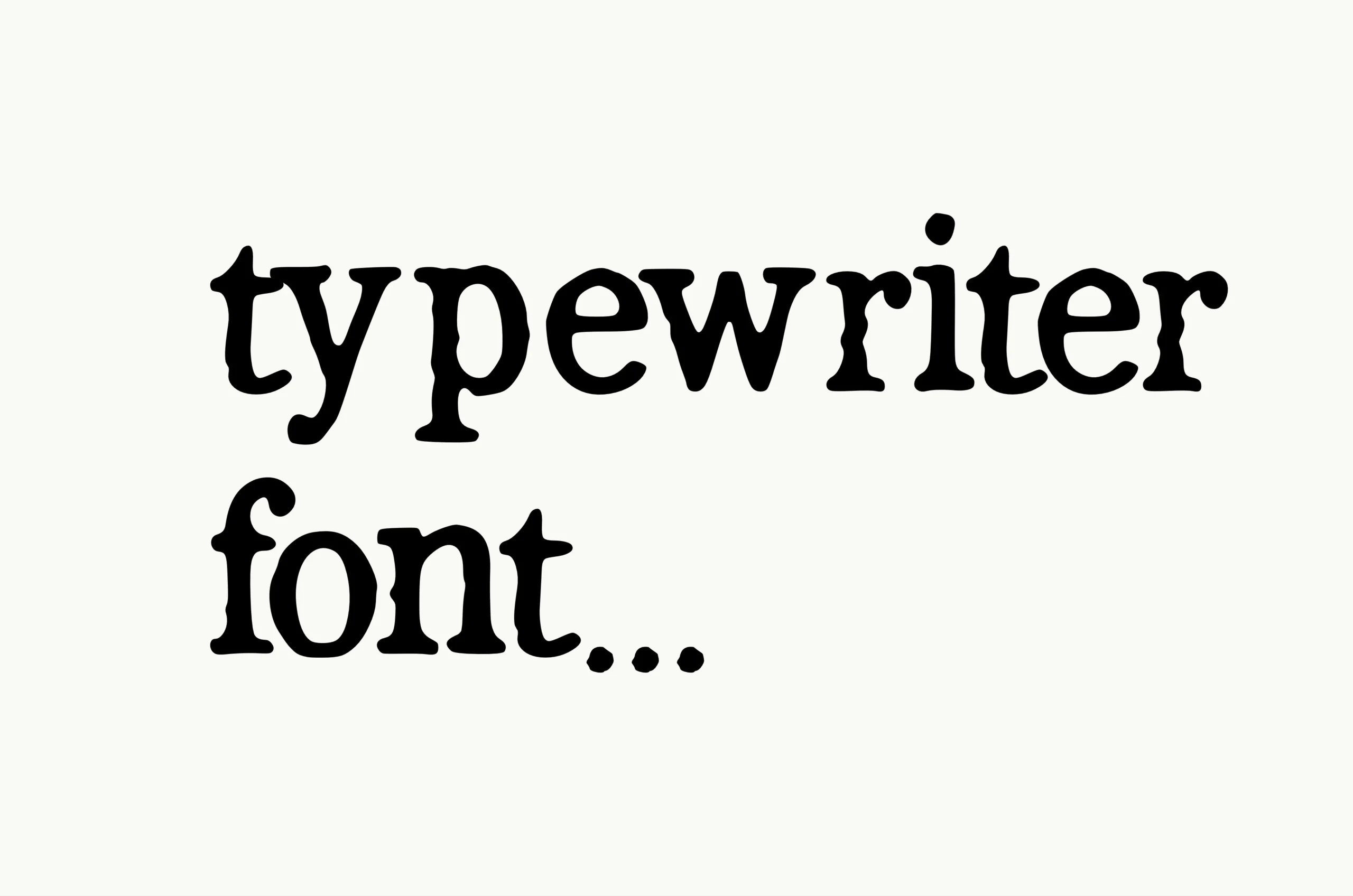
Best For: vintage designs, nostalgic designs, old-school designs, quotes
Typewriter Font has a heavy monospaced rhythm with softened slab serifs, uneven ink-like edges, and slightly irregular letter placement. The rounded counters and blunt terminals give it the feel of old mechanical strikes rather than a polished digital serif, which makes the texture central to its character.
Use it when Serif Fonts need a document-like, archival, or correspondence-inspired tone. It suits quotes, retro labels, zine-style layouts, and short nostalgic headings; keep line spacing open enough to preserve the imperfect rhythm instead of compressing the type into a dense block.
Strong Font
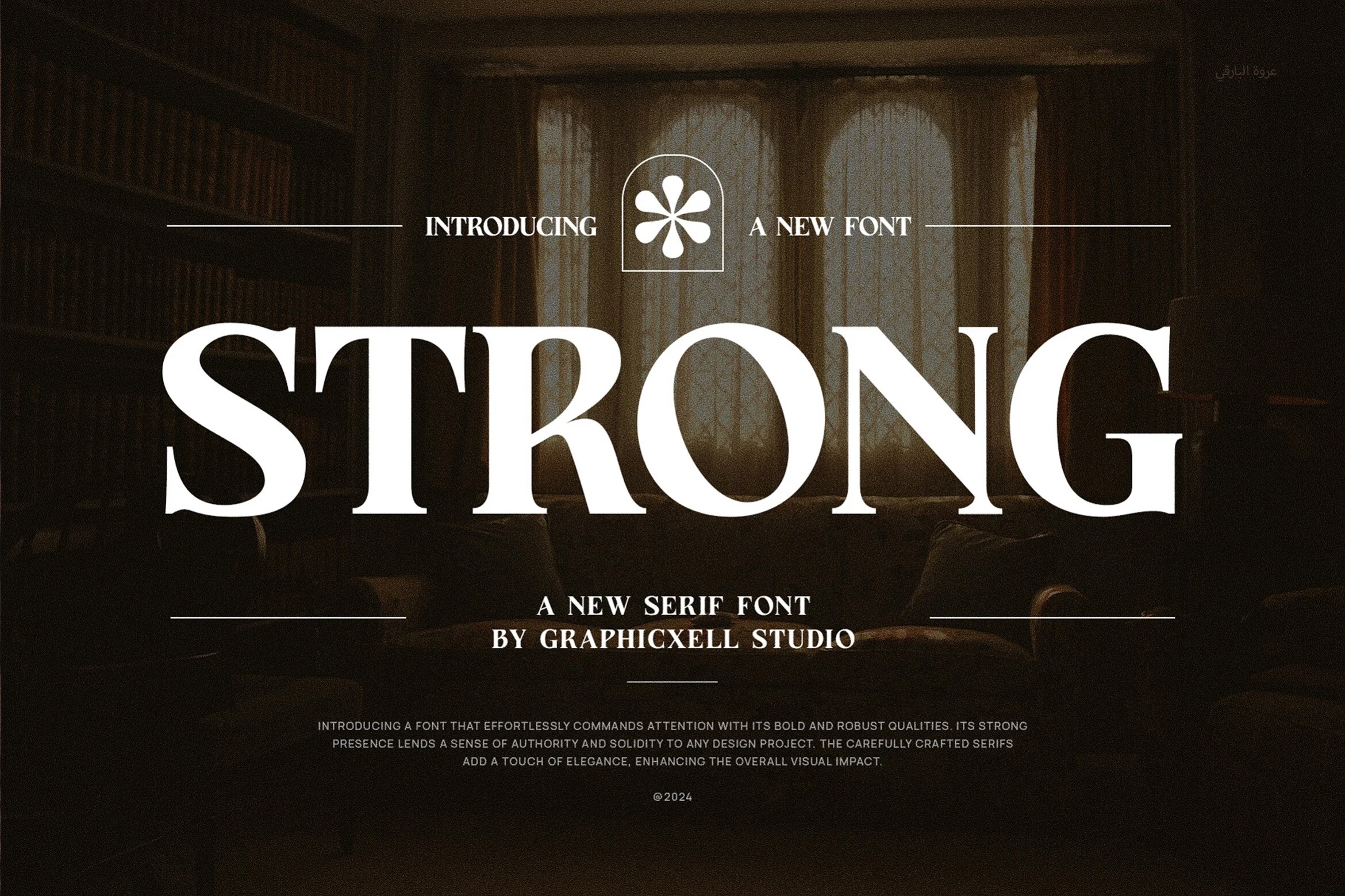
Best For: branding, logos, packaging, professional designs
Strong Font uses broad uppercase serif forms, crisp contrast, and sharply cut terminals to create a stately presence with real authority. The letters feel solid and composed rather than ornamental, and the generous proportions help the design stay clear and readable in large titles, logos, and polished brand work.
Within Serif Fonts, this one works best when you want elegance with structure. Let it lead short headlines or identity pieces, and keep the supporting text quieter so the wide capitals can hold the hierarchy cleanly across packaging, editorial covers, or premium stationery.
Praise Font
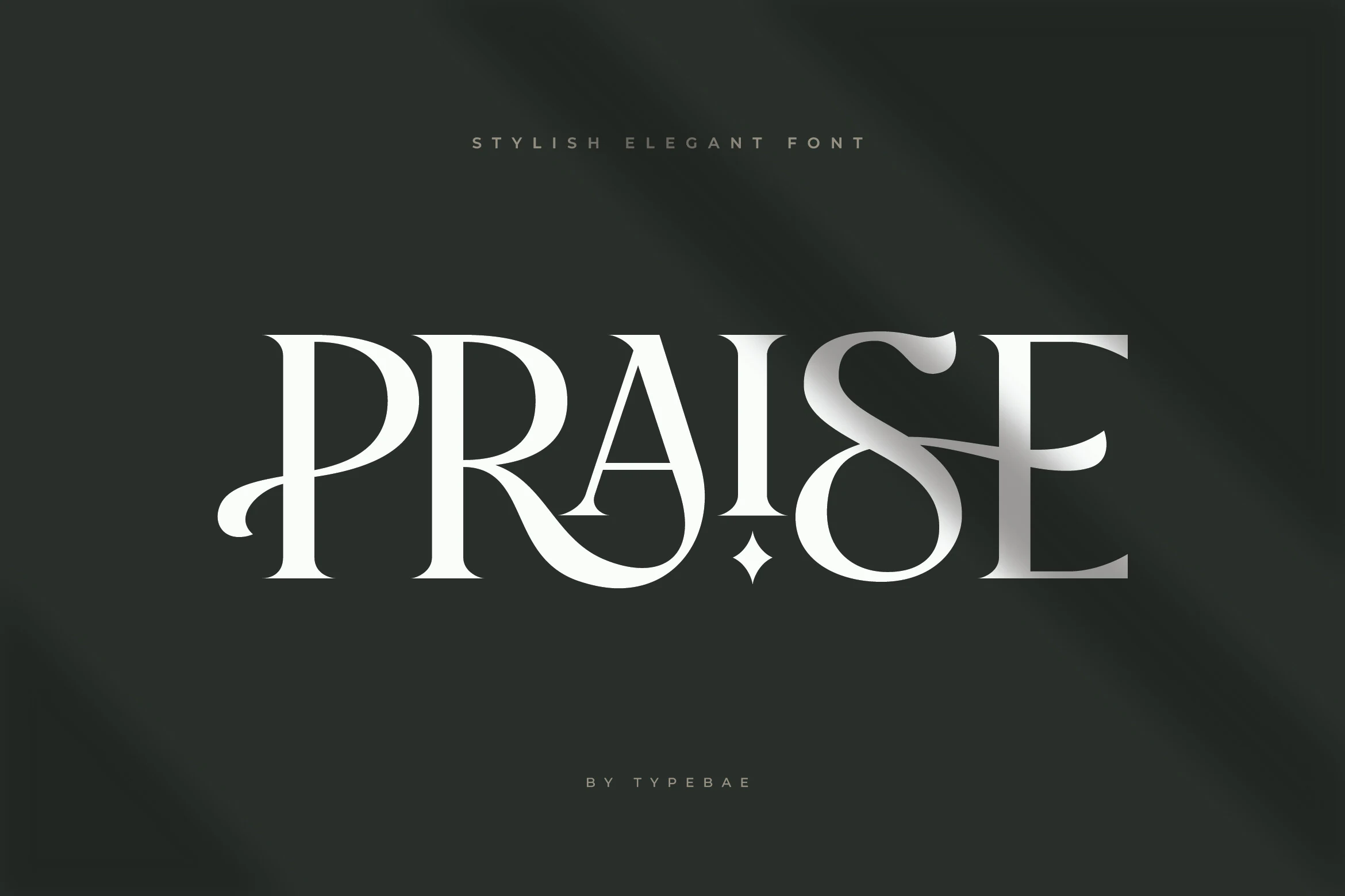
Best For: logos, branding, premium designs, high-end designs
Praise Font is a polished display serif with dramatic contrast, slim vertical stress, and sculptural curves that turn the word shape into a logo mark. The sweeping P, sharp A structure, and stylized ampersand-like S give it a refined editorial edge without making the letterforms feel crowded.
Use it when Serif Fonts need a premium identity rather than a neutral text voice. Praise works best in short brand names, monograms, and hero titles; keep spacing controlled but not tight, since the custom curves need room to stay legible and balanced.
Regal Drownfall Font
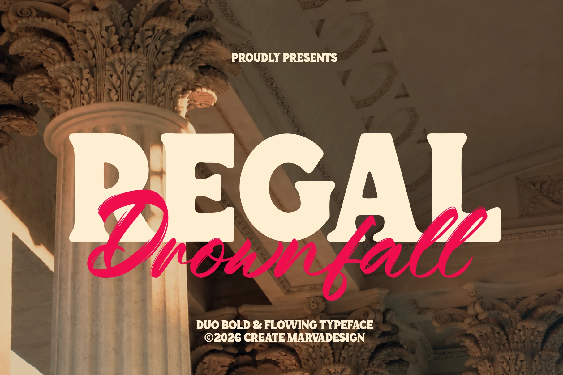
Best For: branding, logos, posters, packaging
Regal Drownfall Font pairs a weighty retro serif with a loose handwritten script, so the contrast is built right into the type system. The serif side uses thick strokes, soft corners, and broad vintage proportions, while the script adds long sweeping joins and a more expressive rhythm across the baseline.
In a Serif Fonts roundup, this one stands out when you want instant hierarchy without piling on extra effects. Let the serif handle the main word and use the script for a secondary name or accent line; that separation keeps the composition readable while giving posters, logos, and packaging a layered, cinematic feel.
The right Serif Fonts can completely change the tone of a design, from quiet editorial refinement to bold retro character or premium luxury branding. Use this collection as a shortcut when choosing type for logos, packaging, invitations, posters, magazine-style layouts, and website headers.
All of these fonts are available on Creative Fabrica, so you can explore the full previews, compare details, and download the styles that fit your next creative project. Choose the font that matches the mood of your design, keep the layout clean, and let the typography carry the visual identity.