29 Best Modern Serif Fonts for Stunning Designs in 2026
Modern Serif Fonts can make branding, editorial layouts, packaging, logos, and social graphics feel more polished without looking old-fashioned. This collection is for designers who want refined serif styles with fashion contrast, luxury details, bold display shapes, or softer handmade character.
Editorial & Fashion Modern Serif Fonts
These polished serifs use slim contrast, tall forms, and magazine-style proportions for fashion branding, covers, mastheads, and refined visual identities.
Milghera Serif Font
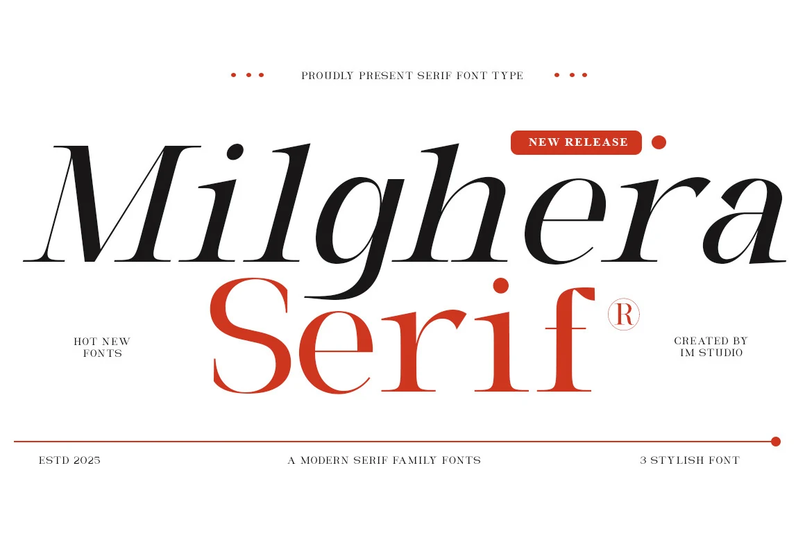
Best For: branding, magazine covers, fashion branding, editorial designs
Milghera Serif Font has the kind of high-contrast drama that feels instantly editorial. The letterforms are slim and elongated, with razor-thin hairlines, broad curves, and a softly slanted rhythm that gives headlines a polished fashion presence rather than a cold geometric look.
In a roundup of Modern Serif Fonts, Milghera stands out when you use its lighter style for oversized titles and bring in the bolder cut for supporting lines or brand marks. Keep tracking fairly tight and let the negative space do the work—those delicate serifs and sweeping joins read best in short, prominent text.
Wolmer Font
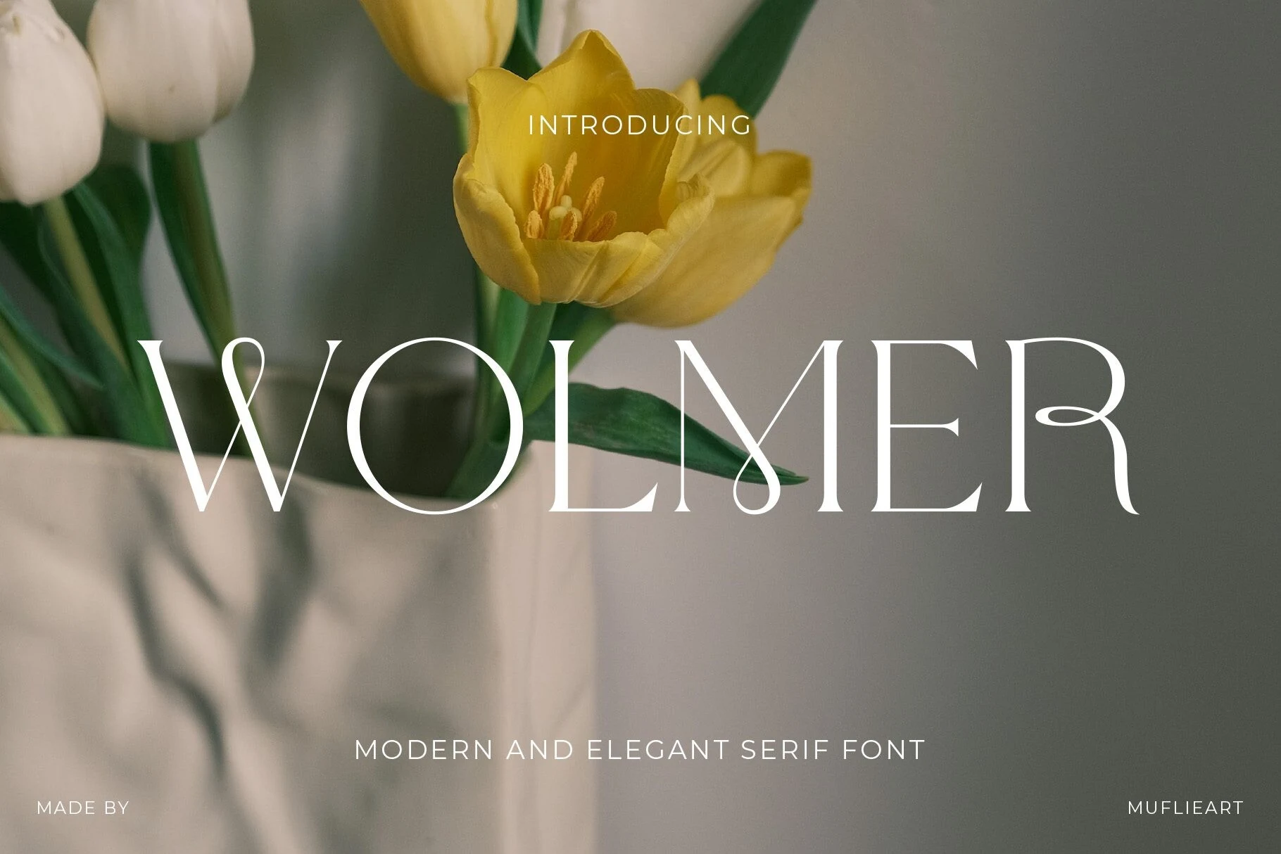
Best For: branding, magazine covers, fashion branding, editorial designs
Wolmer Font has a refined editorial presence built on tall proportions, crisp contrast, and beautifully fluid detailing. The preview shows slender stems paired with sweeping teardrop terminals and unusual crossbar connections, so even a single word feels styled rather than merely set.
If you are collecting Modern Serif Fonts with a fashion-led tone, Wolmer is strongest in large display sizes where those curved joins and airy counters stay visible. Keep body copy separate and let Wolmer handle the headline layer, especially in layouts that need soft luxury without losing structure.
Things Font
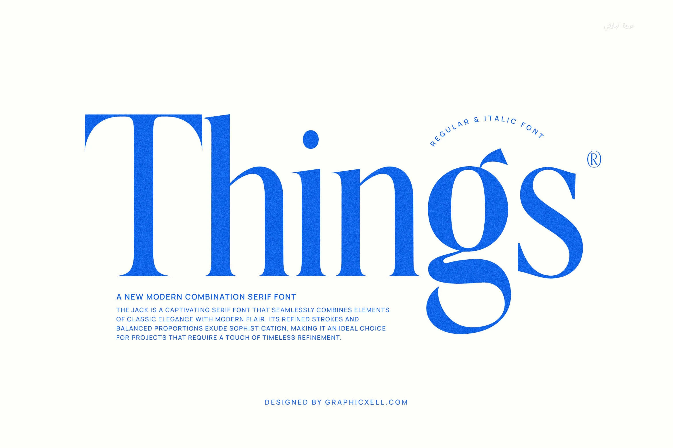
Best For: branding, magazine covers, headlines, editorial designs
Things Font has a sleek editorial feel, with tall stems, sharp contrast, and smooth curves that keep the serif structure elegant rather than severe. The oversized capital T and the sculpted tail on the g give it a stylish rhythm, while the clean proportions help the wordmark feel polished and modern.
For Modern Serif Fonts roundups, Things stands out in headlines, covers, and brand titles where the letterforms have room to breathe. It performs best in short phrases at larger sizes, and slightly relaxed spacing helps those fine joins and dramatic curves stay crisp instead of closing up.
Grandeur – Elegant Classic Serif Font
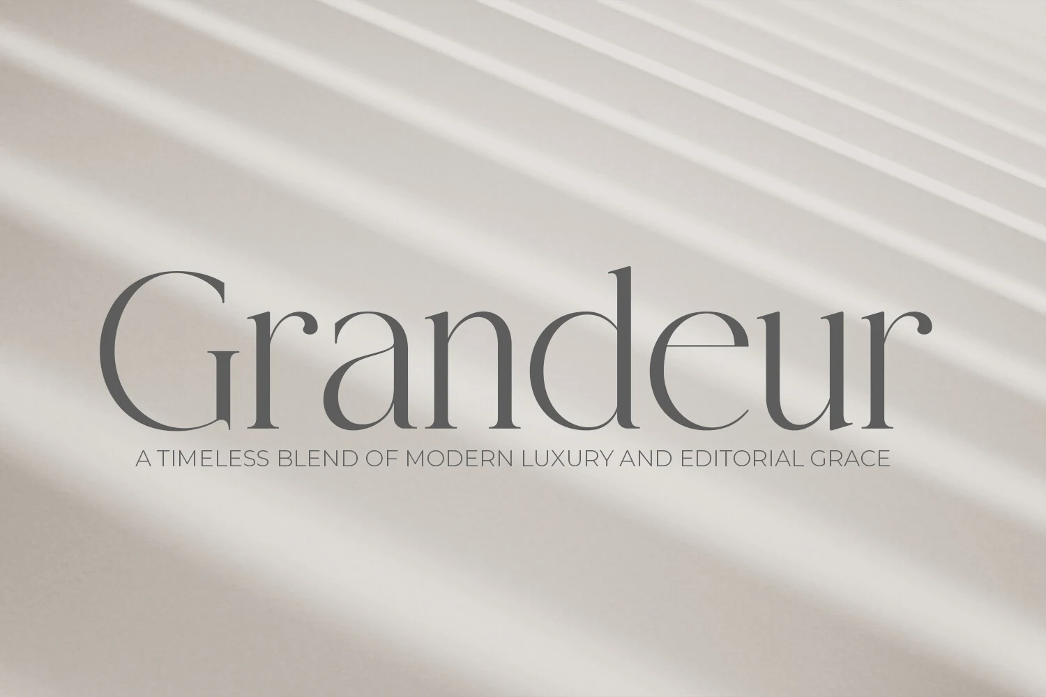
Best For: branding, magazine covers, editorial designs, luxury designs
Grandeur has a calm, polished presence built from slim high-contrast strokes, tall ascenders, and wide open counters. The letterforms feel lightly sculpted rather than ornate, which gives the serif a refined print character with a softer, more contemporary finish.
For anyone collecting Modern Serif Fonts with an editorial slant, Grandeur shines in titles, mastheads, and upscale branding where its proportions can stay visible. Give it generous scale and clean surrounding typography, and the delicate joins and elongated curves will carry the hierarchy beautifully.
Editorium Serif Font
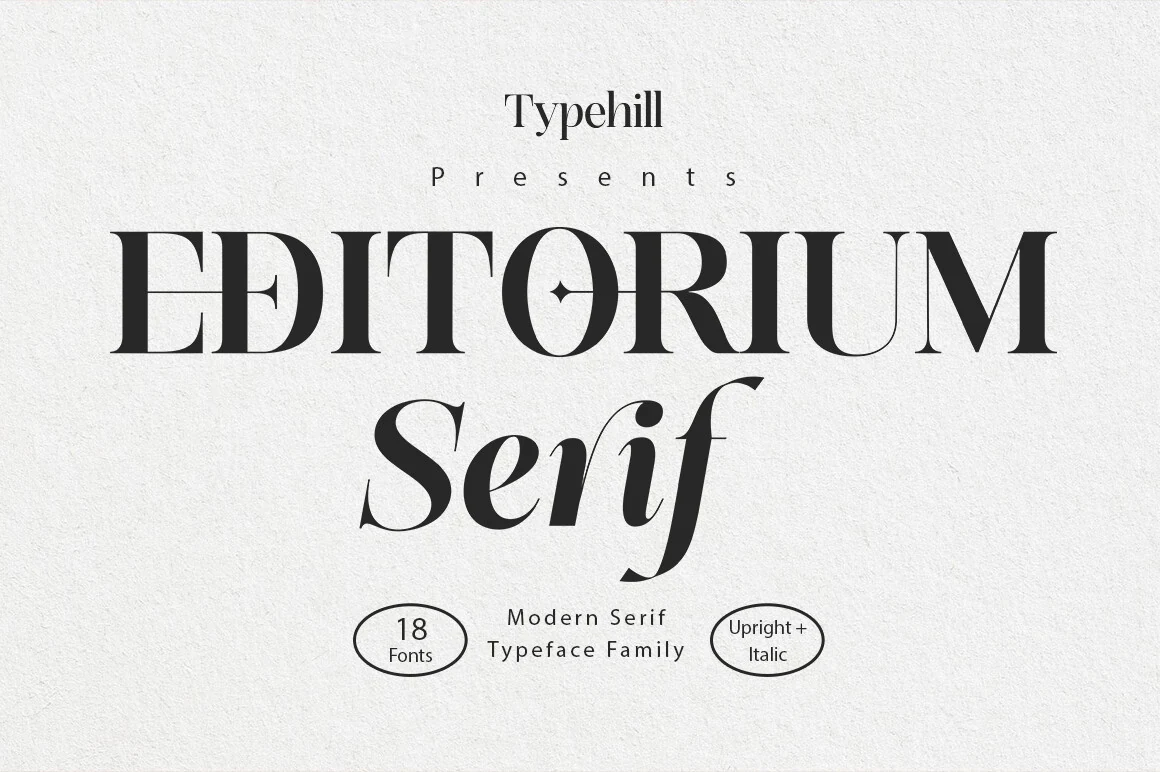
Best For: editorial designs, magazine covers, branding, headlines
Editorium Serif Font leans into a polished editorial look, pairing tall high-contrast capitals with a softer italic companion that adds movement without losing structure. The sharp serifs, narrow joins, and clean counters create a composed rhythm that feels especially suited to magazine-style typography.
For Modern Serif Fonts collections, Editorium is strongest when the upright styles handle main heads and the italic steps in for subheads or pull quotes. Its variable design helps refine hierarchy with small shifts in tone, and the details read best at display sizes where the contrast and spacing can breathe.
Aveloire Font
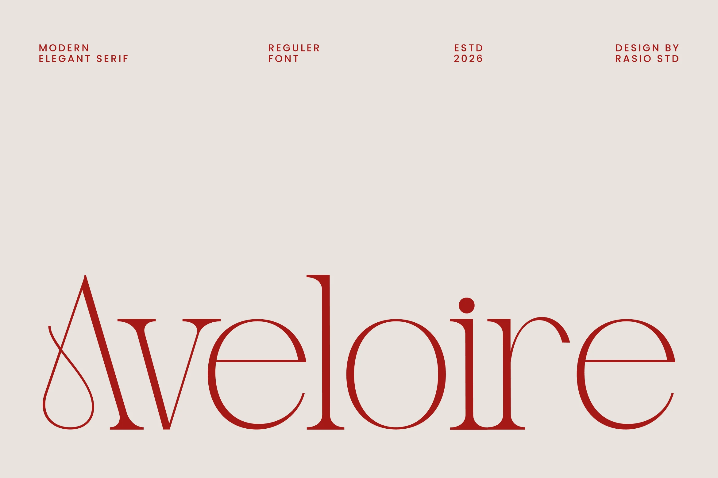
Best For: branding, magazine covers, fashion branding, editorial designs
Aveloire Font feels poised and airy, with refined proportions, slim serifs, and a striking capital A that opens with a looping teardrop flourish. The rest of the word keeps a smooth, balanced rhythm, pairing thin hairlines with rounded bowls so the overall texture stays elegant rather than overly decorative.
If your Modern Serif Fonts shortlist leans editorial, Aveloire is strongest in large headlines where its contrast and delicate terminals remain visible. It suits fashion-facing layouts especially well, and a little extra scale helps the crossbars, curves, and narrow spacing hold their polish in branding or magazine work.
Montage Font
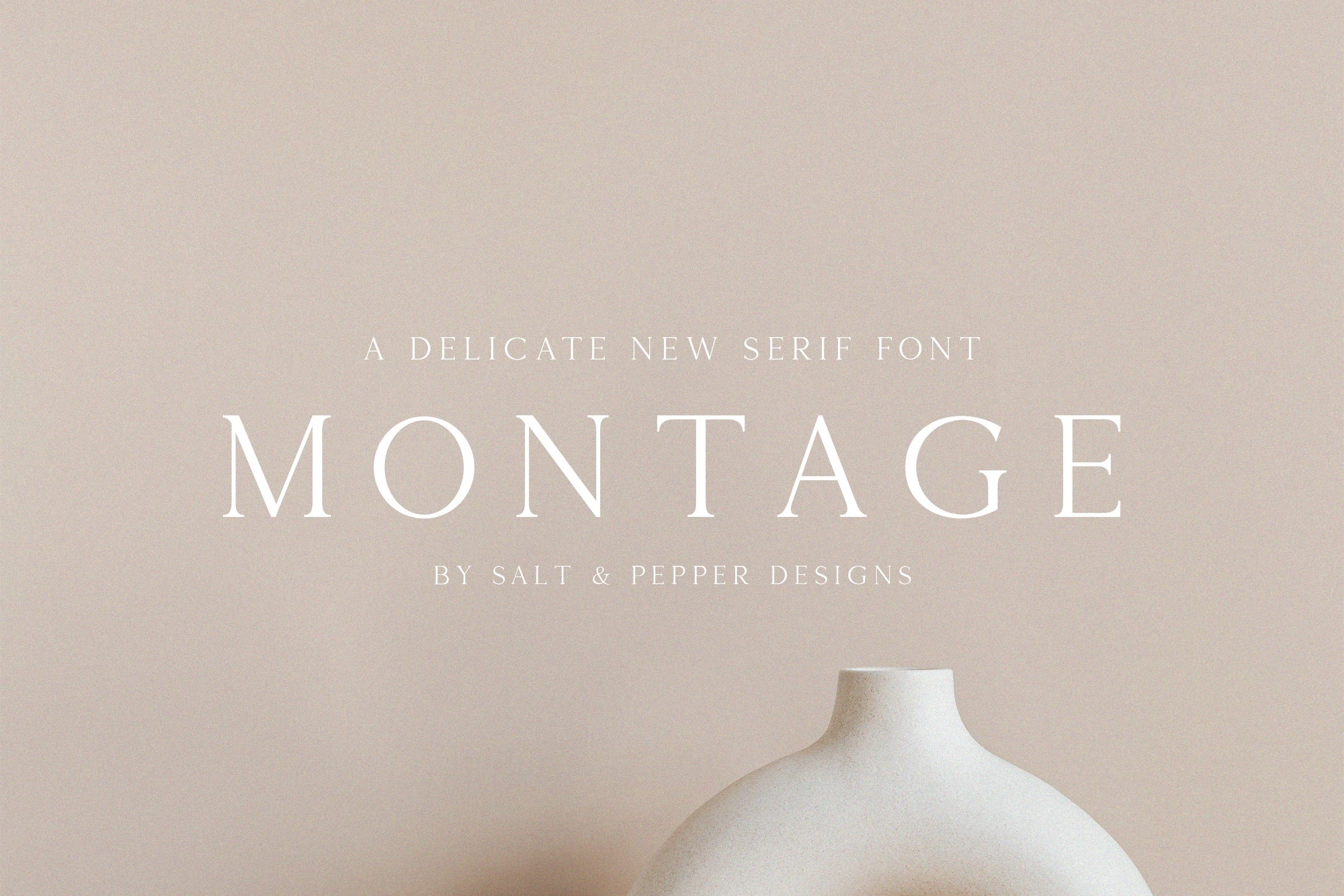
Best For: branding, editorial designs, luxury designs, fashion branding
Montage Font leans into restraint rather than drama. Its letterforms are thin, airy, and sharply refined, with delicate serifs, generous spacing, and a calm contrast that makes the words feel polished instead of heavy. The overall effect is quiet luxury, especially in large titles where the long proportions have room to breathe.
Used within Modern Serif Fonts, Montage is strongest when you want a clean, elevated tone for identity work or editorial covers. The fine strokes keep compositions light, so pairing it with ample margins and a simple secondary sans helps preserve its elegance while giving headings a clear, sophisticated hierarchy.
Ethereal Font
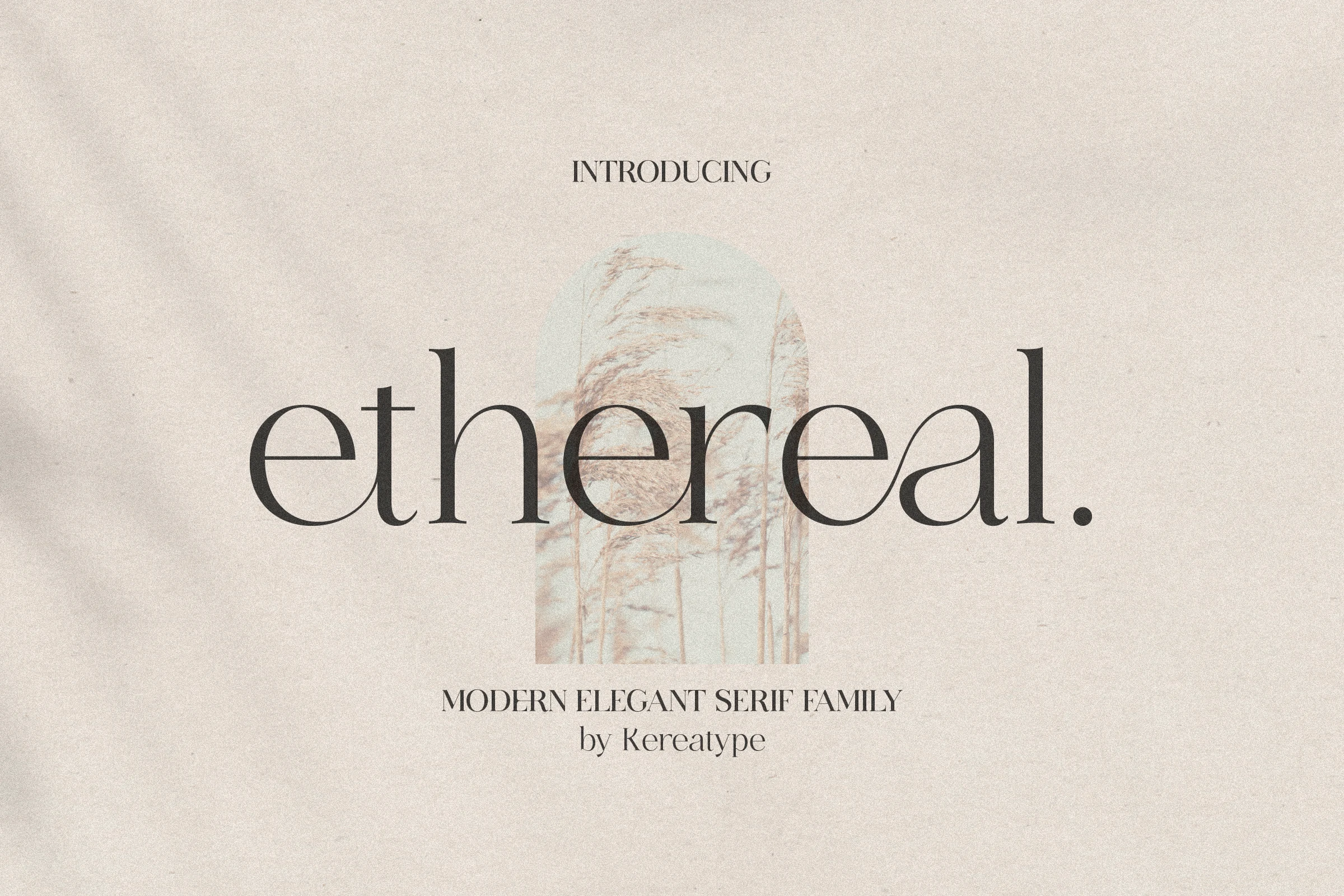
Best For: branding, editorial designs, fashion branding, luxury designs
Ethereal Font has the crisp drama of a fashion serif, with tall contrast, hairline joins, and broad curves that keep the word shapes open and graceful. In the preview, the lowercase letters feel especially polished, balancing thin strokes with fuller verticals so the font looks airy rather than fragile.
Among Modern Serif Fonts, this one is best used where scale and spacing can show off its refined proportions. The family’s multiple weights help you build a cleaner title hierarchy across logos, covers, and brand materials, while the distinctive terminals give short words a stylish editorial finish.
The Foriene Serif Font
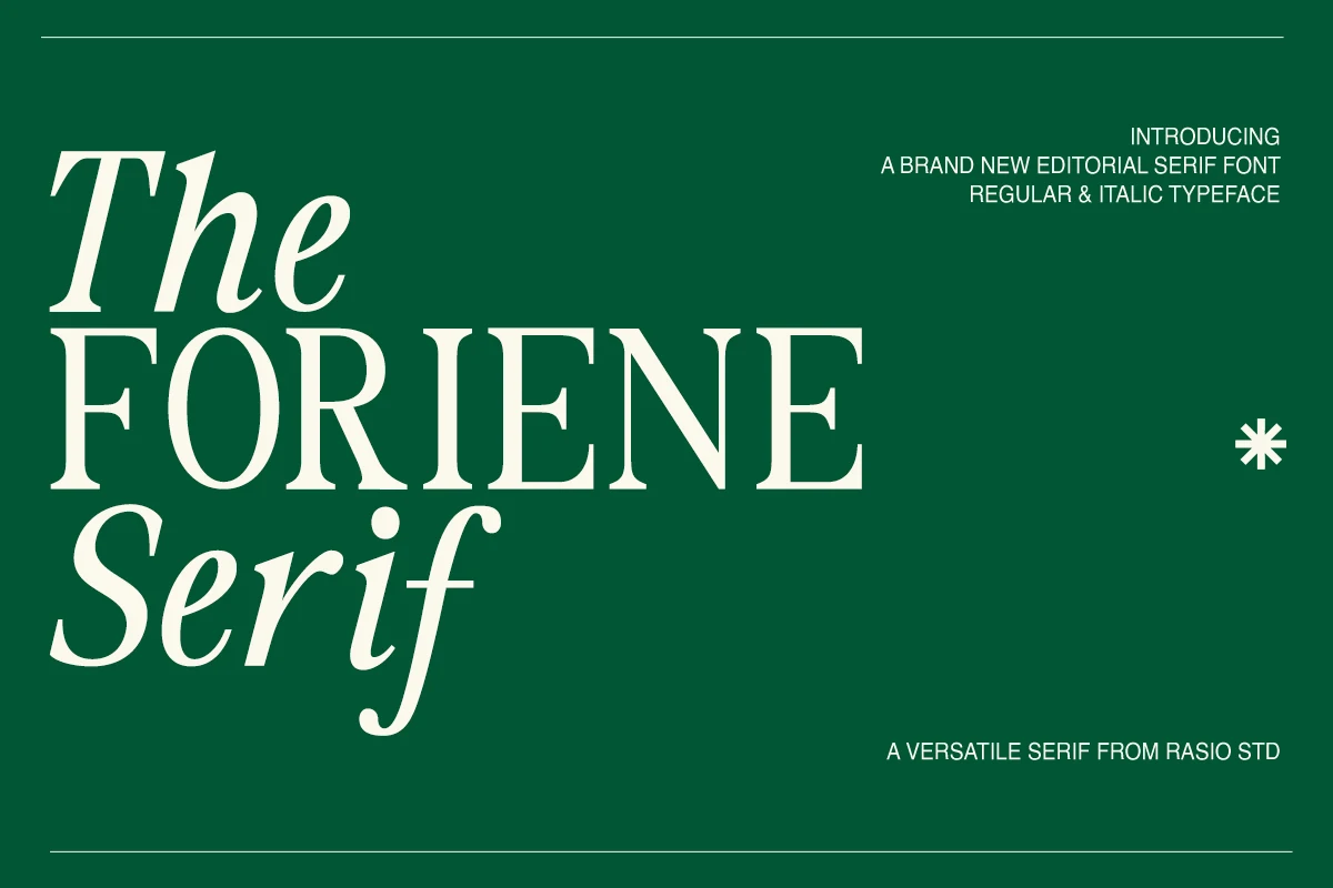
Best For: branding, editorial designs, magazine covers, fashion branding
The Foriene Serif Font has a poised editorial voice, with balanced proportions, graceful contrast, and a clear shift between upright and italic styles. In the preview, the tall capitals feel crisp and composed, while the italic forms add softness and movement, giving headlines a polished rhythm without losing readability.
For Modern Serif Fonts, Foriene is especially effective when you want a clean hierarchy across covers, branding, or ad layouts. Its refined serif structure holds up beautifully in large titles, and the regular-plus-italic pairing helps introduce contrast within one family, making it easier to separate names, subheads, and feature lines.
Luxury & High-Contrast Modern Serif Fonts
This group focuses on sharp contrast, fine hairlines, and upscale display details for luxury logos, premium packaging, wedding designs, and elegant headlines.
Luxurimo Font
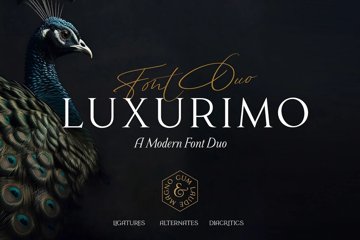
Best For: luxury designs, branding, wedding designs, high-end designs
Luxurimo Font pairs a crisp modern serif with a fine signature script, giving the layout a controlled luxury rhythm rather than a purely decorative one. The serif side uses tall capitals, sharp contrast, and wide spacing, while the script adds narrow strokes and sweeping loops for a softer secondary accent.
For Modern Serif Fonts collections, this duo works best when the serif carries the main title and the script stays above or beside it as a small mark. Keep the contrast intentional: generous letter spacing on the capitals, restrained script length, and enough dark or quiet space around both styles so the hierarchy stays clean.
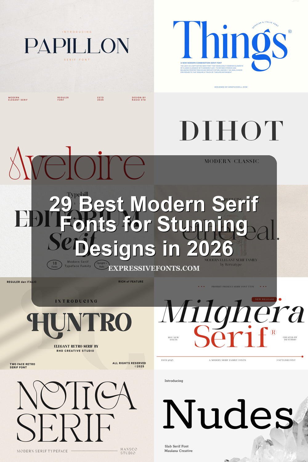
Dihot Font
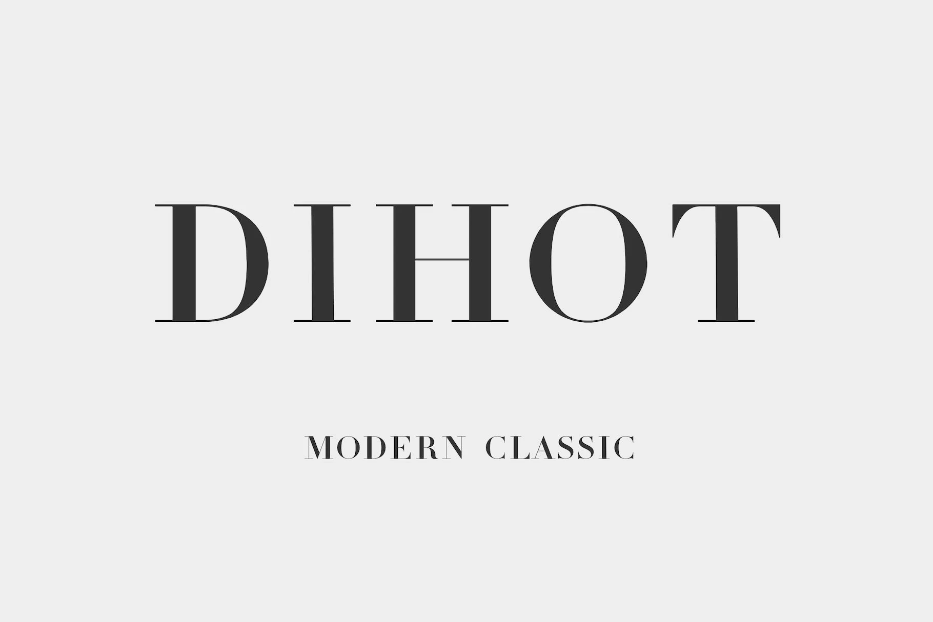
Best For: editorial designs, magazine covers, branding, luxury designs
Dihot Font has the crisp elegance you expect from a Didot-inspired serif: strong verticals, razor-thin hairlines, and generous contrast that makes each capital feel polished and deliberate. The wide spacing in the preview adds even more air, giving the letters a refined, gallery-like presence.
Within Modern Serif Fonts, Dihot is especially effective for mastheads, luxury branding, and editorial titles where its fine details can stay visible. Keep it at larger sizes and avoid crowding the tracking too much, since the sharp serifs and delicate joins do their best work when the composition feels open and controlled.
Amsio Elegant Serif Font
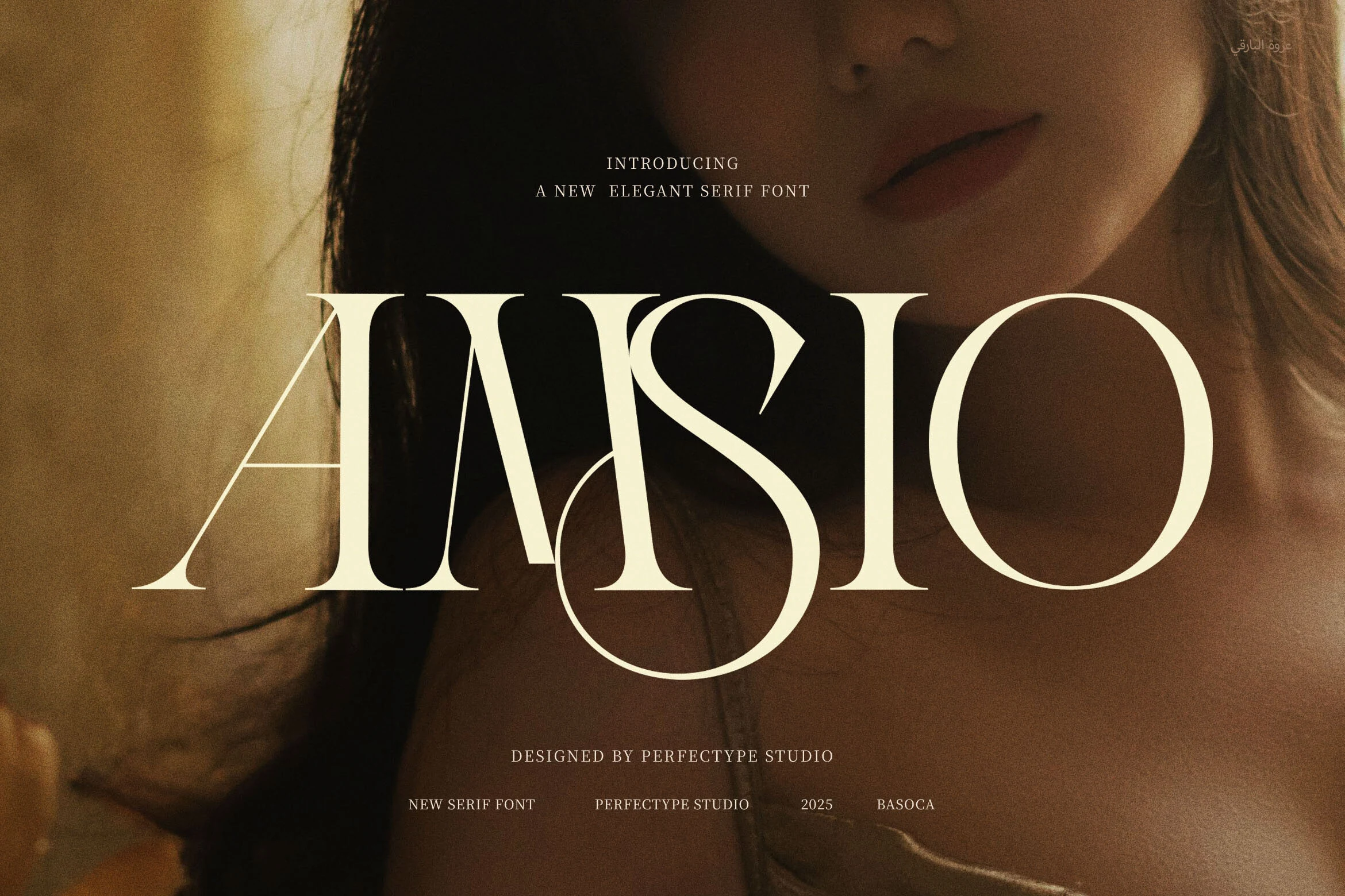
Best For: fashion branding, magazine covers, luxury designs, packaging
Amsio Elegant Serif Font has a polished editorial presence, built around tall proportions, heavy vertical stress, and fine hairline curves. Its sharp serif details and sweeping internal shapes give the letters a dramatic fashion-magazine rhythm without making the wordmark feel crowded.
For Modern Serif Fonts, Amsio works best when the typography is allowed to act as the main visual element. Use generous contrast against the background and avoid overly tight tracking, since the thin strokes and curved intersections need clear space to keep logos, covers, and packaging titles crisp.
Vogane Font
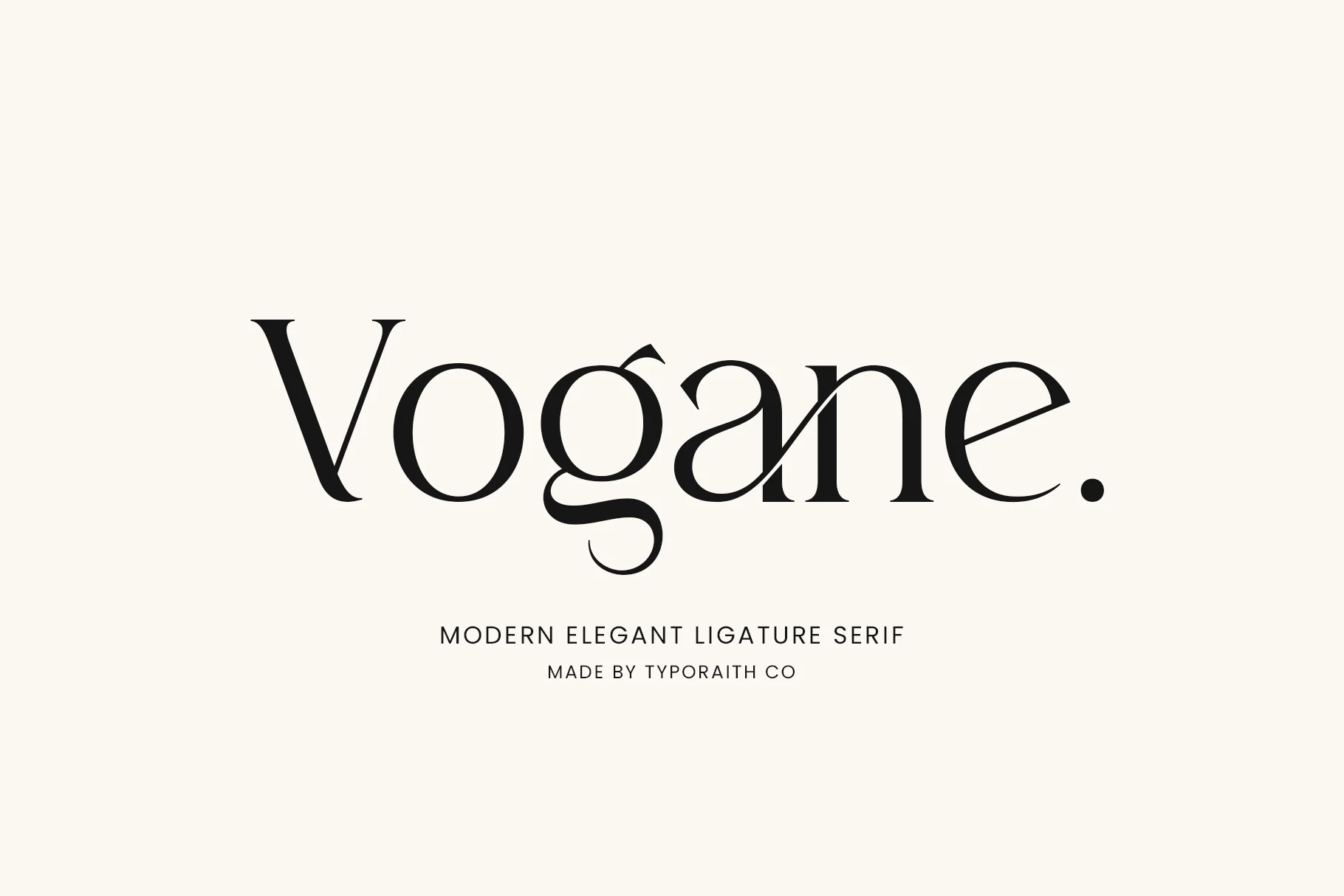
Best For: logos, editorial designs, packaging, high-end designs
Vogane has a clean fashion-led presence, with crisp contrast, smooth oval counters, and a few sculpted details that keep the letterforms from feeling rigid. The generous curves and neatly cut serifs give it a polished rhythm, while the elegant ligature styling adds a softer, more distinctive signature.
Within Modern Serif Fonts, this one feels especially strong for identity work and refined editorial layouts. Its alternates help shape a more custom-looking wordmark, and the design reads best when you keep the hierarchy simple and let the spacing stay open enough for the delicate joins and terminals to show clearly.
Hermione Modern Serif Font
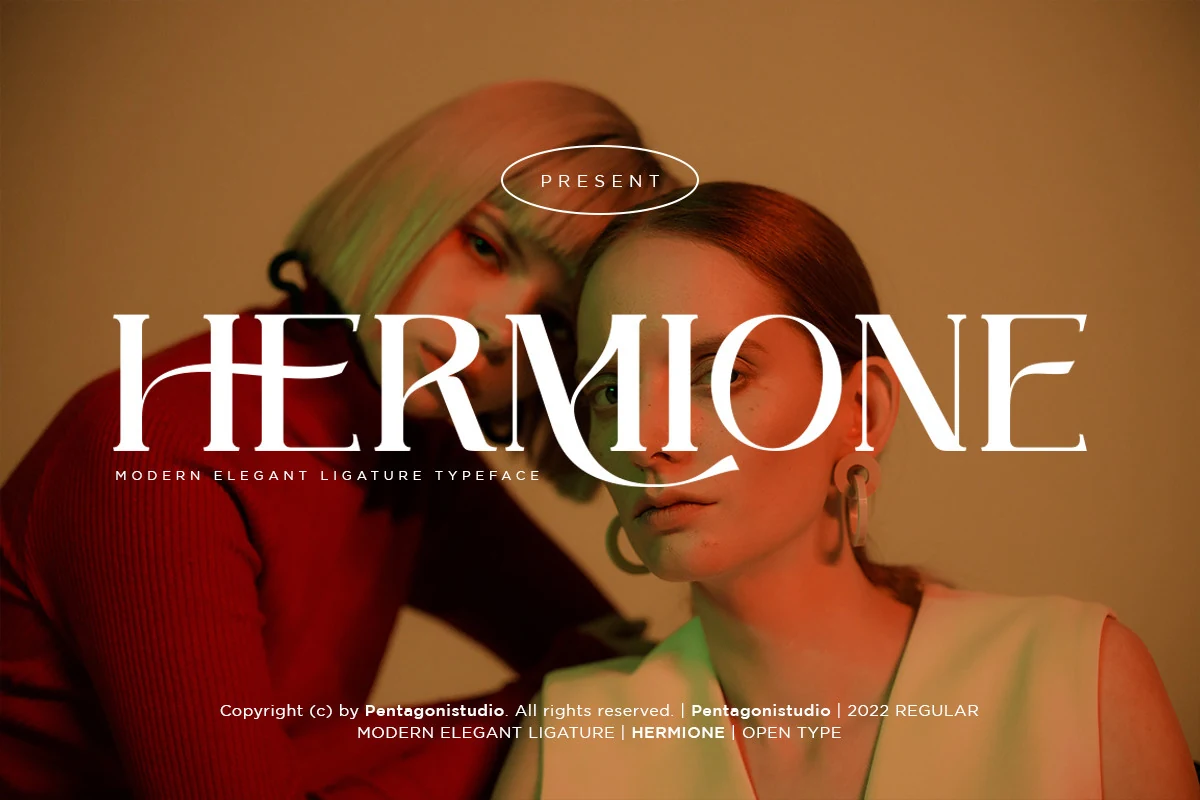
Best For: logos, branding, editorial designs, fashion branding
Hermione Modern Serif Font has a sleek editorial look built on crisp contrast, narrow joins, and tall capitals with poised, sculpted curves. In the preview, the letterforms feel refined but assertive, giving large headings a polished fashion tone rather than a delicate, airy one.
If you are comparing Modern Serif Fonts, Hermione is strongest in short display settings where its stylistic alternates and ligatures can shape more distinctive wordmarks. Those features help titles feel less generic and more custom, especially for branding or cover layouts where a few elegant letters need to carry the whole composition.
Swash & Ligature Modern Serif Fonts
These modern serifs add decorative curves, ligatures, and swashed terminals for custom-looking logos, invitations, beauty branding, and short display titles.
Bezoria – Elegant Serif Font
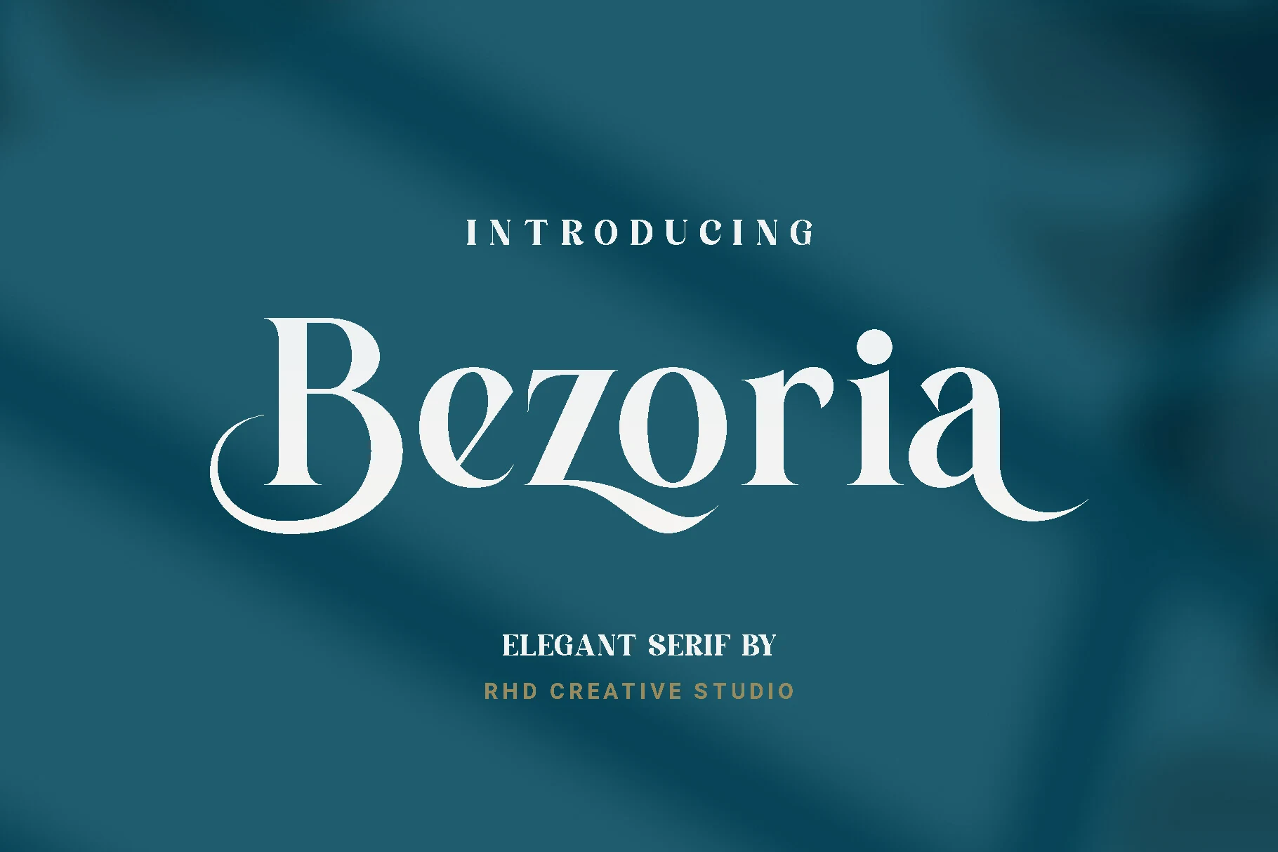
Best For: logos, wedding designs, branding, editorial designs
Bezoria has a poised, fashion-leaning silhouette, with crisp contrast, fine hairlines, and generous curves that keep the serif feeling graceful rather than stiff. The oversized capital B and the sweeping tail on the final letter add a refined flourish, so even a short wordmark feels polished.
For designers exploring Modern Serif Fonts, Bezoria works best when the main line stays clean and prominent, then quieter supporting text handles the details. Its elegant swashes and narrow joins read beautifully in logos, stationery, and editorial headings where a little extra space preserves the shape.
Notica Serif Font
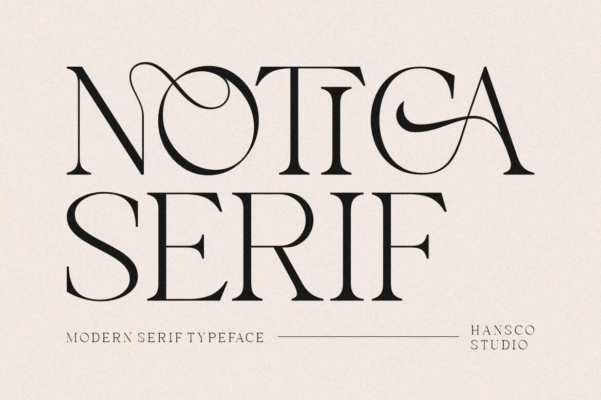
Best For: logos, branding, packaging, wedding designs
Notica Serif Font has a poised display look, built from tall capitals, crisp serif edges, and strong thick-to-thin contrast. The looping swashes threaded through a few letters give the design a romantic lift, while the clean proportions keep it feeling polished rather than overly decorative.
If you’re exploring Modern Serif Fonts, Notica shines in short titles and identity work where its elegant details can stay visible. Use the ligatures or stylistic alternates with restraint, pair it with quieter supporting type, and leave enough spacing around the wordmark so the fine strokes and sweeping terminals remain sharp.
Rusilla Serif Font
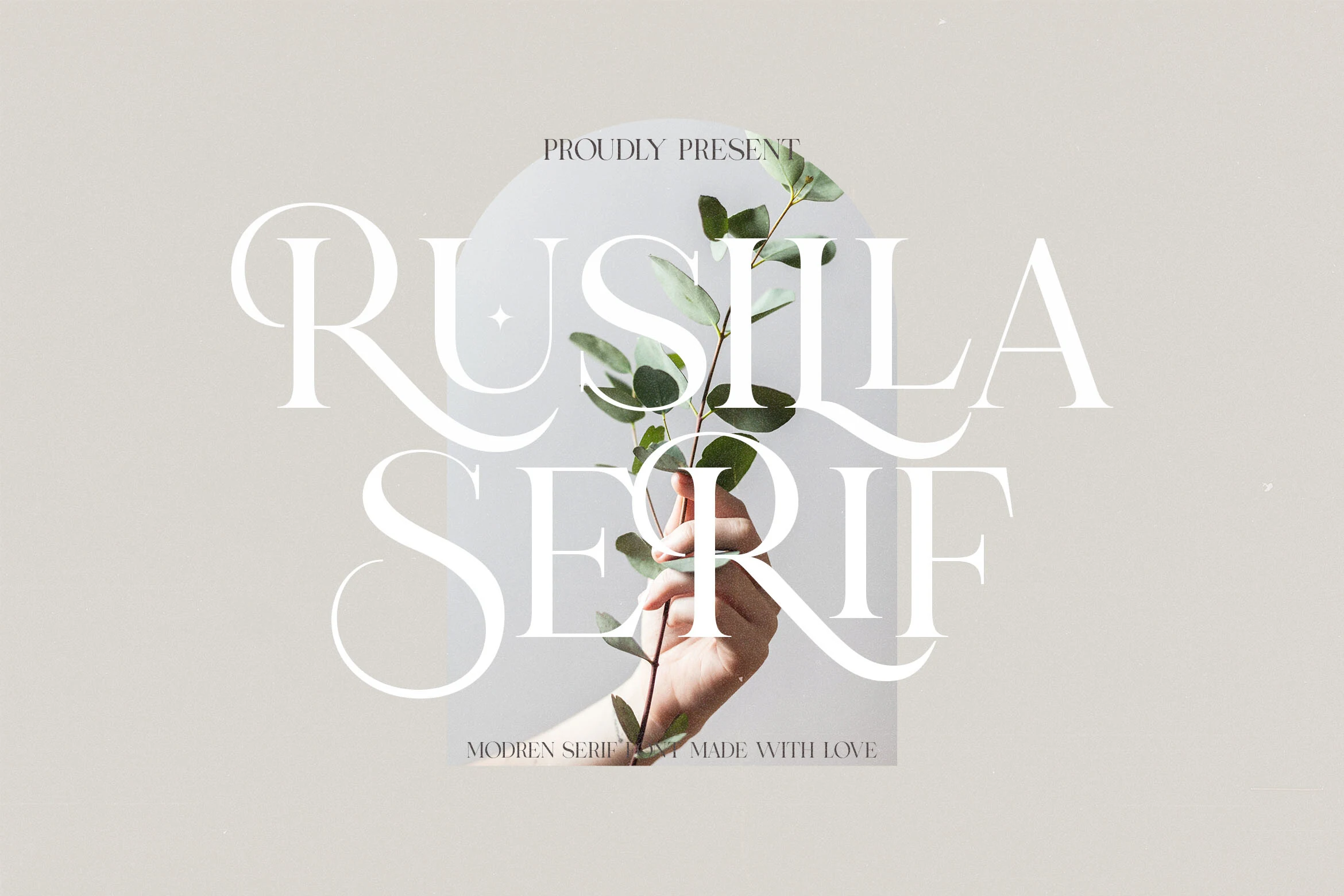
Best For: invitations, logos, wedding designs, fashion branding
Rusilla Serif Font has a refined fashion-editorial presence, with high contrast strokes, very slim joins, and long sweeping terminals that give the capitals a graceful, almost calligraphic flow. In the preview, the oversized letters stretch elegantly across the layout, while the sharp serifs keep the overall look crisp and formal.
If you’re exploring Modern Serif Fonts, Rusilla works best when you let those dramatic curves lead the composition. Short titles, logo treatments, and invitation headings suit it well, especially when paired with generous spacing so the flourishes and elongated forms do not crowd each other.
Balgind Modern Serif Font
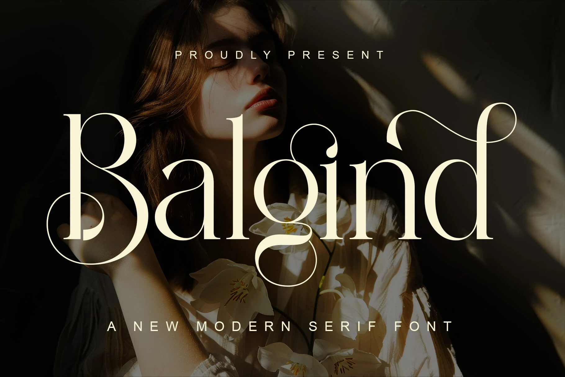
Best For: logos, editorial designs, beauty branding, fashion branding
Balgind Modern Serif Font brings high contrast, elongated curves, and dramatic ligatures into a distinctly polished serif style. The preview shows slim joins and sweeping terminals that soften the structure, giving the letters a graceful feminine flow while keeping the overall silhouette crisp and luxurious.
For Modern Serif Fonts, Balgind stands out in short display settings where those ligatures can shape a more custom wordmark. It works best when you give the letterforms room to breathe, especially in logos, covers, or beauty-led branding where the refined curves become part of the visual identity.
Bold & Structured Modern Serif Fonts
Choose these fonts when the design needs stronger weight, sturdy proportions, or architectural impact for posters, signage, headers, and bold brand marks.
Nudes Slab Serif Font
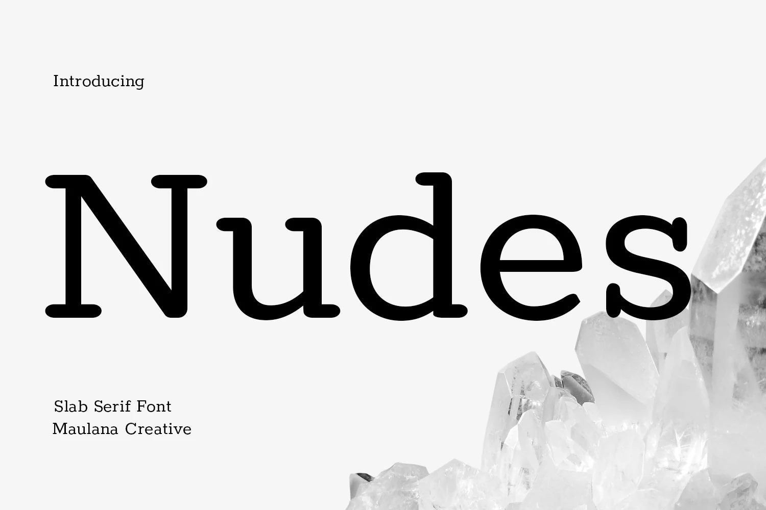
Best For: logos, book covers, headlines, signage
Nudes Slab Serif Font has a soft graphic presence that feels more friendly than formal. The preview shows broad slab serifs, rounded joins, and compact counters, giving each letter real weight while keeping the overall tone clean and approachable.
In a set of Modern Serif Fonts, this one is a strong choice when you want a sturdy headline without harsh edges. It works best in logos, covers, and short display lines, and a touch of extra spacing helps the thick strokes and curved terminals stay clear.
Patcher Font
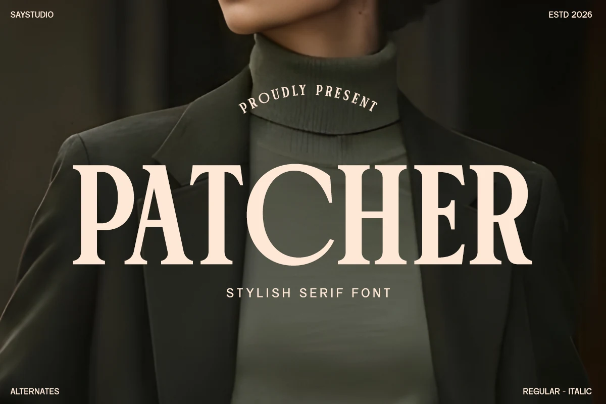
Best For: fashion branding, editorial designs, magazine covers, luxury designs
Patcher Font has a confident editorial silhouette, with tall capitals, firm serifs, and clean high contrast that gives headlines a polished fashion tone. The broad proportions keep the wordmark readable, while the sharp edges and compact counters add enough authority to make short titles feel deliberate.
In a lineup of Modern Serif Fonts, Patcher works especially well when you want the main line to carry the whole composition. It suits branding, magazines, and packaging best at display size, where its contrast stays crisp and a little extra breathing room around the text helps the structure look refined rather than crowded.
Muzzaro Font
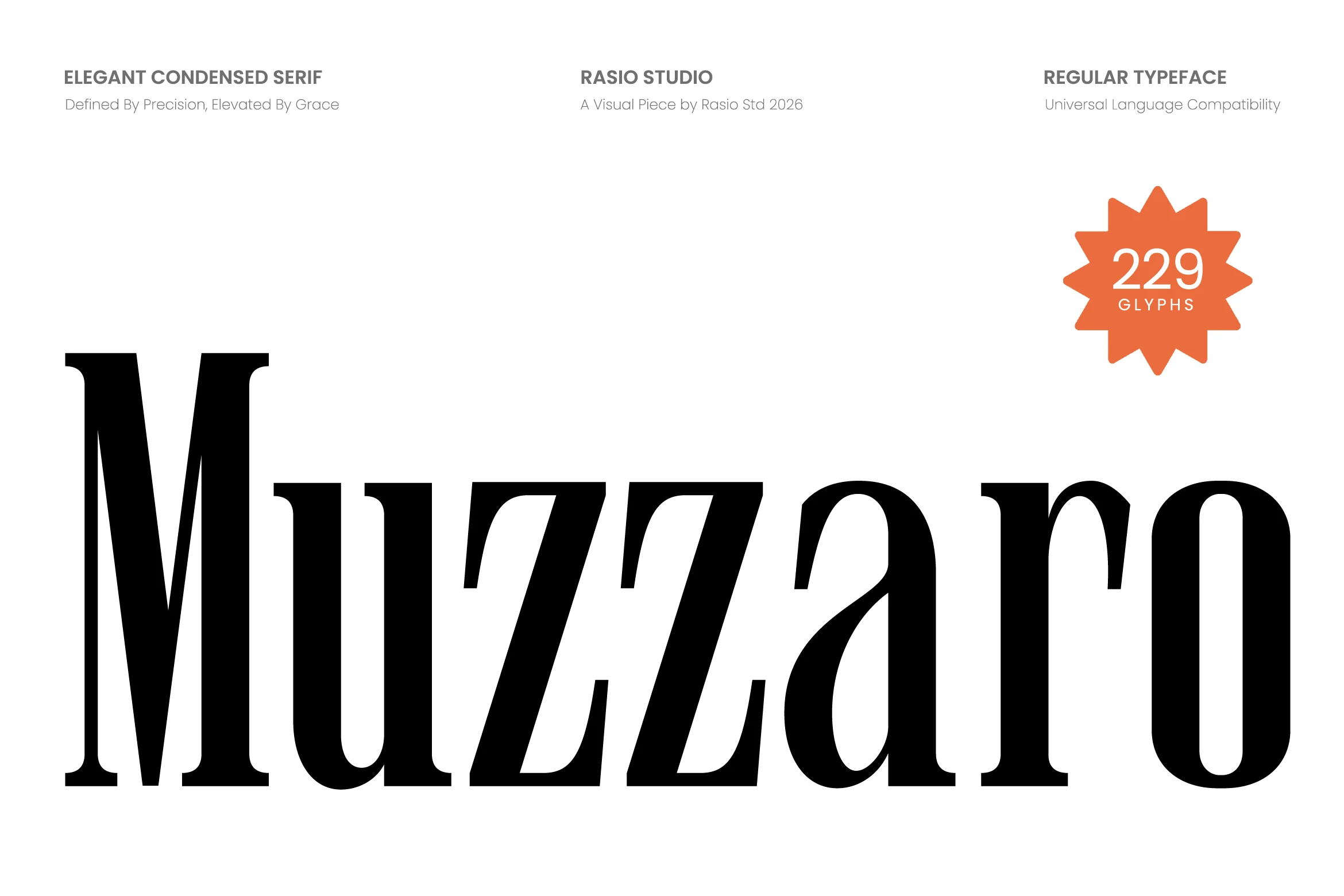
Best For: fashion branding, magazine covers, editorial designs, premium designs
Muzzaro Font has a commanding editorial look built around tall condensed proportions, crisp high-contrast strokes, and sharp serif cuts. The letters feel narrow and sculpted rather than delicate, which gives headlines a confident vertical rhythm and a polished luxury tone.
If your Modern Serif Fonts selection leans toward fashion and print-inspired layouts, Muzzaro is strongest in large titles where its slim structure can stay visible. It handles tight spaces well, but a little extra line spacing helps the dense forms breathe and keeps the contrast clean in covers, branding, or packaging-style compositions.
Luxena Font
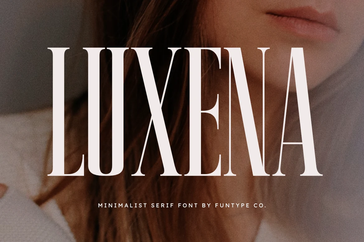
Best For: logos, headlines, posters, luxury designs
Luxena Font has a tall, condensed serif build with heavy vertical stems, thin internal cuts, and sharply controlled curves. The narrow capitals give it a strict fashion-editorial rhythm, while the high contrast keeps the wordmark forceful rather than soft.
For Modern Serif Fonts that need impact, Luxena works best as a headline or logo face with generous tracking and strong background contrast. The supplied OTF and TTF files support practical use across common design software without changing the font’s clean, precise display character.
Charman Serif Font
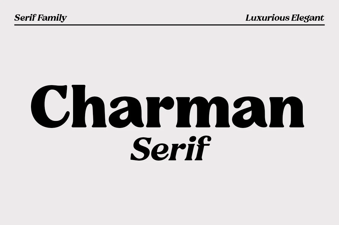
Best For: logos, branding, headlines, luxury designs
Charman Serif Font has a heavy, polished serif structure with rounded stress, firm vertical strokes, and soft bracketed terminals that keep the letters bold without looking harsh. Its wide lowercase forms give headlines a confident rhythm, while the italic styling in the preview adds a more editorial, dressed-up note.
For Modern Serif Fonts, Charman is useful when a layout needs strong title hierarchy rather than delicate detail. The 20-weight family gives designers room to build contrast between logo marks, section titles, and supporting text while keeping the same refined serif voice across the composition.
Mirow Serif Font
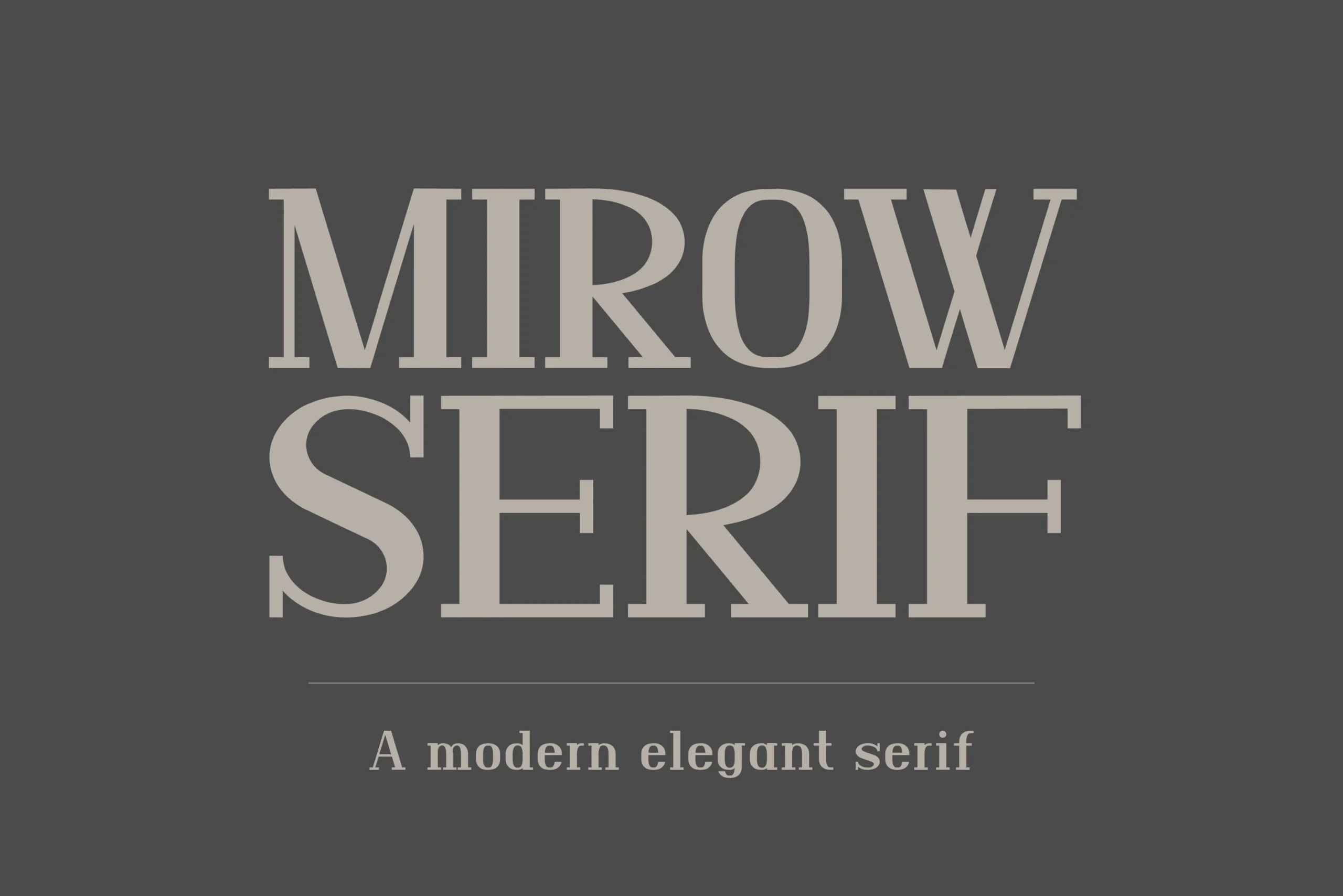
Best For: branding, signage, editorial designs, high-end designs
Mirow Serif has a stately display presence, with structural all-caps forms, sharp slab serifs, and strong vertical stems that make each letter feel carved and deliberate. The symmetrical counters keep the layout disciplined, so even at a large scale the texture stays clean rather than busy.
Among Modern Serif Fonts, Mirow is especially effective when you want typography to carry authority on its own. Its high contrast and substantial proportions suit short headlines, logos, and signage best, and it performs well with generous spacing and a restrained layout that lets the architectural letterforms hold the visual weight.
Luxora Serif Font
Best For: branding, headlines, modern designs, elegant designs
Luxora Serif Font has a polished display presence, yet the letterforms feel inviting instead of stiff. The preview shows medium contrast, broad curves, and slightly rounded serifs that soften the classic structure, giving the capitals a clean rhythm with a gentle, approachable finish.
Within Modern Serif Fonts, Luxora works especially well for short headlines and identity pieces where its open shapes can stay crisp at scale. Its balanced proportions make hierarchy easy to control, and pairing it with a quiet sans helps the softer serif details hold the spotlight without crowding the layout.
Retro & Handcrafted Modern Serif Fonts
This set covers nostalgic, slab, and hand-drawn serif styles that work well for posters, labels, rustic branding, quotes, and more character-led layouts.
Huntro – Elegant Retro Serif Font
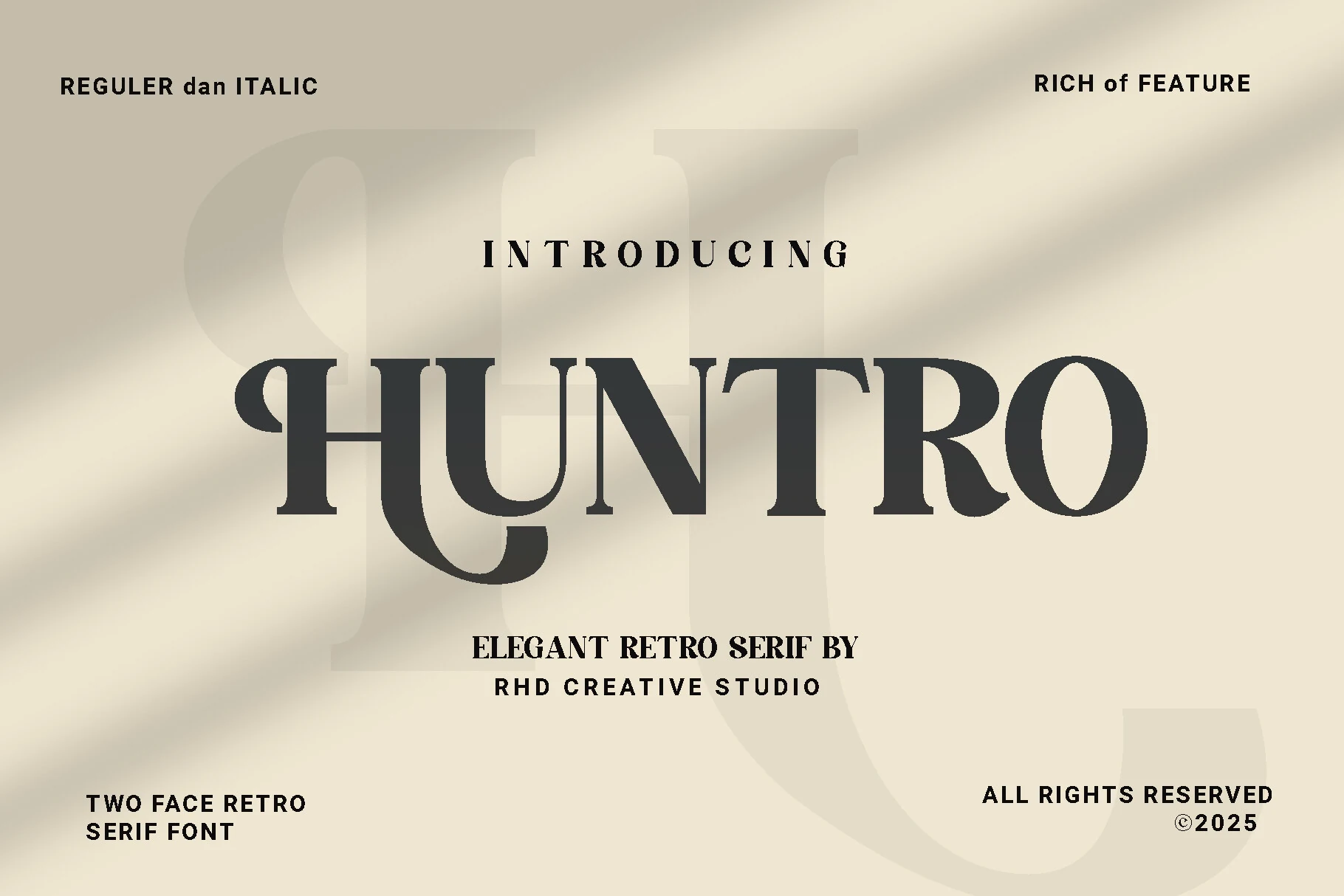
Best For: branding, posters, retro designs, editorial designs
Huntro has a confident retro voice, built from thick verticals, crisp contrast, and sculpted serifs that give the letters a carved, poster-like presence. The preview also shows distinctive curves in the H, U, and R, which keep the design elegant rather than heavy.
Within a collection of Modern Serif Fonts, Huntro works best when you let it lead the composition in short headlines or brand names. Its stronger details hold up well at display size, and pairing it with simpler secondary text helps the dramatic shapes and vintage rhythm stay clear.
Retpack Serif Font
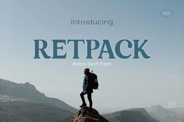
Best For: posters, website headers, social media graphics, retro designs
Retpack Serif Font has a sturdy retro silhouette with broad serifs, rounded bowls, and a slightly softened structure that keeps the heavy weight from feeling stiff. The capitals read bold and confident, with enough curve in the counters and terminals to give the face a friendly vintage pull.
If you want Modern Serif Fonts with a nostalgic edge, Retpack is strongest in large titles for digital banners, posters, and social graphics. Its shape holds attention quickly, so short words and compact headline lines work best, especially when paired with simpler secondary text that lets the retro forms stay in focus.
Wildflower Apothecary Font
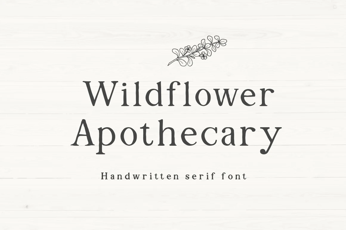
Best For: logos, invitations, quotes, T-shirts
Wildflower Apothecary Font has a gentle handmade feel, with softly uneven serifs, rounded curves, and the kind of organic wobble that keeps it warm rather than polished. The letterforms feel rustic and personal, which gives larger words a calm, handcrafted presence.
If you like Modern Serif Fonts with more character, this one works especially well for signs, labels, and invitation-style layouts. The regular and bold variations help build simple hierarchy, and the slightly imperfect edges look best when you keep the text short enough for that texture to stay visible.
The Serif Hand Font
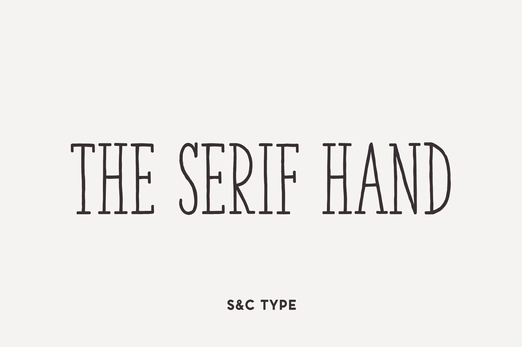
Best For: branding, headlines, editorial designs, modern designs
The Serif Hand Font has the charm of hand-drawn lettering, but its structure stays disciplined. The preview shows tall, narrow uppercase forms, steady line weight, and lightly flared serif endings that keep each letter crisp and easy to read. That balance gives it personality without turning overly decorative.
Within Modern Serif Fonts, it works especially well when you want a human touch without losing order. Its condensed proportions help longer headlines sit neatly in narrow spaces, and the even rhythm makes title hierarchy feel clean across branding, posters, and editorial layouts.
Conclusion
Start with editorial and fashion serifs if you need magazine polish, choose high-contrast or swash styles for luxury branding, and use bold, retro, or handcrafted options when the design needs stronger personality.