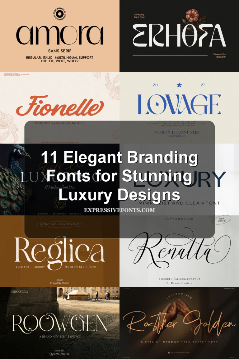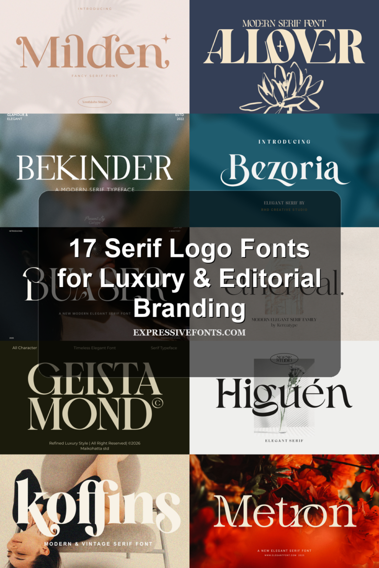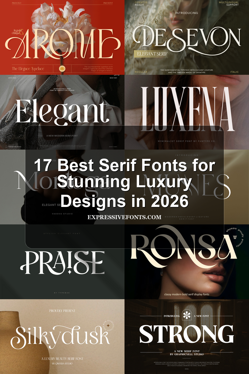
17 Best Serif Fonts for Stunning Luxury Designs in 2026
Best Serif Fonts can give logos, magazine covers, packaging, and luxury branding a sharper editorial voice. This curated list is built for designers who need high-contrast, elegant, bold, or refined serif typefaces for premium visual projects.
Browse by Category
Bold & Dramatic Serif Fonts
These serif fonts use heavy contrast, strong proportions, and visible display details, making them best for logos, covers, posters, and headlines that need immediate visual weight.
Ronsa Font
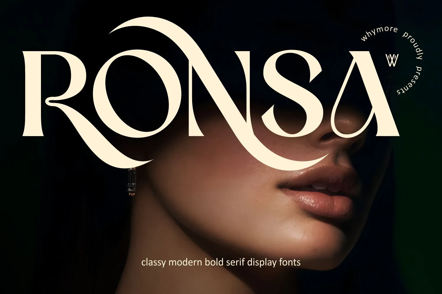
Best For: logos, magazine covers, fashion branding, luxury designs
Ronsa Font uses a bold high-contrast serif structure with wide vertical weight, thin hairline joins, flared terminals, and dramatic sweeping curves. The oversized leg of the R, curled N stroke, and sharp-cut S give it a luxury display tone without making the letters feel overly ornamental.
Ronsa fits searches for Best Serif Fonts when the design needs a strong editorial wordmark rather than quiet body text. Keep it to short titles, add enough spacing around the longer swashes, and pair it with restrained secondary type so the high-contrast shapes stay dominant.
Moon Creme Font
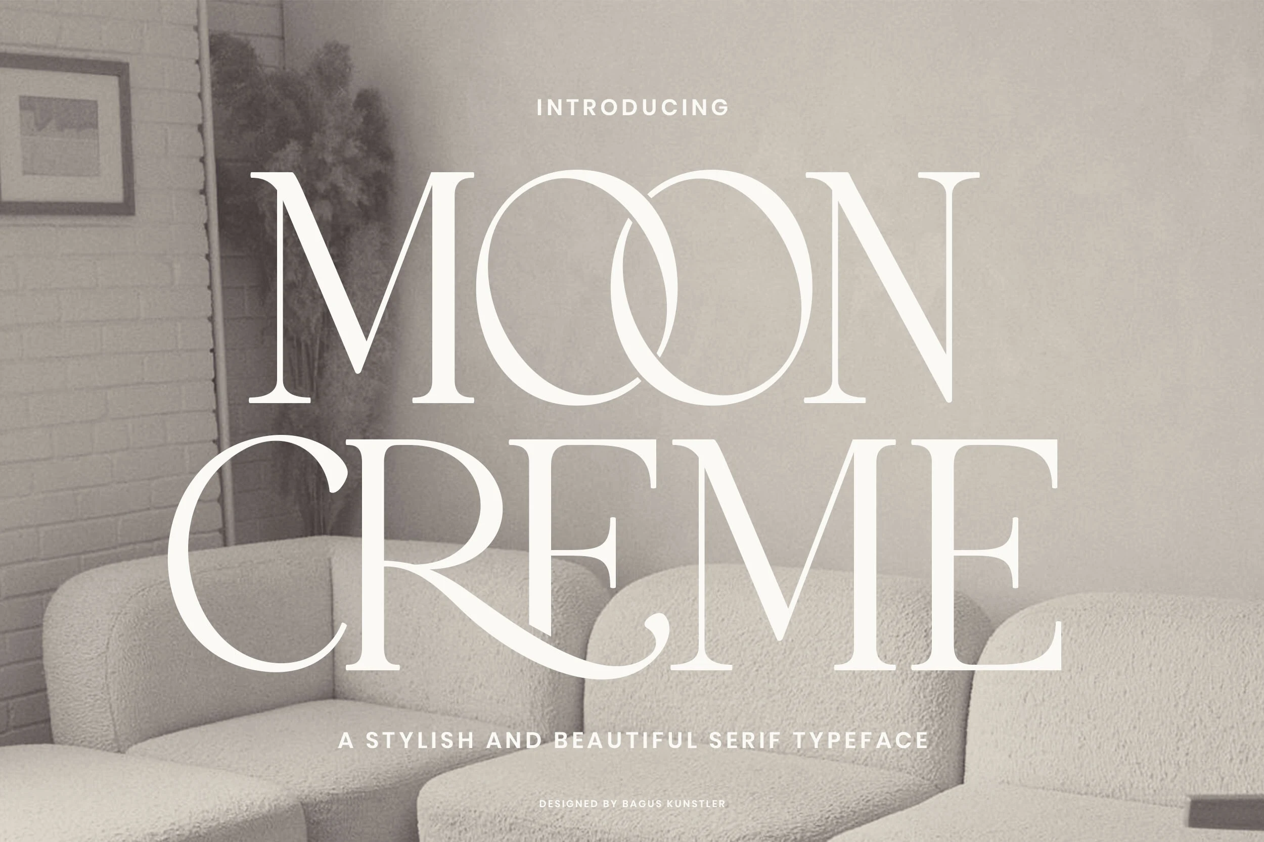
Best For: logos, magazine covers, editorial designs, luxury designs
Moon Creme Font uses tall high-contrast serif capitals, wide round bowls, and crisp hairline joins to create a polished display look. The interlocking double O becomes the visual hook right away, while the long curved leg on the R adds a vintage flourish that keeps the wordmark graceful instead of severe.
If you are exploring Best Serif Fonts for statement typography, Moon Creme works best in short headlines or logos where its contrast and decorative details have space to breathe. Keep supporting text restrained and let the title lead the hierarchy, otherwise the sweeping forms can start to compete with the rest of the layout.
Savage Roses Font
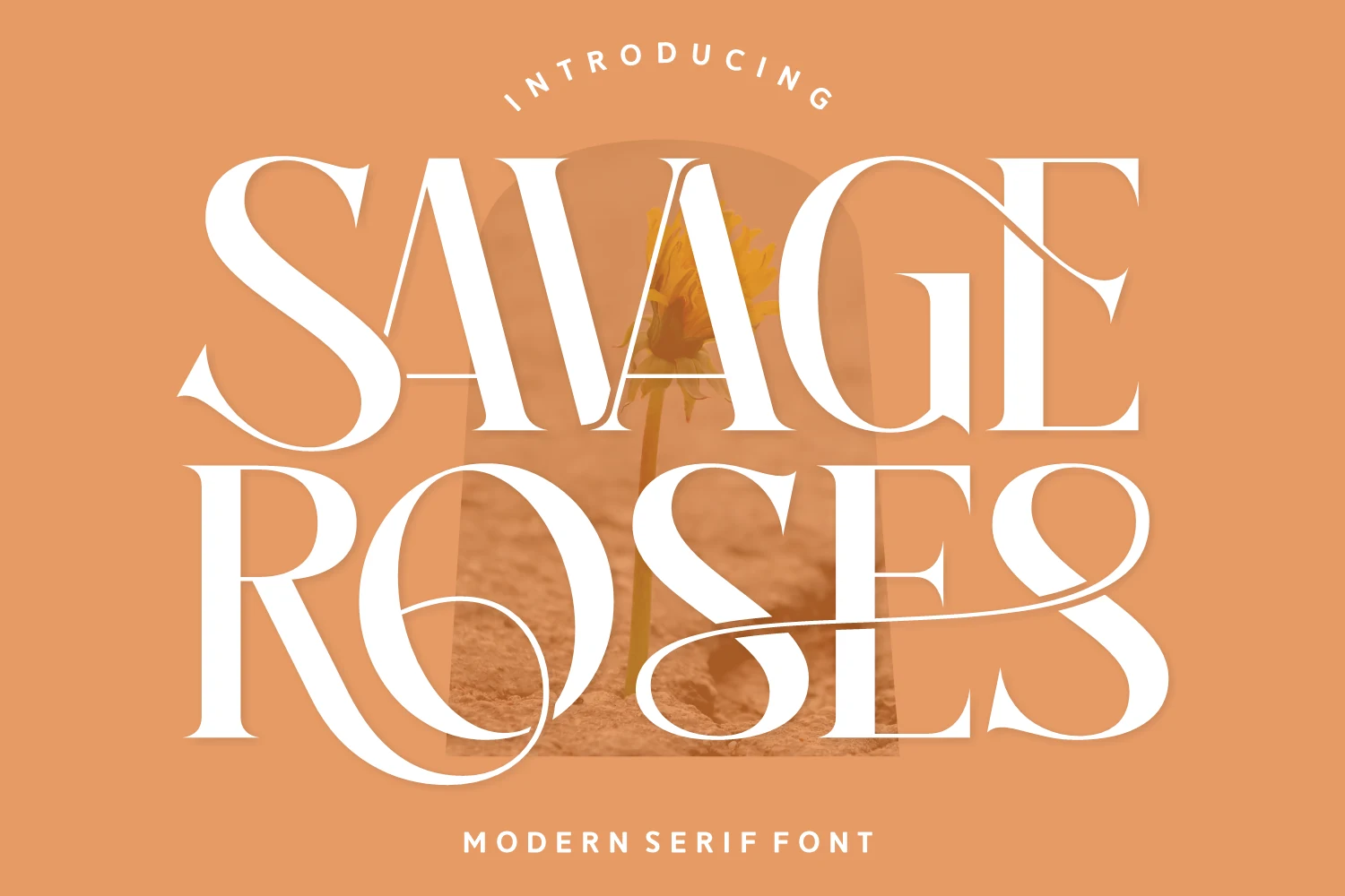
Best For: logos, headlines, fashion branding, romantic designs
Savage Roses Font has a high-contrast serif look with broad curves, crisp hairlines, and oversized swashes that give the letters a distinctly romantic pull. The dramatic S and the long looping tail on the R make it feel expressive and bold, while the overall structure stays polished rather than overly ornate.
Among Best Serif Fonts, this one works best when you want the title itself to carry the mood. Use it for short words or compact headlines, and keep the surrounding layout simple so the sweeping terminals do not compete with other decorative elements.
Things Font
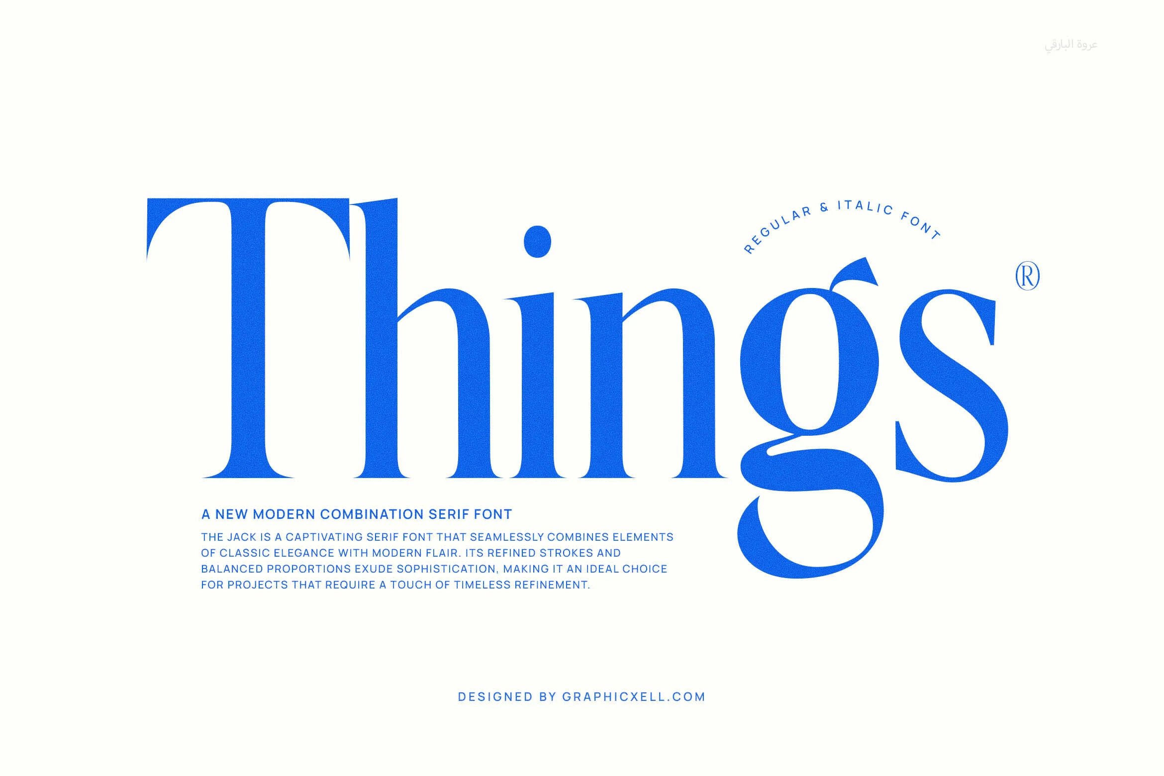
Best For: logos, headlines, website headers, editorial designs
Things Font has a striking display presence built on tall stems, sharp contrast, and smooth rounded bowls. The oversized T brings a classical opening, while the compact lowercase letters and the sweeping tail on the g add a fresher rhythm that feels clean, graphic, and confidently modern.
When comparing Best Serif Fonts, Things stands out for bold headlines and identity work where one word needs to carry the design. Keep it at display size and give that long descender room to breathe; a simple sans companion helps its crisp curves and strong proportions stay in focus.
Strong Font
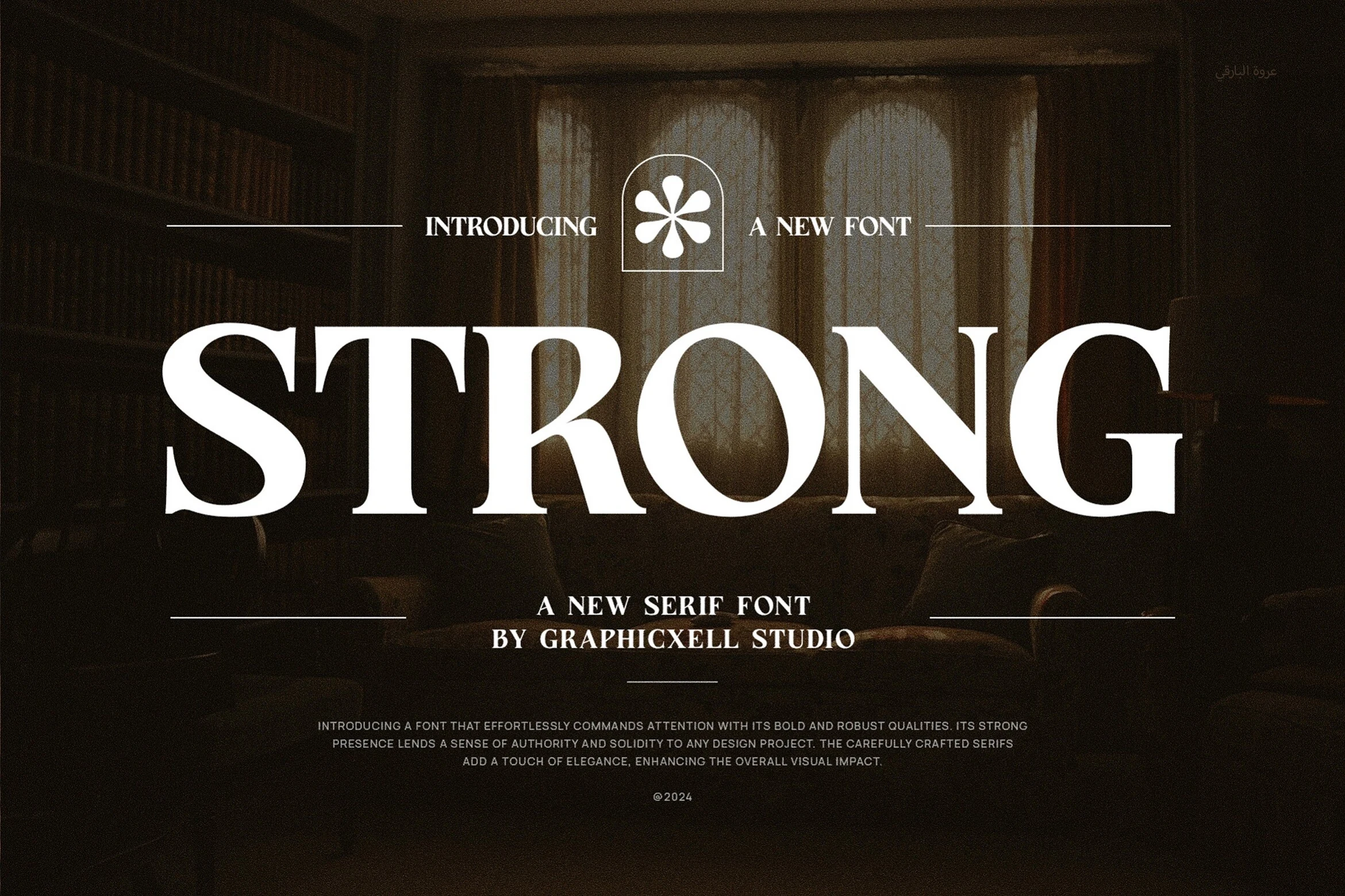
Best For: logos, headlines, book covers, classic designs
Strong Font leans into bold serif structure with broad verticals, crisp wedge-like serifs, and wide rounded counters that keep the wordshape stable and clear. The large capitals create an authoritative, slightly literary tone, while the balanced contrast gives it polish without making the letters feel fragile.
For anyone comparing Best Serif Fonts, Strong works especially well for short titles, cover lines, and branding that needs presence more than decoration. Its readability holds up at medium display sizes, and pairing it with a restrained sans or compact secondary text keeps those heavy forms from overpowering the layout.
Praise Font
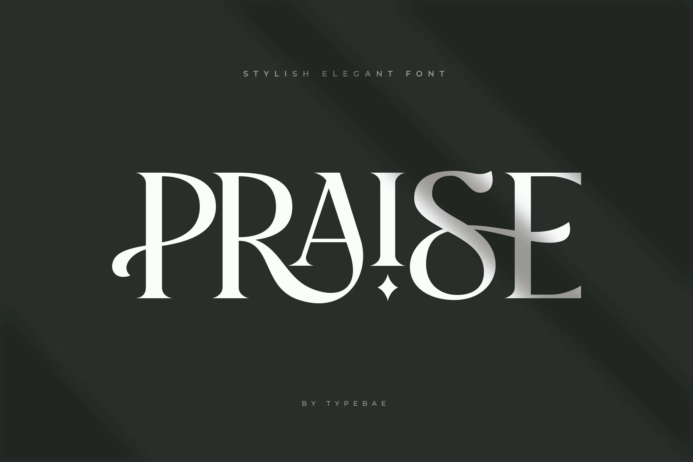
Best For: logos, branding, luxury designs, editorial designs
Praise Font uses tall, high-contrast serif capitals, narrow spacing, and smooth inner curves that give the wordmark a polished editorial edge. The curled entry on the P, sharp A apex, and sweeping S keep the style elegant without turning overly decorative.
For designers comparing Best Serif Fonts for branding, its strength is logo scale: short names, monograms, and headline words where the spacing can stay controlled. Avoid dense text; the dramatic contrast and flourished terminals work better as a focal point than as body typography.
Desevon Font
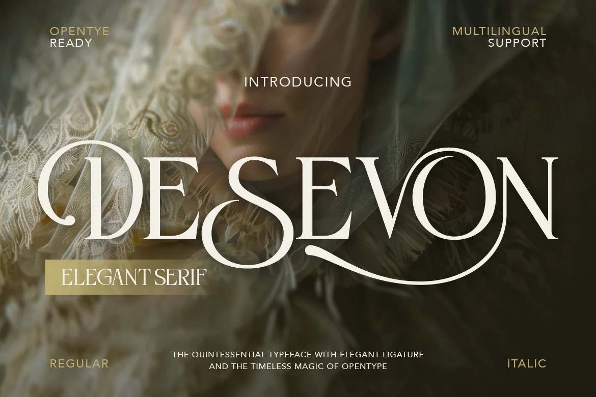
Best For: logos, branding, editorial designs, luxury designs
Desevon has the kind of serif drama that works instantly at display size: tall high-contrast strokes, narrow proportions, and sweeping ligatures that turn a single word into a finished composition. The curled terminals and extended baseline flourish give it a polished, couture feel without losing clarity.
If you’re narrowing down Best Serif Fonts for identity work, this one is strongest in short titles where the swashes have room to breathe. Keep supporting text simple and well spaced, because Desevon already brings plenty of movement and visual hierarchy on its own.
Elegant Luxury Serif Fonts
This group focuses on graceful curves, polished hairlines, and premium beauty or fashion energy, giving brand marks and refined titles a softer luxury finish.
Silkydusk Font
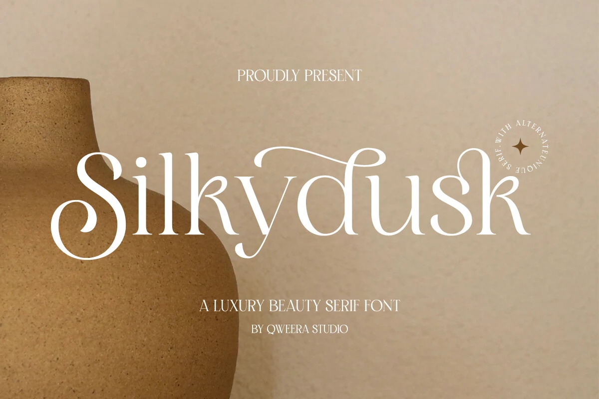
Best For: logos, beauty branding, fashion branding, luxury designs
Silkydusk Font has a refined high-contrast serif look with silky curves, delicate hairlines, and soft sweeping terminals that give the letters a polished beauty feel. In the preview, the generous S and flowing connections add motion without breaking the clean silhouette, so the font feels luxurious rather than overly ornate.
If you are browsing Best Serif Fonts for branding, Silkydusk works best when the wordmark is short enough to let its alternates and ligatures breathe. Those details help create a more custom logo feel, especially when paired with spacious margins and restrained secondary text that keeps the elegant rhythm in focus.
Elegant Font
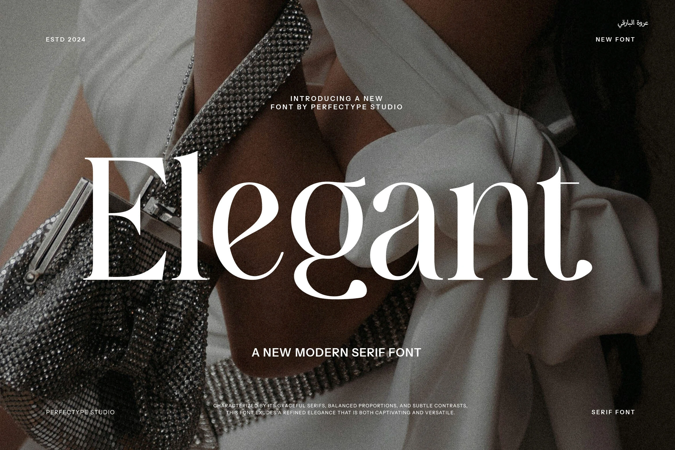
Best For: fashion branding, magazine covers, headlines, luxury designs
Elegant Font has a poised modern serif look, with smooth curves, fine hairlines, and gently flared terminals that keep the letterforms graceful rather than rigid. In the preview, the generous counters and balanced contrast give the word a polished editorial presence, while the large capitals still feel soft and composed.
If you are comparing Best Serif Fonts for branding or display work, this one reads best in short phrases where its thin strokes and curved joins can stay crisp. Give it enough scale and clean spacing, then pair it with minimal supporting text so the refined proportions do the visual work.
Montega Font
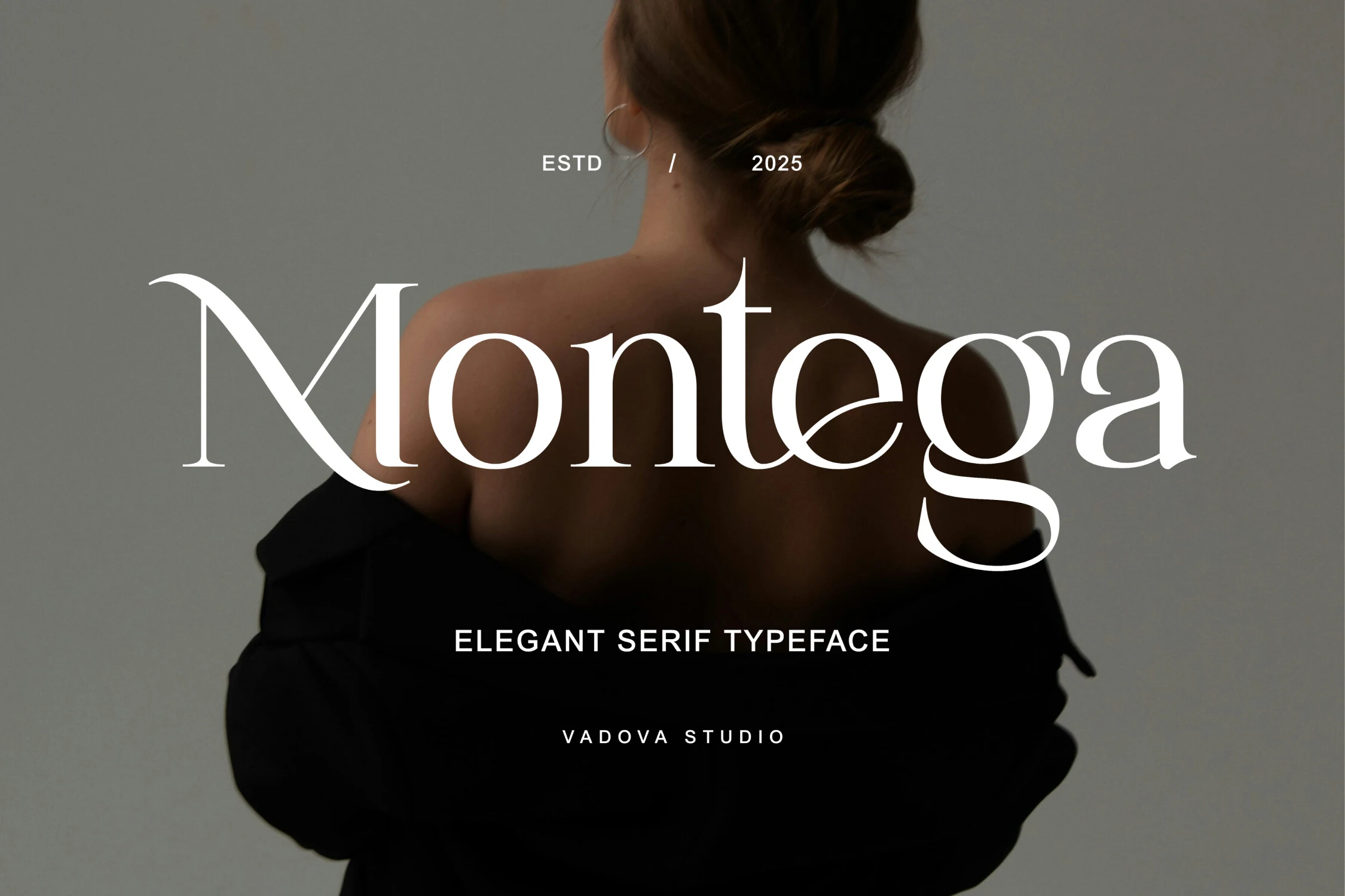
Best For: fashion branding, beauty branding, editorial designs, logos
Montega Font has a polished high-contrast serif style with graceful curves, fine hairlines, and a soft feminine rhythm. The tall x-height keeps it clear, while signature details like the sweeping tail on the g and the rounded a give the wordmark a luxurious, fashion-led presence.
If you are comparing Best Serif Fonts for premium branding, Montega works best when those refined letterforms have room to stand out. Use it for short titles or logos, keep the surrounding layout clean, and pair it with understated supporting text so its contrast and curved terminals stay crisp and confident.
Munnes Font
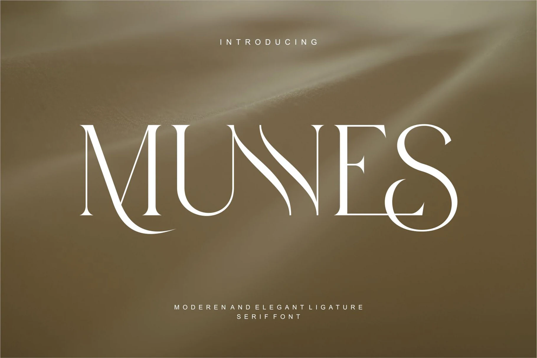
Best For: logos, editorial designs, luxury designs, classic designs
Munnes Font combines high-contrast serif structure with elongated strokes, narrow counters, and softly sweeping terminals that give the letters a poised, slightly vintage finish. In the preview, the M feels stately, while the curved diagonal in the N and the looping S add movement that keeps the composition polished instead of rigid.
If you’re narrowing down Best Serif Fonts for branding or display work, Munnes suits short titles where those elegant curves can stay visible. It benefits from clean spacing and a restrained layout, especially when you want a classic wordmark or editorial heading with a warmer, more nostalgic edge.
Arome Font
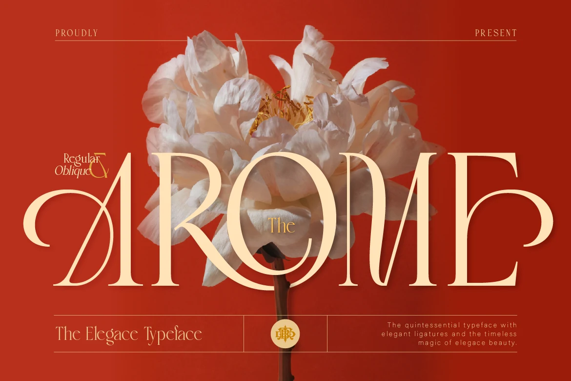
Best For: logos, fashion branding, luxury designs, romantic designs
Arome Font pairs high-contrast strokes with slim hairlines, broad bowls, and elegant sweeping terminals that give the letters a romantic, couture feel. The oversized curved A, the light inner strokes, and the soft round C create a polished display rhythm that feels luxurious without turning stiff.
Arome earns its place in Best Serif Fonts roundups when a logo or headline needs both delicacy and presence. Keep it to short words, leave room around the flourished capitals, and pair it with restrained supporting type so the contrast and graceful curves stay sharp at the top of the hierarchy.
Refined Editorial Serif Fonts
These serif fonts feel cleaner, calmer, and more restrained, which makes them strong choices for magazine layouts, minimal wordmarks, high-end websites, and polished editorial systems.
Luxena Font
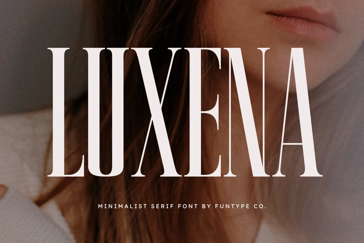
Best For: headlines, fashion branding, magazine covers, luxury designs
Luxena Font has a tall, condensed serif structure that feels crisp, polished, and very controlled on the page. The narrow proportions, clean hairline transitions, and sharp serif edges give it a refined editorial voice, while the overall weight keeps it bold enough to hold attention in large display settings.
For designers comparing Best Serif Fonts, Luxena stands out when you need a headline with height, order, and a luxury finish. It works best in short titles or wordmarks, and a touch of extra tracking helps the slender forms breathe. Pair it with a quiet sans or understated body text to keep its vertical rhythm front and center.
Grandeur – Elegant Classic Serif Font
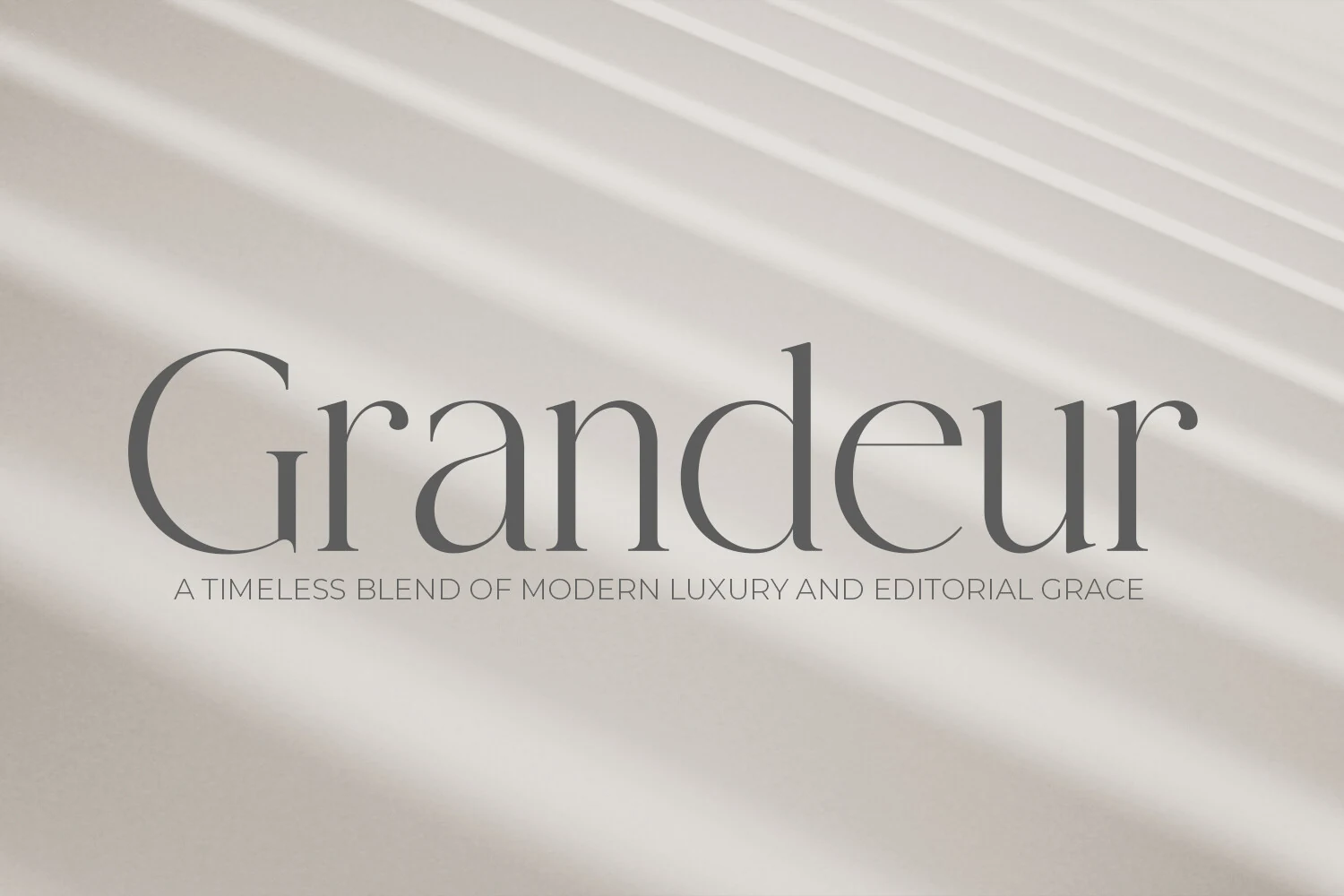
Best For: magazine covers, luxury designs, editorial designs, fashion branding
Grandeur – Elegant Classic Serif Font leans on slender high-contrast strokes, softly tapered serifs, and broad graceful curves that keep the letterforms airy instead of dense. The large open G, rounded counters, and calm rhythm give it a polished editorial presence that feels rooted in classic print without looking dated.
For anyone comparing Best Serif Fonts, Grandeur stands out when a headline needs poise rather than sheer weight. It works especially well in larger sizes with a bit of breathing room, since the fine joins and elongated proportions read more cleanly when the layout stays simple and the supporting type remains understated.
Vogane Font
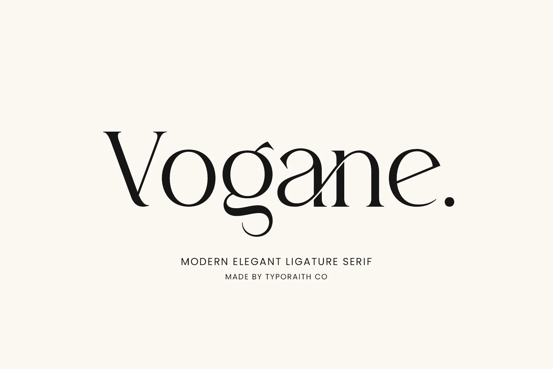
Best For: logos, editorial designs, invitations, high-end designs
Vogane Font has a calm, refined serif voice with soft contrast, rounded bowls, and a graceful rhythm that keeps the wordmark polished without feeling stiff. The tapered V, neat counters, and distinctive lowercase g give it a slightly fashion-led character, while the clean spacing keeps the overall look poised and readable.
For designers sorting through Best Serif Fonts, Vogane stands out when branding needs elegance with a more custom finish. Its ligatures and alternate characters help fine-tune a logo or editorial title, especially when you want smoother joins or a more sculpted silhouette, so it works best in short display settings with simple supporting type.
Ethereal Font
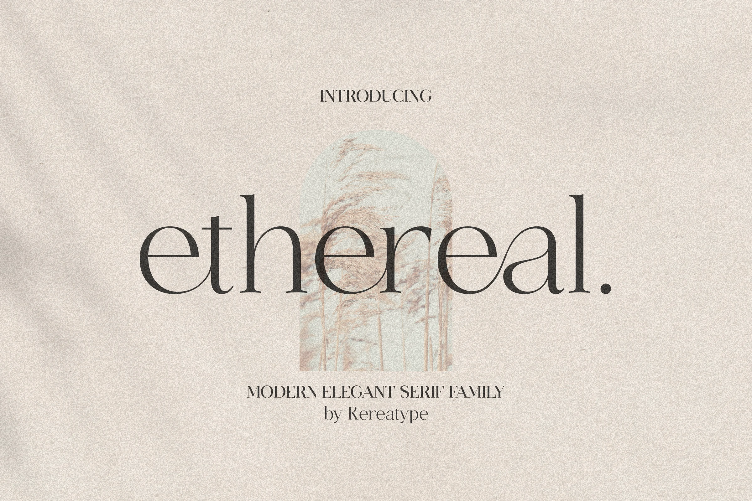
Best For: editorial designs, fashion branding, logos, elegant designs
Ethereal Font has a light, poised serif voice built on slim strokes, tall ascenders, and broad rounded bowls that keep the lowercase forms airy and calm. The open e shapes, clean crossbar on the t, and softly tapered terminals give it a pared-back luxury feel that reads modern rather than overly decorative.
For designers browsing Best Serif Fonts, Ethereal is especially useful when you want elegant titles with a quiet editorial tone. Its various weights help build a cleaner hierarchy across headings, subheads, and pull quotes, so you can keep the layout cohesive while letting the graceful curves stay crisp and understated.
Montage Font
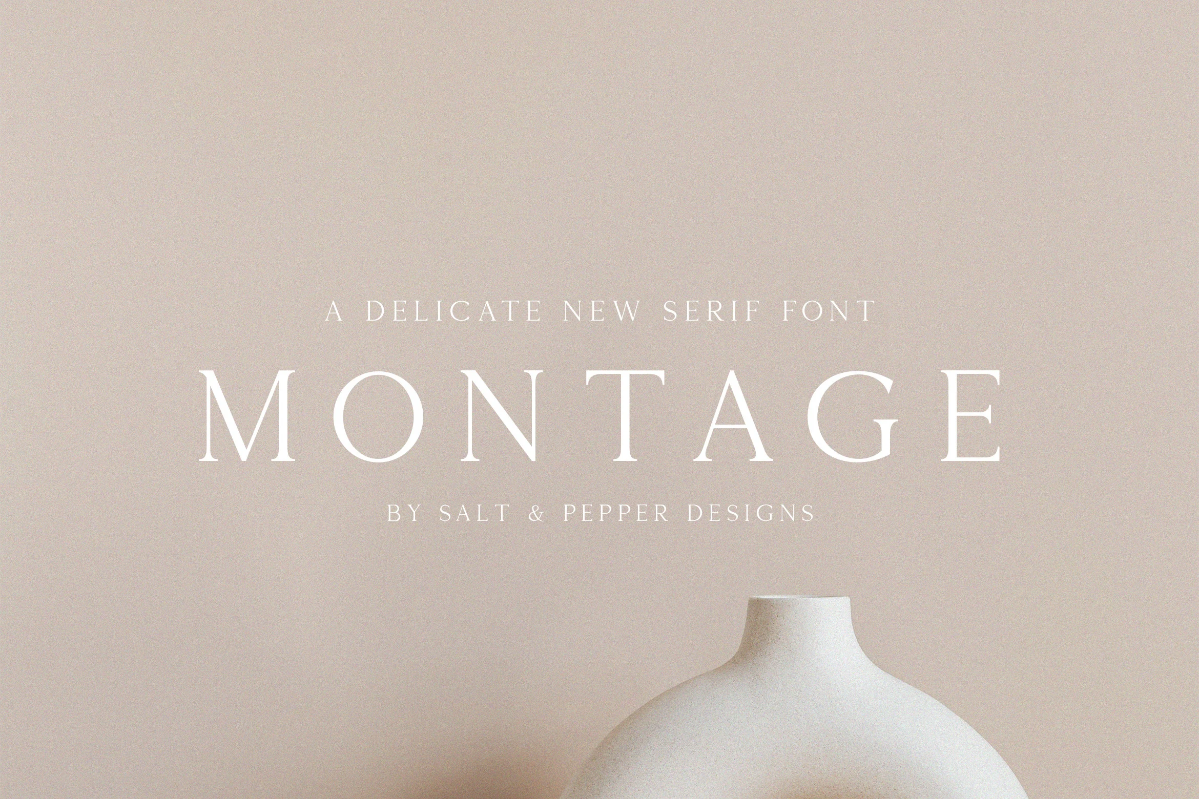
Best For: logos, magazine covers, minimal designs, luxury designs
Montage Font is built around thin, elegant serif capitals with fine contrast, crisp serifs, and generous spacing that gives every letter a calm, polished presence. The wide-set forms and open counters make it feel airy and expensive, leaning more toward quiet refinement than dramatic ornament.
For designers comparing Best Serif Fonts, Montage works especially well when you want a restrained luxury tone in headlines or wordmarks. Keep it at a comfortable display size and let the spacing breathe; the delicate strokes stay cleaner when paired with simple body copy and an uncluttered hierarchy.
Conclusion
When choosing from these Best Serif Fonts, start with the role of the type. Use bold and dramatic styles for logo impact, elegant luxury serifs for beauty or fashion branding, and refined editorial options when the layout needs polish without too much decoration.