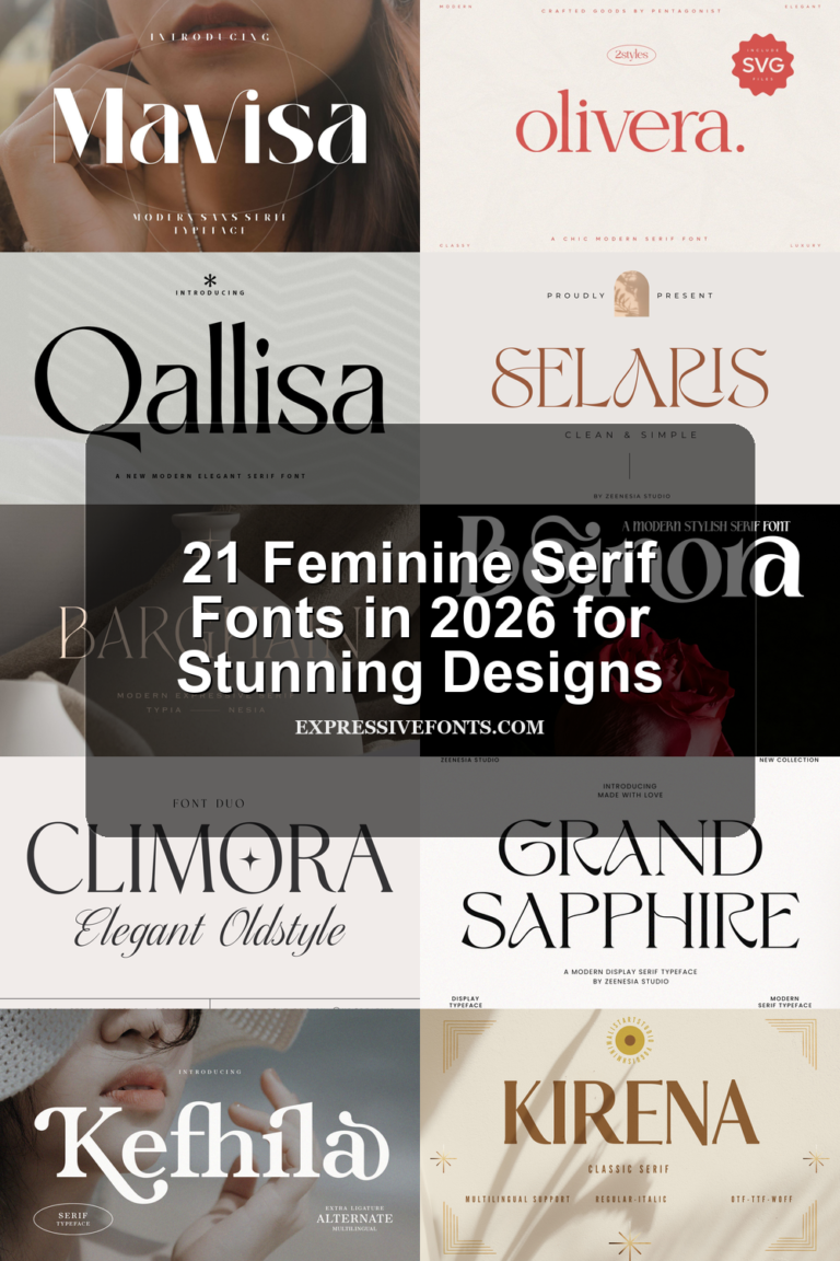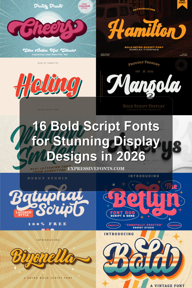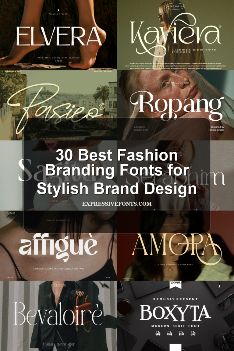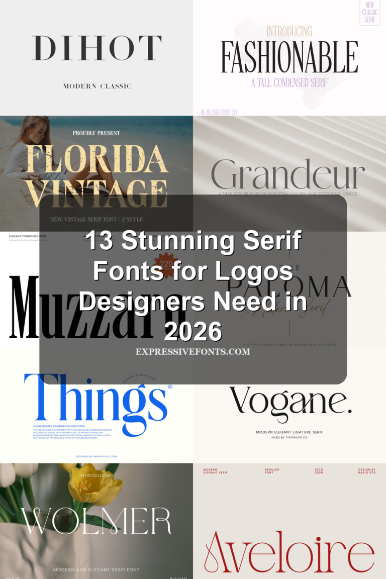
17 Best Playful Fonts for Fun, Bold Designs in 2026
Playful fonts are built for designs that need movement, humor, and instant visual energy. The best ones are not just “fun” by default; they use rounded shapes, bouncy spacing, chunky strokes, tilted baselines, rough edges, or comic-style outlines to make a headline feel active before the words are even read.
This roundup focuses on playful fonts that work well for posters, stickers, children’s designs, packaging, social media graphics, and bold display text. Some lean cute and bubbly, while others bring graffiti, horror, retro, handmade, or comic-inspired character.
Blunt Bubble Font
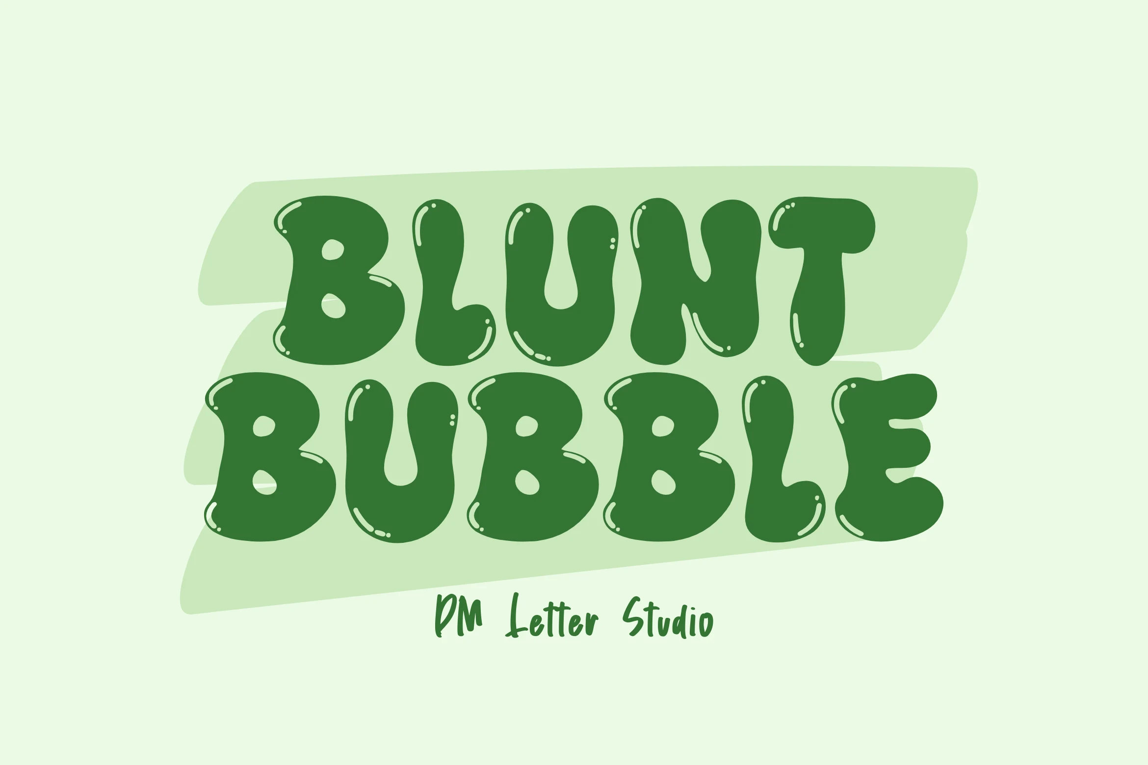
Best For: children’s designs, stickers, bold designs, fun designs
Blunt Bubble Font uses squat, inflated capitals with rounded joins, blunt terminals, and small glossy highlight marks that make the strokes feel rubbery rather than polished. The heavy shapes give Playful Fonts a loud display voice, while the softened edges keep the tone friendly instead of aggressive.
Use it where the title needs to carry the design on its own: snack labels, kid-focused branding, sticker sets, or thumbnail graphics. The letters are broad and tightly energetic, so stronger contrast around the word and slightly looser spacing will help the bubbly forms stay readable.
Magic Blush Font
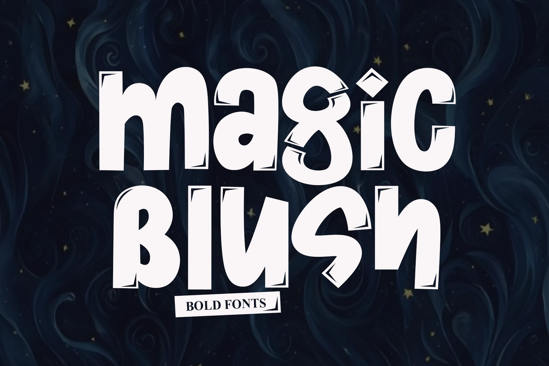
Best For: headlines, posters, display text, playful designs
Magic Blush Font has tall, weighty letterforms with rounded curves and sharp little cut-in notches that make the edges feel animated rather than smooth. The narrow build keeps each word compact, while the bold silhouette gives Playful Fonts a more offbeat, storybook kind of energy.
It works best in short titles where those quirky corners stay visible, especially on posters, packaging, or standout social graphics. Because the letters are condensed and visually active around the joints, a touch more line spacing and a plain supporting font will keep the hierarchy crisp instead of cramped.
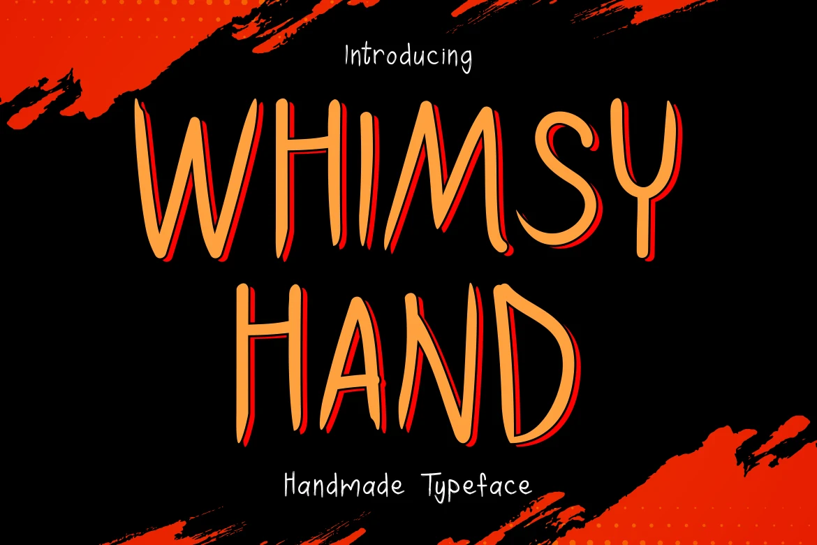
Whimsy Hand Font
Best For: posters, stickers, book covers, playful designs
Whimsy Hand Font has a wiry handmade look, with tall narrow capitals, uneven stroke width, and slightly jagged curves that keep the lettering loose and a little eerie. The irregular rhythm gives it personality, and within Playful Fonts it feels less sugary and more mischievous, with a spooky edge that suits seasonal display work.
It shines in short, high-impact text where the quirky shapes can stay visible, especially for posters, stickers, packaging, or title treatments. Because the letters are slender and intentionally rough, stronger size contrast and short line breaks help the words read clearly without losing that off-kilter handmade tension.
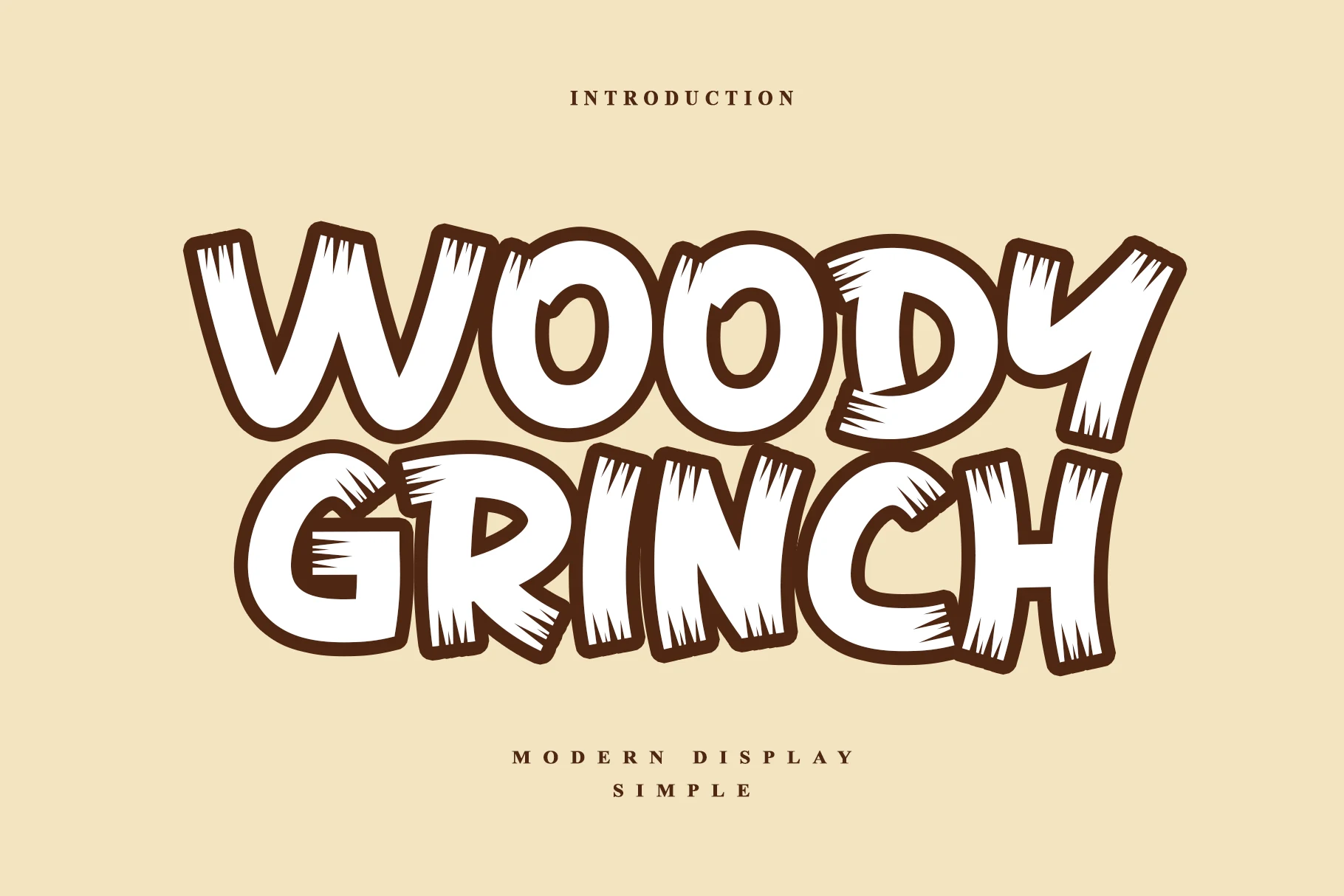
Woody Grinch Font
Best For: posters, packaging, stickers, playful designs
Woody Grinch Font mixes chunky rounded capitals with scraped inner cuts and splintered edges, so the letters feel carved rather than polished. The wide proportions give it instant impact, while the rough texture pushes Playful Fonts in a more rustic, mischievous direction than a clean bubble display.
It works best in short words and bold headings where the distressed detail stays visible, especially on posters, packaging, or sticker graphics. Keep it large and let the outline contrast do the work, because crowded layouts or long lines can hide the woodcut character that makes it stand out.
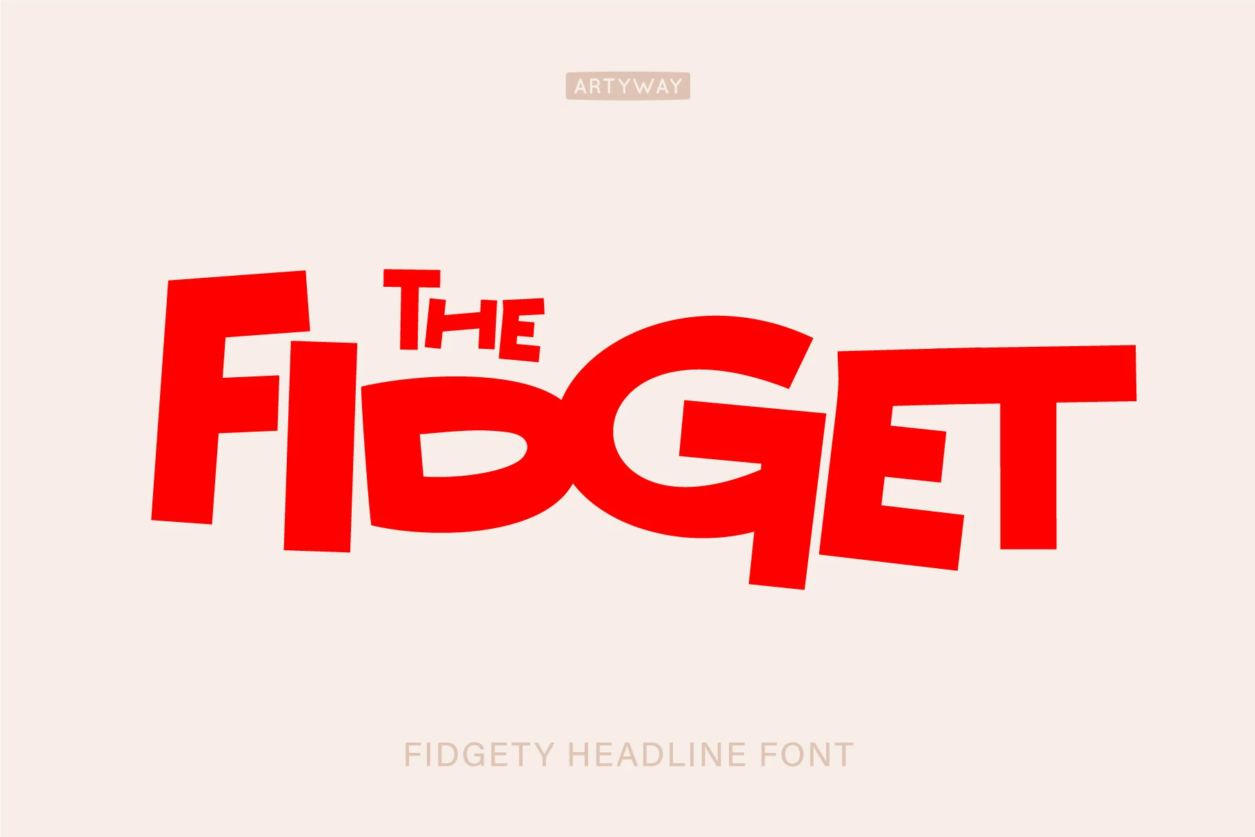
Fidgety Font
Best For: headlines, posters, bold designs, playful designs
Fidgety Font has chunky, off-kilter letterforms with slanted stems, broad curves, and a bouncing baseline that makes the whole word feel in motion. The shapes are bold and simple, but the uneven angles keep Playful Fonts from feeling too neat, giving titles a loud, upbeat rhythm.
It works best in short headlines and event-style graphics where the restless silhouette can carry the composition by itself. Because several letters lean and fit together tightly, give it generous side space and pair it with calmer supporting text so the quirky proportions stay crisp and readable.
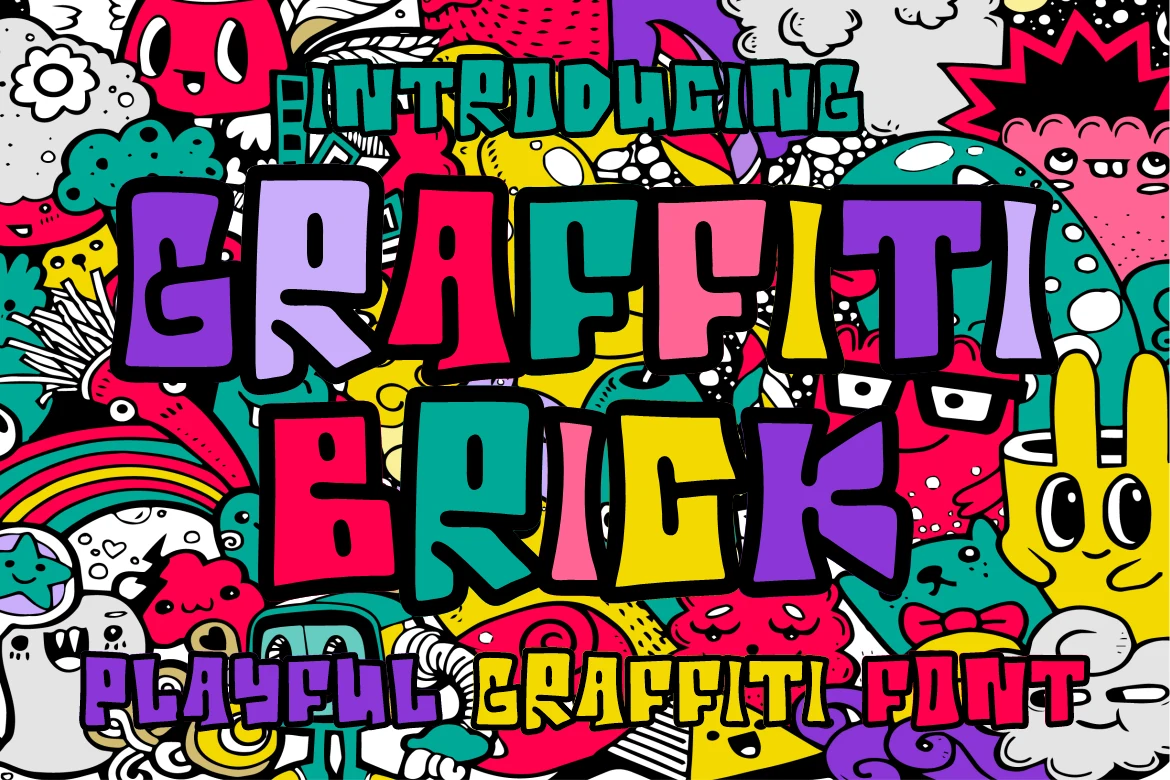
Graffiti Brick Font
Best For: posters, stickers, social media graphics, playful designs
Graffiti Brick Font comes in thick, uneven block letters with a hand-painted feel, heavy black outlines, and compact inner counters that make every word hit hard. Within Playful Fonts, it reads more street-pop than cute, mixing graffiti attitude with chunky cartoon shapes that stay loud even in busy layouts.
It works best for short headlines, stickers, and high-energy promo graphics where the silhouette can do most of the talking. Keep the wording brief and give the letters breathing room, because the tight counters and bold outline already create plenty of texture without needing extra effects around them.
Comic Thick Font
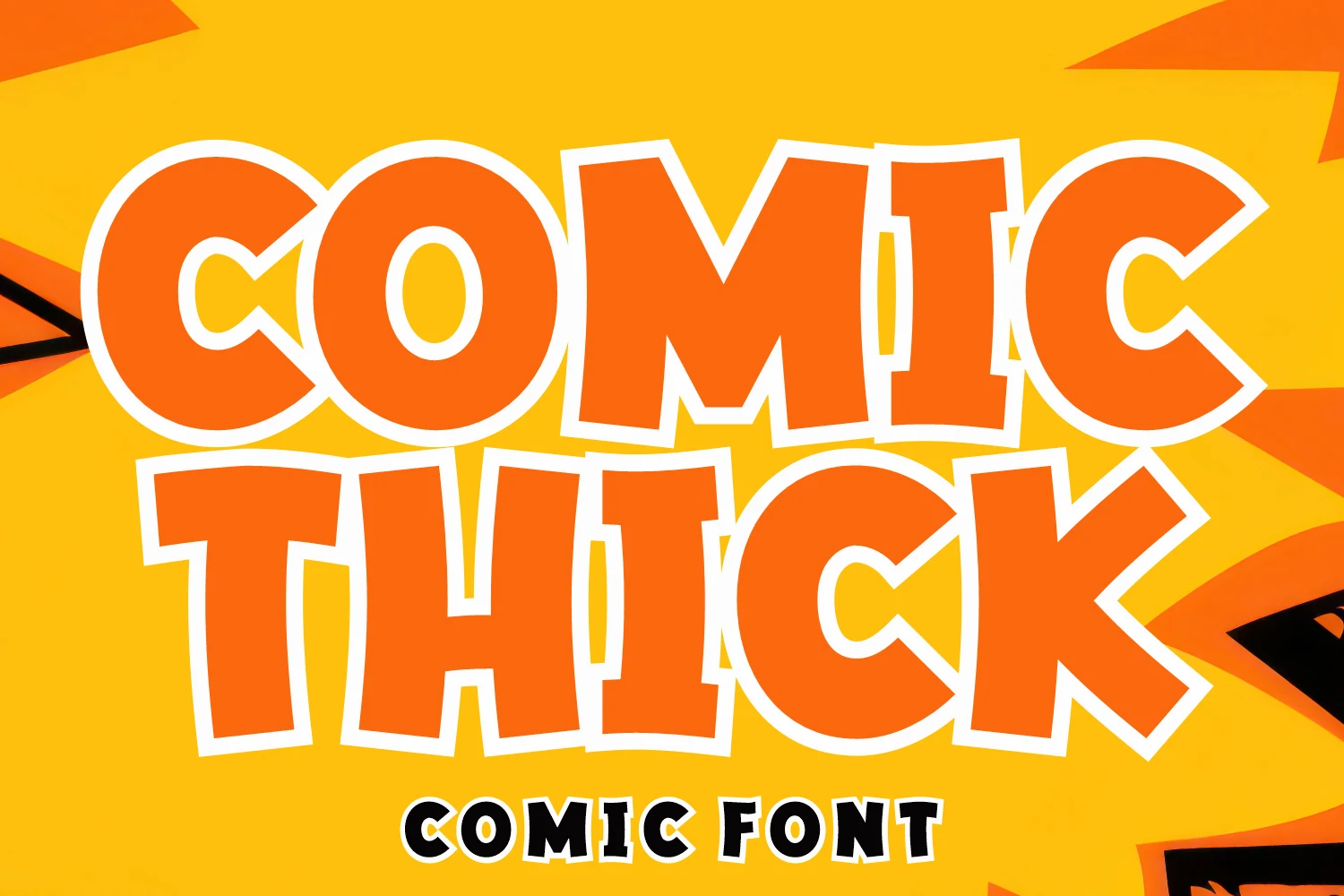
Best For: headlines, posters, children’s designs, playful designs
Comic Thick Font goes big on chunky comic-book shapes, with wide rounded capitals, slightly uneven edges, and a thick outline that makes every word pop fast. Within Playful Fonts, it feels especially upbeat and approachable, giving titles a hand-drawn bounce without losing the bold, readable silhouette.
It works best when you let the headline do the heavy lifting on posters, kids graphics, or bright promo art. The letters are broad and tightly packed, so short wording and a little extra spacing between lines will keep the composition punchy while preserving the lively cartoon rhythm.
Nice Boho Font
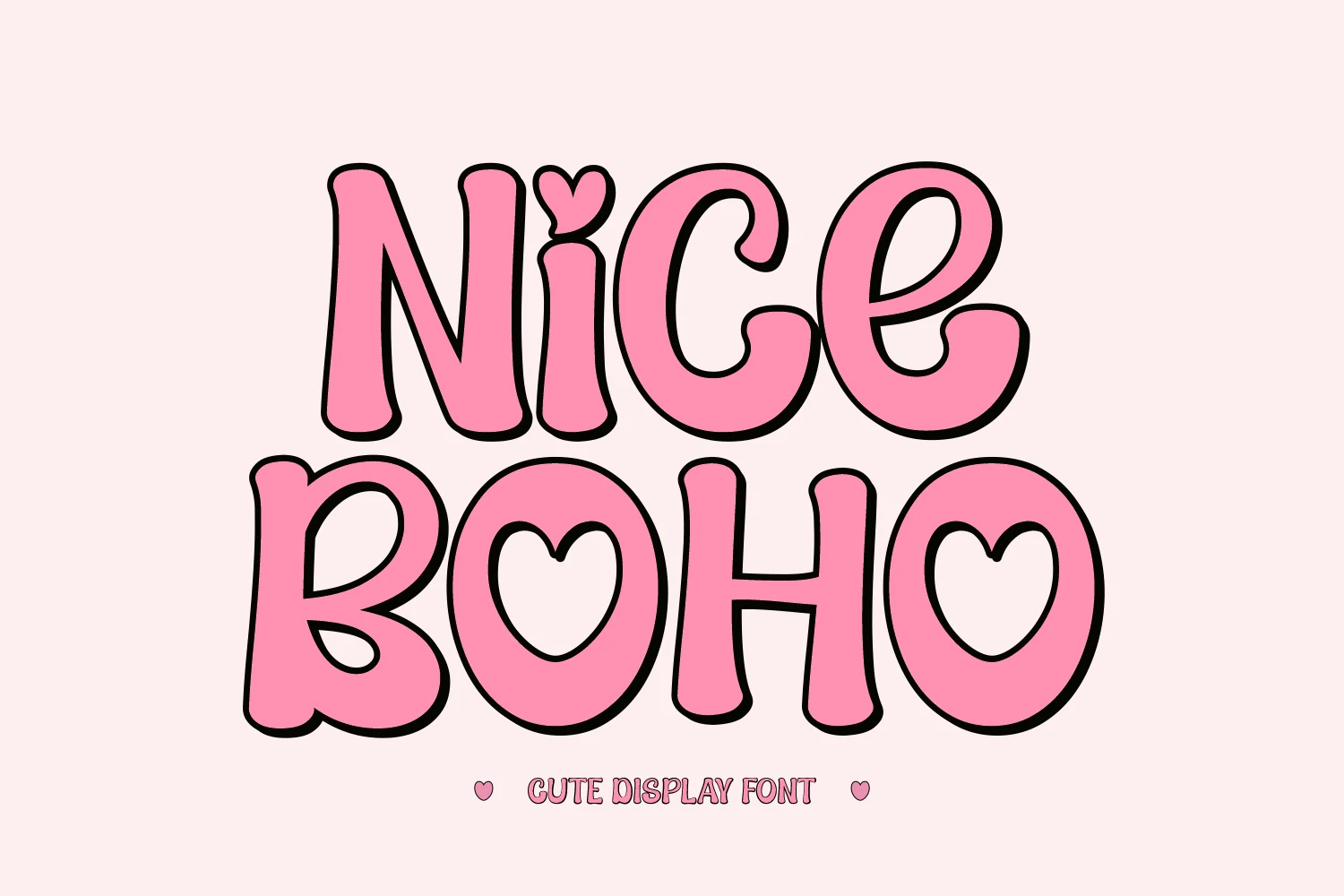
Best For: stickers, children’s designs, cute designs, playful designs
Nice Boho Font has chunky rounded letterforms, soft curves, and a bold outline that gives the words a bubbly retro presence. Small heart details in the dot and counters push the mood further into sweet, groovy territory, so within Playful Fonts it reads as cheerful and intentionally cute rather than simply bold.
It works best for short titles, sticker-style graphics, and craft-friendly branding where those heart shapes stay visible. The forms are wide and decorative, so keep the wording brief and pair it with a simpler secondary font to preserve the easy rhythm and keep the playful details from getting lost.
Nachis Font
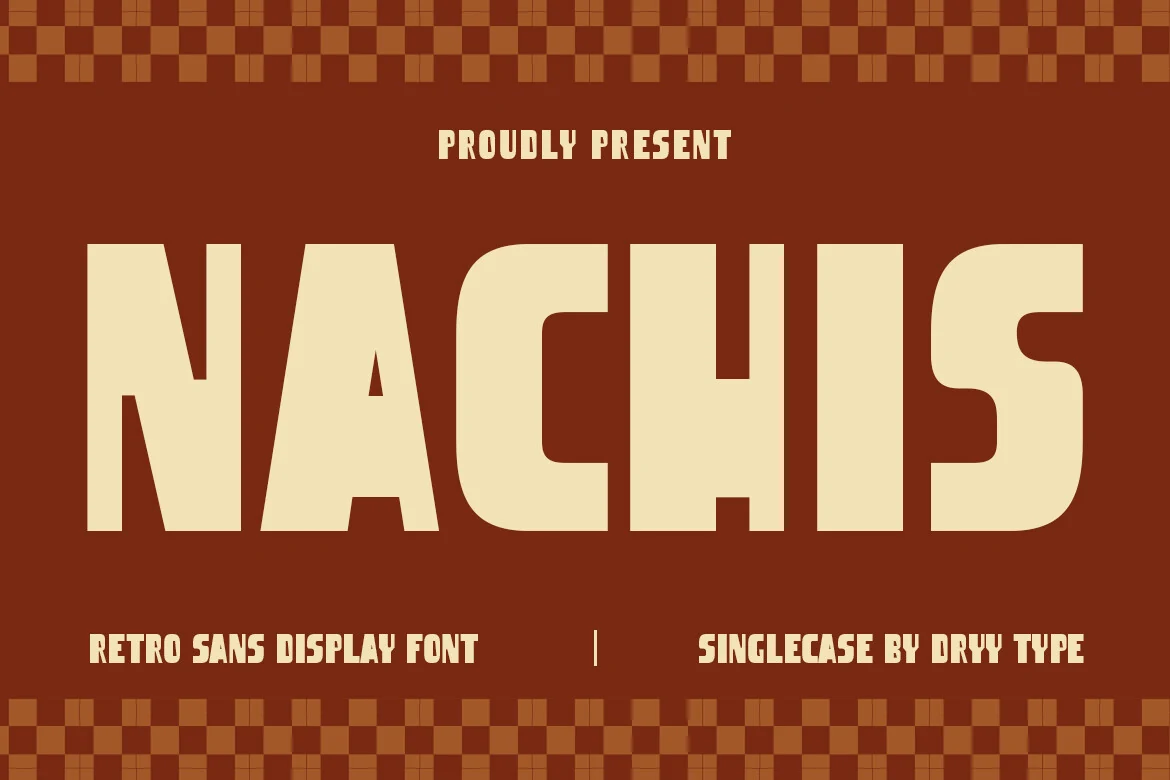
Best For: headlines, posters, packaging, retro designs
Nachis Font has hefty block sans letterforms, dramatic verticals, and tight spacing that give it a sturdy vintage-sign presence. The shapes feel clean rather than distressed, so within Playful Fonts it reads as punchy and nostalgic, with the kind of confident rhythm that suits diner-inspired graphics and old-school packaging.
It works especially well when one or two words need to read fast, whether on posters, labels, or branding. Because the characters are broad and closely fitted, short headlines and generous padding around the text will keep the composition bold and balanced while letting the retro proportions do the heavy lifting.
Chunky Playful Font
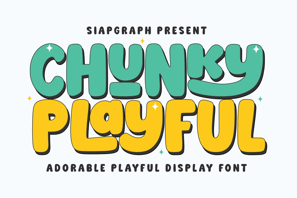
Best For: headlines, posters, social media graphics, playful designs
Chunky Playful Font leans into oversized bubble letterforms with soft corners, thick strokes, and a jaunty baseline that keeps the words feeling lively instead of static. The rounded shapes and bold shadowed look give Playful Fonts a cheerful, kid-friendly presence that reads quickly and still feels full of character.
It works best in short headlines, poster titles, and social graphics where the puffy silhouette can stay front and center. The letters are wide and visually dense, so a little extra line spacing and simple supporting text will keep the layout open while letting the chunky rhythm do the attention-grabbing.
Ready Playful Font
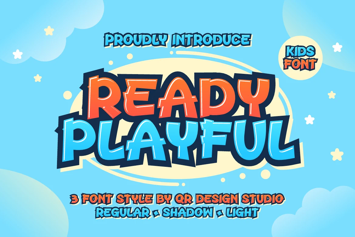
Best For: children’s designs, headlines, posters, playful designs
Ready Playful Font uses chunky, slightly irregular capitals with angled cuts, bright inner outlines, and a thick shadow that gives each word a lifted comic feel. The wide proportions and bouncy shaping make Playful Fonts feel especially energetic here, with a kid-focused personality that reads loud and friendly at a glance.
It works best for titles that need instant charm, especially in children’s designs, posters, or classroom-style graphics. Keep the supporting text simple and give the headline breathing room, because the layered outline and shadow already add plenty of movement and help short words carry the layout.
Paper Slash Font
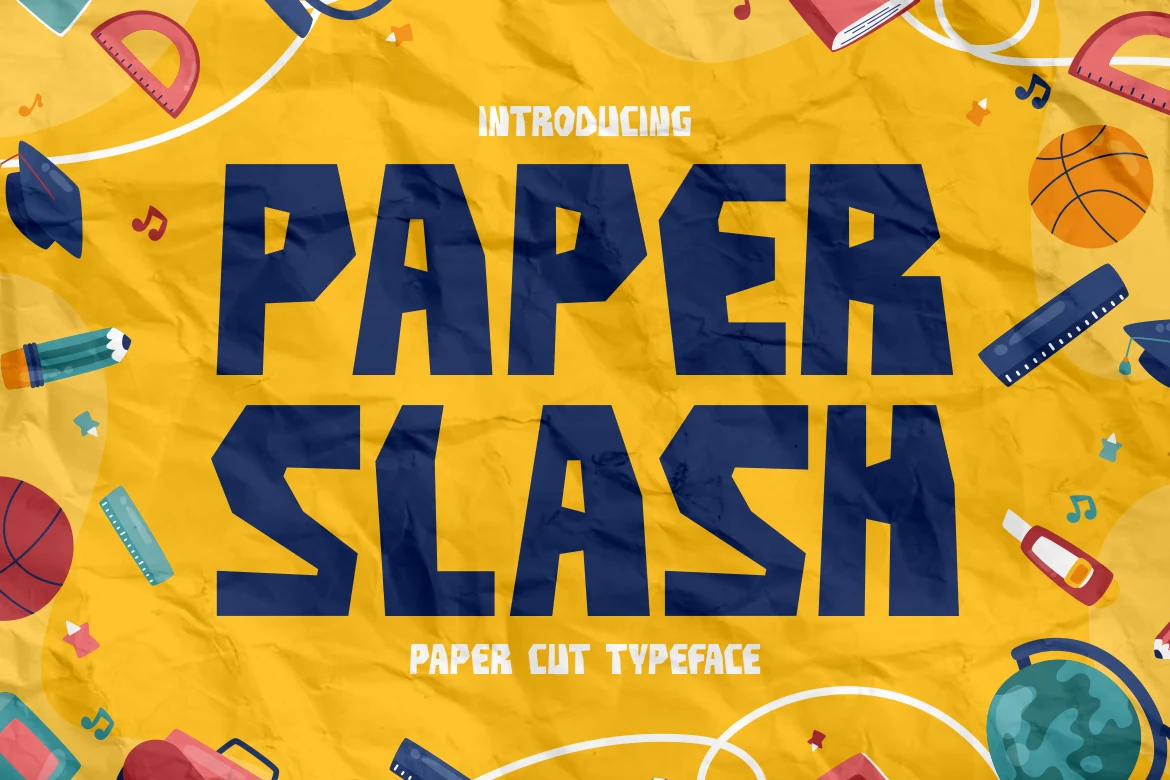
Best For: posters, book covers, children’s designs, packaging
Paper Slash Font has broad block capitals with chiseled corners, uneven cut-in angles, and a handmade silhouette that really does feel snipped from paper. The strong shapes keep Playful Fonts easy to read, while the irregular edges add motion and a crafty, DIY character instead of a polished geometric finish.
It works especially well when you want a headline to feel bold and creative without losing clarity. Short words look strongest, and the sharp notches stay more visible when you give the letters room around the edges, making it a smart choice for kid-focused graphics, covers, and packaging with a lively title hierarchy.
Trasdracila Font
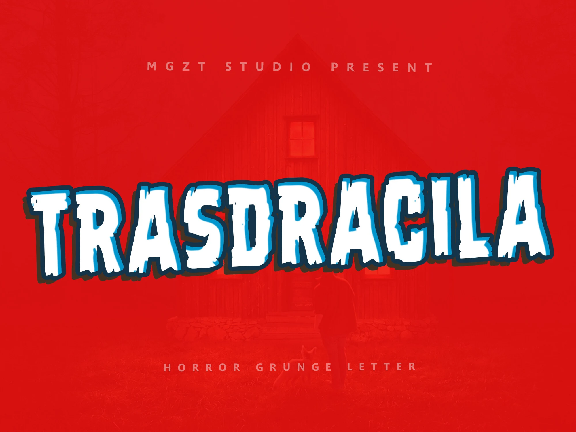
Best For: posters, book covers, stickers, playful designs
Trasdracila Font has chunky all-caps letterforms with ragged bottoms, clipped corners, and jittery edges that give the word a distressed monster-movie feel. The thick outline keeps the shapes readable, while the uneven cuts bring a mischievous horror twist to Playful Fonts rather than a polished comic look.
It works best in short titles where the rough silhouette can stay sharp, especially on posters, book covers, or sticker graphics. Use it with plenty of contrast and compact supporting text, because the irregular texture already adds drama and the letter edges read strongest when the headline stays brief.
Simply Boom Font
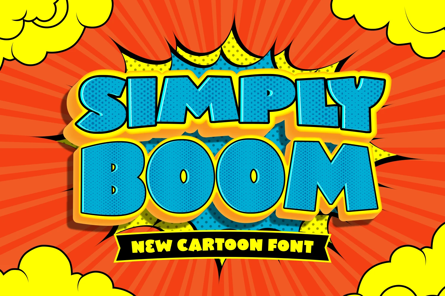
Best For: children’s designs, headlines, posters, book covers
Simply Boom Font leans into extra-wide, chunky capitals with rounded corners and broad counters that make each word feel loud and friendly. The heavy build gives Playful Fonts a comic-book punch, while the softened edges stop it from feeling harsh, so the tone stays upbeat and easy to read.
This one works best when the headline needs to carry the whole layout, especially on kids graphics, posters, or bold cover text. Keep the wording short and let the large shapes breathe, then pair it with a simpler secondary font so the chunky proportions stay clear instead of crowding the composition.
Grandboom Font
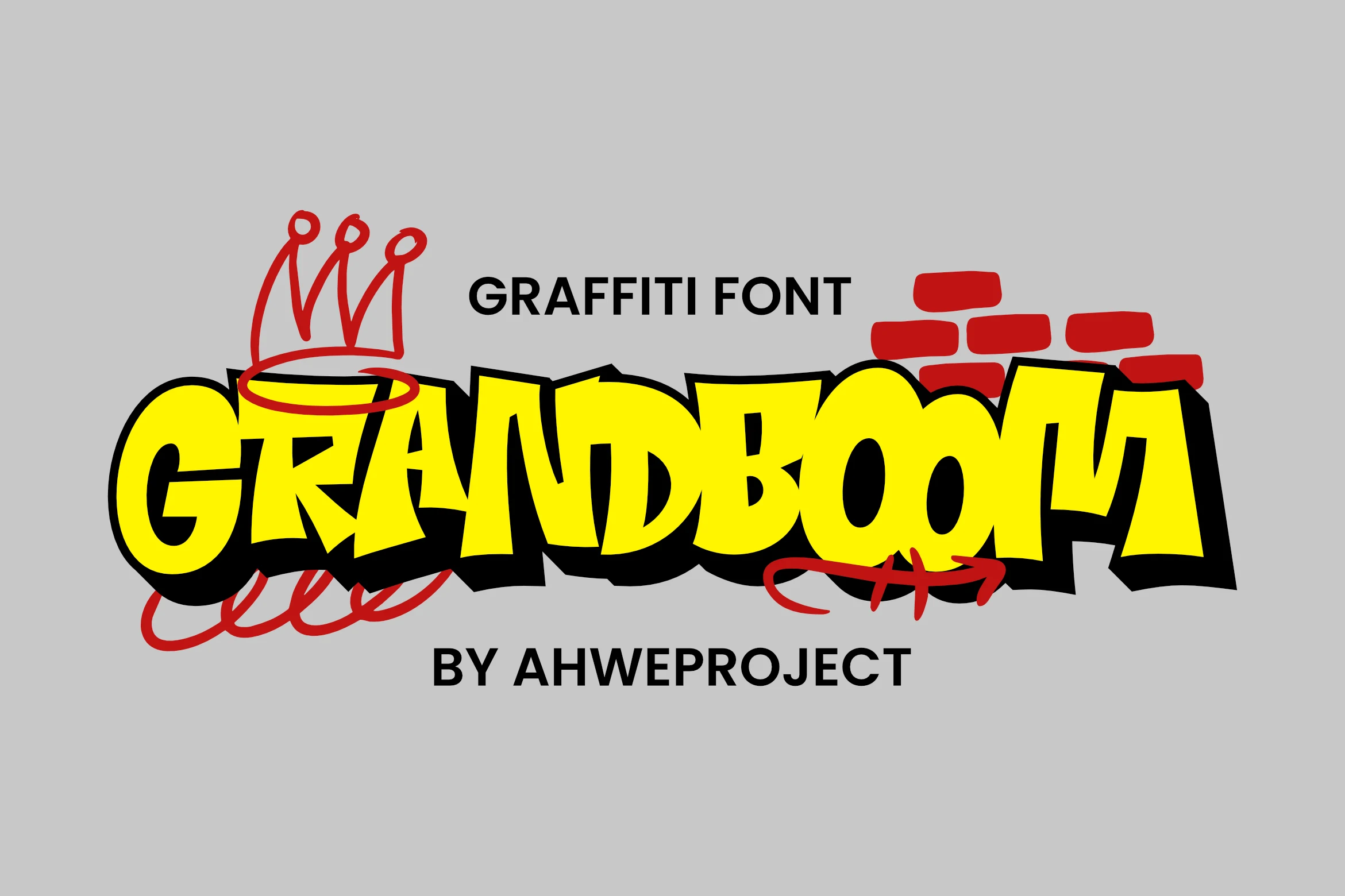
Best For: posters, T-shirts, stickers, expressive designs
Grandboom Font pushes a graffiti look through thick, inflated capitals, sharp angled cuts, and a heavy black shadow that gives the word a wall-painted punch. The exaggerated curves keep it readable, but the jagged rhythm adds attitude, so Playful Fonts take on a louder, more street-driven energy here.
It works best when you keep the message short and let the silhouette do the work on posters, stickers, or apparel graphics. The shadow is already visually dense, so cleaner backgrounds and a restrained secondary font help the letterforms stay crisp instead of turning muddy in a crowded layout.
Scary Demon Font
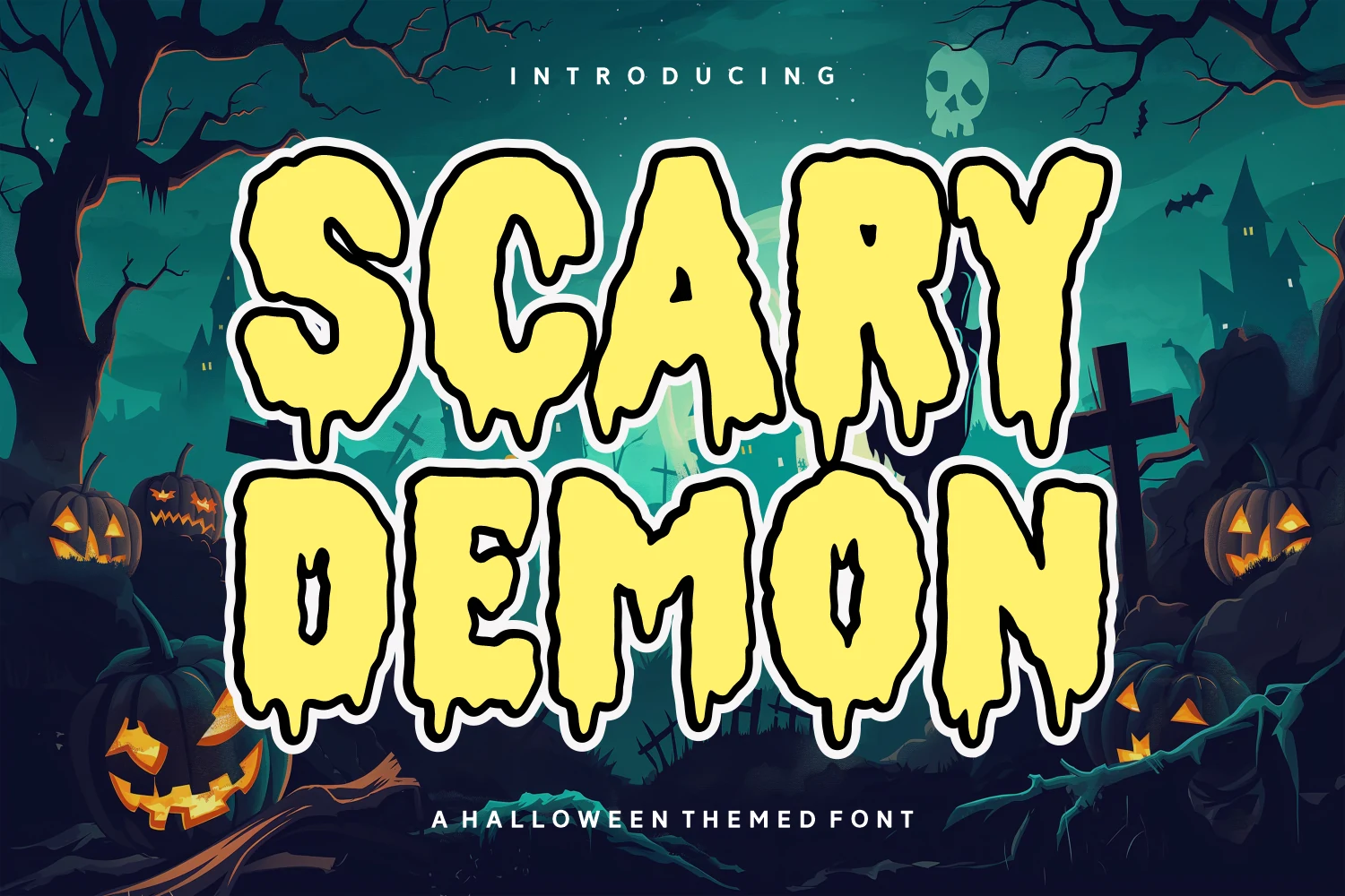
Best For: posters, signage, display text, playful designs
Scary Demon Font uses chunky display letters with irregular edges, sagging drips, and black inner cuts that push the alphabet toward cartoon horror rather than serious gore. The wide shapes keep the words readable, while the uneven contour gives each character a restless haunted-house rhythm.
For Playful Fonts with a seasonal edge, it works best when the word count stays short and the outline has enough contrast behind it. Let the letters dominate the title hierarchy; tight spacing can make the drips collide, but generous margins keep the spooky shapes clear on posters, flyers, and attraction signage.
Gord Playful Font
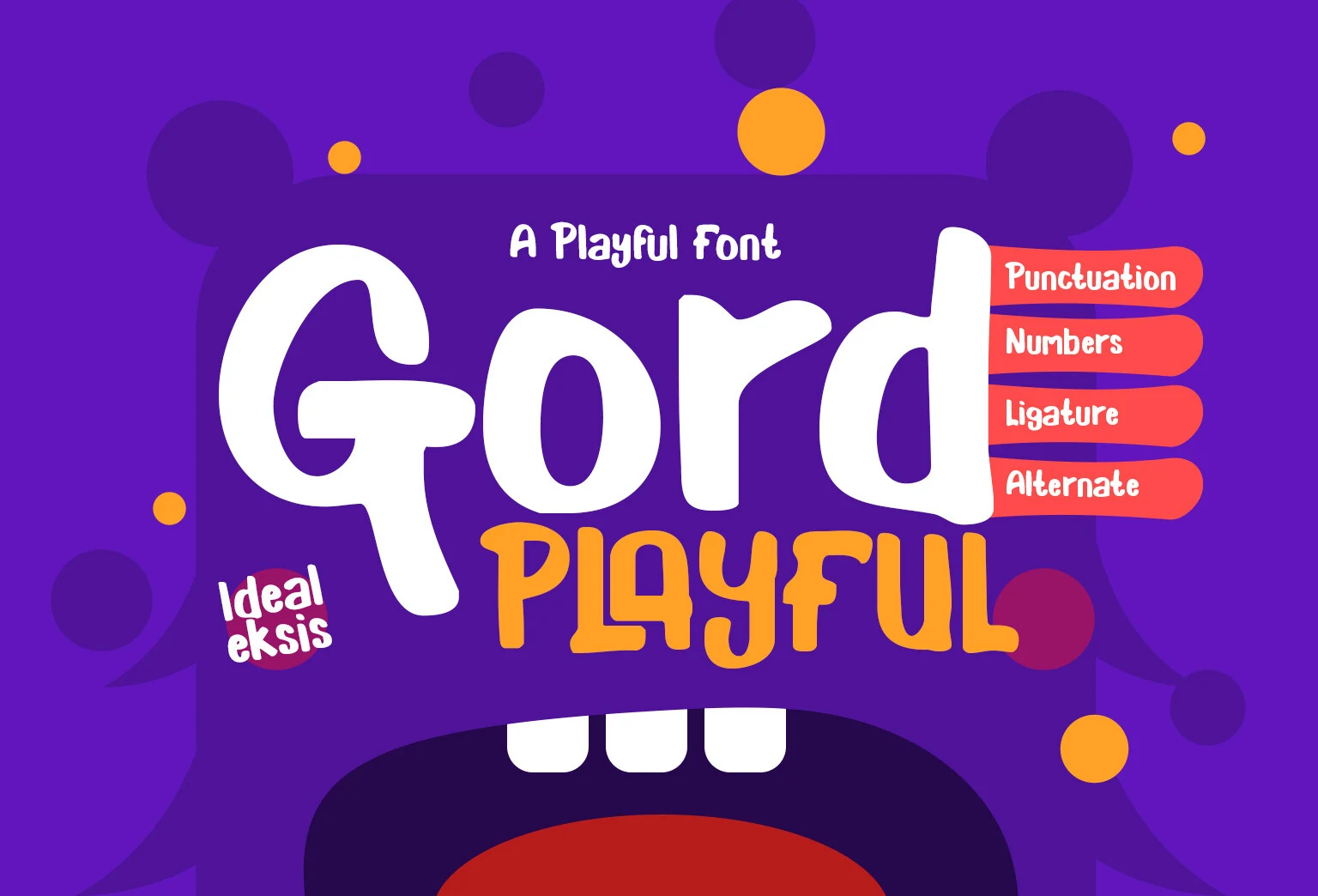
Best For: children’s designs, invitations, display text, playful designs
Gord Playful Font has a soft, rounded look that feels instantly cheerful. The oversized curves, thick strokes, and puffy terminals give the main letterforms a toy-like friendliness, while the narrower companion style adds a quirky hand-drawn rhythm that keeps the composition lively instead of overly sweet.
In Playful Fonts, this one stands out when you keep it on short titles and let the broad shapes do the work. The counters stay open enough for clear reading, so it handles book covers, party invites, and kid-focused headers well; pair it with simple supporting text and leave a little spacing so the bouncy proportions stay crisp.
The strongest playful fonts are the ones with a clear personality and enough structure to stay readable. Rounded bubble fonts work best for friendly designs, graffiti styles bring street energy, and rough or spooky letterforms are better for seasonal posters and bold title graphics.
For the cleanest result, keep the wording short, give the letters enough space, and avoid crowding them with too many effects. Most of these fonts are display-focused, so they work best when the headline is the main visual element.