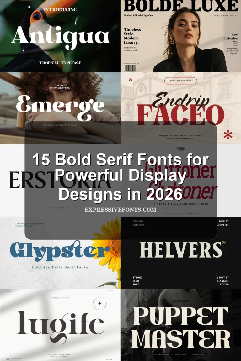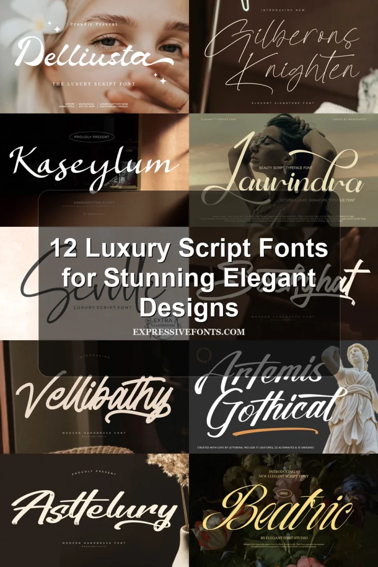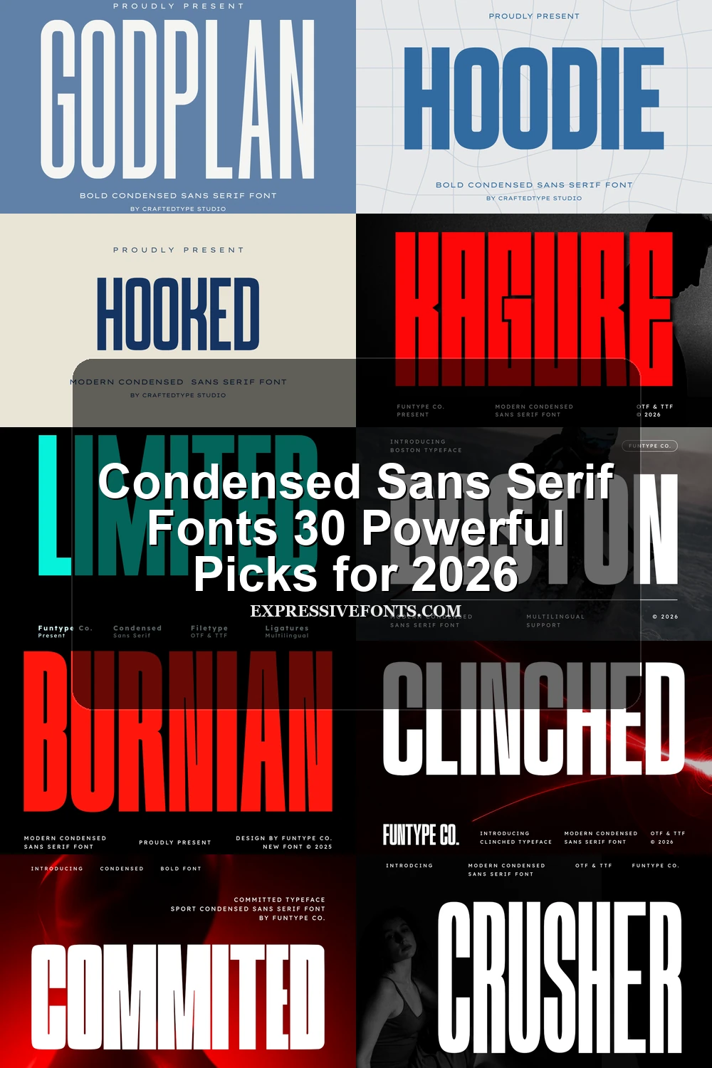
Condensed Sans Serif Fonts 30 Powerful Picks for 2026
Condensed Sans Serif Fonts are built for designers who need bold type in tight spaces. This collection focuses on tall, narrow sans serif styles for posters, logos, apparel, packaging, editorial covers, and high-impact brand systems where every headline has to look strong without wasting horizontal room.
Bold Impact Condensed Sans Serif Fonts
These condensed sans serif fonts use heavy strokes, tight counters, and blunt silhouettes for posters, brand marks, covers, and any headline that needs immediate visual force.
Burnian Font
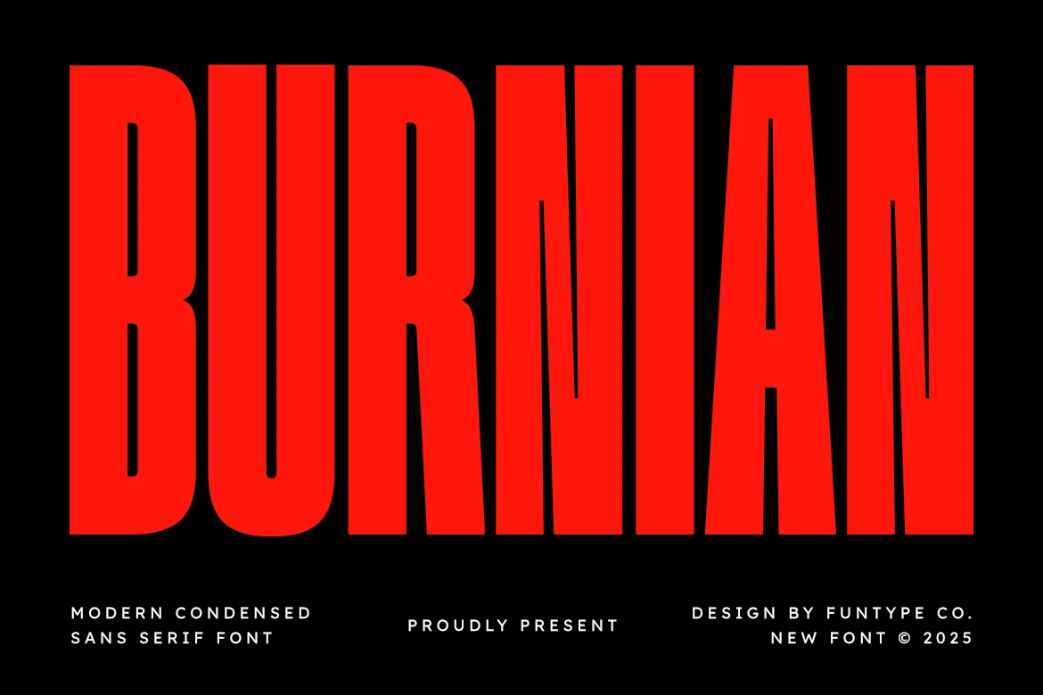
Best For: headlines, posters, branding, bold designs
Burnian Font pushes its height hard, with towering condensed capitals, heavy rectangular strokes, and narrow vertical counters that keep the wordmark dense without losing its basic letter recognition. Its geometric construction gives Condensed Sans Serif Fonts a blunt poster-style presence rather than a soft editorial tone.
Use it where the title needs to occupy vertical space but leave room around the edges of the layout. Tight tracking suits short words and stacked headline systems; for longer phrases, widen the spacing slightly so the internal cuts in letters like R, A, and N do not close up at smaller sizes.
Kagure Font
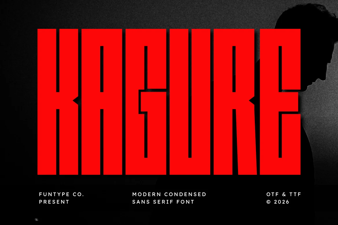
Best For: headlines, posters, logos, branding
Kagure Font leans into brute-force display type, with towering proportions, dense strokes, and crisp geometric cuts that keep the forms sharp rather than rounded. The tight vertical build gives Condensed Sans Serif Fonts a harder industrial character, especially in letters like A, G, and R where the inner shapes feel narrow and controlled.
It suits short headlines and logo-style wording where you want maximum impact in a narrow width. Keep supporting text simple and give the title generous margins; the heavy weight already fills the composition, so a little breathing room helps the counters stay legible and lets the silhouette do the work.
Dilabo Font
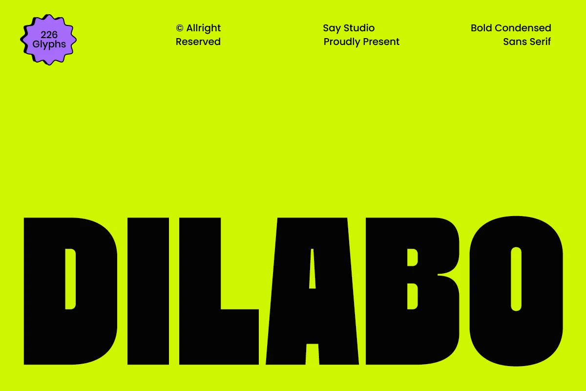
Best For: headlines, posters, branding, bold designs
Dilabo Font has a heavy, compact build with thick vertical strokes, broad rounded corners, and a narrow stance that keeps every word feeling packed and forceful. The tapered A and tight inner counters give Condensed Sans Serif Fonts a tougher street-level energy here, more blunt and attention-grabbing than sleek.
It shines in short display text where the weight can carry the layout on its own, especially for branding and poster titles. Keep supporting copy lighter and simpler, and add a touch of spacing when setting all caps so the dense shapes do not merge into a solid block at smaller sizes.
Crusher Font
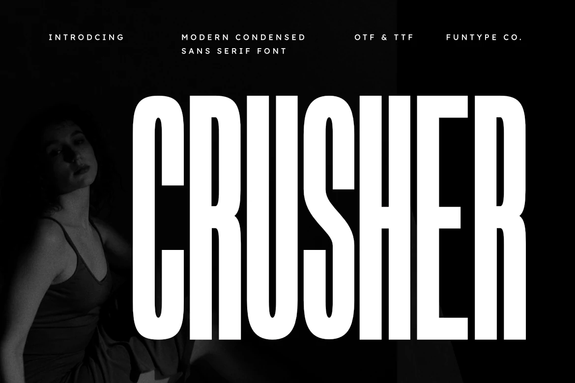
Best For: headlines, posters, logos, bold designs
Crusher Font is built from towering uppercase forms, dense vertical strokes, and narrow counters that make each word feel locked into place. Its blunt weight gives Condensed Sans Serif Fonts a hard editorial edge, especially when the title needs to dominate the layout without decorative detail.
The letter spacing is naturally compact, so it works best for short headlines, sports marks, industrial branding, and poster typography where scale and contrast do the heavy lifting. OTF and TTF files support straightforward use across design and production workflows.
TRT Burn Font
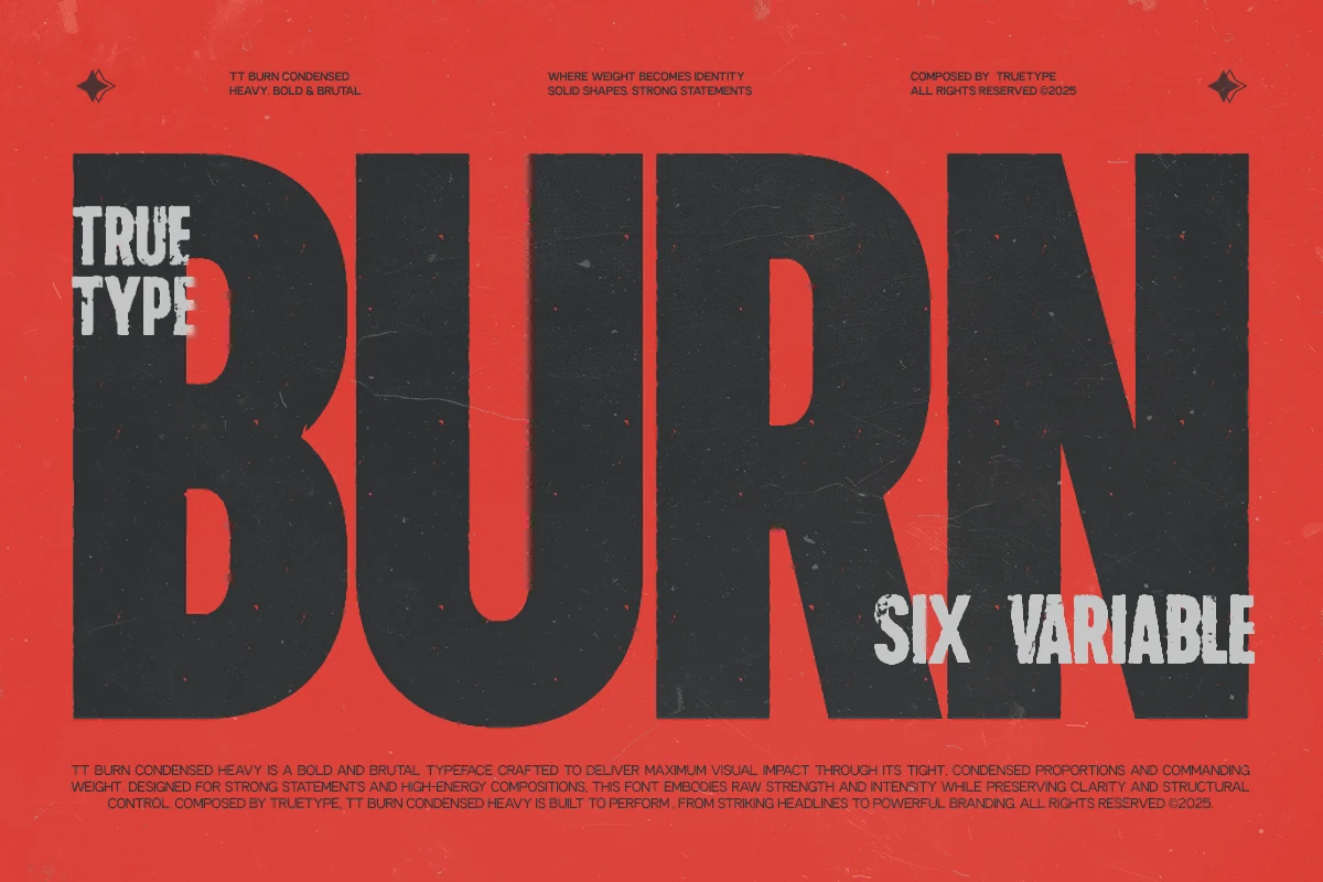
Best For: branding, headlines, posters, display text
TRT Burn Font has a heavy condensed build with straight sides, broad shoulders, and tight internal space that gives every word a dense, forceful silhouette. It stands out within Condensed Sans Serif Fonts for feeling blunt and controlled at the same time, so large titles read as immediate rather than decorative.
The compact width is especially useful when a layout needs real weight without sacrificing horizontal room. Use it for branding, posters, and other short display lines, then support it with smaller secondary text to keep the hierarchy crisp and the main statement firmly in focus.
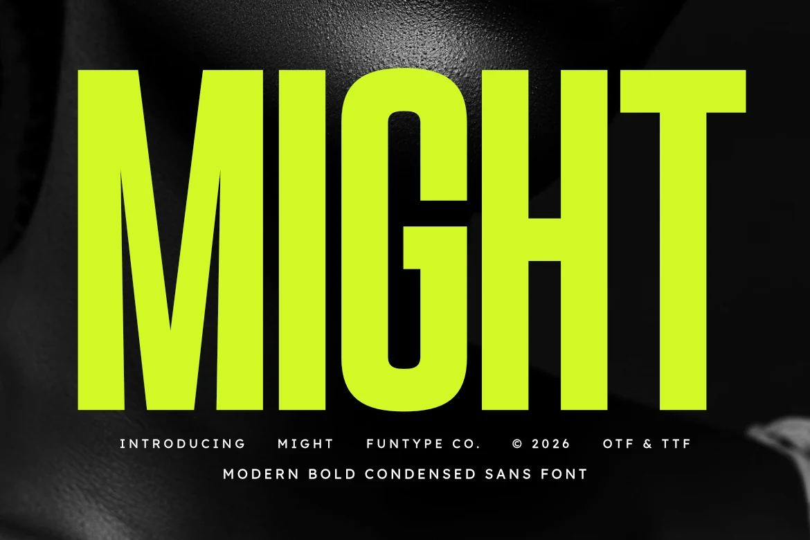
Might Font
Best For: headlines, posters, logos, bold designs
Might Font has towering proportions, thick strokes, and a compact footprint that makes every word feel locked and forceful. The sharp inner cuts add tension to the otherwise solid shapes, giving Condensed Sans Serif Fonts like this a harder, more aggressive presence than a standard block sans.
It works especially well for short headlines, poster titles, and logo concepts where space is tight but the message still needs real weight. The heavy structure holds up at large sizes, and pairing it with lighter supporting text helps keep the hierarchy clean instead of visually overloaded.
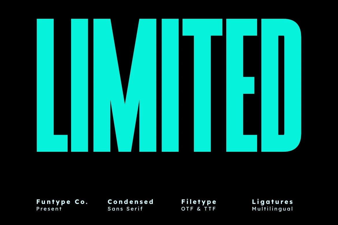
Limited Font
Best For: headlines, posters, branding, bold designs
Limited Font is built around towering proportions, dense vertical strokes, and a very narrow set that gives each word a clean, forceful silhouette. The straight sides and minimal shaping keep it crisp, showing how Condensed Sans Serif Fonts can feel bold and modern without extra ornament.
Because the width is so compact, it works especially well when a headline needs real weight in a tight space. Use it for posters, branding, and cover-style layouts, then pair it with smaller supporting text to keep the hierarchy sharp while the main line carries the impact.
Sport & Athletic Condensed Sans Serif Fonts
These styles feel fast, athletic, and packed with vertical energy, making them useful for event graphics, team-inspired logos, merch, and sharp all-caps title systems.
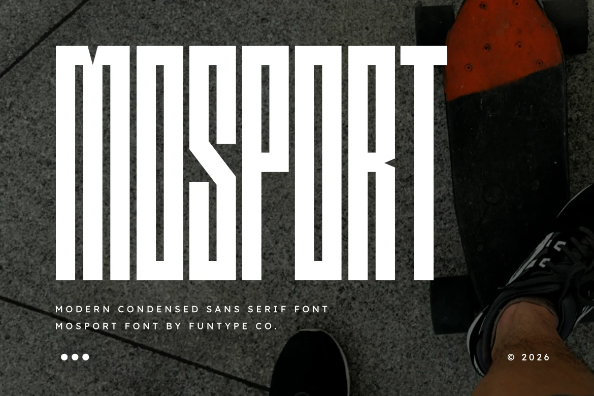
Mosport Font
Best For: headlines, posters, logos, branding
Mosport Font has the kind of vertical pull that makes a headline feel fast before you even read it. The letters are extremely tall and narrow, built from solid block strokes with angular cuts in characters like S and R, which gives Condensed Sans Serif Fonts a sharper athletic tone than a neutral condensed face.
It works best in short titles, event posters, and logo-style lockups where that stretched height can dominate the composition. Pair it with a wider supporting sans for body copy, and leave a little extra line spacing in stacked text so the tight counters and narrow gaps stay clear at smaller display sizes.
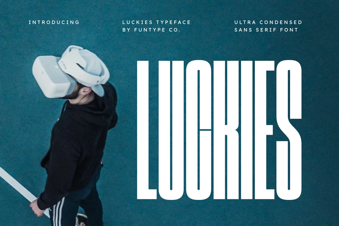
Luckies Font
Best For: headlines, posters, logos, branding
Luckies Font is built for sheer vertical impact, with ultra-condensed capitals, even block strokes, and tight inner spaces that make the word feel engineered rather than decorative. That rigid rhythm gives Condensed Sans Serif Fonts a sleek, futuristic edge, especially for titles that need to feel fast, technical, or sport-driven.
Because the letters are so narrow and tall, Luckies works best in short headlines, logo-style names, and poster text where height matters more than width. Keep the tracking slightly open and pair it with a wider supporting sans so the compressed forms stay crisp instead of cramped when you build a larger title system.
Commited Font
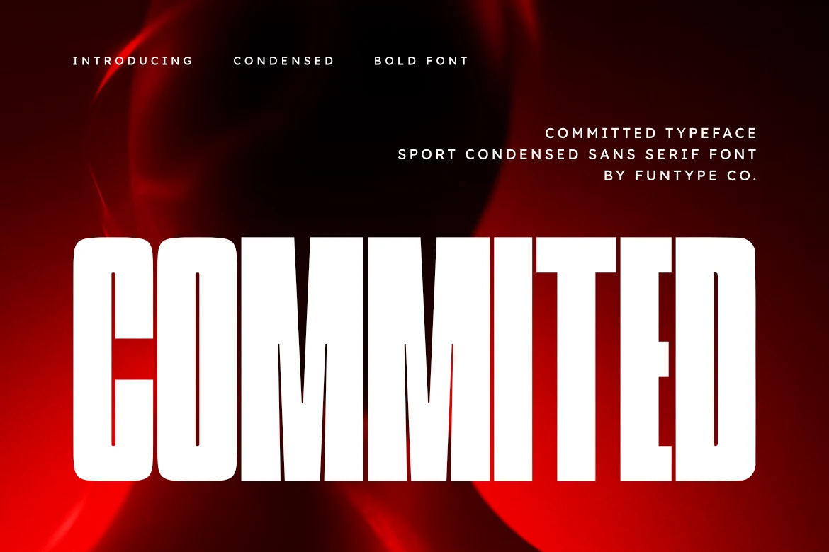
Best For: headlines, posters, logos, bold designs
Commited Font has a hard-driving presence, built from very tall condensed forms, heavy strokes, and tight counters that make each word feel compressed and forceful. The rounded outer corners soften the silhouette just enough, but the overall effect keeps Condensed Sans Serif Fonts firmly in high-impact territory.
It performs best in short headline settings where the narrow width lets you push scale without losing control of the layout. Use a simpler secondary sans beside it and give stacked lines a bit more breathing room, so the dense vertical rhythm stays sharp and the blocky shapes do not visually fuse together.
Boston Font
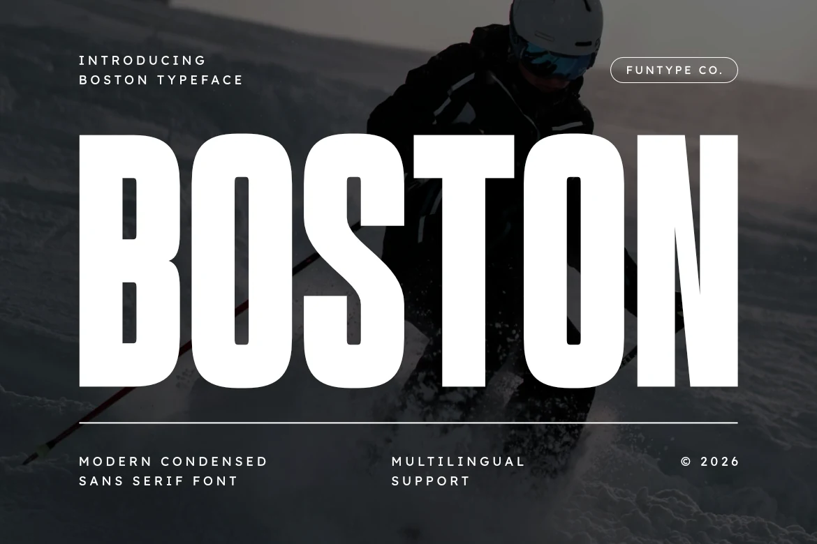
Best For: headlines, logos, posters, branding
Boston Font has a compact, hard-hitting silhouette, with tall condensed capitals, thick even strokes, and softly rounded corners that keep the weight feeling controlled instead of rigid. That mix of density and smooth geometry gives Condensed Sans Serif Fonts a confident sports-forward voice, especially in short all-caps titles.
The narrow width lets you scale Boston up without swallowing the whole layout, which makes it useful for headline systems, poster titles, and logo text. Keep body copy in a simpler wider sans, and add a little line spacing in stacked settings so the tight counters in letters like B, O, and S stay crisp.
Hoodie Font
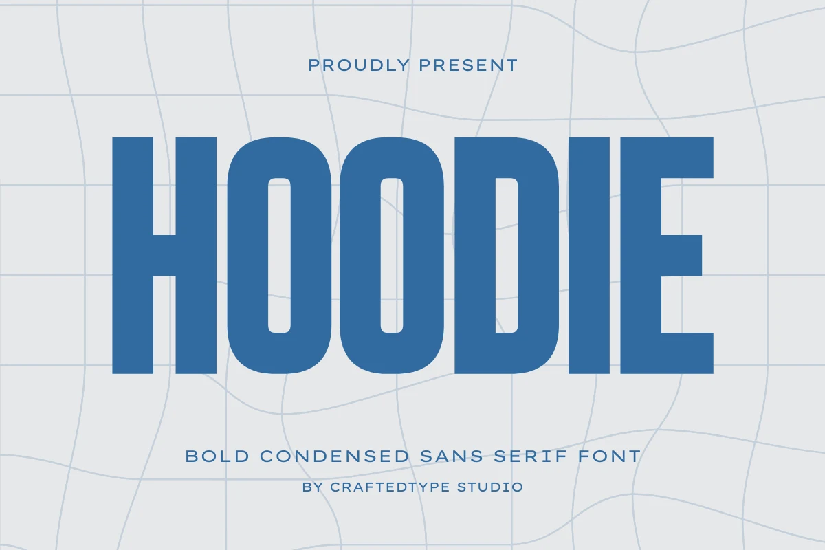
Best For: headlines, logos, posters, merch design
Hoodie Font has a sturdy urban feel, with thick condensed capitals, rounded corners, and broad vertical strokes that keep the wordmark heavy without looking cramped. That smooth blocky construction gives Condensed Sans Serif Fonts a sportier, more approachable tone than a harsher industrial display face.
It works especially well for posters, apparel graphics, and logo-style headings where you need real weight in a narrow width. Pair it with a lighter, slightly wider sans for secondary text; that contrast helps the slim counters in letters like O and D stay open and keeps the hierarchy clear.
Movault Font
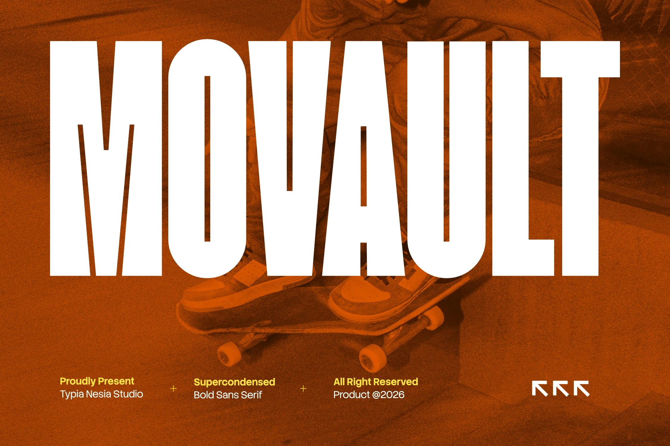
Best For: headlines, posters, logos, display text
Movault Font pushes condensation to the extreme with towering caps, slab-like strokes, and very narrow internal space. Subtle angled cuts inside letters like M and A keep the silhouette from feeling static, giving Condensed Sans Serif Fonts a sharper, more athletic character.
This is a display face for short, forceful wording rather than long copy. Its super-condensed width helps you fill a poster, logo, or title area fast, so it works best when you let the scale do the work and pair it with quieter supporting text for contrast.
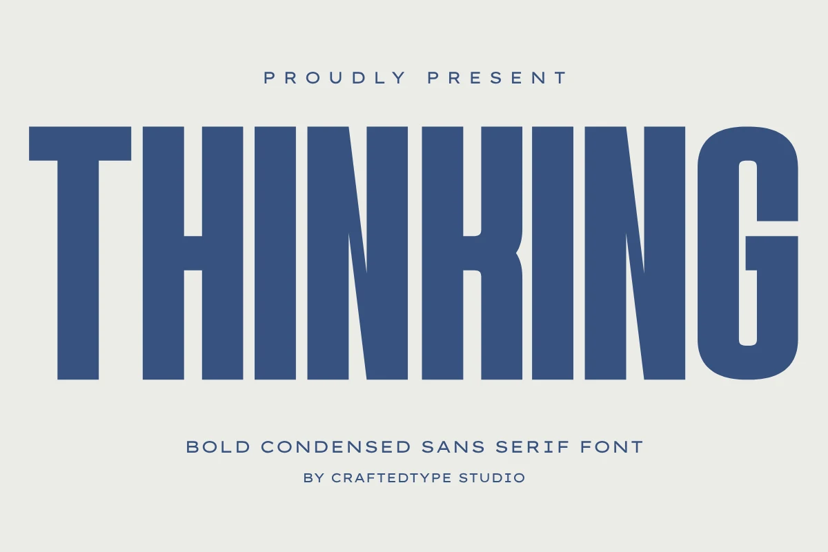
Thinking Font
Best For: logos, headlines, posters, T-shirts
Thinking Font uses towering caps, broad vertical strokes, and tight spacing to create a solid, poster-ready silhouette. The angled joins in letters like N and K keep the blocky build from feeling flat, giving Condensed Sans Serif Fonts a clean industrial tone with strong readability.
It fits logotypes, editorial headlines, and POD graphics where you need weight without wasting width. The clean outlines also help when cutting vinyl for apparel or merch, while the heavy structure holds up well in bold title hierarchy and short, high-impact wording.
Industrial & Minimal Condensed Sans Serif Fonts
This group focuses on cleaner, harder condensed forms with architectural spacing, controlled geometry, and a modern tone for posters, packaging, and logo work.
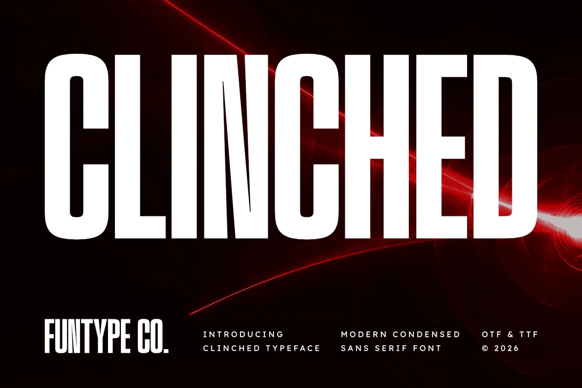
Clinched Font
Best For: headlines, posters, logos, merch design
Clinched Font has an imposing vertical stance, with ultra-condensed proportions, thick even strokes, and softly rounded corners that keep its blocky shape from feeling stiff. The narrow counters and dense rhythm give Condensed Sans Serif Fonts a harder industrial tone here, especially when the word is stretched large across a dark layout.
This is the kind of face that works best when you keep the message short and let scale do the heavy lifting. It suits poster titles, streetwear wordmarks, and packed headline systems; just give stacked lines a little extra leading so the tight internal spaces in letters like N, C, and D stay clean.
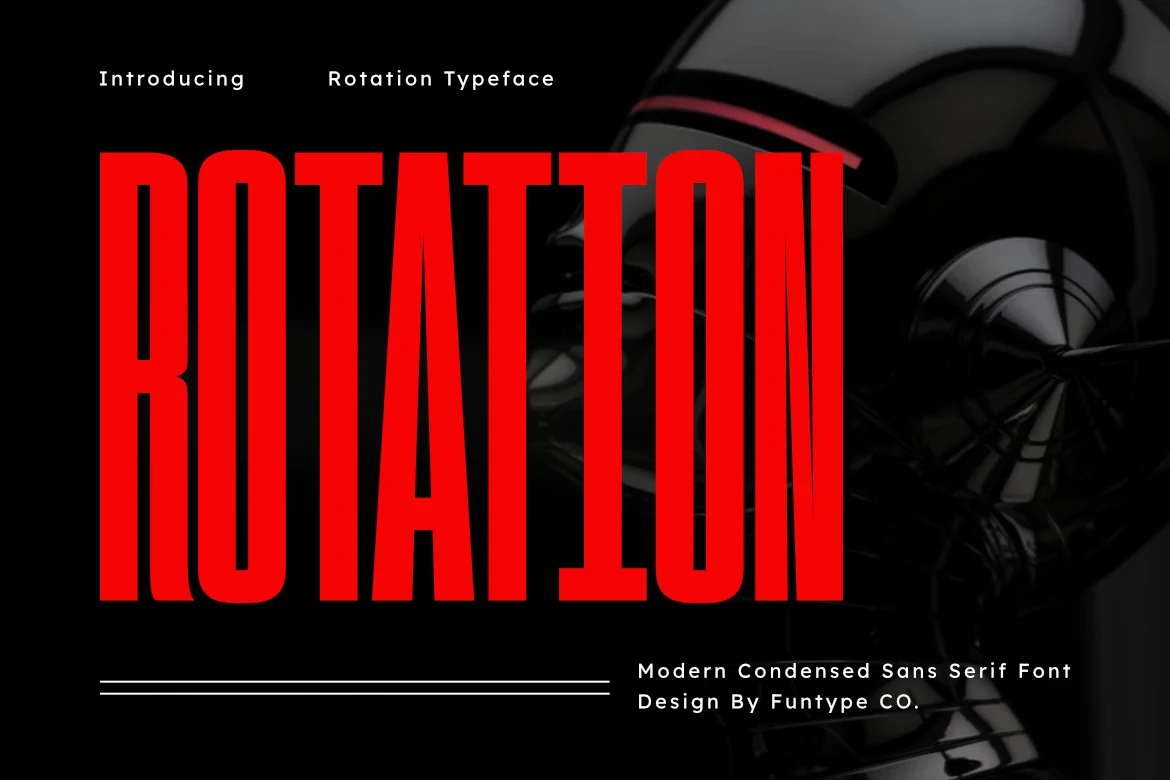
Rotation Font
Best For: headlines, logos, posters, merch design
Rotation Font is all about vertical force: ultra-condensed proportions, heavy block strokes, and narrow inner spaces that make each letter feel tightly engineered. The straight-sided build and sharp geometry give Condensed Sans Serif Fonts a tough industrial voice, with enough precision to feel clean rather than chaotic.
It performs best in short, oversized wording where the height can dominate without eating too much width. For posters, streetwear-style graphics, or packaging titles, keep the message compact and let the scale carry the tension; a simpler wider sans works well underneath when you need contrast in the hierarchy.
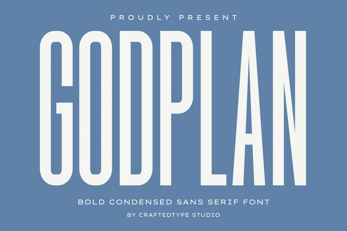
Godplan Font
Best For: headlines, logos, posters, branding
Godplan Font takes a cleaner, more architectural approach to condensed display type, with tall rounded stems, narrow counters, and an even vertical rhythm that keeps the heavy weight feeling composed. That balance gives Condensed Sans Serif Fonts a polished presence here, bold enough for impact but smooth enough to avoid a harsh industrial edge.
It is especially effective in stacked titles, mastheads, and logo text where space is limited but the wording still needs authority. A little extra tracking helps the all-caps setting breathe, and pairing it with a lighter supporting sans keeps the slim interior spaces in letters like A and N clear at smaller display sizes.
Hormuz Font
Best For: headlines, posters, logos, display text
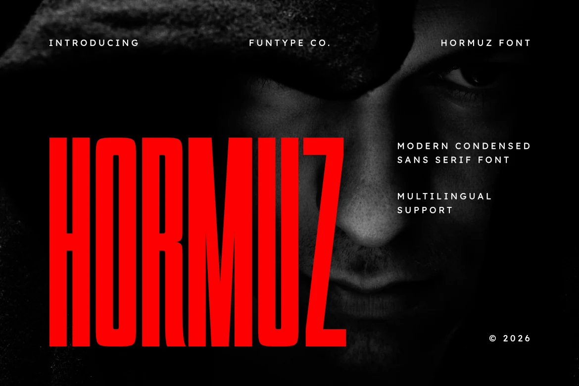
Hormuz Font is built on extreme height and a tight, narrow set, with solid vertical strokes and compact counters that keep every letter forceful on the page. Its geometric structure feels stern but not mechanical, giving Condensed Sans Serif Fonts a darker cinematic edge that reads especially well in oversized display settings.
This is a strong choice for titles that need to hit fast without taking much horizontal space. Use it for short poster lines, sports-minded branding, or dramatic hero text, and keep surrounding copy simpler and wider so the compressed rhythm stays clear and the red-hot silhouette remains the focal point.
Hooked Font
Best For: logos, branding, posters, minimal designs
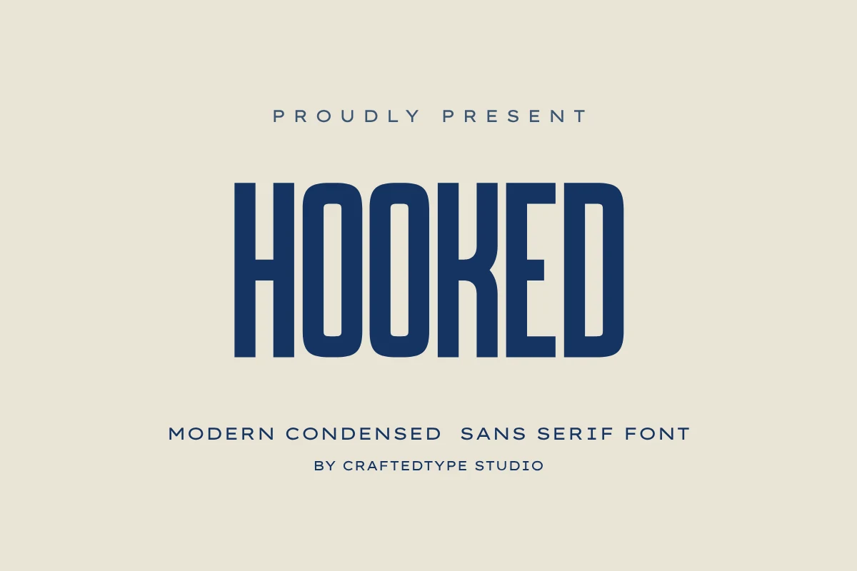
Hooked Font has a lean, upright rhythm, with tall narrow capitals, rounded corners, and clean vertical strokes that keep the wordmark sharp without feeling severe. That balance gives Condensed Sans Serif Fonts a calmer, more polished voice, especially when you want display type that looks modern rather than aggressive.
It works well for logos, minimalist posters, and packaging where space is tight but the title still needs presence. Keep tracking slightly open and pair it with a neutral wider sans for support; that contrast helps the slim counters in letters like O and E stay clear in smaller display settings.
Condensans Font
Best For: branding, posters, headlines, editorial designs
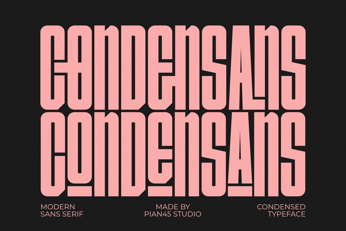
Condensans Font has an ultra-tall, tightly packed build with long vertical strokes and narrow counters that create a sharp architectural rhythm. That disciplined structure gives Condensed Sans Serif Fonts a more authoritative tone, especially when the goal is a clean headline that feels sleek rather than decorative.
The all-caps design is strongest in short wording, stacked titles, and narrow layout spaces where you need scale without extra width. It suits minimalist branding, industrial posters, and editorial openers well, and its compressed proportions help you build bold hierarchy while keeping the page controlled.
Retro & Rounded Condensed Sans Serif Fonts
These warmer condensed sans serif fonts soften the narrow format with rounded corners, vintage curves, and friendly weight for labels, tees, cafe branding, and nostalgic posters.
Pistacho Font
Best For: logos, posters, retro designs, headlines
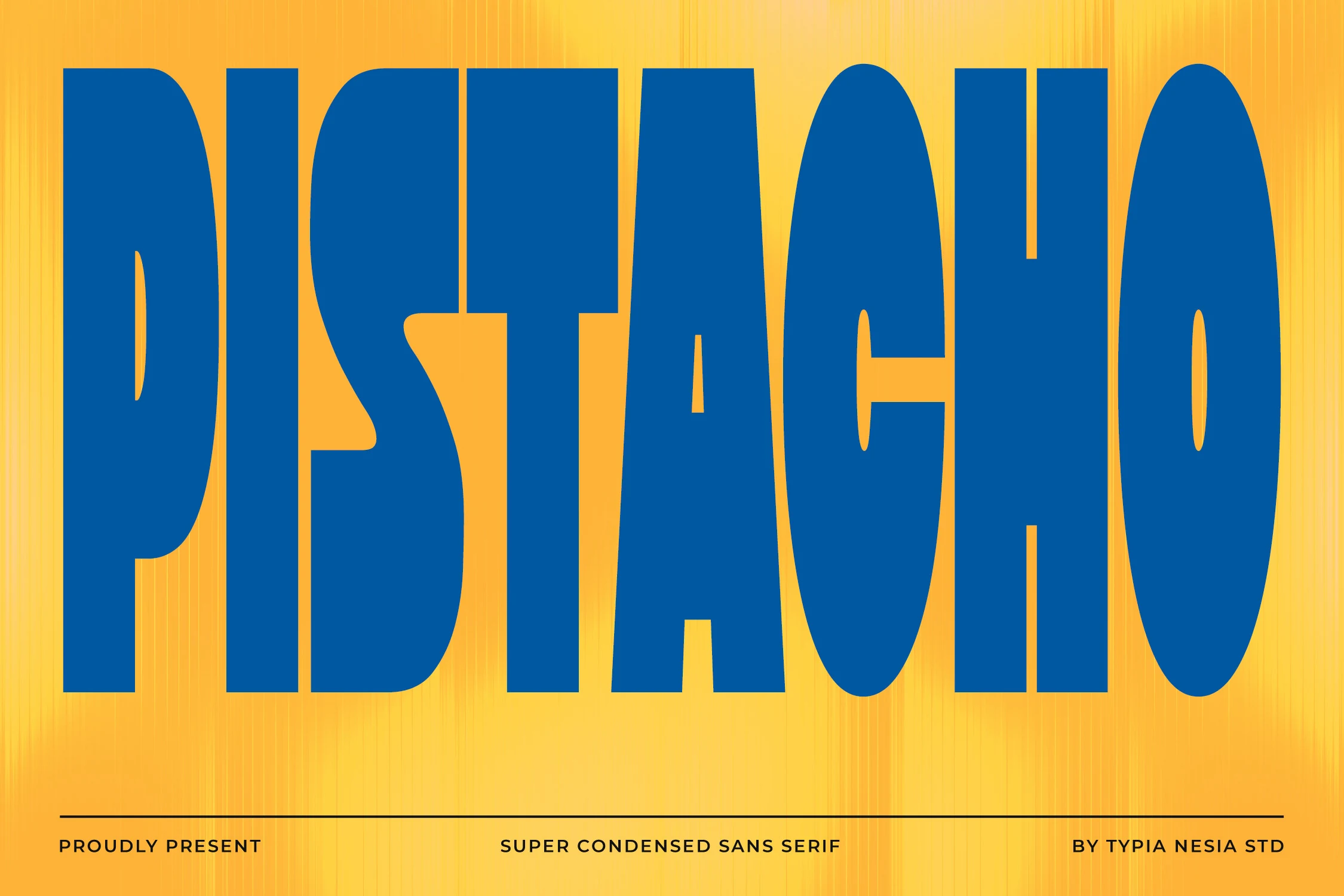
Pistacho Font has a loud retro silhouette, with super-condensed proportions, heavy strokes, and rounded outer curves that keep the wordmark bold without feeling mechanical. Details like the low-bar A, stretched oval O, and pinched S give Condensed Sans Serif Fonts a more nostalgic display flavor here than a neutral modern sans.
It is strongest in short logo lines, poster titles, and big header text where the tall shape can fill space vertically. Keep the wording brief and let the scale do the work; if you pair it with another font, choose something simpler and lighter so Pistacho keeps its chunky rhythm and retro personality.
The Goodfather Font
Best For: posters, logos, packaging, retro designs
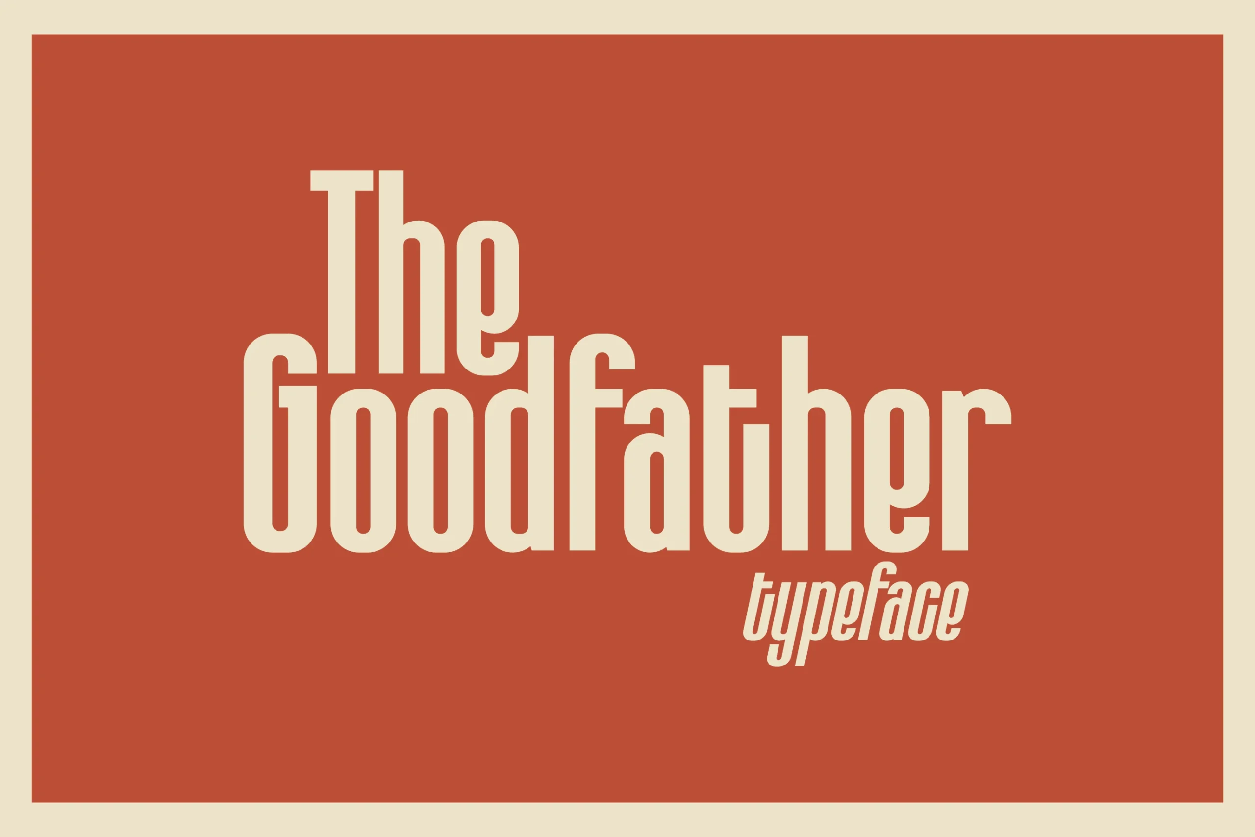
The Goodfather Font leans into tall, tightly packed proportions, but its softened terminals and rounded inner shapes keep the mood warm rather than harsh. That balance gives Condensed Sans Serif Fonts a retro headline feel with enough polish for bold poster titles, logo wordmarks, and standout packaging.
Its strokes stay even from top to bottom, which helps the letters read cleanly despite the narrow width. Use it for short phrases, stacked compositions, or label fronts where vertical emphasis matters—the compact set lets you build strong hierarchy without the headline taking over the whole layout.
Crochet Font
Best For: logos, posters, headlines, vintage designs
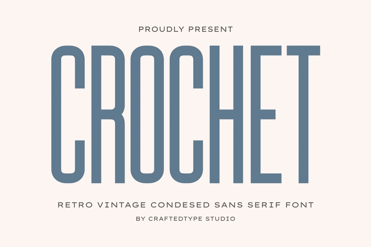
Crochet Font combines extra-tall letterforms with narrow spacing, creating a lean silhouette that feels vintage without looking heavy. Its softened corners and steady stroke weight give Condensed Sans Serif Fonts a more refined rhythm, so the retro tone comes through cleanly rather than turning overly decorative.
The vertical emphasis makes it especially useful for posters, logos, and other front-facing display work where you want height and presence in a limited width. It also suits stacked title layouts well—leave a little breathing room around it, and the slim proportions will keep the hierarchy sharp and elegant.
Pretzel Font
Best For: logos, posters, T-shirts, retro designs
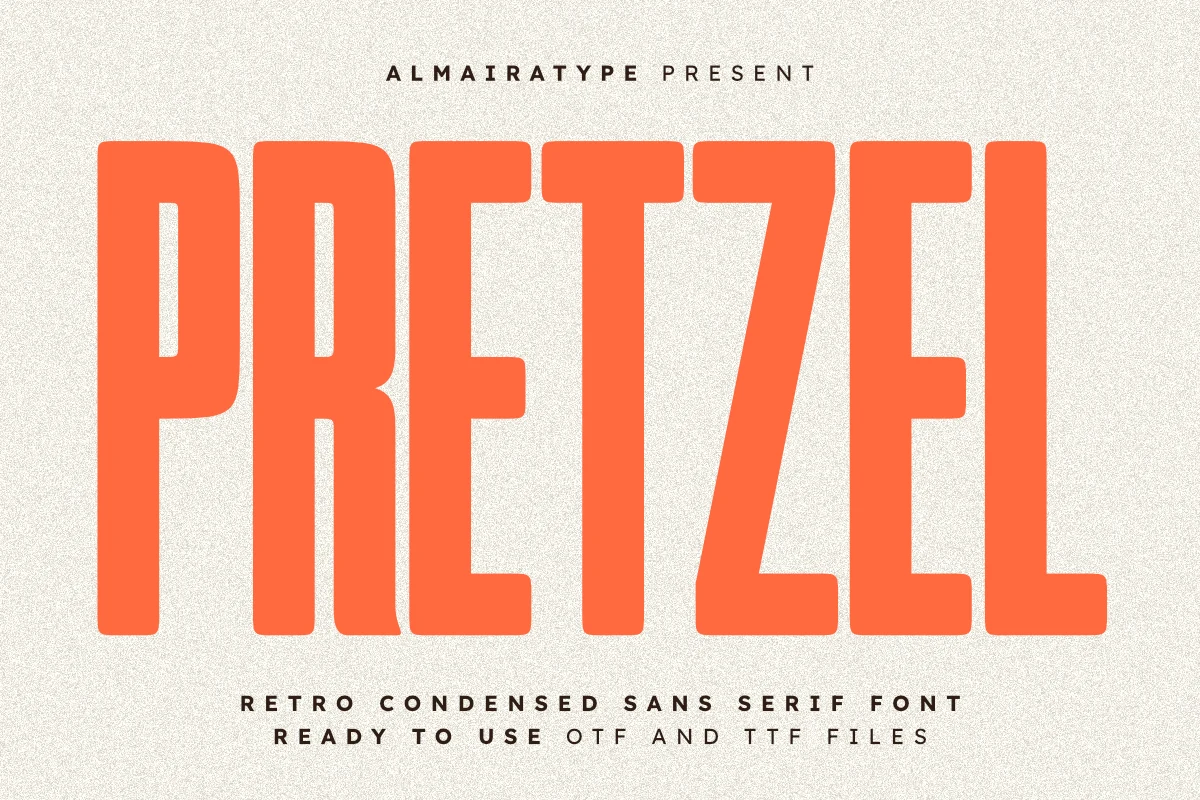
Pretzel Font has a tall, compressed build with chunky monoline strokes and softly rounded corners that keep the heavy structure feeling warm rather than severe. Its retro tone comes through in those blunt curves and broad proportions, giving Condensed Sans Serif Fonts a friendlier, more nostalgic voice for bold display work.
The shapes stay clear and evenly weighted, so it reads well on short headlines, cafe branding, tees, and poster titles where you want impact without a cold industrial edge. Clean outlines also make it practical for vinyl-cut merch and craft layouts, especially when you keep the wording brief and let the vertical proportions carry the hierarchy.
Praise Font
Best For: logos, posters, branding, T-shirts
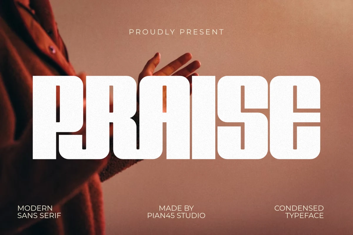
Praise Font uses tall all-caps shapes, thick strokes, and gently rounded bases to create a headline style that feels bold but welcoming. That softer finish gives Condensed Sans Serif Fonts a warmer personality here, making the font feel more inviting than a hard-edged industrial condensed face.
The subtle ligatures help short words sit together more smoothly, which is useful for logos and seasonal display work where you want a custom touch without losing clarity. It suits coffee branding, bakery packaging, posters, and apparel best when used large, with simple supporting text to let the compact vertical rhythm stay clean.
Editorial & Fashion Condensed Sans Serif Fonts
These tall condensed fonts lean toward fashion, magazine covers, and polished campaign typography, giving narrow headlines a sleek, cinematic, and editorial feel.
Influencer Font
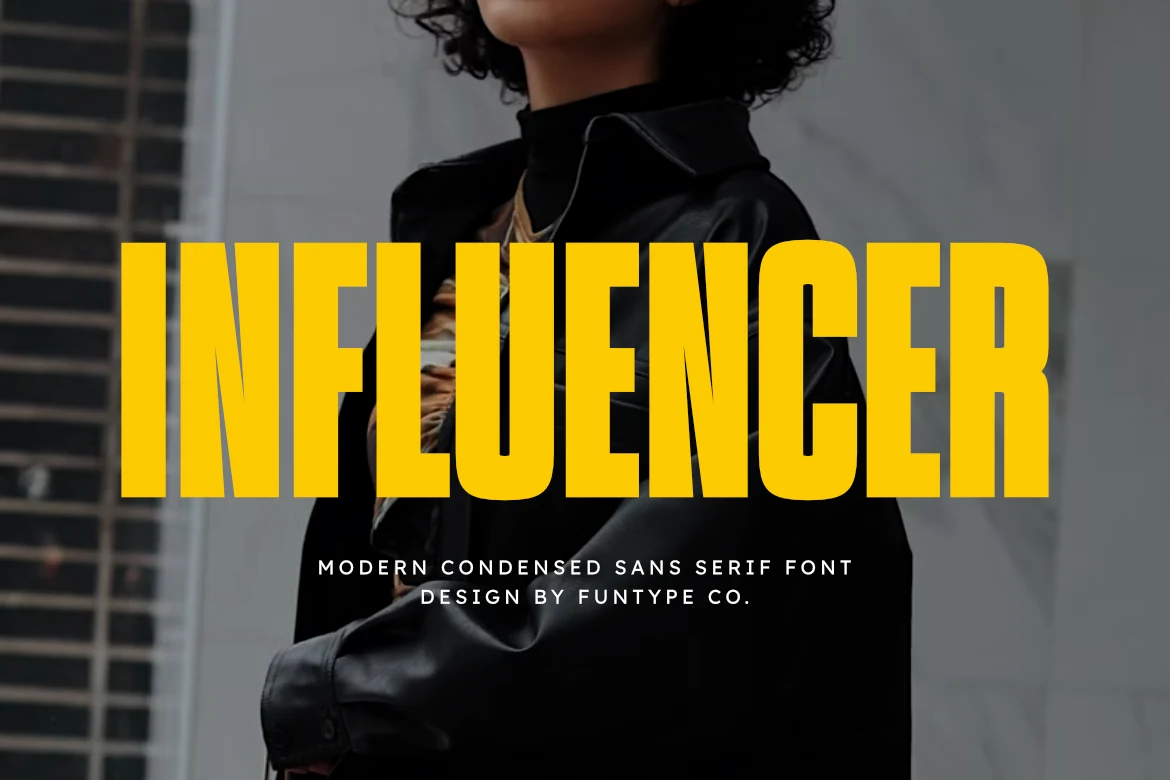
Best For: headlines, posters, editorial designs, fashion branding
Influencer Font has a hard, fashion-led attitude, with towering condensed capitals, thick strokes, and sharp inner joins that keep the wordmark dense without feeling clumsy. The narrow geometry gives Condensed Sans Serif Fonts a more assertive editorial edge here, especially when set large across a clean layout.
It is strongest in short headlines, covers, and brand statements where width is limited but impact still matters. Use it with generous margins and a quieter supporting sans; the heavy weight and compressed rhythm already create plenty of contrast, so a lighter secondary style keeps the hierarchy clear.
Nothing Font
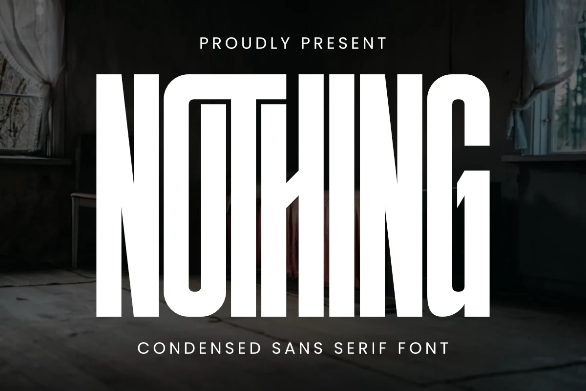
Best For: headlines, posters, logos, editorial designs
Nothing Font stretches each letter into an exaggerated vertical frame, with narrow counters and clean geometric edges that make the wordmark feel severe, modern, and unmistakably graphic. It shows how Condensed Sans Serif Fonts can create drama through proportion alone, without relying on ornament.
The compressed width makes it especially effective for headlines, posters, and cover-style layouts where a few words need to dominate the page. Keep tracking modest and pair it with quieter secondary text so the tall rhythm stays crisp while the main line carries the impact.
Sunlight Font
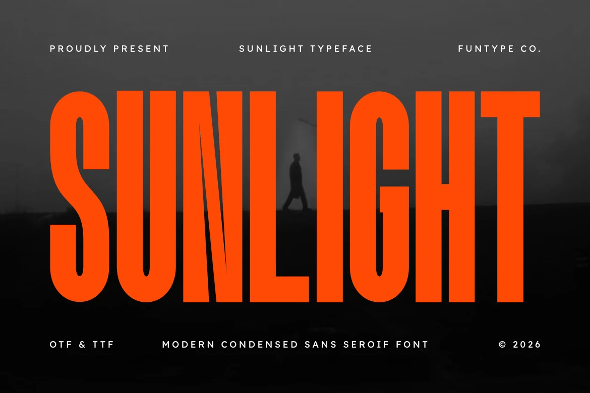
Best For: headlines, posters, branding, editorial designs
Sunlight Font pairs towering proportions with a crisp, even stroke weight, while the angled cut in the N keeps the wordshape from feeling rigid. It gives Condensed Sans Serif Fonts a sharper editorial attitude, with enough clarity to stay readable even when the headline is packed tight.
Because the letters carry so much vertical weight, it works best for posters, branding, and other short display settings where space is limited but impact matters. Let it handle the top tier of the hierarchy, then balance it with smaller, quieter text so the condensed rhythm stays clean instead of crowded.
Polaroid Font
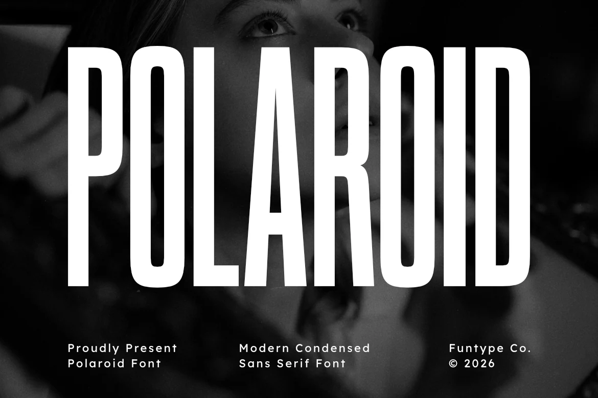
Best For: headlines, posters, fashion branding, packaging
Polaroid Font has an exceptionally tall stance, narrow geometric construction, and clean vertical rhythm that instantly pulls the eye upward. It gives Condensed Sans Serif Fonts a sleek cinematic mood, with enough structure to feel modern while still carrying a subtle retro fashion edge.
The letterforms are lean but not fragile, so headlines stay crisp even when stretched across narrow layouts. It works best for poster titles, packaging fronts, and brand wordmarks where you want strong scale without extra width—especially if you pair it with smaller supporting text and generous side margins.
Edition Font
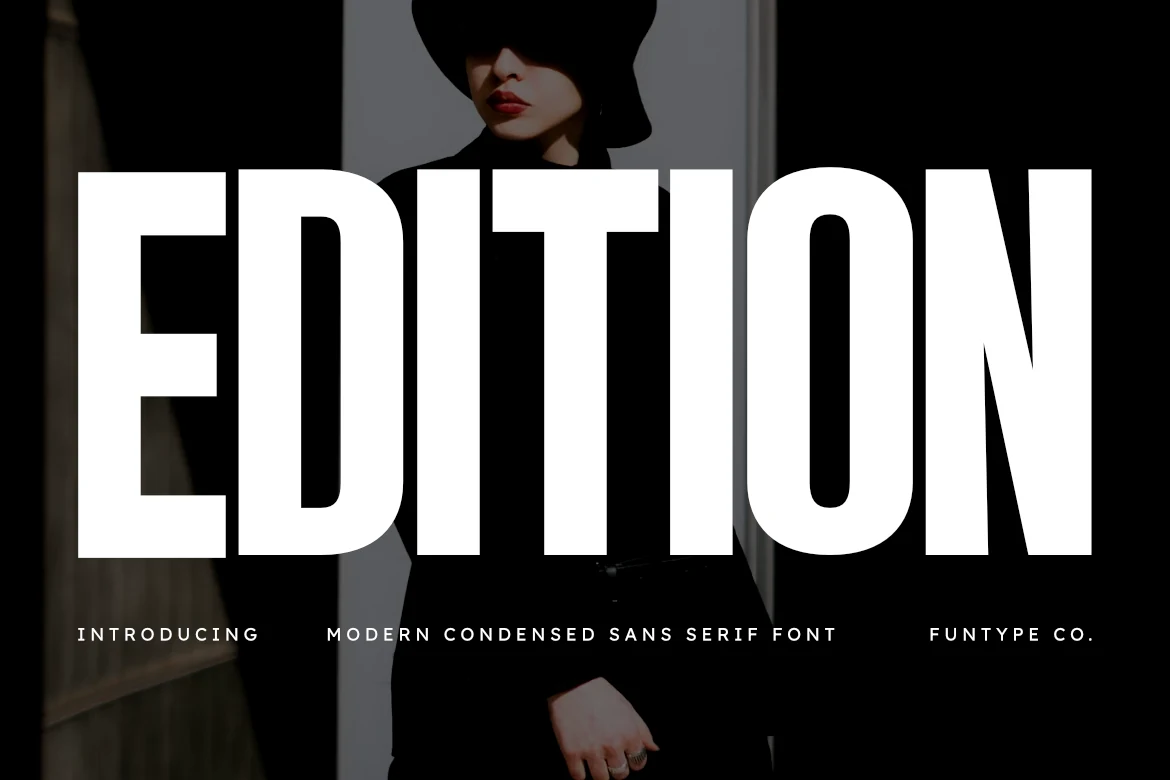
Best For: headlines, posters, fashion branding, editorial designs
Edition Font stretches simple block forms into a tall, narrow silhouette, with even stroke weight and tight internal space that gives the lettering a sharp editorial presence. It shows how Condensed Sans Serif Fonts can feel sleek and commanding at the same time, especially for fashion-led headlines and clean poster layouts.
The shapes are stripped back and highly legible, so it works best when a short line needs scale without taking over the full width. Use it for branding, cover titles, or advertising headers, then contrast it with smaller supporting text to keep the hierarchy crisp and the dramatic vertical rhythm intact.
Conclusion
Choose bold impact styles when the headline needs maximum pressure, sport styles for energy, industrial or minimal fonts for cleaner systems, retro rounded fonts for warmer branding, and editorial or fashion styles when the layout needs a tall, refined display voice.