14 Rounded Sans Serif Fonts for Stunning 2026 Designs
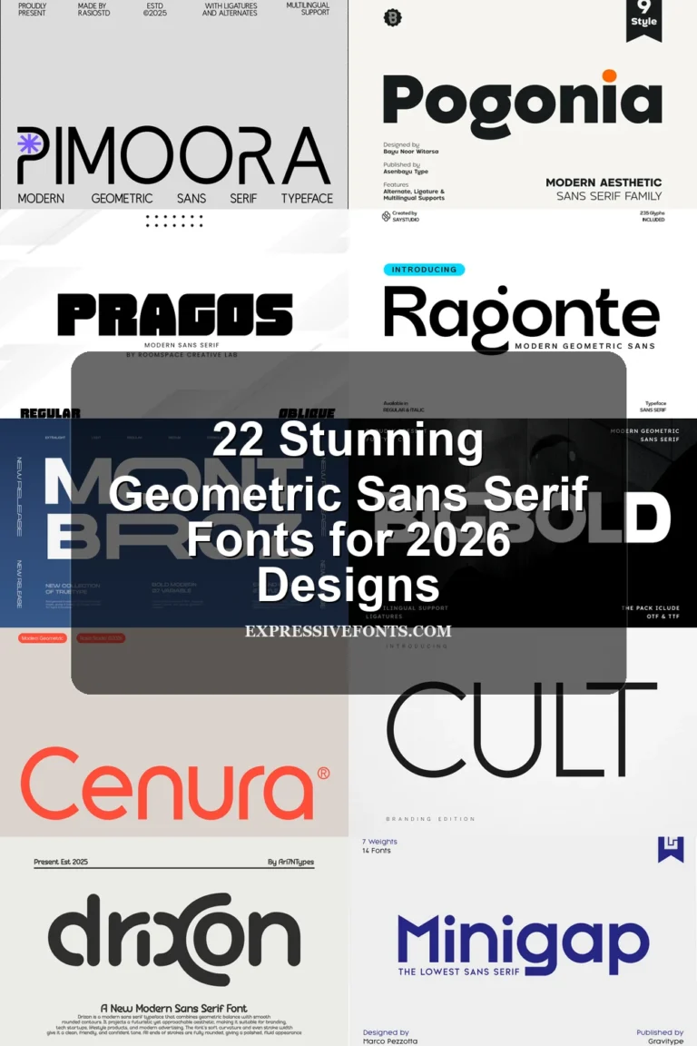
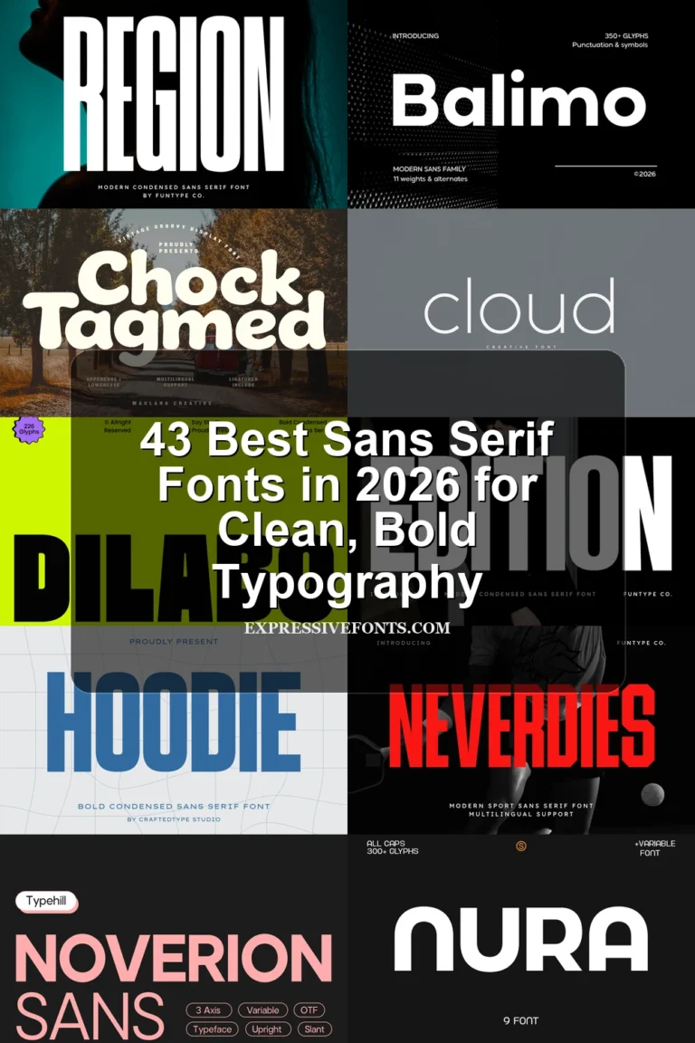
Rounded Sans Serif Fonts are a strong choice for designers who want clean lettering with a softer edge. This collection covers friendly brand marks, bold posters, modern website headers, packaging, social graphics, and retro display work where approachable shapes still need clear structure.
Soft & Friendly Rounded Sans Serif Fonts
These rounded sans serif fonts use gentle curves and open forms for warm logos, beauty branding, packaging, invitations, and casual lifestyle designs.
Rembara Font
Best For: branding, social media graphics, packaging, casual designs
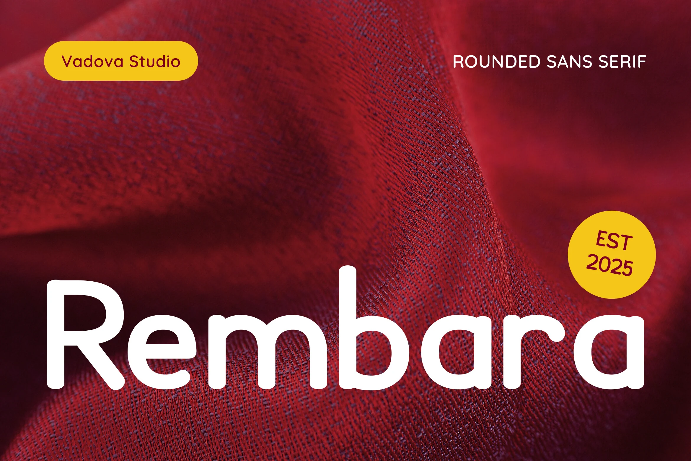
Rembara Font uses thick, rounded strokes with smooth terminals and a soft lowercase rhythm. The single-storey forms and generous curves keep the tone casual without making the letters look childish, which gives Rounded Sans Serif Fonts a more polished lifestyle-brand direction.
It works best where the typography needs warmth and immediate recognition: packaging, youth campaigns, Instagram layouts, and editorial title moments. Keep tracking moderate rather than tight, since the broad curves need enough separation to stay clean at display size.
Rose Font
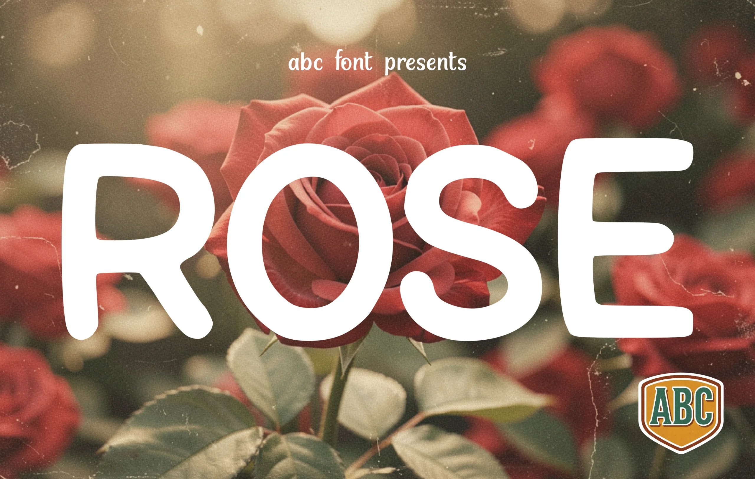
Best For: logos, invitations, beauty branding, romantic designs
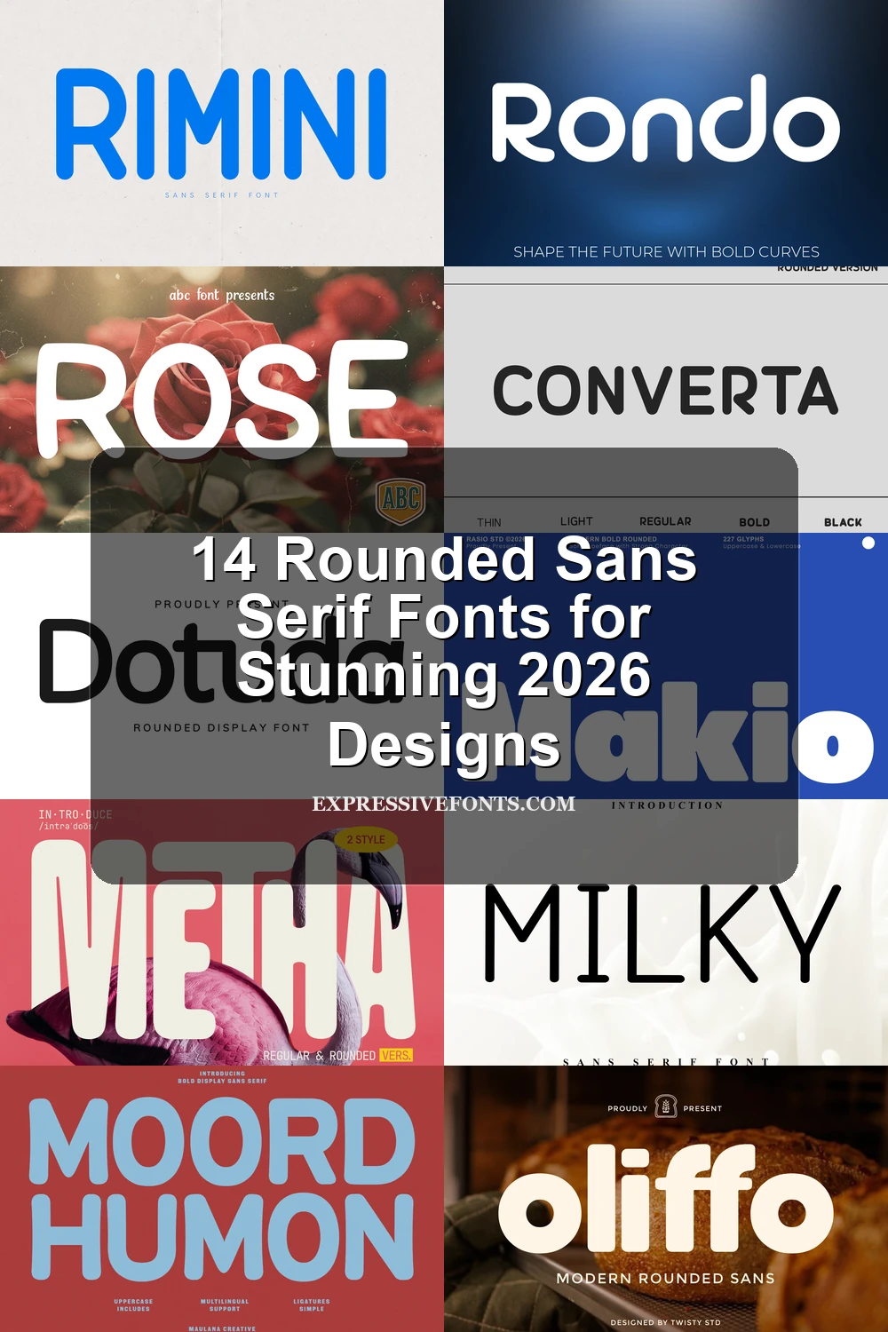
Rose Font has the kind of rounded weight that feels gentle rather than bubbly. Broad curves, open counters, and softened corners give the letters a calm, welcoming rhythm, bringing Rounded Sans Serif Fonts into a more romantic, nature-led mood without losing clarity.
The thick strokes make it strongest in short display settings such as logos, invitations, packaging, and editorial titles. If you set it in all caps or at a large scale, add a touch of spacing so the rounded forms stay airy and keep their soft, polished presence.
Oliffo Font
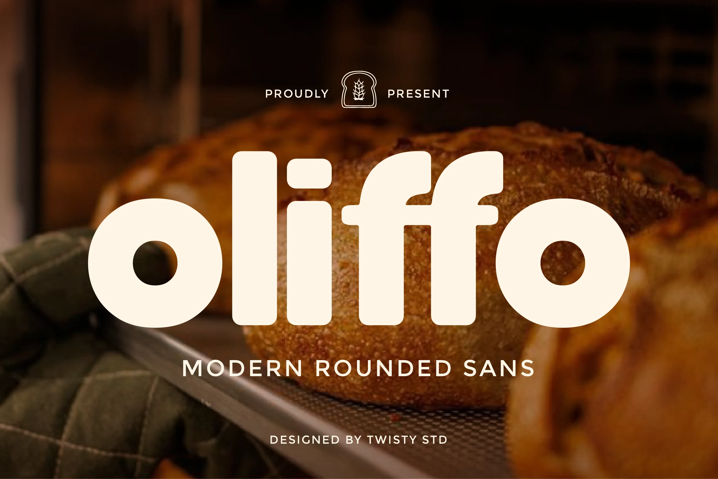
Best For: branding, packaging, signage, restaurant menus
Oliffo Font has a chunky rounded build with smooth terminals, circular counters, and soft joins that make the wordmark feel immediately open and friendly. The heavy weight gives Rounded Sans Serif Fonts a more welcoming tone, while the clean structure keeps the letters modern rather than cartoonish.
It suits branding that wants warmth without losing clarity, especially on packaging, menus, and storefront-style signage. Short names and product titles look strongest here, and slightly looser spacing helps the broad curves stay distinct instead of merging into one dense block.
Bold & Playful Rounded Sans Serif Fonts
These chunky rounded sans serif fonts bring stronger weight, wider shapes, and high-impact curves for posters, packaging, social graphics, and energetic headlines.
Moord Humon Font
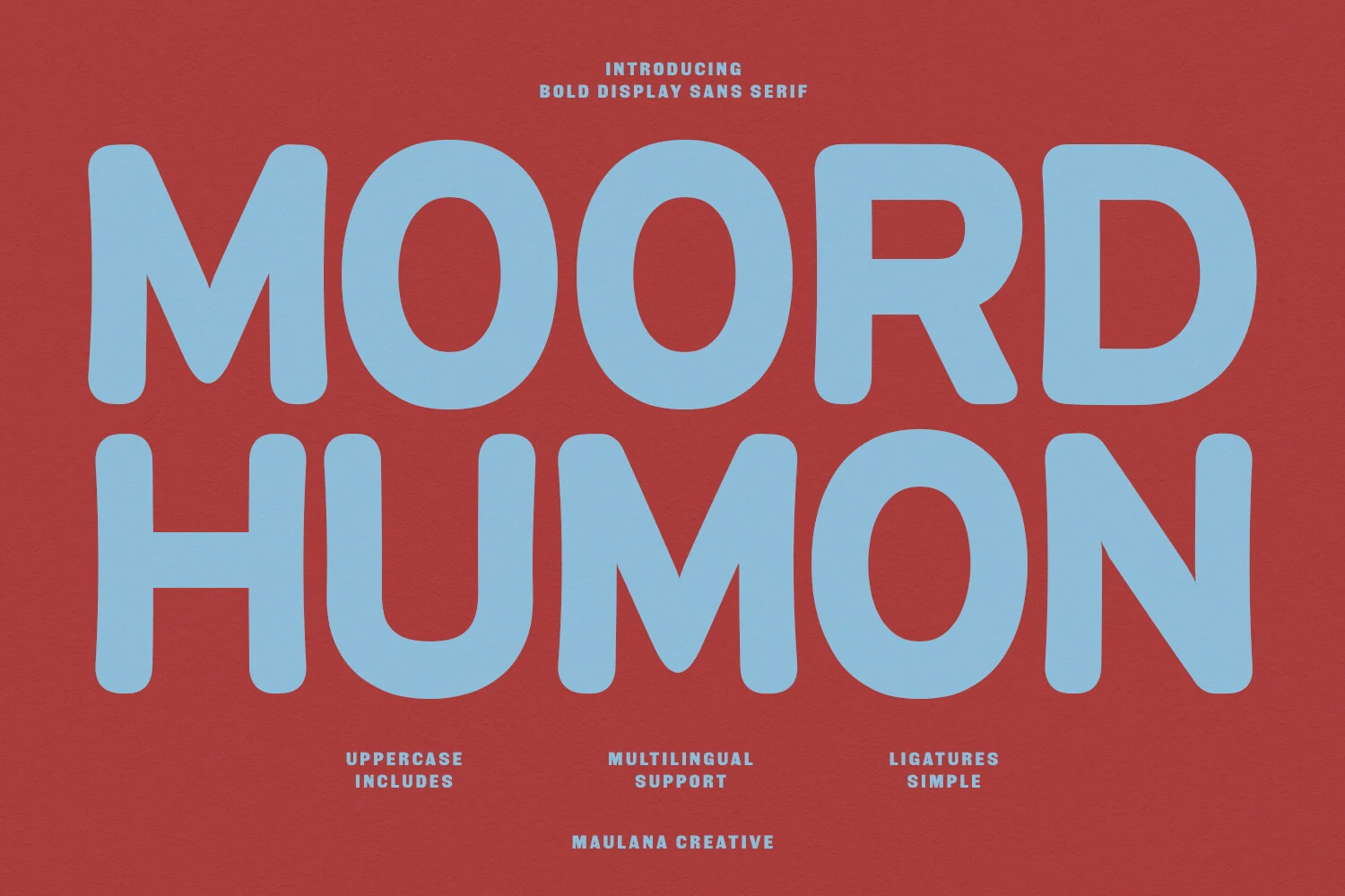
Best For: logos, packaging, posters, playful designs
Moord Humon Font has an oversized, rounded build with thick strokes, broad counters, and softly curved corners that keep its weight feeling friendly. The shapes are bold without turning stiff, which gives Rounded Sans Serif Fonts a more graphic, upbeat personality for attention-grabbing display work.
It performs best in short headlines, logos, packaging, and poster layouts where a few words need to do the heavy lifting. Give it generous line spacing and avoid cramped settings, since the dense forms look cleaner and more confident when the letters have room to breathe.
Metha Font
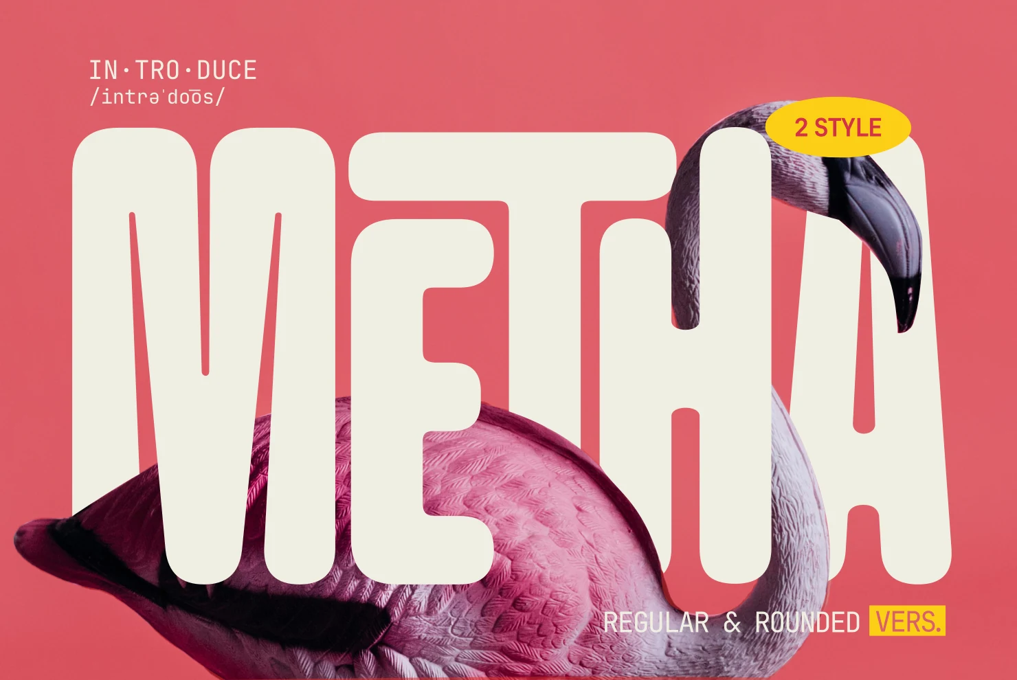
Best For: branding, posters, headlines, playful designs
Metha Font stands out with extra-wide proportions, thick strokes, and heavily rounded corners that keep its oversized shapes feeling soft rather than rigid. That mix of weight and warmth gives Rounded Sans Serif Fonts a more graphic, poster-ready voice while staying easy to scan at a glance.
The Regular and Rounded styles make it easier to build hierarchy across branding, ads, and packaging without shifting the overall tone. In big headlines, use slightly open spacing so the broad forms and tight inner spaces stay crisp instead of looking crowded.
Portilla Rounded Bold Font
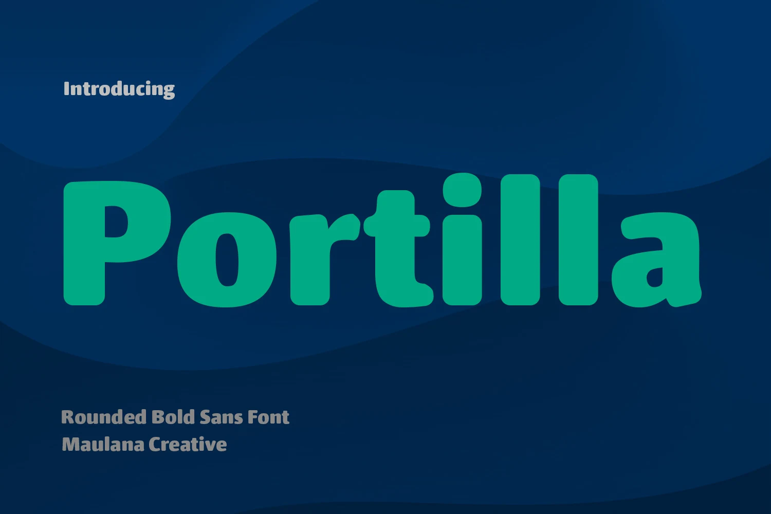
Best For: logos, social media graphics, book covers, headlines
Portilla Rounded Bold Font has a chunky, friendly build with thick strokes, soft terminals, and compact rounded shapes that stay clear even at a glance. The lowercase forms feel especially approachable, giving Rounded Sans Serif Fonts a lively, upbeat tone that suits modern branding without looking overly cute.
It shines in logos, titles, and social graphics where a few words need strong presence. The ligatures and alternates are genuinely useful here, since they help you refine awkward letter pairings and make custom wordmarks feel less mechanical. Keep tracking slightly open in bigger settings so the dense curves do not crowd each other.
Makio Font
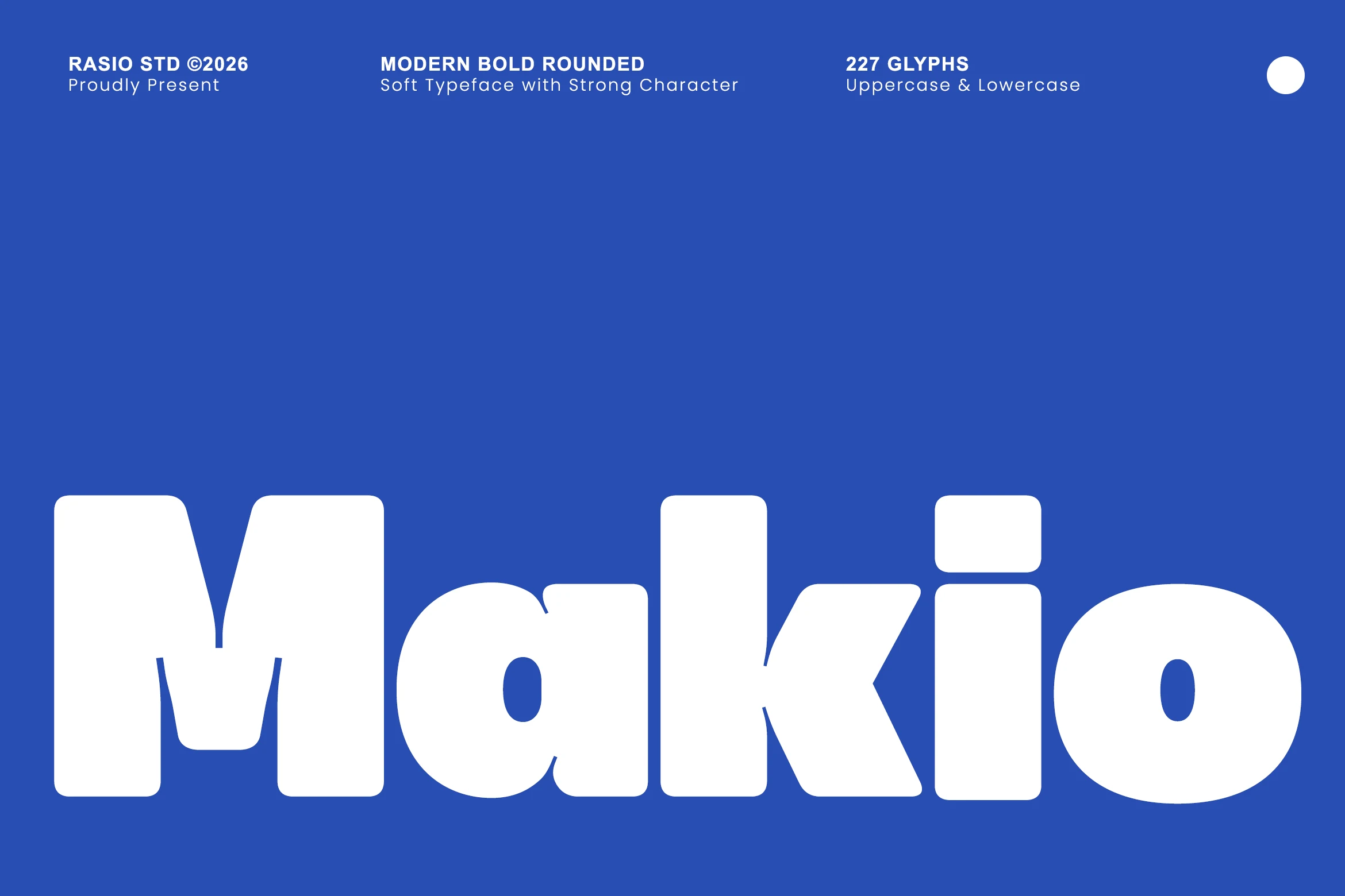
Best For: logos, posters, headlines, bold designs
Makio Font has a dense, pillowy build with oversized rounded corners, thick strokes, and tightly packed joins that make every letter feel solid and upbeat. That soft structure keeps the weight from turning harsh, giving Rounded Sans Serif Fonts a louder, more graphic personality with plenty of impact.
It is strongest in short headlines, logos, and poster text where the broad shapes can dominate the layout. Use generous line spacing and keep supporting type simpler and lighter, since the huge x-height and compact spacing create hierarchy fastest when Makio is allowed to carry the visual weight.
Clean & Modern Rounded Sans Serif Fonts
These cleaner rounded sans serif fonts keep the edges soft while staying polished, making them useful for websites, editorial layouts, brand systems, and UI-style headings.
Milky Font
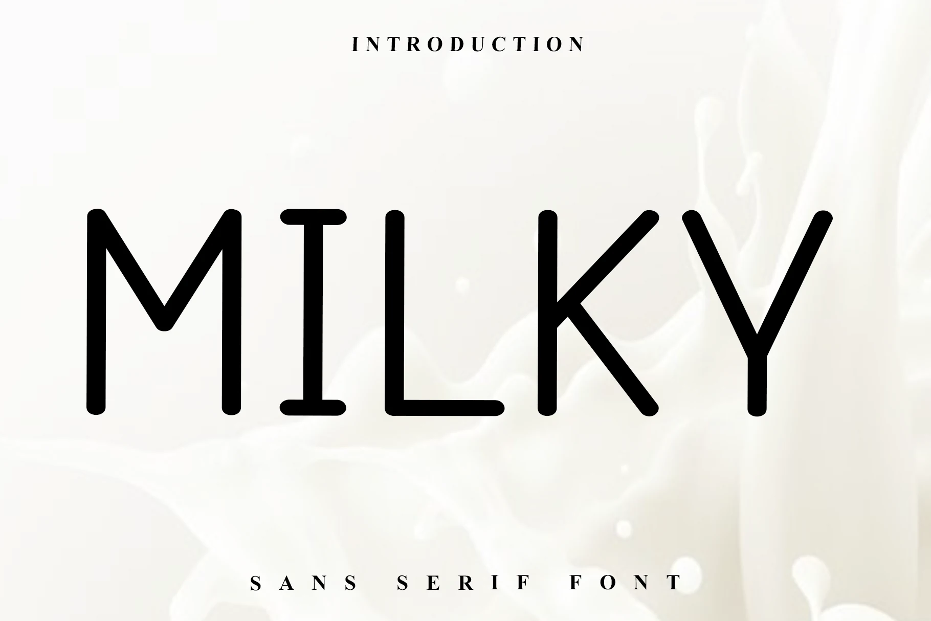
Best For: logos, branding, social media graphics, minimal designs
Milky Font keeps things light and modern with slim monoline strokes, rounded corners, and generous spacing. The tall verticals feel clean and controlled, while the angled M and K bring just enough character to give Rounded Sans Serif Fonts a softer, more design-led voice.
It works especially well for logos, social media content, and digital branding where clarity matters but a hard geometric look would feel too cold. Use it at medium to large sizes with a touch of tracking, since the thin strokes and open rhythm help its distinctive shapes stay crisp on screen.
Converta Rounded Font
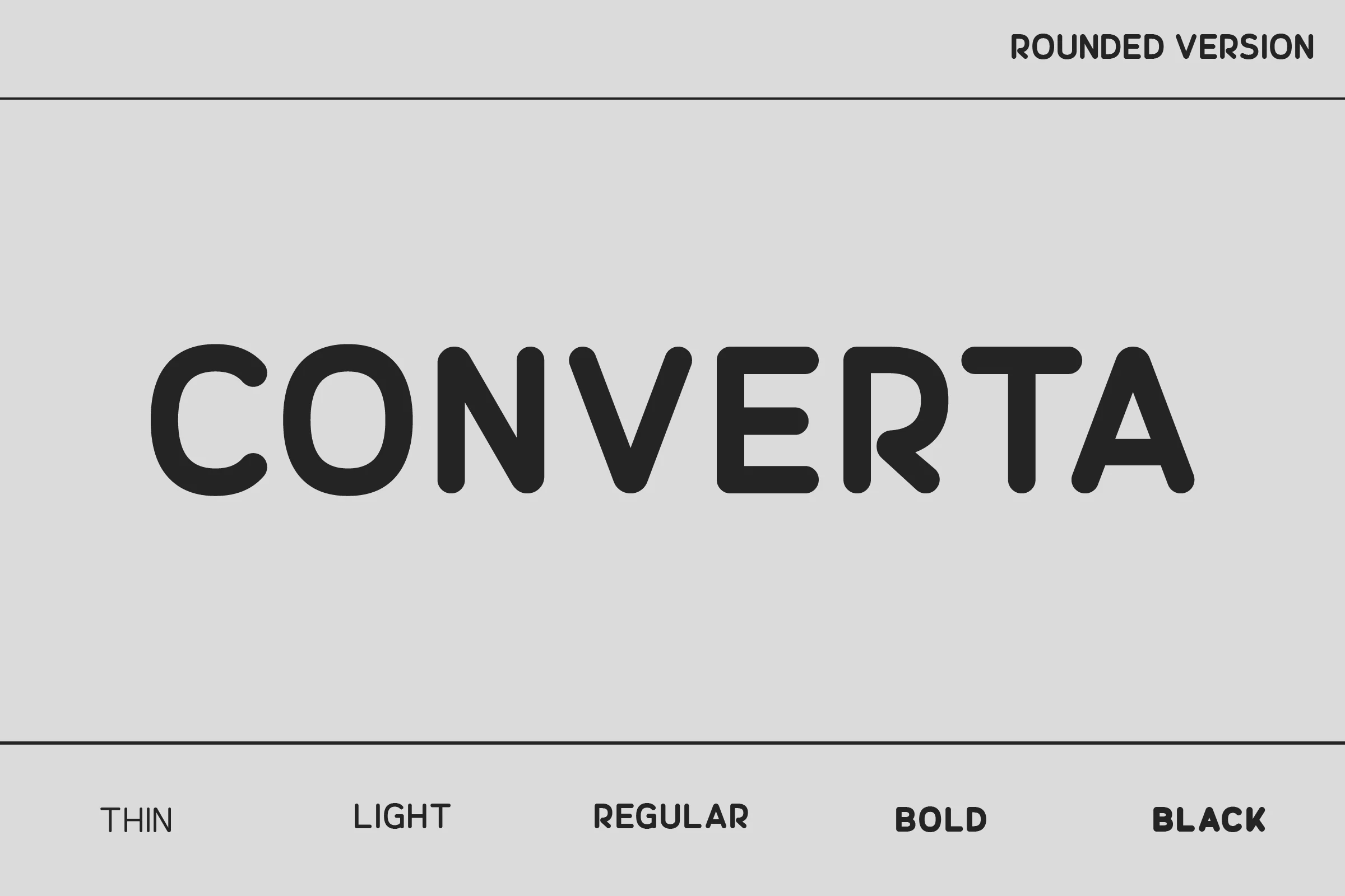
Best For: logos, magazine covers, posters, editorial designs
Converta Rounded Font has a calm, polished structure built from even strokes, softened corners, and roomy counters. Among Rounded Sans Serif Fonts, it leans refined rather than playful, with clean letter spacing and compact curves that make display text look smooth and quietly confident.
That balance of simplicity and sophistication suits logos, magazine layouts, and film-poster style headlines especially well. Keep the tracking slightly open in large settings to emphasize its airy rhythm, and pair it with lighter supporting type when you want the rounded forms to carry the hierarchy.
Rondo Font
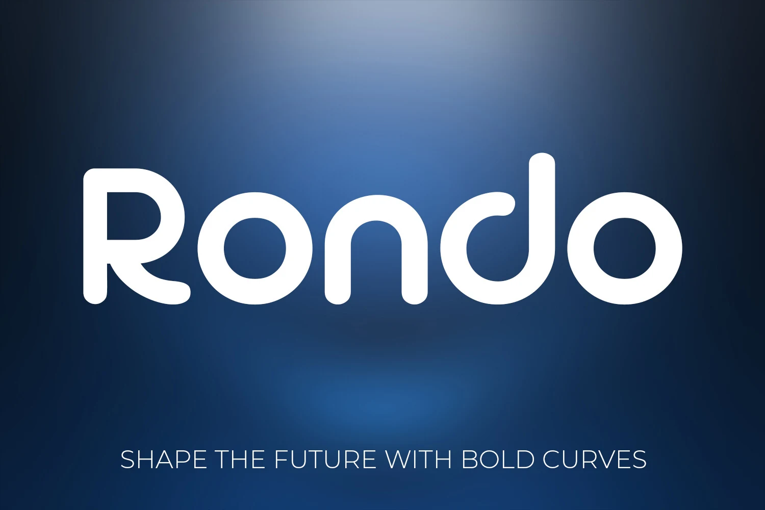
Best For: logos, branding, website headers, modern designs
Rondo Font pairs geometric structure with softened terminals, round bowls, and an even stroke weight, so the letterforms feel clean without turning cold. That balance gives Rounded Sans Serif Fonts a more polished, forward-looking tone, especially in short names and titles where its curved shapes can stay prominent.
It is strongest in logos, website headers, and other display settings that need instant clarity on screen or in print. Keep the tracking slightly open and let it sit at a confident size, because the broad curves and tight joins read best when the letters have a little space to show their smooth rhythm.
Rimini Font
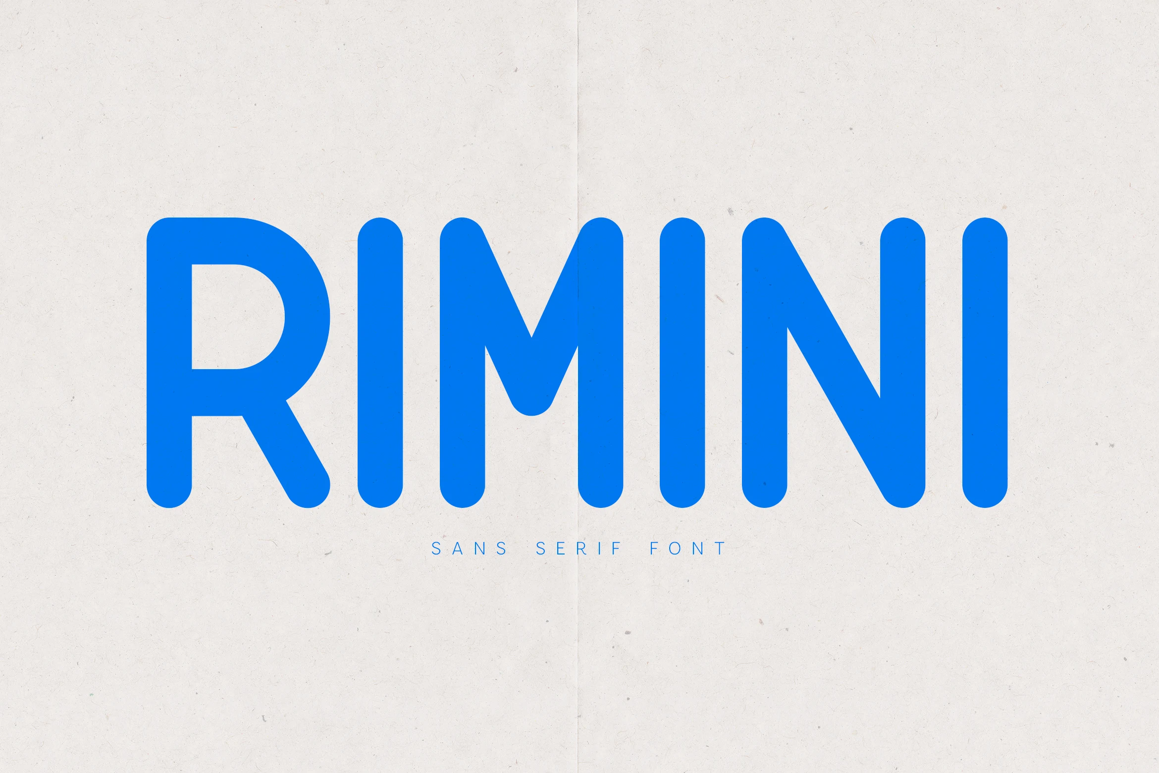
Best For: branding, packaging, editorial designs, clean designs
Rimini Font has a clean, balanced build with rounded terminals, even stroke weight, and tidy geometry that keeps the letterforms calm and highly legible. That measured structure gives Rounded Sans Serif Fonts a more polished, interface-friendly tone, softening the edges without losing the contemporary feel.
It fits branding, packaging, and editorial layouts where clarity matters as much as personality. The wide stance and smooth curves hold up well in headings and short blocks of copy, while slightly open spacing helps its minimal rhythm stay crisp in UI-style compositions and modern page layouts.
Goodly Font
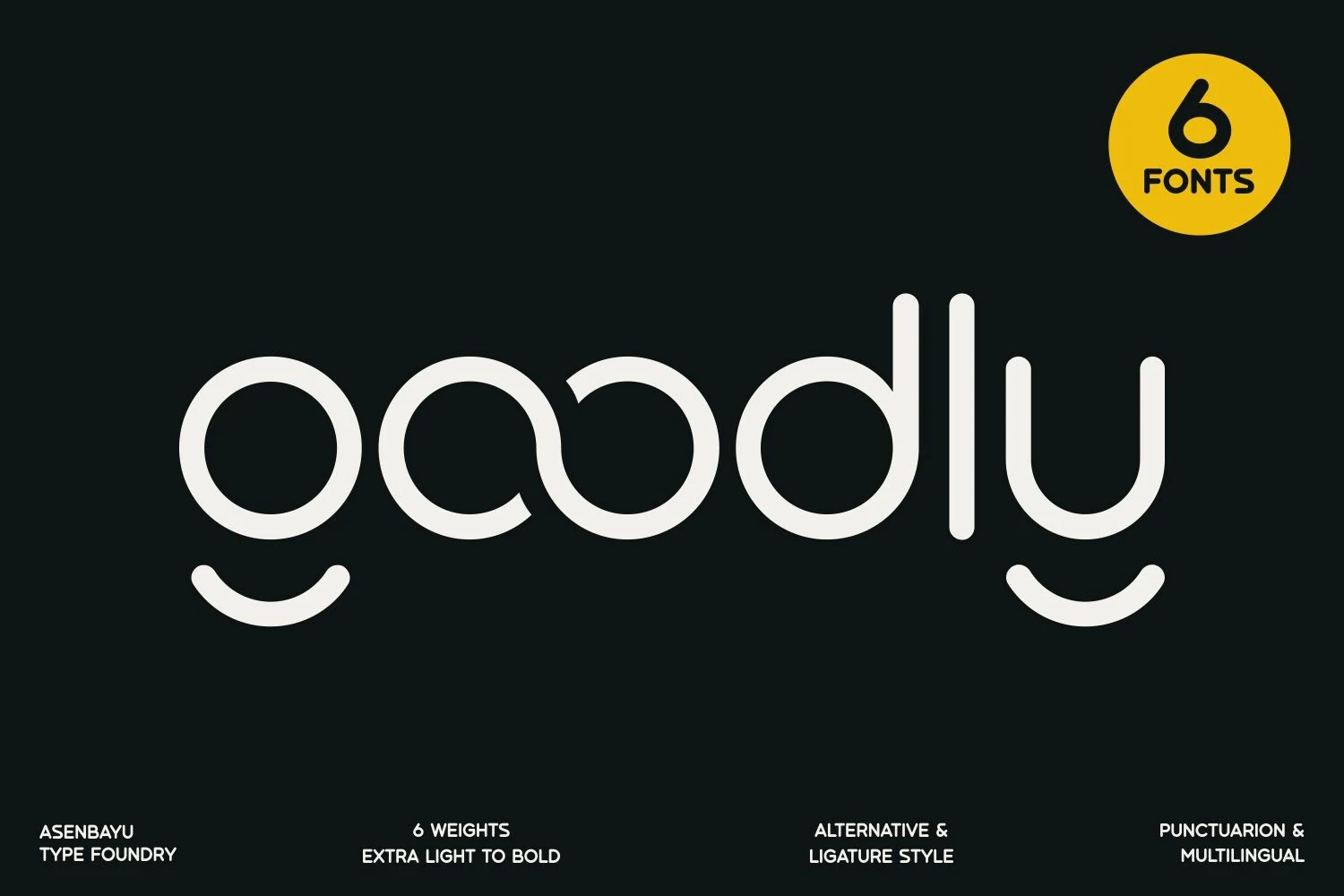
Best For: logos, branding, packaging, fashion branding
Goodly Font has a light, rounded rhythm built from even strokes, circular bowls, and clean verticals, but the curved descenders on the g and y keep it from feeling too plain. That small twist gives Rounded Sans Serif Fonts a more refined, easygoing character while still reading as modern and professional.
The 6 weights make it especially useful when you need one family to cover logos, packaging, and fashion-led branding with clear hierarchy. Keep the spacing slightly open to preserve its airy flow, and let the heavier weights handle short titles where those smooth curves can hold the layout together.
Retro & Vintage Rounded Sans Serif Fonts
These retro rounded sans serif fonts lean into condensed shapes, nostalgic curves, and heavier display rhythm for posters, signage, covers, and vintage branding.
Heiano Saigou Font
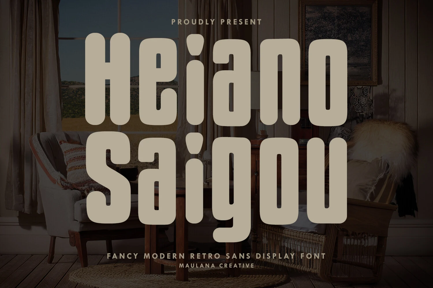
Best For: posters, headlines, retro designs, vintage designs
Heiano Saigou Font has tall, ultra-bold letterforms with rounded corners, narrow inner spaces, and a distinctly retro vertical rhythm. The heavy construction gives it mid-century character, while the softened edges keep it from feeling harsh, giving Rounded Sans Serif Fonts a more theatrical, lounge-style presence.
It works best when the type needs to carry the whole mood, especially in posters, signage, and cover-style titles. Keep it to short words or stacked lines, because the condensed width and dense weight create stronger hierarchy when those elongated forms are allowed to dominate the composition.
Dotuda Font
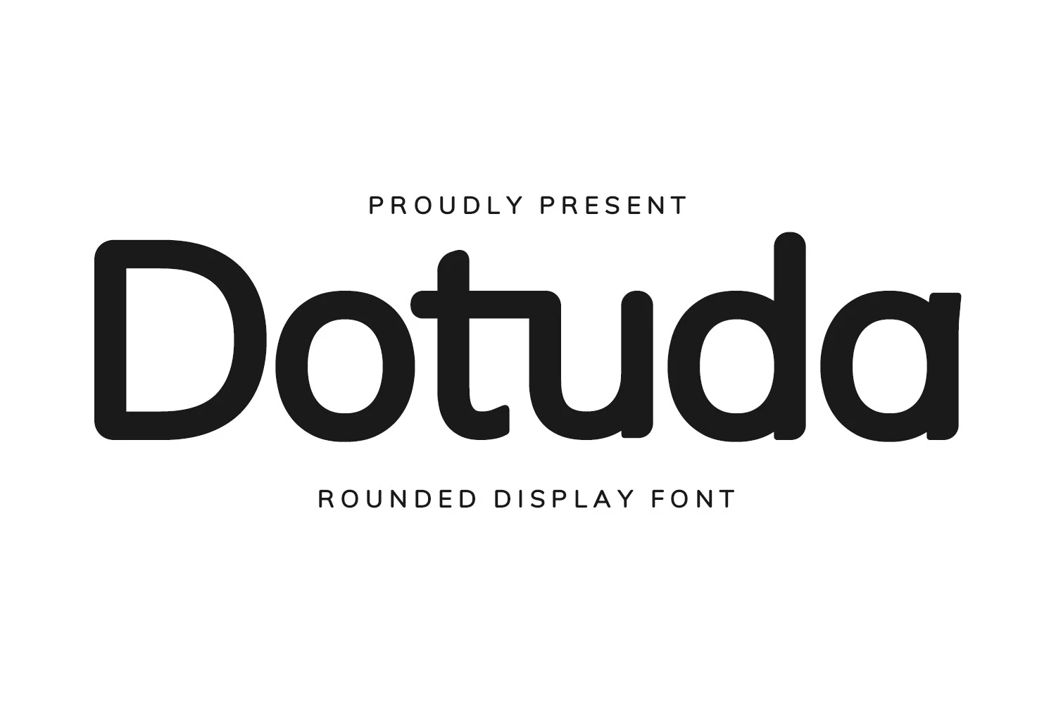
Best For: logos, magazine covers, posters, vintage designs
Dotuda Font blends a vintage display feel with thick rounded strokes, broad bowls, and softened terminals that keep the letterforms friendly instead of rigid. That mix gives Rounded Sans Serif Fonts a nostalgic edge, especially in the compact proportions that make each word feel solid and memorable.
It is strongest in logos, magazine covers, posters, and short titles where the heavier shapes can set the tone quickly. Keep line lengths brief and loosen the spacing slightly, since the dense curves and narrow joins read more cleanly when the letters are not packed too tightly.
Conclusion
Choose softer rounded sans serifs for warm branding, bold chunky styles for posters and packaging, clean modern families for digital layouts, and retro rounded fonts when the design needs stronger nostalgic character.