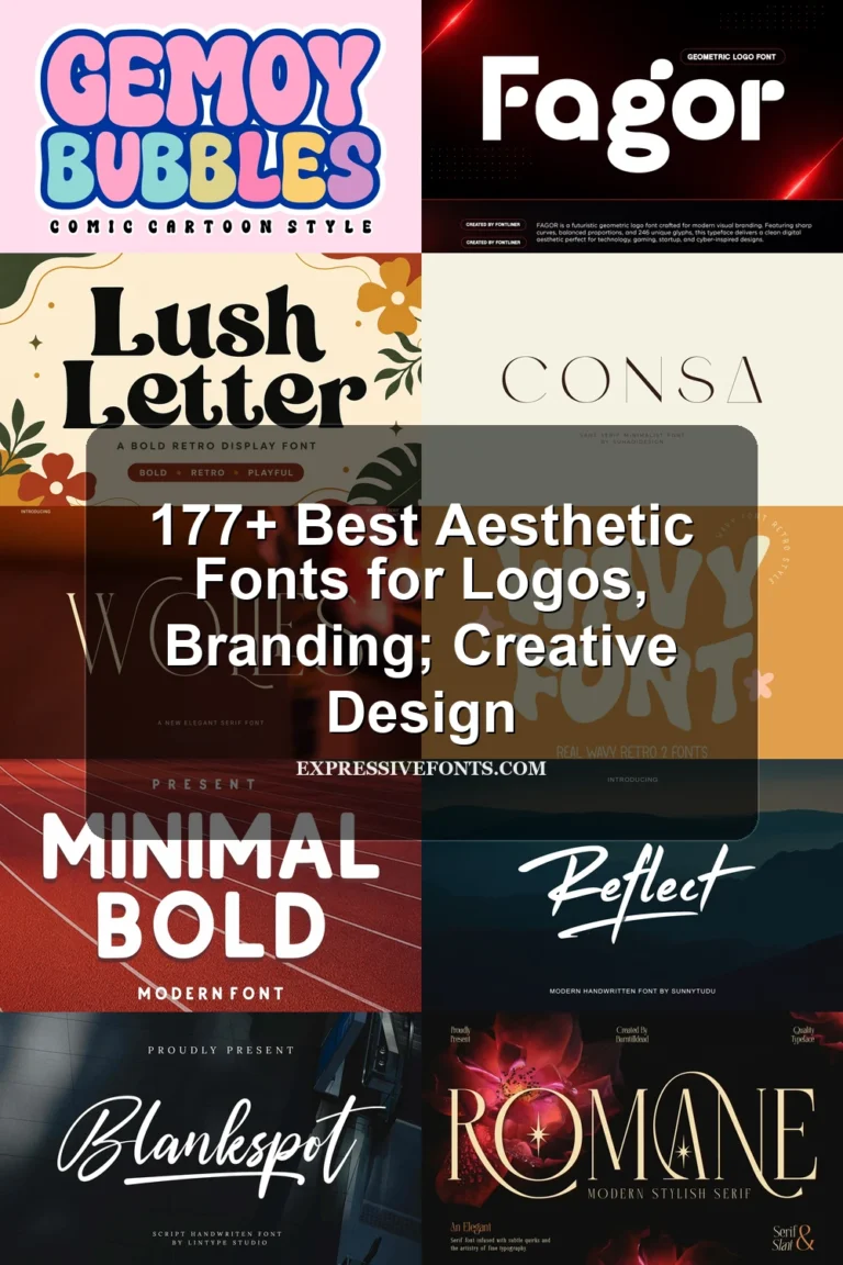
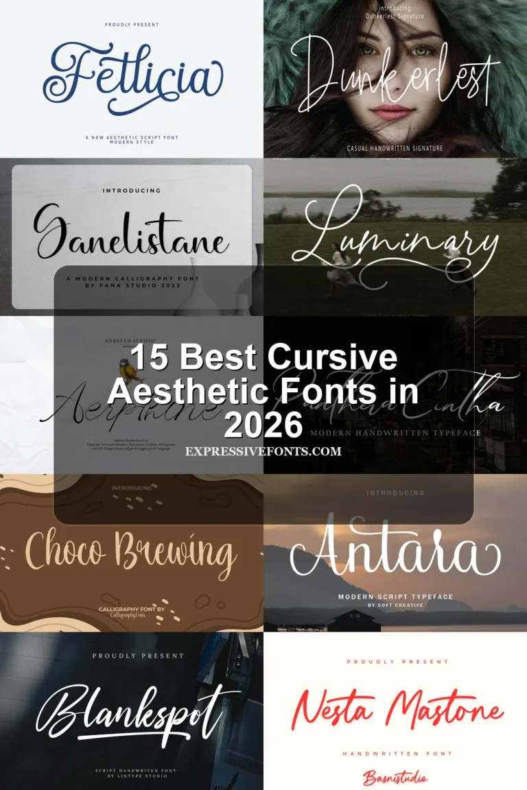
19 Best Vintage Aesthetic Fonts in 2026
Vintage Aesthetic Fonts range from high-contrast connected scripts and distressed lettering to rounded bubble forms, slab serifs, and editorial displays. Together, they serve logos, packaging, posters, signage, invitations, and short headlines, with construction and scale determining whether each style feels clear, compact, forceful, or decorative.
Looking for more aesthetic fonts? Browse our complete Aesthetic Fonts collection to compare modern, elegant, bold, vintage, and retro aesthetic styles.
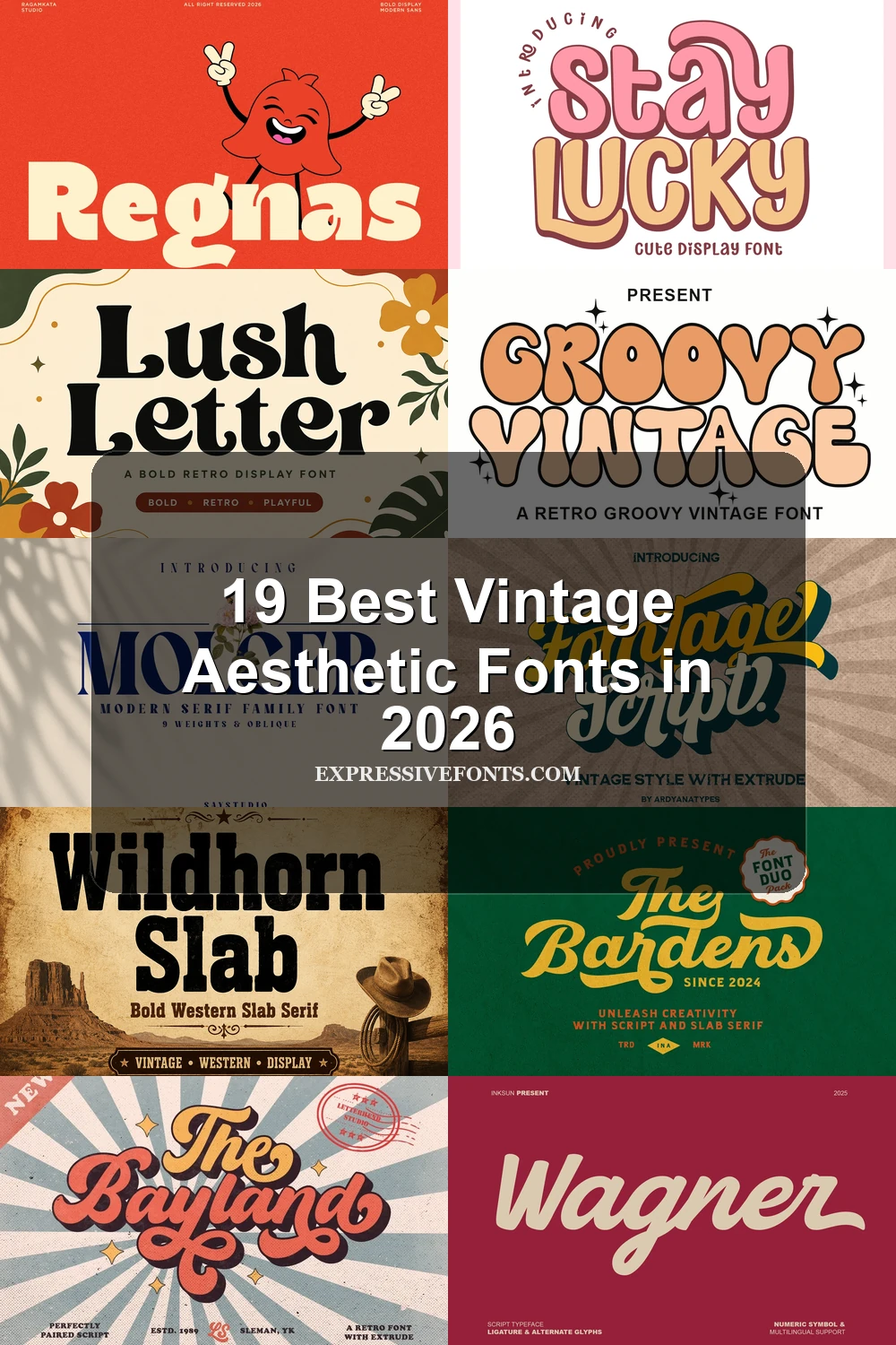
Vintage Aesthetic Fonts: Connected Scripts
These Vintage Aesthetic Fonts rely on connected strokes, slants, loops, and swashes for movement. Compared with the other groups, they feel more personal but require shorter wording and larger sizes.
Monkerti Font
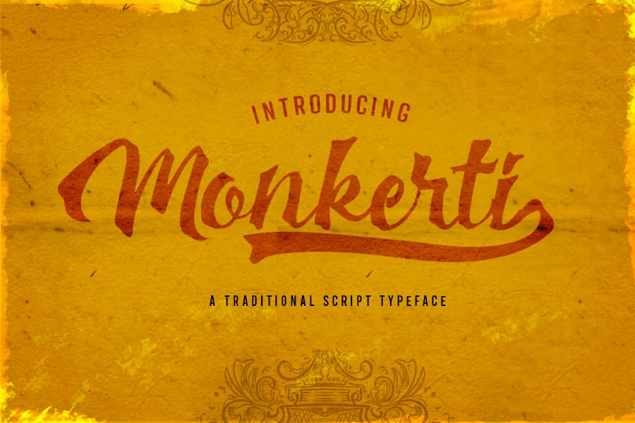
Best For: logos, branding, headlines
Monkerti Font is a high-contrast, right-leaning cursive whose connected letters and trailing-stroke swash on the i create forward motion. Among Vintage Aesthetic Fonts, it is best reserved for large logos and short headlines, since textured joins lose clarity when reduced.
Bardens Font
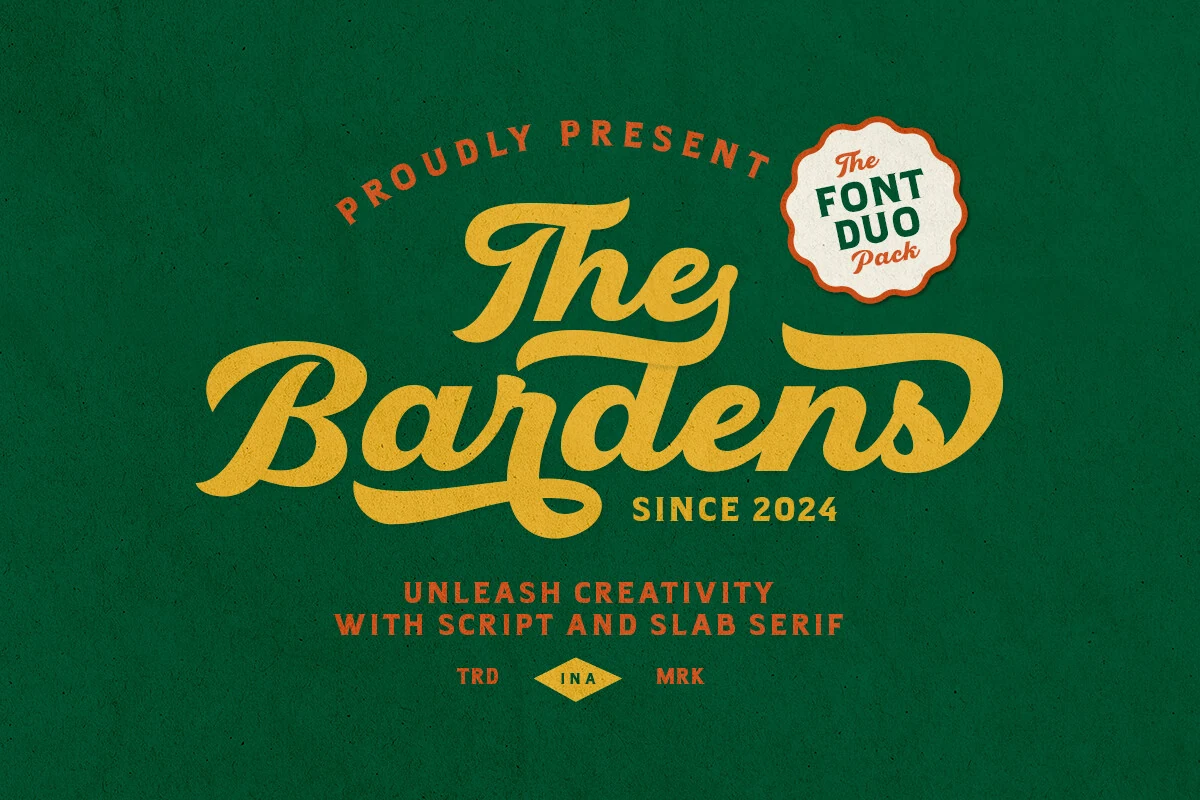
Bardens Font pairs a flowing brush script, with flared terminals and decorative swashes, with a geometric slab serif. That two-part construction lets the script carry a logo or headline while the companion serif supplies clearer supporting text at smaller sizes.
Balistic Font
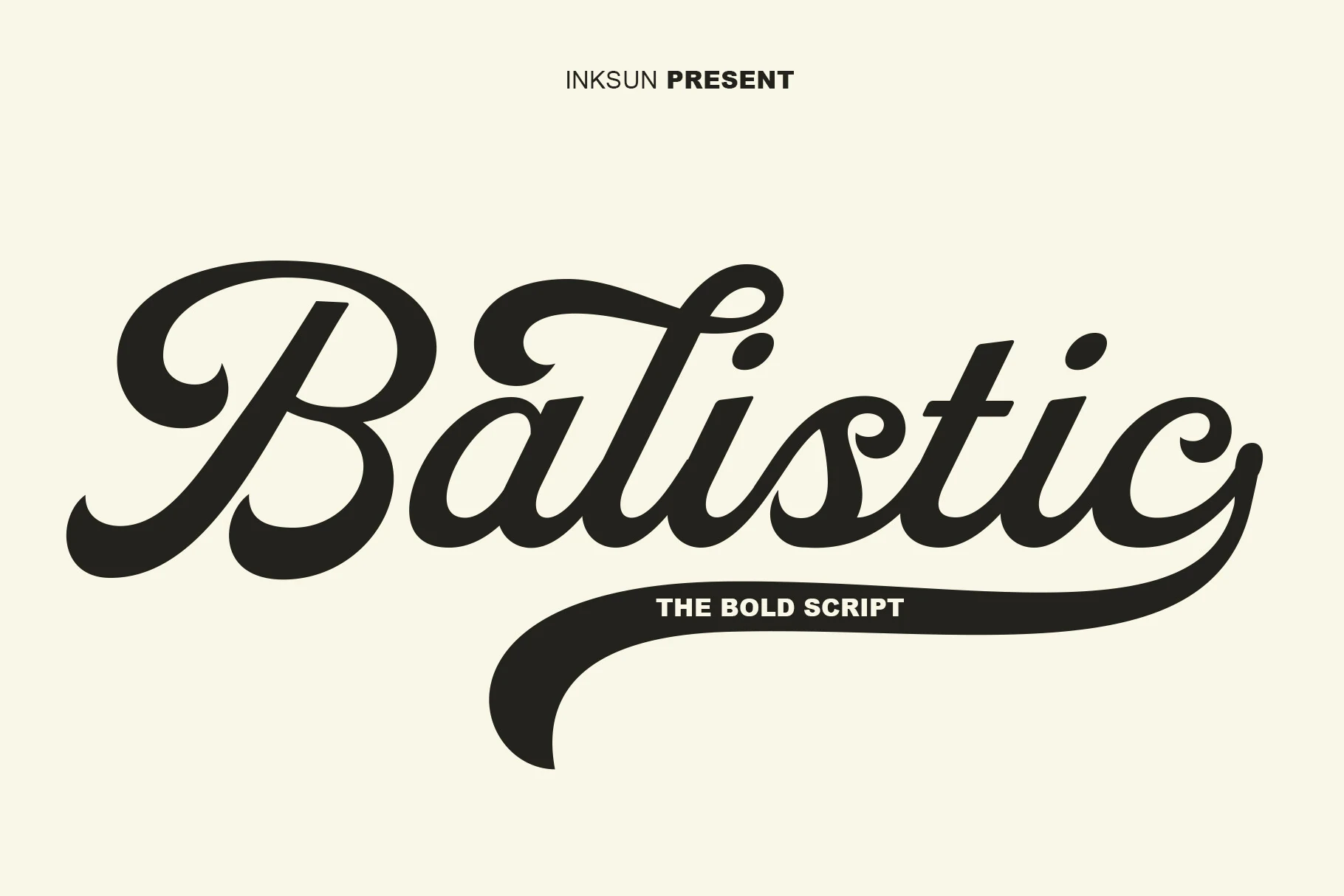
Best For: logos, branding, posters
Balistic Font leads with heavy, connected cursive, a pronounced rightward slant, and a sweeping tail flourish. Its thick strokes keep short branding text forceful at display size, while dense joins become harder to parse when the wordmark is scaled down.
Bentley Font
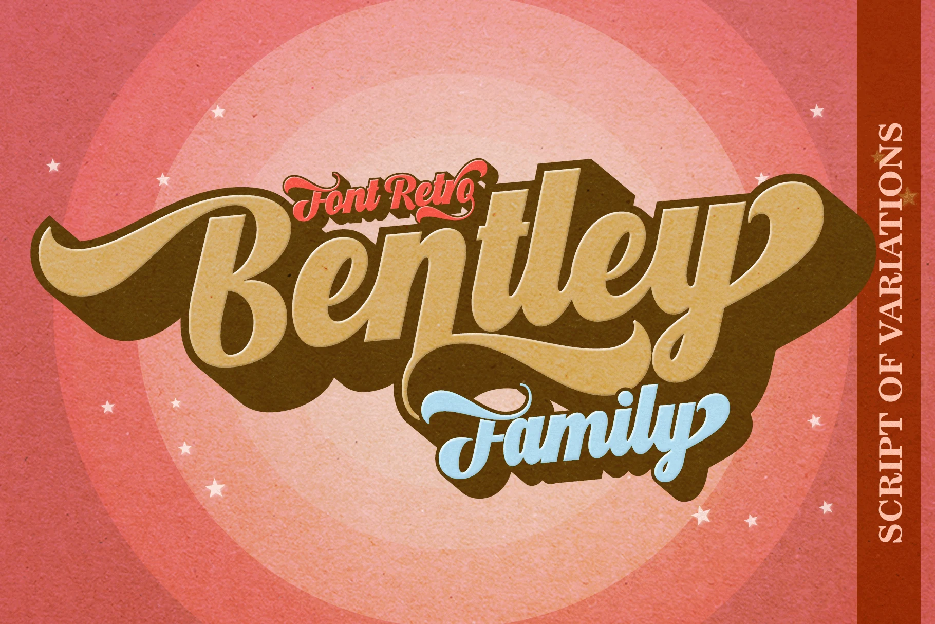
Best For: posters, display text, headlines
Bentley Font uses wide, heavy connected lettering, exaggerated horizontal loops, and extended terminals. The broad footprint fills a poster or headline effectively, although its high-contrast strokes and flourishes can overwhelm a compact wordmark or reduce clarity in longer wording.
Houston Font
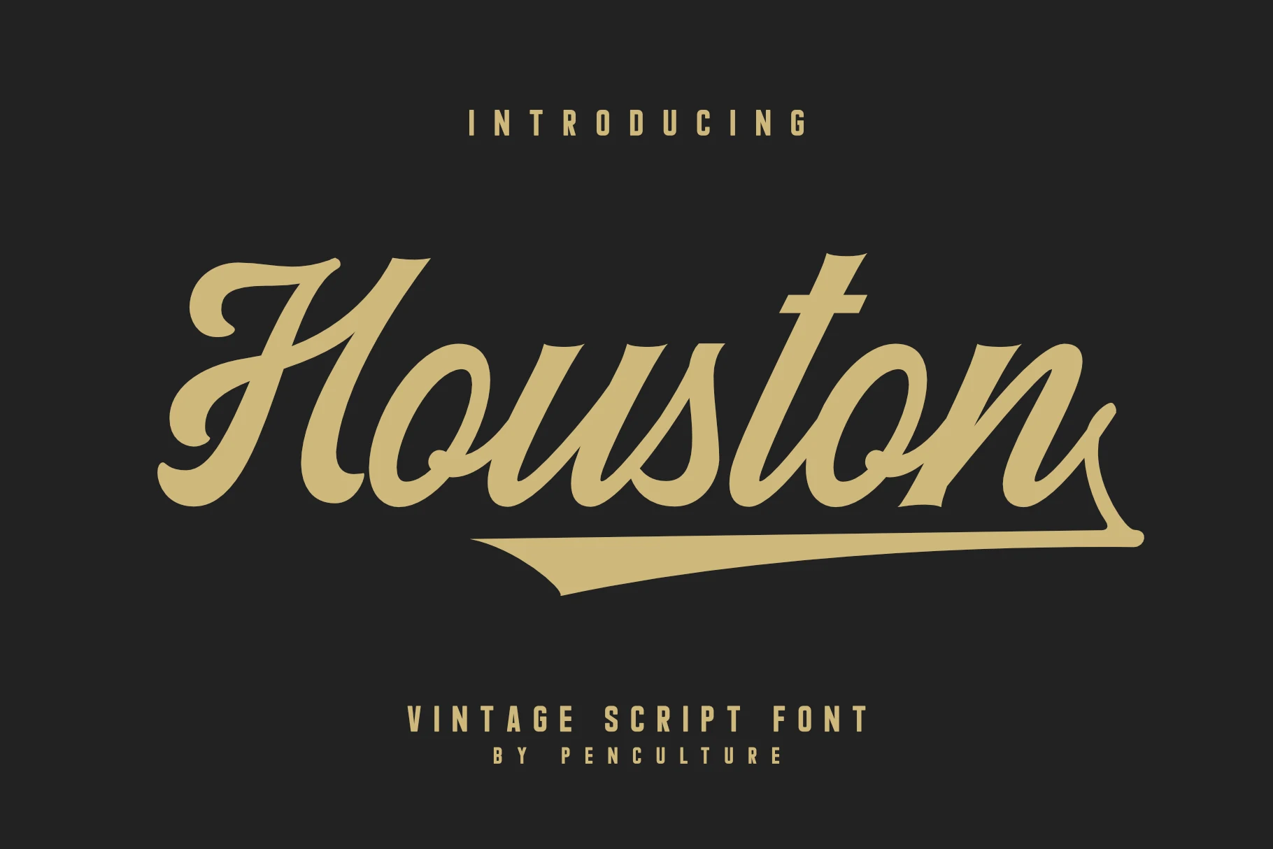
Best For: logos, headlines, display text
Houston Font works especially well when a headline or logo needs its own finishing stroke. Its bold, right-slanting brush script combines connected letters and strong thick-thin contrast with a large underline swash; that underline completes short compositions but adds clutter to dense wording.
Fomtage Script Font
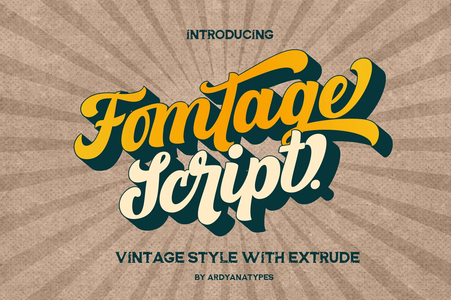
Best For: posters, headlines, signage
Fomtage Script Font combines a pronounced slant with heavy, high-contrast cursive and rounded sweeping swashes. It holds together well in large sign-style words, but tight connections and decorative strokes lose definition at small sizes.
Donatello Font
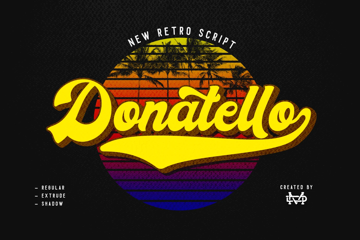
Best For: posters, headlines, display text
Donatello Font is connected retro lettering organized around an elongated underline swash. The rounded terminals and rightward slant make short headlines feel complete and emblem-like, though the extended baseline needs open space and complicates compact layouts.
The Bayland Font
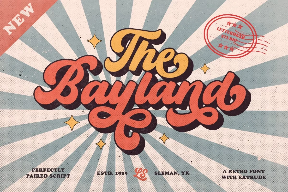
Best For: posters, display text, headlines
The Bayland Font uses thick monolinear strokes, rounded terminals, connected letters, and decorative loops. Its even rhythm is easier to recognize than a sharply contrasted script at display size, but the loops still make long text less comfortable and demand generous sizing.
Wagner Font
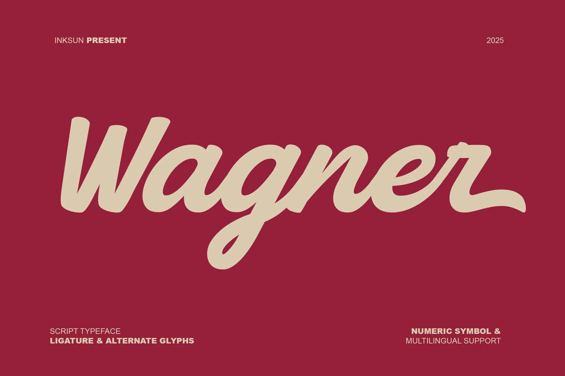
Best For: logos, branding, display text, headlines
Wagner Font has a slightly forward-leaning posture, low contrast, rounded terminals, and a long final-letter tail. The restrained construction gives logos a steady silhouette and strong large-scale recognition, while the tail needs breathing room at the end of each word.
Boldy Skyline Font
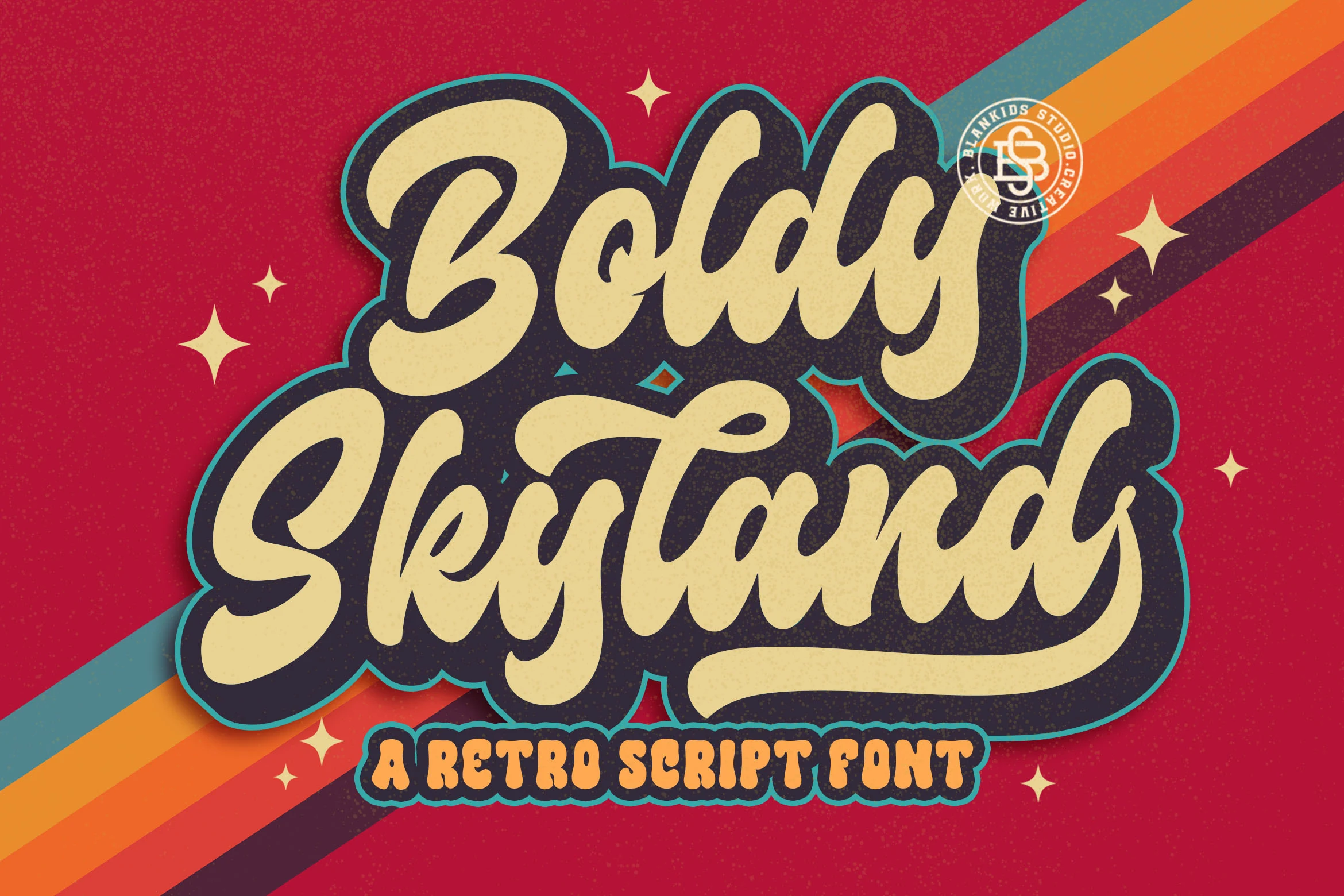
Best For: branding, logos, wedding designs, invitations
Boldy Skyline Font combines heavy connected script with rounded terminals and a visibly distressed texture. The worn surface adds printed-era character to labels, logos, and invitations, but texture can obscure fine joins when the design is reduced.
Retro Sign Font
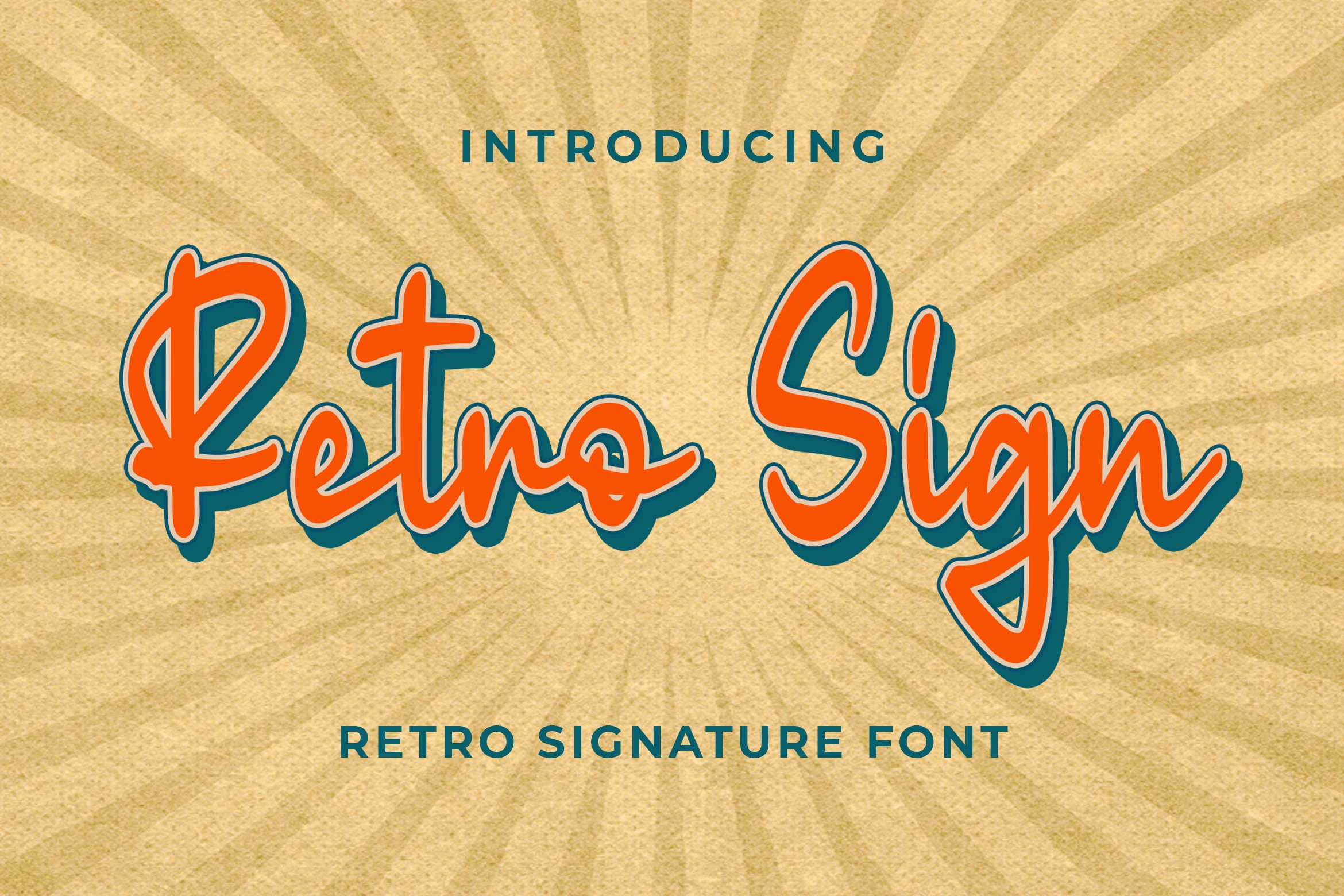
Best For: branding, headlines, wedding designs, logos
Retro Sign Font takes a steadier approach to connected lettering, using upright orientation, low-contrast monoline-leaning strokes, and rounded terminals. Its stable posture improves headline recognition over a strongly slanted script and works well for invitations, labels, and logos.
Rounded Retro Display Lettering
Rounded retro displays use thick, disconnected bubbles with compressed counters and dense shapes. They create immediate poster impact, unlike scripts’ movement or serifs’ structured terminals.
Groovy Vintage Font
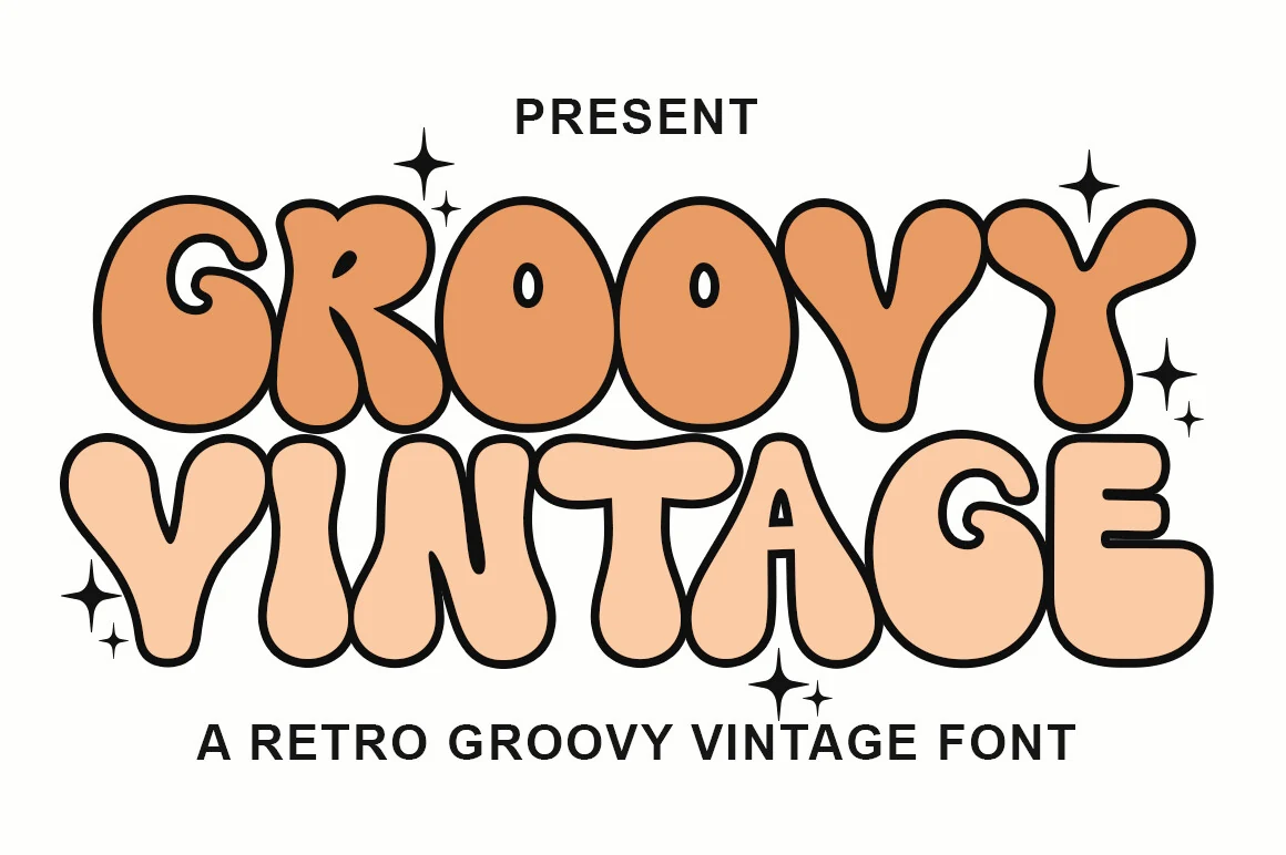
Best For: display text, posters, retro designs
For posters or other short, high-impact uses, Groovy Vintage Font builds wide, rounded bubble letters with heavy strokes and very tight, overlapping spacing. These Vintage Aesthetic Fonts form a dense block of color, so compressed counters make long phrases and small text uncomfortable.
Sweet Sixties Font
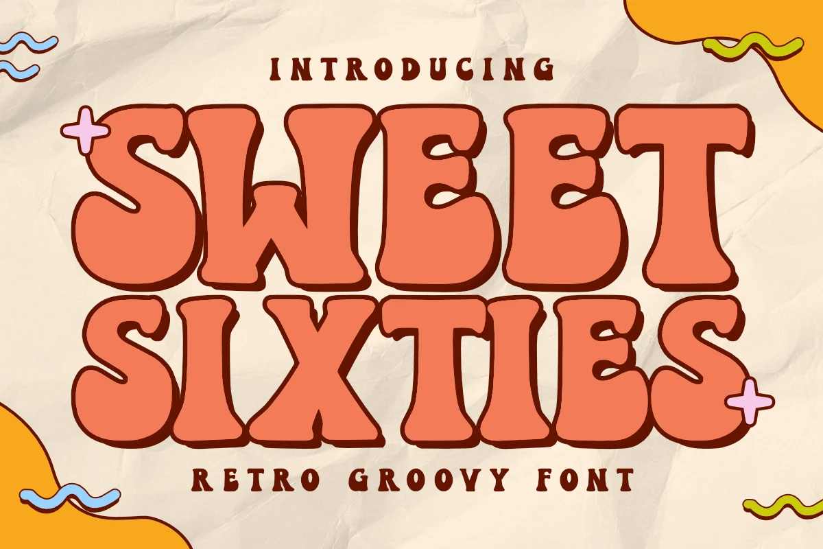
Best For: posters, packaging, branding, headlines
Sweet Sixties Font is built from ultra-heavy, wide bubble forms with wavy contours and rounded terminals. These Vintage Aesthetic Fonts make packaging and event headings conspicuous, but their distorted shapes quickly become visually dense in long phrases.
Stay Lucky Font
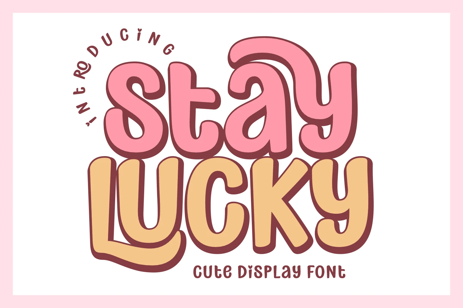
Best For: product labels, children’s designs, stickers, social media graphics
Stay Lucky Font packs rounded, disconnected bubble-sans forms into compact, blocky proportions with minimal interior space. These Vintage Aesthetic Fonts suit stickers and product labels, while closed counters can crowd longer wording and weaken recognition at smaller sizes.
Serif, Slab, and Signage Displays
This group combines sharp or rounded serifs, slab terminals, and upright structures. It offers the steadiest large-format recognition, from signage weight to more editorial brand contrast.
City Mango Font
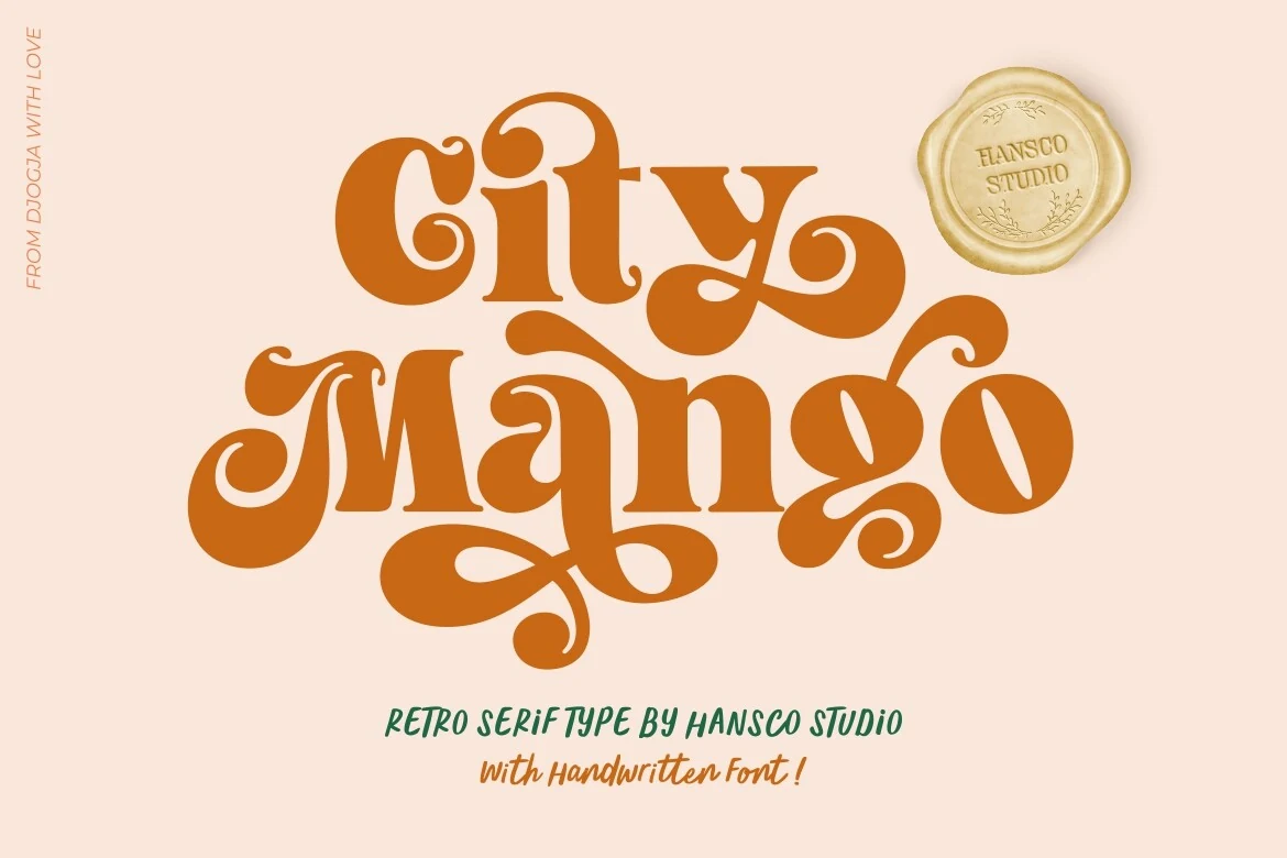
Best For: headlines, display text, posters, retro designs
City Mango Font creates a decorative serif display through high contrast, changing proportions, exaggerated terminals, and fluid swash-like connectors. Overlapping forms give large headlines a distinctive retro surface, but the same behavior makes continuous copy difficult to follow.
Wildhorn Slab Font
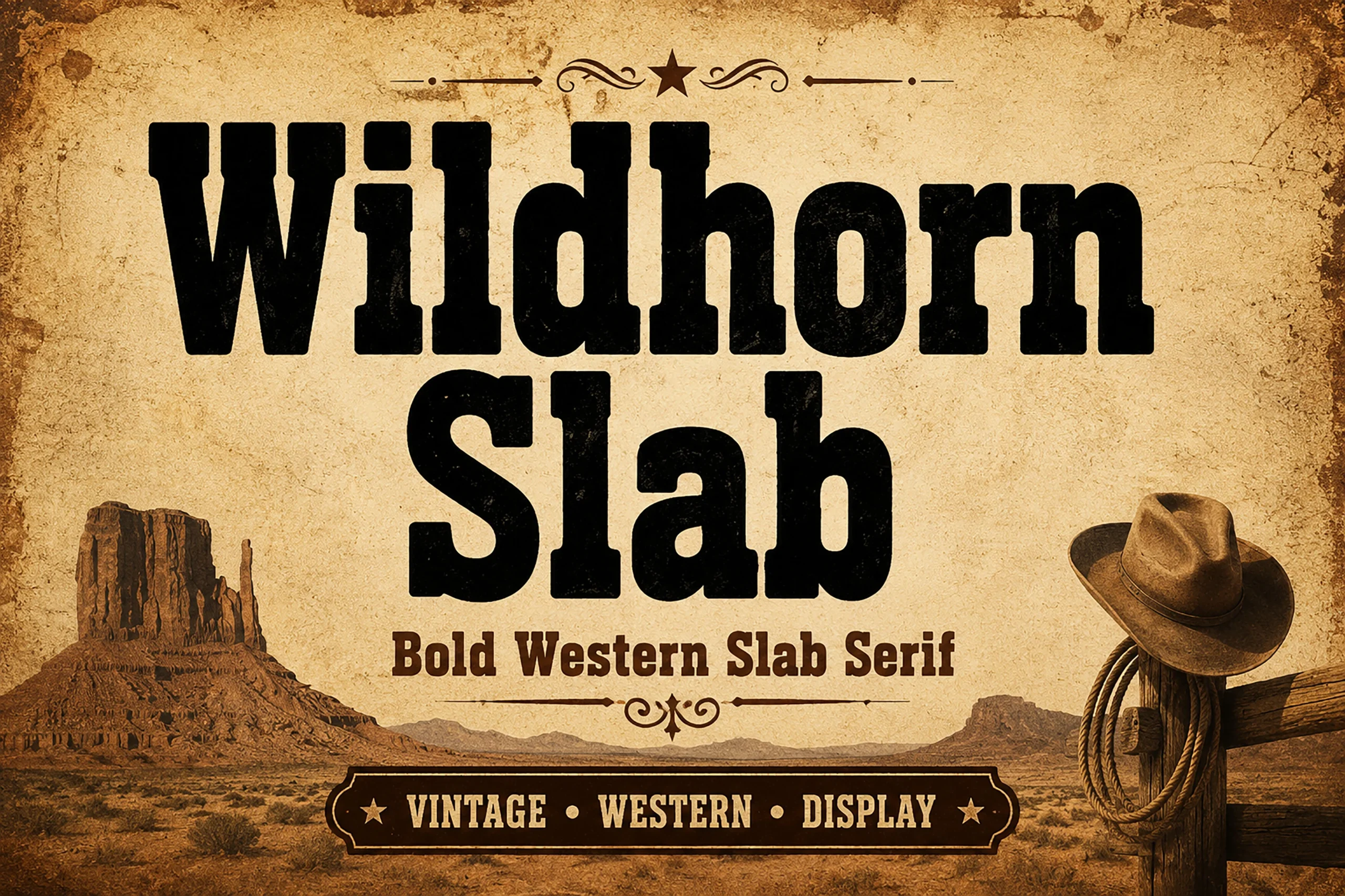
Best For: signage, posters, logos, display text
Wildhorn Slab Font brings Vintage Aesthetic Fonts into upright signage territory with thick rectangular slab serifs, heavy strokes, and geometric construction. Clear block terminals support posters and signs, while the substantial mass is better suited to display lettering than body copy.
Molcer Font
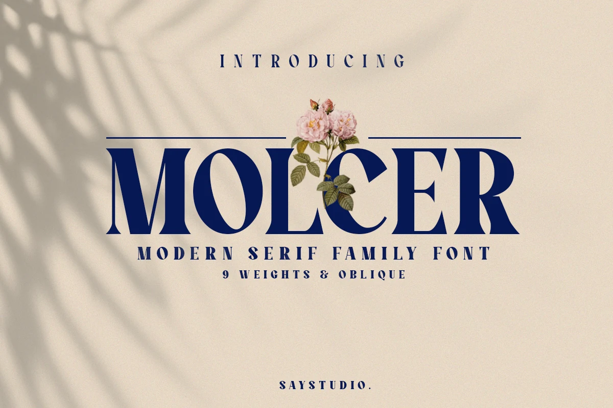
Best For: branding, editorial designs, packaging, logos
Molcer Font offers a wide, high-contrast serif with prominent vertical stems, soft terminals, and sharp cuts. Its upright and italic styles can support a more polished brand system, although fine serif details need generous sizing to remain visible.
Regnas Font
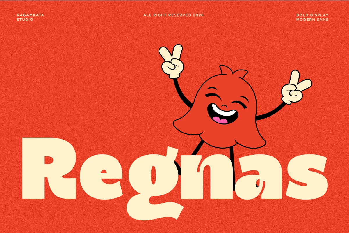
Best For: logos, posters, branding, headlines
Regnas Font suits headings that need soft geometry and emphasis: rounded slab-like serifs, bulbous curves, bold forms, and a bouncy baseline give it an approachable shape. Its low x-height makes large display use preferable to small-scale reading.
Lush Letter Font
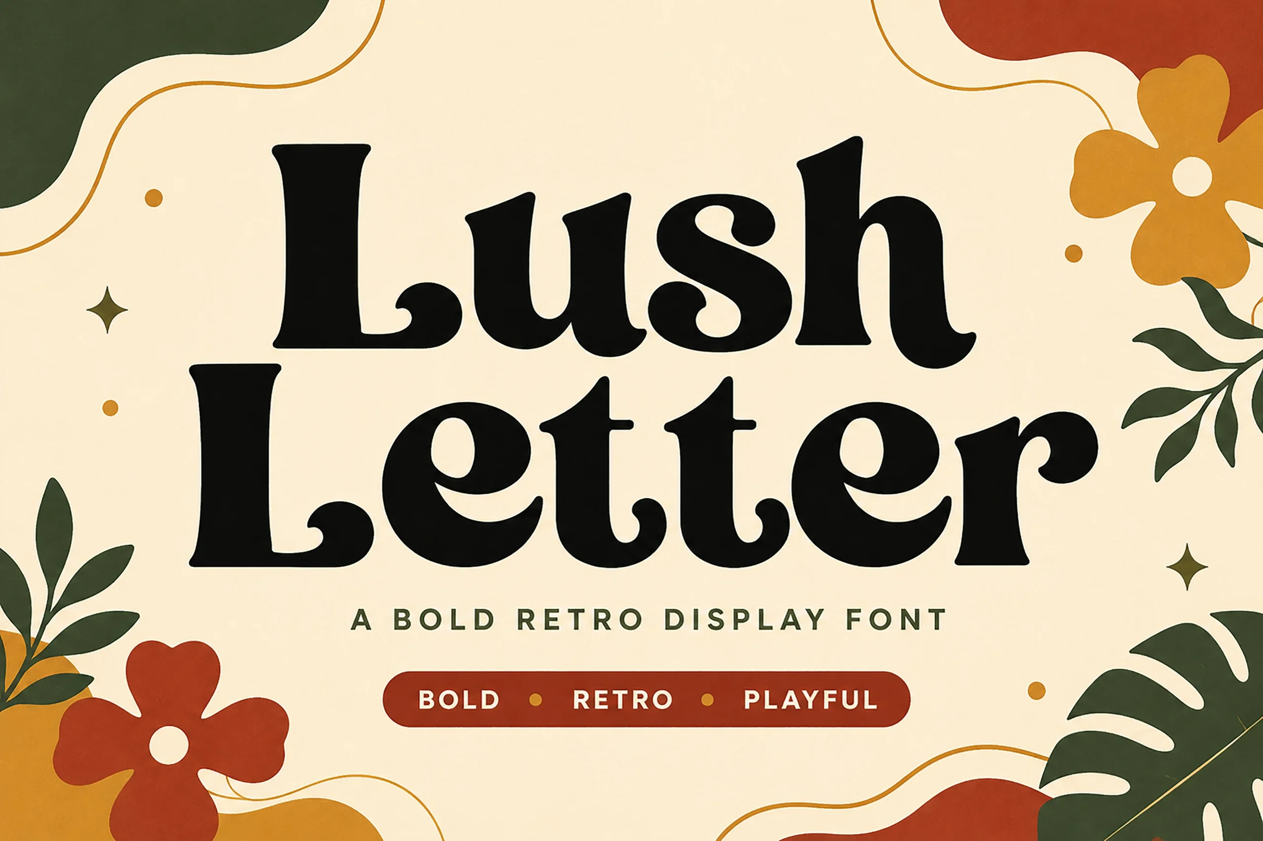
Best For: branding, headlines, posters, display text
Lush Letter Font uses an upright skeleton, rounded serifs, sweeping curved terminals, and pronounced thick-thin variation. It stays recognizable in large headlines and posters, but variable stroke weight makes dense copy less comfortable than short display wording.
How to Choose the Right Font
Choose connected scripts when movement and personality matter, then compare slant, join density, underline or tail swashes, and available breathing room. For Vintage Aesthetic Fonts with stronger structure, use bubble displays for compact, attention-grabbing words, slabs for signage, and high-contrast serifs when editorial detail and large-scale clarity are priorities.