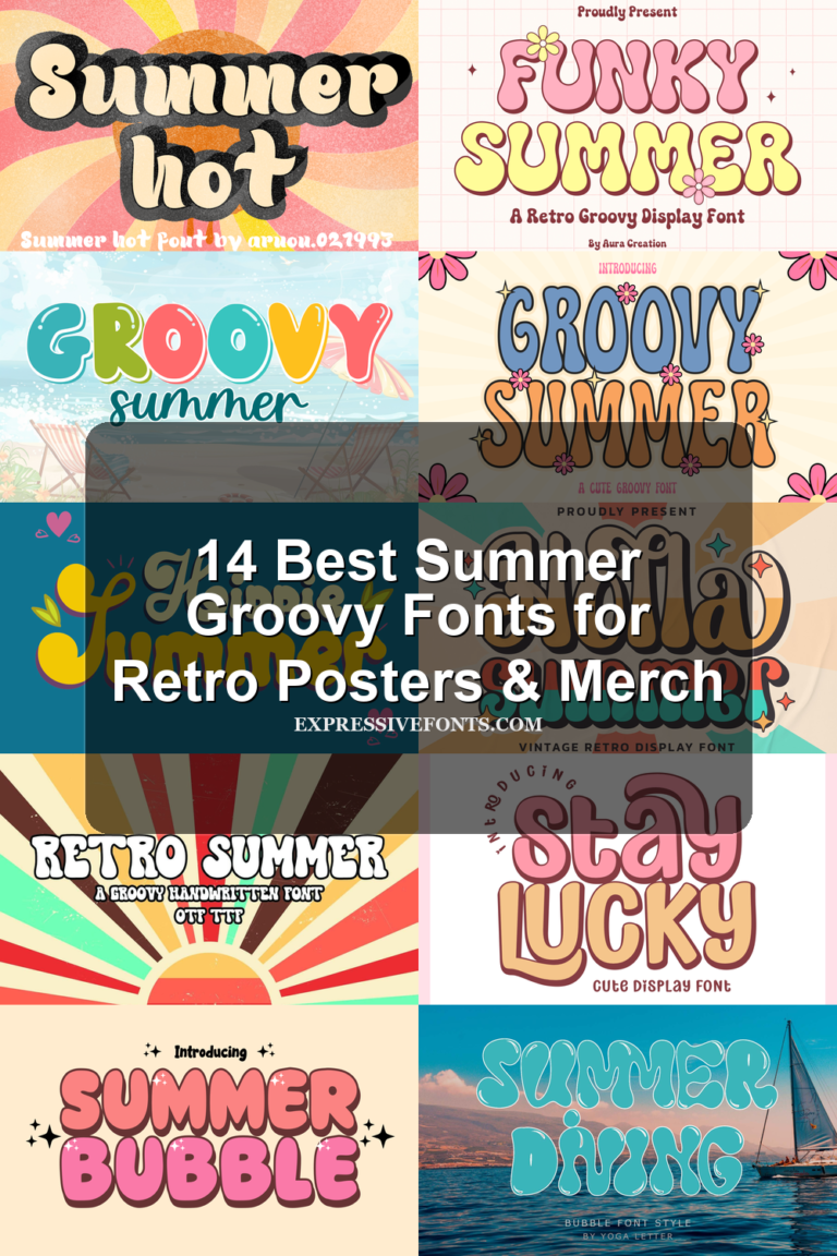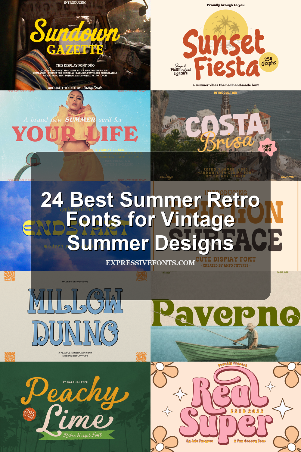
24 Best Summer Retro Fonts for Vintage Summer Designs
This collection is for designers, crafters, and brand owners who need summer retro fonts with clear vintage character. The 24 fonts cover groovy bubble lettering, bold slab serifs, psychedelic display styles, beach cutout type, and warm script duos for posters, logos, stickers, T-shirts, packaging, social graphics, and vacation branding.
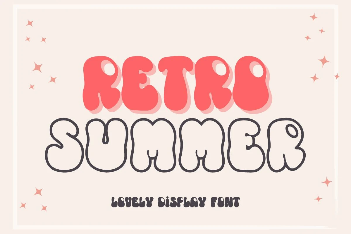
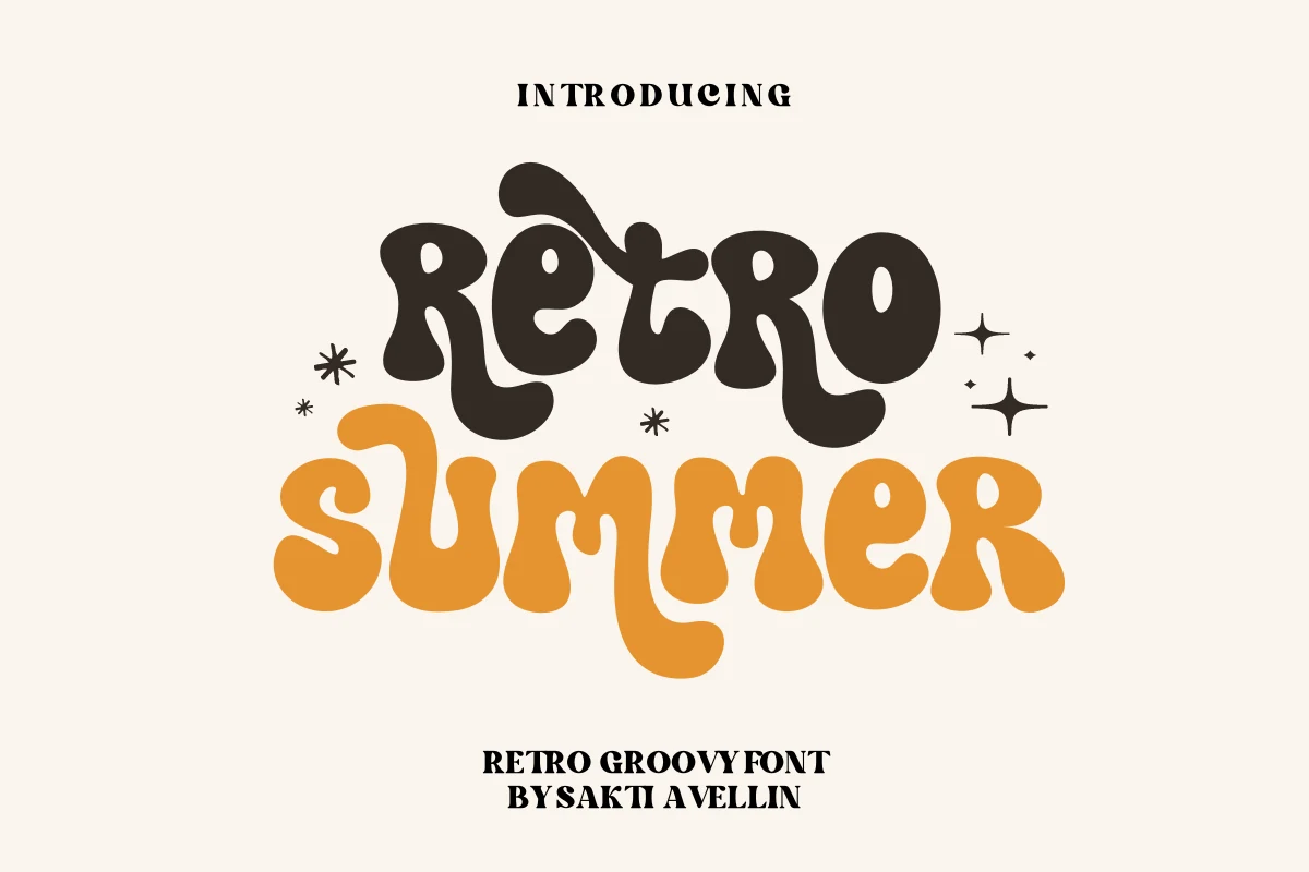
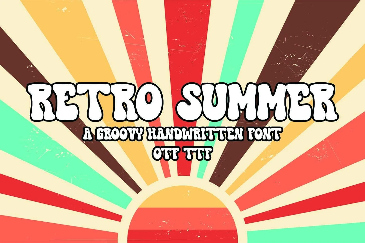
Retro Summer Font
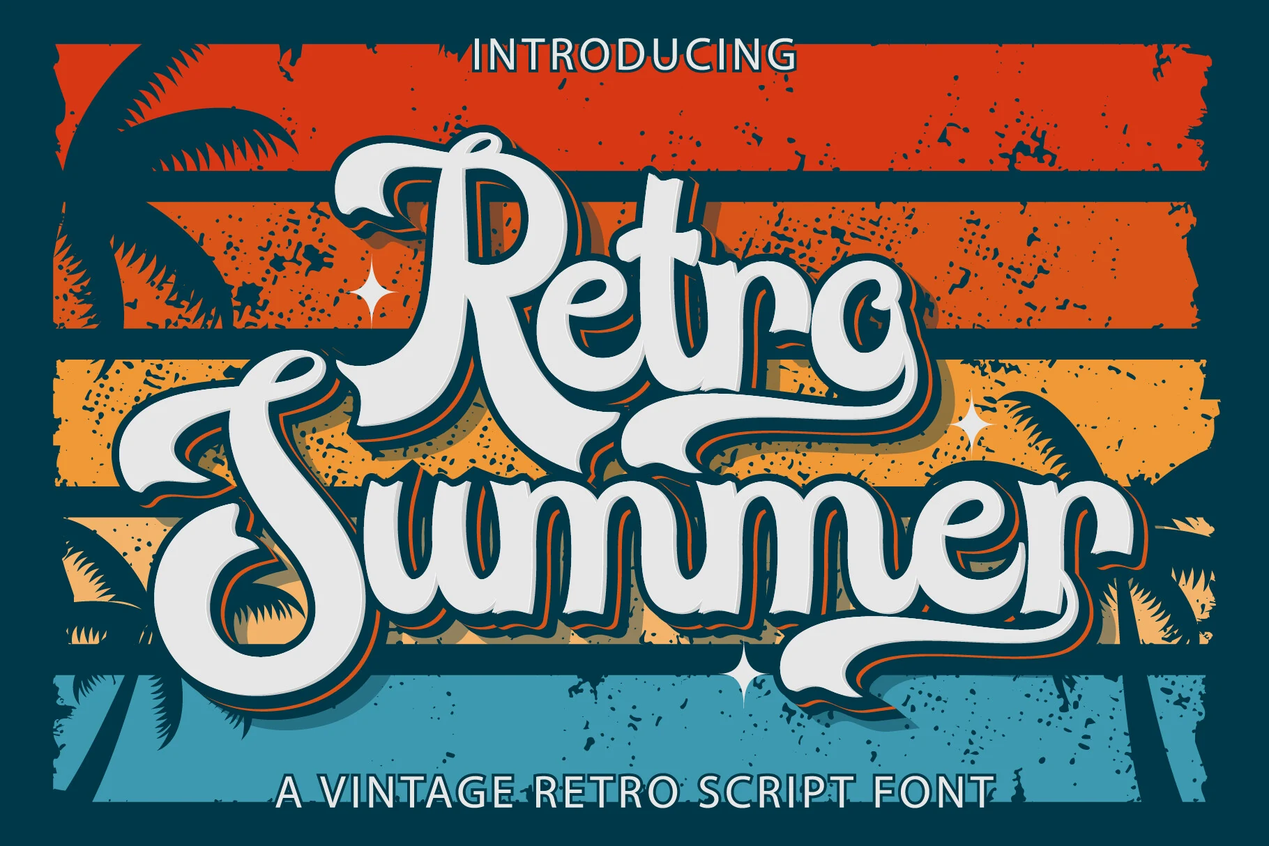
Best For: retro designs, vintage designs, logos, social media graphics
Retro Summer Font uses inflated handwritten letterforms with soft uneven edges, rounded counters, and a thick outline that pushes it toward 1970s poster lettering. It belongs naturally with Summer Retro Fonts when the design needs a groovy headline that feels casual, bright, and deliberately imperfect.
The wide shapes give short words strong impact, but the playful wobble works best when spacing stays loose and the supporting type stays plain. Use it for logos, social posts, invitations, or branding pieces where the display word can carry the main visual rhythm.
Resenger Font
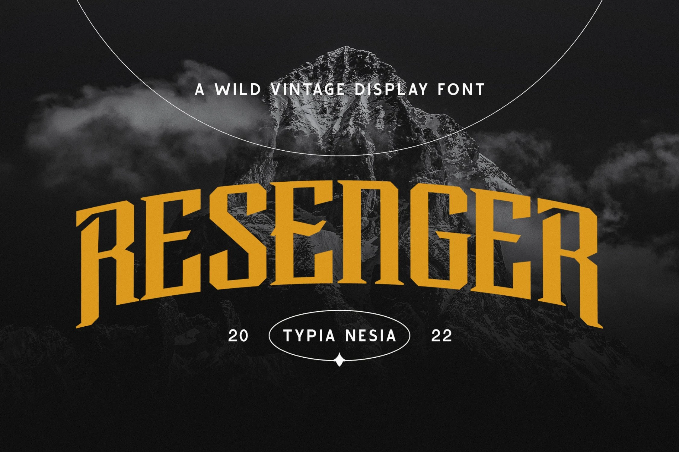
Best For: retro designs, vintage designs, signage, posters
Resenger Font has a hard-edged vintage camp voice, built from tall condensed slab-serif capitals with sharp bracketed cuts, wedge-like terminals, and a broad arched rhythm. The letters feel rugged rather than polished, so it fits Summer Retro Fonts where outdoor branding needs weight, age, and clear display force.
Use it for short names, badges, trail signage, poster titles, and merch graphics where the word can sit large. Its narrow proportions save horizontal space, but the heavy slabs and angular interior cuts need generous tracking at smaller sizes and strong contrast against busy photography.
Stay Lucky Font
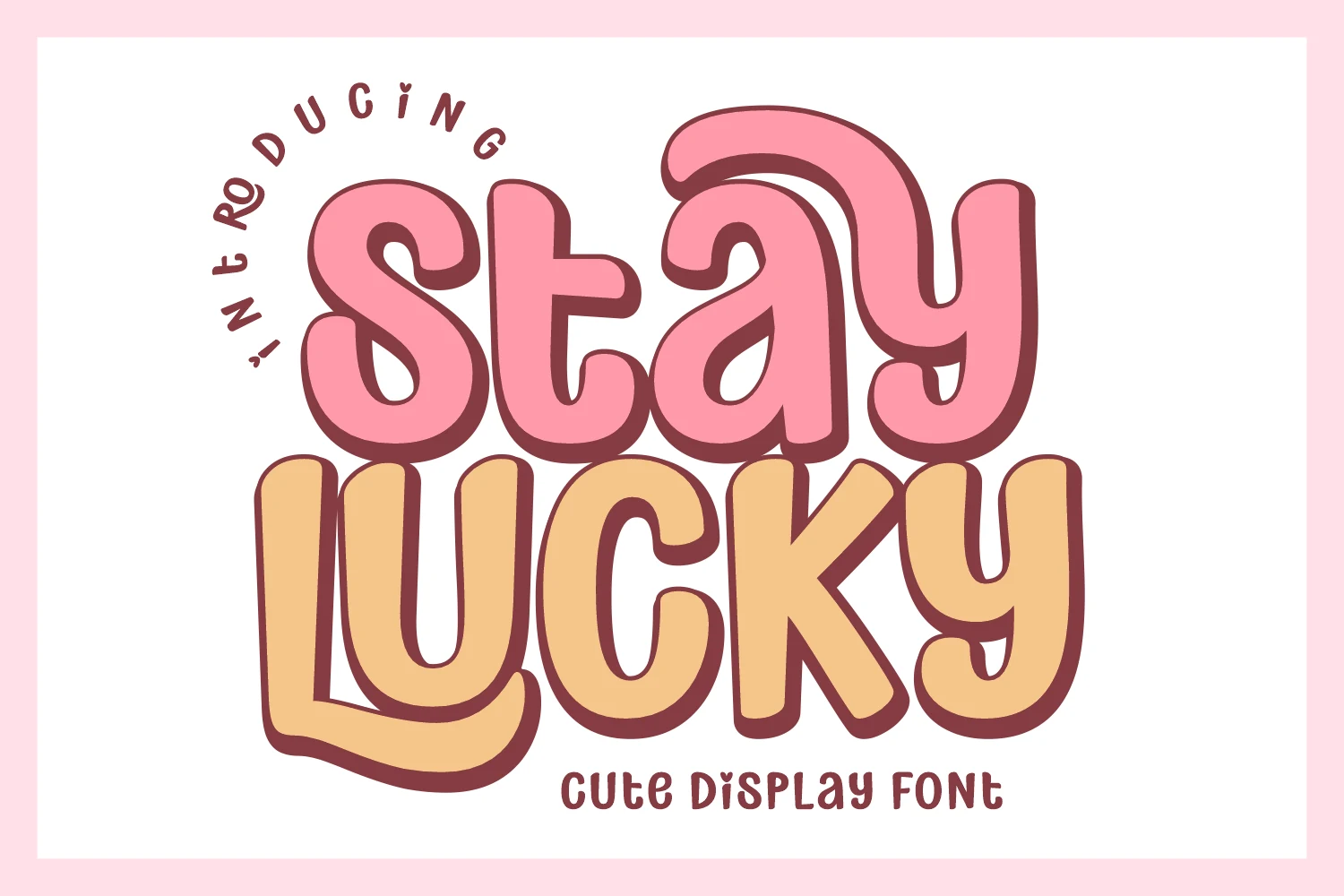
Best For: children’s designs, product labels, stickers, playful designs
Stay Lucky Font leans into a sweet retro mood with chunky rounded shapes, soft counters, and a bouncy stacked rhythm that keeps every word friendly and easy to catch. It suits Summer Retro Fonts especially well when you want a candy-shop feel that reads cheerful rather than noisy.
The broad strokes and clear silhouette help it stay readable on packaging, stickers, party graphics, and casual game screens, even with lively layouts. Use it for short headlines or label text, then pair it with a simple sans for supporting copy so the playful curves stay in charge of the hierarchy.
Costa Brisa Duo Font
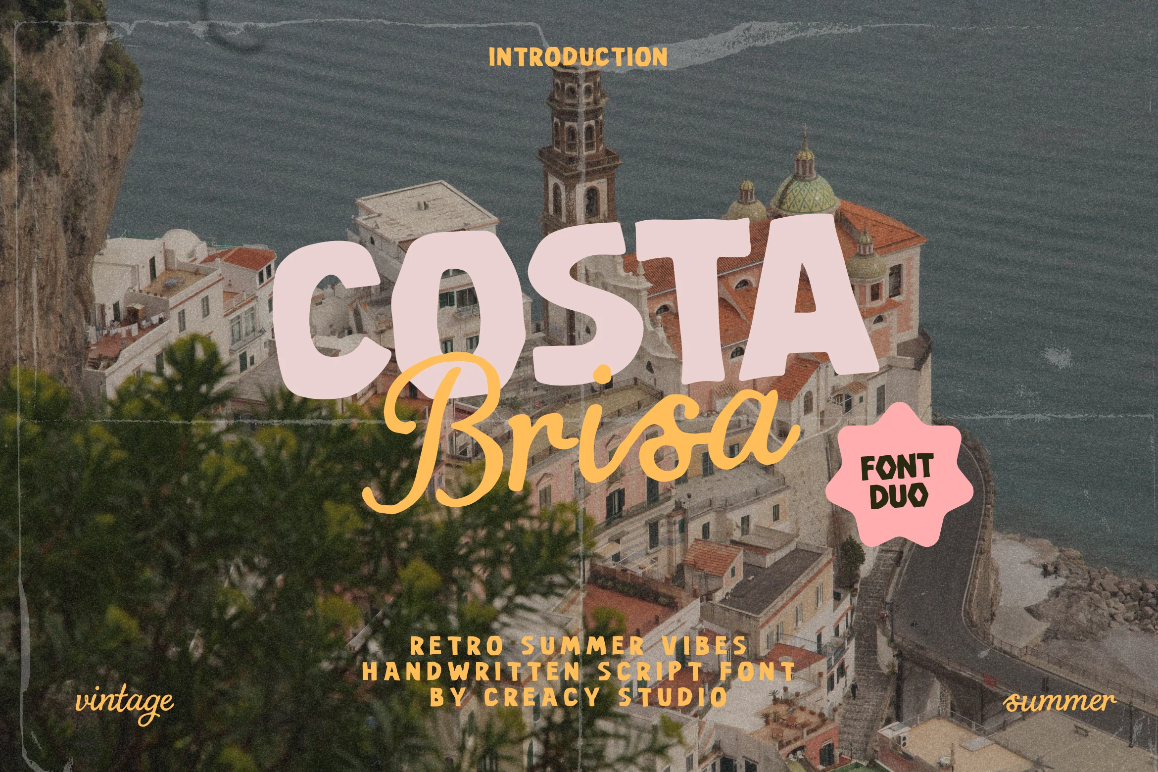
Best For: logos, invitations, social media graphics, website headers
Costa Brisa Duo Font pairs a chunky retro display style with a loose handwritten script, giving you two distinct voices in one warm-weather set. The all-caps letters feel broad and sun-faded, while the script adds a breezy, postcard rhythm, which makes it a natural fit for Summer Retro Fonts.
This contrast works best when the blockier display face handles the main title and the script steps in for a softer accent word or subtitle. Use that split to build clear hierarchy in coastal branding, event graphics, or headers where you want vintage charm without losing legibility.
Retro Collection Font
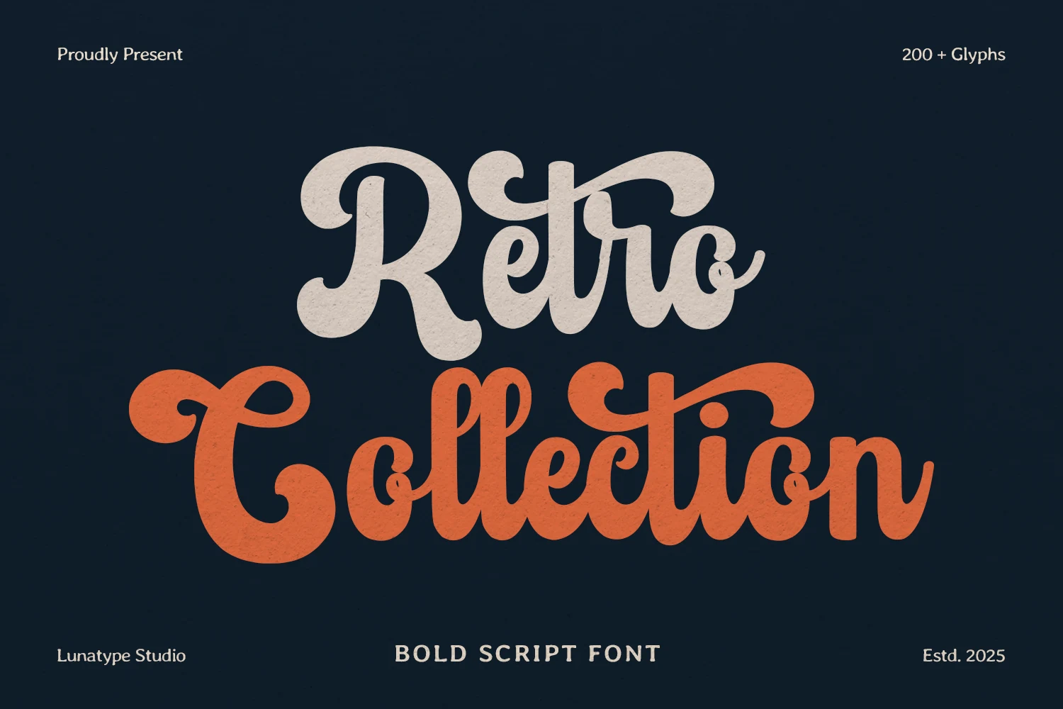
Best For: logos, branding, product labels, retro designs
Retro Collection Font is a bold handwritten script with heavy connected strokes, rounded terminals, and long sweeping joins that give each word a strong vintage logo shape. It fits Summer Retro Fonts when the design needs nostalgic movement without switching into thin or delicate lettering.
The thick curves hold up well in large titles, packaging marks, badges, and social graphics, but the compact connections need breathing room around the word. Keep secondary text simpler and lighter so the script’s loops, swashes, and dense rhythm stay readable as the main display element.
Friction Surface Font
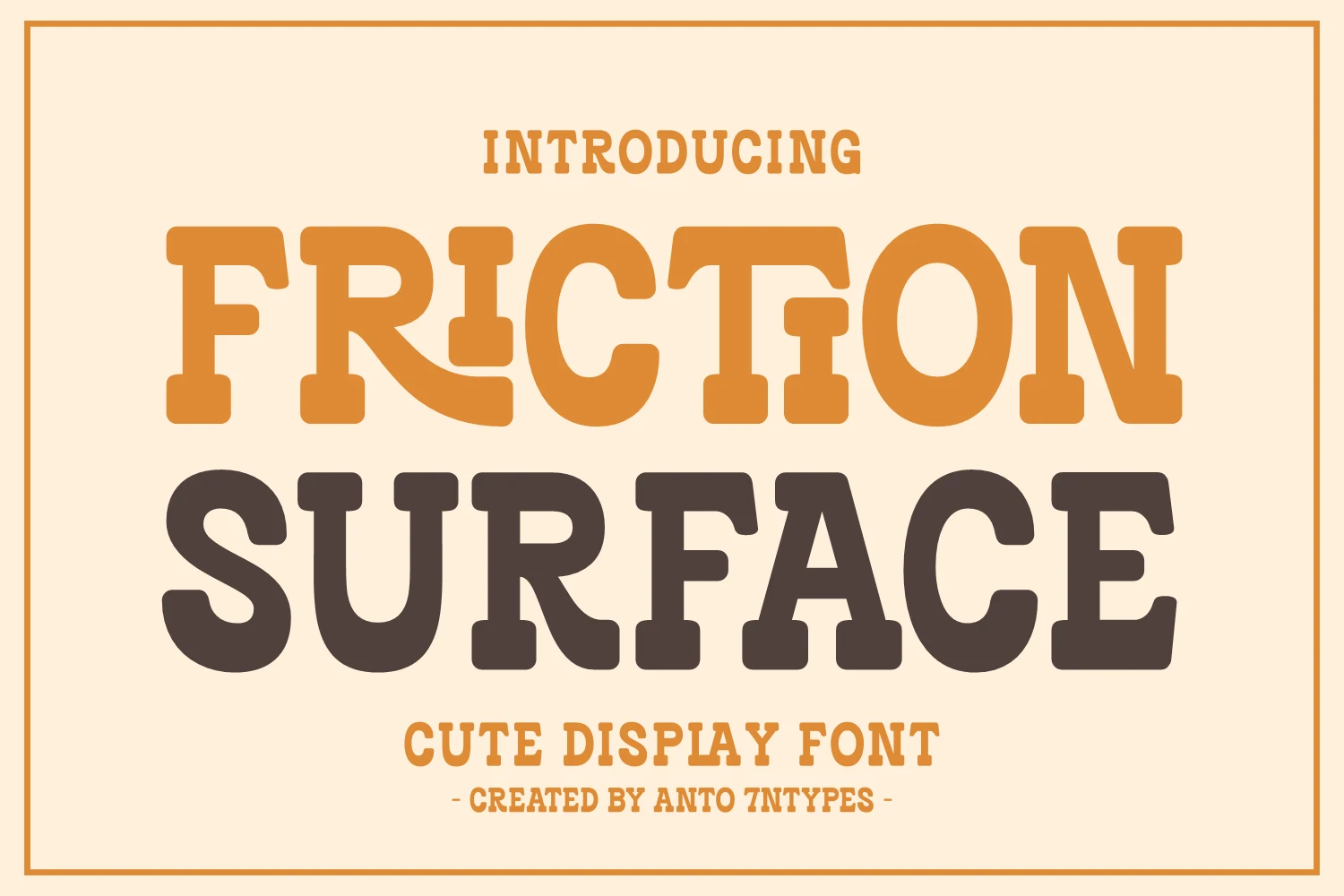
Best For: product labels, invitations, children’s designs, playful designs
Friction Surface Font has the broad stance of a retro western slab serif, with heavy rounded serifs, soft corners, and compact counters that keep the letters bold without feeling stiff. It brings a playful ranch-sign mood to Summer Retro Fonts, landing somewhere between cowboy poster lettering and kid-friendly packaging.
Because the forms are wide and weighty, it works best in short titles, labels, and party graphics where the word can sit large and do the talking. Give it a little extra space and pair it with a plain supporting font so the chunky shapes stay clear instead of crowding together.
Summer Glow Font
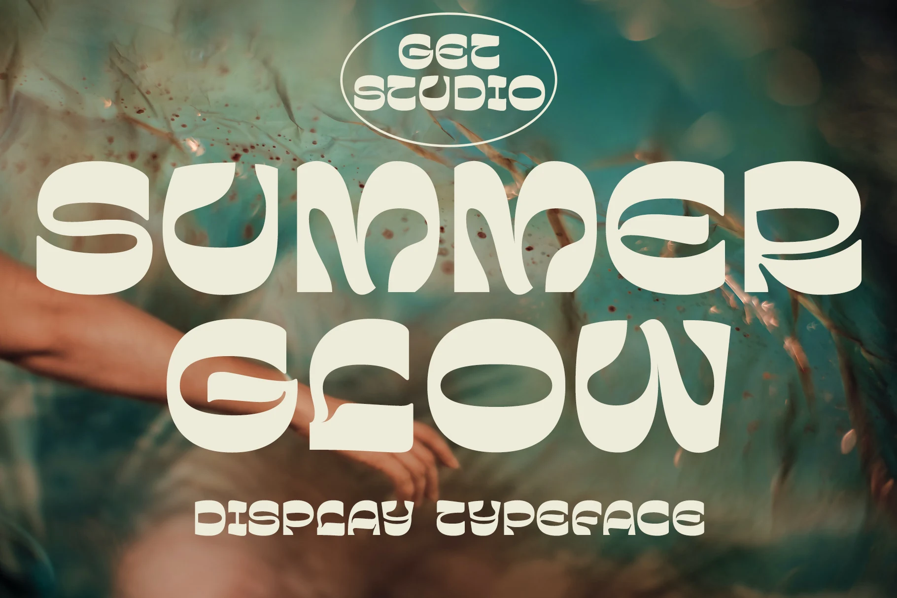
Best For: retro designs, display text, posters, social media graphics
Summer Glow Font brings a wavy mod look to Summer Retro Fonts, using thick rounded caps, sliced inner counters, and softened corners that feel more psychedelic than rustic. The letters have a stretched horizontal rhythm, so each word reads like one bold graphic shape.
Its unusual cutouts are the main attraction, but they also make scale important. Keep it large for posters, headers, and social graphics, use strong background contrast, and avoid tight tracking so the curved openings stay visible instead of turning into closed shapes.
Paverno Font
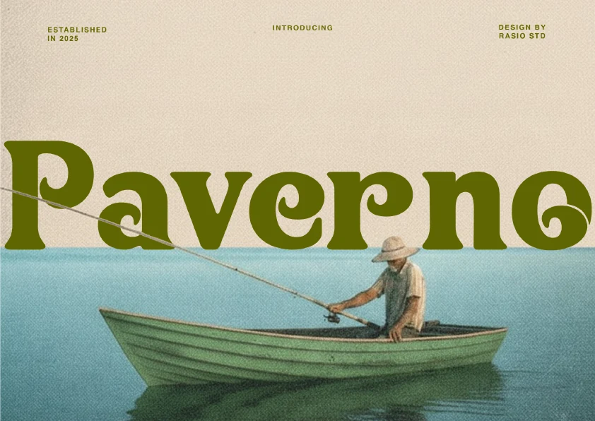
Best For: logos, branding, posters, retro designs
Paverno Font blends thick confident strokes with curled liquid terminals that soften its sturdy silhouette. The tight spacing and broad rhythm give it a sun-faded 1970s mood, making it a strong fit for Summer Retro Fonts when a headline needs warmth without losing presence.
It works especially well for logos, poster titles, and packaging where the letters can sit large and let the sculpted curves show. Because the spacing is compact, keep supporting type simpler and give Paverno room around the wordmark so its relaxed luxury reads cleanly instead of crowded.
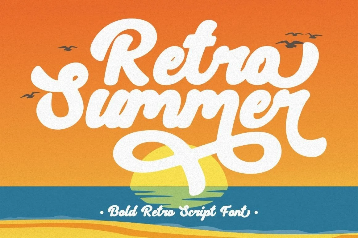
Retro Summer Font
Best For: retro designs, stickers, social media graphics, T-shirts
Retro Summer Font has a thick groovy shape with inflated handwritten letters, wobbly edges, and compact rounded counters. The black outline gives the white forms strong separation, making it a good choice for Summer Retro Fonts that need a loud 1970s-style display word.
Its playful weight suits mugs, shirts, cards, stickers, and social posts where the headline can stay short and centered. Keep the spacing relaxed and avoid placing it too small, because the soft internal cuts and uneven curves need scale to stay readable.
Retro Summer Font
Best For: logos, branding, posters, retro designs
Retro Summer Font has a chunky groovy silhouette, with swollen curves, rounded terminals, and a thick black outline that turns each word into a strong retro graphic. It suits Summer Retro Fonts especially well when you want a headline to feel nostalgic and bold rather than delicate.
The broad shapes make it effective for logos, posters, packaging-style branding, and short title treatments where the lettering can carry the whole composition. Keep the wording brief and give it enough scale, because the soft inner details and tight curves read best when the letters have room to breathe.
Summer Ambience Font
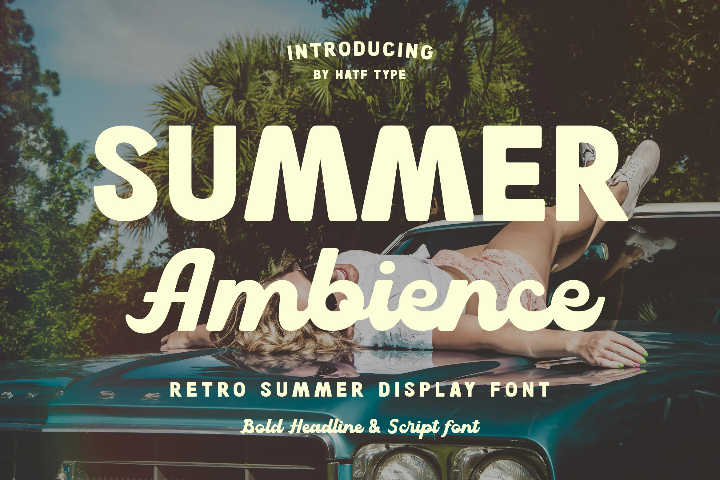
Best For: posters, product labels, social media graphics, retro designs
Summer Ambience Font combines a bold rounded headline face with a smooth connected script, giving Summer Retro Fonts a clean vacation-poster structure. The uppercase letters have soft corners, wide proportions, and steady spacing, while the script adds a relaxed mid-century accent without overpowering the title.
Use the blockier style for the main word and let the script handle a secondary phrase or brand accent. That contrast works well for holiday posters, merchandise labels, and social graphics because it builds hierarchy quickly while keeping the retro summer mood easy to read.
Millow Dunno Font
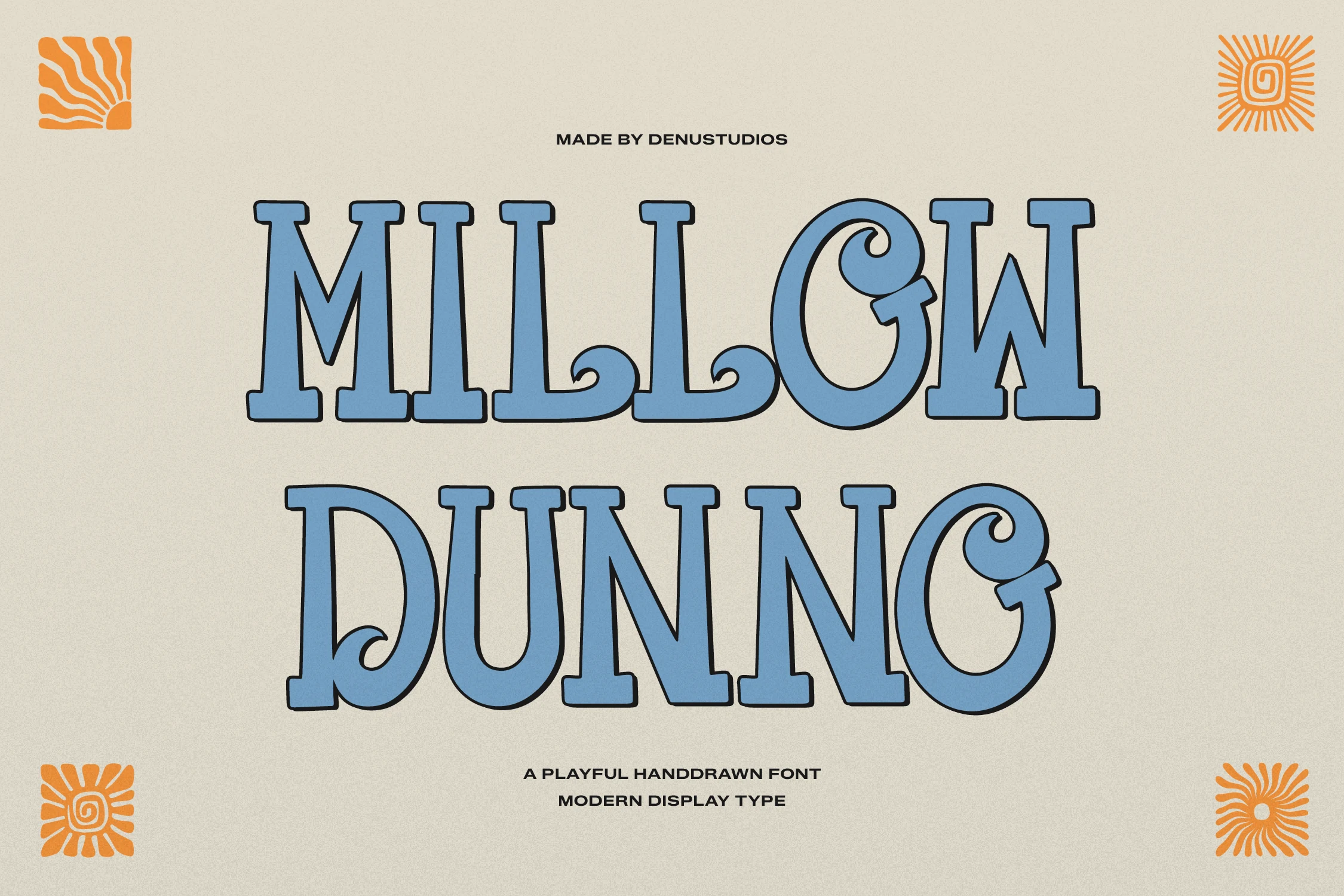
Best For: branding, posters, merch design, social media graphics
Millow Dunno Font mixes chunky slab-serif structure with hand-drawn curls, especially in the bowls and terminal swirls, so it feels playful without losing weight. The wide stance and slightly bouncy rhythm make it a strong pick for Summer Retro Fonts when you want a design to lean coastal, relaxed, and clearly 1970s-inspired.
Its heavy shapes hold attention fast on surf-style branding, festival posters, merch, and headers, but the decorative curls do best in short phrases rather than long lines. Give it generous scale and simple supporting text, so the wave-like details stay visible and the title keeps a clean hierarchy.
Summer Retro Font
Best For: logos, stickers, social media graphics, retro designs
Summer Retro Font has a sweet hand-lettered script shape, with thick rounded strokes, connected lowercase forms, and oversized entry and exit swashes. Its stacked rhythm feels friendly and nostalgic, giving Summer Retro Fonts a softer alternative to blocky 1970s display faces.
Use it for short logo words, stickers, merch titles, and social graphics where the curves can sit large. The wide swashes need space at the edges, so avoid tight crops and use strong contrast behind the creamier stroke style to keep the lettering clean.
Peachy Lime Font
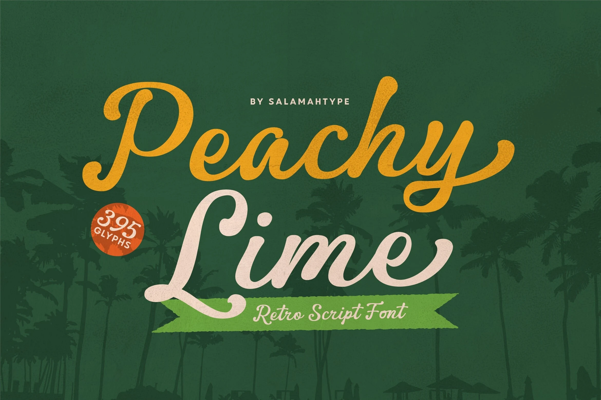
Best For: logos, branding, social media graphics, retro designs
Peachy Lime Font has a smooth retro script flow, with rounded joins, soft stroke endings, and a gentle bounce that keeps the lettering relaxed rather than formal. It fits Summer Retro Fonts especially well when you want a warm, postcard-like wordmark with easy movement across the line.
The tall capital P and L give it a strong opening shape, while the connected lowercase letters keep short phrases cohesive for titles, labels, and profile graphics. Let it run large, and pair it with a plain secondary typeface so the looping script stays clear and carries the mood on its own.
Your Life Font
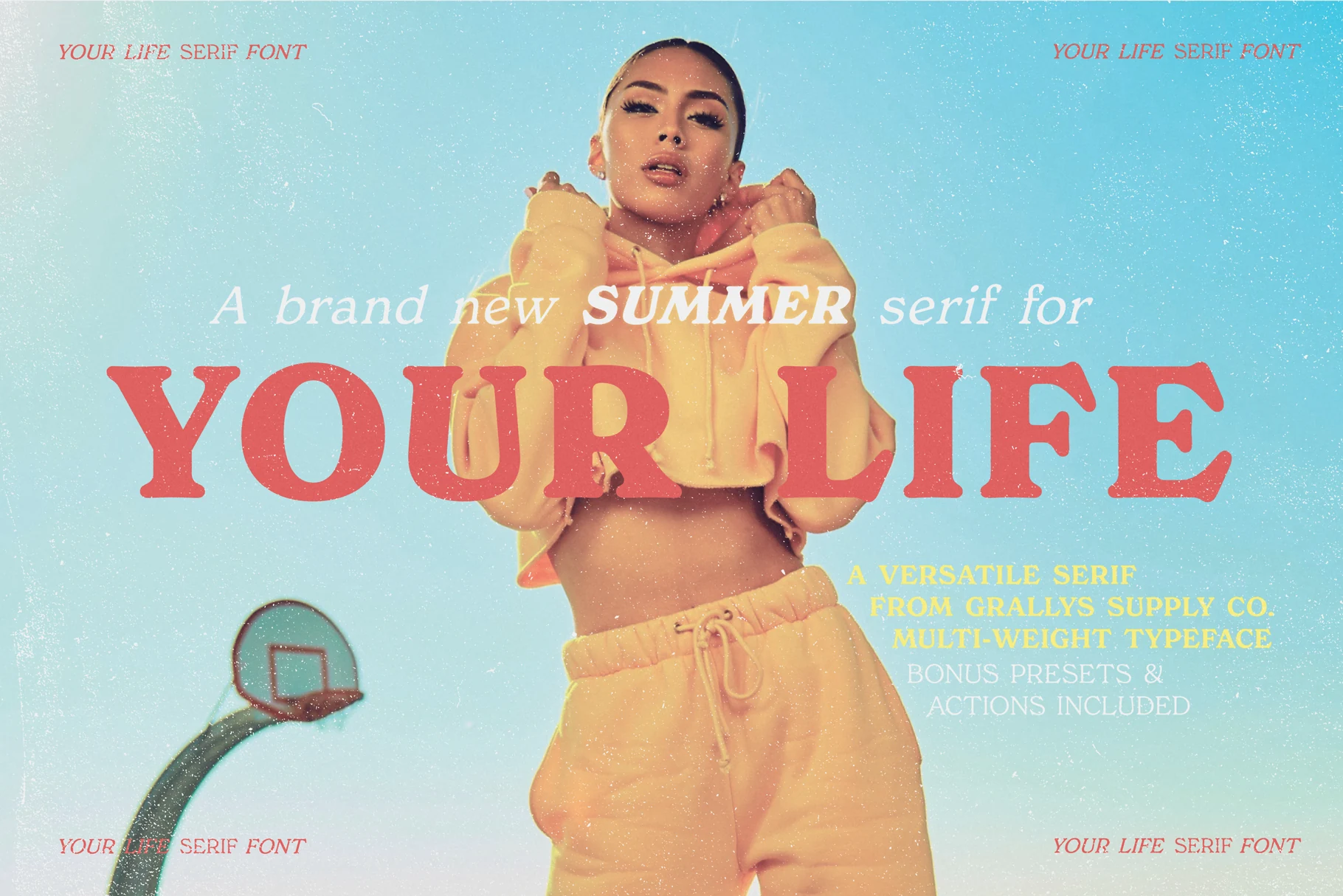
Best For: fashion branding, editorial designs, magazine covers, retro designs
Your Life Font is a retro serif family with chunky bracketed serifs, soft vintage texture, and a fashion-editorial rhythm that feels more magazine than beach sign. It fits Summer Retro Fonts when you need a summer look with polished serif weight instead of bubbly or handwritten lettering.
The bold style works well for main titles, while the lighter italic serif can handle supporting lines without breaking the period mood. Use generous spacing around the large caps, keep contrast clean, and use the included retro summer Photoshop actions when the artwork needs a more aged promotional finish.
Sundown Gazette Duo Font

Best For: editorial designs, product labels, posters, vintage designs
Sundown Gazette Duo Font pairs a thick nostalgic serif with a smooth handwritten script, giving the set a clear split between structured headline weight and warmer personal movement. The script has rounded curves, heavy strokes, and soft terminals, while the serif brings compact all-caps rhythm with a sun-faded editorial feel.
For Summer Retro Fonts, this duo works best when the script carries the main word and the serif supports it as a tighter subheading. Keep enough vertical spacing between the two styles so the flowing script does not crowd the serif, and use strong contrast when placing it over textured or photographic layouts.
Retro Summer Font
Best For: posters, T-shirts, retro designs, playful designs
Retro Summer Font leans into a full-on groovy mood with puffy rounded letters, thick black outlining, and slightly irregular shapes that keep it feeling hand-drawn rather than polished. The heavy weight gives it immediate presence, while the soft curves make the overall look playful instead of rigid.
For Summer Retro Fonts, this one works best when you treat it as the star of the layout. Mixing uppercase and lowercase letters helps build a more bouncy rhythm, and short headlines or single-word statements keep the chunky forms readable without losing their bold vintage charm.
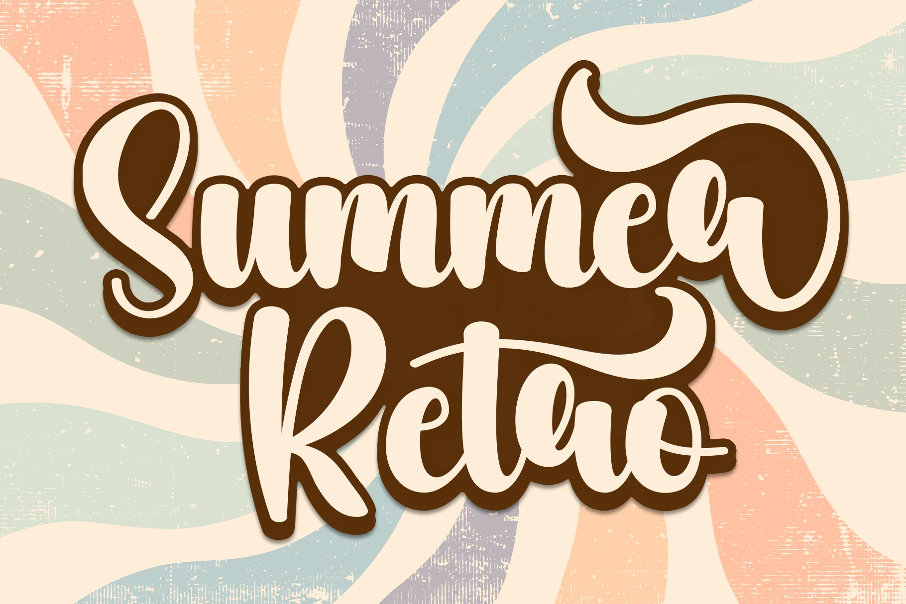
Sunset Fiesta Font
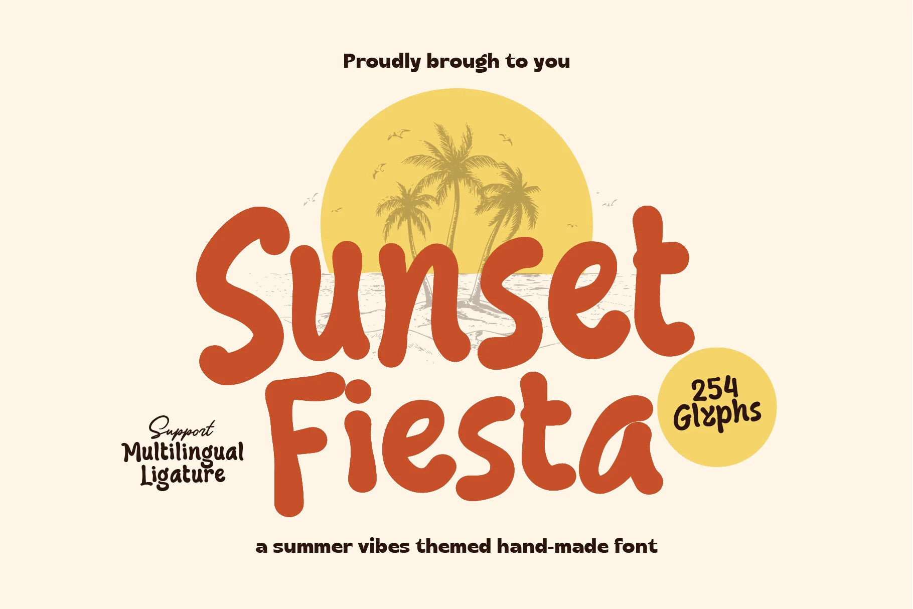
Best For: posters, T-shirts, stickers, retro designs
Sunset Fiesta Font has a chunky hand-made look with rounded strokes, soft corners, and slightly uneven proportions that keep it lively instead of polished. The letters feel broad and sun-warmed, giving the type a friendly retro voice that reads quickly while still carrying plenty of personality.
If you are collecting Summer Retro Fonts, this one works especially well when the headline stays short and bold. Its heavy shapes can fill space fast, so a little extra line spacing and simple supporting text help the playful rhythm stay clear on posters, merch, and other display-focused layouts.
Real Super Font
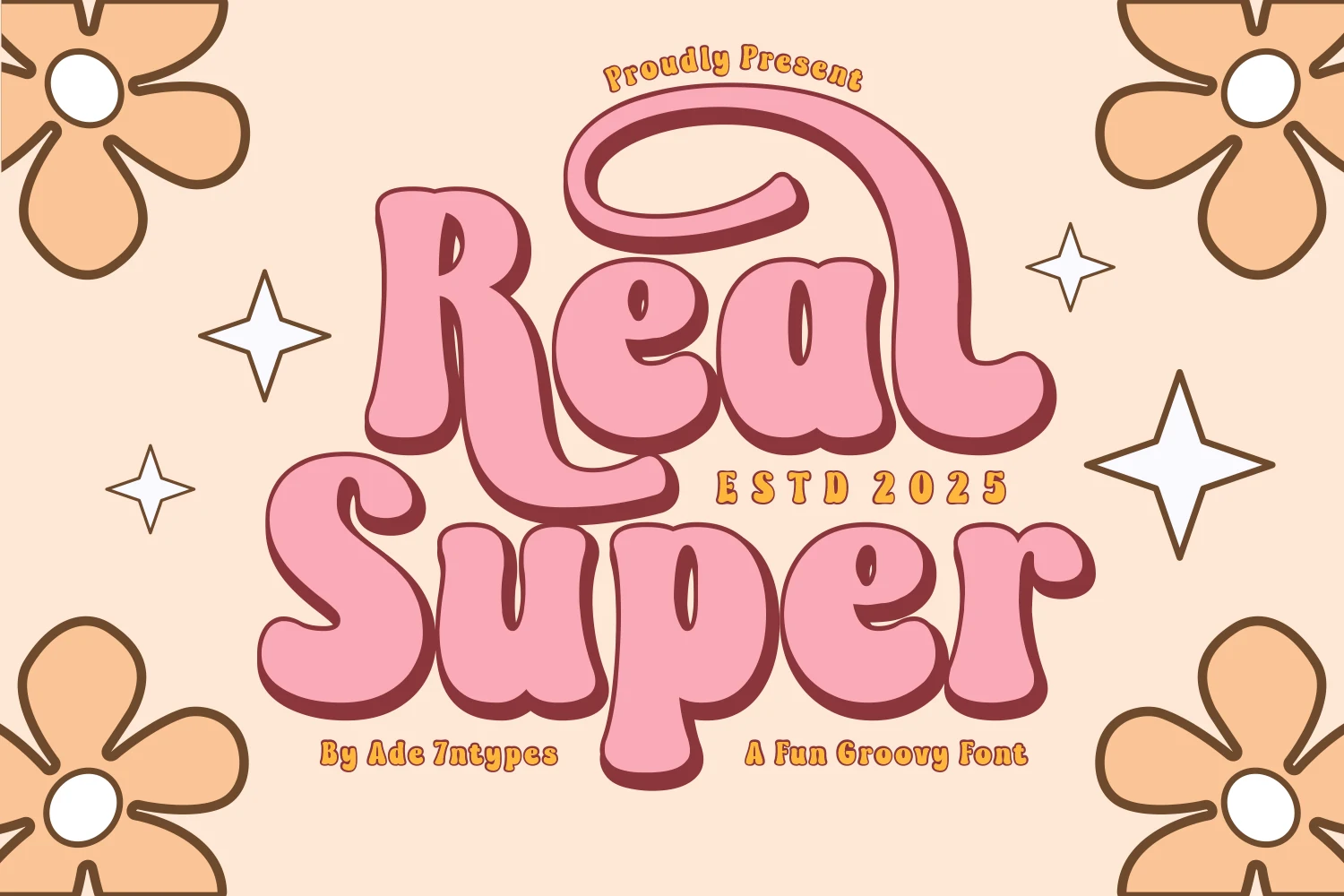
Best For: posters, stickers, retro designs, playful designs
Real Super Font has a full groovy 70s attitude, built from chunky rounded letters with soft inner counters, thick curves, and a low-contrast silhouette that feels bold without turning rigid. The exaggerated swash on the capital R and the dense bubble-like forms give the lettering a cheerful retro pull.
If you are browsing Summer Retro Fonts, this one stands out in short display lines where its weight and curved rhythm can do the work. Keep supporting text simple and give the headline enough room, because the compact shapes and decorative flow read best when they are not crowded by extra detail.
Endstart Font
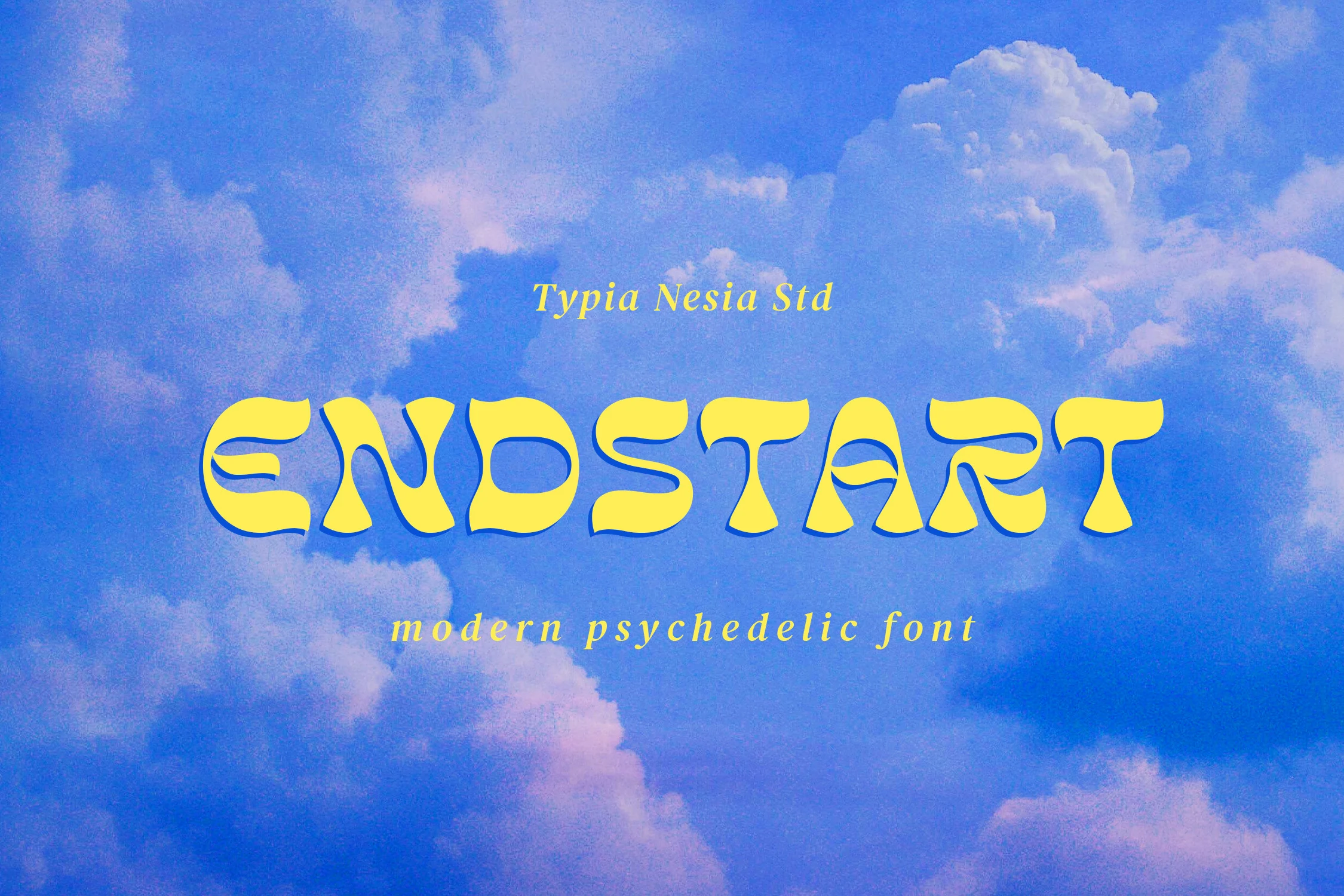
Best For: logos, posters, retro designs, editorial designs
Endstart Font has a modern psychedelic shape system, with wide uppercase letters, flared terminals, soft wave-like curves, and sliced interior details that make the forms feel fluid rather than mechanical. Its low, stretched rhythm gives headlines a retro poster mood while keeping the word shape bold and readable.
In a Summer Retro Fonts lineup, this font is strongest as a main title or logo-style wordmark. The decorative cuts and heavy curves need clean spacing around them, so avoid tight supporting copy and let contrast carry the lettering on posters, covers, or music-inspired editorial layouts.
Staflare Font
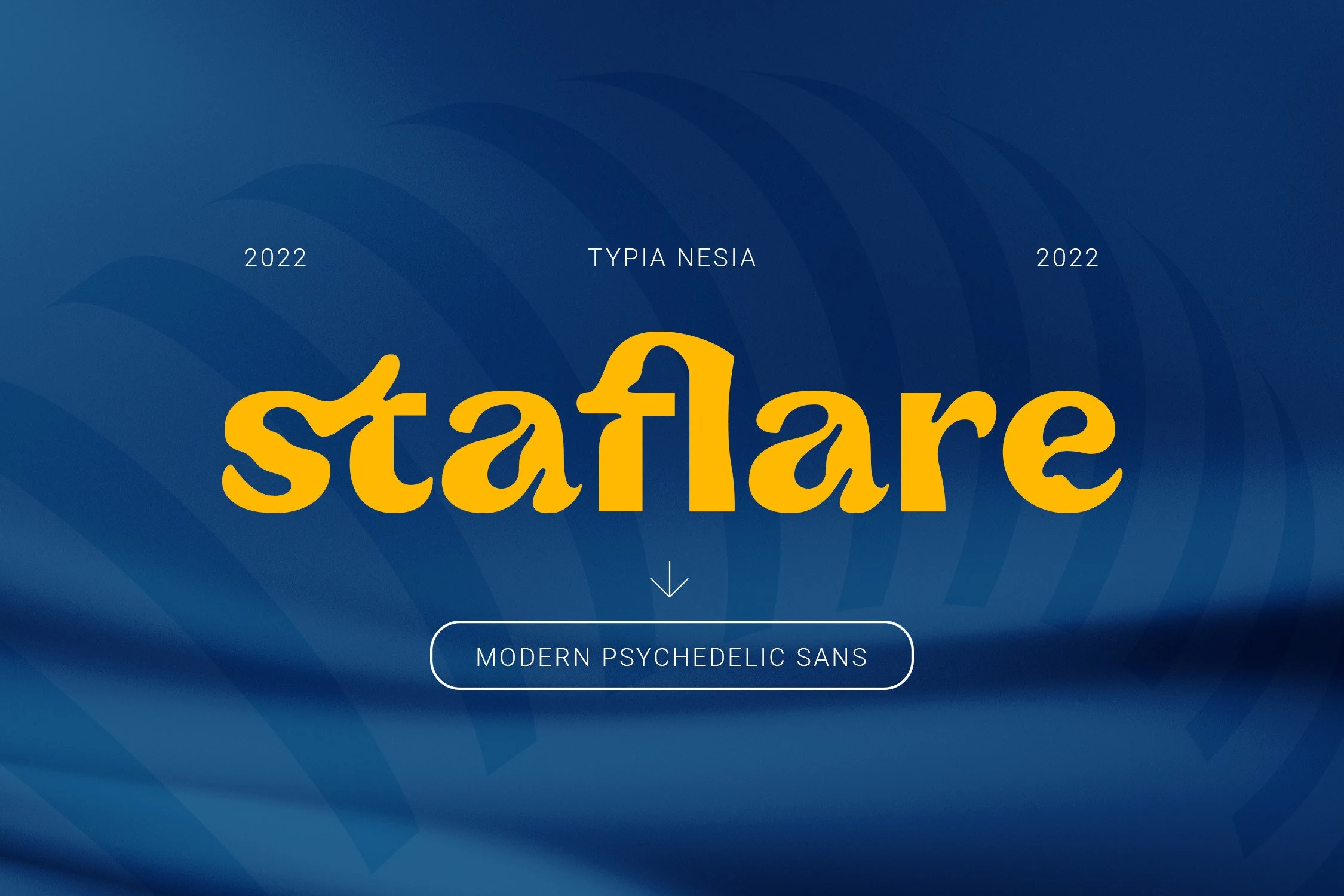
Best For: logos, posters, headlines, retro designs
Staflare Font has a bold psychedelic silhouette with soft swelling curves, blunt terminals, and a low stretched rhythm that makes each word feel wide and steady. The shapes sit between retro display lettering and a cleaner sans, so it brings attitude without giving up headline clarity.
In Summer Retro Fonts, Staflare works best when one or two words do the visual heavy lifting. Its thick forms create a solid block of color, so wider spacing around the headline helps the counters breathe and keeps branding, posters, or cover-style titles from feeling cramped.
Retro Summer Font
Best For: posters, T-shirts, stickers, retro designs
Retro Summer Font uses swollen bubble shapes, thick black contouring, and uneven inner cuts to create a groovy display style with a strong 70s pull. The rounded letterforms feel playful and loud, while the bold outline helps the white interiors stay readable on busy color or texture.
For Summer Retro Fonts, this font works best in short words, slogan-style headlines, and merch graphics where the lettering can take up real space. Keep line breaks generous and avoid tight tracking, because the chunky counters and wavy edges need separation to keep the rhythm clear.
Summer Vibes Font
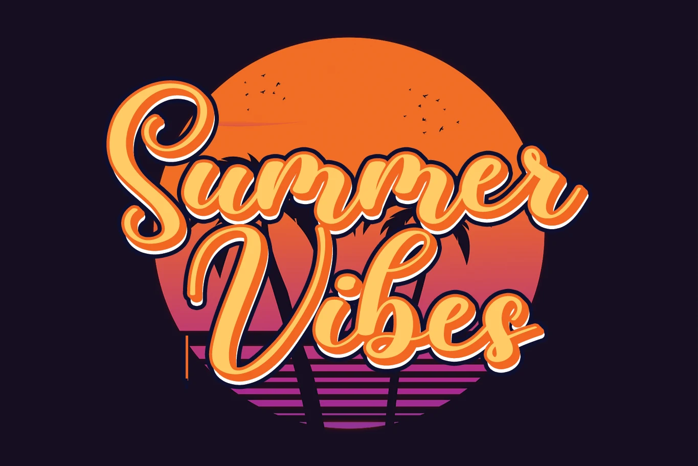
Best For: posters, T-shirts, stickers, retro designs
Summer Vibes Font reads as a bold beach display face with wide block letters, squared weight, and decorative wave cut-ins that instantly push it toward a coastal retro mood. The letterforms feel dense and graphic, so the type can carry the visual energy of a design even before you add illustration.
In a roundup of Summer Retro Fonts, this one is strongest in short titles where the internal details stay visible and crisp. Use it for large-scale words, keep surrounding text simple, and leave enough spacing around the headline so the shells, waves, and seaside texture do not get lost.
Summer Vibes Font
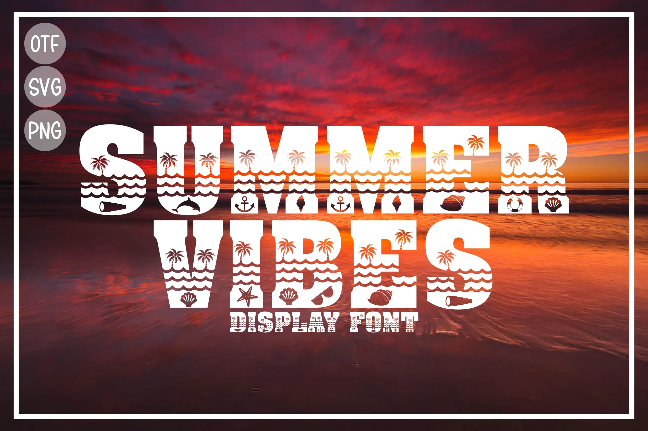
Best For: posters, T-shirts, stickers, retro designs
Summer Vibes Font is a heavy beach display face with wide slab-like letters, crisp white fills, and decorative wave, palm, shell, and anchor cutouts built into the forms. The blocky construction gives it strong headline impact, while the internal details add a playful coastal rhythm.
For Summer Retro Fonts, this style works best when the word count stays short and the lettering is allowed to sit large. Avoid dense backgrounds or tight secondary copy near the title, because the small seaside details need contrast and open space to remain readable.
Use chunky bubble and psychedelic display fonts for posters, stickers, and T-shirts; choose slab serifs for vintage signage or labels; use script and duo fonts for logos, branding, and softer vacation graphics. The right pick depends on whether the layout needs bold impact, coastal decoration, or smoother retro lettering.