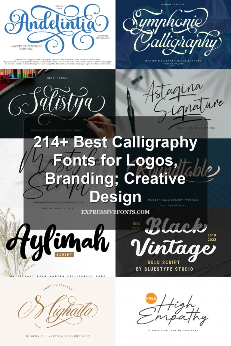
21 Best Signature Cursive Fonts for Branding in 2026
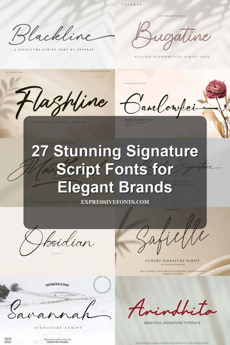
This collection moves from even monoline connections and restrained slants to high-contrast strokes, brush texture, loose baselines, and extended swashes. These Signature Cursive Fonts are built for logos, invitations, headlines, packaging, social graphics, and other short display treatments where flowing movement matters more than paragraph-length readability.
Looking for more cursive fonts? Browse our complete Cursive Fonts collection to compare modern, bold, wedding, logo-friendly, and Cricut-ready cursive styles.
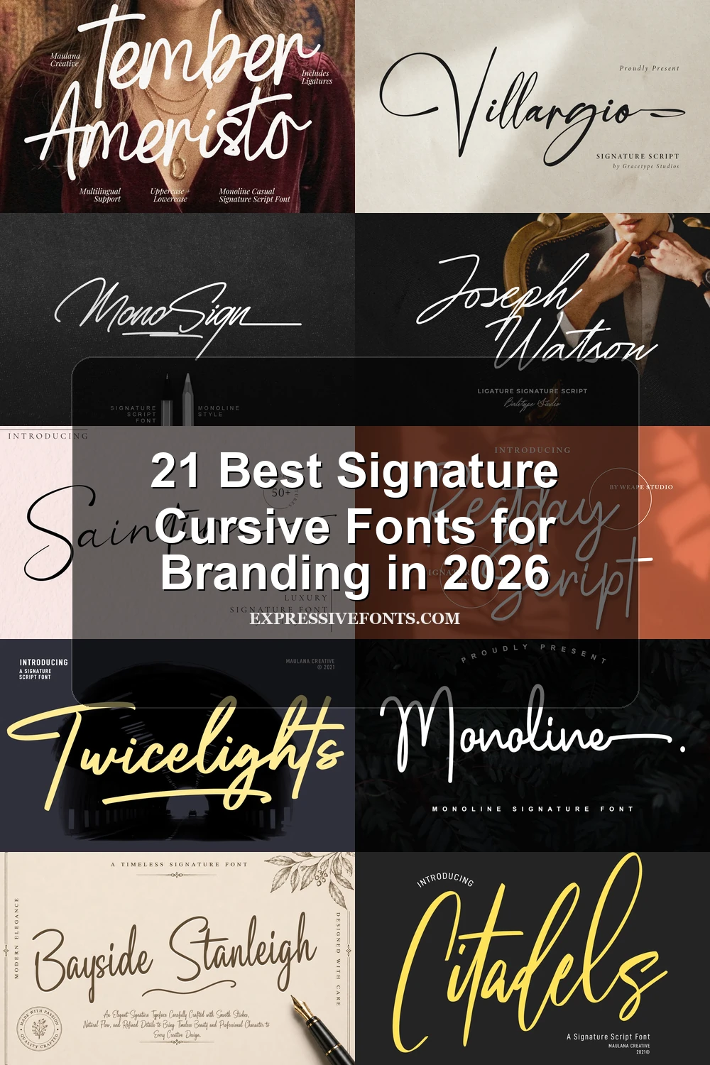
Signature Cursive Fonts
This group centers on connected, mostly monoline handwriting with controlled slants, stable or gently uneven baselines, and selective flourishes. Compared with the other categories, it prioritizes recognizable signature flow and practical branding use.
Saintine Font

Best For: logos, branding, invitations, social media graphics
Saintine Font keeps its connected curves visually even through a largely monoline construction, then adds pronounced horizontal flourishes to terminal strokes. The stable baseline helps branding and social graphics feel controlled, while its stylized letterforms need generous display sizing.
Monosign Font
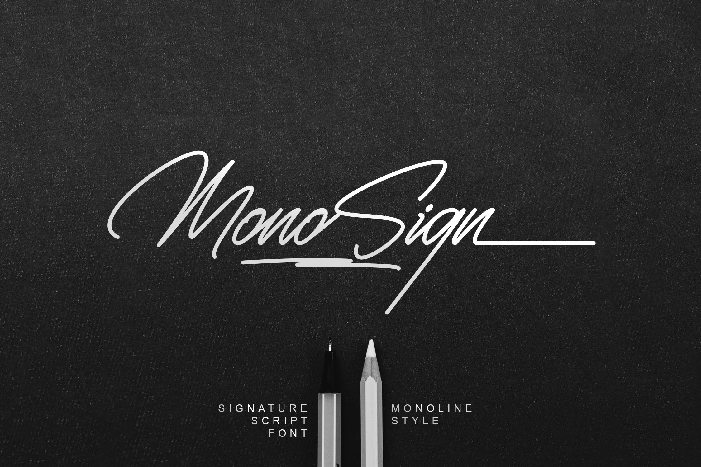
Best For: logos, branding, invitations, personal branding
Monosign Font is defined by a thin monoline sweep, connected cursive forms, and a long decorative tail on the lowercase n. Its light structure suits personal branding and invitations, with PUA-encoded swashes available for display work; readability falls as the size decreases.
Margita Signature Font
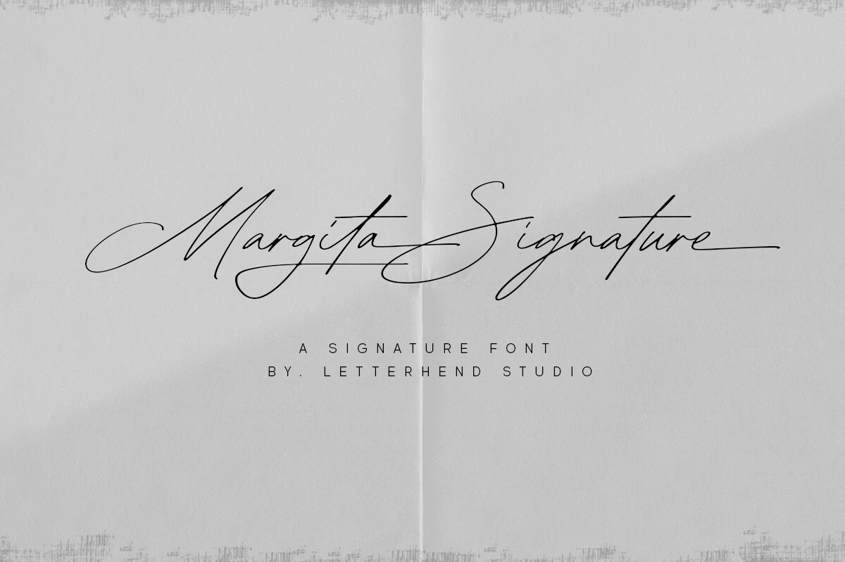
Best For: logos, invitations, packaging, wedding designs
Margita Signature Font suits logos, invitations, packaging, and wedding designs when horizontal swashes and varied letter heights are part of the message. Its connected construction remains fairly even, while stylistic alternates and ligatures add options; thin strokes and intricate joins need display scale.
Tember Ameristo Font
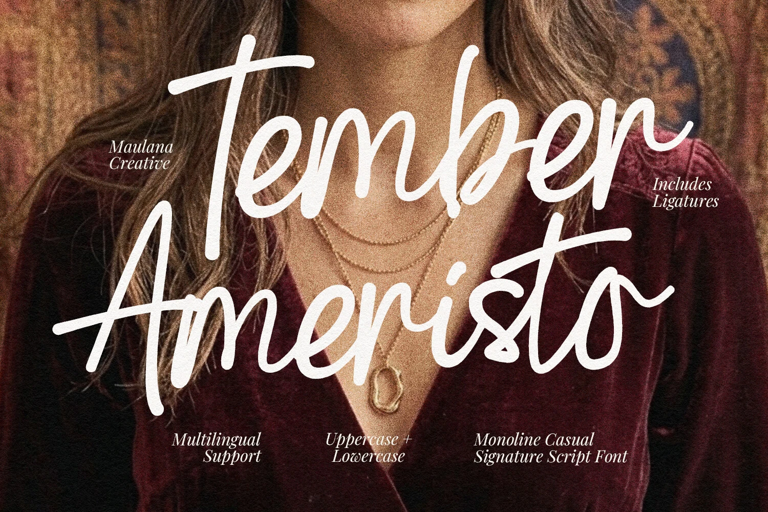
Best For: branding, packaging, wedding designs, social media graphics
Tember Ameristo Font feels naturally handwritten through fluid baseline flow, rounded terminals, and monoline connections. Natural ligatures and comprehensive multilingual support make it practical for branding, packaging, wedding designs, and social graphics, although overlapping connections may crowd very small applications.
Signature Script Font
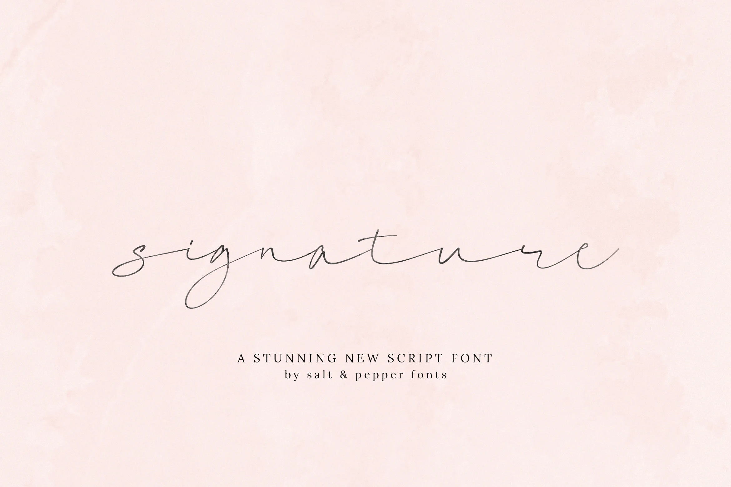
Best For: logos, invitations, wedding designs, personal branding
Signature Script Font creates a restrained personal impression with thin monoline connections, rounded curves, and an uneven baseline. It works well for logos, invitations, and wedding designs, but the light structure can lose definition below display sizes, especially in crowded layouts.
Aurelia Font
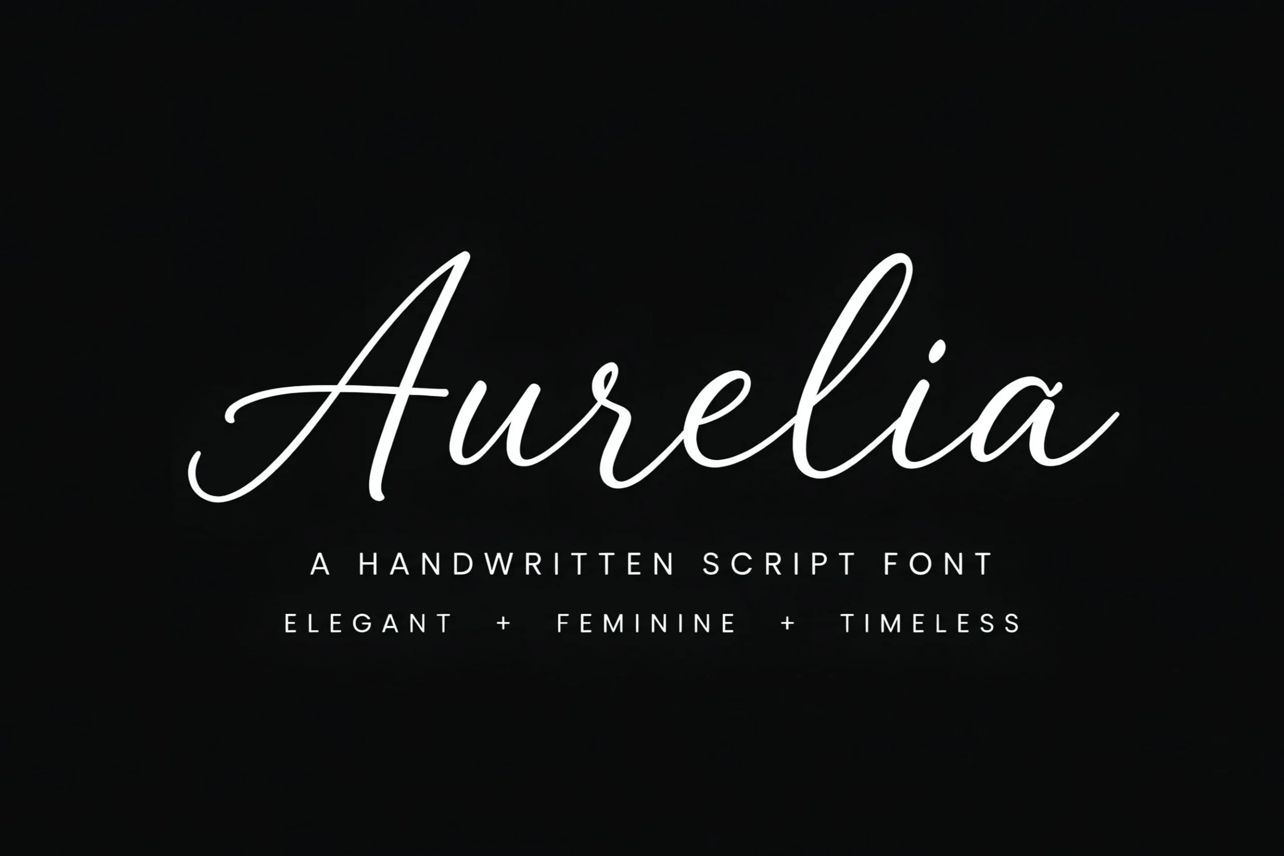
Best For: logos, branding, wedding designs, headlines
Aurelia Font emphasizes forward motion through pronounced entry and exit strokes, smooth connections, and a slight rightward slant. Its stable alignment keeps headlines controlled, while thin decorative curves make it most suitable for logos, branding, wedding designs, and other large titles.
Brittany Signature Script Font
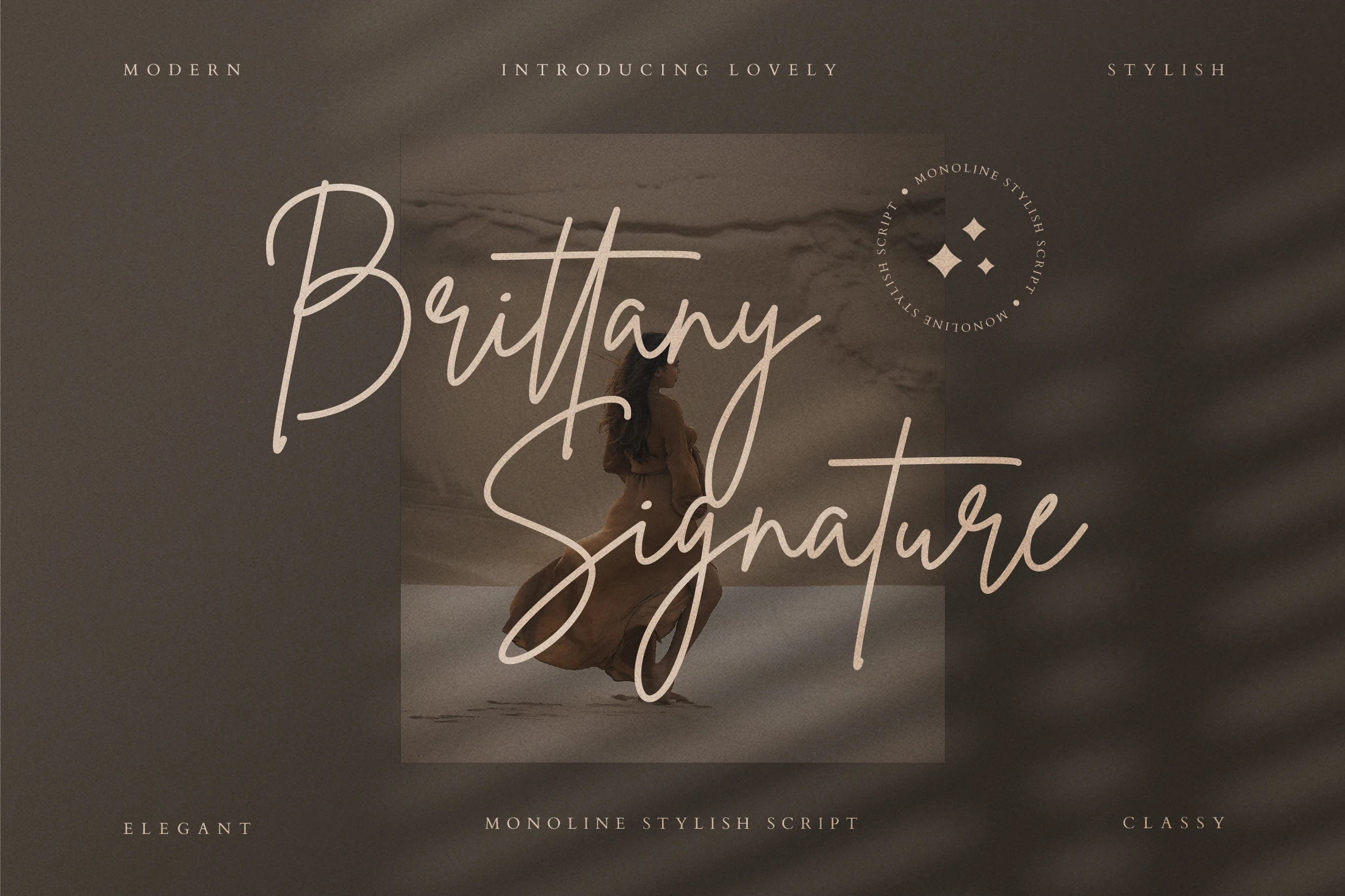
Best For: logos, branding, invitations, wedding designs
Brittany Signature Script Font turns monoline joins into an inky signature gesture with elaborate entry strokes, a rightward slant, and swash-like tails. Its flowing structure suits branding, logos, invitations, and wedding designs, but the connected decoration is not intended for sustained reading.
Restday Signature Script Font
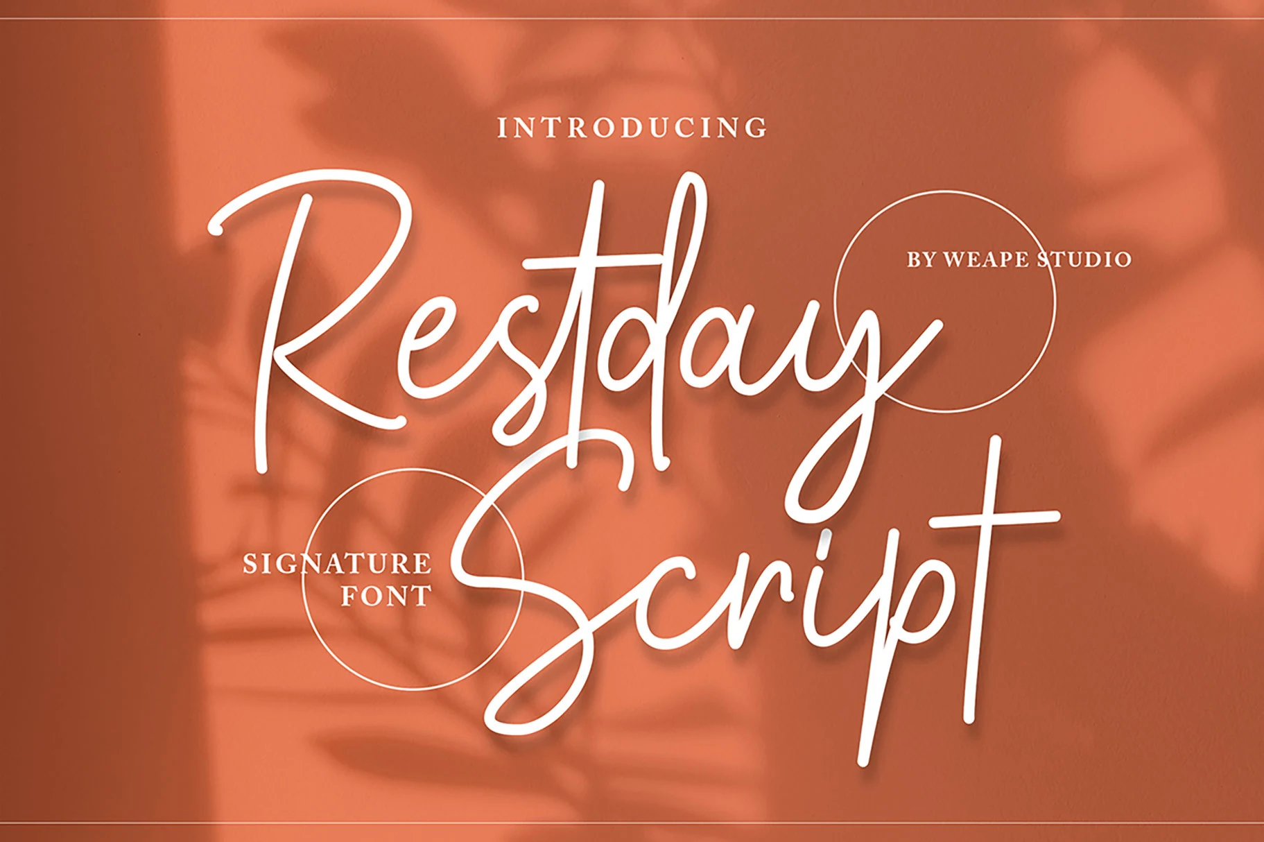
Best For: logos, branding, posters, wedding designs
Restday Signature Script Font has a fast hand-sweep monoline construction, extended loops, rounded terminals, and decorative tails. It adapts to logos, branding, posters, and wedding designs, but overlapping strokes need display sizing so signatures and headings remain easy to recognize.
Monoline Font

Best For: logos, branding, wedding designs, invitations
Monoline Font uses even connected strokes for straightforward recognition, then breaks the pattern with a high M ascender and long final-e tail. That contrast gives logos, branding, wedding designs, and invitations a distinct finish, though continuous joins still limit body-copy use.
Bayside Stanleigh Font
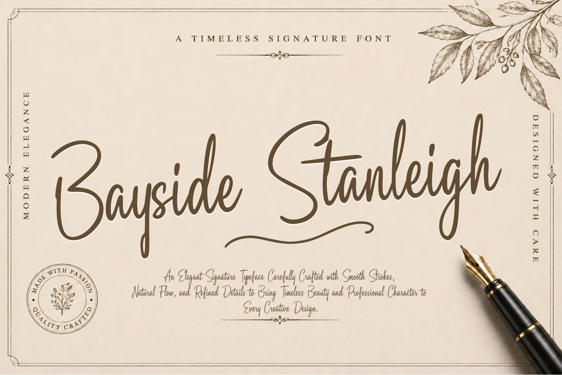
Best For: logos, personal branding, invitations, wedding designs
Bayside Stanleigh Font shapes connected letters with a slanted axis, extended swashes, and smooth hand-lettered curves. Its stable construction keeps large logos, personal branding, and invitations readable, but thin flowing strokes weaken when reduced too far.
Contrast, Brush, and Dynamic Motion
Higher contrast, brush texture, bouncy movement, and character-specific flourishes give these connected scripts more visual force. They differ from the monoline group through stronger stroke variation and from the loose-swash group through greater structural intensity.
Whisper Belle Font
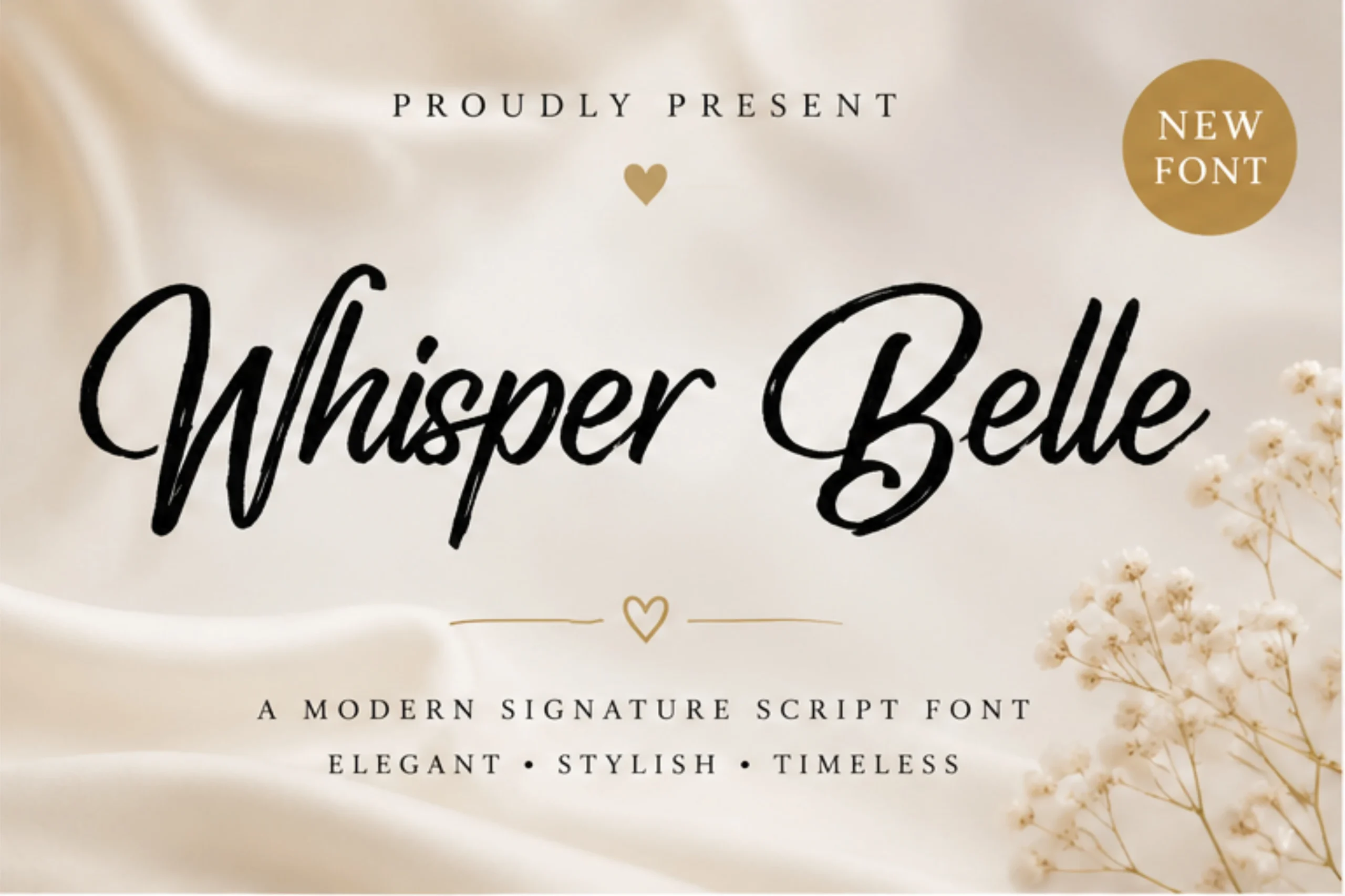
Best For: logos, branding, invitations
Whisper Belle Font uses high thick-thin contrast and a moderate rightward slant to give its connected strokes a delicate signature finish. Rounded terminals soften the display treatment, but decorative joins make it better for headlines, logos, and invitations than body text.
Bastony Signature Font
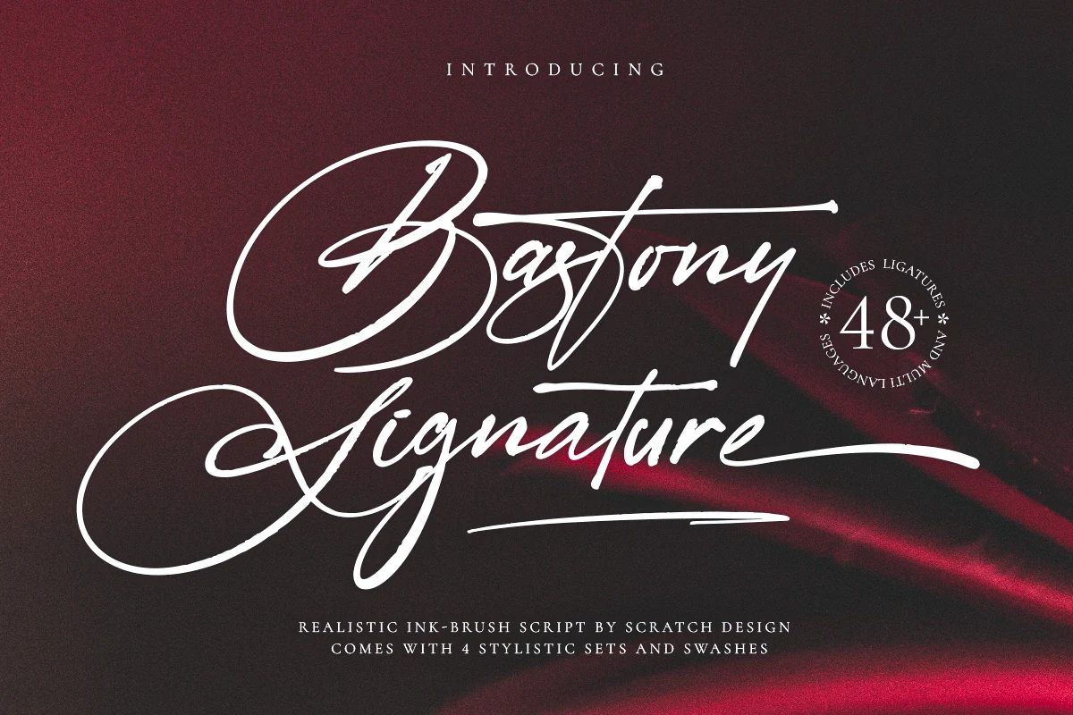
Best For: logos, branding, website headers, display text
Bastony Signature Font combines connected, right-slanting letterforms with dry-brush ink texture and mixed stroke weight. Brush variation and elongated tails add movement to website headers, logos, and display text, though the textured surface and complex swashes can obscure small lettering.
Citadels Signature Script Font
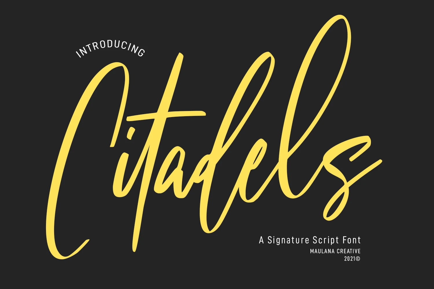
Best For: logos, branding, invitations, quotes
Citadels Signature Script Font pairs high contrast with a bouncy baseline, giving its connected letters an irregular rhythm. Extended uppercase and terminal swashes strengthen invitations, logos, and quotes, but the lively forms become less clear when reduced to small text.
Villargio Font
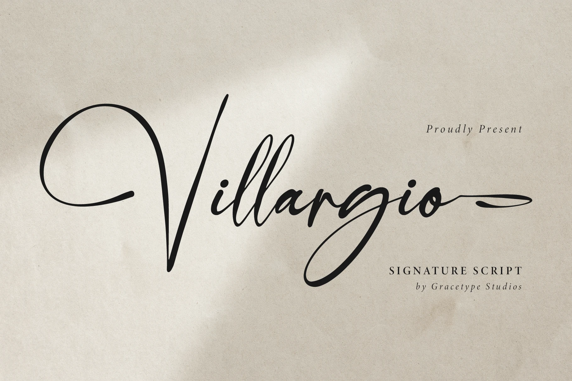
Best For: logos, personal branding, invitations, wedding designs
For branding and invitations that need a theatrical silhouette, Villargio Font combines high contrast with pronounced ascenders, sweeping loops, and extended terminal flourishes. Its stable baseline organizes the connected movement, but the intricate letterforms are best reserved for large Signature Cursive Fonts treatments.
Shadyspeed Script Font
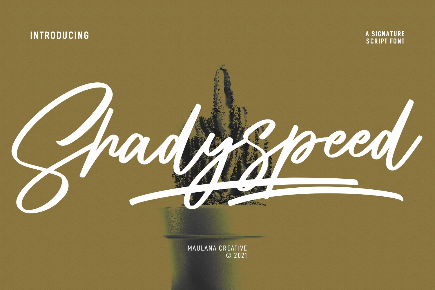
Best For: logos, social media graphics, book covers, headlines
Shadyspeed Script Font combines brush-like high contrast with connected letterforms and an under-baseline swash. Lowercase alternates broaden logo, social media, book-cover, and headline treatments, while complex joins make it a display choice rather than a small-scale reading face.
Quixotic Font
Best For: logos, branding, invitations, wedding designs
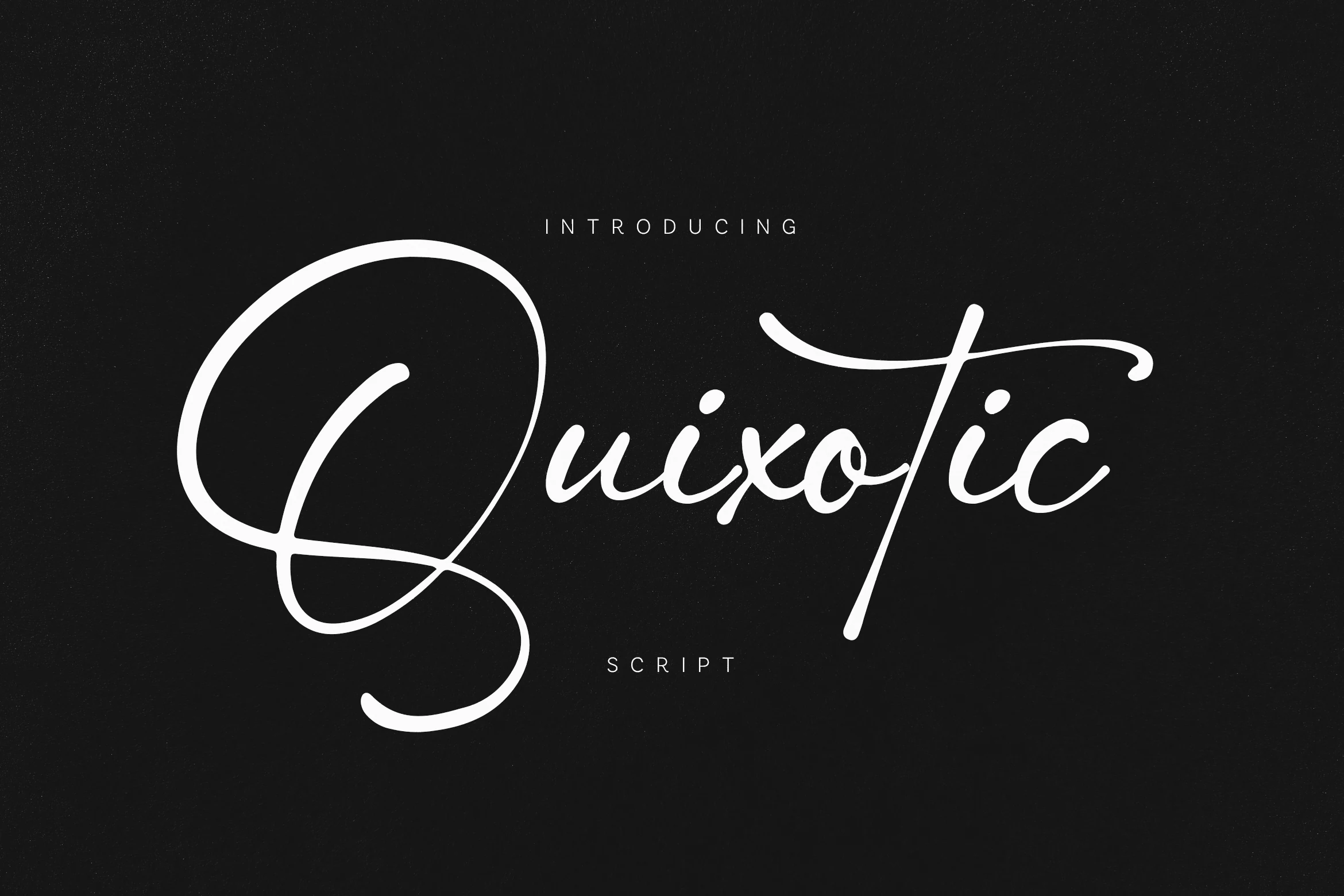
For logos and invitations that need memorable letter-specific gestures, Quixotic Font features an oversized initial Q with sweeping loops and an extended lowercase t crossbar. Its connected monoline links keep the flow relaxed, but exaggerated flourishes demand large-scale display treatment.
Loose Swashes and Expressive Rhythm
Wide proportions, changing letter heights, elongated terminals, and overlapping gestures create a looser rhythm here. These designs feel less controlled than the core Signature Cursive Fonts and work best for short, expressive display lettering.
Caboms Font
Best For: logos, branding, short phrases, display text
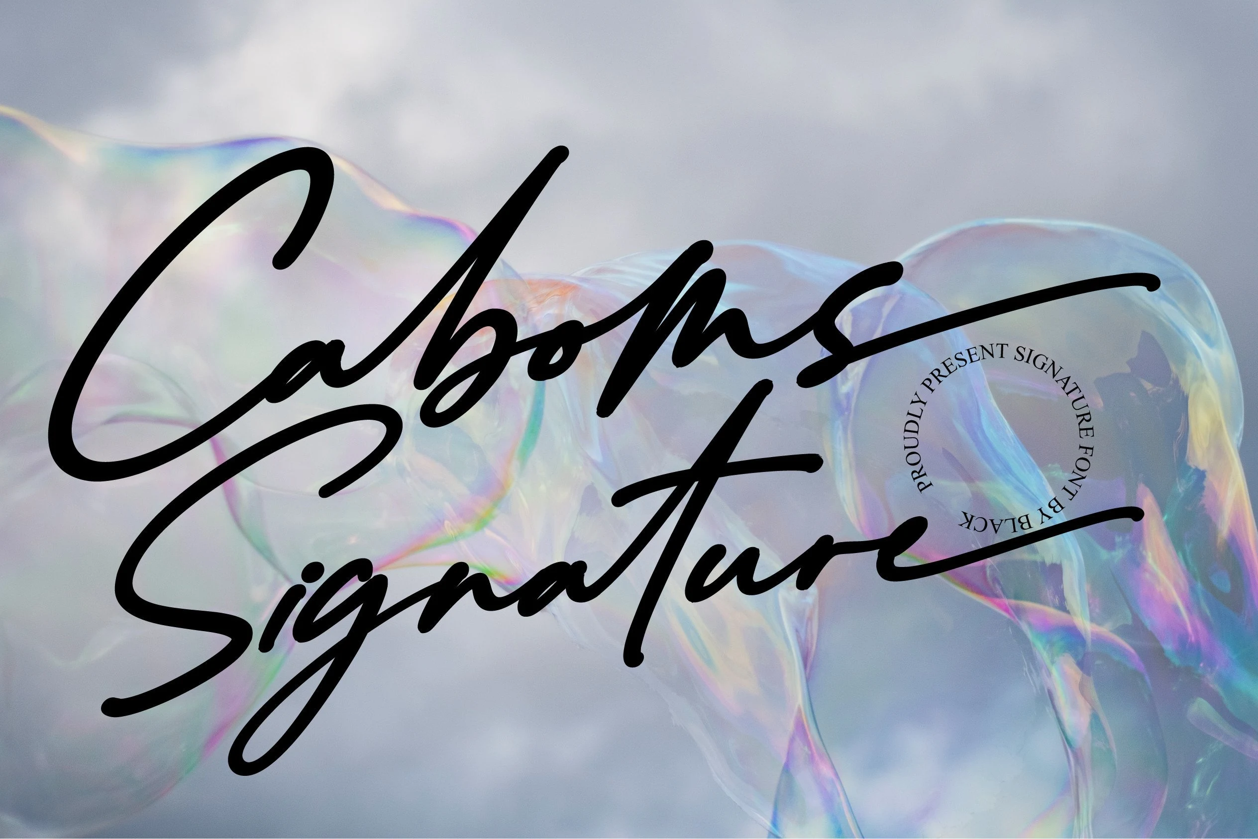
For logos and short phrases, Caboms Font offers especially fluid continuous movement through a pronounced rightward sweep and swash terminals on capitals and final lowercase characters. Its monoline construction feels personal, but overlapping forms make dense text and small applications difficult to read.
Amsahoney Font
Best For: logos, branding, display text, short phrases
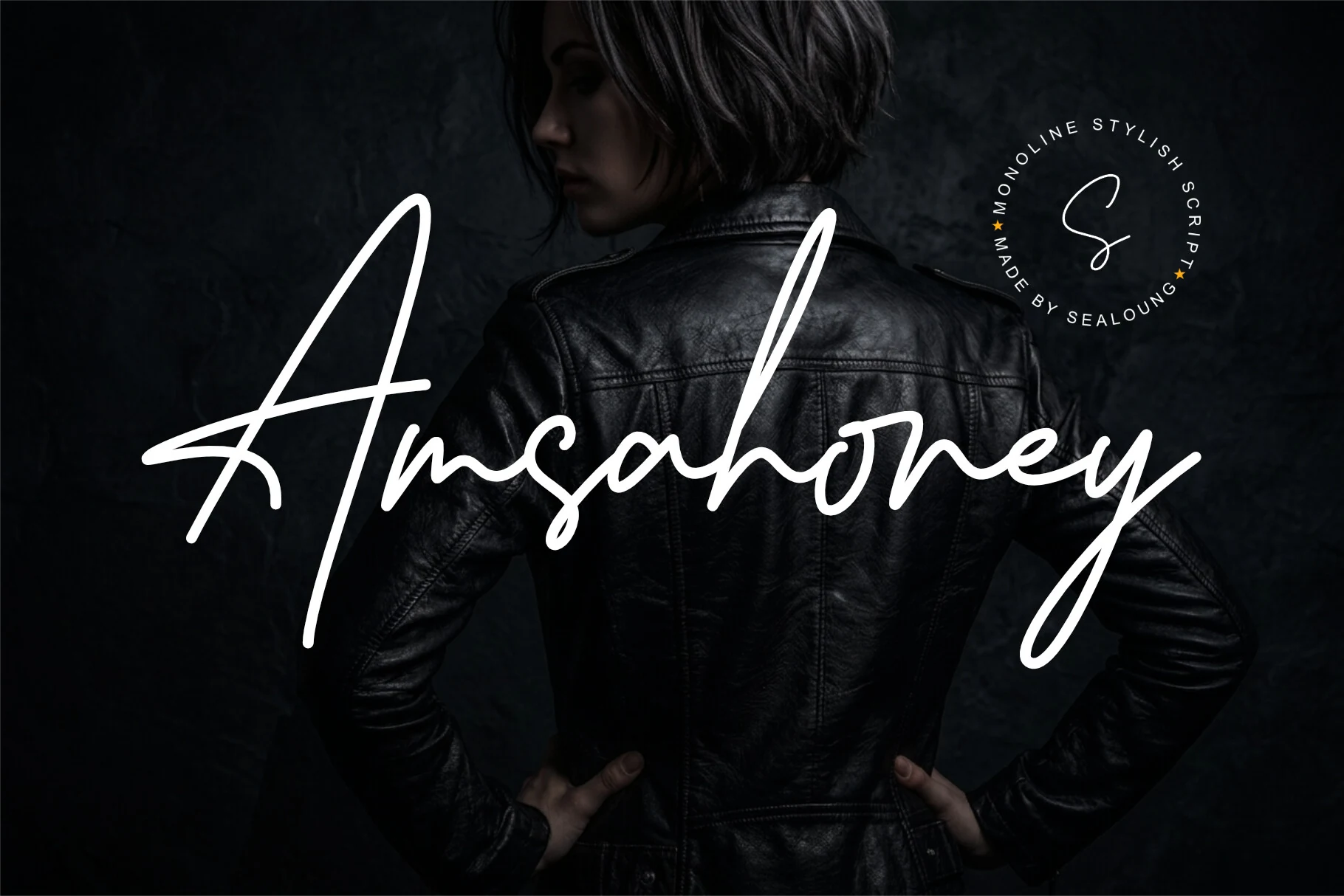
Amsahoney Font brings more visual presence than delicate Signature Cursive Fonts through bold monoline strokes and fully connected letters. Extended swashes on the initial A and final y create expressive endpoints, but overlaps and flowing joins call for large display use.
Joseph Watson – Signature Script Font
Best For: branding, quotes, wedding designs, logos
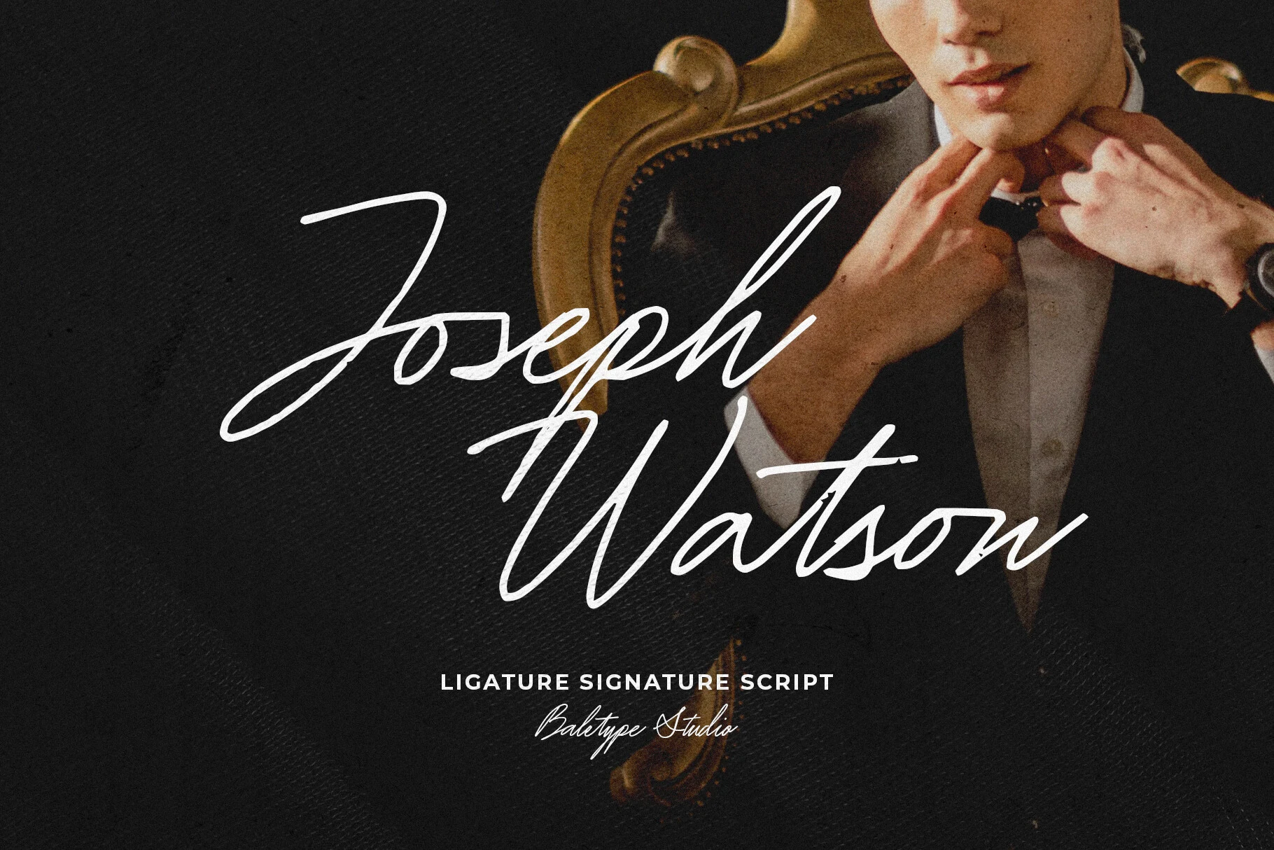
Joseph Watson – Signature Script Font uses a strong rightward slant and elongated flourishes to create a formal signature gesture. Ligatures and multiple-language support help with branded phrases, quotes, and invitations, while its decorative connected forms are clearest in large logos or headers.
Twicelights Signature Script Font
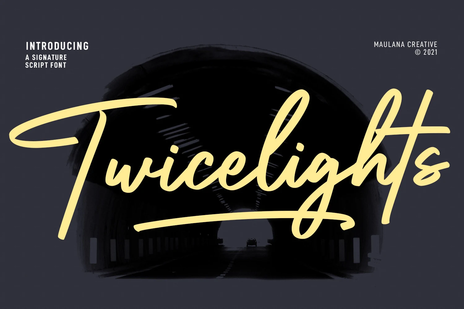
Best For: logos, social media graphics, book covers, display text
Twicelights Signature Script Font uses wide proportions, varied letter heights, and swashes that reach from the baseline to produce a loose display rhythm. Its elongated movement fits logos, social graphics, book covers, and titles, while compact applications may lose clarity.
Honeycomb Font
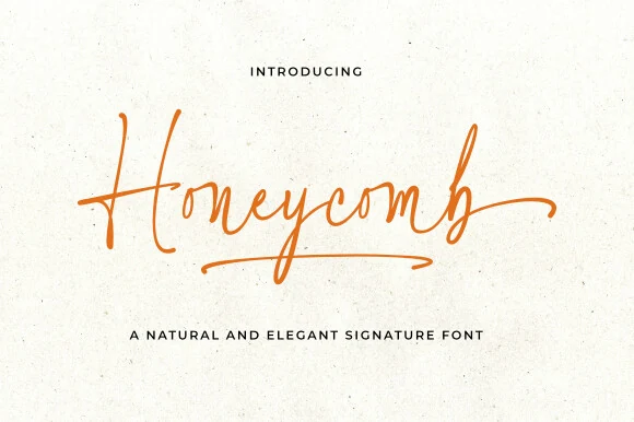
Best For: logos, branding, personal branding, short phrases
Honeycomb Font introduces varied slant into an otherwise connected monoline flow, creating changes of direction across the word. An extended final-character swash supports personal branding and short phrases, though the shifting forms can become ambiguous in smaller text or dense paragraphs.
How to Choose the Right Font
Choose monoline designs when even joins and baseline control matter, or high-contrast and brush styles when you want stronger movement and texture. Reserve the loosest swashes for short phrases and large artwork. When comparing Signature Cursive Fonts, test the actual wording at its final size: thin strokes, overlapping joins, and flourishes can change readability quickly.