21 Best Wedding Cursive Fonts for Invitations in 2026
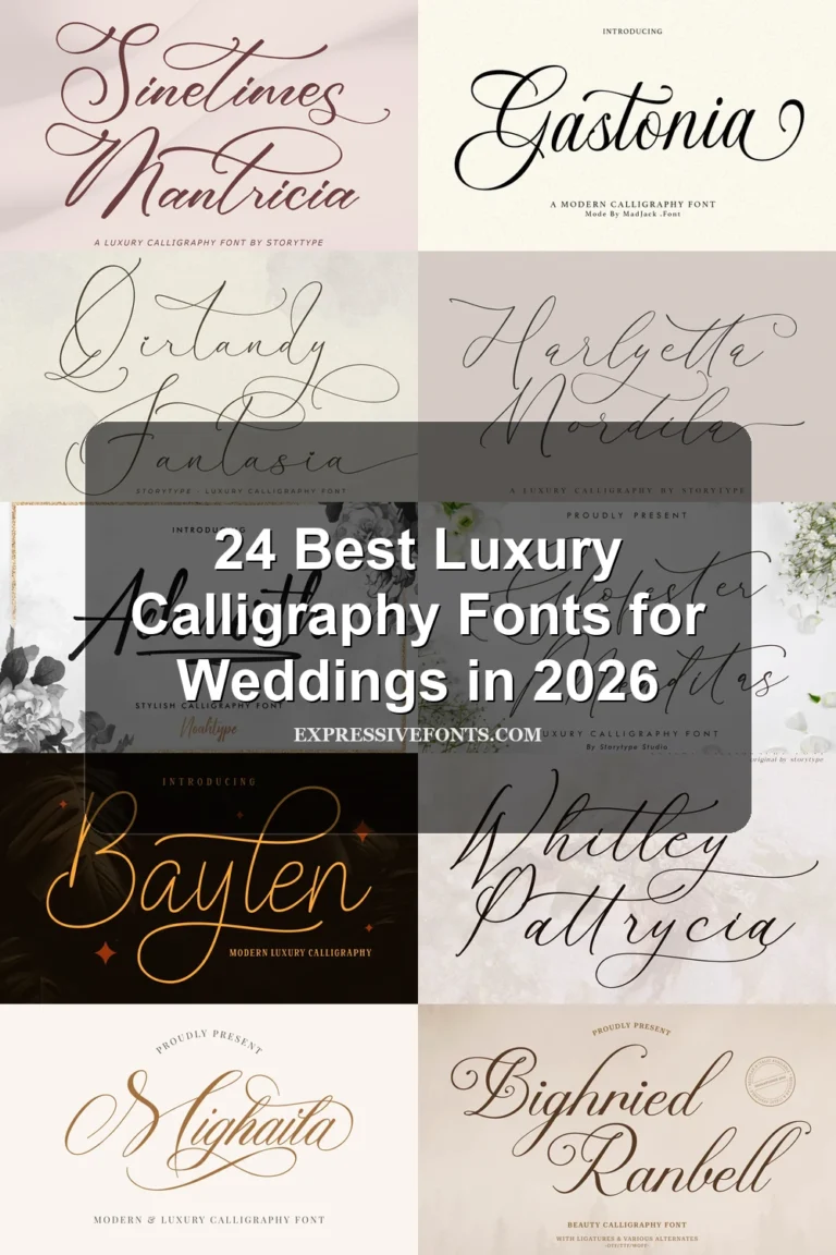
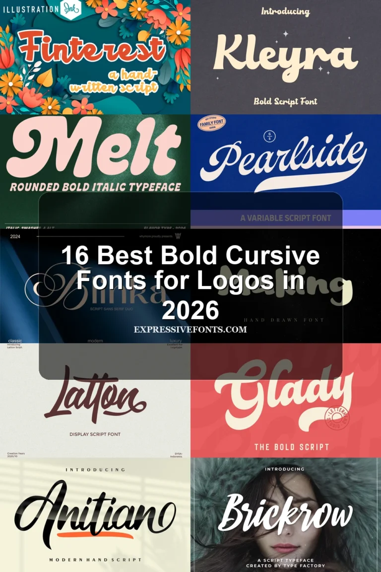
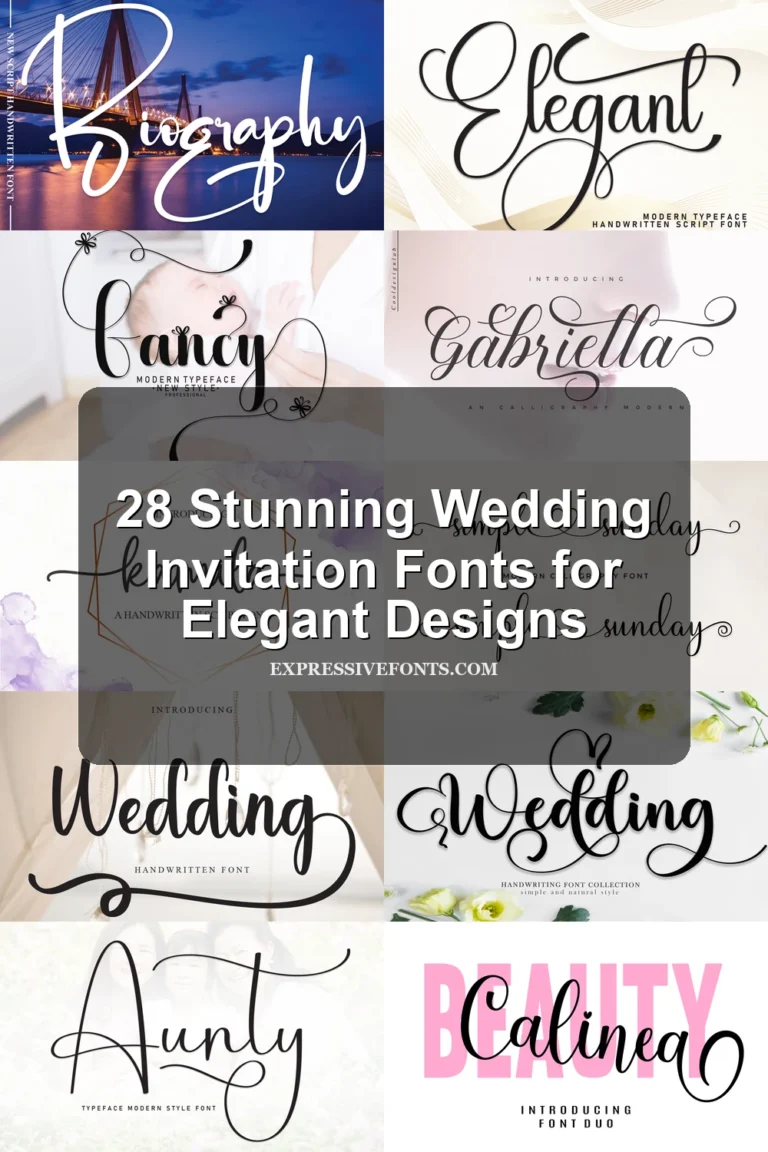
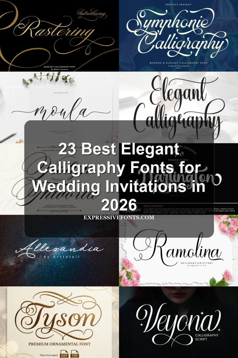
This collection moves from restrained monolinear handwriting to high-contrast scripts with sweeping loops, slanted joins, and expressive swashes. These Wedding Cursive Fonts are most useful for invitation names, ceremony headings, logos, quotes, and other short display treatments where connected movement can remain readable.
Looking for more cursive fonts? Browse our complete Cursive Fonts collection to compare modern, bold, wedding, logo-friendly, and Cricut-ready cursive styles.
Wedding Cursive Fonts: Flourished Formal Scripts
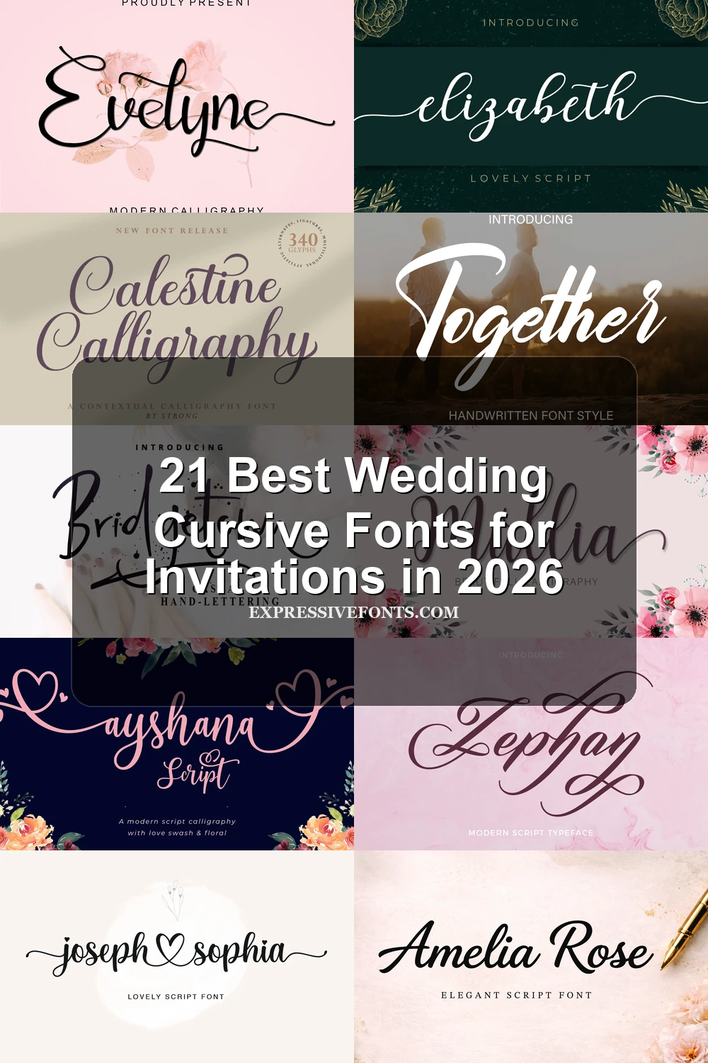
These Wedding Cursive Fonts emphasize formal thick-thin contrast, stable rightward slants, and ornamental terminals. They feel more ceremonial and structured than the lighter monolinear or irregular display groups.
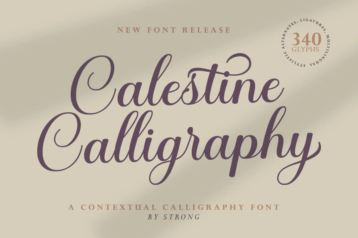
Calestine Calligraphy Font
Best For: wedding designs, invitations, logos, short phrases
Calestine Calligraphy Font stands out through strong thick-thin contrast and a pronounced rightward slant, giving its connected forms a formal calligraphic rhythm. Sweeping ascenders and descenders add impact to wedding phrases, logos, and invitations, though the flourished joins are better suited to short, larger text.
Evelyne Font
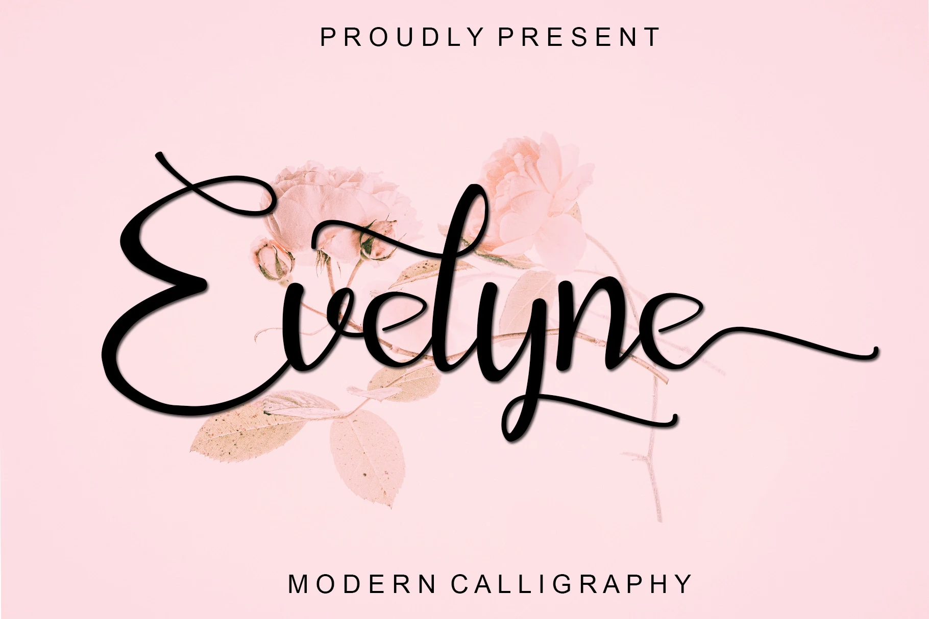
Best For: invitations, packaging, personal branding, creative projects
Evelyne Font finishes its flowing connected forms with trailing terminals, decorative loops, and pronounced contrast between thick and thin strokes. That ornamented construction gives invitation headings, packaging marks, personal branding, and other brief displays a more embellished edge than simpler cursive styles.
Amelia Rose Font
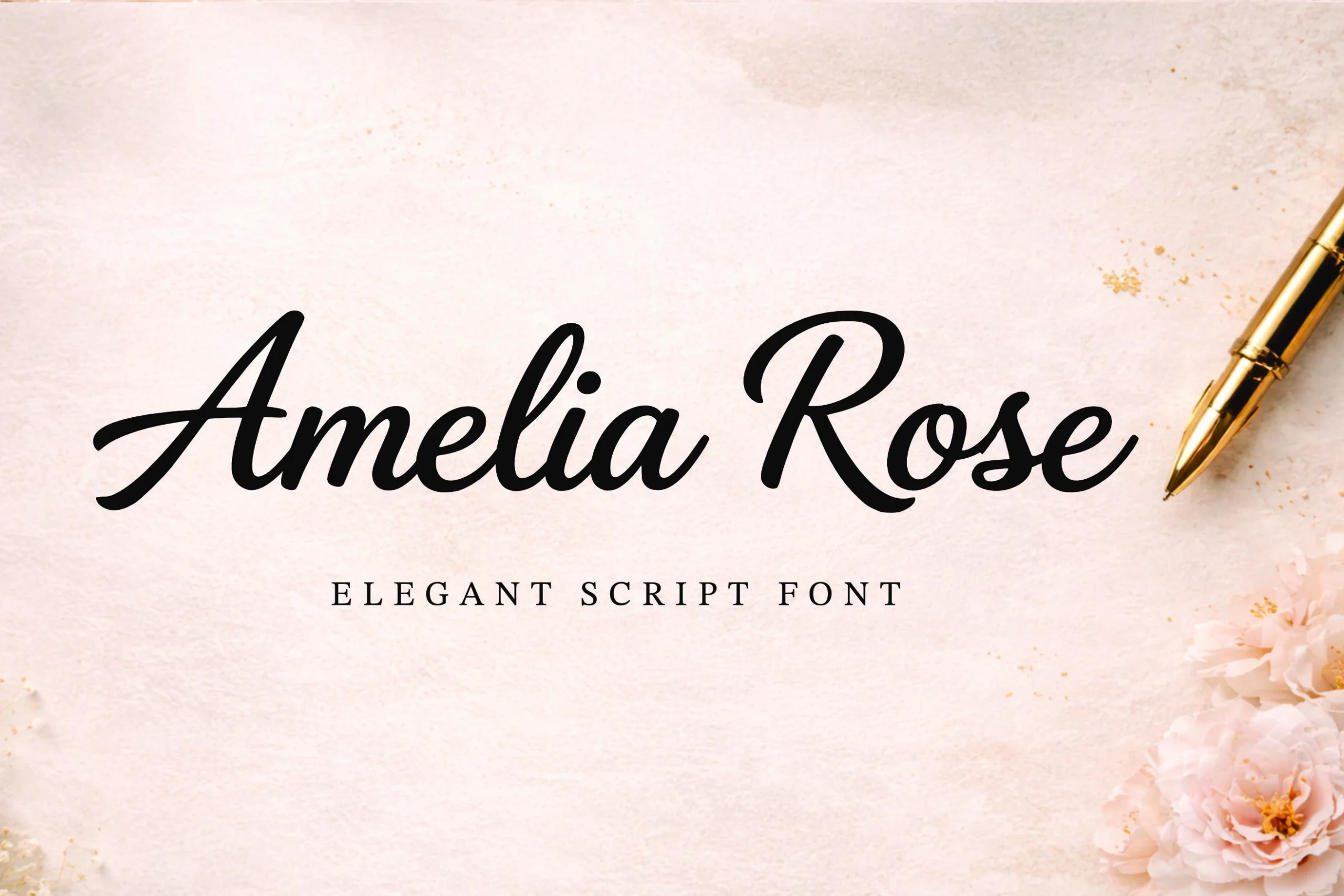
Best For: logos, branding, wedding designs, high-end designs
Amelia Rose Font brings bold, brush-like strokes to connected lowercase lettering, giving wedding branding and logos more visual authority than a hairline script. Its smooth curves work well at display scale, while the high contrast can lose clarity in small applications.
Wedding Enchanting Font
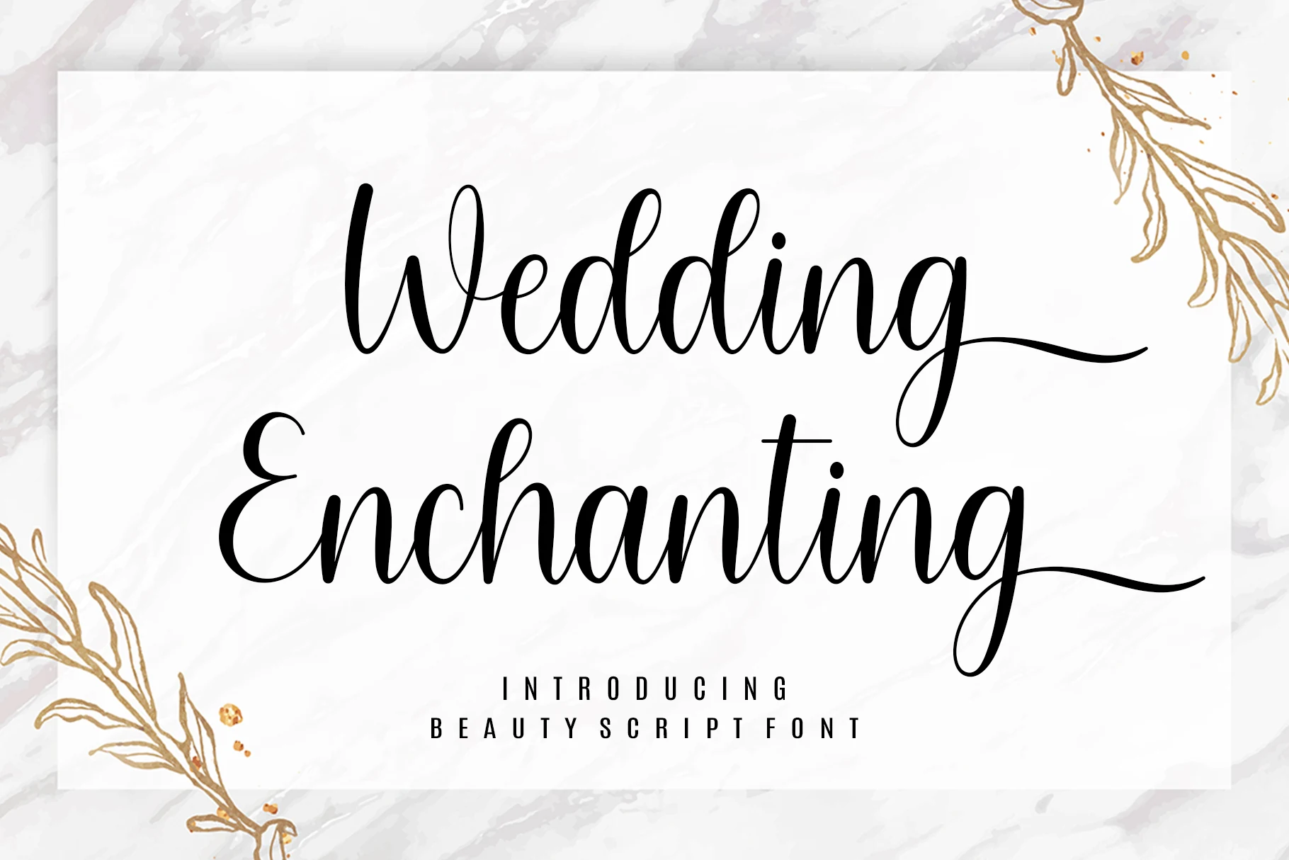
Best For: invitations, wedding designs, romantic designs, elegant designs
Wedding Enchanting Font is made for ceremonial display, with high-contrast connected letters that resolve into extended terminal swashes. The flourished endings give wedding titles and invitation headers strong presence, but Wedding Cursive Fonts with this much detail need generous sizing to keep the connections legible.
Elatina Font
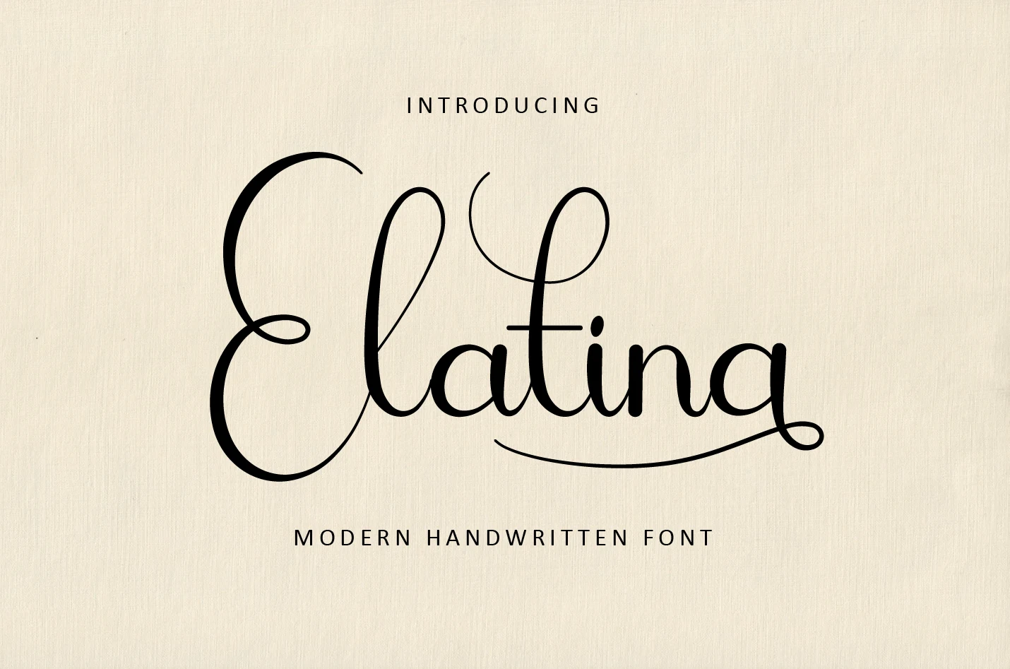
Best For: wedding designs, invitations, logos, headlines
Elatina Font creates a tall, headline-oriented silhouette through elongated ascenders and descenders, high-contrast strokes, and flourished lowercase terminals. It is stronger for names, logotypes, wedding designs, and invitation headers than compact text because its thin flowing lines become harder to read when reduced.
Alanta Font
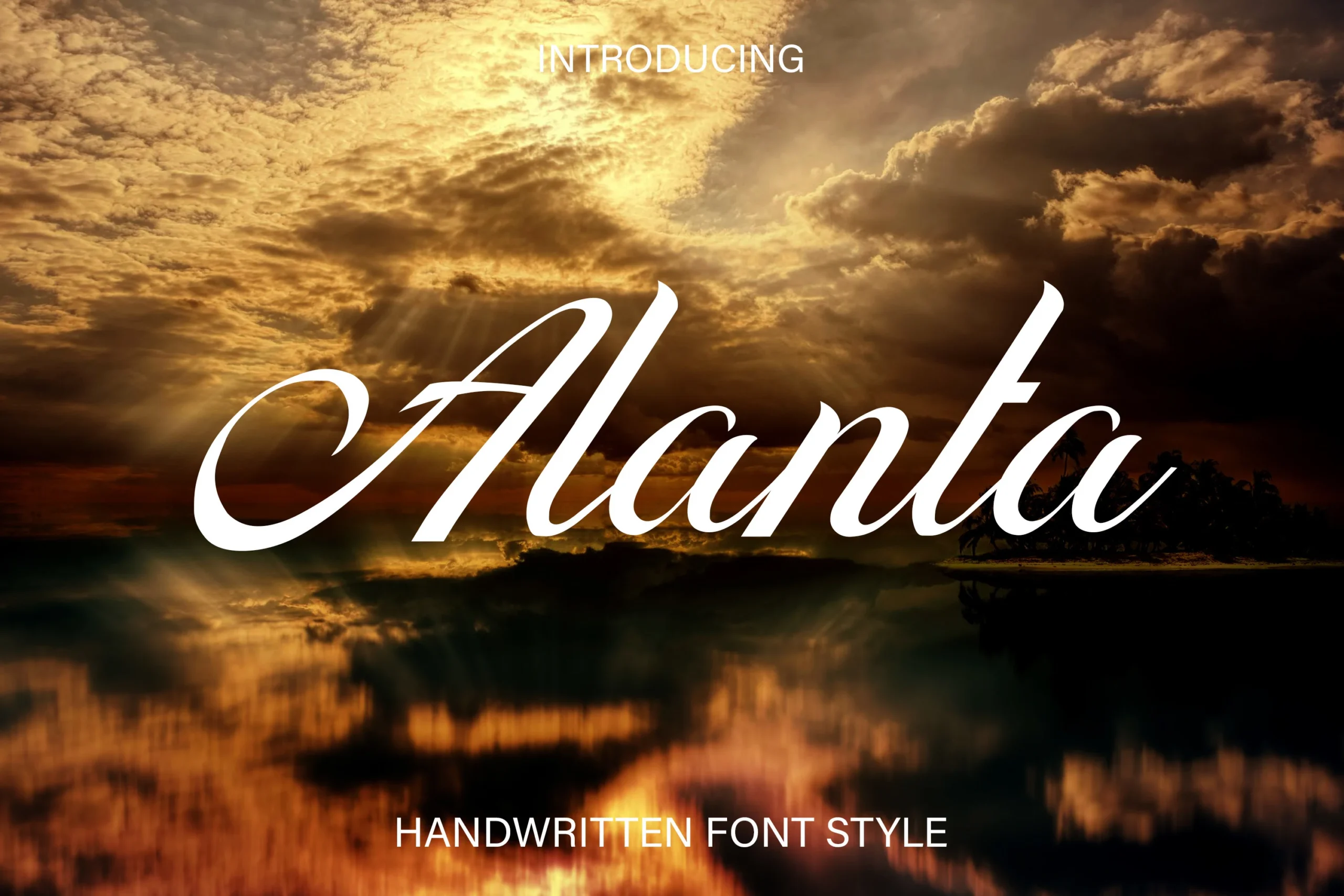
Best For: invitations, wedding designs, logos, headlines
Alanta Font makes its sweeping initial A the focal point of an otherwise continuous, right-slanting structure. That entry swash is valuable for names and headline openings in invitations and logos, while thin connecting strokes make extended body text impractical.
Elizabeth Font
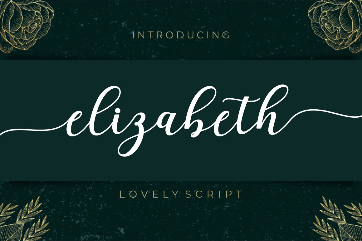
Best For: logos, website headers, display text, wedding designs
Elizabeth Font frames its stable right-leaning cursive with looping initial and terminal swashes. The steady baseline helps preserve display readability, while high contrast and decorative arcs make Wedding Cursive Fonts especially effective for logos, website headers, and wedding designs rather than long copy.
Together Font
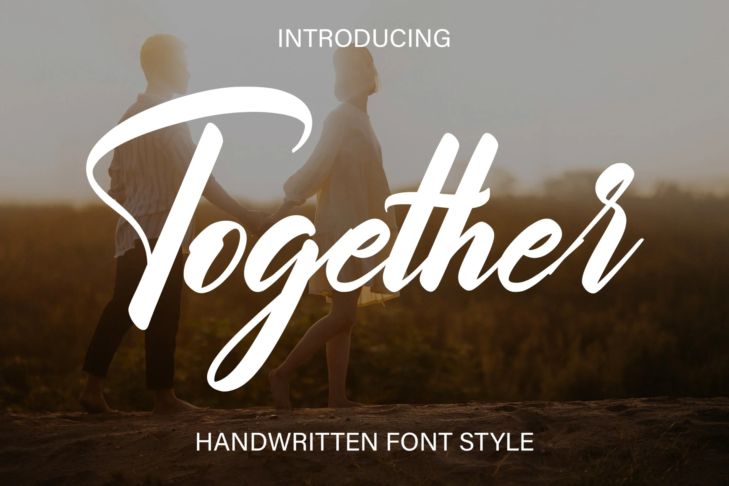
Best For: logos, branding, invitations, wedding designs
Together Font combines connected lettering with calligraphic brush terminals, producing a fuller visual presence for logos, branding, invitations, and wedding designs. Its broad strokes carry well in display settings, but thin connecting lines and intricate swashes still require a comfortable viewing size.
Mullia Font
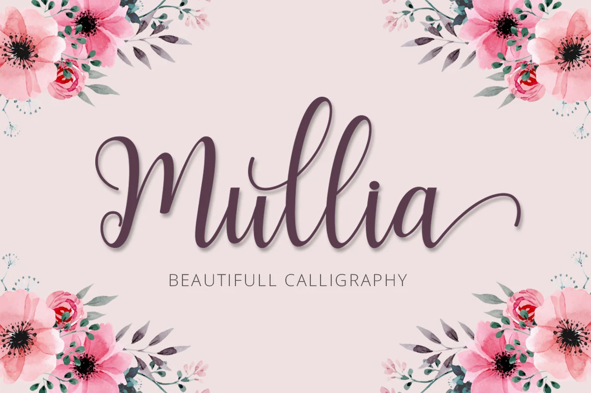
Best For: wedding designs, invitations, social media graphics, cute designs
Mullia Font balances variable line weight with connected cursive letters and extended swashes, combining formal contrast with a hand-lettered character. It suits wedding invitations, greeting cards, and social media graphics, while its changing strokes are better reserved for headings than informational details.
Cleopatra Font
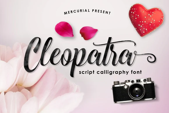
Best For: logos, branding, invitations, wedding designs
Cleopatra Font gets much of its identity from the swash on the final a, which gives names and brand marks a recognizable closing gesture. Its high-contrast connected strokes and irregular rhythm suit invitations and wedding designs, but the terminal feature needs large display scale.
Zephan Font
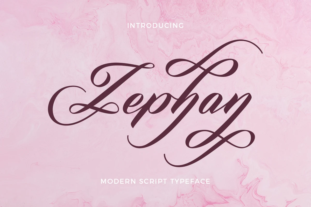
Best For: wedding designs, invitations, logos, headlines
Zephan Font channels calligraphic influence through balanced varied stroke weight, intricate connected loops, and pronounced swashes. Its stable rightward structure supports wedding designs, invitations, logos, and headlines, but the ornamental construction is not practical for body-sized text.
Gastonia Script Font
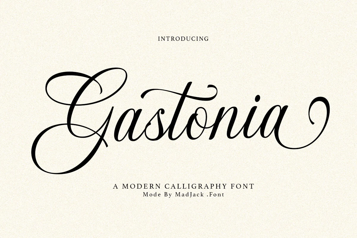
Best For: branding, packaging, wedding designs, luxury designs
Gastonia Script Font combines high-contrast calligraphic strokes with complex connected forms and pronounced swash work. It is a strong choice for Wedding Cursive Fonts used in branding, upscale packaging, wedding displays, and editorial designs, provided the lettering is kept large enough for the connections to remain clear.
Monolinear Flow and Personal Touch
This group centers on even strokes, connected movement, and personal handwriting cues such as bouncy baselines or signature-like swashes. It is less formal than the flourished category and generally easier to approach at display sizes.
Auralique Demo Font
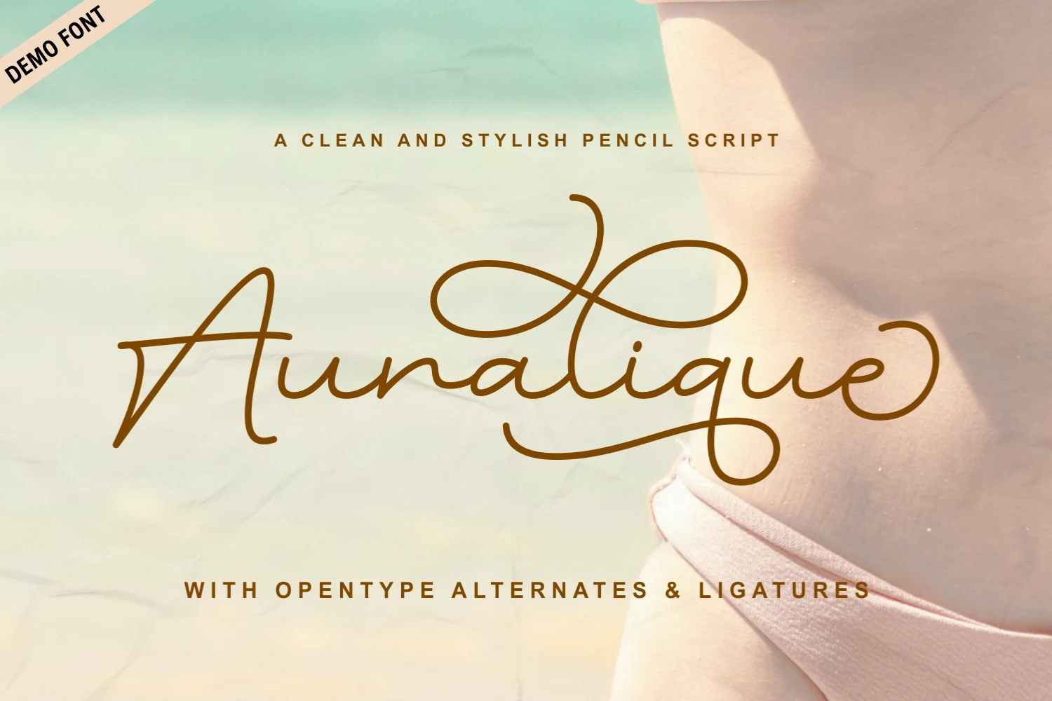
Best For: invitations, wedding designs, romantic designs
Auralique Demo Font pairs pencil-like texture with regular monolinear connected lettering and a steady rightward slant. Looping ascenders, descenders, and thin flourishes give Wedding Cursive Fonts a hand-drawn feel, but they need generous sizing for invitation names or title treatments.
Callifornia Font
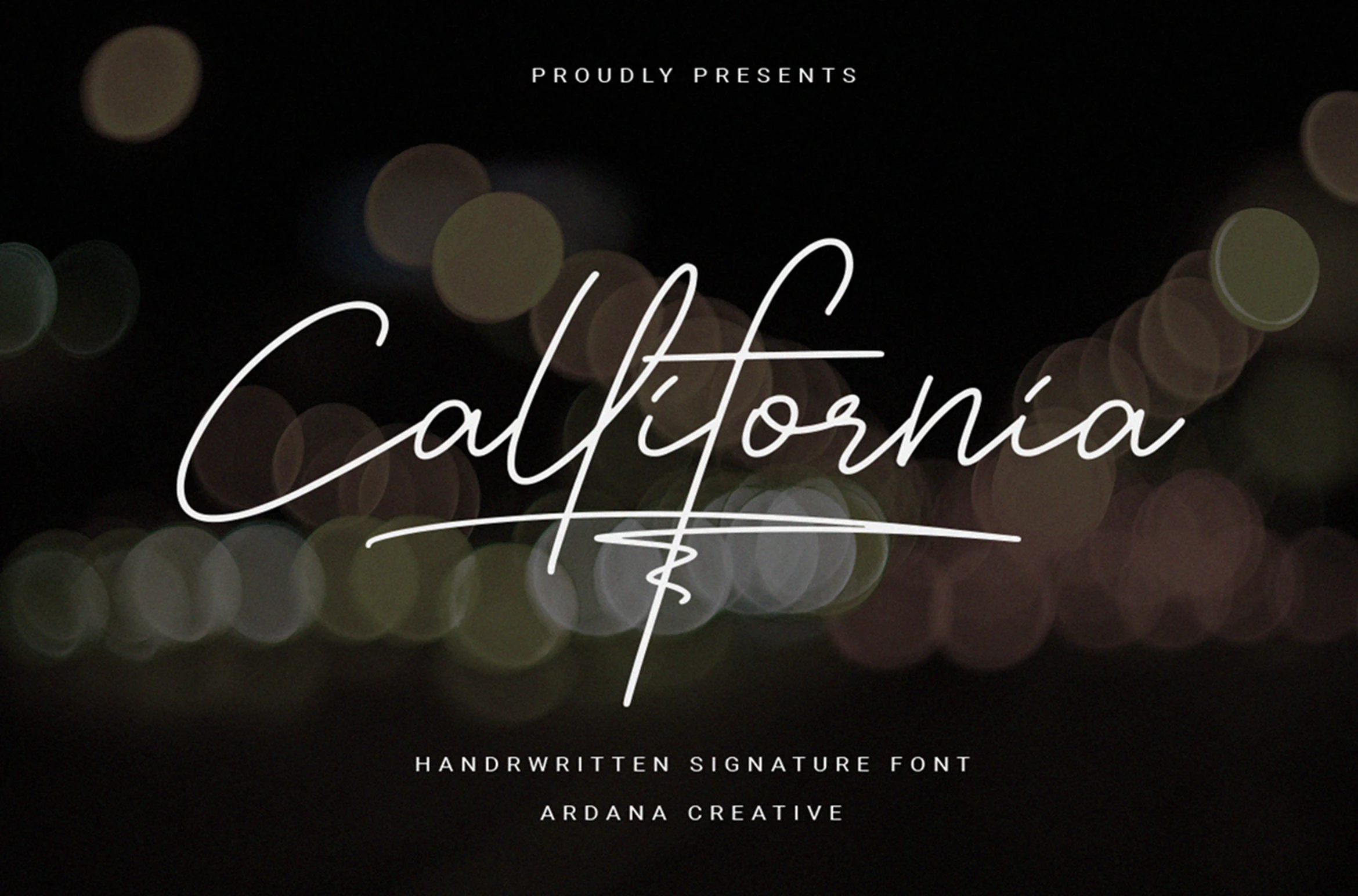
Best For: invitations, wedding designs, personal branding, display text
Callifornia Font has a signature-like construction built from regular monolinear strokes, a long lowercase descender, and a horizontal underline swash. Its connected movement suits Wedding Cursive Fonts for names, invitation lines, and personal branding, but the extended gestures make dense copy a poor fit.
Meredith Font
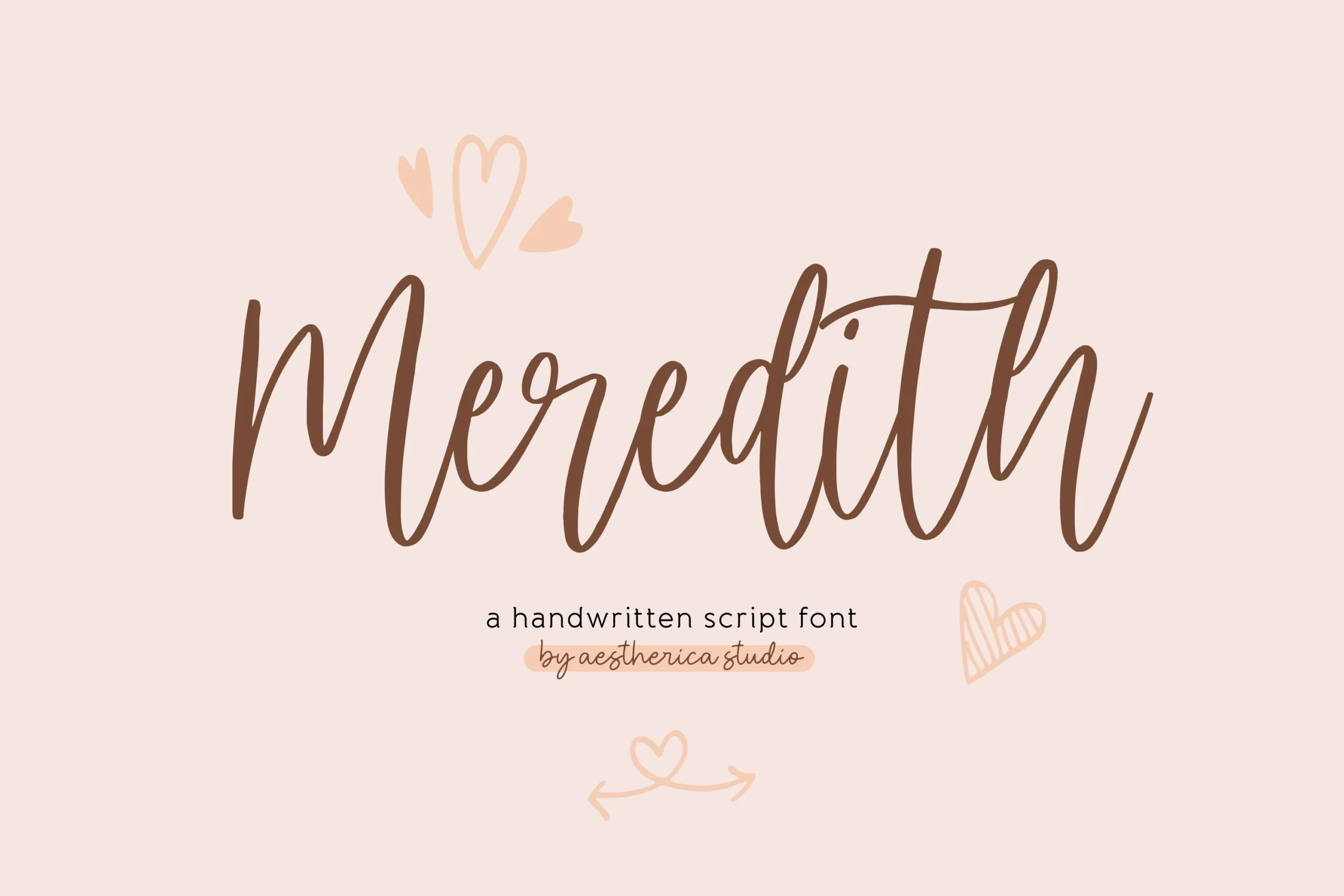
Best For: invitations, wedding designs, short phrases, personal branding
Meredith Font uses monolinear connected strokes, looped ascenders and descenders, and a naturally bouncy baseline to create an approachable handwritten cadence. This is one of the more personal Wedding Cursive Fonts for invitations, short phrases, and branding, but its irregular rhythm is not intended for dense paragraphs.
Mama Font
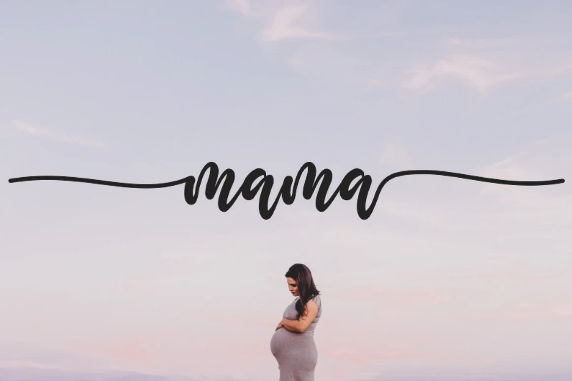
Best For: wedding designs, invitations, logos, quotes
Mama Font uses wide monolinear letters and a continuous, varying baseline to maintain steady connected movement. Included alternates and extended beginning and ending flourishes add options for names, logos, and wedding phrases, though those flourishes can obscure the forms in smaller applications.
Joseph Sophia Font
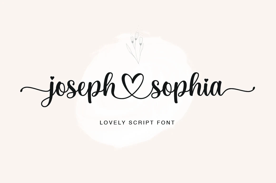
Best For: invitations, quotes, logos, business cards
Joseph Sophia Font turns monolinear connected lettering into a wedding-oriented accent through a heart-shaped connecting flourish, decorative terminals, and heart icons. These Wedding Cursive Fonts work well on invitations, quotes, thank-you cards, and business cards, though the symbols can overwhelm short compact words.
Expressive Romantic Display Scripts
These scripts push cursive movement into expressive display territory through irregular baselines, heart loops, splatters, rounded terminals, and oversized swashes. Their personality is stronger, but their reading range is narrower.
Ayshana Script Font
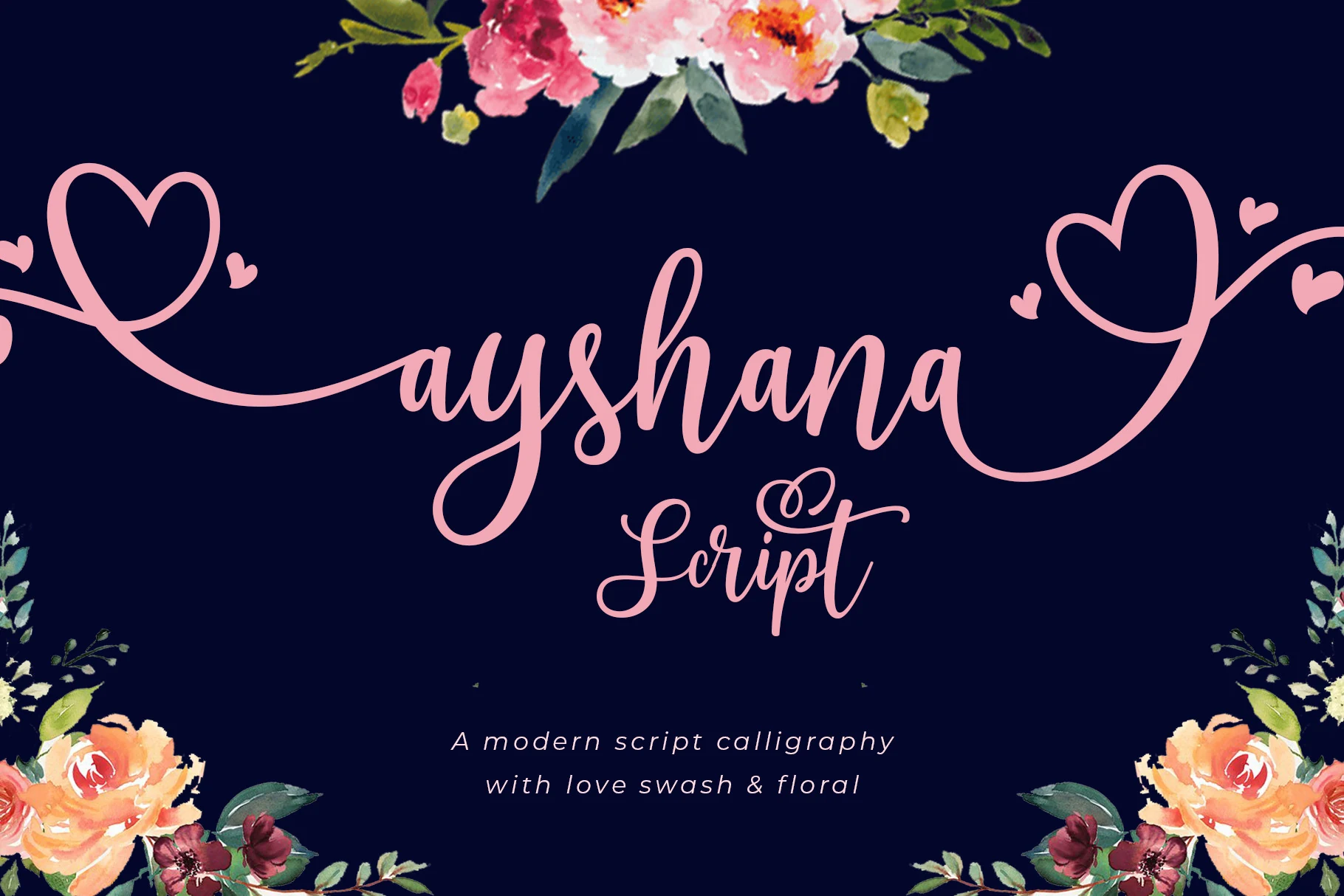
Best For: logos, branding, quotes, display text
Ayshana Script Font is especially effective for logos, branding, quotes, and large display lines. Its wide connected letters feature heart-shaped loops, high contrast, extended swashes, and accessible glyph and swash options. The irregular baseline and elaborate alternatives create a distinct romantic signature, but the letterforms need room to breathe.
Angista Script Font
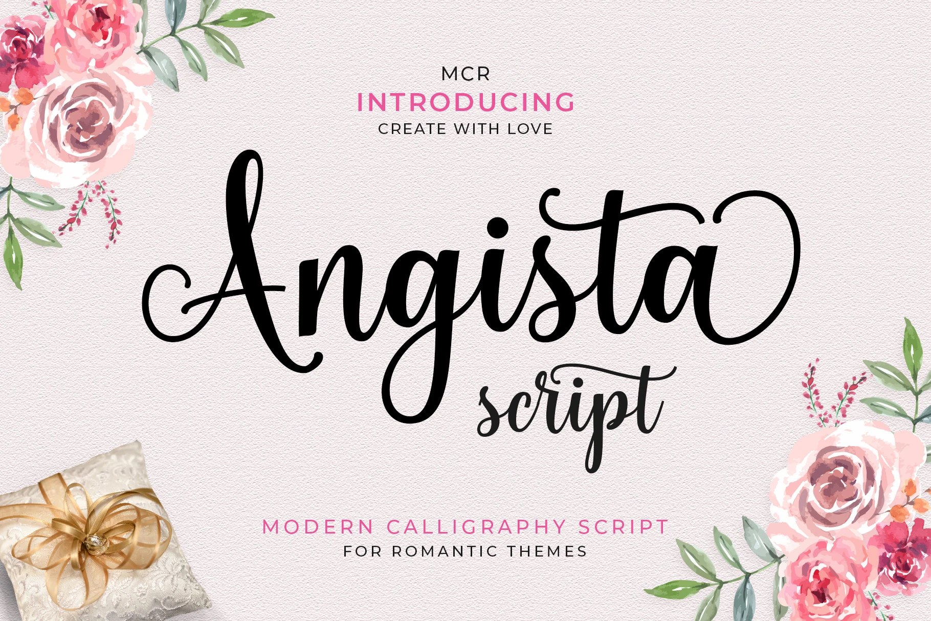
Best For: wedding designs, invitations, elegant designs, display text
Angista Script Font moves beyond a fixed slant with characters that dance along an irregular baseline. Connected loops and exaggerated capital swashes give Wedding Cursive Fonts a strong display identity for invitations and headings, although the changing rhythm can interrupt reading at smaller sizes.
Sweater Font
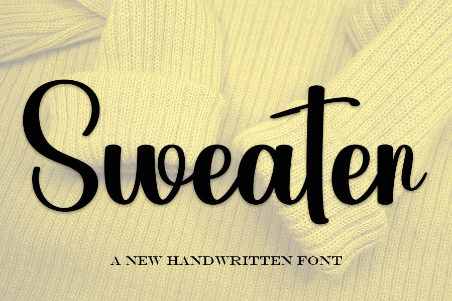
Best For: invitations, wedding designs, logos, personal branding
Sweater Font softens its high-contrast connected joins with rounded terminals, while flourished entry and exit strokes add character around each word. It remains readable at medium to large display sizes, making it useful for Wedding Cursive Fonts in invitations, logos, and personal branding, but reduction weakens the details.
Bridgetown Font
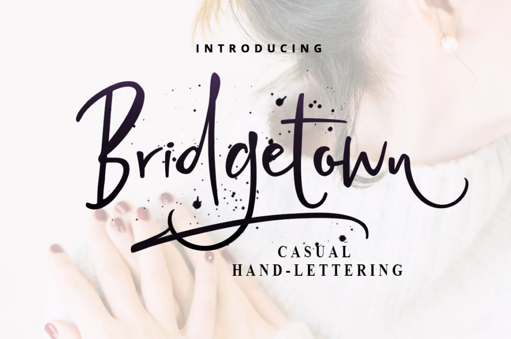
Best For: invitations, wedding designs, quotes, display text
Bridgetown Font combines variable stroke width with irregular letter shapes, ink-splatter accents, and an elongated baseline swash. The handmade details give Wedding Cursive Fonts a more expressive edge for large quotes and invitations, but they can hinder compact information or small supporting text.
How to Choose the Right Font
Choose monolinear options when you want a personal signature and steadier readability, then move to high-contrast scripts for stronger ceremony and hierarchy. Check each font’s joins, baseline, flourishes, and stroke weight at the final size: large names can support elaborate swashes, while smaller details need simpler Wedding Cursive Fonts.