15 Best Modern Cursive Fonts for Wedding Invitations in 2026
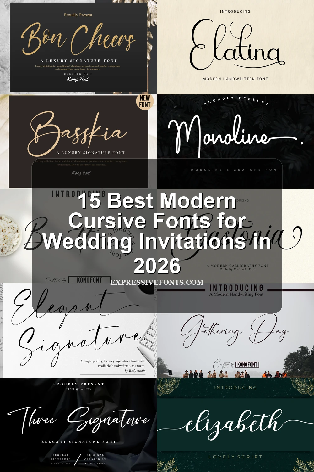
This collection moves from high-contrast flourishes and looping capitals to monoline joins and lively brush movement, keeping connected letterforms at the center. These Modern Cursive Fonts are suited to logos, invitations, headlines, packaging, apparel, and other short display applications where gesture matters more than extended reading.
Looking for more cursive fonts? Browse our complete Cursive Fonts collection to compare modern, bold, wedding, logo-friendly, and Cricut-ready cursive styles.
Modern Cursive Fonts: Flourished Calligraphy
These Modern Cursive Fonts emphasize calligraphic contrast, sweeping terminals, loops, and ornamental capitals. Compared with the other groups, they offer the most formal vertical rhythm and decorative display presence.
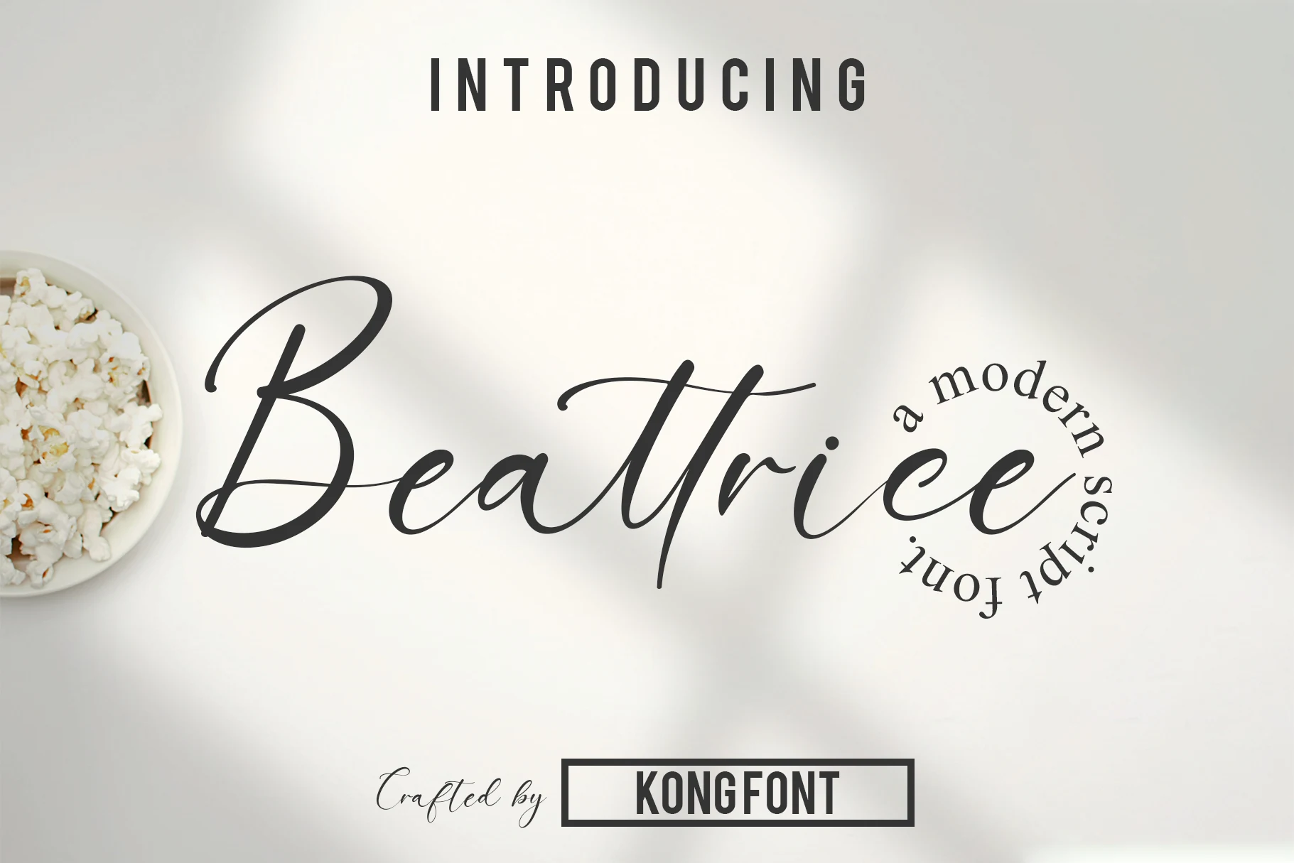
Beattrice Font
Best For: headlines, logos, short phrases
Beattrice Font pairs connected, right-leaning letters with high stroke contrast and sweeping calligraphic terminals. Its decorative movement gives Modern Cursive Fonts a romantic title-card quality, but the thin details are better reserved for logos, headlines, and short phrases than extended reading.
Elatina Font
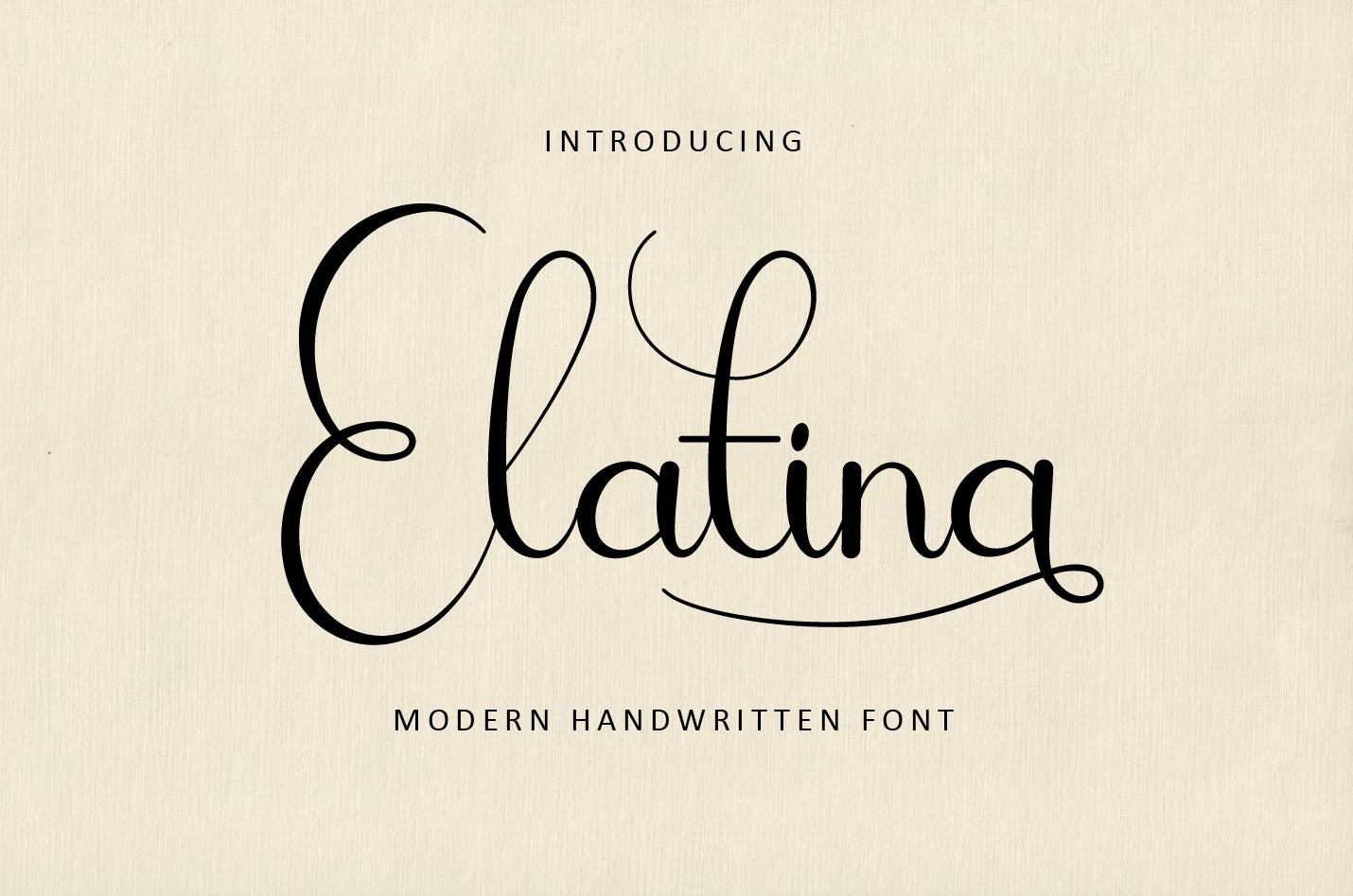
Best For: invitations, branding, logos, display text
Elatina Font is an upright connected script built around organic curves and pronounced thick-to-thin contrast. Its initial and terminal swashes make Modern Cursive Fonts feel especially fluid at large sizes, while thin strokes argue against using it for small supporting copy.
Elegant Signature Font
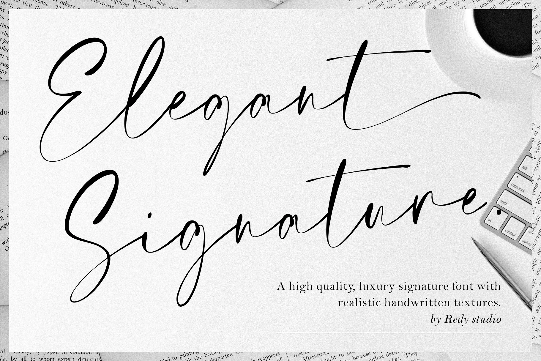
Best For: logos, branding, invitations, wedding designs
Elegant Signature Font combines high-contrast joins with a rightward flow and extended entry and exit strokes. Its PUA encoding provides access to glyphs and swashes, but the intricate connections need display scale to stay legible in branding, invitations, or wedding designs.
Basskia Font
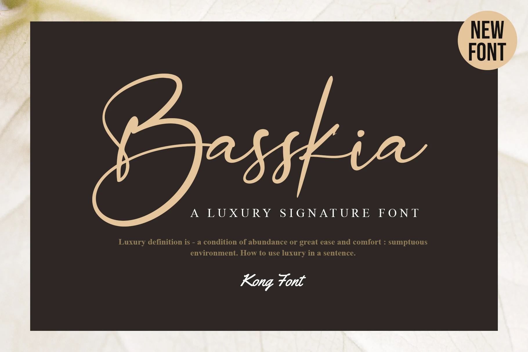
Best For: logos, branding, display text, headlines
Basskia Font works particularly well when a logo or title needs a memorable opening gesture: its sweeping uppercase B anchors an otherwise connected signature structure. High contrast, organic terminals, and a stable baseline support display use, while the stylized initial is less suited to uniform passages.
Elizabeth Font
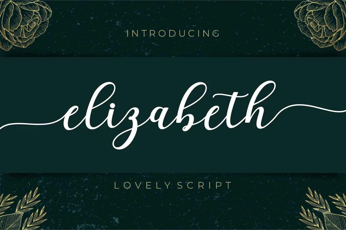
Best For: logos, branding, headlines, display text
Elizabeth Font carries connected letters on a pronounced rightward slant, finishing with a distinctive swash on the final h. Its high thick-to-thin contrast creates fluid Modern Cursive Fonts for headings and branding, but the extended ending needs room and performs poorly in compact text.
Gastonia Script Font
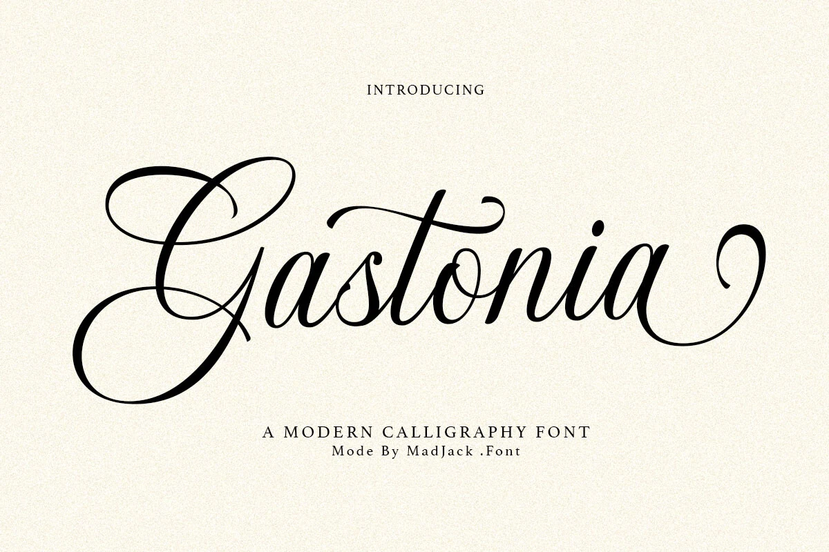
Best For: branding, packaging, wedding designs, editorial designs
Gastonia Script Font stands out through large looping ascenders and descenders, a looping capital G, and tapered terminals. The formal vertical rhythm suits wedding invitations, packaging, branding, and editorial designs, especially when the connected structure can be shown at a generous size.
Aureline Font
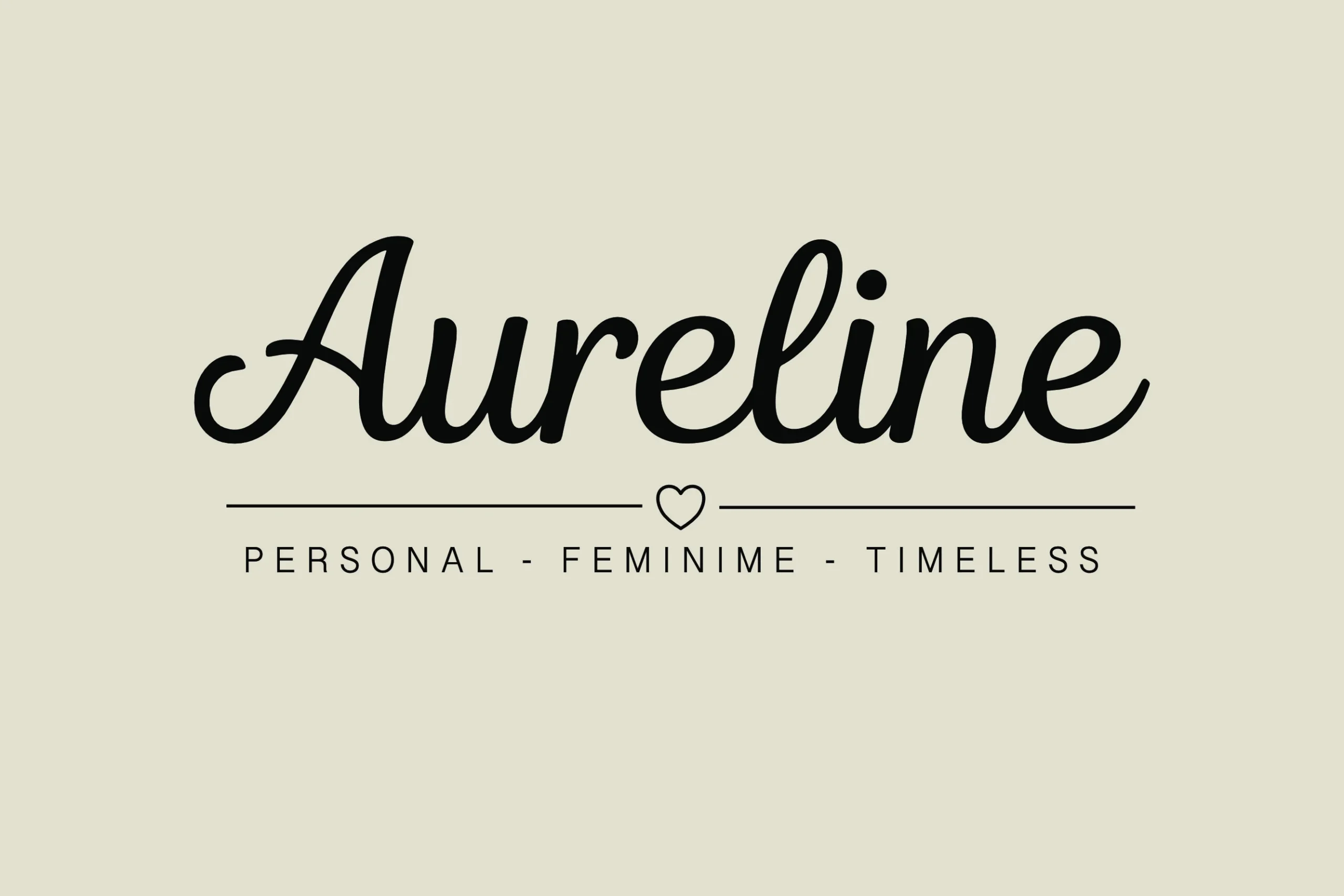
Best For: logos, branding, invitations, headlines
Aureline Font keeps a stable baseline and slight rightward slant, then adds a flourished capital A for emphasis. Its controlled connected rhythm works well in boutique branding and editorial headers, although high contrast and flowing joins reduce clarity when scaled down.
Calestine Calligraphy Font
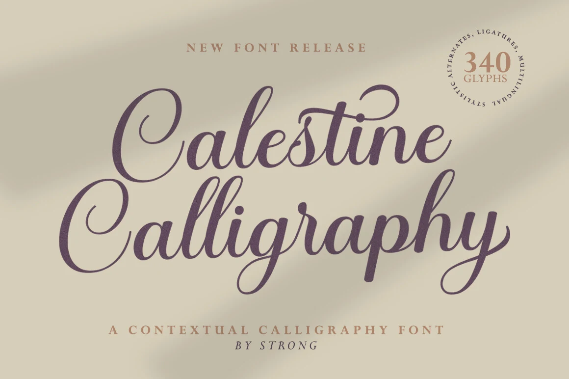
Best For: invitations, wedding designs, logos, headlines
Calestine Calligraphy Font pushes connected construction toward ornamental calligraphy with a pronounced rightward slant, high contrast, and sweeping terminals. Distinct, balanced letters help it retain display readability, making Modern Cursive Fonts like this a strong choice for invitation headers, wedding designs, and logos rather than long copy.
Hello Olivia Font
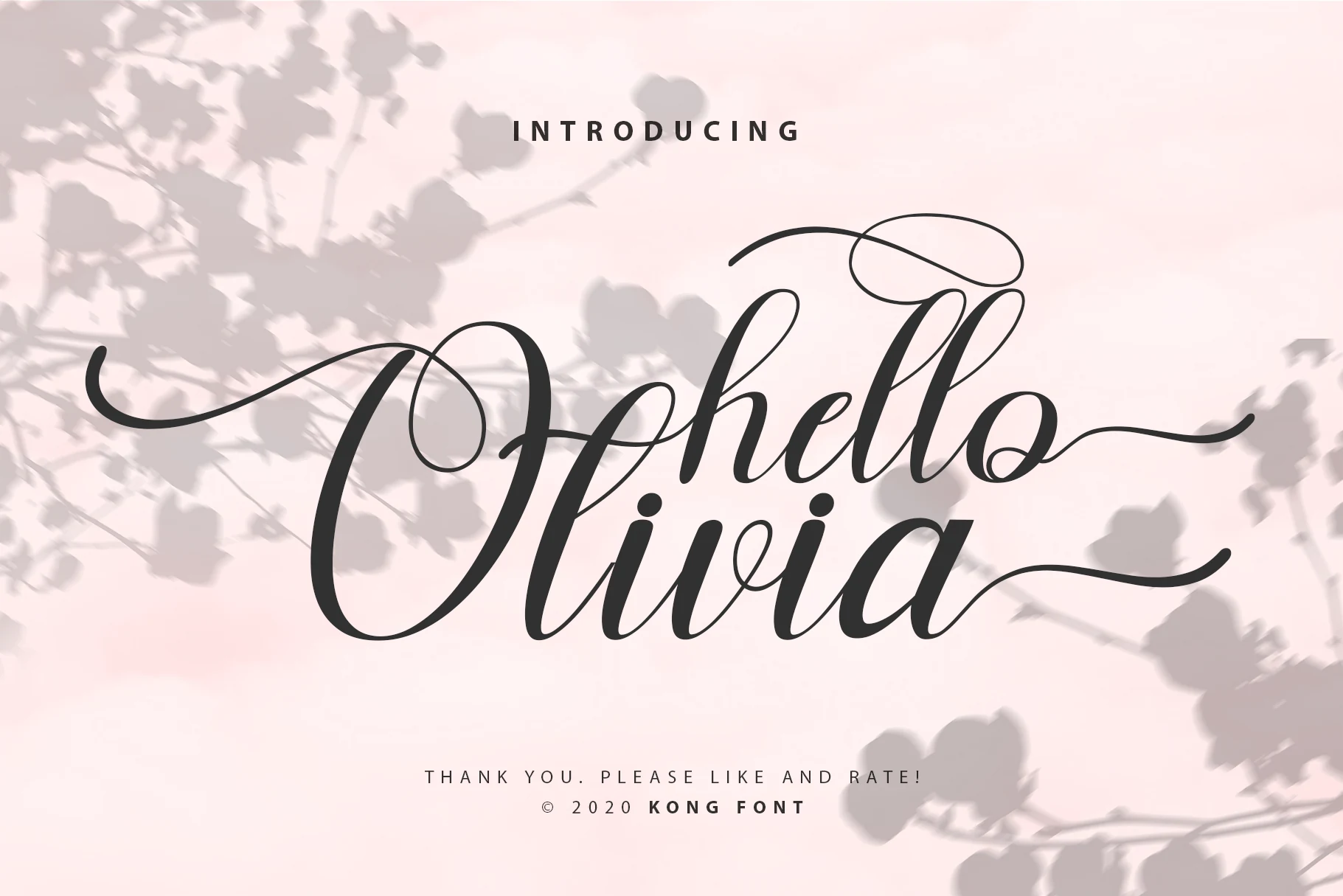
Best For: invitations, wedding designs, branding, display text
Hello Olivia Font builds an ornamental surface from loops across uppercase and lowercase letters, varied stroke thickness, and extended swashes. These Modern Cursive Fonts are most effective in large invitations, wedding designs, and display branding, where the flourishes can remain open instead of crowding longer text.
Flowing Signature Scripts
Signature scripts rely on restrained monoline strokes, connected movement, and elongated entry or exit marks. Their irregular proportions feel more personal than flourished calligraphy, while remaining less forceful than brush styles.
Gathering Day Font
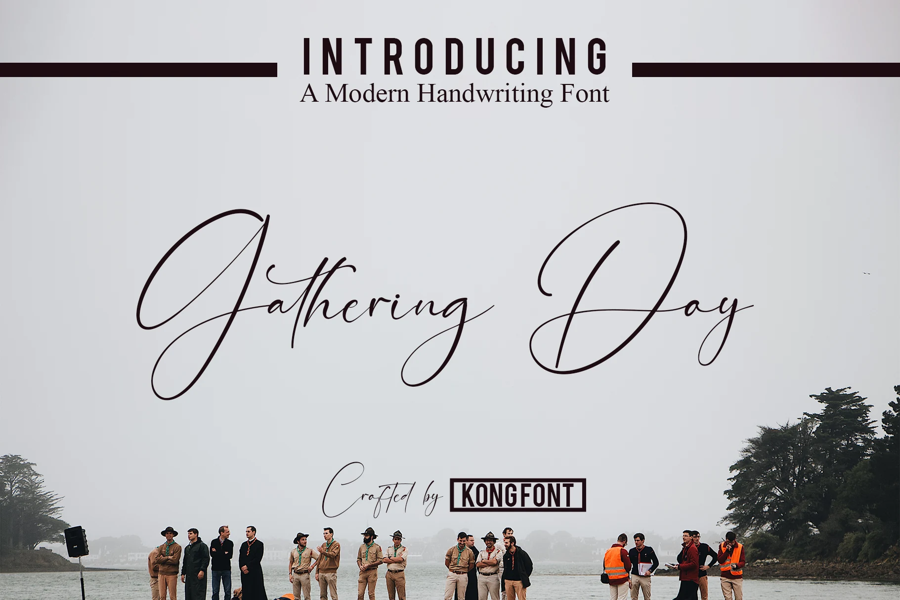
Best For: headlines, display text, invitations
Gathering Day Font uses a low-contrast monoline construction with connected cursive letters, unusually high ascenders, and deep descenders. Extended swashes on initial capitals add vertical reach, so it needs generous display scale for invitations, headlines, or other short layouts.
Monoline Font
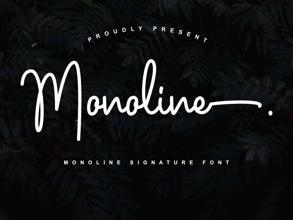
Best For: logos, branding, invitations, wedding designs
Monoline Font tempers its connected construction with low contrast, an irregular baseline, and pronounced ascenders and descenders. The result has a signature-led character for logos and invitations, but Modern Cursive Fonts with this much vertical variation should be kept large for reliable parsing.
Three Signature Font
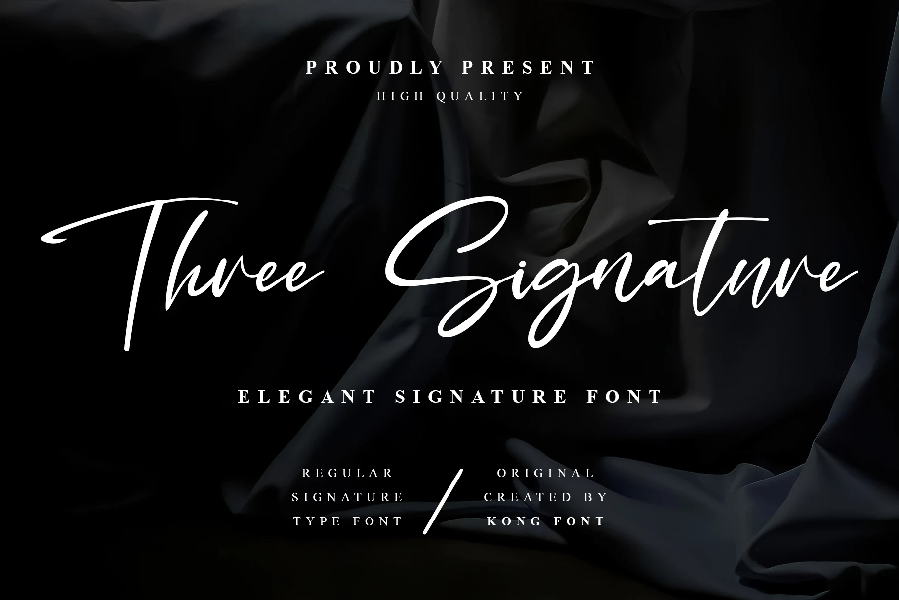
Best For: logos, branding, invitations, short phrases
Three Signature Font uses a stable baseline, restrained monoline weight, and clear rightward slant. Extended entrance and exit strokes add movement without increasing stroke contrast, while PUA-encoded swashes provide extra logo and invitation options at display sizes.
Expressive Brush Cursive
Brush cursives use heavier, more energetic strokes and, in some cases, a shifting baseline. They stand apart through stronger visual impact, making short branding and headings more effective than compact copy.
Bon Cheers Font
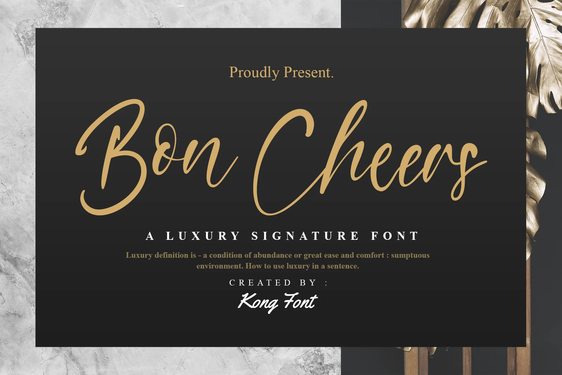
Best For: logos, branding, display text, short phrases
For logos and headings that need visible movement, Bon Cheers Font brings connected brush-style strokes, high contrast, and an irregular, flowing baseline. That shifting rhythm gives Modern Cursive Fonts extra energy, though it can weaken clarity when reduced to small text or dense wording.
Together Font
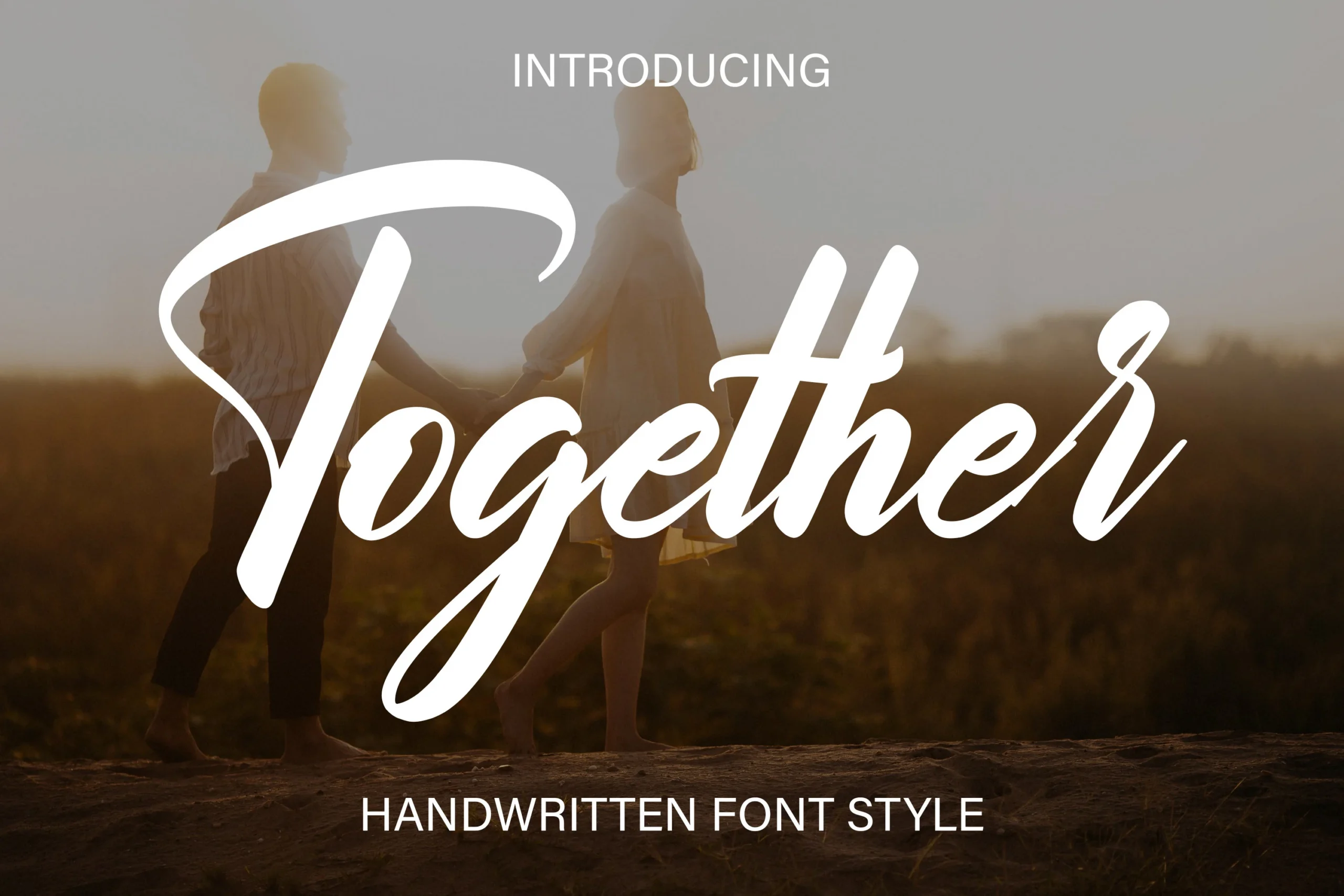
Best For: logos, branding, invitations, short phrases
Together Font gives connected cursive a bold brush weight, rightward slant, and prominent ascending and descending flourishes. The heavier presence holds its own in large branding, invitations, advertisements, and short phrases, where its high-contrast strokes remain easier to see.
Charlotte Bella Font
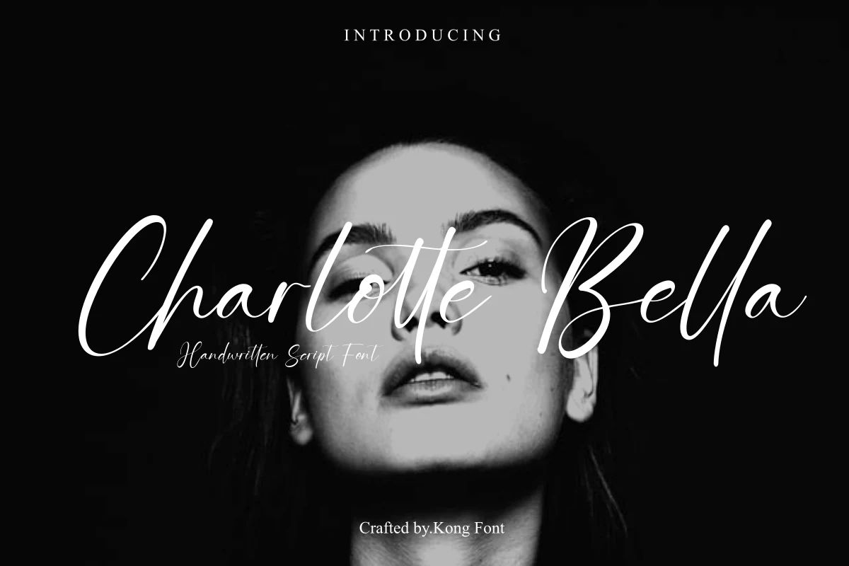
Best For: logos, branding, T-shirts, display text
Charlotte Bella Font makes a broad gesture through elongated swashes, organic curves, and high-contrast connected strokes. Its expansive shape gives logos, T-shirt printing, and other branding elements strong display impact, while smaller text loses definition as the flourishes and joins compress.
How to Choose the Right Font
Choose by the scale and rhythm of the finished design. For the clearest compact lettering, start with a steadier baseline and fewer flourishes; for formal invitations, consider high contrast, loops, and swashes. Monoline options reduce weight variation, while brush styles add bolder impact. Test joins, capitals, and descenders at the actual output size before committing.