23 Best Cool Sans Serif Fonts in 2026
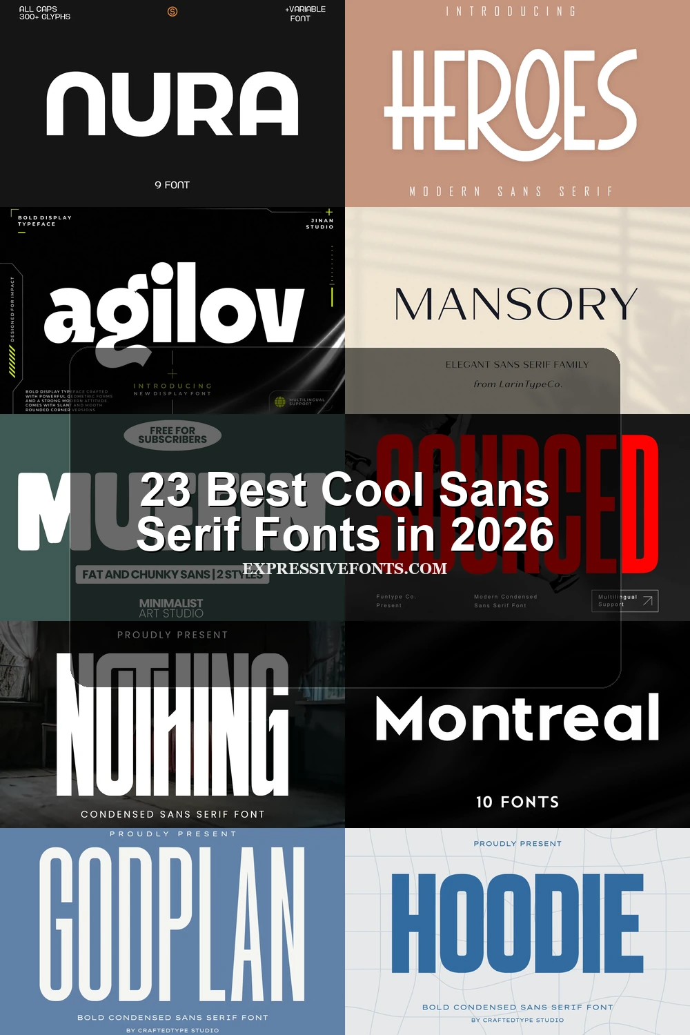
This collection of Cool Sans Serif Fonts spans ultra-condensed blocks, rounded retro forms, open geometric faces, and modified high-contrast displays. Together, they cover practical roles from logos and posters to packaging, apparel, websites, and other large-format identity work.
Looking for more cool fonts? Browse our complete Cool Fonts collection to compare bold, vintage, retro, script, and gothic cool styles.
Cool Sans Serif Fonts: Compressed Headline Forms
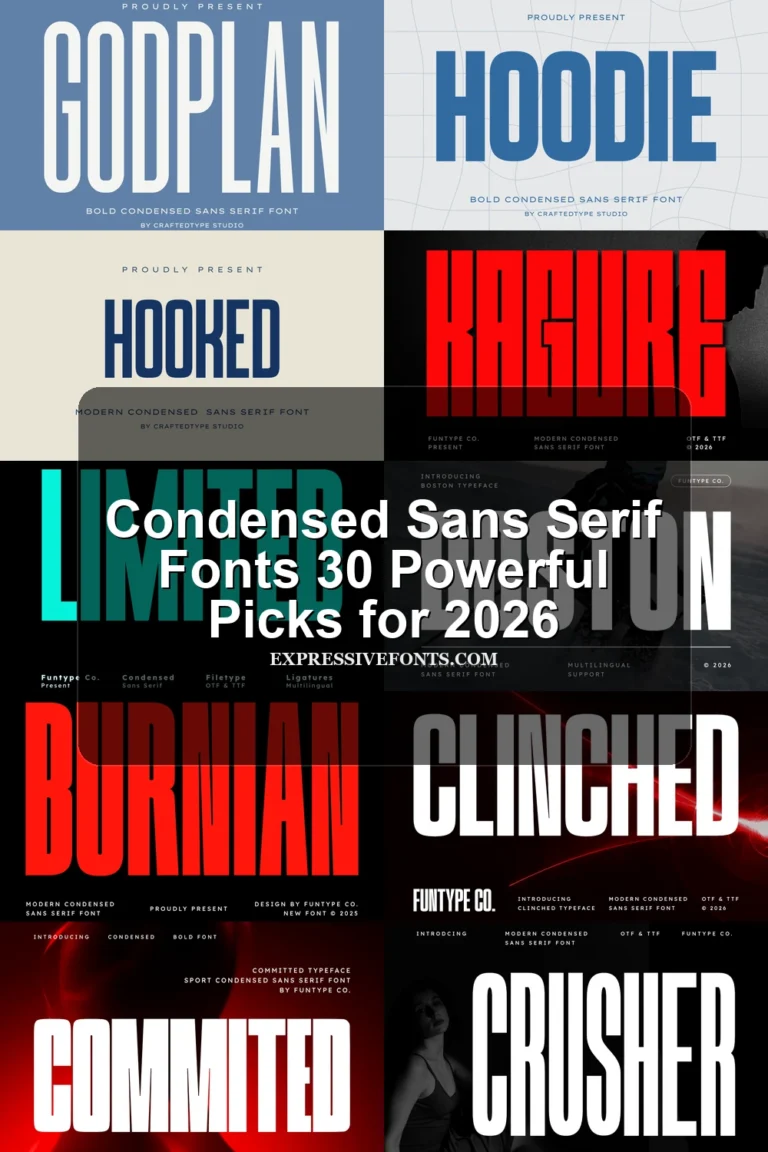
These Cool Sans Serif Fonts rely on tall, narrow proportions, compact spacing, and mostly uniform strokes, creating strong vertical headlines that are less comfortable for continuous reading.
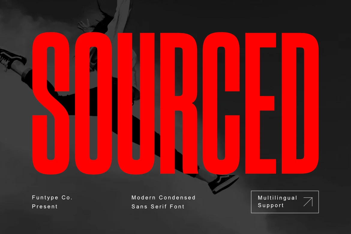
Sourced Font
Best For: logos, branding, posters, merch design
Sourced Font builds an energetic vertical block from extremely narrow geometric proportions and a heavy, uniform stroke. Cool Sans Serif Fonts in this tightly compressed style work best at headline scale; OTF, TTF, and multilingual support broaden its use for logos, posters, and merchandise.
Strave Font
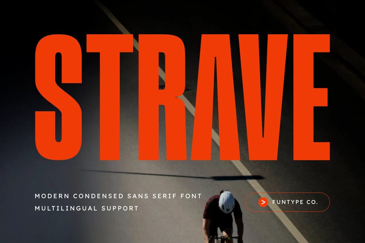
Best For: branding, packaging, posters, T-shirts
Strave Font suits posters, packaging, and fabric graphics where its tall, ultra-condensed proportions, heavy uniform strokes, and squared terminals can dominate without distraction. It remains readable at large sizes, but tight spacing and restricted width make small text and long copy poor fits. OTF, TTF, multilingual support, and cutting-system compatibility add production practicality.
Polaroid Font
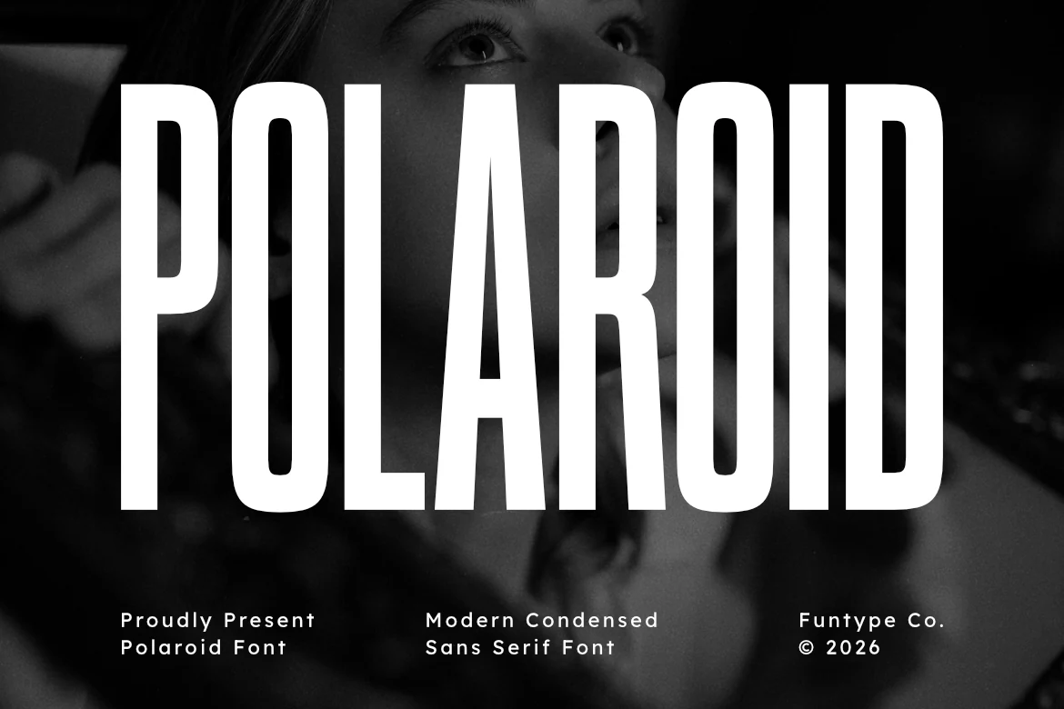
Best For: headlines, posters, branding, packaging
Polaroid Font pairs sharp vertical terminals with an ultra-condensed geometric build and uniform strokes. That combination keeps Cool Sans Serif Fonts legible in large title treatments while preserving a narrow footprint for headlines, posters, branding, and packaging.
Cinema Font
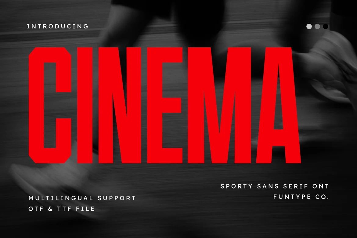
Best For: logos, posters, T-shirts, display text
Cinema Font gives its extremely condensed block structure angled or chamfered corners, creating an equipment-like athletic edge. Heavy strokes preserve large-scale clarity for logos, posters, T-shirts, and display text, while the narrow width limits small-size reading.
Nothing Font
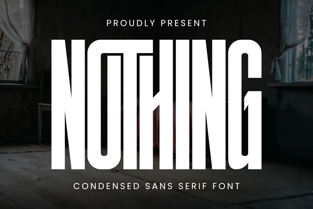
Best For: logos, branding, posters, headlines
Nothing Font creates an imposing architectural silhouette through extreme vertical elongation, very heavy strokes, minimal counters, and angular terminals. Its compressed construction commands large logos, headlines, posters, and branding, but body text is impractical because the internal space is so restricted.
Godplan Font
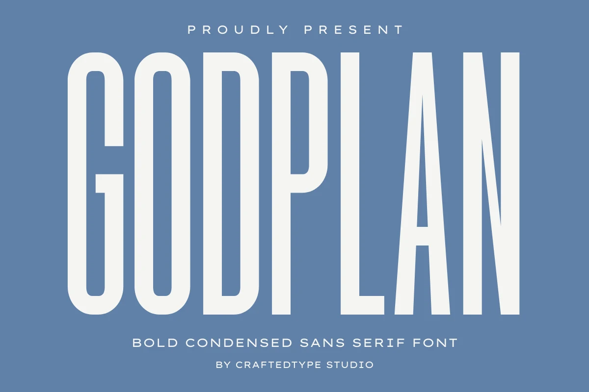
Best For: posters, headlines, display text, signage
Godplan Font gains authority from tall, compact proportions and monolinear strokes rather than decorative flourishes. It stays clear in large signage, posters, headlines, and display text, while the extremely narrow profile makes long-form reading uncomfortable.
Hoodie Font
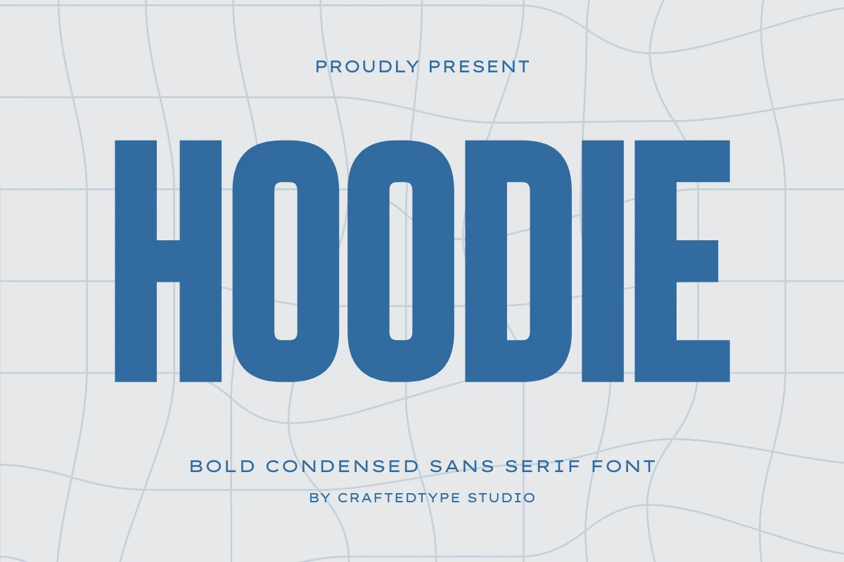
Best For: posters, headlines, logos, T-shirts
Hoodie Font suits posters, headlines, logos, and T-shirts through tall condensed proportions, thick strokes, and squared terminals. Its engineered geometry gives short wording a firm outline and clear large-scale reading, but the narrow forms become tiring in continuous text.
Edition Font
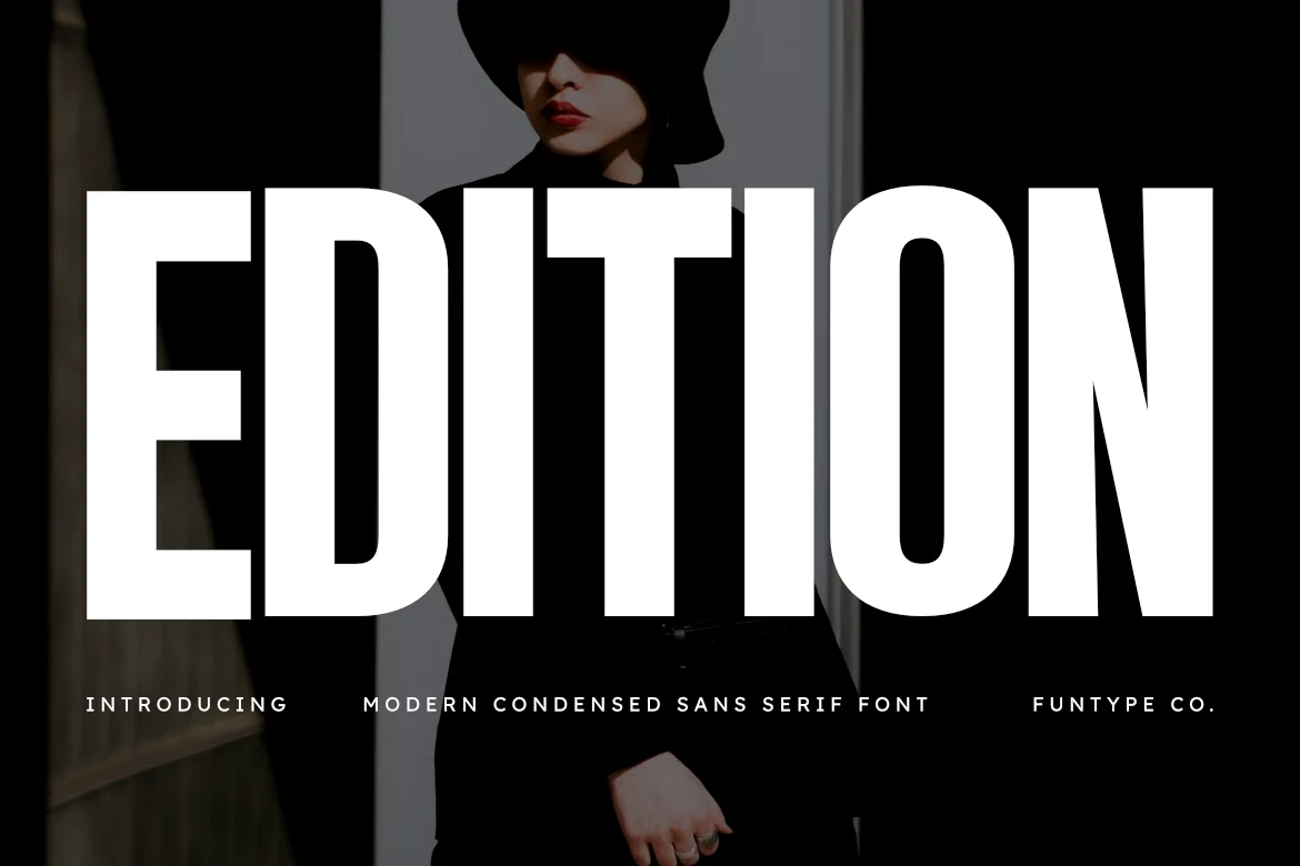
Best For: headlines, posters, branding
Edition Font tempers an ultra-condensed build with horizontal terminals, giving its tall structure a controlled linear finish. It is well suited to headlines, posters, branding, album covers, and advertising, but its compact width is not designed for sustained copy.
Morein Font
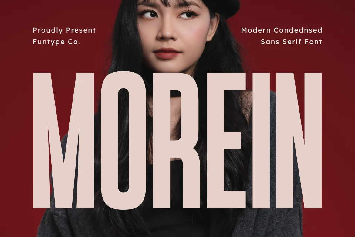
Best For: logos, packaging, posters, display text
Morein Font uses high cap height, sharp angular terminals, and monolinear strokes to keep attention on the title block. Cool Sans Serif Fonts with this degree of condensation need large sizing, though OTF, TTF, and multilingual support help with logos, packaging, posters, and display text.
Blush Font
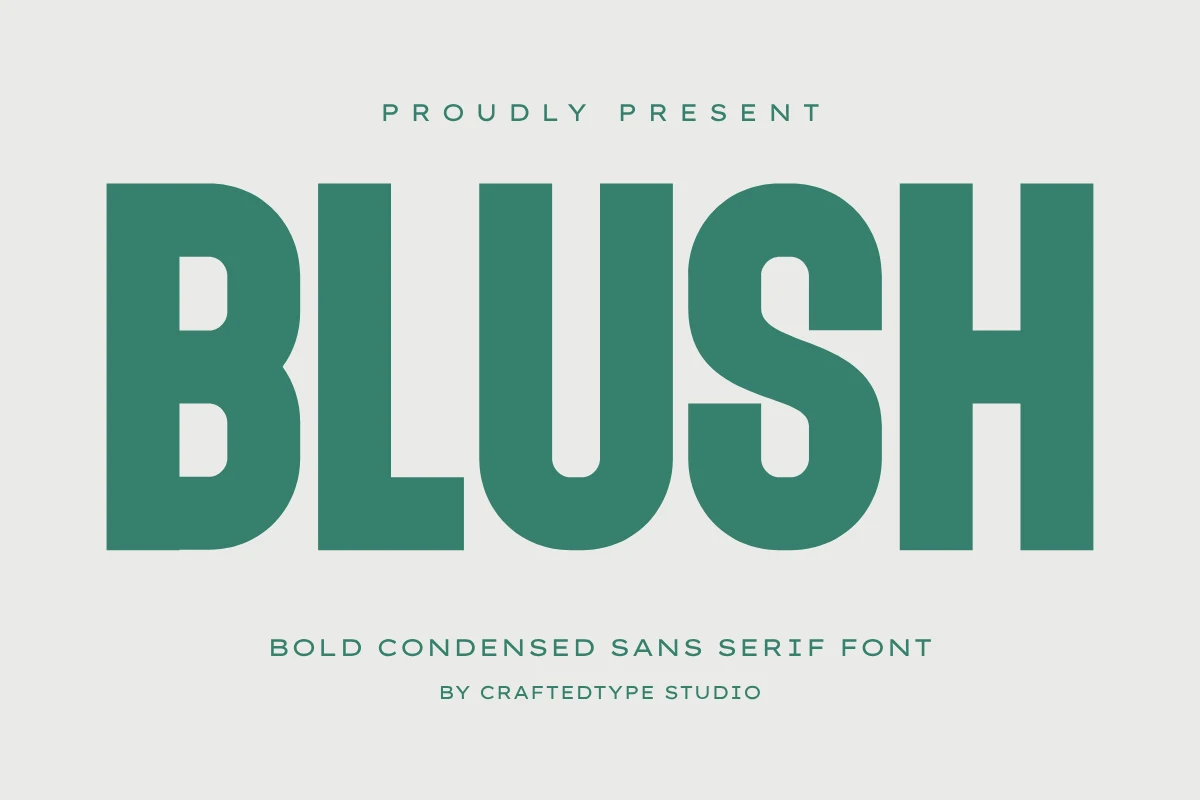
Best For: branding, T-shirts, posters, display text
Blush Font combines a large x-height with uniform condensed strokes for direct headline reading. Its PUA encoding, OTF and TTF formats, and optimization for Cricut Design Space and Silhouette Studio extend its usefulness from branding and posters to T-shirts and display text.
Retro And Rounded Display Styles
Rounded terminals and softened geometry give this group a warmer display voice than the sharper compressed forms, while heavy weights keep branding and packaging text prominent.
Robusta Font
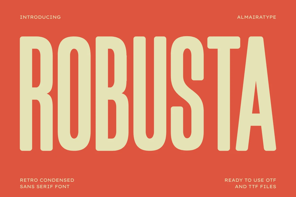
Best For: branding, packaging, social media graphics, T-shirts
Robusta Font uses rounded terminals, monolinear strokes, and a bold condensed structure to soften its retro display presence. Tight spacing and thick forms favor large branding, packaging, social graphics, and craft-cut T-shirts rather than small text.
Muffin Font
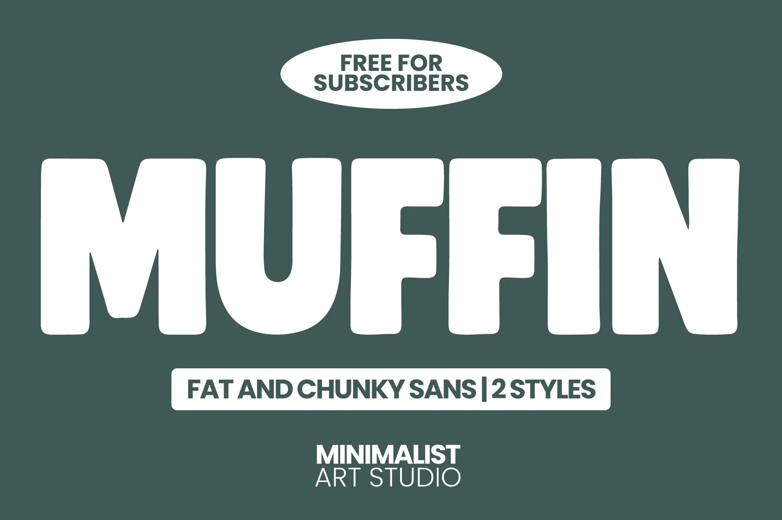
Best For: headlines, logos, packaging, posters
Muffin Font uses a fat weight, blocky compression, and softened corners to give display lettering a playful, approachable voice. Its simple geometry reads clearly when enlarged for headlines, logos, packaging, and posters, but chunky forms are unsuitable for extended copy.
Rolling Font
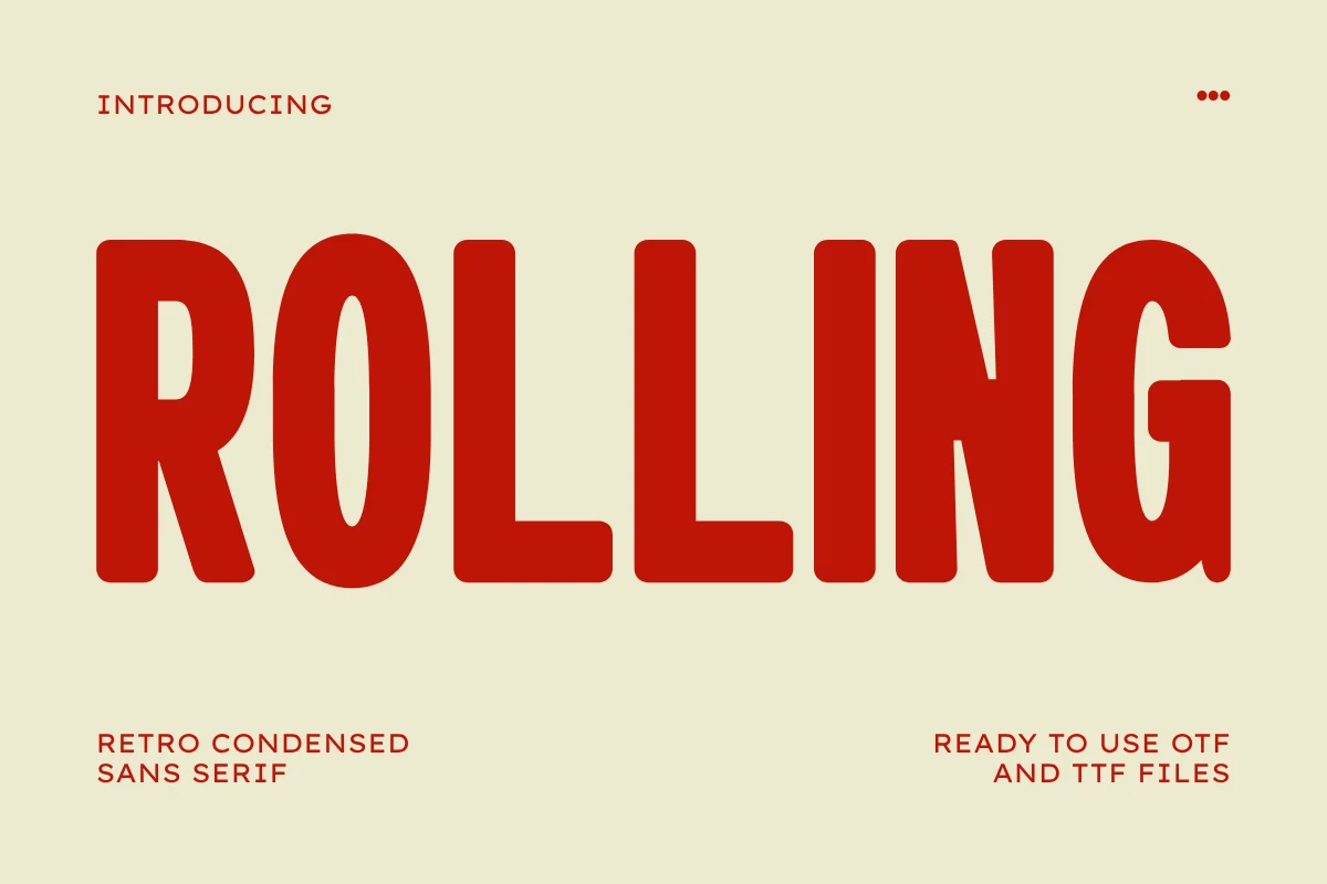
Best For: branding, packaging, posters, T-shirts
Rolling Font uses rounded terminals and vertically oriented, condensed letterforms, but its heavy spacing profile keeps the result utilitarian rather than soft. Clean vector outlines and craft-cut compatibility make it practical for branding, packaging, posters, and T-shirts, not body copy.
Geometric Statement Sans
Wide geometric structures, open counters, and constructed junctions make these faces more spacious than condensed options, supporting logos, posters, and selected website headings.
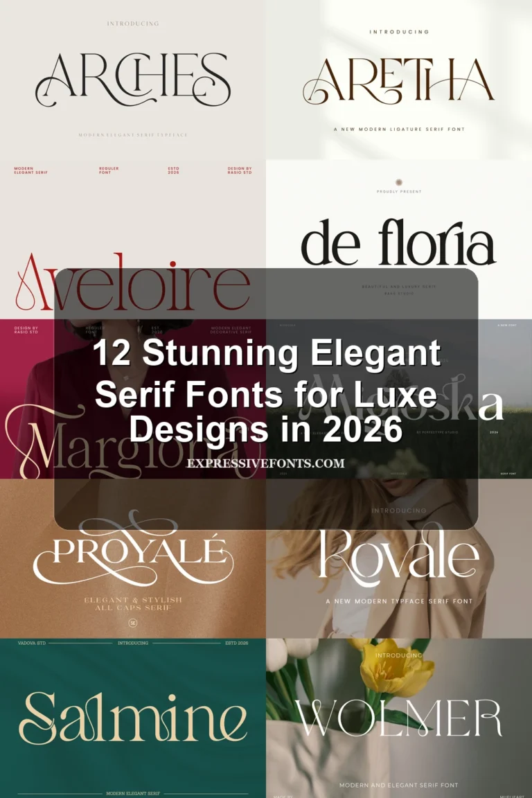
Nura Font
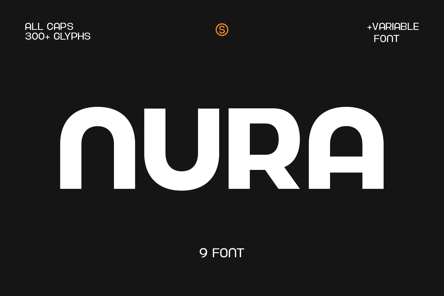
Best For: posters, headlines, logos, branding
Nura Font combines wide geometric proportions with rounded outer corners and sharper inner junctions. Its substantial counters support clear large-scale reading in Cool Sans Serif Fonts applications such as posters, headlines, logos, and branding, though enclosed spaces may close up when reduced.
Olline Font
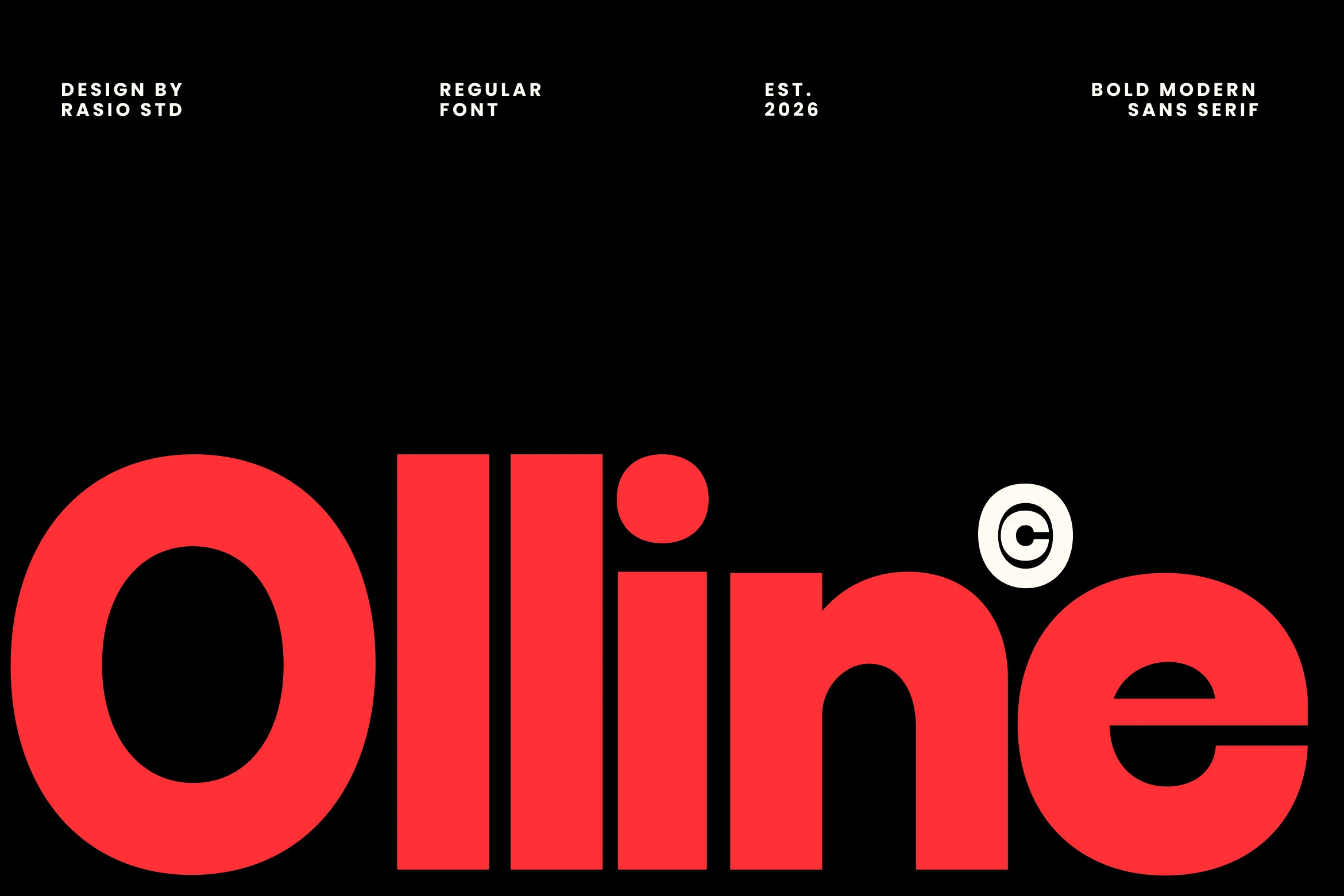
Best For: branding, logos, headlines, display text
Olline Font is recognizable through circular forms, rounded terminals, and a closed lowercase e aperture that gives its heavy geometry a constructed texture. Tight internal spacing makes it a display-scale choice for branding, logos, headlines, and digital or print layouts rather than small text.
Modern Heritage Font
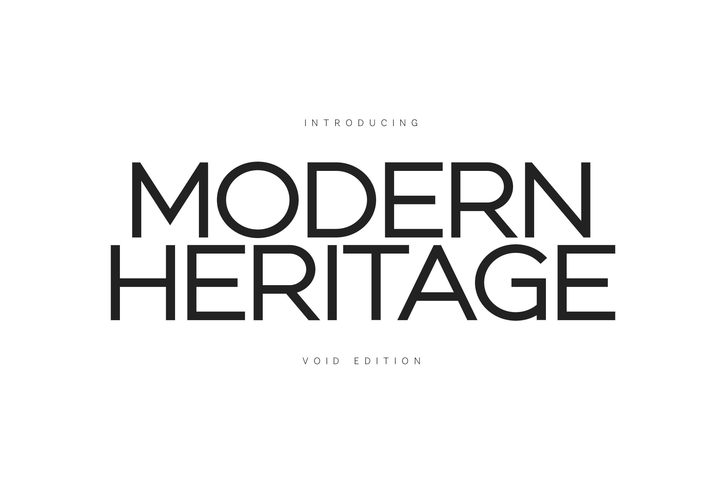
Best For: branding, website headers, headlines, luxury designs
Modern Heritage Font opens up Cool Sans Serif Fonts through a large x-height, wide apertures, and generous geometric forms. Its spacious structure supports clear website headers, headlines, branding, and luxury-oriented layouts while retaining a strong large-scale presence.
Borsen Font
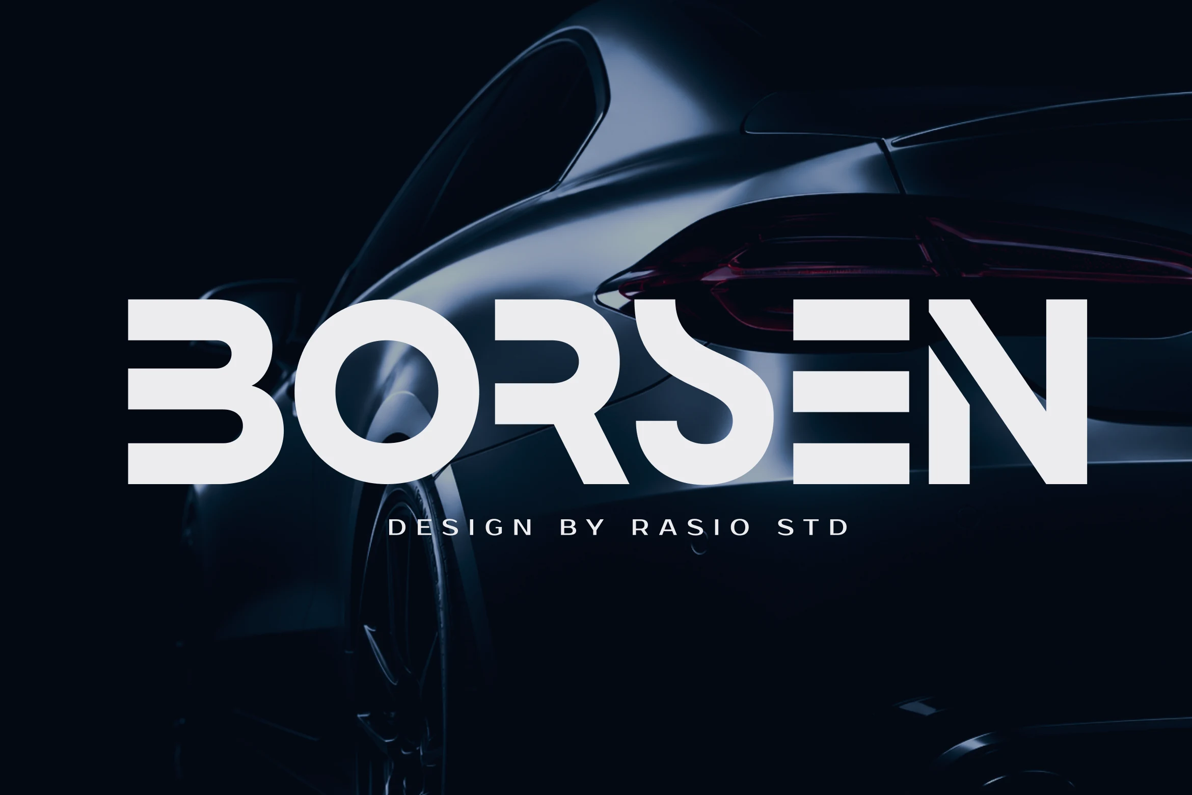
Best For: logos, branding, packaging, headlines
Borsen Font interrupts thick geometric strokes with horizontal cut-out notches and sharp junctions. Those negative-space details are most effective when enlarged, so Cool Sans Serif Fonts in this style belong on automotive identities, gaming titles, packaging, and logos rather than long-form text.
Agilov Font
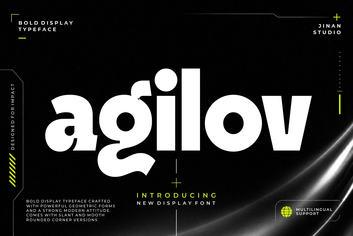
Best For: logos, branding, posters, headlines
Agilov Font mixes rounded and squared terminals within a heavy geometric structure, creating variation without losing its display weight. Low-aperture lowercase forms and tight spacing make it better for logos, branding, posters, and headlines than reduced text.
Montreal Font
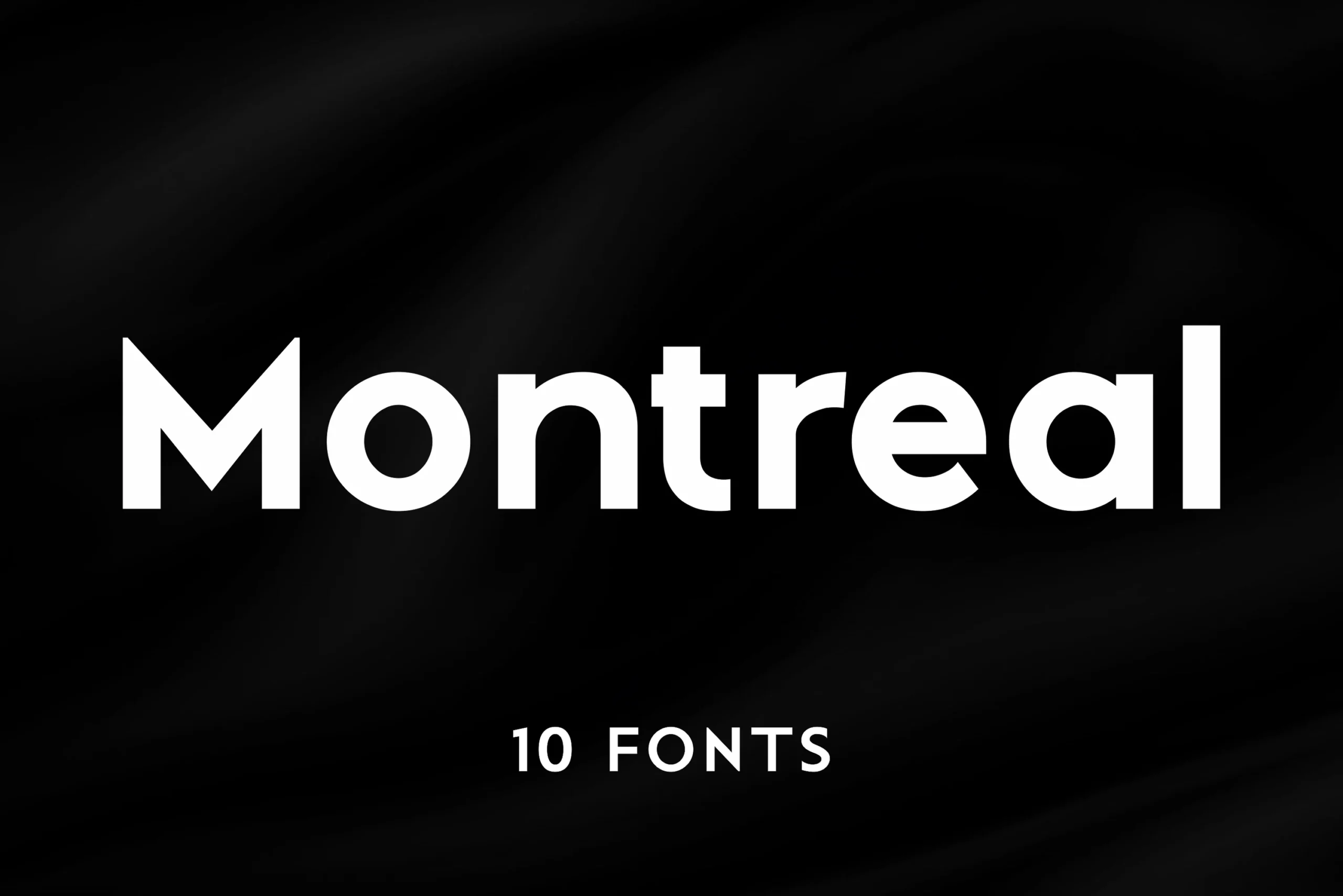
Best For: branding, website headers, display text, modern designs
Montreal Font is the most adaptable geometric system here, with open counters, a large x-height, even proportions, and ten styles. Among Cool Sans Serif Fonts, its clearer construction is particularly useful for branding, website headers, display text, and modern design systems.
Vankis Font
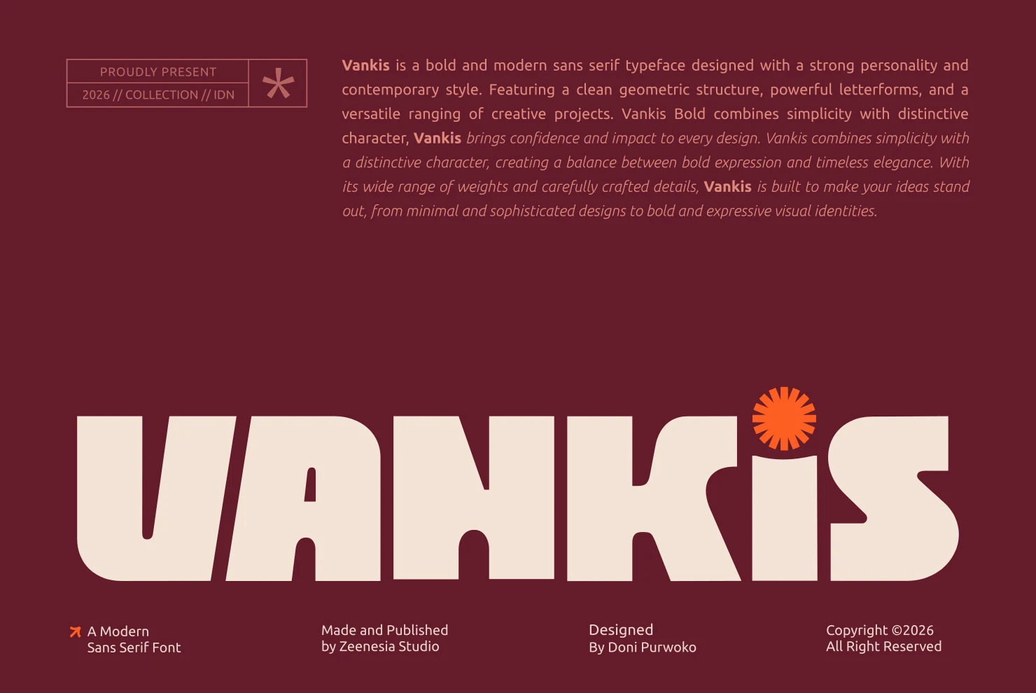
Best For: logos, branding, headlines, posters
Vankis Font uses wide proportions, rounded terminals, thick uniform strokes, and a comparatively low x-height to create a broad poster shape. It reads well in large logos, branding, headlines, and posters, although tight spacing and heavy forms can obscure smaller applications.
High-Contrast And Modified Displays
This group departs from standard geometric construction through altered letterforms, high contrast, or lighter strokes, making each face a specialized choice for display identity work.
Heroes Font
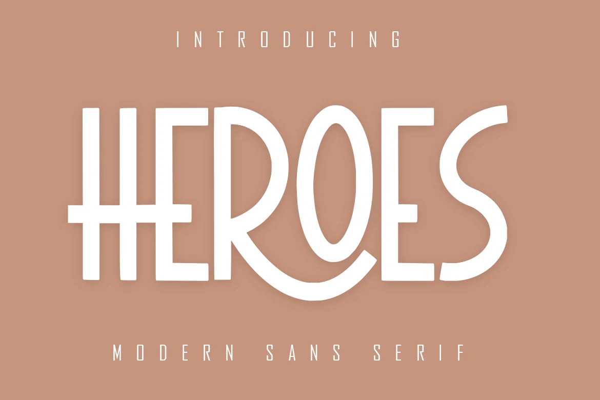
Best For: logos, branding, invitations, social media graphics
Heroes Font adds character through high contrast, an extended H bar, and a sweeping R descender rather than relying on ordinary geometric forms. Cool Sans Serif Fonts with these altered details should be checked carefully at small sizes, but this display face can distinguish logos, invitations, branding, and social graphics.
Sogo Font
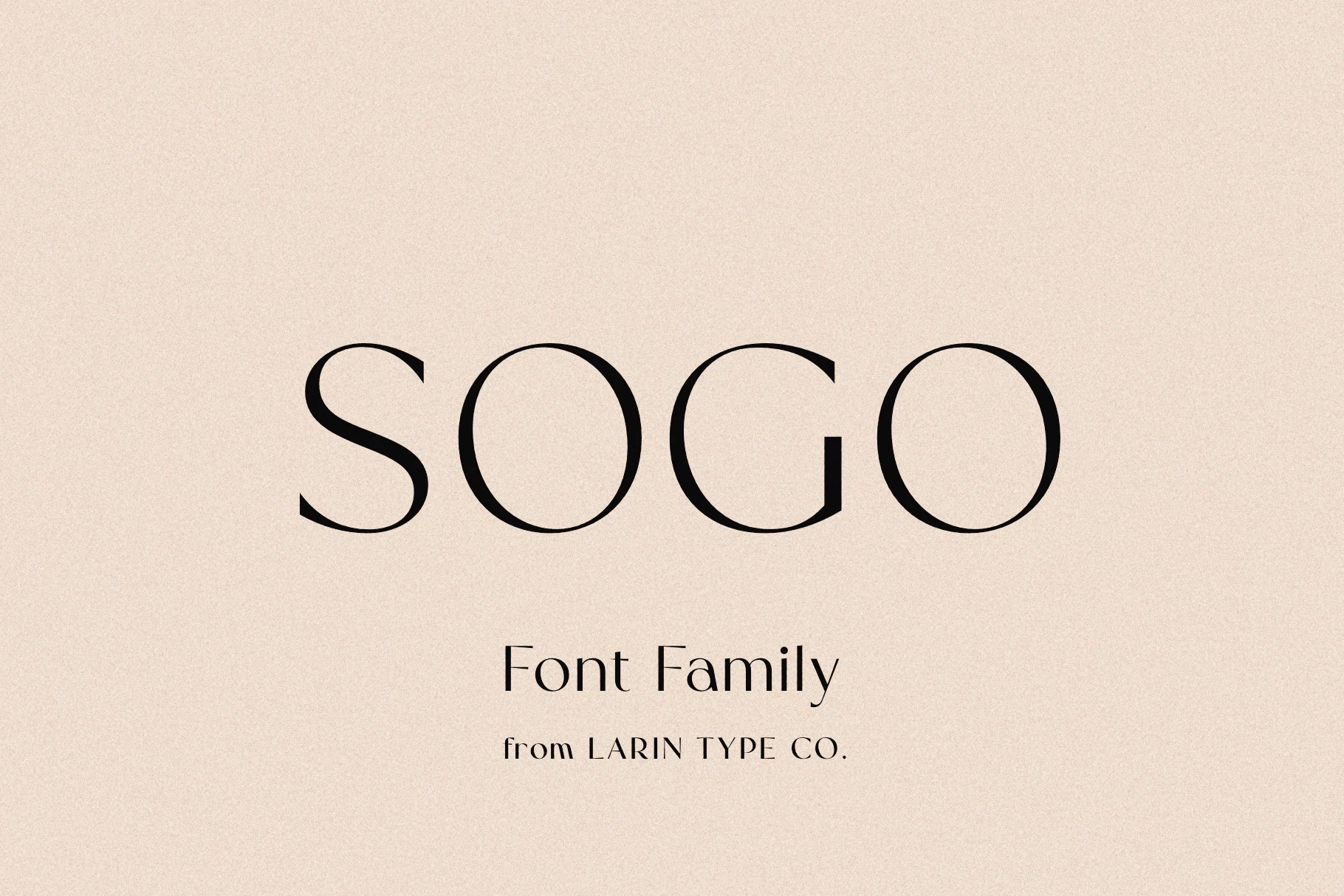
Best For: logos, branding, headlines, luxury designs
Sogo Font is the collection’s classification outlier: the supplied evidence describes a sans serif, while the specimen shows sharp serifs, high contrast, and open counters. Treat this Cool Sans Serif Fonts candidate as display-only until verified, especially for logos, branding, headlines, or luxury designs.
Mansory Font
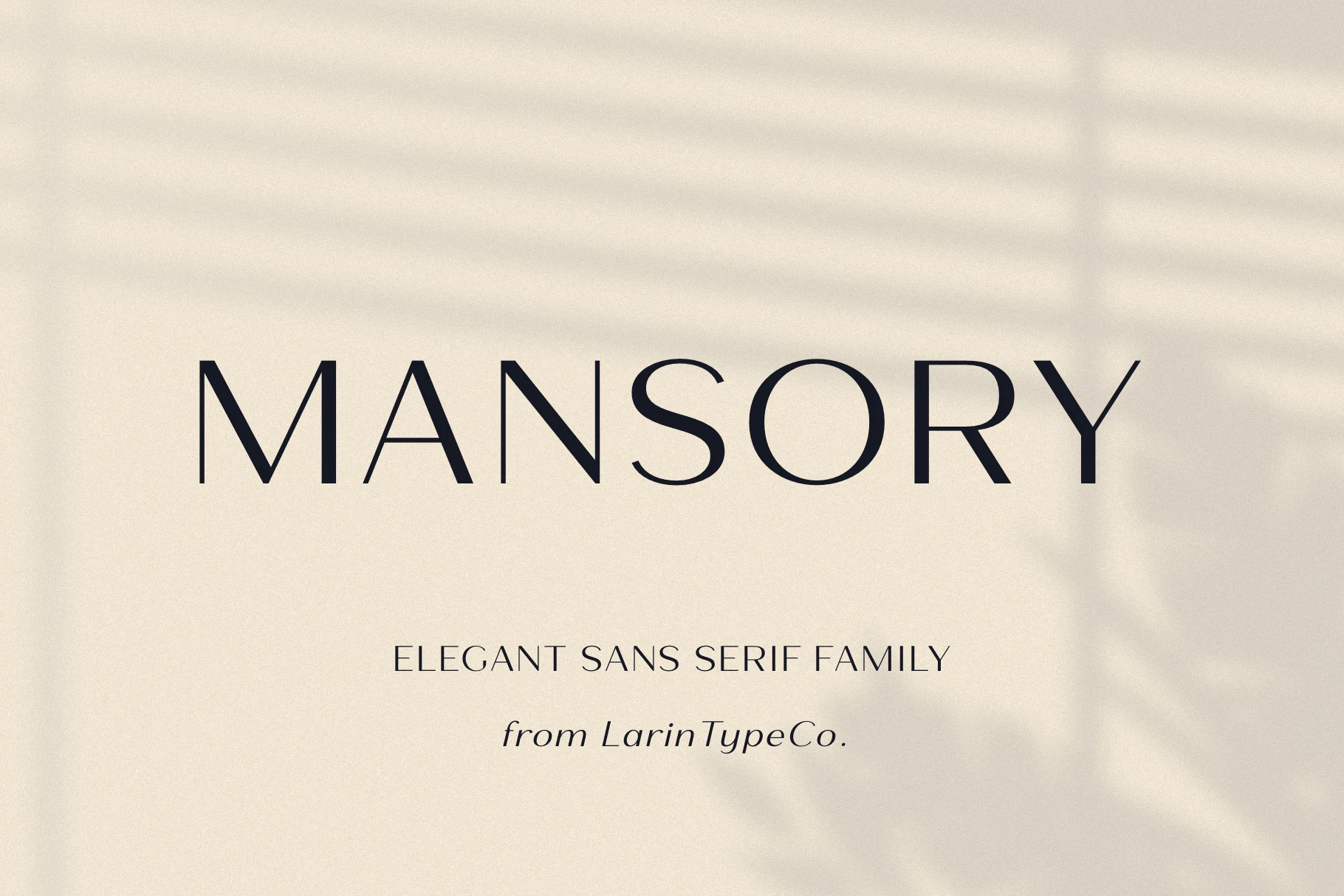
Best For: website headers, display text, headlines, luxury designs
Mansory Font shifts the collection toward light weight and high contrast, with open apertures and wide geometric proportions. Thin strokes need generous sizing, so it works best for website headers, display text, headlines, and luxury designs instead of body copy.
How to Choose the Right Font
Choose by construction first: ultra-condensed faces create the narrowest headline blocks, while wide geometric options offer more open counters and better readability. Rounded terminals soften the role; squared or cut-out details sharpen it. For Cool Sans Serif Fonts in identity systems, Montreal and Modern Heritage are more accommodating, while the most compressed styles belong on large titles, logos, packaging, and apparel.