11 Best Cool Retro Fonts in 2026
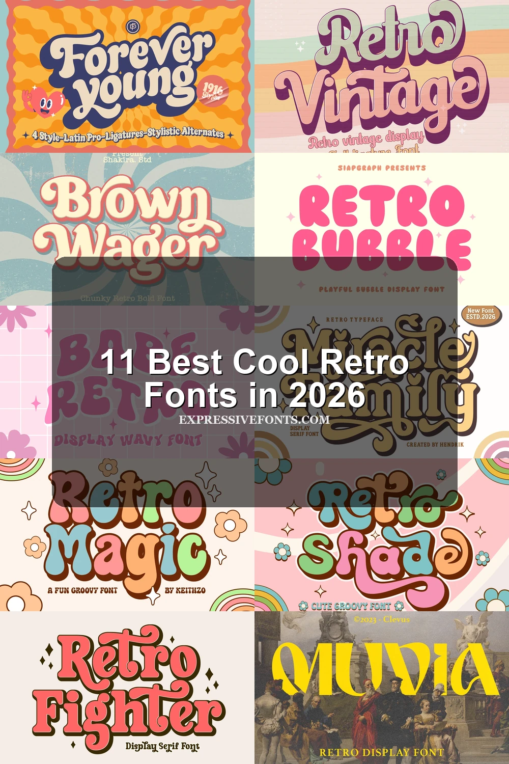
Cool Retro Fonts range from connected, heavy scripts to rounded bubble lettering, wavy displays, and sharply contrasting serif designs. Their practical roles differ accordingly: some prioritize bold logo impact, while others suit posters, packaging, apparel, invitations, or short headline treatments.
Looking for more cool fonts? Browse our complete Cool Fonts collection to compare bold, vintage, retro, script, and gothic cool styles.
Cool Retro Fonts: Connected Flowing Letterforms
Cool Retro Fonts in this group rely on connected flow, rounded weight, and decorative joins. Compared with the other categories, they feel more fluid and expressive, but usually need larger sizing.
Forever Young Font
Best For: logos, signage, display text
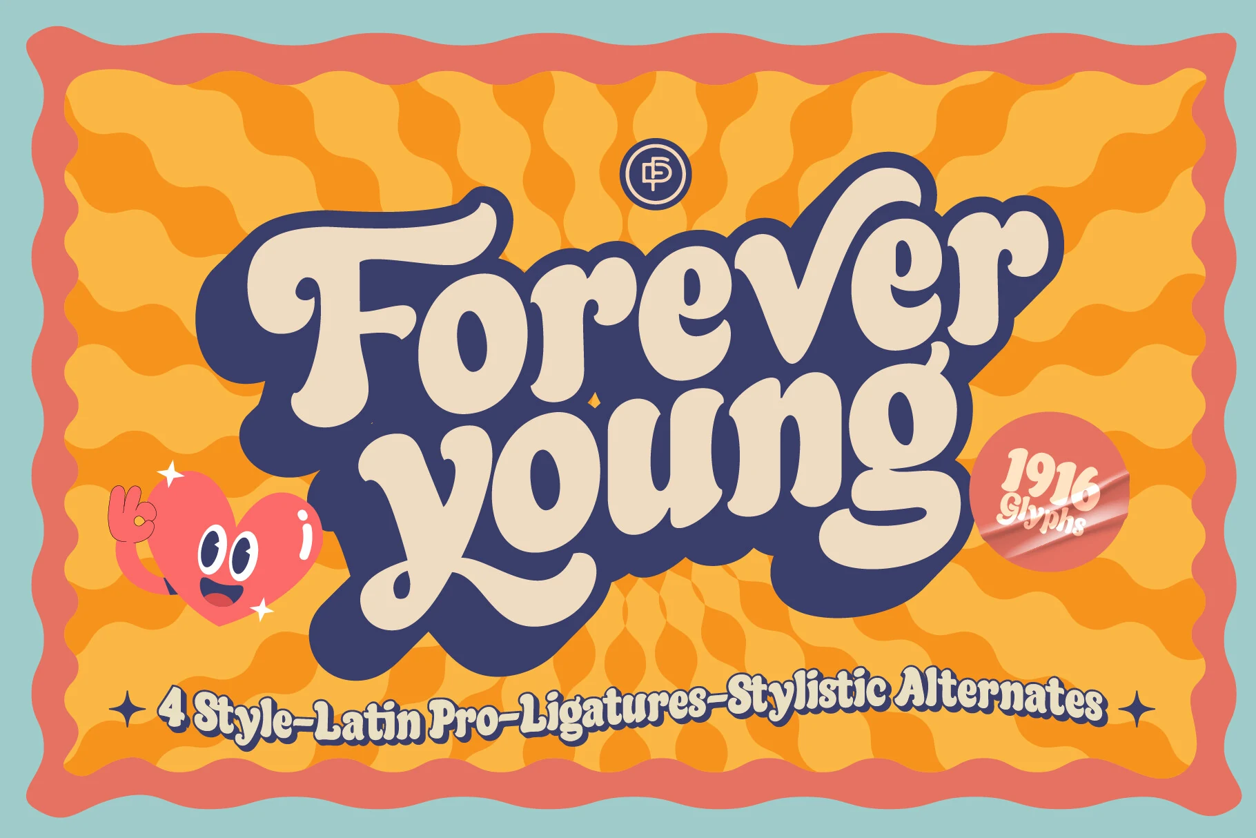
Forever Young Font builds its connected 1970s script from thick strokes, bulbous terminals, smooth curves, swirls, and exaggerated serif-like details. The dense joins hold together well in logos and signage, but clarity drops when the lettering is reduced.
Retro Shade Font
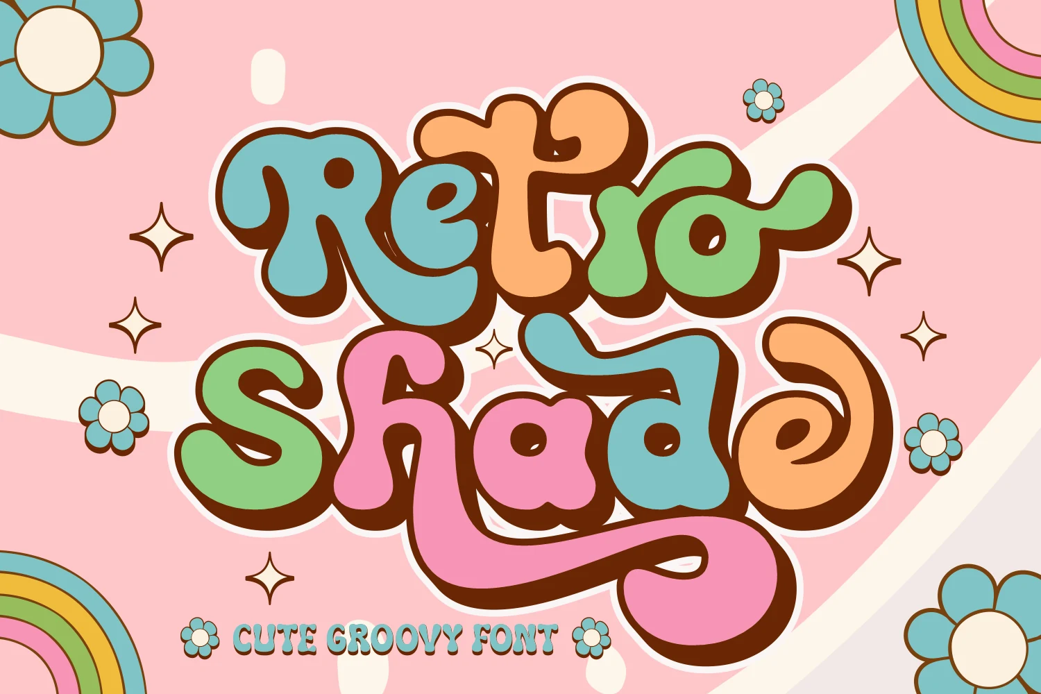
Best For: branding, packaging, book covers
Retro Shade Font stands out through heavy bubble-like letters, continuous fluid strokes, rounded terminals, and built-in decorative swashes. Its clean, round construction supports packaging and branding, while the more elaborate swashes need generous display sizing to remain easy to read.
Retro Vintage Font
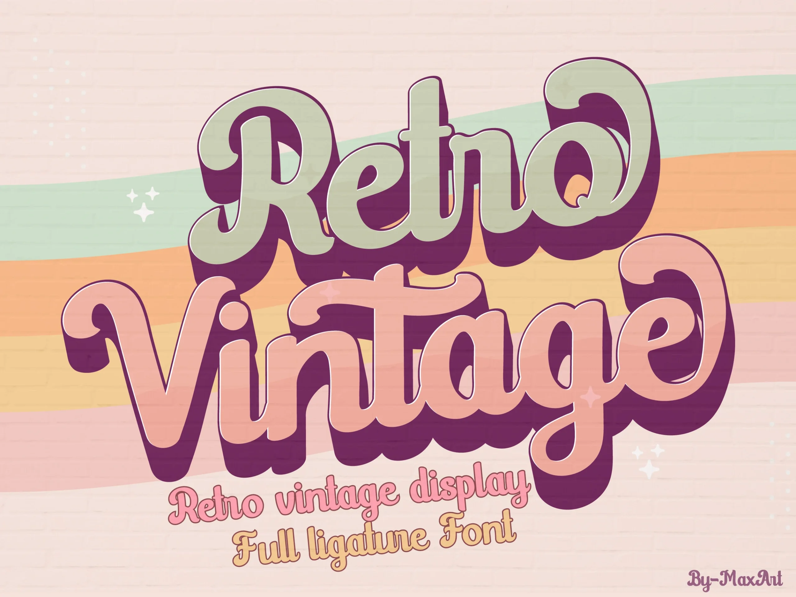
Best For: logos, branding, invitations, wedding designs
For logos and invitations, Retro Vintage Font offers a bold monolinear script with rounded characters, connected construction, and a substantial drop-shadow effect. That combination gives large lettering strong presence and reasonable clarity, though tight spacing and shadowing can muddy smaller compositions.
Miracle Family Font
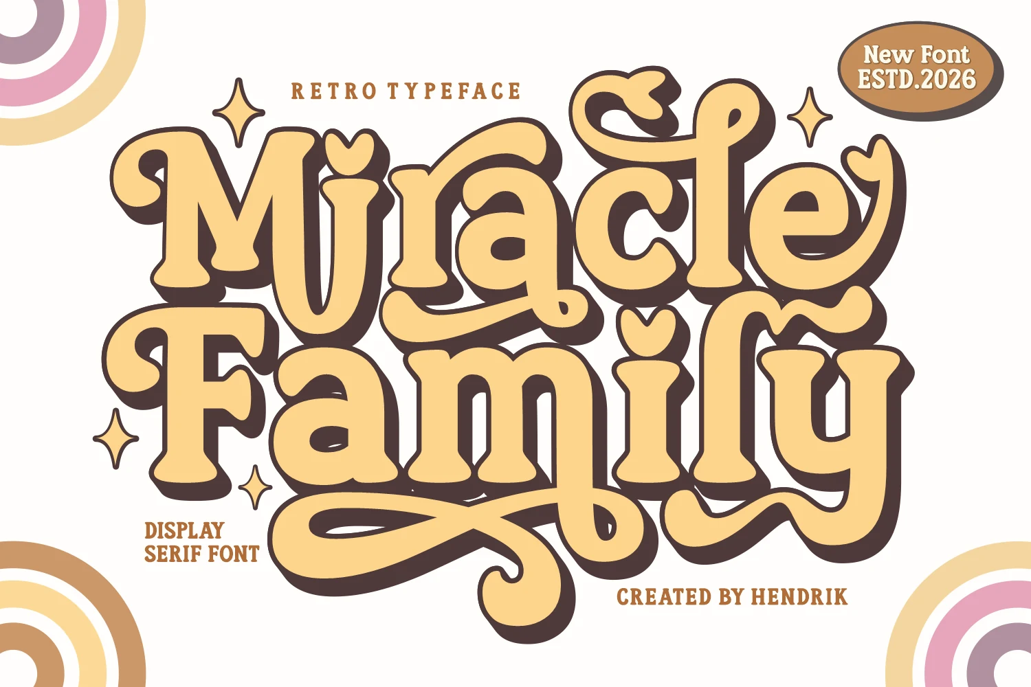
Best For: retro designs, display text, T-shirts
Miracle Family Font adds a crafted display character through thick serif strokes, flowing connected joins, terminal flourishes, and heart-shaped accents. Its decorative construction suits apparel, sublimation, and Cricut work, but those flourishes quickly reduce readability when the lettering is small.
Brown Wager Font
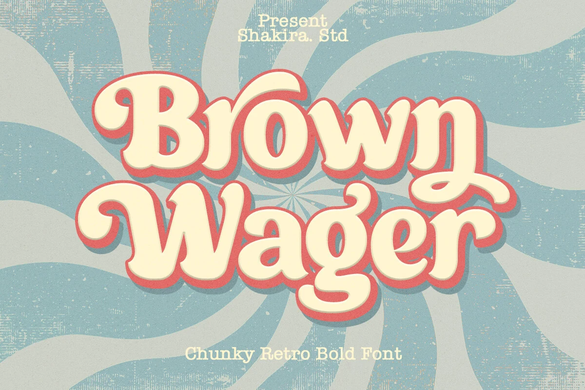
Best For: posters, headlines, display text
For short poster lines, Brown Wager Font brings chunky connected lettering, high-contrast strokes, extended tails, decorative connections, and an irregular baseline. That uneven movement adds expression, while heavy curves and flourishes limit its usefulness for small text or dense layouts.
Rounded Bubble And Wavy Displays
These rounded displays use bubbles, blobs, or visibly wavy contours instead of connected scripts or sharp serifs. Their solid silhouettes attract attention quickly in short phrases and graphic applications.
Retro Bubble Font
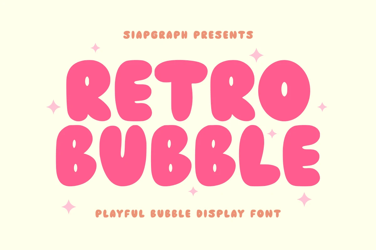
Best For: logos, packaging, stickers, headlines
Retro Bubble Font uses extreme blob-like contours, enclosed counters, and thick monolinear strokes to produce a dense, unmistakable silhouette. It remains effective for logos, stickers, packaging, and apparel, although the heavy forms lose definition when used at very small sizes.
Babe Retro Font
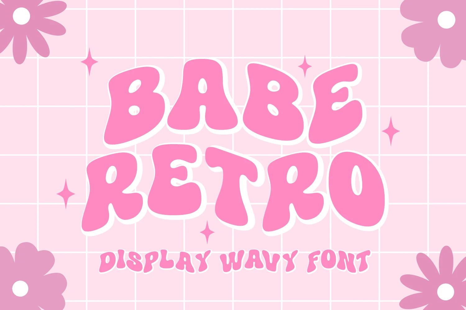
Best For: posters, logos, headlines
Babe Retro Font takes otherwise uniform heavy strokes and bends them into exaggerated wavy, fluid contours with rounded terminals. The distortion adds movement to posters, logos, and headlines, but it makes the design a poor choice for body text or long passages.
Retro Holly Font
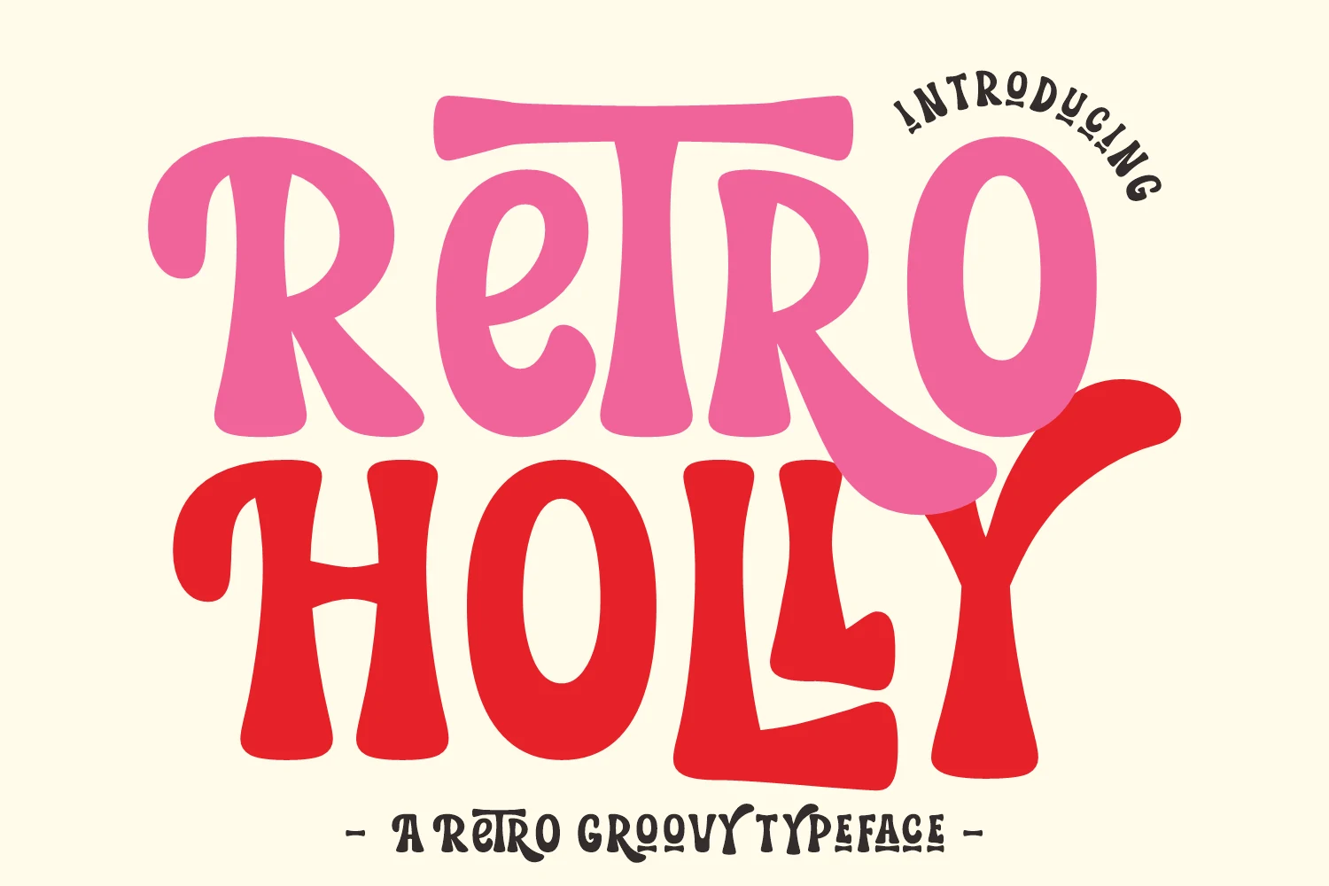
Best For: branding, posters, headlines, display text
For Cricut projects and strong headlines, Retro Holly Font combines thick disconnected strokes, tight spacing, blobby terminals, and exaggerated rounded curves. Its compact visual mass reads clearly at display sizes, while the curving shapes become less effective across longer text.
Retro Magic Font
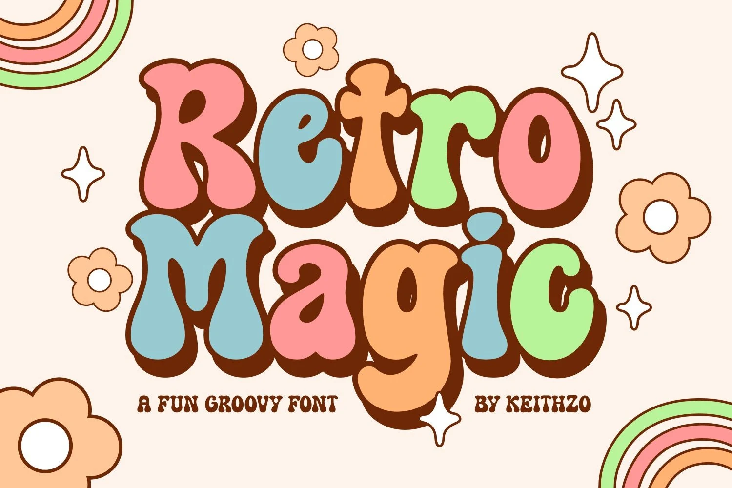
Best For: headlines, display text, nostalgic designs
Retro Magic Font keeps its bubble letters disconnected, soft-edged, and evenly heavy, creating a cleaner rounded texture than swash-heavy scripts. It reads well in larger headlines and display text, though thick forms can still close up in tight applications.
Decorative Serifs And High-Contrast Styles
Decorative serifs and reverse-contrast structures create the strongest stroke variation here. They bring authority and sophistication to headlines, yet their proportions and terminals make extended reading impractical.
Retro Fighter Font
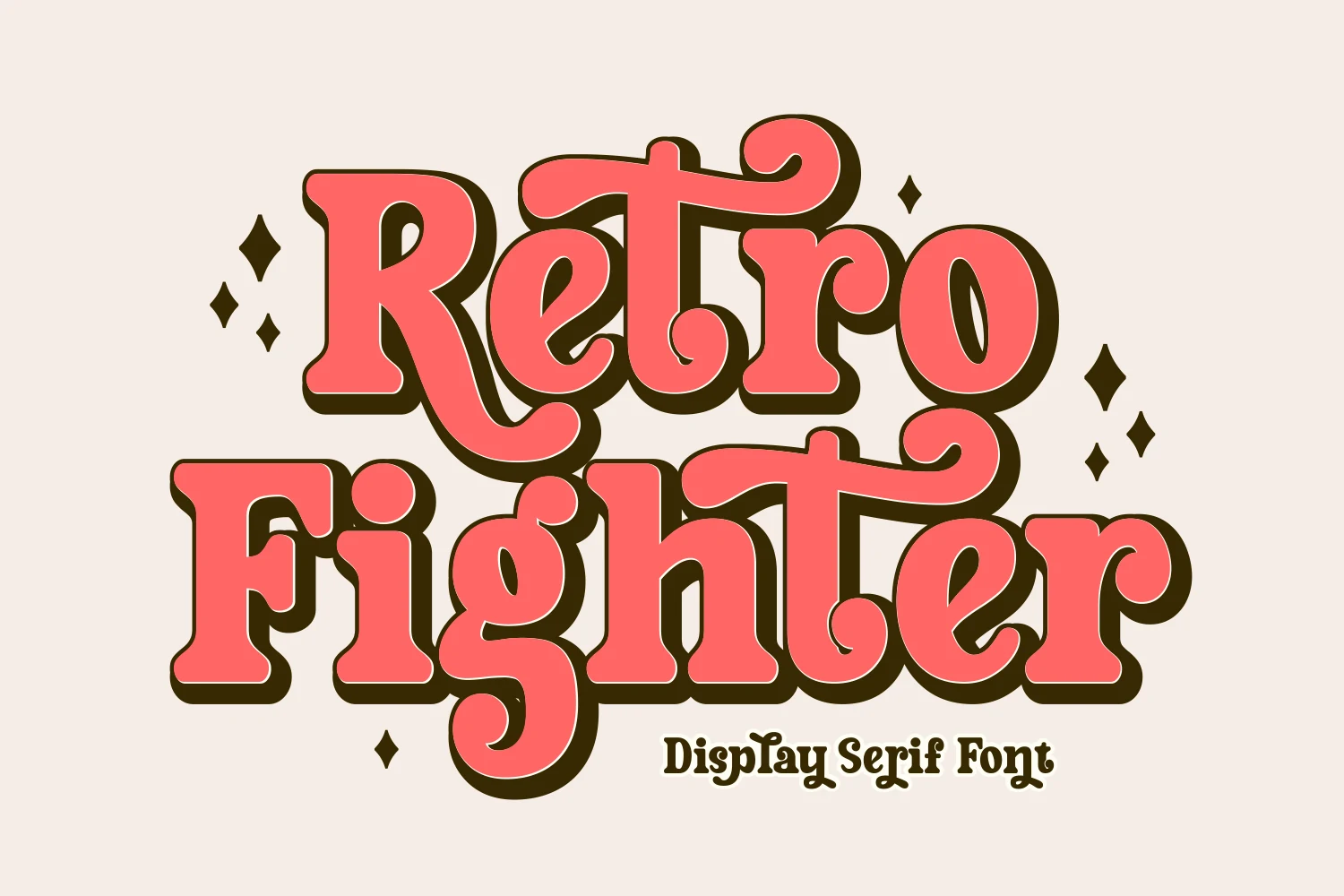
Best For: headlines, posters, logos
Retro Fighter Font creates immediate headline authority through disconnected high-waisted forms, strong stroke contrast, thick rounded serifs, and curling terminal details. Its individually drawn character structure works for posters and branding, but the swashes and proportions are not suited to extended reading.
Muvia Font
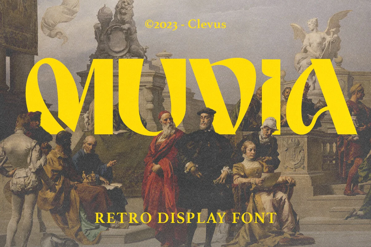
Best For: headlines, posters, merch design, branding
Muvia Font uses wide proportions and reverse contrast, inverting the usual emphasis between thick and thin strokes. Flowing terminals and decorative serif details give posters, merchandise, and branding a distinctive voice, but the stylized forms need generous display scale to stay legible.
How to Choose the Right Font
Choose Cool Retro Fonts by matching construction to scale: connected scripts and swashes need room, bubble styles offer clearer silhouettes, and high-contrast serifs deliver sharper authority. Test joins, counters, shadowing, and flourishes at the intended size before committing, especially when a headline may become packaging, apparel, or signage.